« … so I’d work on it until three or four o’ clock in the morning — that is the time to do Loevecraftian machinations. » — Tom Sutton (2001)
If you ask me, Marvel’s attempts at humour never came off*, being both strained and generally directed at superheroes, who are ridiculous in the first place. It’s like mocking pro wrestling — What’s the point?
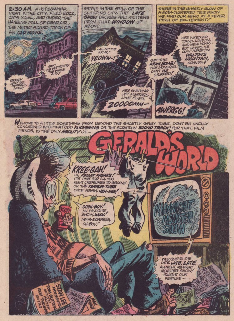
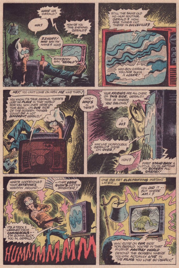
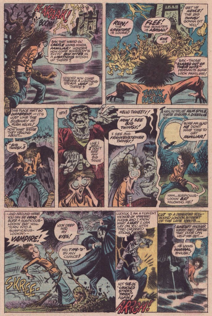
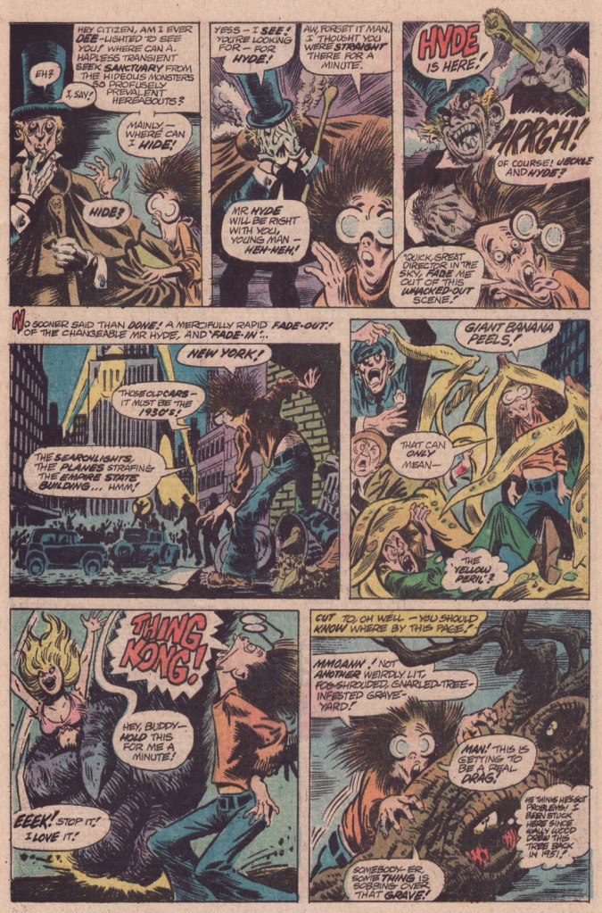
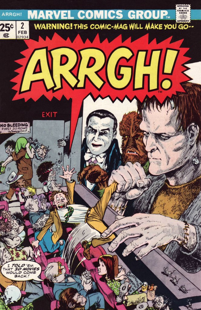
Marvel did half-try its clammy hand at a horror humour comic book midway through the 70s, and while much of it looked decent, it was consistently unfunny. You can give it your best Will Elder, but it won’t stick if you don’t have that rare magic comical gene.
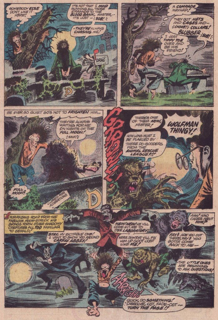
And while I’d love to say that Tom Sutton (1937-2002) had it, I’m afraid he didn’t. But Gerald’s World was a story close to his heart, to the point where he actually remembered creating it and having fun doing so.
« Right, and I did “Gerald”, who stayed up all night watching Fay Wray or something like that. I had fun with those! You know there were people who really didn’t like those things? » (Comic Book Artist no. 12, 2001)
It’s overstuffed, but it’s brimming with mood and solid craft. Take it away, Tom!
For a dose of real-life, depressing horror, read the definitive, late-in-life Tom Sutton interview, ‘An Odd Man Out‘. I’m afraid it’s unlikely to leave you swooning with affection and goodwill for the comic book industry.
And here’s Marie Severin‘s cover for that issue. This is Arrgh! no. 2 (Feb. 1975, Marvel). By issue five, the final one, Marvel were down to licencing 1954 Get Lost! material from Ross Andru and Mike Esposito.
-RG
*there’s always an exception, isn’t there? I’ll proudly vouch for Scott Gray and Roger Langridge‘s Fin Fang Four stories, circa the late Oughties. Recommended? You bet.
« Gamma rays are the sort of radiation you should avoid. Want proof? Just remember how the comic strip character “The Hulk” became big, green, and ugly. » — Neil deGrasse Tyson
It may seem a counterintuitive notion, but some artistic virtuosi, while draftsmen supreme, may be sorely lacking in pure design chops, while some otherwise unremarkable craftsmen design splendidly. The same general principle applies to a colour sense, or handwriting. As the cliché goes, the most skilled brain surgeon’s penmanship may just yield sloppy gibberish, what’s wittily described as chicken scratch writing.
My point in this case is that, while Herb Trimpe (1939-2015) has never ranked among the comics industry’s glory boys, I consider him one of its finest cover artists. It’s a special skill and quite a scarce one…
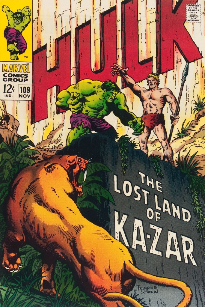
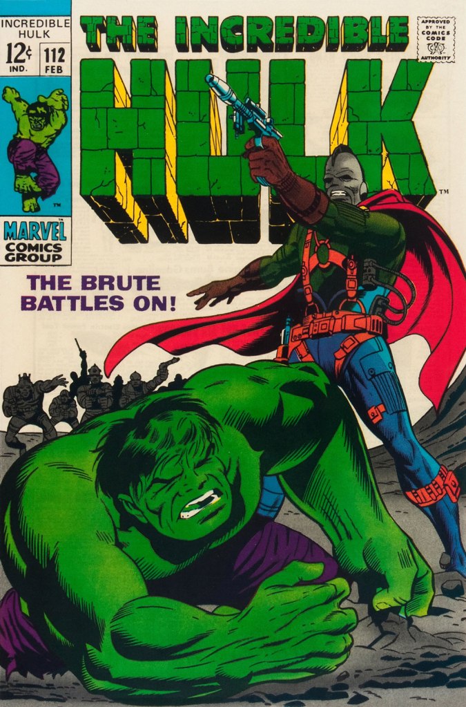
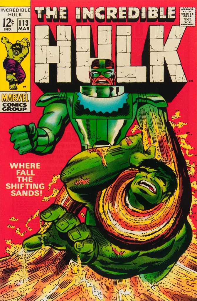
Herb’s streak begins with The Incredible Hulk no. 109 (Nov. 1968, Marvel), his first cover for the series. And yes, being seconded by one of comics’ all-time finest inkers (and cover artists!) didn’t hurt, but this is flawless layout work in the first place. This is The Incredible Hulk no. 110 (Dec. 1968, Marvel), again boasting John Severin inks (and quite likely Marie Severin colours).This surviving piece of production art grants us the opportunity to admire the splendid inks. I honestly don’t know what Ka-Zar was hoping to achieve here, though. Trimpe also produced another, rejected, version of this cover (scroll down, it’s near the bottom) the action tackled from quite a different angle. Featured in IDW’s ultra-fancy, signed-and-numbered limited run in the ‘where can I fit this damn monster?’ Artist’s Edition format in 2015, it demonstrates just how tight Trimpe’s pencil work was.This is The Incredible Hulk no. 111 (Jan. 1969, Marvel). Dan Adkins takes over the inker’s chair. This is The Incredible Hulk no. 112 (Feb. 1969, Marvel). Notice how innocent of hype and verbiage these covers are? This is The Incredible Hulk no. 113 (Mar. 1969, Marvel). I always preferred the simplicity of The Sandman’s garb as envisioned by his creator, Steve Ditko. He was depicted as a bully in a striped green and black sweater, which was fine for a guy able to turn his body into sand. When Jack Kirby redesigned him, he gave him a cool-looking, but frankly rather impractical getup.
And that’s where this streak ends, as far as I see it: the following few issues feature decent covers, but nothing outstanding. But there were scores of excellent Trimpe Hulk covers to come. The blocky dynamism of his visuals, so easy to underrate, made his covers a reliable breath of fresh air in the mire of formulaic and overwritten Marvel 1970s covers (et tu, Gil Kane?)
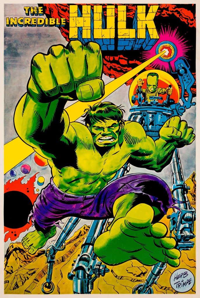
As a bonus, here’s a 1970 Marvelmania poster, one in a series of products exclusively available through mail-order. Nowadays, any of them routinely fetches princely sums. If you think Herb’s perfectly nailed the King Kirby aesthetic with this one, you wouldn’t be far wrong, but there’s a twist. The drawing was designed and pencilled by Kirby, then in the process of leaving Marvel for DC. Trimpe was asked to ink the drawing, redraw the Hulk’s face in his own style, and delete Kirby’s signature. I forget just where I read about this, but Trimpe had some heavy moral qualms about being made a party to this petty act of malice.
« I love the scents of winter! For me, it’s all about the feeling you get when you smell pumpkin spice, cinnamon, nutmeg, gingerbread and spruce. » — Taylor Swift
It occurred to me, just the other day that I’d failed to feature, over the course of five and three-quarters countdowns, anything by Gene Colan. And this despite the fact that I’ve always enjoyed his work and his undeniable adroitness within the horror genre.
Still, I decided to sidestep the obvious touchstone, his monumental run on The Tomb of Dracula, and opted instead for another of his big series at Marvel: Howard the Duck.
I was a fervent fan of the series as a kid, but I honestly haven’t returned to it in decades. Which is not to say that I’ve forgotten it. There’s no doubt that I should give it a fresh look — I’d probably get more of Steve Gerber‘s jokes than I did as a twelve-year-old — but in the interim, let’s focus on a couple of pertinent issues.
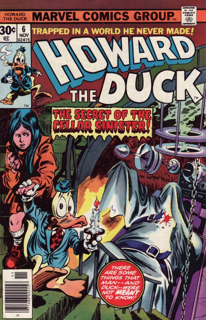
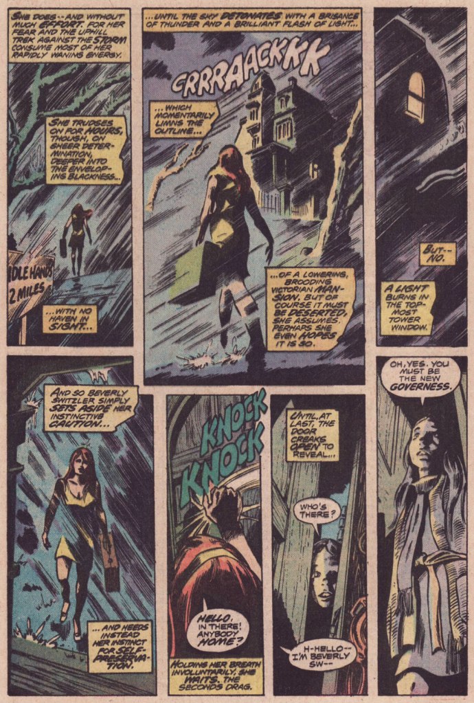
This is Howard the Duck no. 6 (Nov. 1976, Marvel); cover pencils by Gene Colan, inks by the recently departed Tom Palmer (1941-2022).Colan’s style meshes surprisingly well with Mr. Gerber‘s madcap comedy… he plays it straight, and that’s why it clicks. Savvy move.I wasn’t sure about Steve Leialoha‘s appropriateness as a Colan inker at the time, but I really don’t see what I could have objected to. Let’s see, what have we here? The Addams Family, Shelley’s Frankenstein, gothic romances, Nathaniel Hawthorne, religious sects… in this case the reverend Sun Myung Moon‘s Unification Church, better known as The Moonies…
I won’t leave you in suspense! On to the following issue…
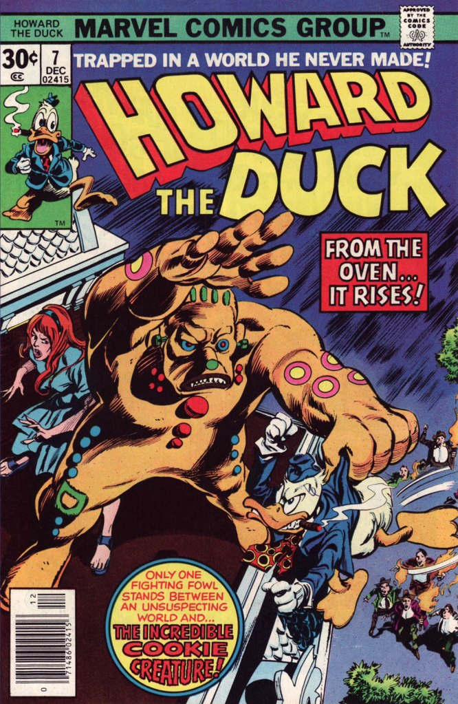
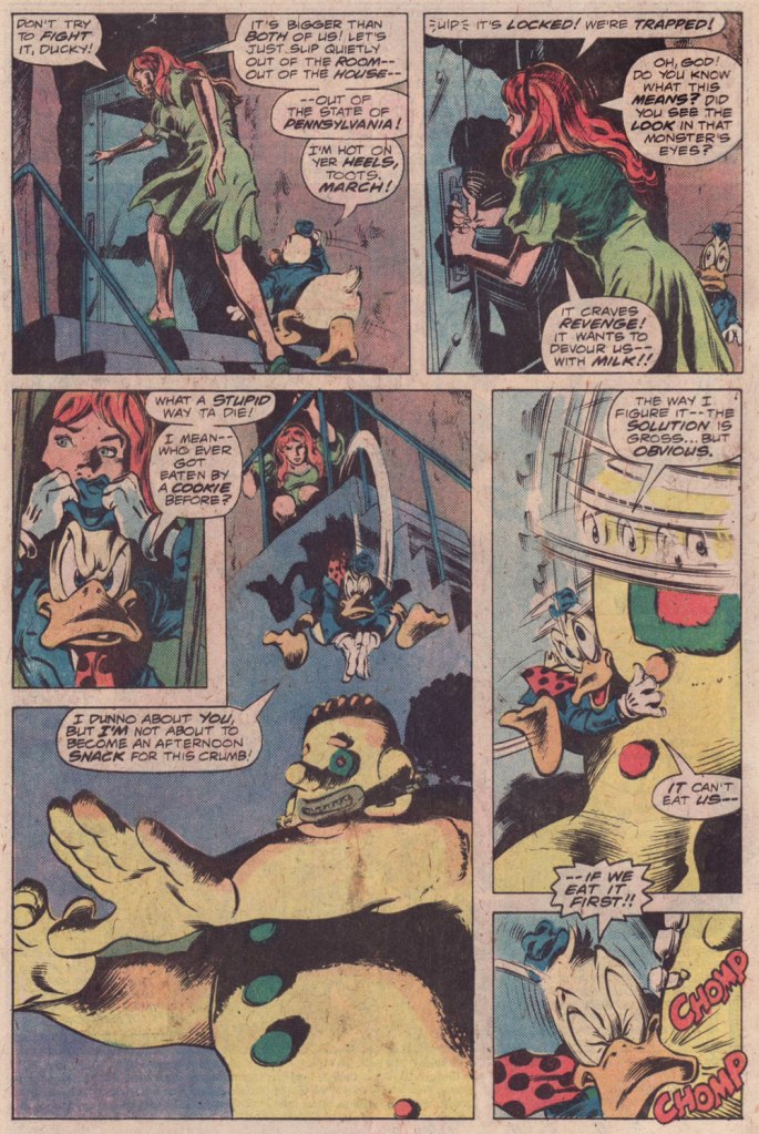
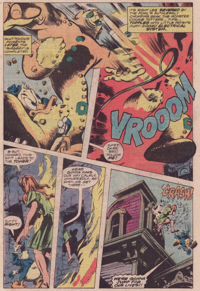
This is Howard the Duck no. 7 (Dec. 1976, Marvel); pencils by Colan, inks by Palmer.
And that’s it! Steve Gerber had a refreshing knack for subverting and upending the Marvel formula: instead of some drawn-out, epic standoff, Howard disposes of the threat — a threat worth two cover features! — in a couple of panels, then the story moves on… to another range of targets.
« — I don’t know about zombies, doctor. Just what is a zombie? — A ghost. A living dead. It’s also a drink. » — I Walked With a Zombie (1943)
Has any of the classic monsters undergone more radical changes over the past century than the lowly zombie? I believe my first encounter with the walking dead (in comics, that is) came through a reprint of a relatively obscure Archie Goodwin – Rocco Mastroserio story, the imaginatively titled Zombies!* (read it here!) from Creepy no. 17 (Oct. 1967, Warren); in it, uncle Archie schooled me about zombies’ aversion to salt and, it follows, sea water. Which I presume is what kept them cooped up on tropical islands.
Confirmation of this vulnerability came in what I consider the scariest scene in the uneven Kolchak: The Night Stalker TV series, from its second episode, the imaginatively titled The Zombie, wherein Kolchak does his level best, under trying circumstances, to pour salt down the throat of a massive, dormant-but-not-for-long zombie.
But the damage to zomboid tradition had already been inflicted, for better (my vote) or for worse, by George Romero‘s ravenous shamblers in 1968’s Night of the Living Dead. While I had no trouble accepting Romero’s savvy upgrade, I recall being offended by the cheesy, mindless, anything-goes approach adopted by Lucio Fulci in his imaginatively titled Zombie**, namely this sequence.
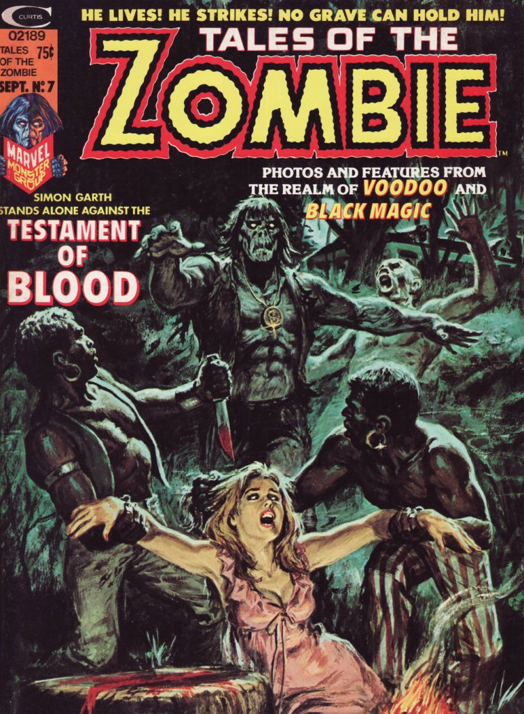
Marvel’s resident Zombie, Simon Garth, had débuted all the way back in 1953 (what is time, after all, to the living dead?) and Menace no. 5‘s imaginatively titled Zombie! (check it out here).
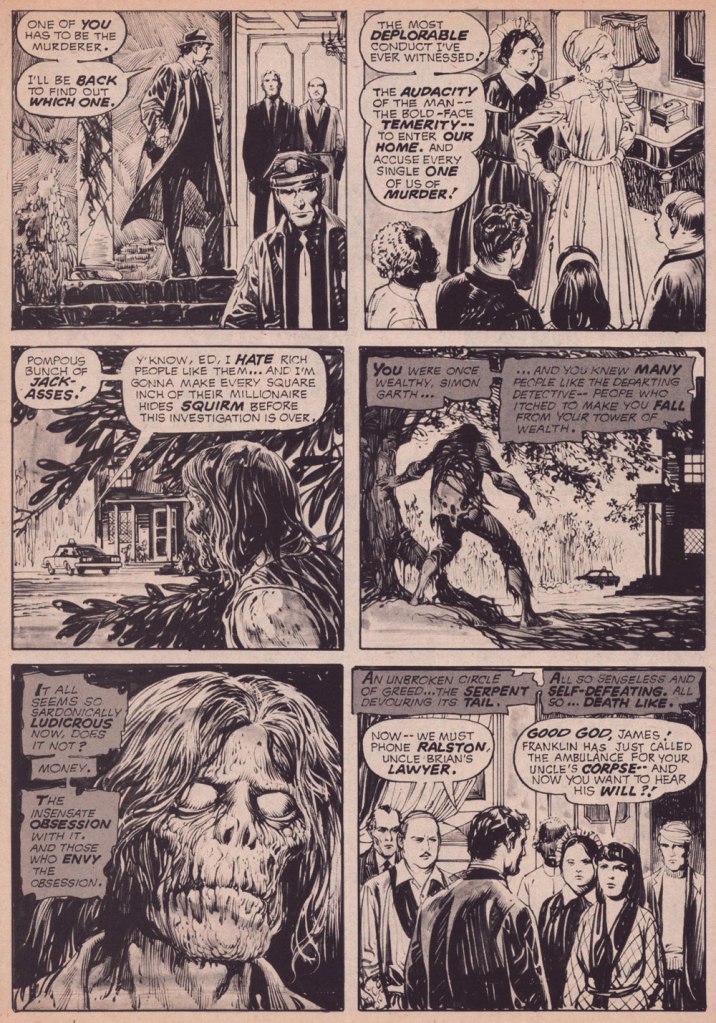
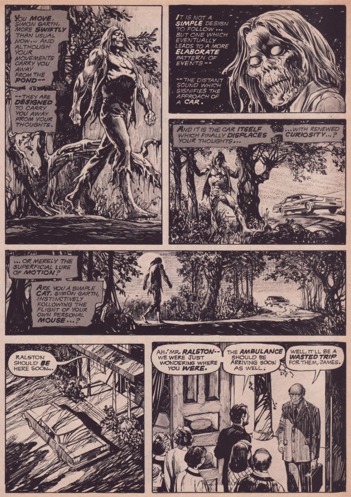
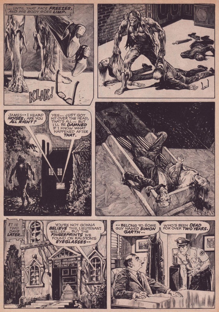
Aside from his Bill Everett-drawn premiere, I frankly have little use for the character, but I have a soft spot for this one story, intended as a time-buying fill-in for the feature’s regular team, writer Steve Gerber and Peruvian artist Pablo Marcos. It’s written by the often-interesting Doug Moench (Master of Kung Fu, Moon Knight) and illustrated by the masterful Alfredo Alcala, a sure consensus favourite around here. The plot itself is rather on the thin side, being one of those Agatha Christie’s Ten Little… er — And Then There Were None scenarios, with Garth mindlessly hovering around and peering in windows, until…
But the artwork is a delight. Like all of Marvel’s supernatural antiheroes (save the Man-Thing), Garth absurdly boasts the physique of a bodybuilder (despite being long dead and not eating anything), but at least Alcala truly knows his anatomy.
The original story is over thirty pages long, so I’m just providing highlights, including the conclusion, which is quite cute. While it must be incredibly hard to write mindless, invulnerable characters, Moench had a good punchline in mind all along.
This is Earl Norem‘s cover for Tales of the Zombie no. 7 (Sept. 1974, Marvel).
-RG
*set in Brazil for the sake of the twist ending — not a bad one, either. **To be fair, called Zombi 2 in Italy, since “Romero’s Dawn of the Dead (1978) was released in Italy as Zombi.” At least the Italians, as the French once did, understand that Zombi is the male, and Zombie the female of the, er… species. Or is it simply the plural?
« To prevent enabling oppression, we demand that black people be twice as good. To prevent verifying stereotypes, we pledge to never eat a slice a watermelon in front of white people.* » — Ta-Nehisi Coates
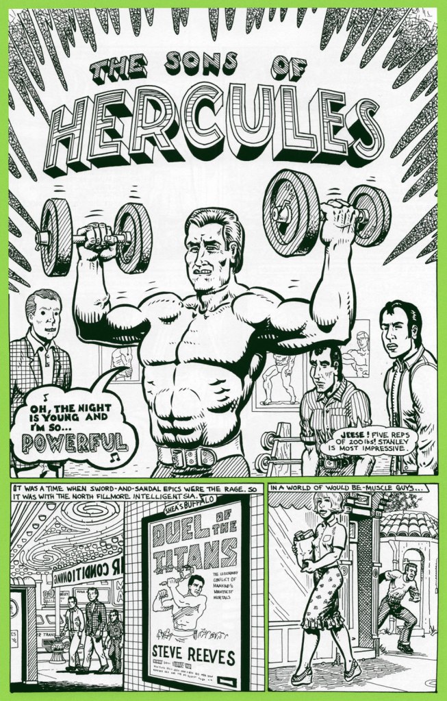
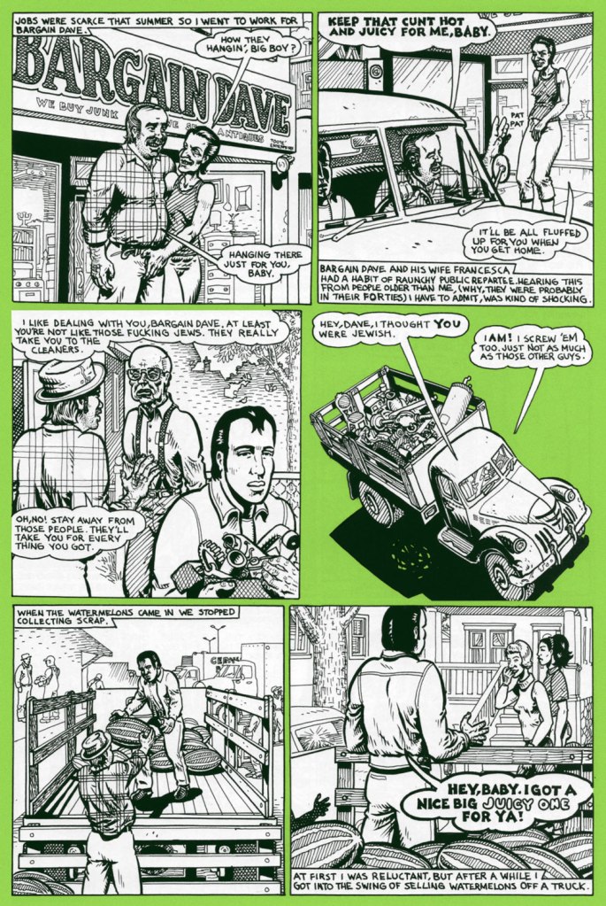
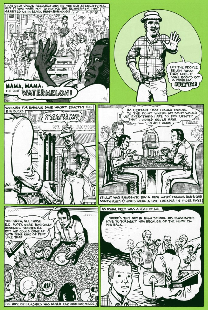
On a scorching day last week, we were at home digging into a particularly tasty watermelon.
As neither of us grew up in the U.S. of A., the simple act of eating juicy pastèque has not been tainted, as it has for many, by racism and stereotypes. We’ve been allowed to appreciate the watermelon for itself, as a healthy, refreshing, tasty treat. A lightbulb came on as I recalled a relevant sequence in one of Spain Rodriguez‘s ‘Fred Toote’ stories, set in the 1950’s Buffalo of his youth — and so here it is:
And that’s not all: a few days later, a friend’s news feed presented me with a most insightful, eye-opening *and* heartbreaking tweet:
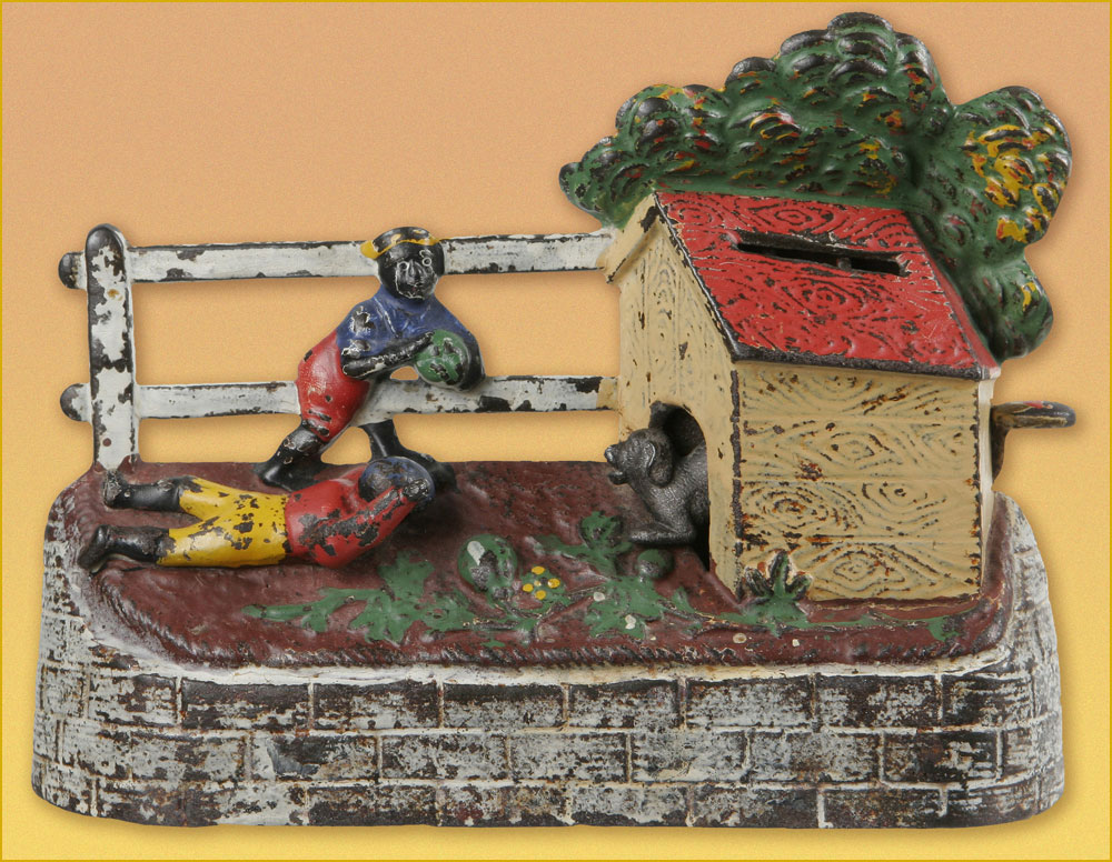
« It seems almost silly to say that watermelons have been racialized, but that is exactly what happened in this culture. » Here’s the full article, a fascinating summary of the issue from Dr. David Pilgrim of Ferris State University’s Jim Crow Museum of Racist Memorabilia, written in response to the rather hostile comment of “Judging from the pictures on your website, you seem to be saying to me that black people don’t like watermelons? Sometimes you liberals make me shake my head.“« Boys Stealing Watermelons Bank. Made by Kyser & Rex of Philadelphia, PA. circa 1894. When a lever is pressed and the coin deposited, a dog runs out to keep the boys from their prize. »Comics pioneer Gustave Verbek (1867-1937), known as Verbeek after he “moved to the United States, where an immigration officer misspelled his name“, tackles a familiar subject in his Upside-Downs strip of Aug. 7, 1904 . Don’t forget to read it upside down for the second half of the story! My warmest thanks to Sunday Press‘ Peter Maresca for providing me with this rare image.
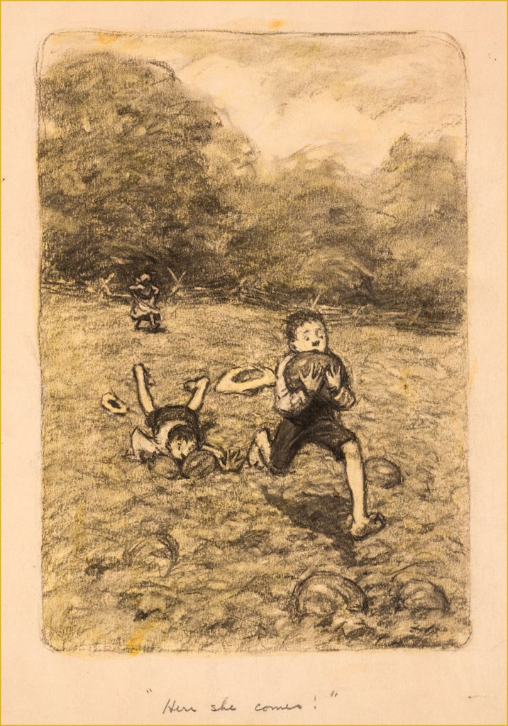
A piece in graphite on manila by James Ellsworth “Worth” Brehm (b. 1883 – d. 1928) illustrating one of Booth Tarkington‘s ‘Penrod’ novels, circa the 1910s. Seems like any and all scamps — of all races — would raid the watermelon patch, given half a chance.
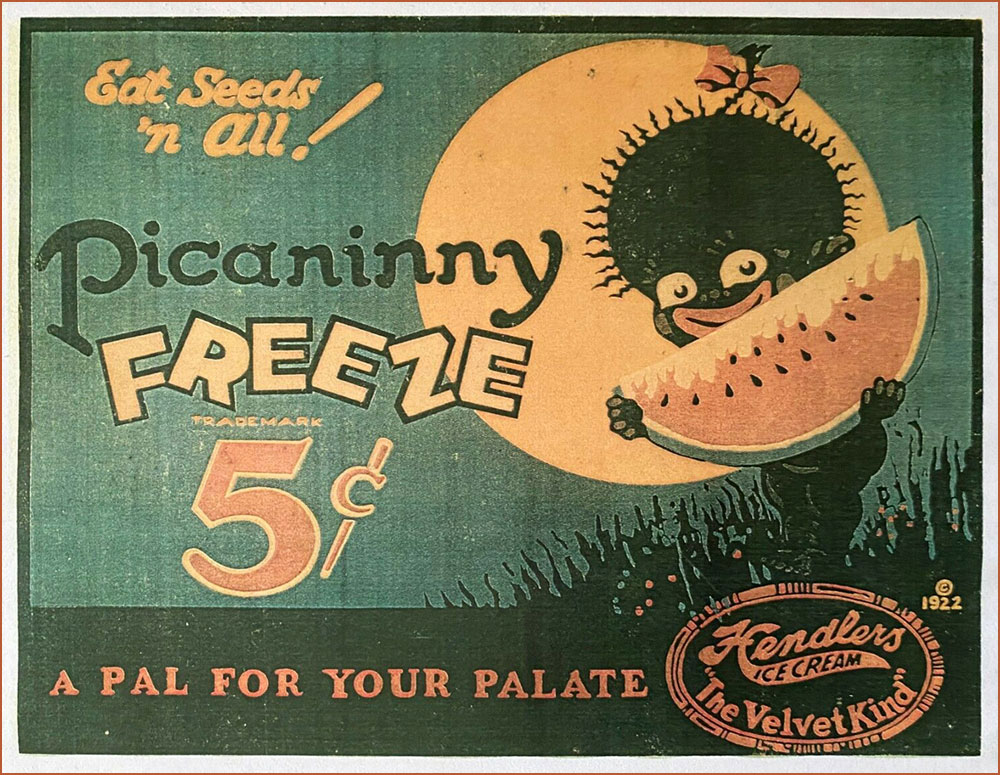
An ice cream advertising sign, circa 1922. If you’ll bear with me, here’s a longish, must-read quote from the indispensable Wicked Words by Hugh Rawson (1989, Crown Publishers, New York):
Pickaninny. A black child. Thus, from a book that was being sold in 1987 in order to raise money for the state of California’s observance of the bicentennial of the United States Constitution. ” If the pickaninnies ran naked it was generally from choice, and when the white boys had to put on shoes and go away to school they were likely to envy the freedom of their colored playmates” (Fred Albert Shannon, essay on slavery, 1934, in The Making of America, W. Clean Skousen, ed., 1985).
Pickaninny arose among slaves in the West Indies, where it was recorded as early as 1653. The original users based the term either on the Portuguese pequenino, little child, or its Spanish equivalent. They employed the term affectionately, of course, and, on the evidence of Captain Frederick Marryat, who was a sensitive recorder of language, applied it to little children generally, regardless of color, e.g. “And den, Mass Easy, you marry wife – hab pickaninny — lib like gentleman” (Mr. Midshipman Easy, 1836).
But no white person can get away with this today. The essential informality of the word makes it seem too condescending, too offensive, to most modern sensibilities. The California Bicentennial Commission, in fact, halted the sale of The Making of America, and issued a formal apology for having authorized it in the first place, after this use of pickaninny was called to their attention (along with other matters, the text also concluding that “slave owners were the worst victims of the system [of slavery].”
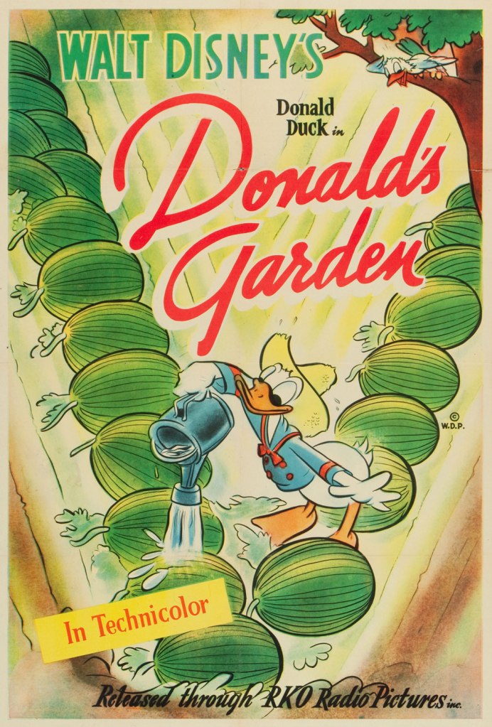
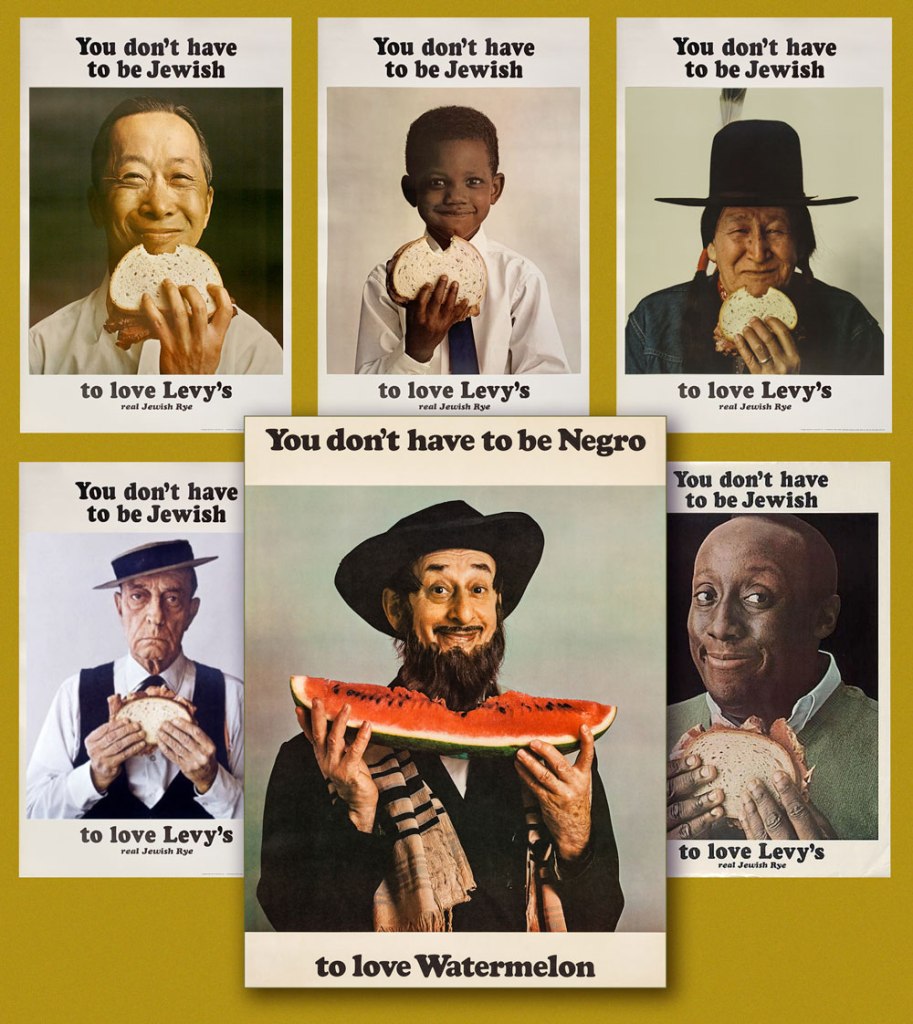
One Sheet poster from Donald’s Garden (RKO, 1942), written by Ralph Wright and directed by Dick Lundy. « During WWII, Americans were expected to help their country in the war effort by participating in “Victory Gardens.” This was a measure to conserve produce domestically so food could be shipped to the troops overseas. » Watch it here!This is Krazy Krow no. 2 (Fall 1945, Timely). Racist stereotype or not? It’s not always the case, as R.C. Harvey soberly argues in an excellent article on Walt Kelly‘s Pogo, Sometimes a Watermelon Is Just a Watermelon. Here’s a sample: Harvey — « This is ultimately a failure to understand what the watermelon stereotype actually entails. Surely you realize that there’s nothing intrinsically degrading in liking to eat watermelon. Watermelon was one of the props in a general stereotype of the African American as filled with infantile enthusiasm, easily distracted and reduced to paroxysms of delight at the rattling of dice, the smell of fried chicken, or the sight of a watermelon. This is not what’s happening in Kelly’s story at all. But then, Andrae hardly seems to have an idea of his own on this subject at all. Rather, he has a grab bag of received notions, incompletely understood and haphazardly applied. Watermelon equals racism, that is all you know and all you need to know. »A slice of Mal Eaton’s delightful Rocky Stoneaxe (né Peter Piltdown); undated, but since it bears the Stoneaxe name, it’s post-1953 and saw print in the pages of Boy’s Life Magazine. Eaton’s a local favourite, and my co-admin ds has twice written about his signature creation. First came Mal Eaton’s Peter Piltdown, then Tentacle Tuesday Masters: Mal Eaton — Peter Piltdown Goes Fishing!And now for something more progressive: called ‘the most successful Jewish ad campaign of all time’ (*explicitly* Jewish would be my caveat), the truly classic Levy’s rye bread campaign was launched in 1961 and lasted into the 1970s, spawning along the way countless imitations, parodies and ripostes, including, circa 1967, the You Don’t Have to be Negro to Love Watermelon seen here front and centre. Keen readers surely will have spotted the unmistakable deadpan mug of the rightly legendary Buster Keaton, bottom left.
According to a New York Times article, « Malcolm X liked the poster featuring the black child so much that he had himself photographed alongside it. »
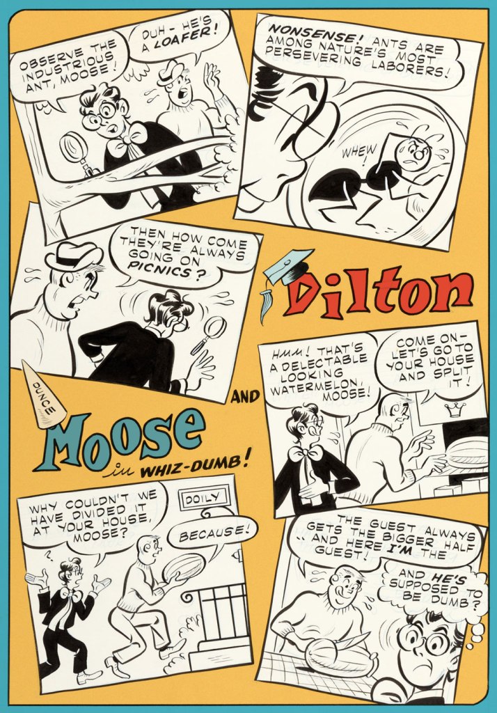
Given the right writer, I’ve always enjoyed the Dilton-Moose pairing more than the Moose-Midge combo. The boy genius and the dunce are genuine friends, while Midge only serves as a vehicle for Moose’s jealousy and as a way to land Reggie in traction. This one appeared in Archie’s Joke Book Magazine no. 46 (May 1960, Archie). Writer unknown, art by Joe Edwards (1921-2207).
A page from Little Audrey and Melvin no. 4 (November 1962, Harvey); kudos to Melvin — I can’t even get a proper boomerang to return to me, let alone a piece of rind used in its stead.
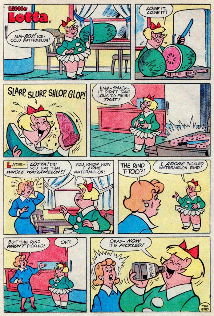
I suppose your stomach acids would have done the trick just as well, Lotta. A page from Little Lotta no. 65 (May 1966, Harvey).
A special watermelon sequence by the Lieber Bros, Stan & Larry, with inks by Mike Esposito (moonlighting as Mikey DeMeo); this is from The Parents of Peter Parker!, published in The Amazing Spider-Man Special no. 5 (Nov. 1968, Marvel).
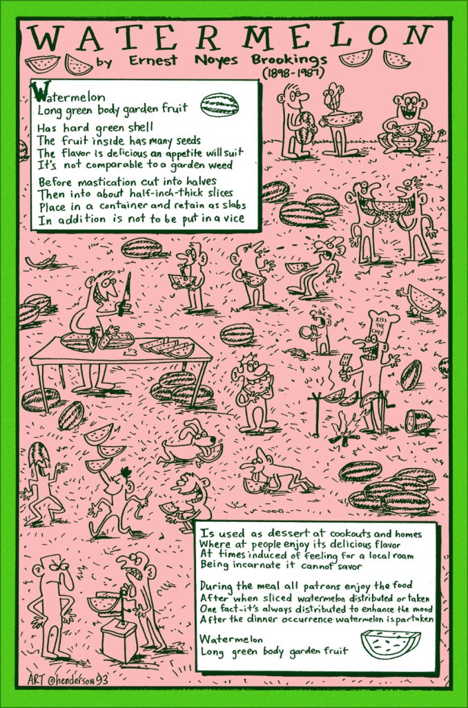
And finally, a collaboration between prankster and cultural scholar Sam Henderson and late-in-life eccentric poet Ernest Noyes Brookings; it appeared in Duplex Planet Illustrated no. 7 (March 1994, Fantagraphics), edited by David Greenberger. And if you’ve enjoyed the visual version, try the 1991 musical adaptation by Maestro Subgum & The Whole!
-RG
*He’s not even slightly exaggerating: the heinous stereotype just won’t die.
« Taking sartorial risks and not following other people is what makes you stand out. » — Zac Posen
I was planning a big commemorative post for today, but I got tangled up in my calendar and realised in time that I was a couple of weeks off. So instead, I’ll just blow off a little steam.
Some cartoonists are born character designers. Others, not so much. The Rhino, a Stan Lee-John Romita Sr. creation, first appeared in The Amazing Spider-Man no. 41 (Oct. 1966, Marvel), soon after Steve Ditko‘s abrupt but quite justified resignation. Isn’t that just a dog of a cover? (pencils and inks by Romita, colours by Stan Goldberg).
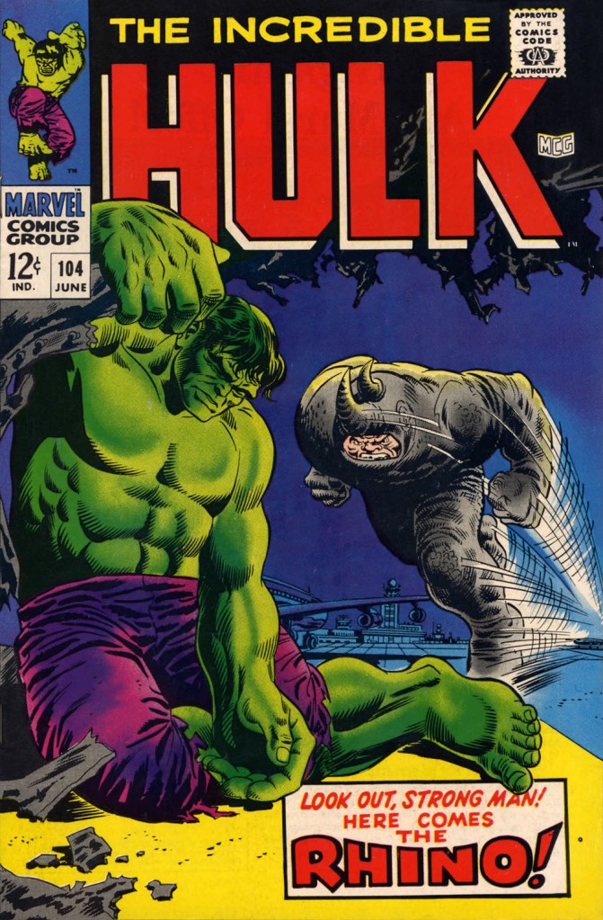
“I’ve been getting these migraine headaches, Doc” “What do you do for a living?” “Uh…” Seriously, what can you do with a character who obviously can’t move that fast, has to lean his head down to strike… blindly, and isn’t particularly smart? All Spidey has to do is duck, which is one of his chief talents.Answer: you pit him against a more suitable adversary, preferably a dumber one. This later, but still ludicrous, appearance is The Incredible Hulk no. 104 (June 1968, Marvel). Cover by Marie Severin and Frank Giacoia.
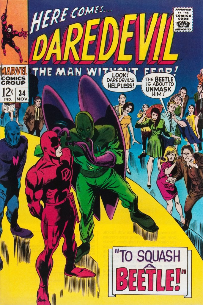
Somehow, Daredevil seems to wind up with more than his share of poorly-attired villains. It’s as if they know he’s blind and won’t judge them too harshly on sartorial grounds.
The Beetle first scurried into view in Strange Tales no. 123 (Aug. 1964, Marvel), tackling the Human Torch (and The Thing). Too bad it wasn’t Doctor Strange he was sparring with, since his threads would then have been designed by Mr. Ditko instead of by Carl Burgos.
He then went on to bug the aforementioned ‘hornhead’. This is Daredevil no. 34 (Nov. 1967); pencils by Gene Colan, inks by Bill Everett. Why does everyone on stage appear to wear a size 15 shoe? At least!
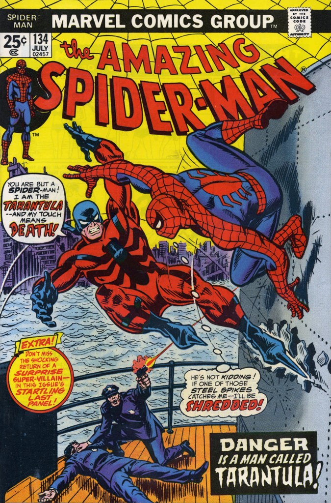
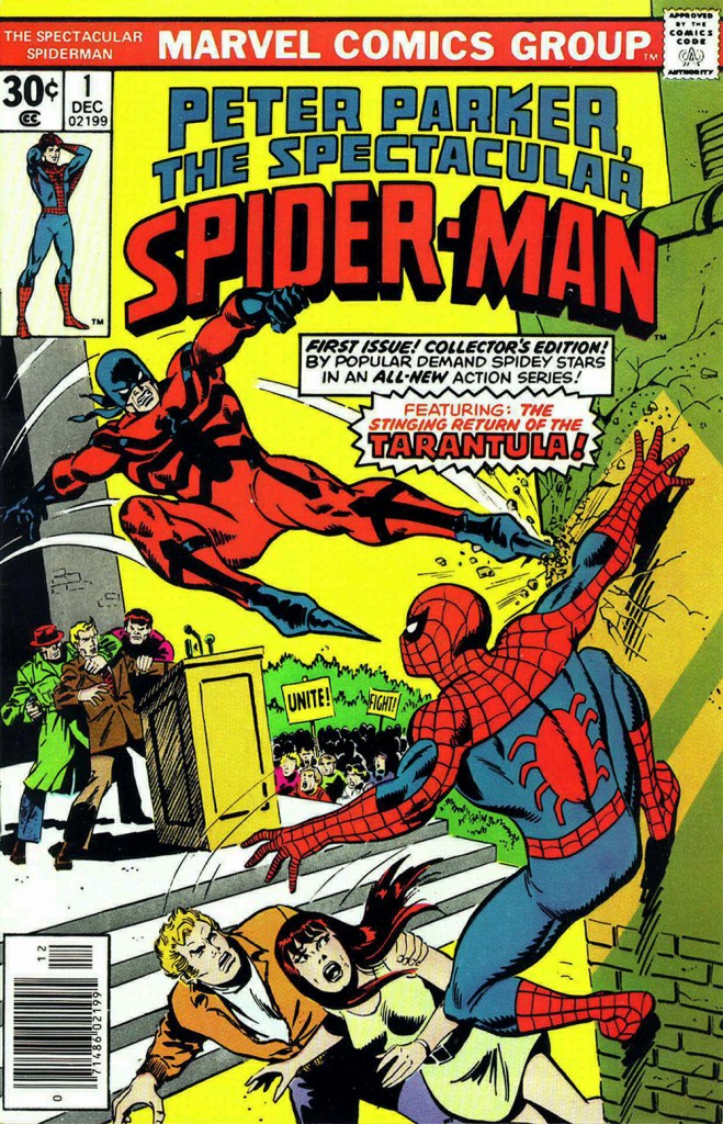
The costume of the Tarantula (a glorious Gerry Conway-Ross Andru creation!) is such an impractical conceit that they pretty much have to use him in the same position on every cover. The guy can barely walk in such, er — calzado, let alone fly at Spider-Man with such force. Just a lousy idea, on every level — tarantulas bite, they don’t sting, Gerry.
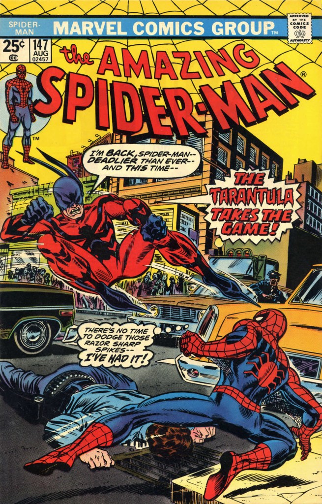
This is The Amazing Spider-Man no. 134 (July 1974, Marvel). Art by John Romita Sr. So… much… pointless…. exposition.They just had to bring him back! This time, Gil Kane and John Romita Jr. do the honours. This is The Amazing Spider-Man no. 147 (Aug. 1975, Marvel).No formula at work here, no sir. This is Peter Parker, the Spectacular Spider-Man no. 1 (Dec. 1976, Marvel). Cover by Sal Buscema. Tarantula creator Conway was the editor, which explains a lot — but hardly excuses it.
Poor Razor-Fist was created by writer Doug Moench and artist Paul Gulacy. How did he get dressed? How did he go to the bathroom? How did he feed himself? How did he get his head to bend that far back? (Perhaps he’s a Pez Dispenser).
This is The Hands of Shang-Chi, Master of Kung Fu no. 30 (July 1975, Marvel). Cover by Gil Kane and (most likely) Frank Giacoia. I guess all the male lions were taking a nap somewhere.
Should you hanker for more of these, er… dressing-downs, you might want to inspect our earlier instalment along these lines, « You’re going out wearing THAT? ».
« To many people in the mid-19th century, Canuck was merely a casual synonym for French-Canadian — and like the nicknames for people of various other ethnicities or nationalities, it came with unpleasant overtones. The word is“used vulgarly and rather contemptuously” »
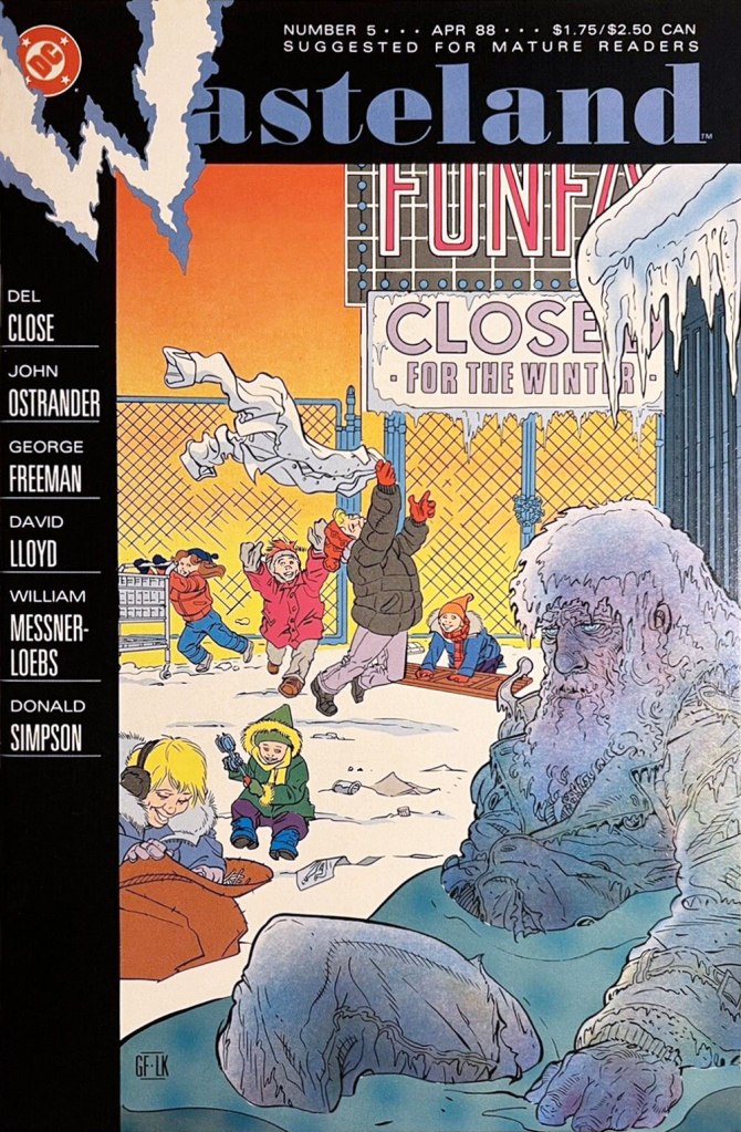
A friendly birthday how-do-you-do to mighty Manitoban George Freeman (born May 27, 1951 — that’s seventy-one years ago — in Selkirk, MB). Some of you will remember him for his Jack of Hearts mini-series at Marvel or his collaboration with Michael T. Gilbert on Elric for First; the more adventurous will recall his fine and, ahem, too-brief work on DC’s Wasteland.
By the 1990s, he was also affiliated with Winnipeg’s celebrated Digital Chameleon studio… but to me, he’s the guy who made Richard Comely and Ron Leishman’s Captain Canuck into a contender, as far as I’m concerned.
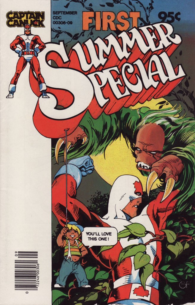
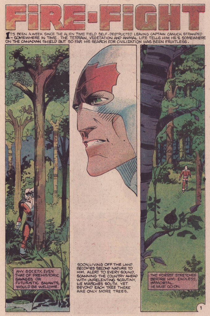
This is Captain Canuck no.7 (Dec. 1979-Jan. 1980, CKR Productions), featuring Ruse, story by Richard Comely, art by George Freeman. Cover by Freeman, with colours by Freeman or Jean-Claude St. Aubin.This was the Captain’s first (and sadly, only) Summer Special (July – Sept. 1980, CKR Productions); a winningly mixed bag, it *was* a lot of fun. Cover by Freeman.Among the goodies included in the Summer Special was a preview of the short-lived CK newspaper strip, which ran in three daily newspapers in Western Canada. It looked quite promising! Written and lettered by Comely, illustrated by Freeman and St. Aubin.This is Captain Canuck no.14 (Mar.-Apr. 1981, CKR Productions), the final issue — just when the series was going from strength to strength. Sigh.
To demonstrate, here’s the opening sequence from that issue. Freeman and St. Aubin were evidently pushing hard against the conventions and constraints of the era’s crappy printing standards.
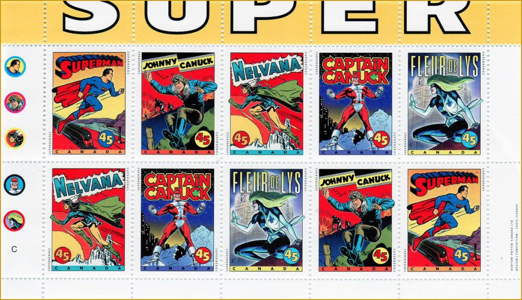
In 1995, the Captain even got his own stamp. Quoting the press release: « What do Superman, Nelvana of the Northern Lights, Johnny Canuck, Captain Canuck and Fleur de Lys have in common? For one thing, they’re all super heroes sprung from the wondrous pages of comic books; and for another, they’re all the marvelous creations of Canadian talent. On October 2, these five super heroes will find new adventure in a booklet of 10 stamps from Canada Post Corporation, to be issued in conjunction with Stamp Month 1995. A universal hero in concept, Captain Canuck is undeniably Canadian in nationality, costume and mannerisms. The concept can be traced to Ron Leishman and Richard Comely. Comely changed Leishman’s Captain Canada to Captain Canuck, and in 1974 established the only independent full-colour comic book in Canada. The cover price was 35¢ – 10¢ higher than other comic books at the time – but that didn’t stop Captain Canuck from outselling all American titles. Unfortunately, the series folded with issue No. 14, in March 1981. »
Part one of The Jack of Hearts’ limited series (Jan. 84, Marvel). The character was introduced in, of all places, an issue of The Deadly Hands of Kung Fu (no. 23, Apr. 1976, Marvel); The Jack shuffled around various Marvel titles for a time, culminating in this solo four-parter scripted by his co-creator, Bill Mantlo, and illustrated by Freeman. That costume must have been a bitch to draw.
Oddly enough, while Freeman was my favourite among the stable of artists chosen to illustrate John Ostrander and Del Close‘s scripts on Wasteland (Don Simpson and David Lloyd got the best), I feel he was assigned the least interesting ones to work on, with the exception of the excellent Del Close autobiographical two-parter, On the Road (issues 6 and 7). Beyond that, he drew one cover and split, unwittingly triggering the debacle that was the second half of the series’ run.
This is Wasteland no. 1 (Dec. 1987, DC). Pencils and inks by Freeman, colouring by his Digital Chameleon accomplice, Lovern Kindzierski.This is Wasteland no. 5 (Apr. 1988, DC). Pencils and inks by Freeman, colouring by Lovern Kindzierski. As denizens of Winnipeg, a notoriously cold city, the guys would know how to colour ice, all right. To quote another famous native son, Randy Bachman : “Portage and Main, Fifty below“.
On the subject of chameleons, it appears that the traditionally held ‘camouflage’ theory of their colour changes is simplistic and generally incorrect.
« There’s no need for some of the language that’s been thrown at some of the artists and writers. These men are highly skilled craftsmen and deserve a lot of respect. » — editorial comment in T.H.U.N.D.E.R. Agents no. 14 (July, 1967, Tower)
This post has been inspired by sundry signs and omens I’ve encountered these past few days: first, a casual mention dropped by Bizarro ink stud Wayno on his blog; then a fond-but-hazy recollection by a graphic designer colleague… and so this week, the agents of T.H.U.N.D.E.R.* make the scene. Well, one of them does.
As with many other choice cultural items of the era, I was first tantalised by a little volume entitled Dynamo, Man of High Camp from the back pages of Famous Monsters of Filmland, devoted to its in-house Captain Company catalogue: Warren magazine back issues, rubber masks and hands, posters, LPs, Super 8 reels, paperbacks, novelties… a veritable trove of wonders. And unlike many a mail-order house, these goodies were the real deal, solid classics avidly sought after and treasured to this day.
Since much has been written about the history of Tower Comics (1965-1969), I’ll skip that part. Here’s the gist of it.
Of course, I adore the Wally Wood material, all the more the unfailingly delicious Steve Ditko-Wood combo. A fine surprise was George Tuska‘s nimble comedic touch on the misadventures of ‘Weed’. But my very favourite flavour in the T.H.U.N.D.E.R. cocktail is ‘Raven’ as written and illustrated by Manny Stallman (1927-97), a quintessentially eccentric delight.
Introduced by Steve Skeates and George Tuska in Enter the Raven (T.H.U.N.D.E.R. Agents no. 8, Sept. 1966), the character’s sole point of interest was that he was a mercenary who, originally intending to betray T.H.U.N.D.E.R., had a change of heart.
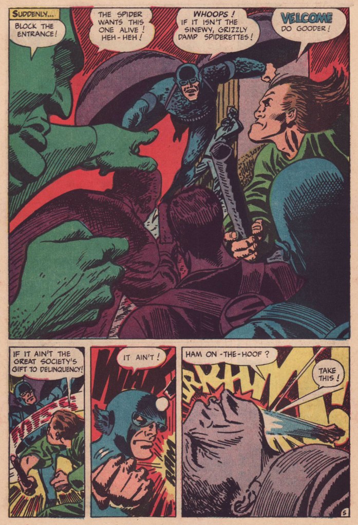
Along came Manny. He took over the character, redesigned him from stem to stern, and gave him a memorable arch-nemesis in Mayven, the Poet. But enough of this prattle, let’s have a look!
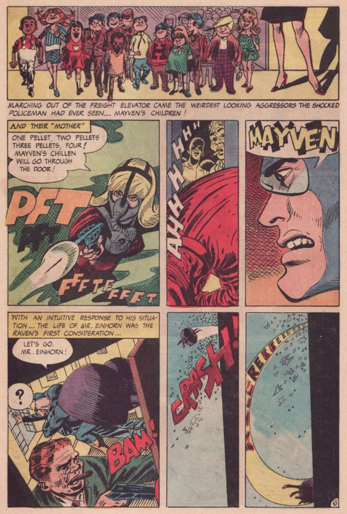
This is page two of Raven Battles Mayven the Poet (T.H.U.N.D.E.R. Agents no. 9, Oct. 1966, edited by Samm Schwartz), spotlighting Mayven’s signature weapon: explosive tots. Stallman had no trouble with action: another page from Raven Battles Mayven the Poet.Mayven, captured in the previous episode, wastes no time in making good — and memorable — her escape from the clink; the opening pages from Mayven Returns (T.H.U.N.D.E.R. Agents no. 10, Nov. 1966).Bold, dynamic, sloppy in all the right places and the right ways. And I *love* that Raven makes an ungodly racket when he flies, itself a great source of visual interest.A three-page sequence from the following episode, The Case of Jacob Einhorn (T.H.U.N.D.E.R. Agents no. 11, Mar. 1967), wherein ice-cold Mayven takes on the assignment to eliminate Mr. Einhorn, a fictive stand-in for legendary ‘Nazi hunter’ Simon Wiesenthal (1908-2005). I wouldn’t want to give too much away… read the whole shebang here!
After a mere five Raven episodes, Stallman was gone. Judging from the letters columns, reader reaction had overwhelming been of this nature:
“In issue #9 the art on the Raven was awful“
“You’re using a lot of grade D artists… as for whoever draws the Raven, his art is utterly atrocious.”
“How about having Chic Stone draw Raven in addition to Lightning?“
« Unsurprisingly, many of the fans of the era hated Stallman’s work and mocked it openly in their letters and in fanzines. Comic book fans have often had very narrow boundaries for what they consider an appropriate style for a super hero strip. And Stallman was coloring way outside of those lines with his work. »
After an issue’s hiatus, the Raven returned, once more reimagined (minus the imagination) this time by Gil Kane. Just another run-of-the-mill flying dude. I’ve always held that Kane should never be allowed to ink himself, but he also makes an excellent case, in his sole Raven outing (and Raven’s final flight), that he shouldn’t be allowed to write, either. Here’s a sample:
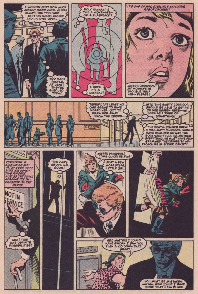
Ahem. All these walking child-shaped time bombs reminded me of a rather fine comic book from a couple of decades later.
This is Daredevil no. 209 (Aug. 1984, Marvel), cover by David Mazzucchelli.This issue is a thrillingly relentless continuation of a thrillingly relentless (but in a different way) Winchester-mystery-house-of-murder tale, The Deadliest Night of My Life!, co-scripted by Harlan Ellison and his pal Arthur Byron Cover. Here, Byron Cover carries the ball, and offers us this darkly delicious sequence. Pencils by Mazzucchelli, inks by Danny Bulanadi.
It could all be coincidence, but I like to imagine that the exploding kids idea is a sharp hybrid of notions from two Mario Bava flicks from 1966: the murderous little girl from Operazione paura aka Kill, Baby… Kill, and the booby-trap beauties from Le spie vengono dal semifreddo aka Dr. Goldfoot and the Girl Bombs.
In closing, I’m happy to report that Mr. Stallman landed on his feet after his fall from the Tower. Honestly, the comics industry, and its fans, didn’t deserve the likes of him. He would go on to recount the Adventures of the Big Boy (published by the Bob’s Big Boy chain of restaurants) for a whopping seventeen years, among other fine assignments. And if ever there was a mensch, he surely was the one. Here’s a telling passage from his obituary:
« When a 1991 stroke caused cartoonist Manny Stallman’s right hand to intermittently go numb, he didn’t let it stop him. He simply took it upon himself to learn to draw with his left hand.
After making that switch, he had trouble drawing the tightly controlled figures he had created for years as a leading artist in what has been called the Golden Age of Comics. So he took advantage of the larger figures he could draw, transposing them onto a blackboard to help teach English and citizenship classes to Russian immigrants at the Albert L. Schultz Jewish Community Center in Palo Alto.
Despite additional health problems that included diabetes and congestive heart failure, he also led classes for Chinese immigrants and taught computer-aided drawing to disabled children. “Manny decided to stop focusing on what he had been able to do before his strokes,” says his wife, Jane Stallman.
“He decided to start ‘where I am‘ and do whatever he could with whatever capacity he had. His life goal was to make someone smile each day.” »
« Ward’s beautiful buxotics operate in a strange separate universe, in which all women are gorgeous voluptoids, all men oafish, saucer-eyed drooling dupes. » — Chris ‘Coop‘ Cooper
Well, I certainly wasn’t planning to hog all the blogging this week, but there were birthdays and other hopefully mitigating factors. While today is the great Will Eisner‘s birthday, it’s likely to overshadow that of a fellow Golden Age toiler, one with an equally intriguing career, but with a trajectory quite divergent from Eisner’s own.
Bill Ward (1919 – 1998) was also born on this day, one hundred and three years ago. Ward started out in comics with the Jack Binder shop, turning out material for Fawcett’s line of characters (Captain Marvel and his family, Bulletman…); he soon found himself working for Quality Comics, most notably on Blackhawk (an Eisner co-creation, it should be noted). He inched closer to his true passion when assigned to Quality’s romance line.
Ward’s cover for Love Diary no. 1 (Sept. 1949, Quality). Artistically speaking, this is what a fully committed Ward can produce.
In the mid-50’s, when came the brutal, censorship-induced compression of the comic book industry, Ward smoothly shifted to producing girlie cartoons for Abe Goodman’s Humorama line, becoming its star and most prolific performer, thanks to his popularity and prodigious speed. He was aided in this by his choice of tool and technique: the conté crayon on newsprint. While everyone else was working on 8″ x 12″ illustration board, Ward was using a soft, beige paper of a size (18″ x 24′) and texture familiar to any art student who’s taken a life drawing class. With this type of stock, he could produce texture rubbings and achieve smooth, sensual sheens ideal for rendering highlights of hair and stockings. Said Ward: « It didn’t take me long to figure out that the quicker you could do the work… the more money you could make. » Over the course of a quarter-century, he wound up producing around 9,000 drawings for the Humorama line.
As Ward recalled of his early training in Binder’s studio, « [Binder] trained me to do layout, which is the most difficult part of art. » To wit, layout never counted among Ward’s strengths. A lot of his pinup work is undermined by poor staging, often grotesque proportions, and absolutely minimal attention to non-erotic detail.
A typical example of a Ward girlie cartoon produced using the conté crayon. This one first turned up in Comedy no. 51 (Jan. 1960, Marvel); in a typical work-for-hire arrangement, for a flat fee (in Ward’s case, 7 dollars a cartoon, topping out at the princely sum of $30 near the end of his 25-year run), Goodman retained all reprint rights (and reprint he did, liberally) and kept the original art, which he sold to collectors for several times its original cost, naturally. Nowadays, these pieces exchange hands for several thousand dollars.
Now, had I ever wondered what Ward’s pencils would look like, if inked by Bill Everett? I readily confess I hadn’t. But upon learning that such a momentous collision once occurred, my mind was set slightly reeling.
Another weathered fellow combatant in the trenches of the Golden Age, Everett (1917-73), unlike Ward, always gave his best, whatever the conditions. Right to the end, despite his rapidly declining health, Everett was, incredibly, producing top-flight work.
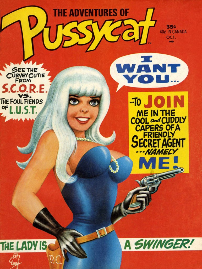
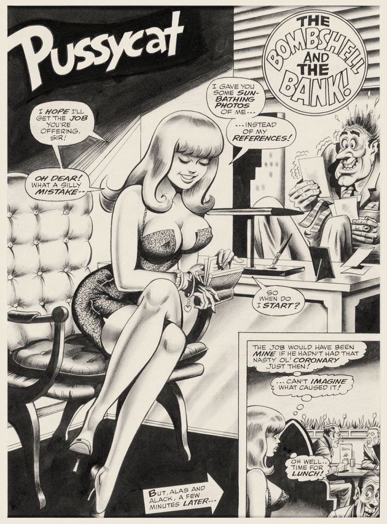
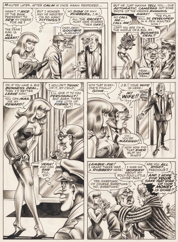
This is The Adventures of Pussycat no. 1 (Oct. 1968, Marvel). Cover by Bill Everett. Highly sought after today, this scarce, magazine-size one-shot is merely a reprint collection of some of Pussycat’s ‘adventures’ from various Goodman Playboy knockoffs, and one of a gazillion contrived acroynym-based attempts to cash in on the ubiquitous 007 craze of the 60’s. It does contain the first Pussycat tale, illustrated by Wally Wood, who would soon go on to his own entry in the super-spy stakes, Tower’s T.H.U.N.D.E.R. Agents. Concentrate on the artwork. The less said about the writing (was it Stan the Man or Larry the Lieber? We’ll likely never know), the better. As usual, any American attempt at French is mangled, even at a mere two words and two syllables (for the record, it should read either “C’est fini!” or “C’est la fin!“). Pensively squinting while adjusting his pince-nez, a ‘curator’ at Heritage Auctions made this uproarious whopper of a claim: « The figures of Pussycat look to be by Bill Everett and everything else is Bill Ward. » So you think Bill Ward drew everything… except the one thing he was interested in drawing? These folks don’t seem to know how comics are produced.“The Bombshell and the Bank!“, never reprinted, saw print in Male Annual no. 6 (1968).This is The Mighty Thor no. 171 (Dec. 1969, Marvel). Jack Kirby pencils, Bill Everett inks. Coming late in Kirby’s run, what a vigorous breath of fresh air after years of lazy erasures!
In the 60’s, Ward also provided covers for various soft-core novels, such as this one from Satellite Publications’ ‘After Hours’ imprint. He even wrote some of them, notably under the alias of ‘Bill Marshall’. His fellow Quality Comics alumnus Gil Fox also penned many of these potboilers under a staggering array of aliases.
This is Side Street (1966, After Hours). I’ve noticed over the years that certain artists of a more single-minded frame of mind can’t be bothered to devote much attention to anything but the object of their obsession. Such was the case with Bill Ward, and with the passing years, ever increasingly so. Exhibit A: has Ward ever seen an actual dog?Which reminded me of this classic, by another ‘can’t be bothered’ master of ‘Good Girl’ art, Alberto Joaquin Vargas Chavez (1896-1982). Another howler from the comedians at Heritage: « This early masterpiece, one of the greatest pin-ups the artist ever painted, was reproduced as a full-color double-page spread in Vargas, Taschen, 1990. Alberto Vargas thought so highly of this lot and the following two stunning paintings that he retained them in his personal collection. » I wouldn’t presume to criticise Vargas’ depiction of the female form, but on the other hand, this is Exhibit B: has Vargas ever seen an actual cat? Don’t worry, Alberto, you’re not alone in this affliction: neither has Neal Adams.
« From the body of one guilty deed a thousand ghostly fears and haunting thoughts proceed. » — William Wordsworth
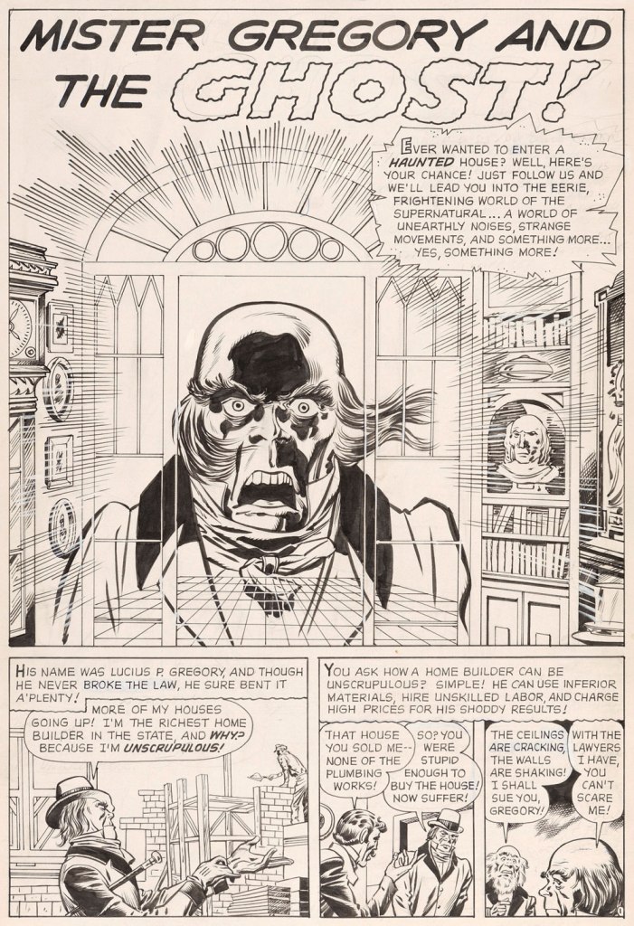
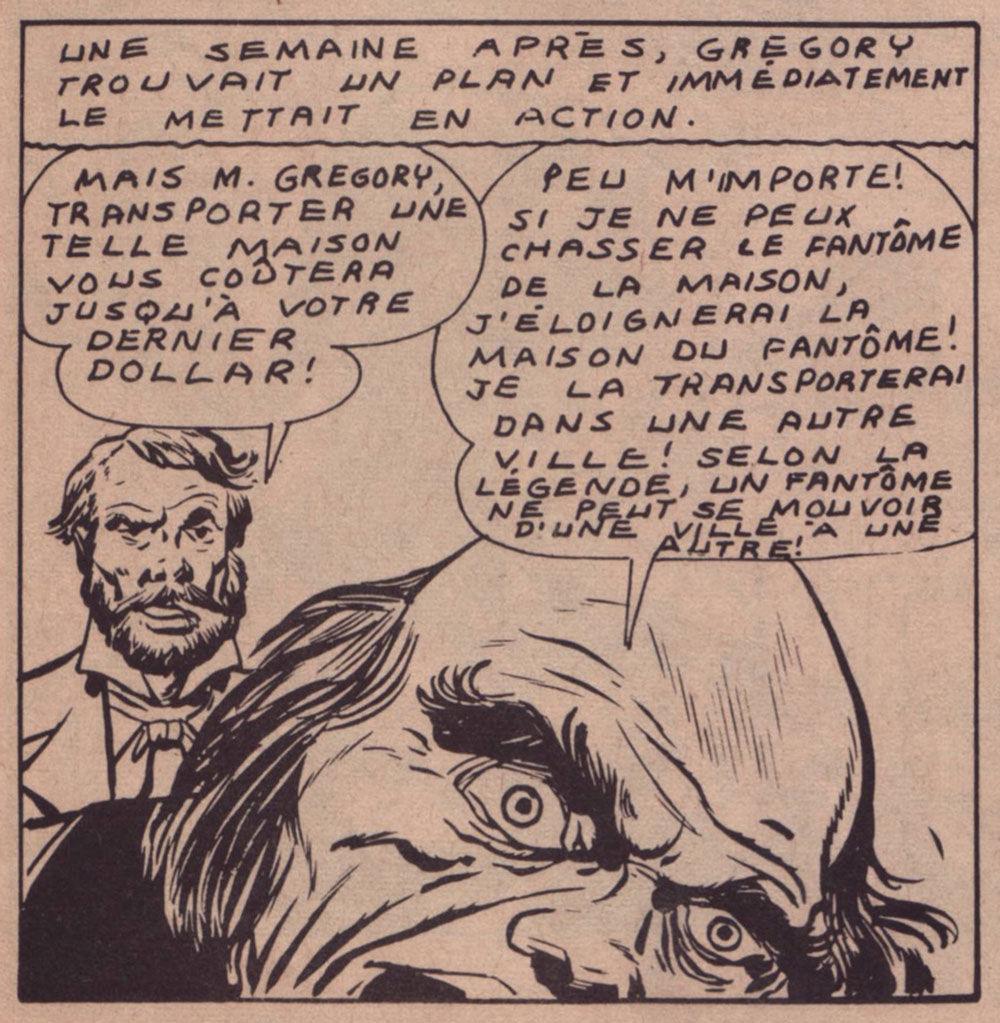
Today’s selection is an early, early favourite of mine. I first encountered it in French, in the pages of Capitaine America no. 8 (Aug. 1971, Les Éditions Héritage); back in those days, Québécois printer-packager Payette & Simms would reprint, in black and white, recent Marvel comics in their ‘Format Double’ package, a terrific deal at 25 cents: you got two issues’ worth, no ads, plus a bonus short story. P&S’ paper stock and printing were better than Marvel’s — but their lettering and translation work generally left much to be desired*.
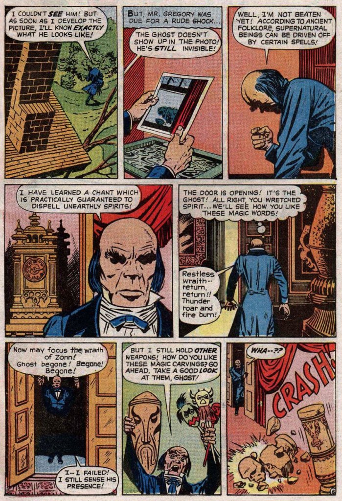
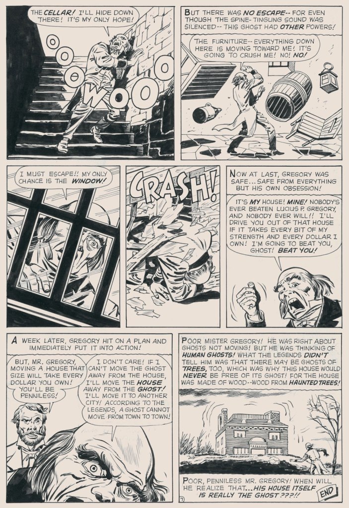
In this case, despite the allure of the slickly sumptuous Gene Colan / Joe Sinnott artwork, the issue’s out-of-nowhere high point was (you guessed it!) a modest little story plucked from the predawn of the so-called ‘Marvel Age’, Mister Gregory and the Ghost!, from a pre-Thor issue of Journey Into Mystery (no. 75, Dec. 1961). Many may disagree with me on this one, but boy, those post-Kirby issues of Cap’n ‘merica just serve to demonstrate what happens without a perpetual motion plot engine like Jack Kirby to propel and guide the series: when you try to introduce new foils for the hero, you get bonehead non-ideas like biker gangs, a jealous scientist in the body of a gorilla, or in issue 123’s Suprema, the Deadliest of the Species!, a brother-and-sister hypnosis act who drive around a gadget-filled tanker truck that magnifies Suprema’s power by way of a *very* 70’s medallion her brother wears around his neck. Then Cap feels its vibrations (“Ping!”) through his shield, and … oh, I won’t spoil the thing’s idiotic charms any further for you: read it here.
This is Journey into Mystery no. 75 (Dec. 1961, Marvel); pencils by Jack Kirby, inks by Dick Ayers, colours by Stan Goldberg.
Ahem — back to Mister G and his Ghost. It’s not exactly a masterpiece of writing either (Larry Lieber?), but it presents Kirby at his moody, understated best. Upon seeing it in colour, I realised how providential my monochromatic encounter had been. While the story’s been reprinted a few times (in 1966, 1971, and in 2020 in a fancy and pricey hardcover omnibus), the printing’s always been pretty shoddy. As you’ll see.
But… it seems that most, if not all of the original art survives, so we’ll make the most of the situation and mix our sources as needed — hope the effect isn’t too jarring!
I find Kirby’s layout for this page to be especially ingenious and interesting.I’ve used the recoloured reprint from Fear no. 4 (July, 1971, Marvel), which was an improvement over JIM75’s, albeit a slight one.
-RG
*here’s an example of Éditions Héritage’s lovely calligraphy, from this very story: