« New Year’s Resolution: To tolerate fools more gladly, provided this does not encourage them to take up more of my time. » — James Agate
And another one gone… another one bites the dust, in the immortal words of John Deacon. Adios, 2025.
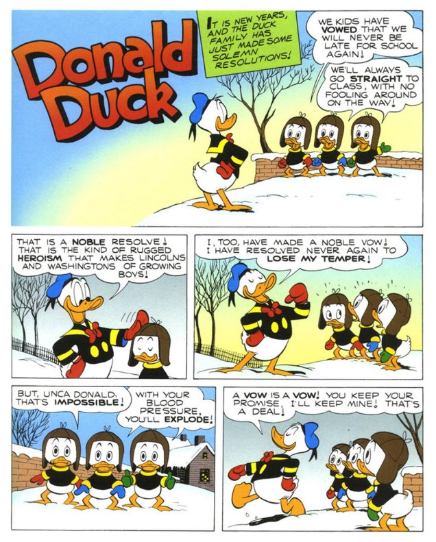
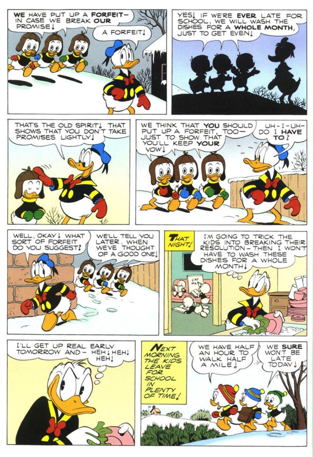
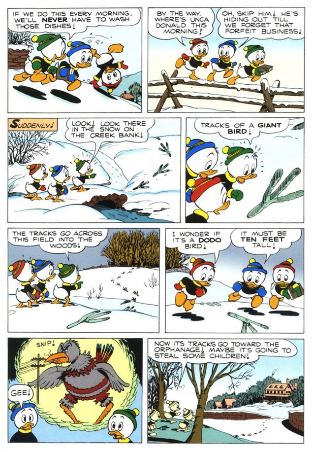
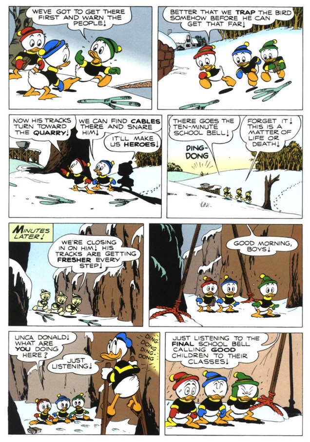
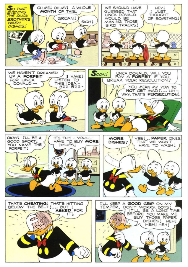
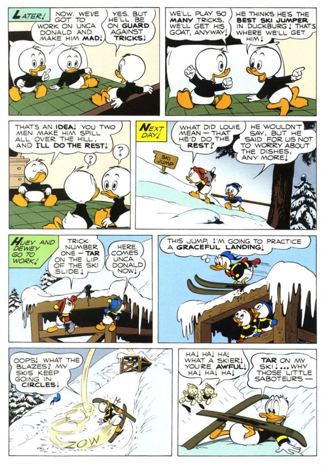
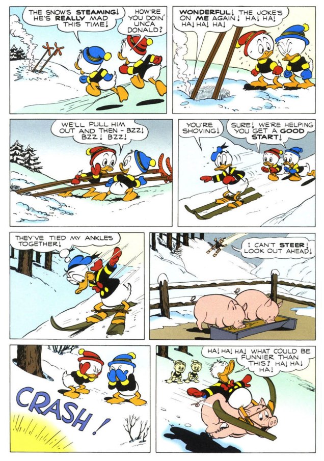
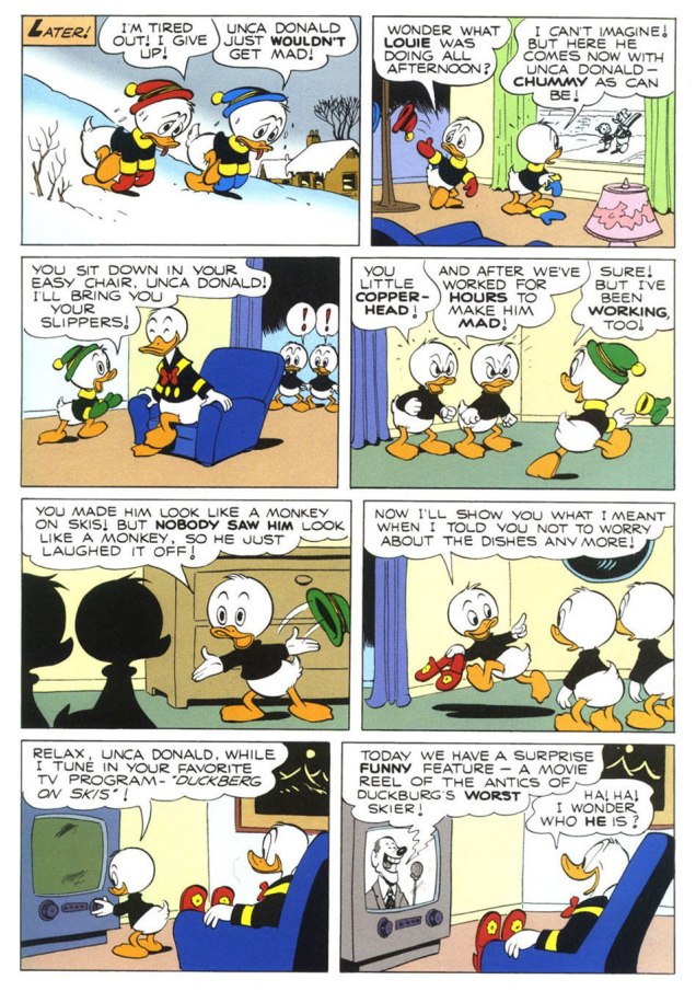
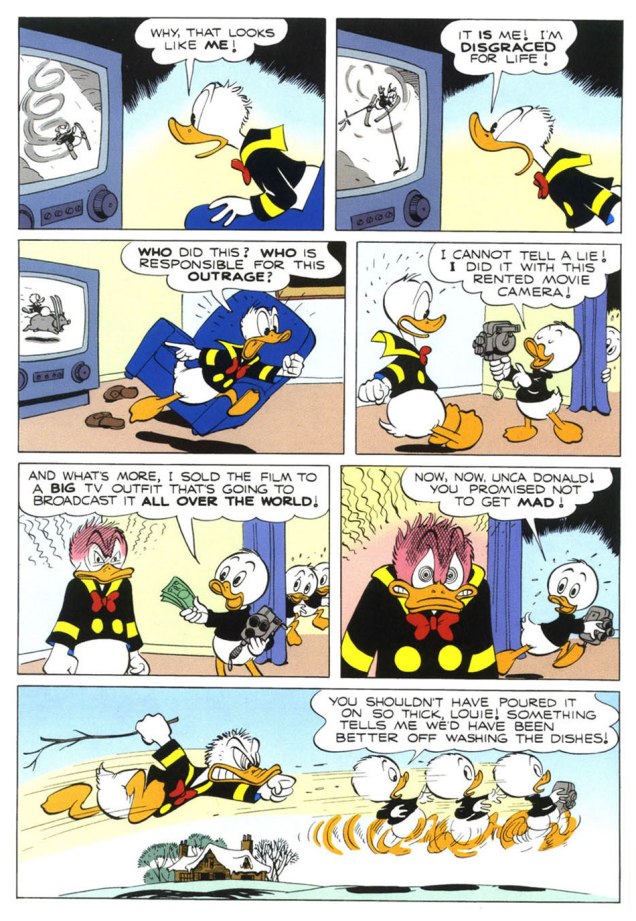
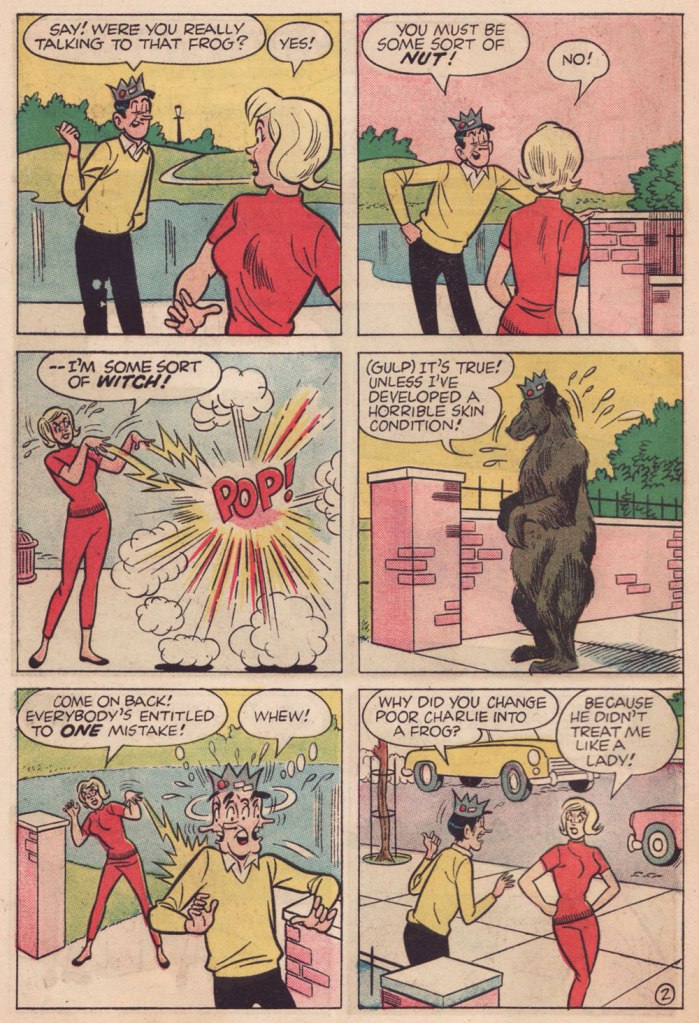
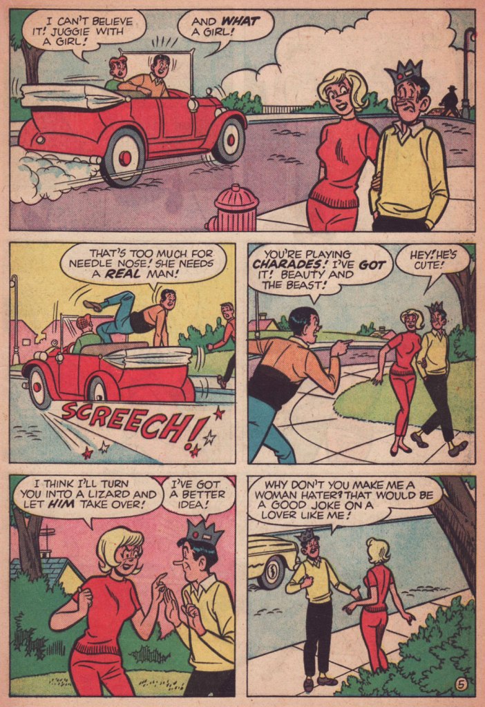
To send off the annum, and instil some hope into the ceremony, I turn to the superlative Carl Barks (1901-2000), « The Good Duck Artist », and this classic — but not overly familiar — ten-pager from Walt Disney’s Comics and Stories no. 173 (Feb. 1955, Dell)*, scripted, pencilled and inked by Mr. Barks and lettered by his wife Garé, a superb artist in her own right. Take it away, folks!
.
.
.
.
.
.
The boys’ ironic recycling of the giant bird stilts is a brilliant touch.
.
.
.
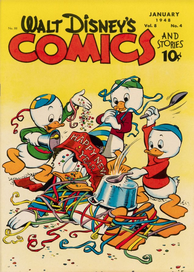
One of Barks’ most refreshing innovations is that he steered Donald’s nephews away from the typical, simplistic ‘little devils’ characterization they were saddled with at their conception. Barks made them crafty but essentially noble, in marked contrast to their Unca Donald. The issue of WDC&S that our story premiered in didn’t feature a New Year’s-themed cover, so here’s an earlier one, from none other than Walt Kelly. This is Walt Disney’s Comics and Stories no. 88 (Jan. 1944, Dell).
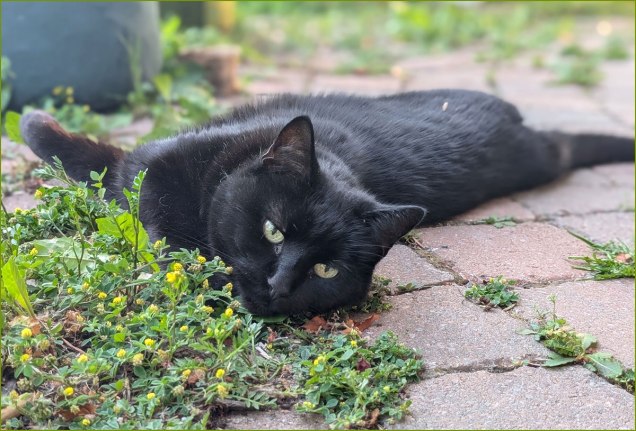
At the end of this wretched, truly merciless year, I dedicate this post to our beloved cat, Barnabas, who left us — peacefully — just this afternoon. May he be 2025’s final innocent victim.
*However, I opted for the superior reproduction values — trust me — of the reprint featured in Walt Disney’s Comics and Stories no. 623 (Apr. 1998, Gladstone). Kudos to Susan Daigle-Leach for the tasteful latter-day colouring.
« I think people will believe anything about someone they haven’t seen for a while. » — Gabriel Kaplan
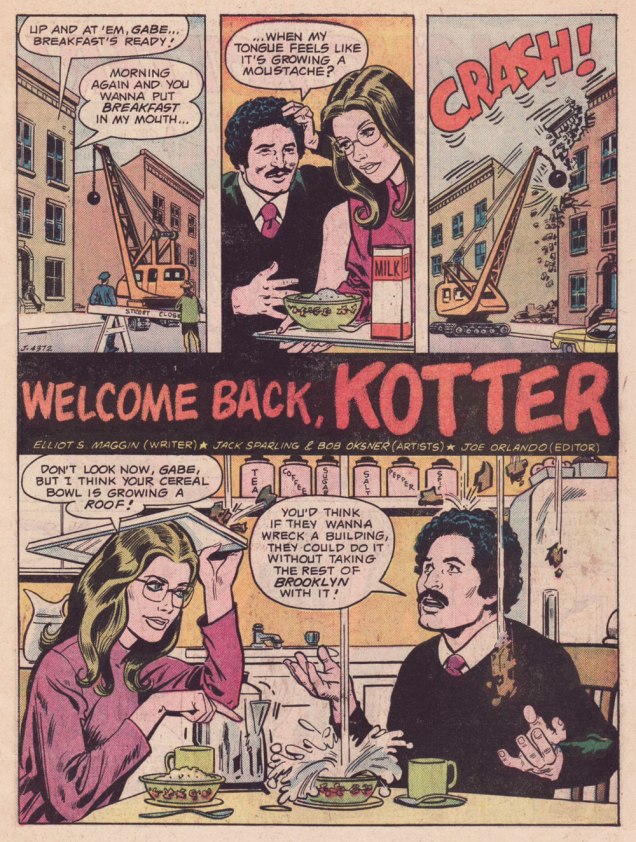
I’ve been meaning to do a Welcome Back, Kotter post for several years. But when I thought about it, I understood that hitching it to the show’s fiftieth anniversary made considerably more sense than, say, its forty-seventh. And while I adore William Johnston‘s sextet of tie-in novels, it would be quite a stretch for a comics blog to cover. Far closer to the mark lies Arnold Drake‘s trio of WBK storybooks, illustrated by Mel Crawford and Jack Sparling. But in the end, I bided my time and managed to get in touch with the scribe first assigned the Kotter Komic assignment, Elliot S! Maggin. And boy, am I glad I did. And so, fifty years to the day of the airing of its pilot episode*, let’s talk Kotter!
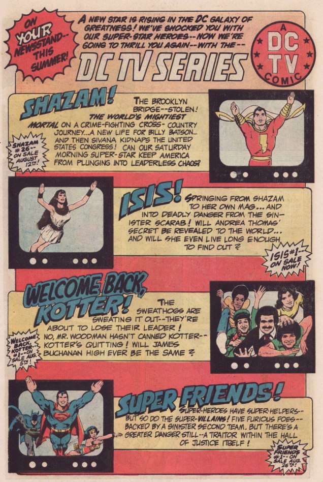
Remember the DC TV line? This ad ran in several DC titles over the summer of ’76.
WOT: First, a bit of context: correct me if I’m wrong, but in the early stages of your career writing comics, you always worked alongside editor Julius Schwartz. Then, in late ’75 or early ’76, something changed, and you began writing for other editors’ titles. What’s the story?
ES!M: Well, Julie was kind of proprietary about me for most of the time I was working with him.
WOT: A sideways sort of compliment.
ES!M: I guess. At some point, Dorothy Woolfolk was editing the Lois Lane book, and… he introduced me to her. She just came into his office for some reason. She said: « Oh, you know, you should write some stuff for me! » And he said « No, he’s very busy, go away! » And he chased her out of the office. And I’m thinking, « Oh, okay. That’s how we’re doing it. »
So I didn’t really go about… I didn’t really make friends with many of the other editors. I tried to make friends with Joe Orlando. You know, I’d have lunch with him once in a while, I guess.
This is Welcome Back, Kotter no. 1 (Nov. 1976, DC); cover by Bob Oksner.
ES!M: But around the time Kotter came out…
You know, people used to hang out outside of Julie’s office door, listening to us plot, because it was so loud. We would yell and scream at each other constantly. He was this Jewish boy from the Bronx, and I was this Jewish boy from Brooklyn, and once I got comfortable working with a guy thirty-five years older than me, we’d just fight all the time. And every once in a while, we’d get serious.
WOT: Serious fighting, or serious work?
ES!M: Yeah, yeah! The fighting was work.
WOT: Sometimes that line is dreadfully thin.
ES!M: I guess at that point, he got mad at me, and I didn’t get work for a couple of weeks. I went to Joe, and I said: « What ya got? », and he said he’s doing this Welcome Back, Kotter book, and I said « Great! I watch that show, that’s fun. » So I wrote the first issue, and that was fine.
Here’s a quartet of pages from the première issue. Pencils by Sparling and finishes (and surely likenesses) by Oksner.
.
.
Aw, Maggin’s Mr. Pevey would have made a great addition to the TV show’s cast.
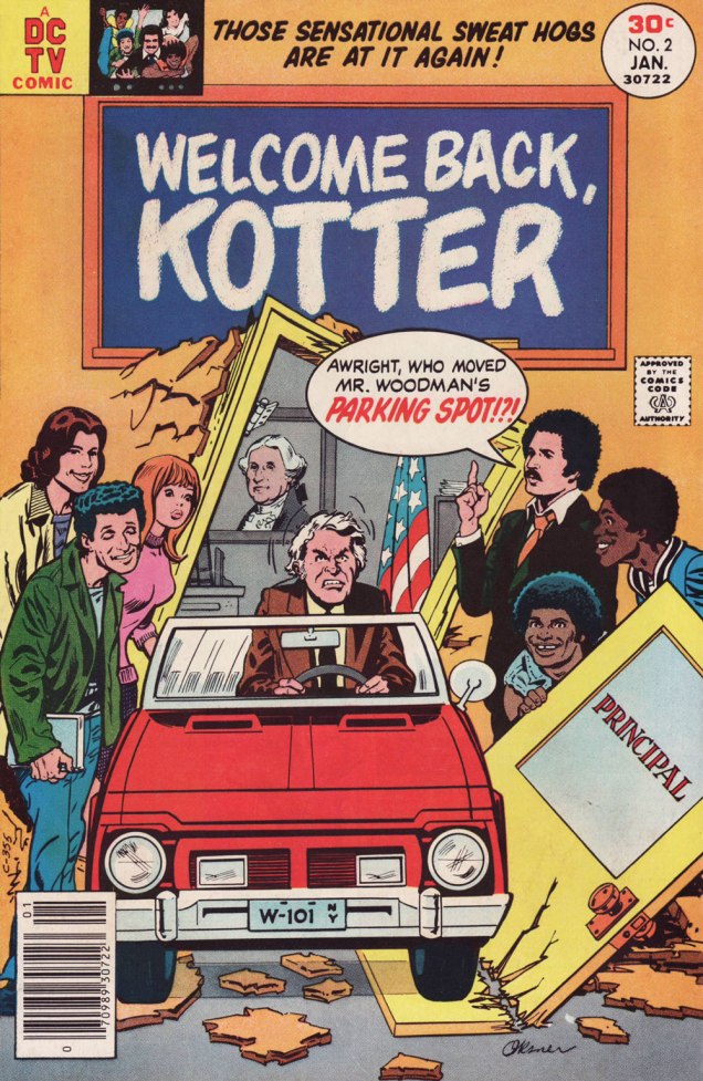
ES!M: They called me down in Carmine‘s office, to watch episodes of the show. It had been on maybe six weeks at that point. Episodes I had already seen, but I liked hanging out in Carmine’s office, because it was big, and he had a lot of toys around. So they set up this video tape… thing, and I watched the shows again, and I wrote the second issue.
This is Welcome Back, Kotter no. 2 (Jan. 1977, DC); cover by Oksner.Art-wise, the second issue seemed comparatively rushed, and sans Oksner, likenesses pretty arbitrary. See what I mean? The GCD attributes the inks to Sparling, but I lean towards Frank Springer.
ES!M: I was living in an apartment complex on Long Island, and there were all these kids around… little kids. And I would work at home, mostly. So they would hang around with me, whenever they realized I was home. They would… shoot me through the window or… something. At some point, whenever I’d write a gag, I would…
WOT: … run it past them?
ES!M: Yeah! And they’d laugh, and run off and play some more. And I figured, as long as they laughed, it was okay. Because they were hearing the voice of Barbarino, or whoever. At some point Travolta would say, « Uh? », or « Duh », or « What d’you think? », something dull, that he delivered in a funny way. And the kids related what I wrote to what Travolta did on screen, so they were getting it. And at some point I realized that Joe [editor Orlando] didn’t watch the show.
WOT: Oops.
ES!M: And he would then object to my Barbarino bits, or Horshack bits, or whatever. So I told him « You’ve got to watch the show, you’ll get it! » But you know, after maybe… how many issues did I write, three, four?
WOT: Just two, I’m afraid. You wrote the first couple, then Tony Isabella did one, then Mark Evanier…
ES!M: I’m sure he (Evanier) watched the show — he watched everything.
WOT: He was even the show’s story editor for part of its second season. So… then Bob Toomey wrote four issues, Scott Edelman two, and there was a leftover story by Evanier that saw print in the WBK Collector’s Edition in 1978.
ES!M: But Joe did not. I mean, he didn’t have time, and he was madly in love with his wife, and he didn’t watch television at all (laughs). He wasn’t paying attention to the source material.
WOT: That happens. But it seems a pretty unfortunate blind spot for a book’s editor.
ES!M: I wrote two issues, and at some point, Joe said: « You can’t write! ». He said « No, you can’t write! » A blanket condemnation of everything I’d ever done.
WOT: Oooh.
ES!M: By that time, I’d made up with Julie, and I was writing more Superman stuff. After that, wherever any of my fights with Julie got serious, I’d go down the street to Marvel, and do something there. Then I would make up with Julie, and they’d never see me again… until I had another fight with Julie.
That was my experience writing Kotter.
And here’s what undoubtedly has to be the Guernica, if you will, of Kotter art: Bob Oksner‘s superlative cover for Limited Collectors’ Edition C-57, from 1978, DC’s final — and finest — WKB publication. Feel free to open it in another tab for a fuller view… I provided a larger image so you can fully take in the wealth of details.
WOT: In closing, how are you keeping busy these days?
ES!M: I just wrote a book called Lexcorp. A novel. Which you should probably plug.
WOT: Done!
ES!M: It’s a first-person story that Lex Luthor tells. And he identifies himself as an unreliable narrator, like… Huckleberry Finn. But it does tell the story of how he saves the world. Stuff like that.
I’m working on another book, working on a time travel story. And my ex-wife asked me to write an autobiography so my grandchildren know who I am.
I have all these people I know with Pulitzer Prizes; and at some point in the autobiography, I wrote: « I have about a dozen Pulitzers floating around through my life, and none of them are mine. This book is available for consideration. »
WOT: Mr. Maggin, thank you so much for taking the time to share these stories with us!
-RG
*the pilot episode, for some reason, was aired third, on September 23, 1975, while the show premiered on the 9th of September with ‘The Great Debate‘ (featuring a wonderfully smarmy James Woods).
While I’m painfully aware that such things are inevitable, the past couple of weeks have been pretty brutal to the ranks of my musical heroes. First went Sylvester ‘Sly Stone’ Stewart; then Brian Douglas Wilson; then Lugee Alfredo Giovanni Sacco, aka Lou Christie, and then Bobby Sherman*… all born in 1943!
It would require quite a stretch to write more about Sly and Lou, but I’ve already devoted a piece to Mr. Sherman (Let’s Hear It for Bobby Sherman!), who enjoyed his own comics series in the early 1970s.
Which leaves us Brian. I’ve been a diehard fan long enough to remember that his name and accomplishments didn’t get separated from his band’s — especially given the embarrassment that the Mike Love-led Beach Boys touring cavalcade had become — until the early 90s. And I also recall that Pet Sounds was, for decades, just an expensive but critically acclaimed commercial failure that didn’t get certified ‘Platinum’ until the year 2000, a third of a century after its release. For similar tales of vindication through gradual changes in fortunes, see The Kinks are The Village Green Preservation Society and The Zombies’ Odessey and Oracle.
So I turn (for the second time!) to Byron Preiss‘ marvellously illustrated authorized biography of the Beach Boys, from 1978. In addition to a highly entertaining and well-documented text, Preiss, a man with an astonishingly well-filled Rolodex, had the bright idea of tapping various illustrators to contribute their visual cover version of a favourite BB song.
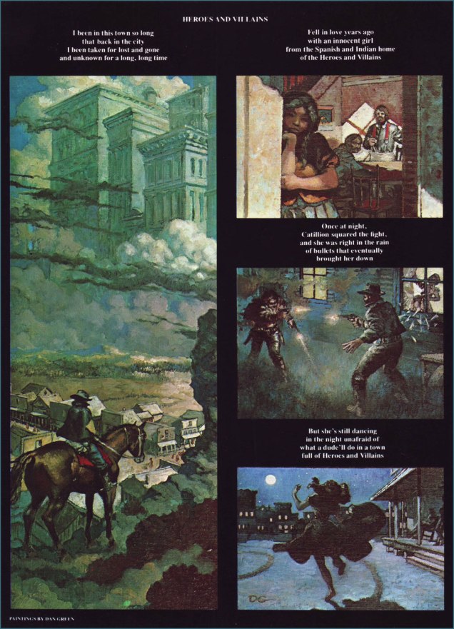
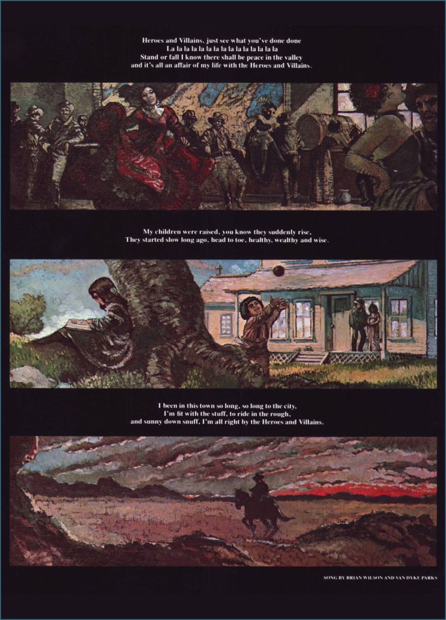
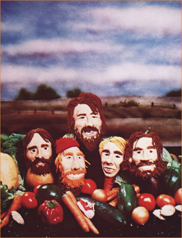
I’ve written about Mr. Stout already, in The Prodigious William Stout, which ought to give you an idea of how I feel about his work. Lyrics by BW collaborator and future record (including a young Bobby Sherman!) producer Gary Usher.Cheeky Harvey Kurtzman spells out just what sort of ‘Fun, Fun, Fun‘ could be had « ’til her daddy takes the T-bird away ».Nice drawing, although the only detail Ralph Reese truly gets right is poor Dennis Wilson‘s ill-starred appetite for the ladies. Also… Mike Love with a guitar, really?Those only familiar with Dan Green (1951-2023; another awkward lacuna from Lambiek’s comiclopedia) as a journeyman inker at Marvel and DC will likely be surprised at his adroitness with a brush. Here he tackles Wilson and Van Dyke Parks‘ (a true gentleman… and also from the class of ’43) arguably most ambitious œuvre, Heroes and Villains.A surprising clay-based entry from Joey Epstein and her husband, our beloved Tom Hachtman, photographed by Ben Asen. The likenesses are pretty solid… save for Brian, who’s too skinny. The song in question is, of course, Vegetables. « I know that you’ll feel better when you send us in your letter an’ tell us the name of your… your favorite vege-table. »This is former Air Pirate and Dirty Duck and Popeye cartoonist Bobby London‘s joyous celebration of Cool, Cool, Water, a tune intended for inclusion on the Beach Boys’ fabled Smile album (though it initially surfaced on their excellent Sunflower LP). To this day, however, London’s got mixed feelings about the whole thing. To begin with, he had no particular fondness for the Beach Boys, and getting dragged by Preiss to a late-70s BB live show, sans Brian (who was in no shape to perform anyhow) and with Dennis likely off promoting his Pacific Ocean Blue album, didn’t move the needle one iota. As London told me: « I had something more interesting and less Crumb-y in mind. » Now *that* is caricature. Despite depicting the Boys as animals, illustrator — and Official Horror Host Hall of Fame inductee — George Chastain unerringly nails the essence of each, not to mention the group dynamics: of course Brian’s off to do his own thing. Not linked to any specific song, this is nonetheless my favourite piece in the book. Take a bow, sir!
-RG
p.s. I should also mention that another one of my favourite musicians died this week, namely Argentine composer Boris Claudio ‘Lalo’ Schifrin, but as he was born in 1932 (he was ninety-three!), his inclusion would have spoiled the pattern. Hope you understand, Lalo. Here’s a mesmerising favourite from his jazz sideman days: 1963’s The Fakir, recorded by Cal Tjader (« the Swedish Nerd king of Latin Jazz », as my friend Rupert dubbed him), and composed, arranged and conducted by Señor Schifrin.
« With pen and ink, I can achieve a scratchy, foggy effect that is appropriate. It was a continual process of learning. » — Nick Cardy
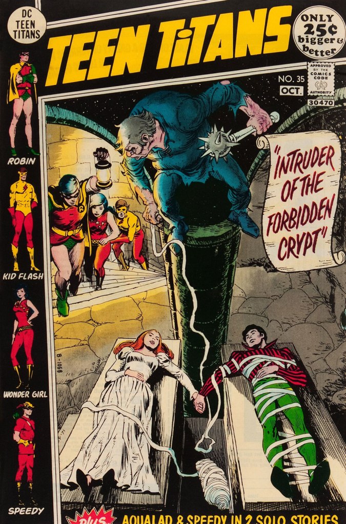
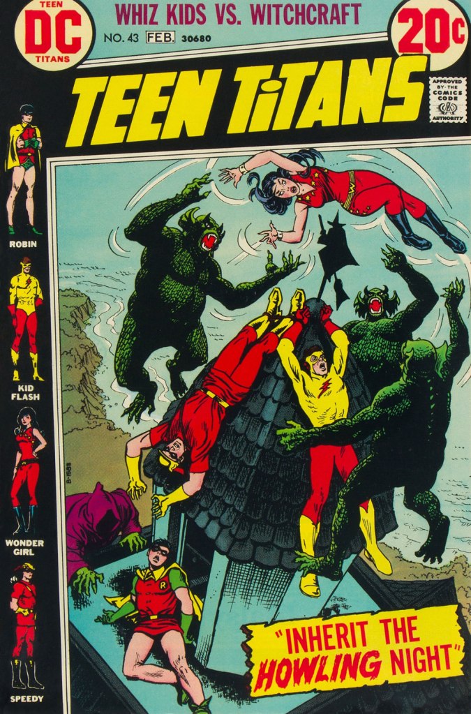
While WOT? favourite Nick Cardy (1920-2013) — who would turn one hundred and four years old today! — spent a lot of time chronicling the undersea adventures of Aquaman, his lingering true love, despite his busy schedule as DC’s premier cover artist, was the Teen Titans — he contributed, either as penciller, inker… or cover artist — to all forty-three issues of the original series.
And what I loved most about editor Murray Boltinoff‘s books is that they were packaged as horror books even when they nominally featured superheroes, a welcome respite. The costumes seemed an afterthought, a most unusual and refreshing attitude. Here, then, is a gallery of Mr. Cardy’s moodiest, most sinister Teen Titans cover artwork.
This is Teen Titans no. 33 (May-June 1971, DC). This is Teen Titans no. 34 (July-Aug. 1971, DC). Lettering by Ben Oda.This is Teen Titans no. 35 (Sept.-Oct. 1971, DC).This is Teen Titans no. 36 (Nov.-Dec. 1971, DC).This is Teen Titans no. 41 (Sept.-Oct. 1972, DC).This is Teen Titans no. 42 (Nov.-Dec. 1972, DC).This is Teen Titans no. 43 (Jan.-Feb. 1973, DC).
« Well, as everyone knows, once witchcraft gets started, there’s no stopping it. » — Mikhail Bulgakov
Another, day, birthday post? Well, it’s still a mighty special occasion, as we’re celebrating the one-hundred and fourth birth anniversary of our beloved Samm Schwartz (1920-1997).
One year ago to the day, we gave you Love in Broom, first of a loosely connected two-parter (‘loosely connected’ is the strongest dose of ‘continuity’ one could expect from the Archie folks in those days).
Of course, the now-named Samantha the witch — and the rest of the cast, notably Jughead and Reggie — appear to have forgotten all about their earlier encounter… but that’s just fine: the burden of continuity is one I’m glad to see sloughed. The chief constant is that our witch has quite a yen for Jug.
Switch Witch first appeared in Archie’s Pal Jughead no. 123 (Aug. 1965, Archie). It was presumably scripted by George Gladir (not coincidentally co-creator of Sabrina the Teenage Witch a couple of years earlier), and unmistakably illustrated by Mr. Schwartz. Of Mr. Gladir, Mark Evanier wrote: « Even when they had no credits, you could generally spot a George Gladir script. They were a little wackier, a little sillier, a little more human in their humor. And oh, yes — they were usually fresher than the ones crafted by younger writers. » This certainly fits the bill.
I had to buy three different copies of this issue to get a complete one… and it’s still a brittle mess. But hey, my ordeal, your benefit!
« The majority has no right to impose its stupidity on the minority. » — George Wolinski (1934-2015)
I realised this morning that yesterday was Mr. Wolinski’s birthday, so here’s a quick post. Despite what one might expect from the name, Wolinski was born in Tunisia; aged eighty, he perished in the terrorist attack on the Parisian offices of Charlie-Hebdo on that grim Wednesday of January 2015. For more context, see last year’s related post Never Forget: Cabu, le grand Duduche.
It would be futile to attempt to do justice to a brilliant, prolific and varied career spanning seven decades, so I won’t waste anyone’s time with such foolishness. Here’s Lambiek’s biographical essay, and here’s a conte cruel from Wolinski’s first solo collection, Histoires lamentables (1965, Hara-Kiri).
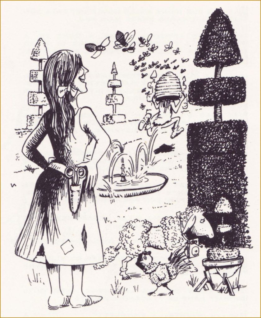
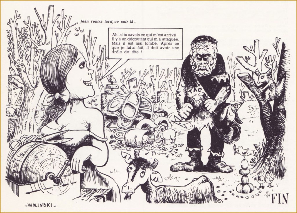
« Jean was the lone survivor of a fire that claimed his entire family. Having suffered atrocious burns to the face, he was as hideous as one could imagine. In order to avoid exposing others to that grim spectacle, he went to live deep in the woods with the wild beasts. However, each year, the returning Spring invoked in him strange reveries. » A PATHETIC TALE. « He then could not refrain from lurking about the homes of men. And so it was, one day, that he heard Isabelle’s song. Her voice made him forget his usual caution. » « Isabelle was blind. At the idea that she could not witness his ugliness, Jean felt an extraordinary emotion. He found the courage to speak to her. She responded with kindness, and he dared return. » « Soon, they became inseparable, and at last Isabelle agreed to follow him into the forest. »« Long months of happiness ensued. And then, Isabelle realised that, little by little, her sight was returning. When Jean learned the wonderful news, he was at once happy and desperate. Because he could no believe that Isabelle would remain by his side, now that she saw his ugliness. But Isabelle told him that his physical appearance mattered little to her, and that she would always love him. »« Jean, however, could not help but be miserable. One day, as he was hunting for mushrooms in the forest, he came upon a hare caught in a snare, pitied him and set him free. As it happened, that hare was a powerful genie who, in gratitude, transformed him into a handsome young man. »« Jean, delirious with joy, ran to meet Isabelle. The young girl was working at the beehive. Jean took her in his arms. »« Sweet Isabelle, assailed by this young stranger and fearing for her virtue, crowned him with the hive. »« Panicked with suffering, poor Jean fled like a madman. »« That evening, Jean returned late… » « Ah, if you only knew what happened to me. Some horrid masher attacked me. But I gave him a bad time. After what I’ve done to him, he must look quite a fright! »
from the look of this early style, I get the sense that young Wolinski was under the artistic sway of, say, Will Elder and Al Jaffee…. not a bad place to start!
Here’s a trio of his early gag cartoons (circa the early 1960s), working in a more natural, more direct style:
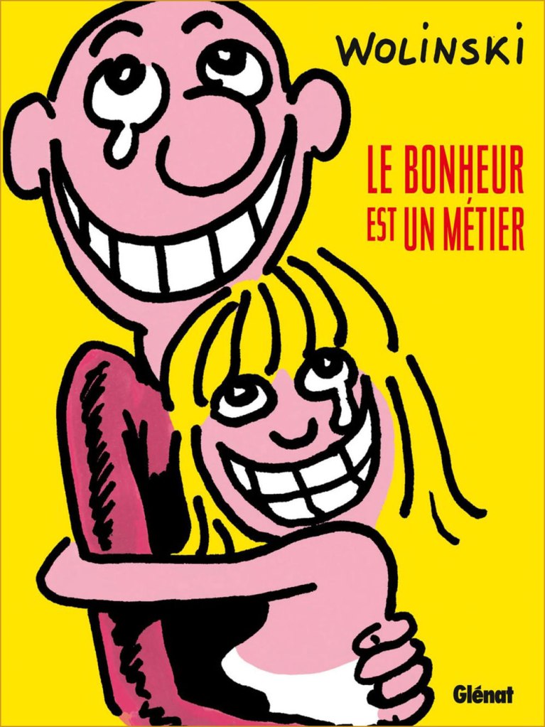
« Working in collaboration means spending half of one’s time explaining to the other that his ideas are stupid. » Wolinski served as the editor-in-chief of Charlie Mensuel from 1970 to 1981. His chief non-editorial contribution was his scripting, for his friend — and fellow Georges — Pichard, the adventures of Paulette, which ran in the magazine from 1970 to 1976. For more Pichard (and Paulette!), check out ds’ post Georges Pichard’s Distressing Damsels. This is Charlie Mensuel no. 80 (Sept. 1975), art — naturally — by Georges Pichard.« Happiness is an occupation » (2016, Glénat). Here’s an example of Wolinski’s fully evolved, more streamlined visual style, from the cover of a posthumous autobiographical collection. Wolinski was interred in Paris’ Cimetière du Montparnasse. Photo by Stéphane X. « Murdered on January 7 during the attack against Charlie-Hebdo. »
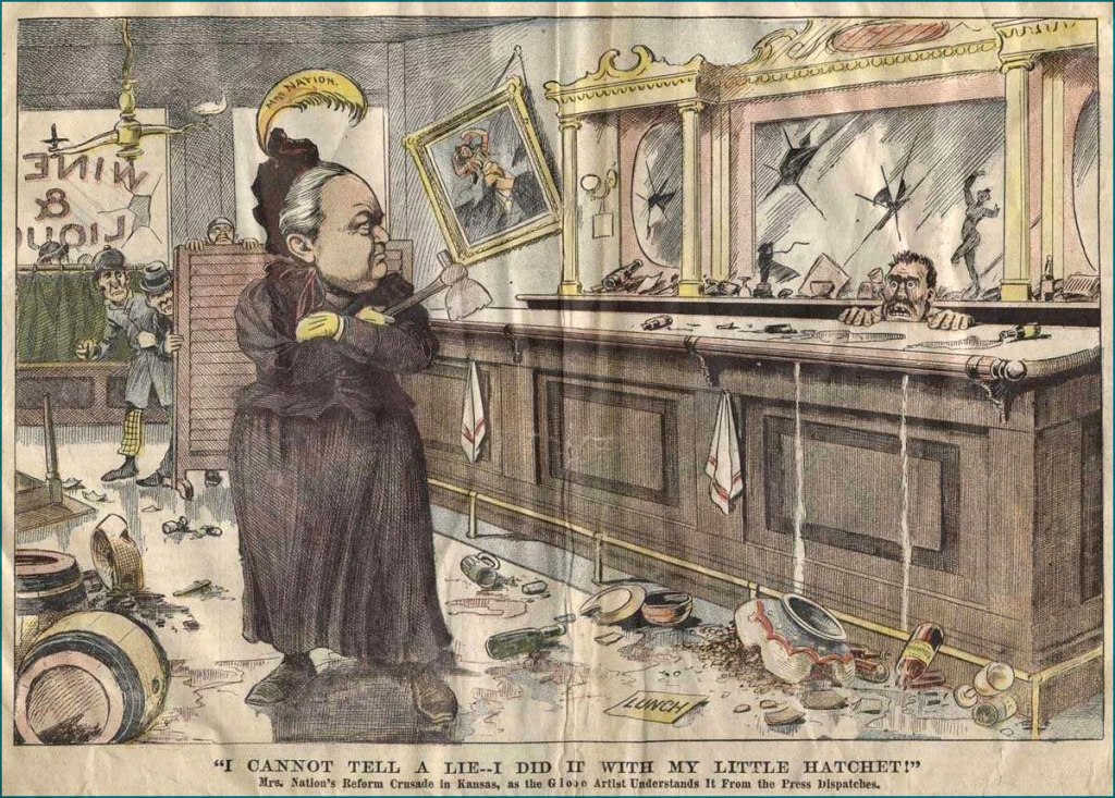
« In 1900, she bought from a Medicine Lodge hardware store the implement that became both her weapon and her symbol — a hatchet — and at the age of fifty-four sallied forth on a smashing campaign that carried her across the country, shouting: ‘Smash! Smash! For Jesus’ sake, Smash!’ »
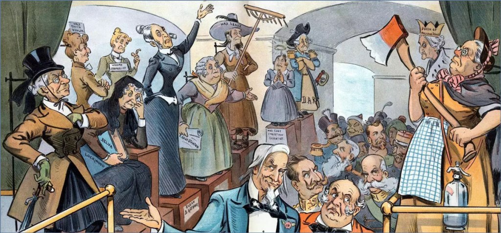
These days I’ve been reading Ardent Spirits: The Rise and Fall of Prohibition (1973) by John Kobler. I didn’t know much about the temperance movement in general, but what surprised me most is how intimately it was tied to suffragette activism. It’s in Ardent Spirits that I came across the fascinating character of Carry Nation*, ‘a bulldog, running along at the feet of Jesus, barking at what He doesn’t like’. She seems a very fitting figure for a post on this March 8th, International Women’s Day.
Whether she was a total barmpot or a blazing visionary is up for some debate; I must give credit to Kobler, who cobbled together a fairly well-balanced portrait of her while many historians tended to quickly dismiss this hatchet-wielding devotee as a crazed lunatic. While basic facts remain the same (disagreement about Nation’s height notwithstanding), interpretation of events and motivations varies wildly. This can be quickly demonstrated by comparing two modern articles of some depth: Carry Nation is described as ‘a flamboyant, theatrical and completely outrageous woman at nearly 6 feet tall [..] smashing barrels on stage and singing her temperance songs to enthusiastic audiences who howled for more‘ (Carrie Nation: American Woman by Richard Behrens) but also as ‘a fearless populist progressive just over 5 feet tall** […] fighting tirelessly for good governance, women’s rights, civil rights, and cleaning the corruption out of the body politic‘ (Hatchet Nation by Mark Lawrence Schrad).
One of six postcards published in 1905 depicting Nation’s ‘hatchetations’: On the Warpath; Raiding a Public House; Addressing Cigarette Fiends; Smashing a Pub; In a Restaurant; In a Pub.
Nation went through an arsenal of weapons (aside from rocks and incidental objects, a sledgehammer) before settling on her beloved hatchet and coining the term ‘hatchetations’ to describe her saloon smashings. It comes as no surprise that she grabbed cartoonists’ imagination, even taking into account that real juicy conflict remains unillustrated (and this was a ruthless war between temperance advocates and their opponents). Just picture this colourful scene — a woman, garbed in the usual constrictive dress of early 19th century, marching into a bar and smashing up bottles, mirrors, chairs, slot machines with her trusty little axe. This striking image is likely why Nation’s name is first to spring up when the topic of prohibition arises in modern conversation.
A bit closer to the present day, here’s a 1960s cartoon by bon vivant Eldon Dedini, who hypothesizes Ms. Nation’s likely reaction to a Playboy Club (the first one opened in Chicago, circa 1960). The caption? « Hi! ».
Happy Women’s Day (and Women’s History Month) to all readers!
~ ds
* This original name came about when Carry Moore, named Carry by a semiliterate father, married David Nation. She preferred to spell her name as ‘Carrie’, until she married David, yielding the grandiose full name Carry A. Nation (A. stood for Amelia), ‘carry a nation for temperance’.
** This question of height intrigues me, for most articles describe Nation as tall and powerful. Mark Lawrence Schrad, who just portrayed her as being just over 5 feet tall, has also written another article in which he calls her ‘imposing in stature, prone to violence and—claiming God spoke to her, urging her to attack saloons—slightly unhinged‘.
« We all know interspecies romance is weird. » — Tim Burton
It’s Bill Ward‘s birthday! No, not Black Sabbath’s Bill Ward — that’s on the 5th of May — save the date, as the suits say. It’s also Will Eisner’s anniversaire, but as he holds a category of his own, let’s let ol’ Bill have his turn, shall we?
Now, while most of the attention devoted to Ward (1919-1998) centres on his enormous output for Marvel founder (and Stan and Larry‘s uncle) Moe ‘Martin’ Goodman, I’m more intrigued by the brief period of his career when he truly seemed invested in his work, namely his passage at Quality Comics, where his craft rivalled that of such illustrious stablemates as Eisner, Jack Cole, Reed Crandall and Lou Fine.
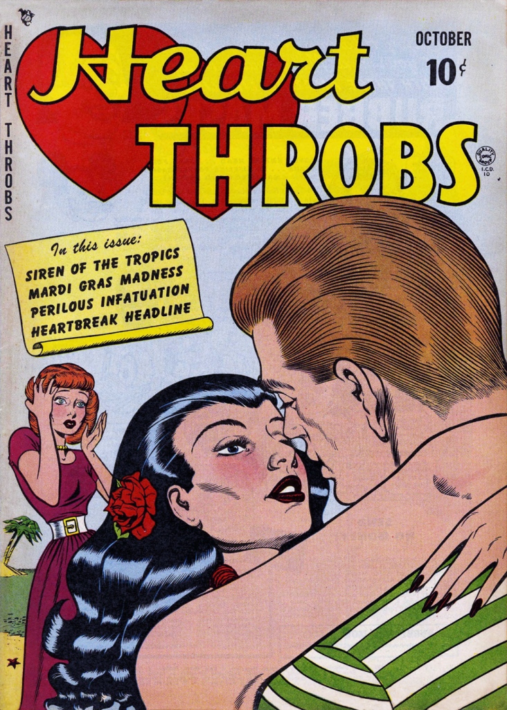
While he worked on such features as Blackhawk and Doll Man, Ward clearly preferred — was it ever in doubt? — depicting beautiful women dressed to the nines, a passion most readily indulged in romance comics, a genre then in its infancy, Joe Simon and Jack Kirby having just set it on its way with 1947’s Young Romance.
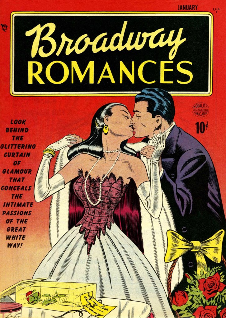
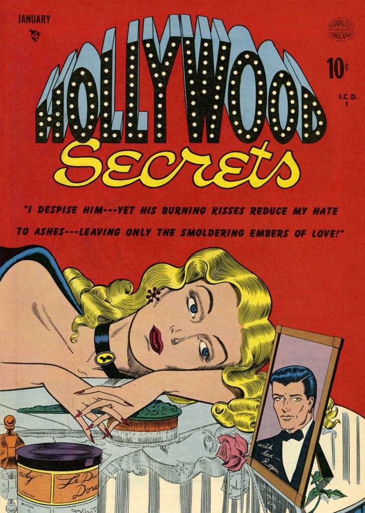
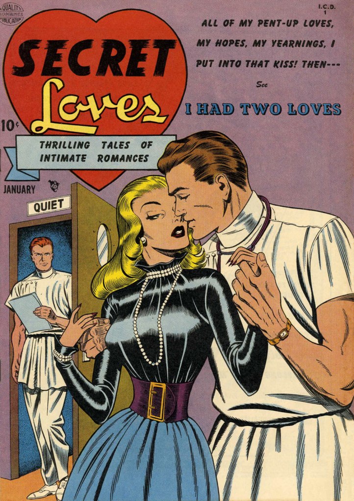
This is Heart Throbs no. 1 (Aug. 1949, Quality). Ever the fetishist, Bill never could resist a well-fitted pair of opera gloves.This is Heart Throbs no. 2 (Oct. 1949, Quality). Quality’s flagship romance title, Heart Throbs lasted one hundred issues, 46 published by Quality, and an even hundred by DC (1956 to 1972) after they picked up what remained of the publisher’s assets, among them Blackhawk, Plastic Man, Doll Man, Uncle Sam, Phantom Lady, and some war (G.I. Combat) and romance titles.This is Hollywood Secrets no. 1 (Nov. 1949, Quality). An unusual colour scheme!This is Campus Loves no. 1 (Dec. 1949, Quality).This is Flaming Love no. 1 (Dec. 1949, Quality). The gloating guy is the prototypical Ward creep.This is Broadway Romances no. 1 (Jan. 1950, Quality). It’s so refreshing to see Ward devote the same level of attention to detail to background items as to the female figure and her accoutrements.This is Hollywood Secrets no. 2 (Jan. 1950, Quality).This is Love Letters no. 2 (Jan. 1950, Quality). Interesting how all these romance covers — the majority of Ward’s production in that genre — all came out within the span of a year or so.This is Secret Loves no. 2 (Jan. 1950, Quality). Ward liked his women to have tiny, needle-like digits — I mean, just compare the lovers’ respective paws!This is Torchy no. 5 (July 1950, Quality), Ward’s signature creature. With the years, as his women grew ever more buxom, his men became ever more grotesque — these are some of the archetypes, but noses got longer, legs got skinnier and shorter, bellies more bulging — until men and women in no way seemed to belong to the same species. While that device of exaggeration was a mainstay of « girlie » art, Ward took it further than just about anyone.
Over the years, things got more… pneumatic. And then some more.
One from an issue of Zip (1967, Marvel); that particular cartoon had probably been around the block a few times by then… it sure doesn’t scream ‘1967!’
Incidentally, the elaborate background textures found in Ward cartoons were achieved by a technique called rubbing, or frottage, « … a reproduction of the texture of a surface created by placing a piece of paper or similar material over the subject and then rubbing the paper with something to deposit marks, most commonly charcoal or pencil. » Not to be confused with the *other* kind of frottage, although, come to think of it, that’s also quite relevant to Ward cartoons.
One of Ward’s ‘Phone Girls’, she saw print in Snappy no. 24 (1958, Marvel)… and likely numerous times thereafter.
« The first hundred years are the hardest. » — Wilson Mizner
Having just learned this morning that today marks a century since the birth of André Franquin (1924-1997), I again pushed my planned post to the back burner. So, instead of writing about a celebrated Belgian genius, I’ll write about *another* celebrated Belgian genius.
Spirou’s ‘Albums’ were a handy way to dispose of unsold copies of the weekly magazine by collecting a trimester’s worth of issues in an attractive hardcover format. This one’s from March 1948, just to give you an idea of Franquin’s early style.A panel from Le dictateur et le champignon (1953). The ripe banana-coloured critter with the long tail, if you don’t already know, is Le marsupilami, Franquin’s homage to Elzie Segar‘s Eugene the Jeep (introduced in 1935 and known as ‘Pilou-Pilou’ in French Europe).This panel took my breath away as a kid when I first saw it, and it still does. It’s from Spirou et Fantasio no. 8, La mauvaise tête (1954). How many contemporary artists could pull off such a scene — let alone the entire sequence, wherein Fantasio ends up winning the race cycling backwards — at all convincingly? I’ve been reading, for the first time, Franquin’s collected Modeste et Pompon (1955-59). After Franquin was tricked into surrendering his creation to Tintin magazine publisher Les Éditions du Lombard, M&P became just another long-running mediocre domestic strip in many successive pairs of (necessarily) lesser hands… but seeing Franquin bring it to life is a most refreshing pleasure.A dynamic Modeste et Pompon sample from near the end of Franquin’s run. During Franquin’s relatively brief passage at Tintin magazine, he set a new standard of graphic freedom, opening a breach for his successors that Georges “Hergé” Rémi himself did *not* welcome. Tintin’s papa, in fact, deemed Franquin’s supple and organic line ‘vulgar’. Album Spirou no. 70 (March 1959, Dupuis), gathering issues 1081 to 1091 and depicting a scene from Le Prisonnier du Bouddha.Album Spirou no. 96 (April 1965, Dupuis), collecting issues 1395 to 1407. Gaston Lagaffe*, like Le Marsupilami before him, was a minor character introduced by Franquin to relieve the tedium of setting down the adventures of Spirou et Fantasio. The popularity of both these would-be background creations wound up dwarfing that of the intended protagonists. Franquin’s original painted artwork for the cover of Album Spirou no. 100 — well, duh — (March 1966, Dupuis), containing issues 1447 to 1459.
In 1977, a depressed yet inspired Franquin, suffocating within the confines of his much-imitated (at his publisher’s clueless insistence) style, created — with kindred confederate Yvan Delporte — Idées noires (Black, or perhaps more fittingly Bleak notions) as an outlet. It first appeared in the short-lived* Spirou mag supplement Trombone illustré, then moved to the more welcoming pages of Fluide glacial. An English-language edition, entitled Die Laughing, was published by Fantagraphics in 2018. Check it out here.
Here are a couple of Idées noires punchlines, which should give you an idea of their tone.
Marcel Gotlib wittily hijacked/paraphrased Sacha Guitry‘s bon mot about Beethoven : « After reading a page of Idées noires by Franquin, we close our eyes, and the darkness that ensues is still Franquin’s. »In countless instances, Franquin even used his signature to expressive comic effect.
-RG
*These days, thinking about Gaston Lagaffe puts me in an ugly mood, I’m afraid. Franquin had expressly, and all along, requested that his creation be put to rest with him. But did his publisher – having built an empire upon Franquin’s creations — honour his wishes? No more than usual. Another arrogant slap — post-mortem this time — in the face of a genius exploited and mistreated his entire adult life. In this world, the interest of the characters… oops, pardon my French, ‘properties’ obviously trumps that of the flesh-and-blood creators. Every time. For there’s always some scab hack or other backstabber (and they *always* claim to be huuuge fans, as Miller said to Eisner, betraying him with a kiss) to aid and abet venal publishers. That’s how we got a pointless Sugar and Spike revival and all those Watchmen prequels. Hopefully, Monsieur Franquin’s daughter will prevail in her lawsuit against Dupuis to settle the matter in a just and fitting manner. [ Update: it didn’t end well. The suits won. ]
**« It is upon the publication of a Franquin article that the supplement is cancelled. In his piece, the fervently antimilitarist Franquin takes to task Thierry Martens, Spirou’s then editor-in-chief, for running articles about Nazi war plane models. » (translated quote from L’histoire de la bande dessinée pour les débutants by Frédéric Duprat, p. 131, Jan. 2011)
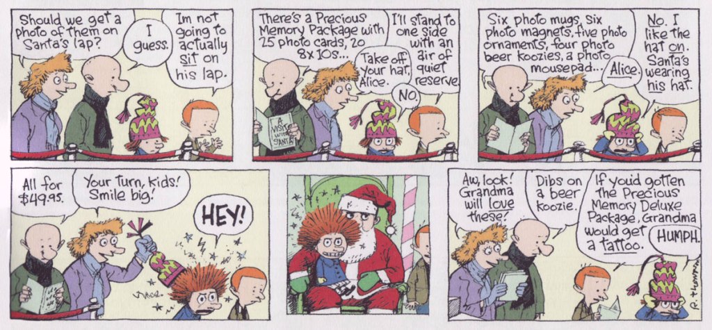
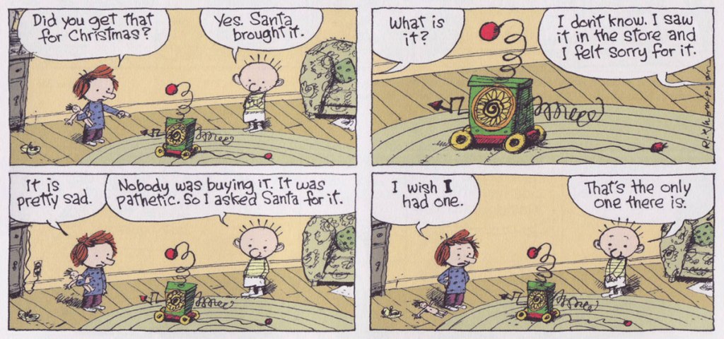
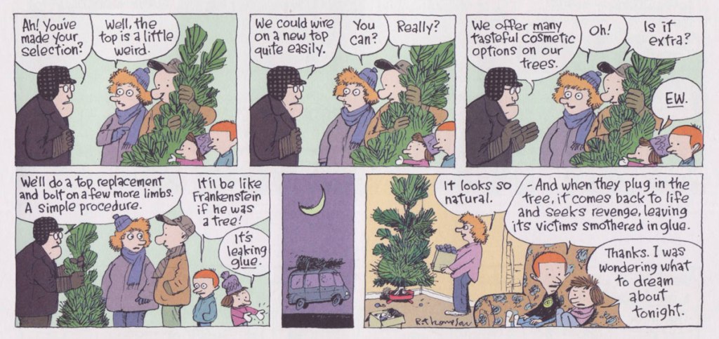
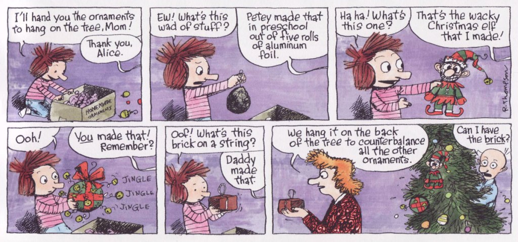
I’ve gathered most of the yule-themed Cul de Sac Sundays… one of these days, I might devote an entire post to Madeline Otterloop’s Christmas sweater dailies.
Merry Christmas, everyone!
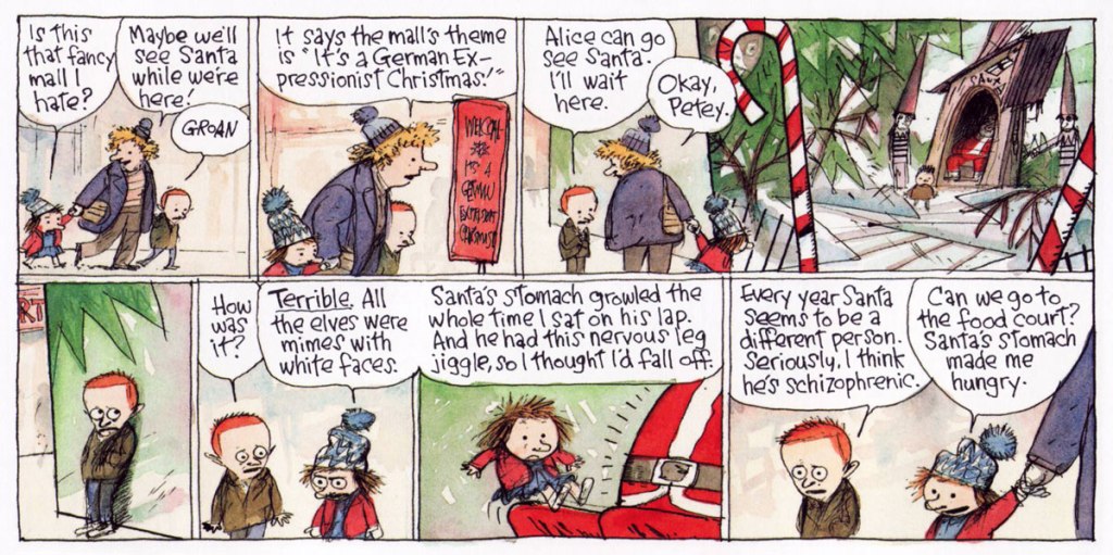
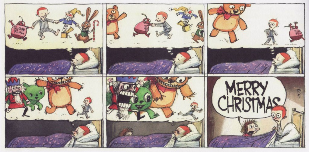
RT: « The creepier side of Christmas. A German Expressionist Christmas has been done by someone, somewhere, I’m sure. » December 11, 2005.RT: « Taking down Christmas is always so hard. I like the timing here. » January 1st, 2006.RT: « Petey dreams of Christmas with music by Tchaikovsky. » December 24, 2006.RT: « Santa Claus commands a lot of fear and awe in children.I could never get a coherent sentence out when sitting on his lap when I was a kid, and I doubt I could today. Thank God I don’t believe in him anymore! » December 23, 2007.RT: « The first appearance of Dill’s mysterious, malignant, poignant, and possibly educational toy. I just wanted something that’d be easy and repetitive to draw, because I was behind. » December 30, 2007.RT: « What I like the most is the tree seller’s resemblance to a mortician. » December 21, 2008.December 28, 2008.RT: « Drawn from life. Nothing more need be said. » December 19, 2010.RT: « Petey’s faith in his commentaries’ scathing qualities is misplaced. » December 4, 2011.RT: « Doing this was a joy. The hard part was doing it in pantomime. » December 11, 2011.