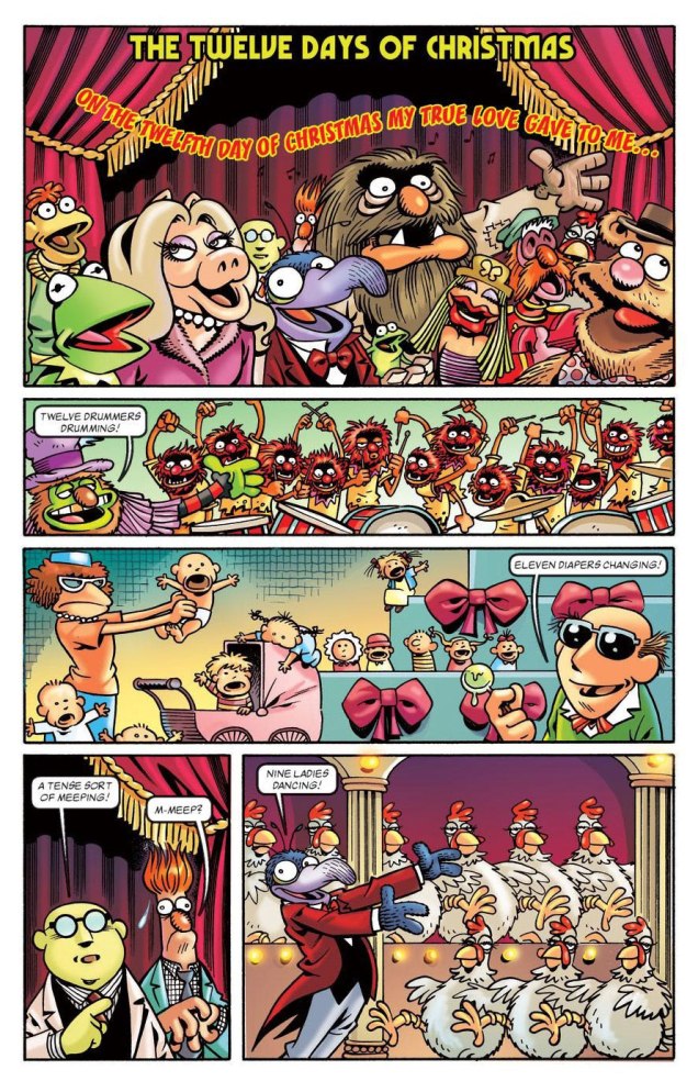
Speaking of festive mayhem, there is none better than penned (imagined, executed!) by Roger Langridge. Over the scope of his long (and ongoing!) career, the whole ‘rocking around the Christmas tree’ thing has shown up at least a couple of times — you may not have snow where you live, but take a gander at these and watch your holiday spirits soar (especially if bolstered by a bit o’ tipple).
Here’s are some merry excerpts taken from The Four Seasons: Winter storyline printed in Muppets: The Four Seasons (2012, Marvel) for your enjoyment:
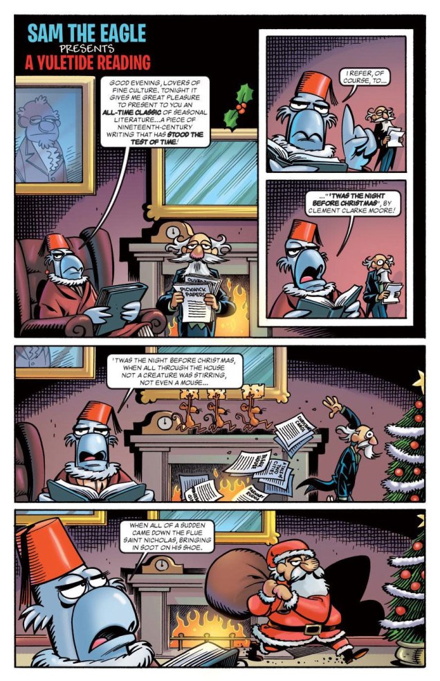
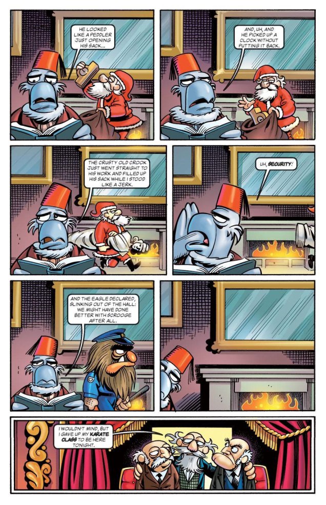
From the same issue, in this two-page digression (though what is The Muppets if not a series of glorious digressions), Sam narrates Dickens’ magnum opus… oh, nevermind.
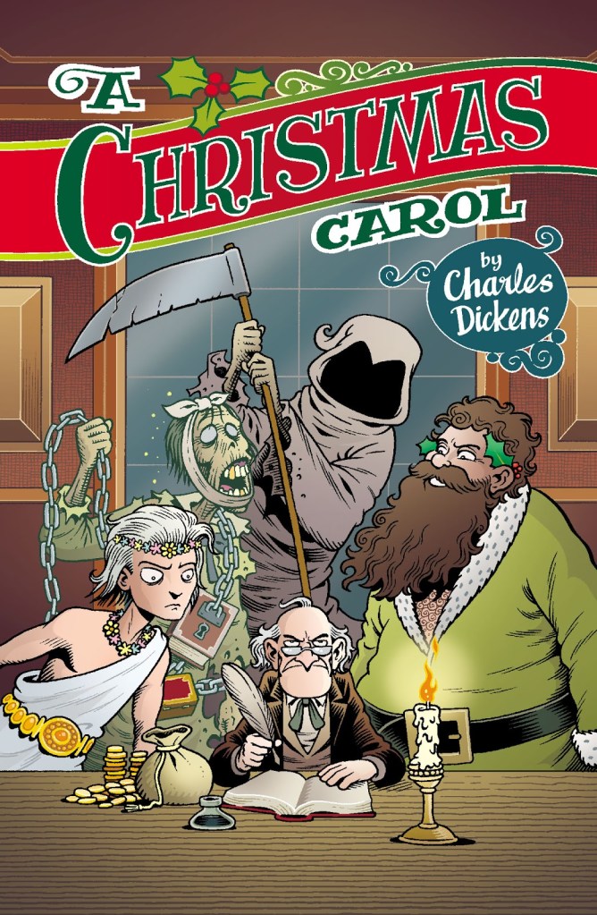
Speaking of Dickens, though, he did not go un-Langridged, happily:
A Christmas Carol (2013, St Mark’s Press)
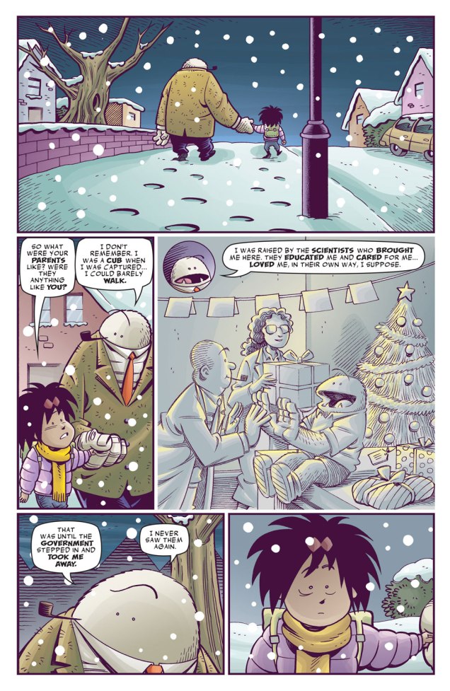
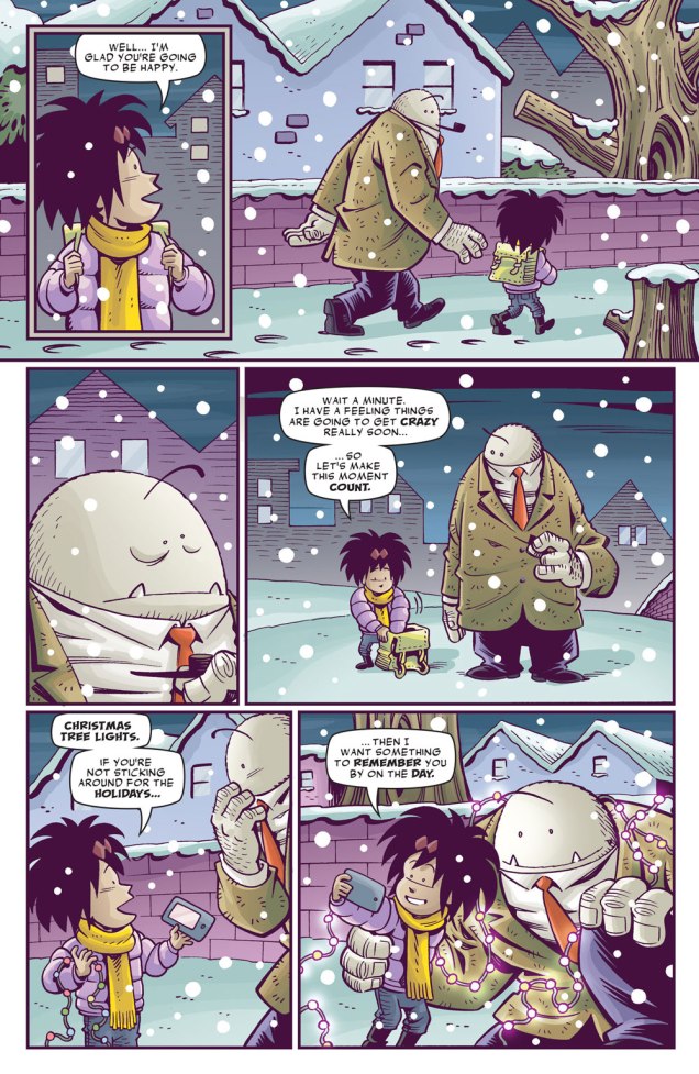
To further your cheer, a few more pages from Langridge’s Abigail & The Snowman (2016, KaBOOM!). This decade sure is a depressing one for all artistic professions — current active cartoonists seem to be mostly doomed to juggling thankless jobs for corporate giants such as Disney-slash-Marvel while defending their right to be (and to own their work) from AI pilfering (although ‘pilfering’ is too cute a word for it). Even such pundits as RL can rarely afford to work on what’s actually dear to their hearts. In that context, the sweet (and thoughtful) story of Abigail and her snowman friend was a very welcome addition to Langridge’s career, lodged as it was between two extremely underwhelming Dynamite-published affairs where he acted as the writer, namely King: Mandrake the Magician (2015) and Betty Boop (2017). I’m now convinced that Langridge’s art can save a poor script (thanks to jokes and beautifully non-sequitur asides inserted into the art), whereas a flat artist can ruin a plot faster than you can shout ‘Gisele Lagacé‘.
Langridge has been drawing daily cartoons based on his life for around 5 years now. This is the strip’s final week, as he has decided that it’s time to move on to something else, so I wanted to mention it before it’s too late — especially since it’s perfectly relevant to the season.
Strip from December 21, 2023
And a merry Christmas to all! We’ll see you again before the New Year.
« Save time and cut fingers with a parsley mincer. »
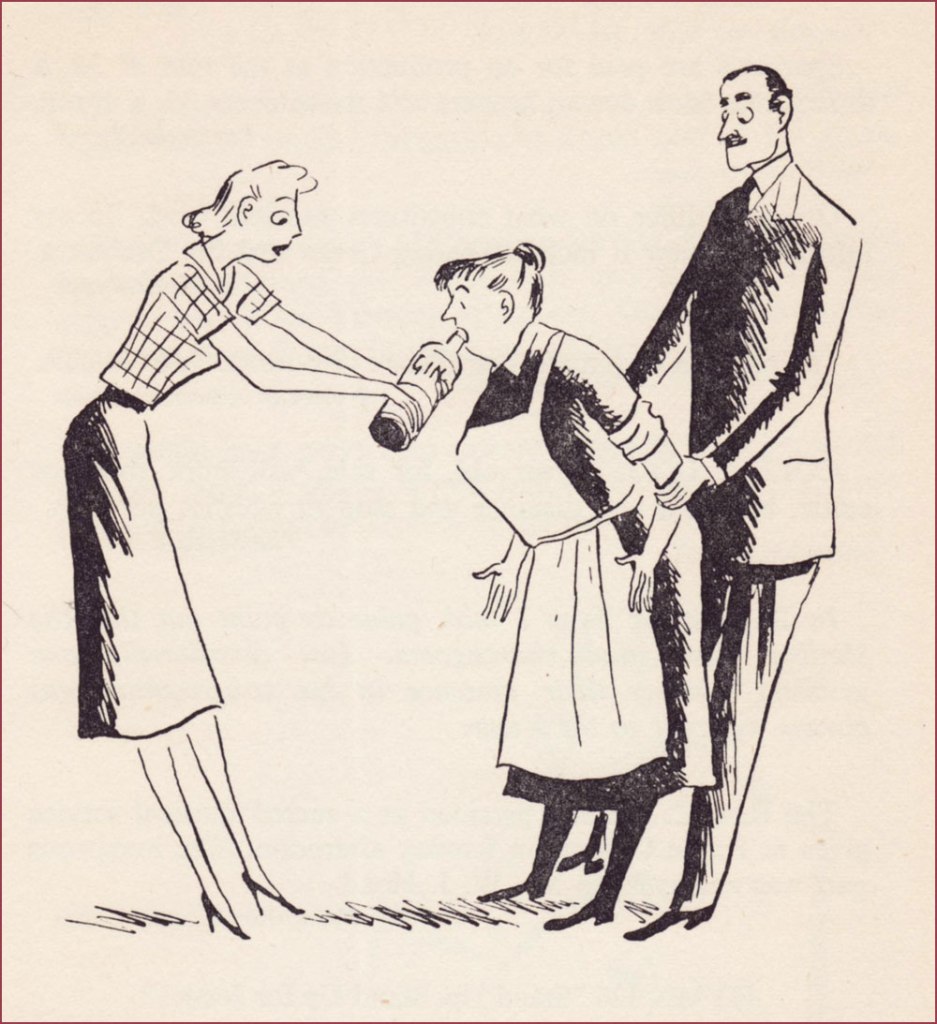
It seems that oodles of my posts start with ‘I found this book randomly in a second-hand bookstore…’, when ‘retrieved from the bottom of a dusty chest in a forgotten attic’ would make for a much more enthralling story. Alas, I am bound to truth… as is Can It Be True? (originally published in 1953 by MacDonald and Co; I have the 3rd edition from 1954), which was priced one measly buck despite its generally excellent condition and venerable age.
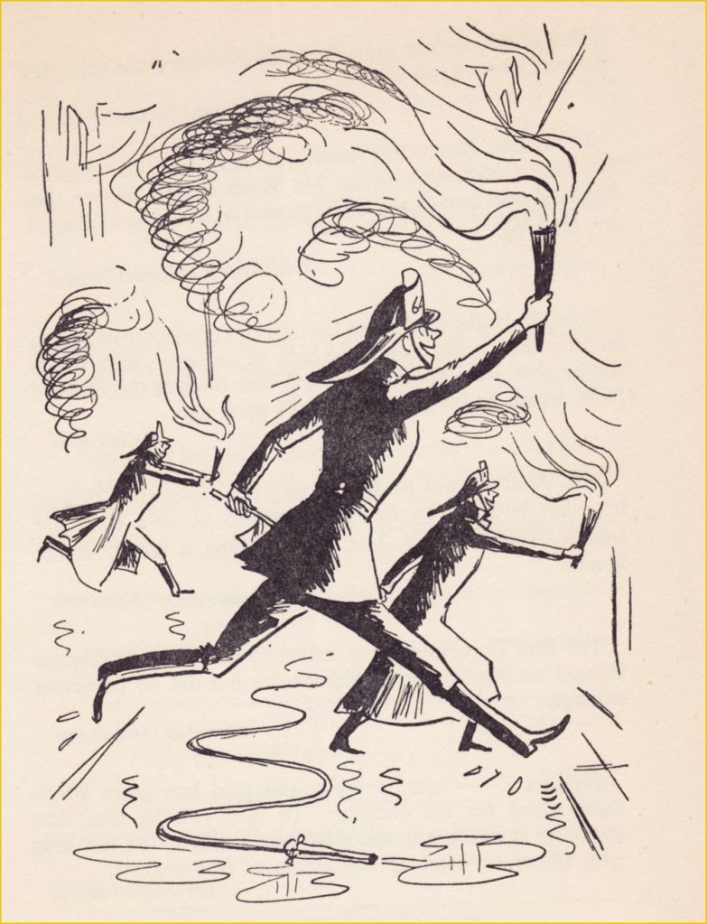
It consists of a collection of misprinted and typo’d quotes drawn from newspaper clippings, magazine articles and other paraphernalia, expertly gathered and compiled into a thin volume by Denys Parsons. This by itself makes for an amusing read, but the cherry on the cake is the occasional illustrations by blog favourite Anton (see Anton’s Spivs and Scoundrels, Baronesses and Beezers, if you’re not sure whom this nom de plume conceals).
As seen from a panel inside the book, the man is holding a poster that reads’ SHRDLUS AT IT AGIAN – Evning Srta’
« ... Spread around her was a sun-flooded valley where buttercups nodded lazily in the summer breeze and tranquil cows chewed solemnly at her elbow. » – Western Family Magazine
« Para. 27B. Men employed on quasi-clerical nature should not be provided with any clothing. » – Post Office Magazine
« The best plan is to hold the bottle firmly and remove the cook as gently as possible. » – Woman’s Paper
« The flames starting on the third floor of the midwest Salvage Co. spread so rapidly that the first firemen on the scene were driven back to safety and leaped across three streets to ignite other buildings. » – Cincinnati Times Star
« The word lawyer, he argued, was a general term, and was not confined to solicitors, but anybody who practised any breach of law. » – Cambridge Paper
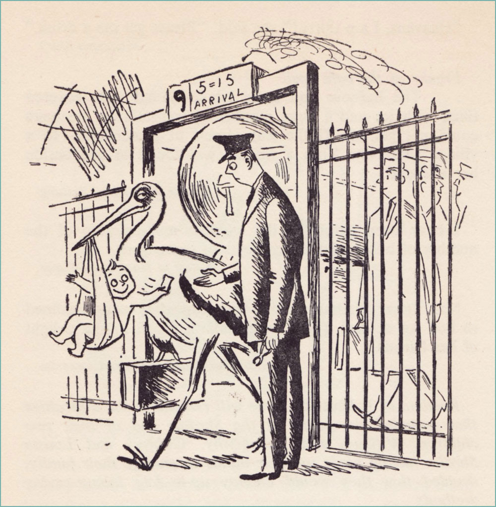
« Mr. and Mrs. Benny Croset announce the birth of a little son which arrived on the 5.15 last Thursday. » – West Union (Oregon) People’s Defender
Denys Parsons, ‘the undisputed king of the misprint’, has a few more books I’m interested in, including another volume of It Must Be True (this one illustrated by Ronald Searle), as well as Many a True Word (another Anton volume!) and All Too True (with drawings by Peter Kneebone). Perhaps another time, another p̶l̶a̶c̶e̶ used bookstore…
You see, there were these two competing comics publishers…
… which is to say DC Thomson and the dystopian-monikered International Publishing Corporation (IPC); between them, they dominated the UK comics market. By the late 1970s, said market had surpassed circulation of ten million copies, its rosiest sales outlook ever.
To be perfectly cynical, the rival publishers’ editorial vision was mostly to copy one another’s successes. Same mouldy old dough.
In 1977, « Freelance writer Pat Mills had an idea for a girls’ horror comic* that would use his 2000 AD approach — longer stories, bigger visuals, with adaptations of stories from big name writers… Misty was about to be born. »
This, of course, is the Stan Lee version of an ‘idea’, for what IPC was commissioning, and Mills was providing, was a copy of DC Thomson’s existing Spellbound. However, since Mills was asking for a piece of the pie, he was sacked before the new magazine’s launch, and replaced with a perhaps more pliable sancho.
In terms of timing, Spellbound happened to cease publication (after 69 issues) just a few weeks before its clone’s launch. For its part, Misty lasted 101 issues before being folded** into the more reliably successful Tammy; a common practice in England for underperforming magazines that still have a following. After all, Spellbound, upon its own cancellation, had been whisked into Debbie.
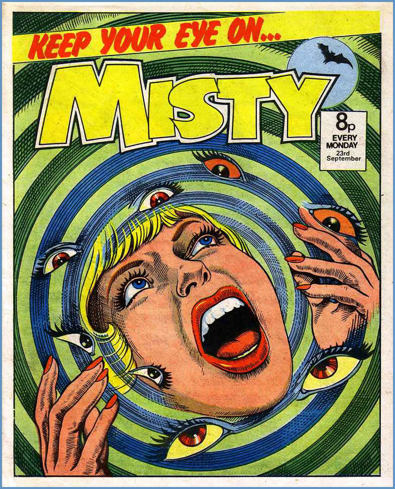
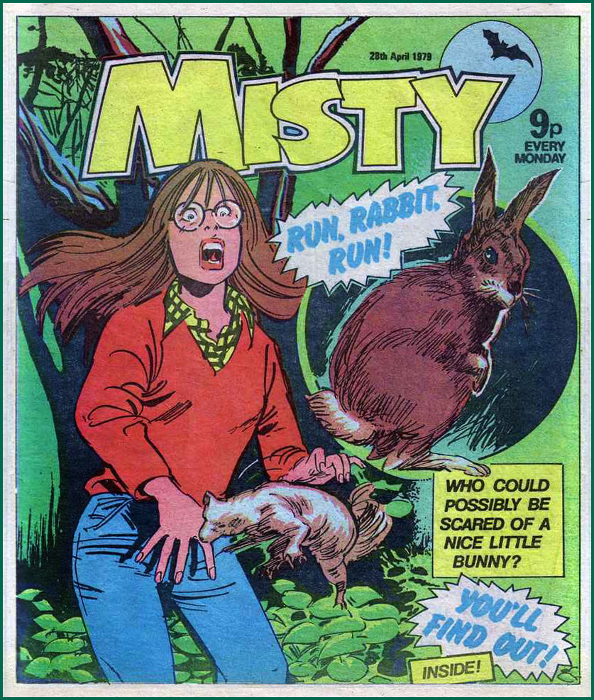
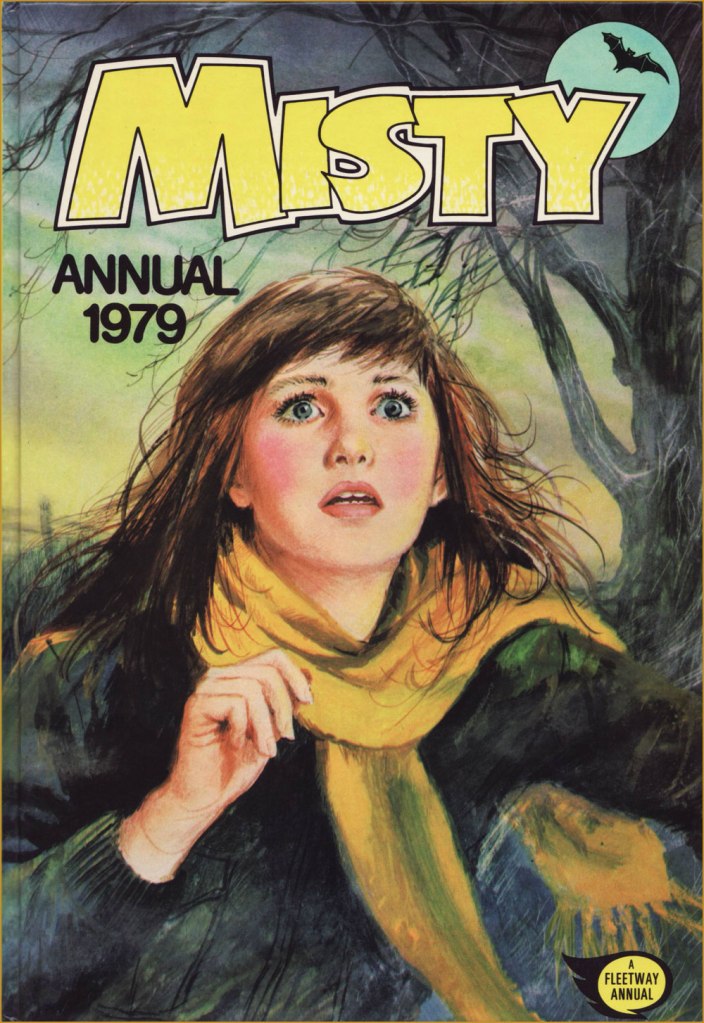
This is Misty No. 22 (July 1st 1978, IPC). This one I can credit: Jordi Badía Romero (1958-1984).This is Misty No. 28 (Aug. 12 1978, IPC).This is Misty No. 34 (Sept. 23 1978, IPC).This is Misty No. 64 (Apr. 28 1979, IPC).This is Misty No. 94 (Nov. 24 1979, IPC).
And here’s a short story.
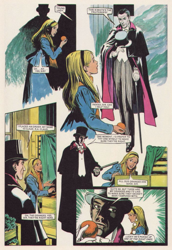
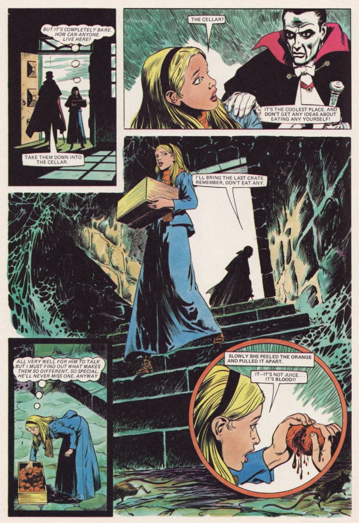
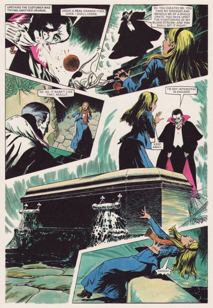
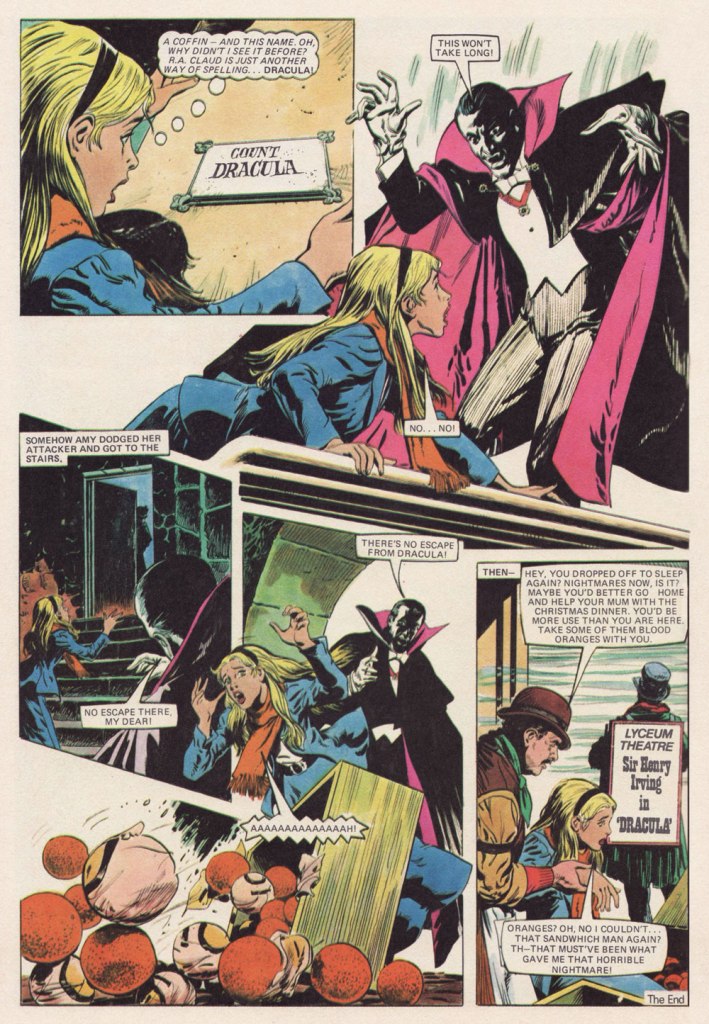
Dr. Julia Round recalls, in her foreword to Misty: 45 Years of Fear (2023, Rebellion): « Misty is perhaps best remembered for its one-shot stories, which were vicious cautionary tales in which characters would be brutally punished for a mistake or misdeed. There was a strong sense of dramatic irony in these stories — wishes backfire, magical items that are gained dishonestly turn on the owner, and unkindness to animals or nature sees girls transformed into bugs or plants. » This particular example is gentler, obviously.
Blood Orange was published in Misty Annual 1979. No credits whatsoever, thank you very much.
-RG
*It’s worth noting — with a shudder — that UK comics were both stringently gender *and* genre specific.
** « Most titles were folded when they got down to about 200,000 sales. They said is was not viable, but can you imagine now, having a circulation of 200,000? » — Wilf Prigmore
« Daddy had an argument on Friday night, with a man from outer space. Daddy said, ‘I don’t care where you’re from, you’re in my parking space!’ » — Colin McNaughton
Here we are, against all odds, at the beginning of yet another edition of WOT?’s annual Hallowe’en Countdown… hope you enjoy the bumpy — that’s the spirit! — ride.
This time, our opening salvo comes courtesy of British illustrator-poet Colin McNaughton (born 1951). Though I’ve been known to haunt used bookstores whenever the occasion arises, I’ve but once encountered a single one of Mr. McNaughton’s productions, a couple of decades ago at that… which is odd, given his rather prodigious output: over seventy books! That said, my mama having raised no fool (my brother notwithstanding), I unerringly grabbed it.
As it happens, Wikipedia claims — though without any context or evidence — that « His most notable book is perhaps There’s an Awful Lot of Weirdos in Our Neighbourhood »… but I’ll accept it unless a stronger claim comes along. It’s a truly splendid tome.
Oh, and here’s the requisite snatch of (auto?) biography: « Growing up in his native England, the young Colin McNaughton had little indication that he would one day become an author-illustrator. There were no books at all in his parents’ home, he recalls, but there were always comics. These were his formative literature, and their slapstick humor has been a lasting influence. “I’ve been talking about the comic format for years,” he says. “It’s the modern way of telling stories for today’s children; it’s about movement, the step between film and the book.” »
I can live with that. enjoy!
There’s an awful lot of weirdos in our neighbourhood! Yes, there’s an awful lot of weirdos in our neighbourhood!I know this physical wreck, who has a bolt through his neck! There’s an awful lot of weirdos in our neighbourhood!And in an upstairs room, an old lady rides a broom! There’s an awful lot of weirdos in our neighbourhood.A man lives on the square, when he’s in he isn’t there! There’s an awful lot of weirdos in our neighbourhood.And that woman down the block, whose snaky hair’s a shock! There’s an awful lot of weirdos in our neighbourhood.We’ve a strange old feller, with horns, down in the cellar! There’s an awful lot of weirdos in our neighbourhood.There’s a guy who’s green and scaly, has webbed feet and sells fish daily! There’s an awful lot of weirdos in our neighbourhood.And someone near the dairy, when the moon is out gets hairy! There’s an awful lot of weirdos in our neighbourhood.Think I’ll leave this miscellanea, and return to Transylvania, ’cause there’s an awful lot of weirdos in our neighbourhood!
How about one more? One more it is!
Mum! The garden’s full of witches! Come quick and see the witches. There’s a full moon out, and they’re flying about, come on! You’ll miss the witches.
Oh, Mum! You’re missing the witches. You have never seen so many witches. They are casting spells! There are horrible smells! Come on! You’ll miss the witches.
Mum, hurry! Come look at the witches. The shrubbery’s bursting with witches. They’ve turned our Joan into a garden gnome. Come on! You’ll miss the witches.
Oh no! You’ll miss the witches. The garden’s black with witches. Come on! Come on! Too late! They’ve gone. Oh, you always miss the witches.
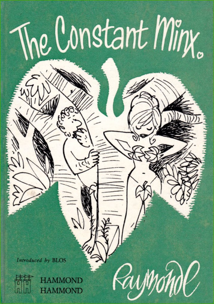
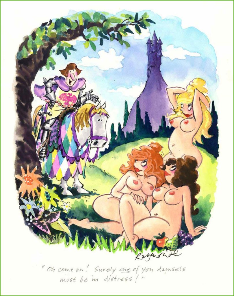
British cartoonist Roy Stuart Raymonde, who died in 2009 at 79 years old, first intrigued me with vivid watercolours and episodes oftimes set in mushroomy forests or secluded glens dotted with babbling brooks. Our anglophilically-minded readers may recall his work for Punch Magazine, and the rest of us will recognize him from the pages of Playboy, to which he contributed a monthly full-colour page for some 30 years.
The rambunctious Raymonde started out in advertising, cushioning his finances by freelancing as a cartoonist, mostly notably for Tit-Bits, a British tabloid-type magazine with an amusing name which reminds me of this George Carlton sketch. By 1960, Raymonde had amassed enough contacts to become a full-time cartoonist.
A collection of Raymonde cartoons published in 1961. Head over here to see some of the insides.
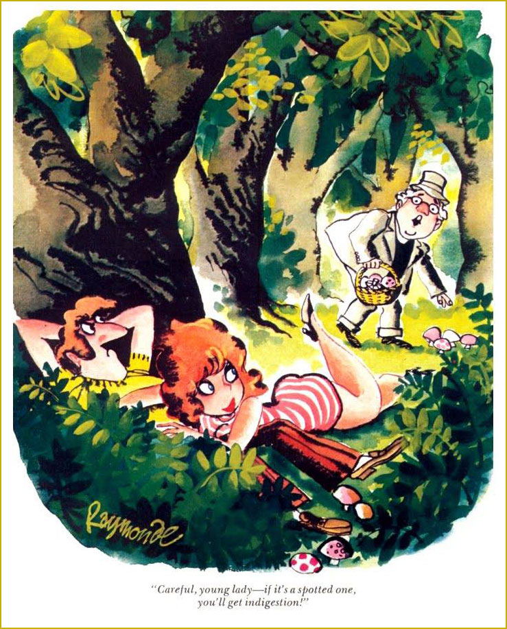
July 1974. This is the cartoon that first attracted my attention… with mushrooms, naturally.
I didn’t know this until writing this post, but delightfully Raymonde was friends with WOT favourite Gerard Hoffnung (see co-admin RG’s posts Gerard Hoffnung’s Constant Readers and Off to the Isle of Cats — and Back by Teatime!), whom he met at the Harrow School of Art (a subdivision of University of Westminster) in 1944, when RR was but 15. The two became lifelong friends, with Hoffnung, then a junior tutor (on his way to becoming a schoolmaster) a mere four years his senior, playing the role of Raymonde’s mentor. This friendship was cut abruptly short by Hoffnung’s premature death, so they were not able to re-enact Simon & Garfunkel’s Bookends, alas. I wasn’t able to find the exact source of this quote, as various websites just parrot the same paragraph over and over, but it seems that Raymonde was nearly expelled after adding funny captions to one of Hoffnung’s instructional drawings, a story hopefully as true as it is hilarious. Hoffnung (never bereft of a sense of humour) came to his defense and argued that this act was a sign of talent.
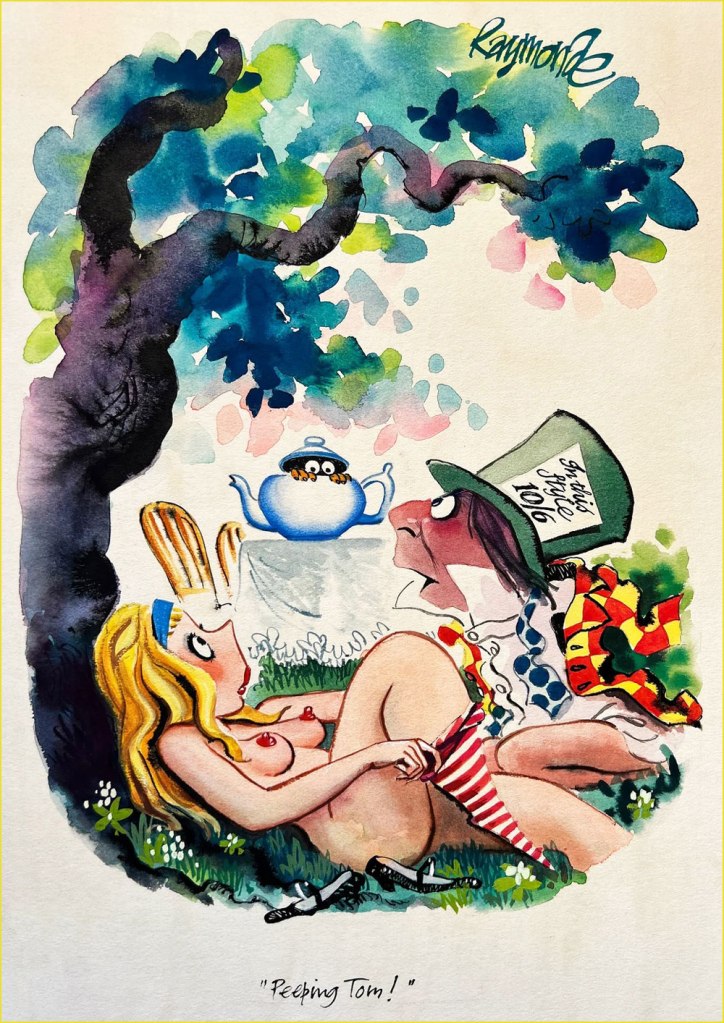
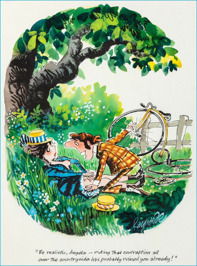
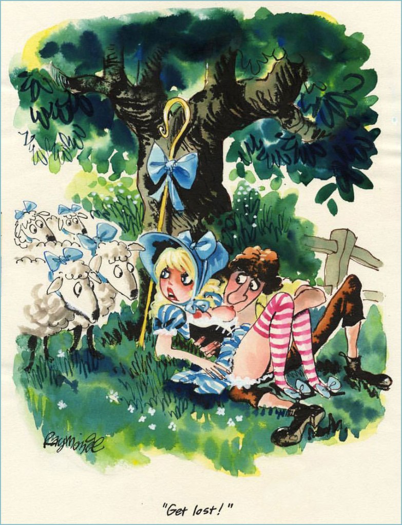
September 1972. What kind of Brit cartoonist worth his Yorkshire Pudding hasn’t spoofed Alice in Wonderland?
1973.
Preliminary sketch of unknown vintage.
Another preliminary sketch.
Given his evident love for the outdoors, I wasn’t surprised to find out that Raymonde bought a thatched cottage at the age of 34 and lived there for the rest of his life, voyages to Japan (where his work was very appreciated, to the point of winning the Gold Prize at the Kyoto International Cartoon Festival in 1996) and such notwithstanding.
1997.
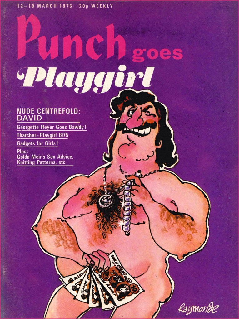
Punch Does Playgirl, March 1975. Raymonde created quite a few covers for Punch… as to the guy depicted, he’s like something out of a Charles Rodrigues sketchbook (see Charles Rodrigues’ Pantheon of Scabrous Humour).
July 1974.
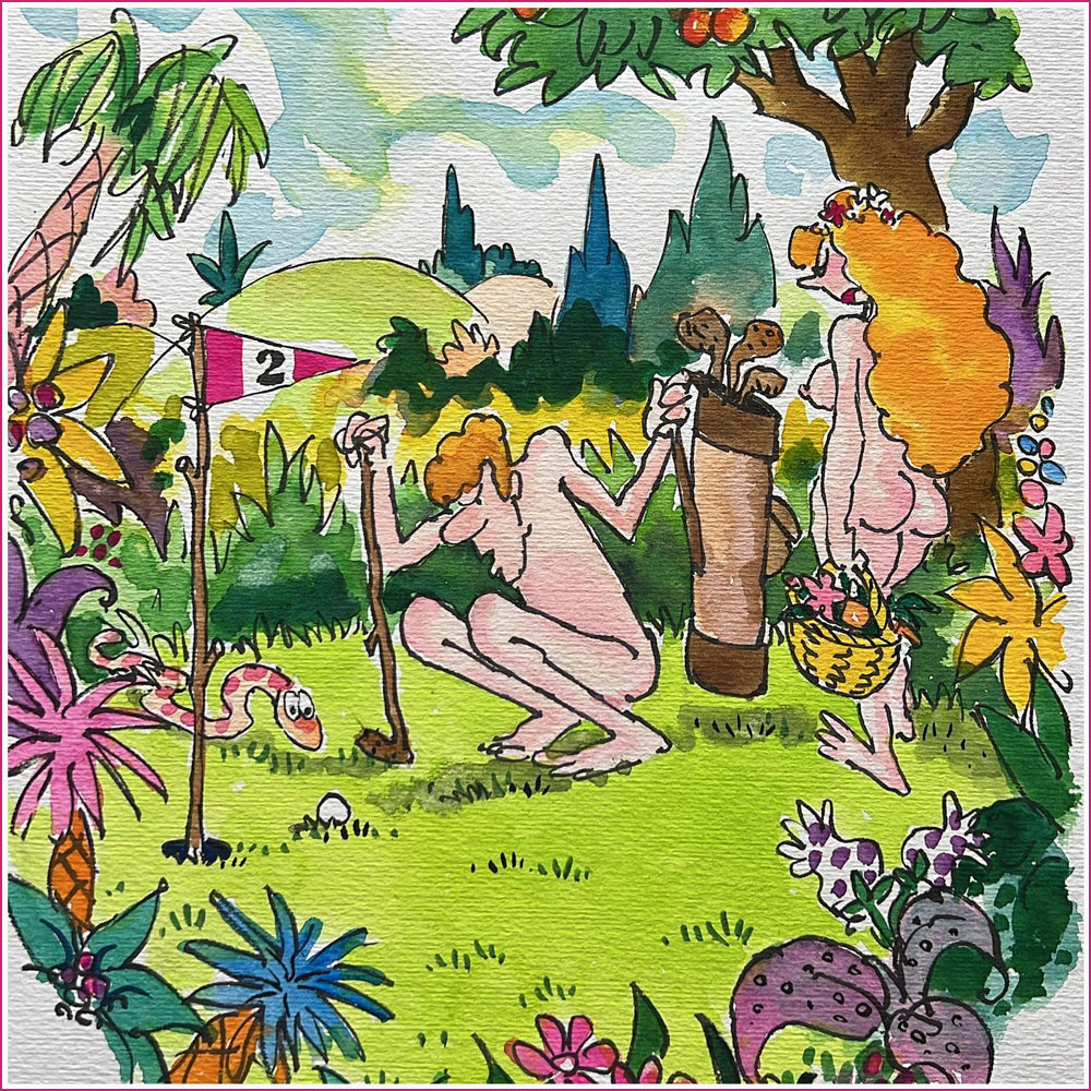
A cartoon used in Fore Play: The Very Best of Playboy’s Classic Golf Humor Paperback (January 1, 1995).
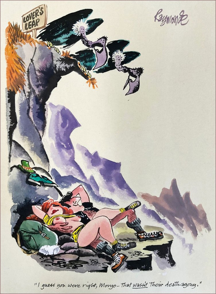
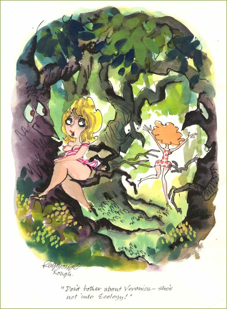
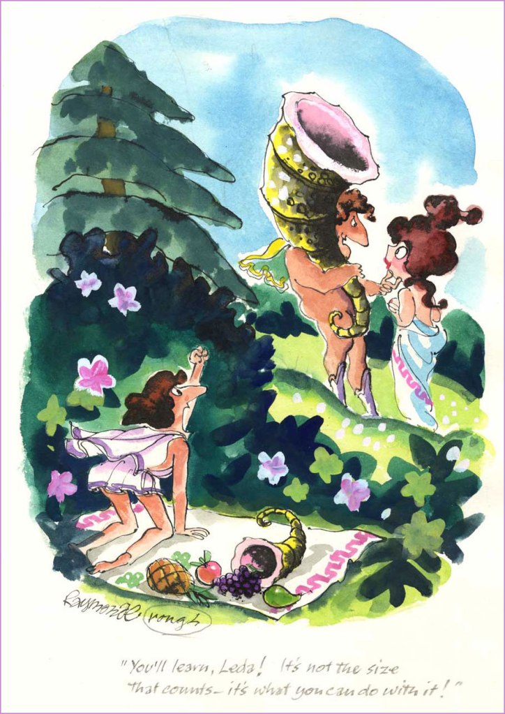
Want to see more? Head over here… and don’t forget to rest your weary head in some spring grass while you’re at it (perhaps with a friendly companion).
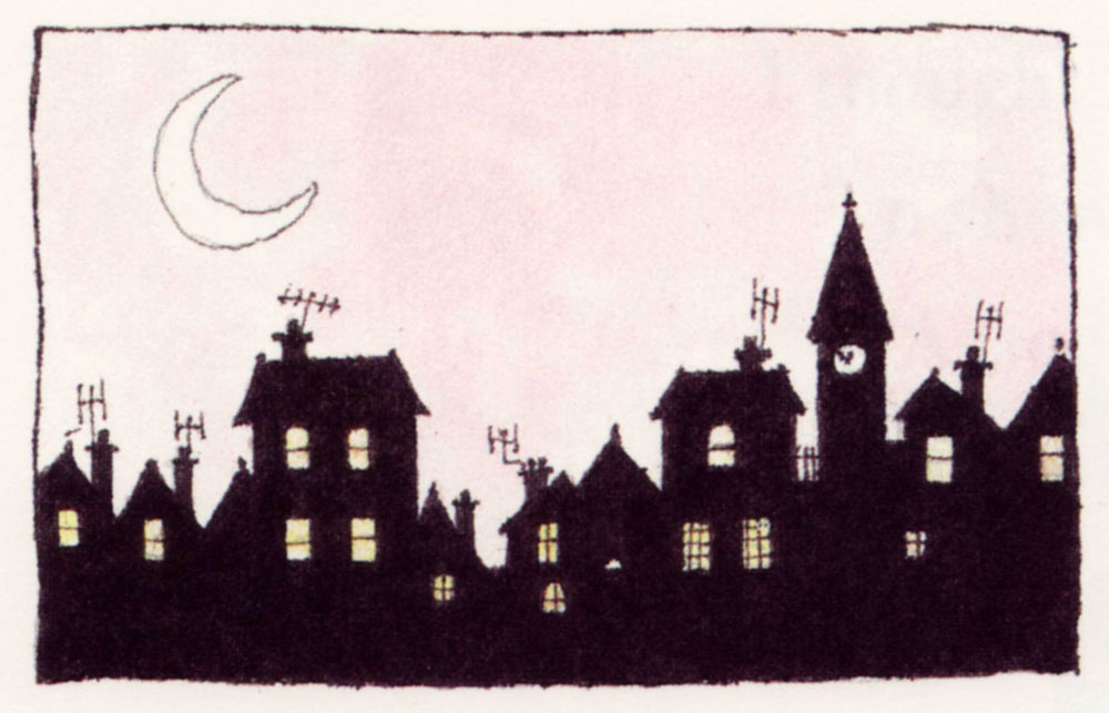
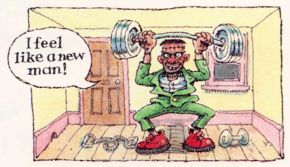
These run the gamut from cheeky to raunchy to creepy, in the classic vein of ghosts for Christmas*. Speaking of Christmas, it may now be over, but the spirit of holiday cheer sure isn’t gone (despite the total absence of snow in these normally snow-covered lands of ours), so let’s have a look!
Some involve all sorts of hivernal mishaps —
The consequences of pre-holiday, er… cheer.
Some of the usual daydreams brought about by possibly too many spirits** —
— and the aforementioned ghosts, somehow especially startling when they’re born under McGill’s pen.
I’ve kept my absolute favourite for last: this revenant is so sad yet grotesque. I’d like to see the faces of people who got mailed this particular card!
~ ds
* As per another lovely tradition, we’ve recently been rewatching Christopher Lee’s Ghost Stories for Christmas. Highly recommended! Some are available on Youtube, like for example Number 13.
** As somebody who attended the Christmas office party this year, I can attest to the funny influence alcohol has on a bunch of normally restrained people when it comes to romantic advances.
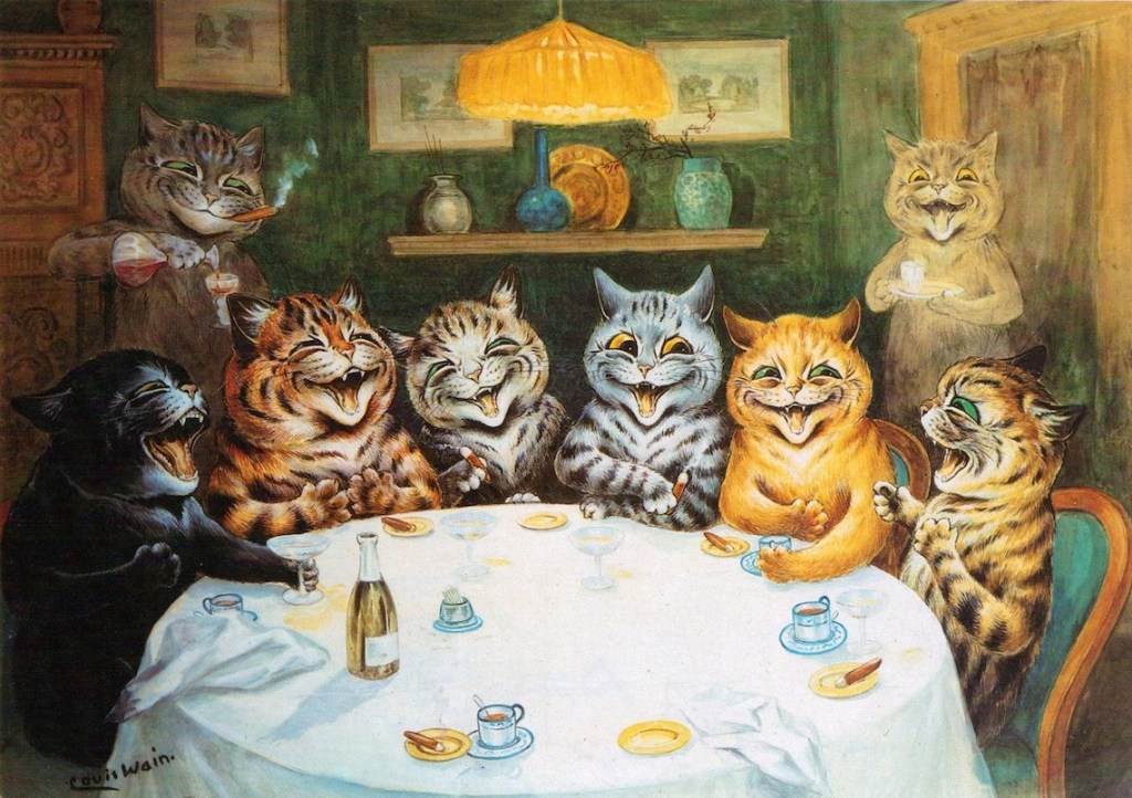
« He made the cat his own. He invented a cat style, a cat society, a whole cat world. British cats that do not look and live like Louis Wain cats are ashamed of themselves.» — H. G Wells
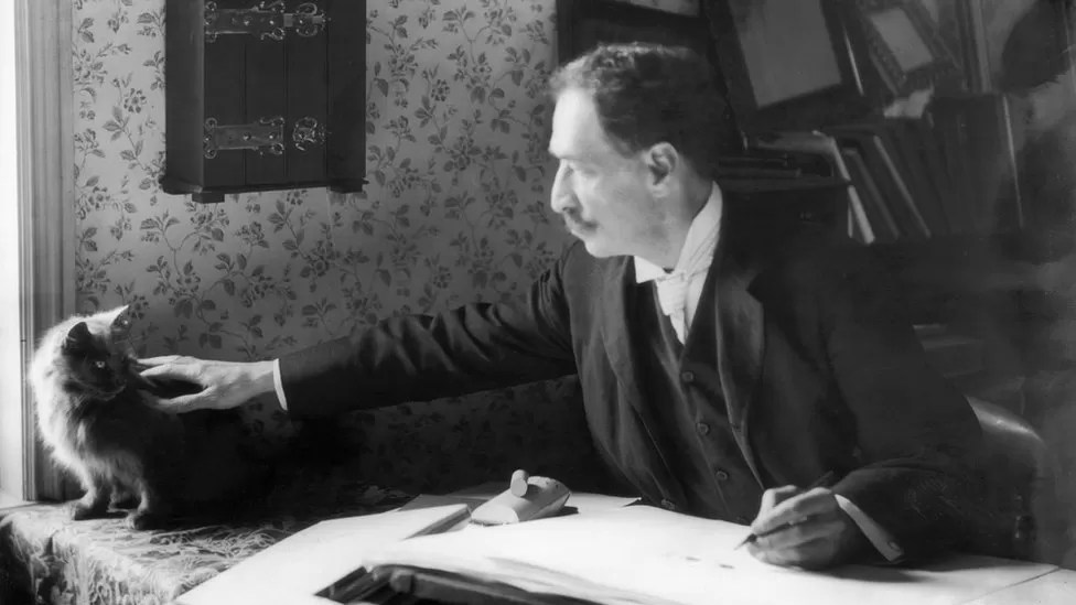
British artist Louis William Wain (1860-1939) had one of those lives that capture one’s imagination* – from a sensitive child born with a facial defect (a cleft lip) and prone to terrifying nightmares, to a youth that would wander around London instead of attending classes, to ultimately a man committed to the pauper ward of a mental asylum. Along the way, he married a lower-class woman ten years his senior despite the scandal this caused, lost her three years later to breast cancer, and produced thousands of cat drawings and paintings.
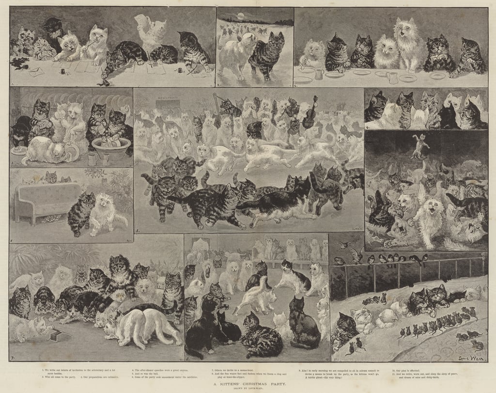
Wain started out as a illustrator of country scenes, houses and estates, livestock at shows, and so on, for publications like Illustrated Sporting, Dramatic News, and The Illustrated London News. His wife’s Emily’s health decline gave Wain the push into feline territory, as he consoled her with caricatures of their cat Peter during her illness. Emily pushed him to try and get this work published, so he showed some drawings to the editor of The Illustrated London News, for which he was freelancing. He was commissioned to paint A Kittens’ Christmas Party, which featured 150 frolicking kittens, took 11 days to finish, and was an instant hit. Emily died soon after in 1887.
Some sources say 200 kittens, I didn’t count them.
Source diverge – according to some, in his grief, Wain threw himself heart and soul into cats and animals in general – he was involved in animal charities and championed a better treatment for animals, including fighting against the routine muzzling of dogs. In another version, he Emily’s death was a ‘merciful release’ and threw himself into work, ended up being considered a ‘cat expert’ just because he drew so many of them (and had distinctly outlandish ideas of their physiology). This can be said of much of Wain’s life, actually – the basic facts are known, but interpretations of the whys and hows vary wildly.
His first cat Peter was black-and-white with a white forehead, and his prototype often appeared in illustrations.
It goes without saying that Wain doubtlessly influenced generations of future artists. These days art with anthropomorphized felines is quite a humdrum sighting, given how much our current culture is obsessed with cats. In this context, it may be hard to recall that several centuries ago people often thought of cats from a practical standpoint, as somewhat filthy-yet-useful vermin-destroyers. This began to change during the Victorian era, and surely Wain’s cats, omnipresent in newspapers and magazines, accelerated this shift in thinking.**
Wain was an immensely prolific artist, but sadly that did not guarantee him a peaceful and wealthy life. When he was 20, his father died, leaving Wain to financially support his mother and sisters, so he had a heavy burden to bear from a young age. By all accounts a modest man, he was quite naïve about financial matters, a walking demonstration of the financially inept artist stereotype***. He often gave his art away, or sold it without retaining copyright, which meant no royalties despite all sorts of merchandise with his cats – postcards, books, toys, biscuit tins, china, et j’en passe. His work was so ubiquitous at some point that publishers did not need to pay him for new material, they could just go on reprinting in perpetuity with nothing but financial gain to themselves while Wain got further into debt.
These cats are obviously cute, but I think what makes them interesting is that Wain would satirize what he saw around him. He might have been an impractical dreamer, but he had a keen eye for human flaws.
He also produced a series of designs for ceramic cats (and some pigs and dogs as well). These sculptures were exhibited in 1914, but did not result in significant sales. A shipment of cats headed for the United States was taken down by a German U-boat torpedo, and that was it – Wain’s financial investment was lost.
« By the time the war broke in 1914, Wain found himself struggling to find a market amid the wartime paper shortage. By the 1920s, he was in poverty. His depression continued, and his mental health deteriorated. Often known to strike out in violent and erratic ways, he was eventually committed to the pauper ward of London’s Springfield Mental Hospital in 1924. »
A lot of articles about him focus on mental issues. Did his wife’s death push him into some form of dementia? Was it just hereditary (one of his sisters was committed when he was 30)? Was he autistic? Was he schizophrenic? The former is a more modern view, whereas the latter theory was proposed by psychiatrist Dr. Walter Maclay in 1939 and stuck when he made a whole case out of it.
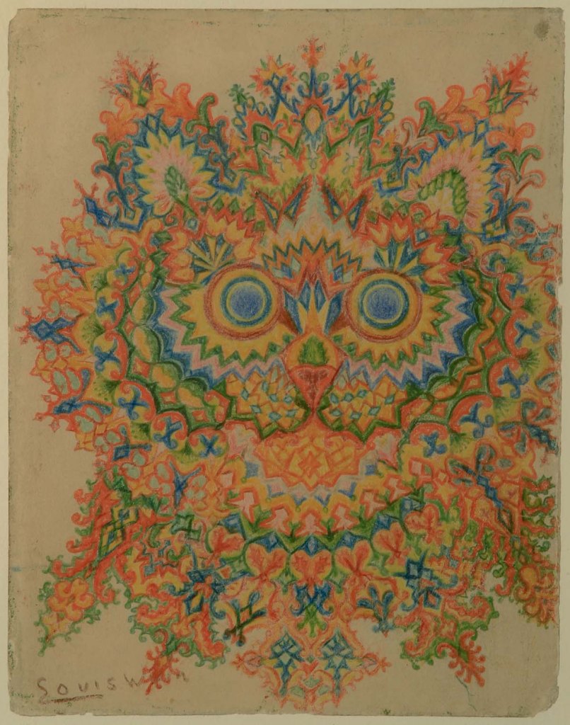
«Maclay collected the work of artists suffering with mental illness and in 1939 he came across eight pictures by Louis Wain in a shop, which he arranged in an assumed chronological order to demonstrate the progression of the schizophrenic mind. His theory was that as the sequence of cat illustrations became more fragmented, so too had the artist’s mental state deteriorated. […] The series of drawings, now known as ‘Kaleidoscope Cats’, became a popular visual example of the schizophrenic mind. Long gone was the Edwardian interpretation of Wain’s work as ‘charming’ and ‘humorous’. Instead, his art was often presented as ‘psychotic’ or ‘disturbed’, both words used in a major exhibition at the Victoria & Albert Museum in 1972.» [source]
Perhaps it’s a modern perspective, but what on earth is ‘psychotic’ about this image?His later work, colourful and somewhat surreal, has been identified by some as an important precursor to psychedelic art.
I think it’s quite depressing to think of Louis Wain first and foremost as an interesting case of mental illness. While it’s an important topic to address, it’s hard not to interpret this emphasis as a side-effect of the human tendency to bask in someone else’s tragedy – we’re avid of gory details and stories that support the general consensus that artists are tortured souls fighting inner demons. Perhaps that’s what reassures ‘normal’ people – we may not be brilliant or creative, but at least we have a healthy psyche! Except that we don’t, but that’s a conversation for another day.
«It is also highly possible that his experimentation in style was inspired by the family’s background in textile design. […] Indeed, these later kaleidoscopic cat patterns were often constructed around a clear grid system, revealing them as careful compositions rather than the product of impulsiveness coming from someone who is gradually losing his perceptive skills. Additionally, some of Wain’s later work was figurative and proves that he continued to be an accomplished and coherent artist whilst in a mental health care setting.» [source]
In 1930, Wain was transferred to Napsbury, which had a colony of cats, and stayed there fairly peacefully until his death in 1939. I hope he’s surrounded by friendly cats, wherever he may be now.
~ ds
* As a matter of fact, a movie about his life, The Electrical Life of Louis, was released in 2021 .
** I am obviously not saying that Wain introduced anthropomorphism to art, as that has been around since the days of early human history, but he did make a large dent in the public’s perception of cats.
*** Such skills have to be taught, as artistic temperament need not necessarily go hand-in-hand the inability to handle everyday matters such as finance, but add that to the list of ‘things we should do as a society’.
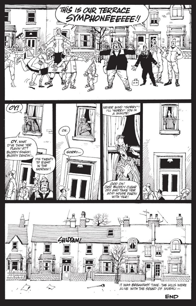
Something about the current spring weather, with its contrast between the warm wind perfumed with chlorophyll and the trash liberated from its snowy prison and strewn about artistically, reminded me of 6-page story Song of the Terraces. Originally published in A1 no. 4 (1990, Atomeka Press), it is officially part of Alan Moore and Steve Parkhouse’s Bojeffries Saga, and as such was also collected in the The Complete Bojeffries Saga published in 1992 by Tundra Press (and reissued in a new collection in 2013 by Top Shelf Productions).
I don’t know if it’s a universal rule, but it seems that people either love to read plays, or hate the very idea. I belong to the former category, and have happily spent my young years on a steady diet of plays. Sometimes these included musical interludes, and I was not in the slightest bit perturbed by being given basically lyrics with some details about the mood of the singers, but no melody.
Perhaps that is part of why I am so fond of Song of the Terraces, or perhaps it’s the familiarity of this scene – its row of lovingly depicted council houses (Parkhouse has a really lovely, fluid style) and its hodgepodge of denizens in various states of spiritual and physical dishevelment are part and parcel of British shows I’ve watched and loved. Be as it may, I find the following tremendously endearing.
This interlude features two characters from the mighty Bojeffries family line – Raoul (the werewolf) and powerful but lonely Ginda – but otherwise is not particularly linked to any storyline.
When you move house, as I did a few months ago, some items inevitably get buried while others get kicked loose. For instance, several decades ago, I had picked up (at a dollar fifty apiece, apparently) a tidy little pile of Punch issues from 1946 and 1955. Punch (1841-2022) of course, boasted at the time what was likely the world’s finest roster of cartoonists. Not only were the cartoons splendid — and now I’m old enough to actually get most of the jokes — but even the ads, often produced in-house, were exquisitely illustrated. And so, instead of the cartoons (you can still scratch that itch with our recent Rowland Emett’s Ramshackle Poesy in Motion, for instance), I’m proposing a sampling of adverts from my pile o’ Punches.
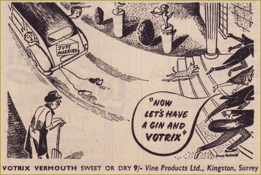
Remember the days before built-in obsolescence? Me neither. I note with pleasure that the grand old Scottish firm of Saxone still stands. For more Anton, check out Anton’s Spivs and Scoundrels, Baronesses and Beezers.From the June 3, 1946 edition of Punch, the Summer Number. This Votrix stuff wasn’t very good, it would appear. « As the second world war started to take hold, the export of vermouth from Italy and France become non-existent. Given the devastation left behind, it was slow to start back up again once the conflict was over. In England Vine Products based in Kingston, Surrey (whom had been making British copies of Sherry and Port for some years) launched Votrix Vermouth advertising it as “Indistinguishable” from pre-war Vermouths from Europe. They claimed it was made with the finest grape juice blended with genuine vermouth herbs. There was a lot of controversy and even several court cases as to how this grape juice was made (and if it was actually wine made from raisins rather than grapes). It was never any real challenge to the vermouths from Italy and France. » [ source ]
While Rothman still exists in name, the company’s true lifespan was 1890-1999. Mergers and acquisitions, that same old story…
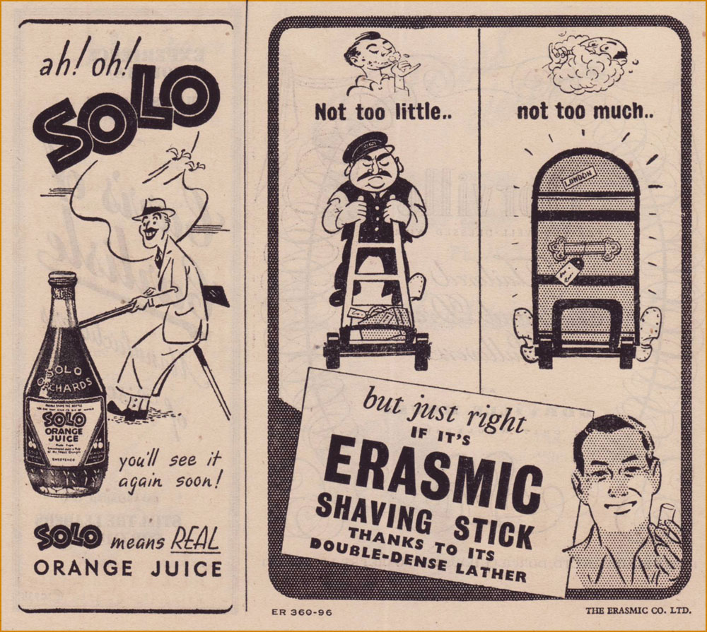
Solo is gone. « Pablo Utrera owned Solo Orchards, an orange juice business. In 1960 Idris Ltd., the soft drinks firm, acquired the whole of the issued share capital of Solo Orchards (“A small but well-known company making quality products“) for a consideration of 143,500 ord. 5s. shares in the company, worth £130,000. By April 1962 Idris had disposed of the Totteridge (Barnet, north London) premises of Solo Orchards, moving production to other factories. » [ source ]
Erasmic (founded in 1869), on the other hand, still operates, its products widely available.
An interesting soft sell approach to selling brakes! Established in 1926, Lockheed merged with Martin Marietta in 1995 to constitute Lockheed Martin.
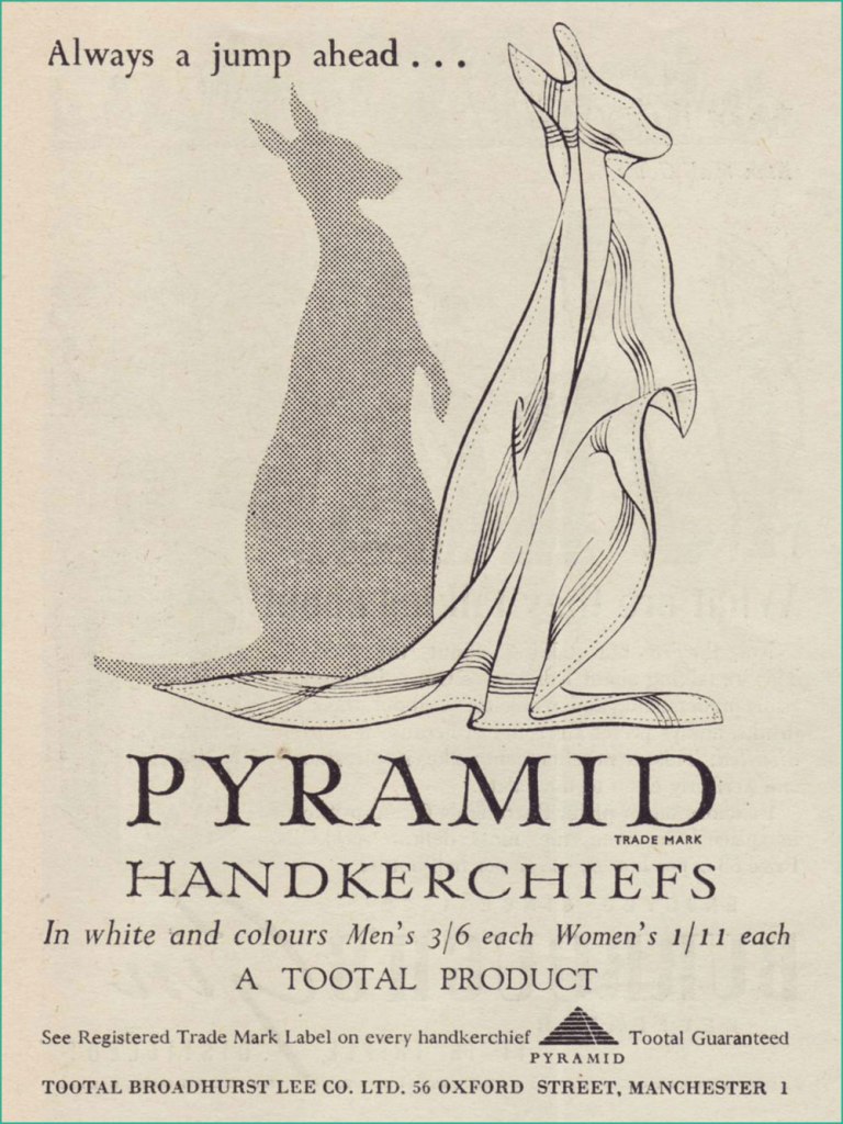
Despite the advent of disposable tissues, Pyramid handkerchiefs appear to have survived. I believe they were named so because they were made from Egyptian cotton. That said, what a clever ad… as a product, hankies hardly strike me as a boundless fount of exciting visual ideas. Get yours here!Having toiled in advertising illustration for some years, I can tell you that the privilege of signing one’s name in an advert is a rarely-accorded one. Unless, of course, your famous name was part of the pitch. This one’s from the pen of Bruce Angrave (1912 – 1983). From the Nov. 28, 1951 issue. Read about the history of the International Wool Secretariat.
Guinness for Strength, went the famous slogan. But was there anything to the Irish brewer’s bold claim? CNN looked into the question. Here, the artwork was provided by John Lobban, who went on to be “one of Britain’s foremost numismatic artists”…. and Paddington Bear illustrators.
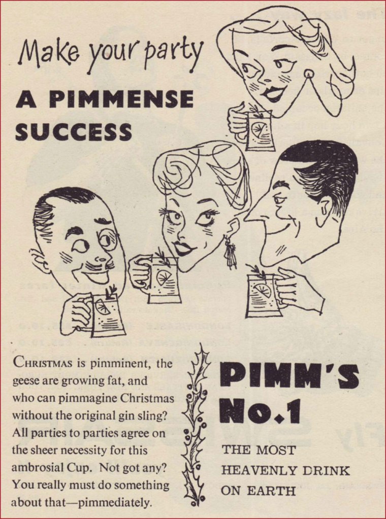
« Every day we left the house in his Phantom V, always with a big pitcher of Pimm’s close at hand. Then we went into this little studio and Richard took his place at the mic with a tall stool to his left and the Pimm’s on the stool. Then we started recording, for maybe three or four hours or until the Pimm’s was gone. He did like to lubricate his voice chords but that was as far as it went – he could have never got through that music in a drunken state. » A decade or so ago, upon reading this quote from songsmith Jimmy Webb about his work with Irish rapscallion Richard Harris, I wondered just what this Pimm’s might be. It was a bit hard to find at the time, and kind of costly for a matter of idle curiosity, but I’m happy to report that it’s delicious.
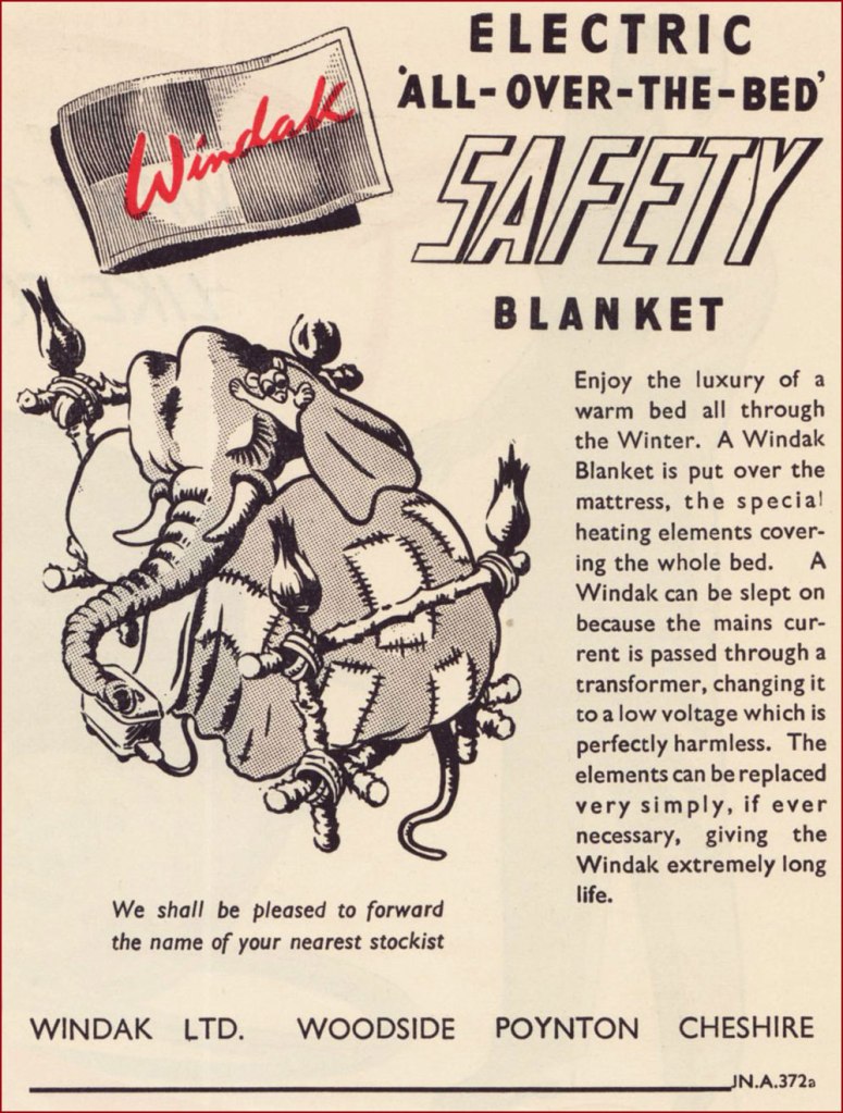
Windak was an offshoot of Baxter Woodhouse Taylor (still around!). Here’s an intriguing bit of trivia: « The Cold-War era of High Altitude flying led there to be an array of different flying suits and helmets trialled for this purpose. At the time, nobody really knew the effects of flying at high altitudes, or what the adverse affects of a sudden cabin depressurisation could be (such as the fear of canopy blowing off). To protect the aircrew against this perceived danger, initial efforts were placed on developing fully enclosed pressure suits. The life span of the development full pressure suits was short lived, as it was soon realised that partial pressure helmets and a pressure jerkin, and eventually just a demand oxygen mask and pressure jerkin was sufficient to “get you down” safely after a cabin depressurisation event. Of the array of full pressure suits tried, this series, known collectively as the “Windak” suit and helmet has become the most well known, due to many television and film appearances in science-fiction works, as space suits. “Windak” was a trade name used by Baxter Woodhouse Taylor, and had been in use since the second world war on items of heated flying clothing. However, people seem to solely refer to this series of full pressure suits as “The Windak Suit“, even though the series contains a few variants. » [ source ]
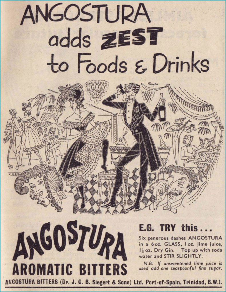
Angostura Bitters remain an essential tool in the mixologist’s attirail.
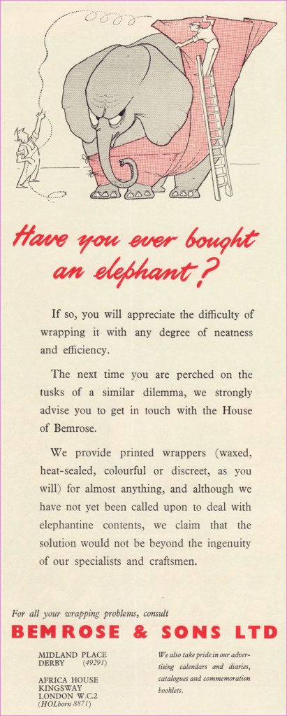
Despite several changes in name and vocation over the years, the firm of Bemrose & Sons abides in some fashion to this day. A perfect example of adapting to survive.
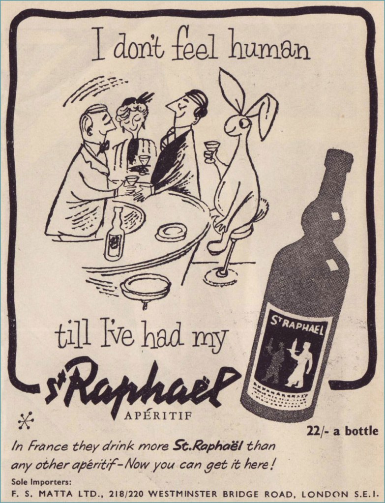
A pair of examples from a series of themed ads. The first saw print in the Aug. 10, 1955 issue, the second in the Sept. 14 one. They didn’t go much for repetition, did they? First concocted in 1830, St Raphaël remains a highly popular apéro. Read its history here. I’m getting a sense that in the liquor business, if you’re hawking a decent quality product, you’re in for the long haul, barring Edgar Bronfman Jr.-level greed and incompetence. But in the business world, that’s as rare as rocking-horse poo, right?
«Babies of course are not human — they are animals, and have a very ancient and ramified culture, as cats have, and fishes, and even snakes: the same in kind as these, but much more complicated and vivid, since babies are, after all, one of the most developed species of the lower vertebrates. » — Richard Hughes
I am fairly neutral about children, and prefer to stay away from them for the most part (although there are some pleasant exceptions to this rule). However, I enthusiastically dig through children’s books when given half a chance, and greatly enjoy comics about ankle biters of the ‘wise far beyond their years’ variety. Some authors’ worlds are so compelling that one wishes to be teleported into them. Who wouldn’t love to hang out with Sugar and Spike, or Cul de Sac’s Alice, or Daniel Pinkwater’s Robert Nifkin?
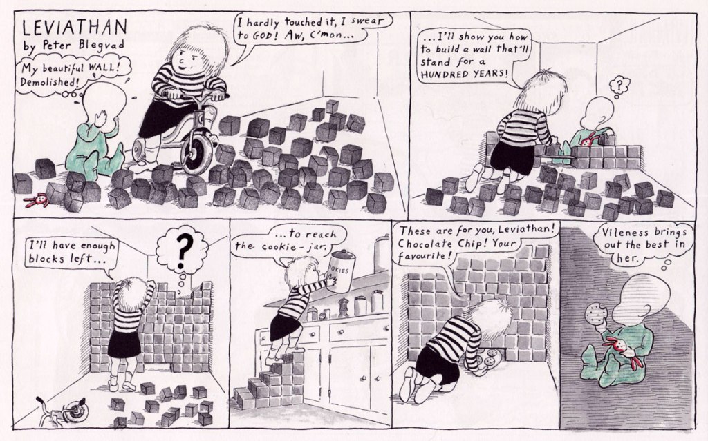
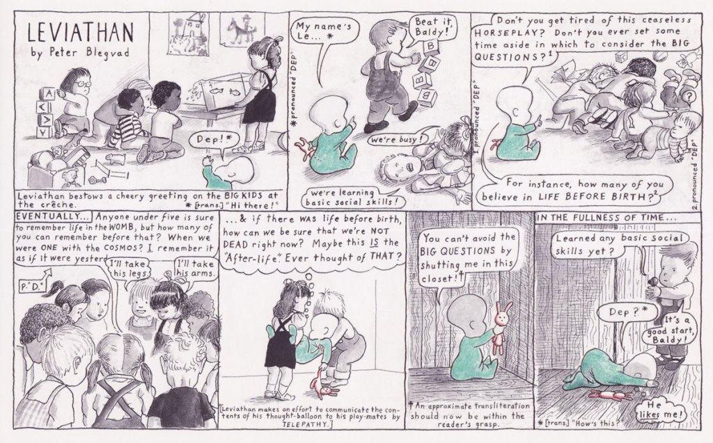
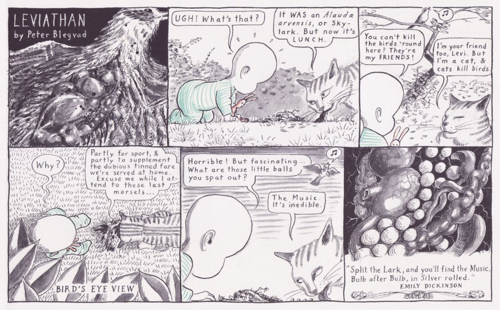
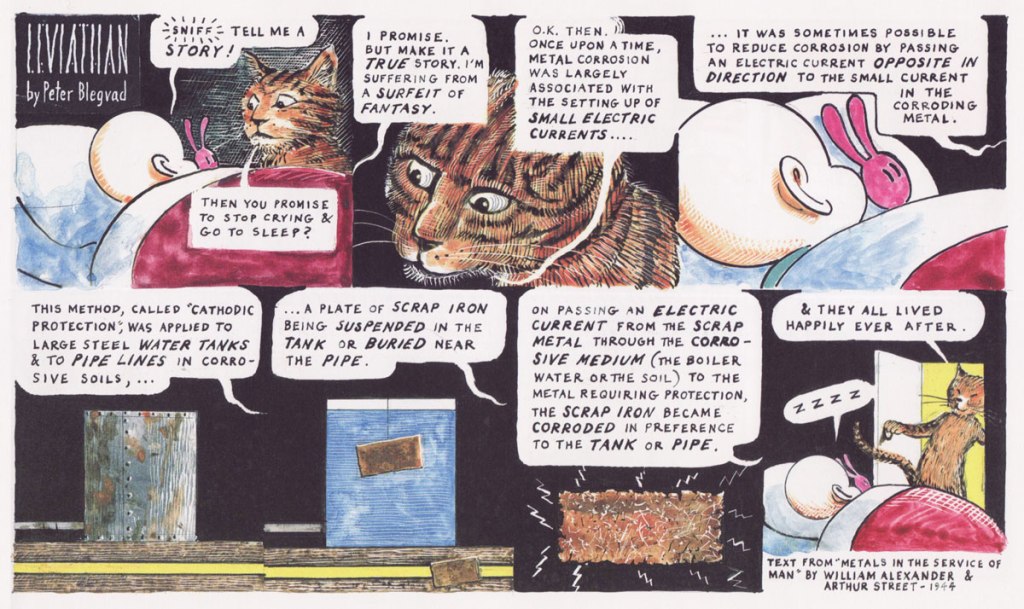
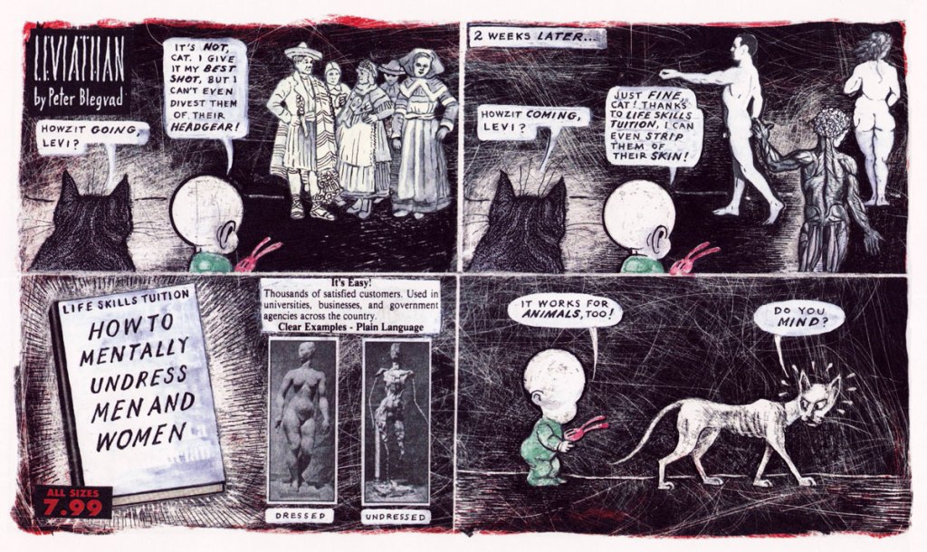
Though I have no such desire to rub elbows with the faceless, introspective Leviathan, his perambulations are great fun to watch. As per his name, he’s more than a little bit of a megalomaniac – as one can argue that all children are. Bred from a long line of ‘more or less faceless neotenic grotesques‘, such as Crockett Johnson’s Barnaby or Walter Berndt’s Smitty, Levi is an infant trying to make sense of the world around him through philosophical musings, an occasional break through the fourth wall, and conversations with his feline companion, Cat.
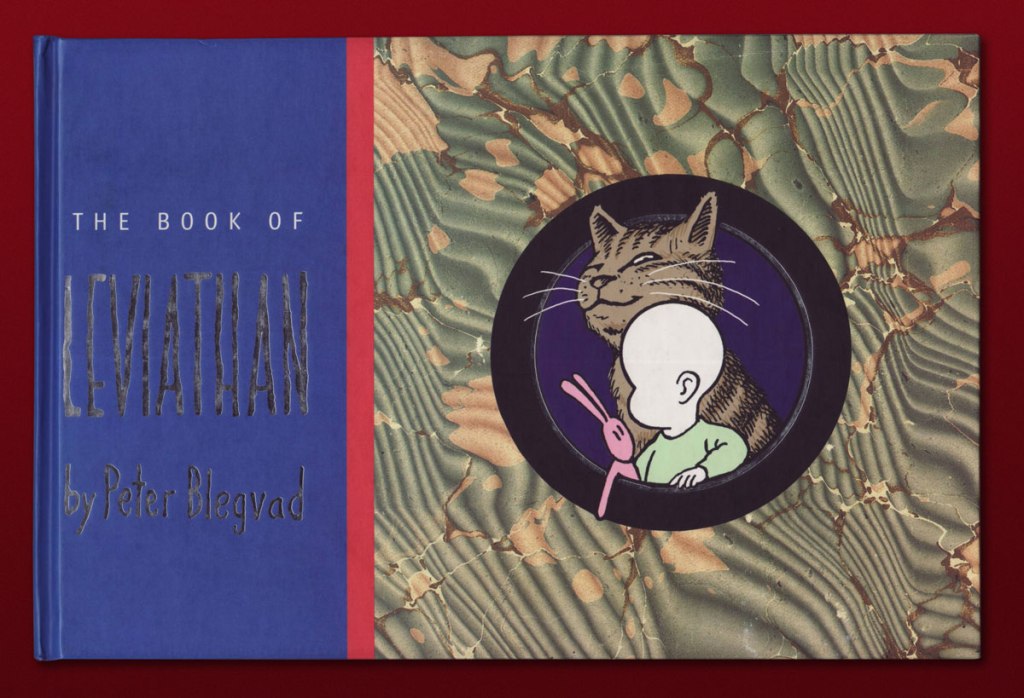
His patriarch is American Peter Blegvad, son of Danish illustrator Erik Blegvad (which accounts for the hard-to-pronounce family name that I tend to misspell as ‘Blevgrad’, since ‘grad’ is a common suffix for a city in Russian*), more known for his musical career than remembered for his cartooning one. Leviathan was published in the Sunday section of British newspaper The Independent** from 1992 to 1999, and some of the strips were collected in The Book of Leviathan, issued in 2000 by The Overlook Press. The latter is how I came across this strip, in the apartment of a friend kind enough to give me his copy when he saw how absorbed I was.
Levi’s big sister Rebecca is a habitual tyrant, though not without a certain charm.
In case you’re wondering re: snow vocabulary, some have disputed this claim as false and stemming from a misunderstanding of Eskimo-Aleut languages, which are agglutinative, and can form new words by combining other words. Here’s a quick article if you’re curious about the specifics.
Like all great observers of children’s rituals, Blegvad clearly had some children around to inspire him.
Q: How did you get the idea of naming a tiny baby Leviathan?
A: From my own kids: they’re both, you bring them home and they’re bigger than anything else in your life.
Q: Why did you switch from Levi’s parents to the Cat?
A: The Cat was easier to draw.
Leviathan seems to invite a hate-or-love kind of response from readers; as Rafi Zabor notes in the introduction to the collection, ‘I have met a few intelligent, literate, artistically sophisticated people who just don’t get it, and their non-response to what is obviously just for starters a classic of its kind, assuming it has a kind, has always puzzled me. ‘ As somebody who belongs in neither camp, I would suggest that this strip sometimes has its head up it arse, and goes so far into self-indulgent metaphysics that it loses its anchor for the sake of willful obfuscation – and sometimes it’s brilliant and very funny. As if to demonstrate the former, Zabor finishes his introduction with ‘Words fail. Times change. Cats meow. Leviathan swims in its native deep, glistening through serial sea-green waters, sending off spectra of intelligible light as it steers with ribbed and radiant fins.’ Nevermind such dubious metaphors – I posit that it’s Leviathan’s playfulness, juggling as it does quotes from long-dead philosophers, questionable puns and surreal vignettes flavoured with Freudio-biblical mythology, is worth the occasional muddle through a high-concept strip that didn’t quite pan out.
~ ds
* I keep misspelling his name as ‘Blevgad’, which would be very unmelodic to Russian ears, as ‘blev‘ means ‘puke’ and ‘gad‘ is sort of like ‘bastard’. I did in fact misspell it several times in this very blog post, until co-admin RG set me straight. Very embarrassing.
** Was this because Leviathan was too erudite and weird for American audiences? Blegvad was born in NYC in 1951, but was raised in England, spent some years in Germany, then returned to NYC in 1977. Given his proclivity for quoting British authors, I think his sensibilities lie more with Albion.