While I’m a late-blooming romance comics fan — the flamboyant Enrique Nieto drew me in, and I stuck around — I’m strictly a Charlton man: with precious few exceptions, DC’s take on the genre is histrionic and insincere. These were the books no-one at National wanted to be stuck editing. Also, and it’s always worth noting: wayyyy too much Vince Colletta. As for Marvel: Stanley Lieber was, not to put too fine a point on it, relentlessly sexist… ’nuff said?**
It’s not for nothing that Charlton was tops in romance, publishing a dozen or so titles at a time when the Big Two put forth a third of that number at most… with plenty of reprints tossed into the mix. Obviously, given Charlton’s tremendous romance output, it wasn’t all gold… but nuggets turned up with sufficient frequency to justify one’s continued interest.
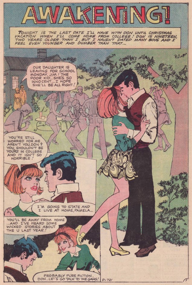
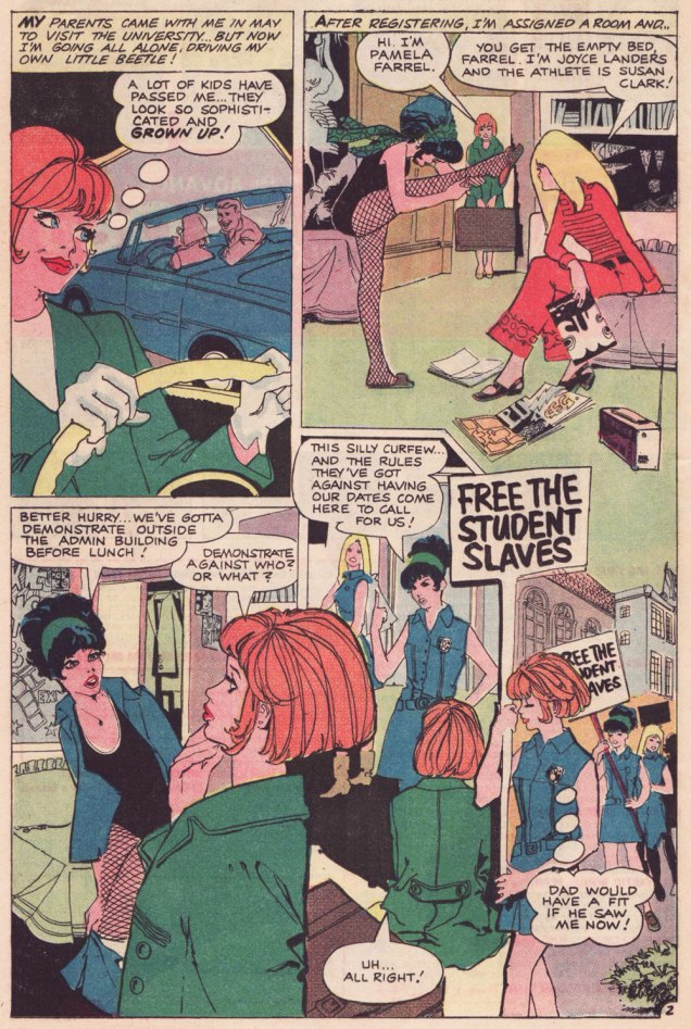
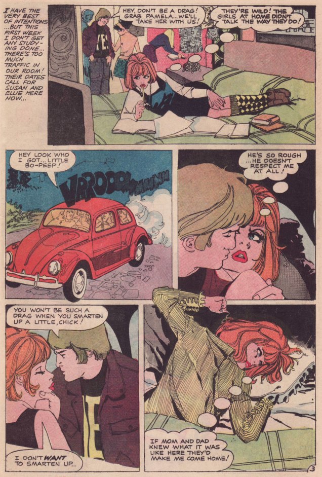
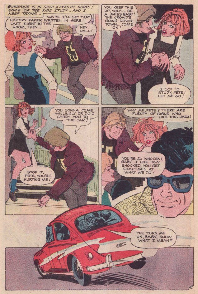
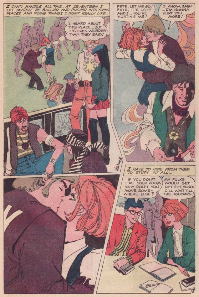
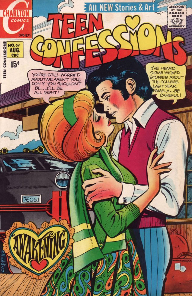
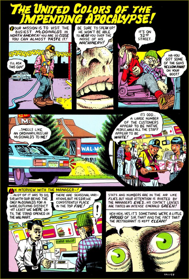
Let us then flash back to 1971, and a nugget from Teen Confessions no. 69 (Aug. 1971, Charlton). Almost certainly written by Joe Gill and definitely pencilled and inked by yet another talented Argentine, Nestor Olivera.***
.
.
Having the bully/sexual predator wear a big YES on his shirt — though never quite show it — is a cleverly appropriate touch on the part of the artist.
.
A typical Joe Gill touch: a character may be introduced, speak one line, advance the story, reinforce its logic… and never reappear. Take a bow, Hugo.Max makes the most of his chivalrous four-panel rôle; in a refreshing twist, there are no strings attached to his gallant turn.
.
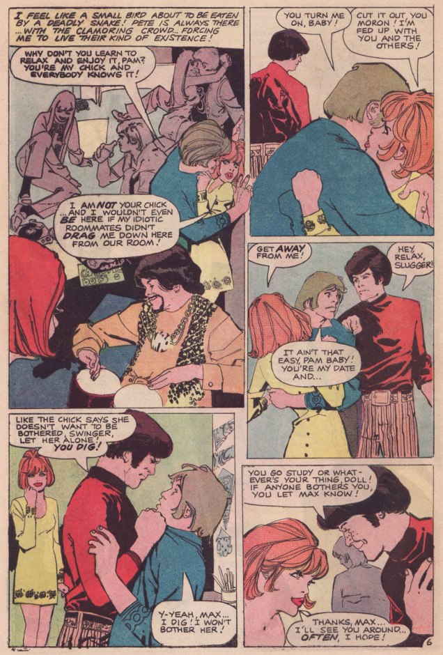
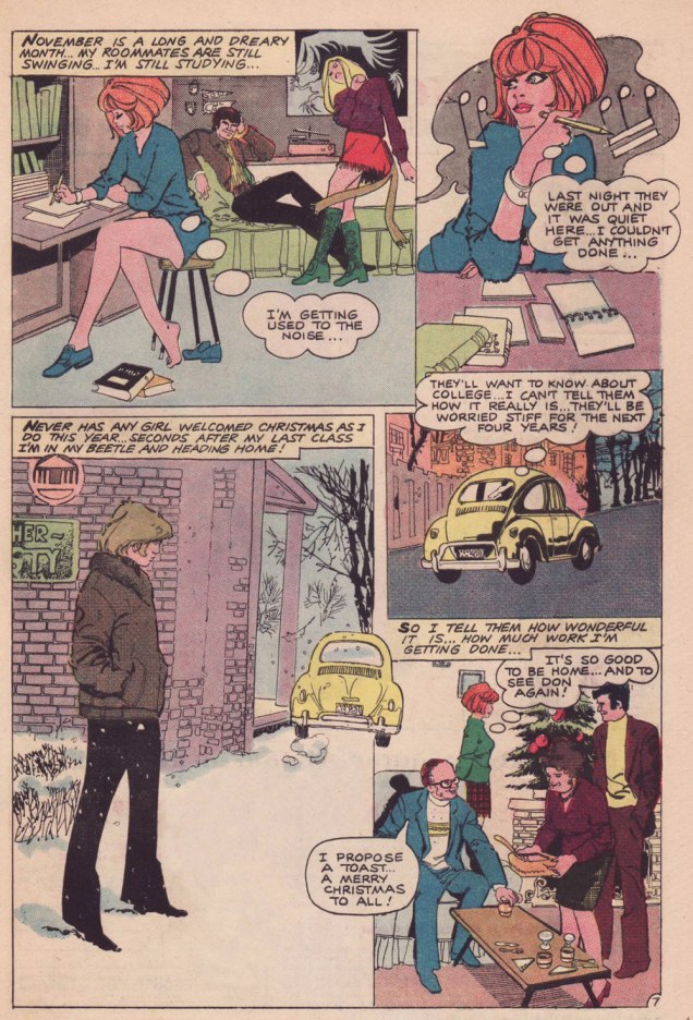
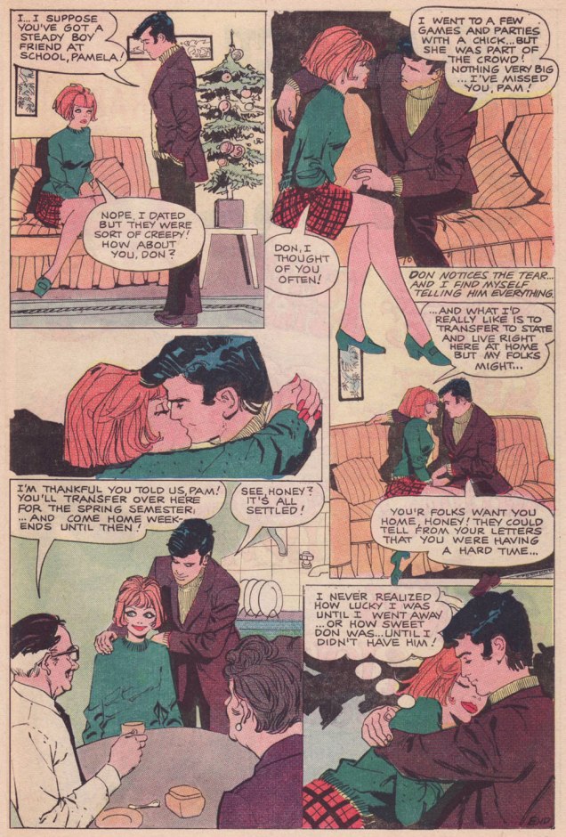
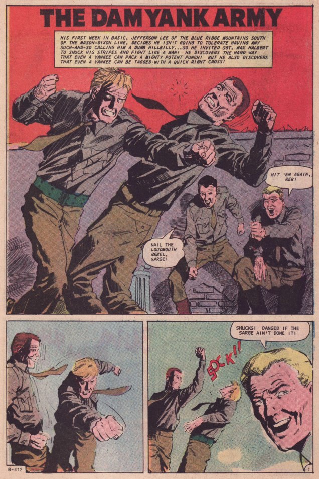
Parents who aren’t utter dimwits also frequently feature in Joe Gill’s romances. Awakening was the cover story. While former Colletta assistant Art Capello is credited — and he signed it, too — I strongly suspect the heavy hand of editor Sal Gentile in the layout and finishes. Why? Because Gentile’s leading men always tended to resemble actor George Chakiris.Compare and contrast: other than romance, the versatile Olivera demonstrated his chops in Charlton’s war titles. This is the opener of The Dam Yank Army, another Joe Gill yarn, cover-featured in Fightin’ Army no. 74 (June 1967; Dick Giordano, editor).
-RG
*By all means read the full interview for some insight (beware!) into Kanigher’s thinking. He continually caroms from insight to delusion, from sagacity to madness… just like his work, one might say.
**Re: Marvel… I may someday devote a post to the question of why early 70s Marvel romance’s dream man was presented as a dead ringer to the, er… controversial Jim Shooter. Probably mere coincidence.
***By ‘talented Argentine’ (Spanish-Argentine, technically), I refer to none other than José Luis García-López. Also from ’71, and in a totally different style, check out his Emancipated Amanda.
« Every Chick tract is a proven soul winner » — Jack Thomas Chick (1924-2016)
Before we begin, one must advance past the primordial question: « Who the 𖦹!!!**! is Jack T. Chick? » This simple query has been answered at length elsewhere, so I refer you to the heavy lifting done by others, notably this comprehensive obituary, or Joe McCulloch’s eye-opening article, Life Is Worth Living, both from the pages of The Comics Journal.
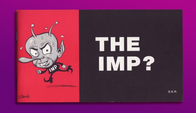
Then, of course, since we are ever standing on the shoulders of giants, there’s Daniel Raeburn‘s likely definitive Chick monograph, published in 1998 and today commanding usurious prices on eBay. Ah, but the author, as gracious as he is erudite, lets visitors to his website download The Imp absolutely free of charge. Go for it!
This is The Imp no. 2 (1998), bearing a lovely illustration by Daniel Clowes, who was the subject of the previous — and first — issue.
In 2016, upon Chick’s shuffling off this mortal coil, Raeburn was interviewed on the CBC’s As It Happens show*. He was asked « Now that he has died, what would you say is his legacy? » [ full interview here ]
Raeburn: « I think he did influence our culture. He influenced the counter-culture. I think particularly in the world of underground comics, I think he was the ultimate outsider. He was the most underground of all the underground cartoonists and I think there is a certain amount of grudging respect for him in that regard. He got his work out there with no help from anybody and he did it his way. He had a real DIY aesthetic. He’s sort of like a punk rocker except that he’s not a punk rocker. He was a Christian. But he did embody the punk, do-it-yourself ethos and I think that will be his lasting legacy — that and camp. I mean his comics have long-lasting camp value. They are unintentionally hilarious. »
And it is in this roundabout way that we arrive at today’s subject. Not Chick tracts per se, but a gloriously blasphemous parody thereof.
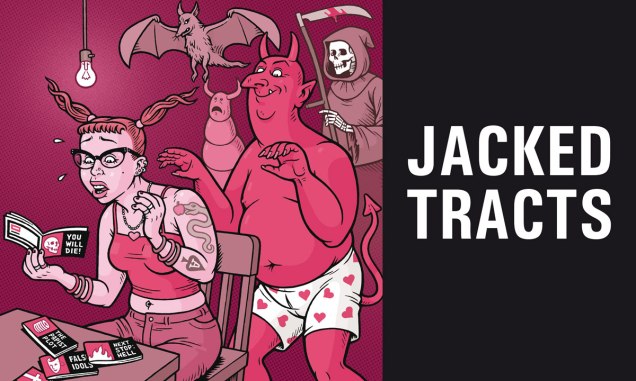
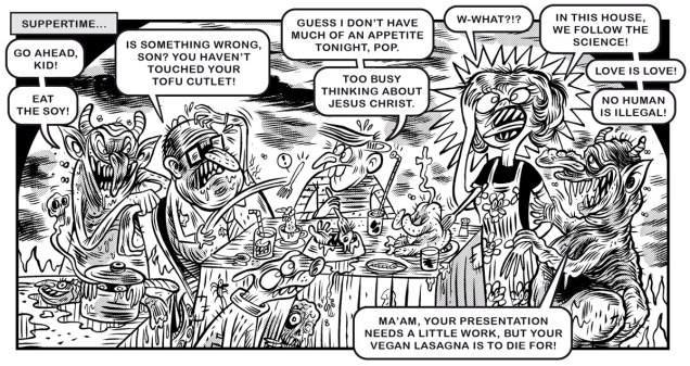
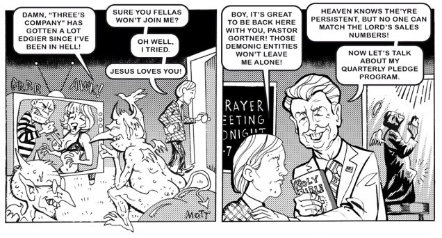
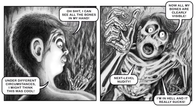
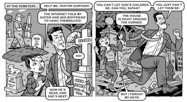
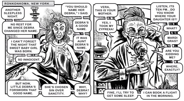
Jacked Tracts (2026) isn’t the first Chick lampoon, not by any means, but it certainly earns the distinction of being the most ambitious. Says writer-editor-illustrator-conductor Danny Hellman, as to the book’s raison d’être and modus operandi: « We took six notorious Christian comic tracts that traumatized us as children, and asked seventy-four of the world’s most depraved cartoonists to re-interpret the art, page-by-page. New text was then added to the art by this book’s editor. »
Hellman’s tantalising cover. First off, two pages from Sleepless in Sheol, a détournement of A Demon’s Nightmare; Art by Ivan Manuppelli, aka Hurricane Ivan. And if this leaves you with a hankering for vegan lasagna, here’s a mouth-watering recipe!Art by Cliff Mott.
The following two pages hail from Fear the Memes, a reinterpretation of the No Fear tract.
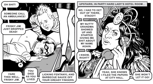
Next up, a pair of samples from Party Hard Lady, a reimagining of Party Girl.
Art by… well, moi. For the character of the sanctimonious granny, I kinda envisioned Jack Kirby’s wonderful Agatha Harkness, as she appeared — and only then — in an early favourite comic book of mine, Fantastic Four no. 94 (Jan. 1970, Marvel). Art by Soph Franz.
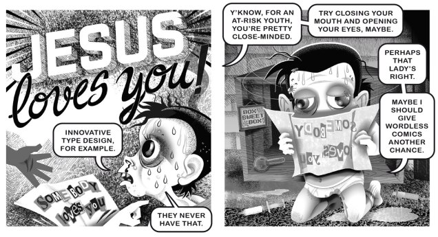
We follow up with two from a retelling of one of the most notorious of Chick’s contes cruels, Somebody Loves Me, rejigged to fine effect into Nobody Loves a Chatty Brat.
Art by Gideon Kendall. Unlike some people, Danny uses real biblical quotes. Ironically, it’s been claimed, and not without merit, that actually reading the Bible may lead straight to atheism. Art by Dyna Moe.
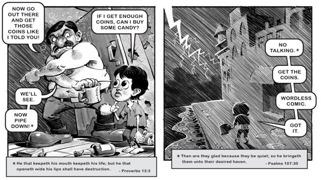
Then it’s on to the evils of drugs, with two excerpts from Trust the Pusher in the Sky, a retooling of Trust Me.
And finally, one from Mr Victor Cayro‘s solo tour de force, Boo-Boos for Beelzebub, riffing exuberantly on Chick’s Boo.
If you’ve got the inclination, feel free to delve into the rabbit hole of the buff Jesus phenomenon.
As you can surely imagine, gathering nearly seventy-five loose cannon cartoonists and shepherding this rabid flock through a project of this magnitude took — never mind the sweat and aggravation and toil — quite some time. Looking at my files, my part in it was drawn in early March, 2021… and the finished book reached my hands just last month.
Just today, while researching this piece, I came upon this quote: « … as we’re less than a year out from Itch.io’s de-listing, re-listing, and continued demonetisation of adult works affecting a number of comics creators seeking to sell their wares online, due to pressure from payment processors and conservative activist groups, and now we’re seeing the same playbook being used on Kickstarter, which is strictly prohibiting “adult-only or sexually explicit content” due to (all together now) pressure from payment processor Stripe, which itself is not exactly free from controversy. » [source] … which in turn led me to ponder the bumpy road to publication that Jacked Tracts had. So I asked Danny.
DH: « My initial plan with JACKED TRACTS had been to self-publish, which I always find a tough slog, especially when it comes to distribution. I approached the owner of a small press to whose books I’d contributed, and asked if he’d be interested in sub-distributing JACKED TRACTS upon publication. He responded by saying he was much more interested in publishing the book outright under his imprint. After a bit of thought, I decided to partner with him. Some months later, the publisher tearfully told me he had to renege on our agreement, as other artists whose work he published had expressed objections to being in the same imprint with me. Presumably these folks objected to my heterodox politics, although with these sorts of whispering campaigns, it can be hard to know what they’re actually about. I then fell back on my original plan: self-publishing and crowdfunding. »
Danny reportedly has copies available. Just follow this magical link to doom and perdition. What have you — immortal soul aside — got to lose?
-RG
*And speaking of Canada: some Americans have mocked my fair country for banning Chick tracts for being hate speech. Dan Raeburn evidently agrees with that characterisation, stating that « … they are nothing but sanctified hate literature. » There was, for instance, this disingenuous hatchet piece in The Washington Post (remember the WP?)
It’s hard to miss the irony of this jingoistic finger-wagging from the country that repealed its Fairness Doctrine. How’s that worked out for you, guys?
“In Canada,” said Ron Cohen, chairman of the Canadian Broadcast Standards Council, “we respect free speech but we don’t worship it. It is one thing we value, but not the only thing.“
« Remember you belong to nature, not it to you » — Grey Owl
Why it took me this long to spotlight David Collier, who’s been one of my favourite cartoonists for decades, is, even to myself, a bit of a puzzle. Is it perhaps because his work already receives plenty of attention – chiefly in English Canada (what we in Québec mockingly call ROC — Rest of Canada)? Could be, but I’m ready now.
While Collier’s rough-hewn, scratchy line won’t get him confused with, say, Tom Palmer or Brian Bolland in this particular plane of reality, it’s absolutely perfect for his writing and persona. He’s a riveting storyteller who catches — and properly interprets — details any more casual observer would miss, yet he’s frequently unable to read the room. He’s a formidable writer, but his spelling* is… perhaps lamentable is too strong a word, at least for his English. He is, however, utterly impervious to French**.
This was the first Collier piece that really grabbed me. From The Comics Journal no. 159 (May 1993, Fantagraphics).
.
Collier has few equals when it comes to fitting a lot of nutrition into a page… without overstuffing it. Pacing, clarity, originality, pertinence… all top-notch. He doesn’t get to show it off all that often, but he also possesses a fine, distinctive colour sense. This piece first appeared in the collection Portraits From Life (March 2001, Drawn and Quarterly).
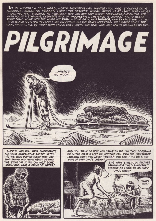
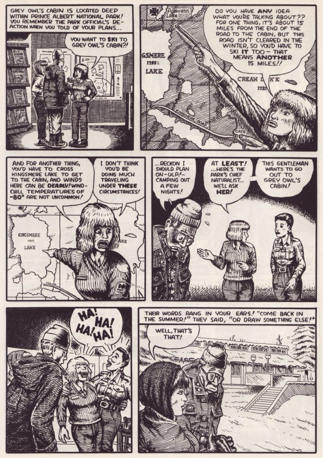
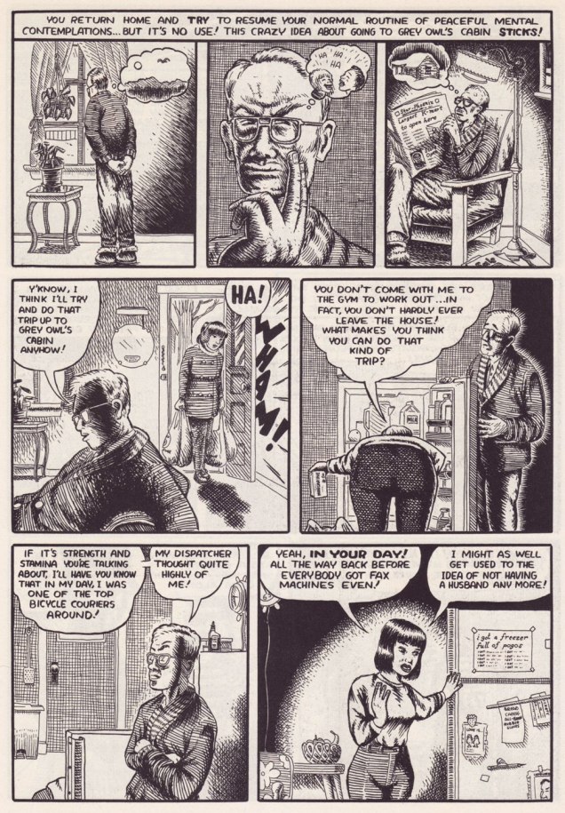
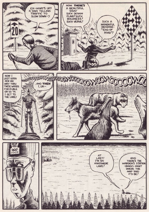
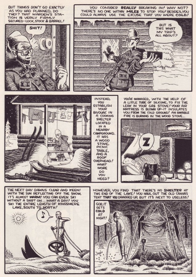
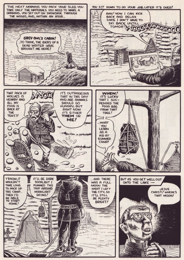
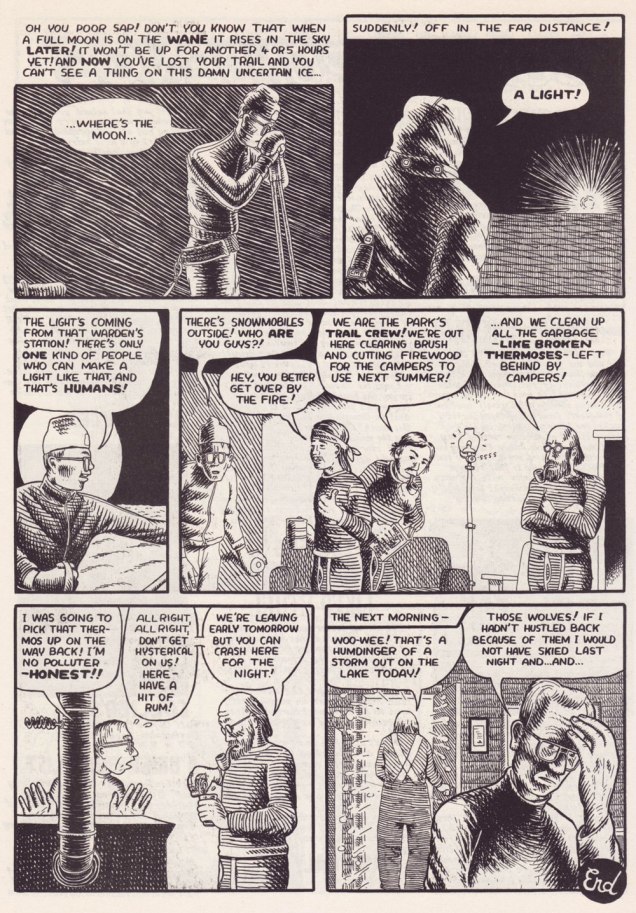
Collier is also entirely at ease with long-form narratives. Here’s a personal favourite of manageable length. It was this piece that made me a loyal fan. The issue of Collier’s it appeared in brilliantly splits its pages between David’s perilous trek to Grey Owl’s cabin and his account of the man’s life story, providing both a solid history lesson and a portrait of the artist as comics character. This material was also reprinted in Portraits From Life.
Somebody clearly digs Harvey Kurtzman‘s EC war — or more precisely anti-war — comics!
.
.
.
.
.
.
.
.
.
Pilgrimage first appeared in Collier’s no. 3 (May 1994, Fantagraphics).
I find it intriguing that Collier, a Canadian history buff if there ever was one, was unfamiliar — circa the early 90s — with the larger-than-life personage of Grey Owl (alias Archibald Stansfeld Blarney, I mean Belaney) the Buffy Sainte-Marie of his day… but we all have our blind spots. Lo and behold, just a few years later, comes the Hollywood biopic. Interesting coincidence…
Another insightful short-short that shouldn’t work… yet does. It all comes down to the details. It originally appeared in Zero Zero no.7 (Jan.-Feb. 1996, Fantagraphics). One more for the road? From the back cover of Collier’s no. 3 (May 1994, Fantagraphics).
I’m happy to say that Collier has continued to grow, even if his French isn’t improving. The most recent book of his I read, Morton: A Cross-Country Rail Journey, was also likely his finest. But that was nearly a decade ago. Let’s hope for something new soon!
-RG
*Robert Crumb himself had scolded him about his spelling… way back in the 1980s.
**the nadir of this is the appearance of « Homme de le bois » (which even a mediocre copy editor would have immediately flagged) right there on the cover, and again inside The Frank Ritza Papers (2004, Drawn and Quarterly). While D&Q were quick to assign Collier a ‘fact-checker’, spelling — especially French spelling! — didn’t seem to be much of a concern. Sigh.
« It is through his creation that the artist translates most certainly the man. Elegance of line, subtlety of colour, freshness of inspiration, modesty of feelings without ever falling into mushiness, Peynet is the antidote of all that pollutes our spirits today. He offers to us the key, key to the enchanted world where he catches in his nets that which we strive to destroy. » — Max Favalelli
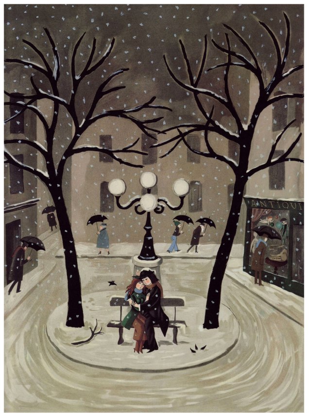
Hello again! I’d been considering devoting a post to Raymond Peynet (1908-1999) for some time, but I realised at some point that this was another textbook case of ‘The tip of the iceberg‘; sure, I’d seen his Les amoureux cartoons in most of my newer issues of Le rire — which is to say issues in the merely sixty to eighty years old range — but the tiniest modicum of research revealed an impressively sustained worldview, some rather breathtaking bits of mass-marketing, and, most significantly, consistent quality and conceptual integrity.
This topic, obviously, would have made for an ideal Valentine’s Day post, but since I was out of town on family business that day, and, more pointedly, we don’t really feel the need to mark that random occasion, it didn’t happen. And yet here we are… one month later to the day.
Having done my homework, I now present to you Mr. Peynet and his ‘amoureux’, immortalised through some six thousand drawings, but also four (!) museums — two in France, and two in Japan, a a life-size bronze statue in Hiroshima’s Peace Memorial Park, some 250 distinct models of latex dolls, several postage stamps, posters, champagne bottle labels… you name it.
Obviously, I’m just scratching the surface. But since Peynet-mania seems to have largely skipped over North America, this might prove a useful, if belated, introduction.
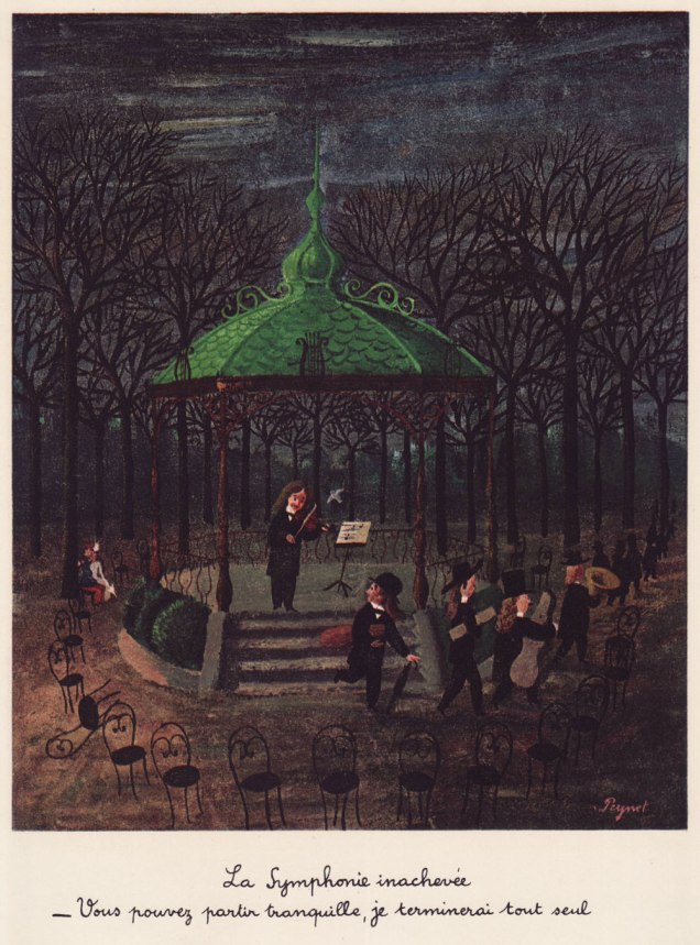
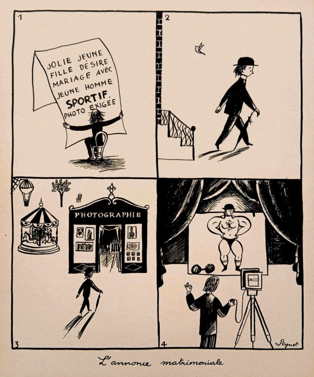
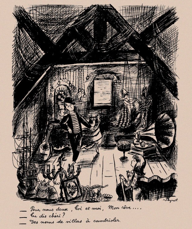
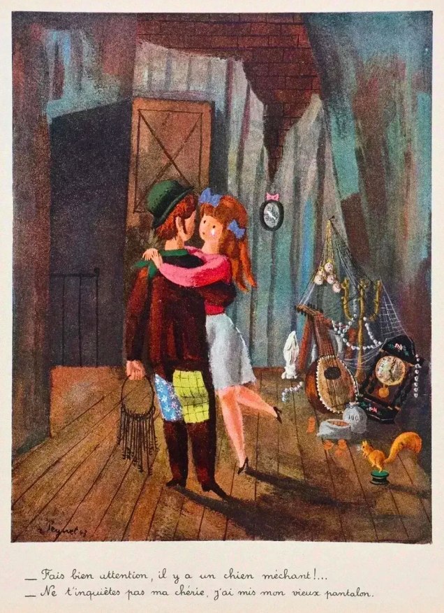
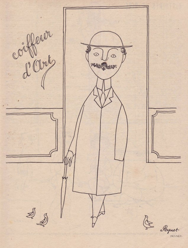
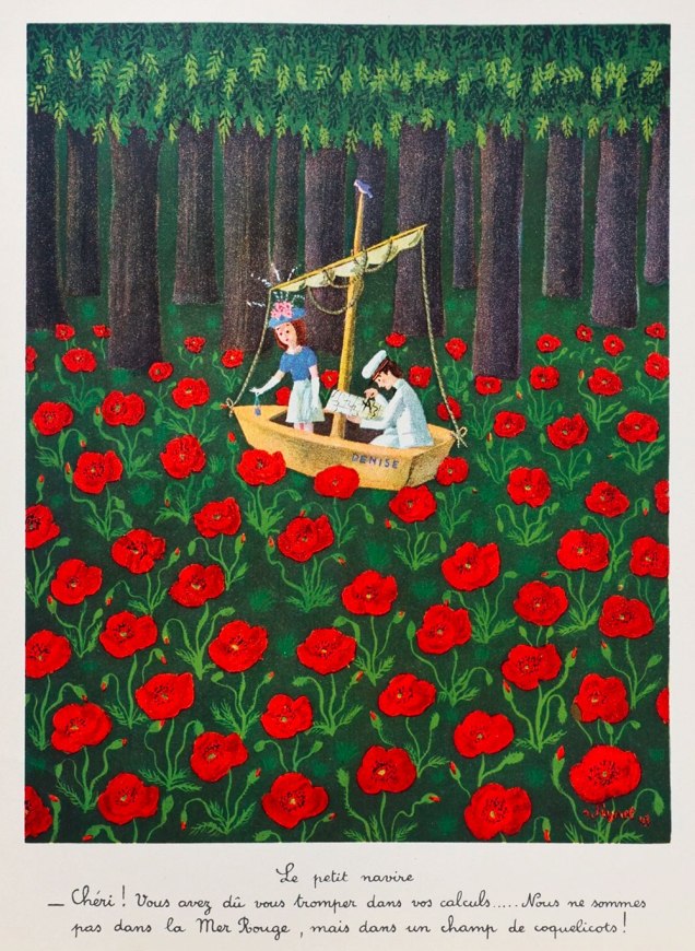
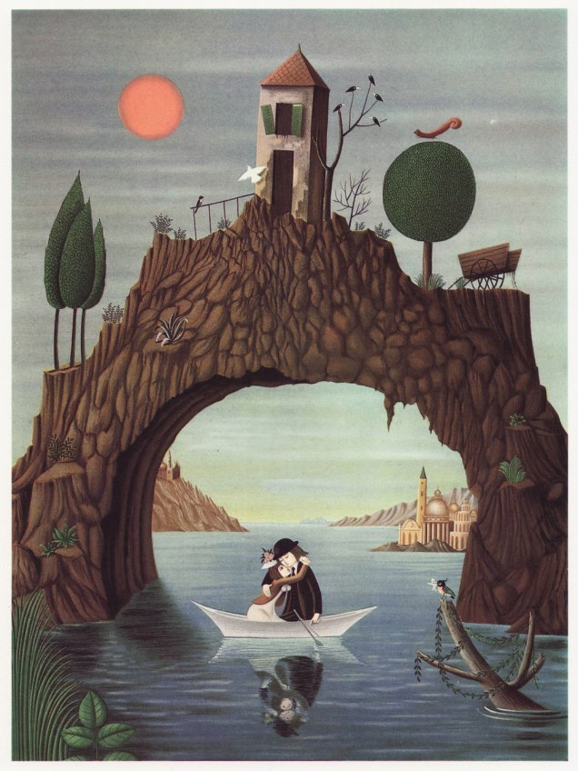
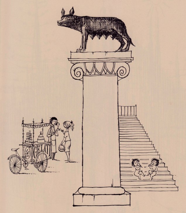
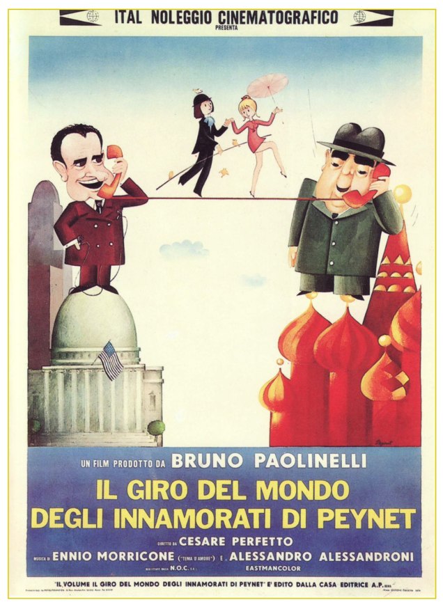
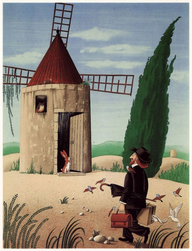
« I will give you my flu, you will give me your bronchitis… we will share the medication. » A lithograph created between 1970 and 1986 for Éditions Les Maîtres contemporains.The Unfinished Symphony: « Don’t worry, you may leave, I’ll finish it by myself. » (Limited edition litograph, 1943). This is how it all began for Peynet. Here’s the whole story of the time and place, clumsily — but charmingly — translated.The Marriage Ad: « Pretty young lady seeks marriage with athletic young man, photo required. » I doubt that Richard Sala ever encountered Peynet’s work, but I can’t help but find that this particular piece prefigures his style somewhat.« –– For Us Two, You and I, My Dream… » « — I beg your pardon, darling? » « These are names of villas to burgle. »« — Be very careful, there’s a mean dog! » « — Don’t worry, my love, I’m wearing my oldest pair of pants. » (Limited edition litograph, 1943)« The Artistic coiffeur ». From Le rireno. 22 (nouvelle série), July, 1953. Shades of the influential Saul Steinberg, which I *will* have to write about at some point.The Little Ship: « Darling! You must have erred in your calculations… we aren’t on the Red Sea, but rather in a field of poppies! » (Limited edition litograph, 1943).« — You’re not accompanying him through his dreams? » « — Never on Sundays, I’ve too much to do around the house. » « — No other lovers love each other as much as we do. » « — Well… take a look at these two below… » Lithograph created between 1970 and 1986 for Éditions Les Maîtres contemporains.« Dearest, don’t you think that there are times when one must set aside things of the heart and be more down to earth? » From Le rireno. 26 (nouvelle série), Feb. 1948. Even back in the 1940s, it wasn’t all chaste naïveté.Lithograph, Éditions Arnaud de Vesgre, 1970. Without being derivative in the least, this piece pleasantly reminds me of Francisco Botero‘s work. Okay, this one’s fairly subtle. I’ll give you a hint: the kids are named Romulus and Remus. Originally published in the collection Per le strade, per le nuvole (“Through the streets, through the clouds”) (Edizioni Elmo, Milan, 1953). Likely another cartoon from Le Rire (Peynet rarely skipped a number), but I don’t own that particular issue.In 1974, out of Italy, came an animated feature (there had been a French short film in 1961), boasting — most appropriately — a gorgeous waltz composed by Ennio Morricone at his peak. The feature is available to watch here.Lithograph from Alphonse Daudet‘s Lettres de mon moulin (« Letters From my Windmill »), Éditions Arnaud de Vesgre, 1985.
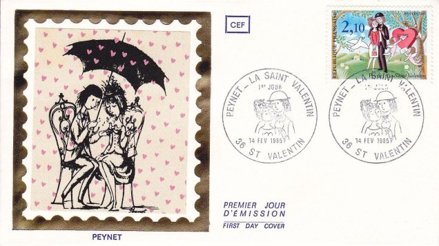
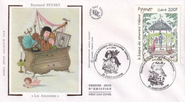
Peynet and his creations were twice honoured by the French post office with a clutch of different stamps. Here are some samples.
First day cover from Valentine’s Day, 1985.First day cover from November 11, 2000, posthumously this time, Peynet having gone to his glory the previous year, joining his wife and muse of sixty-six years, Denise, who’d passed away in 1996. Here’s a lovely obituary from The Guardian.
To see you off musically, here’s a classic song that Peynet’s best friend, Georges Brassens, wrote about the illustrator’s petits amoureux.
« I am fond of pigs. Dogs look up to us. Cats look down on us. Pigs treat us as equals. » — Winston Churchill
Recently, I’d been drawing a blank as to the topic of my next post. So I did what one does in such distressing circumstances: I pulled something at random from the nearest bookshelf — just filled a couple of days earlier, conveniently.
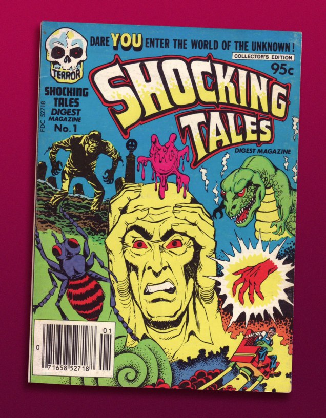
And it paid off: my hand landed upon a screwball, one-shot digest published by a near-defunct Harvey Comics. Its contents? A hodgepodge of 1950s horror and SF tales, including, for instance, Bob Powell‘s classic Colorama (1953) and some of his Man in Black (1957-58) stories. Ninety-five cents well spent.
This is Shocking Tales Digest Magazine no. 1 (Oct. 1981, Harvey).
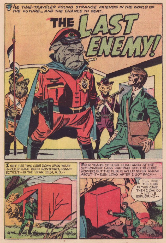
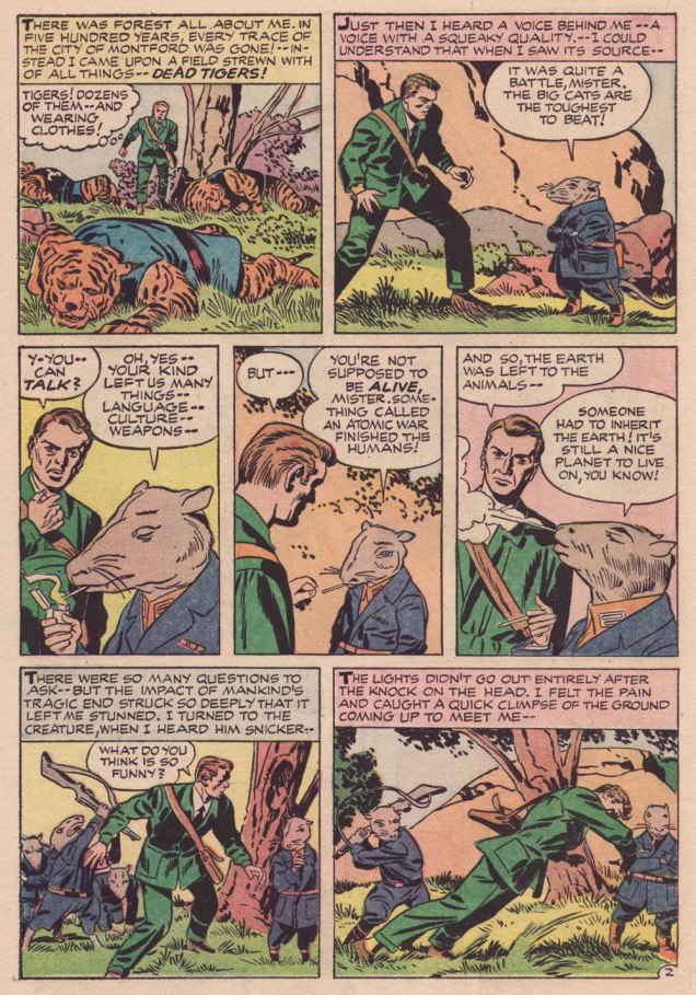
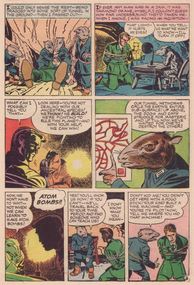
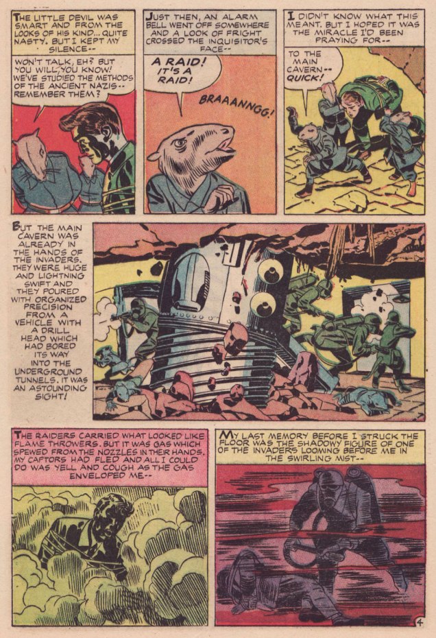
The finest riches in dem dar hills, however, consist in some rather obscure — given its regal pedigree — Jack Kirby material from the late 1950s, reportedly written, pencilled and inked by The King.
However, given the dodgy printing quality of a comics digest, I had to pull out my second-oldest Kirby Komic (the most ancient being December 1952’s Black Magic no. 5 — read it here!) and very, very carefully scan the relevant pages. Oh, the sacrifices I make for this blog! 😉
.
.
.
.
.
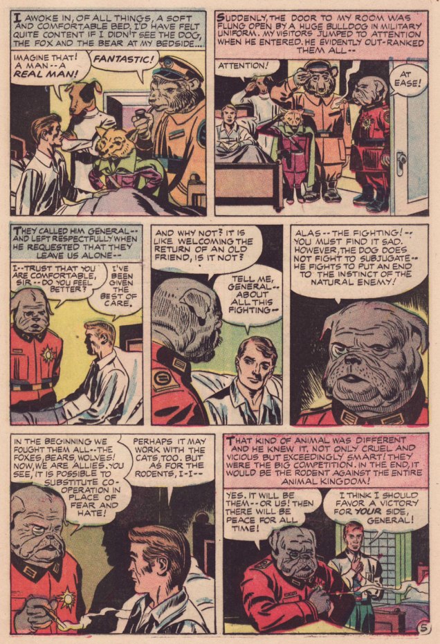
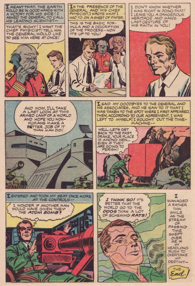
Kirby has often been unfairly slagged for ‘riffing on’ the popular Planet of the Apes franchise, but The Last Enemy predates the 1968 film’s source, Pierre Boulle‘s 1963 novel La planète des singes by some six years… and besides, the ‘animals taking over’ theme has a long history in science-fiction. To name but a pair of antecedents, there’s Lester Del Ray‘s The Faithful (from 1938) and Clifford Simak‘s City (linked stories published between 1944 and 1951 and amalgamated in 1952).
Here’s a second story, which I like even better, thanks to its humorous touches. Several of its plot ideas could have been expanded upon in OMAC, had Kirby been granted time and opportunity.
.
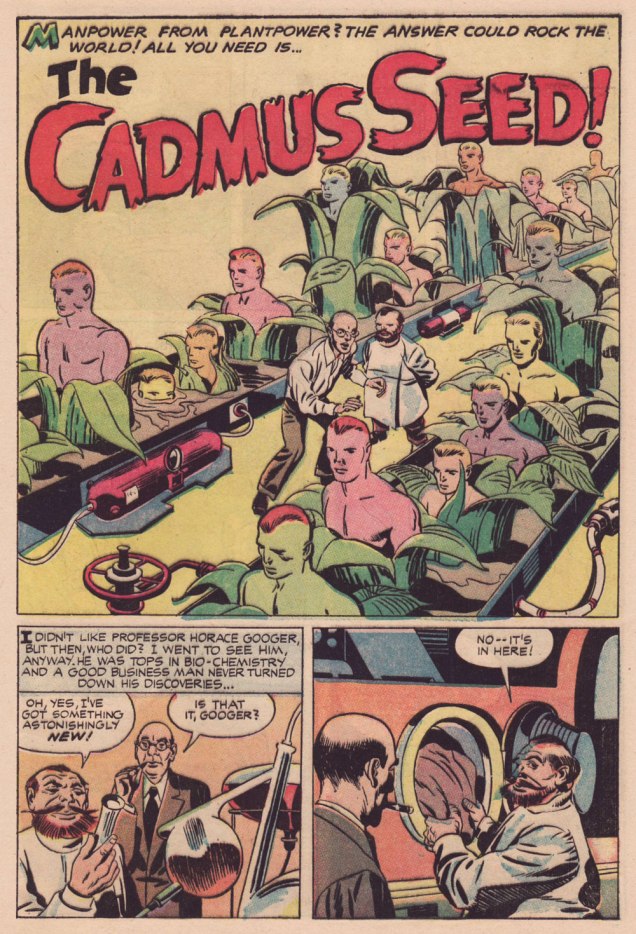
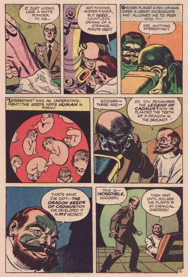
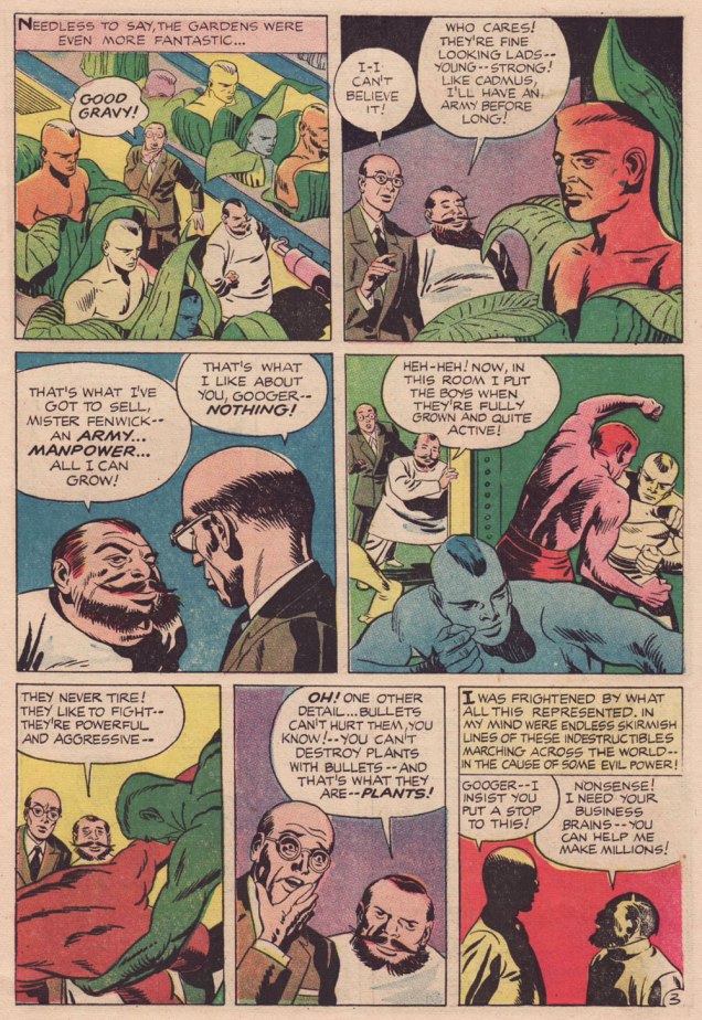
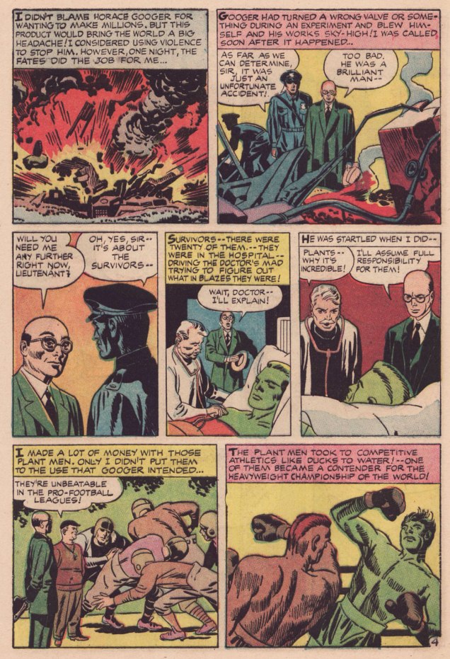
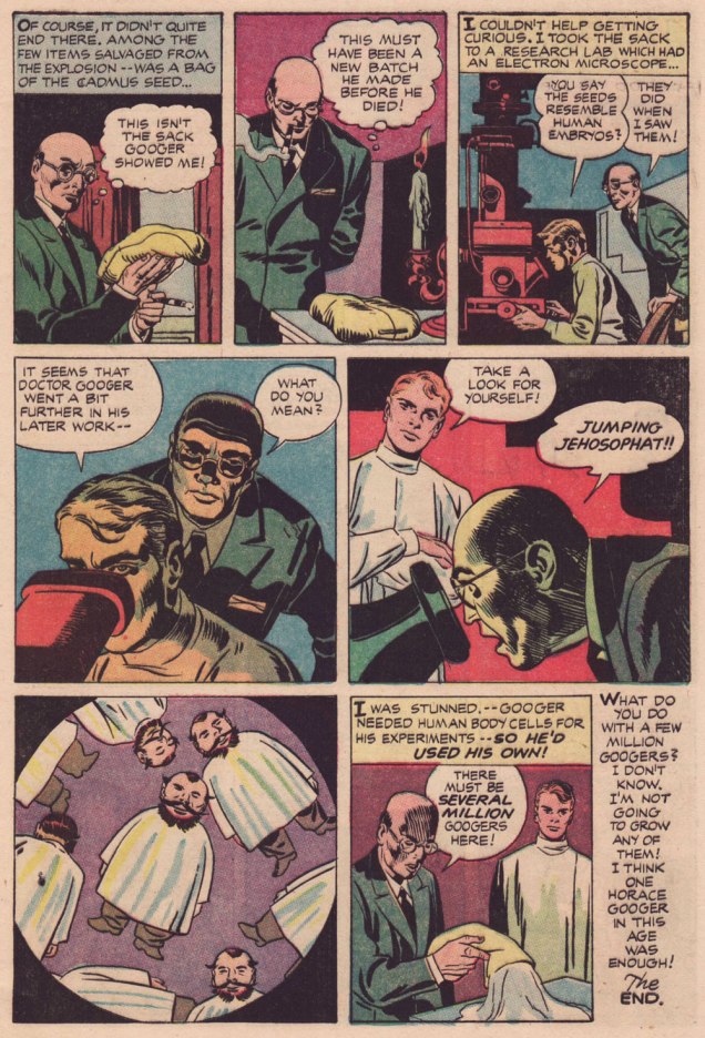
Learn all about the aforementioned Legend of Cadmus and amaze your friends (or bore them to tears, depending on the quality of your circle)!
.
.
.
I suppose I can take Babs having her favourite pooches cloned, but I shudder at the prospect of, ahem, certain people being genetically reproduced on an industrial scale. Another argument for nailing that particular Pandora’s box shut for good.
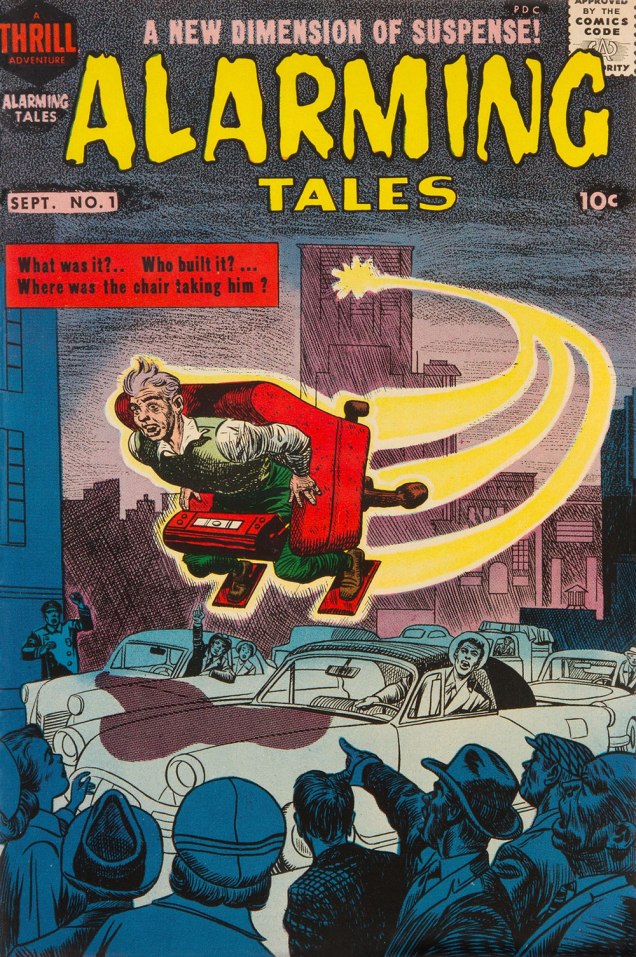
Both yarns appeared in this jam-packed. all-in-colour-for-a-dime wonder, Alarming Talesno. 1 (Sept. 1957, Harvey). I was fortunate enough to pick up a copy for peanuts, eons ago — but fret not, you can read it gratisright here.
Cover artwork by Joe Simon (main figure) and Kirby (everything else). Further details on this issue can be found here… and you can read the rest of it here!
« Go to your bosom; Knock there, and ask your heart what it doth know » — William Shakespeare
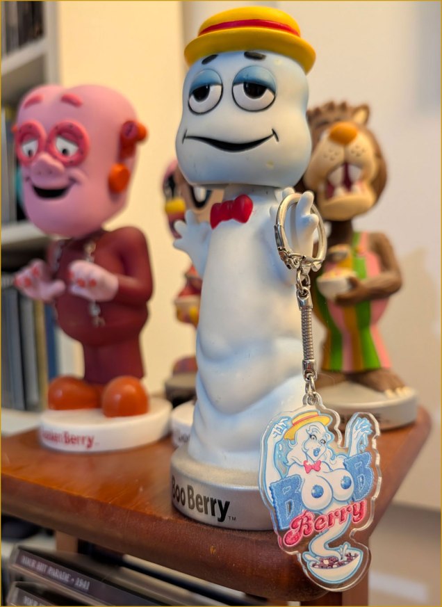
Joe Gravel’s work came my way when, if memory serves, eBay suggested one his cartoons. As a fan of classic breakfast cereal mascots and vintage pinup art, this was as catnip to me.
I ordered his lovely Boob Berry keychain (shown below) — and Dracurella and Frankenbabe stickers and buttons, and my fate was sealed. Writing to thank him, I found Joe to be a gracious and erudite fellow, and so I kept an eye on his work from that point on.
Now, hypersexualization of superheroines and sundry cartoon characters is a bit of a cottage industry, and most of its fodder is quite devoid of interest. Another application of Sturgeon’s Law, if you will. Ah, but Mr. Gravel’s work is witty, accomplished, positive, and perhaps best of all, he doesn’t explain his jokes.
Joe was kind enough to answer my questions about his craft and inspiration… and here’s the result, peppered with some of his favourites and some of mine.
Boob Berry and her… progenitor (?).
WOT?-You draw from all genres, media and companies, yet maintain a consistency in style, and your own style at that. Does that come easy for you, or is it harder than it looks?
JG:Actually, I draw without any thought to staying in my style. It’s what comes naturally and what it has evolved to.
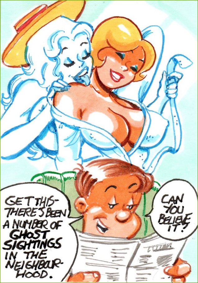
Boob Berry has a way with all the understandably frustrated ladies of the King Features neighbourhood, including Lois, Blondie, and Alice Mitchell.
WOT?-You often produce multi-panel sequences… which brings your work closer to a panel approach, rather than the pin-up/splash one some often encounters. Is that because you have a fuller narrative in mind, one that you pluck sequences from?
JG:Occasionally I’ll have an idea that I can’t condense to a single card so I’ll expand it to a sequence of multiple cards/panels and post them as a single auction. Other times, I’ll do a single card and get a good response to the theme and then continue the narrative with other single card offerings. Were I more organized I’d have themes a bit better planned out. 🙂
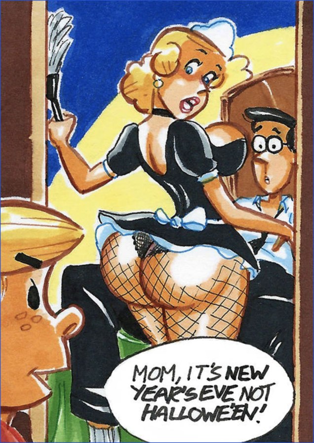
Speaking of Mrs. Mitchell… between that doltish husband and that demon offspring, how could she not use a little tenderness?
WOT?-Gender switches: who gets them and why?
JG:Gender switches are kind of random. Whichever character I figure would look good with a swapped gender is fair game.
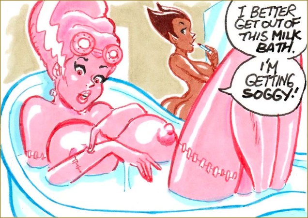
Meet Frankenbabe and Chocurella.
WOT?-The basic, but crucial question: what are some of your influences… and I presume they are numerous and varied.
Gender notwithstanding, I take it no introductions are needed here.A rare instance of a multi-panel sequence, set in a slightly skewed version of the Harvey Comics universe. The 1960s TV crossover you never dared hope for?
WOT?-As a complement to the previous question, can you tell us a bit about your habitual comics and media diet?
JG:I don’t pick up many comics regularly these days though I have taken a liking to Mark Spears’ Monsters series. Besides that, I’ve started picking up the Criminal series by Ed Brubaker and Sean Phillips in trade format. Mostly I’m introduced to new artists through posts I see on Instagram and sometimes Tumblr.
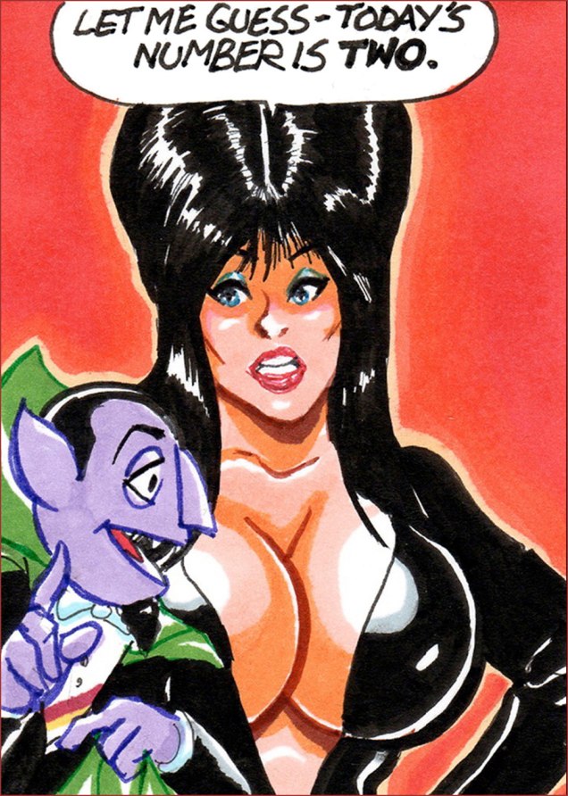
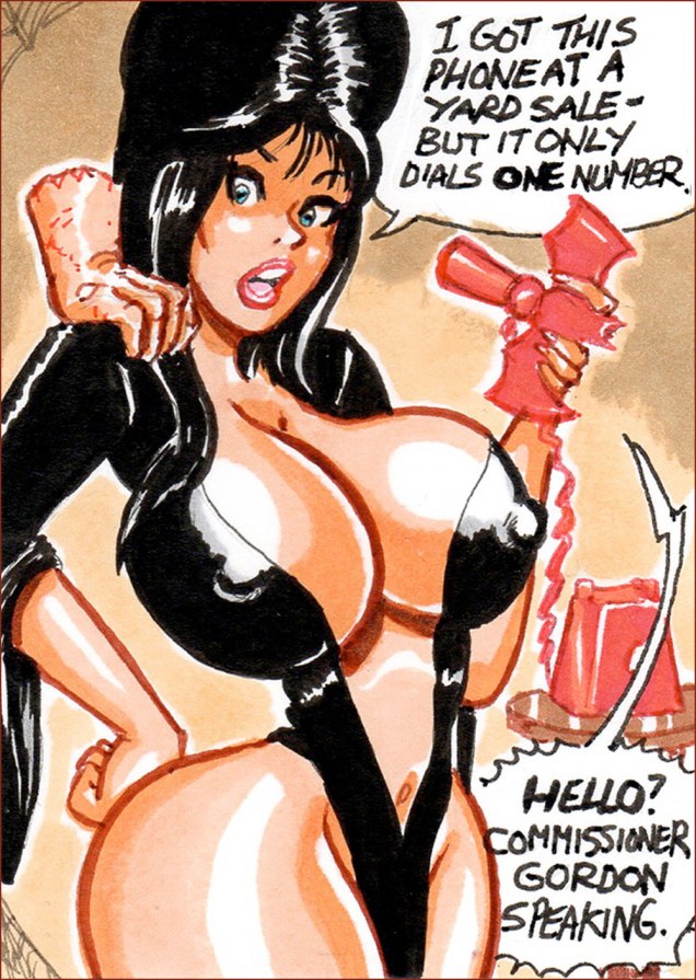
As the joke goes: « I was recently asked who my favorite vampire was. I replied “the Count from Sesame Street.” They told me, “he doesn’t count!” I replied, “I assure you, he does.” »For some reason, Elvira also fits beautifully into the 1966 Batman TV show aesthetic. That’s inspiration.
WOT?-In this digital age, your choice of technique is unusual (and refreshing, if you ask me). Why markers?
JG:I choose markers for my work due largely to the ease of use and the speed it gives me compared to painting. I’m old school so while I dabble in digital art from time to time, I very much prefer the physical media.
WOT?-In terms of planning and layout, are you more akin to, say, a Sergio Aragones or a Jack Kirby, who could start a drawing anywhere and make it work… or a Harvey Kurtzman, who needed a pile of preliminary drawings and overlays to achieve his goal?
JG:For planning and layout, I’m on the opposite spectrum of Kurtzman :). Often I do my rough sketch on the sketch card and then refine the pencils from there. If I have multiple elements on a card, I’ll do a super rough thumbnail on a scrap piece of paper to help visualize what should go where.
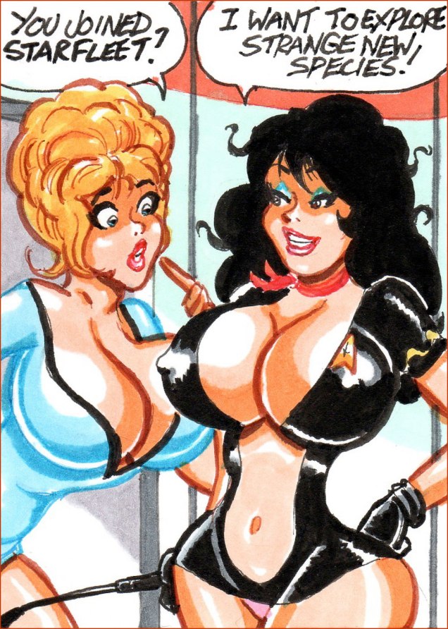
Speaking of gender switches: Star Trek’s James T. Kirk becomes Little Annie Fannie, and Gravel picked my favourite episode, Arena (based on Fredric Brown‘s 1944 short story of the same name) to put her through her paces.Of course, who does Little Kirkie Fannie soon run into? Why, Frederic Mullally and Ron Embleton‘s Wicked Wanda, of course!
WOT?-Any collections planned? Since each panel is auctioned off individually, any collector of your work must be seething with frustration. Is there any hope on that front for the completists?
JG:A collection is a great idea. I’ve had a few people say that I should pull some of my storyline cards together for a booklet or PDF. My biggest hurdle is myself taking the time to do it. Having said that, I have a series going now that I’m going to make an effort to assemble into a sequential piece. Also, much of the time these ongoing series start out as one or two cards that I had gags for and if they’re well-received I continue the series without a pre-planned idea of where they go. Sometimes they just trail off. So, I’d like to get into the mindset of doing a rough arc in my head if an idea takes off.
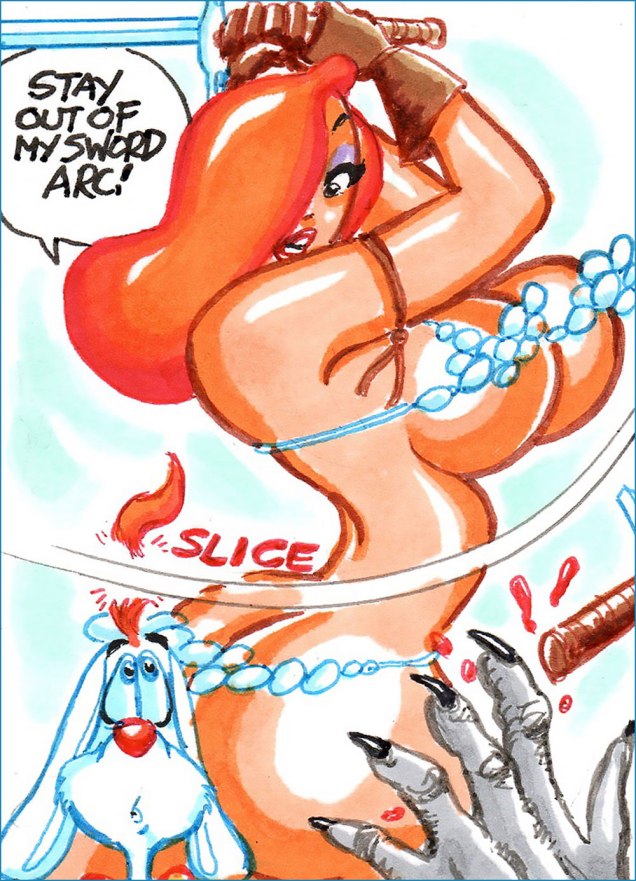
Jessica Rabbit as Red Sonja — why the hell not?
My heartfelt thanks to Joe Gravel for his time, patience and insight! Check out his latest creations, up for auction right here: https://www.ebay.com/usr/rocketred23
« Taking something from one man and making it worse is plagiarism. » — George Augustus Moore (1852-1933)
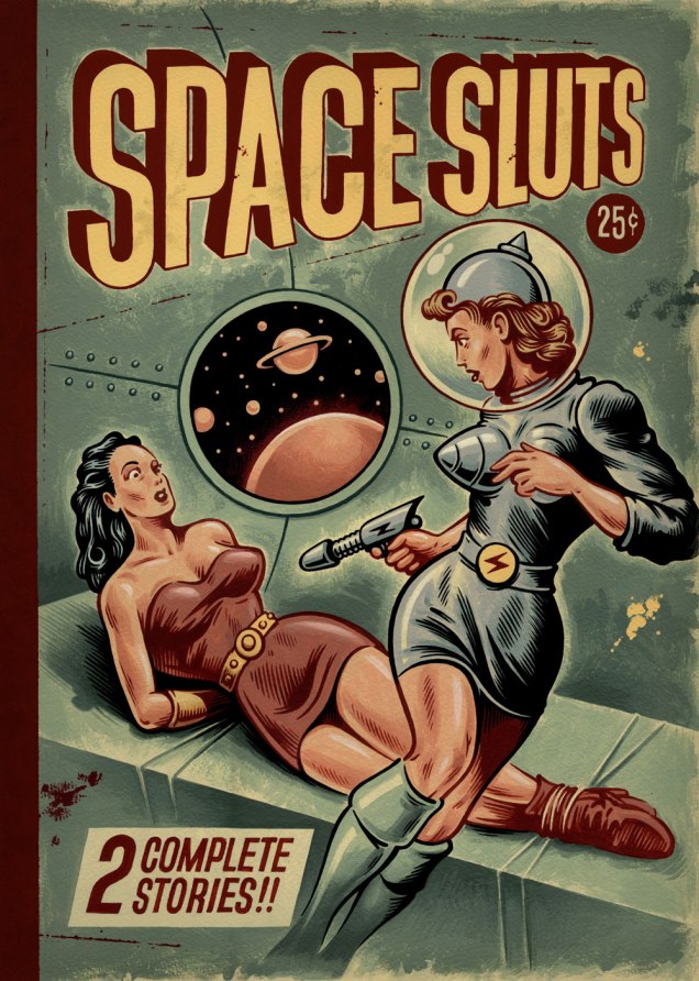
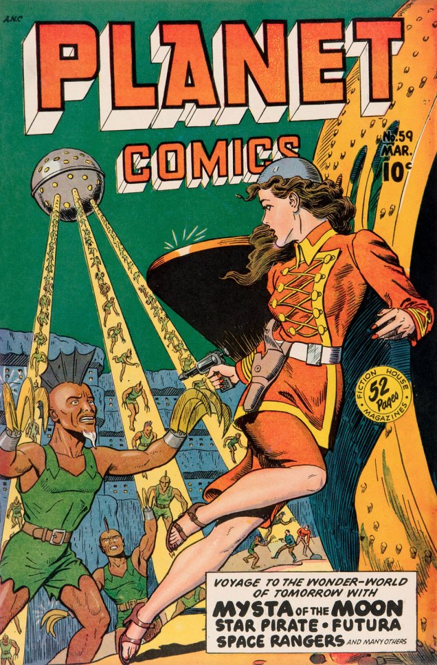
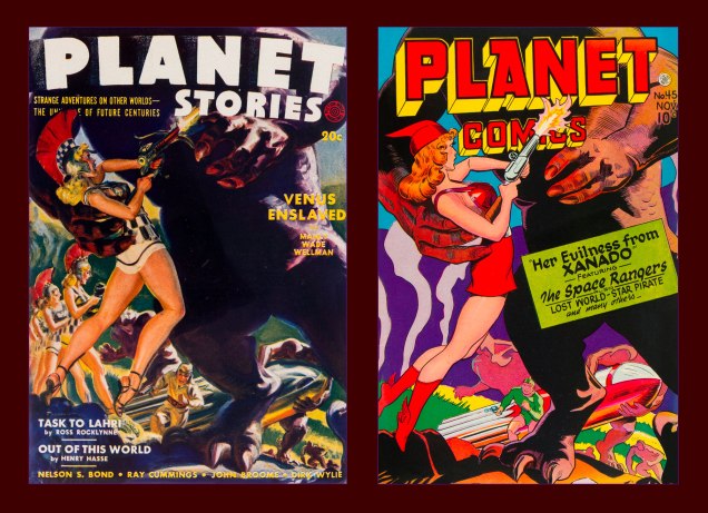
A fortnight or so ago, I came across an image that looked… familiar. It wasn’t slick enough to be AI, so I presumed it was a swipe. My first guess was Fiction House’s Planet Comics, but I initially came up empty. Then I realized my error: I was looking for a reproduction of the whole scene, involving both figures.
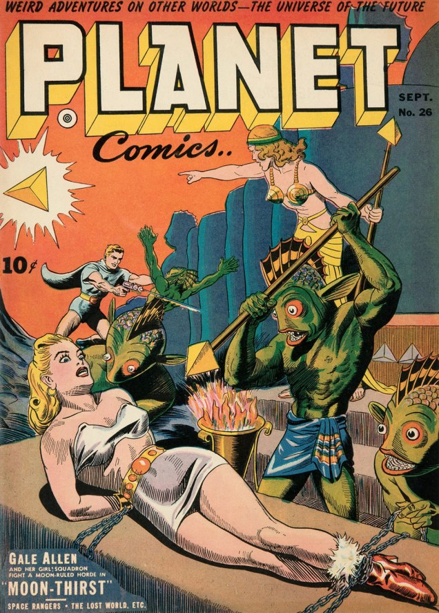
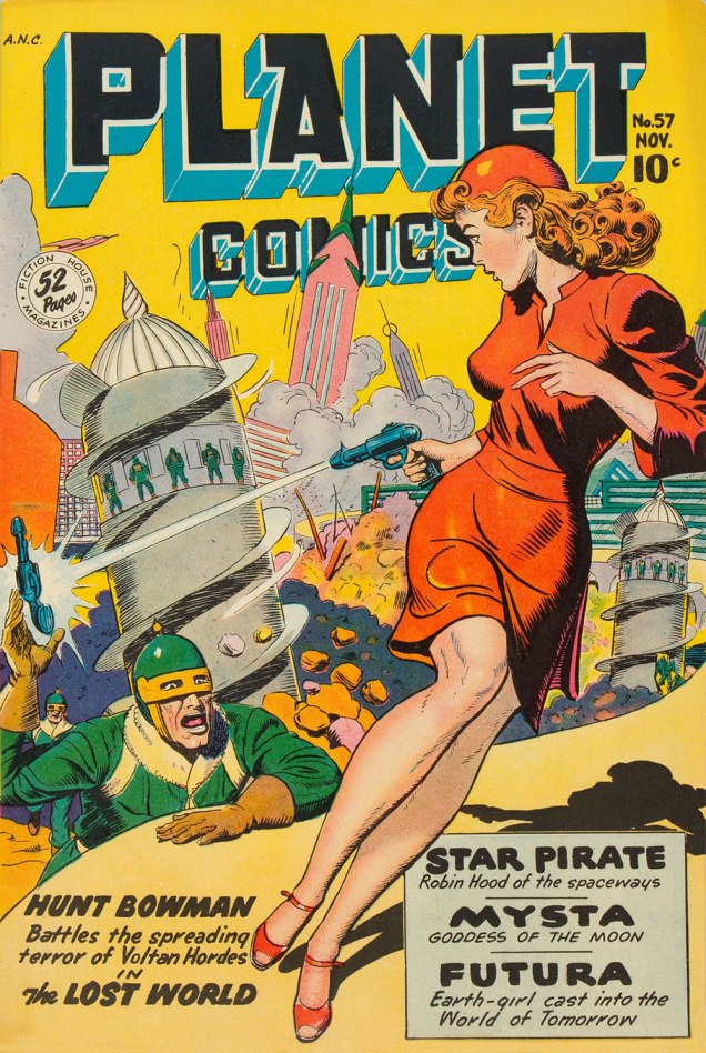
After a second pass… bingo: two issues of Planet Comics. At least the swiper was consistent: both covers were drawn by the same guy, Joe Doolin (1896-1967), a prolific pulp and comic book illustrator. Check out his interesting biography.
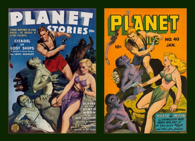
This is Planet Comics no. 26 (Sept. 1943, Fiction House), cover by Doolin. Frankly, it’s easy to imagine this one recycled, with minor changes, as a Sheena-style jungle scene, another of the publisher’s specialties.As for the source of our second figure, here’s Planet Comics no. 57 (Nov. 1948, Fiction House), cover by Doolin.This is Planet Comics no. 59 (Mar. 1949, Fiction House). A mere two issues later, Doolin virtually reused the same pose*, though obviously, he wasn’t so lazy as to not redraw it from scratch. Pretty nifty outfit on the heroine. Who are these bozos? Inbred descendants of the Savage Dragon and Razor Fist? Jeepers.
I mentioned the clumsy swipe in question to a long-time friend and colleague (salut, Éric!), who informed me that the ‘Space Sluts’ had been making the social media rounds (as they would), and that an alarming proportion of commenters had been fooled into thinking the piece was an artifact of some ancient origin, instead of a recent ‘creation’. No great shock there, as your average Joe Schmoe can’t recognize AI slop either when he sees it (but adores it indiscriminately).
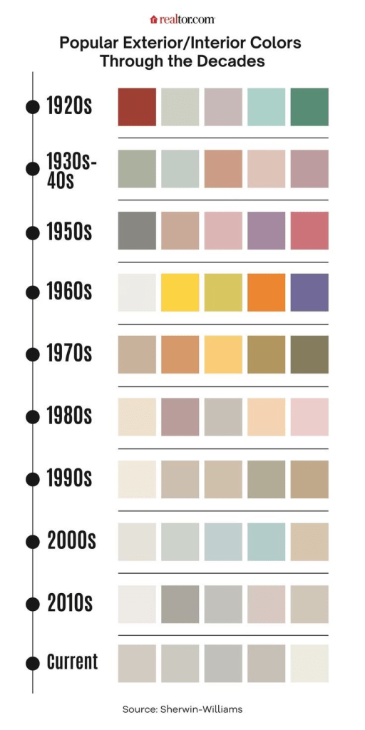
I mean, it’s all wrong: the depressing 21st century desaturated colours (denizens of our current dystopian nightmare shun bright, saturated colours (see graphic below) like a vampire eschews garlic), the telltale phoney brushstrokes of digital art, the incorrect cropping (no art would have been published with the space beyond the edges showing), methods of shading, the ‘dust and scratches’ being the same colour as the printed ink,.. I could go on all night, but I’ve got better things to do.
Then there’s the title. The art is insult enough, but was the shaming necessary? On Facebook, some mooncalf pointed out — incorrectly — that ‘slut’ didn’t have the meaning we’re familiar with until the 1960s. Nope (read on), but it likely wouldn’t have made it into print, and certainly not on the cover of a mainstream pulp magazine. I turn to a favourite reference work, Hugh Rawson‘s Wicked Words (1989, Crown) for the nitty-gritty:
slut. A slovenly woman, one of loose morals, a prostitute, HUSSY, or JADE. “He got very drunk and brought back a sluttish girl to the house. He woke me later to tell me that he had rogered her and her mama, too.“ (Evelyn Waugh, Remote People [in Kenya], 1931). An old word, perhaps related to SLATTERN, slut was applied to women long before the nineteenth century, when it sank to the animal level, becoming a euphemism for a she-dog, or BITCH. In very olden times, it was not restricted to women, e.g. “Why is thy lord so sluttish“ (Geoffrey Chaucer, The Canon’s Yeoman’s Tale, 1387-1400). The feminine senses developed early, however, and they soon became dominant, which is usually what happens when “bad” words have both male and female meanings. Nowadays, only women are sluts or sluttish, the men having managed to get to escape the derogatory designation, just as they did with, for instance, GIRL, HARLOT, and SHREW.
As a side note, Doolin himself was no stranger to swipes, though technically these were above-board, publisher-commissioned recreations.
« The publisher of Fiction House, Thurman T. Scott, was notorious among pulp artists for repeatedly demanding additional revisions before granting final approval of his cover art. Most pulp publishers understood that good covers resulted in good sales, but Thurman T. Scott was obsessed with perfecting an unbeatable formula for maximum sales. The most obvious element of his formula was a big sexy pin-up. This same mania is reflected in the bizarre reappearance of Fiction House pulp covers on Fiction House comics. »
At left, Planet Stories no. 11 (Summer 1942, Fiction House), a cover painted by WOT? favourite Norm Saunders; at right, Planet Comics no. 45 (Nov. 1946, Fiction House), a line art remake by Doolin.At left, Planet Stories no. 14 (Mar. 1943, Fiction House), a cover painted by Jerome George Rozen (1885-1987); at right, Planet Comics no. 40 (Jan. 1946, Fiction House), a line art remake by Mr. Doolin, with a couple of minor modifications tossed in.
-RG
*I expect more from Doolin than from, say, Ross Andru, who used the same basic pose on every single 1970s cover he drew, and I’m barely exaggerating.
« “Obey the government“, said one croak. “We are the government“, said another. » — Ray Faraday Nelson
I’ve been juggling several ideas for posts, most of them leaning more or less to the light-hearted and poetic, save one… and since that outlier is more suited to the current state of affairs, here goes.
.
.
.
.
.
.
.
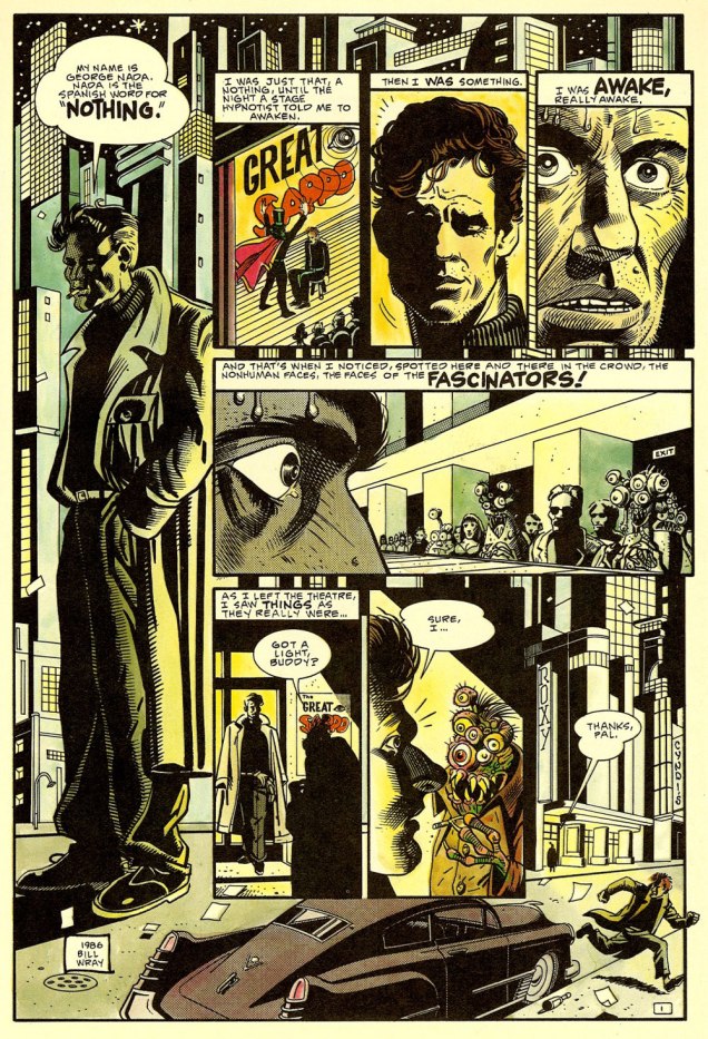
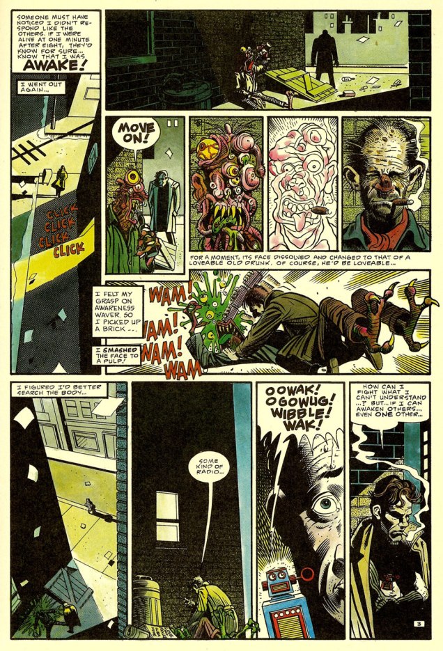
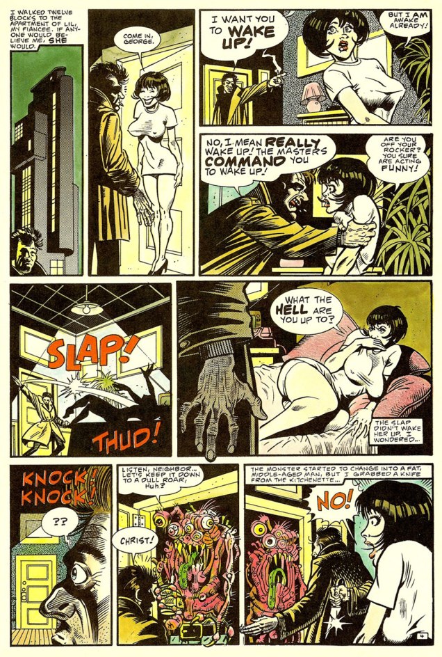
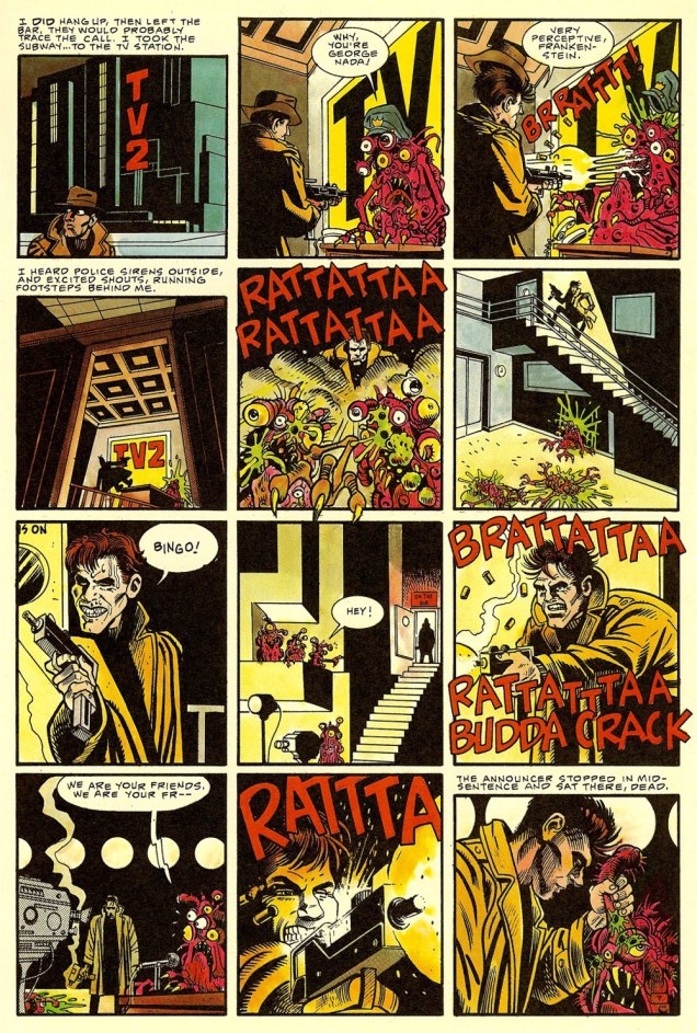
Nada appeared in Alien Encounters no. 6 (Apr. 1986, Eclipse; cat yronwrode, editor). An early work by cartoonist/animator and fine art painter*Bill Wray, he’s gloriously channelling all of his influences at once: Eisner, Steranko, Stout, Reese, Elder, and perhaps a smidgen of Thorne.
You guessed it, the story was adapted by John Carpenter for his 1988 film They Live, one of the great science-fiction films of that decade that bombed at the box office and were later reconsidered… more lucidly. Think Carpenter’s The Thing** (among others… poor guy!), Ridley Scott’s Blade Runner, and this one. At least it didn’t suffer a pointless remake or a Denis Villeneuve sequel. Yet.
Anyway, Carpenter recounted, in an interview published in the venerable American Cinematographer (Sept. 1988), soon after the film’s release: « They Live began three years ago with a comic book I bought called ‘Nada’. It was published by Eclipse Comics, a company which puts out very beautifully rendered science-fiction stories. This particular strip was taken from a short story called ‘Eight O’Clock in the Morning’ by Ray Nelson. » [ source ]
Related aside: on They Live‘s imdb.com page, some lout quite misunderstood the purpose of a FAQ — objectivity, for one thing — and took it upon himself to malign Ray Nelson’s essential contribution. To the question « What are the differences between the short story and the film? », he frothed forth:
The short story, titled Eight O’Clock In The Morning, is an exercise in awful writing. The protagonist goes around murdering “Fascinators” without any discussion of what changes him from a compliant citizen to this state.
What John Carpenter’s story does, in essence, is add fat, muscle, a brain, and pretty much everything else a living organism needs, to a skeleton in the most literal sense. Everything that fills out John Nada’s back story and makes him seem like an actual person who thinks and feels is all John Carpenter’s idea.
Ahem. It seems to me that there just *might* be a slight difference, in terms of expansiveness, between a 94 minute motion picture… and a five page short story. Well, you be the judge: read it here, in its original context and everything!
-RG
*I simply must point out that, though I like Mr. Wray’s work as a cartoonist, I am in absolute awe of his paintings. Here’s how he helpfully puts it: « Making his living as a cartoonist who specialized in painted subjects, he spent many years coalescing a eclectic array of art styles, ultimately finding his voice in a contemporized reflection of traditional California regional painting that focus on humble subject matter rarely considered as fine art. » His paintings are so very *soulful*, demonstrating a glorious grasp of colour and composition, to say nothing of subject and technique. Take a leisurely look here.
**Farewell to The Thing actor T. K. Carter, who passed away just today. What a cast that was!
« New Year’s Resolution: To tolerate fools more gladly, provided this does not encourage them to take up more of my time. » — James Agate
And another one gone… another one bites the dust, in the immortal words of John Deacon. Adios, 2025.
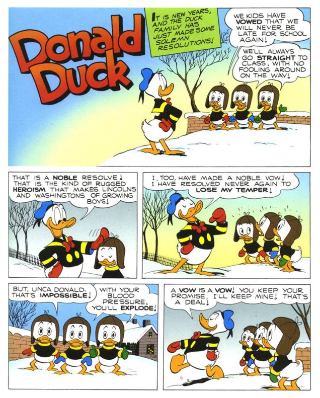
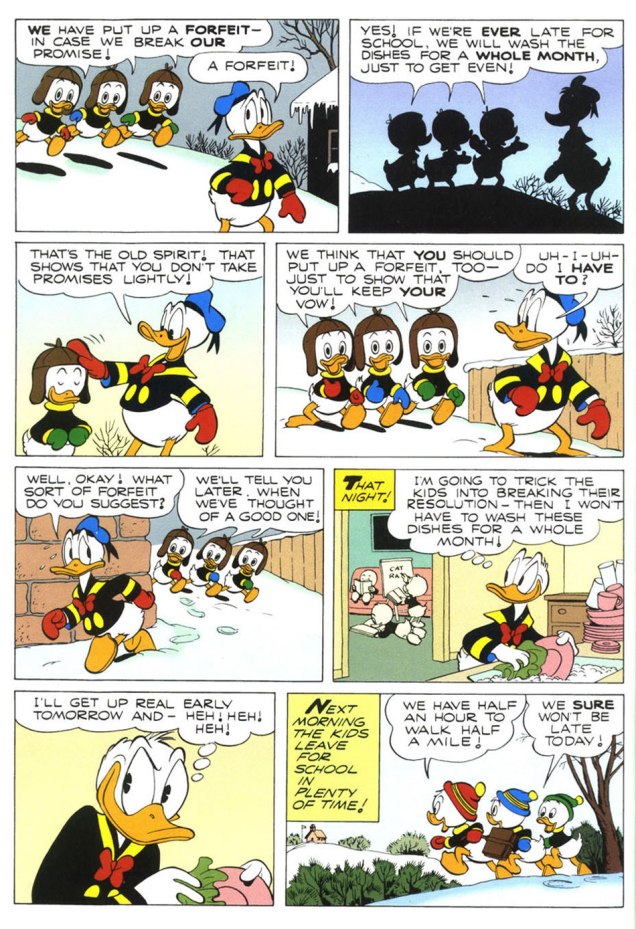
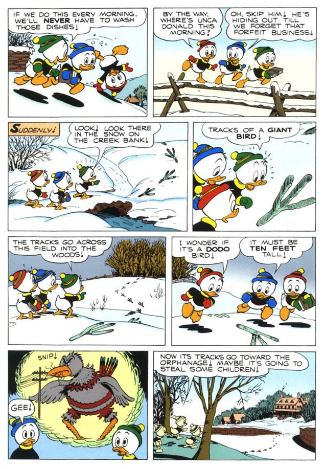
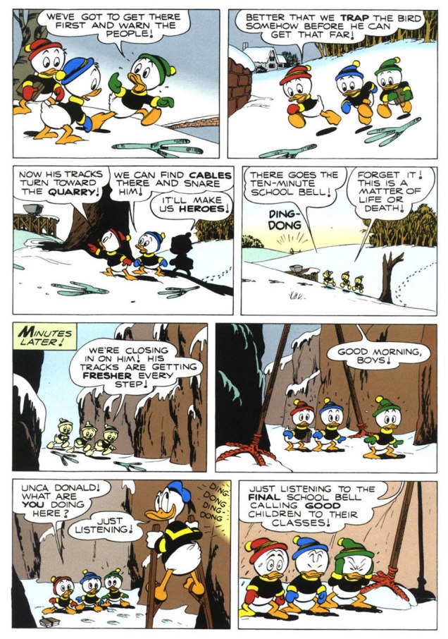
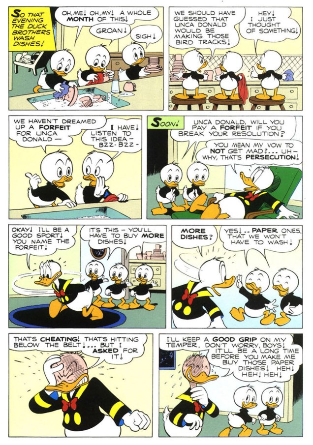
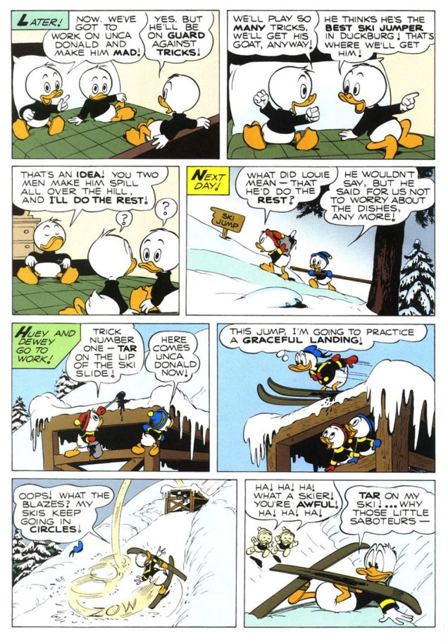
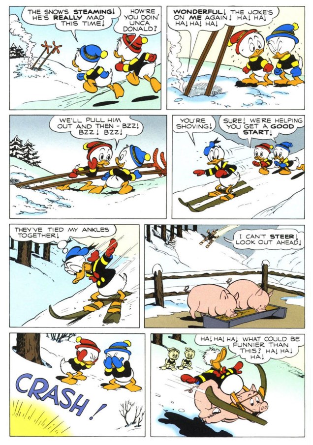
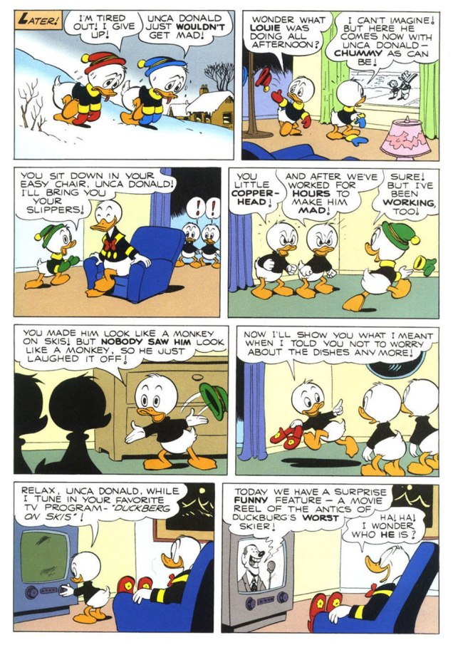
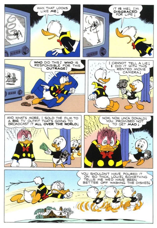
To send off the annum, and instil some hope into the ceremony, I turn to the superlative Carl Barks (1901-2000), « The Good Duck Artist », and this classic — but not overly familiar — ten-pager from Walt Disney’s Comics and Stories no. 173 (Feb. 1955, Dell)*, scripted, pencilled and inked by Mr. Barks and lettered by his wife Garé, a superb artist in her own right. Take it away, folks!
.
.
.
.
.
.
The boys’ ironic recycling of the giant bird stilts is a brilliant touch.
.
.
.
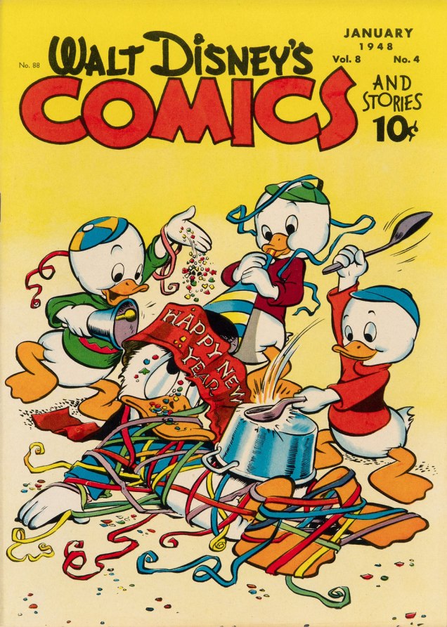
One of Barks’ most refreshing innovations is that he steered Donald’s nephews away from the typical, simplistic ‘little devils’ characterization they were saddled with at their conception. Barks made them crafty but essentially noble, in marked contrast to their Unca Donald. The issue of WDC&S that our story premiered in didn’t feature a New Year’s-themed cover, so here’s an earlier one, from none other than Walt Kelly. This is Walt Disney’s Comics and Stories no. 88 (Jan. 1944, Dell).
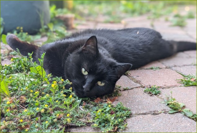
At the end of this wretched, truly merciless year, I dedicate this post to our beloved cat, Barnabas, who left us — peacefully — just this afternoon. May he be 2025’s final innocent victim.
*However, I opted for the superior reproduction values — trust me — of the reprint featured in Walt Disney’s Comics and Stories no. 623 (Apr. 1998, Gladstone). Kudos to Susan Daigle-Leach for the tasteful latter-day colouring.
« In the bleak midwinter, frosty wind made moan, Earth stood hard as iron, water like a stone; Snow had fallen, snow on snow, snow on snow, In the bleak midwinter, long ago. » — Christina Rossetti
Christmas is nearly upon us, but while a great many will opt to retreat into the miasma of nostalgia to forget what an annus horribilis it’s been, I’ve picked something a bit more appropriately sombre in tone to nail down the occasion.
But with a more hopeful chaser… to balance things out a bit.
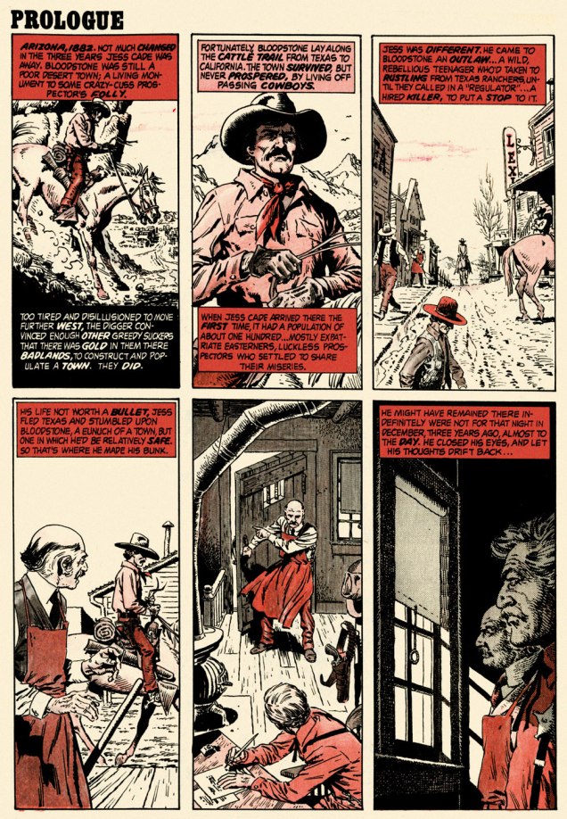
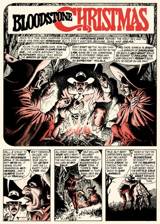
When the indefatigable Carmine Infantino (1925-2013) stepped down from his multi-hatted rôle of publisher, editor-in-chief, cover designer and art director — and so on — at DC, he found that no-one was beating his door down to offer him a similar position.
So he went back to drawing, as a freelancer. As Infantino put it: « Jim Warren was the first comics publisher to contact me after DC. I said “I’ll do work for you, but nothing full-time because I’m busy with other things.” He said, “Okay, whatever you’re willing to give me.” I wasn’t really comfortable with the Warren material — it was the sexiest work I’d ever done! Jim had an older audience and wanted it that way. My feelings about the material never affected the mutual respect Jim and I had for one another. » [ source ]
All told, Infantino pencilled around forty stories for Warren in a span of four years. There was even a brief period when he just about monopolized individual issues of Creepy and Eerie, which was offset by pairing him with wildly disparate inkers. Sometimes the results sang, sometimes they croaked.
Here’s a case of rarely combined styles that nevertheless meshed beautifully: Infantino and John Severin. Let’s face it, who’s more reliably excellent than Mr. Severin?
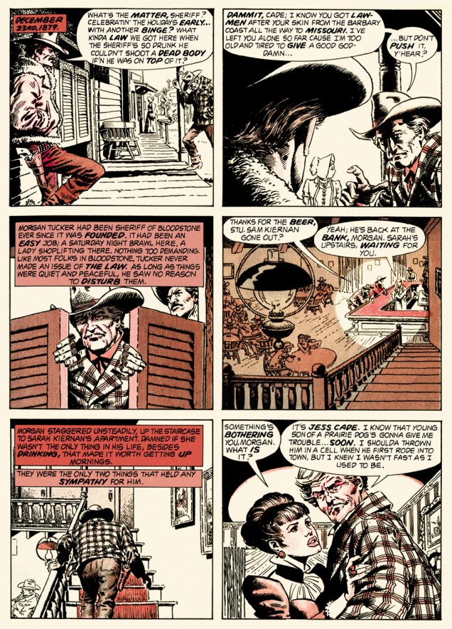
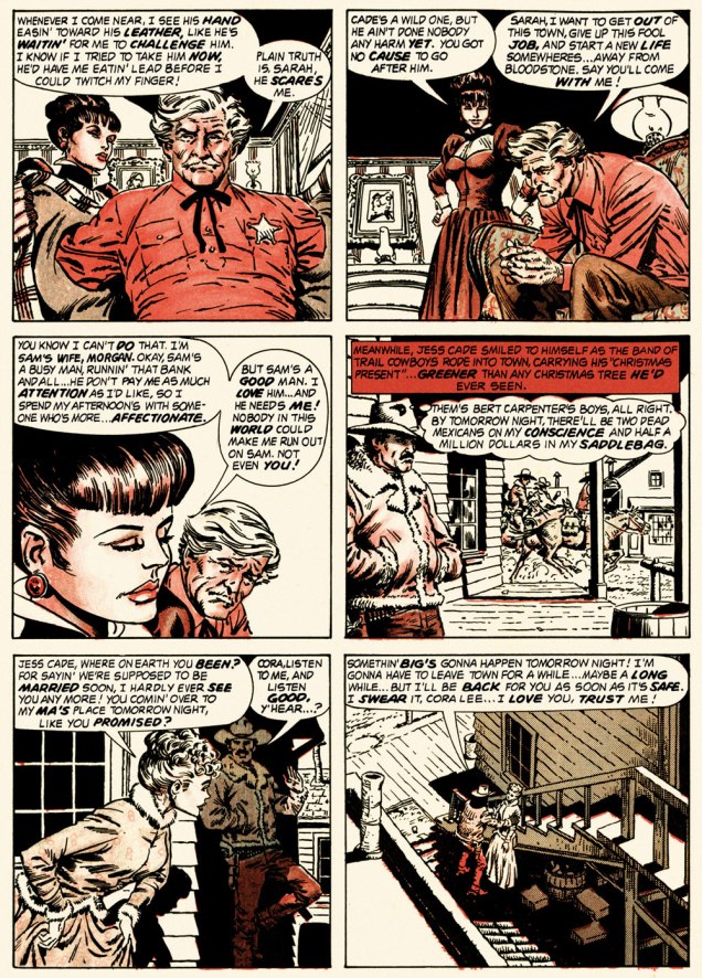
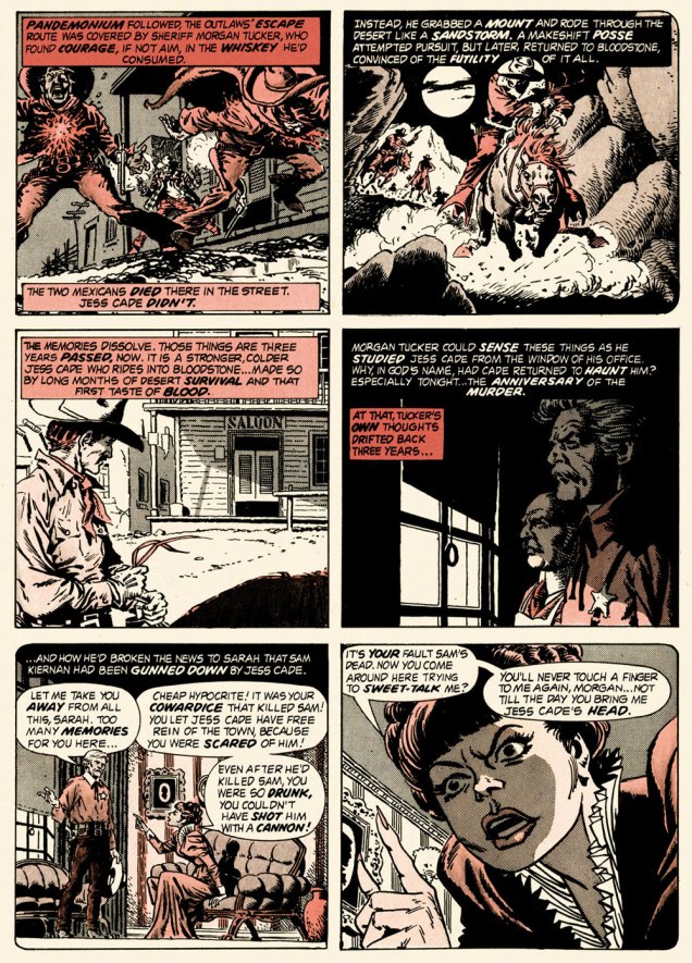
And so this is… Bloodstone Christmas, written by Gerry Boudreau, pencilled by Infantino, and inked by John Powers Severin (1921-2012).
.
.
.
.
.
.
.
I won’t pretend that the entire cast isn’t peopled with stock characters, but its sting in the tail lands satisfyingly, prefiguring the flavour of weird westerns by Joe Lansdale, for one.
.And now, for something sweeter.
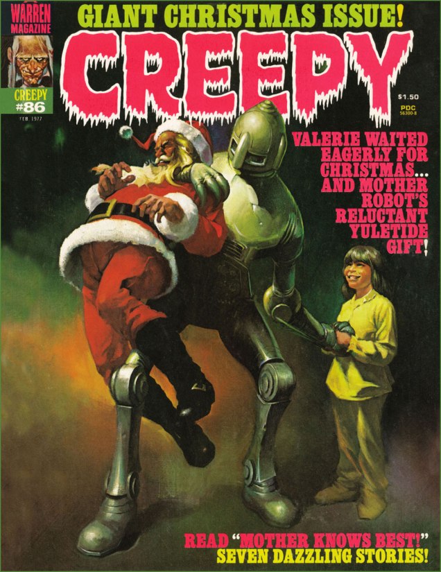
This is Creepy no. 86 (Feb. 1977, Warren). Cover by Ken Kelly (1946-2022).
And now, for the sweeter part of our double-header.
.
.
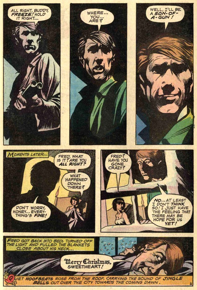
Night Prowler was an early collaboration by Swamp Thing‘s co-creators, writer Len Wein and artist Bernie Wrightson. It was published in House of Mystery no. 191 (Mar.-Apr. 1971, DC). Joe Orlando, editor.
Oh, and Happy Holidays to you, esteemed readers!
-RG
p.s. Oh, and speaking of carmine, the colour, not the man: I just read, a few days ago, in Steve Ettlinger‘s superb Twinkie, Deconstructed (2007), that « the fascinating, rich magenta carmine, also known as cochineal, is extracted from the dried body of the female cochineal insect », and that « the output of the Canary Islands is used almost exclusively to colour the Italian apéritif Campari. » Caveat emptor, then! Ironically, « carmine dye is produced from the acid that females naturally secrete to deter predators. » Not, however, industrious humans.