« I was a peaceful sedentary man, a lover of a quiet life, with no appetite for perils and commotions. But I was beginning to realise that I was very obstinate. » — John Buchan
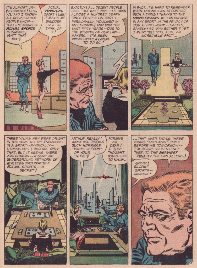
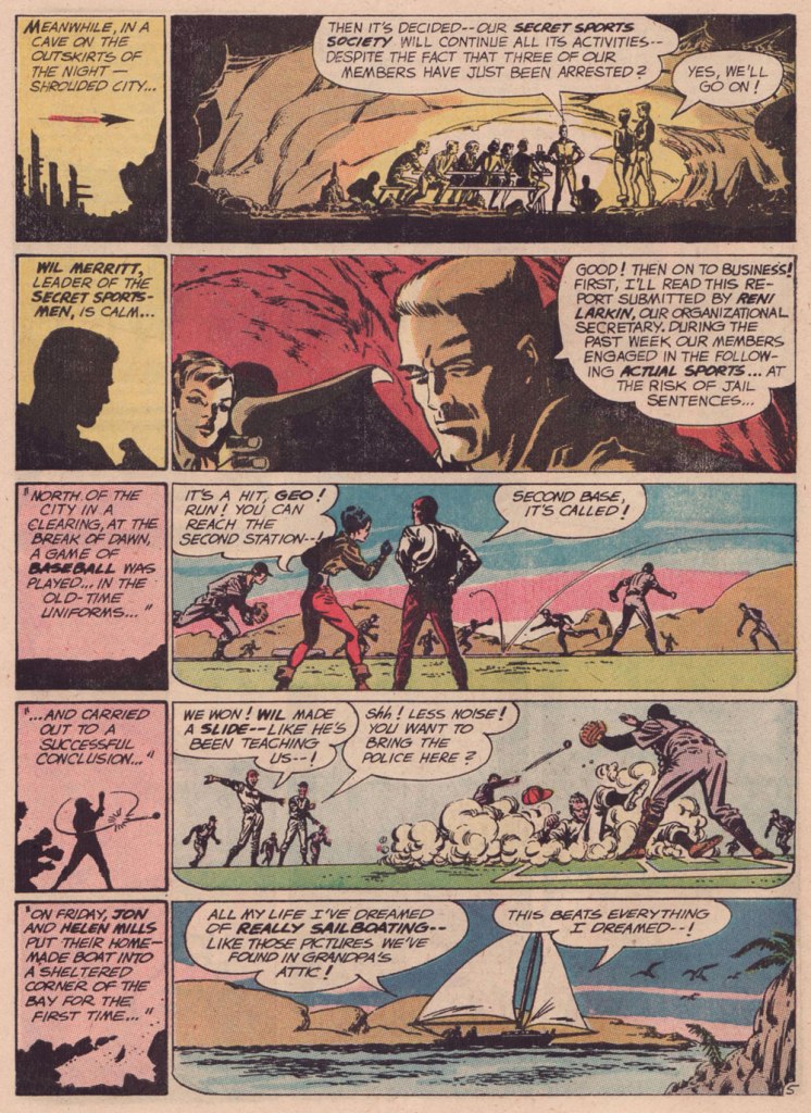
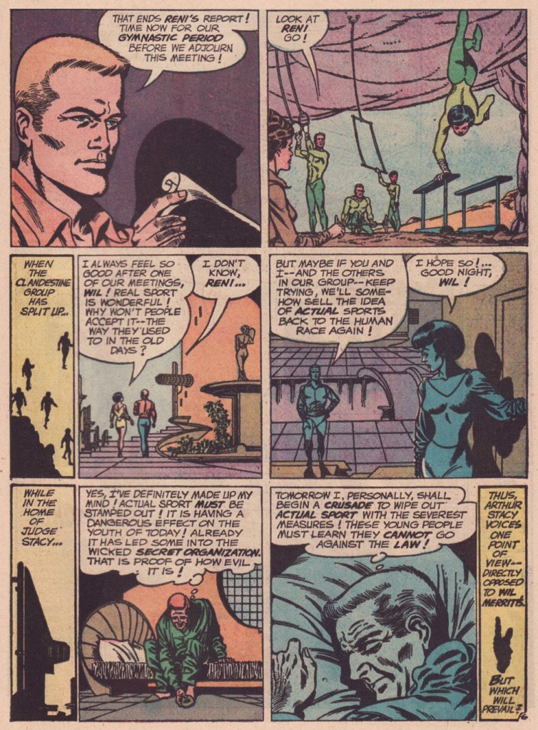
Over the course of several posts, I’ve extolled at length Carmine Infantino‘s skill as a cover designer. Yet the ability to envision and execute a single static image does not automatically translate into the skill of clearly and tidily breaking down a story into a suite of sequential panels, in much that same way that a superbly dexterous surgeon may be incapable of writing legibly. It pleases me to declare that Mr. Infantino’s no one-way specialist.
Infantino describes the evolution of his visual thinking: « The use of negative and positive shapes inside the panel had to mean something. So, to me, if the shapes didn’t draw the eye in, then they weren’t worthwhile. I had to move and change the shape to make it work for me. And that’s what I did. For me beforehand, the figure was the most important thing, and nothing else in the panel mattered. But later on, I found out that it was the total figure I had to worry about. » (all Infantino quotes excerpted from The Amazing World of Carmine Infantino: an Autobiography (2000, Vanguard Productions; edited by J. David Spurlock)
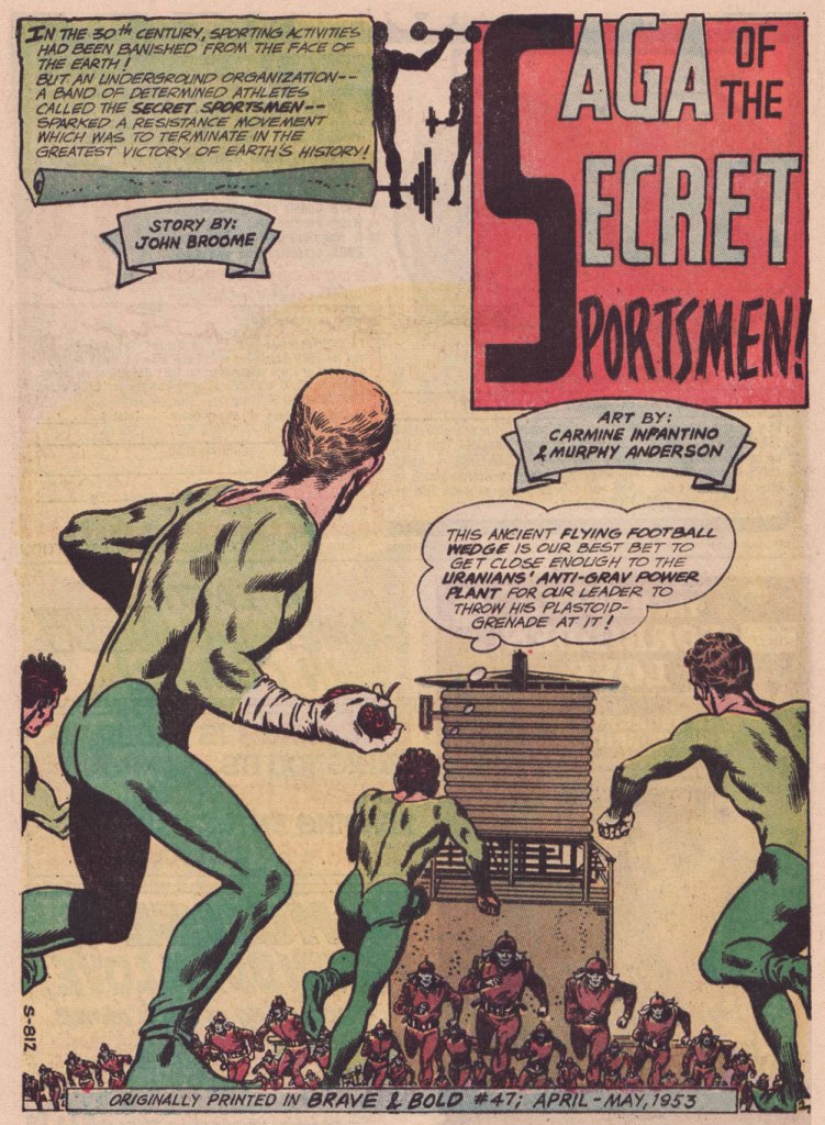
I’ve long wanted to feature this particular tale… for both script and artwork reasons. However, my copy was in Mysteries in Space: The Best of DC Science Fiction Comics (Apr. 1980, Simon and Schuster/Fireside; Michael Uslan, editor)… and I’d be all-but-guaranteed to destroy this beloved book in any attempt to scan from it. But — aha! — I’ve recently acquired a copy of DC Special no. 13 (Jul.-Aug. 1971), which granted the tale its first encore. Game on!
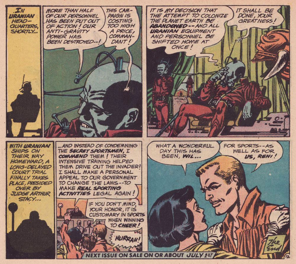
.


.
.
.
.

.

.
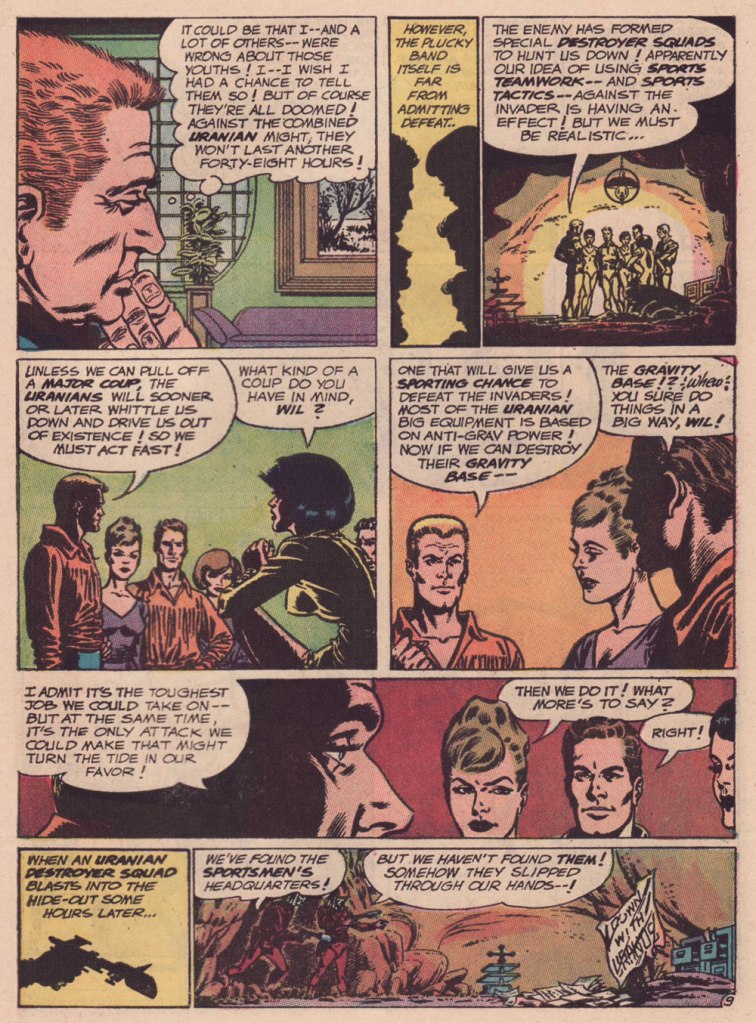
.
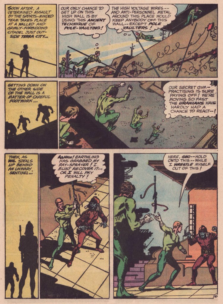
.
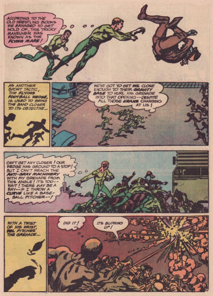
.
Our featured story shares a central perspective with Russ Manning‘s rightly celebrated Magnus, Robot Fighter, whose inaugural issue had come out a mere two months earlier — though with that close a gap, it’s most likely a simple case of coincidence.

Are we getting less physically able with every succeeding generation, as our elders have been claiming for eons? Is it just a mistaken, shallow assessment arising from tone-deaf obduracy and bad faith — or have our forerunners all been correct about a general and ongoing decline?
-RG
