« The hardest tumble a man can make is to fall over his own bluff. » — Ambrose Bierce
Today, I’m going totally ‘mainstream’ on you for a change. Last week, I ventured into a movie theatre for the first time since 2019 (Knives Out was my last such outing) to see my first superhero film since 2012 (The Avengers was my last such outing). And so, while the new Superman epic wasn’t perfect, I found much to enjoy about it.
Among the ideas explored in the film was that baddie Lex ‘Elon’ Luthor, from carefully observing The Man of Steel over several years’ worth of skirmishes, had managed to analyse and codify his combat moves, in order to predict and counter them.
I was reminded of that angle serving as the basis of a favourite Batman story by my favourite Batman writer (and hardly anyone else’s, apparently), David Vern Reed (1914-1994). Despite its publication in a popular, long-running title, this tale is obscure to the point of never having been reprinted in English.
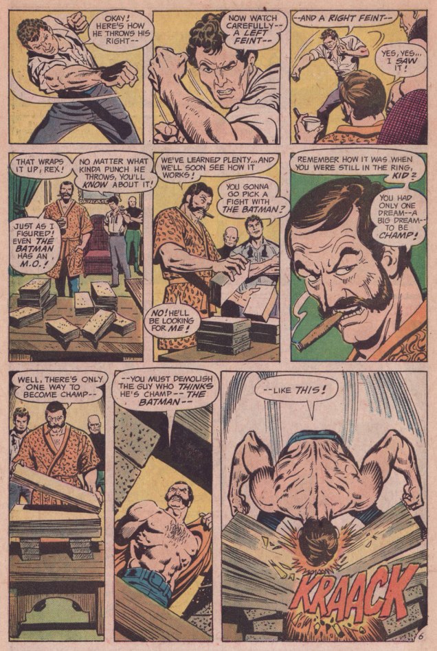
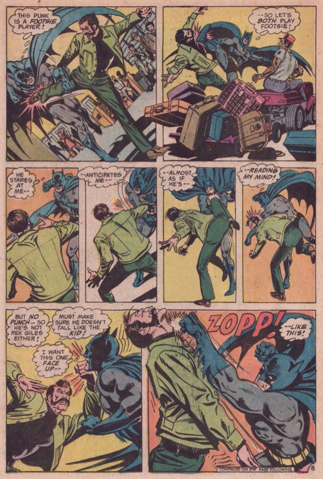
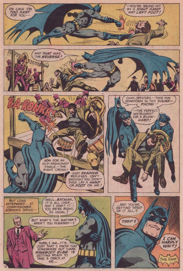
I’m terribly fond of the Schwartz-era Batman, especially the 1970s, because it’s relatively light on costumed supervillains, Batman acts like the detective — albeit a remarkably athletic one — he’s supposed to be, and the plots often hinge on ‘ordinary’ (though clever) criminals striving to outsmart Bats. A favourite example: Vern’s « The Underworld Olympics ’76! » (Batman 272-275, Feb.-May 1976) tetraptych. I think I can safely rule out childhood nostalgia: in my small town, distribution was quite spotty, so I never even *saw* those issues at the time, encountering them instead as an adult, decades on.
If I have a quibble about the art, it’s that Ernie Chan’s finishes mesh poorly with García-López’s usual rock-solid breakdowns. Perhaps it’s because Chan likes to have more to do; given that García-López, his own best inker, typically turns out pencil renderings that are utterly complete and tight as a drum, the job is quite unlike, say, Chan inking a Big John Buscema Conan job — as he so often did — wherein Chan has to do 80 percent of the work over Buscema’s sparse breakdowns, stock poses and rote shortcuts. In contrast, inking García-López essentially reduces the task to tracing over his flawless pencils, which can’t be all that stimulating, educational as it may be.
Speaking of Garcia-Lopez, a priceless anecdote: writer Andrew Helfer, a frequent collaborator, recalled, in his introduction to TwoMorrows’ Modern Masters Volume Five (2007): « … it was Jean Giraud, aka Mœbius, and he was staring at a drawing of Wonder Woman by José Luis García-López. « This García-López », he asked in a heavy French accent. « He uses models, no? » « No, » I answered, smiling. « Son of a bitch! » Mœbius hissed.
« Our Betty Cooper is still the girl next door – she literally lives next to Archie. And she’s the blonde all-American girl; she’s so sweet and forgiving, gives people the benefit of the doubt and second chances, wears her heart on her sleeve. But she’s also incredibly broken on the inside, for many different reasons. » — Lili Reinhart
As a whole, comic book artists are not a happy lot, and for good reason. During the Golden Age, at least, there were countless publishers, so one could move around if unsatisfied with the working conditions.. even if meant finding out that things were rotten all over. After the mid-1950s, when the field violently contracted — you know the story — leaving scant players standing, you pretty much had to take the work, and the abuse, as they came. And certain publishers frowned upon ‘their’ creators playing what little remained of the field.
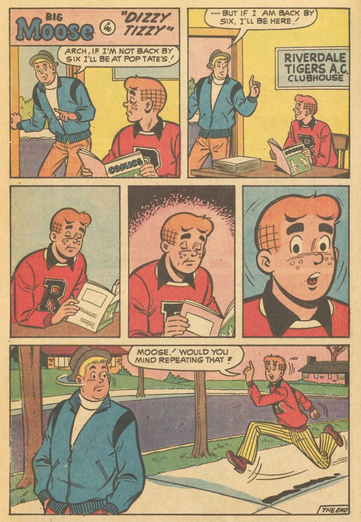
Kurt Schaffenberger had steady work at DC, but presumably — and understandably — sought to keep his options open, so he moonlighted for ACG, often under a pseudonym, probably unaware that the ‘competitor’ was covertly owned (at least in part) by DC co-founder and co-owner Harry Donenfeld. One can imagine Kurt’s distress when ACG folded in 1967. From what I can surmise, he did, in 1970, a lone, inexplicable cover for Stanley Morse… wildly outside his range but still kind of awesome. And then… he quietly boarded a bus to Riverdale.
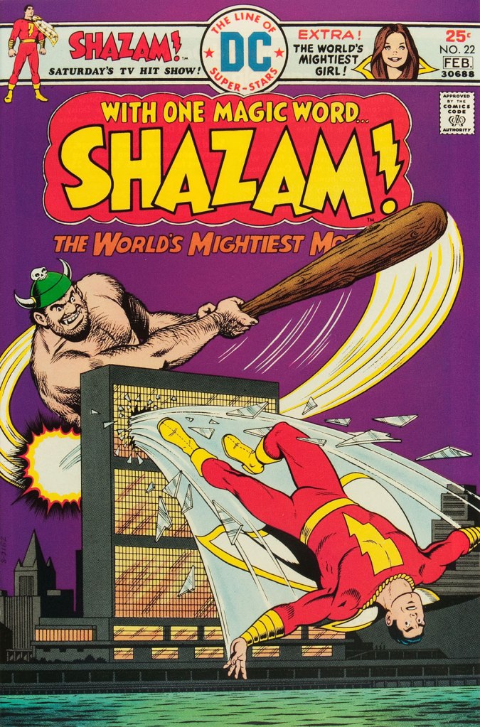
A page from Voice of Doom; script by Frank Doyle, pencils by Schaffenberger, inks by Jon D’Agostino. Published in Archie’s TV Laugh-Out no. 16 (Dec. 1972, Archie).The, er… punchline from Peace of Mind. Script by Frank Doyle, pencils by Schaffenberger, inks (likely) by Chic Stone; published in Archie’s TV Laugh-Out no. 18 (Mar. 1972, Archie).Drawing for Archie wasn’t too much of a stretch for Kurt; whether it was Reggie or The Big Red Cheese getting knocked on his ass, he had his stock posture. This is Shazam no. 22 (Jan-Feb. 1976, DC). Pencils and inks by Mr. Schaffenberger.
A couple more samples from Mr. Schaffenberger’s all-too-brief Archie period — solid, well-paced, ably-designed and economical storytelling:
A slightly surreal one-pager from Archie’s Joke Book Magazine no. 150 (July 1970, Archie).A page from Luck Struck, published in Archie’s Pals ‘n’ Gals no. 73 (Oct. 1972, Archie); note the Captain Marvel tank top young Mr. Andrews is sporting!
And then, there’s the case of Sal Amendola, a Neal Adams protégé whose reputation in comic books largely rests on a single Batman story, 1974’s ‘Night of the Stalker’, a highly praised tale whose chief conceit is that Batman never utters a word and weeps bitterly at the end. I’d apologise for the spoilers, but honestly, it’s been half a century, what mystery is there to dispel?
An excerpt from Detective Comics no. 439 (Feb.-Mar. 1974, DC); I’ll rarely say this, but Dick Giordano’s inks are an asset in this case, not a liability. The story’s scripting credits are at once hilarious and a bit sad: Steve Englehart, script; Vin and Sal Amendola, plot; and… “from an incident as described by Neal Adams.” Yeah, Neal; that’ll surely earn you a Pulitzer.
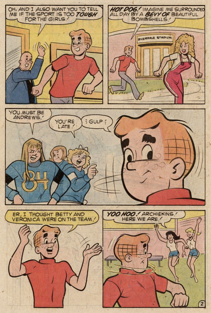
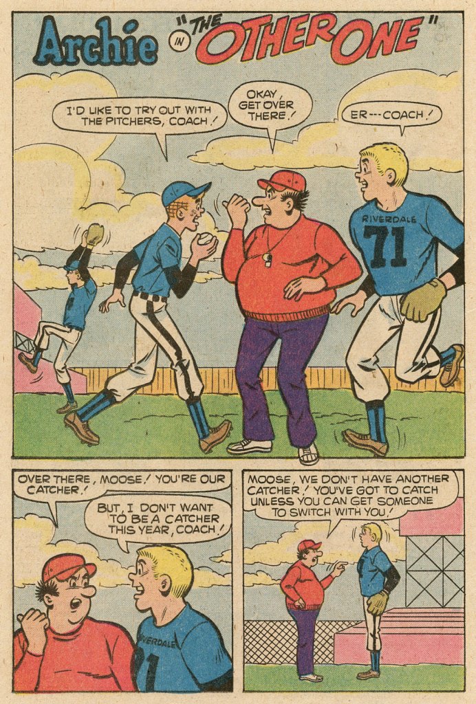
Anyway, after his turn in the Bat-spotlight and 1975’s Phoenix, one of the short-lived Atlas-Seaboard‘s more daring titles, Amendola turned up at… Archie. And it was not a good fit.
This, in fact, was the springboard for this post: a couple of years ago, I encountered an Archie story that so grotesquely missed the mark — stylistically speaking — that it bordered on the fascinating. You guessed it, Sal Amendola, utterly out of his element, not to mention, surprisingly… his depth.
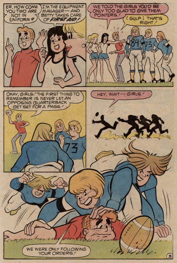
Here are a pair of pages from Coach Reproach, published in Everything’s Archie no. 71 (Dec. 1978, Archie), script by George Gladir, pencils by Amendola, inks by Jon D’Agostino.
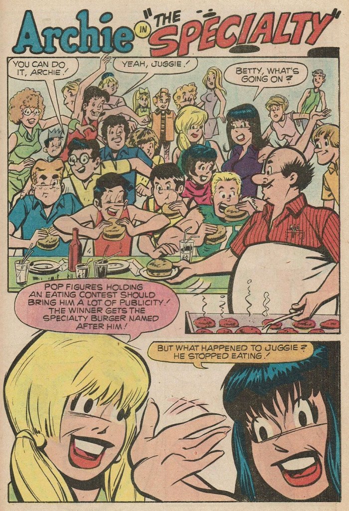
Where to begin? In the first panel, you give Archie a stiff, unnatural pose and you follow it up by repeating it on a background character in the very next panel. And Arch is due for a nasty case of whiplash if he keeps trying to make like Linda Blair.At this point, I’m thinking Sal had learned plenty from his mentor on how to utterly fail at comedy.If what I’ve observed about pitching stances is worth anything, Archie’s about to get brained by a baseball. Ginger boy is also looking right past Coach Kleats. Despite the low bar — issues of quality control were rampant at Archie in the 1970s — this is impressively incompetent storytelling,What happens when you never learn basic inking principles: one creates depth by using thinner lines — and less detail — on background characters, otherwise… visual chaos ensues, as demonstrated here. And Sal’s Betty and Veronica sorely need a brand of shampoo that won’t leave their hair so oily and limp… but the anatomy is beyond help. This is the opening page of The Specialty, from Pep no. 342 (Oct. 1978, Archie).
Schaffenberger’s fellow Golden Age veteran, Gene Colan, also found himself moonlighting in the 1960s. In his case, it was for Marvel, under the alias of ‘Adam Austin’, but also for Dell (just a couple of covers mid-decade) and more significantly for Warren Magazines. In the 1970s, he concentrated on Marvel and was, in the chaos that was the so-called ‘House of Ideas’ at the time, the single most reliable artist in the maelström: surely none can match his seventy consecutive — and meticulously detailed — issues of Tomb of Dracula, in addition to lengthy runs on Howard the Duck, Daredevil, Captain America, Doctor Strange and so forth.
« When writer Jim Shooter became Marvel’s editor-in-chief in the late ‘70s, the tension between Colan and the younger authors came to a head. By 1980, Shooter and Colan were totally at odds with one another over Colan’s approach to storytelling. »
« [Shooter] was harassing the life out of me. I couldn’t make a living,” Colan said. “He frightened me, he really did. He upset me so bad I couldn’t function.” Just as she had urged Colan to quit one job [in] the 1960s, wife Adrienne begged him to leave Marvel in 1980. After delivering his resignation, Colan was asked to sit down and seek resolution with Shooter and publisher Mike Hobson. Colan agreed to the meeting, but declined any overtures to stay at Marvel. “Shooter was in the same room,” Colan recalled, “and I said, ‘That man’s not gonna change. He is what he is. Whether it’s six days, six months or six years, it’s not going to be any different, so I’m not going to put up with it for another minute.‘ » [ source ]
He then scampered over to DC for a few years. His production there was hit-and-miss, but his Batman run (1981-86) was outstanding, pairing him with some of the rare inkers who could do his nuanced pencils justice: Klaus Janson, Tony De Zuñiga (to my amazed delight!) and especially Alfredo Alcala.
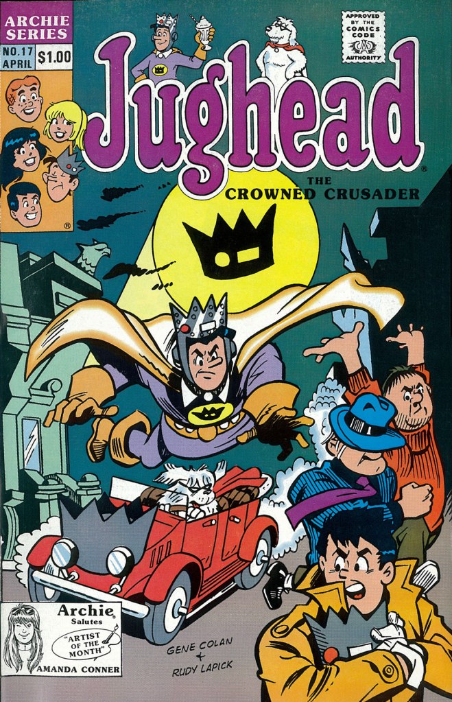
But once his contract ran out, he was out knocking on doors again. Against all odds, Archie beckoned.
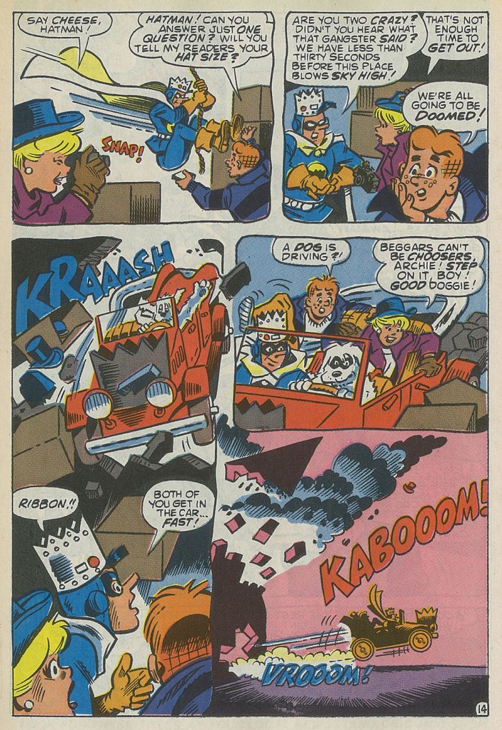
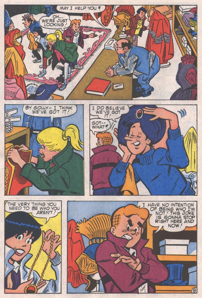
This is the cover — dreadful, I’m afraid — of Jughead no. 17 (Apr. 1990, Archie), reviving the opportunistic, Batman TV show-derived ‘Riverdale Gang as superheroes’ de trop move of the mid-1960s, with even less aplomb. But then the Archie folks were plumbing an especially low point with such ‘experimental’ titles as Jughead’s Diner, Archie 3000, Dilton’s Strange Science, Jughead’s Time Police, Archie’s R/C Racers, Explorers of the Unknown, and of course The Adventures of Bayou Billy.An action-packed — and Colan-shambolic — excerpt from that issue’s Hatman saga, written by Robert Loren Fleming, pencilled by Colan and inked by Rudy Lapick. Notwithstanding his sticking out like the proverbial sore thumb, Colan clearly had a ball working on his Archie stories. He brought some urgently needed chutzpah to a perilously stale formula.A page from Will the Real Archie Please Stand Up!, published in Life with Archie no. 273 (July 1989, Archie), wherein Archie is mistaken for his doppelgänger, a foreign prince named Kafoufi… but of course. Pencilled *and* scripted by Colan, which is most unusual. Oh, and inked by Mr. Lapick, who doesn’t quite know what to do with those ol’ Colan worm-fingers, seen wriggling in panel five.
« A merry Christmas to all my friends except two. » — W. C. Fields
I was in the middle of writing a post on another topic, getting bogged down in its complexities, and then it dawned on me that Christmas was fast approaching, and I’d better switch gears pronto.
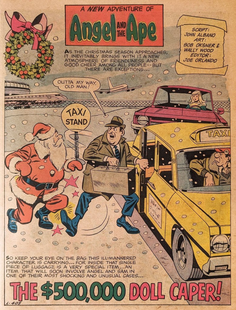
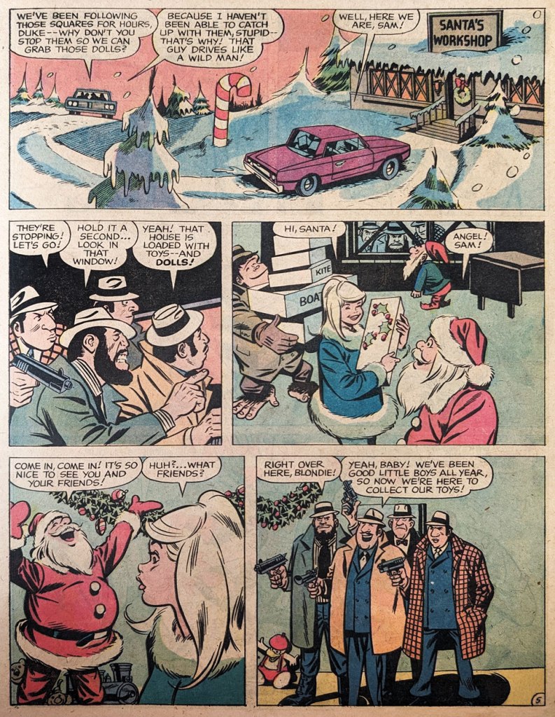
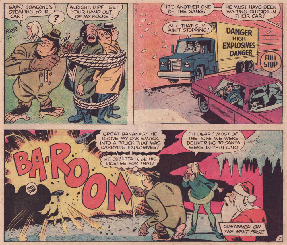
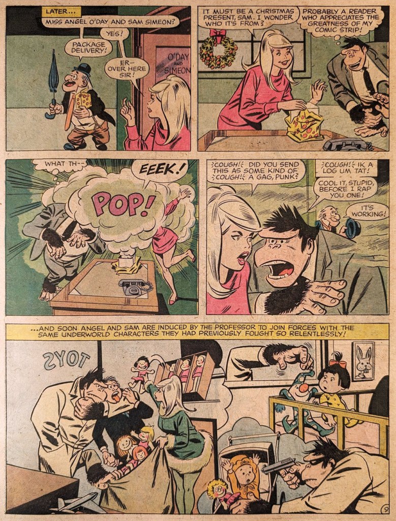
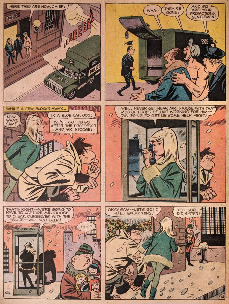
Thankfully, I had something in mind: an Angel and the Ape tale initially produced in the late 1960s but orphaned with the book’s cancellation. It was half-heartedly released from limbo –shall we say buried? — in one of those awkward tabloid format volumes, Limited Collectors’ Edition C-34: Christmas With the Super-Heroes (Feb.-Mar. 1975, DC) and not even advertised on the front or back cover… which is why it took me decades to learn of its existence.
On average, Angel and the Ape was only marginally funnier than the rest of DC’s humour books (save of course for Shelly Mayer’s consistently hilarious Sugar and Spike), but still leagues ahead of Marvel’s painful Not Brand Ecch et al. A&A was, imho, at its peak when E. Nelson Bridwell wrote it, lobbing some choice barbs at the esteemed competition.
To briefly illustrate my point, here’s a relevant panel from Angel and the Ape no. 3 (Mar. 1969, DC).
Script by Bridwell, pencils by Oksner, inks by Wood. The redhead in the green cape and star-spangled tights is Stan Bragg, editor-in-chef at Brainpix Comics, a clever amalgam of the Smilin’ One and his Rascally subordinate. “When you write good stories and do good artwork, don’t I sign it?“
« Physics should represent a reality in time and space, free from spooky action at a distance. » — Walter Isaacson
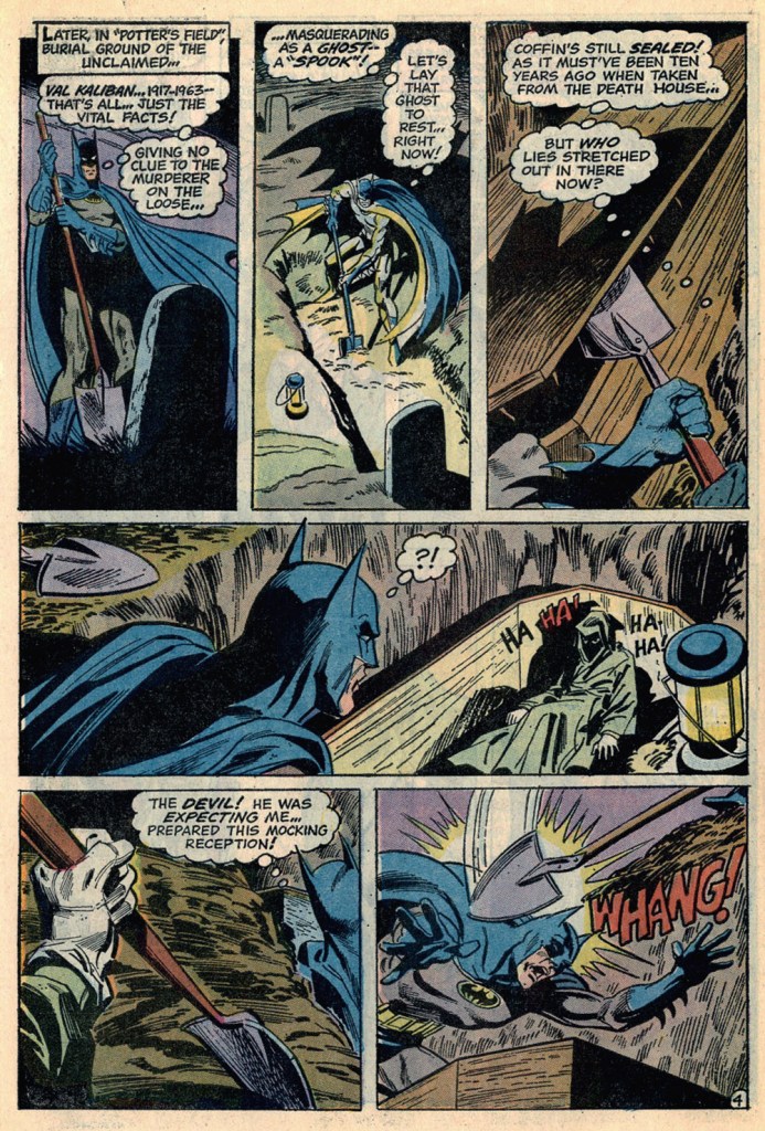
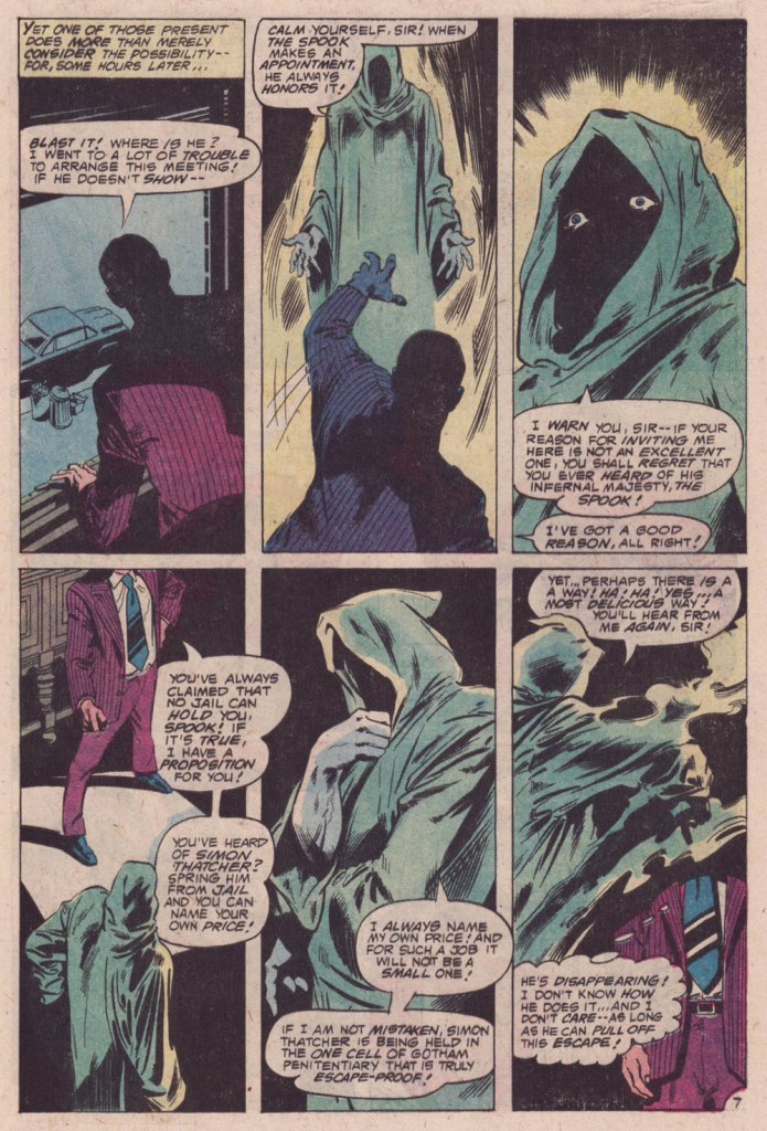
Who’s my favorite Batman foil? Why, The Spook, of course! A brilliant and patient (but twisted, natch) planner, engineer, escape artist and… businessman Val Kaliban was a most worthy opponent for the Batman in detective mode. Let’s sneak a gander at his earliest and most significant appearances.
This is Detective Comics no. 434 (Apr. 1973, DC). A middling cover, certainly not Michael Kaluta‘s best Batman cover… nor his worst. I mean, what’s Batman’s left leg doing exactly?
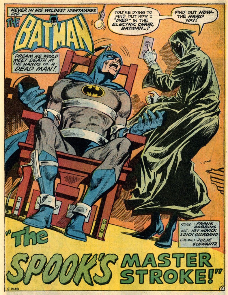
Here’s a fun sequence from the issue’s The Spook That Stalked Batman, scripted by Frank Robbins, pencilled by Irv Novick and inked by Dick Giordano.
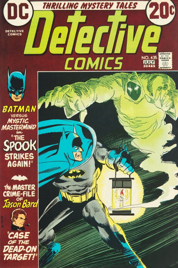
This is Detective Comics no. 435 (June-July 1973, DC); an okay cover by Dick Giordano.Ah, finally… The Spook gets a cover worthy of his mettle. This is Batman no. 252 (Oct. 1973), cover design by Carmine Infantino, pencils and inks by Nick Cardy, and lettering by Gaspar Saladino (well worth mentioning!)
A pair of pages from the issue:
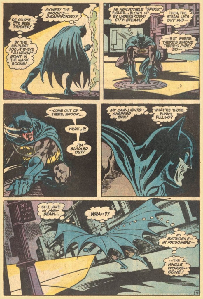
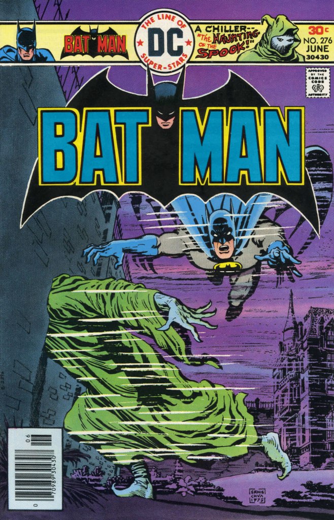
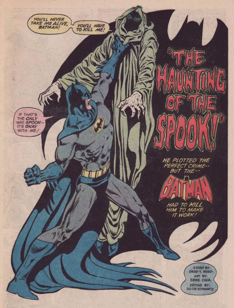
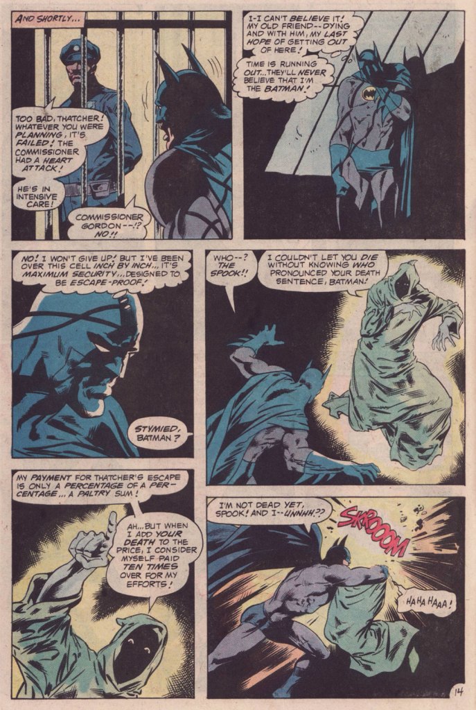
This is Batman no. 276 (June 1976, DC). For the first time, someone other than his creator, Mr. Robbins, handles The Spook. Fortunately, it was talented scribe David Vern (writing as David V. Reed), quite possibly my favourite Batman writer. A fine, moody cover by Ernie Chan.The Spook’s following appearance, in which Dick Giordano demonstrated he could come up with a crappy Andru-Giordano cover… all on his own. This is Detective Comics no. 488 (Feb.-Mar. 1980, DC).
The Spook’s Death Sentence for Batman, written by Cary Burkett, pencilled and inked by the splendid team of Don Newton and Dan Adkins, was a worthy send-off for this fine character. Beyond that… I don’t much care. The Spook is a difficult personage to write for, but he got three solid writers to chronicle his exploits, and that suits me just fine.
« I was always concerned more with the visuals than with the copy — and the visuals had to be provocative! » — Infantino*, in a nutshell.
To recap, under the parameters I’ve set for this category a hot streak is a series of outstanding consecutive covers by a single artist (inkers may vary) on the same comic book title. Since it’s my party, I occasionally make allowances (e.g. allowing entry to a scruffier, but still presentable, specimen), but it’s more challenging and more fun to play it straight.
By my reckoning, there are very few truly great cover artists to begin with, and their output is often stifled by indifferent, incoherent or hostile art direction, poor lettering and colouring choices beyond the unfortunate artist’s control, lack of interest in the imposed subject matter… you get the picture. And there’s also the difficulty of getting a decent streak going when the editor keeps shuffling cover artists.
The artist in his suit and tie (and cigar!) days at DC.
I’ve gone on at length (I refer you in particular to Hot Streak: Nick Cardy’s Aquaman, Previously) about the gargantuan amount of work Carmine Infantino (1925-2013) knocked out conceiving comic book covers during his executive years at DC (1966-75), but most of his best designs were executed by others. I mean the man was already doing the work of five people, what more could he do?
« At DC Comics, I worked round the clock, including weekends, and never taking a vacation in the 10 years I served there. I not only was creating new titles, designing most of the covers, plotting stories and going on the road for the distribution of the magazines, plus doing radio shows and then running out to California to be totally included with Puzo and the producers creating the Superman movies I &II. Time got so tight that I would design covers on the way to the airport and have the driver deliver them to Sol Harrison, who in turn gave them to the waiting artists. I would be at my desk from 7 a.m. to 9 p.m. It began to be a destructive grind. »
While Carmine is most closely associated with Silver Age characters The Flash and Adam Strange, I couldn’t discern, in these titles, a run of sufficiently stellar *and* consecutive covers (Flash nos. 139-142 and Mystery in Space nos. 69 to 71 come closest… do bear in mind that I have no consideration for ‘key’ issues or ‘famous’ or ‘event’ covers). It’s no real surprise that Infantino’s design work rose to a crescendo of accomplishment and consistency when he was made the company’s de facto art director, late in 1966. And what was he working on at the time? Batman. So, since Detective no. 261 bears a ho-hum cover and no. 269 is pretty spiffy, but the work of Gil Kane, here’s Mr. Infantino’s hot streak:
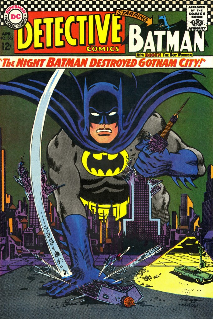
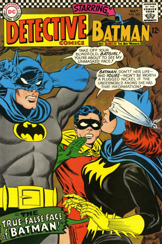
This is Detective Comics no. 362 (Apr. 1967, DC), pencilled by Infantino and inked by Murphy Anderson. Carmine wasn’t a fan of the so-called ‘Go-Go Checks’, that checkerboard pattern that once famously adorned those distinctive yellow NYC cabs. He didn’t mince words, either: « What a ridiculous thing: it was the stupidest idea we ever heard because the books were bad in those days and that just showed people right off what not to buy. ». Certainly, in the case of Detective Comics, they left the top of the page far too cluttered.This is Detective Comics no. 363 (May 1967, DC), featuring (this) Batgirl‘s second appearance. She’d been created by editor Julius Schwartz and Infantino at the request of the hit Batman TV show‘s producers, figuring that the series needed a heroine for a little extra spice. Art by Infantino and Anderson.This is Detective Comics no. 364 (June 1967, DC). Roy Reynolds, alias The Getaway Genius, was a fun civilian villain whose finest hour, in my view, came at the tail end of 1973 with Batman no. 254‘s King of the Gotham Jungle! (written by Frank Robbins, pencilled by Irv Novick and inked by Dick Giordano), when he was unexpectedly caught between the Batman and the Man-Bat. I wouldn’t be surprised to learn that a Batmaniac or three had reconstructed this Joker edifice in their backyard or basement, out of Lego blocks or papier mâché… or actual bricks.
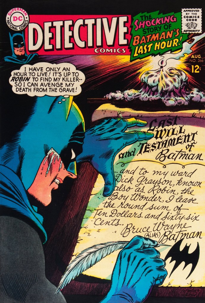
Carmine really went to town on this one, and it’s rightly earned its place in the hall of classics. This is Detective Comics no. 365 (July, 1967, DC). The cover story, The House the Joker Built! is scripted by John Broome, pencilled by Bob Kane ghost Sheldon “Shelly” Moldoff and inked by Joe Giella.Speaking of design, here’s the masterful Ira Schnapp‘s house ad for Detective 365, as it appeared in Green Lantern no. 54 (July, 1967, DC), among other titles.This is Detective Comics no. 366 (Aug. 1967, DC); I love those moody colours and light effects, that tell-tale Infantino candle and the mysteriously parsimonious inheritance bequeathed to Robin.This is Detective Comics no. 367 (Sept. 1967, DC), an intriguing preview of Where There’s a Will — There’s a Slay!, written by Gardner Fox, pencilled by Infantino, inked by Sid Greene. I wonder how many young readers enthusiastically destroyed the cover to assemble the puzzle…
Note also the improved logo placement (a return to issue no. 327 original ‘new look’ logo, actually), giving the layout a chance to… breathe a bit better. The Batman cameo at top left is still de trop.
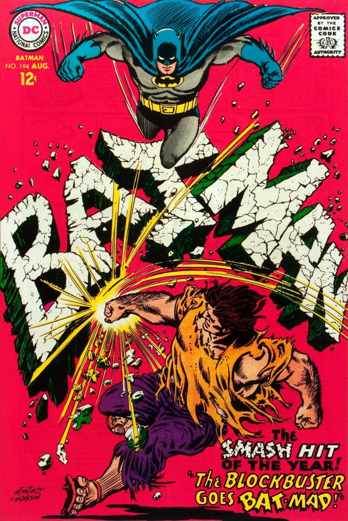
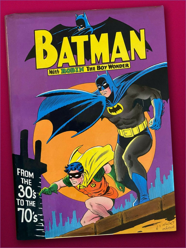
This is Detective Comics no. 368 (Oct. 1967, DC). Infantino reportedly created the covers first, and editor Schwartz assigned his writers to work up a scenario to fit. This one could not have been a cakewalk. Gardner Fox was the unlucky recipient of that gargantuan task.Since it’s not an issue of Detective, this cover’s not *technically* part of the streak… but as it features Batman, and it appeared between issues 365 and 366 of Detective, I’m throwing it in. Infantino and Anderson’s literal and figurative blockbuster of a cover for Batman no. 194 (Aug. 1967, DC). Its cover aside, a pretty ho-hum issue. The book and the character were in urgent need of another overhaul, and it was just around the corner. « When Donenfeld saw this cover, he had a fit! He said, ‘I don’t see the logo on top!’ I said ‘You don’t have to — you’ve got Batman up there!’ »Aw, heck — here’s Ira Shnapp’s accompanying house ad, a work of art in itself, wouldn’t you agree?Speaking of immortal Infantino Batman images: « Aurora wanted action shots of their models, so I did this rough layout, sent it to them, and they liked it! I had a moon behind him, but they dropped it. The tree created the design. I was very high into design at this point (1964) — the design was pouring out of me! ». Here’s a look at the finished model.I couldn’t very well leave out what’s possibly the most famous of Carmine’s Bat-scenes: this is Batman From the 30’s to the 70’s (1971, Crown Publishers) a splendid hardcover anthology. Its cover adapts an Infantino-Anderson mini-poster that originally saw print in Detective Comics no. 352 (June 1966, DC) and bore instead the inscription « Best Bat-Wishes Batman and Robin ». Superman, Wonder Woman and Captain Marvel, er… ‘Shazam’ also got their own historical anthology in this format.
-RG
*unless otherwise specified, most Infantino quotes are drawn from his excellent, profusely visual 2001 autobiography (with J. David Spurlock), The Amazing World of Carmine Infantino (Vanguard Publishing).
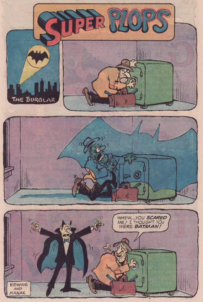
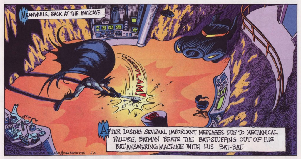
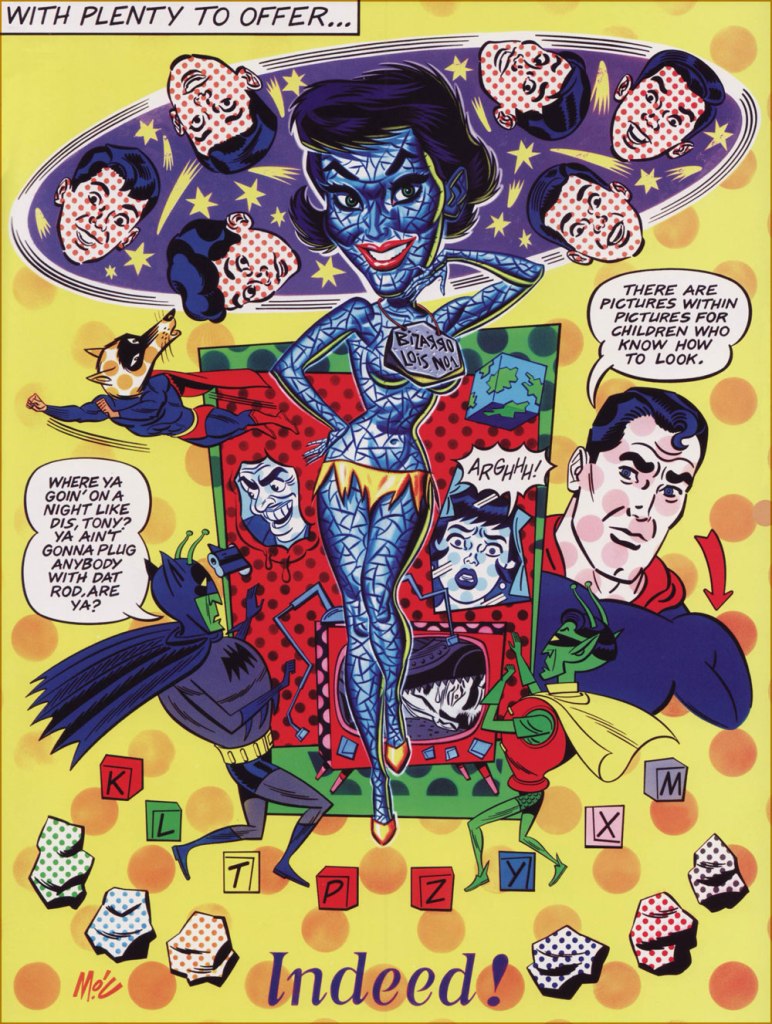
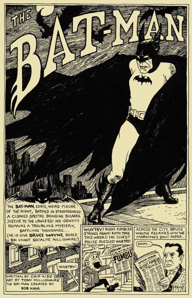
« The best thing for rich people to do is become Batman. » — Karl Heinrich Marx*
So we’ve got another dour, dark, mumbly, violent, grim ‘n’ gritty Batman movie making the rounds. I’ll pass — I’m afraid that’s not my Batman of choice. But I’m certainly game to provide an alternative view.
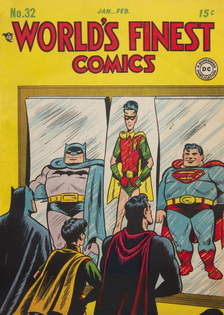
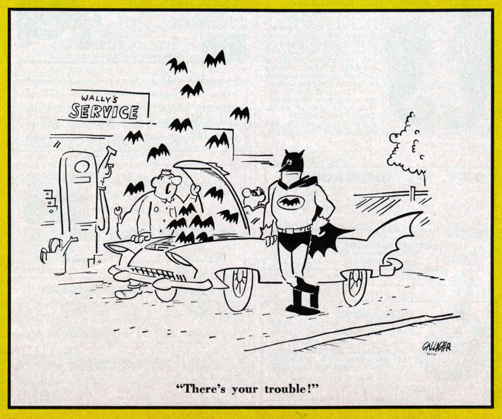
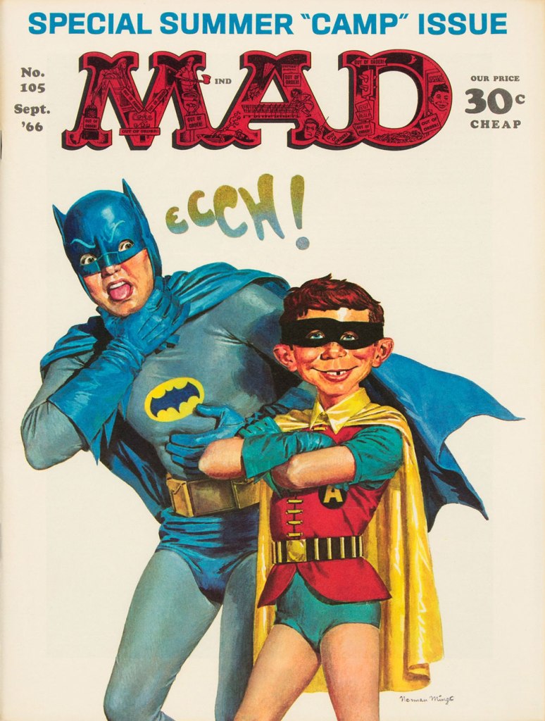
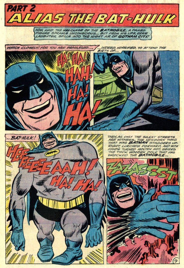
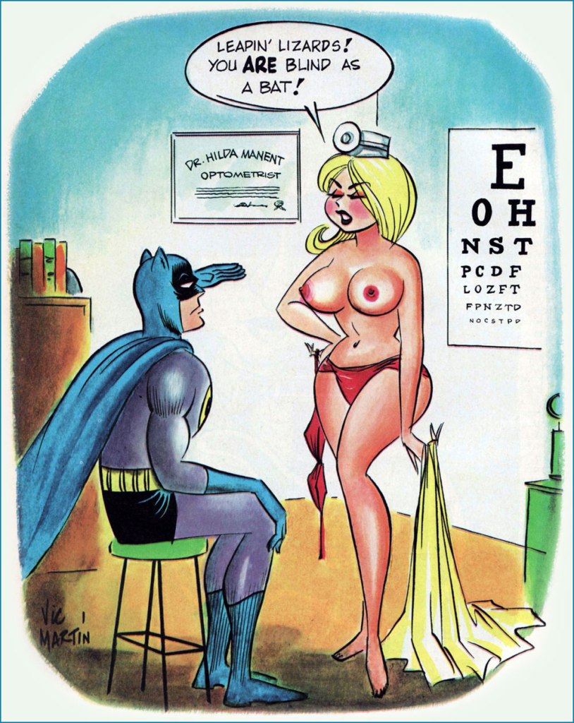
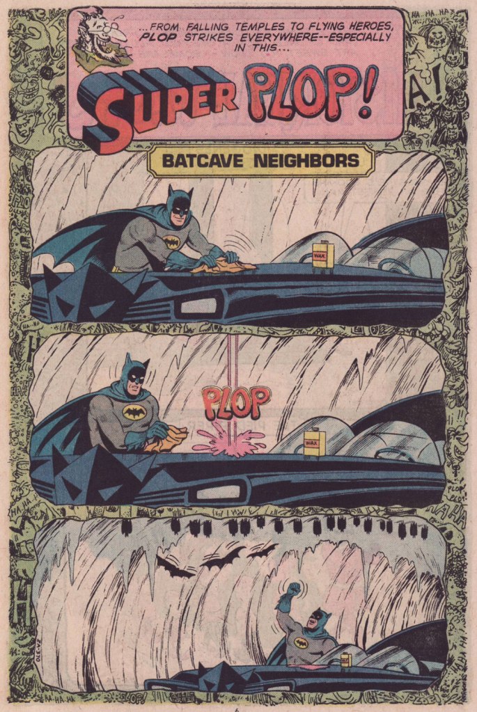
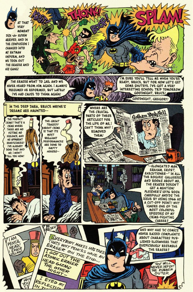
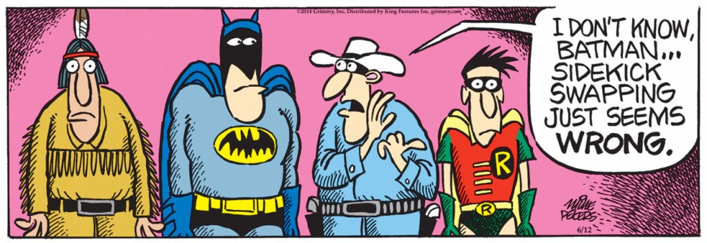
This is World’s Finest no. 32 (Jan.-Feb. 1948, DC); cover art by Hamilton, Ontario’s Win Mortimer (1919-1998), just one in a long, memorable series of frequently goofy scenes featuring this heroic trio.A cute one from John Gallagher (1926 – 2005), twice (1957, 1971) the winner of the National Cartoonists Society ‘Best Gag Cartoonist‘ Award and elder brother of Heathcliff creator George Gately Gallagher. It was published in scouting monthly Boys’ Life‘s July, 1966 issue, smack dab in the heart of Batmania. We ran another bit of bat-drollery from John in an earlier post.This is Mad Magazine no. 105 (Sept. 1966, EC); cover by Norman Mingo (1896-1980).A pivotal page from ‘Alias the Bat-Hulk’ written by Bob Haney, pencilled by Mike Sekowsky and inked by Mike Esposito, from The Brave and the Bold no. 68 (Oct.-Nov. 1966, DC), edited by George Kashdan. We’re featured the issue’s fabulously batty cover in our earlier tribute to Mike Sekowsky. Bless you, gentlemen — you truly understood what fun meant and what comics should be.Prolific Argentine cartoonist Vic Martin (in his homeland, he drew the strip “Salvador” for Medio Litro magazine) moved to the US in the early 1950s, crafting a respectable body of work in the comic book field, chiefly for Ziff-Davis, before migrating to men’s magazines and girlie digests. By the 1970, he’d found a home with Cracked Magazine (He handled the Hudd & Dini feature), while also freelancing for Sick and Crazy. Everything but Mad, really. This particular cartoon comes from the March, 1967 issue of Avant Publishing’s “Escapade”. As Pat Masulli is listed under “production” in the masthead, a Charlton connection is more than likely. And speaking of “Leapin’ lizards!“, Martin would later (1973-74) work on the Little Orphan Annie comic strip.From Plop no. 9 (Jan.-Feb. 1975, DC); Writer unknown, art by Kurt Schaffenberger.This one’s from Plop! no. 20 (Mar.-Apr. 1976), DC); idea by Don ‘Duck’ Edwing, art by Dave Manak.Dan Piraro‘s May 21, 1995 Bizarro Sunday strip. Between Piraro and his canny accomplice, Wayno, there have been scores of excellent bat-japes over the years. I must confess that the term ‘bat-bat’ triggers other associations. « To the Man-Mobile! »This is Pictures Within Pictures, a 1998 watercolour by Mitch O’Connell (not to be confused, of course, with this beloved, near-homonymous fella — yes, I can just hear Beavis and Butthead chortling). The piece is full of references to various Golden Age comics made infamous by Fredric Wertham‘s Seduction of the Innocent. For instance, er… Batman‘s speech balloon quotes from this particular comic book‘s opening splash. On a sobering note, let’s not forget that the 1950’s furore over comic books, as absurd as it may have seemed, still has relevance today.In a more deadpan vein, here’s the opening splash of Chip Kidd and Tony Millionaire‘s madcap homage to the very earliest of Batman’s exploits, with nods a-plenty to the 1943 film serial. “The Bat-Man” originally appeared in Bizarro Comics (Aug. 2001, DC).Another most decidedly dynamic duo, Eddie Campbell and Hunt Emerson, assembles to concoct an affectionate, thoughtful and yes, funny look at one of Batman’s most bizarre-yet-neglected members of the Bat’s rogues’ gallery, Lenny Fiasco, aka The Eraser, introduced in Batman no. 188 (Dec. 1966, DC) with The Eraser Who Tried to Rub Out Batman! This sequel, Who Erased the Eraser? also made its original appearance in Bizarro Comics (Aug. 2001, DC), edited by Joey Cavalieri.Here’s one (June 12, 2014) from Pulitzer Prize-winning (1981) editorial cartoonist Mike Peters (b. 1943). It’s from his unevenly written but always gorgeous comic strip Mother Goose and Grimm (created in 1984 and still going strong in over 800 newspapers worldwide). Like his colleagues Piraro and Wayno, Mr. Peters can scarcely resist a good bat-gag, so this is just one in a crowd of many.Everyone’s familiar with the famous playground song and staple of crooner Robert Goulet’s répertoire, right? The web is rife with visual adaptations, but this was my favourite, the work of Matthew S. Armstrong and available as a handsome t-shirt.
-RG
*the second-funniest Bat-related thing I encountered online this week is this attribution of a Batman (created in 1939) quote to Marx (1818-1883).
The funniest was the following deeply ironic quote from pathological liar and glory hog Bob Kane: « How can an article about me or the Batman be the true story when I am not consulted or interviewed? »
A decade-and-a-half after his unceremonious cancellation, the Stranger was dusted off and given another shot in Showcase no. 80 (Feb. 1969), which was gorgeously illustrated by Messrs. Grandenetti and Bill Draut, and the Stranger, fedora, turtleneck and all, was soon spun off into his own title once more. It began well enough, but despite some often gorgeous covers, in no time descended into endless formulaic repetition: the PS makes vague, laughably pompous statements, his skeptic foil Dr. Thirteen fumes and rants, and my candidate for all-time most tedious arch-nemesis, Tala (introduced by Bob Kanigher and Neal Adams in issue 4) almost invariably turns out to be behind the issue’s menace.
It’s surely a minority opinion, but I only regain some interest in the series after its most celebrated creative team, Len Wein and Jim Aparo, have moved on. Scripters Arnold Drake, David Michelinie and Paul Levitz pick up the mantle, along with artists Gerry Talaoc and Fred Carrillo, and the book improves as its sales slowly tank. Near the end, editor Joe Orlando adds The Black Orchid as a back-up feature, and Deadman becomes a regular participant, both inspired decisions, but insufficient to stem the tide.
This is The Phantom Stranger no. 41 (Feb.-Mar. 1976, DC), the series’ final bow. Art by Jim Aparo. While I’m quite underwhelmed by Aparo’s work on the insides, just about every cover he provided, during and after his run, was outstanding.
A couple of years after the book’s cancellation, The Phantom Stranger and Deadman were teamed up again for a Halloween special. Beyond a decent cover, the results were rather… dire. I really, really wanted to like it, but it’s just a hodgepodge of overwritten mediocrity that can’t seem to decide what it wants to be or what its audience is: not scary in the least (even by Comics Code Standards), barely moody, a waste of trees.
This is DC Super Stars no. 18 (Jan.-Feb. 1978, DC)… also the final issue of that particular series. Cover art by Jim Aparo.
The first page, one of the better ones. Script by Martin Pasko and art by Romeo Tanghal and Dick Giordano (who’s actually in the plus column this time).
Sigh. Yet another self-indulgent reference to perhaps the Nerd-fest of the 1970s, the Rutland (VT) Halloween Parade, comes in to utterly derail the story.
Tala is behind it? You don’t say! And then the “creative” team shoehorns itself into the proceedings. How refreshingly outré. An excerpt from the second half of the, er, epic, written by Gerry Conway, pencilled by Tanghal, and inked by Bob Layton.
One of the earlier tributes to the Rutland parade, this is Batman no. 237 (Dec. 1971, DC); cover art by Neal Adams (with presumed design input by Infantino and Cardy). This has laughably been deemed The Greatest Halloween Comic Book Ever, which provides a view into the mindset of people who apparently deem only superhero comics worthy of their attention.
-RG
*helpfully reprinted, though in dribs and drabs and all over the place, through the 1970’s.
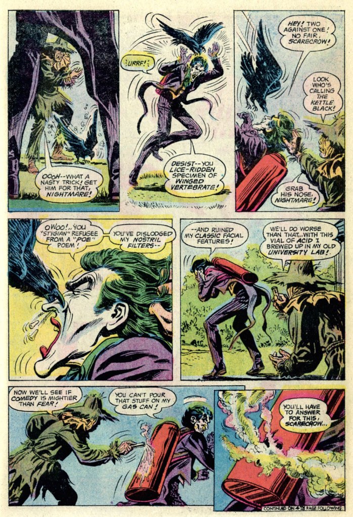
« Every scarecrow has a secret ambition to terrorize. » — Stanisław Jerzy Lec
I can’t help but feel that a villain who makes time in his nefarious schedule for taking his, er, pooch for regular walks can’t be *all* bad. Likewise for a rogue who appreciates the cleverness and joie de vivre of a raven.
This is The Joker no. 8 (July-August 1976), featuring The Scarecrow’s Fearsome Face-Off!, which was edited by Julius Schwartz (in case the alliterative title hadn’t tipped you off), scripted by Elliot S! Maggin, pencilled by the always-solid Irv Novick and inked by Tex Blaisdell. Cover by Ernie Chan (as Ernie Chua).
In the mid-70s, The Clown Prince of Crime held his own book for ten issues (nine of which appeared at the time… the tenth only seeing print in… 2019!), and its stories chiefly (and rather winningly) focussed on his squabbles with other members of The Batman’s rogues’ gallery (certainly the finest in comics). I haven’t followed the dodgy shenanigans of the back issue marketplace in decades, but I was amused and bemused by the lofty prices that this otherwise-innocuous little series commands. Overflow from his cinematic popularity, perhaps?
I like the way Professor Crane works. Over these past couple of years, this last two panel sequence has probably come to pass in real life more often than one would care to count.
The Joker adopting a hyena as a companion was but a cruel cover dodge, but The Scarecrow‘s pet raven, Nightmare, is present and accounted for, superbly crafty and most efficient, just like the genuine article!
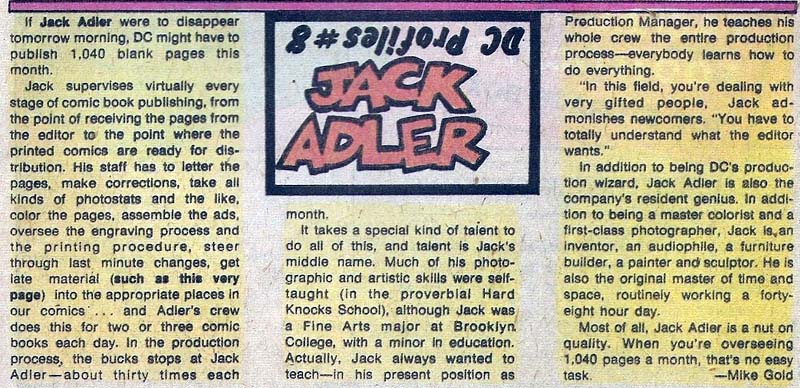
The same page, from the original printing. In closing, a slight editorial note: It’s easy to forget that, unless you kept close tabs on the printer’s work, most mainstream comics were quite badly printed… it’s especially easy to forget since much of the more popular work has since been reprinted from the original art or photostats, and digitally coloured-and-printed. Conversely, when it comes to the work of defunct publishers, and if the original artwork, or quality photostats of same, is no longer in existence or otherwise unavailable, reprinters have to make do with a flawed, not to mention secondary, sources — at best. For instance, the printing of my original edition of this Joker issue is dreadfully out of register. In the wings, things were quickly shifting at DC: as of late ’75, Carmine Infantino (publisher, etc.) and Nick Cardy (art director, etc.) were out, and an absolutely crucial production technician, Jack Adler, was being sidelined. He would retire a few years later. Long story short, Sturgeon’s Law in action, and why I went with the digital colour job. After toning down the contrast a bit. A guy’s got to have standards.
JLA’s roster has rotated throughout the years, but for the sake of this post, only the seven original members will get cephalopod tussling privileges! Here they are, with the conspicuous absence of Batman and Superman who are no doubt rushing behind the scenes to rescue everybody (but don’t worry, we’ll get to them as well):
The Brave and Bold no. 28 (February-March 1960, DC). Cover pencilled by Mike Sekowsky and inked by Murphy Anderson.
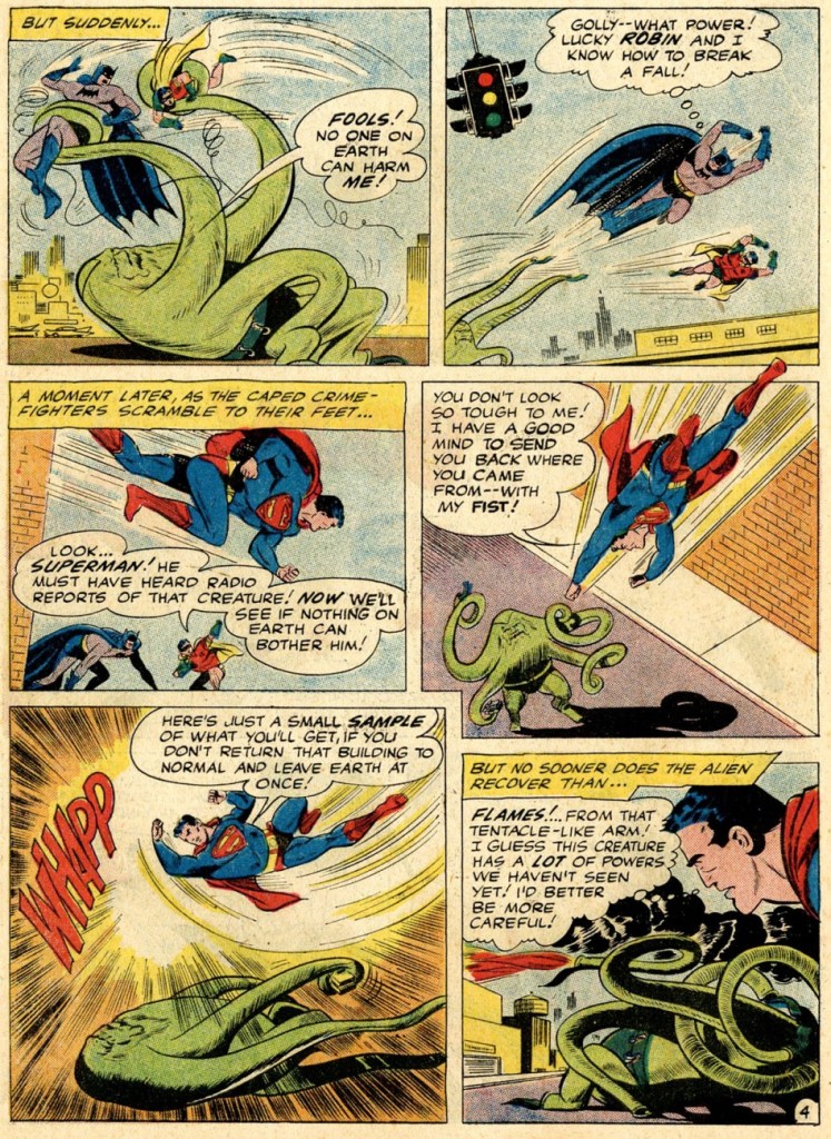
I’ll start with Superman, otherwise he’ll get offended – you know how susceptible he can be. Rather, a double whammy of Superman and Flash, who stumble upon some rather adorable (aside from their propensity to eating people) tentacled aliens. Of course our superheroes decide to make a race out of it, because concentrating on saving some planet or other is clearly not exciting enough – and Batman just happened to be hanging around to give the starting signal. Some afternoons are just that quiet. Race to Save the Universe!, scripted by Denny O’Neil, pencilled by Dick Dillin and inked by Joe Giella, was published in World’s Finest Comics no. 198 (November 1970, DC).
Nevertheless, this dynamic duo does allow itself to get distracted from its marathon, just long enough to defeat this green cutie:
Don’t underestimate kittens.
Incidentally, Superman already has a Tentacle Tuesday all to himself (Tentacle Tuesday: It’s a Bird! It’s a Plane! It’s a Tentacle!) Still, here he is collaborating (more like ‘rescuing’) Jimmy Olsen from an intriguing green (why must they always be green?) monstrosity with worm-like tentacles. Ugh, not the most appealing. These pages are from The Voyage of the Mary Celeste II!, scripted by Jerry Siegel, pencilled by Curt Swan and inked by George Klein and published in Superman’s Pal, Jimmy Olsen no. 75 (March 1964, DC).
DC’s “Big Three” – its most iconic and popular – are of course Superman, Batman and Wonder-Woman. As far as the latter is concerned, as much as I love this character, seeing as we already have two Tentacle Tuesdays posts in her honour – Tentacle Tuesday: H.G. Peter and Wonder Woman lend a hand and Tentacle Tuesday: More Golden Age Wonder Woman Wonders! – I think I’ve said everything I had to say on the subject. Thus, we move on to Batman, albeit briefly because there is also Tentacle Tuesday: All Aboard the Batmarine! to peruse. He’ll have to share the stage with Superman, but I’m sure he’ll be a good sport about it.
World’s Finest Comics no. 110 (June 1960, DC). Pencilled by Curt Swan and inked by Sheldon Moldoff.
The cover story is The Alien Who Doomed Robin, scripted by Jerry Coleman and inked by Sheldon Moldoff.
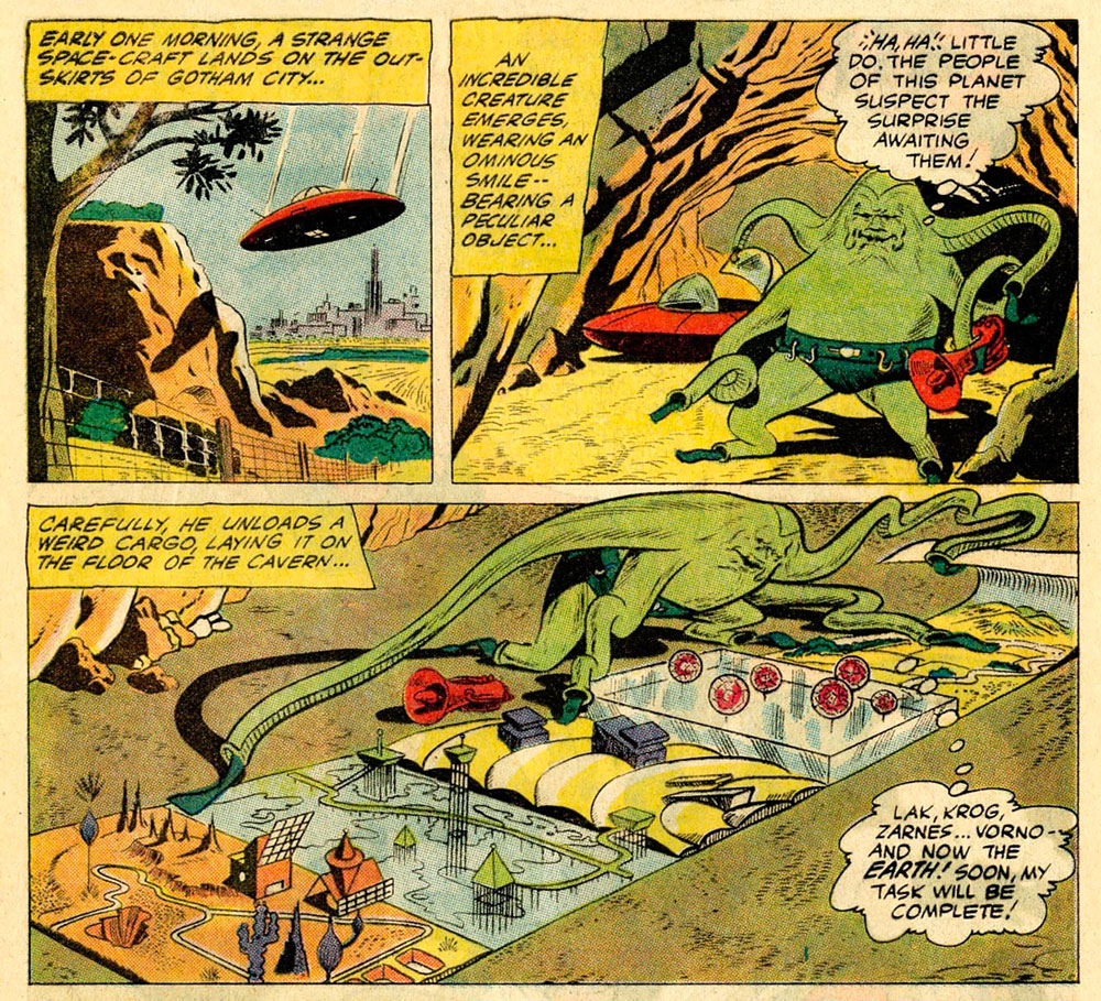
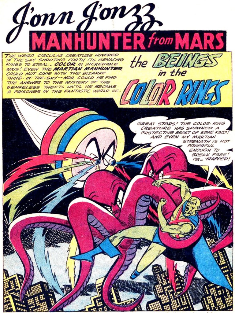
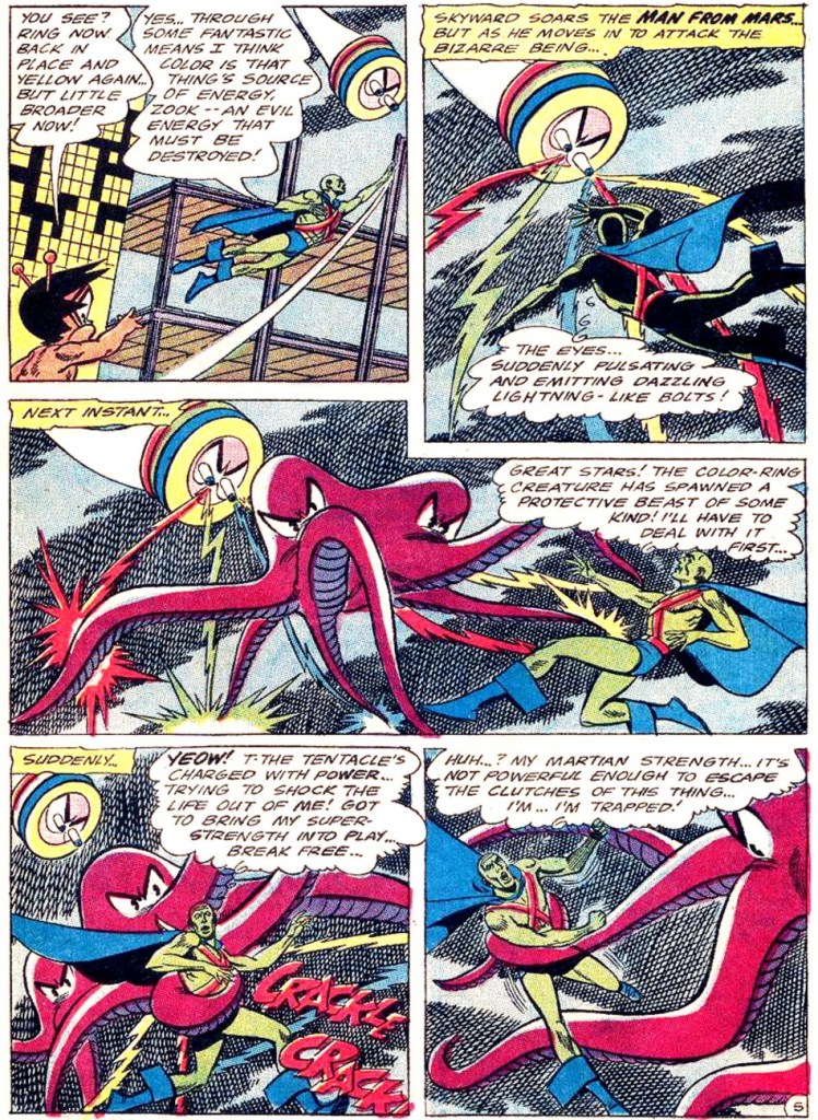
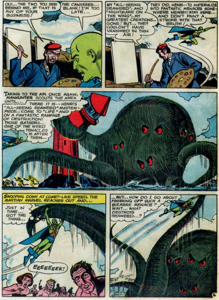
Our next JLA member is the Martian Manhunter, whom I have a strange soft spot for. It’s well known that girls just can’t resist green skin! In honour of this bias, here are not one, but two excerpts from stories featuring tentacles front and centre.
First, two pages from The Beings in the Color Rings, scripted by Dave Wood and illustrated by Joe Certa, published in House of Mystery no. 148 (January 1965, DC).
And for dessert, a page from The Supernatural Masterpieces!, scripted by Dave Wood and illustrated by Joe Certa, published in House of Mystery no. 150 (April 1965, DC).
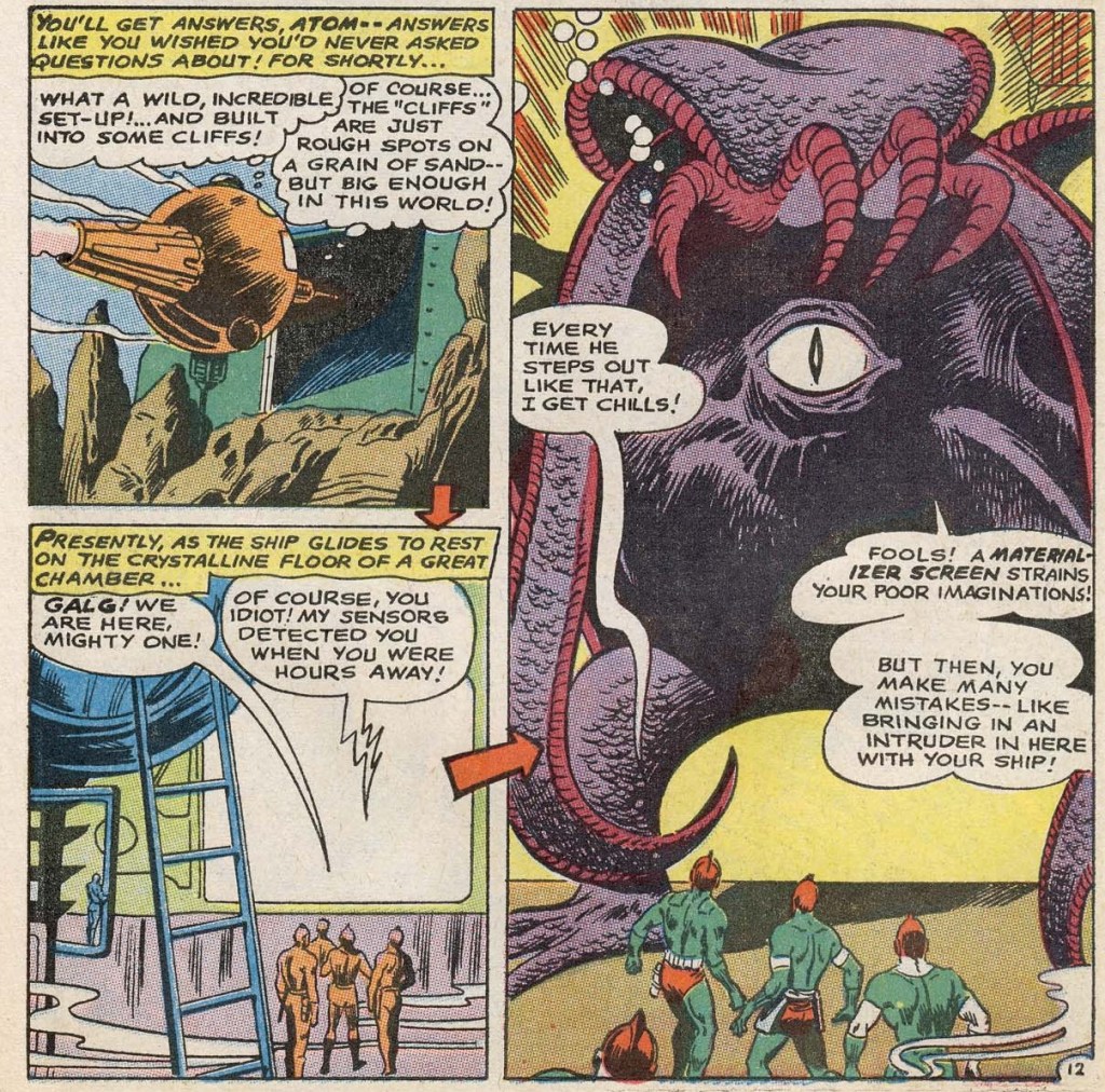
Naturally, Aquaman has encountered more than a handful of octopuses in his long undersea career – I went on about that in some length in Tentacle Tuesday: Aquaman and his Octopus Sidekicks. I have plenty more where that came from, so there surely be a part II to that particular tale… in the meantime, here is a rather striking cover that didn’t make it into that post.
The Brave and the Bold no. 73 (August-September 1967, DC). Cover pencilled by Carmine Infantino and inked by Charles Cuidera.
The cover story is Glag the Destroyer, scripted by Bob Haney, pencilled by Howard Purcell and inked by Sal Trapani.
Last… and maybe least, because I could never warm up to him… is Green Lantern. The following pages are from a story pencilled by Gil Kane, who doesn’t generally get glowing reviews from WOT. Nevertheless co-admin RG wrote an ingenious post combining our common dubiousness about Kane and percolated it through specifically Green Lantern covers – the result is Hot Streak: Gil Kane’s Green Lantern, which impressed, if not quite convinced, me.
Funny Thing Happened on the Way to Earth!, scripted by John Broome, pencilled by Gil Kane and inked by Vince Colletta, was published in Green Lantern no. 70 (July 1969, DC).
I hope you enjoyed this overview of the Justice League of America as filtered through the rather eccentric lens of tentacles.
« Because sometimes, for whatever reason, you just want to draw an octopus. » — Mike Mignola, June 2019
I would say that this Tentacle Tuesday feature was started for a similar reason – sometimes one just needs to gather tentacled material, to share it more efficiently with like-minded weirdos.
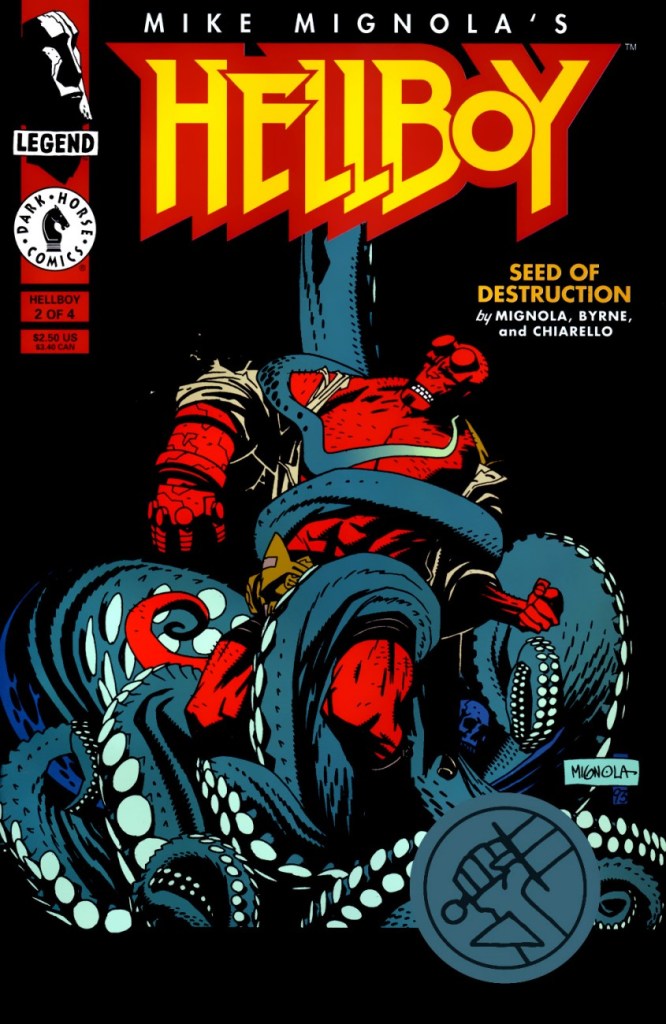
The back cover of Hellboy: Seeds of Destruction no. 2
I don’t imagine writer and comics artist Mike Mignola (most notably, creator of Hellboy and its spin-off B.P.R.D.) needs much of an introduction – he’s fairly ubiquitous in mainstream culture, and his style has been aped by many, which according to the proverb is the most sincere form of flattery. I was aware of this already, and yet was staggered by the sheer number of copycats I stumbled across while seeking out materials for this post.
I also started suffering from tentacle fatigue: as much as I love octopuses, seeing dozens upon dozens of fairly similar images made me weary. Mignola draws tentacles well, but he also draws them very, very often, and he also likes to revisit scenes already depicted. The result is a sprawling mess of sketches, variant covers and spin-offs of spin-offs… perhaps not inappropriate, come to think of it. This particular octopus has far more than just eight limbs!
Enjoy this barrage of Mignola tentacles, just make sure you’re in the proper mood for them 😉
Hellboy: Seeds of Destruction no. 2 (April 1994).
Page from Hellboy: Seeds of Destruction no. 3 (May 1994).
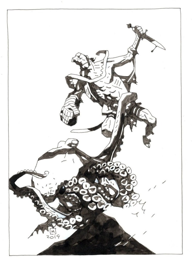
Sketch from June 2019.
ZombieWorld: Champion of the Worms no. 2 (October 1997)
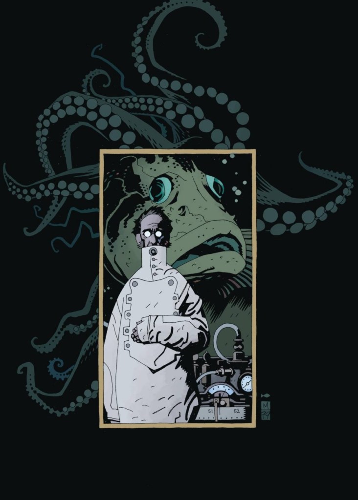
No post of this nature would be complete without featuring, in some form or other, H.P. Lovecraft, arguably the father of our modern obsession with tentacles. On that topic, I am linking to an excellent article about Mignola’s relationship with the creator of the Cthulhu Mythos (be warned that it’s in French, sorry!)
Art for the cover of Dark Horse Presents no. 142 (April 1999). Mignola made Lovecraft look downright dignified and borderline handsome, which is quite a feat, considering the latter’s unusual physiognomy.
Mignola revisited this very scene for his cover of Children of Lovecraft, and anthology of (non-comics) stories ‘inspired’ by Lovecraft (September, 2016). This was also published by Dark Horse.
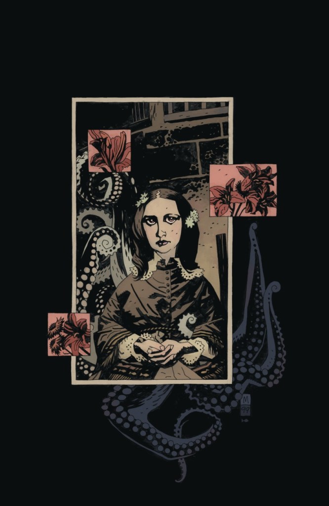
More Victorian England and Lovecraftian archetypes can be found within the pages of Jenny Finn:
Artwork for Jenny Finn no. 1 (June 1999).
Back cover artwork for Jenny Finn Messiah no. 1 (2005).
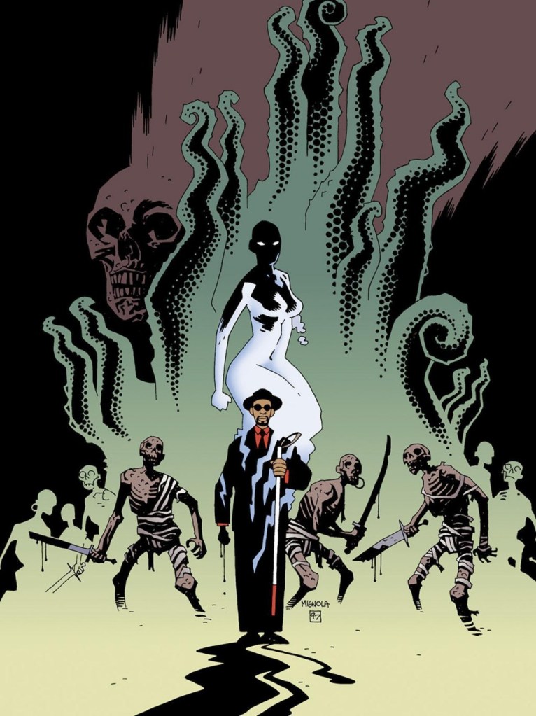
Even Batman, in Mignola’s hands, gets tentaclefied!
A page from Batman: Legends of the Dark Knight no. 54 (November 1993).
Batman: The Doom That Came to Gotham no. 2 (November 2000).
As a final note, I’d like to officially make a moue of distaste at people who share art without attribution, or without bothering to ascertain its source. To wit: a pair of images that are widely shared as Mike Mignola artwork… except that it isn’t by him at all, just by someone drawing in a similar style. Instagram and Pinterest are breeding grounds for such deplorable artistic credit robbery.
The following two illustrations are by Malaysian artist Daryl Toh.


