A Visit to the Hall of Impractical Costumes!

« Taking sartorial risks and not following other people is what makes you stand out. » — Zac Posen

I was planning a big commemorative post for today, but I got tangled up in my calendar and realised in time that I was a couple of weeks off. So instead, I’ll just blow off a little steam.

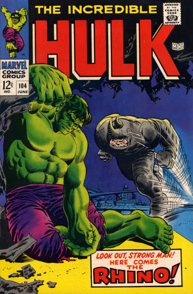
Some cartoonists are born character designers. Others, not so much. The Rhino, a Stan Lee-John Romita Sr. creation, first appeared in The Amazing Spider-Man no. 41 (Oct. 1966, Marvel), soon after Steve Ditko‘s abrupt but quite justified resignation. Isn’t that just a dog of a cover? (pencils and inks by Romita, colours by Stan Goldberg).

I’ve been getting these migraine headaches, Doc” “What do you do for a living?” “Uh…” Seriously, what can you do with a character who obviously can’t move that fast, has to lean his head down to strike… blindly, and isn’t particularly smart? All Spidey has to do is duck, which is one of his chief talents.
Answer: you pit him against a more suitable adversary, preferably a dumber one. This later, but still ludicrous, appearance is The Incredible Hulk no. 104 (June 1968, Marvel). Cover by Marie Severin and Frank Giacoia.

Somehow, Daredevil seems to wind up with more than his share of poorly-attired villains. It’s as if they know he’s blind and won’t judge them too harshly on sartorial grounds.

The Beetle first scurried into view in Strange Tales no. 123 (Aug. 1964, Marvel), tackling the Human Torch (and The Thing). Too bad it wasn’t Doctor Strange he was sparring with, since his threads would then have been designed by Mr. Ditko instead of by Carl Burgos.

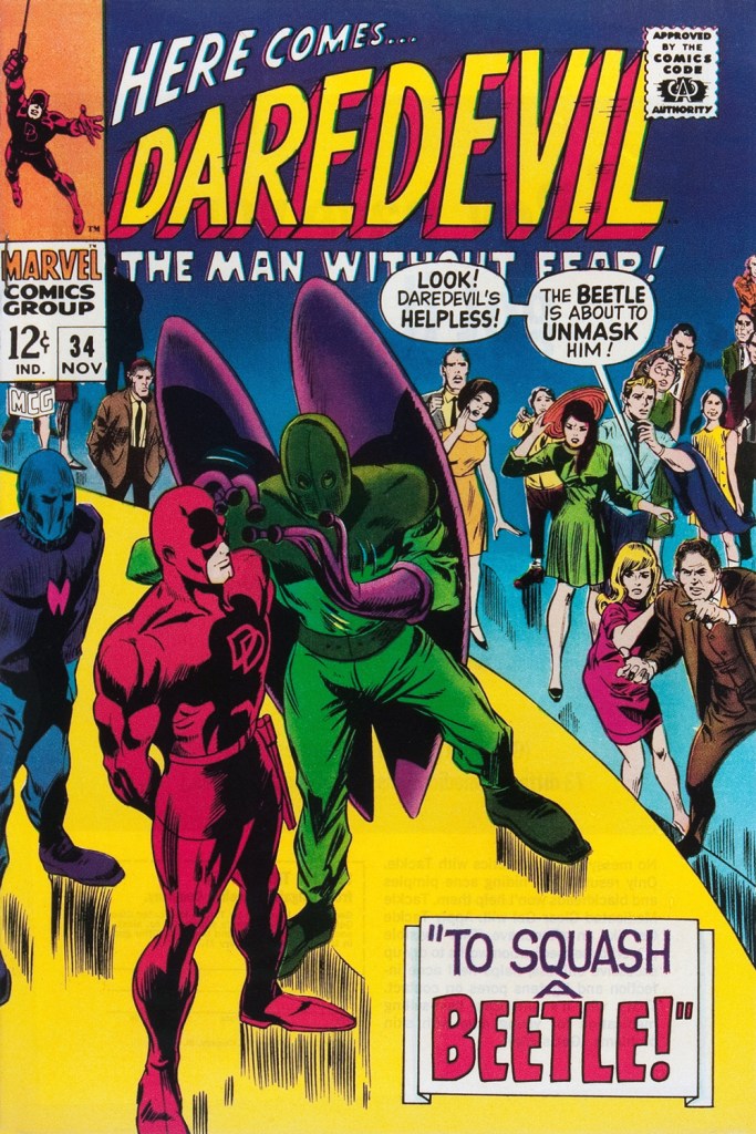
He then went on to bug the aforementioned ‘hornhead’. This is Daredevil no. 34 (Nov. 1967); pencils by Gene Colan, inks by Bill Everett. Why does everyone on stage appear to wear a size 15 shoe? At least!

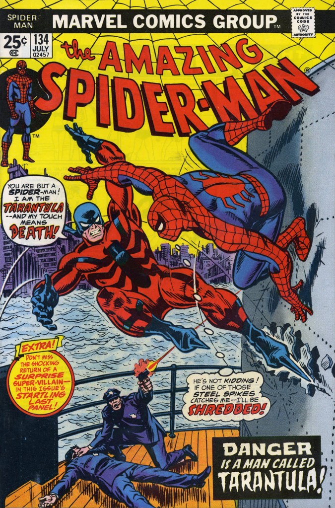
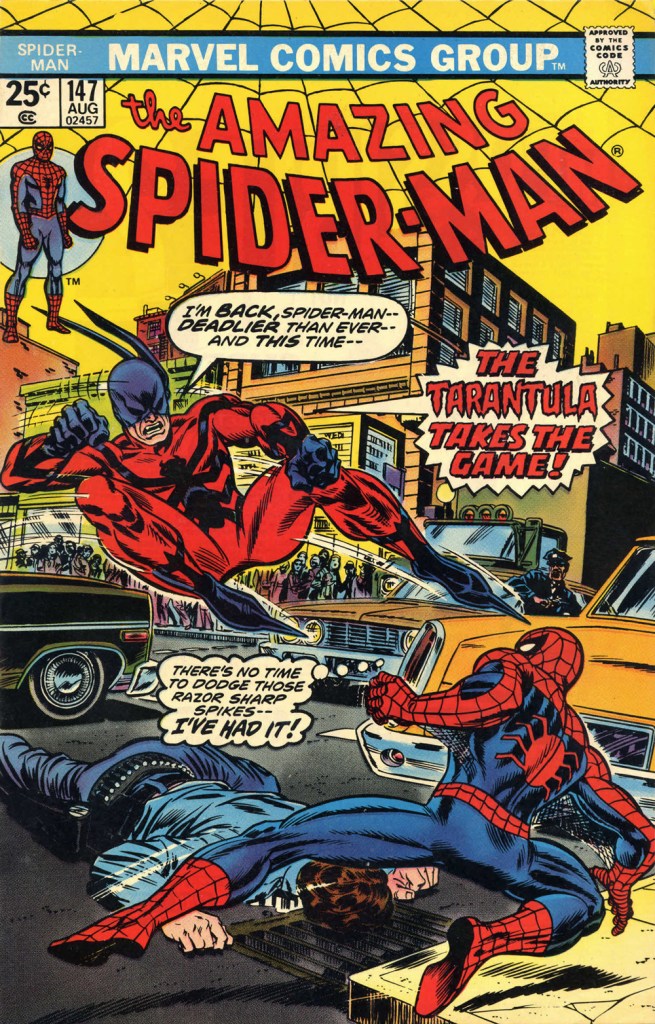
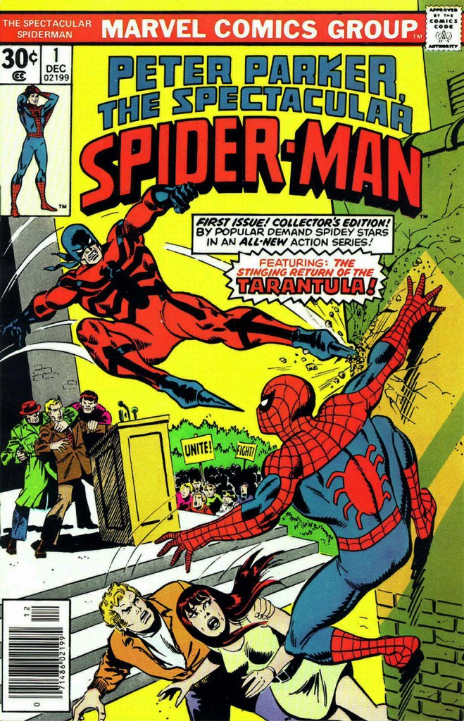
The costume of the Tarantula (a glorious Gerry Conway-Ross Andru creation!) is such an impractical conceit that they pretty much have to use him in the same position on every cover. The guy can barely walk in such, er — calzado, let alone fly at Spider-Man with such force. Just a lousy idea, on every level — tarantulas bite, they don’t sting, Gerry.

This is The Amazing Spider-Man no. 134 (July 1974, Marvel). Art by John Romita Sr. So… much… pointless…. exposition.
They just had to bring him back! This time, Gil Kane and John Romita Jr. do the honours. This is The Amazing Spider-Man no. 147 (Aug. 1975, Marvel).
No formula at work here, no sir. This is Peter Parker, the Spectacular Spider-Man no. 1 (Dec. 1976, Marvel). Cover by Sal Buscema. Tarantula creator Conway was the editor, which explains a lot — but hardly excuses it.

Poor Razor-Fist was created by writer Doug Moench and artist Paul Gulacy. How did he get dressed? How did he go to the bathroom? How did he feed himself? How did he get his head to bend that far back? (Perhaps he’s a Pez Dispenser).

This is The Hands of Shang-Chi, Master of Kung Fu no. 30 (July 1975, Marvel). Cover by Gil Kane and (most likely) Frank Giacoia. I guess all the male lions were taking a nap somewhere.

Should you hanker for more of these, er… dressing-downs, you might want to inspect our earlier instalment along these lines, « You’re going out wearing THAT? ».

-RG

Tentacle Tuesday: Justice League of America

JLA’s roster has rotated throughout the years, but for the sake of this post, only the seven original members will get cephalopod tussling privileges! Here they are, with the conspicuous absence of Batman and Superman who are no doubt rushing behind the scenes to rescue everybody (but don’t worry, we’ll get to them as well):

The Brave and Bold no. 28 (February-March 1960, DC). Cover pencilled by Mike Sekowsky and inked by Murphy Anderson.

I’ll start with Superman, otherwise he’ll get offended – you know how susceptible he can be. Rather, a double whammy of Superman and Flash, who stumble upon some rather adorable (aside from their propensity to eating people) tentacled aliens. Of course our superheroes decide to make a race out of it, because concentrating on saving some planet or other is clearly not exciting enough – and Batman just happened to be hanging around to give the starting signal. Some afternoons are just that quiet. Race to Save the Universe!, scripted by Denny O’Neil, pencilled by Dick Dillin and inked by Joe Giella, was published in World’s Finest Comics no. 198 (November 1970, DC).

Nevertheless, this dynamic duo does allow itself to get distracted from its marathon, just long enough to defeat this green cutie:

Don’t underestimate kittens.

Incidentally, Superman already has a Tentacle Tuesday all to himself (Tentacle Tuesday: It’s a Bird! It’s a Plane! It’s a Tentacle!) Still, here he is collaborating (more like ‘rescuing’) Jimmy Olsen from an intriguing green (why must they always be green?) monstrosity with worm-like tentacles. Ugh, not the most appealing. These pages are from The Voyage of the Mary Celeste II!, scripted by Jerry Siegel, pencilled by Curt Swan and inked by George Klein and published in Superman’s Pal, Jimmy Olsen no. 75 (March 1964, DC).

DC’s “Big Three” – its most iconic and popular – are of course Superman, Batman and Wonder-Woman. As far as the latter is concerned, as much as I love this character, seeing as we already have two Tentacle Tuesdays posts in her honour – Tentacle Tuesday: H.G. Peter and Wonder Woman lend a hand and Tentacle Tuesday: More Golden Age Wonder Woman Wonders! – I think I’ve said everything I had to say on the subject. Thus, we move on to Batman, albeit briefly because there is also Tentacle Tuesday: All Aboard the Batmarine! to peruse. He’ll have to share the stage with Superman, but I’m sure he’ll be a good sport about it.

World’s Finest Comics no. 110 (June 1960, DC). Pencilled by Curt Swan and inked by Sheldon Moldoff.

The cover story is The Alien Who Doomed Robin, scripted by Jerry Coleman and inked by Sheldon Moldoff.

Our next JLA member is the Martian Manhunter, whom I have a strange soft spot for. It’s well known that girls just can’t resist green skin! In honour of this bias, here are not one, but two excerpts from stories featuring tentacles front and centre.

First, two pages from The Beings in the Color Rings, scripted by Dave Wood and illustrated by Joe Certa, published in House of Mystery no. 148 (January 1965, DC).

And for dessert, a page from The Supernatural Masterpieces!, scripted by Dave Wood and illustrated by Joe Certa, published in House of Mystery no. 150 (April 1965, DC).

Naturally, Aquaman has encountered more than a handful of octopuses in his long undersea career – I went on about that in some length in Tentacle Tuesday: Aquaman and his Octopus Sidekicks. I have plenty more where that came from, so there surely be a part II to that particular tale… in the meantime, here is a rather striking cover that didn’t make it into that post.

The Brave and the Bold no. 73 (August-September 1967, DC). Cover pencilled by Carmine Infantino and inked by Charles Cuidera.

The cover story is Glag the Destroyer, scripted by Bob Haney, pencilled by Howard Purcell and inked by Sal Trapani.

Last… and maybe least, because I could never warm up to him… is Green Lantern. The following pages are from a story pencilled by Gil Kane, who doesn’t generally get glowing reviews from WOT. Nevertheless co-admin RG wrote an ingenious post combining our common dubiousness about Kane and percolated it through specifically Green Lantern covers – the result is Hot Streak: Gil Kane’s Green Lantern, which impressed, if not quite convinced, me.

Funny Thing Happened on the Way to Earth!, scripted by John Broome, pencilled by Gil Kane and inked by Vince Colletta, was published in Green Lantern no. 70 (July 1969, DC).

I hope you enjoyed this overview of the Justice League of America as filtered through the rather eccentric lens of tentacles.

~ ds

Tentacle Tuesday: Tender Tendrils of Vernal Bloom

« Is the spring coming? » he said. « What is it like? »
« It is the sun shining on the rain and the rain falling on the sunshine… » | Frances Hodgson Burnett, The Secret Garden

Having been meaning for a while now to concentrate on tentacled plant life, I was hitherto stopped by the idea that it’s somewhat unseemly to talk about flora when most of our readership is buried in snow and ice. But now, well! – today was the first day of the year suitable for wearing shorts, and green shoots are popping up wherever one’s gaze happens to land.

We have waited for quite a long time before co-admin RG managed to get his hands on this issue… and it turned out that the insides vary from ‘lacklustre’ to ‘wow, that’s ugly!’ Still, the wonderful, striking cover makes it worth owning, I believe.

Horror: The Illustrated Book Of Fears no. 2 (February 1990, Northstar). Cover by Mark Bernal.

ACG got its tentacle parade in Tentacle Tuesday: ACG’s Adventures Into the Tentacles, but as usual, some material didn’t quite fit the theme, and I saved the following cover for a more appropriate occasion. This, I do believe, is the moment.

Adventures into the Unknown no. 48 (October 1953, ACG), cover by Ken Bald.

Speaking of adventures, let’s delve into Strange Adventures for a bit. The following story has a rather peculiar plot – « Star Hawkins is down on his luck and has to pawn Ilda, his robot secretary. Luckily, Star is hired to locate a fugitive who’s thought to be hiding on Vesta, an asteroid mining settlement, in the Red Jungle. But with a little tracking skill and the help of the creepy vegetation of the Red Jungle, he nabs the fugitive, gets his prisoner, and gets Ilda back from the pawn shop, promising never to pawn her again. »

Page from The Case of the Martian Witness!, scripted by John Broome, pencilled by Mike Sekowsky and inked by Bernard Sachs, published in Strange Adventures no. 114 (March 1960, DC).

Here’s another Earthman (who has dreamed of this moment, by his own admission!) struggling with some coquettish plant tentacles that just want to be friends.

A page from Super-Athlete from Earth!, scripted by Gardner Fox, pencilled by Gil Kane and inked by Bernard Sachs, published in Strange Adventures no. 125 (February 1961, DC).

The next thing after adventures is, naturally, mysteries. If they’re strange, puzzling mysteries, even better… what’s that word I’m looking for… ah, yes: baffling! Another day, yet another ravenous man-eating plant.

Baffling Mysteries no. 19 (January 1954, Ace Magazines). Cover is presumed to be by George Roussos. I think strangulation is not even the worst option here.

One more happy tromp through the jungle? Sure, why not!

Kona no. 12 (October-December 1964, Dell). Cover by Vic Prezio. This giant ant-crab (?) is but one in a long line of supersized animal threats Kona has had to defeat.

The following image was originally created as a cover for House of Mystery no. 251 (1977, DC), but was nixed in favour of another, Neal Adams-penned illustration, which we’ve already featured in a previous post (Tentacle Tuesday: Plants Sometimes Have Tentacles, Too). I prefer this gruesome version (complete with skeleton being digested!… also more detail, more dynamic layout and better anatomy of all involved), pencilled by José Luis García-López and inked by Bernie Wrightson.

Happy gardening to all! And have a look at last spring’s tentacled plant post Tentacle Tuesday: Spring Has Sprung… Its Snare! while you’re at it!

🌱 ds

Hot Streak: Gil Kane’s Green Lantern

« It was exactly an assembly line. You could look into infinity down these rows of drawing tables. » — Gil Kane

Some of our more sensitive readers may have noticed that we’ve been none too gentle with Gil Kane (1926-2000) in the past, dealing him some rather rough lumps at times. But that’s not the whole story: in taking stock of such a protracted and prolific (dare I say profligate?) career as his, much of it inevitably spent on autopilot, one must be discerning. In other words, I like some of Kane’s work, but there’s plenty of it I don’t care for. Still, WOT’s rule of thumb is that if we altogether loathe an artist and/or his work, we’ll just turn a blind eye.

And speaking of the sense of sight, what makes a great comic book cover? Must be my art school training and subsequent work in advertising tipping the scales, but to me, design and layout reign primordial as ingredients… as values. I’m often dismayed at many a would-be critic’s apparent method of assessing an image’s artistic worth, namely: how many popular characters does it feature? Is it action-packed? Is the issue sought-after and expensive? Does it feature a famous character’s début? Is it drawn by a fan-favourite artist who unquestionably can do no wrong… because he’s a fan-favourite artist who unquestionably can do no wrong? (and how dare you claim otherwise!)

Gil Kane reportedly generated around eight hundred covers for Marvel in the 1970s… of all levels of craft and quality. With that kind of frenzied output, it’s impressive that most were perfectly serviceable, given that there certainly was no time for meticulous, sober planning. They were generally over-captioned (not Kane’s fault!) and crassly sensationalistic, but that’s what Marvel sought and settled for.

It’s a shame that Kane and his former classmate at the School of Industrial Art (back in the early 40s!), DC lynchpin Carmine Infantino didn’t get on too well, because their Silver Age collaborations had a special spark… must have been the animosity. It had been noted by the DC brass, as early as the late 50s, that Carmine’s covers reliably caught prospective buyers’ attention and dimes. And so, by 1967, he was unofficially designing most of the publisher’s covers, and certainly the covers of all titles edited by Julius Schwartz. Green Lantern was among these.

So we turn today’s spotlight on a hot streak of seven. Kane gets his name in the title, but it would be more accurate to say they were Infantino-designed, Gaspar Saladino-lettered, Jack Adler-coloured, Gil Kane-pencilled and Murphy Anderson and Sid Greene-inked covers. The streak begins after Green Lantern no. 54’s downright poor cover, and ends with the interruption of Kane’s impressively long run of consecutive issues.

We begin with Green Lantern no. 55 (Sept. 1967, DC). Harmonious, easy-to-parse arrangement of numerous elements and exemplary integration of text. Design by Infantino, pencils by Kane, inks by Murphy Anderson, lettering by Gaspar Saladino, colours by Jack Adler. Oh, and lest we forget: logo designed by Ira Shnapp (circa 1964), classic Green Lantern uniform designed by Kane (circa 1959).
This is Green Lantern no. 56 (Oct. 1967, DC). Kane was never much for varying his monsters (see below). Pencils by Kane, inks by Anderson.
For a bit of comparison on how things were done from company to company, this is Tales to Astonish no. 91 (May, 1967, Marvel). This is what happens when there’s no planning or attention to detail: in an already-crowded cover, did we really need that ugly box advising us of the presence of The Abomination? He’s right there! (maybe the abomination refers to the cover itself). And the foreshortening nightmare that is the baddie’s left arm was so dire that, when a fan commissioned Arthur Adams to produce a recreation of this cover (which, things being as they are, many surely consider ‘iconic’)… he wisely corrected the anatomy and tweaked the poor composition. Interesting how Marvel’s heavy-fingered yes-man, art director John Romita Sr., was always game to “fix” Ditko and Kirby art, but saw nothing wrong with this one.
This is Green Lantern no. 57 (Dec. 1967, DC), featuring Catastrophic Weapons of Major Disaster!, written by Gardner Fox, pencilled and inked by Kane. Cover by Kane and Greene… love the placement of the signatures!
This is Green Lantern no. 58 (Jan. 1968, DC), featuring Peril of the Powerless Green Lantern! (a Julius Schwartz title if there ever was one), written by Gardner Fox, pencilled by Kane and inked by Greene. I’m not overly fond of the Kane-Greene mix, but Sid Greene, as a penciller-inker did some splendid work on the Star Rovers series (1961-64), co-created and scripted by Gardner Fox.
An issue whose price few can afford unless they bought it off the racks, this is Green Lantern no. 59 (March 1968, DC); pencils by Gil Kane, inks by Murphy Anderson. Featuring the introduction of GL alternate Guy Gardner, who was to be dubiously re(jack)-booted in the 1980s, by Steve Englehart and Joe Staton, as a jackass with an ugly uniform and a worse haircut. Notwithstanding the fact that the Green Lantern Corps would never bestow power and stewardship on such an immature and pompous loose cannon.
This is Green Lantern no. 60 (April 1968, DC); an evident Infantino design, with pencils by Kane and inks by Anderson… which interestingly ends up producing a prototype of Brian Bolland‘s distinctive style… a decade early.
This is Green Lantern no. 61 (June 1968, DC); pencils by Kane, inks by Greene, and featuring (groan) Thoroughly Modern Mayhem!, scripted by Mike Friedrich, pencilled by Kane and inked by Greene. Co-starring Alan Scott, the Golden Age Green Lantern.

-RG

Tentacle Tuesday: Unpopular Mechanacles

Greetings, tentacle lovers! After a hearty breakfast of cephalopod pancakes (no octopuses harmed), one can sit down with a quiet cup of tea and enjoy today’s crop of mechanical tentacles.

I tend to follow a chronological order, so our first is E-Man no. 1 (October 1973, Charlton Comics). The cover aside, these images have been taken from a recent reprint, which accounts for the somewhat garish colours. I am hardly a fan of Joe Staton, so this is starting off on a somewhat less aesthetically pleasing foot, but mechanical tentacles are en flagrant délit in the cover story. Besides, E-Man has a certain innocent charm.

The cover story is The Beginning, scripted by Nicola Cuti and illustrated by Joe Staton:

Going towards a much darker note (both in terms of printing and content – and to be honest, I by far prefer this dark-ish colour palette to the rainbow of E-Man colours), here is The Absolute Power-Play of the Parasite!, scripted by Martin Pasko, pencilled by Curt Swan, and inked by Frank Chiaramonte, and published in Superman no. 320 (February 1978, DC):

Next, dramatic Rebirth!, scripted by Marv Wolfman and drawn by Gil Kane (Tentacle Tuesday Dabbler!), published in Action Comics no. 544 (June 1983, DC):

There’s even a sort of pin-up in that issue: The New Brainiac, pencilled by Ed Hannigan and inked by Dick Giordano.

So much flair and poise!

In a previous post (Tentacle Tuesday: Mechanical Tentacles) I promised that I would stick to but a few instances of Doctor Octopus and ne’er again return to him. However, I would like to point out this familiar fellow in the lab coat (top right):

…So You Want to Work for Globex, Huh?, scripted by Gail Simone, pencilled by Óscar González Loyo and inked by Steve Steere Jr., was published in Simpsons Comics no. 66 (January 2002, Bongo). Sometimes Simpsons comics are real fun to read, and this is one of those instances.

~ ds

Tentacle Tuesday: The Tentacles Are Coming! The Werewolves Are Here!

« The tentacles had burned where they’d touched our skin… and the oozing slime they’d rubbed into the wound didn’t help. We panted and trembled »

I have little interest in werewolves, despite just having finished one in wool. I’d say I place them somewhere between Frankenstein’s monster (in which I have zero interest – sorry!) and Dracula (whom I am generally intrigued by, depending on whose version we’re talking about). Having said that, the bizarre concept of werewolf vs tentacles grabbed my imagination by its incongruity. “Grarr”, as the werewolf might say.

The author and her werewolf; he doesn’t have a name, yet.

The Giant-Size Werewolf may not be as rife in tentacles as the Giant-Size Dracula, but it has its moments. “A man, a woman… and rampaging hordes” has a certain nice ring about it!

A page from Tigra the Were-Woman!, published in Giant-Sized Creatures no. 1 (July 1974). Script by Tony Isabella, pencils by Don Perlin and inks by Vince Colletta.

When the Moon Dripped Blood!, scripted by Doug Moench and illustrated by Yong Montaño, was published in Giant-Size Werewolf no. 4 (April 1975):

Anybody would be startled by slimy tentacles coming out from under a robe… slimy and burning, at that.

Doug Moench continues his tentacle shenanigans one month later in Werewolf by Night no. 7 (March 1975).

Cover pencilled by Gil Kane (Tentacle Tuesday dabbler!) and inked by Tom Palmer.

The Amazing Doctor Glitternight was scripted by Doug Moench and illustrated by Don Perlin:

Likely beating all records for how much text you can cram into one splash page.
The “yecch-monster” awakens as Glitternight somehow manages to exude both light and darkness, and simultaneously nourish and feed. I get the impression somebody was paid by the word for this story.
Has the werewolf ever heard that “words are very unnecessary“? Was it essential to inform us that he might have been stunned, or maybe paralyzed, and it doesn’t matter anyway, as both are just words?

Next time the Werewolf encounters tentacles, it’s an epic, 2-issue tale of the desperate fight against ‘soul-eater’ Marcosa, an ectoplasmic wraith who occasionally takes a physical form and often deploys tentacles to do his dirty work for him.

Werewolf by Night no. 36 (January 1976). Cover Don Perlin.

Marcosa in Death (plot-spoiler: death is not actually involved) was scripted by Doug Moench and illustrated by Don Perlin:

Moral of the tale: don’t open doors when you don’t know what’s behind them.

Marcosa doesn’t quite die despite all the gnashing of teeth and ripping of tentacles, so the story continues to its grim conclusion in the next issue. The End, scripted by Doug Moench and illustrated by Don Perlin, was published in Werewolf By Night no. 37 (March 1976).

Perlin goes wild drawing teeth! An orthodontist’s worst nightmare (or perhaps a nice little earner).

What other giant-sized topic will we continue with next time? Only time will tell! Stay tuned…

~ ds

Tentacle Tuesday: It’s a Bird! It’s a Plane! It’s a Tentacle!

« A kryptonian octosaur — the most fearsome creature of my long-dead home planet — here — on earth! »

Since Batman was already awarded a Tentacle Tuesday back in April (see Tentacle Tuesday: All Aboard the Batmarine!), it is time to allocate one to the other superhero that crops up all the freaking time, namely good old “Supes” (for those who are on familiar terms with him). I won’t hide from you that I have very little interest in the adventures of the aforementioned character, but I made a pledge to follow tentacles wherever they may lead me. The octopus of comics demands sacrifices!

The Man of Steel. The Last Son of Krypton. The Son of Jor-El. Metropolis’ favorite son. The Man of Tomorrow. Champion of the Oppressed. The Big Blue Boy Scout. The iconic Cape. The definitive Flying Brick. The Big Good of The DCU. The Superhero.

[source]

First, we have a number of inside pages of varying interest, depicting tentacles both organic and mechanical —

A page from The Superman Super-Spectacular!, scripted by Edmond Hamilton, pencilled by Curt Swan and inked by George Klein, was published in Action Comics no. 309 (February 1964).
A page from The Demon Under the Red Sun!, scripted by Otto Binder and illustrated by Al Plastino, was published in Superman no. 184 (February 1966).
The Demon Under the Red Sun!, part two. Superman wields his rapier-like wit to defeat the poor beastie. This was years before the Flying Spaghetti Monster!
A page from The Power of the Parasite, scripted by Jim Shooter and illustrated by Al Plastino, was published in Action Comics no. 361 (March 1968).
A panel from The Monster Who Unmasked Superman!, scripted by Cary Bates, pencilled by Curt Swan and inked by Murphy Anderson, was published in Action Comics no. 431 (January 1974).
The Monster Who Unmasked Superman!: aggressive tentacle grabbery ensues.
Page from Balance of Power!, scripted by Len Wein, pencilled by Dick Dillin and inked by Dick Giordano, was published in Justice League of America no. 111 (May-June 1974).
A page from …With But a Single Step!, scripted by Marv Wolfman and illustrated by Gil Kane, was published in Action Comics no. 545 (July 1983).

As a tastier, second part of our programme, I offer you an intriguing cover by Dave Gibbons:

Superman Annual no. 11 (September 1985)

And a page (or three) from what co-editor RG calls “the ultimate Superman story” (and I will absolutely take his word for it) — For the Man Who Has Everything… scripted by Alan Moore and illustrated by Dave Gibbons.

The tentacle mantle is taken up by other characters — pesky, clingy little buggers, aren’t they? « It’s called a Black Mercy. It’s something between a plant and an intelligent fungus. It attaches itself to its victims in a form of symbiosis, feeding from their bio-aura. Why, it gives them their heart’s desire…. », explains Mongul, the ‘benefactor’ who got Superman into this spot of trouble.

Mongul gets his comeuppance! And his heart’s desire of world domination, courtesy of the Black Mercy.

¤ ds

Tentacle Tuesday: Dracula Drops In

« Kate’s death scream gags stillborn in her throat as the tentacles dart toward her, slithering hungrily across her body. »

Here’s a quick association exercise: as fast as you can, name words that come to mind when somebody says “Dracula”. Um, fangs! Stake! Blood, cape, biting! … Tentacles? Say what?

It would have never occurred to me to look for tentacles in Dracula, giant-size or otherwise, so thanks to admin RG for this splendid suggestion.

GiantSizeDracula-2-PabloMarcus
Giant-Size Dracula no. 2 (September 1974). Cover by Pablo Marcos.

You’re not sure those green things were tentacles? If it quacks like a duck, it may well be an aquatic bird – and if it slithers towards female “human flesh”, count it as tentacles! Call Them Triad… Call Them Death! is scripted by Chris Claremont, pencilled by Don Heck and inked by Frank McLaughlin. I have to say that the art is distinctly subpar, as far as I’m concerned.

Giant-Size-Dracula-Issue-2-3-DonHeck
The writing isn’t brilliant, either.

Words are inadequate”.

Giant-Size-Dracula-Issue-2-4-DonHeck

Perhaps it’s the drab colours that weigh this down, and the original art would be a considerable improvement? Nope, sorry.

Giant-Size Dracula2-Don_Heck

As further example of the ineptitude of this art team, a quick question: does this look like he’s slapping her?

Giant-Size-Dracula-Issue-2-2-DonHeck
She was lying face down, but she somehow manages to flip over instantly.

However, I have no wish to engage in Don Heck bashing – he had his moments, it’s just that this story wasn’t one of them. Instead, I will direct you to this article explaining how Harlan Ellison mocked Heck once upon a time, several lifetimes ago. Also, ouch.

Harlan Ellison: There are guys who’ve got very minimal talents and it doesn’t matter whether they corrupt it or not. I could name them and would happily name them, but why bother? There’s no sense kicking cripples. I mean, all you have to do is open up comic books from Marvel and DC and take a look at them. You see these guys have a very minor-league talent and, to say, “Well, these people are wasting their talent” is ridiculous. I mean, they’re never going to be any better. What’s the name of the guy who used to do… over at Marvel… he use to do… [Pause]… the worst artist in the field.

Continuing our foray into Draculas of colossal proportions tangling with tentacles…

GiantSizeDracula4
Giant Size Dracula no. 4 (March 1975). Cover pencilled by Gil Kane and inked by Tom Palmer.

Sadly, the tentacles promised on the cover don’t really appear in the cover story. Time to move to another series —

TOMB-OF-DRACULA-62-GeneColan-TomPalmer
Tomb of Dracula no. 62 (January 1978), pencilled by Gene Colan and inked by Tom Palmer.

What Lurks Beneath Satan’s Hill? (tentacles, obviously) is scripted by Marv Wolfman, pencilled by Gene Colan and inked by Tom Palmer.

TombofDracula62-Marv-Wolman-Tom-Palmer
This has been scanned from the reprint, which in my opinion looks worse, not better.

The story continues in number 63 –

TombofDracula63-GeneColan-TomPalmer
Tomb of Dracula no. 63 (March 1978). Cover pencilled by Gene Colan and inked by Tom Palmer.

The Road to Hell! is scripted by Marv Wolfman, pencilled by Gene Colan and inked by Tom Palmer:

Tomb-of-Dracula-1972-Issue-63-2

Tomb-of-Dracula-1972-Issue-63-3
« All-you-can-eat-calamari — dive in! »

Next up (eventually), an equally random concept: Werewolf VS tentacles!

∼ ds

Tentacle Tuesday: Notes on Anatomy

« Their bodies are mainly soft and pliant, with one major exception. In the centre of their web of tentacles lies a hard, sharp and murderous beak that resembles that of a parrot, is a tool for killing and dismembering prey… » (source)

When the story begs for an octopus intervention, artists can go the more-or-less realistic route, or take complete liberties with an octopus’ anatomy. Today I won’t talk about assorted tentacled zoological marvels one finds in comics – insert your choice of description into “… with tentacles”: dinosaurs, sharks, gorillas, robots, old hags, worms, bartenders, and so on. Yes, I can support my claims (email me if you want evidence… or just look through previous editions of Tentacle Tuesday).

Anyway, let’s say you want to draw a somewhat believable octopus – giant, sure, and plenty scary, but somewhat true to life. There’s a problem: frightening brutes generally have some sort of gaping maw, a set of incisors (preferably dripping with some revolting stomach acid), something they can visibly threaten the hero with. The octopus’ mouth is hidden under all that undulating mass of tentacles, pretty much where one would expect a normal creature’s anus to be, and definitely not next to his eyes. For that reason, in most octopuses sightings in comics, their mouths aren’t visible at all. But some artists, well, they want to have their cake and eat it, too. Here is a gallery of octopus mouths – we’ll start off with naturalistic ones, and make out way into that’s not how any of this works territory. I won’t include anything with a lamprey mouth, however.

Here’s the only clean attempt: the beast has a beak, there are no teeth in it, and the eyes are on the other sides of the octopus, where they’re supposed to be. Walter Simonson, you win this one!

Sword-of_Sorcery5-Walter Simonson
Sword of Sorcery no. 5 (Nov-Dec 1973, DC), cover by Walter Simonson. Fafhrd, is that you?

In the next image, an attempt is made at something vaguely beak-like, but that dentition is definitely wrong. The octopus has some tiny teeth on its tongue which it uses to drill holes or scrape things out, and some razor-sharp hooks/teeth on its suckers, but nothing like normal teeth, which is why no octopus has ever needed dentures.

UnderseaAgent6-Gil-Kane-DoomsdayintheDepths
Doomsday In The Depths, scripted by Garder Fox and illustrated by Gil Kane, was published in Undersea Agent no. 6 (March 1967, Tower).

The other approach one could take is drawing something that looks like an especially irate parrot, but with tentacles. It is not entirely illogical, as the octopus’ mouth has been described as “similar to a parrot’s beak” by several people in the know.

KubertFrontPageA
Tentacles of Terror was published in Front Page Comic Book no. 1 (1945, Harvey). This page is drawn by Joe Kubert, at at least the signature attests to this – I admit I would have never guessed. There are much nicer Kubert tentacles over at Tentacle Tuesday Masters: Joe Kubert.

Batman recently had a whole Tentacle Tuesday to himself – here he is again, fighting a squid with very unsquid-like features. At first, he looks normal, but glance at the bottom of the left corner – how did he suddenly develop a beak where there was none to be seen several panels prior?

1562812791523-1
An excerpt from Four Birds of a Feather, Batman no. 11 (June-July 1942, DC), script by Bill Finger, pencils by Bob Kane (take that particular credit with a grain of salt), inks by Jerry Robinson, backgrounds and lettering by George Roussos.

Continuing the beak-and-parrot theme…

The Phoenix #279- The Weekly Story Comic
The Phoenix no. 279 (May 2017). Can anyone identify the cover artist?

A final note to this conversation about octopuses’ mouths – should you locate an octopus, please don’t put it on your face (or any other body parts).

∼ ds

Tentacle Tuesday Dabblers: Gil Kane

When digging through comics in quest for tentacled material, one soon notices that Gil Kane‘s name tends to crop up again and again. Despite this seeming ubiquity, I’ve never specifically concentrated on his art, though he certainly has appeared in Tentacle Tuesdays before (quite a lot in Tentacle Tuesday: Conan-O-Rama, for instance).

I can’t quite put my finger on it, but one of the things that seems to bug me is that Kane, whose real name was Eli Katz and who was born in Latvia, threw himself with such vigour into American culture. It’s an unfair reproach, I realize – one can hardly expect a four-year old child to hang on to a quickly-receding memory of his parents’ motherland to the detriment of whatever culture he’s growing up in, not to mention that this would be unhealthy.

The crux of the matter is that I don’t grasp that je-ne-sais-quoi that people seem to find appealing about Kane’s art. Where others see “dynamic storytelling, emotionally charged characters, and innovative [sic] staged fight scenes“, I see overly busy, hard-to-parse scenes and stiff anatomy. It doesn’t help that the bulk of his oeuvre is concerned with a subgenre of comics I have strong misgivings about, namely superheroes.

To answer the question of what is it that makes Kane so special, I have naturally turned to Gary Groth:

GaryGroth-GilKane

That is certainly well argued, but I’ve read a few Kane interviews and his intellectualism is just clearly not on my wavelength at all. There’s no doubt that he was the analytical kind (this interview with him published in Alter Ego no. 10 (1969) calls him « the comics’ most articulate artist »), but what he says often strikes me as stilted (much like his art). Take this, for instance: « Craft is merely the springboard. It’s the ability to give wings to your expression; otherwise your expression bangs around in an inarticulate way and comes out thick and untutored; you’re just throwing away range and scope. » Let’s just say that Kane was a very opinionated man, which does him credit. Yet I get the impression that his inclination to pick at himself veered towards self-destructiveness, as if he were ever striving for some lofty heights he was aware he would never reach.

In that process of self-improvement (let’s call it that), he often slagged other artists who were operating on a different level from his. Even as he flattered them, his compliments felt incredibly back-handed, bringing to mind those people who never smile, trying to get their atrophied mouth muscles to do the job and achieving merely a sort of pained rictus. For instance, I’m a little sore about his description of Will Eisner, who « did little morality stories, which were very moving, but they had the quality of reading a children’s picture book; he could be quite dramatic, but always on a kind of innocent level. He never had complex, subtle characterizations…» or, again, « Eisner is a writer until you start talking about literature, and talking about the great writers of literature. Then Eisner is only a cartoonist. »

You can read the full interview over at Destination Nightmare.

All this being said, I do like *most* of today’s crop… save for the last two Kull the Destroyer covers, instances of the messy, rigid mises en scène I was carping about earlier. The best cover (imho) is inked by Tom Palmer, not so coincidentally. Co-admin RG has been heard to posit that Gil Kane should never have been allowed to ink himself.

And now I’d better stop displaying my ignorance and move on to the tentacles!

Warlock3-GilKane
Warlock no. 3 (December 1972). Cover by Gil Kane.

JourneyintoMystery3-GilKane
Journey into Mystery no. 3 (February 1973). Pencils by Gil Kane, inks by Tom Palmer.

GilKane-MarvelSpotlight27.

The original art for Marvel Spotlight no. 27 (April 1976). Pencils by Gil Kane, inks by Frank Giacoia.

KulltheDestroyer17-GilKane
Kull the Destroyer no. 17 (October 1976). Pencils by Gil Kane, inks by Klaus Janson.

Kull heDestroyer21-GilKane
Kull the Destroyer no. 21 (June 1977), cover by Gil Kane.

~ ds