« The best thing for rich people to do is become Batman. » — Karl Heinrich Marx*
So we’ve got another dour, dark, mumbly, violent, grim ‘n’ gritty Batman movie making the rounds. I’ll pass — I’m afraid that’s not my Batman of choice. But I’m certainly game to provide an alternative view.
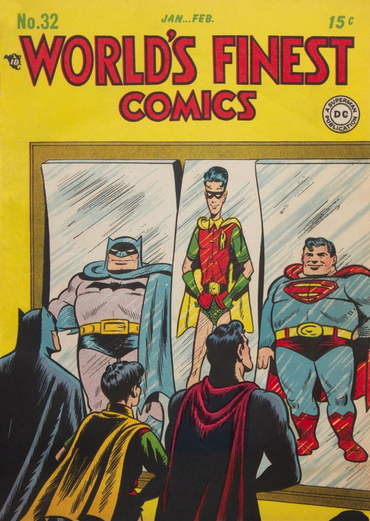
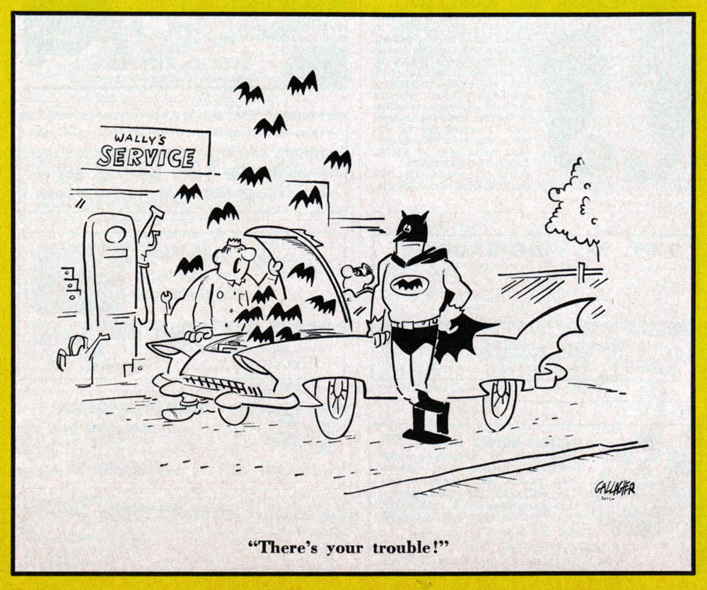
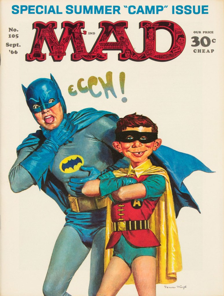
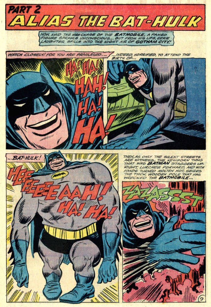
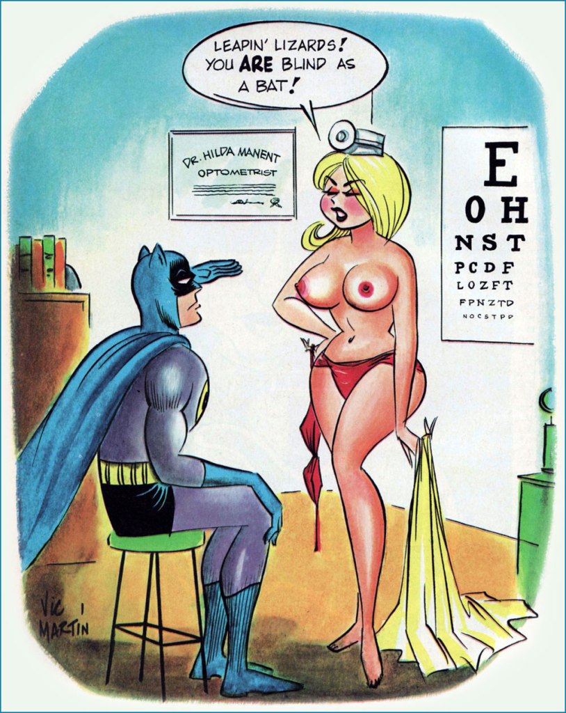
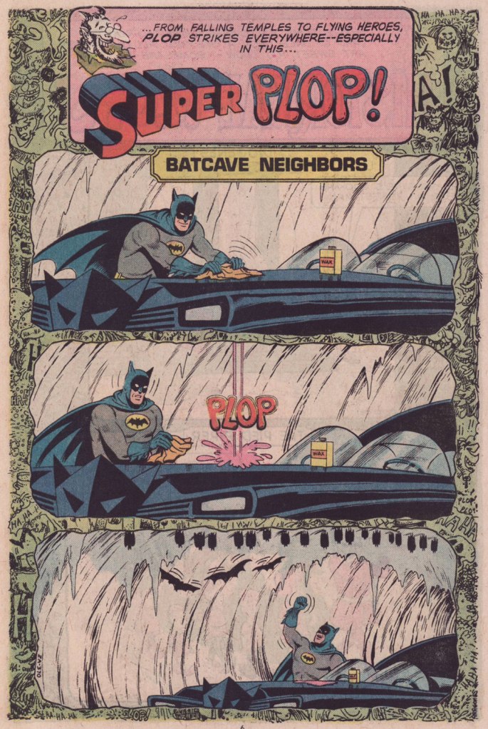
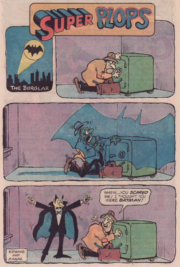
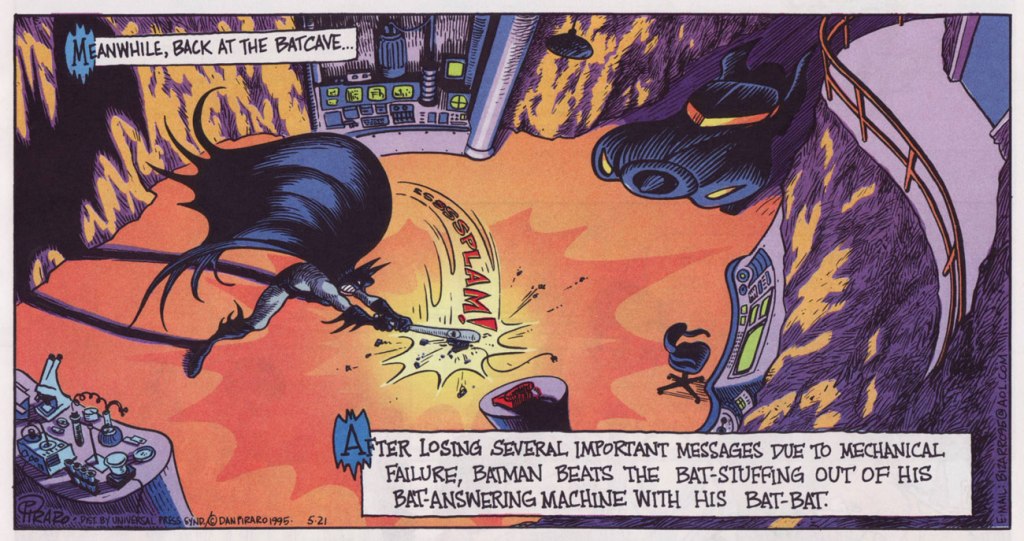
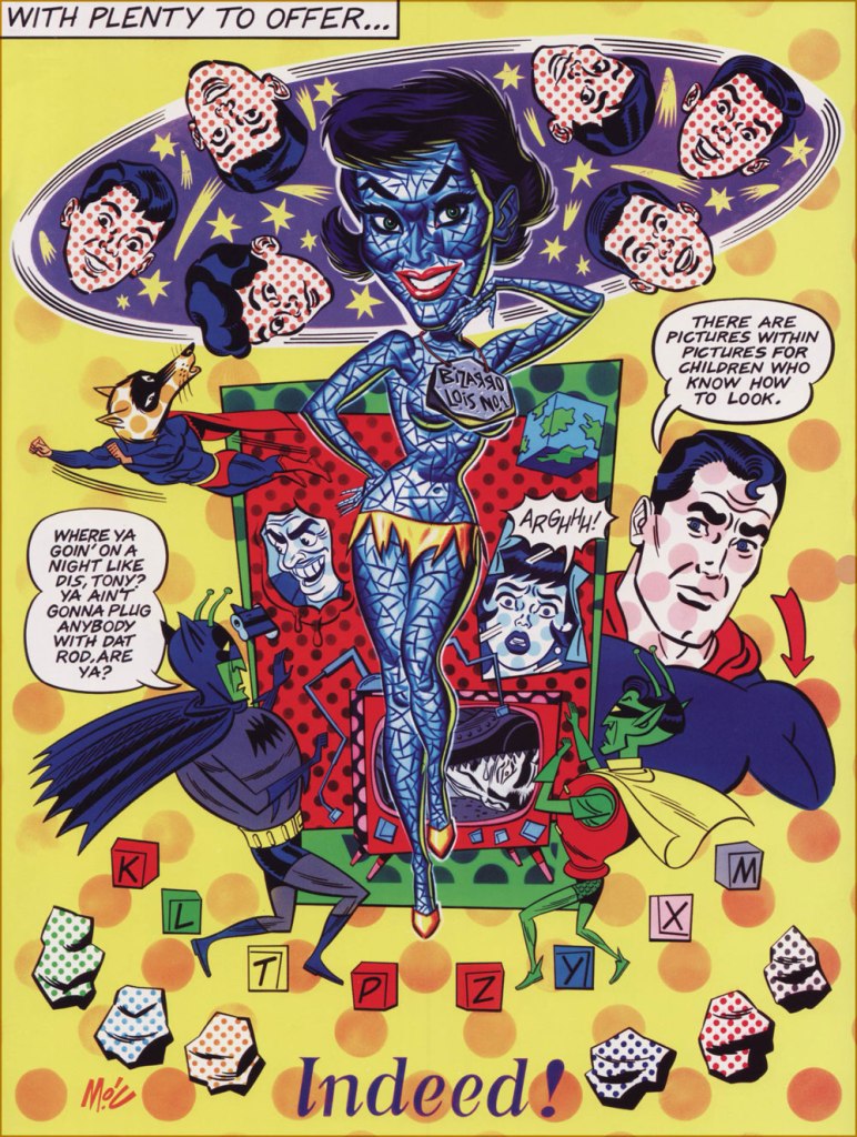
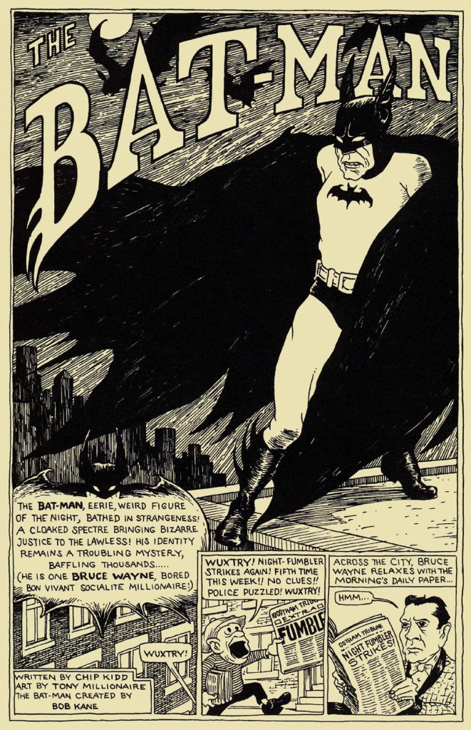
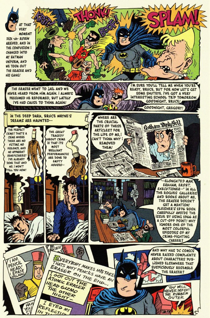
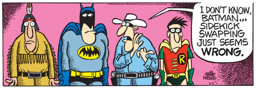
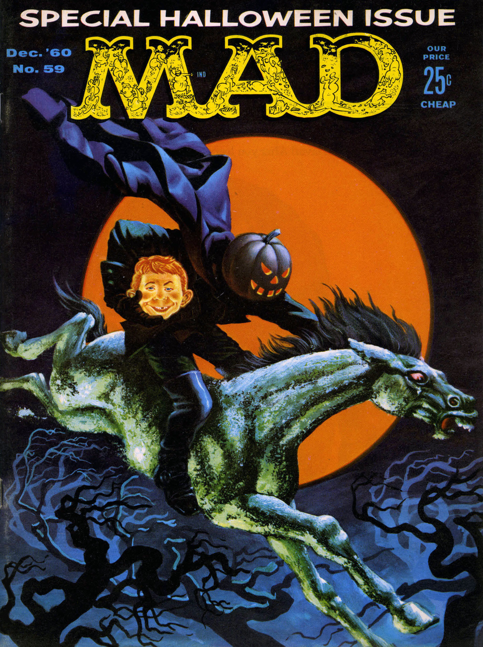
This is World’s Finest no. 32 (Jan.-Feb. 1948, DC); cover art by Hamilton, Ontario’s Win Mortimer (1919-1998), just one in a long, memorable series of frequently goofy scenes featuring this heroic trio.A cute one from John Gallagher (1926 – 2005), twice (1957, 1971) the winner of the National Cartoonists Society ‘Best Gag Cartoonist‘ Award and elder brother of Heathcliff creator George Gately Gallagher. It was published in scouting monthly Boys’ Life‘s July, 1966 issue, smack dab in the heart of Batmania. We ran another bit of bat-drollery from John in an earlier post.This is Mad Magazine no. 105 (Sept. 1966, EC); cover by Norman Mingo (1896-1980).A pivotal page from ‘Alias the Bat-Hulk’ written by Bob Haney, pencilled by Mike Sekowsky and inked by Mike Esposito, from The Brave and the Bold no. 68 (Oct.-Nov. 1966, DC), edited by George Kashdan. We’re featured the issue’s fabulously batty cover in our earlier tribute to Mike Sekowsky. Bless you, gentlemen — you truly understood what fun meant and what comics should be.Prolific Argentine cartoonist Vic Martin (in his homeland, he drew the strip “Salvador” for Medio Litro magazine) moved to the US in the early 1950s, crafting a respectable body of work in the comic book field, chiefly for Ziff-Davis, before migrating to men’s magazines and girlie digests. By the 1970, he’d found a home with Cracked Magazine (He handled the Hudd & Dini feature), while also freelancing for Sick and Crazy. Everything but Mad, really. This particular cartoon comes from the March, 1967 issue of Avant Publishing’s “Escapade”. As Pat Masulli is listed under “production” in the masthead, a Charlton connection is more than likely. And speaking of “Leapin’ lizards!“, Martin would later (1973-74) work on the Little Orphan Annie comic strip.From Plop no. 9 (Jan.-Feb. 1975, DC); Writer unknown, art by Kurt Schaffenberger.This one’s from Plop! no. 20 (Mar.-Apr. 1976), DC); idea by Don ‘Duck’ Edwing, art by Dave Manak.Dan Piraro‘s May 21, 1995 Bizarro Sunday strip. Between Piraro and his canny accomplice, Wayno, there have been scores of excellent bat-japes over the years. I must confess that the term ‘bat-bat’ triggers other associations. « To the Man-Mobile! »This is Pictures Within Pictures, a 1998 watercolour by Mitch O’Connell (not to be confused, of course, with this beloved, near-homonymous fella — yes, I can just hear Beavis and Butthead chortling). The piece is full of references to various Golden Age comics made infamous by Fredric Wertham‘s Seduction of the Innocent. For instance, er… Batman‘s speech balloon quotes from this particular comic book‘s opening splash. On a sobering note, let’s not forget that the 1950’s furore over comic books, as absurd as it may have seemed, still has relevance today.In a more deadpan vein, here’s the opening splash of Chip Kidd and Tony Millionaire‘s madcap homage to the very earliest of Batman’s exploits, with nods a-plenty to the 1943 film serial. “The Bat-Man” originally appeared in Bizarro Comics (Aug. 2001, DC).Another most decidedly dynamic duo, Eddie Campbell and Hunt Emerson, assembles to concoct an affectionate, thoughtful and yes, funny look at one of Batman’s most bizarre-yet-neglected members of the Bat’s rogues’ gallery, Lenny Fiasco, aka The Eraser, introduced in Batman no. 188 (Dec. 1966, DC) with The Eraser Who Tried to Rub Out Batman! This sequel, Who Erased the Eraser? also made its original appearance in Bizarro Comics (Aug. 2001, DC), edited by Joey Cavalieri.Here’s one (June 12, 2014) from Pulitzer Prize-winning (1981) editorial cartoonist Mike Peters (b. 1943). It’s from his unevenly written but always gorgeous comic strip Mother Goose and Grimm (created in 1984 and still going strong in over 800 newspapers worldwide). Like his colleagues Piraro and Wayno, Mr. Peters can scarcely resist a good bat-gag, so this is just one in a crowd of many.Everyone’s familiar with the famous playground song and staple of crooner Robert Goulet’s répertoire, right? The web is rife with visual adaptations, but this was my favourite, the work of Matthew S. Armstrong and available as a handsome t-shirt.
-RG
*the second-funniest Bat-related thing I encountered online this week is this attribution of a Batman (created in 1939) quote to Marx (1818-1883).
The funniest was the following deeply ironic quote from pathological liar and glory hog Bob Kane: « How can an article about me or the Batman be the true story when I am not consulted or interviewed? »
Today’s TT is like one of those 5$ grab bags: you don’t exactly know what you’re going to get, but there will at least one thing you’ll find amusing! Unless the store has cheapened out and stuffed it with nonsense nobody in their right mind would want. This offering, on the other had, is full of our favourite artists, and is not nearly as disparate as I first thought 😉
I don’t always have an over-arching idea for a post, inevitably ending up with plenty of odds and ends that don’t neatly fit into any one category. Actually, some of those “scraps” are the most enjoyable finds for me.
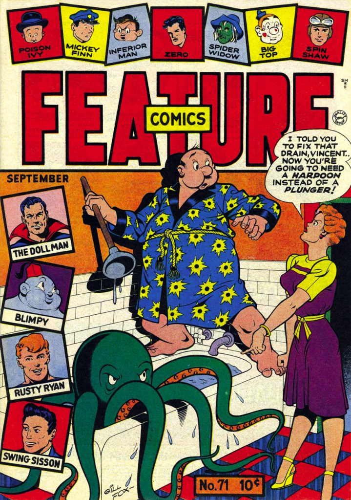
Feature Comics no. 71 (September 1943, Quality Comics). Cover by Gill Fox. The octopus-in-plumbing theme is an oldie-but-goodie; the undaunted housewife may yet regret her cavalier attitude towards the tentacled one, who probably wants to move in with his family.
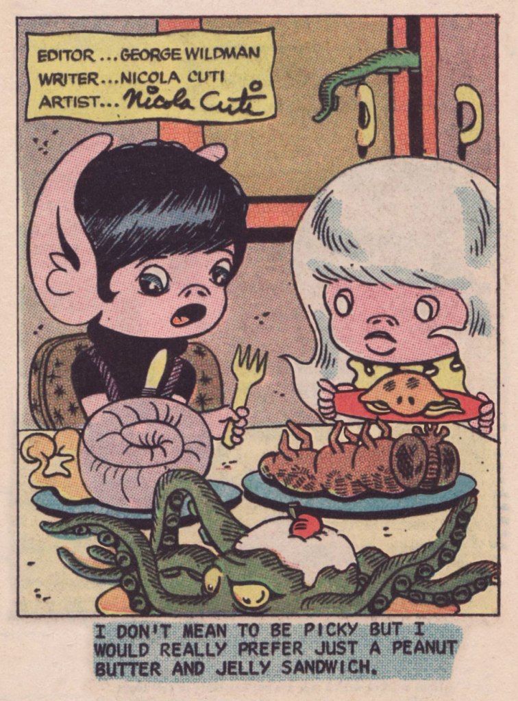
Nicola Cuti‘s Weirdlings was a charming little ‘filler’ gag page designed and drawn by him. This one was published in Haunted no. 14 (Sept. 1973, Charlton). I think the octopus, that appears to be still alive, would also prefer a good old PBJ sandwich.
Archie’s Pal Jughead no. 77 (October 1961). Cover by, dare I say legendary, Samm Schwartz; revisit (or discover!) some of the nicest covers he has drawn for Archie Comics in co-admin RG’s post.
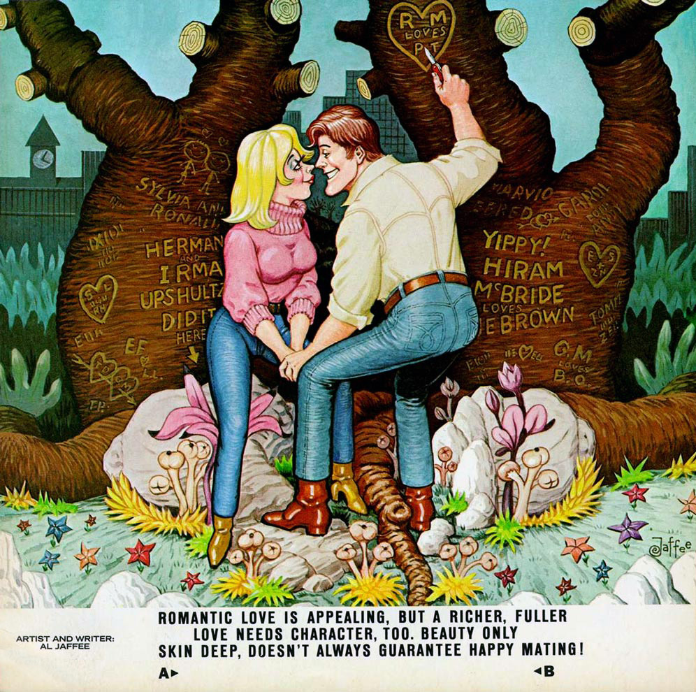
This year, spring officially begins on March 20th, so it’s still a few days away… but the vernal bevy of birthdays has already started. Al Jaffee is still our first Spring Birthday Boy – he was always precocious, you know! Born in 1921 on March 13th, he turns 98 today, and that’s a truly impressive age, even for the oldest working cartoonist. Break out the bubbly!
Take my hand as we gallop through Jaffee’s career at a fast clip. In chronological order, then…
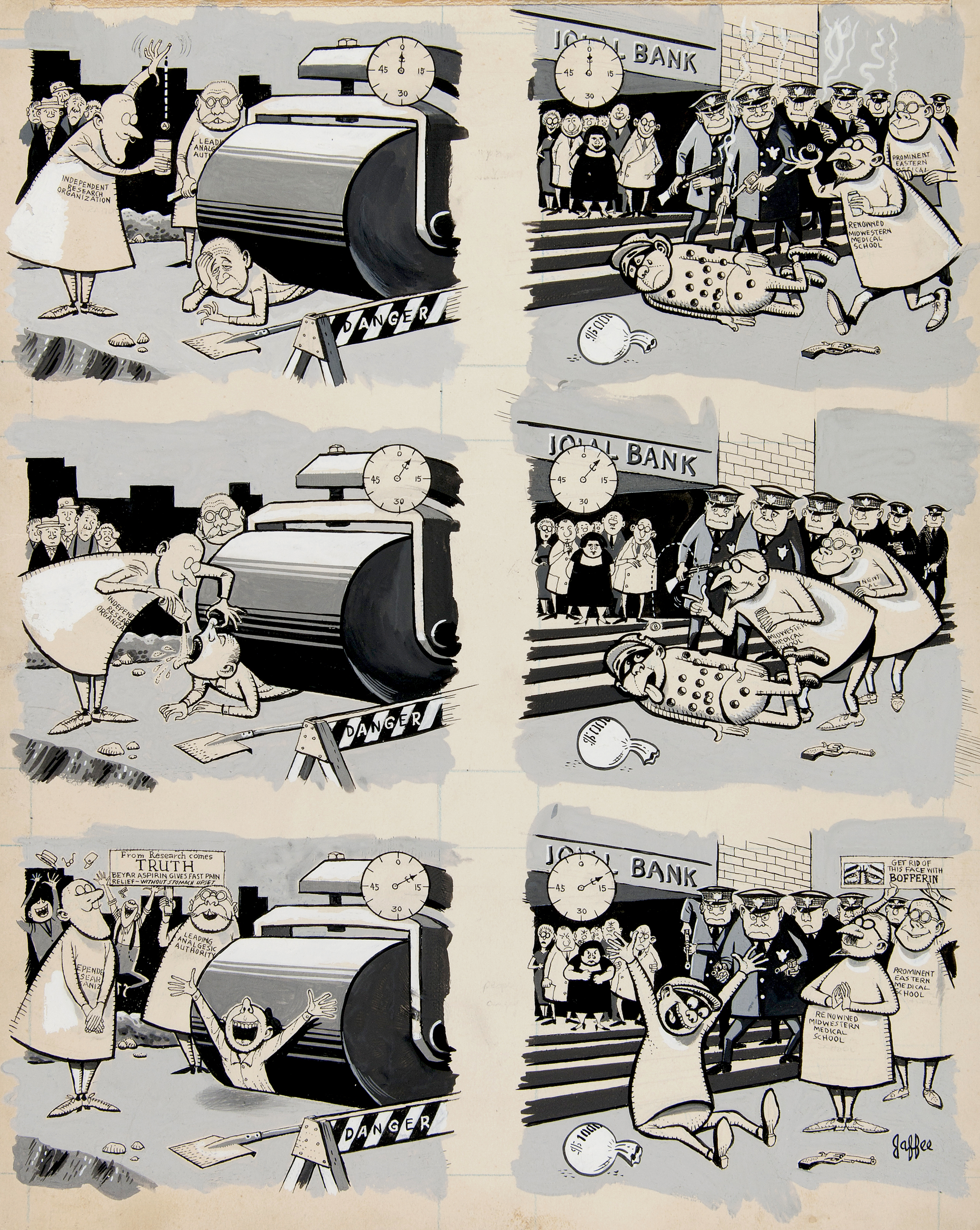
Original art for “Pain Relief Speed Test On Actual People In Actual Pain“, published in Humbug no. 7 (February 1958).
The New York Herald Tribune Syndicate published Tall Tales from 1957 to 1963. Al Jaffee came up with the idea of this strip’s format (one vertical panel for dailies, and a series of vertical panels for Sundays) when he was in financial straits – its unorthodox configuration ensured that newspaper editors would be able to squeeze it in *somehow*.
Sunday Tall Tales strip from 1960.
Visit The Fabulous Fifties blog for more – the amazing Ger Apeldoorn has scanned tons of Tall Tales from old newspapers, a monumental (and much appreciated) endeavour.
Sunday Tall Tales strip from 1961.
« The world is full of bloviators. And this kind of stuff, when there’s someone on the public scene who’s really going beyond his duties as a politician or a religious leader or a sportsman, he’s fair game. The main thing is to keep your eyes and ears open and when you hear something that’s clearly baloney, such as “eight out of 10 doctors smoke Chesterfield cigarettes” – these are ads that actually ran! One of the tobacco companies had the nerve to claim that doctors prefer their cigarettes. So it’s easy to shoot down that kind of bull. But you do it with a gentle hand, you don’t preach and say “tobacco kills! How can these doctors do that?!” No, you just go them one step further and say, “In addition to eight out of 10 doctors smoking this brand of cigarette, in their time off, they each drink a gallon of bourbon, which also has health benefits.” » |source|
« Thanks a lot for ignoring my recent request for a house call, Doc! You saved me ten bucks!! It went toward the funeral!!! » Now, isn’t this a happy vernal scene? (Look at the pretty flowers!) Al Jaffee painted this “Get Mad” picture postcard for publication in The Worst From Madno. 12 (1969).
First edition of Mad’s Al Jaffee Spews Out More Snappy Answers to Stupid Questions, (Signet, February 1972).
« I’m not an educator or a preacher. I think the important thing, in my line of work anyway, is that you’re helping the reader to think for himself. It’s not just about getting a chuckle from them. When you expose hypocrisy or nonsense or plain ol’ stupidity, you want to do it in a way that makes the reader connect the dots. Don’t tell the joke, just hint at the joke. If you over-explain it, it’s no good. » /source/
This painting (layout by Harvey Kurtzman, art by Al Jaffee) was designed to accompany an Esquire article from April 1972 about Elaine’s, a hip restaurant in NYC that was known for attracting writers, actors, and other prominent New Yorkers. Incidentally, Elaine Kaufman, the owner of this establishment, was a barrel of laughs (I’m not saying that sarcastically, either). « Kaufman was known for not mincing her words, for booting less-favored customers to seat new arrivals and for forbidding hamburgers to be served in her restaurant. She was once arrested after a physical altercation with a visiting Texan. Elaine also once had a fist fight with the actress Tara Tyson, and also chased away the notorious paparazzo Ron Galella by hurling two garbage can lids at him and exclaiming, “Beat it, creep… you’re bothering my customers”. » Ah, the people you knew at Elaine’s…
The back cover of Mad no. 170 (October 1974), “A Mad Look at a TV Commercial“.
You might be wondering if Mr. Jaffee’s art and wit were any good much later in his career, say in the 90s. Stupid question, bub. Of course they were!
Original art from Mad’s Restaurant Survival Guide (Mad no. 300, January 1991).
Art from a 1998 issue of Mad Special illustrating yet another round of Snappy Answers to Stupid Questions. When I said ’round’, I meant it: these are stupid questions asked at a wrestling programme. This one was probably “does this pink boa make me look fat?”
Have you ever wondered what Al Jaffee is like in person? Here’s your chance to find out:
“But you haven’t even mentioned MAD fold-ins!”, you might exclaim in dismay. Hey, I’m not gonna repeat myself… visit A MAD Dash… Inside for that and more Jaffee silliness.
Oh, fine, you guys. Just one, though, ’cause otherwise we’ll be here for another couple of hours, and frankly I’ve got hungry cats to feed.
What new way are people falling head over heels these days?, published in Mad no. 216 (July 1980).
You say you’re having trouble folding your screen? Geez, do we have to do *all* the work around here?
Many happy returns, Mr. Jaffee! <3<3<3
Mr. Jaffee and his wife Joyce in 2016, when he was but 95 years old. When he once quipped «Serious people my age are dead», he meant it as gospel. 😉
« Just then he saw the goblin rising in his stirrups, and in the very act of hurling his head at him. » — Washington Irving, The Legend of Sleepy Hollow
And here’s a peek at one of Freas’ preliminary versions of the cover. I daresay it’s lovely, but the final rendition is the clear winner. Sometimes the editorial process works just fine!
Some of you may recall Freas’ classic cover art for Queen’s News of the World album, back in 1977. That, in fact, was a case of Freas recasting his painting from the October 1953 issue of pulp mag Astounding Science Fiction. Look familiar?
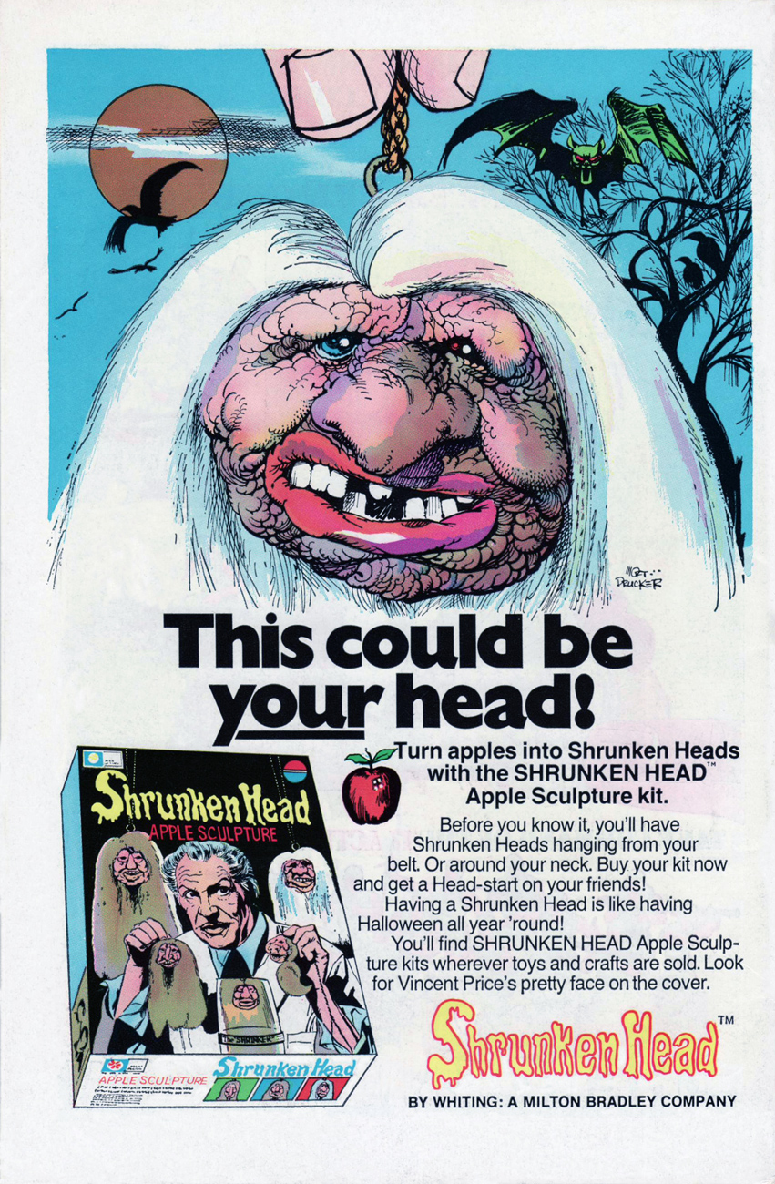
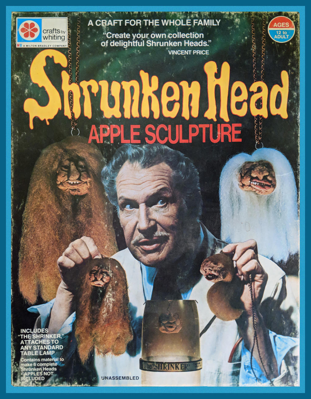
« Having a shrunken head is like having Halloween all year ’round! »
A classic, fondly-remembered ad from the back of comics published in the fall of 1975.
How cool is it that even the box art is hand-drawn? One of these will set you back a pretty penny on eBay these days.
The artwork is by Mad Magazine pillar (and arguably their artist most adept at capturing celebrity likenesses) Mort Drucker (b. 1929). Check out that fabulous signature!
Of course, I’d always longed to snag my own kit, and a few years ago, I succeeded.
« Each apple will be different from any other; no two will be exactly alike. This is due to variations in many factors, but mostly in the moisture content of the apple. »
« Caution: Do not use in excess of 40 watt bulb. »
Should you find yourself with some extra apples after a productive head-shrinking session, why not make the most of your leftovers with Vincent’s recipe for æblekage, which is to say Danish Apple Cake? Waste not, want not.
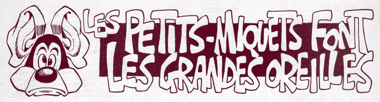
« Tous les merdeux ricanaient en se disant qu’une revue sans merdeux à la tête, ça ne marcherait jamais.* »
In issue 63 (April, 1974) of the recently rechristened « Charlie Mensuel » (to avoid confusion with its sister publication, Charlie Hebdo, yes, *that* Charlie Hebdo), insightful bandes dessinées critic and French national treasure Yves Frémion-Danet (b. 1947, Lyon), writing under his « Théophraste Épistolier » nom de plume, provided a classic essay accompanying a reprint of Harvey Kurtzman and Will Elder‘s « Goodman Gets a Gun », originally published in Help no. 16 (Nov. 1962, Warren). In his piece, Frémion posits that, with his 28 issues of Mad / Mad Magazine, Kurtzman’s brand of satire completely changed the rules of the game, and that despite an utter lack of commercial success and name recognition for himself and his work (reportedly, a French edition of Mad was published in 1965-66, for six or seven issues) on the continent, his influence on a significant swathe of the subsequent generation of French and Belgian cartoonists easily validates his vital importance.
Théophraste Épistolier’s column’s logo, which translates as “Little Mickeys give you big ears”. A “Petit Miquet” is, in french, a generic name for cartoon characters from a dismissive and/or ignorant perspective. Someone to whom Mickey Mouse is the sole precursor of all Little Mickeys. Artwork by Gotlib.
Frémion spares no praise for Kurtzman’s acolytes Elder, Jack Davis, Basil Wolverton, Wally Wood and John Severin, and publisher Bill Gaines, but has nothing but contempt for editorial successor Al Feldstein (“vile copier”, “lumbering”, “regular”…). Frémion charts Kurtzman’s subsequent projects and associations, and his rôle in the rise of Underground Comix. Recommended reading… if you can read french.
Ah, but that brings us to an apt illustration of that creaky adage, « A picture is worth a thousand words »: as it happens, the legendary Marcel Gotlib (b. 1934, d. 2016), speaking of influential, provided a quartet of original illustrations to put across what comics were like Before and After Kurtzman, commenting at once on American comics and on Franco-Belgian bande dessinée, with a snappy Gallic twist. Like Goofus and Gallant, but with far more tongue.
It took me a long time to come to terms with Gotlib. In my formative years, in Québec, his was such an outsize, smothering influence that one got quite sick of him. To be fair, not of him so much as his multitudinous, third-and-fourth-rate would-be clones. His style was easy to imitate, yet difficult to master. You see how that could easily careen off the rails?
In the left panel, the pistol is missing, having been whited-out « in accordance with the law on publications intended for young people », a quite repressive set of regulations adopted in 1949.
More of the same: « Certain body parts have been whited-out. » Gotlib’s point is well made: when something relatively innocuous gets erased, the mind often fills the blanks with more perverse possibilities. Serves you right, censors.
The issue in question. Charlie / Charlie Hebdo was published from Feb. 1969 to Feb. 1986, lasting, in fits and starts, 198 issues. It then merged with Pilote… and disappeared. Cover, of course, by Charles Schulz.
-RG
*« All the shitheads giggled, telling themselves that a magazine without an shithead in charge never would stand a chance. » – Théophraste Épistolier
Okay, now that you’ve seen some Mad covers (see a MAD dash… outside) let’s have a peek at some inside art by the habitués.
One of my favourite MAD artists is Antonio Prohías (1921-1998). Hailing from Cuba (but being forced to emigrate thanks to an repressive government that wasn’t too fond of the concept of “free press”), he moved to New York in 1960. Apparently Prohias was in no hurry to learn English (and, in fact, his cartoons are silent). Here’s a cute anecdote involving Sergio Aragonés, courtesy of Wikipedia:
« Two years after Prohias’ debut in the magazine, cartoonist Sergio Aragonés made the trek from Mexico to New York in search of work. Because Aragonés’ command of English was then shaky, he asked that Prohias be present to serve as an interpreter. According to Aragonés, this proved to be a mistake, since Prohías knew even less English than he did. When Prohías introduced the young artist to the Mad editors as “Sergio, my brother from Mexico,” the Mad editors thought they were meeting “Sergio Prohías. Twelve years later, Mad writer Frank Jacobs reported that Prohias’ conversational English was limited to “Hello” and “How are you, brother?” Said Aragonés, who speaks six languages, “Even I could not understand him that well. »
Clearly, art was Prohias’ language, and we’re not at all complaining.
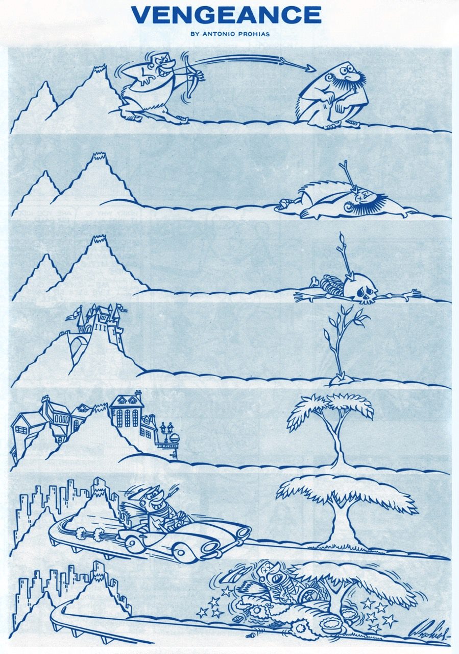
It pays to play the *long* game! “Vengeance” was published in Mad no. 66 (October 1961). Art by Antonio Prohías.
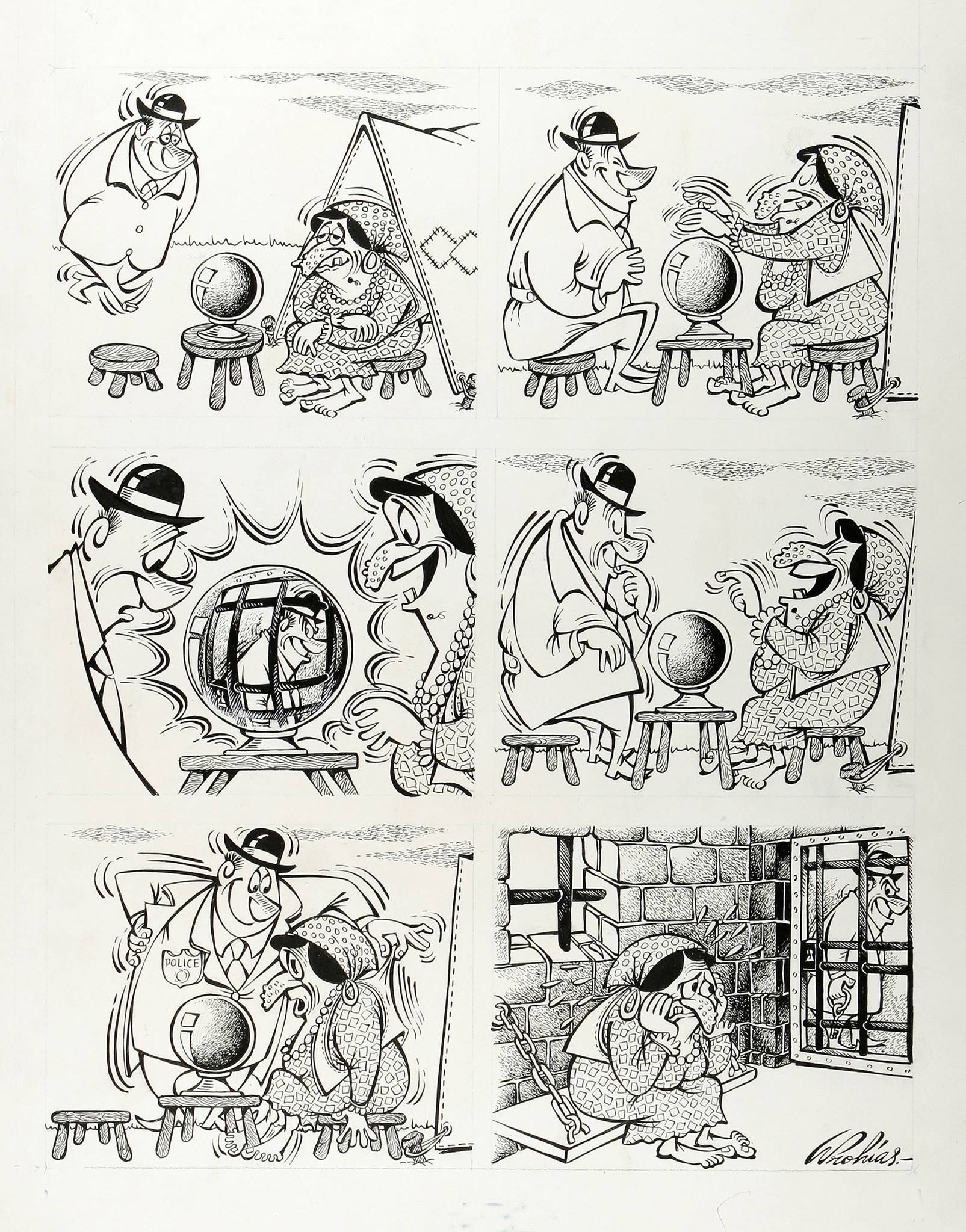
This it the original art for a gag called “The Old Ball Game”, created for Mad’s Fortune Kookie Dept. It was published in Mad no. 161, September 1973. Art by Antonio Prohías.
Original art for a strip published in Mad no. 253, March 1985. Ironically, I don’t particularly like Prohías’ Spy vs Spy, despite the lovely art and violent dismemberment scenes, much preferring Peter Kuper’s (much later, starting in 1997 up until today) version of this strip.
Next on our list is Al Jaffee, the “world’s oldest cartoonist” (Guinness World Records certified and everything!), Mad’s longest-running contributor, creator of the Mad Fold-In, mastermind of Snappy Answers to Stupid Questions.
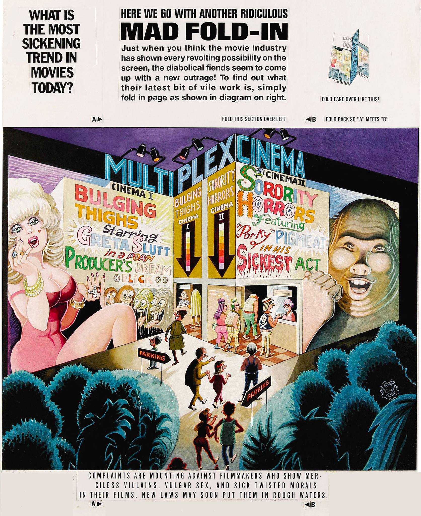
This fold-in comes from Mad no. 297, September 1990. Drawn by Al Jaffee, it answers (maybe) the paramount question of “What is the most sickening trend in movies today?”( Since I can’t very well ask you to fold your computer screen, the answer is “Commercials in theaters.”)
Incidentally, Mad introduced fold-ins in 1964 – they were a most prominent feature of MAD Magazine, conceived, drawn and written by the aforementioned Jaffee. I’ll quote the man himself:
“Playboy had a foldout of a beautiful woman in each issue, and Life Magazine had these large, striking foldouts in which they’d show how the earth began or the solar system or something on that order — some massive panorama. Many magazines were hopping on the bandwagon, offering similar full-color spreads to their readers. I noticed this and thought, what’s a good satirical comment on the trend? Then I figured, why not reverse it? If other magazines are doing these big, full-color foldouts, well, cheap old Mad should go completely the opposite way and do an ultra-modest black-and-white Fold-In!”
I guess they folded (ahem) on the “black-and-white” part later on. Here’s another nice Al Jaffee production:
This cartoon dwelled on the back cover of Mad no. 214 (April 1980), and was written by Dave Manak & drawn by Al Jaffee.
In a 2010 interview, Jaffee said, “Serious people my age are dead.” That may just be the recipe for eternal life.
Moving on to another mainstay of MAD: Sergio Aragonés, an artist about whom Mad director Al Feldstein said “he could have drawn the whole magazine if we’d let him.” Prolific, delightfully funny, and (by all accounts) a really friendly guy, Aragonés (born in 1937) is still with us today.
A little gruesome hippy humour from Sergio Aragonés, published in Mad no. 139, December 1970.
My favourite recurring feature by Aragonés is “Who knows what evils lurk in the hearts of men? The shadow knows.“ Many years ago, I picked up a copy of “Mad’s Sergio Aragonés on Parade” at a second hand store. I didn’t know who he was, then, but I loved the sometimes tiny, always funny squiggly drawings immediately. (I also didn’t know who the Shadow was, so that reference was sailing right over my head.) Even though I have since then upgraded to the considerably heftier “Sergio Aragones: Five Decades of His Finest Works“, there’s no way I’m getting rid of my dog-eared, stained and shopworn copy – that’s the one I reach for when I need a chuckle.
Published in From Mad no. 131, December 1969, scanned from “Mad’s Sergio Aragonés on Parade“, and artistically coloured by co-admin RG.
Published in From Mad no. 129, September 1969, scanned from “Mad’s Sergio Aragonés on Parade“, and artistically coloured by co-admin RG.
Hurray for Aragonés, the weird hours he keeps (by his own admission), and the thousands of ideas bubbling in his head at any given time. “Sergio has, quite literally, drawn more cartoons on napkins in restaurants than most cartoonists draw in their entire careers“, said Al Jaffee, and glancing at the tiny drawings decorating the margins and in-between-panels of Mad magazine, one can easily believe it.
The other guy who just has to be mentioned is Don Martin (1931-2000), promoted as Mad’s Maddest Artist. Where else would we get our fix for goofy characters with comically large, hinged feet? I can just imagine the squeaking noises they make.
Well, *have* you? This Don Martin cartoon was used as one of the eight “Vital Message” mini posters offered with Mad Super Special no. 17 (1970). It makes me think of my mom’s parting admonition every time I would leave the house – “and don’t hit old ladies with an umbrella”. I am proud to say that I’ve followed her advice… so far.
Here’s a fun description of standard Don Martin characters (source):
« His people are big-nosed schmoes with sleepy eyes, puffs of wiry hair, and what appear to be life preservers under the waistline of their clothes. Their hands make delicate little mincing gestures and their strangely thin, elongated feet take a 90-degree turn at the toes as they step forward. Whether they’re average Joes or headhunters, Martin’s people share the same physique: a tottering tower of obloids. Martin puts the bodies of these characters through every kind of permutation, treating them as much like gadgets as the squirting flowers and joy buzzers that populate his gags: glass eyes pop out from a pat on the back; heads are steamrollered into manhole-cover shapes. All of this accompanied by a Dadaist panoply of sound effects found nowhere else: shtoink! shklorp! fwoba-dap! It’s unlikely Samuel Beckett was aware of Don Martin, but had he been he might have recognized a kindred spirit. »
And now… for a bit of levity: a few favourite MAD covers.
I’ll start with this by-now-iconic cover, that’s nevertheless worth posting (with proper attribution to artists involved and in high enough resolution to admire the details, two characteristics sadly often absent from stuff posted online). You’ll note I’ve skipped over the first couple of Harvey Kurtzman covers (MAD nos. 1, 3 and 4) – which are amazing but a topic for another conversation.
Mad no. 5, June-July 1953. Cover by Will Elder, colours by Marie Severin. The busty babe is the least interesting character on this cover!
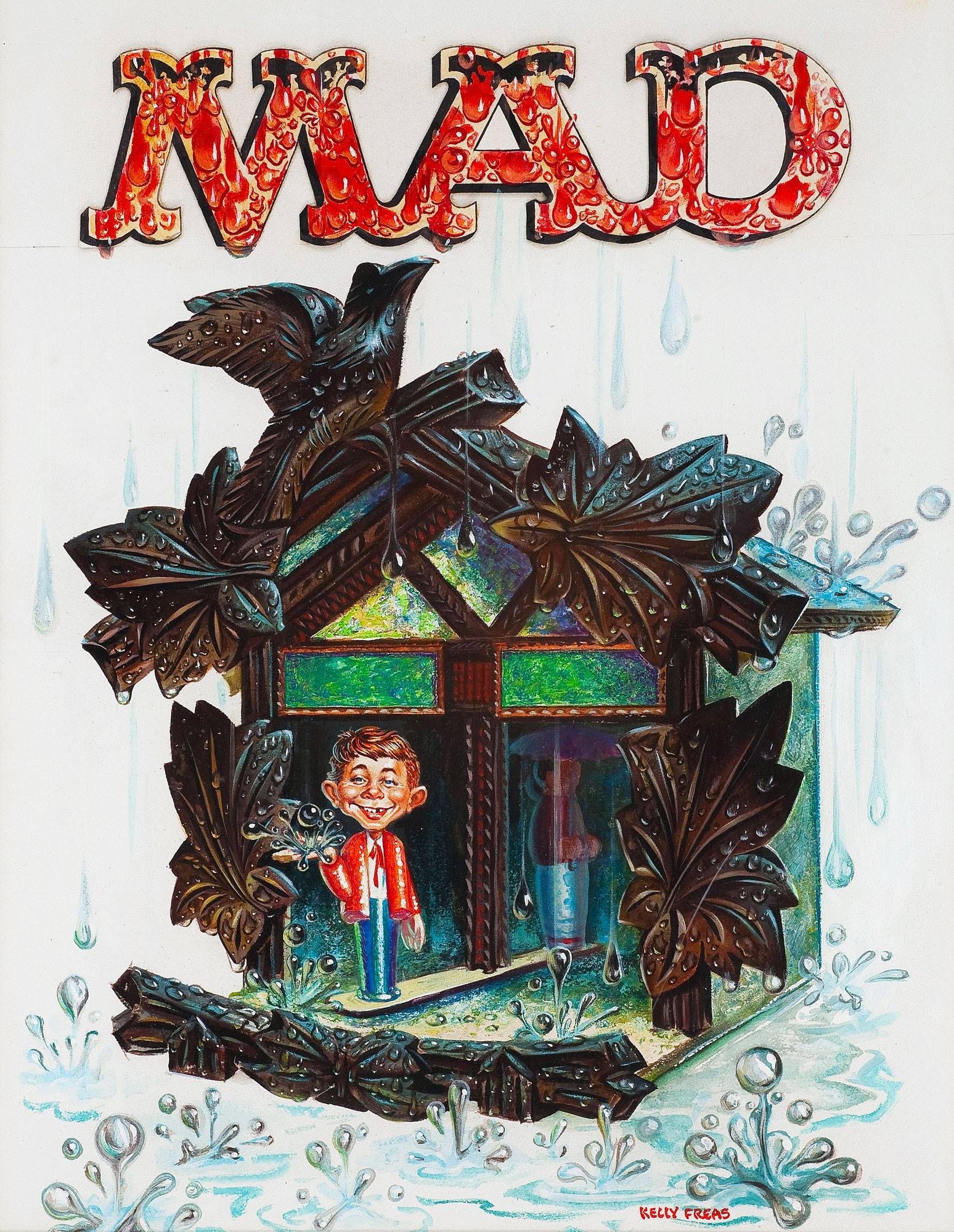
And it’s back to Kurtzman for covers of MAD nos. 6 to 10. Then I’ll disregard the somewhat boring covers, and jump over the Norman Mingo ones, and that brings us to… Frank Kelly Freas! It shall quickly become apparent that I really like his art (guilty as charged). Having started his career at Mad in February 1957, by July 1958 he was the magazine’s official cover artist (his first was MAD no. 40), and painted most of its covers until October 1962.
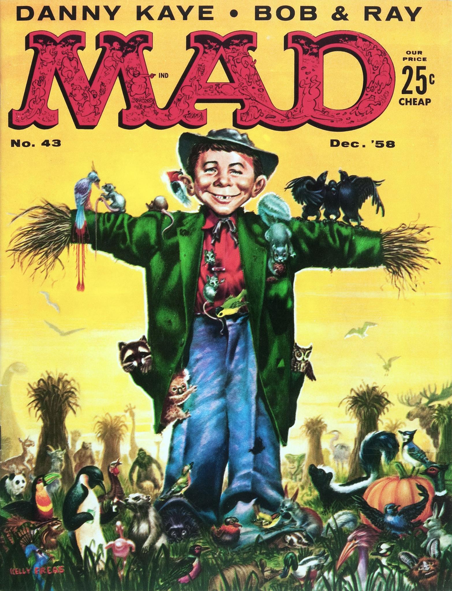
This one must have been fun to draw. I especially like the three (drunk?) crows singing on Alfred E. Neuman’s left arm. Mad no. 43, December 1958. Cover by Frank Kelly Freas (from an idea by Joe Orlando).
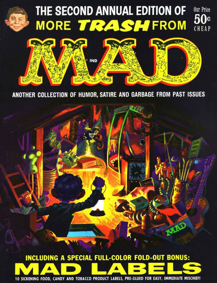
Frank Kelly Freas painted this attractive, colourful cover for the annual More Trash From Mad no. 2, 1959. This cover + Mad labels (you can see some of them here) for 50 cents? Seems like a good deal!
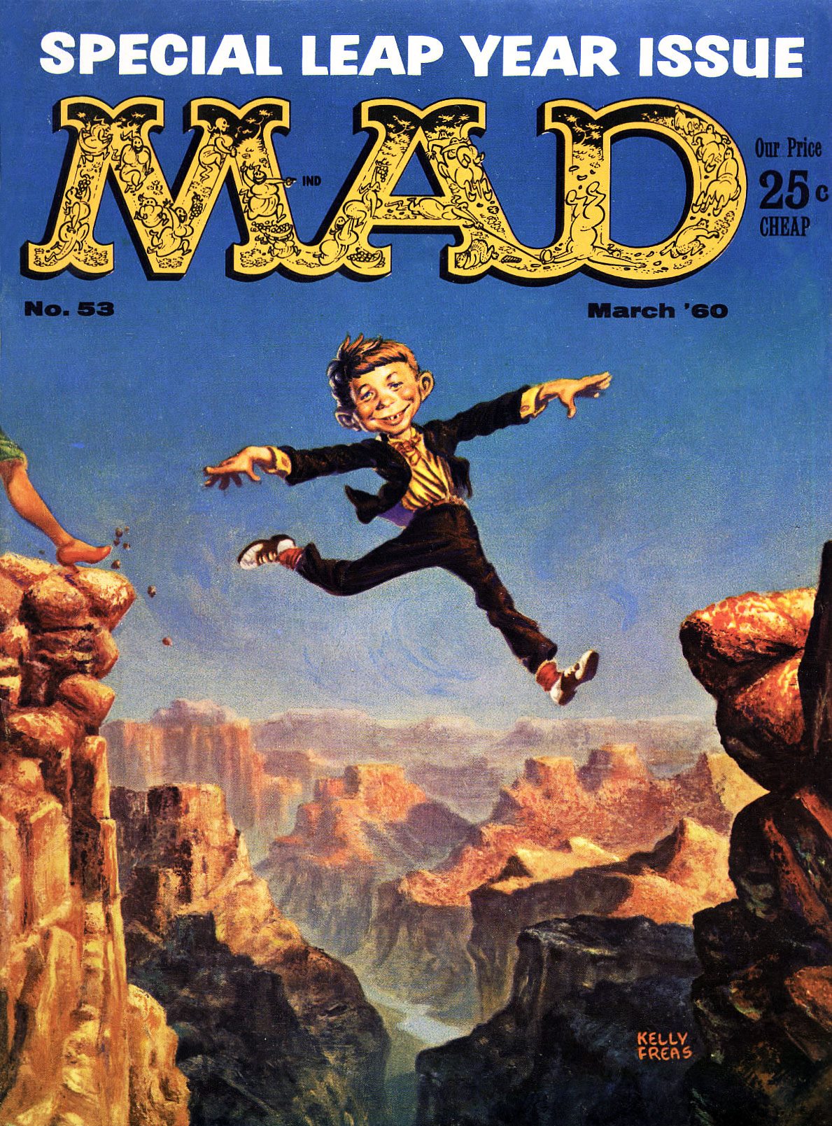
MAD Magazine no. 53 (March, 1960). Looks like there’s a woman about to follow Alfred E. Neuman’s bold cliff-jumping example.. unless she’s the one who pushed him off.
Original art for the cover of Mad no. 55, June 1960. Cover by Frank Kelly Freas. The sides of the weather indicator would be labelled “Fair” and “Foul” on the actual cover, but here you can really admire the detail of Freas’ deft brush. Alfred E. Neuman would be standing under “Fair”, of course, which would mean he’s predicting the weather erroneously… but maybe he’s just a pluviophile.
Another Kelly Freas cover: Mad Magazine no. 58 (October 1960). A summery cover, wouldn’t you say? Look closely and you’ll see that Freas cleverly carved his name onto the bough. Random fact: Freas painted bomber noses during WWII.
MAD no. 62, April 1961.
And to wrap this post up… a lithograph from the cover of More Trash from MAD no. 1 (1958).
Everything but the kitchen sink (which has been replaced by a barbecue).
“Only three of these lithographs were ever published before the production was stopped as a violation of the MAD copyright. The other two are currently in private major MAD Magazine collections. This is the only lithograph done by Kelly Freas of one of his MAD book covers.”
For more (not necessarily MAD-related) FKF, go here.
« Last year I went fishing with Salvador Dali. He was using a dotted line. He caught every other fish. » — Steven Wright
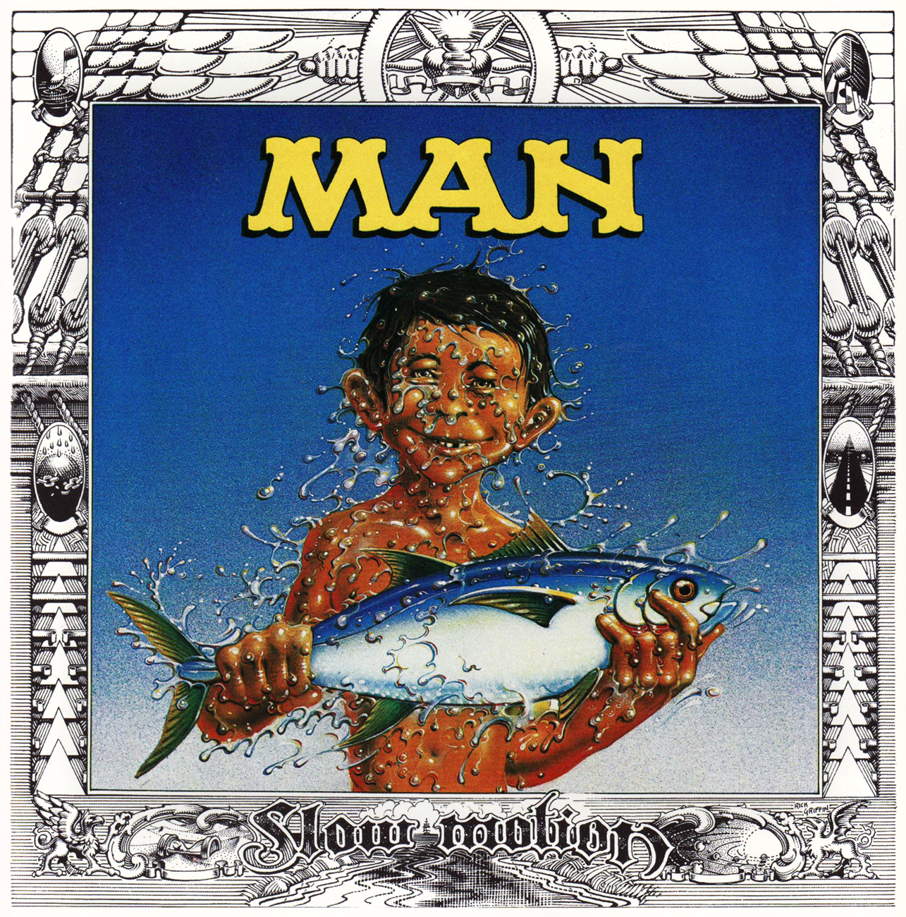
In 1974, prodigious underground cartoonist Rick Griffin was commissioned to design a cover for Welsh rockers Man’s ninth opus… and this is what he came up with.
The original version of Griffin’s proposal, cheekily titled « The Baptism of Alfred E. Neuman. »
While the image of the grinning fool popularly known as Alfred E. Neuman was, and remains in the public domain, Griffin was really pushing his luck, even without MAD Magazine’s distinctive typeface on bold display. Let’s just say William M. Gaines’ lawyers had far more than a leg to stand on.
Understandably reluctant to let such a lovely *and* provocative work of prime Griffin altogether go to waste, Man (and their legal counsel, presumably), engineered a clever and elegant design solution, shown below, which graces the band’s Slow Motion album, issued in late 1974, and still thumbs its nose at MAD Magazine, exceptionally cast in the thankless rôle of the fuddy-duddy villain.
However, here’s an account — circa 2023 — I recently discovered that casts the matter in a whole new light: « John Peel made ‘Day and Night‘ his Single of the Week in Sounds, but it was the album cover that attracted most comment. American counterculture artist Rick Griffin had come up with a design that prominently featured Mad magazine character Alfred E. Neuman, only for the cover to be subsequently cropped so that Mad’s cover boy was merely a peripheral presence. For years it was claimed that Mad had refused permission for Neuman to be shown, but it now appears they had actually given tacit verbal approval, and that it was the record company, United Artists, who made an executive decision to censor the design without contacting the magazine. »
This illuminating bit appears in David Wells’ (of Cherry Red Records) exhaustively researched — and exquisitely written — liner notes to Grapefruit Records’ Patterns on the Windows: The British Progressive Pop Sounds of 1974 boxed set. Recommended, as is the rest of this chronological series.
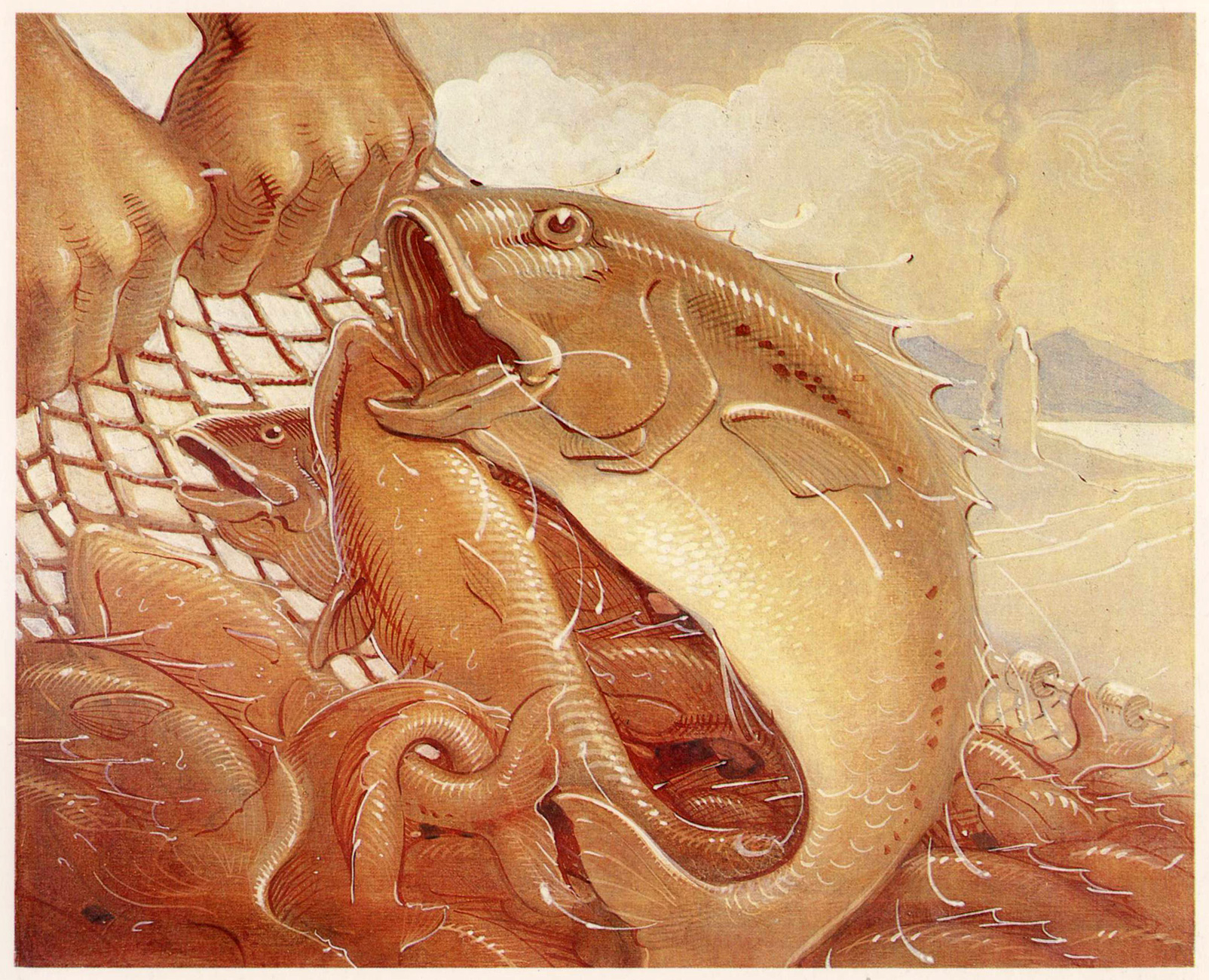
As a born-again Christian (circa 1970) *and* surfer, it follows that fish were, topic-wise, a natural fit for Griffin.
A painting from Griffin’s foremost undertaking of the 1970s, « The Gospel of John » (available to this day!); this one illustrates John 21:6, « And he said unto them, cast the net on the right side of the ship, and ye shall find. They case therefore, and now they were not able to draw it for the multitude of fishes. »
For the record, I prefer my fish alive and swimming free.