« In the bleak midwinter, frosty wind made moan, Earth stood hard as iron, water like a stone; Snow had fallen, snow on snow, snow on snow, In the bleak midwinter, long ago. » — Christina Rossetti
Christmas is nearly upon us, but while a great many will opt to retreat into the miasma of nostalgia to forget what an annus horribilis it’s been, I’ve picked something a bit more appropriately sombre in tone to nail down the occasion.
But with a more hopeful chaser… to balance things out a bit.
When the indefatigable Carmine Infantino (1925-2013) stepped down from his multi-hatted rôle of publisher, editor-in-chief, cover designer and art director — and so on — at DC, he found that no-one was beating his door down to offer him a similar position.
So he went back to drawing, as a freelancer. As Infantino put it: « Jim Warren was the first comics publisher to contact me after DC. I said “I’ll do work for you, but nothing full-time because I’m busy with other things.” He said, “Okay, whatever you’re willing to give me.” I wasn’t really comfortable with the Warren material — it was the sexiest work I’d ever done! Jim had an older audience and wanted it that way. My feelings about the material never affected the mutual respect Jim and I had for one another. » [ source ]
All told, Infantino pencilled around forty stories for Warren in a span of four years. There was even a brief period when he just about monopolized individual issues of Creepy and Eerie, which was offset by pairing him with wildly disparate inkers. Sometimes the results sang, sometimes they croaked.
Here’s a case of rarely combined styles that nevertheless meshed beautifully: Infantino and John Severin. Let’s face it, who’s more reliably excellent than Mr. Severin?
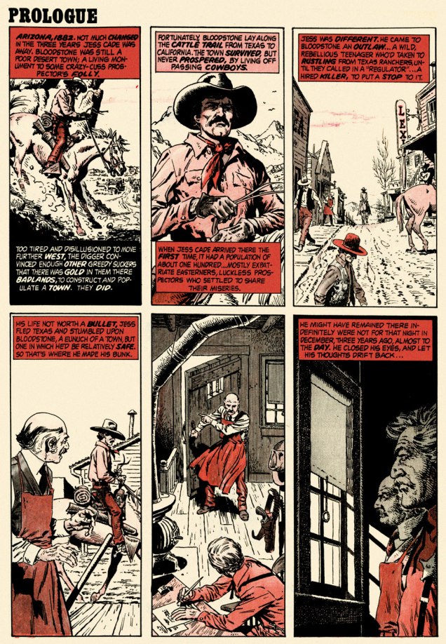
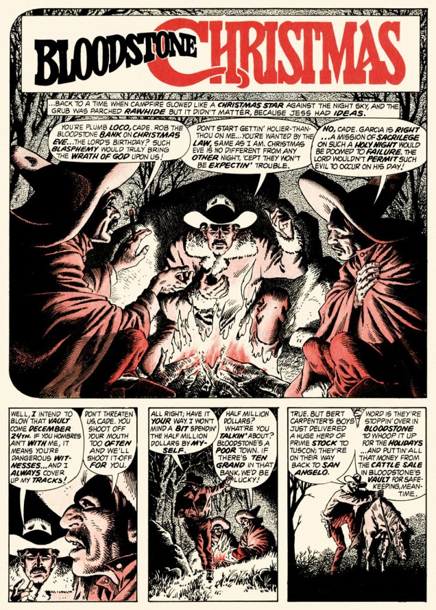
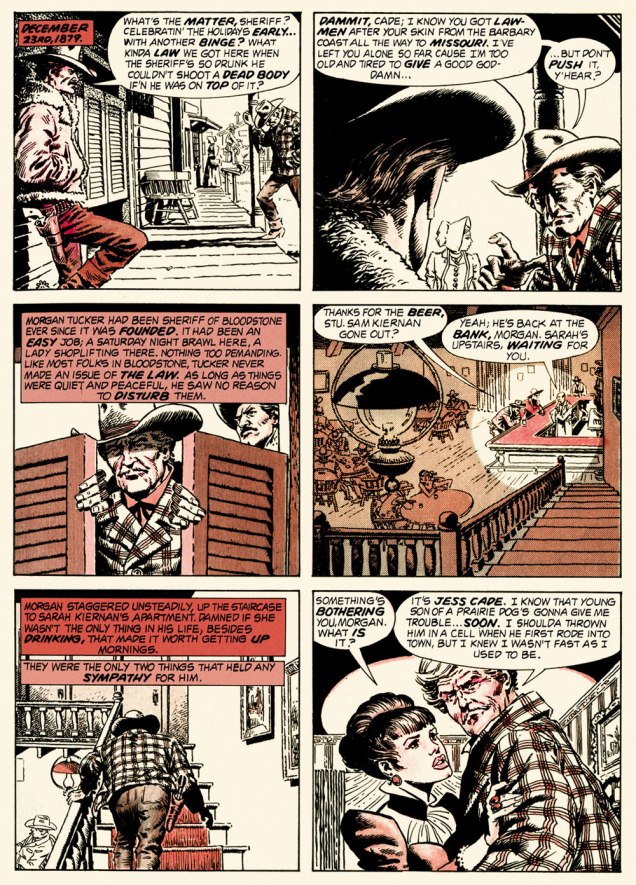
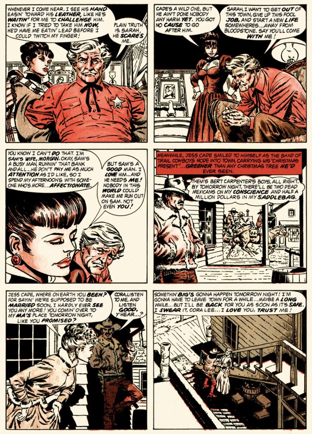
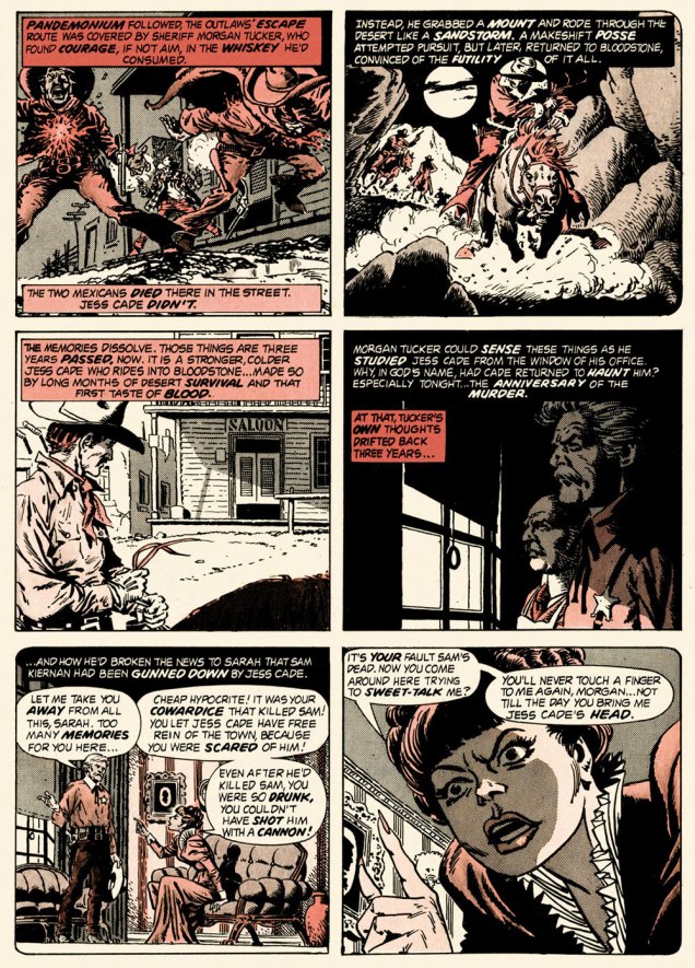
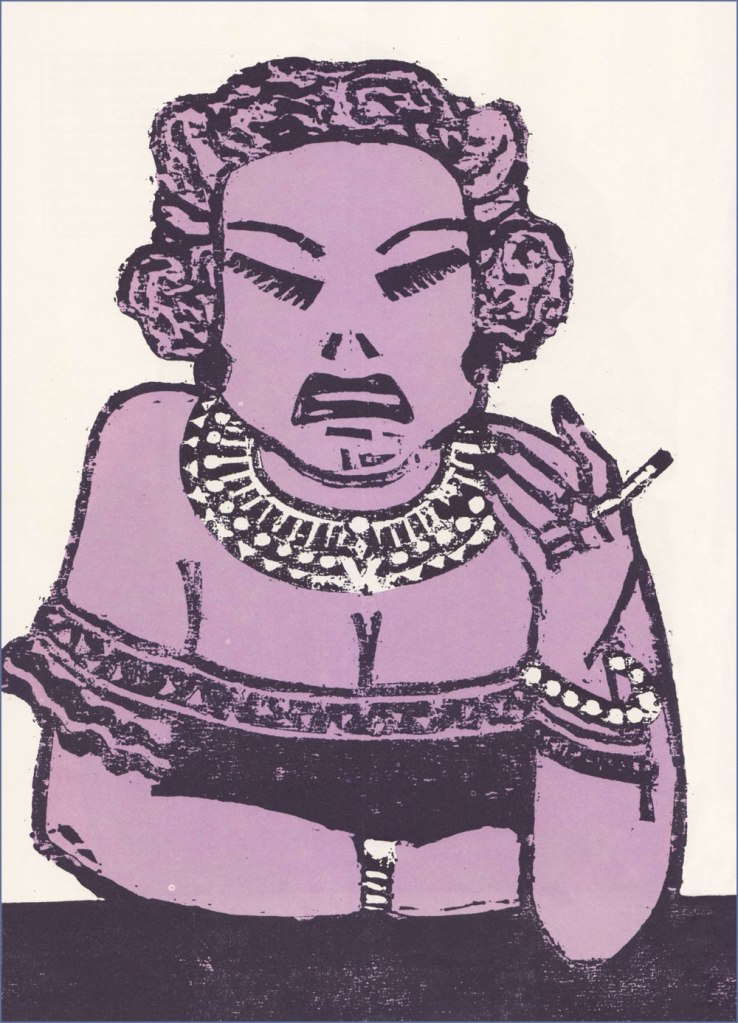
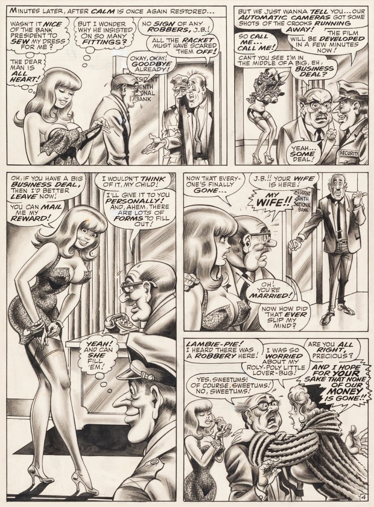
And so this is… Bloodstone Christmas, written by Gerry Boudreau, pencilled by Infantino, and inked by John Powers Severin (1921-2012).
.
.
.
.
.
.
.
I won’t pretend that the entire cast isn’t peopled with stock characters, but its sting in the tail lands satisfyingly, prefiguring the flavour of weird westerns by Joe Lansdale, for one.
.And now, for something sweeter.
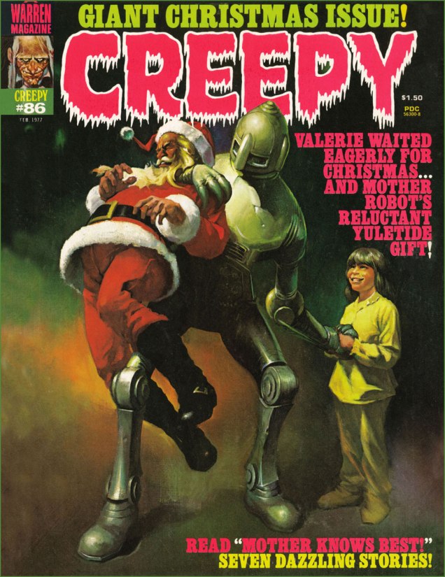
This is Creepy no. 86 (Feb. 1977, Warren). Cover by Ken Kelly (1946-2022).
And now, for the sweeter part of our double-header.
.
.
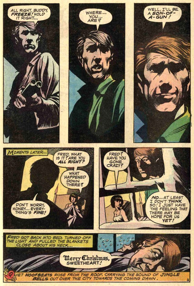
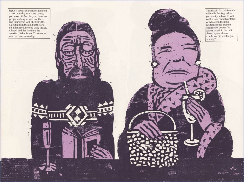
Night Prowler was an early collaboration by Swamp Thing‘s co-creators, writer Len Wein and artist Bernie Wrightson. It was published in House of Mystery no. 191 (Mar.-Apr. 1971, DC). Joe Orlando, editor.
Oh, and Happy Holidays to you, esteemed readers!
-RG
p.s. Oh, and speaking of carmine, the colour, not the man: I just read, a few days ago, in Steve Ettlinger‘s superb Twinkie, Deconstructed (2007), that « the fascinating, rich magenta carmine, also known as cochineal, is extracted from the dried body of the female cochineal insect », and that « the output of the Canary Islands is used almost exclusively to colour the Italian apéritif Campari. » Caveat emptor, then! Ironically, « carmine dye is produced from the acid that females naturally secrete to deter predators. » Not, however, industrious humans.
« I don’t understand retiring. I don’t know what I’d do. I don’t play golf. I have to sit at a drawing table or else it’s a wasted day. The nature of the work can change here, but I have to be doing something, especially with my hands. » — Seymour Chwast
Nobody really expects those we deem “immortals” to actually live forever… but I suspect some part of us does, or at least hopes so.
I haven’t yet reached that fateful age when reading the paper largely consists of scanning the obituary column to learn which of your friends (and possibly enemies) have died, but I fully grasp the concept… and shudder in sympathy.
And so on to my point: it’s easy to take genius (or mere talent, for that matter) for granted, and so I generally endeavour to salute valued creators while they’re still around, instead of paying belated lip service to their greatness once reminded of their existence by news of their passing.
For years, I’ve been meaning to devote a post to Seymour Chwast… and dragging my feet. He’s had such a long, inspiring — and daunting — career. But the other day, when Tony Bennett died, aged 96, I took it as a sign not to reserve my tribute for Mr. Chwast’s next birthday (that’s late next month). Here goes.
First, an amuse-gueule. This mute but highly rhythmical piece hails from issue 69 (October, 1977) of Push Pin Graphic, the fabled design studio’s showcase magazine. The issue’s theme is “House Nice”, parodying interior decorating fixture House Beautiful Magazine. Written and drawn by Mr. Chwast.
Design historian Steven Heller explains: « Push Pin’s principal cofounders, Seymour Chwast (b. 1931) and Milton Glaser (b. 1929), two native New Yorkers who met while attending Manhattan’s Cooper Union, brought distinct tastes and preferences — as well as chemistry — to their unique partnership. Chwast savored American comic strips and pop culture while Glaser studied etching in Italy and was passionate for Italian Renaissance painters. The former injected a cartoonist’s abandon into his artwork, the latter introduced a sublime elegance. Despite their formal differences, both shared the conviction that postwar design and illustration should not be limited to prevailing practices — either sentimental realism or reductive simplicity. They rejected rote methods and rigid styles while concocting incomparable ways of transforming old into new… »
The following encapsulates even more succinctly the duo’s boundless contribution: « Seymour Chwast and Milton Glaser are legendary graphic designers who founded Push Pin Studios, where they rebelled against the swiss style establishment – blending illustration with design. » [ source ]
Amen: from my standpoint as an art student back in the early 1980s, I’ll say one thing about Swiss design: that shit was oppressive.
To sidestep the perils of losing my way amidst such a gargantuan topic, I’ve opted to focus on a favourite entry in the Chwast œuvre.
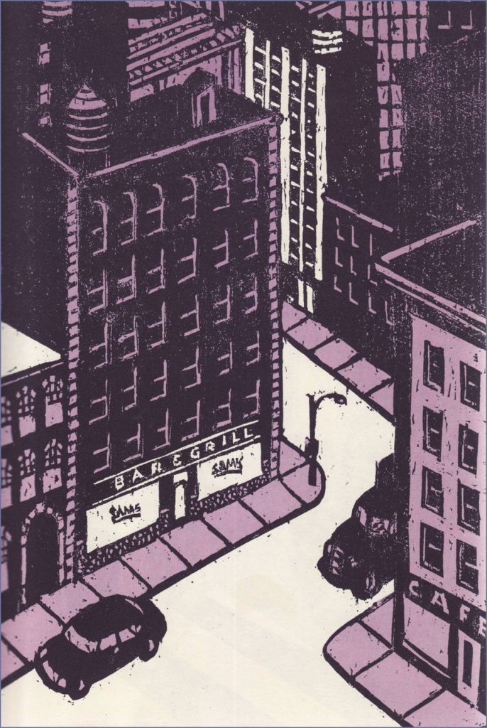
« Another of Chwast’s graphic stories is Sam’s Bar (Doubleday, 1987). Written by Donald Barthelme, it is also a total narrative and pictorial story. It captures in woodcut illustrations one night in a bar somewhere in America, people talking to each other and talking to themselves as the reader goes from one end of the bar to the other. » The book’s intriguing structure would have made it an ideal comic *strip*, in the literal sense.
Ellie says: « So I told the kid May 31, 1989, was the cutoff date, as of May 31, 1989 she’s off the payroll whether she’s finished goddamn college or has not she’s finished goddamn college. So she tells me she’s thinking of transferring to UCLA and that’s going to set her back two semesters. So she can get fencing. Where she is they don’t have fencing. I said I’ll rent you an Errol Flynn movie. »
Trish and Calvin.Hal and Germaine.Two lawyers, Mario and Saul. Someone ought to make a show about a lawyer named Saul.
The book’s handy endpapers, featuring “The Regulars at Sam’s Bar“.
I wouldn’t want to short-change Barthelme’s contribution… as a collaboration, this truly works a treat. Here’s an amusing passage I encountered on the subject of this routinely misunderstood author: « Donald Barthelme was, by his own design, a hard writer to categorize. Even at the height of his fame, in the late 70s and early 80s, there were readers who just didn’t get him, or suspected his work was a hoax or a joke they weren’t in on. At The New Yorker, where he was a regular contributor for decades, clerks in the library were expected to type up on index cards brief summaries of every article, fact or fiction, that appeared in the magazine. Barthelme’s cards sometimes contained just one word: “gibberish.” » [ source ]
One more for the road? I couldn’t leave out Chwast’s adorable cover illustration for issue 57 (Why People Keep Dogs) of Push Pin Graphic, from 1972.
Many happy returns and thanks for the inspiration, dear Mr. Chwast!
« Ward’s beautiful buxotics operate in a strange separate universe, in which all women are gorgeous voluptoids, all men oafish, saucer-eyed drooling dupes. » — Chris ‘Coop‘ Cooper
Well, I certainly wasn’t planning to hog all the blogging this week, but there were birthdays and other hopefully mitigating factors. While today is the great Will Eisner‘s birthday, it’s likely to overshadow that of a fellow Golden Age toiler, one with an equally intriguing career, but with a trajectory quite divergent from Eisner’s own.
Bill Ward (1919 – 1998) was also born on this day, one hundred and three years ago. Ward started out in comics with the Jack Binder shop, turning out material for Fawcett’s line of characters (Captain Marvel and his family, Bulletman…); he soon found himself working for Quality Comics, most notably on Blackhawk (an Eisner co-creation, it should be noted). He inched closer to his true passion when assigned to Quality’s romance line.
Ward’s cover for Love Diary no. 1 (Sept. 1949, Quality). Artistically speaking, this is what a fully committed Ward can produce.
In the mid-50’s, when came the brutal, censorship-induced compression of the comic book industry, Ward smoothly shifted to producing girlie cartoons for Abe Goodman’s Humorama line, becoming its star and most prolific performer, thanks to his popularity and prodigious speed. He was aided in this by his choice of tool and technique: the conté crayon on newsprint. While everyone else was working on 8″ x 12″ illustration board, Ward was using a soft, beige paper of a size (18″ x 24′) and texture familiar to any art student who’s taken a life drawing class. With this type of stock, he could produce texture rubbings and achieve smooth, sensual sheens ideal for rendering highlights of hair and stockings. Said Ward: « It didn’t take me long to figure out that the quicker you could do the work… the more money you could make. » Over the course of a quarter-century, he wound up producing around 9,000 drawings for the Humorama line.
As Ward recalled of his early training in Binder’s studio, « [Binder] trained me to do layout, which is the most difficult part of art. » To wit, layout never counted among Ward’s strengths. A lot of his pinup work is undermined by poor staging, often grotesque proportions, and absolutely minimal attention to non-erotic detail.
A typical example of a Ward girlie cartoon produced using the conté crayon. This one first turned up in Comedy no. 51 (Jan. 1960, Marvel); in a typical work-for-hire arrangement, for a flat fee (in Ward’s case, 7 dollars a cartoon, topping out at the princely sum of $30 near the end of his 25-year run), Goodman retained all reprint rights (and reprint he did, liberally) and kept the original art, which he sold to collectors for several times its original cost, naturally. Nowadays, these pieces exchange hands for several thousand dollars.
Now, had I ever wondered what Ward’s pencils would look like, if inked by Bill Everett? I readily confess I hadn’t. But upon learning that such a momentous collision once occurred, my mind was set slightly reeling.
Another weathered fellow combatant in the trenches of the Golden Age, Everett (1917-73), unlike Ward, always gave his best, whatever the conditions. Right to the end, despite his rapidly declining health, Everett was, incredibly, producing top-flight work.
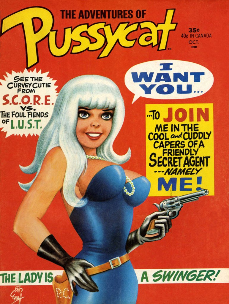
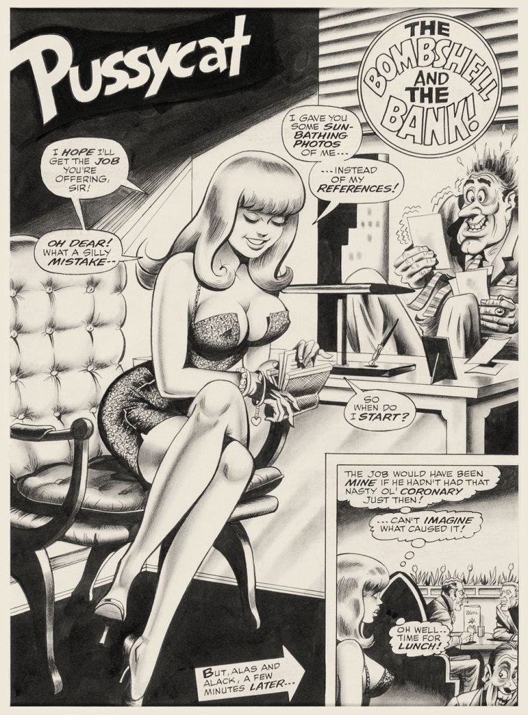
This is The Adventures of Pussycat no. 1 (Oct. 1968, Marvel). Cover by Bill Everett. Highly sought after today, this scarce, magazine-size one-shot is merely a reprint collection of some of Pussycat’s ‘adventures’ from various Goodman Playboy knockoffs, and one of a gazillion contrived acroynym-based attempts to cash in on the ubiquitous 007 craze of the 60’s. It does contain the first Pussycat tale, illustrated by Wally Wood, who would soon go on to his own entry in the super-spy stakes, Tower’s T.H.U.N.D.E.R. Agents. Concentrate on the artwork. The less said about the writing (was it Stan the Man or Larry the Lieber? We’ll likely never know), the better. As usual, any American attempt at French is mangled, even at a mere two words and two syllables (for the record, it should read either “C’est fini!” or “C’est la fin!“). Pensively squinting while adjusting his pince-nez, a ‘curator’ at Heritage Auctions made this uproarious whopper of a claim: « The figures of Pussycat look to be by Bill Everett and everything else is Bill Ward. » So you think Bill Ward drew everything… except the one thing he was interested in drawing? These folks don’t seem to know how comics are produced.“The Bombshell and the Bank!“, never reprinted, saw print in Male Annual no. 6 (1968).This is The Mighty Thor no. 171 (Dec. 1969, Marvel). Jack Kirby pencils, Bill Everett inks. Coming late in Kirby’s run, what a vigorous breath of fresh air after years of lazy erasures!
In the 60’s, Ward also provided covers for various soft-core novels, such as this one from Satellite Publications’ ‘After Hours’ imprint. He even wrote some of them, notably under the alias of ‘Bill Marshall’. His fellow Quality Comics alumnus Gil Fox also penned many of these potboilers under a staggering array of aliases.
This is Side Street (1966, After Hours). I’ve noticed over the years that certain artists of a more single-minded frame of mind can’t be bothered to devote much attention to anything but the object of their obsession. Such was the case with Bill Ward, and with the passing years, ever increasingly so. Exhibit A: has Ward ever seen an actual dog?Which reminded me of this classic, by another ‘can’t be bothered’ master of ‘Good Girl’ art, Alberto Joaquin Vargas Chavez (1896-1982). Another howler from the comedians at Heritage: « This early masterpiece, one of the greatest pin-ups the artist ever painted, was reproduced as a full-color double-page spread in Vargas, Taschen, 1990. Alberto Vargas thought so highly of this lot and the following two stunning paintings that he retained them in his personal collection. » I wouldn’t presume to criticise Vargas’ depiction of the female form, but on the other hand, this is Exhibit B: has Vargas ever seen an actual cat? Don’t worry, Alberto, you’re not alone in this affliction: neither has Neal Adams.
« Doublethink means the power of holding two contradictory beliefs in one’s mind simultaneously, and accepting both of them. » — George Orwell
For its July 4, 1949 issue, Life Magazine pulled a couple of rather unusual moves: it featured an elaborate preview of George Orwell’s just-published novel Nineteen Eighty-Four and, as if that wasn’t weird enough, it called upon the services of renowned cartoonist Abner Dean to (copiously) illustrate the article.
Typically, given the USA’s usual political temperament and the then-prevailing climate of McCarthyism and the Red Scare, Life resorted to some choice bits of disinformation and misdirection to sell Orwell and his book to its decidedly whitebread readership. No irony whatsoever.
« British novelist George Orwell, 46, who fought in the Spanish Civil War, saw firsthand what the Communists were up to and has since devoted all his talents to warning the world of the fate which awaits it if it confuses liberalism with regimentation. His new novel, Nineteen Eighty-Four, is a terrifying forecast of what the world of human beings may be like 35 years hence. It is a July selection of the Book-of-the-Month Club and will be condensed in the September Reader’s Digest. It is guaranteed to make the flesh creep on anything except brass monkeys and commissars. »
Dean’s huge (52 cm x 24 cm) spread ushering readers into The Strange World of 1984. It’s hard to do it justice at this reduced size, but open it in a separate tab for a closer look.
Let’s see, now. Orwell fought in the Spanish Civil War. Fair enough. Let’s dwell on that detail for a bit. Which side was he on?
« In December 1936, Orwell went to Spain as a fighter for the Republican* side in the Spanish Civil War that was provoked by Francisco Franco’s Fascist uprising. He did not join the International Brigade as most leftist did, but the little known Marxist POUM. In conversation with Philip Mairet, editor of New English Weekly, Orwell said: ‘This fascism… somebody’s got to stop it’. To Orwell, liberty and democracy went together, guaranteeing, among other things, the freedom of the artist; the present capitalist civilization was corrupt, but fascism would be morally calamitous.
He joined the Independent Labour Party contingent, which consisted of some twenty-five Britons who had joined the militia of the Workers’ Party of Marxist Unification (POUM – Partido Obrero de Unificación Marxista), a revolutionary communist party. The POUM, and the radical wing of the anarcho-syndicalist CNT (Catalonia’s dominant left-wing force), believed General Franco could be defeated only if the Republic’s working class overthrew capitalism — a position at fundamental odds with the Spanish Communist Party, and its allies, which (backed by Soviet arms and aid) argued for a coalition with the bourgeois parties to defeat the fascist Nationalists. » [ source ]
So… Orwell was not merely a communist, but a Marxist advocating the overthrow of capitalism. Just like your average Reader’s Digest subscriber, obviously!
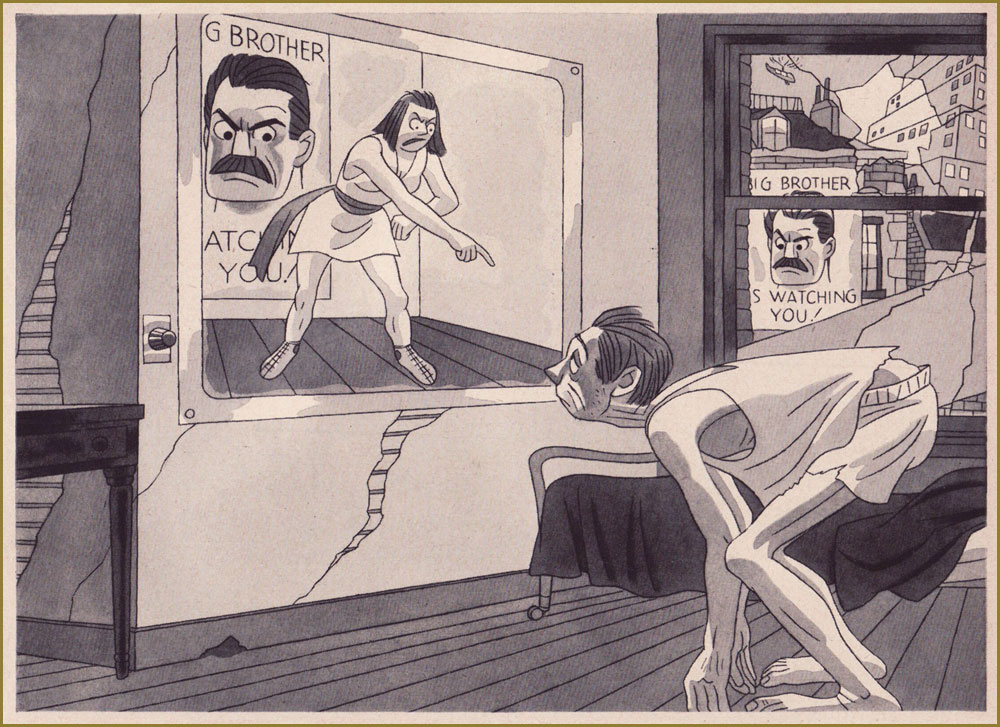
« THE TELESCREEN dominates the lives of Party members; it is a kind of television set which can never be turned off, and which can pick up as well as receive images. Over it the members hear what they are supposed to do and believe — and from the other end the dreaded Thought Police can see everything they do and hear everything they say. » Prophetic? Now don’t be silly.
« TWO MINUTES HATE is a daily institution designed to keep Party members in a frenzy of excitement and rage against the Party’s enemies. »
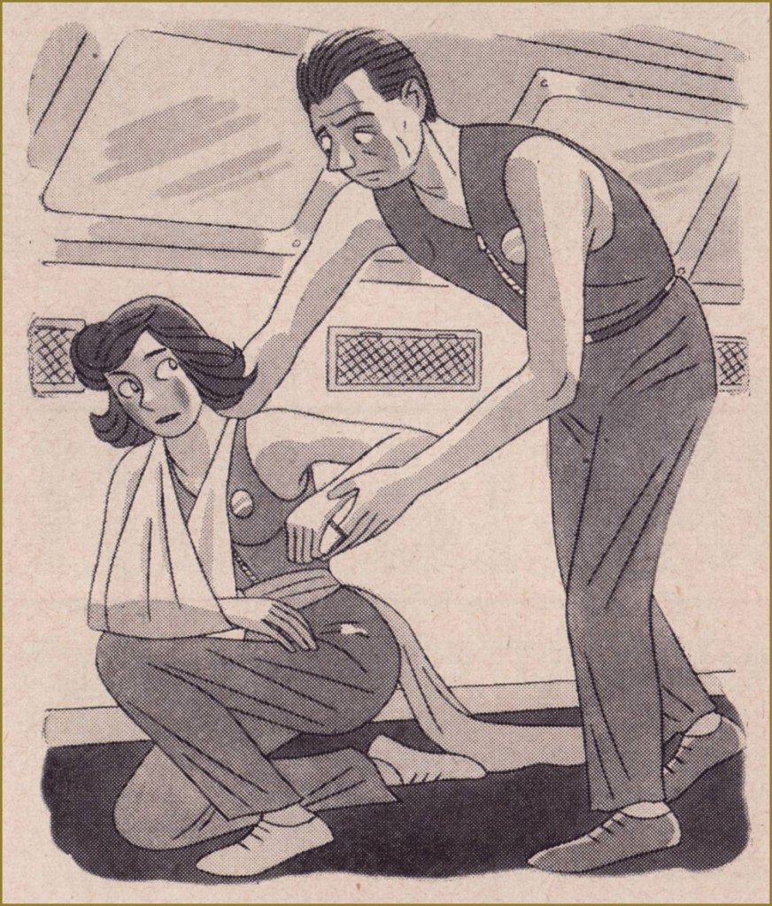
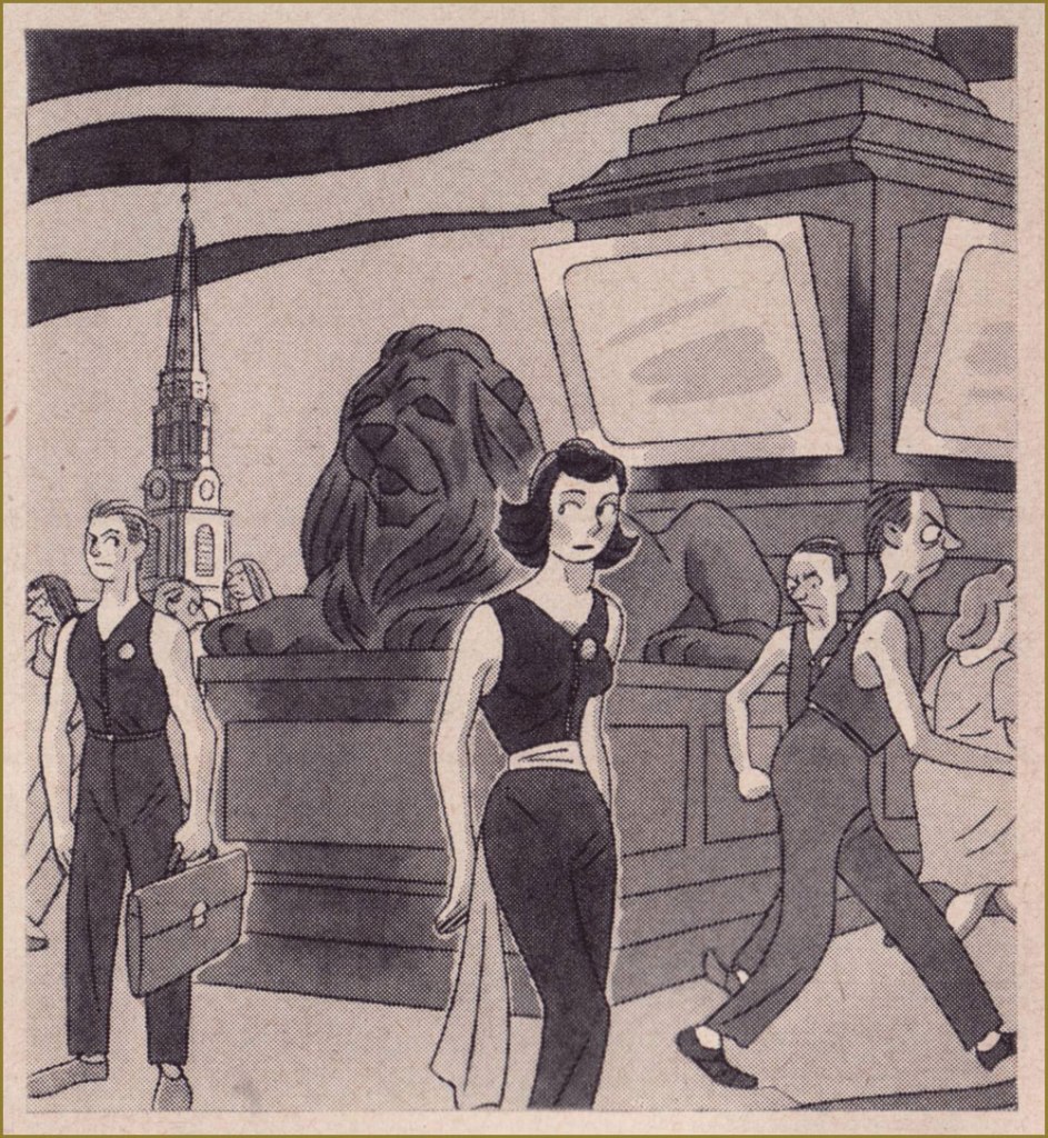
A LOVE AFFAIR in six panels. Spoilers galore. Protagonist Winston Smith meets Julia.
Julia hands Winston a note, which he drops into the memory hole (basically an incinerator) as a precaution.
They meet in the midst of a crowd in Victory Square, and Julia whispers some instructions to Winston.
« Now, in a trysting place beneath the trees he finds a kindred soul in the rebellious Julia; she removes the hateful sash of the Anti-Sex League and they enter upon one of the most furtive and pathetic little love affairs in all literature. » The anonymous author of the article does not seem to approve.
« Julia is good at smuggling forbidden pleasures; they have real coffee (not the ersatz ‘Victory’ mixture) and chocolate, and Julia adorns herself with cosmetics and perfumes which no Party member is ever supposed to see. »
« But eventually, the Thought Police catch up with them. For the unspeakable crime of indulging in a human emotion they are arrested and hauled away to repent their sins in the horrible confines of the Ministry of Love. » I did warn you about spoilers: indeed, Winston Smith Takes It on the Jaw!
It’s intriguing that LIFE would devote this much space to such a controversial topic, but hardly surprising that it would stack the deck. It’s a regrettable hallmark of blind hubris to believe that only ‘the opposition’ is capable of totalitarian atrocities, when allowed unchecked power. Benevolent dictators have always been very, very scarce. To quote Margaret Atwood, a lady who knows her way around a dystopia, « ‘1984’ is not a wonder tale. Not only could it happen, but it has happened, but under different names. »
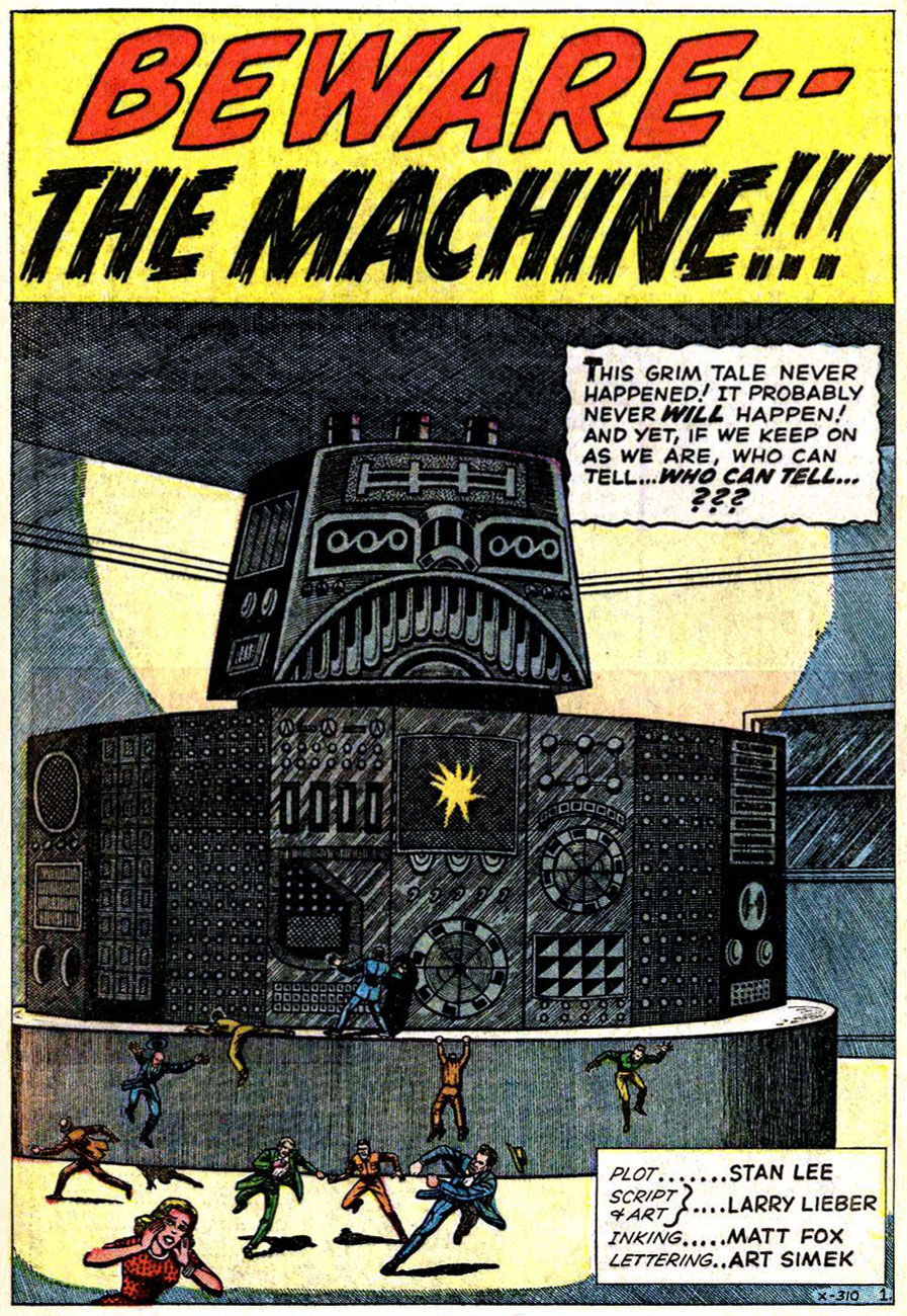
« Matt Fox drew comics like they were carved out of stone. » — Dan Nadel, Art in Time (2010)
As far back as I can recall, I’ve been intrigued by the tremendous latitude to be found in specific penciller-inker pairings. Depending on who’s at the helm, things can go anywhere from manna to mud.
No need to dwell on the damage a bad or lazy inker can inflict, and we’ve all witnessed the magic of inkers that elevate any pencils they’re called upon to finish.
It’s of yet greater interest, I believe, to delve into the rare and mystifying alchemy worked by two flavours you’d never dream of commingling in the same dish… like anchovies and ice cream, or perhaps Nutella and caviar.
One such audacious mixture was given a go in the transitional post-Atlas days of Marvel comics, as the publisher’s long-running anthologies were shedding their mostly-standalone short story format in favour of the resurgent superheroes.
First, though, a bit about our performers:
Recently-retired (in 2018) writer-artist Larry Lieber (born October 26, 1931, and still with us), is Stan Lee’s younger brother (who didn’t anglicise his name nor sport a toupee) and publisher Martin Goodman‘s nephew. From day one (he got his start in comics with Atlas in 1951), Larry toiled on the family farm, so to speak, his entire career (including a chaotic editorial stint with Martin and Chip Goodman’s ill-conceived Atlas-Seaboard company in 1974-75). His most notable work at Marvel was his run as writer-artist on Rawhide Kid (1964-1973); after Atlas-Seaboard, he worked for Marvel-related newspaper strips, frequently with brother Stan (first The Incredible Hulk, 1978-79, then The Amazing Spider-Man, 1986-2018). He did co-create Iron Man, Ant-Man and Thor… but hasn’t seen a dime for it beyond his measly page rate back in the 60s. Once more, that’s the American comic book industry for you, particularly if you’re a bit of a milquetoast.
In the 1950s, he drew a handful of short stories for Atlas, as well as a single story and a trio of covers for Youthful’s Chilling Tales… upon which largely rest his reputation in comics. Peter Normanton, in The Mammoth Book of Best Horror Comics, wrote: « There is an air of disquiet to his vision, yet it charms through a surreptitious blending of the primitive with the mockingly insane. His characters border on the lunatic seemingly at home in his landscapes, concealing a darkness corruptive of the soul. »
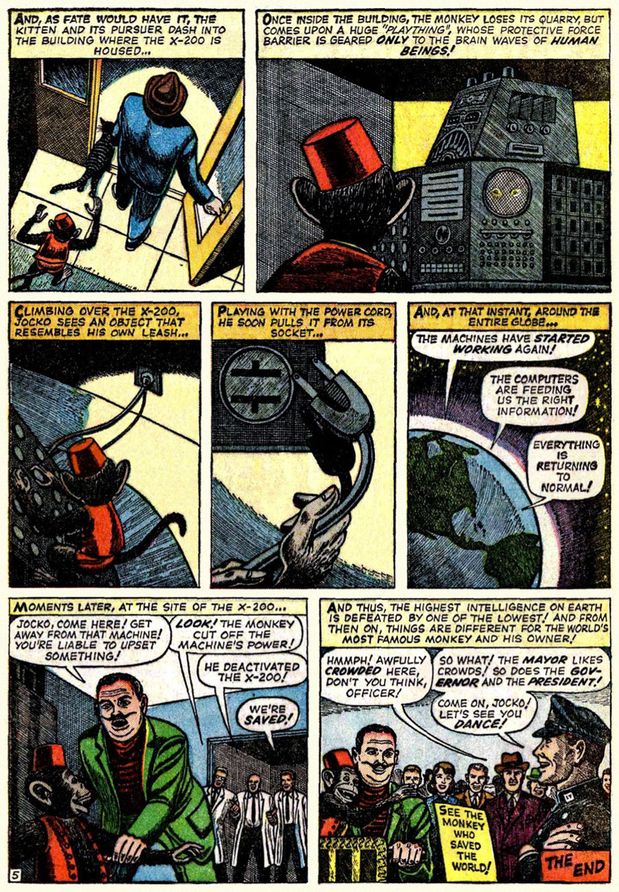
This is Beware — the Machine!!! from Strange Tales no.111 (Aug. 1963, Marvel). Lieber, while he’d never be called (or claim to be, to his credit) a master draughtsman, did possess one irrefutable and priceless artistic quality: he could tell a story clearly, smoothly, without undue fuss.
« Without conscience, compassion, or any other behavioral safeguards that humans possess… » I can certainly think of some exceptions, can you?
Uh, guys, monkeys are hardly low on the intelligence totem pole. Now if the X-200 had been brought down by, say, a slime mould, you’d be closer to the truth of your claims.
Now, you may ask, did Lieber appreciate Fox’s stellar efforts? Short answer: nope. In this chat with Roy ‘Houseroy’ Thomas, he lets it all hang out. [ source ]
Roy Thomas:One of the strangest inkers you had was Matt Fox.
Larry Lieber: I hated that stuff! Oh, God, and years later, I learned that Matt Fox is considered one of the greats by some people, and his artwork brings a buck or two.
RT: Yeah, but not in comics.*
LL:I hated his stuff because I struggled with drawing, and I was trying to make the drawings look as real as humanly possible, and I had a tough time. I remember I once had Don Heck inking me on a five-page western, and I remember saying, “My God, he’s good at making my stuff look better than it is,” and he was. Matt Fox – if my stuff was a little stiff, he made it even stiffer; he made it look like wood cuttings!
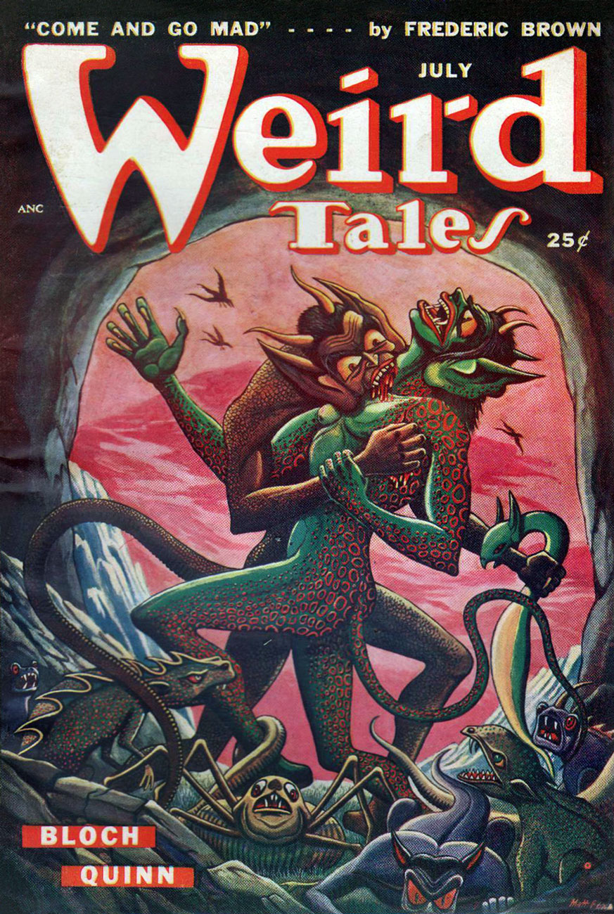
RT: Fox had been in advertising. He’d done lithographs, pulp illustrations; evidently he did some covers for Weird Tales, the magazine that published H.P. Lovecraft and Robert E. Howard, including Conan, back in the ’30s. Fox did color wood cuts; he was a real artist, but his comic inking was so strange – his line just deadened everything.
LL: One of my traits was that I was reluctant to say anything bad about anybody, because everybody has to earn a living. I wouldn’t complain, no matter who they put on. But one day I was working in the office penciling a western, and Stan walked by. He saw my pencils and he said, “This is your penciling?” And I said, “Yeah.” Stan said, “This is pretty good. I’ve been looking at the finished stuff, and that looks terrible.” And he removed that inker – it wasn’t Matt Fox – and gave me a better one. But I, of my own volition, wouldn’t say a word about it.
RT: Fox obviously had a style that just didn’t translate well into comics.
No, Roy: Fox had a style that just didn’t translate into your own, extremely limited idea of comics. This is, after all, the guy who assigned Vince Colletta to ink Frank Robbins, as well as the single individual most responsible for infecting US comics with the dread malady of “continuity“.
It must be said, however, that Fox’s meticulous line work is not particularly suited to the lousy colouring and printing found in comic books of that vintage. So… let’s look at some original art!
Page two of I Was a Victim of Venus!, from Tales of Suspense no. 43 (July 1963, Marvel).
« Camoflauging », Larry? Page five of The Search for Shanng!, from Strange Tales no. 113 (Oct. 1963, Marvel).
Page three of The Enemies! from Journey into Mystery no.101 (Feb. 1964).
Here’s a chronological Lieber-Fox bibliography, comprising 17 stories:
Escape into Space (Tales of Suspense no. 42, June 1963) The Man Who Wouldn’t Die! (Journey into Mystery no. 93, June 1963) We Search the Stars! (Strange Tales no. 110, July 1963) I Was a Victim of Venus! (Tales of Suspense no. 43, July 1963) Beware — the Machine!!! (Strange Tales no. 111, August 1963) I Come From Far Centaurus! (Tales of Suspense no. 45, September 1963) The Smiling Gods! (Tales to Astonish no. 47, September 1963) The Search for Shanng! (Strange Tales no. 113, October 1963) Grayson’s Gorilla! (Tales to Astonish no. 48, October 1963) The Purple Planet! (Journey into Mystery no. 98, November 1963) The Secret of Sagattus! (Tales to Astonish no. 50, December 1963) Stroom’s Strange Solution! (Journey into Mystery no. 99, December 1963) No Place to Turn! (Tales to Astonish no. 51, January 1964) The Unreal! (Journey into Mystery no. 100, January 1964) The Enemies! (Journey into Mystery no. 101, February 1964) The Menace! (Journey into Mystery no. 102, March 1964) The Green Thing! (Tales of Suspense no. 51, March 1964)
Larry! sure! loved! his! exclamation! marks!!!
Most of these have never been reprinted until recently, and since they appeared in key early issues of Silver Age Marvel superhero titles… they’ve largely languished in obscurity. Writing-wise, they deserve it. But the artwork is what we’re interested in.
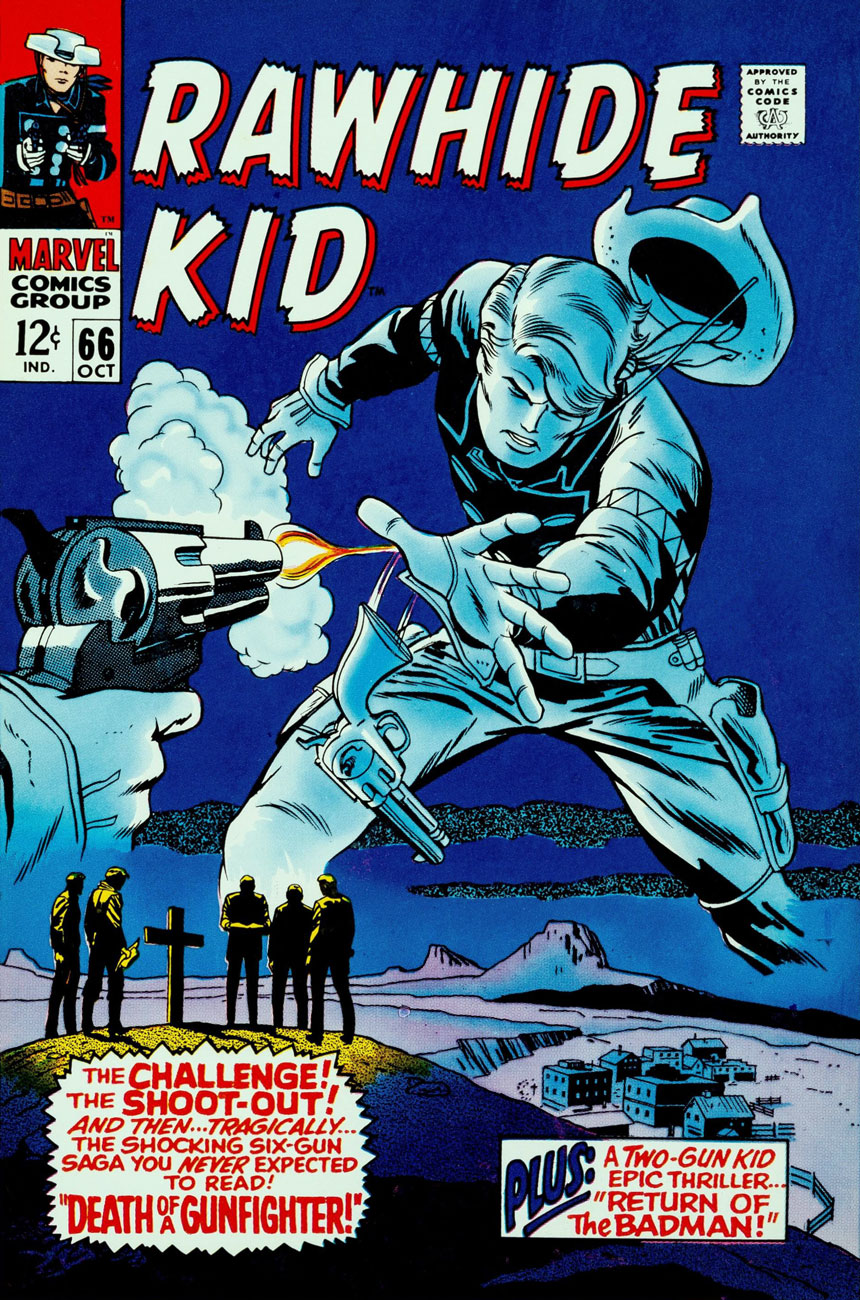
And on that point, it would be fair to feature a solo piece from Fox and Lieber, for a bit of perspective on each man’s respective strengths and peccadillos.
This is Rawhide Kid no. 66 (Oct. 1968, Marvel); pencils by Larry Lieber, surprisingly solid inks by Vince Colletta.
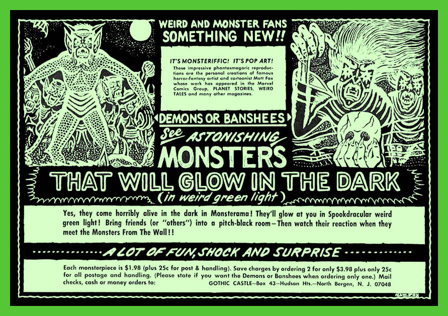
In closing, here’s a bittersweet excerpt from Bhob Stewart‘s vivid recollections of his meetings with Fox in the mid-60s, during Stewart’s time as editor (and just about everything else) of Castle of Frankenstein, when Fox dropped by to place an ad in the magazine.
« Fox came across as a straight-arrow, no-nonsense sort of a guy, and after a brief conversation about Weird Tales, he quickly got to the point. He was selling glow-in-the-dark posters, and he wanted to run an ad in Castle of Frankenstein. With that, he unfurled his glowing poster depicting demons and banshees dancing in the pale moonlight. We took it into a dark corner of the room, and yes, indeed, it did emit an eerie green glow.
He next produced an ad for the posters. He had made a negative photostat of his ink drawing, so the reversal of black to white simulated glowing monsters coming out of the darkness toward the reader. Clever hand-lettering effects added a subtle suggestion of glowing letters seen at night, not unlike the moment when Marion Crane first spots the Bates Motel sign through her car’s rain-covered windshield. »
The advert in question, from Castle of Frankenstein no. 8 (1966).
« … it was the second time I saw him. I admired his tight rendering in ink and crayon on pebbleboard. Then I casually asked, “So how many orders did you get for the glow-in-the-dark posters?” He responded bitterly, “None.” After that day, I never saw him and his demonic entourage again. He became the Phantom Artist, whereabouts unknown. Fox died in 1988… » [ source ]
-RG
*utter half-baked, speculative claptrap from Rascally Roy. The fact is that very little of Fox’s original comics artwork survives. For instance, Heritage Auctions has never sold a single Matt Fox solo page. If anything still exists, it’s been in private hands for a long, long time. Furthermore, the comic books in which Fox’s work saw print do ‘bring a buck or two‘, particularly the issues of Chilling Tales featuring his covers (numbers 13, 15 and 17). Read these sinister beauties here!
(In fact, to fill that gap in demand, renowned fantasy painter Ken Kelly has even produced recreations of Matt Fox covers. Here’s a sample.)