« In the bleak midwinter, frosty wind made moan, Earth stood hard as iron, water like a stone; Snow had fallen, snow on snow, snow on snow, In the bleak midwinter, long ago. » — Christina Rossetti
Christmas is nearly upon us, but while a great many will opt to retreat into the miasma of nostalgia to forget what an annus horribilis it’s been, I’ve picked something a bit more appropriately sombre in tone to nail down the occasion.
But with a more hopeful chaser… to balance things out a bit.
When the indefatigable Carmine Infantino (1925-2013) stepped down from his multi-hatted rôle of publisher, editor-in-chief, cover designer and art director — and so on — at DC, he found that no-one was beating his door down to offer him a similar position.
So he went back to drawing, as a freelancer. As Infantino put it: « Jim Warren was the first comics publisher to contact me after DC. I said “I’ll do work for you, but nothing full-time because I’m busy with other things.” He said, “Okay, whatever you’re willing to give me.” I wasn’t really comfortable with the Warren material — it was the sexiest work I’d ever done! Jim had an older audience and wanted it that way. My feelings about the material never affected the mutual respect Jim and I had for one another. » [ source ]
All told, Infantino pencilled around forty stories for Warren in a span of four years. There was even a brief period when he just about monopolized individual issues of Creepy and Eerie, which was offset by pairing him with wildly disparate inkers. Sometimes the results sang, sometimes they croaked.
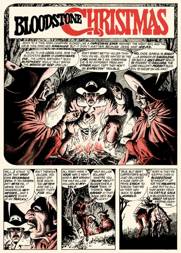
Here’s a case of rarely combined styles that nevertheless meshed beautifully: Infantino and John Severin. Let’s face it, who’s more reliably excellent than Mr. Severin?
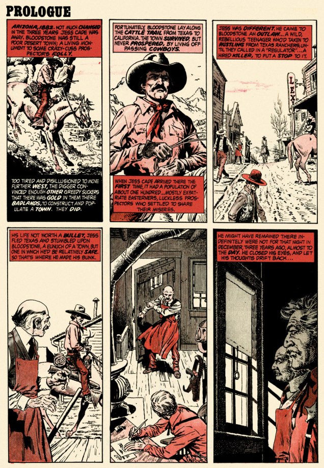
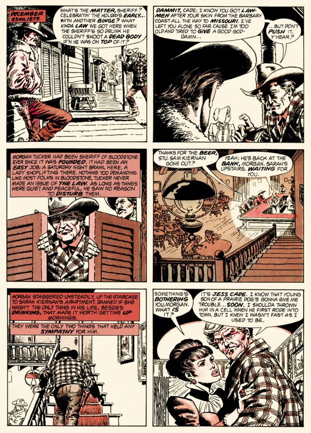
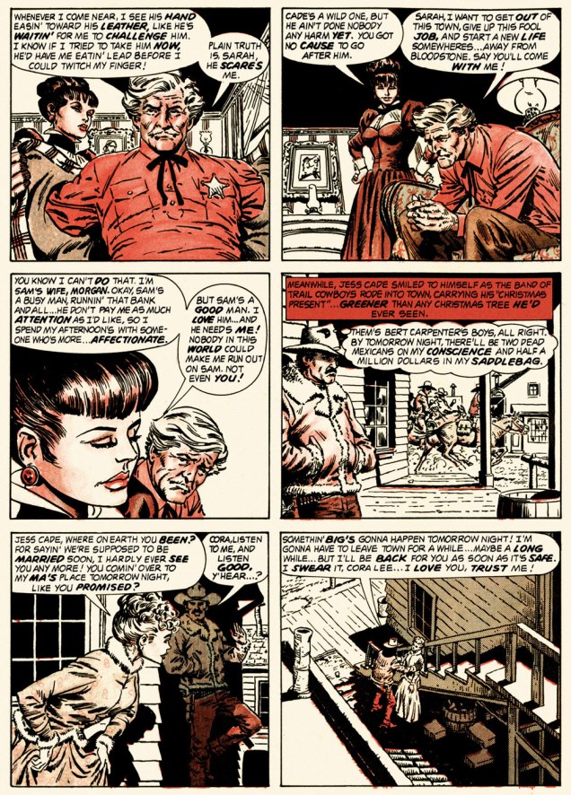
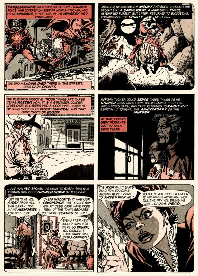
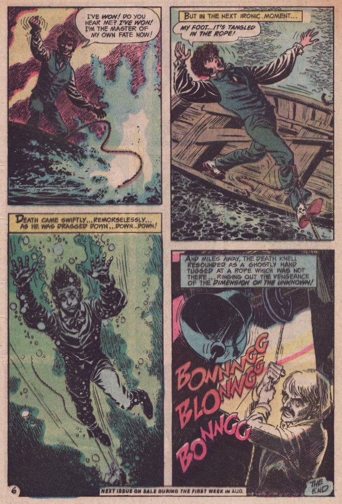
And so this is… Bloodstone Christmas, written by Gerry Boudreau, pencilled by Infantino, and inked by John Powers Severin (1921-2012).
.
.
.
.
.
.
.
I won’t pretend that the entire cast isn’t peopled with stock characters, but its sting in the tail lands satisfyingly, prefiguring the flavour of weird westerns by Joe Lansdale, for one.
.And now, for something sweeter.
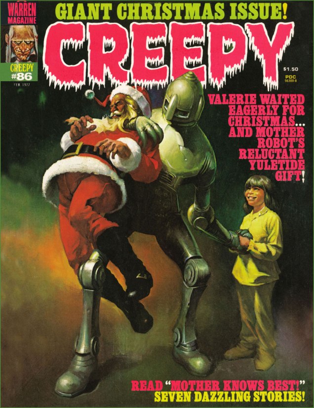
This is Creepy no. 86 (Feb. 1977, Warren). Cover by Ken Kelly (1946-2022).
And now, for the sweeter part of our double-header.
.
.
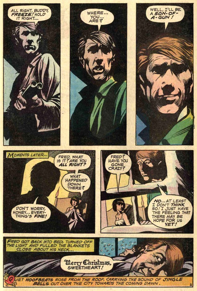
Night Prowler was an early collaboration by Swamp Thing‘s co-creators, writer Len Wein and artist Bernie Wrightson. It was published in House of Mystery no. 191 (Mar.-Apr. 1971, DC). Joe Orlando, editor.
Oh, and Happy Holidays to you, esteemed readers!
-RG
p.s. Oh, and speaking of carmine, the colour, not the man: I just read, a few days ago, in Steve Ettlinger‘s superb Twinkie, Deconstructed (2007), that « the fascinating, rich magenta carmine, also known as cochineal, is extracted from the dried body of the female cochineal insect », and that « the output of the Canary Islands is used almost exclusively to colour the Italian apéritif Campari. » Caveat emptor, then! Ironically, « carmine dye is produced from the acid that females naturally secrete to deter predators. » Not, however, industrious humans.
« May the man who has his finger on the button have a lovely day today / Hope nothing hangs him up or ticks him off or bums him out in any way / Lord, help him keep his cool cause he could pull the final curtain on my play / May the man who has his finger on the button have a lovely day today. » — Larry Wilkerson (as warbled by Bobby Bare)
The idea for this post came to me a couple of days ago, and this afternoon, while cobbling together the visual components, it dawned on me that today’s Memorial Day (Remembrance Day for Canadians, and ‘Victory Day‘ for those afflicted with brain worms and/or syphillis), and therefore quite à propos.
DC’s The Day After Doomsday series first turned up — of all places — in the pages of The Witching Hour, a page and a half bit of filler fluff by Len Wein and Jack Sparling. It must have struck a chord, if not with readers, then with its creators, for the feature stubbornly kept a-rising from its post-apocalyptic grave.
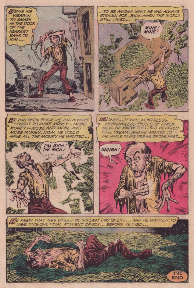
In spite of its episodic and arguably slight nature, TDBD enjoyed surprising longevity. It truly found its home in the Joe Orlando-edited Weird War Tales (1971-1983, DC’s gateway title for war fans into ‘horror’ and vice versa), where most of its dispatches saw print. You never know what’s going to catch on with the unwashed masses.
A most humble beginning for a series, this brief scene appeared in The Witching Hour no. 9 (June/July 1970, DC). Script by Wein, art by Jack Sparling (1916-1997). Dick Giordano, editor.
.
Humour rears its homely head in the concurrently appearing second instalment — too close to call! — this one from House of Secrets no. 86 (June/July 1970, DC). Same creative team.
.
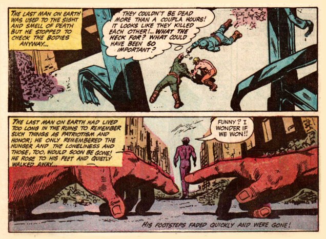
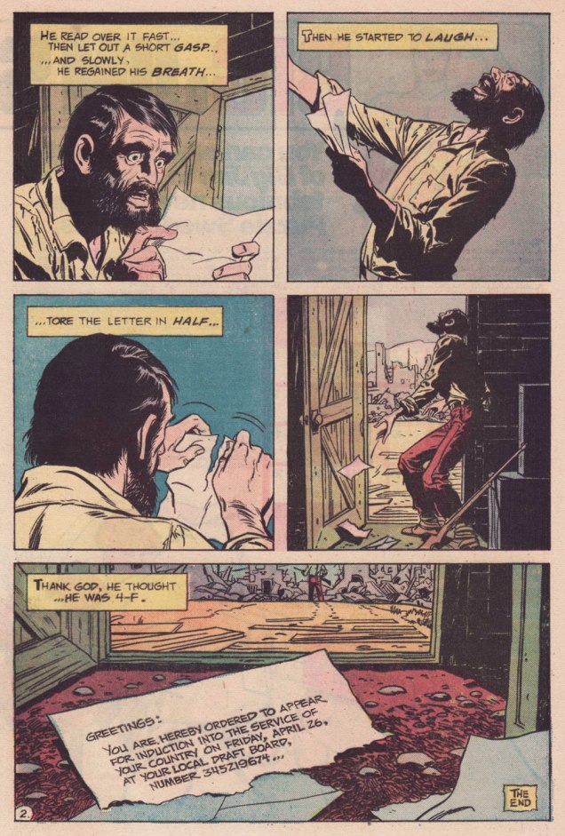
My candidate for the series’ finest hour, this episode elegantly riffs both on the Vietnam War Draft and on Fredric Brown‘s classic 1948 short-short ‘Knock‘, wherein «The last man on Earth sat alone in a room. There was a knock on the door… » 4-F, incidentally, signifies « Registrant not acceptable for military service. To be eligible for Class 4-F, a registrant must have been found not qualified for service in the Armed Forces by an MEPS under the established physical, mental, or moral standards. » And let’s hear it for perennially under-appreciated artiste Bill Draut (1921-1993).
That issue had a splendid cover, and so here it is!
This is Weird War Tales no. 30 (Oct. 1974, DC); cover pencils and inks by Luis Domínguez, from a probable design by publisher Carmine Infantino.
.
A scroogey teaming of WOT? favourites Steve Skeates and Alfredo Alcala, this turned up in Weird War Tales no. 35 (March 1975, DC). I’ll bet they had trouble deciding whether to run it in Plop! or WWT.
.
Finally, this one appeared in Weird War Tales no. 48 (Sept./Oct. 1976, DC). Script by Skeates, art by Buddy Gernale.
« I think people will believe anything about someone they haven’t seen for a while. » — Gabriel Kaplan
I’ve been meaning to do a Welcome Back, Kotter post for several years. But when I thought about it, I understood that hitching it to the show’s fiftieth anniversary made considerably more sense than, say, its forty-seventh. And while I adore William Johnston‘s sextet of tie-in novels, it would be quite a stretch for a comics blog to cover. Far closer to the mark lies Arnold Drake‘s trio of WBK storybooks, illustrated by Mel Crawford and Jack Sparling. But in the end, I bided my time and managed to get in touch with the scribe first assigned the Kotter Komic assignment, Elliot S! Maggin. And boy, am I glad I did. And so, fifty years to the day of the airing of its pilot episode*, let’s talk Kotter!
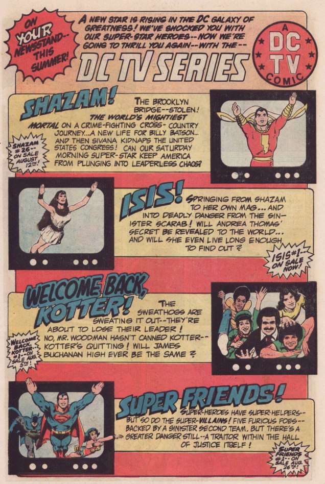
Remember the DC TV line? This ad ran in several DC titles over the summer of ’76.
WOT: First, a bit of context: correct me if I’m wrong, but in the early stages of your career writing comics, you always worked alongside editor Julius Schwartz. Then, in late ’75 or early ’76, something changed, and you began writing for other editors’ titles. What’s the story?
ES!M: Well, Julie was kind of proprietary about me for most of the time I was working with him.
WOT: A sideways sort of compliment.
ES!M: I guess. At some point, Dorothy Woolfolk was editing the Lois Lane book, and… he introduced me to her. She just came into his office for some reason. She said: « Oh, you know, you should write some stuff for me! » And he said « No, he’s very busy, go away! » And he chased her out of the office. And I’m thinking, « Oh, okay. That’s how we’re doing it. »
So I didn’t really go about… I didn’t really make friends with many of the other editors. I tried to make friends with Joe Orlando. You know, I’d have lunch with him once in a while, I guess.
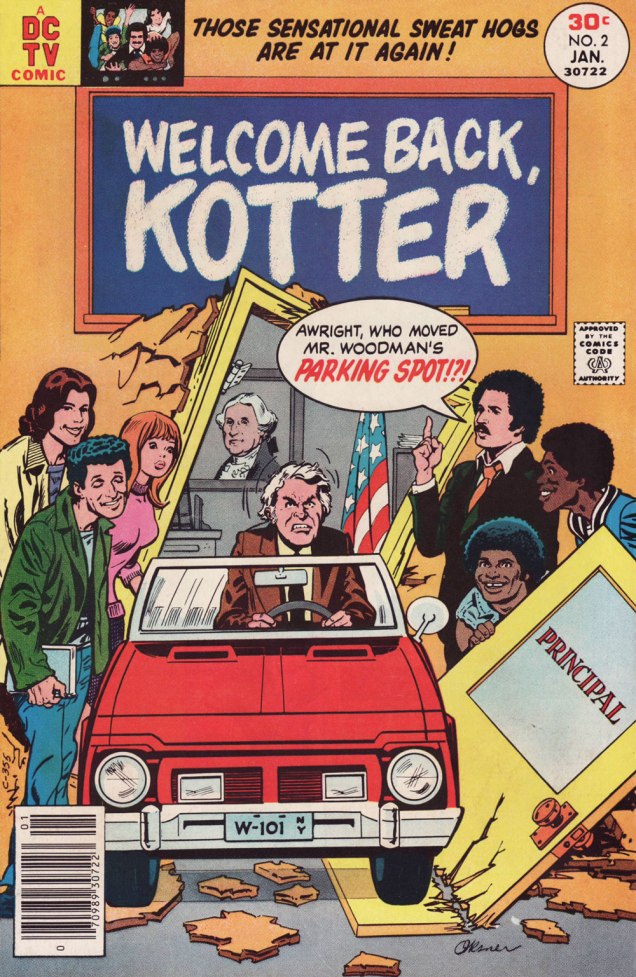
This is Welcome Back, Kotter no. 1 (Nov. 1976, DC); cover by Bob Oksner.
ES!M: But around the time Kotter came out…
You know, people used to hang out outside of Julie’s office door, listening to us plot, because it was so loud. We would yell and scream at each other constantly. He was this Jewish boy from the Bronx, and I was this Jewish boy from Brooklyn, and once I got comfortable working with a guy thirty-five years older than me, we’d just fight all the time. And every once in a while, we’d get serious.
WOT: Serious fighting, or serious work?
ES!M: Yeah, yeah! The fighting was work.
WOT: Sometimes that line is dreadfully thin.
ES!M: I guess at that point, he got mad at me, and I didn’t get work for a couple of weeks. I went to Joe, and I said: « What ya got? », and he said he’s doing this Welcome Back, Kotter book, and I said « Great! I watch that show, that’s fun. » So I wrote the first issue, and that was fine.
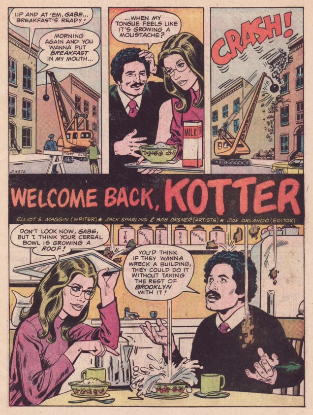
Here’s a quartet of pages from the première issue. Pencils by Sparling and finishes (and surely likenesses) by Oksner.
.
.
Aw, Maggin’s Mr. Pevey would have made a great addition to the TV show’s cast.
ES!M: They called me down in Carmine‘s office, to watch episodes of the show. It had been on maybe six weeks at that point. Episodes I had already seen, but I liked hanging out in Carmine’s office, because it was big, and he had a lot of toys around. So they set up this video tape… thing, and I watched the shows again, and I wrote the second issue.
This is Welcome Back, Kotter no. 2 (Jan. 1977, DC); cover by Oksner.Art-wise, the second issue seemed comparatively rushed, and sans Oksner, likenesses pretty arbitrary. See what I mean? The GCD attributes the inks to Sparling, but I lean towards Frank Springer.
ES!M: I was living in an apartment complex on Long Island, and there were all these kids around… little kids. And I would work at home, mostly. So they would hang around with me, whenever they realized I was home. They would… shoot me through the window or… something. At some point, whenever I’d write a gag, I would…
WOT: … run it past them?
ES!M: Yeah! And they’d laugh, and run off and play some more. And I figured, as long as they laughed, it was okay. Because they were hearing the voice of Barbarino, or whoever. At some point Travolta would say, « Uh? », or « Duh », or « What d’you think? », something dull, that he delivered in a funny way. And the kids related what I wrote to what Travolta did on screen, so they were getting it. And at some point I realized that Joe [editor Orlando] didn’t watch the show.
WOT: Oops.
ES!M: And he would then object to my Barbarino bits, or Horshack bits, or whatever. So I told him « You’ve got to watch the show, you’ll get it! » But you know, after maybe… how many issues did I write, three, four?
WOT: Just two, I’m afraid. You wrote the first couple, then Tony Isabella did one, then Mark Evanier…
ES!M: I’m sure he (Evanier) watched the show — he watched everything.
WOT: He was even the show’s story editor for part of its second season. So… then Bob Toomey wrote four issues, Scott Edelman two, and there was a leftover story by Evanier that saw print in the WBK Collector’s Edition in 1978.
ES!M: But Joe did not. I mean, he didn’t have time, and he was madly in love with his wife, and he didn’t watch television at all (laughs). He wasn’t paying attention to the source material.
WOT: That happens. But it seems a pretty unfortunate blind spot for a book’s editor.
ES!M: I wrote two issues, and at some point, Joe said: « You can’t write! ». He said « No, you can’t write! » A blanket condemnation of everything I’d ever done.
WOT: Oooh.
ES!M: By that time, I’d made up with Julie, and I was writing more Superman stuff. After that, wherever any of my fights with Julie got serious, I’d go down the street to Marvel, and do something there. Then I would make up with Julie, and they’d never see me again… until I had another fight with Julie.
That was my experience writing Kotter.
And here’s what undoubtedly has to be the Guernica, if you will, of Kotter art: Bob Oksner‘s superlative cover for Limited Collectors’ Edition C-57, from 1978, DC’s final — and finest — WKB publication. Feel free to open it in another tab for a fuller view… I provided a larger image so you can fully take in the wealth of details.
WOT: In closing, how are you keeping busy these days?
ES!M: I just wrote a book called Lexcorp. A novel. Which you should probably plug.
WOT: Done!
ES!M: It’s a first-person story that Lex Luthor tells. And he identifies himself as an unreliable narrator, like… Huckleberry Finn. But it does tell the story of how he saves the world. Stuff like that.
I’m working on another book, working on a time travel story. And my ex-wife asked me to write an autobiography so my grandchildren know who I am.
I have all these people I know with Pulitzer Prizes; and at some point in the autobiography, I wrote: « I have about a dozen Pulitzers floating around through my life, and none of them are mine. This book is available for consideration. »
WOT: Mr. Maggin, thank you so much for taking the time to share these stories with us!
-RG
*the pilot episode, for some reason, was aired third, on September 23, 1975, while the show premiered on the 9th of September with ‘The Great Debate‘ (featuring a wonderfully smarmy James Woods).
« Truly the universe is full of ghosts, not sheeted churchyard spectres, but the inextinguishable elements of individual life, which having once been, can never die, though they blend and change, and change again for ever. » — H. Rider Haggard
Here at WOT?, we’re both Russell aficionados, but with some reservations. I think I needn’t delve into such details, when my partner ds already eloquently laid it out in her post Grains of Golden Sand: P. Craig Russell’s Fantasies… and I happen to fully agree with her reasoning.
What’s perhaps not been explicitly stated is Russell’s virtually infallible way with a cover, both in design and execution. As I keep emphasising, great — and consistently great at that — cover artists are pretty thin on the ground.
Someone at DC must have seen his gorgeous seven-issue run of covers for Elric Stormbringer*(1997, Dark Horse/Topps) and offered him the Spectre gig.
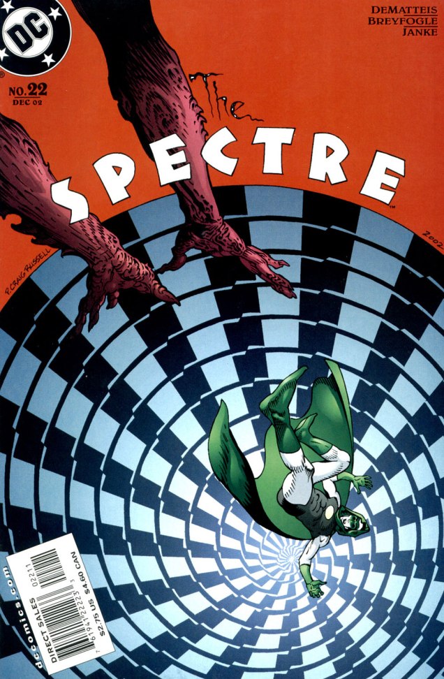
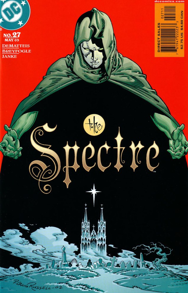
Hey, something from this century! This is The Spectre no. 19 (Sept. 2002, DC). A nice bit of Kirby tribute on Darkseid. In this case, and in fact throughout the Russell sequence, the expressive colours are the work of Lovern Kindzierski.This is The Spectre no. 20 (Oct. 2002, DC). It’s worth pointing out the added value of Russell being a consummate letterer/font designer. Without a logo set in stone (as is generally the case, usually at the insistence of the marketing department) the savvy artist benefits from the extra freedom of counting the title logo among the moving parts of his design. Cue the de rigueurWill Eisner/Abe Kanegson mention.This is The Spectre no. 21 (Nov. 2002, DC). When I showed her these, ds expressed some surprise at her failing to devote a Tentacle Tuesday Masters entry to Mr. Russell.This is The Spectre no. 22 (Dec. 2002, DC).This is The Spectre no. 23 (Jan. 2003, DC).This is The Spectre no. 24 (Feb. 2003, DC).This is The Spectre no. 25 (Mar. 2003, DC).This is The Spectre no. 26 (Apr. 2003, DC).This is The Spectre no. 27 (May 2003, DC). Thus ends the streak…. with the series.
It doesn’t hurt that The Spectre, the brainchild of Superman co-creator Jerry Siegel (1914-1996) and artist Bernard Baily (1916-1996), boasts one of the best-designed superhero costumes of all, virtually unchanged since his introduction, some eighty-five years ago. The exception in this case is the chest emblem, which I presume is meant to indicate that *this* Spectre is former Green Lantern Hal Jordan, instead of defunct flatfoot Jim Corrigan. A bit of a boneheaded notion, imho, and typical of the incessant rebooting and tinkering these poor legacy characters are subjected to by dishwater-dull ‘creatives’.
-RG
*The Elric series was also under consideration, but The Spectre’s nine-issue streak is numerically more impressive.
« The hardest tumble a man can make is to fall over his own bluff. » — Ambrose Bierce
Today, I’m going totally ‘mainstream’ on you for a change. Last week, I ventured into a movie theatre for the first time since 2019 (Knives Out was my last such outing) to see my first superhero film since 2012 (The Avengers was my last such outing). And so, while the new Superman epic wasn’t perfect, I found much to enjoy about it.
Among the ideas explored in the film was that baddie Lex ‘Elon’ Luthor, from carefully observing The Man of Steel over several years’ worth of skirmishes, had managed to analyse and codify his combat moves, in order to predict and counter them.
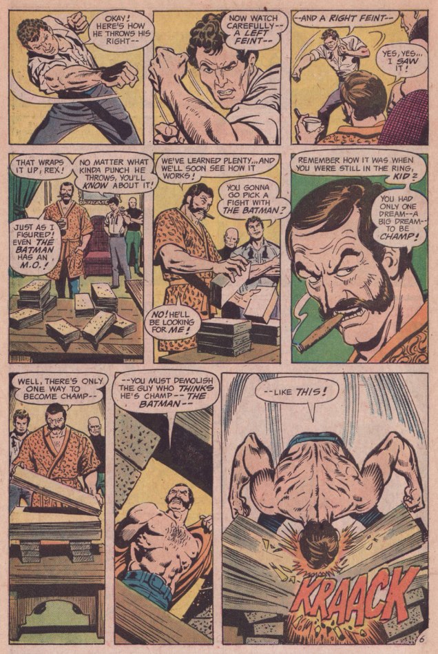
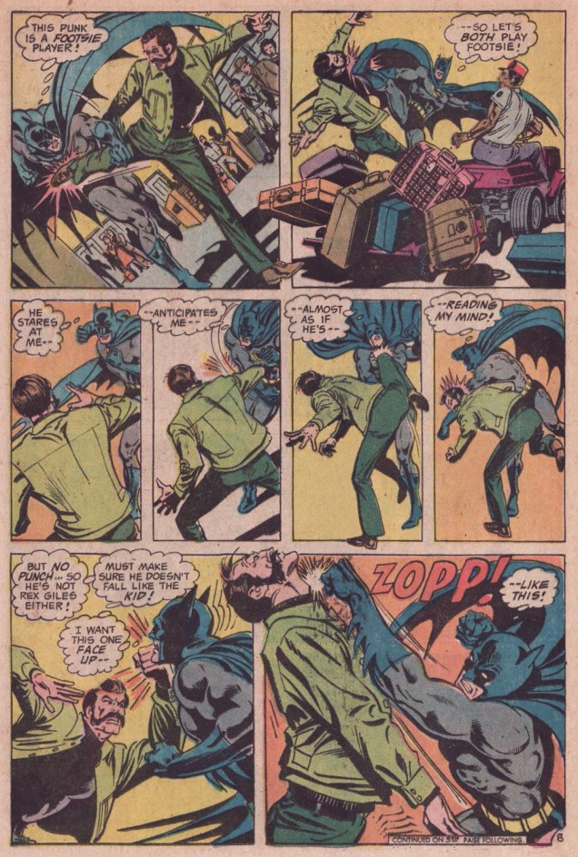
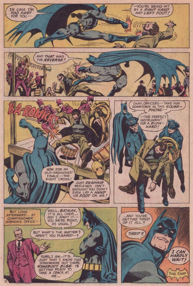
I was reminded of that angle serving as the basis of a favourite Batman story by my favourite Batman writer (and hardly anyone else’s, apparently), David Vern Reed (1914-1994). Despite its publication in a popular, long-running title, this tale is obscure to the point of never having been reprinted in English.
I’m terribly fond of the Schwartz-era Batman, especially the 1970s, because it’s relatively light on costumed supervillains, Batman acts like the detective — albeit a remarkably athletic one — he’s supposed to be, and the plots often hinge on ‘ordinary’ (though clever) criminals striving to outsmart Bats. A favourite example: Vern’s « The Underworld Olympics ’76! » (Batman 272-275, Feb.-May 1976) tetraptych. I think I can safely rule out childhood nostalgia: in my small town, distribution was quite spotty, so I never even *saw* those issues at the time, encountering them instead as an adult, decades on.
If I have a quibble about the art, it’s that Ernie Chan’s finishes mesh poorly with García-López’s usual rock-solid breakdowns. Perhaps it’s because Chan likes to have more to do; given that García-López, his own best inker, typically turns out pencil renderings that are utterly complete and tight as a drum, the job is quite unlike, say, Chan inking a Big John Buscema Conan job — as he so often did — wherein Chan has to do 80 percent of the work over Buscema’s sparse breakdowns, stock poses and rote shortcuts. In contrast, inking García-López essentially reduces the task to tracing over his flawless pencils, which can’t be all that stimulating, educational as it may be.
Speaking of Garcia-Lopez, a priceless anecdote: writer Andrew Helfer, a frequent collaborator, recalled, in his introduction to TwoMorrows’ Modern Masters Volume Five (2007): « … it was Jean Giraud, aka Mœbius, and he was staring at a drawing of Wonder Woman by José Luis García-López. « This García-López », he asked in a heavy French accent. « He uses models, no? » « No, » I answered, smiling. « Son of a bitch! » Mœbius hissed.
« All realities, all dimensions are open to me! » — Prince
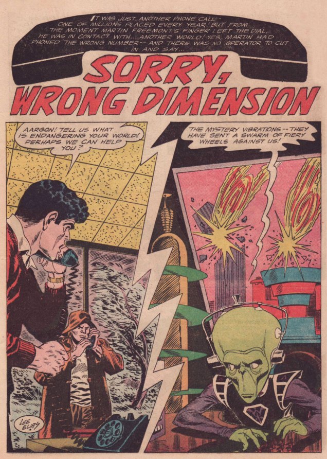
Growing up, Lee Elias (1920-1998) never was a particular favourite of mine. A handful of stories in DC’s mystery titles aside — and I’ve grown to love those — I probably came across his work for Marvel’s Human Fly series, and I was always disappointed when Elias, not my beloved Frank Robbins, turned up in the credits. For the record, Elias drew ten of the nineteen HF issues, and Robbins drew six, plus five covers.
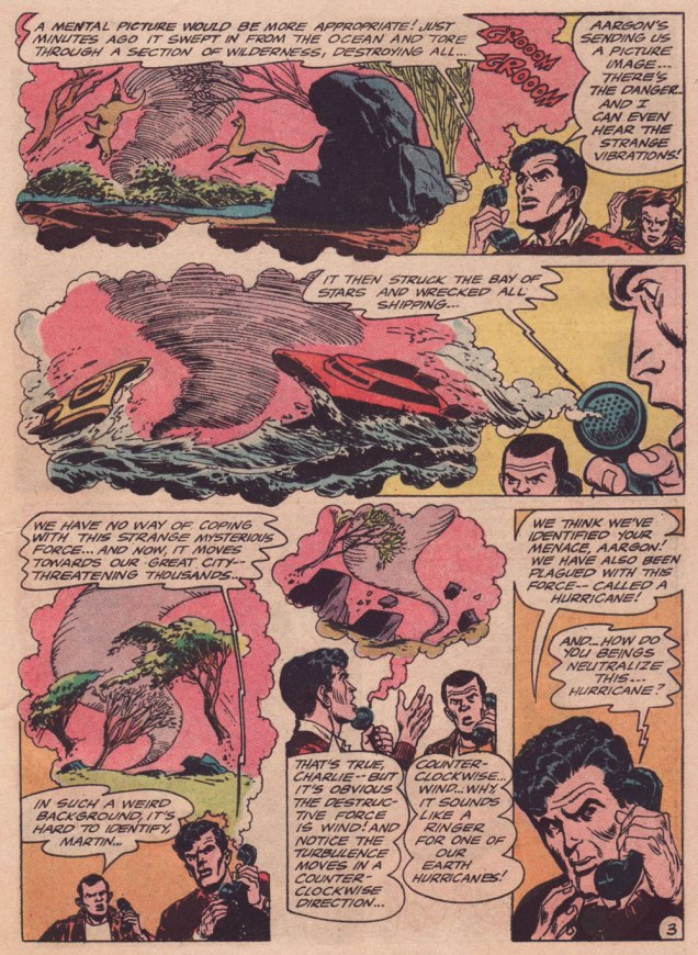
Over time, I noticed his gloriously gruesome cover work with art director-designer Warren Kremer for Harvey’s Pre-Code Horror titles of the early 1950s. His work on DC’s Adam Strange in the mid-1960s is best forgotten — there is only one Adam Strange, and it’s Carmine Infantino‘s (with trusty inker Murphy Anderson along for the Zeta Beam ride, of course). However, I adore Elias’ brief run (with writer Dave Wood) on Ultra the Multi-Alien, the splendidly wacky feature that replaced Adam Strange in Mystery in Space (issues 103 to 110, 1965-66).
Why am I so fond of this particular story? It’s the little things: for once, a story in a Jack Schiff-edited title makes some semblance of adhering to scientific — or at least science-fictional — principles; here, Elias designed an alien race that, given their grumpy, unprepossessing mugs, would typically have been cast as villains, but instead turn out perfectly honourable; the story’s human protagonists give aid to strangers in need, never asking for a thing in return: no Zarkan mineral rights, no salacious dirt on J’onn J’onzz, just selfless dedication to doing the right thing and the satisfaction of averting a crisis. How refreshingly old-fashioned, a cooling balm for these harrowing times.
-RG
p.s. my partner ds should return to our blog soon… she’s at present battling a mild case of writer’s block, so I’m filling in.
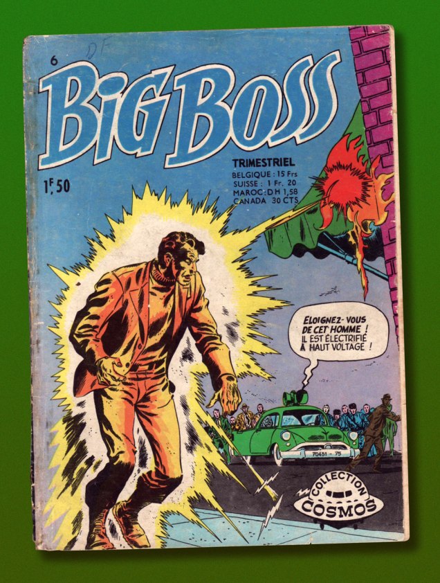
This is Big Boss no. 6 (Oct. 1971, Arédit-Artima); cover by Ruben Moreira.
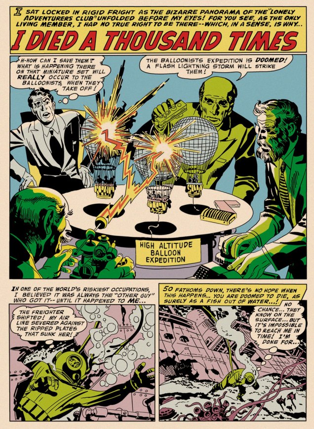
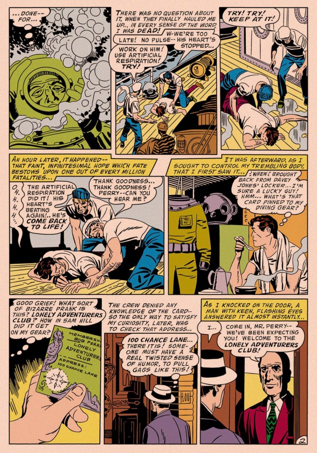
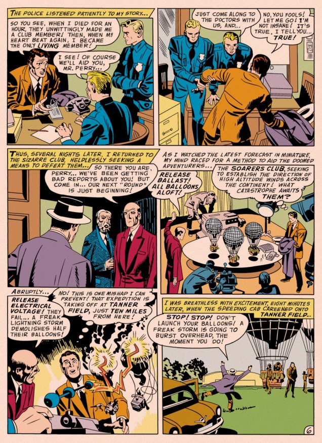
One might be inclined to say that, with its themes of adventurers cheating death or living on borrowed time, I Died a Thousand Times inspired Kirby’s Challengers of the Unknown, except that Ace, Rocky, Prof and Red had burst into print a few months earlier. Suffice it to say that they sprang from the same fertile well. It’s always intriguing to observe how the particular seed of an idea can be grown in a myriad of directions.
If you’ll forgive me the intrusion, this is how the opening panel appeared in the Big Boss reprint. In order to make things more readable in the digest format — and in black and white — Arédit‘s in-house art department routinely reframed and even augmented the artwork, with varying degrees of competence and success. This is one of the more accomplished efforts. The story’s writer is unknown (though it features a most Kirbyesque plot); it was pencilled and likely inked by King Kirby, and originally appeared in My Greatest Adventure no. 16 (July-Aug. 1957, DC); edited by Whitney Ellsworth; Jack Schiff; Murray Boltinoff and George Kashdan… let’s just say DC *was* a tad heavy on the management side in those days.
Though Kirby’s standalone short stories of this period are as charming and inventive as you’d expect, this modest trove of material has by and large been neglected. While a handful of these tales (The Thief of Thoughts; The Creatures from Nowhere!; The Cats Who Knew Too Much!; The Man Who Betrayed Earth; The Negative Man; and The Stone Sentinels of Giant Island) were semi-randomly reprinted in the early 1970s when DC had lots of pages to fill, this one didn’t resurface in North America until 2011’s pricey-then-and-pricier-now hardcover Jack Kirby Omnibus no. 1.
While that chain of events is a fascinating bit of history, what I’m here to celebrate is a sequence of classic covers by recent — 2024 recent — Will Eisner Comic Awards Hall of Fame inductee Creig Valentine Flessel (1912-2008). Flessel produced eighteen of the first nineteen Detective Comics covers (the premiere issue bore a striking, but rather primitive drawing by associate editor Vin Sullivan), visibly gaining assurance and verve as he sped along. By my reckoning, however, it’s only with the eleventh issue that he solidly hit his stride, which he never let up until the assignment passed into other hands… and then came Batman.
Anyway, here they are: no hand-holding, no patronising, superfluous captions… just graphic purity — and sweat-soaked, pulpy thrills galore.
This is Detective Comics no. 11 (Jan. 1938, DC).This is Detective Comics no. 12 (Feb. 1938, DC).This is Detective Comics no. 13 (Mar. 1938, DC).This is Detective Comics no. 14 (Apr. 1938, DC).This is Detective Comics no. 15 (May 1938, DC).This is Detective Comics no. 16 (June 1938, DC).This is Detective Comics no. 17 (July 1938, DC).This is Detective Comics no. 18 (Aug. 1938, DC). Even as a relatively sheltered white teenager, I could easily tell that Sax Rohmer‘s Fu Manchu stories were racist (and sexist as well) « Yellow Peril » tripe… even in the context of their era, they went the extra mile. This is Detective Comics no. 19 (Sept. 1938, DC), Flessel’s final cover for the title.
Flessel would turn up all over the place. Gary Groth writes, introducing his definitive, career-spanning Flessel interview:
« Flessel never became an auteur with a truly recognizable narrative voice or characters that he could call entirely his own. He was so skilled and versatile that he became an artistic chameleon, a commercial propensity that served him well throughout his career. He wrote and drew stories for the earliest published comic books: More Fun, Detective Comics and Adventure; worked for the advertising firm of Johnstone and Cushing; assisted Al Capp on Li’l Abner and worked with Charlie Biro on Crime Does Not Pay in the ’50s; spent the ’60s and early ’70s drawing David Crane, a comic strip about a minister in a small town and segued seamlessly into an eight-year gig doing The Tales of Baron Von Furstinbed for Playboy. »
Detail (the whole spread would have been impossible to scan properly) from one of Flessel’s long-running series of Eveready Batteries adverts, done in the employ of the celebrated Johnstone and Cushing ad agency (this one’s from 1951). On his The Fabulous Fifties blog, Ger Apeldoorn showcases a number of these lovelies — check ’em out!Flessel turned up as Jerry Grandenetti‘s inker on my favourite issue of Joe Simon and Grandenetti’s much-maligned, short-lived but quite charming Prez (no. 4, Feb.-Mar. 1974, DC). Notwithstanding the — intentionally — fanciful elements of the Wild in the Streets-inspired social satire, old hand Simon had a much firmer grasp on how politics actually work than did any of the earnest, self-consciously ‘relevant’ comics writers of the day. And one can only sigh nostalgically at days when the worst thing that might slither into the White House was a mere vampire…
Flessel’s ability to depict ladies of the buxom and comely variety had certainly played a role in his landing a gig assisting Al Capp on Lil’ Abner for a couple of years in the late 1950s. At the time, Capp spent much of his time touring college campuses and berating the younger set, as was his wont.
Said virtuosity in the light-hearted and erotic stood him in good stead for an eight-year gig on The Tales of Baron Von Furstinbed for The Playboy Funnies; this one’s from the January, 1983 issue of Playboy Magazine. And here’s another, for good measure.
In closing, a brief exchange from The Comics Journal interview — please do go and read the whole thing, it’s a gem!
GROTH: I have a note that you had something to do with Superboy from 1958 to ’59.
FLESSEL: I did one. You know, it’s frightening; it’s like going out and drinking a lot of martinis and doing a job and not remembering.
« With pen and ink, I can achieve a scratchy, foggy effect that is appropriate. It was a continual process of learning. » — Nick Cardy
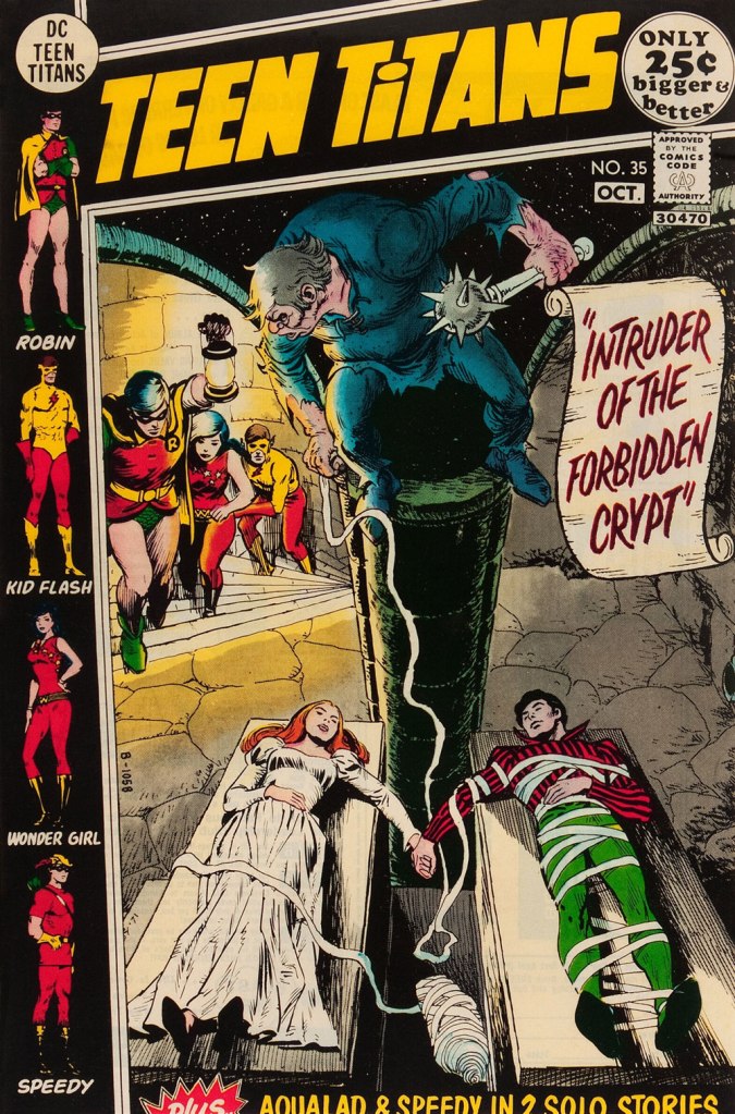
While WOT? favourite Nick Cardy (1920-2013) — who would turn one hundred and four years old today! — spent a lot of time chronicling the undersea adventures of Aquaman, his lingering true love, despite his busy schedule as DC’s premier cover artist, was the Teen Titans — he contributed, either as penciller, inker… or cover artist — to all forty-three issues of the original series.
And what I loved most about editor Murray Boltinoff‘s books is that they were packaged as horror books even when they nominally featured superheroes, a welcome respite. The costumes seemed an afterthought, a most unusual and refreshing attitude. Here, then, is a gallery of Mr. Cardy’s moodiest, most sinister Teen Titans cover artwork.
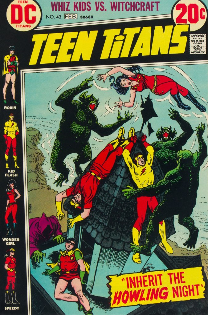
This is Teen Titans no. 33 (May-June 1971, DC). This is Teen Titans no. 34 (July-Aug. 1971, DC). Lettering by Ben Oda.This is Teen Titans no. 35 (Sept.-Oct. 1971, DC).This is Teen Titans no. 36 (Nov.-Dec. 1971, DC).This is Teen Titans no. 41 (Sept.-Oct. 1972, DC).This is Teen Titans no. 42 (Nov.-Dec. 1972, DC).This is Teen Titans no. 43 (Jan.-Feb. 1973, DC).
« Every poem should remind the reader that they are going to die. » — Edgar Allan Poe
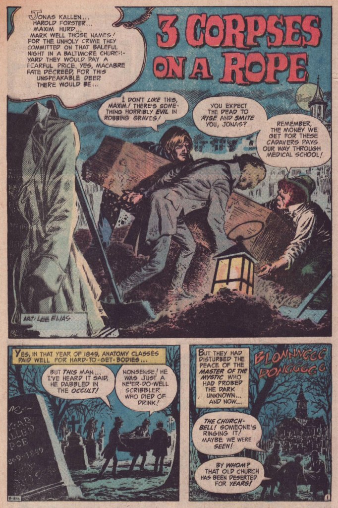
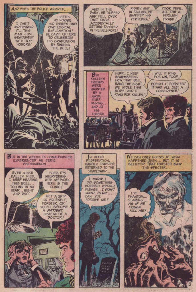
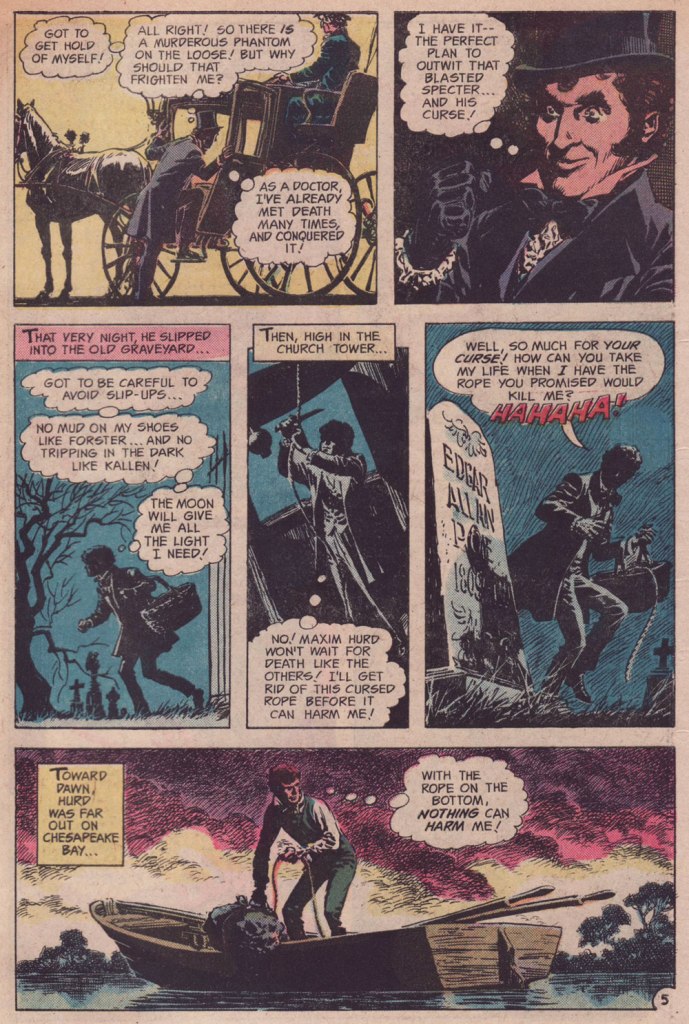
Ah, mixing fact with fiction — such an honoured tradition. In the mid-1970s, DC editor Murray Boltinoff (Ghosts, The Unexpected, The Witching Hour, Teen Titans, The Brave & the Bold) hit upon the notion of featuring historic writers encountering in daily life the supernatural object of their eventual inspiration.
The formula was tweaked a bit for the Edgar Poe entry, in that the tale opens after Poe’s burial, and the late writer is not the protagonist. Read on!
“3 Corpses on a Rope“, written by Carl Wessler and illustrated by Lee Elias, originally appeared in Ghosts no. 43 (Oct. 1975, DC).If you ask me, despite his evident illustrative gift, Elias’ depiction of the revenant ends up looking more like Poe’s fellow Baltimorean John Astin, whom I envision starring in a one-man show entitled ‘An Evening With Edgar Allan Poe‘.