Here Come the Flakes!

« It’s quiet snow that I remember best… snowfall and Brahms on November nights. » — Rod Mckuen, Midnight Walk

While Autumn is easily my favourite season, much of its magic and colours are gone by the purgatory that is the month of November, and I find myself longing for snow to brighten the relentlessly longer and gloomier evenings.

And then, yesterday, as I was still mulling over this post, I woke up to this view from my front door.

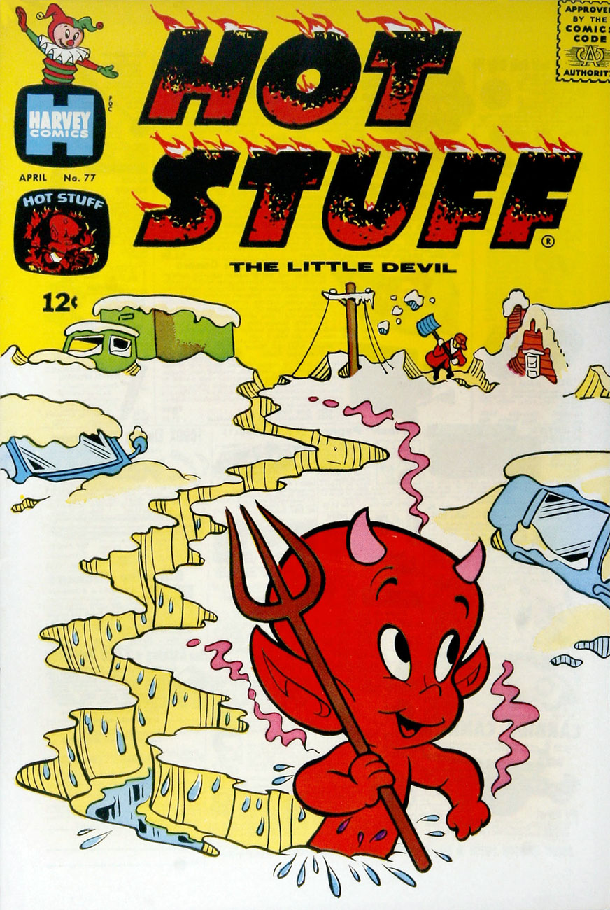
Well, then! This post consists of a(nother) gallery of Warren Kremer‘s delightful Harvey covers, this time with a snowy theme. Never truly ‘ha ha’ funny, they get along on charm and crafty, limpid conception and execution.

This is Little Dot no. 15 (Jan. 1956, Harvey). While most of Harvey’s efforts were channeled into their ‘Big Two’, Casper and Richie Rich, I always found these too bland (in the former’s case) or kind of deplorable (in the latter’s). I was more attuned to the line’s (slightly) bad boys, Spooky and Hot Stuff (Donald Ducks to Casper and Richie’s Mickey Mice), but really, the genuine interest resided in art director Kremer’s nimble design gymnastics and thematic acumen on Little Dot covers. By this time, these have improbably (but happily) inspired designers all over the globe. Nevertheless, a big juicy pox on the article’s author for failing to acknowledge Warren Kremer even once.
This is Spooky no. 73 (Apr. 1963, Harvey). Those 1960s Harveys were so beautifully uncluttered in their design, with the bonus of Kremer’s marked and ongoing contempt for the Comics Code Authority stamp. Oh, and here’s our earlier selection of Spooky covers.
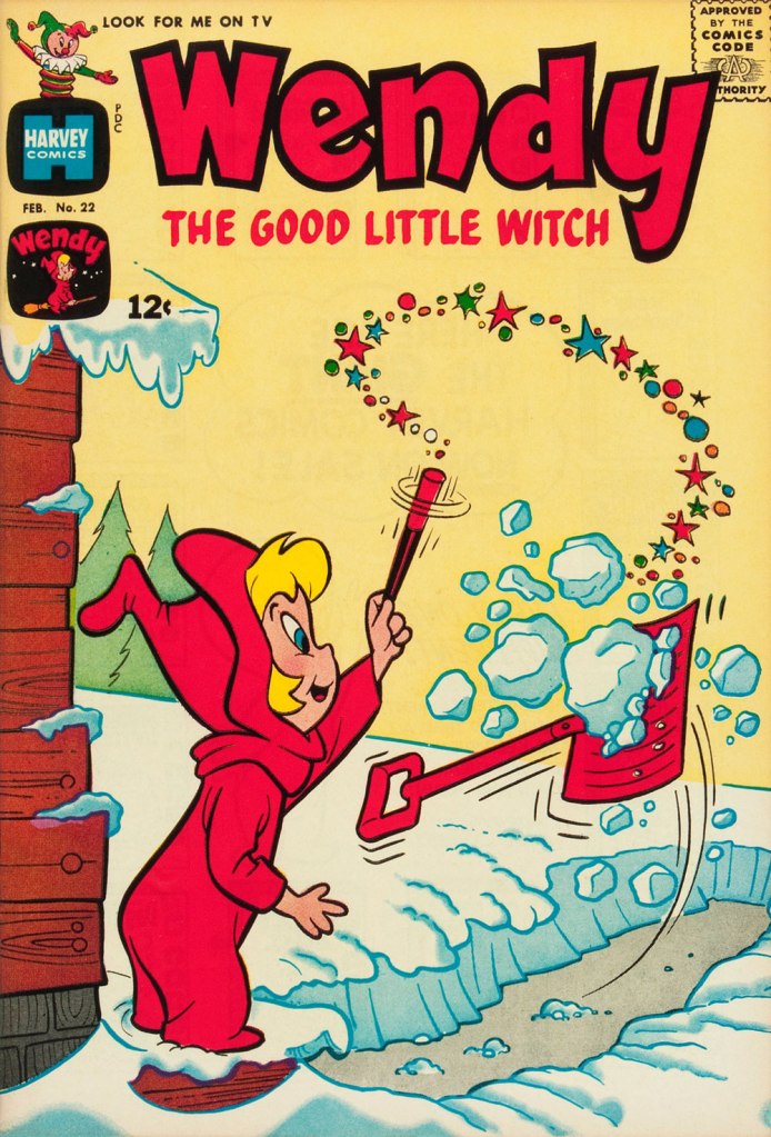
This is Wendy, the Good Little Witch no. 22 (Feb. 1964, Harvey).
Richie Rich no. 23 (May 1964, Harvey). What have you been eating, Richie?
This is Little Audrey and Melvin no. 23 (Mar. 1966, Harvey). As you can see, Audrey’s sidekick Melvin shares a former fedora with our dear friend Forsythe Pendleton ‘Jughead’ Jones. That particular chapeau is called a Whoopee Cap.
This is Richie Rich no. 55 (Mar. 1967, Harvey).
This is Casper, the Friendly Ghost no. 116 (Apr. 1968, Harvey). Variations on skiing through solid objects is quite the cartooning wellspring.
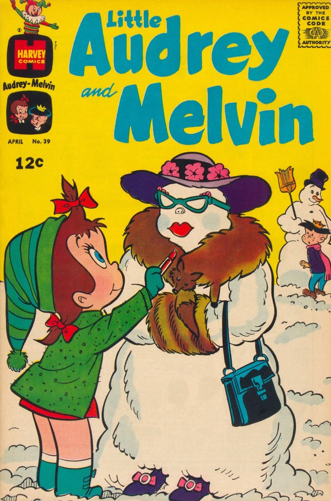
This is Little Audrey and Melvin no. 39 (Apr. 1969, Harvey).
This is Hot Stuff, the Little Devil no. 93 (Oct. 1969, Harvey). For more Hot Stuff covers, check out Who Will Change the Devil’s Nappy?
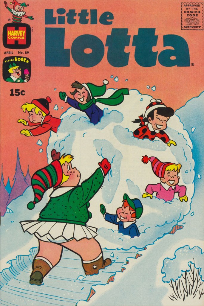
This is Little Lotta no. 89 (Apr. 1970, Harvey). And they didn’t find the local children’s mangled bodies until the following spring thaw.

-RG

Hallowe’en Countdown VI, Day 22

« A black cat crossing your path signifies that the animal is going somewhere. » — Groucho Marx

Linda Turner, a.k.a. the Black Cat, made her debut in Pocket Comics no. 1 (Aug. 1941). She was first drawn (and probably written) by Al Gabriele. After passing through the hands of a few other artists (Pierce Rice, Arturo Cazeneuve, Jill Elgin…), she landed in Lee Elias‘ lap in the post-war years.

She was a stunt woman, and combined physical prowess with mental agility gleaned from her father, an amateur detective…. and fought crime in a glamorous and revealing black bodysuit.

A perfectly Hallowe’en-themed cover, this is Black Cat no. 14 (Nov. 1948, Harvey); cover (bearing his signature and everything!) by Lee Elias. Read this issue here!

Why waste a good title? As fashions changed in the comic book field, and superheroes — and heroines — lost ground to all manner of horrors, Black Cat, clearly a versatile and catchy moniker, switched hats and mission statements on a slew of occasions over the course of its healthy run. To wit:

BLACK CAT COMICS 1-15, 17-29
BLACK CAT WESTERN COMICS 16, 55-56
BLACK CAT MYSTERY COMICS 30-53, 57
BLACK CAT WESTERN MYSTERY 54
BLACK CAT MYSTIC 58-62
BLACK CAT 63-65

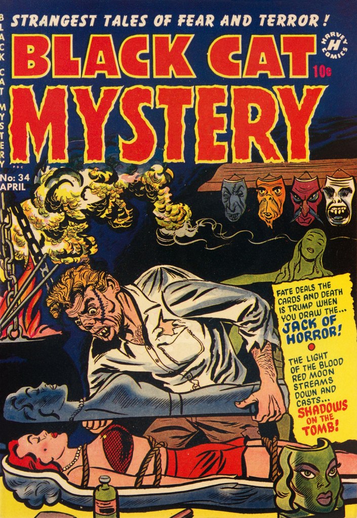
A man’s got to have a hobby. This is Black Cat Mystery no. 34 (Apr. 1952, Harvey). Cover artist regrettably unknown.

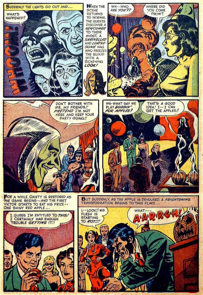
This issue happened to contain a lovely little Halloween tale:
Halloween Nightmare was pencilled by our pal Manny Stallman and (likely) inked by John Giunta. Scripter unknown, wouldn’t you know it?
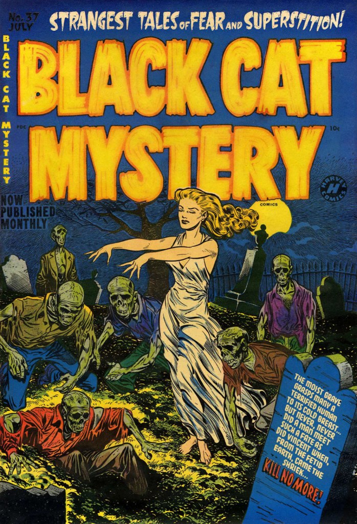
The series, whatever title it bore, featured scads of great covers. This is Black Cat Mystery no. 37 (July 1952, Harvey); cover art by Harvey art director and resident genius Warren Kremer. Read this issue here!
« Dear Lord, someone’s coming to rescue me! At long last… oh, it’s YOU. » Working from a Kremer layout, Mr. Elias brings us the darker flip side of the old desert island fantasy. This is Black Cat Mystery no. 48 (Feb. 1954, Harvey). Read it here!
And since we’re on the topic of black cats, meet our resident King o’ the Cats, Barnabas!

-RG (with a kind assist from ds)
A Sweet, Refreshing Slice of Watermelon

« To prevent enabling oppression, we demand that black people be twice as good. To prevent verifying stereotypes, we pledge to never eat a slice a watermelon in front of white people.* » — Ta-Nehisi Coates

On a scorching day last week, we were at home digging into a particularly tasty watermelon.

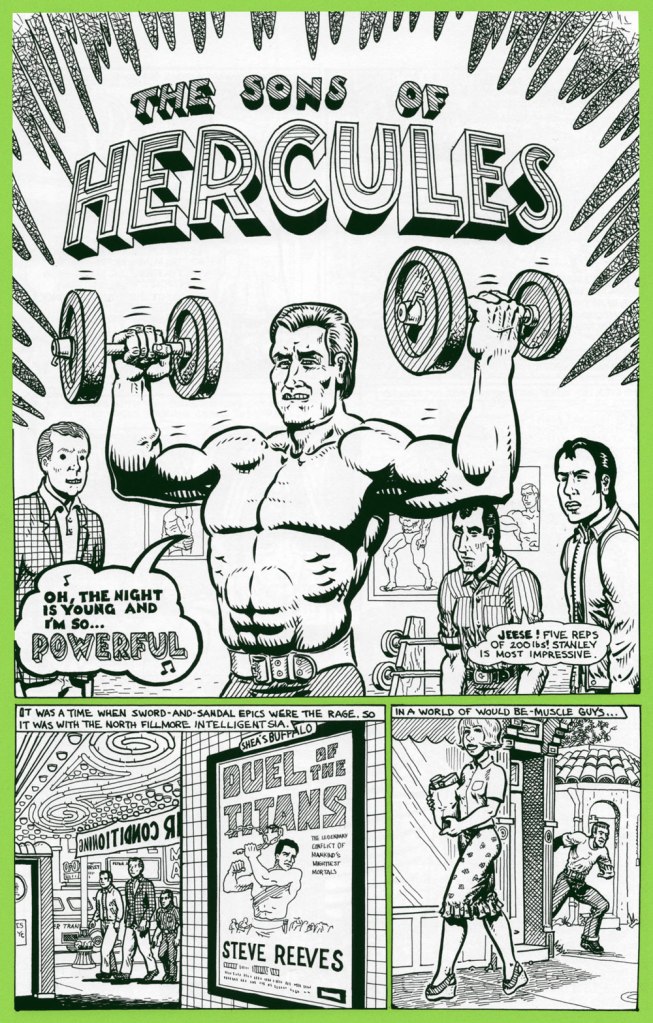
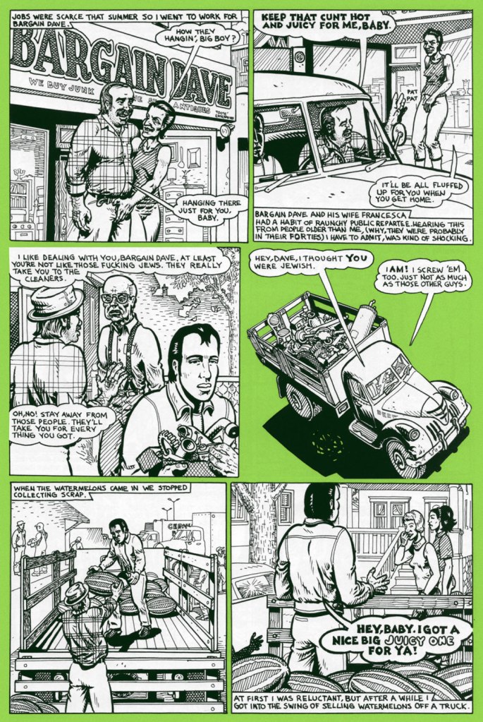
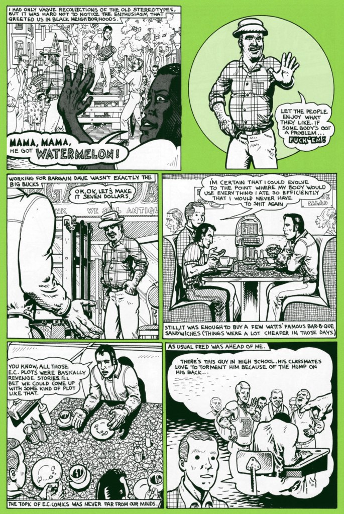
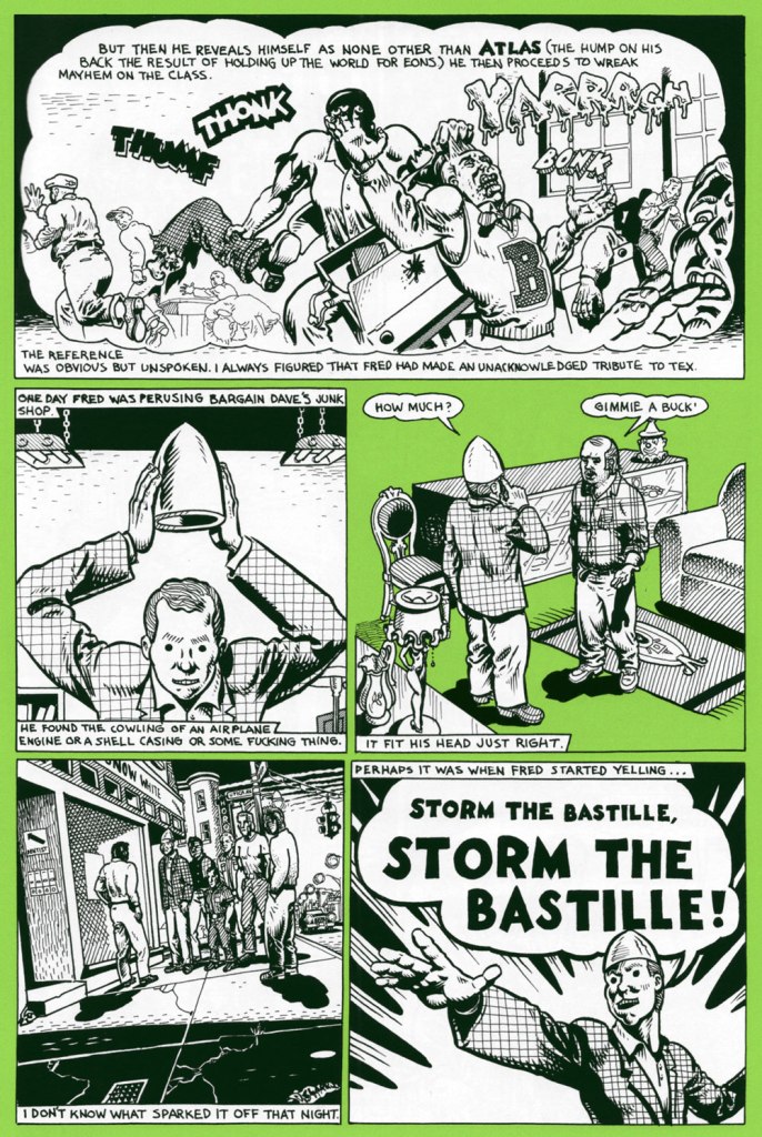
As neither of us grew up in the U.S. of A., the simple act of eating juicy pastèque has not been tainted, as it has for many, by racism and stereotypes. We’ve been allowed to appreciate the watermelon for itself, as a healthy, refreshing, tasty treat. A lightbulb came on as I recalled a relevant sequence in one of Spain Rodriguez‘s ‘Fred Toote’ stories, set in the 1950’s Buffalo of his youth — and so here it is:

Bargain Dave tells it like it is! The Son of Hercules first appeared in Blab! no. 12 (Autumn 2001, Fantagraphics), but the ideal place to find it is in Cruisin’ With the Hound: the Life and Times of Fred Tooté (2012, Fantagraphics), which collects the whole (motor)cycle. I’ve previously featured another tale of Spain’s youthful exploits, Treasured Stories: «Tex’s Bad Dream or ‘The Egg Lady’s Revenge’» (1988).

And that’s not all: a few days later, a friend’s news feed presented me with a most insightful, eye-opening *and* heartbreaking tweet:

« It seems almost silly to say that watermelons have been racialized, but that is exactly what happened in this culture. » Here’s the full article, a fascinating summary of the issue from Dr. David Pilgrim of Ferris State University’s Jim Crow Museum of Racist Memorabilia, written in response to the rather hostile comment of “Judging from the pictures on your website, you seem to be saying to me that black people don’t like watermelons? Sometimes you liberals make me shake my head.
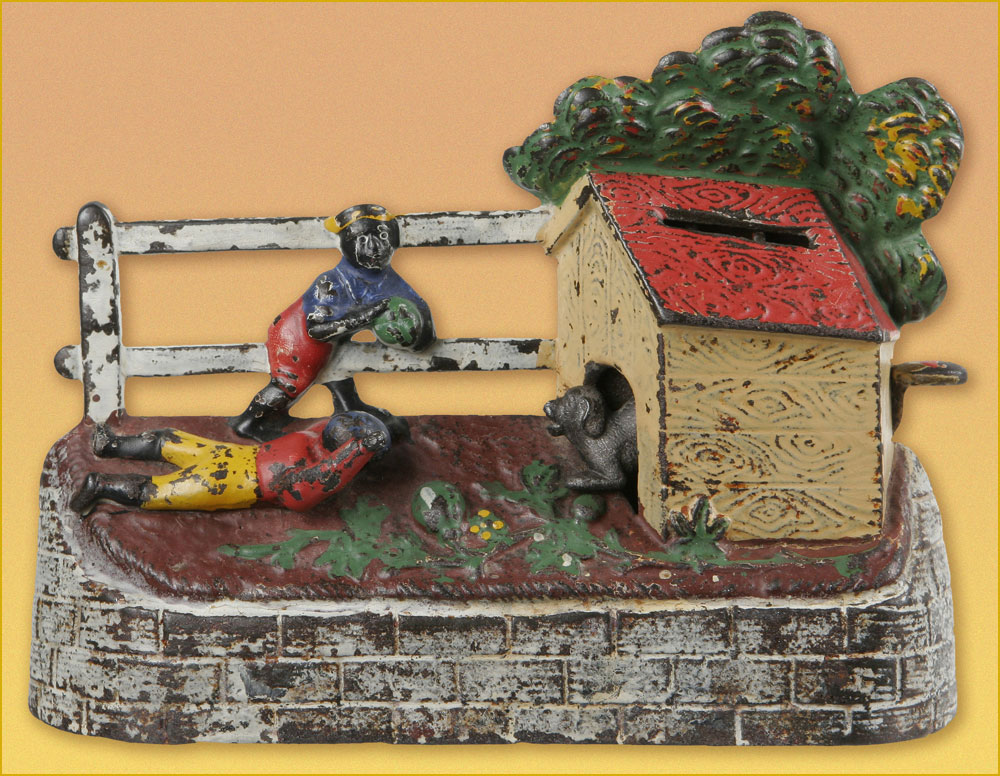
« Boys Stealing Watermelons Bank. Made by Kyser & Rex of Philadelphia, PA. circa 1894. When a lever is pressed and the coin deposited, a dog runs out to keep the boys from their prize. »
Comics pioneer Gustave Verbek (1867-1937), known as Verbeek after he “moved to the United States, where an immigration officer misspelled his name“, tackles a familiar subject in his Upside-Downs strip of Aug. 7, 1904 . Don’t forget to read it upside down for the second half of the story! My warmest thanks to Sunday Press‘ Peter Maresca for providing me with this rare image.
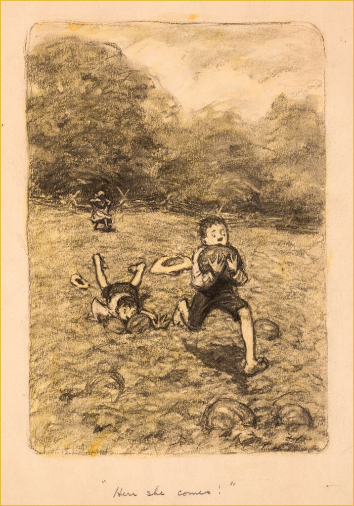
A piece in graphite on manila by James Ellsworth “Worth” Brehm (b. 1883 – d. 1928) illustrating one of Booth Tarkington‘s ‘Penrod’ novels, circa the 1910s. Seems like any and all scamps — of all races — would raid the watermelon patch, given half a chance.
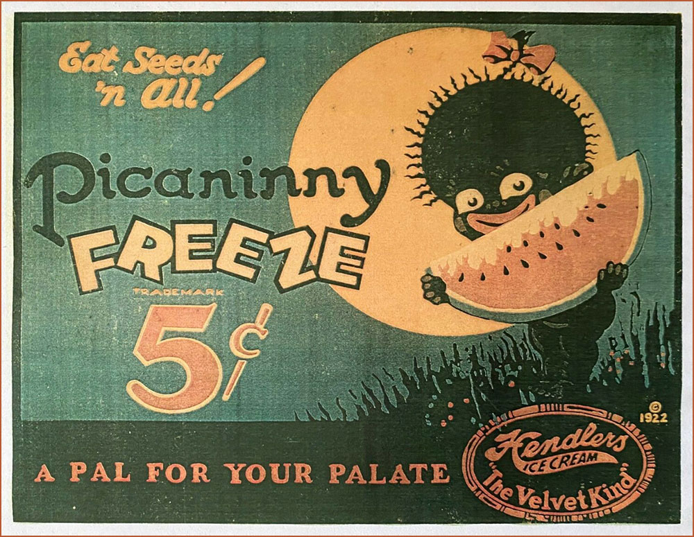
An ice cream advertising sign, circa 1922. If you’ll bear with me, here’s a longish, must-read quote from the indispensable Wicked Words by Hugh Rawson (1989, Crown Publishers, New York):

Pickaninny. A black child. Thus, from a book that was being sold in 1987 in order to raise money for the state of California’s observance of the bicentennial of the United States Constitution. ” If the pickaninnies ran naked it was generally from choice, and when the white boys had to put on shoes and go away to school they were likely to envy the freedom of their colored playmates” (Fred Albert Shannon, essay on slavery, 1934, in The Making of America, W. Clean Skousen, ed., 1985).

Pickaninny arose among slaves in the West Indies, where it was recorded as early as 1653. The original users based the term either on the Portuguese pequenino, little child, or its Spanish equivalent. They employed the term affectionately, of course, and, on the evidence of Captain Frederick Marryat, who was a sensitive recorder of language, applied it to little children generally, regardless of color, e.g. “And den, Mass Easy, you marry wife – hab pickaninny — lib like gentleman” (Mr. Midshipman Easy, 1836).

But no white person can get away with this today. The essential informality of the word makes it seem too condescending, too offensive, to most modern sensibilities. The California Bicentennial Commission, in fact, halted the sale of The Making of America, and issued a formal apology for having authorized it in the first place, after this use of pickaninny was called to their attention (along with other matters, the text also concluding that “slave owners were the worst victims of the system [of slavery].”

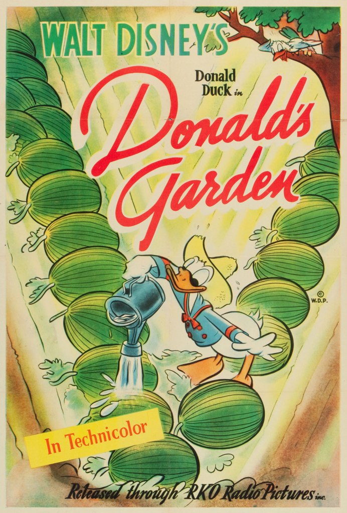
One Sheet poster from Donald’s Garden (RKO, 1942), written by Ralph Wright and directed by Dick Lundy. « During WWII, Americans were expected to help their country in the war effort by participating in “Victory Gardens.” This was a measure to conserve produce domestically so food could be shipped to the troops overseas. » Watch it here!
This is Krazy Krow no. 2 (Fall 1945, Timely). Racist stereotype or not? It’s not always the case, as R.C. Harvey soberly argues in an excellent article on Walt Kelly‘s Pogo, Sometimes a Watermelon Is Just a Watermelon. Here’s a sample: Harvey — « This is ultimately a failure to understand what the watermelon stereotype actually entails. Surely you realize that there’s nothing intrinsically degrading in liking to eat watermelon. Watermelon was one of the props in a general stereotype of the African American as filled with infantile enthusiasm, easily distracted and reduced to paroxysms of delight at the rattling of dice, the smell of fried chicken, or the sight of a watermelon. This is not what’s happening in Kelly’s story at all. But then, Andrae hardly seems to have an idea of his own on this subject at all. Rather, he has a grab bag of received notions, incompletely understood and haphazardly applied. Watermelon equals racism, that is all you know and all you need to know. »
A slice of Mal Eaton’s delightful Rocky Stoneaxe ( Peter Piltdown); undated, but since it bears the Stoneaxe name, it’s post-1953 and saw print in the pages of Boy’s Life Magazine. Eaton’s a local favourite, and my co-admin ds has twice written about his signature creation. First came Mal Eaton’s Peter Piltdown, then Tentacle Tuesday Masters: Mal Eaton — Peter Piltdown Goes Fishing!
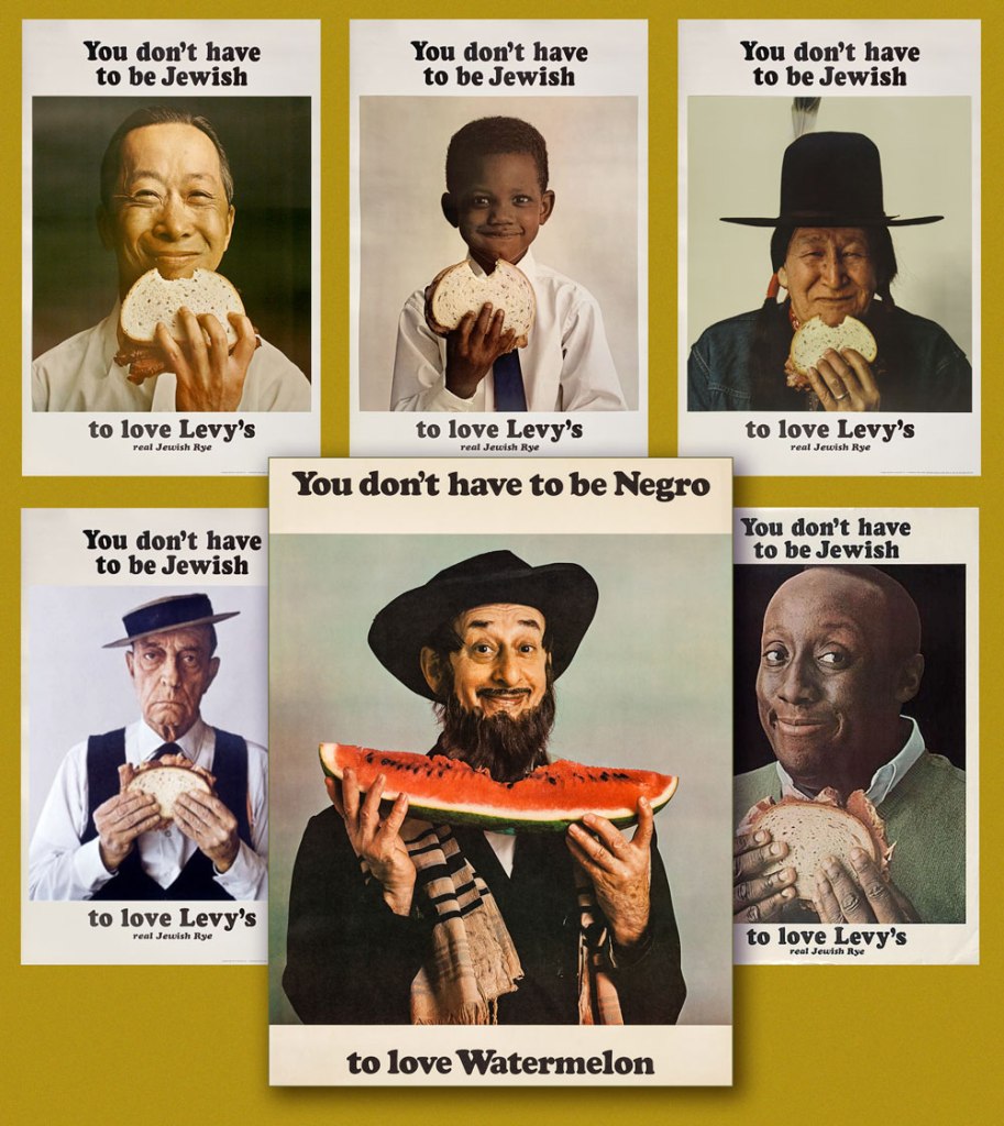
And now for something more progressive: called ‘the most successful Jewish ad campaign of all time’ (*explicitly* Jewish would be my caveat), the truly classic Levy’s rye bread campaign was launched in 1961 and lasted into the 1970s, spawning along the way countless imitations, parodies and ripostes, including, circa 1967, the You Don’t Have to be Negro to Love Watermelon seen here front and centre. Keen readers surely will have spotted the unmistakable deadpan mug of the rightly legendary Buster Keaton, bottom left.
According to a New York Times article, « Malcolm X liked the poster featuring the black child so much that he had himself photographed alongside it. »
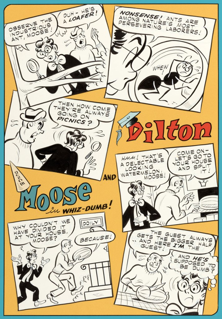
Given the right writer, I’ve always enjoyed the Dilton-Moose pairing more than the Moose-Midge combo. The boy genius and the dunce are genuine friends, while Midge only serves as a vehicle for Moose’s jealousy and as a way to land Reggie in traction. This one appeared in Archie’s Joke Book Magazine no. 46 (May 1960, Archie). Writer unknown, art by Joe Edwards (1921-2207).
A page from Little Audrey and Melvin no. 4 (November 1962, Harvey); kudos to Melvin — I can’t even get a proper boomerang to return to me, let alone a piece of rind used in its stead.
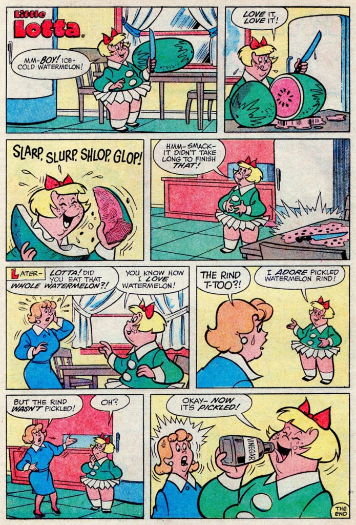
I suppose your stomach acids would have done the trick just as well, Lotta. A page from Little Lotta no. 65 (May 1966, Harvey).
A special watermelon sequence by the Lieber Bros, Stan & Larry, with inks by Mike Esposito (moonlighting as Mikey DeMeo); this is from The Parents of Peter Parker!, published in The Amazing Spider-Man Special no. 5 (Nov. 1968, Marvel).
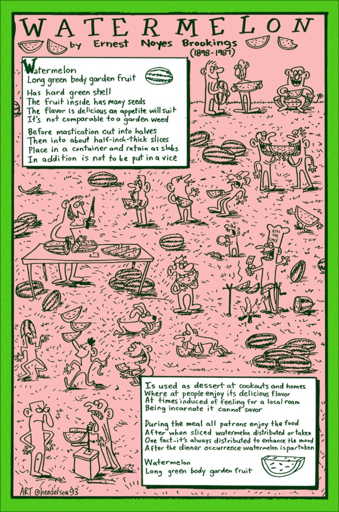
And finally, a collaboration between prankster and cultural scholar Sam Henderson and late-in-life eccentric poet Ernest Noyes Brookings; it appeared in Duplex Planet Illustrated no. 7 (March 1994, Fantagraphics), edited by David Greenberger. And if you’ve enjoyed the visual version, try the 1991 musical adaptation by Maestro Subgum & The Whole!

-RG

*He’s not even slightly exaggerating: the heinous stereotype just won’t die.

Hallowe’en Countdown V, Day 25

« Swing your razor wide! Sweeney, hold it to the skies! » — Stephen Sondheim

Variations on a theme: The entirely reasonable dread of the straight razor.

First there was this Lee Elias cover that…

Actually, no. Before that, there arose the idea in art director Warren Kremer‘s ever-effervescent mind:

One of Kremer’s surviving preliminary sketches.
Then there was this one, more refined and with wonderful suggestions, instructions and notions addressed to the assigned cover artist, Lee Elias.
Ah, here we are. The final (in more ways than one!) version. This is Chamber of Chills Magazine no. 18 (July 1953, Harvey). Art by Lee Elias… but you know that’s not the entire process. Check out this earlier Hallowe’en post for more of that magical Kremer-Elias collaboration.

Then, one year on…

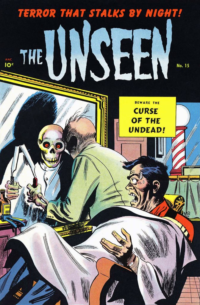
… appeared this cover entry by Québécois Joseph Michel Roy aka Mike Roy (inks likely provided by George Roussos). This is The Unseen no. 15 (July 1954, Pines), the series’ final issue. To give credit where it’s due, the death’s head reflection is a cute new wrinkle.

More than two decades down the road, Marvel, since they were already borrowing Harvey’s Chamber of Chills title (did they even ask? I wonder), figured they may as well reenact one of its classic covers.

Say, what’s this about the day’s first shave? … is there shaving after death? Hassles, hassles.

Though most would nowadays call upon electric shavers or disposable plastic razors, I presume that straight razors have made a comeback among the hipster set. Still, a niche is hardly universal.

This is Chamber of Chills no. 22 (May, 1976, Marvel). Pencils by Larry Lieber, raised on high by the masterly inks of Tom Palmer, who, not content with being one of the all-time finest ink slingers, was also an excellent colourist.

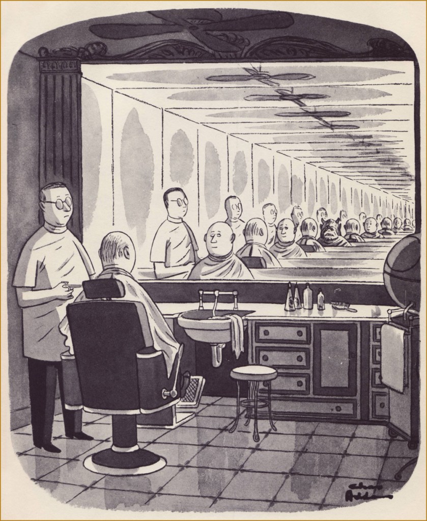
As a bonus, here’s one on the general topic by the immortal Chas Addams. It appeared in The New Yorker in 1957, then was reprinted later that year in his solo collection Nightcrawlers (Simon and Schuster). For more of that excellently-morbid Addams mirth, amble over to this earlier spotlight from our Hallowe’en Countdown’s initial edition.

Most modern reprints of Addams cartoons I’ve seen tend to be on the washed out, blurry side, so I’m grateful to have my ancient volumes of his work. Feast your weary peepers on this fine vintage!

-RG
Tentacle Tuesday: Glittering Lure of the Golden Age

The source of tentacles in Golden Age comics seems inexhaustible – every time I think I have reached the bottom of the well, I find myself awash in cephalopods. That being said, a lot of these octopusoid appearances are one-panel cameos, and even when the tentacles linger for a few pages, the shitty printing, questionable scans or bare-bones art don’t exactly incite me to use this material in a Tentacle Tuesday. Today’s crop is all Golden Age, running the gamut from 1939 to 1952, and composed of pages/covers I can enthusiastically endorse.

George (of Harry J. Tuthill’s The Bungle Family, ‘one of the most under-rated comic strips in the history of American cartoonery’ according to Art Spiegelman, one of the top hundred comics of the 20th century‘, according to The Comics Journal) may be thoroughly bundled up in tentacles, but he still keeps a sort of prosaic calm that I admire.

Feature Comics no. 23 (August 1939, Quality Comics). Cover by Ed Cronin. As for Charlie Chan, he was originally a private detective in a series of novels by Earl Derr Biggers, from which a number of movies were made. Opinions are divided about whether he was a breakthrough Asian character (tired of Yellow Peril stories, Biggers conceived him specifically as an alternative to stereotypical, ‘sinister and wicked‘ Chinese) or perpetuated a lot of the same preconceived notions that were circulating at the time (and, alas, are still with us today).

Just look at the canines the red devil is ready to plunge into Black Hood’s leg! Throw in a fanged octopus, and this cover has as much action as one would possibly want. Sadly, nothing of the sort actually goes on in this issue.

Top Notch Comics no. 16 (June 1941. Archie Comics). Cover by Al Camy.

Robotman and his Robot dog are a worthy topic of discussion in themselves, especially when Jimmy Thompson is involved (see Robotman and Jimmy Thompson: Golden Age Comics’ Best-Kept Secret), but for now these two pages will do nicely!

Page from Fisherman’s Luck, published Star-Spangled Comics no. 41 (February 1945, DC).
This page from Boy Meets Robotdog was printed in Star-Spangled Comics no. 75 (December 1947, DC). I would certainly come to this house!

We really like Howard Nostrand at WOT, though so far he has been woefully under-featured in our posts!

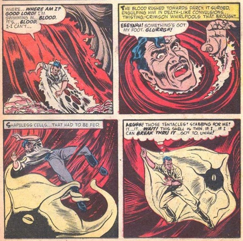
This page is from The Man Germ, scripted by Nan Barnett and illustrated by Howard Nostrand. This story was published in Chamber of Chills Magazine no. 13 (October 1952, Harvey Comics).

Finally, I have a soft spot for these tiered layouts that Rugged Action employs… especially when an octopus with tender, moist eyes is moonlighting in one of them.

Rugged Action no. 1 (December 1954, Marvel). Cover by Carl Burgos.

~ ds

Tentacle Tuesday: Octopus Cameo*

*No, I am not referring to the popular company that lets customers hire favourite ‘stars’ to record personalized videos; a month ago, I didn’t even know this existed, and my life has not been improved by this knowledge.

Sometimes an octopus stays politely in the background, waving hello shyly from behind a rock, or waiting for a dance invitation like a bashful kid at a high-school dance (do they still have these?) I never know where to use these covers; their tentacled nature is undeniable, but their octopuses are so peripheral to the main story that they tend to be overlooked when I am in search of a unifying theme for a post.

cam·e·o/ˈkamēˌō/

a small character part in a play or movie, played by a distinguished actor or a celebrity.

a piece of jewellery, typically oval in shape, consisting of a portrait in profile carved in relief on a background of a different colour.

I’m not sure this counts as a “portrait in profile”, but I will happily accept it as a cameo.

All right, on to the comics…

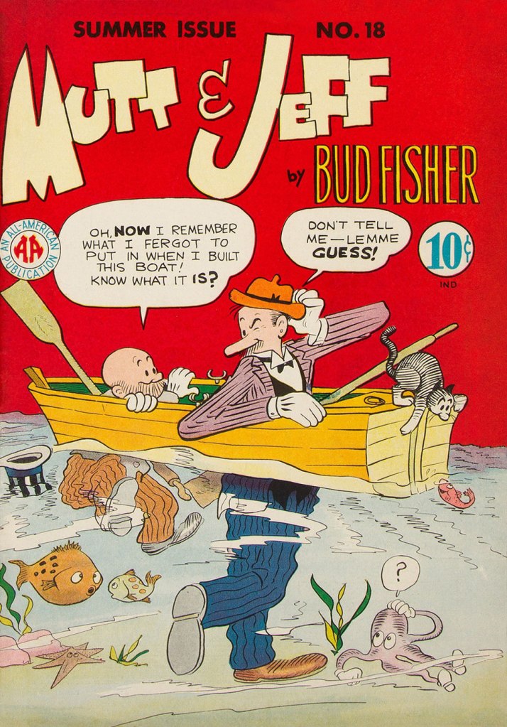
Mutt & Jeff no. 18 (Summer 1945, All-American). Cover is by Sheldon Mayer. So the octopus has only four tentacles, but he’s a cutie!

Mutt & Jeff have already been part of a Tentacle Tuesday line-up, but the main interest here is Sheldon Mayer, a big favourite at WOT. Don’t believe me? Set your orbs on Yesterday’s Tomorrow’s Teenagers: Sheldon Mayer’s Sugar and Spike.

Life with Archie. no 41 (September 1965, Archie). Cover by Bob White.

Co-admin RG rounded up quite a few of his favourite Bob White covers in Bob White, Forgotten Archie Artist and More Bob White, Lost Archie Artist – I highly recommend to have a look at both posts!

Treasure Chest vol. 22 no. 9 (December 1966, George A. Pflaum). Cover by Reed Crandall. This cover is of course dedicated to Jules Verne.

Treasure Chest, a long-running catholic publication we mention routinely though not too often (for details, see co-admin RG’s Hallowe’en Countdown IV, Day 24), runs the gamut from informative to fun, sometimes both at the same time. There are occasional clunkers (like the admittedly rather entertaining multi-part story I am currently reading about Godless Communism), but overall it’s well worth picking up, should some issue catch your eye.

Can you spot the octopus, right there in the window? He’s all set to escape, I think. Bonus: bats! As the top says, this is a strip from June 1970, scripted by Brant Parker and Johnny Hart, with art by Parker. These two have created The Wizard of Id in 1964, so this strip has been around for quite a while…

I originally had in mind happy, frolicking octopuses for this post, so here is one instance of just that. As a matter of fact, his smile is somewhat unnatural and more of a rictus, but I don’t want to be picky…

Bunny no. 14 (March 1970, Harvey). Cover by Hy Eisman. More (dubious) puns than one can shake a stick at… it’s almost like reading a Piers Anthony novel.

I’ll quote from Don Markstein’s excellent summary of this hare-brained comic series: « Bunny was aggressively, even obsessively trendy. Even at the time, it seemed to lay on the love beads and “psychedelic” display lettering a bit thick. […] But she owed her painfully discordant Sixties-ness to nobody. […] It’s as if her entire raison d’être was to parody the decade of student activism and radical youth fashions, even while living it. To make matters worse, this teenage girl comic was edited, written and drawn by middle-aged men who were probably, like most middle-aged men, unable to communicate with their own daughters. To vary the dialogue, in which everything that wasn’t “groovy” was “outasight”, they made up their own slang. Things could also be “zoovy” or “zoovers” or even, in extreme cases, “yvoorg” — which was obviously “groovy” spelled backward, but no hint was ever given as to how it might be pronounced. »

~ ds

Tentacle Tuesday: The Kids Are Alright!

« Adults are just outdated children. » — Dr. Seuss

While some are of the opinion that children should be seen but not heard (and preferably not seen), others coo mindlessly over every mollycoddled tot. I think the truth lies somewhere in the middle, and today I’ll concentrate on courageous, plucky children who are not afraid of diving head first into adventure.

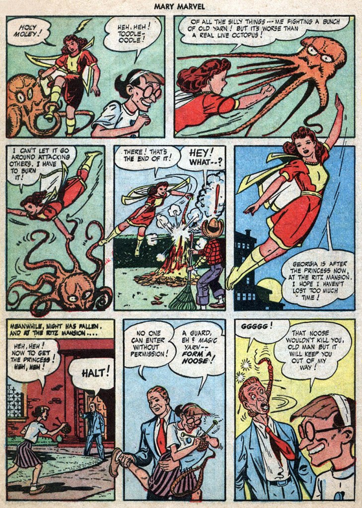
The Magic Yarn, published in Mary Marvel no. 2 (June 1946, Fawcett), was scripted by Otto Binder and drawn by Jack Binder. This immensely entertaining story about an old bat with dreams of world domination involves an octopus, some bondage (of course!), and lots of knitting. (Read it here)

Moving on to actual (rather than knitted) octopuses, here’s the original art from On the Bottom of the Sea, published in Little Max no. 16 (Harvey, April 1952). The story artist may be uncredited on GCD, but we know that it’s Al Avison 😉

The Little Wise Guys tangle with an ornery cephalopod. Giggles ensue! This is Daredevil Comics no. 111 (June 1954, Lev Gleason), with a cover is by Charles Biro. The cover story is Scarecrow’s Lucky Blunder, scripted by Charles Biro and illustrated by Ralph Mayo.

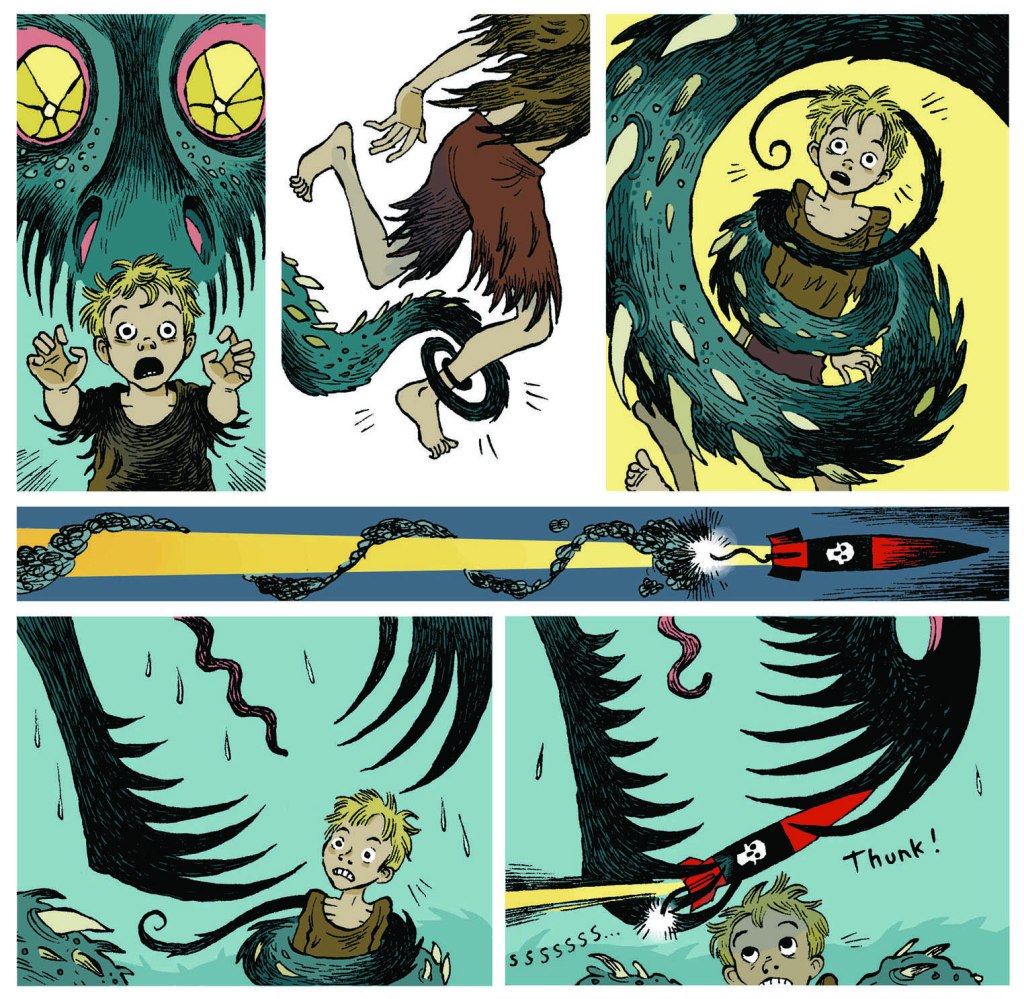
Finally, making an epic effort to wrench myself away from the tender embrace of the Golden Age, I’ll accelerate a little too much and end up in all the way in 2015. Here’s a page from Scarlett Hart: The Tentacles of Terror by Thomas Taylor and Marcus Sedgwick.

~ ds

Who Will Change the Devil’s Nappy?

« Don’t you know there ain’t no devil, it’s just god when he’s drunk. » — Tom Waits, Heartattack and Vine (1980)

Another week, another heat wave… I had something else in the pipeline for this week, but the canicular conditions brought to mind Hot Stuff The Little Devil (heat rises!) and his creator Warren Kremer‘s monumental parade of beautifully conceived and crafted calefaction variations.

As you may already know, the Harvey Comics stable consists, in the main, of one-note characters erected upon the visual template of licensed 1940s animation properties Casper the Friendly Ghost (Richie Rich, Hot Stuff, Spooky) for the boys, and Little Audrey (Little Dot, Wendy the Good Little Witch, Pearl) for the girls.

CasperRichieA
Would I kid you? (truthfully, I might). There’s even a meme about it.

We’ve already presented cover galleries from Spooky and Little Dot (as well as a Hallowe’en-themed array), and it’s now Hot Stuff’s turn to toast and roast. Though we’ve both been rather dismissive of the contents of Harvey Comics, I must point out that if there is a specific series that burns brighter than its brethren do, it’s Hot Stuff’s… at least during the line’s creative peak, the 1960s. Here’s an example of a good one.

Each cover is the brainchild and handiwork of Harvey’s indefatigable resident genius and art director, Warren Kremer. Obviously, one man does not a company make, and his able colleagues Howie Post, Ernie Colón, Sid Couchey and Sid Jacobson were hardly lightweights or slouches… but Kremer was the cover generator.

HotStuff09A
This is Hot Stuff, the Little Devil no.9 (Feb. 1959, Harvey). Is this helping? Probably not. Sorry!

HotStuff15A
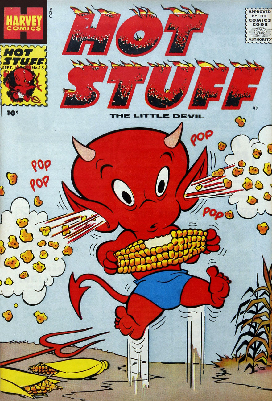
This is Hot Stuff, the Little Devil no.15 (Sept. 1959, Harvey).

HotStuff33A
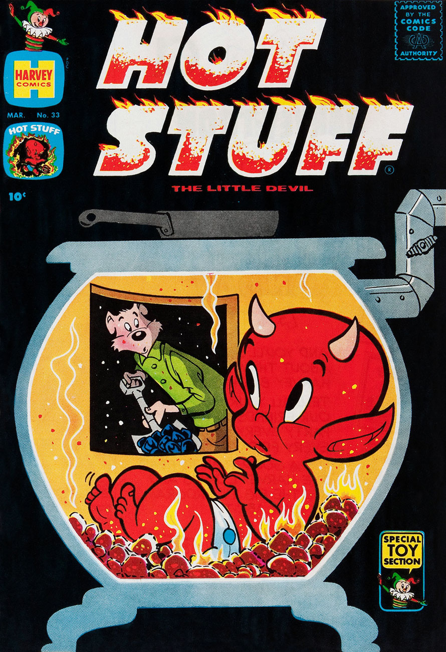
This is Hot Stuff, the Little Devil no.33 (Mar. 1961, Harvey). I especially admire Kremer’s black covers, though they complicated the printing and make issues in pristine (or even decent) shape a scarce proposition.

HotStuff34A
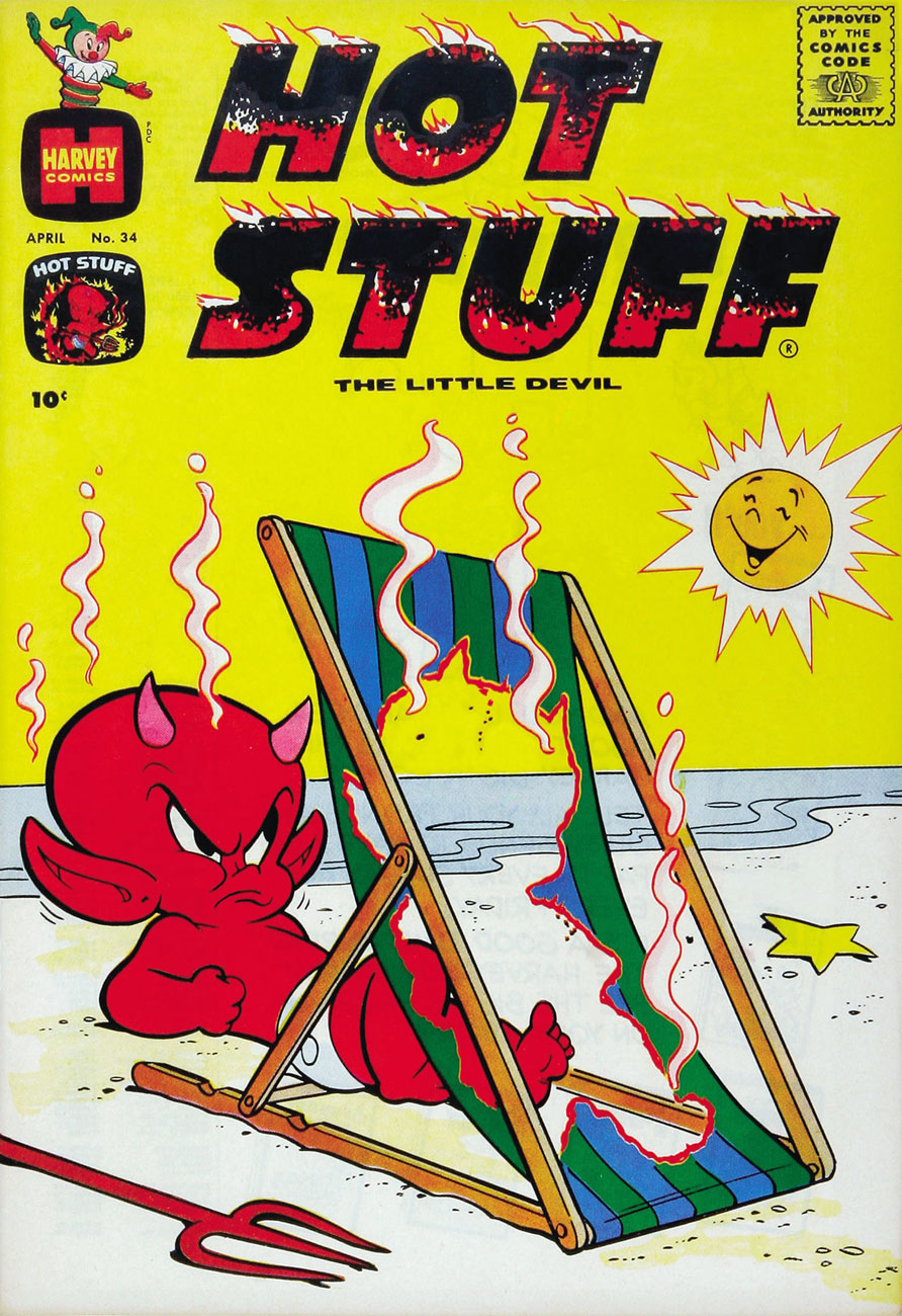
This is Hot Stuff, the Little Devil no.34 (Apr. 1961, Harvey).

HotStuff36A
This is Hot Stuff, the Little Devil no.36 (June 1961, Harvey).

HotStuff41A
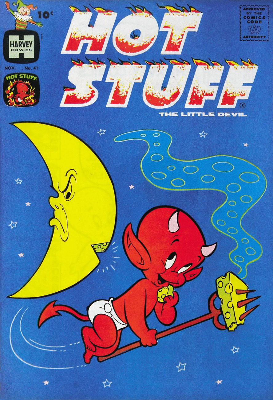
Ah, so that ol’ devil moon is not merely made out of cheese, but of stinky cheese to boot? Good to know. This is Hot Stuff, the Little Devil no.41 (Nov. 1961, Harvey). Fun fact: because of its distinctive holes, Swiss Gruyère is the shorthand cartoon cheese.

HSSizzlers07A
This is Hot Stuff Sizzlers no.7 (Feb. 1962, Harvey).

HSSizzlers08A
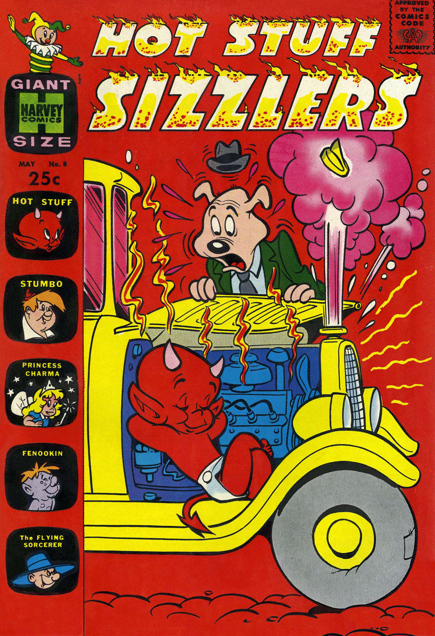
This is Hot Stuff Sizzlers no.8 (May 1962, Harvey).

DevilKids03A
This is Devil Kids Starring Hot Stuff no.3 (Nov. 1962, Harvey). One wonders why other comics publishers didn’t show the same lack of regard for the Comics Code Authority Stamp of Approval typically demonstrated by Kremer and Harvey. Their ‘shove it in a corner and colour it invisible’ approach is refreshing. I suppose that, like other publishers specialized in the nominally wholesome ‘kiddie’ market, Harvey’s code approval was a formality.

HotStuff68A
This is Hot Stuff, the Little Devil no.68 (Oct. 1965, Harvey). Listen to this excellent ‘word jazz‘ piece by the late, great Ken Nordine (1920-2019), on the fecund topic of… Fireflies.

DevilKids21A
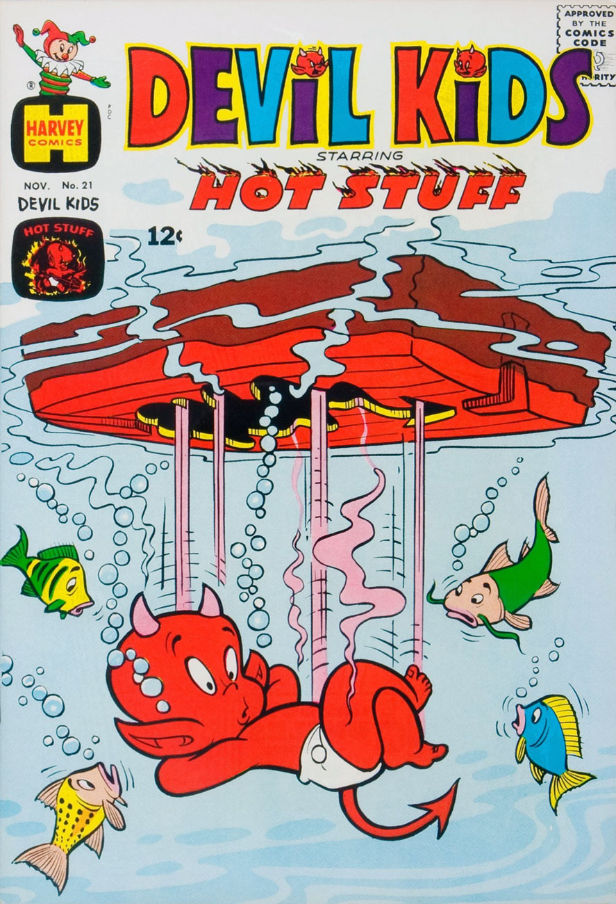
This is Devil Kids Starring Hot Stuff no.21 (Nov. 1965, Harvey). A little better, cooling-wise?

HotStuff77A
This is Hot Stuff, the Little Devil no.77 (Apr. 1967, Harvey). And how’s this?

That’s it for now! Keep cool, and may your asbestos underwear never chafe!

-RG
Tentacle Tuesday: By the Sign of the Jack-in-the-Box Harlequin

As Tentacle Tuesday creeps by once again, we found ourselves knee-deep in ghosts and devils – adorable, baby-featured ones. As a matter of fact, if you’re the kind who breaks out in hives when exposed to an overdose of cuteness, I would suggest skipping this week’s installment.

harveycomicslogo

The best-known titles published by Harvey Comics, whether comic book adaptations of an animated cartoon (for instance, Casper the Friendly Ghost or Baby Huey, both adapted from Paramount’s Famous Studios cartoons) or original series, are certainly no passion of mine for the simple reason that the stories are, for the most part, quite boring. Their strained slapstick elicits, at best, a semi-chuckle: each character is so tied to a shtick that the whole thing becomes predictable very quickly. Hot Stuff, the little devil with temperature regulation problems, constantly burns through and/or melts stuff. Little Dot draws polka dots on everything – or hangs out with giraffes. Little Lotta demolishes all food in sight à la Garfield. Richie Rich swims in money, eats money, inhales money. Wendy the Good Little Witch is nauseatingly boring (I disagree with that being a viable definition of “good”).

All of these characters have redeeming features – their heart is in the right place and they enthusiastically come to the aid of friends and animals. The Harvey Girls, as they’re called (Little Lotta, Little Dot and Little Audrey) are clever and enterprising, if spoiled and headstrong, which is a pleasant change from females in need of rescuing. I wouldn’t go as far as calling their antics “proto-feminist”, notwithstanding the lofty claim made to that effect in the introduction to the Dark Horse Harvey Girls anthology.

One can hem and haw about it all day, but there is one redeeming and indisputably striking feature, and it’s one to contend with: the covers are beautiful! Lovingly designed, gorgeously coloured, they’re pure eye candy.

We have artist and art editor Warren Kremer, who worked at Harvey for some 35-odd years starting in 1948, to thank for that. See my colleague’s Little Dot’s Playful Obsession and his spotlight on Spooky the Tuff Little Ghost for more details. Me? I shall simply concentrate on tentacles.

CasperandNightmare21
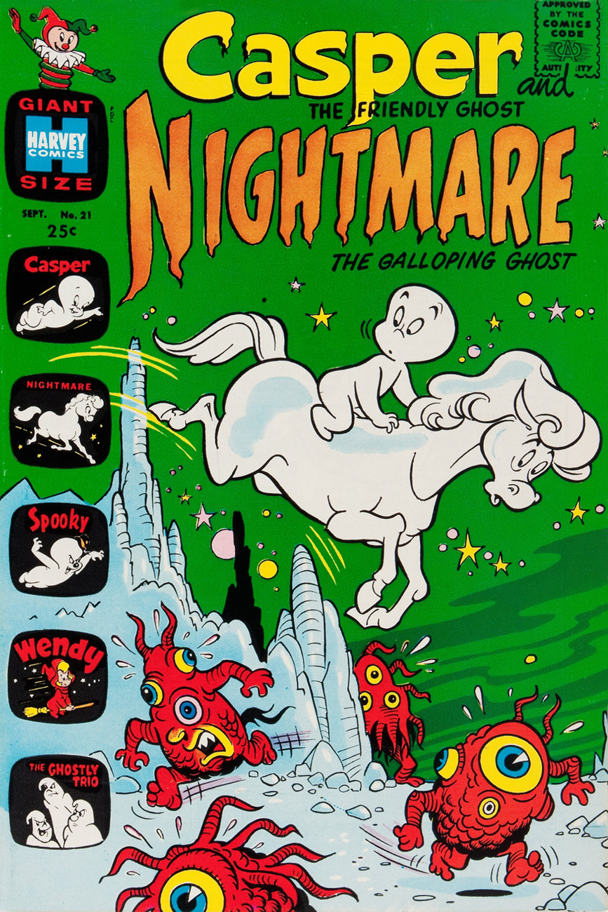
Casper & Nightmare no. 21 (1968). Casper the Friendly Ghost was adapted from Famous Studiosanimated cartoon, and soon gave birth, so to speak, to a score of spinoffs, such as Spooky the Tuff Little Ghost and Wendy the Good Little Witch.

Richie-Rich-128
Richie Rich no. 128 (September 1974). Richie Rich, yet another Warren Kremer character, debuted in Little Dot. Don’t you just love the super-bashful octopus?

DevilKids-Starring-HotStuff-67
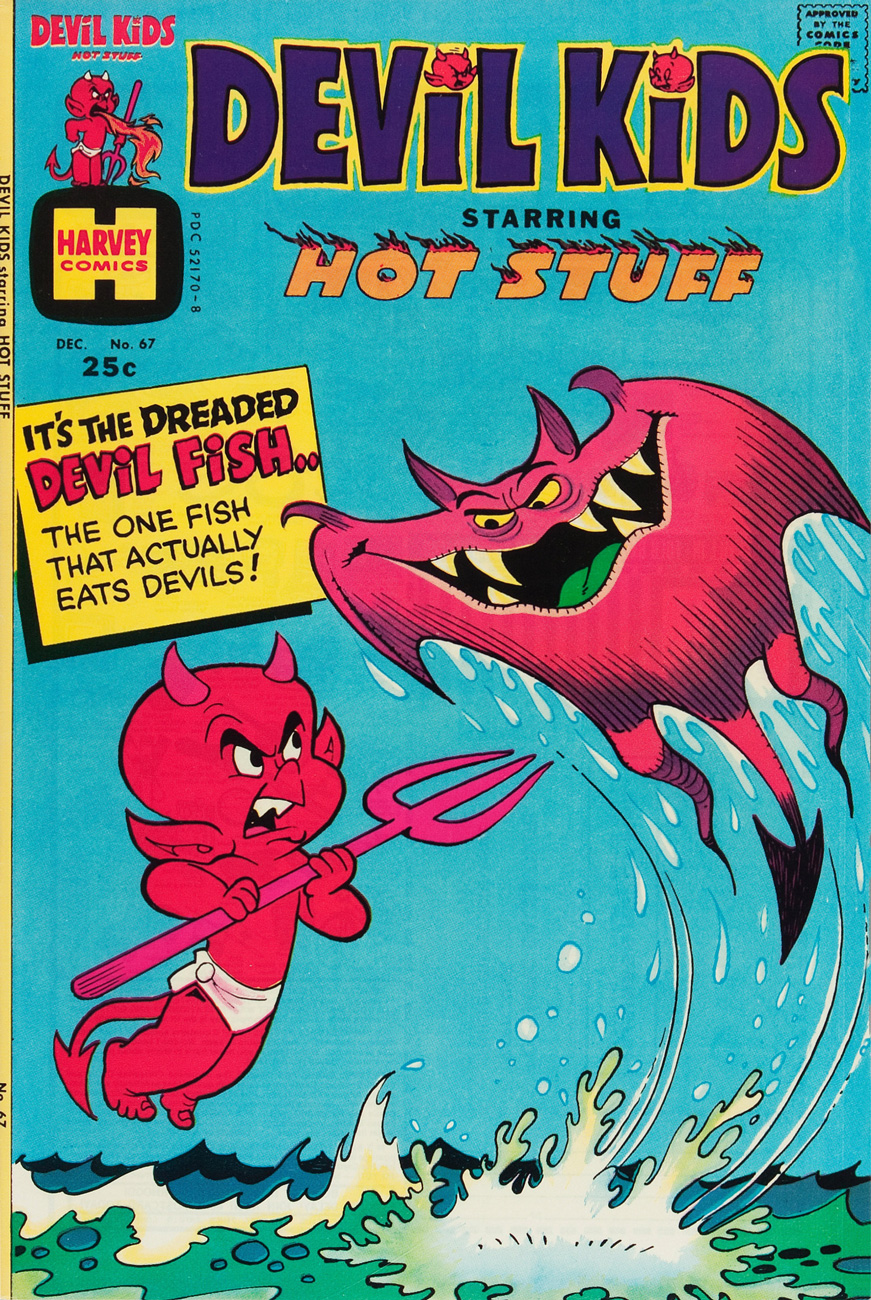
Devil Kids Starring Hot Stuff no. 67 (December 1974). Hot Stuff the Little Devil is another Kremer character.

RichieRichProfits5
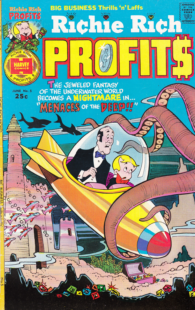
Richie Rich Profits no. 5 (June 1975)

CasperDigest2A
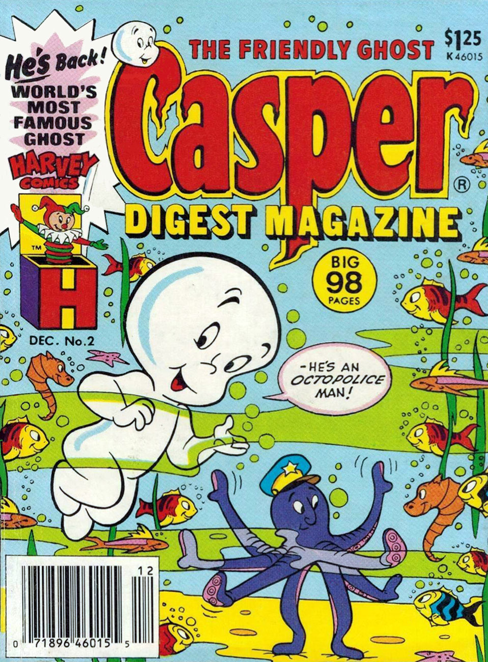
Casper Digest no. 2 (December 1986). This would be a far nicer image sans all the page-cluttering copy (and bar code)!

~ ds

What! You Call This Cold Weather?

« Polar exploration is at once the cleanest and most isolated way of having a bad time which has been devised. » ― Apsley Cherry-Garrard, The Worst Journey in the World (1922)

Here’s what happened: I was leafing through Paul C. Tumey‘s splendid comics anthology Screwball! The Cartoonists Who Made the Funnies Funny (2019, The Library of American Comics/IDW) when I came across a wonderful sample of Gene Ahern‘s Room and Board (1936-58) wherein the strip’s central figure, Judge Homer Puffle, feeds another boarder a steady line of bull in that grand, booming Baron Munchausen — Captain Geoffrey Spicer-SimsonColonel Heeza Liar Commander McBragg tradition.

Room-And-Board1937A
Gene Ahern‘s Room and Board (March 17, 1937, King Features).

Of course, it’s all piffle and bunk, but it brought to mind a passage from a favourite article on weather peculiarities in Siberia, Marcel Theroux‘s The Very, Very, Very Big Chill (published in Travel & Leisure in 2000):

« Local people told me that at minus 60 and below, a dense fog settles in the streets, and pedestrians leave recognizable outlines bored into the mist behind them. A drunkard’s tunnel will meander and then end abruptly over a prone body. At minus 72, the vapor in your breath freezes instantly and makes a tinkling sound called ‘the whisper of angels.’ »

Then I thought: « all very nice, but that makes for a rather meagre post »… so I decided to toss in a few bonus images featuring that venerable recurring motif… and got carried away.

Astonishing36A
This is Astonishing no. 36 (Dec. 1954, Atlas), the title’s penultimate pre-Code issue… not that Atlas ever crossed the line into gruesome. The cover-featured yarn is The Man Who Melted!, an amusing load of utter rubbish you can read here. Cover art by Carl Burgos.

ChamberChills10MarvelA
This is Chamber of Chills no. 10 (May, 1974, Marvel), and most everything’s the same, save for the colour palette and the now-hostile expression on the caveman’s mug.

ChamberChills10HarveyA
And this is also Chamber of Chills no. 10 (July, 1952, Harvey)… the original, whose title Harvey Comics left curbside for Marvel to recycle when they went all kid-friendly in the Comics-code-ruled Silver Age. Cover designed and art-directed by Warren Kremer and illustrated by Lee Elias. For some insight into these collaborators’ working methods on the horror titles, here’s our post on that very topic. Incidentally, what’s up with the hifalutin Lord Byron quote, Harvey folks? This wacky fare is quite plainly fiction… what’s your point? [Read it here.]

Unexpected101A
This is Tales of The Unexpected no. 101 (June-July 1968, DC). Layout and pencils by Carmine Infantino, inks by George Roussos. Infantino, promoted the previous year to editorial director (he would soon rise to the rank of publisher), brought in the versatile Nick Cardy to serve as his right-hand man on the artistic front; together, they designed all of DC’s covers until both men stepped down in 1975.

HOM199A
This is House of Mystery no. 199 (February, 1972, DC), illustrating Sno’ Fun! a rare (possibly unique, really) collaboration between Sergio Aragonés (script) and Wally Wood (pencils and inks). Cover designed by Infantino and Nick Cardy, pencilled and inked by Neal Adams and coloured by Jack Adler.

Unexpected142A
This is Unexpected no. 142 (Dec. 1972, DC); cover art by Nick Cardy.

Unexpected147A
This is Unexpected no. 147 (June, 1973, DC); cover art by Nick Cardy.

Unexpected150A
This is Unexpected no. 150 (Sept., 1973, DC); cover art by Nick Cardy.

SuttonHaunts36A
« Hey, look! The critter is frozen whole… it’s in pretty good shape! » Tom Sutton vibrantly sells Joe Gill and Steve Ditko‘s cautionary tale of arctic drilling gone awry, The Ancient Mine. Also in this issue: Steve and Pete Morisi‘s Surprise!, and Gill and Fred Himes’ touching Pipe Dream. This is Haunted no. 37, (Jan., 1974, Charlton), presented by the publisher’s blue-skinned, green-haired answer to Nana Mouskouri, Winnie the Witch.

HulkHaunted37A
« … that face haunts me… was it a man or a beast? » Ah, the Seventies. Left dazed and frazzled by his whirlwind life of slow-mo violence, glamorous excess and substance abuse, not to mention radiation poisoning, the inevitable occurs: The Hulk wanders onto the wrong set, as well as the wrong publisher’s! Against all odds, he handles the rôle with aplomb and commendable gravitas. A page from Gill and Ditko’s The Ancient Mine. Read it here!

Ghosts37A
This is Ghosts no. 37 (April, 1975, DC), featuring Luis Dominguez‘s first (or many) cover for the title, a passing of the torch from Nick Cardy, who’d handled nearly every one of the preceding three dozen…. minus two: number 7’s cover was the work of Michael Kaluta and number 16‘s that of Jack Sparling.

Oh, and since I wouldn’t want any of you superhero aficionados to think I’m freezing you out, here’s another demonstration of Mr. Infantino‘s “encased in ice” idée fixe.

Detective373A
Mr. Freeze, who first popped up in Batman no. 121 in 1959, initially known as, er… Mr. Zero (Celsius, Fahrenheit or Kelvin?) before being revamped and renamed for the mid-60s Batman TV show, a makeover that carried over to the comics, but tragically didn’t include his outfit. This is Detective Comics no. 373 (March, 1968, DC); layout by Infantino, finishes by Irv Novick. [ read it here!]
… and I can just about hear the « but what about Cap? » troops tromping down the hall, so…

KirbyCap112A
Namor goes all First Commandment on some poor Inuits (surely they’ve seen frozen bodies before?), displaying an unseemly level of insecurity for someone of his standing. This recap hails from King Kirby’s sensational feat of deadline rescue on the behalf of a tardy Jim Steranko (to be fair, it was worth the wait). George Tuska‘s inks are a surprisingly good fit! This is Captain America no. 112, Lest We Forget! (April 1969, Marvel). [ read it here!]
My co-admin ds was just telling me yesterday about a client who, upon remarking to a succession of winter-kvetchers that actually, we’d had a pretty mild January, was invariably met with goggling bafflement, as if he’d just then grown a second head. In related news, it was just announced that said month of January was, indeed, the planet’s warmest on record. There is, naturally, an xkcd strip about this sort of circular denialism.

-RG