While that chain of events is a fascinating bit of history, what I’m here to celebrate is a sequence of classic covers by recent — 2024 recent — Will Eisner Comic Awards Hall of Fame inductee Creig Valentine Flessel (1912-2008). Flessel produced eighteen of the first nineteen Detective Comics covers (the premiere issue bore a striking, but rather primitive drawing by associate editor Vin Sullivan), visibly gaining assurance and verve as he sped along. By my reckoning, however, it’s only with the eleventh issue that he solidly hit his stride, which he never let up until the assignment passed into other hands… and then came Batman.
Anyway, here they are: no hand-holding, no patronising, superfluous captions… just graphic purity — and sweat-soaked, pulpy thrills galore.
This is Detective Comics no. 11 (Jan. 1938, DC).This is Detective Comics no. 12 (Feb. 1938, DC).This is Detective Comics no. 13 (Mar. 1938, DC).This is Detective Comics no. 14 (Apr. 1938, DC).This is Detective Comics no. 15 (May 1938, DC).This is Detective Comics no. 16 (June 1938, DC).This is Detective Comics no. 17 (July 1938, DC).This is Detective Comics no. 18 (Aug. 1938, DC). Even as a relatively sheltered white teenager, I could easily tell that Sax Rohmer‘s Fu Manchu stories were racist (and sexist as well) « Yellow Peril » tripe… even in the context of their era, they went the extra mile. This is Detective Comics no. 19 (Sept. 1938, DC), Flessel’s final cover for the title.
Flessel would turn up all over the place. Gary Groth writes, introducing his definitive, career-spanning Flessel interview:
« Flessel never became an auteur with a truly recognizable narrative voice or characters that he could call entirely his own. He was so skilled and versatile that he became an artistic chameleon, a commercial propensity that served him well throughout his career. He wrote and drew stories for the earliest published comic books: More Fun, Detective Comics and Adventure; worked for the advertising firm of Johnstone and Cushing; assisted Al Capp on Li’l Abner and worked with Charlie Biro on Crime Does Not Pay in the ’50s; spent the ’60s and early ’70s drawing David Crane, a comic strip about a minister in a small town and segued seamlessly into an eight-year gig doing The Tales of Baron Von Furstinbed for Playboy. »
Detail (the whole spread would have been impossible to scan properly) from one of Flessel’s long-running series of Eveready Batteries adverts, done in the employ of the celebrated Johnstone and Cushing ad agency (this one’s from 1951). On his The Fabulous Fifties blog, Ger Apeldoorn showcases a number of these lovelies — check ’em out!Flessel turned up as Jerry Grandenetti‘s inker on my favourite issue of Joe Simon and Grandenetti’s much-maligned, short-lived but quite charming Prez (no. 4, Feb.-Mar. 1974, DC). Notwithstanding the — intentionally — fanciful elements of the Wild in the Streets-inspired social satire, old hand Simon had a much firmer grasp on how politics actually work than did any of the earnest, self-consciously ‘relevant’ comics writers of the day. And one can only sigh nostalgically at days when the worst thing that might slither into the White House was a mere vampire…
Flessel’s ability to depict ladies of the buxom and comely variety had certainly played a role in his landing a gig assisting Al Capp on Lil’ Abner for a couple of years in the late 1950s. At the time, Capp spent much of his time touring college campuses and berating the younger set, as was his wont.
Said virtuosity in the light-hearted and erotic stood him in good stead for an eight-year gig on The Tales of Baron Von Furstinbed for The Playboy Funnies; this one’s from the January, 1983 issue of Playboy Magazine. And here’s another, for good measure.
In closing, a brief exchange from The Comics Journal interview — please do go and read the whole thing, it’s a gem!
GROTH: I have a note that you had something to do with Superboy from 1958 to ’59.
FLESSEL: I did one. You know, it’s frightening; it’s like going out and drinking a lot of martinis and doing a job and not remembering.
« Save time and cut fingers with a parsley mincer. »
It seems that oodles of my posts start with ‘I found this book randomly in a second-hand bookstore…’, when ‘retrieved from the bottom of a dusty chest in a forgotten attic’ would make for a much more enthralling story. Alas, I am bound to truth… as is Can It Be True? (originally published in 1953 by MacDonald and Co; I have the 3rd edition from 1954), which was priced one measly buck despite its generally excellent condition and venerable age.
It consists of a collection of misprinted and typo’d quotes drawn from newspaper clippings, magazine articles and other paraphernalia, expertly gathered and compiled into a thin volume by Denys Parsons. This by itself makes for an amusing read, but the cherry on the cake is the occasional illustrations by blog favourite Anton (see Anton’s Spivs and Scoundrels, Baronesses and Beezers, if you’re not sure whom this nom de plume conceals).
As seen from a panel inside the book, the man is holding a poster that reads’ SHRDLUS AT IT AGIAN – Evning Srta’
« ... Spread around her was a sun-flooded valley where buttercups nodded lazily in the summer breeze and tranquil cows chewed solemnly at her elbow. » – Western Family Magazine
« Para. 27B. Men employed on quasi-clerical nature should not be provided with any clothing. » – Post Office Magazine
« The best plan is to hold the bottle firmly and remove the cook as gently as possible. » – Woman’s Paper
« The flames starting on the third floor of the midwest Salvage Co. spread so rapidly that the first firemen on the scene were driven back to safety and leaped across three streets to ignite other buildings. » – Cincinnati Times Star
« The word lawyer, he argued, was a general term, and was not confined to solicitors, but anybody who practised any breach of law. » – Cambridge Paper
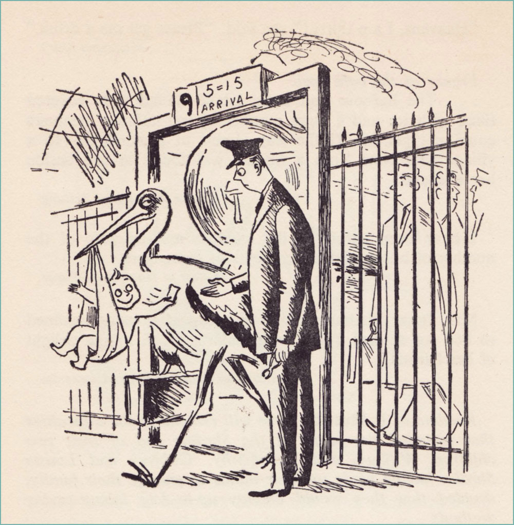
« Mr. and Mrs. Benny Croset announce the birth of a little son which arrived on the 5.15 last Thursday. » – West Union (Oregon) People’s Defender
Denys Parsons, ‘the undisputed king of the misprint’, has a few more books I’m interested in, including another volume of It Must Be True (this one illustrated by Ronald Searle), as well as Many a True Word (another Anton volume!) and All Too True (with drawings by Peter Kneebone). Perhaps another time, another p̶l̶a̶c̶e̶ used bookstore…
« Looking for love is tricky business, like whipping a carousel horse. » — George Cukor
As I’ve noticed that we’ve been dwelling strictly in the cartoonier suburbs of late, allow me to gently nudge us into the realm of high-end draftsmanship and bravura technique for a change. In so doing, let us turn the clock back a century or thereabouts.
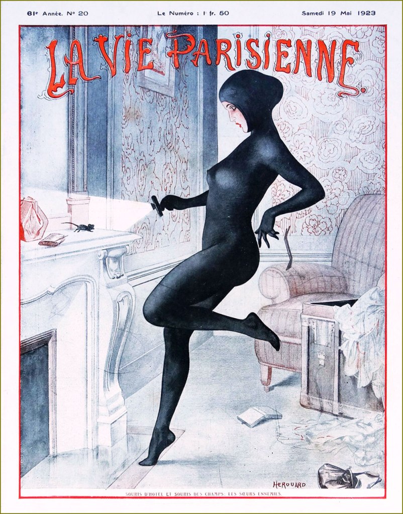
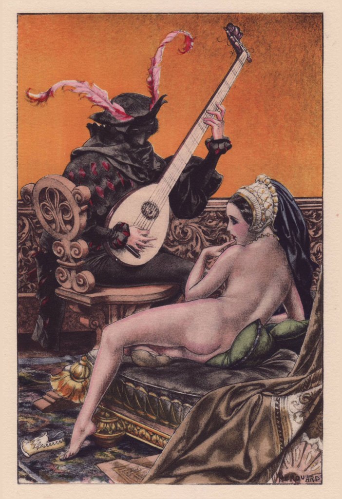
French cartoonist-illustrator Chéri Hérouard, né Chéri-Louis-Marie-Aimé Haumé (1881-1961) is mostly renowned for his lengthy and fruitful (1910-1940) association with the ‘mildly risqué’ weekly La Vie parisienne. It is said that « During World War I, General Pershing personally warned American servicemen against purchasing the magazine, which boosted its popularity in the United States. » There always was — and let’s hope there always shall be! — considerable difference between the French and American mindsets.
« The Nightmare of Coal », Hérouard’s cover for La vie parisienne’s November 1st, 1919 edition. For those interested, there’s a classy hardcover collection entitled La vie parisienne: Covers & Cartoons 1917-1922 (Dover/Calla Editions, 2018). The art restoration is flawlessly executed and the translation is often hilariously botched. La vie parisienne’s May 19, 1923 issue. « The hotel mouse and the field mouse: enemy sisters ». A ‘souris d’hôtel’ was a thief that plied her trade in chic hotels. A cat burglar of a sort. This sleekly sexy look is clearly based on Musidora‘s legendary turn as Irma Vep in pioneering cinéaste Louis Feuillade‘s epic 1915 serial Les Vampires.
Like many of the best and most free-spirited cartoonists, Hérouard illustrated books and magazines aimed at both innocent and decidedly roué readerships…
To wit, Hérouard produced sixty-four illustrations for a four-volume set of ribald historical tales entitled L’Heptaméron des Nouvelles de la Reine de Navarre — which is to say Marguerite de Navarre (1492–1549) — in a rather exclusive print run of 1540 copies (Javal et Bourdeaux, Paris, 1932). It was quite a challenge to pick just a handful. If you want them all, here’s a copy for sale… while it lasts!
.
Even with a limited colour palette, Hérouard was a master of light and shadow.
.
.
.
.
.
Admire the depth of field in this image… so many planes, and yet it never feels cluttered. That’s composition (among other things).
In addition to the book, hand-coloured engravings of the illustrations were produced in a run of five hundred. I recently acquired my very favourite of the lot, and the kind seller graciously included an uncoloured version for comparison. And so, before:
… and after!
Some background on the technique of stencil colouring: the stencil is created using a zinc sheet one-tenth of a millimetre thick. Using a very sharp metal blade, previously traced openings are cut into the zinc sheet, according to the drawing and colour required. The stencil is then applied upon the printed proof (e.g. engraving, lithograph or phototype). For faithful reproduction, the necessary number of stencils must be traced and cut (an average of fifteen to forty stencils, sometimes up to sixty for more delicate works). In the course of the tracing, one must determine the range of values of each colour, beginning with the lightest, and define with precision the shape and location of the gradations, keeping in mind the effects of superposition. For each stencil, the colour must be prepared, taking care to maintain its tonal intensity throughout the printing process. This colour — be it gouache, watercolour, India ink or wash — will be applied using a special round hog bristle brush. In the case of certain stencils, the colour will be softened after its application, mixed and blended using a small softening brush.
Oof! Given the immensity and delicateness of the task, it must be noted that the colourist in question was one ‘Jacomet’, presumably Daniel Jacomet (1894-1966). Bravo!
And finally, here’s a… striking quartet of sepia rotogravure etchings, which were discreetly sold as a set in the years just preceding the second world war. For these, Hérouard adopted the transparent pseudonym of ‘Herric’… but the style is unmistakable.
« After the horrors of 14-18, the healthy pleasures of peace. »
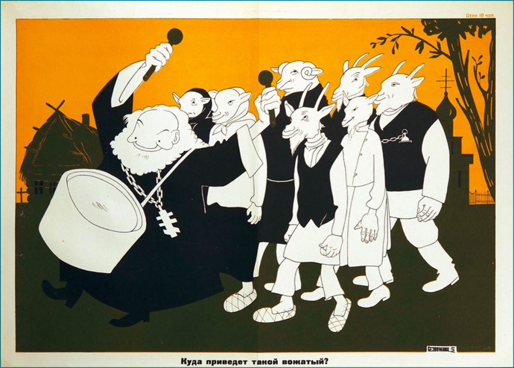
D. Moor may not ring like a convincingly Slavic name, but it is the nom de plume of Russian illustrator Dmitry Stakhievich Orlov(1883-1946). Why the D. abbreviation was picked is obvious; as for the family name, he plucked it from The Robbers, a 1781 play by German Friedrich Schiller about two brothers, one of whom Orlov thought he resembled in temperament.
Orlov adopted his pseudonym in 1907, when he switched careers from typography to political cartooning after one of his caricatures was printed in a newspaper. His biting sense of humour was not always well received by the Tsarist régime, and occasionally censored, which provoked the passionate Orlov into even more acerbic mockery. In these years he also designed posters for silent films, which in a way forecast his future as an affichiste. After the Russian Revolution of 1905, Orlov joined the ranks of those actively working in favour of an uprising; when in 1917 Russia fell into civil war that would lead to the formation of the USSR, D. Moor put to good use his aggressive anti-religious stance and talent for caricaturing politics.
‘Three Russian attractions: Tsar bell, Tsar cannon, and Tsar Nicholas. Tsar bell doesn’t ring, Tsar cannon doesn’t shoot, Tsar Nicholas doesn’t reign…’, 1917
Orlov’s poster for Убійца (1910)*
He was responsible for creating much in the way of striking agitprop, and is often cited as the father of the Soviet propaganda poster. His most famous poster** was not only aped by other illustrators during Orlov’s lifetime, but also acquired great popularity after the USSR fell apart***.
The Solemn Promise (1919)
Death to Global Imperialism (1919)
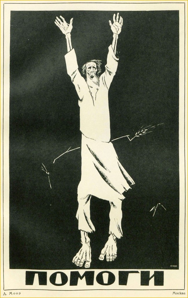
Help (1921). This is one of D. Moor’s most striking posters, and refers to those affected by the Povolzhye famine, which began in 1921 and lasted until 1922, killing an estimated six million people. Note the starving peasant being pierced by a single stalk of wheat.
I may be somewhat straining the definition of ‘comics’ by writing this post, yet some of D. Moor’s posters clearly feature linear graphic storytelling.
Labor (1920)
The White Guards and the Deserter (1919)
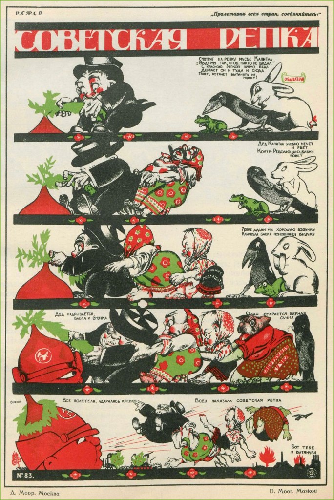
The Soviet Turnip (1920). This alludes to a classic fairytale in which a family is collectively trying to rip out a big turnip from the ground, even involving the help of the dog, the cat, and the mouse.
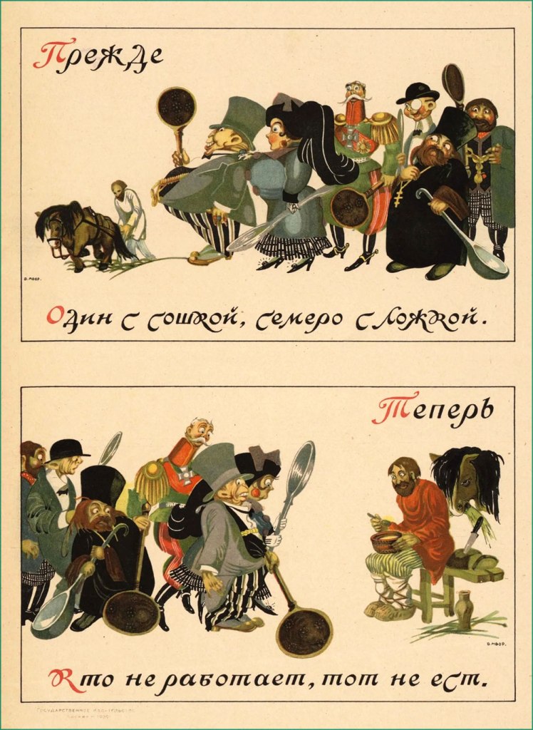
This uses two proverbs to make its point – under ‘Before’, ‘One with a plow, seven with a spoon’ and under ‘Now’, ‘The idle don’t get to eat’. (1920)
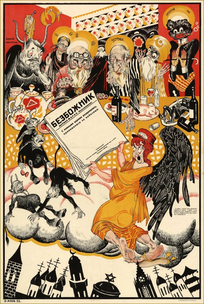
Alongside his active production of posters, D. Moor continued his career as a political caricaturist, publishing his anti-religious work in The Godless at the Workbench magazine (Безбожник у станка) — nice title, isn’t it? — and regularly contributing to various satirical magazines and communist newspapers, such as Pravda or Krokodil.
« We’re done with earthly kings, now comes the turn of heavenly ones », 1922
« Where will such a leader guide you? » (1930)
During World War II, Orlov of course supported anti-Nazi efforts (well, once Germany launched an invasion of the Soviet Union, at any rate).
1941. This is kind of untranslatable, but in Russian Hitler and Himmler are spelled with a hard ‘G’, not an H, leaving us with the quartet of Himmler, Göring, Hitler and Goebbels all starting with G… as well as the word for ‘shit’ (govno, говно).
Throughout his life Orlov also taught art at several institutions, and historical accounts indicate that he was a warm and talented teacher adored by his students. Did Orlov enthusiastically embrace the censorship-happy Soviet system, or was he just another artist trapped in a moment of history? I don’t have an answer for this, as one gets a very different perspective depending on which biography one consults and in which language – some emphasise his fervour for Soviet labour, and some philosophically note that he was anti-Soviet ‘like any self-respecting honest intellectual’.
You can take a look at more posters here, or head over here(perhaps with the help of google translate) to take a peek at caricatures poking (careful) fun at some Soviet figures.
~ ds
* An especially interesting thing for me was that his work spans the years of the orthographic reform in Russian. The reform was planned long before 1918 to combat the peasants’ illiteracy, so it wasn’t tied to the revolution per se, but since it came into effect in 1918, it was instilled by the Bolsheviks. The movie title, for example, is written with the letter ‘і’, which was kicked out of the alphabet.
** I am not including it for reasons of ubiquity, but take a look here.
*** Plenty of ex-Soviets feel an irresistible nostalgia about the USSR years, as if their memory can only conjure rose-coloured memories and erases everything unsavoury. The « Have you registered as a volunteer? » poster has been aped and parodied in social media.
These run the gamut from cheeky to raunchy to creepy, in the classic vein of ghosts for Christmas*. Speaking of Christmas, it may now be over, but the spirit of holiday cheer sure isn’t gone (despite the total absence of snow in these normally snow-covered lands of ours), so let’s have a look!
Some involve all sorts of hivernal mishaps —
The consequences of pre-holiday, er… cheer.
Some of the usual daydreams brought about by possibly too many spirits** —
— and the aforementioned ghosts, somehow especially startling when they’re born under McGill’s pen.
I’ve kept my absolute favourite for last: this revenant is so sad yet grotesque. I’d like to see the faces of people who got mailed this particular card!
~ ds
* As per another lovely tradition, we’ve recently been rewatching Christopher Lee’s Ghost Stories for Christmas. Highly recommended! Some are available on Youtube, like for example Number 13.
** As somebody who attended the Christmas office party this year, I can attest to the funny influence alcohol has on a bunch of normally restrained people when it comes to romantic advances.
« I can’t decide whether to give up peanut butter on account of its calories, or to eat it on account of its vitamines… »
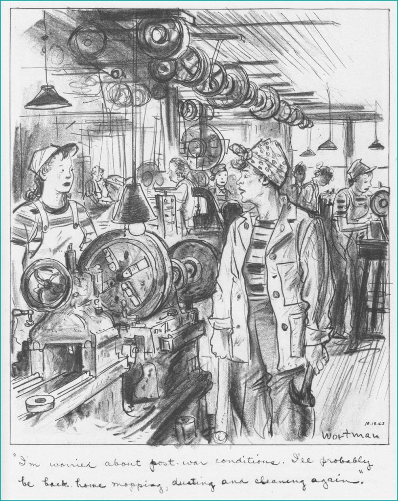
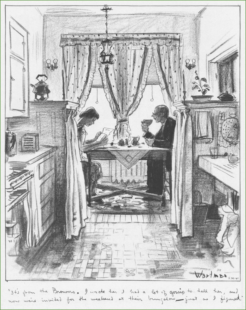
When it comes to what Amazon loosely classifies as ‘literary graphic novels’ (very much a meaningless category), it’s rare for me to stumble across something completely unfamiliar on a bookstore shelf, unless of course it’s something hot off the press. Denys Wortman’s New York: Portrait of the City in the 30s and 40s (Drawn & Quarterly*, 2010), which I spotted in the well-stocked The Comic Hunter (Moncton, Canada), looked unfamiliar and intriguing.
The edition I purchased is from 2010; I wasn’t able to find out when this one, with an arguably more striking cover, was published. This illustration had the caption of ‘If I have to come down to buy them, you’ll have to come down on your prices’, and was drawn on August 30th, 1948.
I’d never heard of Wortman, but just a quick skim through this volume showed that he clearly had an amazing ability to evoke a certain place and time, and fill it up with characters so real that one wouldn’t be surprised to run into them on the street. Nostalgia for a place one never experienced is a recurring feature of the human mind – Wortman’s New York is one I am familiar with from books and movies, and that faded away long before I was born. One would also be remiss in failing to express admiration for DW’s living, breathing linework. His attention to the minutest details are used to recreate scenes from lives of people who certainly didn’t have an easy time of it, yet still inspire a sort of familiar comfort almost a hundred years later.
To get some bibliographical stuff out of the way (for a full story, I shall direct you to the website maintained by Wortman’s eighth son), Denys Wortman was born in 1887 and died in 1958 at 71. Among other things, he also drew Metropolitan Movies, a comic strip that ran between 1924 and 1954 and is mostly remembered (if that’s the right term here) for two of its characters, a couple of cheerful vagrants named Mopey Dick and the Duke.
It was a tad difficult to decide which pages to feature, so I tried to go for a variety of scenery. Wortman must have been a Gerald Kersh character to possess such an intimate knowledge of all these industries, markets, streets, and types of human beings… I invite you to a bit of time travel.
« In art school days there was much talk about “character,” but I feel there was a small amount of misapprehension mixed up with its interpretation. I could not see then and I can’t now why a man with a lot of whiskers has any more character than one who is clean-shaven. Nevertheless I would prefer to draw the former. And I would prefer to draw him after he has lived long enough for Experience to have etched lines in his face — the more the better. Because the more lines and markings he has in his face the more chance I have of finding ones that I can match with lines on my paper to help create the illusion that the face I am drawing has bones under the skin, that the eyes are seeing things, that the mouth is speaking, and that the man has a soul. »
It must be mentioned that these drawings have been rescued from the mists of forgetful time by WOT favourite James Sturm (see Free Inside Package: James Sturm’s The Cereal Killings (1992-95)), who hunted down Wortman’s son and his astonishingly large, apparently languishing archive of his dad’s illustrations.
I’ll end this with a great quote from the foreword to Denys Wortman’s New York, written by Robert W. Snyder —
« You can still see traces of Wortman’s New York in crowded Manhattan side streets, spirited New Deal Murals, and soaring skyscrapers**. Harder to find are the feelings and lived memories of this place. The sailors and their sweethearts who strolled the boardwalks of Coney Island are now, in their eighties, a fading presence. To understand them, and how they lived in a city that inspired hope and fear, idealism and wisecracks, solidarity and individuality, there is no better place to look than a Denys Wortman cartoon. »
~ ds
* I tend to not like what D&Q publishes, but this is another pleasant exception to the rule (here’s the original exception).
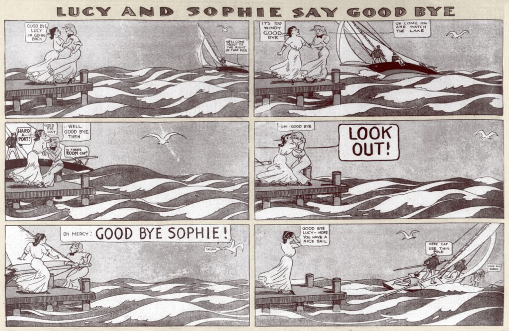
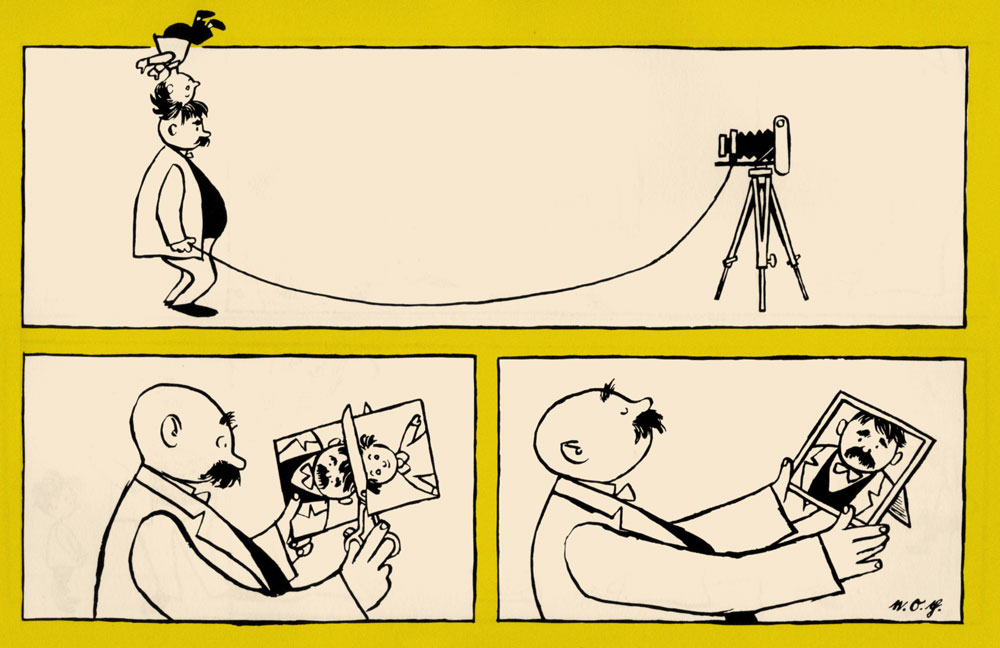
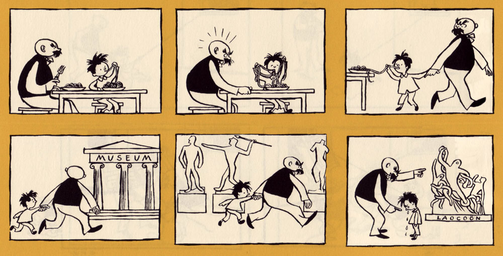
I hesitated about doing a post about Lucy and Sophie Say Good Bye because it seemed too obvious. Then I thought, obvious to whom? Surely a comic from 1905 can’t be all that widely recognized, a century hence. Besides, there’s a cool little bonus: the mystery surrounding the artist of this strip.
Some think that this mystery has been solved. Case in point, in 2021, the intrepid Eddie Campbell and Ron Evry of Mister Ron’s Basement made great use of their eagle eyes and spotted the similarity between Lucy and Sophie Say Goodbye and Cholly Cashcaller, both strips running almost concurrently in The Chicago Tribune. When Campbell pinged Barnacle Press, its sleuthing team (after some tracking down signatures, styles, and historical details) decided that the heretofore anonymous author was Robert James Campbell (1873-1938)*. Read the story here.
Chapter closed? Not quite. Kevin Cooley argues (and quite persuasively**) that this was a hasty and incorrect assumption, and that the artist is actually George O. Frink (1874? – 1932). Given that people far more erudite than I have spent years studying this topic, I’m resolutely staying away from having an opinion on the subject, but it’s all rather fascinating. Suffice it to say that Cooley has written a highly perceptive analysis of this strip and I highly recommend reading it (here)…. but that I tend to trust Campbell’s judgment, given that he’s not only an excellent cartoonist, but also a comics historian.
Has this strip gained traction and garnered interest in recent years because lay people (as opposed to comic historians) are titillated by the idea of two women kissing in a newspaper strip from the very early 20th century? That goes without saying. Yet this historical importance doesn’t take anything away from the art or humour of this strip. Besides, most people will be able to relate to the feeling of being s̶o̶ ̶i̶n̶ ̶l̶o̶v̶e̶ such close friends that the outside world fades into nonsignificance, even as horses collide, waves crash, and a crowd gathers.
I picked some of my favourites, but you can see more of these over at Barnacle Press.
*
**
*
*
*
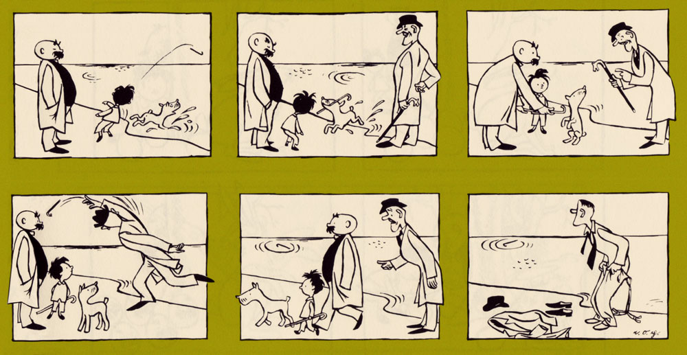
As you may have noticed, Lucy is often bodily torn away from her companion by some passing contraption, be it a boat or a montgolfière . As mentioned earlier, Cooley wrote a detailed analysis on the subject, from which I will now quote:
« Lucy and Sophie’s fears are not in vain. One of these threats is ultimately carried out, and it cannot be dodged, ignored, or avoided. In the strip’s final installment on October 15th, 1905, the lovers are carted off by sinister mustachioed men in brown trench coats. “Say we got two crazy ones send the wagon,” says one. The women are wrestled into separate streetcars and held apart as they say their final goodbye. A young man in typical newsboy hat, papers and bell tucked under his arm, says “Gee dats der finish.” »
~ ds
* I don’t know how many Campbells are running around this world, but presumably quite a few.
** Speaking of being persuasive, I’d be remiss in not including part of Campbell’s rebuttal, at least in part — read the full thing in the comments section of The Lucy and Sophie Cartoonist – Another Look (Updated with Part Two – A George Frink Profile). Co-admin RG (himself a cartoonist) has often argued that artists have a different, deeper perception of other artists (as compared to those not at all versed in the craft/art of comics), enabling them to recognize someone’s style, even if it’s, say, subtle pencils buried under someone else’s forceful inking. Campbell’s point is similar, I think.
« I’ve been thinking about this strange affair today and it occurs to me now that K. Cooley doesn’t understand that there are some who are well versed in the study of cartoon art who can recognize an artist’s voice, or personality, by looking at a comic, the way one recognizes a friend’s voice on the telephone. Being told a more or less persuasive story doesn’t change the situation that the Frink comic he shows, with its depth of field and crackly angles and energy, all typical of Frink, is incompatible with the balloony lines and easy-going patterns of the Lucy and Sophie compositions. There are two distinct artistic personalities at work, one of whom is Frink and the other of whom shares a multitude of qualities with Robert Campbell, who drew many pretty ladies adorning the Sunday magazine pages of the same issues of the newspaper, all of whom had a tendency to look exactly like Lucy and Sophie. “One” does not ascribe works according to artists’ complicated backstories, or at least not until the primary issue of the looks of things have been analyzed. »
Today’s featured strip was once immensely popular in its native Germany, but who now remembers the name of Erich Ohser (1903 – 1944) or his nom de plumeE. O. Plauen*? Sic transit gloria mundi, alas.
Cartoonist and illustrator Ohser belonged to a set of three Erichs, the other two being Erich Kästner, a satirist and journalist, and Erich Knauf, a newspaper editor and poet. The three met in Leipzig and found in each other sympathetic souls with a common aesthetic and worldview. The Erich trifecta moved to Berlin at the end of the 1920s, where Knauf became the editor of publishing house Büchergilde Gutenberg, which published Ohser’s cartoons and illustrations as well as volumes of Kästner’s poetry.
All Erichs were ardently opposed to the emerging scourge of Nazis, but Ohser’s caricatures were particularly biting and ‘depicted [HItler and Goebbels]’ cohorts as gangs of dull-witted thugs, employing all the weapons of caricature: exaggeration and distortion, one-sided emphasis and intentional grotesquerie‘**. When Hitler came to power in 1933, Ohser’s work opportunities dried up completely as he was not admitted to the Reich Chamber of Culture, which meant that he couldn’t work at all. Fortunately, the editor of Berliner Illustrirte Zeitung finagled a special permission from the Ministry of Propaganda – Ohser could continue working, as long as he used a pseudonym and stayed firmly away from political material. Such was the birth, in 1934, of the weekly strip Vater und Sohn and the sobriquet ‘e.o.p.’, later expanded more officially to E. O. Plauen.
Ohser and his son Christian, who was surely an inspiration for the strip.
Father and Son won Ohser public acclaim, as well as financial success, but also many copycats and some inevitable appropriation – to Ohser’s chagrin, the strip’s characters were used to advertise Nazi charity drives and political events. Ohser ended the strip in 1937, probably because he felt that his creation was being misused by other hands, but he continued to work on cartoons and illustrations under the same pseudonym. He also had to put his talent at the service of the reviled enemy to survive, producing caricatures of anti-Nazi figures such as Churchill and Roosevelt for Nazi weekly newspaper Das Reich.
«‘I draw against the Allies – and not for the National Socialists’: This is how Ohser justified his disturbing caricatures of the 1940s to a friend of his, the writer Hans Fallada. He drew Russia as a murderous bear beast, America as a greasy, greedy capitalist, England as a bloodthirsty colonial ruler – it’s hard to believe that the same man gave the world the touching ‘Father and Son’ picture stories. » [source]
This uncomfortable position of living a sort of double life screeched to a halt when Ohser and Knauf were arrested in 1944 after being denounced by their roommate for anti-Nazi sentiment. Ohser committed suicide in his cell the night before the hearing. Knauf was killed a month later after being sentenced to execution by the court.
There are a few collections in various languages drifting about, but the definitive English-language one was published in 2017 by New York Review Comics. Here are a few excerpts from the latter, lovingly colorised (as is often the case around here) by co-admin RG. I also limited my selections to one-pagers, which leaves out (for example) the pleasantly surreal episode spanning many weeks when Father and Son get stranded on a desert island.
« Resemblance ».Ohser and his son Christian were regulars at the Berlin Zoo, which is reflected in a lot of strips, as is Ohser’s clear love and respect for animals.
« Nicely cropped»
« Unsuccessful overture »
« Too bad!»
« Cautionary example »
« A letter from the fishes »
« The birthday surprise »
« Trading sobs »
« Occupation: inventor »
Ohser’s son Christian holding a collection of Father and Son strips.
~ ds
*Plauen is the name of the town where Ohser grew up.
** From the afterword to Vater und Sohn (2015) by Elke Schulze, translated to English.
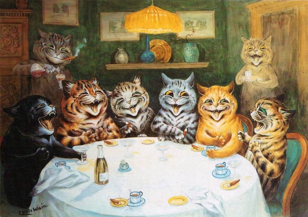
« He made the cat his own. He invented a cat style, a cat society, a whole cat world. British cats that do not look and live like Louis Wain cats are ashamed of themselves.» — H. G Wells
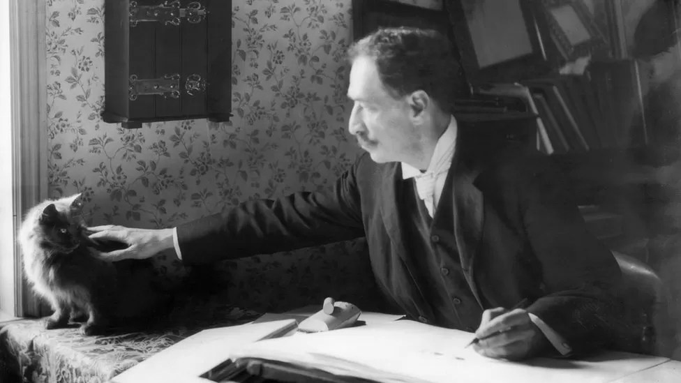
British artist Louis William Wain (1860-1939) had one of those lives that capture one’s imagination* – from a sensitive child born with a facial defect (a cleft lip) and prone to terrifying nightmares, to a youth that would wander around London instead of attending classes, to ultimately a man committed to the pauper ward of a mental asylum. Along the way, he married a lower-class woman ten years his senior despite the scandal this caused, lost her three years later to breast cancer, and produced thousands of cat drawings and paintings.
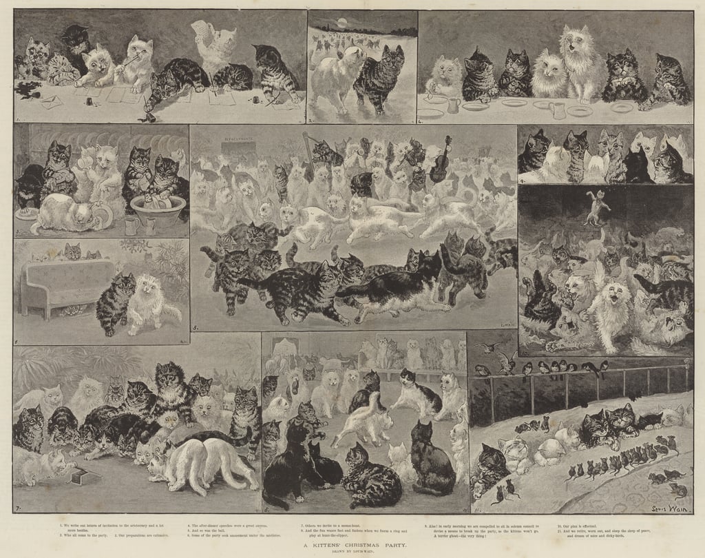
Wain started out as a illustrator of country scenes, houses and estates, livestock at shows, and so on, for publications like Illustrated Sporting, Dramatic News, and The Illustrated London News. His wife’s Emily’s health decline gave Wain the push into feline territory, as he consoled her with caricatures of their cat Peter during her illness. Emily pushed him to try and get this work published, so he showed some drawings to the editor of The Illustrated London News, for which he was freelancing. He was commissioned to paint A Kittens’ Christmas Party, which featured 150 frolicking kittens, took 11 days to finish, and was an instant hit. Emily died soon after in 1887.
Some sources say 200 kittens, I didn’t count them.
Source diverge – according to some, in his grief, Wain threw himself heart and soul into cats and animals in general – he was involved in animal charities and championed a better treatment for animals, including fighting against the routine muzzling of dogs. In another version, he Emily’s death was a ‘merciful release’ and threw himself into work, ended up being considered a ‘cat expert’ just because he drew so many of them (and had distinctly outlandish ideas of their physiology). This can be said of much of Wain’s life, actually – the basic facts are known, but interpretations of the whys and hows vary wildly.
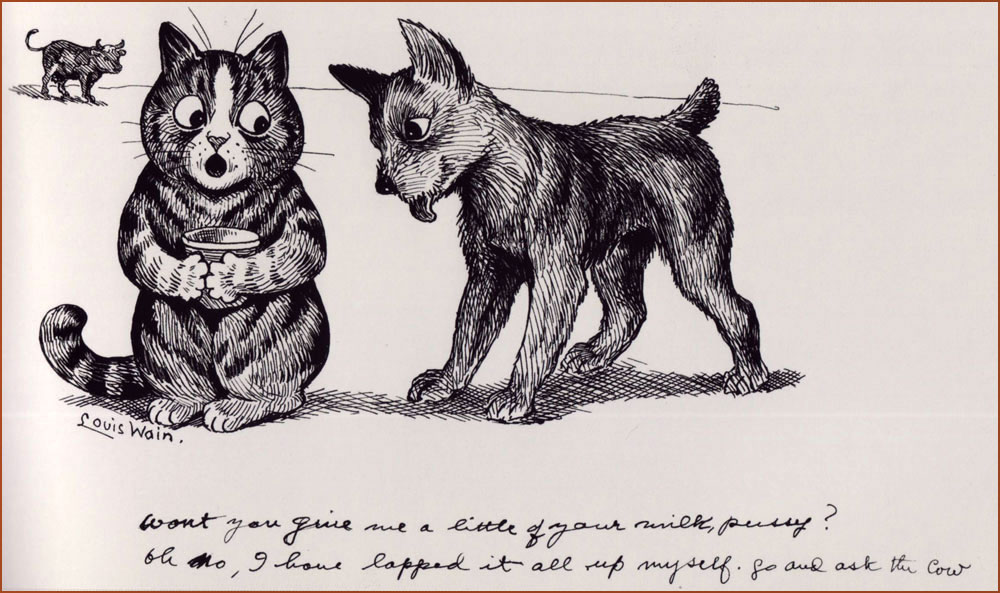
His first cat Peter was black-and-white with a white forehead, and his prototype often appeared in illustrations.
It goes without saying that Wain doubtlessly influenced generations of future artists. These days art with anthropomorphized felines is quite a humdrum sighting, given how much our current culture is obsessed with cats. In this context, it may be hard to recall that several centuries ago people often thought of cats from a practical standpoint, as somewhat filthy-yet-useful vermin-destroyers. This began to change during the Victorian era, and surely Wain’s cats, omnipresent in newspapers and magazines, accelerated this shift in thinking.**
Wain was an immensely prolific artist, but sadly that did not guarantee him a peaceful and wealthy life. When he was 20, his father died, leaving Wain to financially support his mother and sisters, so he had a heavy burden to bear from a young age. By all accounts a modest man, he was quite naïve about financial matters, a walking demonstration of the financially inept artist stereotype***. He often gave his art away, or sold it without retaining copyright, which meant no royalties despite all sorts of merchandise with his cats – postcards, books, toys, biscuit tins, china, et j’en passe. His work was so ubiquitous at some point that publishers did not need to pay him for new material, they could just go on reprinting in perpetuity with nothing but financial gain to themselves while Wain got further into debt.
These cats are obviously cute, but I think what makes them interesting is that Wain would satirize what he saw around him. He might have been an impractical dreamer, but he had a keen eye for human flaws.
He also produced a series of designs for ceramic cats (and some pigs and dogs as well). These sculptures were exhibited in 1914, but did not result in significant sales. A shipment of cats headed for the United States was taken down by a German U-boat torpedo, and that was it – Wain’s financial investment was lost.
« By the time the war broke in 1914, Wain found himself struggling to find a market amid the wartime paper shortage. By the 1920s, he was in poverty. His depression continued, and his mental health deteriorated. Often known to strike out in violent and erratic ways, he was eventually committed to the pauper ward of London’s Springfield Mental Hospital in 1924. »
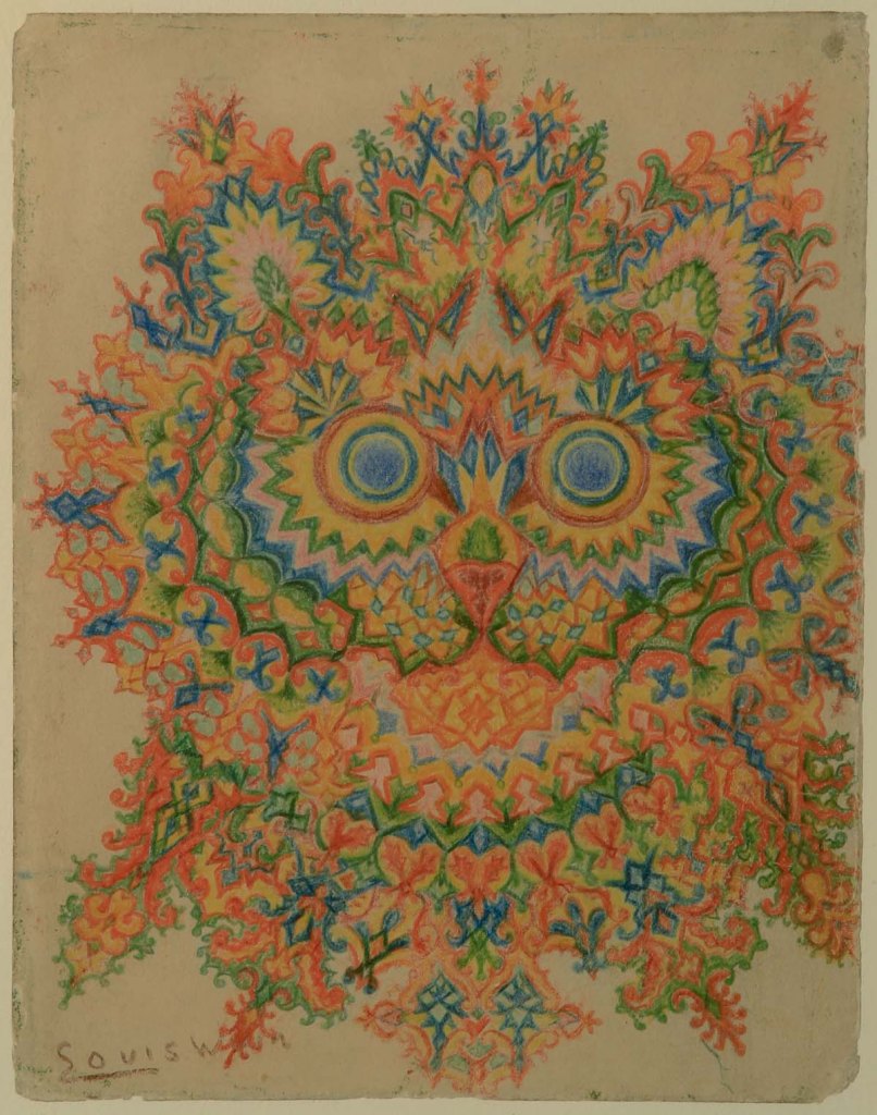
A lot of articles about him focus on mental issues. Did his wife’s death push him into some form of dementia? Was it just hereditary (one of his sisters was committed when he was 30)? Was he autistic? Was he schizophrenic? The former is a more modern view, whereas the latter theory was proposed by psychiatrist Dr. Walter Maclay in 1939 and stuck when he made a whole case out of it.
«Maclay collected the work of artists suffering with mental illness and in 1939 he came across eight pictures by Louis Wain in a shop, which he arranged in an assumed chronological order to demonstrate the progression of the schizophrenic mind. His theory was that as the sequence of cat illustrations became more fragmented, so too had the artist’s mental state deteriorated. […] The series of drawings, now known as ‘Kaleidoscope Cats’, became a popular visual example of the schizophrenic mind. Long gone was the Edwardian interpretation of Wain’s work as ‘charming’ and ‘humorous’. Instead, his art was often presented as ‘psychotic’ or ‘disturbed’, both words used in a major exhibition at the Victoria & Albert Museum in 1972.» [source]
Perhaps it’s a modern perspective, but what on earth is ‘psychotic’ about this image?His later work, colourful and somewhat surreal, has been identified by some as an important precursor to psychedelic art.
I think it’s quite depressing to think of Louis Wain first and foremost as an interesting case of mental illness. While it’s an important topic to address, it’s hard not to interpret this emphasis as a side-effect of the human tendency to bask in someone else’s tragedy – we’re avid of gory details and stories that support the general consensus that artists are tortured souls fighting inner demons. Perhaps that’s what reassures ‘normal’ people – we may not be brilliant or creative, but at least we have a healthy psyche! Except that we don’t, but that’s a conversation for another day.
«It is also highly possible that his experimentation in style was inspired by the family’s background in textile design. […] Indeed, these later kaleidoscopic cat patterns were often constructed around a clear grid system, revealing them as careful compositions rather than the product of impulsiveness coming from someone who is gradually losing his perceptive skills. Additionally, some of Wain’s later work was figurative and proves that he continued to be an accomplished and coherent artist whilst in a mental health care setting.» [source]
In 1930, Wain was transferred to Napsbury, which had a colony of cats, and stayed there fairly peacefully until his death in 1939. I hope he’s surrounded by friendly cats, wherever he may be now.
~ ds
* As a matter of fact, a movie about his life, The Electrical Life of Louis, was released in 2021 .
** I am obviously not saying that Wain introduced anthropomorphism to art, as that has been around since the days of early human history, but he did make a large dent in the public’s perception of cats.
*** Such skills have to be taught, as artistic temperament need not necessarily go hand-in-hand the inability to handle everyday matters such as finance, but add that to the list of ‘things we should do as a society’.
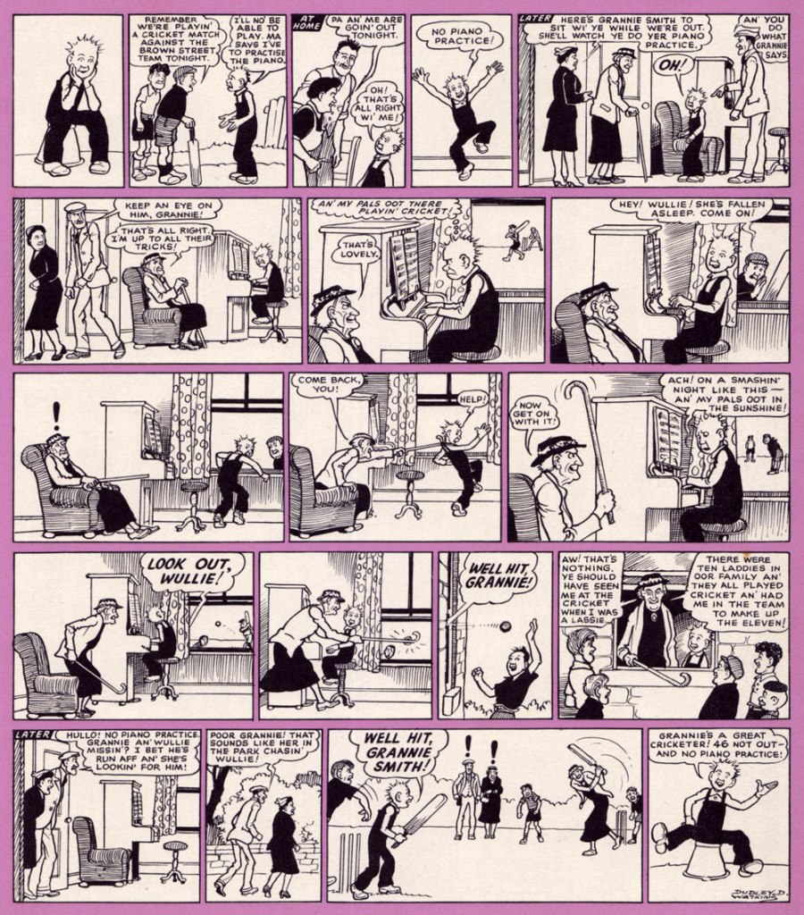
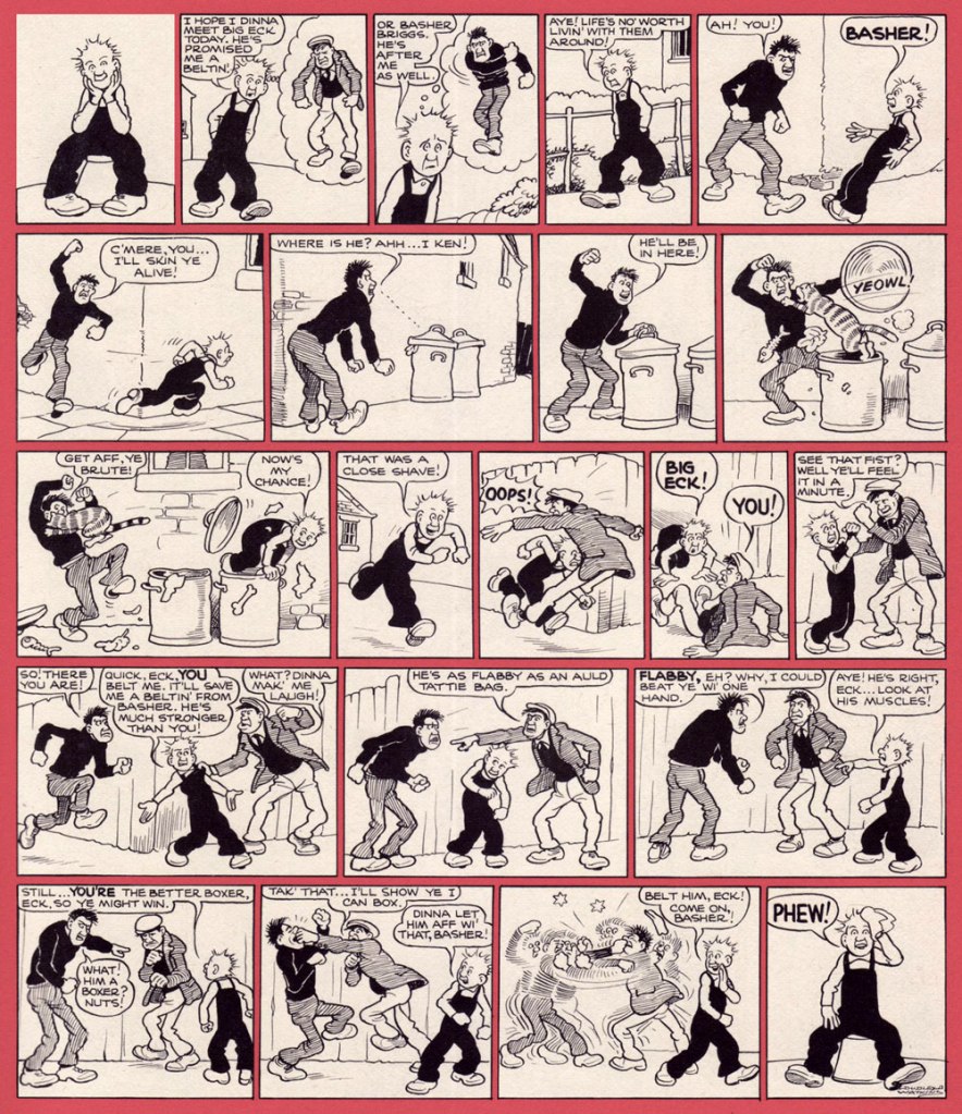
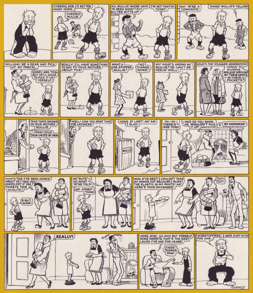
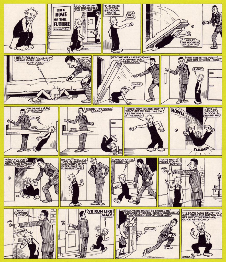
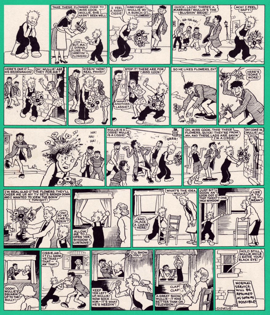
See the janny? See ma granny? Ma granny hit um wi a sanny then she timmed the bucket owerum an he tummelt doon the sterr an he landed in the dunny wi the baikie in his herr.*
The home of Scottish strip Oor Wullie is The Sunday Post, distributed by D.C Thomson (publishers of, notably, The Beano and The Dandy). You may note that I used the present tense – this strip was brought into the world in 1936, but astonishingly it’s still going strong (it celebrated its 80th anniversary in 2016, to give a quick idea to those who prefer not to launch into mathematical cogitations). It has, through the years, gone through a number of different hands, but it was originally created by comics writer and editor Robert Duncan Low and drawn by cartoonist Dudley Dexter Watkins, who died very much in the cartooning saddle in 1969. His work was reprinted for a bit, until new blood could be found to take over, first in the shape of Tom Lavery (who was told to imitate Watkins’ style), then followed by a bevy of other cartoonists since then.
The Low & Watkins duo also came up with The Broons, which started the same year and ran in The Sunday Post as well, to the point where the strips were often collectively referred to as Broons & Oor Wullie. There’s a lovely documentary about The Broonshere.
Reading Oor Wullie is loads of fun, and a big part of that is its use of Scottish slang – not so much of it that action is obscured, but enough for plenty of colour and also the opportunity to pick up some new vocabulary. Did you know that ‘oxter‘ means ‘armpit‘, for example?
« […] the use of the dialect reflected the publisher D. C. Thomson’s ‘realist’ editorial policy and focus on authenticity. It was intended to attract a large Scottish urban audience and in this was really successful. Both strips were massive hits and at their peak had an estimated readership of three million (79% of the adult population of Scotland!)
One of the most interesting aspects of Oor Wullie and The Broons is that for most Scots they were/are the only mainstream, regularly available written representation of their spoken language. In being this they have an increased relevance within the current Scottish language revival. The National Library of Scotland is even using Oor Wullie as a means to introduce and engage children in the richness of the lexicon. It has a website that’s ‘a guid fun wey tae lairn oor language‘. »
Wullie (or William) is a pretty standard boy prototype: prone to mischief and frequently embroiled in neighbourhood fights, embarrassed when his mam dresses him in nice clothing, but basically an honest lad with his heart in the right place. In that sense, he reminds me of Sluggo. You may note that every page starts and ends with Wullie sitting on his favourite bucket – every boy needs a good friend!
The following strips have been scanned from a 1976 collection, ‘selected from the Sunday Post and earlier Oor Wullie books‘. The artist is the aforementioned Dudley Watkins (which I can confidently claim, as each page is signed – I also compared the art to some original Dudley art being sold online, and this conclusion seems legit).
To celebrate Our Wullie‘s 80th birthday in 2016, 86 statues of Wullie in different costumes were placed around Dundee for the Bucket Trail event (including Oor Bowie, a David Jones tribute). This was a great hit, and Wullie’s BIG Bucket Trail was launched in 2019, with around 200 statues installed all around Scotland. View them here, they’re really fun.
When one thinks that a Moscow-born Russian (that would be me) would be greatly enjoying a classic Scottish comic some decades later… the world works out in funny ways.