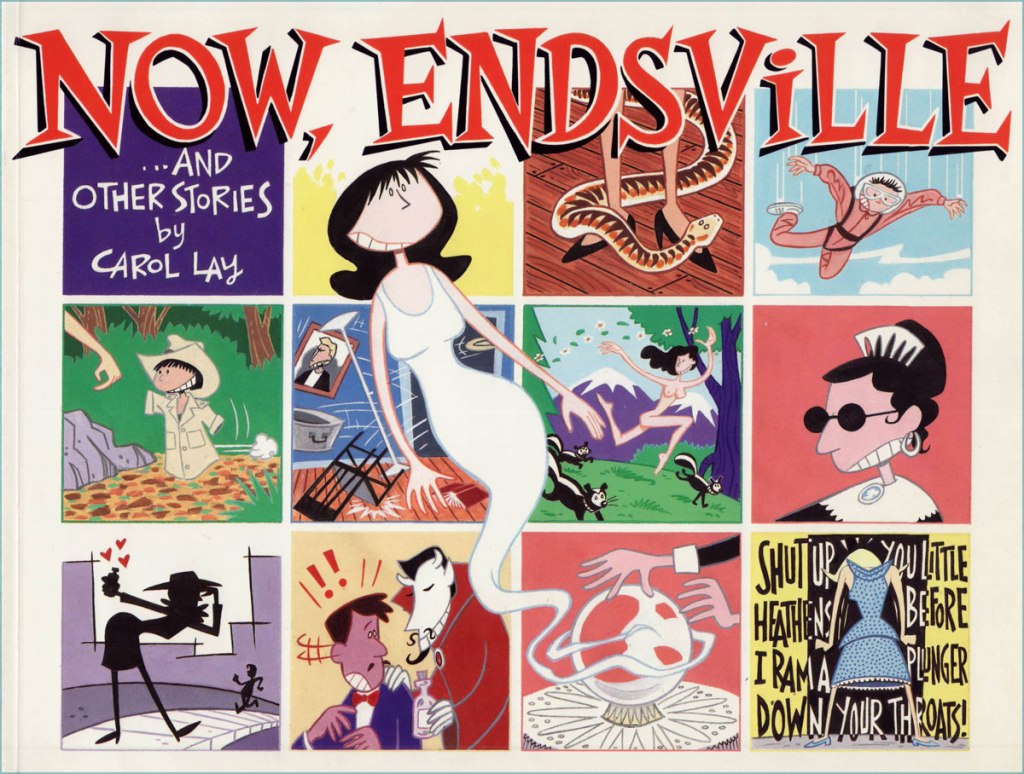
I talked about Carol Lay all the way back in 2017 (see The Giant Licking Machine), but did her a disservice by only featuring a single one of her Story Minutes. I am here to remedy that inadequacy.
In 1990, Lay drew a 5-page story for LA Weekly titled The Thing Under the Futon (read it here – the thing under the futon even has tentacles). « The pay was several times what independent comics paid and the audience was larger and included women », Lay quips on her website, so a one-time story planted the seed for a weekly comic strip called Story Minute, so named because it would just take you a minute to read a story (I might also add that it’s very difficult to stop at reading just one). That eventually was rechristened Way Lay and ran until 2008.
My introduction to the subject at hand.
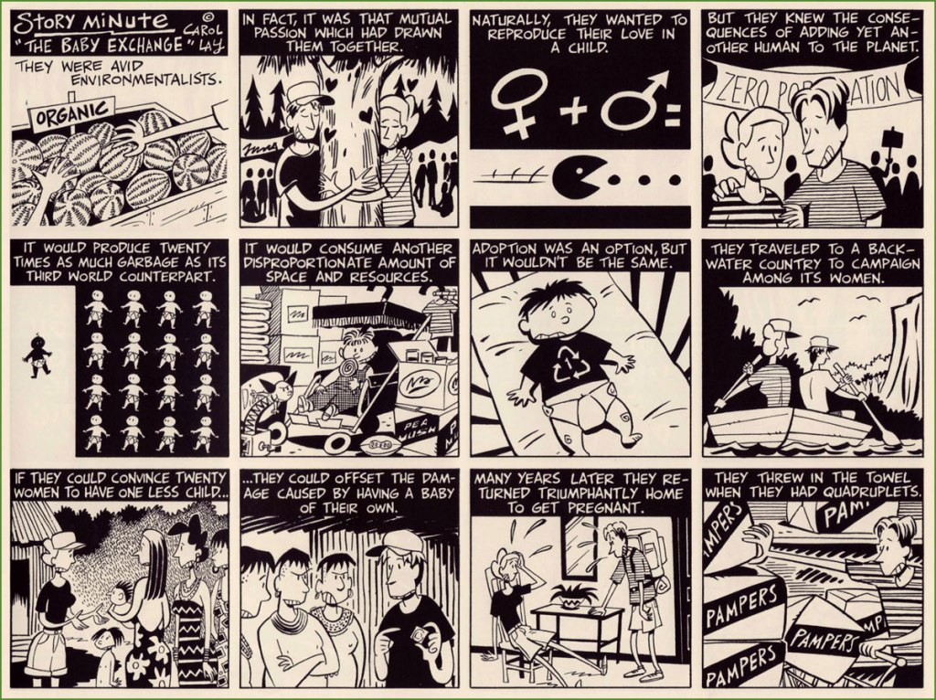
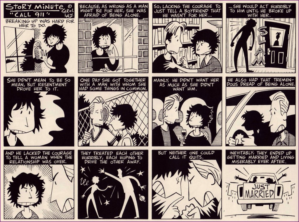
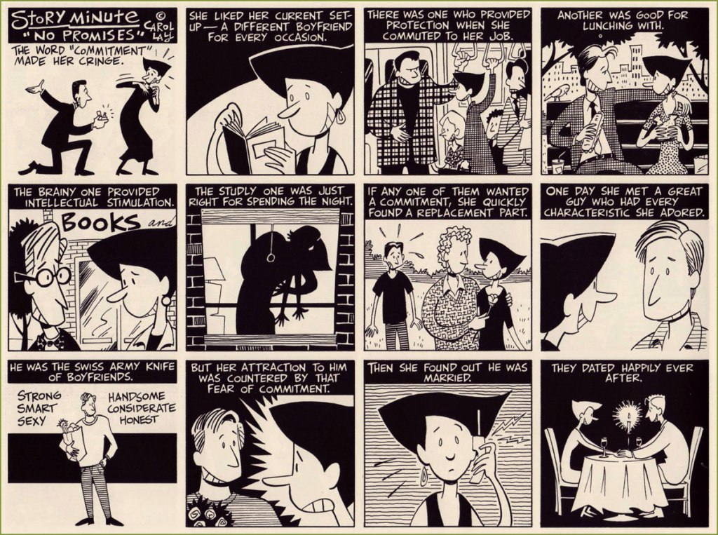
As I mentioned in the earlier post, the most recent collection of these is Illiterature, published in 2012, and it’s where the strips below have been selected from. Lay picks all kinds of topics as strip springboards, but since I am the one selecting the ones to feature, there’s a definite interpersonal tilt, as I think her forte is her ability to showcase the inner workings of a close relationship by plonking people into a slightly surreal or sci-fi context. The line between cynical and poignant is navigated with ease.
« I kept mostly to the order in which I produced the strips, but I took the liberty of tossing some clinkers or shuffling a few so that they flow better in book form… I also used my artistic license to improve on some of these older works – I’m a better writer and artist than I was when I created these strips… In a sense several of the strips in these volumes are ‘director’s cuts’ in that I’m a better director now than when I drew them. »
« Her surname, a familiar catchphrase of the time, was inspired by the inter-lyric expostulations of a nationally famous Paramount Pictures songbird, Helen Kane. ‘Boop Boo a Doop!’ was the chant she sang in her sweet, high-pitched voice, a flippant raspberry to the jazz age. Somehow these nonsense syllables seemed to embody the spirit of the waning days of the twenties… »
I think everybody knows Betty Boop, though probably not that many have seen the original cartoons from the 1930s. She was ‘created’ by Max Fleischer orchestrating a team of animators – as with any gestalt creation, one can argue about who was responsible for what until one is blue in the face, but it has been convincingly argued (by Bill Blackbeard, for example) that Grim Natwick was the actual creator, probably with a stable of other animators.
In 1930, Betty, then still nameless, made her first appearance in (the pleasantly weird) Dizzy Dishes as a supporting character, as a seductive canine anthropomorph with dog ears and human curves. She acquired more personality once she was matched up with Bimbo, another doggo, in Bimbo’s Initiation (1931) – which is an even stranger cartoon, a tale of hazing by a bunch of creatures with pulsating buttocks and candles on their heads pursuing Bimbo with chants of ‘wanna be a member? wanna be a member?’, to which Bimbo always responds ‘no!’ to get sent to yet another chamber of tortures. I would suggest not psychoanalysing that too closely. Watch for the grand WTF finale:
By 1932, Betty, who now had a stable position as Bimbo’s regular girlfriend and a name to call her own, had jettisoned her dog attributes, floppy dog ears quite seamlessly transformed into big hoop earrings. Though she was a’booping from the very beginning, she acquired her hallmark Boop surname with Betty Boop Limited (1932). The aforementioned Helen Kane* was not pleased, and there were, as Blackbeard explains in his introduction to Betty Boop’s Sunday Best: The Complete Color Comics, 1934-1936 (Kitchen Sink Press, 1995), ‘threats of lawsuits, various legal manœuvres, and demands for creator royalties, all without result‘.
In 1933, Hearst’ King Features Syndicate started negotiating terms for a Betty Boop comic strip, and in 1934 the strip, drawn by Bud Counihan, appeared. However, this was not exactly the same unhinged, hip-jiggling Betty of earlier years. King Features wanted to appeal to more conservative audiences, and Betty’s sexuality was toned down a notch. The animated Betty didn’t fare much better – as usual, guardians of Moral Purity™stuck their fingers in the pie, and from June 1934, the Motion Picture Production Code kicked into effect, forcing Betty to leave behind her carefree flapper days to become either a career girl, or some generic housewife.
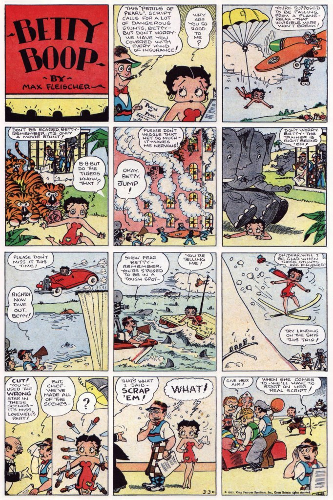
Oh, but there was still plenty fun to be had. Besides, the comic strip Betty was not quite as smothered – while the latter was nursing babies and whatnot in a long dress, the former was still running around in her risqué red number, occasionally even kissing men and living the life of a spoiled movie star. Here are a few Sunday strips – thanks for co-admin RG for scanning these unscannables.
Sunday strip from March 1935. Counihan’s tigers are consistently adorable.
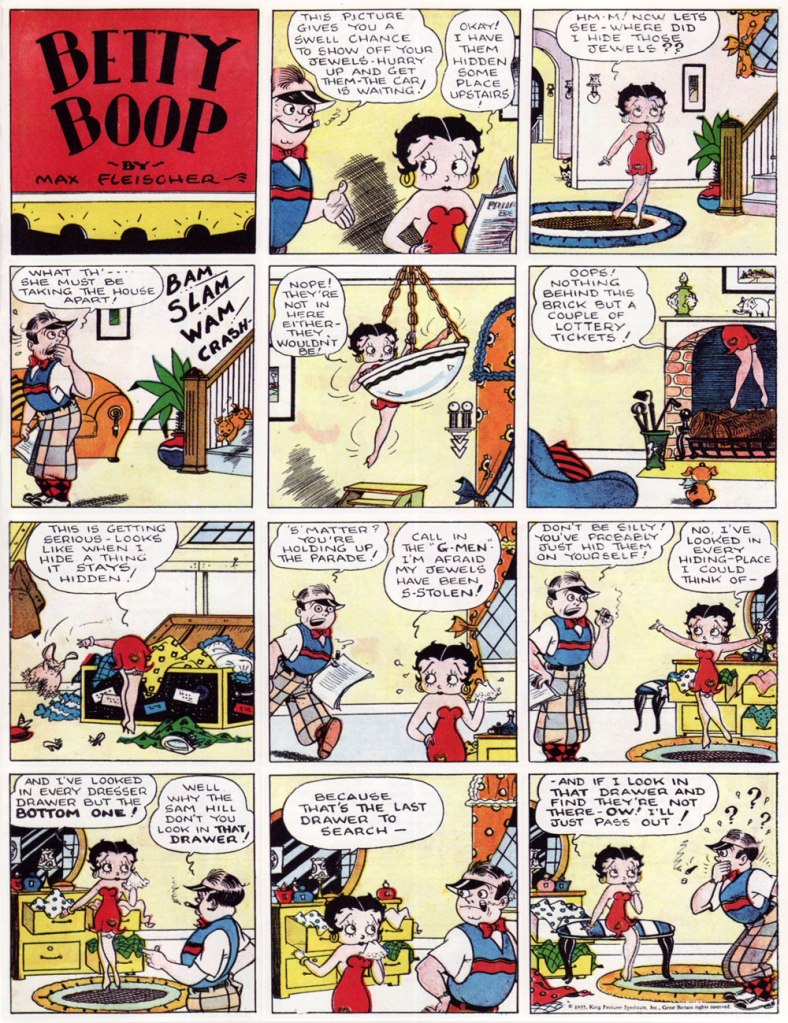
Sunday strip from 1935, and a few different perspectives on Betty’s legs and derrière.
Sunday strip from 1935. That’s a more fun version of a police line-up…
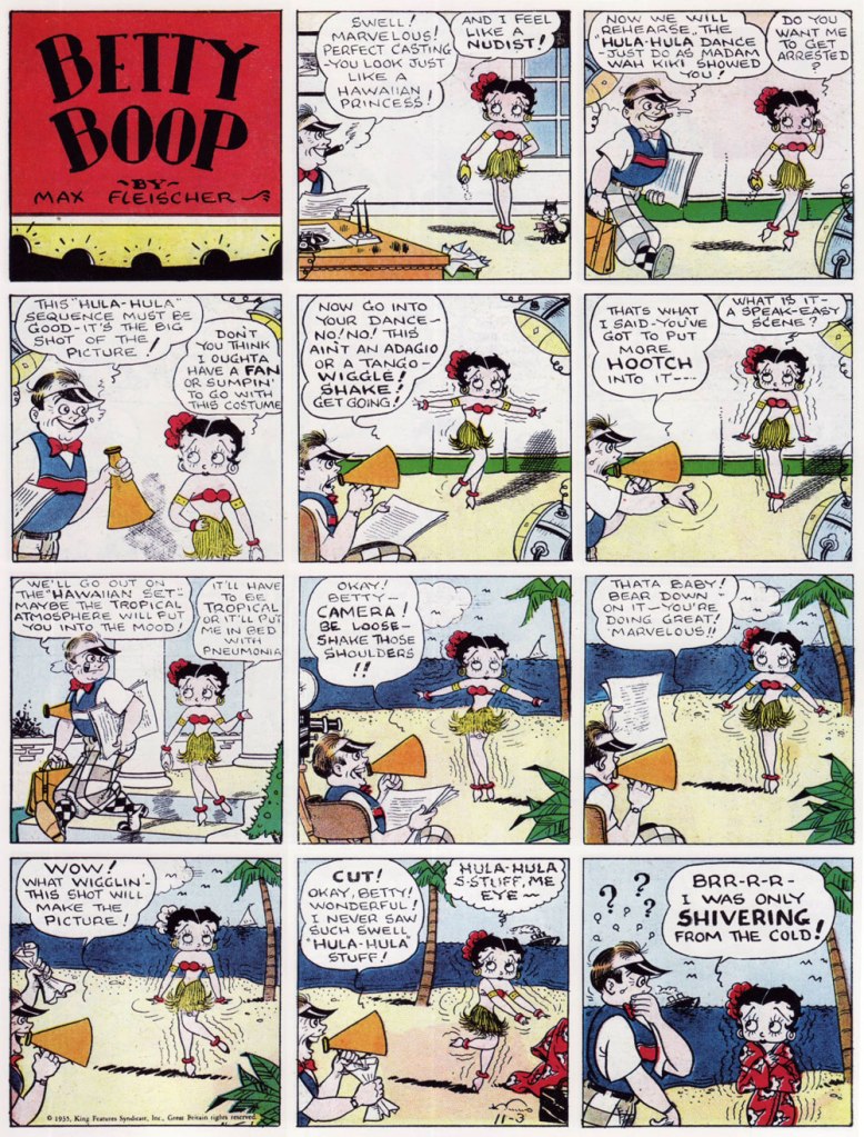
Sunday strip from 1935. Mentions of nudism come up more often than one would expect (and yet Betty is never particularly undressed, at least not by modern standards).
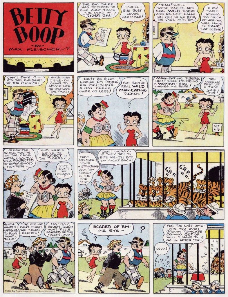
Sunday strip from 1936. In the later years, Betty’s indomitable aunt Tillie monopolized much of the action. She may have not had Betty’s sex appeal, but she was kind of fun to watch – a generous woman (also generous with her fists in cases of disagreement). Have I mentioned the tigers?
Blackthorne Publishing, known for their reprints of classic titles, issued three 72-page collections of Betty Boop reprints, comprising a mix of dailies and Sundays.
Blackthorne Comic-Strip Preserves nos. 1 and 2 (both published in January 1986). Covers by Bud Counihan.
There are a lot of modern conversations about the meaning of Betty Boop**. Was she but a sex symbol, bent to the lascivious male gaze that created her? Or perhaps an early example of a feminist icon, in control of her own sexuality? Her combination of innocence and feminine wiles actually reminds me of Sally the Sleuth (see Here Comes Sally the Sleuth… and There Goes Her Dress!), as Betty effortlessly runs around half naked, thwarting rape attempts without losing an ounce of her cheerfulness. These questions mostly address a pre-1934 Betty, as her identity in the public eye seems to have been formed in those few years of unhinged actions and symbolism… as well as BB merchandise in the 1980s, as she was rediscovered by makers of all manner of goods (note that it was still her sexier form that was used on cups, lamps, t-shirts, keychains, and whatever else you can think of).
From recent attempts to revive the character, Gisele Lagacé and Roger Langridge‘s comic series comes to mind – more as a traumatic experience rather than a pleasure, despite being hyped as ‘insanely entertaining‘. Langridge is a WOT favourite, but in this case even his script cannot save Lagacé’s insipid art (‘Lagace’s art is amazing. Her characters emote in ways I didn’t think two-dimensional cartoons could.’ says The Court of Nerds) or the flat colours by Maria Victoria Robado (who normally opts for colourful images, so I’m thinking that the drabness was imposed upon her by the artist). At least some of the covers of this 4-issue series were nice…
Betty Boop no. 4 (January 2017), cover by Roger Langridge.
« The autobiographical narrations by Cruse examining everything from Acid and UFOs, to TV punditry and death itself are priceless! So read on, and enjoy the work of a true master of wit, wisdom, and weirdess! And tell you friends to buy this book! It’s just a matter of time before all copies are seized and burned! For soon a cleansing will surely be upon us! » —Jay Lynch*
Alabama cartoonist Howard Cruse (1944-2019) is usually recognized as the author of Stuck Rubber Baby (1995), a serious graphic novel about a young gay man whose life gets swept up in the American Civil Rights Movement. It was lauded by many, some praising it for its ability to demonstrate that comics can appeal to adults (Harvey Pekar), some for its place in the comic book canon as the ‘Great American Graphic Novel’ (Justin Hall). I am not denying its historical importance, of course, but I am slightly allergic to this idea of the Important Work of Art™.
Once upon a time, my favourite Cruse material was Barefootz (more about further down), but that has changed over the years. My current treasured possession (gift of co-admin RG!) is Dancin’ Nekkid With the Angels (1987, Kitchen Sink Press), which collects some previously unpublished material as well as stories that appeared in various underground publications (Snarf, Bizarre Sex, Gay Comix, of which Cruse was a founding editor**, Dope Comix…) as well as in Village Voice, Heavy Metal, etc. The book was published in a print run limited to 1,082 copies, and strangely enough, some are still available for purchase here, a sad testament to Cruse’s relative lack of renown.
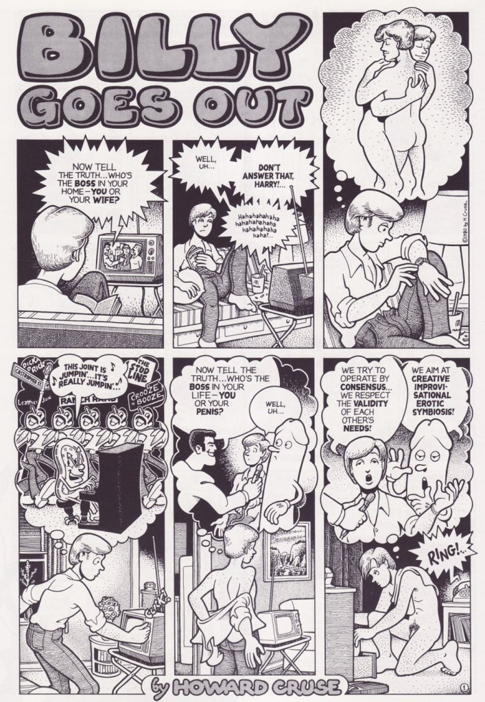
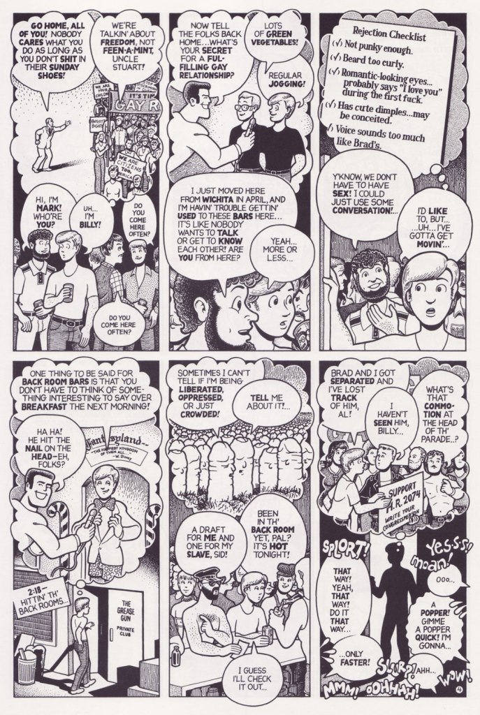
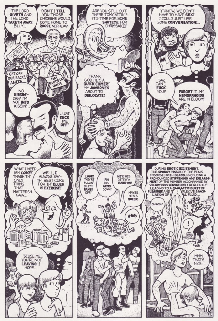
This anthology includes its share of my favourite Cruse pieces (to name a few, Unfinished Pictures, about an artist overstimulated by his own art; the absolutely brutal Creepy Snuff Porn, a satirical piece about the Meese commission of pornography; Dirty Old Lovers, featuring two older gays, Clark Stobber and Luke Tewba, prowling the streets in search of goofy, sexy fun), but the one that lingers most in memory, having sub-rented a permanent room in my brain, is the pitch-perfect, heart-breaking Billy Goes Out (1980), interestingly not even included in the best-of collection The Best Sides of Howard Cruise (2012, Boom Town). Here it is.
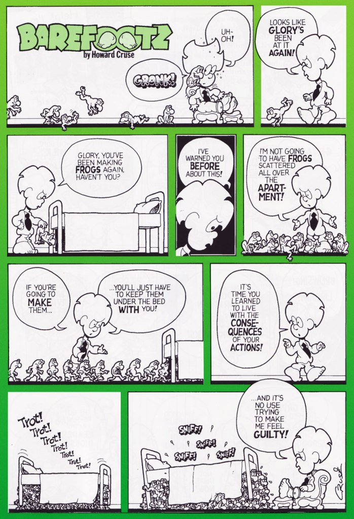
Since I mentioned it earlier, I’d also like to include two pages from Barefootz, a pleasantly surreal, somewhat drug-fueled strip. Its sense of humour is a gentle one, though it demands an ability to enjoy free-form association and controversial topics (death, abortion, cannibalism…), although the latter are inserted with such childlike enjoyment that I am hard-pressed to imagine somebody taking offense. The strip debuted in a university newspaper in 1971, migrating a year later to a few Denis Kitchen publications (Snarf, Commies from Mars, Marvel-packaged Comix Book), and then to its very own home, Barefootz Funnies.
« Compared to fellow underground comic creators, Cruse’s Barefootz character was easy to label “too cute” to be underground, and legend has it that Barefootz Funnies was widely despised by many artists from the era. Barefootz Funnies took an interesting journey from 1975 to 1979. When Barefootz debuted as a comic character in 1971, Cruse was still in the closet about being gay. Cruse later admitted the character was not the most representative of his own personality, since Barefootz wasn’t gay. But in Barefootz no. 2, Cruse revealed that Barefootz’s artist buddy Headrack was gay. This type of revelation ran counter to Barefootz’s reputation as being too cutesy to be part of the underground comic revolution. Cruse’s publicly emerging sexual orientation in real life was leading him to become more bold in his comics, which created ambivalence about the cartoony style and nature of the Barefootz character. Cruse finished the series with one final issue, which featured the cathartic “Barefootz Variations,” a story that summed up his mixed feelings about Barefootz and about cartooning itself. » [source at ComixJoint]
Barefootz himself is a man with inexplicably large and always bare feet, who lives with hundreds of cockroach roommates and a petulant under-the-bed monster called Gloria who coughs up frogs when she’s displeased.
This is Barefootz Funnies no. 2 (Apr. 1976, Kitchen Sink).
~ ds
* I don’t think I’m imagining the note of bitterness in Jay Lynch‘s voice when he says that ‘cleansing will surely be upon us‘; a cartoonist who has lived through the purges of the U.S. Supreme Court’s 1973 ruling on obscenity, followed by the aforementioned Meese Commission on pornography in 1986, which severely limited the retail outlets carrying underground comics and empowered humourless censors, surely has cause to be embittered.
** In 1979, Denis Kitchen asked Cruse to be an editor of an anthology featuring the work of gay comic artists. Although he hadn’t officially come out as gay at that point, Cruse decided that to refuse would be cowardly, and the first issue of Gay Comix was published in 1980.
« Hey, Look! is essential reading for any cartoonist. » — the late and much-missed Patrick Dean, who truly knew what he was talking about.
Sometimes I think of a post topic and dismiss it with a ‘nah, too obvious’… but on some of my brighter days, I run the idea past my wife, who provides a welcome reality check: ‘Obvious to whom?‘, she asks. Well, there’s been a collected edition… which has been out of print for most of the nearly thirty years since it hit the stands. Fair enough.
As I’ve been lately foraging through the crumbling back pages of Golden Age humour comics (see my previous post), it would be negligently immoral for me to pass over one of the crown jewels of the genre, the era and the medium.
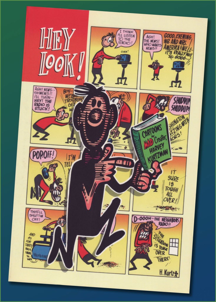
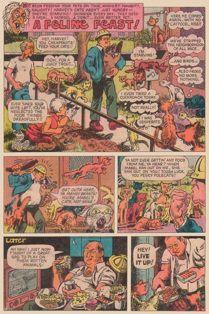
One* of the redeeming features of Marvel’s overwhelmingly crass Dynamite (magazine) rip-off, Pizzazz, was its reprinting of a handful of Harvey Kurtzman‘s majestic Hey Look! strips. Of course, it made perfect economic sense: grab some already (and barely)-paid-for, all-but-forgotten ‘filler’ from the 1940s, slap some new colour on ‘em, and wham! One less egg to fry.
Here’s the collection in question. Published in 1992 by the venerable Kitchen Sink Press, it has yet to be improved upon. In addition to all the Hey Look! strips, it includes an unsurprisingly excellent introduction by the erudite John Benson, and further sweetens the pot with Kurtzman’s other Timely features of the era, namely Genius, Egghead Doodle and Potshot Pete. The latter is particularly worth a look-see.
The earliest Hey Look! strips are cute and of some historical significance, but rather scattershot and tentative. Here’s roughly where Kurtzman starts to really, and consistently, cook. Originally published in Gay Comics no. 33 (Aug. 1948, Timely).
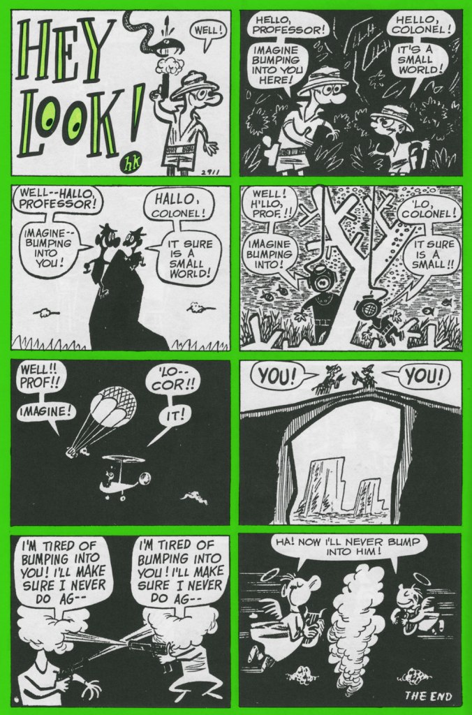
Mr. Kurtzman was ahead of the game, anticipating the superhero genre’s dark turn of the mid-80s and beyond, and pointing out its inherent fascism. Already a bit too close too home at the time of its creation, this piece languished in limbo until its publication in 1966 in a limited-edition portfolio.
Originally published in Nellie the Nurse no. 16 (Dec. 1948, Timely).
Originally published in Hedy Divine no. 30 (Dec. 1948, Timely).
Originally published in Joker no. 35 (Jan. 1949, Timely).
Originally published in Millie no. 16 (Feb. 1949, Timely). Always experimenting: dig here Kurtzman’s elegant use of the scratchboard technique.
Originally published in Nellie the Nurse no. 19 (Apr. 1949, Timely). With the miniaturisation of electronics, and cameras in particular, there’s (of course) been an opposing movement toward huge telephoto lenses. Read into it what you will.
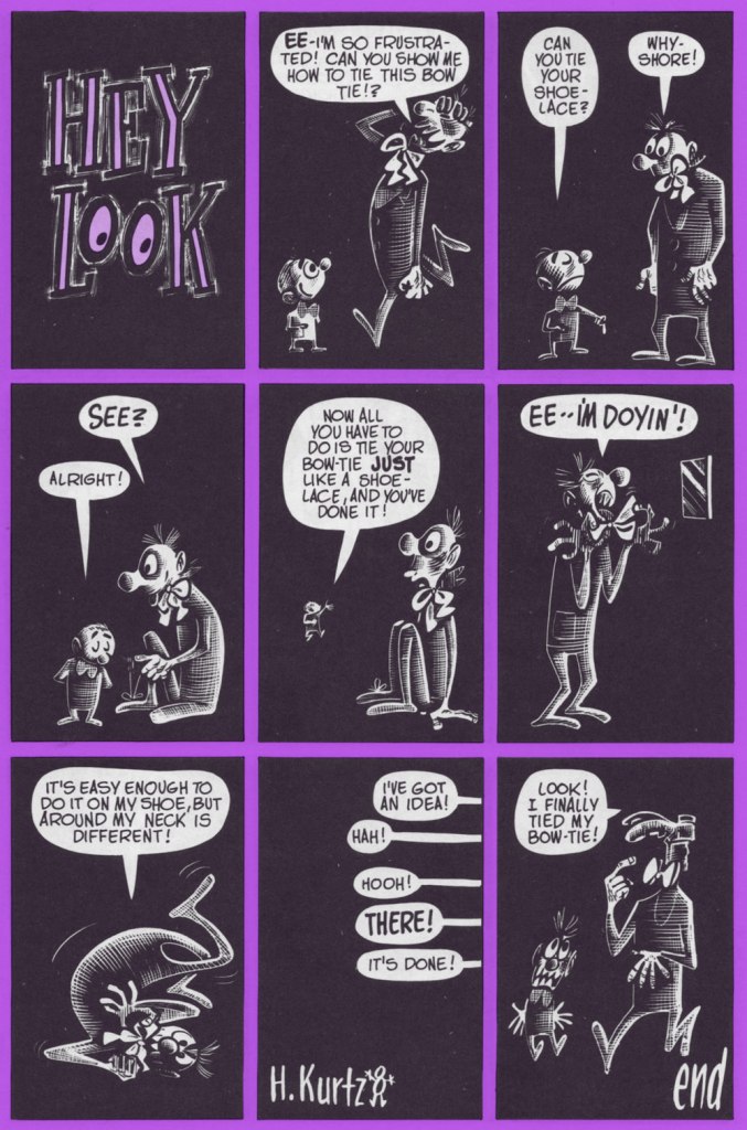
I was, and remain, especially fond of this one, originally published in Gay Comics no. 37 (Apr., 1949) and reprinted in Pizzazz 15 (Dec. 1978)… the one with the Battlestar Galactica cover. ‘Cabazziz’ is made up, but Podunk has roots.
Originally published in Patsy Walker no. 22 (May 1949, Timely). Incidentally, generic ‘teen’ humour character Patsy Walker has since (circa 1976) been refashioned and recycled, in the tried-and-true ‘waste not, want not’ Marvel manner, into a superheroine, Hellcat. Sheesh.
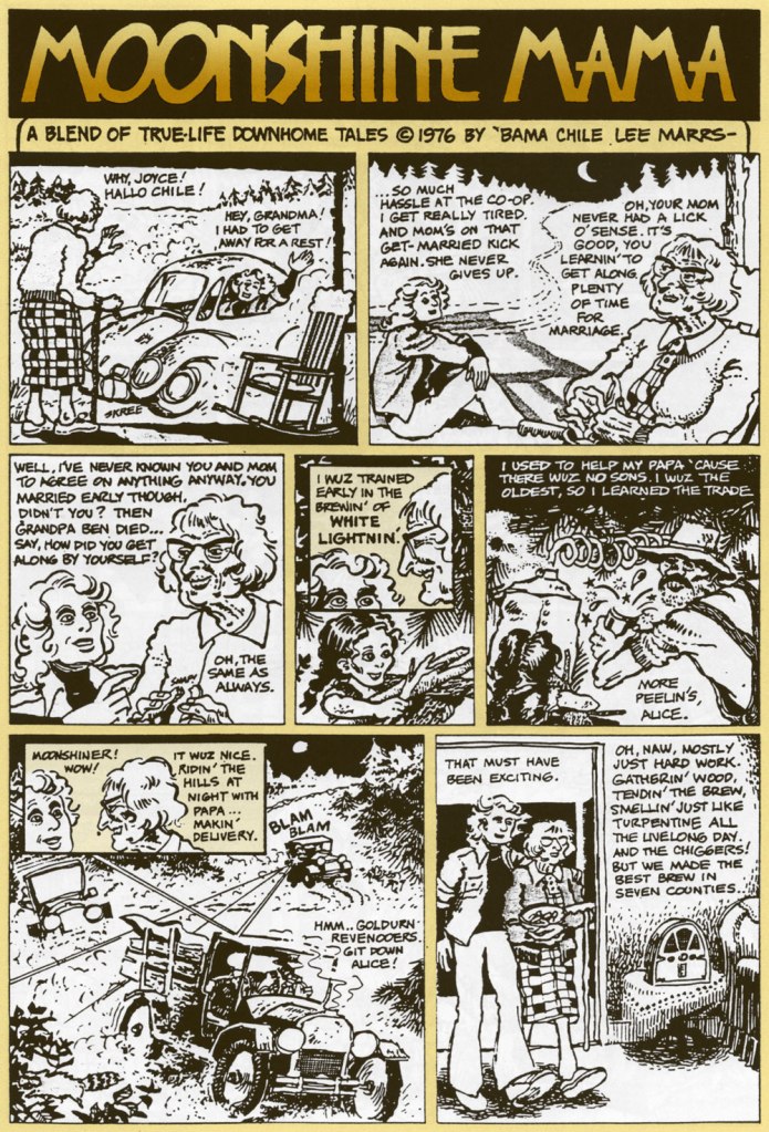
« Moonshiners put more time, energy, thought, and love into their cars than any racer ever will. Lose on the track, and you go home. Lose with a load of whiskey, and you go to jail. » — Junior Johnson
Lee Marrs (b. 1945) is not your typical « underground » cartoonist, though to be fair — what would a typical undergrounder be? The movement’s whole raison d’être was ‘vive la différence‘, wouldn’t you say?
Hers is not a prolific career, perhaps, but look at the gloriously idiosyncratic path she followed: newspaper comic strip assistant (Hi & Lois, Prince Valiant, Little Orphan Annie…), underground (Wimmen’s Comix, Pudge, Girl Blimp, The Compleat Fart and Other Body Emissions), and mainstream cartoonist — well, even better: she was a regular contributor to DC’s justly-fabled (but yet to be reprinted, ahem) Plop!; she appeared in Marvel’s Mad knock-off Crazy; she even scripted, in the early 90s, a Viking Prince (yes, Kanigher and Kubert’s 1955 creation) epic, illustrated by Bo Hampton, and even a bit of Batman (‘Stalking‘, with Eddy Newell, in 1998). But that’s merely scratching the surface: here’s a more comprehensive rundown of her captivating journey.
Ah, don’t you love a happy ending? Originally published in Weird Mystery Tales no. 18 (May 1975, DC), edited by Tex Blaisdell.
This is The Compleat Fart and Other Body Emissions (Jan. 1977, Kitchen Sink); colours by Pete Poplaski. Featured front-and-centre, doing his thing, is Joseph Pujol, France’s fabulous Pétomane!
Originally published in Wimmen’s Comix no. 7 (Dec. 1976, Last Gasp). This is underground storytelling at its finest: uncompromising, political, passionate, personal, at once witty, moving and instructive. And that whole gamut gets run through in a mere four beautifully-drawn, expertly-paced pages.
And I’m delighted to report that the scintillating Ms. Marrs is still active today, her verve and talent undimmed and undiluted. By all means, check out her website for the undeniable evidence!
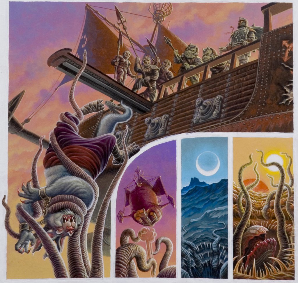
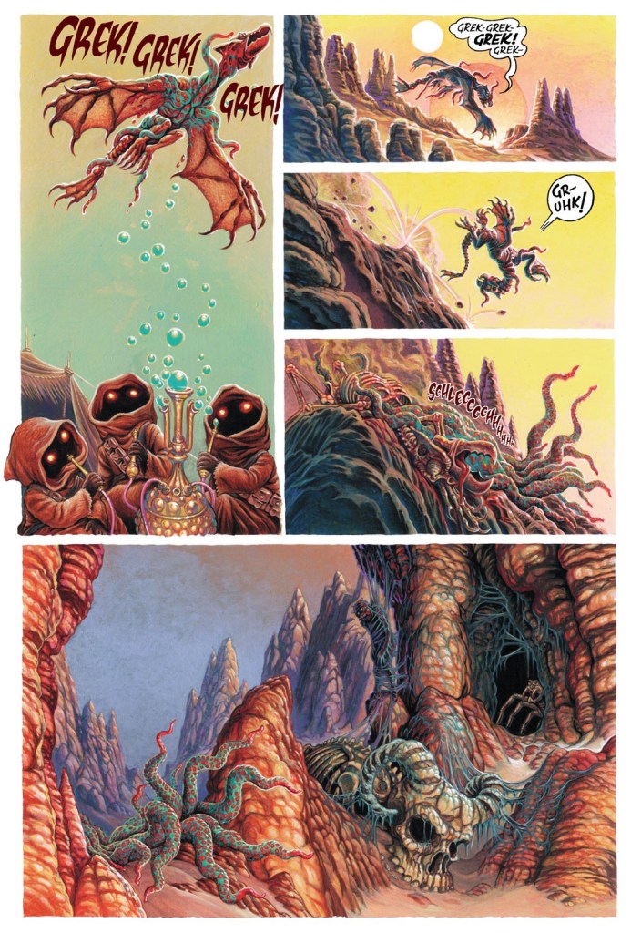
One might call the illustrator and comics artist Kellie Strøm a bit of a cosmopolitan – born in Denmark, he grew up in Ireland and, in adulthood, made London his place of residence. He has accomplished much, but seemingly obtained little recognition for it – his graphic novel (The Acid Bath Case, 1992, published by Kitchen Sink), a collaboration with Stephen Walsh, seems to have been lost in the rivers of time, despite being a striking showcase of Strøm’s black-and-white, precise-yet-graceful style. He also has a great eye for colour, as becomes evident from a quick glance at Star Wars comics he’s illustrated (but does anybody read Star Wars comics?), or, in a much more pleasant and hopefully longer-lasting and farther-reaching vein, his paintings for children’s books.
A panel from The Acid Bath Case (1992, Kitchen Sink). These may not be tentacles per se, but as far as I’m concerned, they qualify!
Personally, I have a soft spot for his illustrations in glorious full colour – I believe that it’s a rare skill to be able to use a full rainbow palette and not end up with gaudy or downright ugly results. Let’s have a look!
That thing is soon growing up to be a tentacled monstrosity, but right now it’s all pretty colours!
The following are pages from Fortune, Fate, and the Natural History of the Sarlacc, written by Mark Schultz and published in Star Wars Tales no. 6 (2000, Dark Horse). Watch an unfortunate victim plunge into the gullet of a merciless tentacled beast!
For comparison purposes: this is the original art…
And the following are pages from the printed comic:
I also mentioned Strøm’s career as an illustrator in children books. The results are beautiful, and, I sincerely hope, well-remunerated.
Panels from Het Zeemans – ABC (2008, Rubinstein Publishing) – or, in other words, Sailors’ ABC:
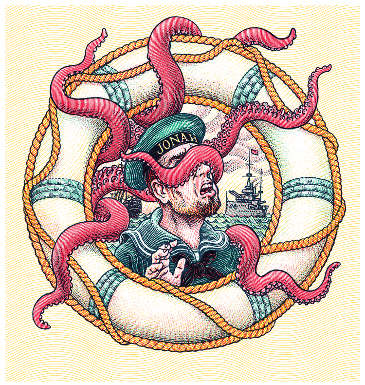
I didn’t have the heart to remove the copyright from this image! Visit Strøm’s website here. Look how many delightful tentacles one can squish into one panel!
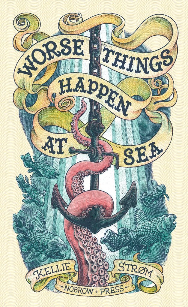
2014 saw the release of the tentacle-wealthy Worse Things Happen at Sea(Nobrow Press), in which « historical ships are attacked, enveloped and engorged by monstrous sea creatures surfacing from the deepest depths of the darkest oceans. » Must be Strøm’s Nordic roots re-surfacing, though apparently he cannot swim!
« … And so Hooten Landing remained unchanged through the years… a landmark and a memorial… a colonial world that had made only one or two concessions to the march of progress. » — From Ye Olde Spirit of ’76 (July 3, 1949)
Having reached the last half of Kitchen Sink’s chronological reprinting of the Post-WWII Spirit, we come at last to the end of our own chronicle. As stated earlier, facing an inexorable dwindling of Eisner’s involvement and investment in his creation due to other commitments and an understandable sagging of his stamina, the strip slowly entered its decline. Then as now, good help was hard to find, to the point where Eisner opted to wrap up the strip rather than let it peter out completely. This sober and courageous decision most certainly contributed in preserving the feature’s solid reputation to this day.
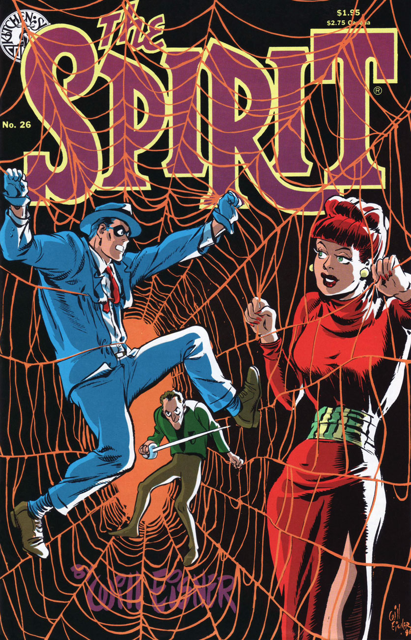
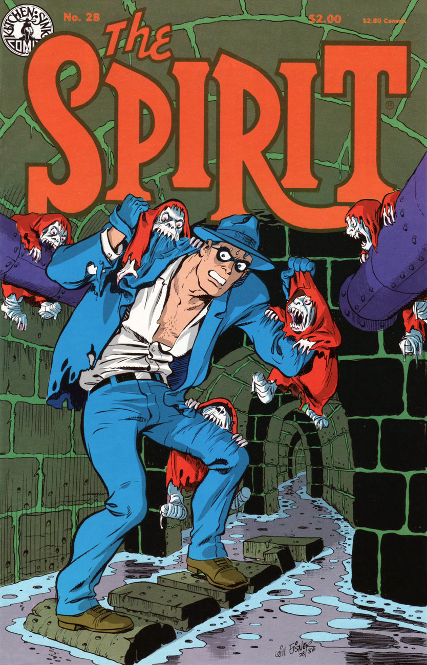
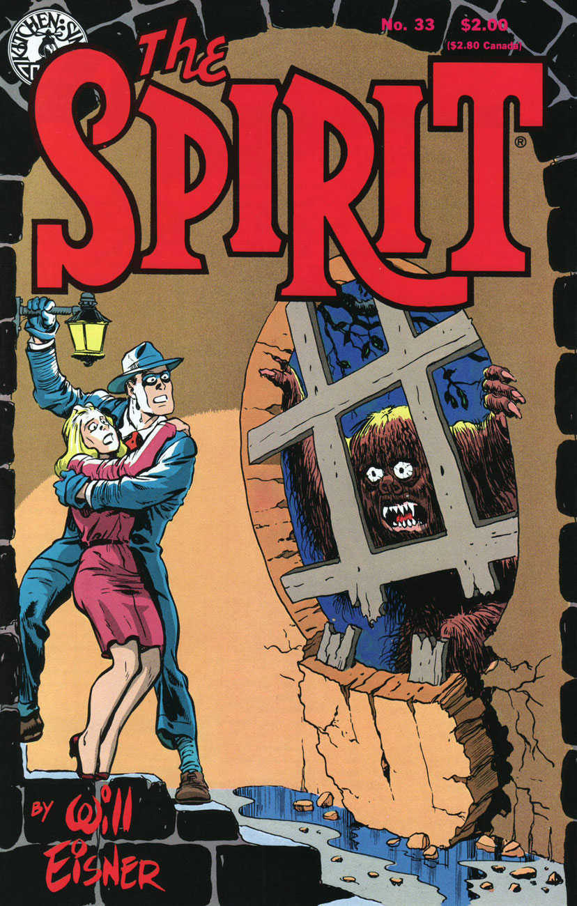
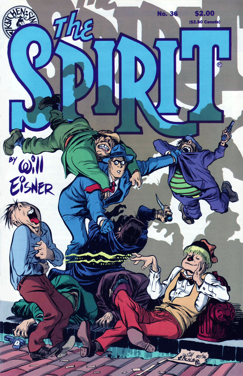
As we embark on the inarguably lesser half of the run, we encounter fewer standout covers, which is to be expected, given the creator’s diminished affection for the contents. Nevertheless, forty-four Will Eisner covers are bound to yield some genuine sparklers. Here, then, are my picks.
Kitchen Sink Press’ The Spirit no. 46 (July 1988) cover-features Satin, originally published on June 12, 1949. Also in this issue: the clever and entertaining The Prediction (June 19, 1949); The Elevator (June 26, 1949); and Ye Olde Spirit of ’76 (July 3, 1949). Cover by Eisner, with colours by Ray Fehrenbach. Obviously, we’re still in classic territory.
This is The Spirit no. 46 (Aug. 1988), which, over six instalments, « takes The Spirit to the Peligros, a fictional group of South Pacific islands, where he interacts with an entirely new set of characters, cultures and adventures. » The issue opens with Lilly Lotus(July 10, 1949); then follows with Sally of the Islands (July 17, 1949); The Masked Man (July 24, 1949); and The Ball Game (July 31, 1949), introducing latter-day sidekick and comic foil Sammy. Cover colours by Ray Fehrenbach.
This is The Spirit no. 47 (Sept. 1988), which wraps up the masked man’s Pacific Island with the cover-featured Matua (Aug. 7, 1949), followed naturally by The Return (Aug. 14, 1949); then it’s back to Central City business with The Candidate (Aug. 21, 1949) and White Cloud (Aug. 28, 1949). Cover colours by Ray Fehrenbach.
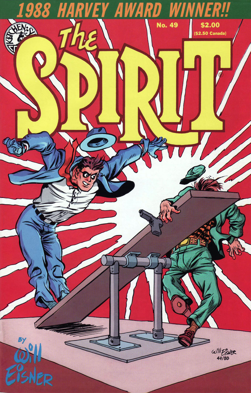
This is The Spirit no. 49 (Nov. 1988), presenting Crime (Oct. 2, 1949); Death of Autumn Mews (Oct. 9, 1949) partly a retelling of the former Denny Colt’s origin, and boasting a true-blue classic splash page; The Curse (Oct. 16, 1949); and Fox at Bay (Oct. 23, 1949). Cover colours by Ray Fehrenbach. Incidentally, The Spirit was the 1988 Harvey Awards laureate in the category of “Best Reprint Project”.
This is The Spirit no. 50 (Dec. 1988). Gathered therein are the Hallowe’en tale of Elect Miss Rhinemaiden of 1950 (Oct. 30, 1949), featuring the return of the sorcerous Hazel P. Macbeth; The eerie The Inner Voice (Nov. 6, 1949); Surgery… (Nov. 13, 1949); and The Thanksgiving Spirit (Nov. 20, 1949). And yes, The Spirit spends the entire issue on crutches. Eisner was ever the innovator! Cover colours by Ray Fehrenbach.
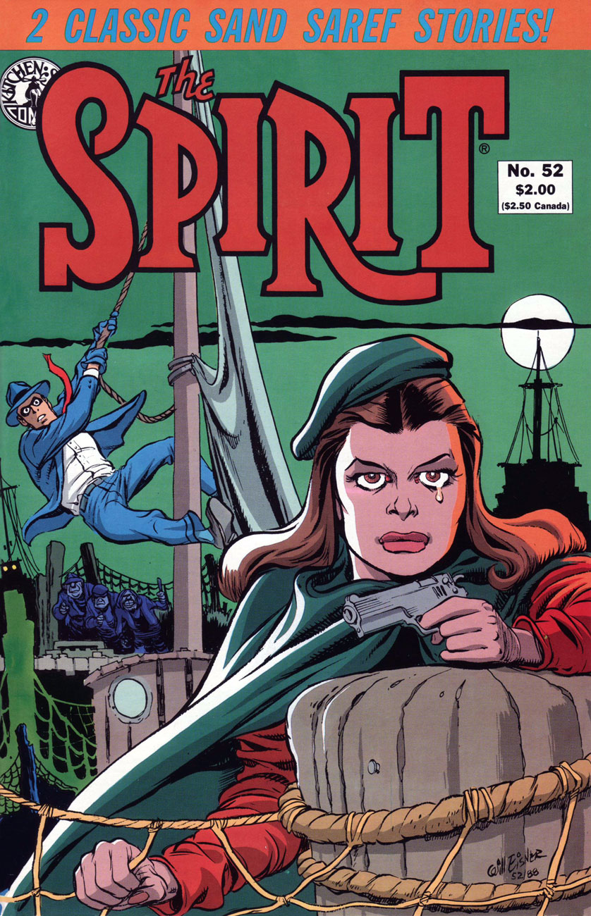
This is The Spirit no. 52 (Feb. 1989), and it cover-features the classic Bring in Sand Saref (Jan. 15, 1950); also in this issue: The Christmas Spirit (Dec. 25, 1949); Fan Mail (Jan. 1, 1950); and part one of the cover story, Sand Saref (Jan. 8, 1950); this cover bears some outstanding colour work by Mr. Fehrenbach, if I may say so.
Some background about the classic Sand Saref two-parter, from Tom Heintjes‘ Stage Settings column:
« The final two stories form one longer tale, and they’ve earned a place in comics history. Eisner’s work and film noir have been mentioned in the same breath for decades, and you hold in your hands one of the best reasons why. »
« The story’s history is unorthodox. Sand Saref and Bring in Sand Saref had their origins in Eisner’s shop, which had been producing various comic books and pieces of commercial art with growing frequency. The two stories were originally done as a single 11-page feature, but it didn’t star The Spirit. The lead character was John Law, a character Eisner intended to launch independently of The Spirit feature.
When the John Law project was shelved due to the often poor newsstand distribution of many comic books, Eisner later saw an opportunity, and seized it by breaking the 11-page John Law feature into a two-part Spirit story. Astute readers are now saying: ‘But Spirit stories are seven pages long, requiring fourteen pages of art.‘ Well, there are no flies on Will Eisner. He created the first three pages of ‘Sand Saref’ to bring up the page count.
Eisner said breaking the John Law story into two halves, eliminating all traces of the intended hero, and inking in the faces of The Spirit’s cast of characters wasn’t simple. “The characters were different people, so considerable dialogue had to be rewritten,” he said. “John Law was a policeman and The Spirit wasn’t. Merely because they both fought on the side of law and order didn’t make them the same character.” In fact, Eisner has Sand Saref tell The Spirit ‘you’re a cop’ in the climax of the 14-page story. »
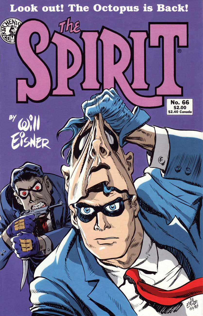
This is The Spirit no. 66 (Apr. 1990), and the issue reprints Future Death (Jan. 21, 1951); The Meanest Man in the World (Jan. 28, 1951); the shadowy, ultra-violent Showdown (Feb. 4, 1951); and its cover-featured conclusion, The Octopus Is Back (Feb. 11, 1951). Cover hues by none other than Joe Matt!
The Spirit no. 69 (July 1990) reprints Time Bomb (Apr. 15, 1951); Hobart (April 22, 1951); Help Wanted (April 29, 1951); and cover-featured The Facts (May 6, 1951); Ray Fehrenbach is back on colours.
The Spirit no. 70 (Aug. 1990) reprints The Hero (May 13, 1951); The 7th Husband (May 20, 1951); King Wang (May 27, 1951); and The Thing in the Jungle (June 3, 1951); Eisner’s cover illustration mixes elements of the second and fourth stories, and it is ably coloured by Ray Fehrenbach, comme d’habitude.
This is The Spirit no. 85 (Nov. 1991), featuring The Ballad of Greenly Sleeve (July 6, 1952); Matt Slugg (July 13, 1952); Marry the Spirit (July 20, 1952) and of course, the sadly tantalizing cul-de-sac that was Jules Feiffer and Wally Wood‘s Outer Space (July 27, 1952). Cover by Eisner and colours by Fehrenbach.
A word or two about The Outer Space Spirit, as it’s come to be called: Eisner, looking for a worthy successor to bequeath the strip to, found young Wally Wood. Talented as he was, Wood’s tragic character flaws were already well established: unlike Eisner, he couldn’t pace himself and he couldn’t stay the course, two qualities essential to the steady production of a comic strip. But for the couple of weeks before Wood started missing deadlines, such lush, interstellar beauty! Feast your peepers here.
Finally, as a bonus: detail from a Kitchen Sink house ad devoted to the publisher’s more-than-fine assortment of Eisnerania; it first appeared on the back cover of The Spirit no. 45 (July, 1988).
Well, that’s it! Thanks for tagging along on Will Eisner and his most famous creation’s tireless peregrinations.
If you’ve missed the earlier entries in the series (punctuality is not one of your strong suits, is it?), all is not lost. In fact, it’s all handily archived within easy reach :
… or if single-clicking is more your speed (takes all kinds!), there’s always our general category, That’s THE SPIRIT!, which will bring up everything at once… but in chronologically inverse order.
« Some men are like flies… without a plan – without direction… they flit restlessly about the world… escaping one danger… and another… only to fall into the spider’s web… » — Bleak’s prospects are grim (Jan. 4, 1948)
Here we are, making our way through Kitchen Sink’s valiant chronological reprinting of Eisner’s post-WWII The Spirit, namely strips from December 1947 to December 1948; still at the peak, with a bit of fatigue on the horizon. At any rate, this particular vintage inspired a score of the master cartoonist’s most sublime new covers… as you’ll witness.
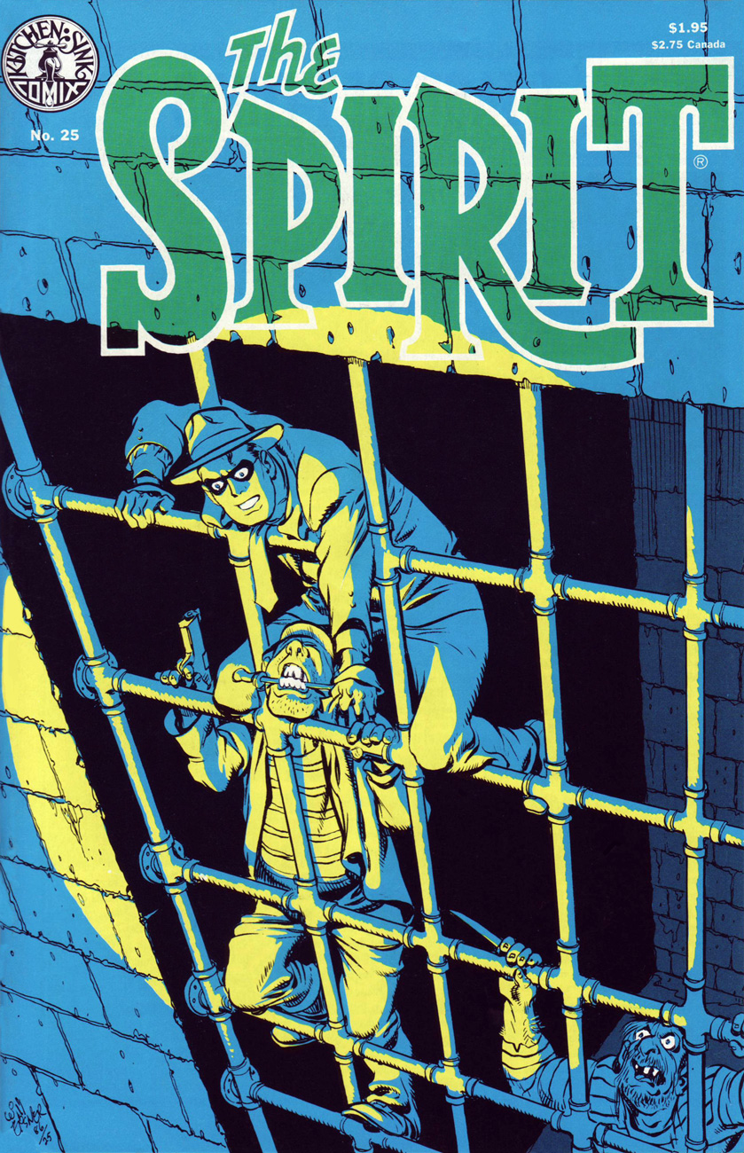
Kitchen Sink Press’ The Spirit no. 25 (Nov. 1986) cover-features Eisner’s famous and much-reprinted jailbreak saga, Slippery Eall (aka ARiver of Crime), originally published on November 30, 1947. The story features inmates bearing the mugs of Eisner studio contributors: letterer Abe Kanegson is Bellows; penciller-inker Jerry Grandenetti is Dapperish; and Eisner himself is Slippery Eall. Also in this issue: Death of Hugo (Dec. 7, 1947), Snow (Dec. 14) and Christmas Spirit of 1947: Joy (Dec. 21). Cover by Will Eisner. Cover colouring by Pete Poplaski.
Speaking of the slammer, Eisner muses sardonically on the cartooning life: « Working in this field is a very, not lonely, but solitary life. All of us come to realize how many hours we’ve been chained to the drawing board. We used to talk in the studio about how if we were sent to jail, it wouldn’t make any difference. We could still turn out comics and our lives would not be a hell of a lot different. »
Here’s that celebrated opening splash, from its appearance in Will Eisner’s 3-D Classics featuring The Spirit no. 1 (Dec. 1985, Kitchen Sink); get those glasses out!
From Dave Shreiner’s ongoing talk with Eisner, published in The Spirit no. 26‘s Stage Settings column: “Eisner has always been a functionalist, rarely a decorative artist producing something for its beauty alone. He is a powerful artist in that nearly every device he uses serves more than one purpose. With a bit of prodding, he took issue with the seemingly prevalent attitude among comic book artists that splash pages serve as a second cover to a story: there for decoration and enticement, but redundant to the story.”
Eisner: « A lot of the artwork done in this field is for a kind of personal satisfaction. It’s used to display artistic muscle, rather than confining itself to an artistic purpose. I believe a lot of artists fear addressing themselves to a purpose because they’re afraid that the showiness, or dazzle dazzle of their artwork, will probably be diminished.
Consequently, they feel the approval level, the applause meter, will fall off somewhat. We’ve talked before about one of the problems facing artists in the comic book field being that their work is judged essentially on the physical appearance of it. It’s the artwork, rather than the content. That fact contributes to comic books being looked down upon. »
This is The Spirit no. 26 (Dec. 1986), and it brings us ‘Umbrella Handles’ (Dec. 28, 1947); The Name Is ‘Powder’ (Jan. 4, 1948); The Fallen Sparrow (Jan. 11, 1948); and Just One Word Made Me a Man (Jan. 18, 1948). Colours by Pete Poplaski, grey toning by Ray Fehrenbach.
This is The Spirit no. 28 (Feb. 1987), and it features Life Below (Feb. 22, 1948); The Return of Roger (Feb. 29, 1948, evidently, like 2020, a leap year); The Strange Case of Mrs. Paraffin (Mar. 7, 1948); and War Brides (Mar. 14, 1948). Colours by Pete Poplaski, grey toning by Ray Fehrenbach.
On the subject of the inspiration behind cover-featured Life Below, Eisner explains: « I was trying to find a unique, or exciting and startling setting within a normal situation. It always intrigued me that cities, particularly New York City, had miles and miles of catacombs under the streets. People doing city stories frequently overlook the potential of them. Underneath the city are layer after layer of story material. »
This is The Spirit no. 31 (May 1987), featuring The Last Hand (May 16, 1948); Assignment: Paris (May 23, 1948); The Emerald of Rajahpur (May 30, 1948); and The Guilty Gun (June 6, 1948). Colours by Pete Poplaski, grey toning by Ray Fehrenbach.
This is The Spirit no. 33 (July 1987), featuring The Springtime of Dolan (July 11, 1948); Barkarolle (July 18 1948); cover-featured The Thing (July 25th, 1948), an adaptation of Ambrose Bierce‘s short story The Damned Thing and quite the Jerry Grandenetti showcase; and The Eisner Travel Agency (Aug. 1st, 1948). Cover colours by Dave Schreiner.
This is The Spirit no. 35 (Sept. 1987), comprising cover-featured The Story of Gerhard Shnobble (Sept. 5, 1948); Cache McStash (Sept. 12, 1948); Lorelei Rox (Sept. 19, 1948); and Ace McCase (Sept. 26, 1948). Cover colours by Ray Fehrenbach. That poor Mr. Schnobble (the little flying guy with the grin and the bowler hat)… his is among the most tragic fates in comics.
This is The Spirit no. 36 (Oct. 1987), and it brings cover-featured Tooty Compote (Oct. 3, 1948); Gold (Oct. 10, 1948); Nazel B. Twitch (Oct. 17, 1948); and Pancho de Bool (Oct. 23, 1948). Cover colours by Ray Fehrenbach. Striking shadow effects: the KS production team sure knew how to make the most of the relatively primitive mechanical means at its disposal.
This is The Spirit no. 37 (Nov. 1987), and it hits us with Halloween (Oct. 31, 1948); cover-featured Plaster of Paris (Nov. 7, 1948); The Chapparell Lode (Nov. 14, 1948); and Quirte (Nov. 21, 1948). Cover colours by Ray Fehrenbach. Note the witty symmetry of the matching KS logo, top left.
This is The Spirit no. 38 (Dec. 1987), which lands expertly and rolls with The Amulet of Osiris(Nov. 28, 1948); cover-featured The Coin (aka Stop the Plot!, Dec. 5, 1948), an action-packed humdinger featuring the return of The Octopus; Two Lives (Dec. 12, 1948); and Christmas Spirit of 1948 (Dec. 19, 1948). Cover colours by Ray Fehrenbach. A dizzying honey of a cover.
Past this juncture, the strip’s slow, inexorable decline commences, and the covers reflect that fact. But not to worry: Eisner was a consummate pro, and the rest of the run is not without its gems. Besides, I’ll be cherry-picking ’em for you.
If you’ve just arrived at the intermission, fret not: take your seat and relax, here’s what you missed so far :
… or point your clicker on our general category, That’s THE SPIRIT!, and summon the lot at once… but in reverse chronological order; that’s the minute toll this dab of convenience exacts.
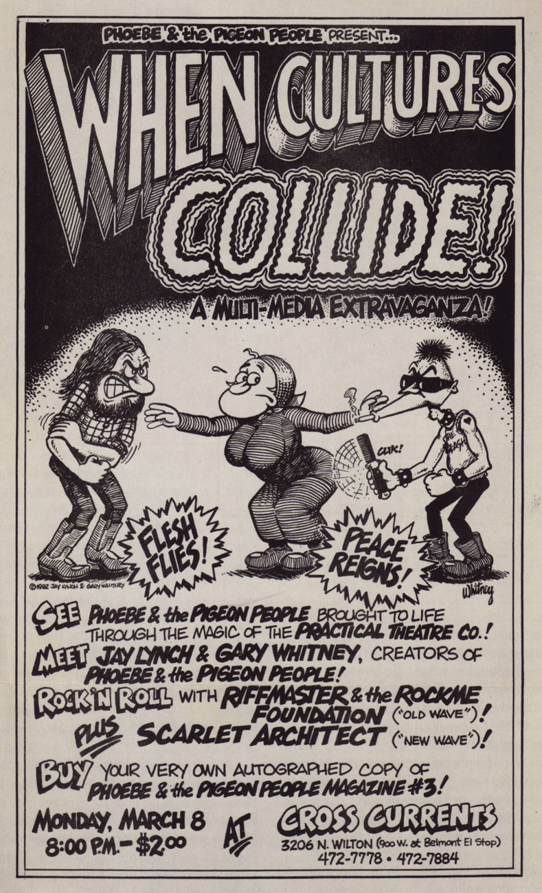
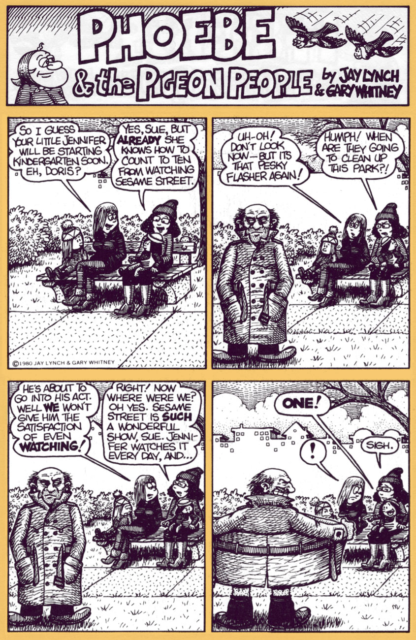
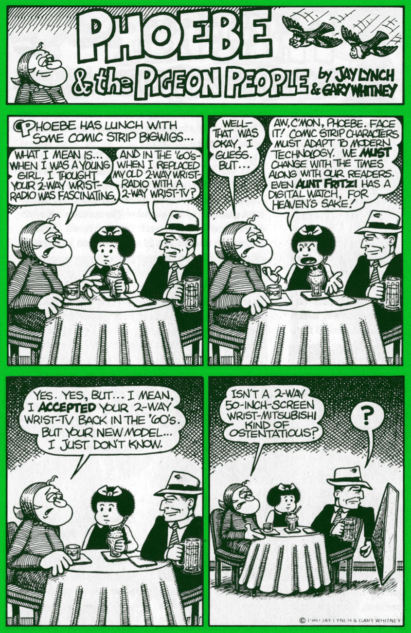
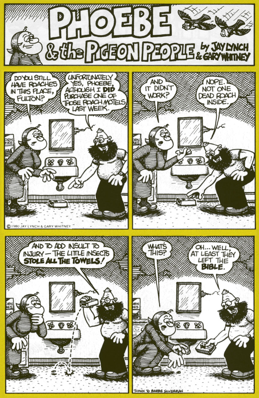
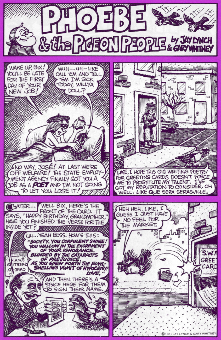
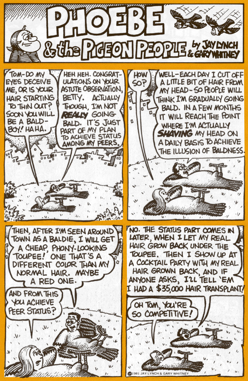
Today, we’ll shine a light upon his epochal comic strip Phoebe and the Pigeon People. Here’s how it was hatched:
« In April 1978, Lynch teamed up with cartoonist Gary Whitney to produce weekly Phoebe and the Pigeon People strips. Lynch wrote them and Whitney drew them. “It was very easy and it got us invited to cocktail parties”, said Lynch. “We wanted to do a strip that would appeal to secretaries, rather than a strip that would appeal to the comic fan type person.”
« Lynch and Whitney launched a stage show based on the characters, called When Cultures Collide, with an improvisational theater troupe, The Practical Theater. The performance included a battle of the bands between rock and new wave musicians. » (quoted from Ink & Anguish, a Jay Lynch Anthology, 2018, Fantagraphics)
P&TPP was another one of those captivatingly freewheeling features that popped up during the heady heyday of alternative weeklies. A while back, we devoted a post to Tom Hachtman‘s Gertrude’s Follies, which bloomed in a similarly unlikely fertile milieu. In Phoebe’s case, The Chicago Reader was the publication it called home during its impressive 1978-1996 run.
A 1982 poster for the event in question. Art by Gary Whitney.
For a few years now, they’ve (in this case, a shadowy outfit vaguely named “Alternative Comics“) been promising us a Phoebe collected edition. We’re still waiting. Hey, if the publisher needs more time to do the job right, so be it… but expectations are accordingly high.
Amazon’s blurb is an ominous portent: « The under-achieving Phoebe and friends hang out with beatnik people-headed jazz-loving beat-philosophy cooing pigeons in a park in Chicago. »
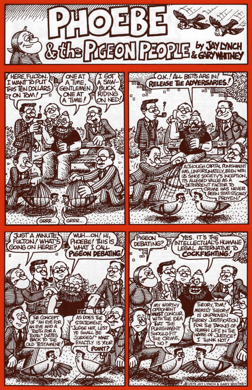
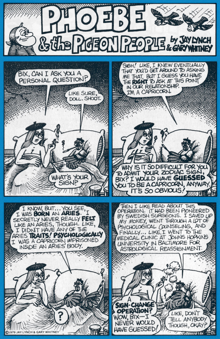
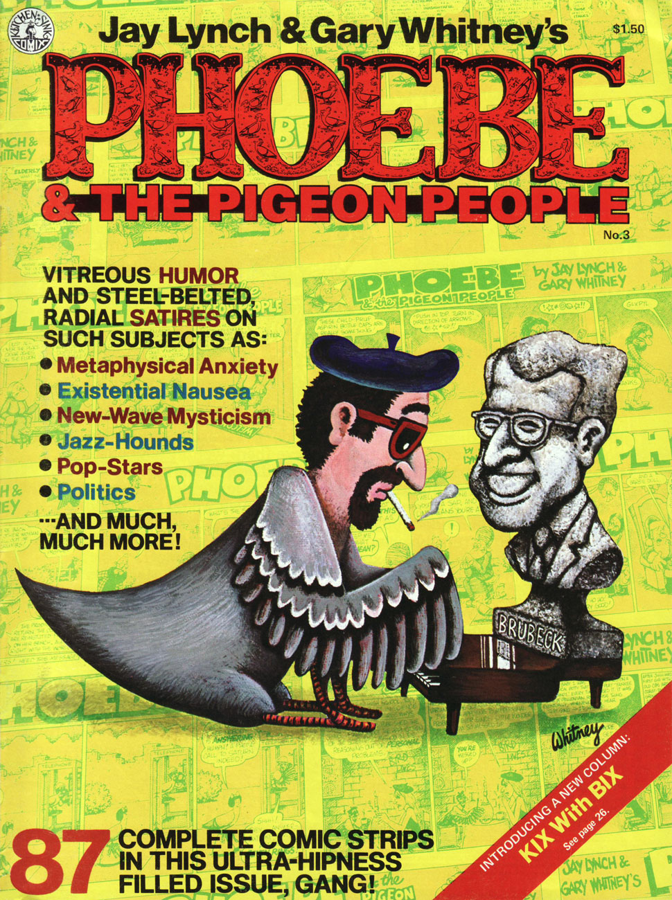
Uh, not even close. Here are a few highlight from the strip’s first four years, pulled from the pages of Kitchen Sink’s valiant three-issue run (1979-81); read these selections and you’ll know more about the strip than whoever wrote that blurb. You’re welcome!
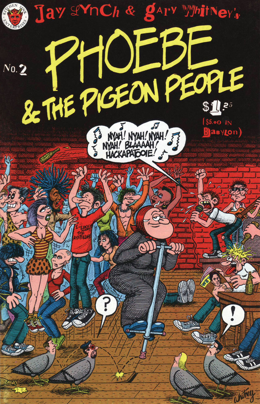
Phoebe & The Pigeon People no. 2 (May 1980, Kitchen Sink).
Clearly, these strips are so rooted in their time period that they retain no relevance whatsoever to today’s world and its social and political mores.
Ah, politicians: Plus ça change, plus c’est la même chose. I’d love to see some of our finer young minds take a crack at such an opportunity. One can still dream, right?
In Phoebe’s world, there was always plenty of room for the meta-contextual.
This is the magazine-size Phoebe & The Pigeon People no. 3 (July 1981, Kitchen Sink). Until the omnibus arrives, this is your best bet. Read the run right here, friends!
Our loveable auteurs and some of their cast, enjoying the Chicago winter. That’s Mr. Lynch on the left, Whitney on the right.
I particularly love the strip’s anything-for-a-joke ethos: as was Lynch’s wont, he ran the gamut from lowbrow to highbrow, from squeaky-clean to salacious, from sunny side up to scrambled. Let’s face it, that bizarre premise would have challenged and defeated most would-be humourists within a few weeks, let alone a decade-and-a-half.
Jay Lynch, dapper elder, as he appears in the short film There’s Something Weird About Jay Lynch (2014, filmed and edited by John Kinhart). Watch it here!
« See? Brute force triumphs after all!!! » — Mr. Fly (Jan. 11, 1942)
While Kitchen Sink’s ambitious chronological gathering of Eisner’s post-WWII The Spirit was intended to clean up and organize the series after decades of random, piecemeal reprinting, it was still a bit of a mess, at least early on. The methods of reproduction varied from issue to issue, and even within issues: three of four of issue one’s stories carry the original newspaper shadings, while one (« Hildie ») is newly-coloured and grey-toned. However, the folks at KSP can’t be faulted for this chaos: it all hinged upon which stories’ original line art remained in existence. Through it all, the publisher remained commendably hopeful but realistic and honest about the prevailing realities and conditions.
This is The Spirit no. 1 (Oct. 1983, Kitchen Sink). Colours by Pete Poplaski, grey toning by Ray Fehrenbach. Four tales are featured: The Christmas Spirit (Dec. 23, 1945), by Eisner and John Spranger; Dead End (Dec. 30, 1945), by Eisner, Spranger and Bob Palmer; Hildie (Jan. 6, 1946), by Eisner and Alex Kotzky; and Dolan’s Origin of the Spirit (Jan. 13, 1946), by Eisner, Spranger and Palmer.
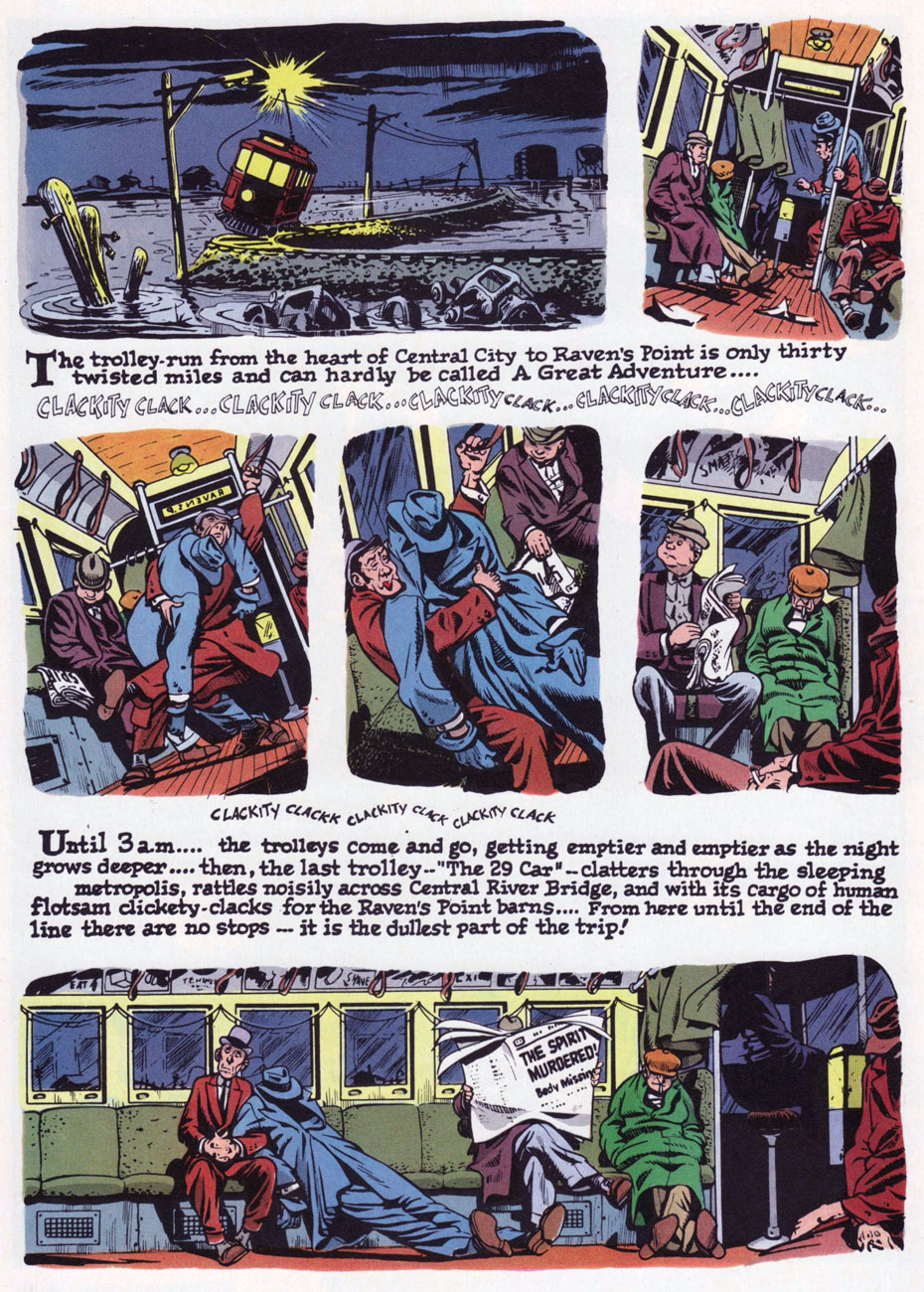
This is The Spirit no. 4 (March 1984, Kitchen Sink). Colours by Poplaski, grey toning by Fehrenbach. Four stories within, all by by Eisner, Spranger and Palmer: Nylon Rose (Mar. 17, 1946); The Last Trolley (Mar. 24, 1946); Yafodder’s Mustache (Mar. 31, 1946); and The Kissing Caper (Apr. 7, 1946).
Here’s a fine example of the careful colour work executed by grey tinter Poplaski and colourists Fehrenbach (in this case) and Mike Newhall, taking evident pains to avoid overwhelming Eisner’s detailed line work. In terms of old-fashioned colouring, this was a notch (or seven) about what was being done in mainstream comics in the 1980s, a period of technological changes, of magnificent highs and painful lows. This is page two of noir classic The Last Trolley (Mar. 24, 1946), from The Spirit no. 4.
The colour question elicited ever-churning controversy and budgetary woes in the face of steadily diminishing sales. By issue 9, the custom colouring was abandoned to make way for the rather more economical, but muddy laser-scanning of original Spirit sections, and an extra story was added to issues 10 and 11; then inside colour was jettisoned for good, with gray toning retained. But issue size was reduced to 6 1/4” x 9 3/4″ (as opposed to the traditional comic book format, which is, as we all know, 6 5/8″ x 10 1/4″) for issues 12-16.
Denis Kitchen sums up the situation very aptly, circa issue 4, late in ’83:
« … the current color comic market demands a more sophisticated reprinting of these stories. There is nothing sacred about the original color. Though Eisner experimented boldly with color, he generally left coloring to assistants, and much of it was handled in a pedestrian manner.
We shoot these stories, where possible, from original art in Will Eisner’s archives. Where stats, negatives silverprints or other proofs are the only source, we use the best existing copies. Our colorists, where possible, use the original sections as color guides and are concerned with authenticity and precedent. Color changes, gray tones and other ‘augmentations’ are made with the approval of Will Eisner. »
This is The Spirit no. 11 (Aug. 1985, Kitchen Sink). For this final colour issue, five stories, all by by Eisner, Spranger and Palmer: The Haunt (Oct. 27, 1946); Beagle’s Second Chance (Nov. 3, 1946); Caramba (Nov. 10, 1946); Return to Caramba (Nov. 17, 1946) and Coot Gallus (Nov. 24, 1946)
This is The Spirit no. 17 (Mar. 1986, Kitchen Sink). Colours by Poplaski, grey toning by Fehrenbach. Four stories within, all by Eisner and Jerry Grandenetti: Be Bop (Apr. 20, 1947); Ev’ry Little Bug (Apr. 27, 1947); The Fix (May 4, 1947), and The Fortune (May 11, 1947).
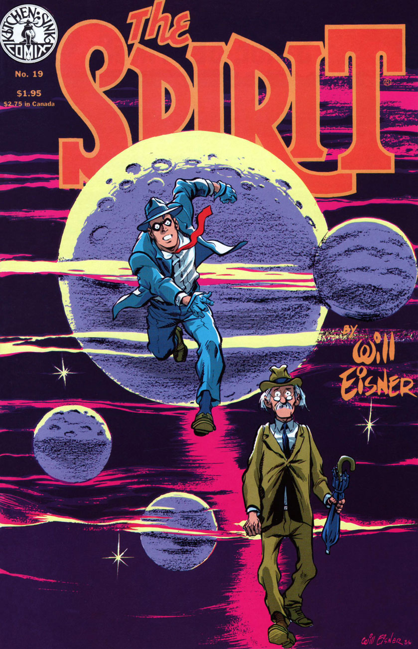
This is The Spirit no. 19 (May 1986, Kitchen Sink). Colours by Poplaski, grey toning by Fehrenbach. Four stories await within, each by Eisner, Grandenetti and letterer Abe Kanegson: Black Gold (June 15, 1947); Hangly Hollyer Mansion (June 22, 1947); Whiffenpoof!! (June 29, 1947), and Wanted (July 6, 1947).
This is The Spirit no. 22 (Aug. 1986, Kitchen Sink). Colours by Poplaski, grey toning by Fehrenbach. Presenting a quartet of tales by Eisner, Grandenetti and Kanegson: A Killer at Large (Sept. 7, 1947); Into the Light (Sept. 14, 1947); End of the SS Raven (Sept. 21, 1947), and Orson Welles lampoon UFO (Sept. 28, 1947).
If you’ve just caught us mid-swing, nothing to worry about: earlier entries are at your beck and call as follows :
… or point and click on our general category, That’s THE SPIRIT!, and beckon everything at once… but in reverse chronological order; that’s the price you pay for convenience.


