Panning the murky old print stream for the odd glimmering nugget
Come As You Are: Charlton Comics
Shoddy printing, editorial indifference, low pay… we’ve all heard the tales. But what kept the plucky Derby, Connecticut publisher vital and interesting to both the less and the *more* demanding comics reader was its editorial laisser-faire, lack of a constraining “house style” (or house genre!), and charming diversity. Throughout its best years, the imprint attracted the finest specimen of independent-minded iconoclasts of all stripes. Steve Ditko, of course, but also kindred free spirits such as Pat Boyette, Tom Sutton, Warren Sattler, Sam Glanzman, Pete Morisi, Rocco Mastroserio, José Delbo, Enrique Nieto, Don Newton, Wayne Howard, Jack Keller, and many more. Not everyone’s cup of tea, but readers who dug Charlton’s Lapsang Souchong preferred it to Marvel and DC’s Orange Pekoe and Earl Grey. – RG
While I’m a late-blooming romance comics fan — the flamboyant Enrique Nieto drew me in, and I stuck around — I’m strictly a Charlton man: with precious few exceptions, DC’s take on the genre is histrionic and insincere. These were the books no-one at National wanted to be stuck editing. Also, and it’s always worth noting: wayyyy too much Vince Colletta. As for Marvel: Stanley Lieber was, not to put too fine a point on it, relentlessly sexist… ’nuff said?**
It’s not for nothing that Charlton was tops in romance, publishing a dozen or so titles at a time when the Big Two put forth a third of that number at most… with plenty of reprints tossed into the mix. Obviously, given Charlton’s tremendous romance output, it wasn’t all gold… but nuggets turned up with sufficient frequency to justify one’s continued interest.
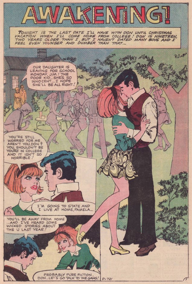
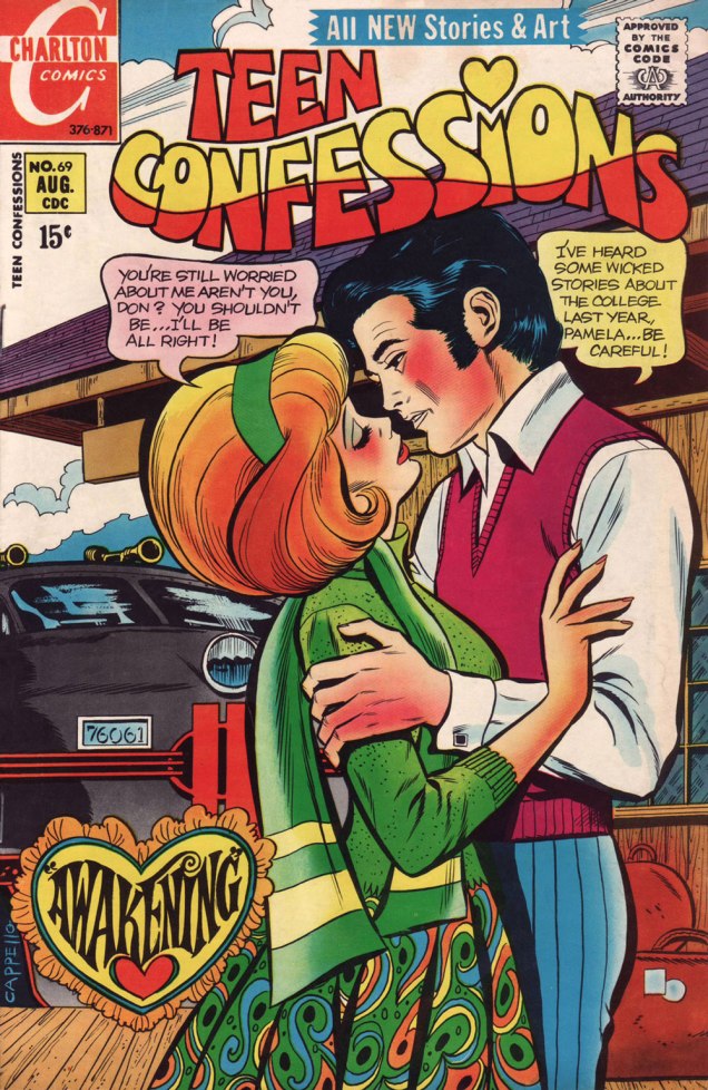
Let us then flash back to 1971, and a nugget from Teen Confessions no. 69 (Aug. 1971, Charlton). Almost certainly written by Joe Gill and definitely pencilled and inked by yet another talented Argentine, Nestor Olivera.***
.
.
Having the bully/sexual predator wear a big YES on his shirt — though never quite show it — is a cleverly appropriate touch on the part of the artist.
.
A typical Joe Gill touch: a character may be introduced, speak one line, advance the story, reinforce its logic… and never reappear. Take a bow, Hugo.Max makes the most of his chivalrous four-panel rôle; in a refreshing twist, there are no strings attached to his gallant turn.
.
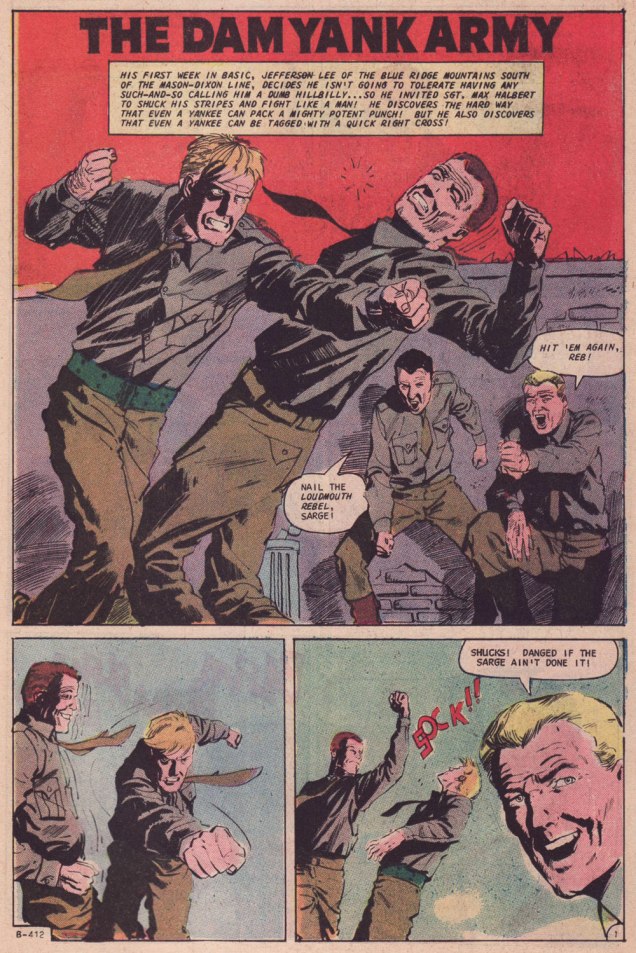
Parents who aren’t utter dimwits also frequently feature in Joe Gill’s romances. Awakening was the cover story. While former Colletta assistant Art Capello is credited — and he signed it, too — I strongly suspect the heavy hand of editor Sal Gentile in the layout and finishes. Why? Because Gentile’s leading men always tended to resemble actor George Chakiris.Compare and contrast: other than romance, the versatile Olivera demonstrated his chops in Charlton’s war titles. This is the opener of The Dam Yank Army, another Joe Gill yarn, cover-featured in Fightin’ Army no. 74 (June 1967; Dick Giordano, editor).
-RG
*By all means read the full interview for some insight (beware!) into Kanigher’s thinking. He continually caroms from insight to delusion, from sagacity to madness… just like his work, one might say.
**Re: Marvel… I may someday devote a post to the question of why early 70s Marvel romance’s dream man was presented as a dead ringer to the, er… controversial Jim Shooter. Probably mere coincidence.
***By ‘talented Argentine’ (Spanish-Argentine, technically), I refer to none other than José Luis García-López. Also from ’71, and in a totally different style, check out his Emancipated Amanda.
« Losing my mind, but I don’t care I see Donna everywhere Down by the lakeside, in a lawn chair Donna, Donna everywhere » — Too Much Joy
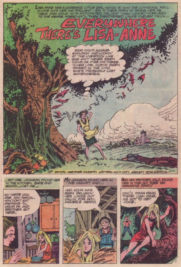
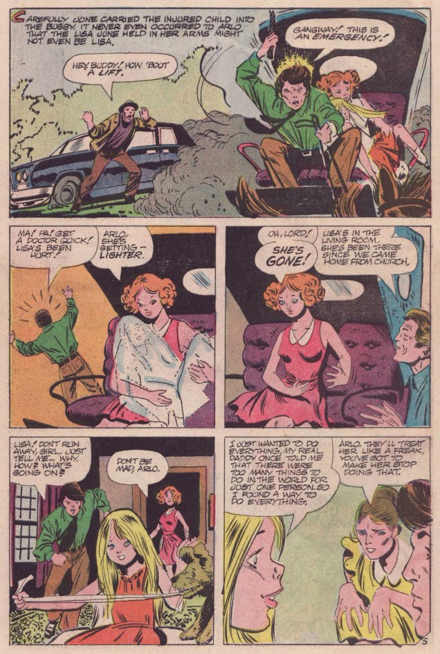
Today’s featured tale hails from Charlton’s groundbreaking anthology title Midnight Tales (1972-1976). It differs from the rest of the publisher’s mystery line in that it largely served as a vehicle and spotlight for Wayne Howard (1949-2007), who even received a ‘created by’ mention on the covers. My partner ds delved deeper into Midnight Tales minutiae in her Tentacle Tuesday entry « Plants Sometimes Have Tentacles, Too ».
« Everywhere There’s Lisa-Anne » saw print in Midnight Tales no. 6 (Nov. 1973, Charlton). It was written by Nicola Cuti, Howard’s co-conspirator (they had both apprenticed with Wally Wood), who provided the lion’s share of Midnight Tales scripts. It was illustrated by Tom Sutton and coloured by Mr. Howard.
What I enjoy about this snappy little tale is its graceful economy: it packs a lot of context and characters into its mere six pages, but flows so efficiently that it never feels rushed. It doesn’t attempt to explain what doesn’t need explaining, nothing is overstated, and none of the characters is a convenient idiot. No patronising hand-holding, just straight-ahead storytelling.
Let’s hope, for the Johnsons’ sake, that Lisa-Anne’s very convincing and the sheriff no laggard!
Lisa-Ann’s ubiquity reminds me of a favourite Cul de Sac Sunday strip… and any excuse to trot out the Richard Thompson is to be seized eagerly!
« In World War One, they called it shell shock. Second time around, they called it battle fatigue. After ‘nam, it was post-traumatic stress disorder. » — Jan Karon
Jerry Grandenetti‘s whirlwind passage through the halls of Charlton (circa early 1966) was barely noticed, let alone commented upon. Ah, but it nonetheless was interesting. Grandenetti, frustrated with his limited prospects in illustrating war scripts for Bob Kanigher at DC, was in the middle of trying to expand his client base and break away from the obvious constraints of dealing with a petty tyrant. He was also eager to let his style evolve naturally, which certainly wasn’t going to happen in the pages of Star-Spangled War Stories.
And so, in 1966, Grandenetti, while keeping active at DC, passed through Tower (Fight the Enemy), Gold Key (The Twilight Zone), Marvel (Tales to Astonish: both The Hulk and Namor), Warren (Creepy and Eerie), though much of that work was ghosted for Joe Orlando and only revealed to be Jerry’s own… well after the fact.
For my money — and it won’t surprise anyone — the most unhampered and noteworthy art he created over that year was at Charlton. Here’s a sample!
.
.
.
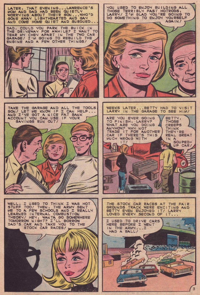
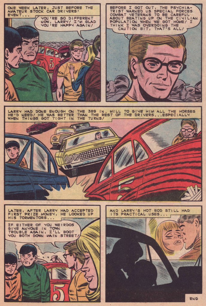
« Leadfoot Larry » was written by Joe Gill and inked by Jon D’Agostino.
While I prefer Grandenetti’s own inks (unless Wally Wood or Murphy Anderson are on the table!) over his pencils, future Archie stalwart Jon D’Agostino (1929-2010) performs a slick job that doesn’t smother Jerry’s pencils. A pair of romance stories saw him unfortunately saddled with indifferent Vince Alascia, but a teaming with Rocco Mastroserio proved attractive. The crown jewel of the ’60s Grandenetti Charltons was a sixteen-pager purporting to tell « The True Story of Jesse James! », wherein JG got to ink himself.
For me, what sets « Leadfoot Larry » apart is that it’s a character piece, the hot rodding taking a back seat to the — often underlying — themes of PTSD, sound reason pitted against blind rage, trust, maturity and responsibility facing callowness and cowardly chaos… with the sobering conclusion that you just can’t reason with some people. In typical Joe Gill fashion, most of the issues are circumstantial… they don’t explode into melodramatics. It’s not a perfect world, nor should it be, but one I’d rather inhabit, given the choice.
.
Here’s the issue it’s from, Hot Rod Racers no. 8 (Apr.-May 1966, Charlton). Despite being cobbled together from interior art, the cover manages to be pretty striking. Pat Masulli, editor.
« A dead body revenges not injuries. » — William Blake
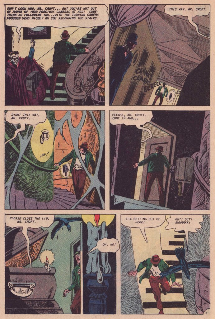
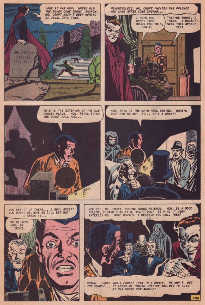
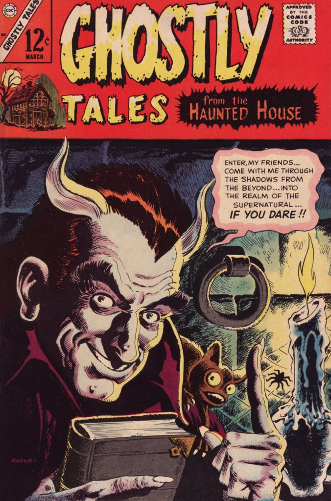
« Do you end every Hallowe’en Countdown with Steve Ditko? », ds reasonably asked me last month. Well, no, I replied, but it generally plays out that way since, by my reckoning, nothing embodies the spirit of this finest of holidays quite like a sepulchral Joe Gill – Steve Ditko yarn.
My heartfelt thanks to all our guests — visitors, readers and contributors — who made this breakneck endeavour possible… in particular ds, who shouldered a significant part of the load and came through with flying, but appropriately sombre, colours.
Take it away, Messrs Gill, Ditko and Dedd!
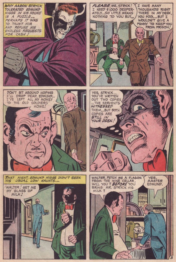
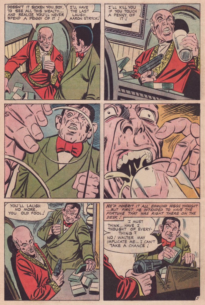
Yes, it’s your basic ‘greedy relative’ plot, but perfectly executed. And the late Mr. Strick would surely concur about the ‘perfectly executed’ part. And since the cover gives away a bit too much, here it is, after the story. This is Ghostly Tales no. 103 (Apr. 1973, Charlton). Cover by Steve Ditko, naturally.
And we have one more countdown concluded against soul-searing odds. Now, if you’re craving more, you insatiable ghouls, feel free — could we stop you even if we tried? — to slobber amidst our back pages, at this point numbering two hundred and forty-eight posts :
« We can lick gravity, but sometimes the paperwork is overwhelming. » — Wernher von Braun
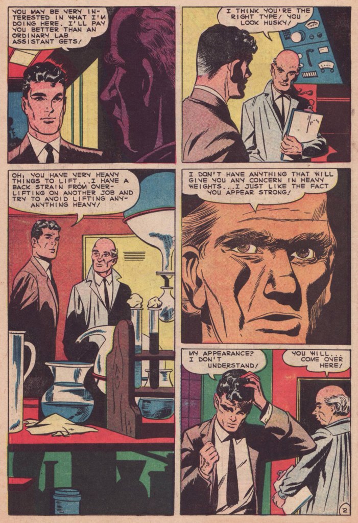
The other day, I was digging through my to-read pile, and came upon a 1950s Charlton science-fiction title I’d picked up for a song during a trip to the Maritimes (that’s New Brunswick in this case), last Fall. Its second story struck me as slight but quite fun, which is pretty much the best one could hope for in those strict, early years under the Comics Code’s oppressive authority. Despite the quickly executed job under overpowering Colletta varnish, I surmised I could identify the penciller’s style: none other than Matt Baker, whom I wrote about almost exactly a year ago, in Matt Baker’s Disquieting Romance. I’d advise you to begin there.
In his review of Matt Baker: The Art of Glamour (2012, TwoMorrows), cartoonist Eddie Campbell provided a useful bit of context: « A final phase, in which Baker had a hard time getting any work at all, is also examined briefly. Between 1955 and ‘59 he mostly pencilled for Vince Colletta, who was somehow well enough placed to pick up as much work as he could handle from Atlas and Charlton. He farmed a great deal of it out to others to pencil, leaving the inking for himself, which is one way to make a living and I’ve never had any problem with it. Colletta is a figure that comic book fans love to vilify. There’s him, Fredric Wertham, and the Red Skull, making the triumvirate of evil. »
But enough telling for now, time for some showing!
This is Mysteries of Unexplored Worlds no. 14 (Aug. 1957, Charlton); cover art by Charles Nicholas and Vincent Alascia. Yes, there was a time when the profligate Alascia was a decent inker.
*
*
*
*
*
Though uncredited, the story was evidently written by Joe Gill. Typical of him, the story is driven by straightforward but purposeful dialogue, in which much is intimated between the lines. It takes the rare gift of economy that tell such a story — and make it work — in just a handful of pages.
So what was in it for Vince Colletta? Basic economics aside — it’s easier to ink well-executed layouts — perhaps he harboured sympathy for this massively talented Black man who couldn’t get work, as all but a few did — regardless of talent — after the massive contraction of the comics field in the mid-Fifties. As a native Sicilian, it couldn’t be far from Colletta’s mind that in America, his own people, not so long before, were forcibly excluded from the ‘Whites’ club.
As Brent Staples wrote in How Italians Became ‘White’ (The New York Times, Oct. 12, 2019): « Italian immigrants were welcomed into Louisiana after the Civil War, when the planter class was in desperate need of cheap labor to replace newly emancipated black people, who were leaving backbreaking jobs in the fields for more gainful employment.
These Italians seemed at first to be the answer to both the labor shortage and the increasingly pressing quest for settlers who would support white domination in the emerging Jim Crow state. Louisiana’s romance with Italian labor began to sour when the new immigrants balked at low wages and dismal working conditions.
The newcomers also chose to live together in Italian neighborhoods, where they spoke their native tongue, preserved Italian customs and developed successful businesses that catered to African-Americans, with whom they fraternized and intermarried. In time, this proximity to blackness would lead white Southerners to view Sicilians, in particular, as not fully white and to see them as eligible for persecution — including lynching — that had customarily been imposed on African-Americans. »
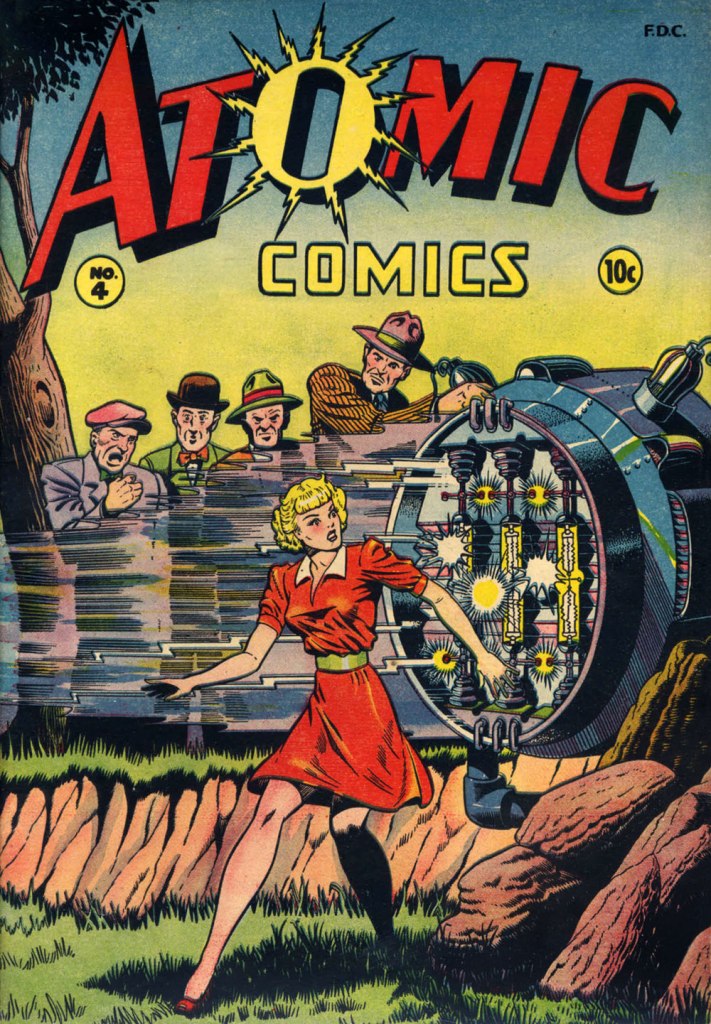
Baker didn’t delve much into the science-fiction genre, but here’s one such case: this is Atomic Comics no. 4 (July-Aug. 1946, Green Publishing). Read it here!Another rarity in Baker’s œuvre: blackness — despite being undermined by the colourist here. This is Amazing Ghost Stories no. 15 (Dec. 1954, St. John). On comicbookplus.com, where you can read this entire issue, a reader commented approvingly: « There are a lot of horror comics set in Haiti. This is the first one I’ve read where it looks like the author did some research on the history of Haiti. »
« There will be no questions asked if I kill you here, gringo! » — Bad hombre Alejandro Roja
On February 5, 2024, versatile veteran cartoonist José Delbo (born in Buenos Aires, Argentine, on December 9, 1933) left us at the most respectable age of ninety. Comics fans of a certain age will no doubt recall him chiefly from his long stint on DC’s Wonder Woman (1975-1981, issues no. 222-286), but to my mind, that’s hardly his finest hour: he wasn’t done any favours there, hobbled as he was by pedestrian (or worse) writing and indifferent (or worse) inking. Same goes for his run on Batgirl (1976-82) in Batman Family and Detective Comics.
For a detailed rundown of his remarkably long and varied career, you can’t go wrong with this excellent bio.
This post’s title gave away my candidate for Delbo’s magnum opus, such as it is; but I would be remiss in failing to also note his charming work on Dell’s The Monkees (fifteen issues), where he got to demonstrate his deft hand at humour; and his winningly bizarre collaboration with Tony Tallarico, Geronimo Jones (nine issues, 1971-73, plus one that remains unpublished).
This is Billy the Kid no. 58 (Nov. 1966, Charlton), Delbo’s second issue on the title but his first cover. After this one, he would go on to pencil and ink the subsequent fifty or so covers and most of the inside features. When you find an artist who can draw horses, you hold on to him (or her)! How many, among the current generation, could successfully handle that particular mission?
Incidentally, Billy’s distinctive steed appears to be an Appaloosa: « The Appaloosa’s eye-catching pattern comes from the spotted horses brought into the Americas by Spanish Conquistadors. Known as the Dalmatian horse breed, it was bred in the mid-18th century by the Native American Nez Percé people. Its name comes from the Palouse River that flows through what used to be Nez Percé territory. » [ source ]
Charlton Comics’ flagship western title, Billy the Kid (153 issues, 1955-1983, including its first five as “Masked Raider”), endured as long as it did for good cause: notable runs by accomplished artists, among them John Severin, Rocco Mastroserio, Luis Domínguez, Delbo, and finally Warren Sattler. Yet, for my money, it’s Joe Gill’s spare but psychologically consistent and highly humane scripting that holds the enterprise together.
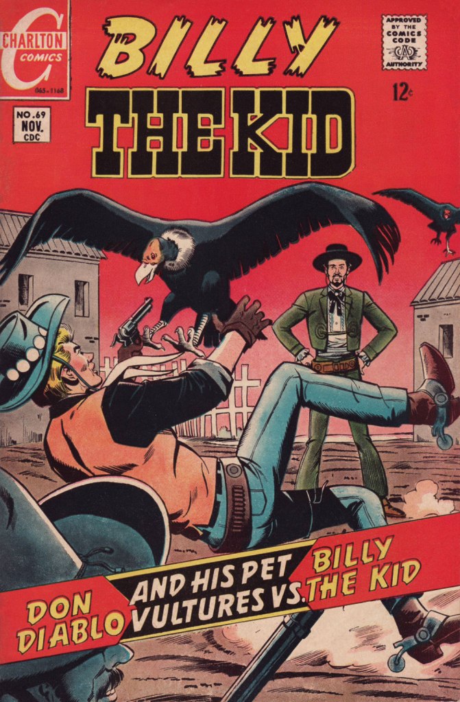
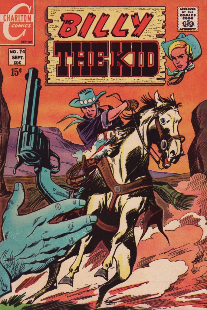
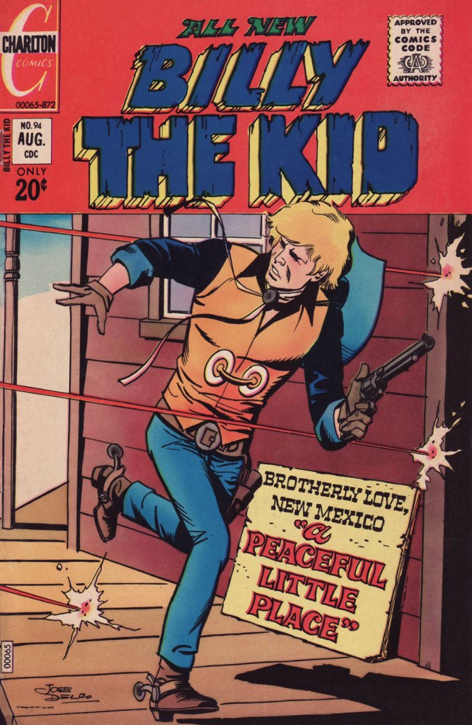
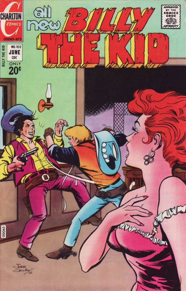
This is Billy the Kid no. 69 (Nov. 1968, Charlton).This is Billy the Kid no. 74 (Sept. 1969, Charlton).This is Billy the Kid no. 80 (Sept. 1970, Charlton).This is Billy the Kid no. 94 (Aug. 1972, Charlton); I love the clever signpost integration of the featured title.This is Billy the Kid no. 98 (Jan. 1973, Charlton). Readers accustomed to Marvel and DC-style hype may notice how light on text these covers are. A lot of shouting isn’t what sells a cover: an arresting visual will do that.This is Billy the Kid no. 102 (June 1973, Charlton).This is Billy the Kid no. 103 (Aug. 1973, Charlton).This is Billy the Kid no. 106 (Dec. 1973, Charlton). The foxy villainess Billy’s tussling with is La Duquesa, featured in “Slave of Beauty”.
Happy trails, and gracias for everything, Señor Delbo!
Well, I made it through another countdown. Thanks for your interest and support!
In the proper spirit of the thing, I’ve indulged and reserved my very favourite Hallowe’en treat for last, and that’s a Joe Gill–Steve Ditko chiller — for the second consecutive year!
I’ve always adored this one for its adroit juggling of hushed atmosphere and giggles, its casually dropped hints and layered subtlety. Ditko really had no peer when it came to insinuating his narrator into the visual tapestry. In this case, his first and finest host, Mr. L. Dedd (or I. M. Dedd, depending on the source). Ditko is clearly having a ball.
Unless I’m mistaken, Steve Ditko always inked himself (and sometimes gloriously inked Kirby) until 1964, when George Roussos as ‘George Bell‘ (seemingly using the wrong end of the brush, sorry) inked Ditko’s pencils on a trio of early Doctor Strange episodes (Strange Tales nos. 123-125, if you must know).
Even while working at Marvel, Ditko (wisely) kept working for Charlton. At his busiest, he was assigned an inker on a revival of Captain Atom, Rocco ‘Rocke’ Mastroserio, and the combination bore splendid fruit. Ditko was one of those cartoonists who laid down the basics in the pencils, then had most of his fun in fleshing them out in ink. Finishing Ditko’s layouts wasn’t a task just any Joe could handle, as the ensuing years would bear out.
And so we’re done, countdown-wise, for another year. If that’s not quite sufficient to slake your loathsome lust, promenade yourself through our bloated-by-now archives, at this point two hundred and seventeen posts strong :
Wishing you all a hair-raising Hallowe’en — thanks for all the creepy loitering!
-RG
*did I imagine that someone (David Mamet?) once said that her name sounded like ‘a bowling ball tumbling down the stairs’? It may have been meant as a compliment.
« Carefully, the old man utters a cacophonous incantation… then lets his mind go blank. » — Stephen Skeates
We recently (last March 30) lost a fine fellow and writer in Steve Skeates (1943-2023). I’ve long appreciated his work, as I felt he was among the very few ‘mainstream’ comic book writers who could actually be funny, not to mention gripping or thought-provoking*, whatever the situation demanded.
At its peak, his writing also stood out by virtue of its containing actual creative ideas rather than the usual mishmash of bromides and creativity-stifling continuity that the fanboys clamoured for.
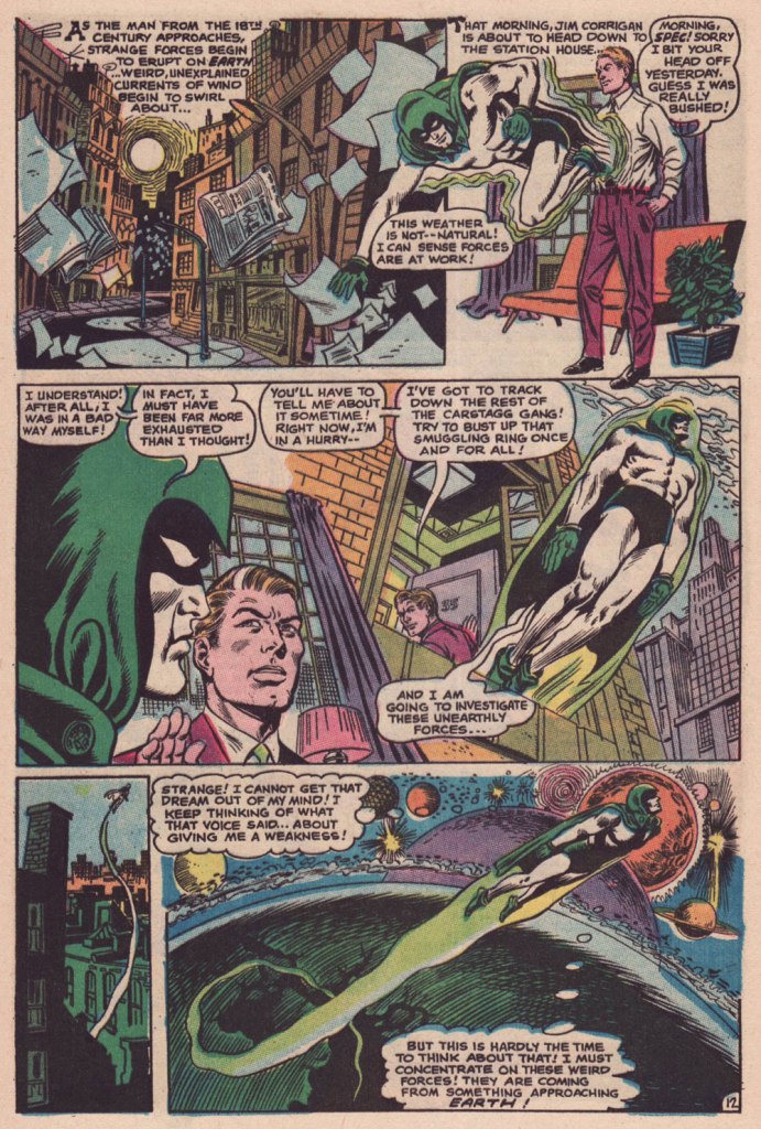
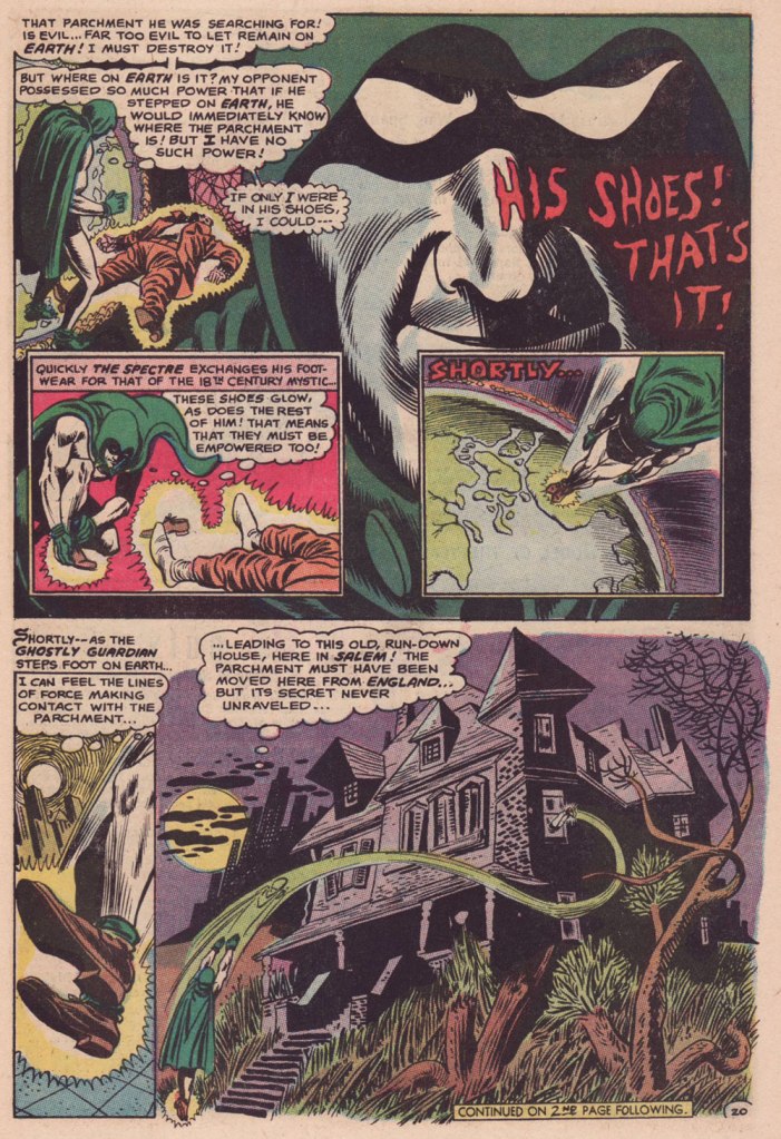
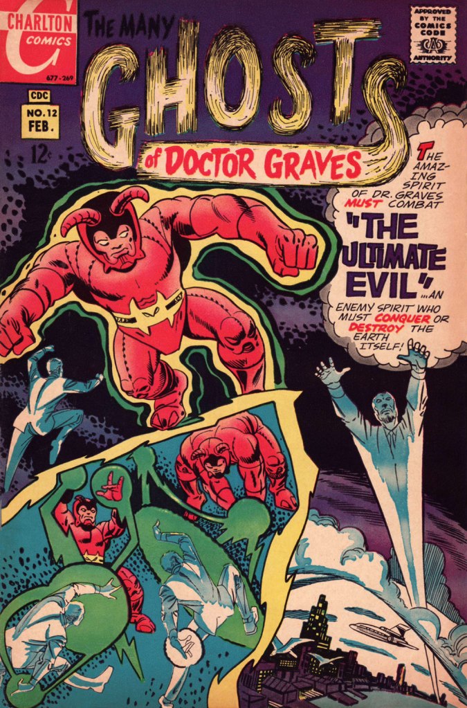
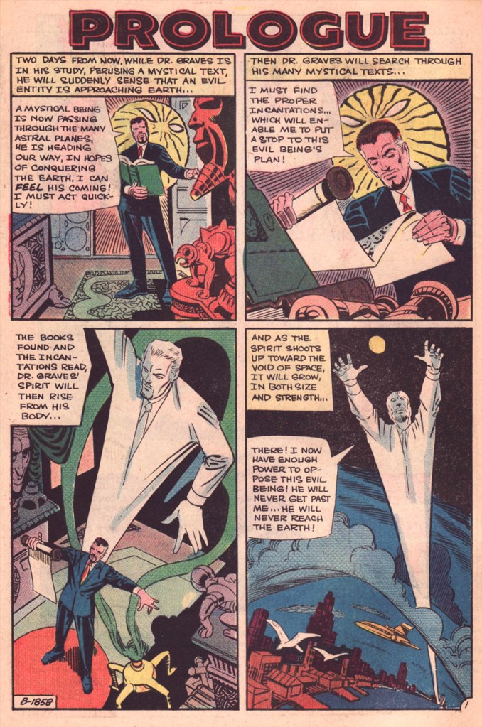
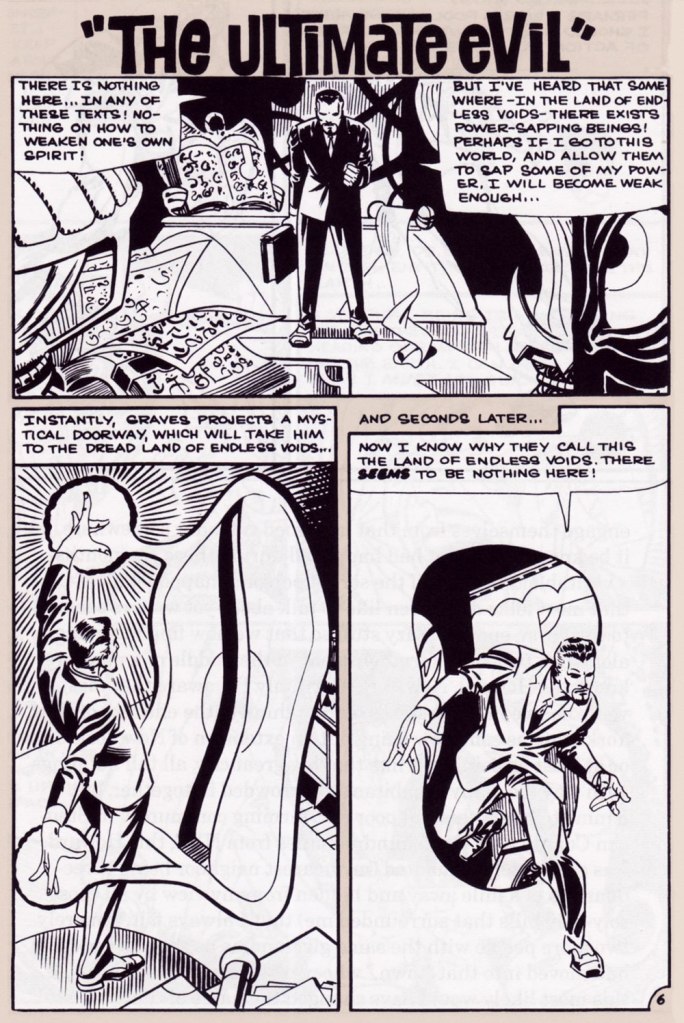
Today, I’ll showcase a bicephalous favourite, The Spectre in « The Parchment of Power Perilous » and Dr. Graves in « The Ultimate Evil », both springing from the same author… and the same plot.
How did this come to pass? Skeates told the story in an article entitled « Graves Acting Strangely: The Ultimate Evil Reconsidered », published in Charlton Spotlight no. 5 (Fall 2006, Argo Press, Michael Ambrose, editor).
« … at that particular point in time, I was totally unaware of the unique manner in which Julie [Schwartz ] approached his profession, typically in the dark when it came to the fact that this longtime comic book icon was far more actively involved in the plotting process than any other editor up at DC. […] I ambled into Julie’s well-kempt office armed with an intricate plot… something I had stayed up half the night before constructing, working, reworking, polishing and repolishing, only to have Julie read it over, extract a couple of ideas he liked, and unceremoniously toss the rest of it away. […] the two of us set about constructing what basically amounted to a brand-new plot based on those couple of ideas of mine that Julie liked, ideas that had somehow gotten his creative juices flowing. »
Charles J. “Jerry” Grandenetti (1926-2010) shows to breathtaking advantage his mad compositional virtuosity, anchored by Murphy Anderson’s rational inks. Skeates again: « … inker Murphy Anderson was the perfect stabilizing force, his meticulously detailed inks reining in Grandenetti’s insanity just enough so that even the latter’s wildest notions — colliding planes (no, not aircraft — planes of existence), his frequent disdain for panel borders, the same character shot from two or three separate angles within seemingly the same panel, etc. — became perfectly understandable, making the story so much utter fun to follow (even for someone like me who obviously knew exactly where it was going. ) »Grandenetti’s two previous issues on the title, illustrating Gardner Fox’s Pilgrims of Peril (check out a stunning excerpt here) and The Ghost That Haunted Money!, had demonstrated that he likely was the only match for Ditko when it came to depicting hallucinatory other-dimensional vistas. Let’s face it, just about all who followed Ditko on Doctor Strange either half-heartedly aped Ditko’s designs or drew other dimensions as if they were Wally Wood’s outer space (or Dali’s The Persistence of Memory). Well, save for Tom Sutton, I guess. Grandenetti could have done a great job, but honestly, I like his career as it is. The day Steve Ditko walked away from Doc Strange is the day the character ceased to exist, as far as I’m concerned.Five pages from The Spectre n. 8 (Jan.-Feb. 1969), edited by the… mighty hand of Schwartz. Special kudos to the uncredited colourist (though DC’s assistant production manager Jack Adler surely supervised), who did a superlative job, making discerning use of bold contrasts and close harmonies. It would have been so easy to end up with a garish mess!
Unlike (with one notable exception, initials SD) his colleagues who scampered from Charlton to DC along with editor Dick Giordano (Denny O’Neil and Jim Aparo, for instance) in the late 1960s, Skeates maintained his Charlton work for a time. He explained: « I simply possessed too much affection for what I was producing for that Derby, Connecticut company to do anything along those lines. » Skeates enjoyed « … contributing to Charlton’s take on the “mystery” anthology, ghostly compilations somehow edgier, funkier, and far more fun than those produced by DC and Marvel. »
« Furthermore, unlike DC, Charlton didn’t require that I first submit a plot outline, get it approved, and then write my story. Instead, I could just suddenly turn in a finished product, on spec, a way of working I very much preferred — diving right in with the plot idea only sketchily there, not boxed in even by myself but allowing the story to work itself out, to go where it wanted to go. » Amen.
The one time we saw the Doctor M. T. Graves truly get his mystical groove on was in this tale of two Steves, Skeates and Ditko, a splendid bit of recycling-but-not-quite.
And he’s how the whole ball of wax coalesced: « I suddenly remembered that fairly intricate Spectre plot that Julie had long ago summarily tossed aside. Hey, y’know, I might just be able (especially if I placed most of my emphasis on those portions that Julie hadn’t extracted, working on the bulk of my original plot while rather downplaying those couple of ideas that Julie and I had built our new plot on) to transform that baby into a workable Dr. Graves adventure! »
This is The Many Ghosts of Doctor Graves no. 12 (Jan.-Feb. 1969, Charlton). Edited by Sal Gentile.
« Boom! I was into it, writing this story nearly as fast as I could type. Of course, to in effect have Graves play the role of the Spectre, I could see no way around making certain alterations to my protagonist’s makeup, making him far more mystically powerful than he had ever before seemed, more like Marvel’s Doctor Strange than anyone else…
Yet I could see no real problem in any of that, unless of course someone up at Charlton wound up doing something supremely silly like assigning the art for this story to none other than Ditko himself — which, as it turned out, is exactly what happened! »
Some — perhaps all, who knows? — of this tale’s original art (or at least production photostats) has survived, and gives us the opportunity to gaze upon Ditko’s artwork in its raw state, so to speak.
Hail and farewell, Mr. Skeates. You will be missed.
« Clocks in disagreement are worse than no clock at all. » — David Mitchell
There’s simply nothing that gets me more into the proper Hallowe’en spirit than a spectral Joe Gill – Steve Ditko yarn.
Back in 1999, Mr. Ditko shared this intriguing insight about his most frequent — and preferred — collaborator:
« Joe Gill is one comic book story/script writer who understands a comic panel. Many other writers believe a single panel is a long, continuing strip of a movie film, containing numerous, changing, point-of-view frames. »
Here, then, is a moody tale that originally saw print in Haunted no. 7 (Aug. 1972, Charlton).
I could be wrong, but this, to my recollection, is the only Charlton ghost story wherein Ditko gave us a full-page splash.Incidentally, the pint-sized ghostly narrator is Impy, a Ditko creation who later had the dubious honour of being evicted from his own book (with issue 21, Apr. 1975) by one Baron Weirwulf. Bah, I liked Impy better.
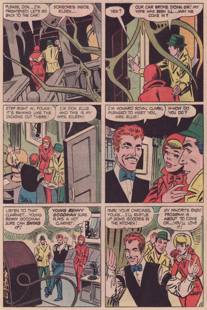
A few notes: The title design is among the best I’ve seen from Charlton; it wasn’t generally their forte.
I’m wondering whether I’m just imagining the Benny Goodman / Don Ellis jazz subtext. Joe Gill is just the type of guy to surreptitiously toss that into the mix. Goodman, the ‘King of Swing’ was an paradigm of the big band school of jazz, while Ellis, though he began his career with Glenn Miller’s band, soon fell in with the avant-garde side of things. I see a natural dichotomy at work here… though I’m a fan of both myself.
Also, this seems to me like another instance of the suave villain / obnoxious hero setup (think Night of the Demon)… I mean, who would you rather spend an evening with, dapper Howard R. Clark, or with those two boorish, meddlesome stuffed shirts? Oops, I think I’ve given my bias away.
For a bit of mood setting, listen to some of those fabulous Lights Out radio shows that Mr. Clark so rightly digs.
And here’s a swingin’ Miller performance, circa 1937, of the Louis Prima standard Sing, Sing, Sing. And to balance things out, here’s Don Ellis performing his Bulgarian Bulge in 1969. Now, now.. can’t we all just get along?
So we’re done, countdown-wise, for another year. If that’s not enough to satisfy your odious cravings, take a stroll through our voluminous-by-now archives, at this point one hundred and eighty-six posts strong (or at least long!):
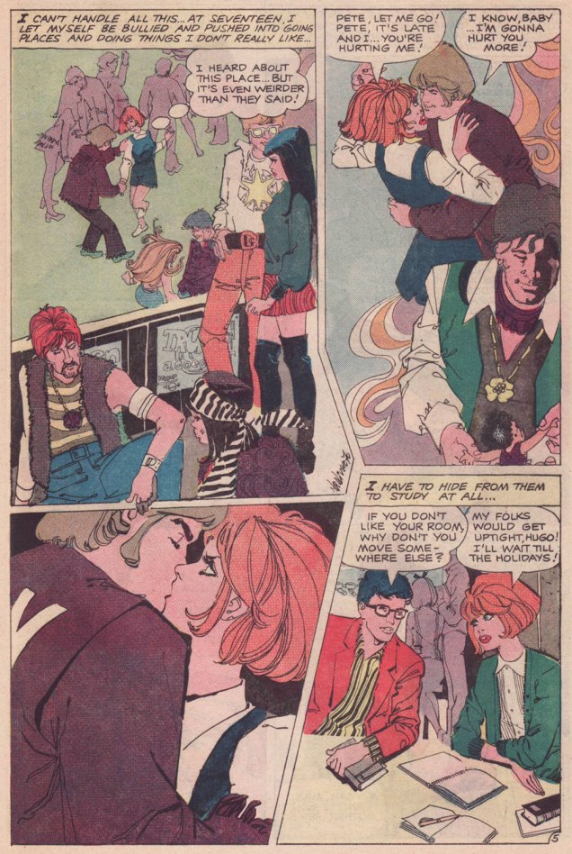
People have quite a range of definitions as to what constitutes romance. For some it’s novels of werewolf romance, others prefer completely mind-boggling Fabiosa stories (‘Unborn triplets crashed my husband’s love‘), and some ship (I learned this term from a younger colleague) characters from whatever TV show happens to be in vogue.
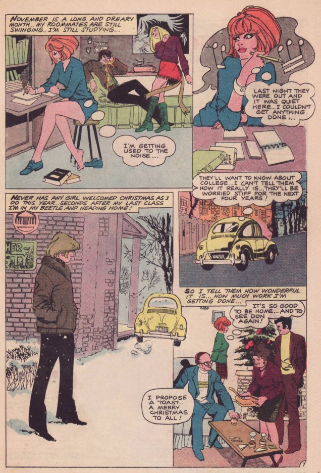
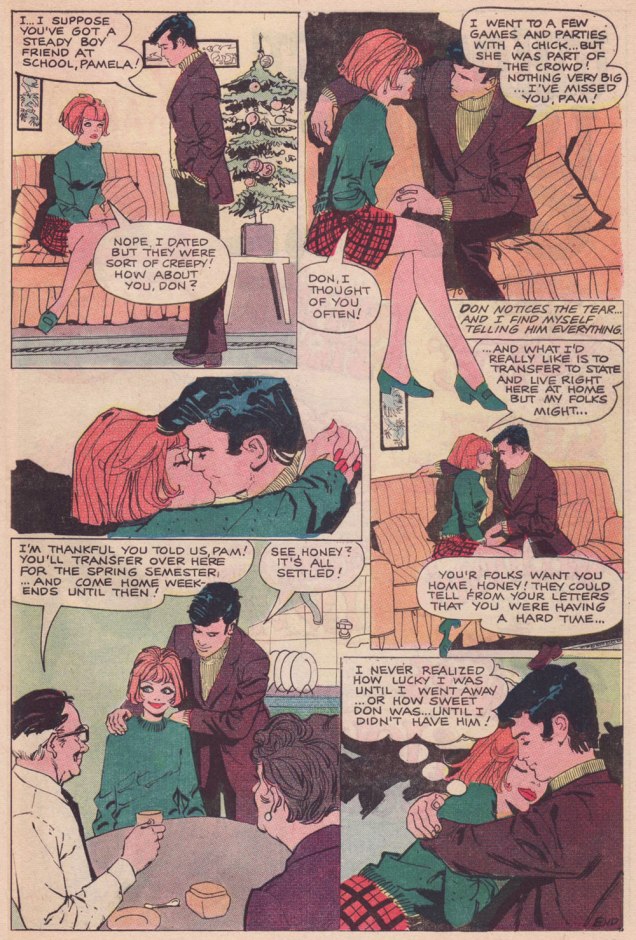
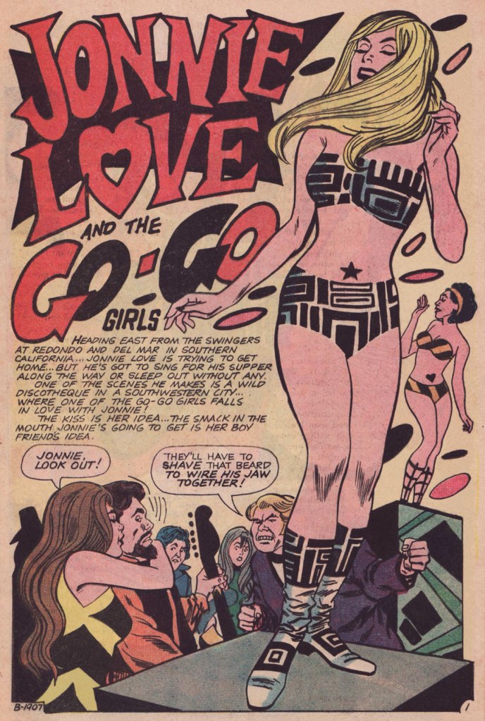
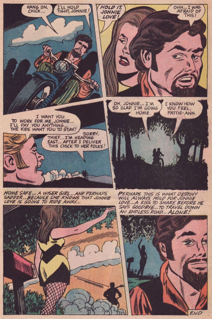
If you were a teenager in the ’50s, 60s, or 70s, you probably would have read romance comics, immensely popular at the time. Charlton Comics published a whole bevy of them, and co-admin RG has amassed a respectable collection. For weeks now I’ve been reading issues of Teen-Age Love during my lunch hour, specifically for their Jonnie Love stories. Introduced in Teen-Age Love no. 61 (November 1968) as the ‘new teen swinger’ – ‘he has a way with a guitar and a way with girls!’, Jonnie lingered within its pages for quite a while, having all kinds of adventures, hanging out with new conquests and lost souls in every issue. As advertised, he was indeed good with a guitar. Joe Gill, who was scripting the stories, wrote him as a kind of chevalier errant, wandering from town to town (with the ultimate goal of going back to his hometown, which he never achieves), offering a helpful hand to damsels in distress who are running away from predatory men, disciplinarian fathers, or just the solitude of a small town.
Jonnie Love stories appeared in 31 issues overall, but I’m most intrigued by those published in Teen-Age Love issues numbers 61-74, as they were created by the same tip-top team: scripted by Joe Gill, pencilled by Bill Fraccio and inked by Tony Tallarico (see RG’s (Fondly) Remembering Tony Tallarico).
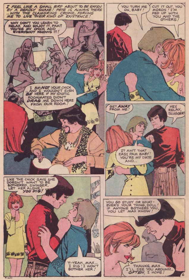
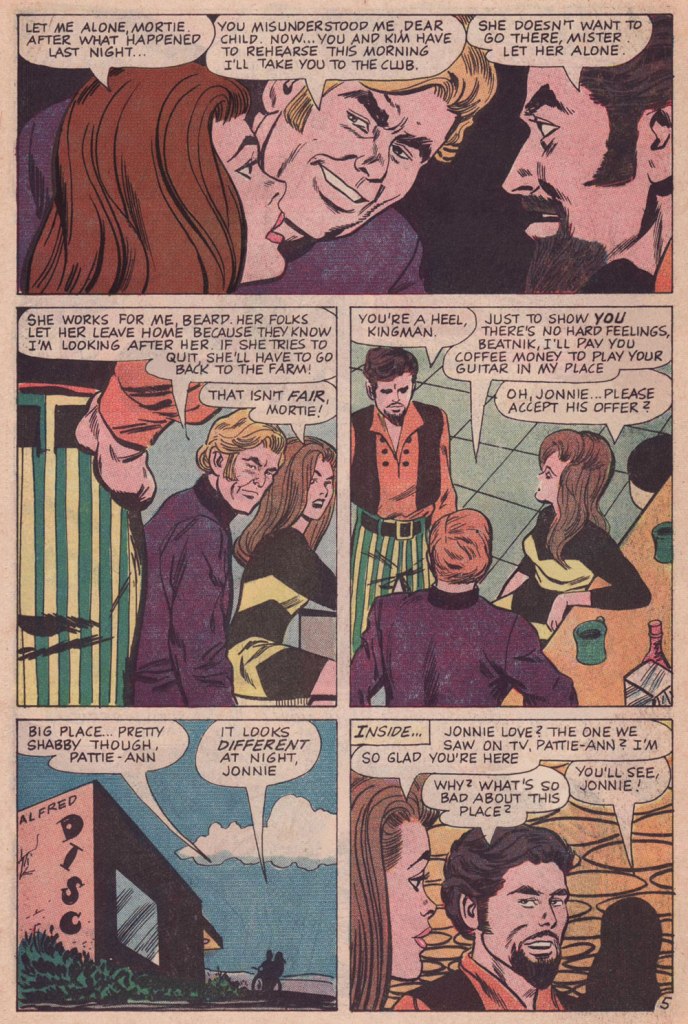
It was actually rather difficult which tale to feature, for they’re all pretty good, and I had to decide on some sort of optimal concomitance of a good plot and how the story was told visually. The final decision was Jonnie Love and the Go-Go Girls, published in Teen-Age Love no. 63 (April 1969), which I think strikes a good balance between plotting and interesting art, and is a fairly typical example of Jonnie’s behaviour in general.
Cover illustrated by the Bill Fraccio and Tony Tallarico combo. Dig the classy tattoo on the girl’s leg, courtesy of the previous owner of this comic (where are you now, Mamie?) The kissing couple in the top left corner is a preview of another story drawn by Vince Colletta. The protagonist is a brunette, whereas Jonnie often consorts with blondes (perhaps a sort of a short-hand for an attractive woman).
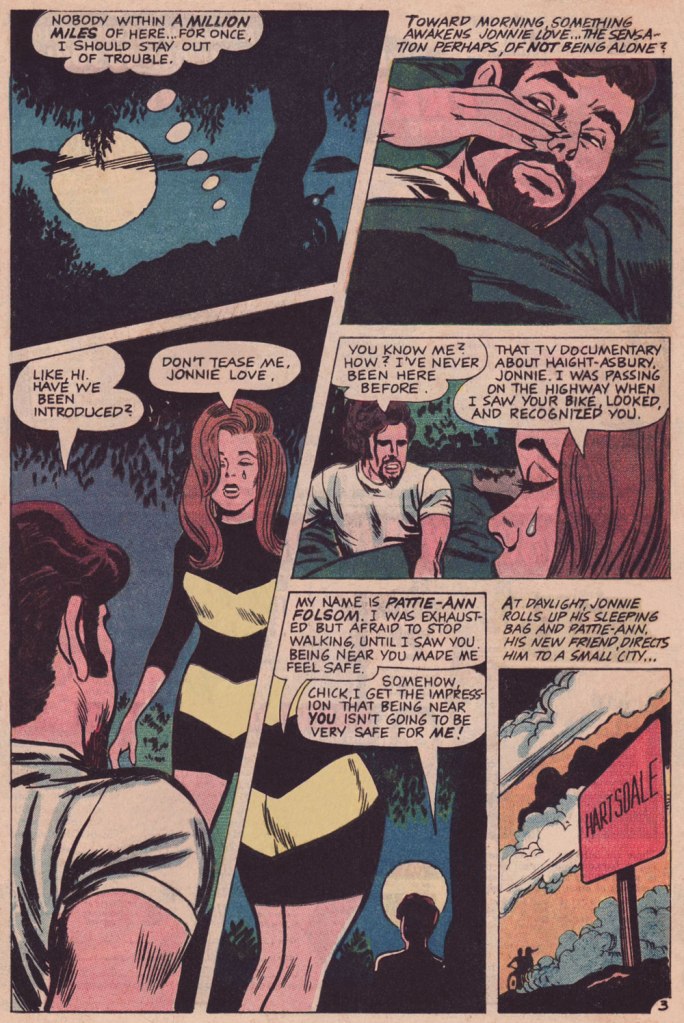
This story has several things going for it – an entertainingly evil manager, a grotty dance club, the go-go-dancers, and of course the protagonist, a farmer’s daughter who ran away from her parents to make it big in showbiz (the lines dreaming of glory/twitching like a finger on a trigger of a gun‘ come to mind). ‘Cute‘, notes Jonnie, ‘but there are tens of thousands with as much talent‘. Some romance stories set out to stun their readers with ritzy places, glamorous dates, and finding a rich prince charming; others feature women who give up a life of success for simpler living – a small town, a farm, a cabin in the woods. The latter moral always feels a bit stilted, even aside from me feeling bad for women who have to give up a career they worked so hard to achieve (mostly because such plots are retrograde, and it’s all-too-seldom considered that a woman can marry and continue working).
In Jonnie Love yarns, there is a strong undercurrent of returning ~Home~, home from which one foolishly ran away and which beckons lonesome wanderers back to its comforting womb. The plots are imbued with bittersweet longing for this homecoming, and that is what lingers most in one’s mind after finishing the stories. Yet the people depicted in them are outcasts; Jonnie himself was outed as a weirdo in both dress and thoughts by the people in his home town, which is why he left it in the first place. Returning is hardly the panacea it’s supposed to be (unless one is willing, this time around, to ‘fit in’ properly), and while some of these nomads do manage to make it back, our main character is doomed to forever roam strange towns, sleep in fields, and share sweet kisses with girls he knows he’ll never see again. Rather a tragic figure, really.