« Denmark is like a secret little place with its own special language. » — Helena Christensen
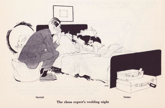
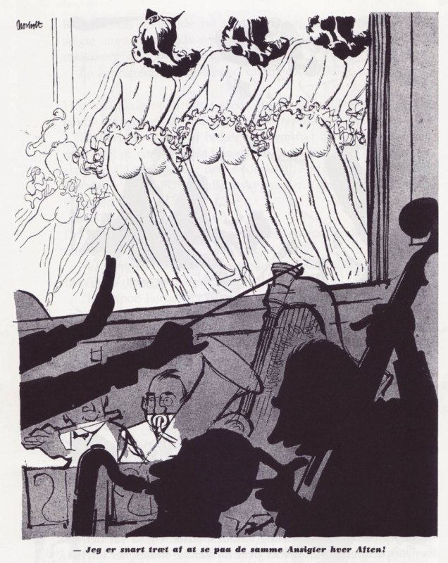
Here’s a post that has been a looong time coming. To wit: back on May 14th, 2015, I wrote: « From the pen of a Scandinavian cartoonist who signs his work “Norholt” comes this elegant eye-opener, pulled from a collection entitled “Best Cartoons from Abroad, 1955: A Collection of the Best Cartoons from the Outstanding Publications All Over the World“. Edited by Lawrence Lariar and Ben Roth. Sadly, any search for the mysterious Norholt leads me right back to this selfsame book, an indication that this was perhaps the talented lad’s only English-language publication. Sigh… »
This is what I had:

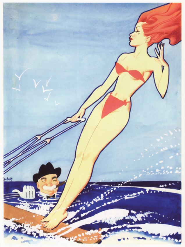
Then, in 2022, a Norholt original turned up for auction at Heritage. They seemed to know even less than I did, and wrote: « Humorama Artist Breezy October-1957 Gag Cartoon Original Art (Timely Features/Humorama Publ., 1957). A statuesque nude dominates this choice selection from an artist signed as “Norholt” (perceived spelling, lower left). Splendid spontaneity in the brush technique. Production notes (reverse) document an origin in the Humorama line’s Breezy magazine (10-57), with an encore in either Gaze or Gee Whiz (the “G” initial is ambiguous). » People may not have known what it was, but they had eyes: it changed hands for 780 dollars (plus commission and shipping).

I still kept an eye out, and earlier this year, discovered the existence of an abundantly illustrated, Danish-language biography authored by his daughter, Kirsten, an actress likely better known than her father ever was. Which, thankfully, might have been why this precious book saw publication at all.

I then learned, through the biography’s helpful Sources section, of the existence of a slim collection entitled Povl Norholts bedste tegninger fra Hudibras (Chr Erichsens Forlag, 1984); I found myself a cheap copy for my library, but you may freely peruse the entire volume right here!
From this website, we expand somewhat on what little we knew: « Povl Norholt (December 3, 1908 – August 23, 1993) became a student from the Metropolitan School and was employed by A P Møller for a while before he decided to become a draftsman. He was co-founder of the humorous magazine Hudibras and created the beautiful Miss Sylvia, who became the epitome of a Norholt girl. And if it was a drawing of her on the cover, the circulation increased noticeably.
Povl Norholt had a style that could certainly have led to world fame if he had accepted the offer to draw for the American magazine Esquire*. He did not, however, but found a wife in Denmark, which daughter Kirsten Norholt is happy about. She became an actress but has also written a book about her father. It is simply called ‘Norholt’. She has donated part of her father’s work to the Museum of Leaf Artists, which is located at the Royal Library.
By the standards of the time, Povl Norholt’s drawings were tantalizing and erotic, executed with taste and professionalism. When he was asked late in his career if he wanted to make a poster for a Bedside movie, he declined. It was too flat and vulgar. »


-RG
*Oh, how Esquire (and Norholt’s American agent) tried to get him to move to America! That most amusing negotiation is deliciously recounted in his biography. Daughter Kirsten concludes: « In reality, I think it was never my father’s dream to come to America. He was comfortable and safe in Denmark among friends and family, and his dreams of going abroad were more towards England, where his two sisters lived. »
**Obviously modelled after E. Simms Campbell‘s Esky (« the white mustachioed, pop‐eyed, bulbous‐nosed connoisseur of female beauty »), Esquire Magazine’s mascot, who first appeared in 1934.