« A merry Christmas to all my friends except two. » — W. C. Fields
I was in the middle of writing a post on another topic, getting bogged down in its complexities, and then it dawned on me that Christmas was fast approaching, and I’d better switch gears pronto.
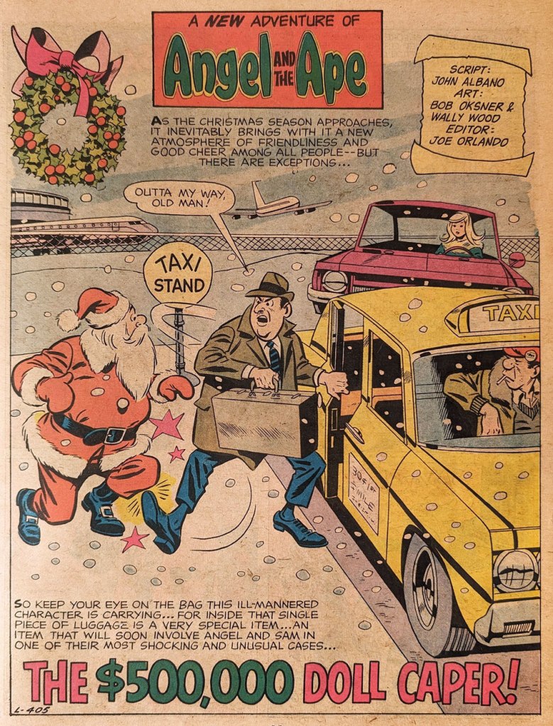
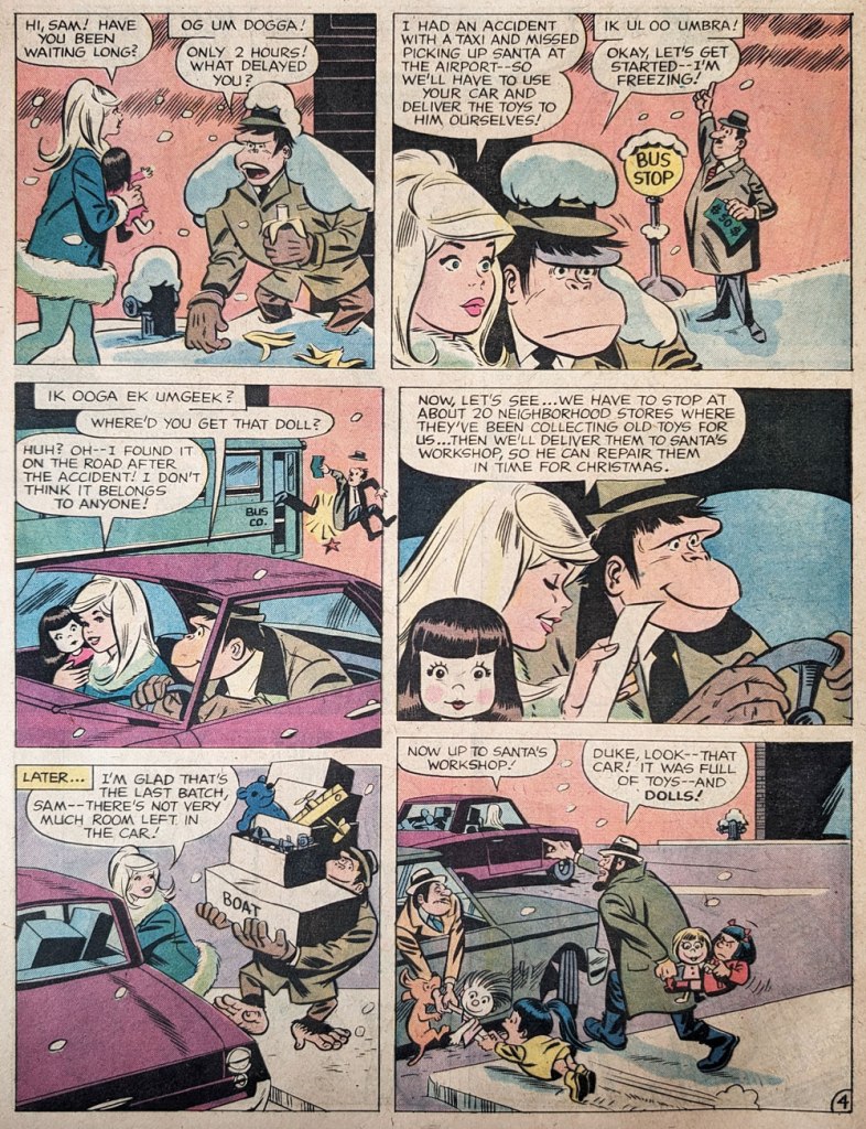
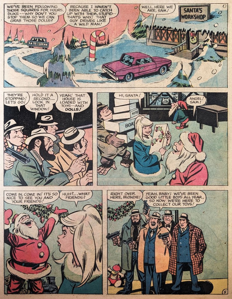
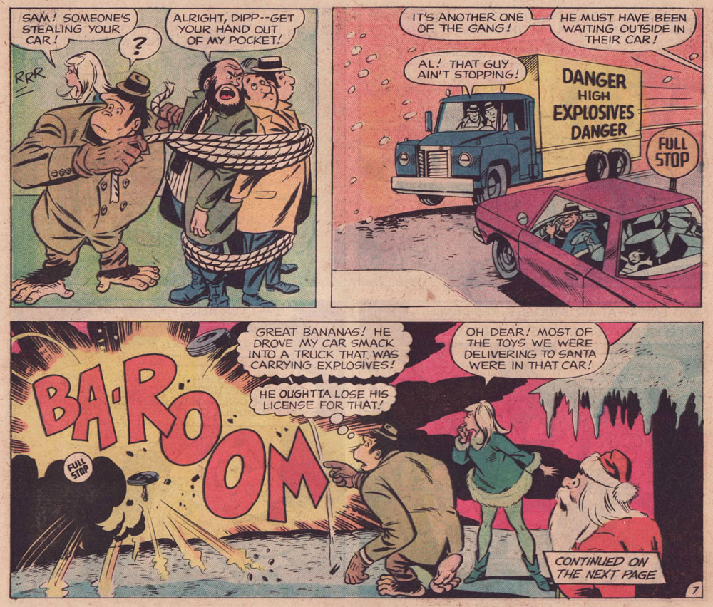
Thankfully, I had something in mind: an Angel and the Ape tale initially produced in the late 1960s but orphaned with the book’s cancellation. It was half-heartedly released from limbo –shall we say buried? — in one of those awkward tabloid format volumes, Limited Collectors’ Edition C-34: Christmas With the Super-Heroes (Feb.-Mar. 1975, DC) and not even advertised on the front or back cover… which is why it took me decades to learn of its existence.
On average, Angel and the Ape was only marginally funnier than the rest of DC’s humour books (save of course for Shelly Mayer’s consistently hilarious Sugar and Spike), but still leagues ahead of Marvel’s painful Not Brand Ecch et al. A&A was, imho, at its peak when E. Nelson Bridwell wrote it, lobbing some choice barbs at the esteemed competition.
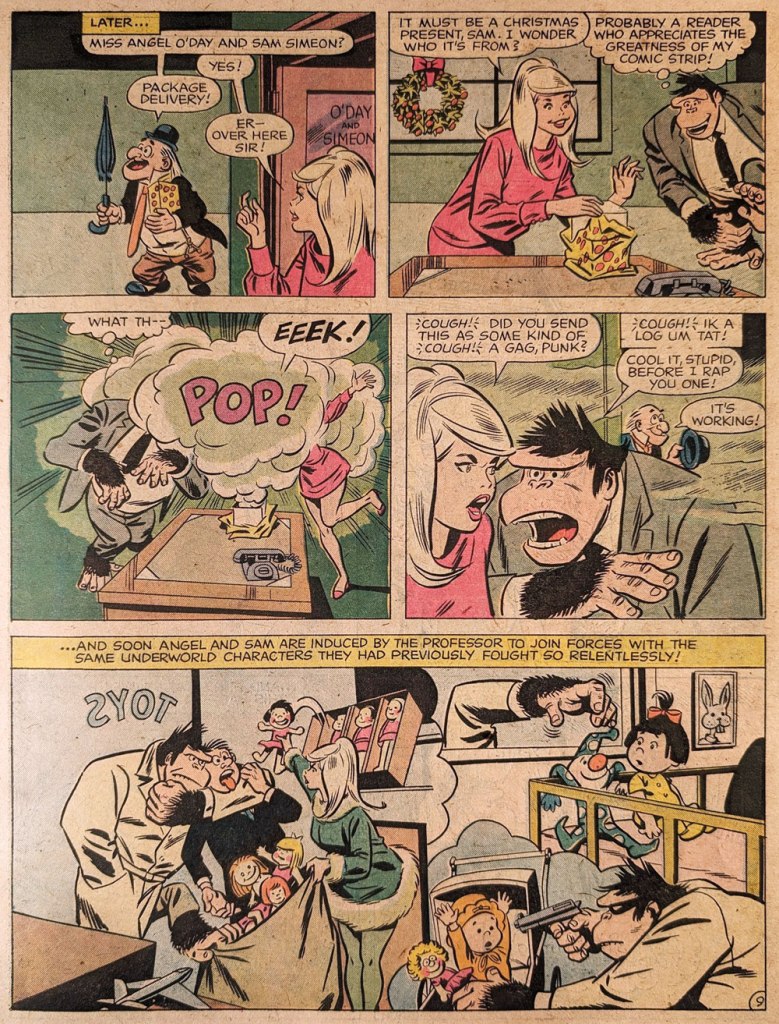
To briefly illustrate my point, here’s a relevant panel from Angel and the Ape no. 3 (Mar. 1969, DC).
Script by Bridwell, pencils by Oksner, inks by Wood. The redhead in the green cape and star-spangled tights is Stan Bragg, editor-in-chef at Brainpix Comics, a clever amalgam of the Smilin’ One and his Rascally subordinate. “When you write good stories and do good artwork, don’t I sign it?“
« If anything, I consider myself non-violent. I’m from the hippy era, peace, love, groovy. » — Rick James
1968 wasn’t exactly a banner year for Harry Shorten and Wally Wood‘s Tower Comics (1965-69); Wood’s flagship title, T.H.U.N.D.E.R. Agents, was down to running a mixture of reprints and inventory, and a mere two issues were cover-dated 1968. A final number, the 20th, limped onto newsstands a full year after its predecessor.
So it’s understandable that Wood started casting around for plan B. He gave Archie a try. It didn’t take… surely his fellow Tower editor and Archie refugee Samm Schwartz must have tried to warn him. Oh well.
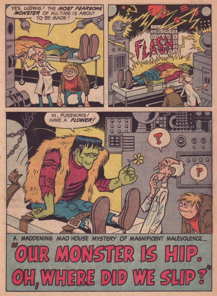
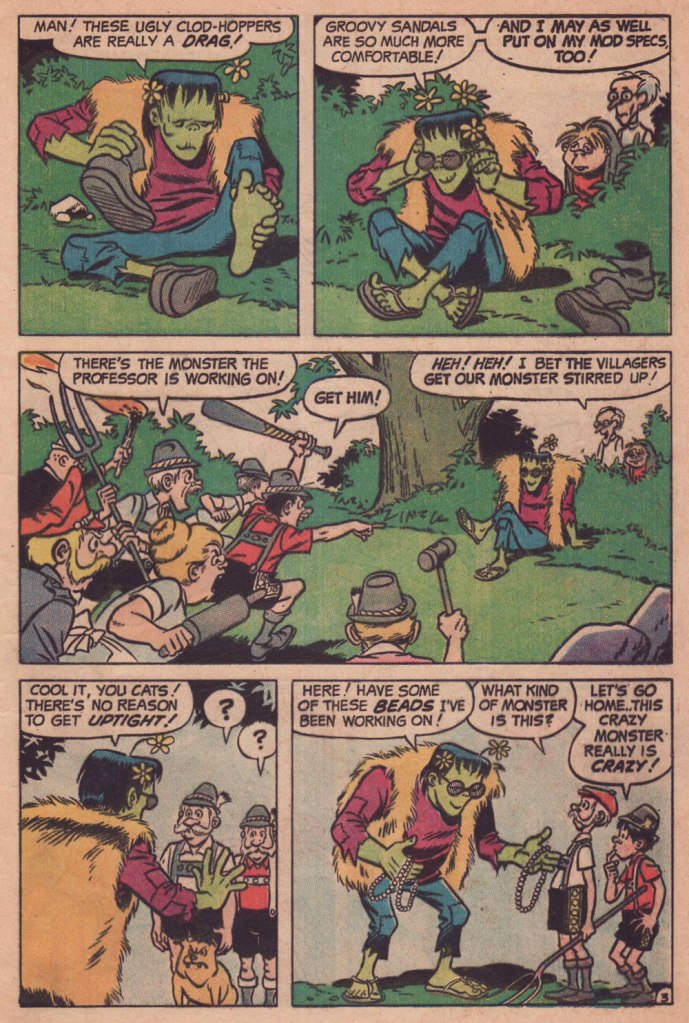
« Our Monster Is Hip. Oh, Where Did We Slip? », most likely scripted by Archie mainstay George Gladir (1925-2013), appeared in Archie’s Madhouse no. 64 (Oct. 1968).
As far as I know, this was the only story Wood drew for Archie Comics, at least in their usual humorous mode. In the ’70’s, he would provide finishes over Jack Abel‘s pencils on one story (« Devil Rider », Red Circle Sorcery no. 10, Dec. 1974) for the interesting but short-lived, Gray Morrow-directed Red Circle Comics Group, a more ‘mature’ Archie offshoot… and that’s it.
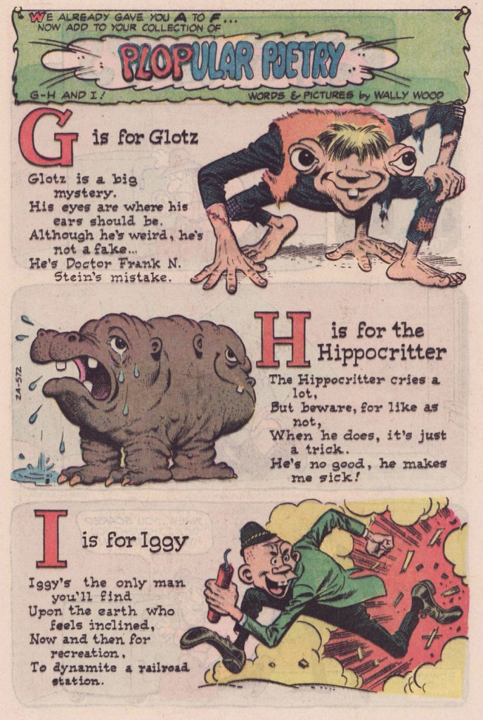
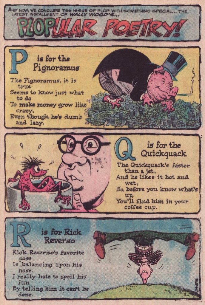
Here’s a seldom-seen 1970’s Wally Wood treat: he concocted this irreverent alphabet for Plop! (1973-76), DC Comics’ surprisingly solid yet nearly forgotten gallows humour anthology — forgotten? oh, it’s the same old recipe: just let the material remain out of print for nearly half a century (and counting)*, fold in gradually the dust and grime of neglect, and let wither, uncovered, until utter oblivion is achieved.
While Plopular Poetry is minor ‘woodwork’, it represents some of the best produced by poor Woody at this late stage in his life.
Published in Plop! no. 18 (Nov.-Dec. 1975, DC).Published in Plop! no. 19 (Jan.-Feb. 1976, DC).Published in Plop! no. 20 (Mar.-Apr. 1976, DC).Published in Plop! no. 21 (May-June 1976, DC).Published in Plop! no. 22 (July-Aug. 1976, DC).Published in Plop! no. 23 (Sept-Oct. 1976, DC). According to his protégé Ralph Reese, this is Woody doing his own lettering on the poems. … and that was it. Plop! had run its course, cancelled with its 24th issue, five letters short of an alphabet. Published in Plop! no. 24 (Nov.-Dec. 1976, DC). Were the five final letters ever produced? I’ve been keeping my eyes open all these years… but I’m still waiting.
As a bonus…
Wood’s cover preliminary for Plop! no. 19’s cover boy, Smokin’ Sanford. Rendered in blue pencil on paper.A more refined version of Sanford, rendered in graphite over blue pencil.This is Plop! no. 19 (Jan.-Feb. 1976, DC), Wood’s fourth and final cover for the title, with sidebars and logo design by Sergio Aragonés; edited by his buddy from the EC days (and even earlier), Joe Orlando. Do I detect another, highly meticulous hand in the inking (Ralph Reese comes to mind, but he says he never worked on Plop!, and if one of us is wrong, odds are it’s me), or is Sanford’s wacky tobaccy messing with my mind?
And here’s a glimpse into the creative process! Note the disappearance, in the end, of Sanford’s threads and spectacles.
-RG
*aside from a pair of obscure digest reprints in the mid-eighties.
« Jerry Grandenetti started out ghosting The Spirit, and nobody… NOBODY… captured the spirit of The Spirit better. Not content to stay in Will Eisner’s shadow forever, he forged his own unique style leading to a highly successful comics career lasting decades. » — Michael T. Gilbert
Since my very first encounter with his work, Jerry Grandenetti (1926-2010; born ninety-five years ago today, another Thursday April 15th) has endured as one of my true artistic heroes. But he’s not celebrated much at all.
Though he’s worked extensively on The Spirit, he’s treated as a bit of a footnote in the Eisner hagiography. His DC war work is well-regarded, but he’s inevitably overshadowed by the Joe Kubert – Russ Heath – John Severin trinity. Besides, by and large, the war comics audience doesn’t overlap much with the spandex long johns crowd. Grandenetti has only very occasionally and timidly dipped a toe into the super-heroics fray, and he was far too unusual for overwhelming mainstream acclaim.
In fact, aside from the couple of converts I’ve made over the years, I can only think of three fellow torch-bearing aficionados: Michael T. Gilbert (who digs best the early, Eisner-employed Jerry); Stephen R. Bissette (who favours the spooky 60s and 70s work); and Don Mangus, who’s most into the DC war stuff. I daresay I enjoy it all, but my taste is most closely aligned with Mr. Bissette’s on this particular point. Let’s sample a bit of everything, insofar as it’s feasible to sum up a career spread out over five decades… in a dozen-or-so images.
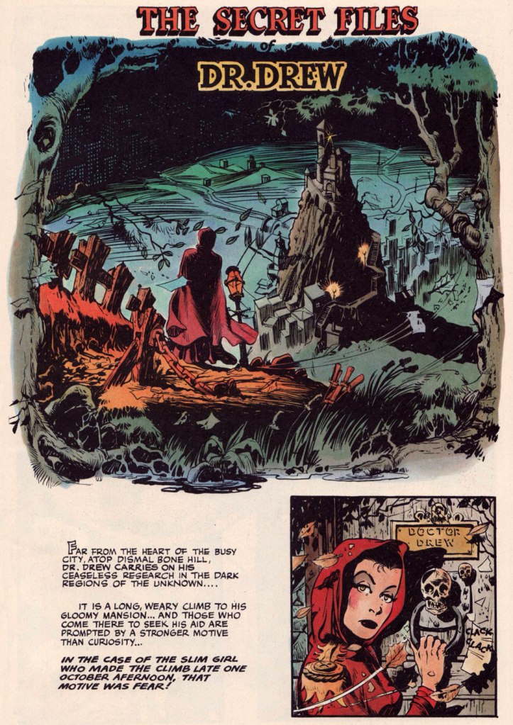
Opening splash from The Secret Files of Dr. Drew: Sabina the Sorceress, written by Marilyn Mercer and lettered by Abe Kanegson, from Rangers Comics no. 56 (Dec. 1950, Fiction House); this version hails from a reprint (Mr. Monster’s Super Duper Special no. 2, Aug. 1986, Eclipse) using the surviving original art; it was recoloured by Steve Oliff.
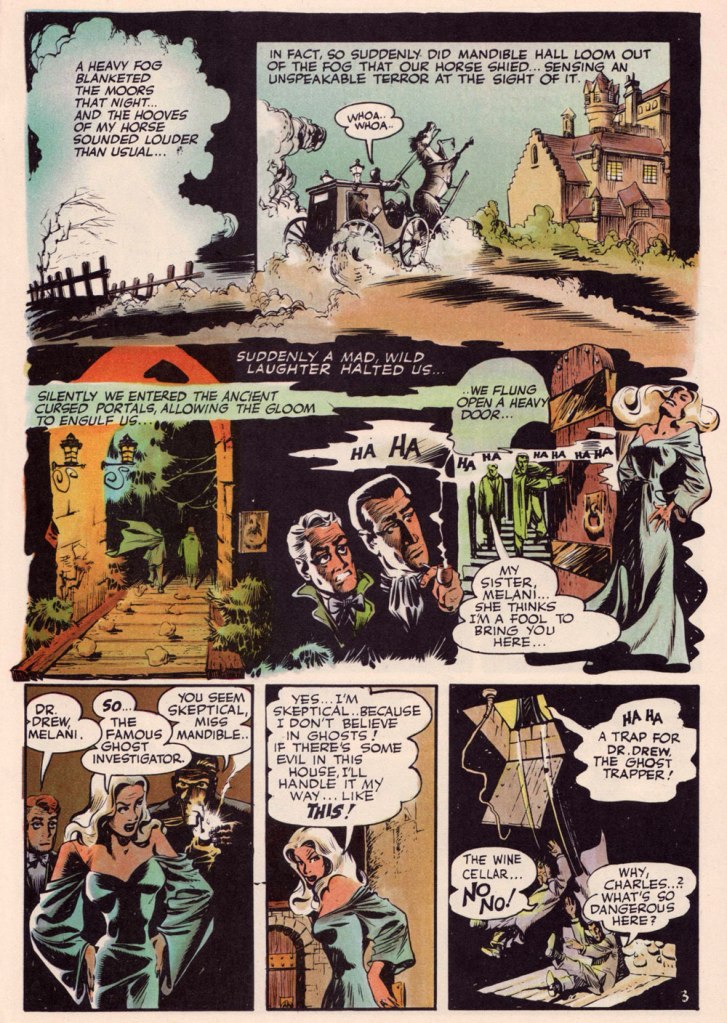
Page 3 from The Secret Files of Dr. Drew: Curse of the Mandibles!, written by Marilyn Mercer and lettered by Abe Kanegson, from Rangers Comics no. 55 (Oct. 1950, Fiction House); this version hails from a reprint (Doc Stearn… Mr. Monster no. 4, Dec. 1985, Eclipse) using the surviving original art; it was most tastefully recoloured by Steve Oliff.
In 1954, the powers-that-be at National Periodical Publications (you know, DC) gave Grandenetti some latitude to experiment with their War covers. Grandenetti produced an arresting hybrid of painted and line art. The process involved a grey wash painting that was photostatted, with flat colour laid over the resulting image. The first few attempts yielded striking, but nearly monochromatic results. A bit farther down the pike, the production department got more assured in its technical exploration.
This is G.I. Combat no. 77 (Oct. 1959, DC); wash tones and colouring by Jack Adler, who recalled, in a 1970s interview: « It was suggested that we start doing washes for covers, and we were talking about doing it for so damned long, but nobody attempted it. I think Grandenetti did the first one, an army cover with someone floating in the water. I think that was the first wash cover that was done. That one ended up looking like a full color painting. »
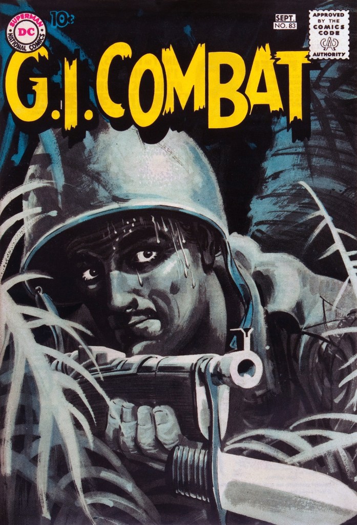
This is G.I. Combat no. 83 (Aug.- Sept. 1960, DC); wash tones and colouring by Jack Adler. In 1995, Robert Kanigher, Grandenetti’s editor on the DC war books and a frequent collaborator, recalled: « Jerry liked to experiment and I had to sit on him to get him to stop it. Especially in his covers, which were outstanding, when I forced him to draw as realistically as possible. »
Original art from The Wrath of Warlord Krang!, smothered in dialogue and exposition by Stan Lee, from Tales to Astonish no. 86 (Dec. 1966, Marvel); inks by Bill Everett. Namor‘s constant random shouts of ‘Imperius Rex!‘ make him sound like a sitcom character with Tourette’s. As far as I’m concerned, it’s possibly been the most annoyingly asinine slogan in comics since Stan stole ‘Excelsior!‘ from Jean Shepherd.
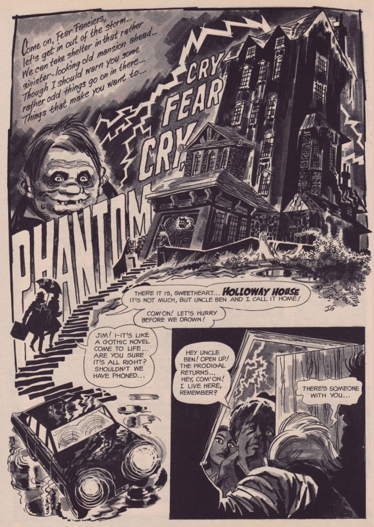
The opening splash from Cry Fear, Cry Phantom, written by Archie Goodwin, from Eerie no. 7 (Jan. 1967, Warren). In the mid-60s, presumably tiring of being pigeonholed as a war artist at DC, Grandenetti made the publishers’ rounds, doing a bit of work for Tower, Gold Key, Charlton, Marvel, Cracked (check it out here) and most memorably Warren where, after ghosting a few stories for Joe Orlando, he unleashed his innovative expressionistic style.
DC was generally hesitant to entrust its more established properties to the more “out there” artists. In the cases of Grandenetti and Carmine Infantino, the solution was to match them with the weirdness-dampening inks of straight-arrow artist Murphy Anderson. And you know what? It did wonders for both pencillers and inker.
This is The Spectre no. 6, October, 1968. A tale told by Gardner Fox (and likely heavily revised by hands-on editor Julius Schwartz, a man who loved alliterative titling) and superbly illustrated by the Grandenetti-Anderson team. Steve Ditko aside, Jerry Grandenetti had no peer in the obscure art of depicting eldritch dimensions (you’ll see!)
Page 13 from Pilgrims of Peril! written by Gardner Fox, from The Spectre no. 6 (Sept.- Oct. 1968, DC); inked by Murphy Anderson. Dig the salute to a trio of real-life spooky writers, all of whom editor Julius Schwartz knew well, having even served as Lovecraft’s literary agent late in the man’s life. By the tail end of the 1960s, Lovecraft’s work was finally making some commercial inroads, thanks largely to Arkham House co-publisher Derleth‘s unflagging diligence.
Page 22 from Pilgrims of Peril! written by Gardner Fox, from The Spectre no. 6 (Sept.- Oct. 1968, DC); inked by Murphy Anderson.
Page 2 from Men Call Me the Phantom Stranger, written by Mike Friedrich, from Showcase no. 80 (Feb. 1969, DC); inks by Bill Draut. This story reintroduced an obscure character from the early 50s, which Grandenetti had drawn a couple of times during his six-issue run. The Phantom Stranger has remained active ever since, but most writers (save Alan Moore, wouldn’t you know it?) don’t really know what to do with him. This, however, is my very favourite PS appearance. Draut, a slightly old-fashioned penciller by this time was, as a slick inker, a wonderful fit for Grandenetti’s confidently loopy layouts.
Page 3 from The Haunting!, written by Jack Oleck, from House of Mystery no. 183 ((Nov.-Dec. 1969, DC). Grandenetti pencils and inks: undiluted!
Page 2 from Eyes of the Cat, written by Robert Kanigher, from House of Mystery no. 189 (Nov.-Dec. 1970, DC); inks by Jerry’s fellow Will Eisner ghost Wallace Wood. The inspired combination of Grandenetti’s adventurous layouts and the velvety unctuousness of Wood’s finishes are a match made in heaven, but one Woody wasn’t fond of. Oh well.
So there you are. Just the tiniest tip of the iceberg. Happy birthday, Mr. Grandenetti!
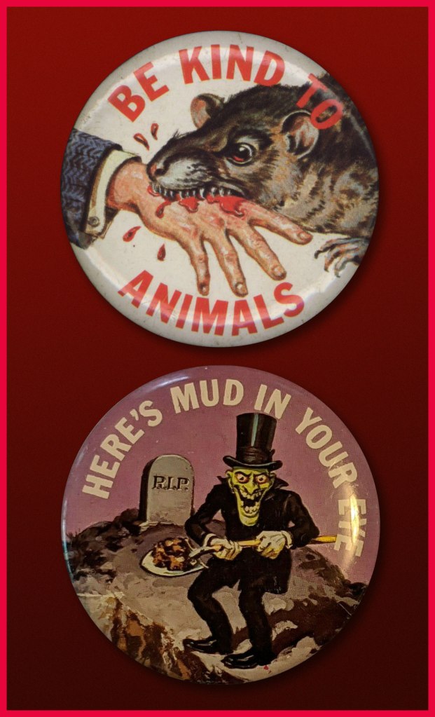
« … a radical series of crappy jokes & trashy art mopped out of the Bowery’s least washed lavatories. Fueled on bologna sandwiches, black coffee & cheap cigarettes, these are the ugly buttons that scream ‘America‘ to an America that has forgotten itself. » — a tasty bit of hype from Goblinko
Fabled pulp illustrator Norman Saunders (a definite favourite around these parts) is legitimately appreciated for his body of work, but I do believe he isn’t sufficiently lauded for his humorous work. After all, he could hold his own against the likes of Basil Wolverton and Wally Wood, and how many of his peers could lay claim to such a lofty achievement?
A passage from his son David’s definitive monograph, the simply and fittingly titled Norman Saunders:
Ugly Buttons came out in 1967 to exploit the popular trend of protest buttons with witty sayings. The macabre humor of Ugly Buttons reflects their Halloween release date as well as the morbid comedy of popular TV shows like The Addams Family and The Munsters. Norm Saunders created half [ eleven, actually ] of the twenty-four images in this set, while Wally Wood created the other half.
A sample of the original packaging…
I’m sorry… but that bat is just so adorable…
You can see why these are perfect Hallowe’en fodder!
Macabre, and with a tidy moral to boot! At a nickel apiece, an undeniably excellent value.
Well, perhaps not *strictly* altogether moral.
The final Saunders button, shot from the original art. This looker was entitled Peek-a-Boo.
One of the original boxes, which held 24 packs. Featured buttons Here’s Looking at You and I’m a Cool Ghoul were designed by Wally Wood.
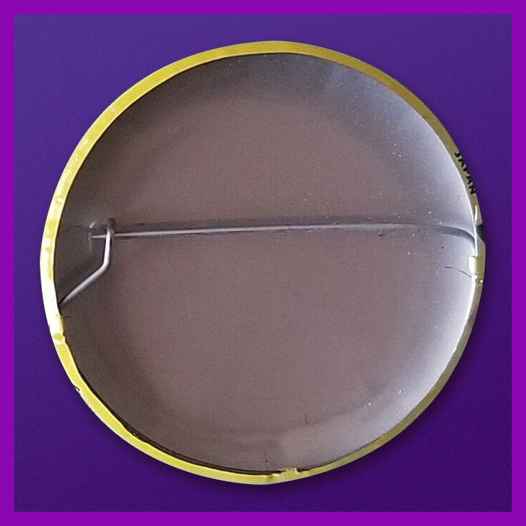
Collectors find this set very difficult to complete. Although the series was a popular success in 1967, the buttons appear to have rarely survived. This is perhaps attributable to the design of the tin back pin, which was made in Japan with a hair-trigger clasp that instantly popped open and fell off.
Here’s one of the underperforming bad boys in question. To be fair, this one’s still holding together, which surely has earned it some kind of goodwill, a half-century hence. Those old enough (enough, enough!) will recall when ‘Made in Japan’ was an indicator of shoddy goods. All that’s been turned on its head since, interestingly. The Japanese people have admirably overcome much adversity, that’s evident.
By the way, I don’t know just how sanctioned these reissues are, but the cool cats at Goblinko have made these lovely buttons available once more, presumably sturdier and certainly at a perfectly reasonable price (forty times the original, I’ll grant you… but you do get to pick).
« … And so Hooten Landing remained unchanged through the years… a landmark and a memorial… a colonial world that had made only one or two concessions to the march of progress. » — From Ye Olde Spirit of ’76 (July 3, 1949)
Having reached the last half of Kitchen Sink’s chronological reprinting of the Post-WWII Spirit, we come at last to the end of our own chronicle. As stated earlier, facing an inexorable dwindling of Eisner’s involvement and investment in his creation due to other commitments and an understandable sagging of his stamina, the strip slowly entered its decline. Then as now, good help was hard to find, to the point where Eisner opted to wrap up the strip rather than let it peter out completely. This sober and courageous decision most certainly contributed in preserving the feature’s solid reputation to this day.
As we embark on the inarguably lesser half of the run, we encounter fewer standout covers, which is to be expected, given the creator’s diminished affection for the contents. Nevertheless, forty-four Will Eisner covers are bound to yield some genuine sparklers. Here, then, are my picks.
Kitchen Sink Press’ The Spirit no. 46 (July 1988) cover-features Satin, originally published on June 12, 1949. Also in this issue: the clever and entertaining The Prediction (June 19, 1949); The Elevator (June 26, 1949); and Ye Olde Spirit of ’76 (July 3, 1949). Cover by Eisner, with colours by Ray Fehrenbach. Obviously, we’re still in classic territory.
This is The Spirit no. 46 (Aug. 1988), which, over six instalments, « takes The Spirit to the Peligros, a fictional group of South Pacific islands, where he interacts with an entirely new set of characters, cultures and adventures. » The issue opens with Lilly Lotus(July 10, 1949); then follows with Sally of the Islands (July 17, 1949); The Masked Man (July 24, 1949); and The Ball Game (July 31, 1949), introducing latter-day sidekick and comic foil Sammy. Cover colours by Ray Fehrenbach.
This is The Spirit no. 47 (Sept. 1988), which wraps up the masked man’s Pacific Island with the cover-featured Matua (Aug. 7, 1949), followed naturally by The Return (Aug. 14, 1949); then it’s back to Central City business with The Candidate (Aug. 21, 1949) and White Cloud (Aug. 28, 1949). Cover colours by Ray Fehrenbach.
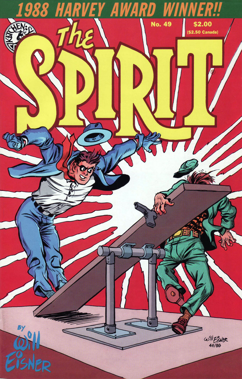
This is The Spirit no. 49 (Nov. 1988), presenting Crime (Oct. 2, 1949); Death of Autumn Mews (Oct. 9, 1949) partly a retelling of the former Denny Colt’s origin, and boasting a true-blue classic splash page; The Curse (Oct. 16, 1949); and Fox at Bay (Oct. 23, 1949). Cover colours by Ray Fehrenbach. Incidentally, The Spirit was the 1988 Harvey Awards laureate in the category of “Best Reprint Project”.
This is The Spirit no. 50 (Dec. 1988). Gathered therein are the Hallowe’en tale of Elect Miss Rhinemaiden of 1950 (Oct. 30, 1949), featuring the return of the sorcerous Hazel P. Macbeth; The eerie The Inner Voice (Nov. 6, 1949); Surgery… (Nov. 13, 1949); and The Thanksgiving Spirit (Nov. 20, 1949). And yes, The Spirit spends the entire issue on crutches. Eisner was ever the innovator! Cover colours by Ray Fehrenbach.
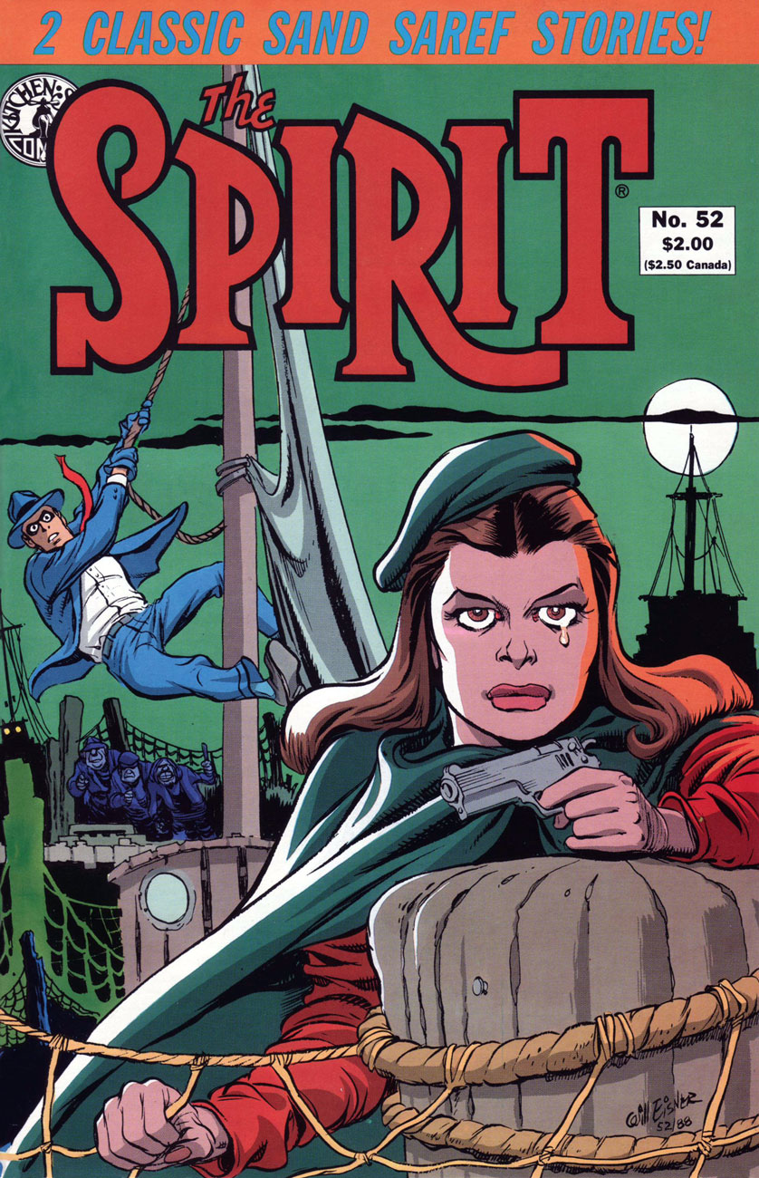
This is The Spirit no. 52 (Feb. 1989), and it cover-features the classic Bring in Sand Saref (Jan. 15, 1950); also in this issue: The Christmas Spirit (Dec. 25, 1949); Fan Mail (Jan. 1, 1950); and part one of the cover story, Sand Saref (Jan. 8, 1950); this cover bears some outstanding colour work by Mr. Fehrenbach, if I may say so.
Some background about the classic Sand Saref two-parter, from Tom Heintjes‘ Stage Settings column:
« The final two stories form one longer tale, and they’ve earned a place in comics history. Eisner’s work and film noir have been mentioned in the same breath for decades, and you hold in your hands one of the best reasons why. »
« The story’s history is unorthodox. Sand Saref and Bring in Sand Saref had their origins in Eisner’s shop, which had been producing various comic books and pieces of commercial art with growing frequency. The two stories were originally done as a single 11-page feature, but it didn’t star The Spirit. The lead character was John Law, a character Eisner intended to launch independently of The Spirit feature.
When the John Law project was shelved due to the often poor newsstand distribution of many comic books, Eisner later saw an opportunity, and seized it by breaking the 11-page John Law feature into a two-part Spirit story. Astute readers are now saying: ‘But Spirit stories are seven pages long, requiring fourteen pages of art.‘ Well, there are no flies on Will Eisner. He created the first three pages of ‘Sand Saref’ to bring up the page count.
Eisner said breaking the John Law story into two halves, eliminating all traces of the intended hero, and inking in the faces of The Spirit’s cast of characters wasn’t simple. “The characters were different people, so considerable dialogue had to be rewritten,” he said. “John Law was a policeman and The Spirit wasn’t. Merely because they both fought on the side of law and order didn’t make them the same character.” In fact, Eisner has Sand Saref tell The Spirit ‘you’re a cop’ in the climax of the 14-page story. »
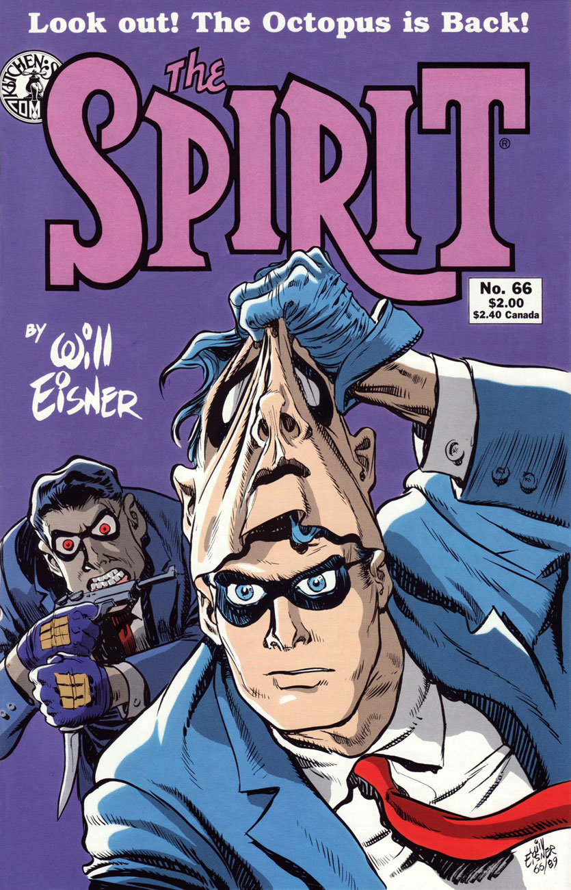
This is The Spirit no. 66 (Apr. 1990), and the issue reprints Future Death (Jan. 21, 1951); The Meanest Man in the World (Jan. 28, 1951); the shadowy, ultra-violent Showdown (Feb. 4, 1951); and its cover-featured conclusion, The Octopus Is Back (Feb. 11, 1951). Cover hues by none other than Joe Matt!
The Spirit no. 69 (July 1990) reprints Time Bomb (Apr. 15, 1951); Hobart (April 22, 1951); Help Wanted (April 29, 1951); and cover-featured The Facts (May 6, 1951); Ray Fehrenbach is back on colours.
The Spirit no. 70 (Aug. 1990) reprints The Hero (May 13, 1951); The 7th Husband (May 20, 1951); King Wang (May 27, 1951); and The Thing in the Jungle (June 3, 1951); Eisner’s cover illustration mixes elements of the second and fourth stories, and it is ably coloured by Ray Fehrenbach, comme d’habitude.
This is The Spirit no. 85 (Nov. 1991), featuring The Ballad of Greenly Sleeve (July 6, 1952); Matt Slugg (July 13, 1952); Marry the Spirit (July 20, 1952) and of course, the sadly tantalizing cul-de-sac that was Jules Feiffer and Wally Wood‘s Outer Space (July 27, 1952). Cover by Eisner and colours by Fehrenbach.
A word or two about The Outer Space Spirit, as it’s come to be called: Eisner, looking for a worthy successor to bequeath the strip to, found young Wally Wood. Talented as he was, Wood’s tragic character flaws were already well established: unlike Eisner, he couldn’t pace himself and he couldn’t stay the course, two qualities essential to the steady production of a comic strip. But for the couple of weeks before Wood started missing deadlines, such lush, interstellar beauty! Feast your peepers here.
Finally, as a bonus: detail from a Kitchen Sink house ad devoted to the publisher’s more-than-fine assortment of Eisnerania; it first appeared on the back cover of The Spirit no. 45 (July, 1988).
Well, that’s it! Thanks for tagging along on Will Eisner and his most famous creation’s tireless peregrinations.
If you’ve missed the earlier entries in the series (punctuality is not one of your strong suits, is it?), all is not lost. In fact, it’s all handily archived within easy reach :
… or if single-clicking is more your speed (takes all kinds!), there’s always our general category, That’s THE SPIRIT!, which will bring up everything at once… but in chronologically inverse order.
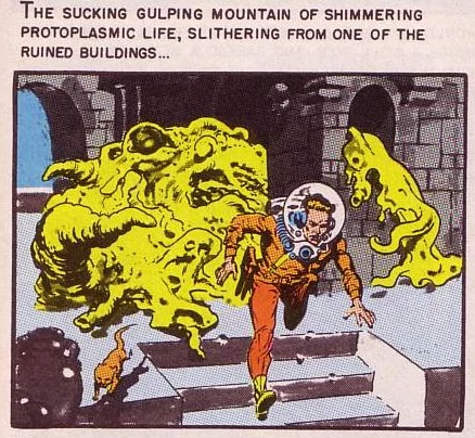
I say, the year’s first Tentacle Tuesday is a big responsibility! That’s why I’d like to start with some slimy or furry, squirming or pitter-pattering, whimsical or gnarled, skittish or spine-chilling, drooly woolly creepy crawlies with toupees and bloodshot eyes. After all, the 2020s decade is sadly guaranteed to be full of ’em… but of a significantly less cute variety than the lot that I’m featuring today.
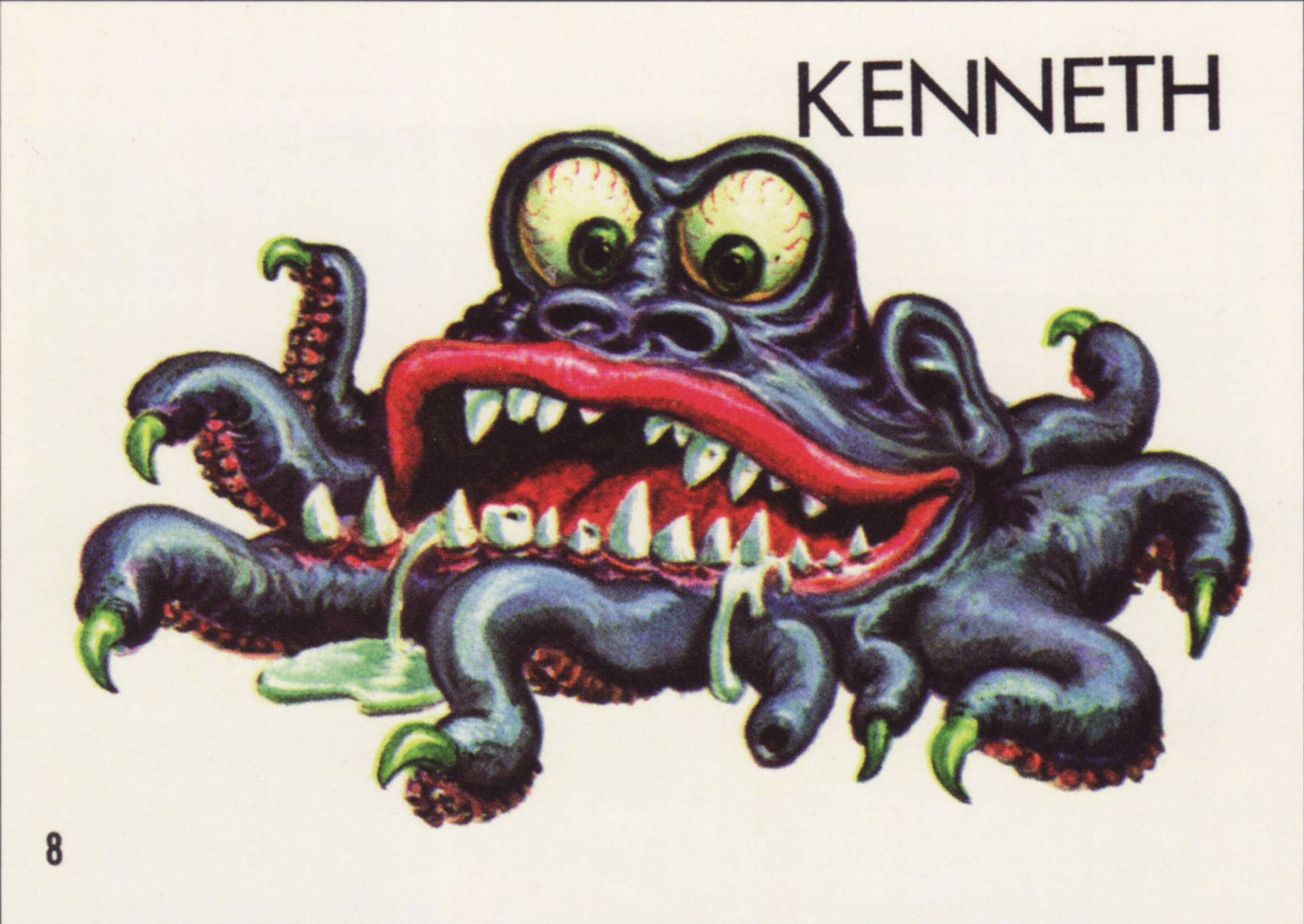
Topps‘ Ugly Stickers have a lot going for them: excellently drawn, tongue-in-cheek monsters in various states of putrefaction. If there’s one commonality between them, it’s that most of them showcase teeth any dentist would be thrilled to drill through. Many of them have far more appendages that a regular creature needs… and a lot of these appendages are distinctly tentacular, which is of course where we come in! And they’re all cute as a button.
David Saunders, Norman Saunders’ son, explains in the latter’s biography (Illustrated, 2009):
«In 1965 Topps released Ugly Stickers. This set was initially based on the grotesque drawings of Basil Wolverton, but when he demanded copyright control, he was paid off for his first twelve images and then fired. The rest of the creatures in the set were designed by Norman Saunders and Wally Wood.
The creatures that appear on the display box, the wax wrapper, and the giant twelve-piece puzzle were all designed by Saunders. He also painted all 44 Ugly Stickers. These were so popular they were reissued in four later versions and even spawned a line of rubbery toys called Teacher’s Pets.»
So what’s the break-down? Out of the original 44 stickers, Wolverton designed 10. The rest were the handiwork of WallyWood and Norman Saunders. The total set numbers 164. Not all cards were repeated in the re-runs, which is why the numbers don’t compute, for those of you who multiplied 44 cards by 4 versions and obtained 176, not 164; there were 4 groups of 40 cards + 4 non-repeated cards.
A page from Monster Mash: The Creepy, Kooky Monster Craze In America, 1957-1972 (Two Morrows Publishing, 2015), which you can read here.
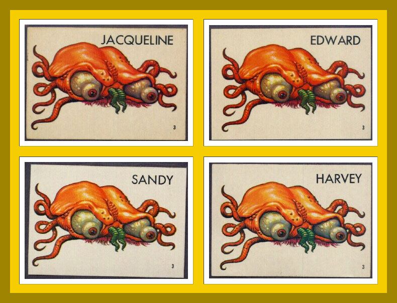
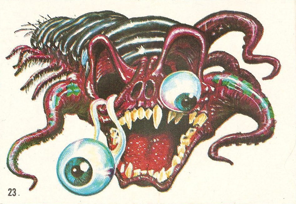
In some print runs, the creatures did not have names, doubtlessly leaving that part to the reader’s imagination. Most cards, however, do have names, with genders shamelessly swapped, making guys into gals and back into guys again. Take a peek at the full list of name changes over at this very instructive website, Bubble Gum Cards.
Does s/he look like a Jacqueline to you? Or maybe an Edward? I vote for the former; such an elegant name for a bug-eyed, displeased brain-thing, Just look at the flair with which she wears that pink tuft of fur underneath.
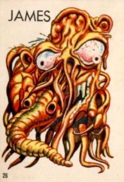
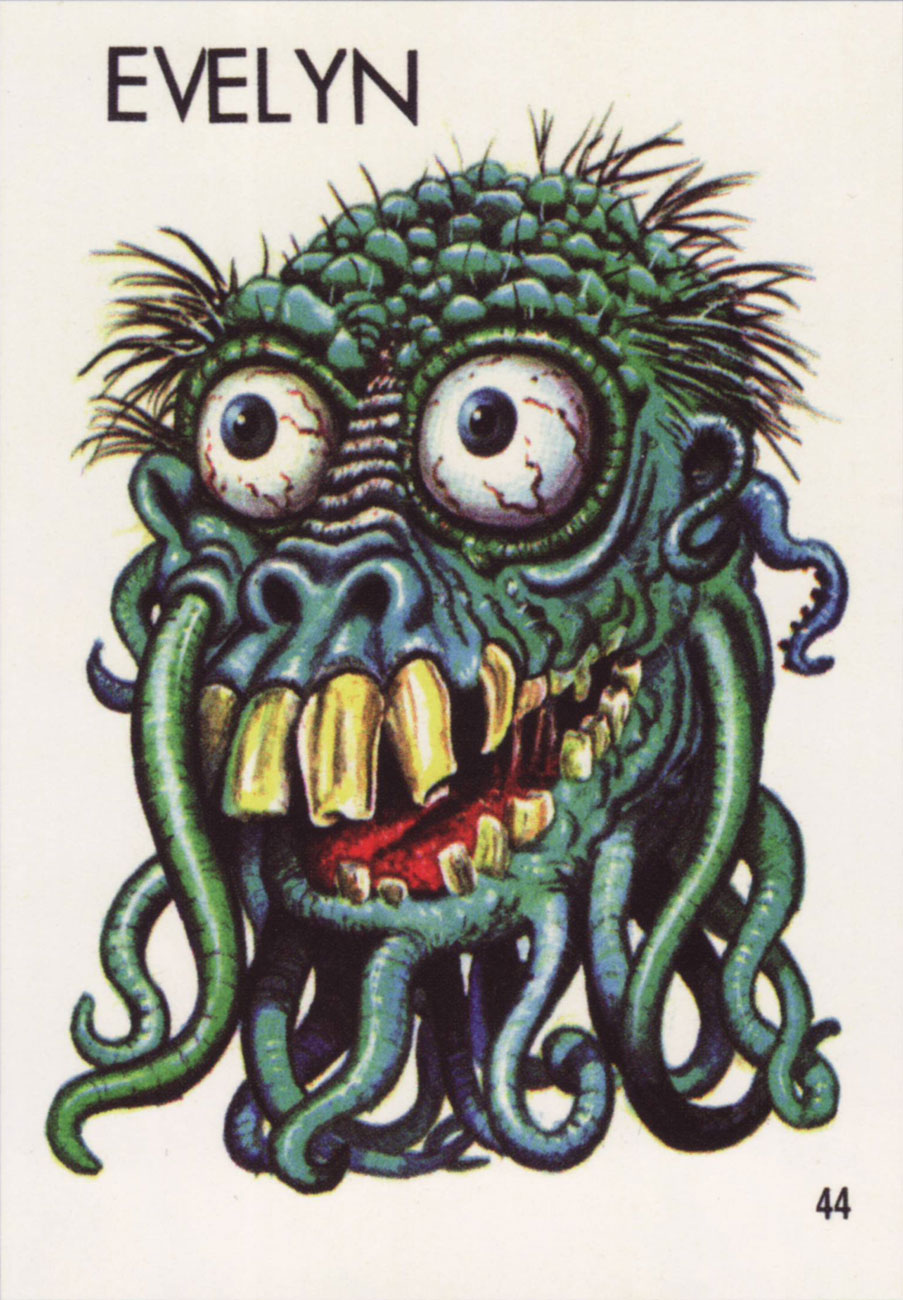
Joseph and Evelyn (or Stanley and Renée, or…) were previously used by my co-admin RG in his Hallowe’en Countdown III, Day 24 post, but they distinctly have tentacles, so I believe it’s worth running them again.
As a little bonus, here’s a lady from Topps’ 1966 Ugly Name Stickers series who asked to be included. Her name was… Donald, Sylvia, Angelo, Phyllis, Barney, or Rosemary. “Barney” is really pushing it!
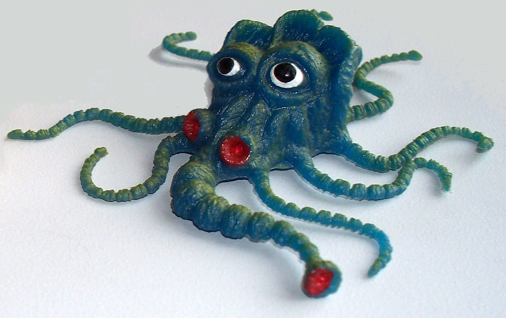
A little friendly critter from the Teacher’s Pets series (probably…. these things are veiled in a shroud of mystery), which was a rubbery spin-off from Ugly Stickers.
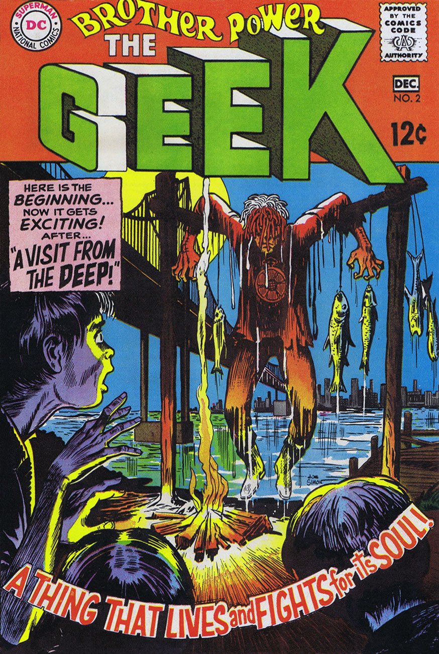
« Somehow, this thing had caught the spark of life! And, anything that lives will fight to stay alive… even if it’s just a Rag-a Bone and a Hank of Hair! »
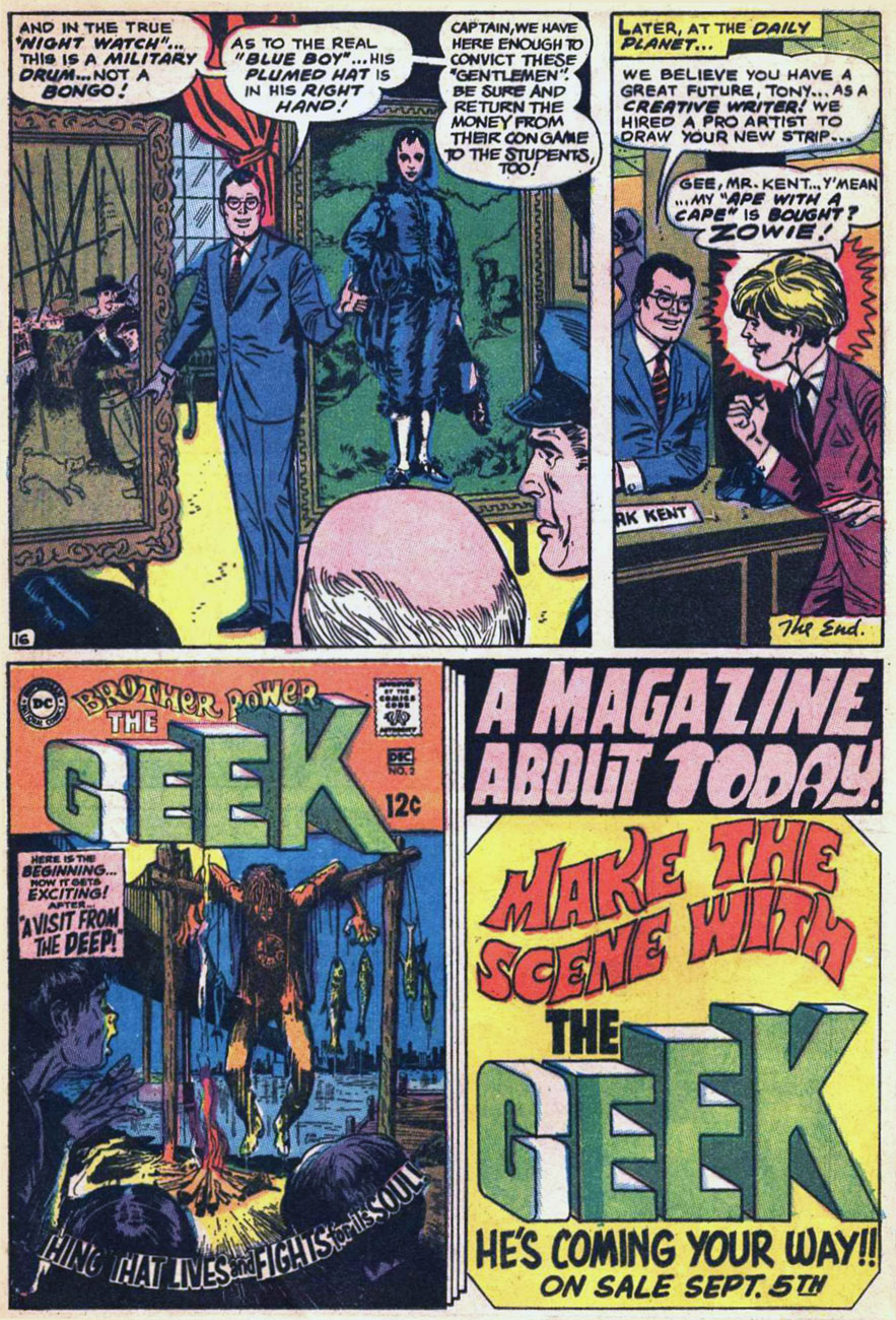
Ah, Brother Power, the Geek. A notorious flop for DC in 1968… or was it? At the time, it took several months for a book’s initial sales reports to make their way back to the publisher. Axing a title after two measly issues is quite a preemptive and premature strike against it. I suspect a case of toxic in-house politics. From the onset, editorial cold feet had the suits meddling with the project: the character of the animated rag doll was to be called The Freak, which was nixed in favour of the less druggy but more chicken-head-bite-y TheGeek.
This is Brother Power The Geek no. 2 (Nov.-Dec. 1968, DC); cover by Joe Simon, colours by DC’s peerless production manager Jack Adler, and logo presumably by Gaspar Saladino.
I recall that this particular house ad seared itself into my brain at a very young age, but I had to wonder where exactly I’d first encountered it. As it turns out, it was in a random comic book that happened to land my way in childhood, namely Superman no. 211 (Nov. 1968), featuring You, Too, Can Be a Super-Artist!, written by Frank Robbins (I just found out!) and illustrated by Ross Andru and Mike Esposito.
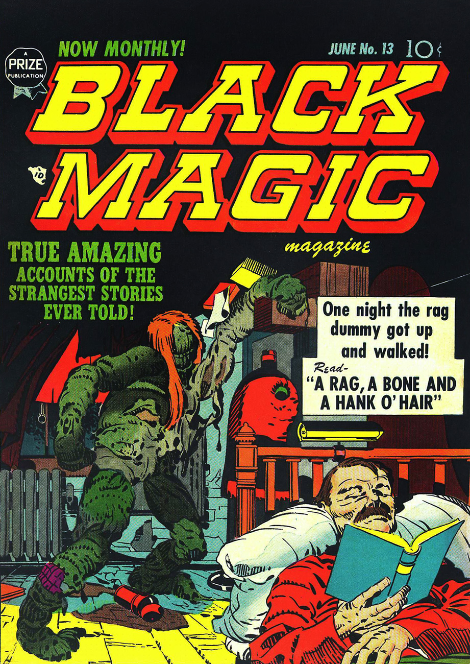
This is Black Magic no. 13, aka vol. 2 No.7 (June 1952, Prize); cover, of course, by Jack Kirby, with likely inks by Joe Simon. Read it here!
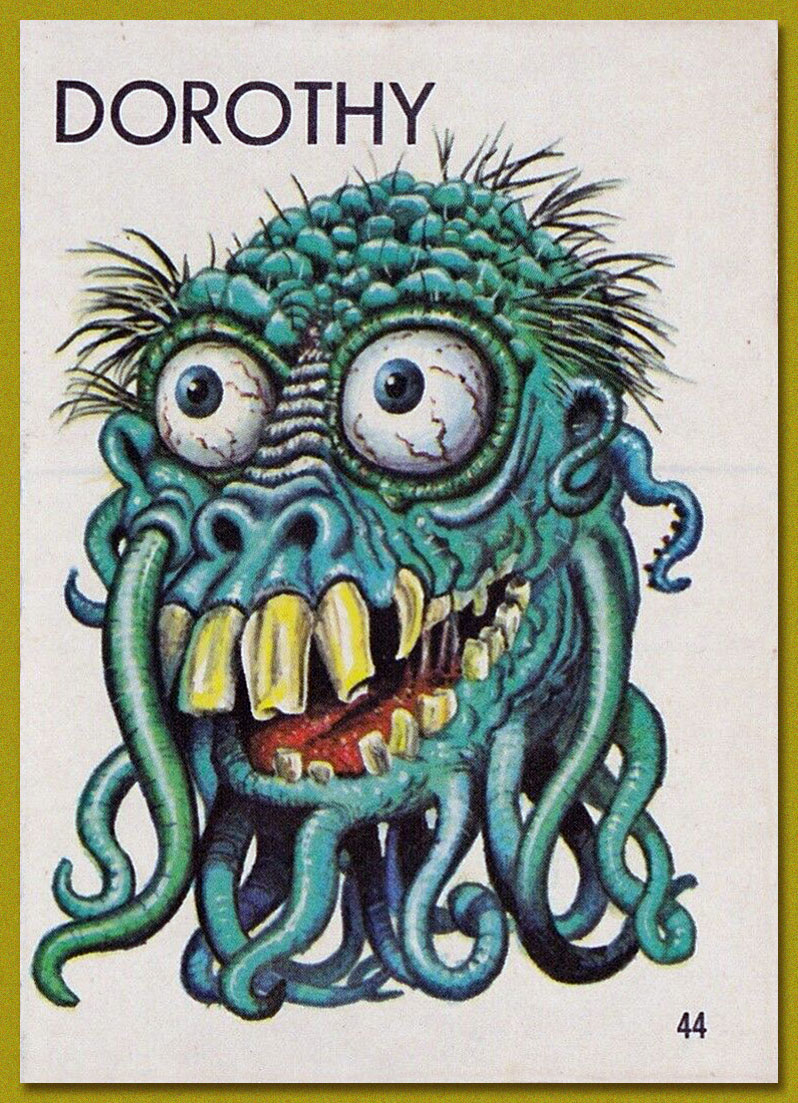
This lovely panorama is from Brother Power The Geek no. 1 (Sept.-Oct. 1968, DC). Written, laid out and inked by Joe Simon, finished pencils by Al Bare.
Say, have I seen Brother Power’s fellow detainees somewhere? Why, yes, of course! It’s Tentacle Master Wally Wood‘s Dorothy, Stanley and Doris, introduced to the world by Topps‘ Ugly Stickers back in 1965! Designed by Wood, they were painted by the masterful Norman Saunders.
Brother Power the Geek, despite its commercial failure and infamy, offered a good-natured, unpretentious romp, even if didn’t quite show us « The Real-Life Scene of the Dangers of Hippie-Land! » You can’t always get what you want.
Brother Power was brought back under DC’s Vertigo imprint in 1993, but as with the revival of its fellow Joe Simon creation, Prez, it received a « groovy » and « ironic » hipster treatment. Bah.
« When a man steals your wife, there is no better revenge than to let him keep her. » — Sacha Guitry
Here’s my contender for the most adult thing ever published in a Warren Magazine, as opposed to adolescent. It was also Wally Wood’s final significant contribution to his bibliography (though it was created around 1971); by the time of its belated publication Wood’s work had degenerated into depressing, crude porn before he tragically took his own life in November, 1981. As Witzend sadly proved, most comics creators, when handed a creative carte blanche, would merely regurgitate the same old thing they were doing for the mainstream, but with the addition of tits and/or gore. This, however, whilst featuring a generous dollop of T&A, is another breed of beast. It was published, of all places, in Warren’s SF anthology 1984 (issue 5, Feb. 1979). Go figure.
The marvellous Bhob Stewart queried Nick Cuti about the story during a roundtable gathering of former Wood assistants in Derby, Connecticut, in July 1985. The discussion later appeared in Against the Grain: MAD Artist Wallace Wood, edited by Stewart (2003, TwoMorrows Publishing)
Bhob: You worked on “Last Train to Laurelhurst“? [the story’s original title] Cuti: « As a matter of fact, I’m in it on the opening page. That’s me — right there [points to foreground figure in splash.] I used to wear muttonchops in those days. We wrote that together; Woody came up with the basic storyline, and I wrote a lot of dialogue. I hated his ending. I said, ‘Woody, you really ought to change the ending.’ The ending was that the guy blasted his faithless wife and her lover and then walked away. I said, ‘Gee, that’s what he’s intending to do in the very beginning. There’s no switch at the end. If you change it around somehow, it would make it a little bit more surprising.’ So he went home and rewrote the ending. I thought that the ending he came up with was far superior and made it a really brilliant story, to really tell you what life can be like.
Ernie Colón did the pencils. It was Woody’s idea, and I wrote some of the script, I don’t know how much because we used to toss things back and forth all the time when I was at the studio.It was for a magazine called Pow that never came to be. [Jim] Warren had approached Wood to do an adult humor magazine which would have had serious stories, very sexy, something that adults would enjoy reading. Unfortunately, Woody and Warren had diametrically opposed personalities, and they couldn’t seem to get together on it.
There was a funny story: Ernie had done the pencils with a soft pencil, and Woody and I were wondering what the heck we could do to make sure it didn’t get smudged. I was very carefully going over the pencils with an eraser to get out the smudges. I came in the next day with the pencils and said, ‘I found the perfect way to avoid smudging the pencils.’ Woody said, ‘What?’ And I said, ‘I sprayed them.’ Woody’s face dropped, and he almost reached over the strangle me before I stopped him and said, ‘Hey, Woody, I’m only kidding!’ [laughter] Because when you spray something, you can’t erase the pencils any more. You would have ink and pencil on the same paper. He almost had a heart attack right there; his mouth dropped open, and he said, ‘Oh, no!’ Then he started laughing after I told him it was only a joke. Later, when I walked into the house, and Marilyn said, ‘Oh, Woody, Nick’s here. You know, the fellow who sprays all your pencils?’ Obviously, he had thought enough of the joke to tell her about it. »
Speaking of Pow, here’s a cover sketch Wood did in 1971.An adult humour magazine? I guess they hadn’t quite settled on the tone.
Today’s Tentacle Tuesday delves into William Gaines’ EC and the glorious 50s (well, glorious for *some* things, at any rate). “Weird”, you say? Why, weird simply must include tentacles!
It’s a mixed bag: those of you who dislike Al Feldstein (and I know my co-admin RG would raise his hand readily) may be terribly annoyed by this post, but patience, my friends! there’s a lot of Wally Wood (a Tentacle Tuesday master, by the way!) in here, too, and who in their right mind would admit to detesting Wally Wood?
(As for myself, in case somebody is wondering, I like Feldstein’s artwork just fine.)
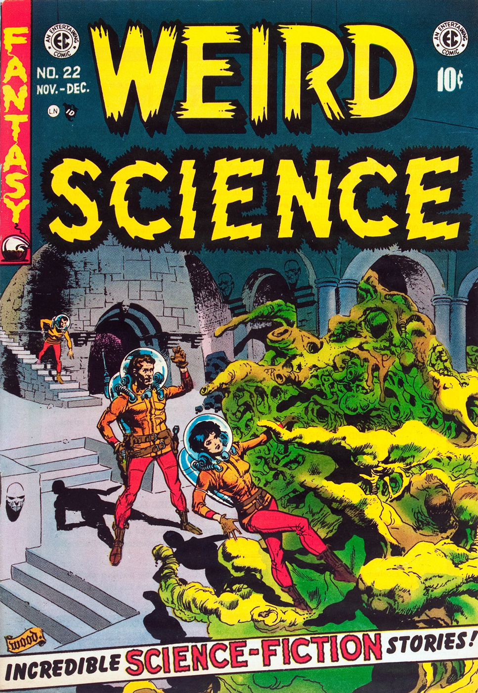
Weird Science no. 6 (March-April 1951). Cover by Al Feldstein.
« EC’s flaws are pretty obvious: even when the artists were striving for greater seriousness than the ironic gore of the horror stories or the outrageous early sci-fi plots or even the clever but predictable crime and suspense stories, the writing was often overwrought, prolix, and ham-fisted, and the artists were straightjacketed by EC’s rigid visual grid. They were Entertaining Comics first and foremost, but they also seemed compelled to break out of their commercial formulas, however finely realized, and publish stories that were fiercely honest, politically adversarial, visually masterful, and occasionally formally innovative…» (source: Gary Groth’s Entertaining Comics)
Weird Science no. 10 (November-December 1951), art by Wally Wood.
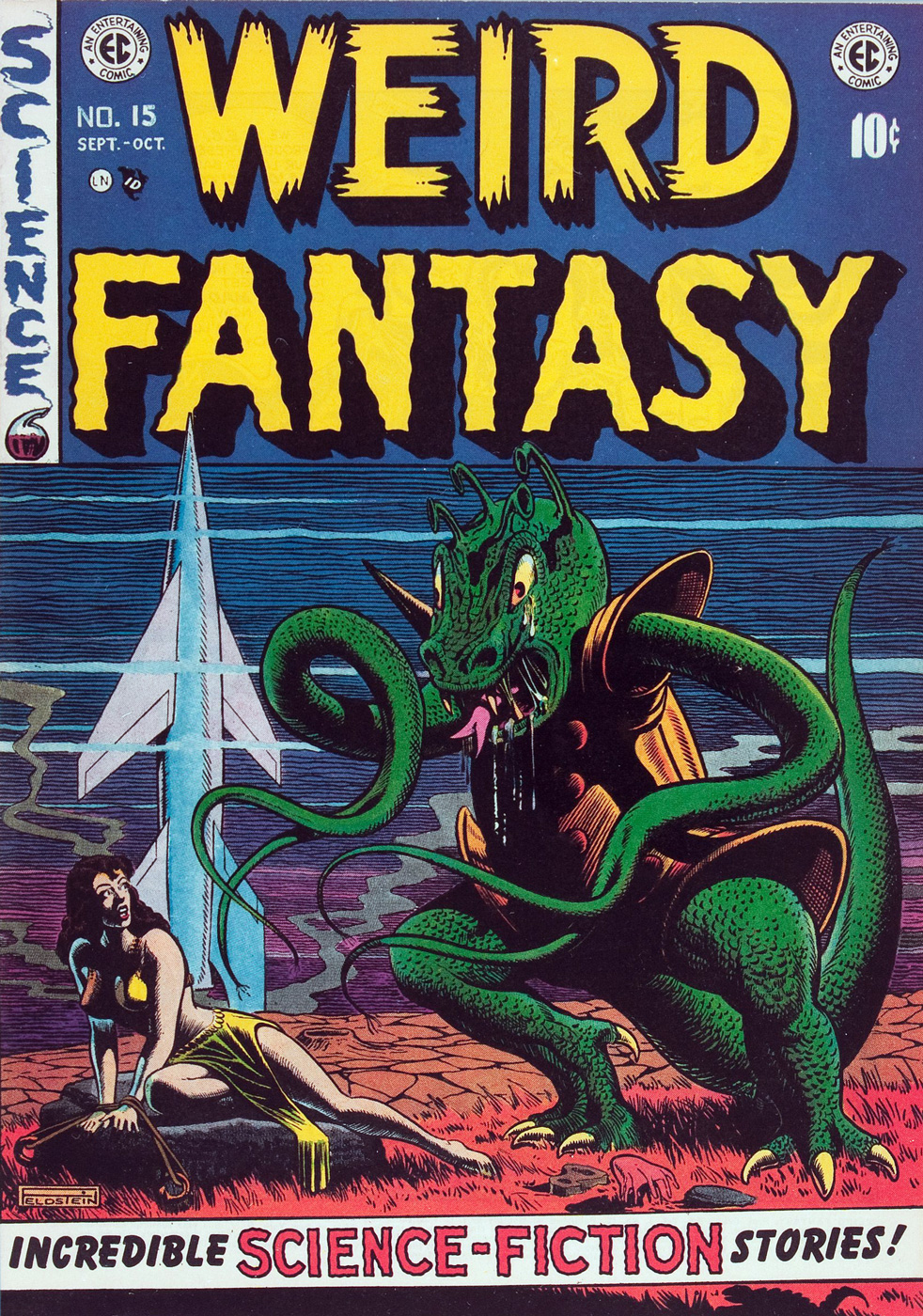
Weird Fantasy no. 15 (Sept-Oct 1952). Cover by Al Feldstein. The best cover that Feldstein has ever drawn? Quizás, quizás, quizás! The monster is doing a traditional Slavic dance, I think.
« While [Feldstein was] freer than most writers of his era to indulge his fantasies, he was also more punitive toward the characters who acted them out. John Updike tormented adulterers with depression and guilt. Feldstein lopped off their heads or burnt them alive. If they received a scarlet letter, it was branded on their flesh. In real life, sexual misbehavior might have cost one alimony. Feldstein made Shahira law seem like Thomas Jefferson had drafted it. Feldstein reflected a society which, while fascinated by sex, was terrified or ashamed of this fascination. » (source: Bob Levin in Let Us Now Praise Al Feldstein)
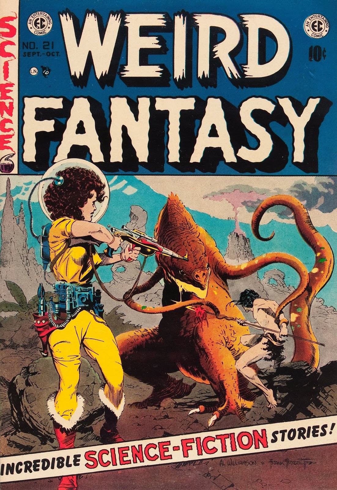
Weird Science-Fantasy Annual no. 1 (1952), art by Al Feldstein.


 The marvellous
  An adult