Hallowe’en Countdown VI, Day 27

« Now these men have no need for words… they know! » — Anonymous

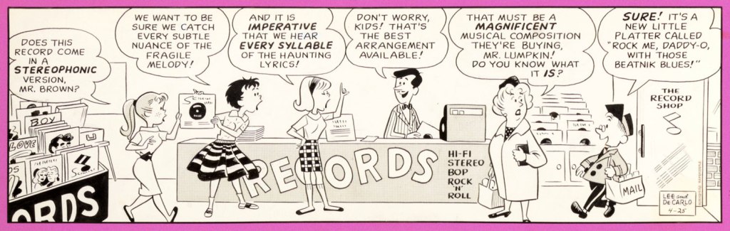
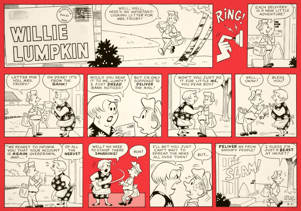
Now I won’t claim that Dick Ayers (1924-2014) was all that great an artist. In the early Sixties at Marvel, as an inker of Jack Kirby’s pencils, he was at best neutral, more likely than not to defuse much of the explosive excitement of the King’s pencils*.

However, Ayers’ chief strengths lay elsewhere: it was demonstrated time and time again that he could quickly put together dynamic and easy to parse — don’t laugh, it’s no cakewalk — layouts, and if you paired him with a dominant inker (such as John Severin (on Sgt. Fury) Alfredo Alcala (on Kamandi), Jack Abel (on Freedom Fighters) or Gerry Talaoc (on The Unknown Soldier), you’d get some quite presentable results — and quickly at that. Guys like Ayers should be saluted instead of dismissed, because they were the glue that held the funnybook business together and operating more or less smoothly.

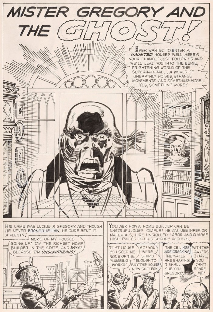
I won’t claim either that Eerie Pubs’ product was anything but shoddy, shlocky goods, but I won’t deny that it can be fascinating… in small doses. While still working for Marvel, Ayers produced a memorable bunch of stories for a pair of former Timely/Atlas colleagues, publisher Myron Fass and editor Carl Burgos (creator of the Golden Age Human Torch). This is Ayers’ first published effort for those rascals. It appeared in Horror Tales v.2 no. 1 (Jan. 1970, Eerie Pubs). Brace yourselves!

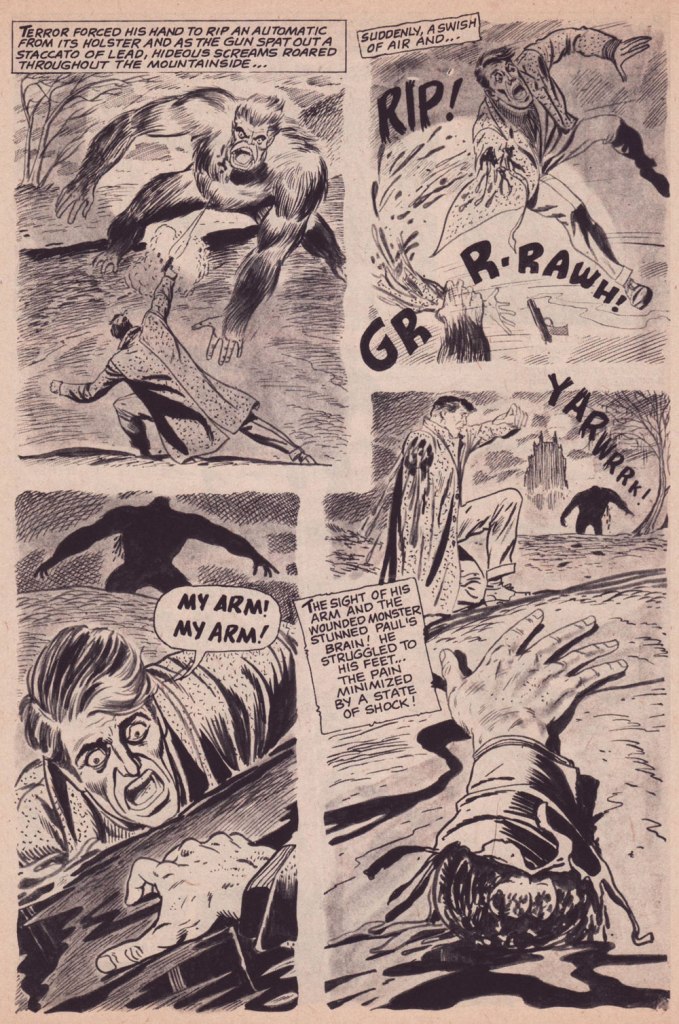
«… Dick Ayers understood what ‘Carl and Myron’ were asking for and gave it to them in spades. They wanted gore? They got it! Ripped-off limbs, lolling tongues, gouts of blood and oh my… those popping eyes! Ayers’ trademark was the eye-poppin’. Socket just couldn’t contain ’em! » — from Mike Howlett‘s definitive study The Weird World of Eerie Publications (2010, Feral House).

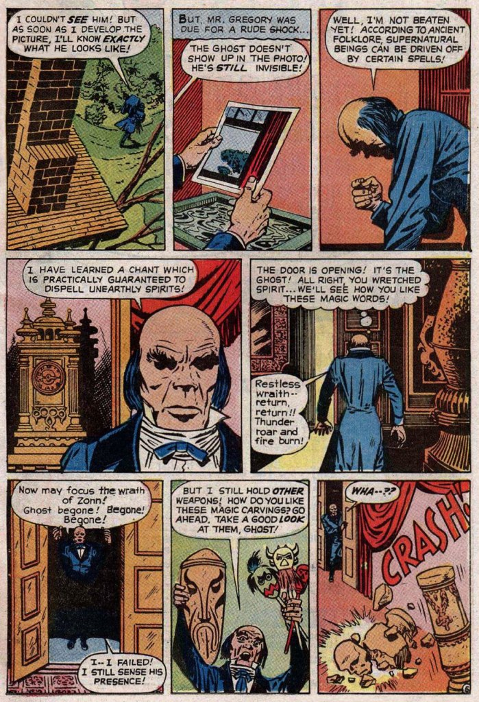
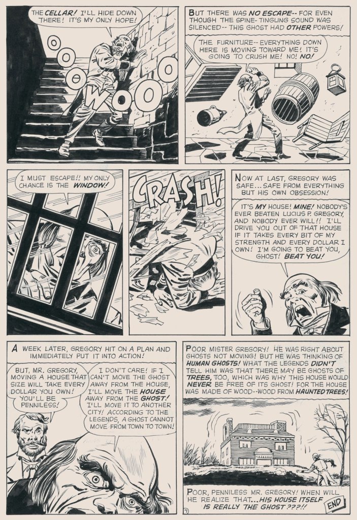
« House of Monsters » is a Grand Guignol remake of « The Castle of Fear », from Weird Mysteries no. 3 (Feb. 1953, Stanley Morse). Read it here! Myron Fass held the rights to a lot of old inventory, so he had the old stories touched up or redrawn, some of them multiple times. Grotesqueness aside, I do prefer the original version. It had a better monster and a stronger ending… but you be the judge!

I came across this saucy bit of Ayers carnage in 1976, in one of the first Eerie Pubs mags to surface following a hiatus imposed by a severe contraction of the black and white horror mag market (thanks, Marvel). At the time, it just seemed like the oddest item: at once something of another, earlier time (it was an all-reprint affair), but also extremely garish in its goriness, even by slack contemporary standards.

Here’s my beat-up original copy of Weird vol. 9 no. 3 (Sept 1976, Eerie Pubs). Cover by Bill Alexander. I didn’t realise at the time that it was a bit of an Eerie’s Greatest Hits collection, so every other Eerie mag subsequently encountered rather paled in comparison.

-RG

*But then, with the splendid exception of Steve Ditko (and that was a waste of precious resources), I’d argue that virtually all of the inkers he was saddled… er, paired with before Joe Sinnott were rather underwhelming.

Making the Rounds With Willie Lumpkin

Willie Lumpkin was created by Dan DeCarlo and Stan Lee when Harold Anderson, the head of Publishers Syndicate (which merged into Hall Syndicate, which was eventually purchased by Hearst and is now part of King Features…) wanted a ‘bucolic’ newspaper strip set in some small town. The ‘friendly mailman’ idea is supposed to be Anderson’s, the family name Lee’s.

I cannot say that it’s a very funny strip (well, it was written by Lee, need we say more?), but it has a certain charm, and DeCarlo’s art is highly enjoyable, even though one occasionally feels like one has stumbled into an Archie story. DeCarlo liked drawing cheesecake, and we enjoy looking at it (for the heavy guns, visit RG’s Dan DeCarlo at Humorama (1956-63)), but in this case it is the other characters I am interested in, the kids with dirt behind their ears, spinster aunties in funny glasses, and of course the adorably bookish Lumpkin, the glue that holds the denizens of this small town together.

The strip ran from December 1959 to May 1961. Here are a few pickings —

I stayed mostly away from the aforementioned cheesecake, but here is an example of it:

If the name Lumpkin rings some sort of different bell for you, it might be because he got incorporated into the Marvel universe in 1963 – a much older Lumpkin became the Fantastic Four‘s mail carrier with issue no. 11 (February 1963):

Pencilled by Jack Kirby and inked by Dick Ayers.

Over his Marvel years, his back story expanded and expanded, reminding me of the Russian expression ‘a stopper for every barrel’. He seemed to have been shoved into every plot that needed some secondary character to do something, delivering letters left and right, getting wounded multiple times during various epic battles, and accidentally ending up immortal (as of 2019). Same old, same old. I bet he preferred his quieter days among courting teenagers and middle-class families.

For more Sunday strips (in colour!) gathered by Ger Apeldoorn, head over to his wonderful The Fabulous Fifties blog, or peruse Apeldoorn’s collection of black and white dailies.

~ ds

Treasured Stories: “Mister Gregory and the Ghost!” (1961)

« From the body of one guilty deed a thousand ghostly fears and haunting thoughts proceed. » — William Wordsworth

Today’s selection is an early, early favourite of mine. I first encountered it in French, in the pages of Capitaine America no. 8 (Aug. 1971, Les Éditions Héritage); back in those days, Québécois printer-packager Payette & Simms would reprint, in black and white, recent Marvel comics in their ‘Format Double’ package, a terrific deal at 25 cents: you got two issues’ worth, no ads, plus a bonus short story. P&S’ paper stock and printing were better than Marvel’s — but their lettering and translation work generally left much to be desired*.

In this case, despite the allure of the slickly sumptuous Gene Colan / Joe Sinnott artwork, the issue’s out-of-nowhere high point was (you guessed it!) a modest little story plucked from the predawn of the so-called ‘Marvel Age’, Mister Gregory and the Ghost!, from a pre-Thor issue of Journey Into Mystery (no. 75, Dec. 1961). Many may disagree with me on this one, but boy, those post-Kirby issues of Cap’n ‘merica just serve to demonstrate what happens without a perpetual motion plot engine like Jack Kirby to propel and guide the series: when you try to introduce new foils for the hero, you get bonehead non-ideas like biker gangs, a jealous scientist in the body of a gorilla, or in issue 123’s Suprema, the Deadliest of the Species!, a brother-and-sister hypnosis act who drive around a gadget-filled tanker truck that magnifies Suprema’s power by way of a *very* 70’s medallion her brother wears around his neck. Then Cap feels its vibrations (“Ping!”) through his shield, and … oh, I won’t spoil the thing’s idiotic charms any further for you: read it here.

This is Journey into Mystery no. 75 (Dec. 1961, Marvel); pencils by Jack Kirby, inks by Dick Ayers, colours by Stan Goldberg.

Ahem — back to Mister G and his Ghost. It’s not exactly a masterpiece of writing either (Larry Lieber?), but it presents Kirby at his moody, understated best. Upon seeing it in colour, I realised how providential my monochromatic encounter had been. While the story’s been reprinted a few times (in 1966, 1971, and in 2020 in a fancy and pricey hardcover omnibus), the printing’s always been pretty shoddy. As you’ll see.

But… it seems that most, if not all of the original art survives, so we’ll make the most of the situation and mix our sources as needed — hope the effect isn’t too jarring!

I find Kirby’s layout for this page to be especially ingenious and interesting.
I’ve used the recoloured reprint from Fear no. 4 (July, 1971, Marvel), which was an improvement over JIM75’s, albeit a slight one.

-RG

*here’s an example of Éditions Héritage’s lovely calligraphy, from this very story:

Hallowe’en Countdown V, Day 23

« Drinking your own blood is the paradigm of recycling. » — Gary Busey

Say, isn’t there something… sorta quaint about that cover?

In the 1970s, while DC and Charlton consistently provided all-new material*, Marvel quickly switched to an all-reprint formula (the better to save money whilst flooding the market, my dear!), sometimes even on the covers, with some amusingly inappropriate updates at times.

This is Dead of Night no. 2 (Feb. 1974). Alterations by unknown hands. Only one issue of this title would feature new material: its eleventh and final issue (introducing The Scarecrow); this number, however, reprints pre- and post-code Atlas stories from 54-56.
This is Marvel Tales no. 125 (July 1954, Atlas); cover art by Harry Anderson. The milky semi-transparency is a nice touch.

Okay, here are another pair of before and afters:

This is Tales to Astonish no. 34 (Aug. 1962, Marvel). Cover pencils by Jack Kirby, inks by Dick Ayers. Hardly a classic, not to mention that it lazily recycles the story’s opening splash. It’s also a textbook demonstration of what I dislike about Marvel colouring in the Silver Age: I’m guessing it was company policy to leave the backgrounds mostly in grey to make the characters ‘pop out’. A sound commercial policy, perhaps, but artistically, it seems pretty stale to me.
This is Monsters on the Prowl no. 29 (Aug. 1974, Marvel). A classic instance of John Romita‘s alteration-happy art direction. Making the protagonist a woman and adding a witness are both dishonest touches, for what it’s worth. On the plus side, I do like the lightning bolt (good use of existing space!), and the colouring is a marked improvement. Edited by Rascally Roy Thomas.
This is Mystic no. 30 (May, 1954, Atlas); colours by Stan Goldberg. A striking cover by Russ Heath
… is, if not ruined, then at the very least diminished by clumsy and pointless updates, including the removal of Heath’s signature (although upon seeing the ‘improvements’ perpetrated upon his work, he might have opted for the comics equivalent of an ‘Alan Smithee‘ or ‘Cordwainer Bird‘ credit). This is Crypt of Shadows no. 9 (Mar. 1974, Marvel). Alterations, once more, by unknown, guilty hands. Also edited by Roy Thomas (just so you know who’s responsible).

-RG

*and if and when they didn’t, they’d tell you! Not so with Marvel. As for Gold Key, they would just pretend the material was ‘reprinted by popular demand’.

Tentacle Tuesday: Don’t Miss the Boat!

« Don’t change your tack when the timbers crack
On the dark and the rolling sea…
» *

I am relatively indifferent to tales of adventure, but the siren song of the ocean sometimes prompts me to venture into reading tales about ruthless pirates or valorous seafarers and the perilous voyages they undertake on ships big and small, magnificent or modest. Who hasn’t felt a thrill at spotting a handsome vessel on the water, even if that water is but a canal running through the city? The other point of interest of this discussion is that where there’s an ocean and a ship upon it, there is a (preferably) giant octopus somewhere nearby, only waiting to shred the ship’s hull to smithereens and voraciously gobble up its shipmates.

I’ve talked about consumed shipmates before (see Tentacle Tuesday: Seafaring octopuses and the men they have shamelessly devoured), so today let’s focus on some nautical vessels!

Here is a modestly-sized yet utilitarian boat with a handsome octopus in tow. Maybe he just wanted to climb on deck to rest a while, like this otter?

More Fun Comics no. 44 (June 1939). Cover by Creig Flessel.

A similar boat (I don’t know whether it’s my profound lack of knowledge of boats that makes it seem that way) was attacked by a bigger, scarier – downright malevolent! – octopus some twenty years later. See Kyle “Ace” Morgan, Matthew “Red” Ryan, Leslie “Rocky” Davis and Walter Mark “Prof” Haley scramble for safety while an enraged octopus seeks to devour them! Oh, sorry, I’m being melodramatic.

Challengers of the Unknown no. 77 (Dec. 1970 – Jan. 1971, DC). Pencilled by Jack Kirby, inked by Jack and Rosalind (Roz) Kirby.

This cover has actually been recycled from Showcase no. 12 (Jan.-Feb. 1958, DC), where the background was yellow and the water a more normal shade of blue-white. I do like how the octopus stands out against a black background, however (and the multi-coloured water really sets off his beady, evilly-glowing green eyes!)

Of course these encounters also take place within the stories, as opposed to on the cover.

Page from The Outcasts of the Seven Seas, scripted by Bob Haney, pencilled by Howard Purcell, and inked by Sheldon Moldoff, was published in Sea Devils no. 23 (May-June 1965).

Time to move underwater, a very natural setting for an octopus attack. Here we have a submarine tenderly wrapped in tentacles:

Page from The Human Torch in the Clutches of the Puppet Master!, (over)scripted by Stan Lee, pencilled by Dick Ayers and inked by George Roussos. This story was published in Strange Tales no. 116 (Jan. 1964, Marvel).

Last but not least, I’ve kept this neat little submarine until the end:

Voyage to the Deep (IDW Publishing, 2019), a collection of Dell Comics’ short-lived, four-issue series published from 1962 to 1964 and illustrated by Sam Glanzman. Note the introduction by WOT favourite Stephen Bissette!

Glanzman is also a favourite of ours, though we haven’t talked about him much (yet). In case you’re wondering what the insides of one of those issues looked like – good, they looked really good! Note the octopus proudly perched in the middle of the page.

Page from Voyage to the Deep no. 1 (September-November 1962, Dell). Art by Sam Glanzman.

~ ds

Behold… the Great Shnozzola!

« That’s the conditions that prevail! » — Jimmy Durante

Today, we salute noted vaudevillian, piano player, comedian, singer, film and radio star, raconteur and unlikely comics legend James Francis “Jimmy” Durante, born on this day, February 10, in 1893 (as it was a Friday, the family presumably fasted or had fish for dinner). He truly was a master of all media, as you’ll witness.

This early bit of biography appeared in Juke Box Comics no. 4 (Sept. 1948, Eastern Color); it was illustrated by Ed Moore. Hear Cantor and Durante reminisce about their early days on this 1947 episode of The Jimmy Durante Show.
A passing mention of old Jimmy, from Nyoka the Jungle Girl no. 24 (Oct. 1948, Fawcett). Writer and artist unknown.
An early cover by Dick Ayers (1924-2014), this is Jimmy Durante Comics no. 1 (Oct. 1948, Magazine Enterprises).
The second and final issue of Jimmy Durante Comics (Winter 1948-49, Magazine Enterprises).
Mr. Durante rates a smashing musical appearance in this Rube Goldberg Device daily strip (Apr. 14, 1951, King Features Syndicate)… by Rube Goldberg, naturally.
And here’s the Shnozzola in the midst of a carnal melée of his fellow Old Hollywood legends (can you name them all, cinephiles?) This is Bill Griffith‘s cover for The Tiajuana Bible Revival Volume Two: Under the Stars in Hollywood (1977, Hooker, California: Paramounds Prod.). This was « An anthology reprinting 1930’s Tijuana Bibles, some of which were obscene parodies of popular newspaper comic strips of the day. Others made use of characters based on popular movie stars and sports stars of the day, such as Mae West and Joe Louis, sometimes with names thinly changed. Before the war, almost all the stories were humorous and frequently were cartoon versions of well-known dirty jokes that had been making the rounds for decades. » [ source ]
Pointillist-satirist Drew Friedman‘s immortal Jimmy Durante Boffs Young Starlets first saw print in National Lampoon vol. 2 no. 78 (Jan. 1985).
Durante briefly pops up (with the Checkered Demon!) in the second half of a truly all-star underground comix jam involving R. Crumb, Steve Clay Wilson (1941-2021… he left us just three days ago, aged 79… RIP), Victor Moscoso, Spain Rodriguez, Rick Griffin, Robert Williams and Gilbert Shelton. It appeared in Zap Comix no. 12 (1989, Last Gasp). Cartoonists are generally fond of the Schnozzola, but Underground cartoonists are just mad about him.
And finally, on a gentler note… here’s a clearly affectionate caricature (a preliminary sketch) of the esteemed Signor Durante (aw, he’s blushing!) by the amazing Sam Berman (crayon on onionskin paper, 1947). Berman (1907-1995) was, deservedly, quite a big deal in his day; as the erudite Drew Friedman told Print Magazine in his quality of co-curator of the 12 Legendary Caricaturists You’ve (probably) Never Heard Of exhibition at NYC’s Society of Illustrators, Berman « was indeed famous and celebrated in his day. Beginning his career in the late 1930s, he created iconic sculpted caricature covers for Esquire featuring their new mascot “Esky” (created by Berman) for an entire year. He created the sculpted caricatures of the leading actors (Fredric March, Carole Lombard, etc.) for the opening titles of the 1937 classic screwball comedy Nothing Sacred, did huge amounts of work for all the top magazines and newspapers of the day, including for Mark Hellinger’s popular column, created close to 60 amazing full-color portraits for the 1947 booklet The NBC Parade of Stars, drew children’s books, and arguably his most famous creation, the opening caricature of Jackie Gleason rising over Brooklyn for “The Honeymooners,” although he was never credited on the show for drawing that image, nor in any books. He then inexplicably went into map-making and faded quietly into obscurity. »

To wrap things up, here’s Jimmy D. and Frankie S. duetting in Russian. And why not? Happy birthday, Jimmy, wherever you are (and do say hello to Mrs. Calabash!)

-RG

The King in Exile: Spies (1961)

« He’s back from the dead / the telegram read / If you get on a flight / You could catch him tonight / You’ll find Commissar / He’s at the Munich Hilton Bar » — B.A. Robertson

In 1958, Classics Illustrated publisher Gilberton tried something a bit different: a mostly non-fiction documentary title on various topics entitled The World Around Us, and featuring The Illustrated History of… Dogs, Space, Pirates, Great Explorers… depending on your area of interest, these could mean unrelenting tedium or sheer bliss. I haven’t encountered many issues, but the two I own, Ghosts and Spies, count among my prized paper possessions.

WorldAroundUsSpiesA

This is The World Around Us no. 35 (August, 1961), featuring this lovely mixed media piece by The Unknown Artist, whose cover remains defiantly unblown. On the inside, some fine company: George Evans, Norman Nodel, Edd Ashe, Jo Albistur… and Jack Kirby (inked by Dick Ayers)… the most beaten-down, anonymous, excitement-dialed-down-to-one Kirby you’re ever likely to see. Oh, he could do the job just fine, but the job, and the publisher, were not making anything of his regal strengths*. He would recall that this was « … the worst paying job of my entire life, including times I worked for free. »

Those early post-Code years were difficult ones for the diminished comics industry, and Kirby’s situation wasn’t exactly rosy: he’d been blacklisted at DC, thanks to the Jack Schiff / Sky Masters imbroglio, and his work at Harvey Comics had dried up. So what was a prolific artist to do, but pick up whatever bits of freelancing were available, here and there…

KirbySpiesSkySpies01AKirbySpiesSkySpies02AKirbySpiesBusiness01AKirbySpiesTricks01AKirbySpiesTricks02A

Quoting from Paul Gravett‘s review of Classics Illustrated: A Cultural History, we find this telling statement: « The most demanding editor was Roberta Strauss, a stickler for detail, who would count soldiers’ buttons or pleats in skirts and even called an editorial meeting in her hospital room only days after her son’s birth. » Give me Harvey Kurtzman‘s editorship** any old day!

-RG

*not so very unlike animation studio Ruby-Spears which, despite having at its disposal, in the 1980s, the combined talents of Kirby, Alex Toth, Gil Kane, Doug Wildey, Jim Woodring… and then I started working at Ruby-Spears, working on the most egregious shit the world has ever seen, the crappiest, most horrible cartoons. », Russ Heath, Bill Wray… yielded, let’s just say… underwhelming product. But it paid better than Gilberton.

**« Kurtzman’s editing approach to Two-Fisted Tales and Frontline Combat was a stark contrast to EC editor Al Feldstein‘s style. Whereas Feldstein allowed his artists to draw the story in any manner they desired, Kurtzman developed detailed layouts for each story and required his artists to follow them exactly. »