« Drinking your own blood is the paradigm of recycling. » — Gary Busey
Say, isn’t there something… sorta quaint about that cover?
In the 1970s, while DC and Charlton consistently provided all-new material*, Marvel quickly switched to an all-reprint formula (the better to save money whilst flooding the market, my dear!), sometimes even on the covers, with some amusingly inappropriate updates at times.
This is Dead of Night no. 2 (Feb. 1974). Alterations by unknown hands. Only one issue of this title would feature new material: its eleventh and final issue (introducing The Scarecrow); this number, however, reprints pre- and post-code Atlas stories from 54-56.
This is Marvel Tales no. 125 (July 1954, Atlas); cover art by Harry Anderson. The milky semi-transparency is a nice touch.
Okay, here are another pair of before and afters:
This is Tales to Astonish no. 34 (Aug. 1962, Marvel). Cover pencils by Jack Kirby, inks by Dick Ayers. Hardly a classic, not to mention that it lazily recycles the story’s opening splash. It’s also a textbook demonstration of what I dislike about Marvel colouring in the Silver Age: I’m guessing it was company policy to leave the backgrounds mostly in grey to make the characters ‘pop out’. A sound commercial policy, perhaps, but artistically, it seems pretty stale to me.
This is Monsters on the Prowl no. 29 (Aug. 1974, Marvel). A classic instance of John Romita‘s alteration-happy art direction. Making the protagonist a woman and adding a witness are both dishonest touches, for what it’s worth. On the plus side, I do like the lightning bolt (good use of existing space!), and the colouring is a marked improvement. Edited by Rascally Roy Thomas.
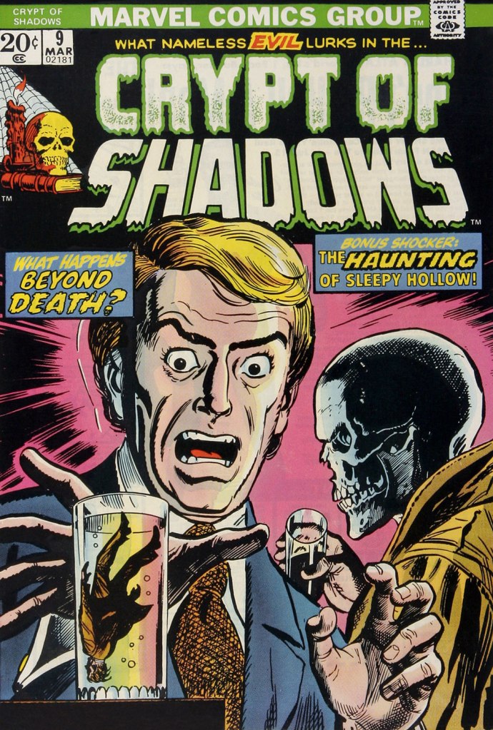
This is Mystic no. 30 (May, 1954, Atlas); colours by Stan Goldberg. A striking cover by Russ Heath…
… is, if not ruined, then at the very least diminished by clumsy and pointless updates, including the removal of Heath’s signature (although upon seeing the ‘improvements’ perpetrated upon his work, he might have opted for the comics equivalent of an ‘Alan Smithee‘ or ‘Cordwainer Bird‘ credit). This is Crypt of Shadows no. 9 (Mar. 1974, Marvel). Alterations, once more, by unknown, guilty hands. Also edited by Roy Thomas (just so you know who’s responsible).
-RG
*and if and when they didn’t, they’d tell you! Not so with Marvel. As for Gold Key, they would just pretend the material was ‘reprinted by popular demand’.
Thanks for the before and after covers. To me, the green amphibious hands on the DEAD OF NIGHT cover are more effective. On the MONSTERS ON THE PROWL cover, both the lightning and the recoloring of the building improve the cover.
The only thing I like about the otherwise cheesy cover of CRYPT OF SHADOWS is that the skull is much more effective without the string eyeballs but given the gloved hand, I can’t tell if the skull is real or a mask.
Hi Neal ! The green hands are pretty well done (clearly not Romita’s handiwork… more like Tom Palmer or Ralph Reese) *are* effective. But it’s clear how Atlas-Marvel always did a crappy job of maintaining their image archives. They couldn’t have been working from a first-rate photostat to lose so much fine detail in the image. And some of those background modifications (the drapes, in particular) are pretty damn crudely done.
Agreed on MotP, but you know that already. 😉
Heath’s skull is so much more expressive, and the colouring more effective. I don’t know, I hardly think I’d second-guess Russ Heath on lighting choices… and that flesh-coloured glove is just… odd.
Agreed that Heath’s black and white skull on the MYSTIC cover is so, so much better than the gray, over-inked skull on the CRYPT OF SHADOWS cover, but the (weird, round, flesh-colored) eyeball still makes the skull look like a man in a mask.
Well, I’m going to have to disagree with you two. I find the re-coloring of the Monsters on the Prowl cover uninspired and absurd in that it ruined all the vibe of mystery and creepiness from the previous version of Tales to Astonish. Such a bad job required misleading and superfluous additions (lightning strikes) to regain, without success, a bit of depth. It’s just bad marketing that trades in a great atmospheric scene for cheap and shallow sensationalism.


Thanks for the before and after covers. To me, the green amphibious hands on the DEAD OF NIGHT cover are more effective. On the MONSTERS ON THE PROWL cover, both the lightning and the recoloring of the building improve the cover.
The only thing I like about the otherwise cheesy cover of CRYPT OF SHADOWS is that the skull is much more effective without the string eyeballs but given the gloved hand, I can’t tell if the skull is real or a mask.
LikeLike
Hi Neal ! The green hands are pretty well done (clearly not Romita’s handiwork… more like Tom Palmer or Ralph Reese) *are* effective. But it’s clear how Atlas-Marvel always did a crappy job of maintaining their image archives. They couldn’t have been working from a first-rate photostat to lose so much fine detail in the image. And some of those background modifications (the drapes, in particular) are pretty damn crudely done.
Agreed on MotP, but you know that already. 😉
Heath’s skull is so much more expressive, and the colouring more effective. I don’t know, I hardly think I’d second-guess Russ Heath on lighting choices… and that flesh-coloured glove is just… odd.
Thanks for chiming in!
LikeLike
Agreed that Heath’s black and white skull on the MYSTIC cover is so, so much better than the gray, over-inked skull on the CRYPT OF SHADOWS cover, but the (weird, round, flesh-colored) eyeball still makes the skull look like a man in a mask.
LikeLike
Well, I’m going to have to disagree with you two. I find the re-coloring of the Monsters on the Prowl cover uninspired and absurd in that it ruined all the vibe of mystery and creepiness from the previous version of Tales to Astonish. Such a bad job required misleading and superfluous additions (lightning strikes) to regain, without success, a bit of depth. It’s just bad marketing that trades in a great atmospheric scene for cheap and shallow sensationalism.
LikeLike