« Remember you belong to nature, not it to you » — Grey Owl
Why it took me this long to spotlight David Collier, who’s been one of my favourite cartoonists for decades, is, even to myself, a bit of a puzzle. Is it perhaps because his work already receives plenty of attention – chiefly in English Canada (what we in Québec mockingly call ROC — Rest of Canada)? Could be, but I’m ready now.
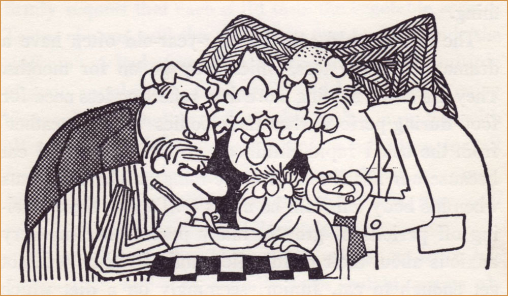
While Collier’s rough-hewn, scratchy line won’t get him confused with, say, Tom Palmer or Brian Bolland in this particular plane of reality, it’s absolutely perfect for his writing and persona. He’s a riveting storyteller who catches — and properly interprets — details any more casual observer would miss, yet he’s frequently unable to read the room. He’s a formidable writer, but his spelling* is… perhaps lamentable is too strong a word, at least for his English. He is, however, utterly impervious to French**.
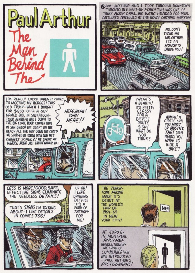
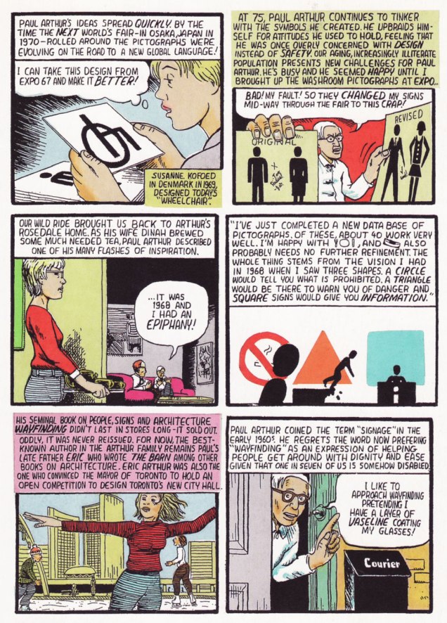
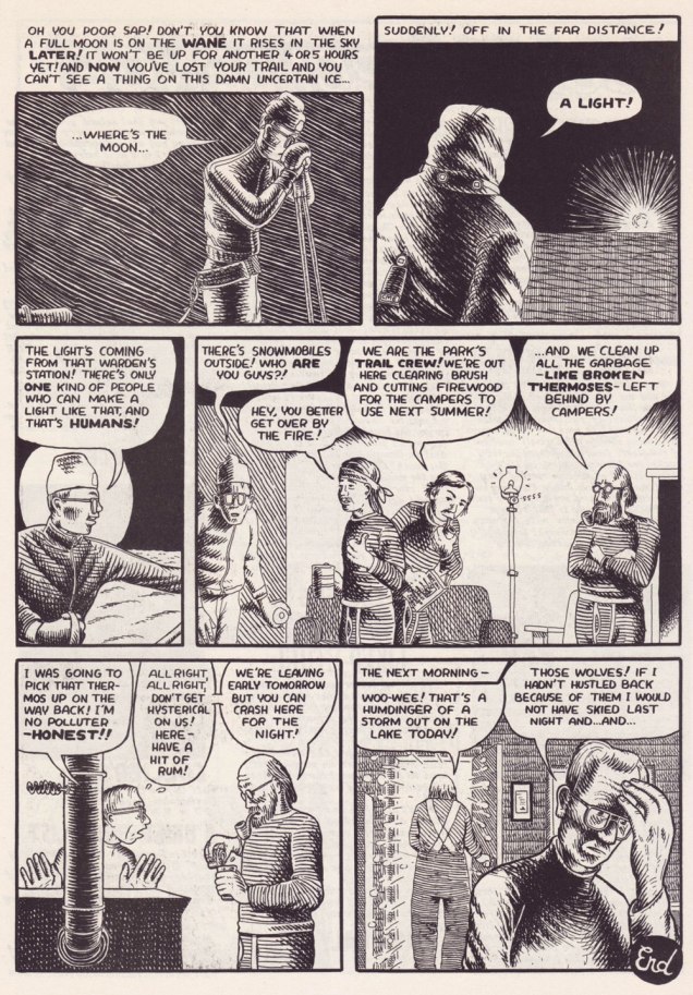
This was the first Collier piece that really grabbed me. From The Comics Journal no. 159 (May 1993, Fantagraphics).
.
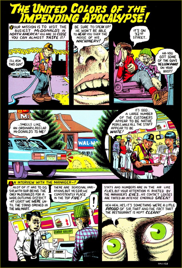
Collier has few equals when it comes to fitting a lot of nutrition into a page… without overstuffing it. Pacing, clarity, originality, pertinence… all top-notch. He doesn’t get to show it off all that often, but he also possesses a fine, distinctive colour sense. This piece first appeared in the collection Portraits From Life (March 2001, Drawn and Quarterly).
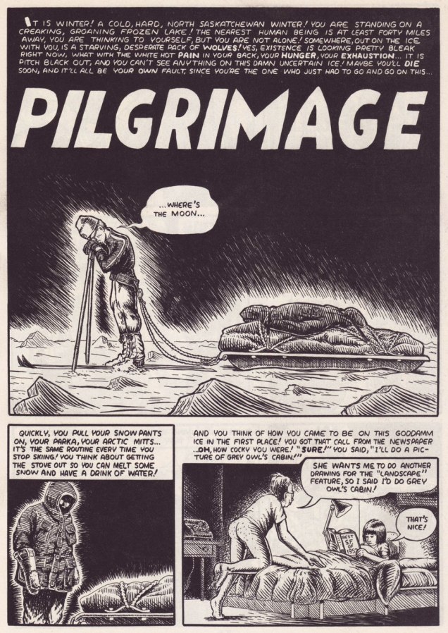
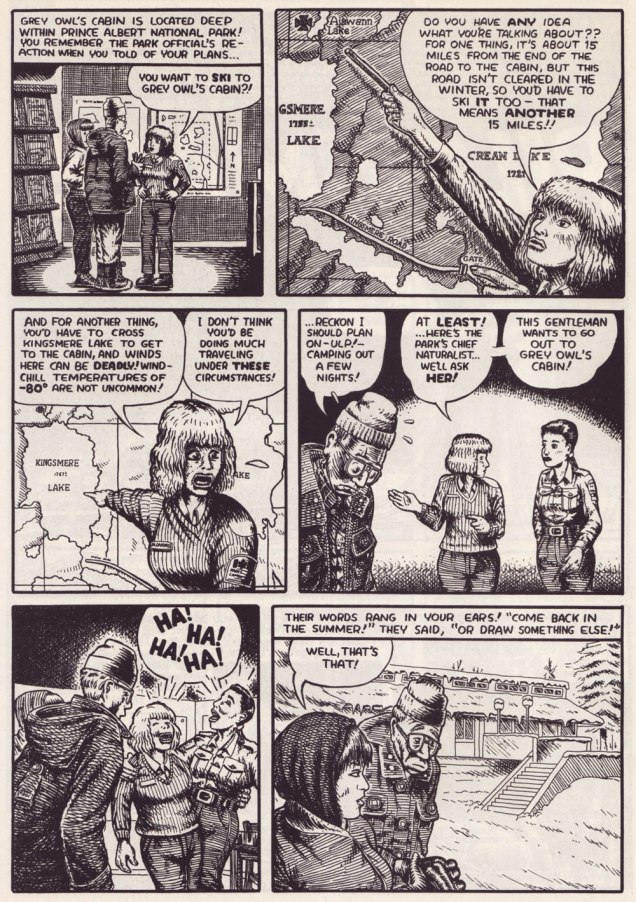
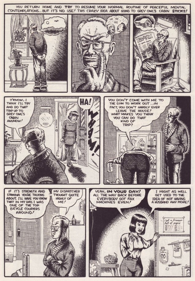
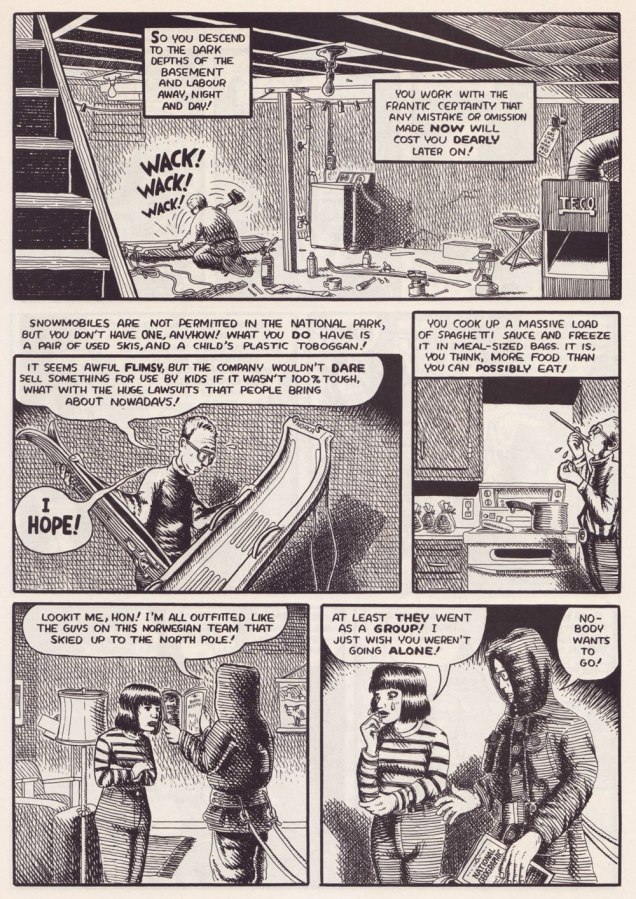
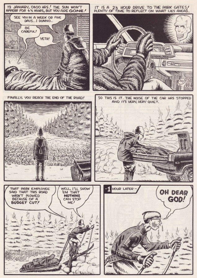
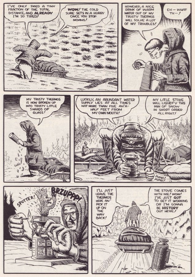
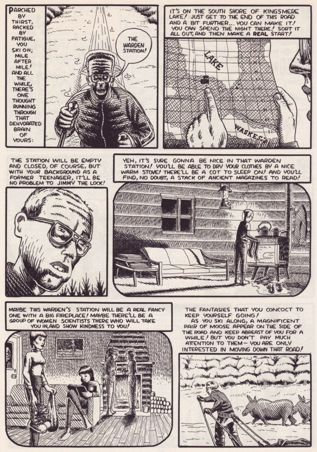
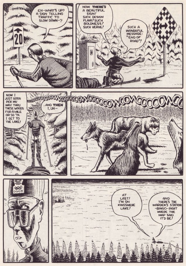
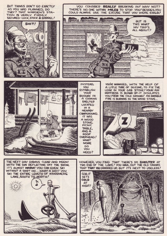
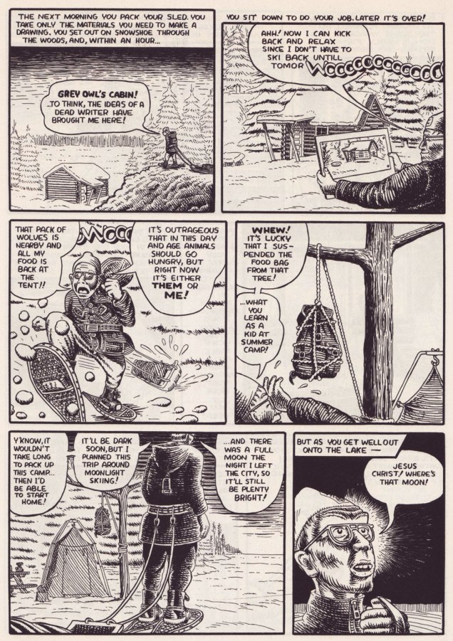
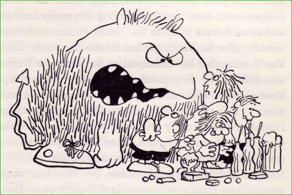
Collier is also entirely at ease with long-form narratives. Here’s a personal favourite of manageable length. It was this piece that made me a loyal fan. The issue of Collier’s it appeared in brilliantly splits its pages between David’s perilous trek to Grey Owl’s cabin and his account of the man’s life story, providing both a solid history lesson and a portrait of the artist as comics character. This material was also reprinted in Portraits From Life.
Somebody clearly digs Harvey Kurtzman‘s EC war — or more precisely anti-war — comics!
.
.
.
.
.
.
.
.
.
Pilgrimage first appeared in Collier’s no. 3 (May 1994, Fantagraphics).
I find it intriguing that Collier, a Canadian history buff if there ever was one, was unfamiliar — circa the early 90s — with the larger-than-life personage of Grey Owl (alias Archibald Stansfeld Blarney, I mean Belaney) the Buffy Sainte-Marie of his day… but we all have our blind spots. Lo and behold, just a few years later, comes the Hollywood biopic. Interesting coincidence…
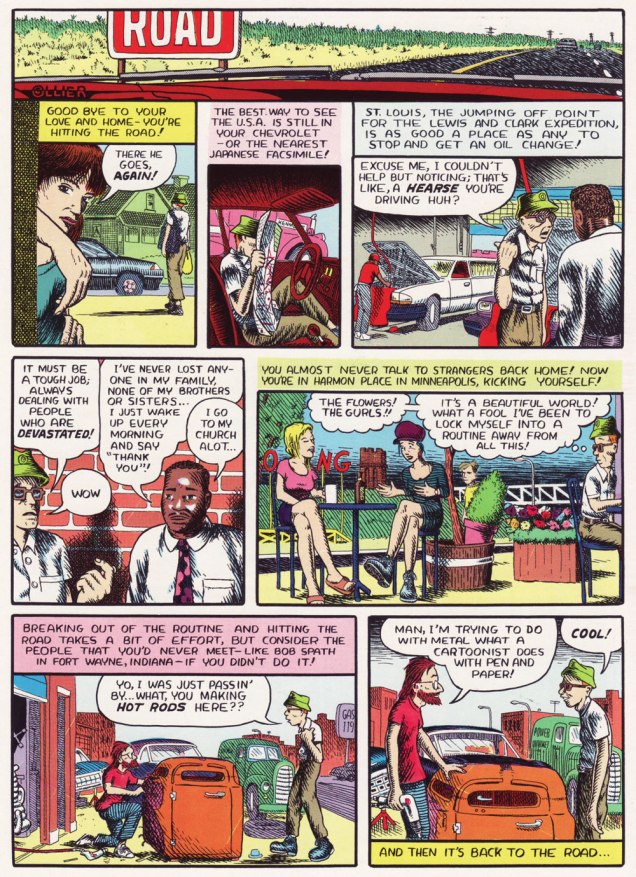
Another insightful short-short that shouldn’t work… yet does. It all comes down to the details. It originally appeared in Zero Zero no.7 (Jan.-Feb. 1996, Fantagraphics). One more for the road? From the back cover of Collier’s no. 3 (May 1994, Fantagraphics).
I’m happy to say that Collier has continued to grow, even if his French isn’t improving. The most recent book of his I read, Morton: A Cross-Country Rail Journey, was also likely his finest. But that was nearly a decade ago. Let’s hope for something new soon!
-RG
*Robert Crumb himself had scolded him about his spelling… way back in the 1980s.
**the nadir of this is the appearance of « Homme de le bois » (which even a mediocre copy editor would have immediately flagged) right there on the cover, and again inside The Frank Ritza Papers (2004, Drawn and Quarterly). While D&Q were quick to assign Collier a ‘fact-checker’, spelling — especially French spelling! — didn’t seem to be much of a concern. Sigh.
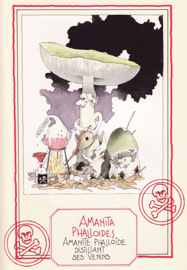
« Parmi les champignons se cachent d’ignobles individus, des espèces savoureuses et des sujets tout à fait pacifiques…»
December may not be exactly the month one associates with mushrooms, but that is precisely when mycophiles get broody and start cataloguing (mentally or otherwise) new species encountered during the warmer months*, dreaming about spring and its new flush.
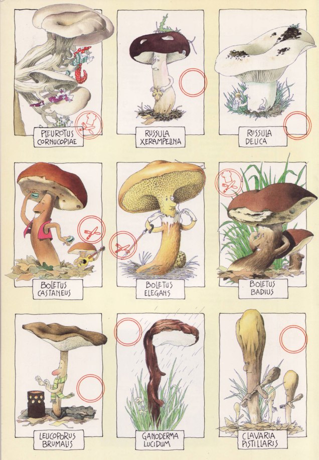
Here’s a selection of mushroom portraits taken from Le gratin des champignons by Roland Sabatier, an outstanding artist previously featured by co-admin RG in « Pépin le Long, You’re Fired! » (and, need I mention, a member of the Mycological Society of France). The second reaction I had upon leafing through this volume’s pages (the first was to squeal delightedly) was stunned admiration regarding the level of detail with which each mushroom is illustrated. I am by no means the first to note this (in his outstanding introduction, Georges Becker**, co-author of this tome, makes much the same point in far more eloquent prose), but it bears mentioning that while Sabatier may have transformed mushrooms into wonderful characters with their own games and stories, he managed to so very rigorously observe and illustrate their characteristics that one could actually use this book as a mushroom guide and not get, you know, poisoned.
Let’s get cooking!
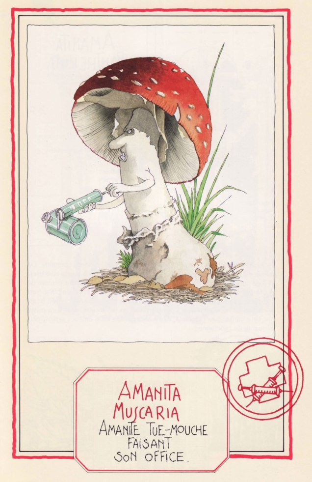
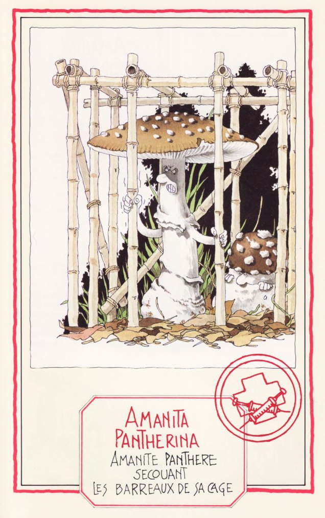
Speaking of getting poisoned, meet four Amanitas, a most deadly genus… with a few delicious, choice morsels thrown in to keep us on our toes:
The Death Cap… distilling its own venom. A most lethal animal.
The Fly Agaric, probably the most depicted mushroom in the arts, ‘performing its function‘. Despite its reputation, it is not deadly per se, as alluded to in a previous post (Fungus Friday: Amanita New Year (To Get Over This One)).
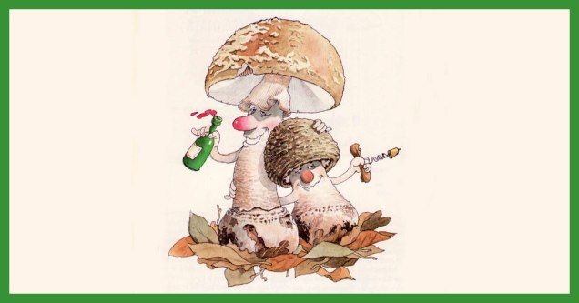
The Blusher, so called for its propensity to blush a pink hue when bruised (or embarrassed, one presumes). These wino amanitae exiting the tavern definitely look sloshed.
The handsome Panther Cap, shaking the bars of its cage. Like its Fly Agaric cousin, it’s not deadly as such, and has some psychoactive components. Admire its striking looks here.
Now we move on to more traditionally edible characters —
The Banded Agaric is also known as ‘Pavement mushroom’, which explains this fur-foxed lady showing her goods… walking the beat, as it were. This lady is tough as nails, and has been known to burst right through the pavement. Is she edible? You bet! ***
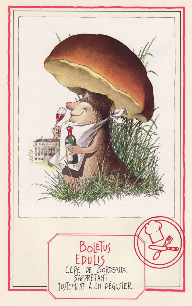
Ah, mushroom of many names (does this make it the rose of mushrooms?) – Penny Bun, Porcino, Cep, call it what you will… highly prized throughout cultures, fragrant à souhait. Here the cèpe de Bordeaux is about to savour some Bordeaux wine.
A favourite of WOT admins, the Fairy Ring Mushroom, saddled with an unfairly gloomy Latin name (‘marasme’ comes with an etymology of ‘wasting away’ or ‘decay’), dancing a ronde. Undemanding and widely spread, this mushroom dries most excellently (sometimes right on the very lawn it grows upon) and enlivens soups and stews throughout winter.
Another well-known mushroom, the Golden Chanterelle, as beautiful as it is fragrant. Will I picture these playing tiny little violins every time I find them in a forest? Absolutely.
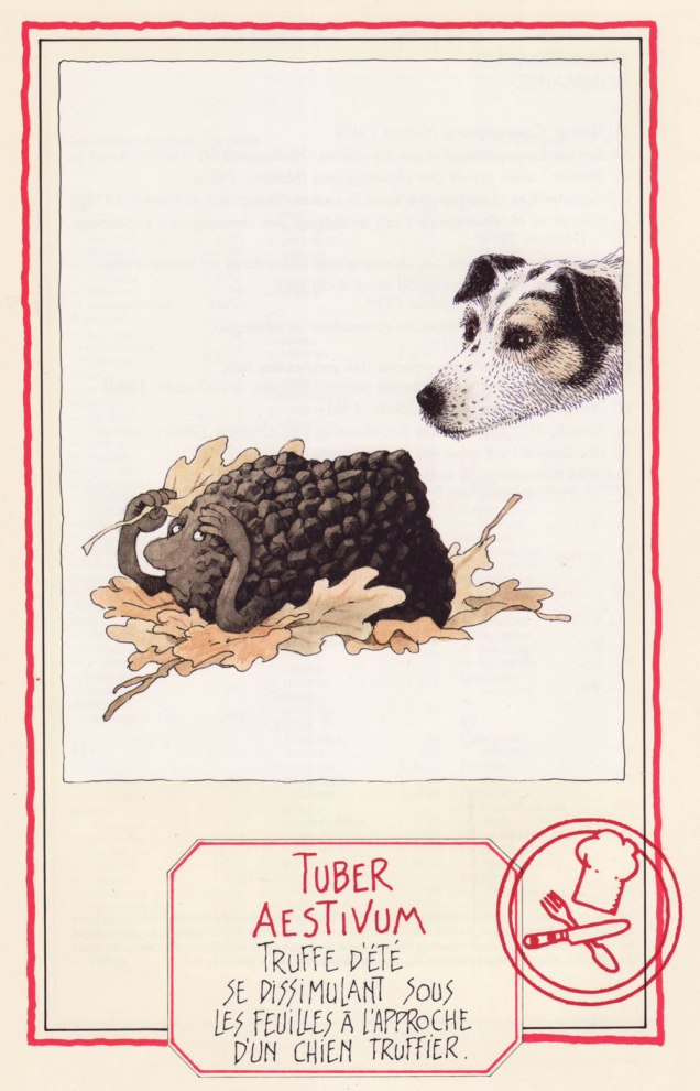
We couldn’t resist adding this scene depicting the Summer Truffle trying to camouflage itself as a truffle-sniffing dog approaches. I love the inquisitive gleam in the doggo’s eye.
We wrap up with, well… I trust you can interpret the Latin well enough without me. The Common Stinkhorn (‘stinky satyr indulging in his depravity‘) is actually edible, though not nearly as popular (or tasty) as another member of its family, the pretty Veiled Lady. Whether you would actually want to eat it is another question.
First published in 1986, this book has known several editions to update nomenclature (some mushroom families and names have changed considerably in the last 40 or so years, which is its own topic). We have the 1991 edition, published by Glénat. Sabatier had so many favourite mushrooms he illustrated, they didn’t even all make it into the book officially… which is truly a crime. Take a peek at some other of his mushroom people, only included on the inside of the book’s cover (but at least included in that smaller capacity!):
~ ds
* Technically one can find some mushrooms during winter, but that is not my area of expertise (at least as yet).
** French mycologist of renown (1905-1994), as well as writer, politician and apparently even musician (piano).
*** I’m actually not a big fan. This Agaricus tastes too much like the ‘champignon de Paris’ mushrooms sold in supermarkets to be of much interest.
« We live in the age of the refugee, the age of the exile. » — Ariel Dorfman
The tale of Czechoslovakia is a fascinating but painful one — as anyone who’s read any Kundera at all surely knows — between the Nazi and Soviet occupations, Czechoslovakia suffered steadily and profoundly through most of the 20th century. For my part, I gained a sharper view of the situation from reading an in-depth 1969 article about Czech economist Ota Sik (1919-2004).
Meanwhile, our protagonist, painter-illustrator Miroslav Šašek (1916-1980) had fortunately already settled to Paris by the time things got too ticklish back home.
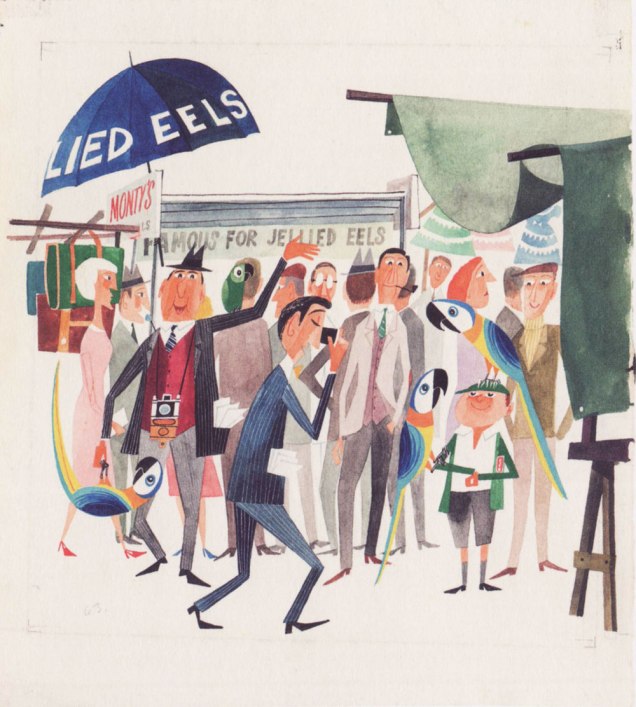
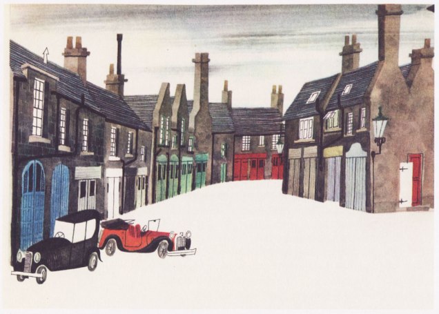
For several years, he’d been mulling over the idea of a ‘kiddies’ guide to Paris’, and in 1957, he was ready to shop it around. Venerable English publishing firm W.H. Allen (1835-1991) took a gamble, and Tintin’s home, the even more venerable Belgian maison Casterman (founded in 1780 and still around) signed on as well. Pictured here is an early German edition.Collage *and* a prudent black cat? Count me in. The closing piece (I haven’t seen them all and counted, but I’m told each book in the series comprised eighty illustrations) from This Is Paris / Paris. Here’s a handful of other drawings from the book.Original art from an interior ‘This Is London‘ illustration, second book in the series and published in 1959. Read it here! « London is full of interest. On Sunday morning you can go up to Petticoat Lane open-air market. » Good old British cuisine… after ninety-four years in business, Tubby Isaac’s Jellied Eel Stall closed for good in 2013. Jellied Eel made it to an impressive second place in Ranker’s List of Most Disgusting Meats, bested (ha!) only by Icelandic Rotten Shark Meat (fresh shark was nasty enough for me — holy ammonia, Batman!). You can still cast your votes for your favourites loathsome viands.The trusted old house of WH Smith is nowadays but a shell of its former glory.Illustration from This Is Rome (1960). Such masterful use of a) negative space and b) collage. For the record, SPQR stands for Senatus Populusque Romanus, which translates to “The Senate and People of Rome”. The acronym has lately been misappropriated by white supremacists. So many dog whistles fouling the air these days…Cover art from (just like it says) This Is Venice (1961). Those were better days: note the welcome absence of billionaires’ yachts.Illustration from This Is Edinburgh (1961). « The trip to Edinburgh was one of Šašek’s favourites — “I loved working on This Is Edinburgh, though I hated the weather there. In the middle of summer, it was cold and rainy. You needed a hot-water bottle in bed with you. Working conditions were good though because the nights are very short in Edinburgh. I worked from 4 a.m. to midnight and finished the book in two months.” » W.H. Allen employee Jeffrey Simmons, who worked with Šašek throughout the series, stated that « [ Šašek ] … always made the decision himself about which destination to tackle next. And I confess that sometimes they seemed quite perverse choices to me. They weren’t always chosen on a commercial basis, I don’t think. They were all successful, of course, but some much more so than others. ». I suspect that he was referring to his pick of the Scottish capital, who had a population of less than half a million at the time. But if it inspired him — and it clearly did — I wouldn’t call it perverse. This Is San Francisco (1962). « After the book’s publication in 1962, Šašek returned to receive the Key to the City. »Interior illustration from This Is San Francisco (1962). These elements likely wouldn’t have worked as a photograph, but the greater flexibility of illustration — more latitude in colour and contrast, the dropping out of extraneous visual components — make this composition sing (like the wires, presumably.)An incredible one from This Is Hong Kong (1965). « “Hong Kong was a hard book to do because of the language problem. It took me hours and hours to draw the characters of the alphabet. I tried to use a camera, but it didn’t work. Sometimes I could have screamed! Three times, ten times, twelve times over it took me to perfect one picture! » While some artists may have been satisfied with a generic representation of the Chinese characters, Šašek’s respect for his readers would not allow for any short cuts. He was acutely aware of the eagle eyes of children through the many letters he received from them. »Nearing the end of the line: a look at some original art from This Is Australia (1970), the penultimate book in a series of eighteen.A portrait of the artist mid-musing, dated 1961.
While the series, obviously a product of its time, receded in popularity over the years, it’s thankfully been undergoing a revival in this century. Such an invaluable time capsule deserves to be preserved for posterity, both on historical and artistic grounds.
« I find vocabulary to be a great drawback. » — Elizabeth Taylor
I think most of us will concur — sorry, Liz — that a rich vocabulary is a useful asset on multiple levels. And in riding with that particular train of thought, if a new year brings new goals and resolutions to achieve them, what could be more judicious and feasible than picking up a handful of new words… and their proper meaning?
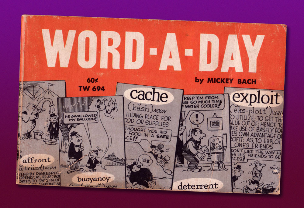
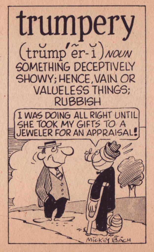
Cartoonist Mickey Bach (1909-1994) made it his mission to help the newspaper-reading masses bone up on unusual vocables. While he’s never ranked among the cartooning greats, the premise of his feature, Word-a-Day, was a rock-solid one, granting the panel a healthy run from 1946 to 1979, first with the Publishers Syndicate until 1967, when it merged with the Hall Syndicate*.
It’s also worth noting that, for a feature that’s been officially defunct for some forty-five years, it’s a pretty lively one: an admirably devoted and industrious fan has kept the Word-a-Day flame alive with the Word A Day Revisited Index. Kudos!
As far as I can tell, there was only one Word-a-Day collection published, but it was a successful one. First published by Scholastic Book Services in 1965 and comprising selections from 1960 to 1963, it received at least four printings through 1972, this being the fourth, from April of that year.
Let’s see what lies within, shall we?
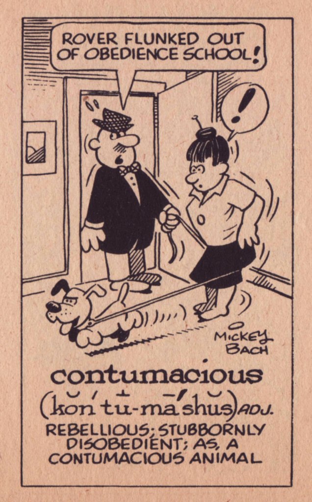
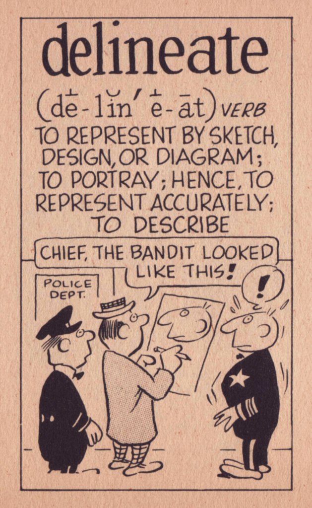
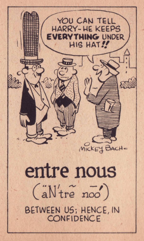
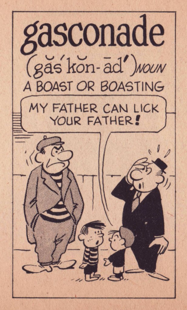
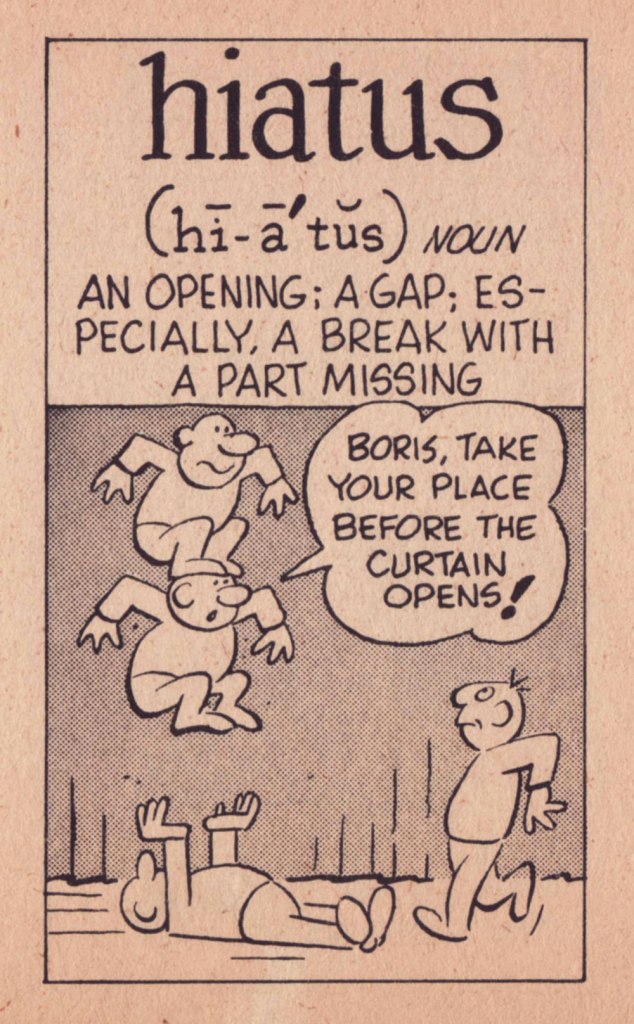
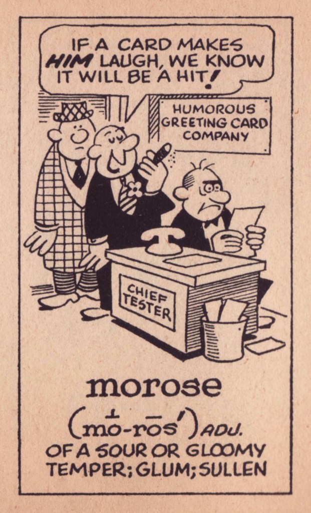
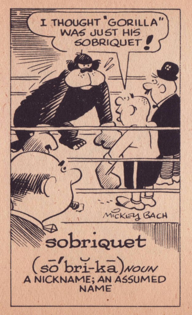
Part of the nostalgic fun in these images is their reliable repertory company of cartooning archetypes such as sandwich men, hobos, boxers, cranky bosses, talent agents, bearskin rugs, door-to-door salesmen, masked burglars, beret-sporting artistes…Ah, yes: that nagging feeling that we, as a society, are somehow regressing rather than progressing.Bach had a somewhat generic, but pleasant and competent cartoon style, wherein I detect the great Bill Holman as a principal influence. Bach clearly was a man of discernment.Don’t be that boorish chump: here’s a handy guide to tipping étiquette from no less an authority than Emily Post (not to be confused with Emily Ghost). This one’s a particular favourite of mine, having had to correct its misuse time and again; apparently, some people have surmised (without checking, naturally) that ‘fulsome’ means, ‘full’, only more so and in a fancier way. No, guys, ‘a fulsome investigation will be conducted‘ does not signify what you think it does. Derived from the French ‘Gasconnade’, which refers pejoratively to the speech of denizens of the Gascony region. « Speaking with the Gascon accent, which is to say accentuating silent ‘e’s, and letting ring out several final consonants that the French leave silent. »I find this one particularly clever.This one’s considered archaic nowadays — when it is considered at all — though its close relative, insipid, endures. Not to be confused with its homophone, incipience, which refers to the beginning of something.Sadly, Gorilla will likely pound the erudition out of that unfortunate pugilist.Here’s a sentiment most reasonable the world over are currently experiencing, to their chagrin.
« There could be no jealousy/over my poetry/it’s my weakest quality/no vocabulary » — Todd Rundgren, Chapter and Verse
From both of us at WOT?, thanks for your continued support and interest, and may the coming year bring you as little as possible of what you’re dreading.
In 1967, Field Enterprises acquired Robert M. Hall‘s New York-based Hall Syndicate, merging it with Publishers to form the Publishers-Hall Syndicate. » Phew.
« Save time and cut fingers with a parsley mincer. »
It seems that oodles of my posts start with ‘I found this book randomly in a second-hand bookstore…’, when ‘retrieved from the bottom of a dusty chest in a forgotten attic’ would make for a much more enthralling story. Alas, I am bound to truth… as is Can It Be True? (originally published in 1953 by MacDonald and Co; I have the 3rd edition from 1954), which was priced one measly buck despite its generally excellent condition and venerable age.
It consists of a collection of misprinted and typo’d quotes drawn from newspaper clippings, magazine articles and other paraphernalia, expertly gathered and compiled into a thin volume by Denys Parsons. This by itself makes for an amusing read, but the cherry on the cake is the occasional illustrations by blog favourite Anton (see Anton’s Spivs and Scoundrels, Baronesses and Beezers, if you’re not sure whom this nom de plume conceals).
As seen from a panel inside the book, the man is holding a poster that reads’ SHRDLUS AT IT AGIAN – Evning Srta’
« ... Spread around her was a sun-flooded valley where buttercups nodded lazily in the summer breeze and tranquil cows chewed solemnly at her elbow. » – Western Family Magazine
« Para. 27B. Men employed on quasi-clerical nature should not be provided with any clothing. » – Post Office Magazine
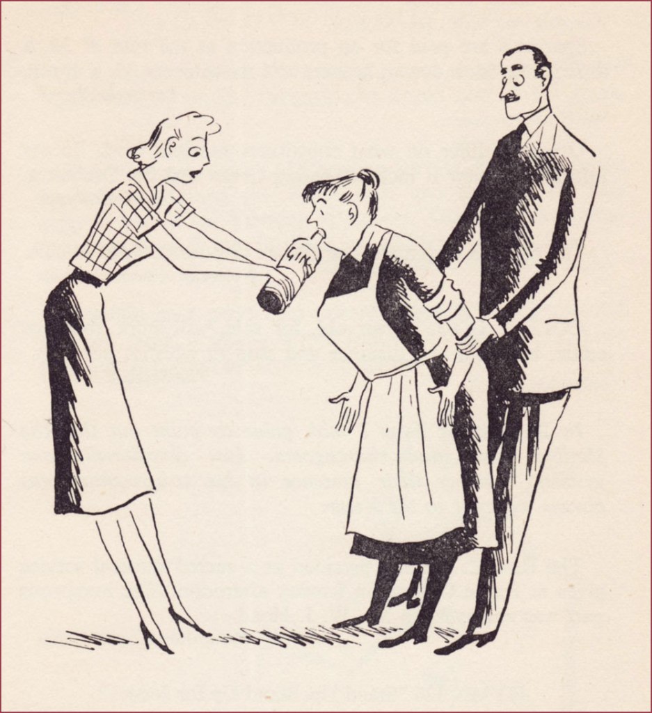
« The best plan is to hold the bottle firmly and remove the cook as gently as possible. » – Woman’s Paper
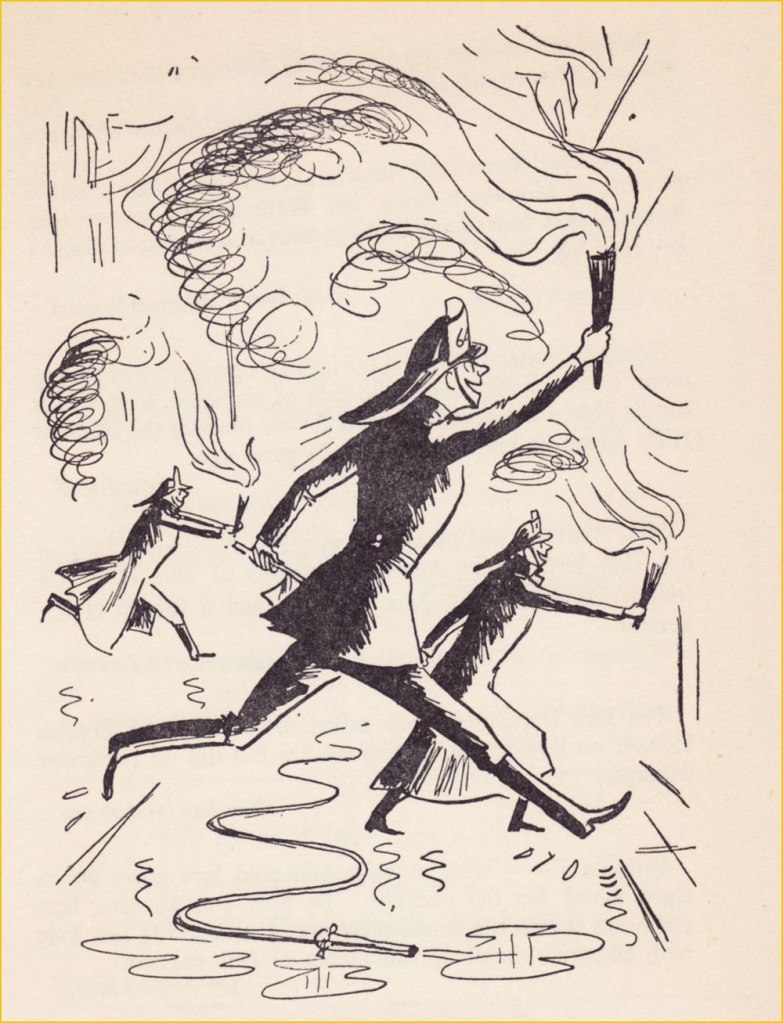
« The flames starting on the third floor of the midwest Salvage Co. spread so rapidly that the first firemen on the scene were driven back to safety and leaped across three streets to ignite other buildings. » – Cincinnati Times Star
« The word lawyer, he argued, was a general term, and was not confined to solicitors, but anybody who practised any breach of law. » – Cambridge Paper
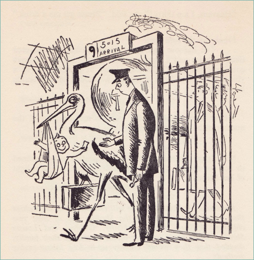
« Mr. and Mrs. Benny Croset announce the birth of a little son which arrived on the 5.15 last Thursday. » – West Union (Oregon) People’s Defender
Denys Parsons, ‘the undisputed king of the misprint’, has a few more books I’m interested in, including another volume of It Must Be True (this one illustrated by Ronald Searle), as well as Many a True Word (another Anton volume!) and All Too True (with drawings by Peter Kneebone). Perhaps another time, another p̶l̶a̶c̶e̶ used bookstore…
This is a post I didn’t want to write — or rather, a post I didn’t want to write under the present circumstances. While I’ve known Bernie Mireault (June 27, 1961 – September 2, 2024) for a long time, I couldn’t presume to call him my friend. We were never particularly close, but we ran in similar circles for a time. Then our paths split, many years ago. But I always liked him and greatly admired and followed his work.
I remember him as a kind, generous, humble man, with a soothing voice and manner. And blessed — and cursed, I suppose — with massive, multifaceted talent. Now that he’s left this world, his memory and his work linger. Allow me to showcase a couple of my most treasured Mireaults.
« Though this is fictionalized science, it’s not science fiction. We’ve imagined some of the details, but the characters existed, and did and said (most of) the things you’ll read. » Two-Fisted Science: Safecracker (1997, General Tektronics Labs). Published in advance of the Two-Fisted Science anthology, in order to promote it. However, Bernie’s piece outshines everything else, if you ask me. For good or ill, cheap copies of the comic book are still handily acquired.
This is only (most of) a single chapter of Bernie’s contribution — which totals 30 pages! — but it’s fully enjoyable on its own. Script by Jim Ottaviani, pencils, inks and lettering by Mr. Mireault.
A bit of background about Mr. Lavatelli (1917-1998)…Pray note Bernie’s clever nod to the great Harvey Kurtzman (top left). Of course, working on a story starring genial genius Dr. Richard Feynman already gives you an edge, but Bernie was one of the few cartoonists who could breathe life into the drabbest of narratives. Non-fiction seems especially daunting for today’s cartoonists, for some reason.
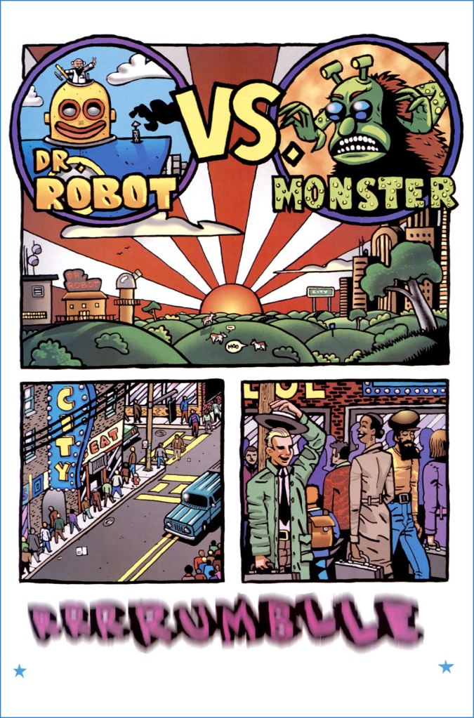
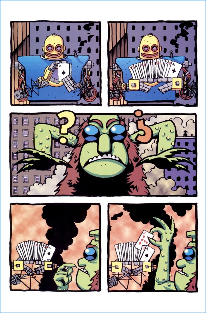
For another facet of Mireault’s talent, and to highlight his peerless colouring chops, here’s my favourite of his too-few Dr. Robot stories, written, pencilled, inked, lettered *and* coloured by Mireault. To this day, insultingly cheap copies are plentiful. Less than the original cover price, for Pete’s sake.
Thanks, Bernie. I’m truly sorry things didn’t work out for you.
I was going to post something very brief this month, telling you what to expect from us in September, which is… nothing else. We’re busily preparing this year’s edition of our Hallowe’en Countdown — which will include some more Mireault, that’s all I can tell you for now. See you soon!
In the spirit of saluting our heroes while they’re still around to get a boost from it…
A few weeks ago, I got wind of a delightful bit of news: that local favourite Russell Kommer Myers now holds, according to Guinness, the world record for Longest running daily cartoon strip by a single author. Perhaps because of his chug-along consistency, the prodigious Myers is generally taken for granted. Well — I’m happy to say — not in these parts: see our tribute post from a while back, Growing Old Gracelessly With Broom-Hilda, for further, abundantly illustrated praise.
Here’s some of what the folks at Guinness (not the Dublin ones) had to say:
« The longest running daily cartoon strip by a single author is “Broom-Hilda” by Russell Myers (USA), which has been in continuous publication for 53 years 292 days since first published by the Chicago Tribune Syndicate on 19 April 1970, as of 5 February 2024.
Russell was born “BT” (before television) and fell in love with comics and cartooning as a child. He started a collection of over 2,000 comic books, which he still has.
After years of having other comic strips rejected, Russell sold “Broom-Hilda,” which became an overnight success. He is a “one-man shop,” writing and drawing every strip himself, over 19,710 as of the 54th anniversary. »
For a little perspective, here’s what Lambiek had to say on the subject:
« He leaves previous record holders behind, like Frank Dickens (‘Bristow’, 51 years), Charles M. Schulz (‘Peanuts’, 49 years) and Marc Sleen (‘Nero’, 45 years). Yet Myers is still behind Ed Payne (‘Billy the Boy Artist’, 56 years), Fred Lasswell (‘Barney Google & Snuffy Smith’, 59 years), Jim Russell (‘The Potts’, 62 years) and Russ Johnson (‘Mr. Oswald’, 62 years, though this was a monthly comic). » Honestly, one is inclined to gently bring up the touchy, controversial issue of, ahem… assistants.
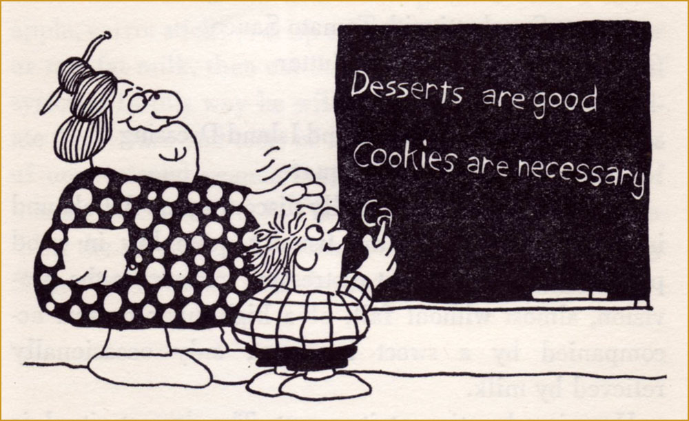
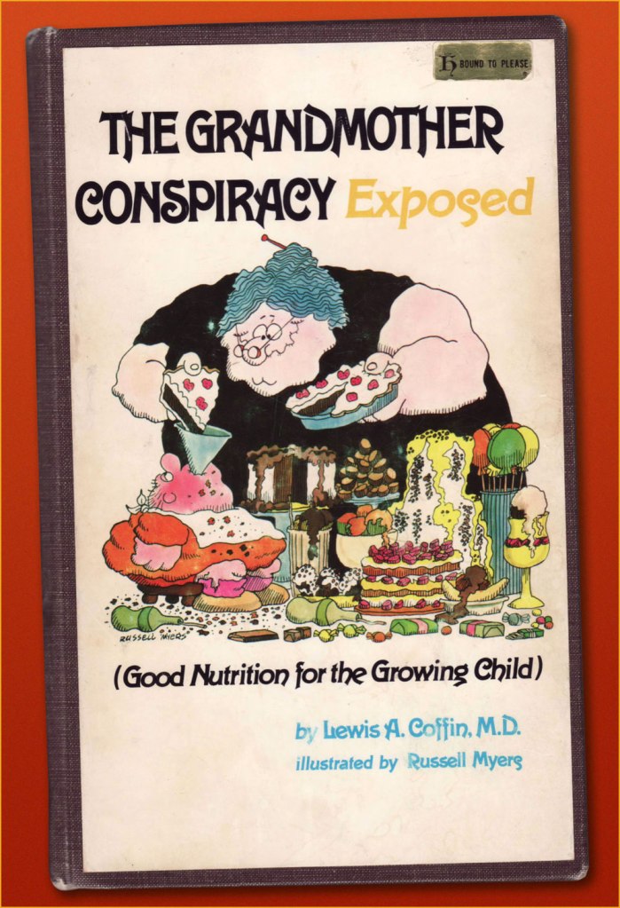
Having already dealt with Broom Hilda, let’s dig a little deeper. In 1974, early in his strip’s run, he contributed illustrations to California paediatrician Lewis A. Coffin’s book, The Grandmother Conspiracy Exposed (Good Nutrition for the Growing Child)… and did a lovely job. Given the ever-fickle nature of the dietary business — to say nearly nothing of its oft-political ramifications — Coffin’s book now seems of its time and place, but he was pretty progressive, and put forth a lot of sound notions. Here are some of Mr. Myers’ fun chapter illustrations:
« The best way to get vitamins is to eat foods which contain them. »« The advantages of breast feeding are well known: lack of preparation, sterility, natural warmth, ready availability, proper nutritional balance of ingredients, prevention of anemia, attractiveness of container design, transfer of protective factors against disease, apparent lower incidence of allergic disease, relative absence of intolerance to milk, and all the emotional gain for both mother and child. » « Unless you live in a semi-tropical area or are a heavy manual labourer who sweats profusely for long periods, you probably require no salt beyond that found naturally in food stuffs. »« I believe that a person who has felt a sun-warmed, firm but ripe tomato in his hand, lifted it up to his nose and savoured the deep, earthy aroma, and tasted the full, tart-sweet taste, juice and seeds dripping down his chin, will never forget the look, feel, smell or taste of that real tomato, and will know how to pick out the best tomatoes in the supermarket, because he will have that supreme standard to measure them against. »« My children love raw vegetables. They dislike many cooked vegetables, often the same ones they like raw. While I’m not saying you should sell the stove, it seems they sense that something’s missing after cooking. » « For many years Americans felt secure in the belief that the government and, more specifically, the Food and Drug Administration was constantly screening all processed food for harmful additives. It has finally become evident that this is not the case. » « Most school systems have completely abdicated the responsibility for nutritional education and have totally misused their most potent teaching tool, example, in the name of economy. » « Your children will sneak around your back and gorge at the neighbour’s house, or will slither down to the local store and furtively cram candy-bars and soft-drinks down their deprived throats. »« It wasn’t until television came along that the finely honed art of brain-washing children came to full flower. »« … we know that the majority of peoples in the world not only don’t drink milk, but they would be quite ill if they did. »« You would naturally assume that your local school’s lunch program was nutritionally a good one. »And here’s my durably bound copy of this lovely tome, discarded early this century from the library of Alma College, a private Presbyterian liberal arts college in Alma, Michigan.
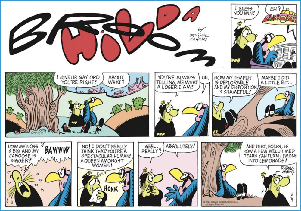
And since I’ve touched upon Mr. Myers’ Broom Hilda achievement, I would be remiss in not giving our readers a look at what he’s been up to lately. After all, an endurance record means little if the work itself has scant remaining merit. If you ask me, his timeless charm has weathered the years admirably well.
A Sunday strip from June 9, 2024.And a daily from June 15, 2024. Pretty sharp for a guy in his mid-eighties!
« Len Norris portrays rather the little man in his everyday complications, and by showing us his, and our own predicaments, he helps relieve us of the burden of the daily toll of bloodshed and terror we see in the news pages. » — Stu Keate
Here’s to a semi-forgotten Canadian legend.
In my long-ago teen years, when I began haunting second-hand bookstores, single-author collections of political cartoons were everywhere, dirt-cheap, largely interchangeable to the untrained eye.. and evidently hard to dispose of.
Most common were collections of The Daily Express’ Ronald “Carl” Giles (1916 – 1995), AKA Giles — but this being Canada, we saw plenty from The Montreal Gazette’s Terry Mosher AKA Aislin and the Vancouver Sun’s twin cartooning stars, Roy Peterson and Len Norris. Peterson is the one that first caught my eye — Vancouver was a long way off — thanks to his quarter-century run illustrating Allan Fotheringham‘s back page column in Maclean’s Magazine. However, I shelled out folding kale for but a single one of these collections, and it was the one comprising the cream of Norris’ 1960-61 output; it turned up in a long-neglected chest at my folks’ place last month, and so it’s ripe for rediscovery.
Here’s a bit of background on the man… born in 1913 in London, England…
« Norris came to Canada with his family when he was 13, growing up in Port Arthur, Ont. (now Thunder Bay). He moved to Toronto during the Great Depression, where his artistic talents landed him jobs in ad agencies. Before he joined The Sun, he was the art director for Canadian Homes and Gardens Magazine.
Norris didn’t become a full-time cartoonist until he joined The Vancouver Sun in 1950.
Norris was a sensation out of the box, picking up a National Newspaper Award for Top Canadian Cartoonist in 1952. His work was so popular that 27 collections of his cartoons were published.
He produced an estimated 8,000 cartoons during his 38 years at The Sun. He officially retired in 1979, but kept producing two cartoons a week until he finally hung up his pen in 1988, at age 75. He died in 1997 at 83. » [ source ]
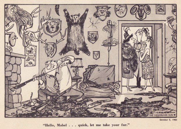
Ah, those quaint Colonials… « The phrase “the natives are getting restless” emerged from racist colonial origins. It sets up a scenario where wise, cool minds are overseeing and running things. And there is a more “savage,” “uncivilized” set of local people, the natives, who are seen as subordinate. Who deserve to be ruled by the lighter-skinned European colonists. »Quite timeless, that one — regrettably.Unlike a couple of these political parties, the Shrine Circus is still around — so it might have been the savvier investment after all. You can take the Englishman out of England, but… it’s snap to picture this appearing in the pages of Punch instead of a North American newspaper.Note that each and every child has his or her own ambulatory posture. Now that’s draftsmanship. Clearly, in Norris’ case, the verisimilitude of each detail, every gesture, springs from a deep well of visual observation — and he was no slouch with the verbal either. Like many a cartoonist, Norris was unambiguously on the side of the animals.I can relate far more readily with this gag since I’ve acquired a home with both a septic tank and lots of greenery.While the point might be a tad obvious — though still worth making — the expert composition is what makes this one special.Speaking of that Punch spirit: with this particular cartoon, Norris gleefully wanders into Rowland Emett‘s garden patch.I love how Norris didn’t stack the deck, where a lesser light surely would have: the members of the academic body on the right are still recognizably educators.Ah, poor Laika. Such a heartbreaking tale. Though she notably inspired a monument in Moscow, an outstanding Finnish rock band, a moving verse of a Divine Comedy song, and this cartoon, it’s a given that the poor doggie would have rather lived her life in peace than die alone and terrified.
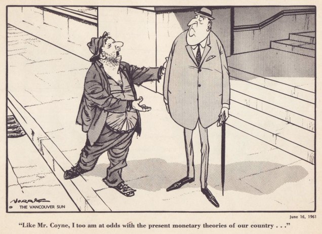
The next two make it thanks to bravura use of compositional space. Such chops!
With a population of 3,985 — and rising — Grand Forks, BC, “is Boundary Country’s largest city”. All kidding aside, it does look like a very nice place to visit.Dig if you will the artist’s mastery of volume and gesture, of costume and body language. The Mr. Coyne alluded to is James Elliott Coyne (1910-1979), who was the Bank of Canada’s second Governor, from 1955 to 1961. He resigned in the aftermath of what was known as The Coyne Affair.
His Vancouver Sun colleague Trevor Lautens eloquently depicted the Norris he knew: « Len limned not the pompous event, but the pompous event’s effect on ordinary people. He seemed a small-c conservative, but look and you will find that his drawings were blandly subversive. The bureaucrats were black-suited, pince-nezed satraps. Pietistic Social Crediters wore haloes and walked on fluffy clouds. The Victoria Conservative Club was populated by dozing, look-alike, pear-shaped gents with walrus moustaches. »
For a deeper burrow into Norris’ œuvre and legacy, here’s a fine documentary film on the subject.
« Mushrooms are different. They are not only raw material for the kitchen, they are a theme for endless discussion. They are ever present in our minds, even when we are not discussing them. »
I am not particularly interested in psychoactive mushrooms, though I get asked about them a lot. They may seem like the central topic of today’s post, but I prefer to think of them as an aside to ethnomycology, a word whose roots make it easy to decipher even if you’re not familiar with it. Mainly, the post is about the delightfully psychedelic world of Brian Blomerth. But let me start from afar…
Like any fandom with a very specific pool of knowledge, mycology has its gatekeepers* and its resident celebrities. A cursory glance at mainstream mushroom literature will quickly yield the name of Paul Stamets, mytho (and myco) -logical figure of authority, intrepid entrepreneur, spiritual guide or hack prone to bouts of pseudoscience, depending on whom you ask.
Parsing social media commentary, one might be forgiven for getting the impression that he’s some sort of cult leader. His fan base is arguably loopier than the man himself, but it’s hard to deny that Stamets likes to take basic facts and spin them into a web of conjecture presented as evidence. Add a tendency to proffer medical advice and present mushrooms (especially of the magic kind) as a panacea, not to mention his brisk trade in heavily watered-down mushroom supplements (check it out here), and the sobriquet of “Elon Musk of Mycology”** no longer seems that harsh. Stamets indeed has a lot of research on psycho-active mushrooms under his belt, and as an active advocate for mycology, he may have inspired a number of people to get interested in the topic… but his messianic persona has long eclipsed his early years as a scientist. I’ll have my mushrooms without a side of semi-religious ravings, thank you.
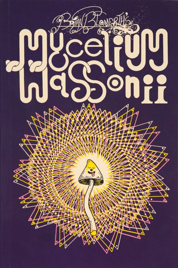
Moving on to the actual topic at hand (believe it or not, I hadn’t set out to write an essay on Stamets), I recently stumbled upon Brian Blomerth’s Mycelium Wassonii and fell in love with the artwork. Then I noticed that Paul Stamets was somehow involved and had an ‘oof’ moment, but fortunately his contribution is simply a (great, admittedly) 2-page introduction, though he shows up in search results alongside Blomerth with the persistence of a cat who wants to be let out. Besides, small contribution or not, I was clearly not passing up the chance to delve into the internal politics of mycology. This is a verbose post, scroll on to the images if you’re so inclined.
The front cover of Brian Blomerth’s Mycelium Wassonii (2021, Anthology Editions).
Anyway, this graphic novel chronicles the mycological adventures of Russian-born pediatrician Valentina Pavlova Guercken and her American husband Robert Gordon Wasson. When Valentina met Gordon, he was of the opinion that mushrooms were ‘putrid’, but his mycophilic wife’s enthusiasm for picking and consuming them so vividly piqued his interest that the two embarked on a series of ethnomycological field studies soon after their honeymoon in 1927. This culminated in the publication of Mushrooms, Russia and History in 1957. 1955 in particular was a pivotal year. During the Wassons’ trip to Mexico, G. Wasson became the first documented Westerner to participate in Velada, a Mazatec mushroom ritual involving the intake of psilocybin. Both Wassons were deeply affected by their Mexican sojourn. Gordon wrote an account of his experiences for Life Magazine, a photo essay titled Seeking the Magic Mushroom. Six days later, This Week published an interview with Valentina wherein she suggested the use of Psilocybe mushrooms as a psychotherapeutic agent, as well as a potential treatment for mental disorders and a way to mitigate pain in terminal diseases. The brouhaha created by these pieces, as well as the samples the Wassons brought back from Mexico that wound up in the hands of Albert Hofmann (‘father’ of LSD), paved the way to a magic mushroom culture.***
‘What do you do with this gross thing?’, asks Gordon. Despite her enthusiasm for psychedelic mushrooms for medication and treatment, Valentina was clearly first interested in them from a gastronomical perspective. I can relate.
Valentina tells the story of how, as a child, she was sent out to get some boletes (Boletus Edulis, ‘borovik’ in Russian) by her mother, but she kept bringing back the wrong thing. I love how Blomerth gives his mushrooms little speech bubbles, like they’re saying something in an alien language to the people going by.
After their honeymoon, Gordon, now a convinced mushroom lover (what did you think honeymoons are for?), the couple returns to NYC and their day jobs. Yet mushrooms are never far from their minds (a familiar affliction), and as they compile recipes, the impulse to collect them in a mushroom cookbook grows.
Gradually, the idea of mycophobic societies as represented by Gordon and mycophilic societies as represented by Valentina takes hold, and the cookbook expands into a treatise about mushroom culture. Ethnomycology is born.
While it can be argued that Gordon’s interest in the Mazatec mushroom culture and subsequent publications about it were motivated by his desire to expand human knowledge, it’s undeniable that he behaved in a less than exemplary way from the onset. The Mazatec wise woman María Sabina (pictured above) who allowed him to be part of the sacred ritual did so because Gordon lied to her about a lost son. He also took a picture of her on the condition of never publishing it, but then revealed her name, location and community in volume 2 of Mushrooms, Russia and History, which led to all manner of tragic and violent repercussions on her life.
Blomerth deserves many accolades for this book, above and beyond his colourful and cartoony art. He managed to tease a coherent yet detailed storyline out of a topic that reminds me of a Lernaean hydra – pull on one narrative thread, and many more threads spring up. Unsavoury moments are not glossed over, and yet one leaves with an invigorating impression of mycological passion that connects to a general lust for life. Finally, Blomerth draws mushrooms accurately – one can recognize specific species from his drawings.
Head over to his website for some gorgeous t-shirts. Fans of the above material may also be interested in Blomerth’s other mind-expanding (he, he) graphic novel, Bicycle Day, involving the aforementioned Albert Hofmann.
Returning to the topic of fungal superstars, I recommend David Arora as an examplar of a knowledgeable, passionate mycologist who also doesn’t take himself too seriously.
– How did this whole mushroom thing start?
– I’m not entirely sure… I think I just loved my wife.
~ ds
* In this particular case, said gatekeeping is motivated by nobler motives, namely those of keeping people safe. Some of these fungal newbies throw themselves in headlong, disregarding the very possible and palpably lethal outcomes of misidentification.
** Someone on Facebook coined this term and I had a good chuckle. On an even pettier note, Stamets chose, for his website, a white font on a blue background… and my eyes do not appreciate it.
*** Here I am somewhat constrained by space, as I have already ventured far off the field of actual comics. I haven’t even touched upon the subject of people (proto-hippies?) who travelled to Mexico in order to locate María Sabina and/or magic mushrooms (famously, John Lennon et al.) or the CIA’s involvement with the Wassons.
« Arrows of neon and flashing marquees out on Main Street / Chicago, New York, Detroit and it’s all on the same street / Your typical city involved in a typical daydream / Hang it up and see what tomorrow brings » — Robert Hunter
Among the foremost pleasures of a brick-and-mortar bookstore is the increased odds of stumbling upon an item whose existence you never suspected: case in point, another cheap (one buck!) gem I scooped up in Ellsworth, ME’s The Big Chicken Barn last Autumn.
Now — I’ve long been a huge fan of the pseudonymous Cecil Adams‘ sassy syndicated answer column The Straight Dope (1975-2018), in no small part thanks to resident — all the merry way! — illustrator Michele ‘Slug’ Signorino‘s waggish accompanying cartoons, rendered in what he colourfully called his ‘smudge-a-dot technique’.
And so, last October, I grabbed a lovely Scholastic publication that had until now ably eluded my radar — 1978’s Junior CB Picture Dictionary, compiled and edited by Joan Downing and dexterously illuminated by the aforementioned Mr. Signorino. I was delighted to discover that he’s still happily active well into his Eighties: « he still works and does not intend to retire. “This isn’t work,” he said. »
This slim-but-priceless tome happens to tick several of my pet boxes: a somewhat (but not quite!) passé communication technology; a lively, singular species of jargon; a merrily anarchic illustrative style… and so forth. Let’s sneak a peek, then!
Checking My Eyelids for Pinholes: Tired; getting sleepy.City Kitty: Local police.County Mounty: Sheriff or county police.Draggin’ Wagon: Wrecker or tow truck.Eatem Up Stop: A truckstop.Flagwaver: Road construction worker.Haircut Palace: A low bridge or overpass. There’s one of these a couple of blocks up the street from where I used to live, but I suppose every big city has to live with that problem. In Boston, MA, the phenomenon is particularly colourful, as is called ‘Storrowing‘. Mama Bear: Female police officer.Mixing Bowl: Highway cloverleaf.Motor Mouth (Also: Ratchet Jaw): One who talks too much.Rat Race: Traffic during rush hour.Skating Rink: Road slippery from ice, snow, or rain.Super Skate: Sports car.Truckin’ Teenybopper: Young hitchhiker. The bulk of my first-hand experience with CB came from hitchhiking in my youth so I indeed was a truckin’ teenybopper myself! I’m still warmly grateful for the longest ride I ever got: from Portland, OR, to Long Beach, CA, thanks to a friendly truck driving man. He was actually headed for San Diego, but I was already over three thousand miles from home… and had to get back in time for college.Wall to Wall and Ten Feet Tall: Good CB reception. A visual reference to famous pooch ‘Nipper‘. Window Washer: Rain. Is that you, Dirty Danny?
For more dirt on the magnificent Signor Signorino, feast your peepers on this lovely 2022 profile. And in case you’re wondering “Does Slug have a book about his career?”, why yes, he certainly does!
I’ll let Steve Earle have the last jab at this one: « Everybody told me you can’t get far/On thirty-seven dollars and a Jap guitar/Now I’m smokin’ into Texas with the hammer down*/And a rocking little combo from the Guitar Town**. »