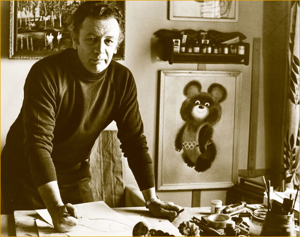
I grew up on the illustrations of Soviet illustrator/cartoonist Victor Chizhikov (1935-2020). I’m not sure whether I’m from the last generation that remembers his work this well — on a similar topic of ‘boy, we’re old’, older non-Slavic readers might be familiar with Misha, the mascot that Chizhikov designed for the 1980 Moscow Olympic Games.
Chizhikov with his creation Misha (both a nickname for Mikhail, and a contraction of ‘bear’).
In 1955, Chizhikov started contributing illustrations and caricatures to Krokodil, a publication I was born too late to be personally familiar with (though I did write a post about it). While he has definitely drawn a number of ‘adult’ cartoons in his life, it’s his cheerful anthropomorphic animals, mushroom-studded landscapes and gently roguish children that linger in people’s minds, and those appeared from 1956 and onwards, frolicking through the pages of Весёлые картинки (Merry pictures), a publication aimed at children between 4 and 11. In 1958, Chizhikov also joined the staff of Мурзилка* (Murzilka), a magazine for the 7 to 13 year old crowd. I had subscriptions to both as a child. My grandfather was especially keen on giving me a well-rounded education, though he needn’t have worried, as I come from a family where nearly everybody was a voracious reader, albeit occasionally disagreeing on genre. I used to have a stack of Весёлые картинки somewhere, but I got rid of it at some point with the impetuousness of a young adult, alas.
An issue of «Мурзилка» from 1968.
A page from a 1965 issue of «Мурзилка» depicting scenes made up of palindromes.
Original art for an illustration created for a 1975 issue of «Мурзилка».
Page from a 1966 issue of «Весёлые картинки» — ‘Petrushka in the land of fairytales‘ was a recurring feature. Chizhikov had a most fluid line when needed.
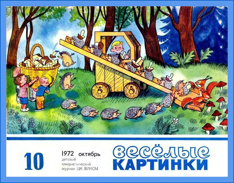
The October page from a 1972 calendar published in «Весёлые картинки».
An issue of «Весёлые картинки» from 1982.
Interestingly, Chizhikov was daltonic, something one would never be able to guess from his illustrations. It is said that his wife would label pots of paint and pencils to help him out, but I don’t know what variant of colour blindness he was stricken with. A critic once described his characters as having a ‘mischievous squint, as if they live in an eternal summer in the bright sun‘ — maybe they were just squinting trying to discern the nuances between colours?
‘The Lamplighter Ant’
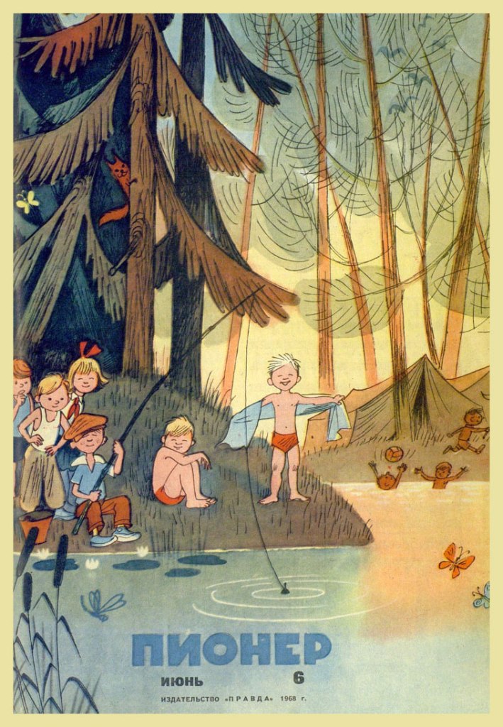
Issue of «Пионер» from 1958 — this was a magazine for 10 to 14 year-olds, but I don’t remember ever encountering any issues in the wild (possibly because my family objected to buying something called ‘Pioneer‘).
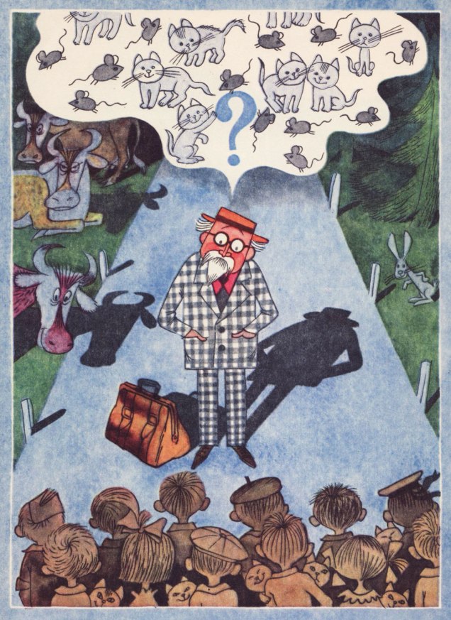
I owe this trip down memory lane to a friend who gave me a 1971 edition of 25 загадок — 25 отгадок (25 riddles — 25 answers) written by the immensely energetic and thus ubiquitous Korney Chukovsky** and illustrated by Chizhikov. Many thanks, Drew!
« Two stallions I have, they carry me on water. The water is tough, as if it were a stone. »
« If pine trees knew how to run and jump, they would flee from me to never cross my path again, because I am very steely, mean and toothy. »
« Small houses are running down the street, carrying little girls and boys. »
« Kondrat was walking to Leningrad, and coming towards him were twelve kids, each with three baskets, with a cat in each basket, and each cat having 12 kittens, each kitten holding four little mice. How many kittens and mice are the kids carrying to Leningrad? »
Cover of another book by Chukovsky, the ever-popular Doctor Aybolit, whose name translates literally to something like ‘Doctor Ouchithurts’. This character was loosely based on Hugh Lofting’s Doctor Dolittle, as well as Chukovsky’s friend Zemach Shabad, known for treating not only sick children, but also the equally ailing animals the children would bring along to their appointments.
~ ds
*Мурзилка is still around today, and given that it began publication in 1924, it is now listed in Guinness Worlds Records as the longest running children’s magazine in the world.
** 1882-1969, author of innumerable absurd ditties, rhymes and poems so well remembered and loved that many got incorporated into Russian as idioms; brilliant translator of English novels, stories and poems, making them accessible to a Russian-speaking audience for the first time; dissenter of governments, be it Soviet or Russian.
Despite the online abundance of all manner of cat cartoons, the work of Russian artist Vasya Lozhkin (the nom de plume of Alexei Kudelin, born in 1976, lawyer by profession) stands out. Passed around on social media with equal enthusiasm by housewives looking for a giggle, journalists foraging for a satirical cartoon to supplement an article, and art lovers with a penchant for the feline, his paintings run the gamut from wistfully sentimental to quite scary, often in some combination thereof.
One can argue whether Lozhkin is actually an Artist or not (capital A intended) — he himself says that he loves painting, but is no painter. As far as I’m concerned, his eye for colour and striking compositions compensate for whatever deficiency may exist in terms of actual drawing talent. He’s unabashedly prolific, returning again and again to the same themes, populating his world with an addictive medley of orange tomcats, grannies of a threatening disposition, sad Slavic bears and grey bureaucrats of ill intent… as well as good sprinkle of ‘ordinary’ people gone mad, with or without the presence of alcohol. There’s a lot of alcohol.
‘I’m an artist! I have a certificate!’ The author posing next to one of his paintings.
It is Lozhkin’s cats that mostly grab the public’s fickle heart, thus providing their creator with what must be a fairly steady income from knick-knacks of all kinds, à la Kliban*. I’m glad. If it didn’t involve ordering stuff from Russia, I’d be first in line for, say, a mug or two. He has produced something like five thousand paintings so far, exhibiting no shyness whatsoever about recreating particularly successful canvases. He notes that ‘I like cats, but so does my audience. Since my job is to feed my family, I feed it with cats.’ His pragmatism strikes one as being almost defensive.
« Life is a merry carnival »
«Smile, and this world will smile back at you! »
« Talking about the ideas behind Lozhkin’s paintings is like explaining a joke — the explanation will not make it funnier or clearer. His metaphysical world is a sort of peculiar successor to the classic Lubok, where a highly amusing image with a straightforward caption is filled with philosophical meaning. Grotesque buffoonery is aimed to the public exposure of a man’s self, his hidden aspirations and his dreams. The Skomorokh makes an absurd mockery of events, turns the innermost self inside out, so that Man can see his soul — see it and laugh at the absurdity of its ideals. » [source in Russian]
«Stuffing your face while Motherland is sleeping? »
«Improving the marketable appearance »
«Freemasons invent rock’n’roll in order to wreck USSR »
« Each sees what he wants to see. And hears what he wants to hear. But with the sense of smell, this trick does not work: if one early morning you go stand in the middle of a field, knee-deep in manure, squint your eyes and take a sniff, you’re certainly not going to smell violets. » On the topic of sweet violets…
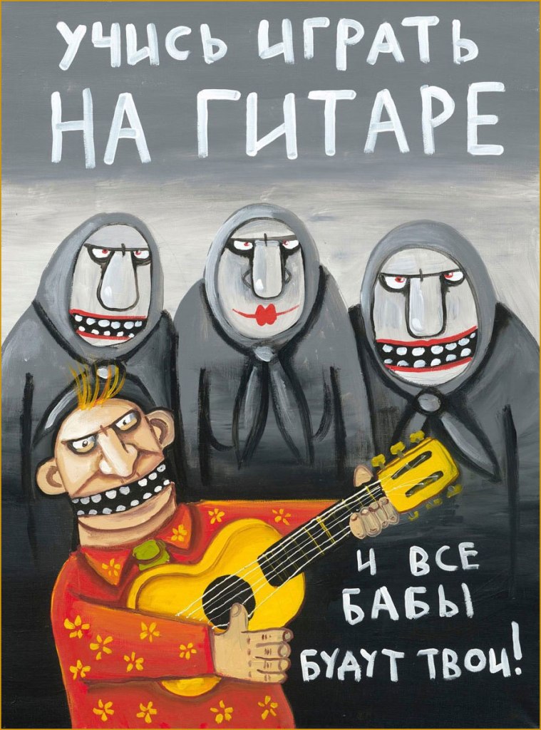
«Learn to play guitar, and all broads will be yours! »
«Get down, fool! »
« Glamour cockroaches got into Petrovich’s head by accident »
‘Cockroaches in the head‘ is a popular idiom, meaning somebody’s mind is messy or full of idiomatic eccentricities. Do professional art critics ignore Lozhkin’s cats et al because this isn’t high art, or because they’re perplexed? Occasional exhibitions, if not very well attended, are distinctly enthusiastically attended by ‘people with cockroaches in their heads’.
«A soul’s suffering will be healed with love »
Komsomolskaya Pravda (the ‘Komsomol truth’) included Lozhkin in its series of ‘Best Contemporary Artists’, dedicating its 15th volume to his art. On one hand, he is now amusingly rubbing elbows with Edvard Munch (volume 6) or Salvador Dali (volume 30)…. currently the series is up to 34 (Pablo Picasso, and no, I don’t understand which logic these choices are governed by, either). Lozhkin was amused by this, apparently. From this end of the world, having anything to do with a pro-Putin newspaper** with Soviet roots is disturbing, but then again… I don’t have to survive in that climate.
Veer to the right towards the traditional Slavic bear family for ‘Motherland’, stray to the left for ‘Abroad’, with its circus of horrors and immoralities. Internet denizens are scarily divided about this painting – is this satire, or brainwashing? I’ll let the reader decide, based on the rest of Lozhkin’s oeuvre as glimpsed in this post.
In an interview, Lozhkin said that the fairy tales he creates always have a happy ending, despite heavy elements of psychosis. He also mentioned that lately he’s been trying to accentuate on the positive, to evoke pleasant emotions from his audience. I admire the motive, but I’m not sure he believes in it himself — there is little doubt that the darkness deepens.
« Each one of us, if you look carefully, has this bottomless depth; everything is in there, the icy horror, this hopeless darkness, gray hopelessness and green melancholy, as well as terrible laughter, pandemonium, devils, animals, cockroaches… »
Contemporary Russian cartoonist (and colourist) Alexey Gorbut, born in Yekaterinburg, had been drawing (by his own admission) since babyhood. When asked in an interview to describe his work in three words, he said ‘I’m always drawing’. As clearly seen from his art, he is a great fan of Golden and Silver age comics, an devotee of old horror comics (he specifically mentions Chamber of Chills* and Tales from the Crypt as favourite anthologies in this interview), with a special affection for Steve Ditko and Alex Raymond. While he wears these influences on his sleeve, his work still boasts plenty of Slavic trimmings, which makes for a really fun blend of styles and perspectives.
Gorbut mostly self-published his stories until 2016. Alexey Volkov spotted his work while looking for an illustrator for a project requiring a Kirby-esque hand, and, smitten with Gorbut’s style and his proclivity for drawing on paper instead of a tablet, offered him to collaborate on a book to be published by Jellyfish Jam. The Alexeys’ first book together was «Победителиневозможного » (2017), a sort of Metal Men seen through the lens of Soviet sci-fi. A team comprising four members who possess fantastical powers, two men, one woman and an android, is on the search — to exact revenge — for their creator, a mysterious time traveller.
The cover of «Победители невозможного » (2017), which translates to something like ‘Vanquishers of the impossible’. “Krackle” notwithstanding, the result actually did not come out Kirby-esque at all — you can see some inside page samples here.
Their next significant collaboration was «Вор теней» (Thief of Shadows), plotted by Volkov and Kirill Kutuzov, who were old childhood friends and partners in comic crimes. The first four issues were published in 2019 by aforementioned Jellyfish Jam, with publishing rights picked up by Bubble Comics on issue 5 and onwards. The series is still going strong, and the Kutuzov, Gorbut and Volkov trio became such a steady team in readers’ minds that they were even assigned an unofficial acronym, KGV (which of course brings to mind ‘KGB’).
Page from Вор теней no. 1: Вор теней и час волка (May 2019, Jellyfish Jam).
The cover of the first collection gathering the first five issues, published in 2020 by Bubble Comics.
« Майор Гром 1939 » (‘Major Thunder 1939’), a seven-story collection, came into being in 2019, a successful stab at recreating a golden age comic with ‘old-school’ storytelling and wackiness.. and far more interesting than Bubble’s Major Grom franchise it sprang from, if you ask me. Volkov and Gorbut took the main series’ characters and transferred their raison d’être to the Soviet era, cooking up a delirious blend of parody with a heavy sprinkling of American comic influences defused by Soviet lifestyle snippets. Titillating details abound, like corrupt billionaire Plague Doctor becoming the Plague Physician, a child of noblemen murdered by the Bolsheviks.
Майор Гром 1939 no. 1… October 1939, I mean 2019, published by Bubble Comics.
Alternate cover for no. 1. If it looks familiar…
… it’s because it should!
Detective Comics no. 31 (September 1939), cover by — or at least credited to — Bob Kane.
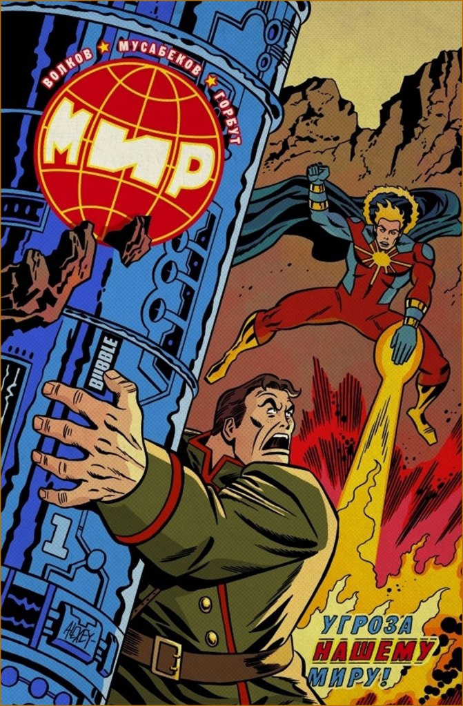
Superhero/sci-fi series «МИР» (2020 and ongoing) is written by Volkov and illustrated by Madibek Musabekov, with the former drawing “real-life” action and the latter, dream sequences and such. Musabekov has a perfectly ordinary, dull, tablet-drawn style devoid of any personality, and he also draws all the covers so that’s one series I’m not going to touch… but Gorbut’s alternate covers can be nice.
МИР no. 1 (August 2020, Bubble Comics)… on the other hand, now ‘Kirby-esque’ has caught up.
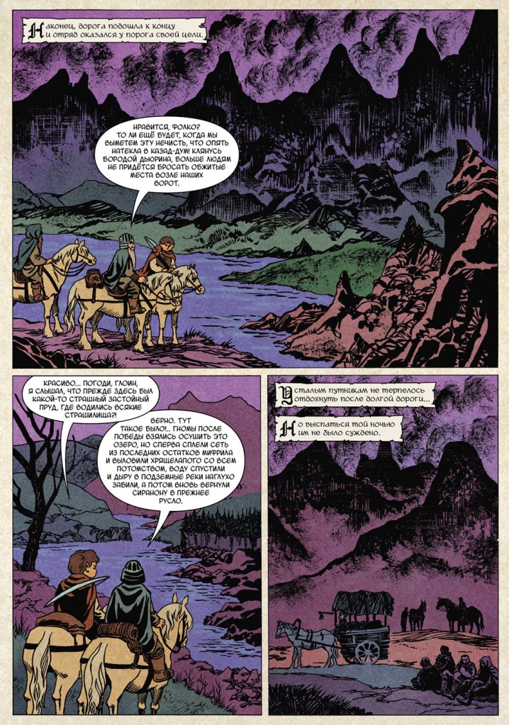
More recently Gorbut has adapted Nick Perumov‘s «Кольцо Тьмы» (The Ring of Darkness) fantasy novel series. If it looks like a Lord of the Rings rip-off, that’s because it’s purposefully set in Tolkien’s word, with a hobbit protagonist (not that it makes it less of a rip-off, mind). As it happens, I recently read a novel (from another fantasy cycle) by Perumov, and co-admin RG can confirm that I kept swearing at its prose throughout, though I still finished it out of a sort of morbid fascination. Gorbut’s art is nothing to sneer at, just too bad it’s tied to something so trite. Here is the cover of Volume 1, « Кольцо Тьмы: Эльфийский клинок» (2022, Alpaca), as well as some inside pages:
Those trees in the background are rather Bilibin-esque, which I really like.
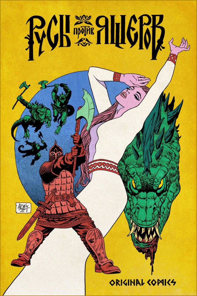
Finally, for more of a Slavic effect (though not devoid of certain European influence!), here are two comics covers created for « Русы против Ящеров » (Lizards Must Die), a videogame released in 2023.
~ ds
* While from the context it’s clear he meant the 1950s Harvey anthology, I think it’s safe to assume he’s equally fond of the 1970s Marvel one.
D. Moor may not ring like a convincingly Slavic name, but it is the nom de plume of Russian illustrator Dmitry Stakhievich Orlov(1883-1946). Why the D. abbreviation was picked is obvious; as for the family name, he plucked it from The Robbers, a 1781 play by German Friedrich Schiller about two brothers, one of whom Orlov thought he resembled in temperament.
Orlov adopted his pseudonym in 1907, when he switched careers from typography to political cartooning after one of his caricatures was printed in a newspaper. His biting sense of humour was not always well received by the Tsarist régime, and occasionally censored, which provoked the passionate Orlov into even more acerbic mockery. In these years he also designed posters for silent films, which in a way forecast his future as an affichiste. After the Russian Revolution of 1905, Orlov joined the ranks of those actively working in favour of an uprising; when in 1917 Russia fell into civil war that would lead to the formation of the USSR, D. Moor put to good use his aggressive anti-religious stance and talent for caricaturing politics.
‘Three Russian attractions: Tsar bell, Tsar cannon, and Tsar Nicholas. Tsar bell doesn’t ring, Tsar cannon doesn’t shoot, Tsar Nicholas doesn’t reign…’, 1917
Orlov’s poster for Убійца (1910)*
He was responsible for creating much in the way of striking agitprop, and is often cited as the father of the Soviet propaganda poster. His most famous poster** was not only aped by other illustrators during Orlov’s lifetime, but also acquired great popularity after the USSR fell apart***.
The Solemn Promise (1919)
Death to Global Imperialism (1919)
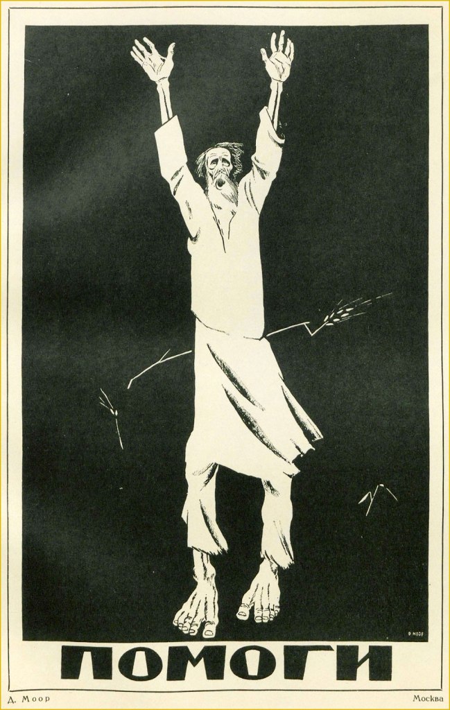
Help (1921). This is one of D. Moor’s most striking posters, and refers to those affected by the Povolzhye famine, which began in 1921 and lasted until 1922, killing an estimated six million people. Note the starving peasant being pierced by a single stalk of wheat.
I may be somewhat straining the definition of ‘comics’ by writing this post, yet some of D. Moor’s posters clearly feature linear graphic storytelling.
Labor (1920)
The White Guards and the Deserter (1919)
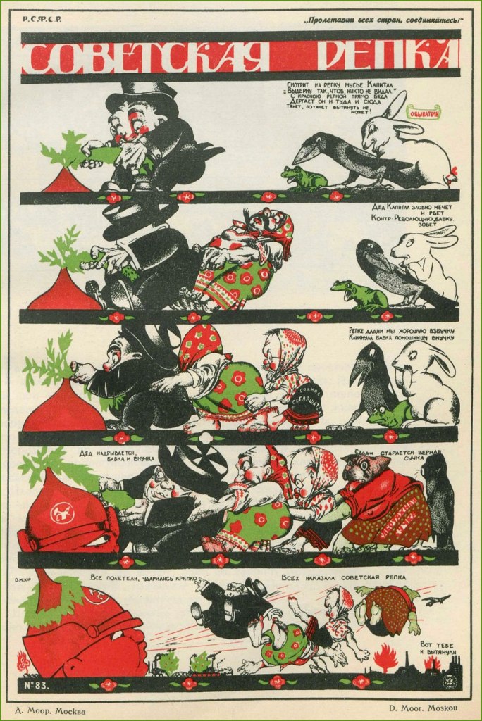
The Soviet Turnip (1920). This alludes to a classic fairytale in which a family is collectively trying to rip out a big turnip from the ground, even involving the help of the dog, the cat, and the mouse.
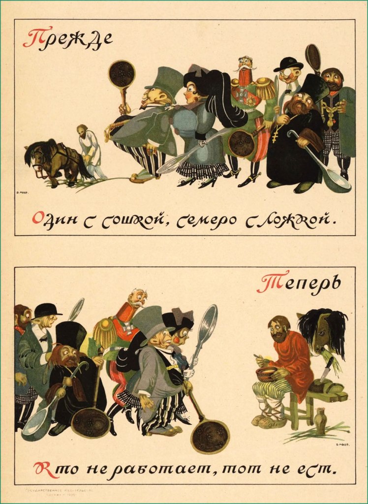
This uses two proverbs to make its point – under ‘Before’, ‘One with a plow, seven with a spoon’ and under ‘Now’, ‘The idle don’t get to eat’. (1920)
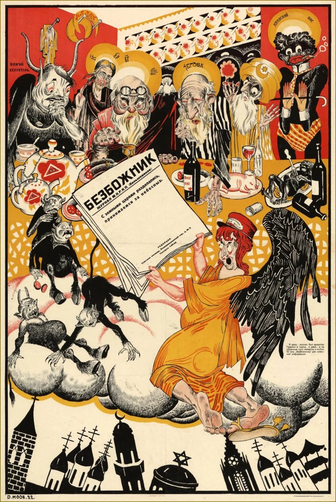
Alongside his active production of posters, D. Moor continued his career as a political caricaturist, publishing his anti-religious work in The Godless at the Workbench magazine (Безбожник у станка) — nice title, isn’t it? — and regularly contributing to various satirical magazines and communist newspapers, such as Pravda or Krokodil.
« We’re done with earthly kings, now comes the turn of heavenly ones », 1922
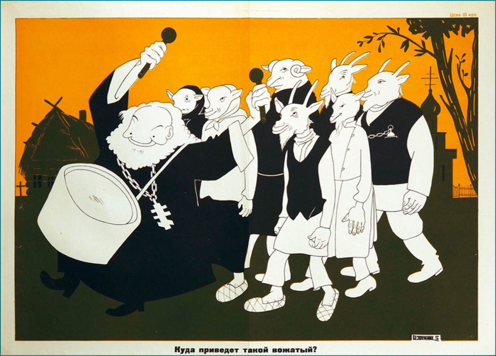
« Where will such a leader guide you? » (1930)
During World War II, Orlov of course supported anti-Nazi efforts (well, once Germany launched an invasion of the Soviet Union, at any rate).
1941. This is kind of untranslatable, but in Russian Hitler and Himmler are spelled with a hard ‘G’, not an H, leaving us with the quartet of Himmler, Göring, Hitler and Goebbels all starting with G… as well as the word for ‘shit’ (govno, говно).
Throughout his life Orlov also taught art at several institutions, and historical accounts indicate that he was a warm and talented teacher adored by his students. Did Orlov enthusiastically embrace the censorship-happy Soviet system, or was he just another artist trapped in a moment of history? I don’t have an answer for this, as one gets a very different perspective depending on which biography one consults and in which language – some emphasise his fervour for Soviet labour, and some philosophically note that he was anti-Soviet ‘like any self-respecting honest intellectual’.
You can take a look at more posters here, or head over here(perhaps with the help of google translate) to take a peek at caricatures poking (careful) fun at some Soviet figures.
~ ds
* An especially interesting thing for me was that his work spans the years of the orthographic reform in Russian. The reform was planned long before 1918 to combat the peasants’ illiteracy, so it wasn’t tied to the revolution per se, but since it came into effect in 1918, it was instilled by the Bolsheviks. The movie title, for example, is written with the letter ‘і’, which was kicked out of the alphabet.
** I am not including it for reasons of ubiquity, but take a look here.
*** Plenty of ex-Soviets feel an irresistible nostalgia about the USSR years, as if their memory can only conjure rose-coloured memories and erases everything unsavoury. The « Have you registered as a volunteer? » poster has been aped and parodied in social media.
Look, some vintage horror movie posters! Or are they really?
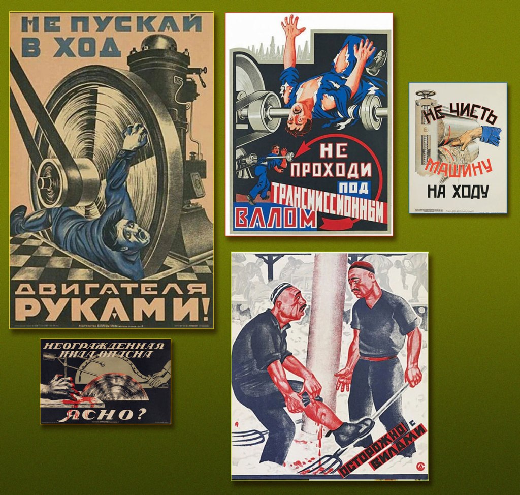
Nope, they’re just posters reminding factory workers of some basic precautionary measures when working with all sorts of heavy equipment.
‘Don’t launch the motor using your hands‘ – ‘Don’t clean the machine while it’s on‘ – ‘An unprotected saw is dangerous – all clear?‘ – ‘Careful with the pitchfork‘
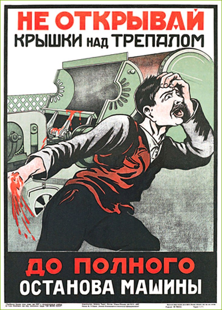
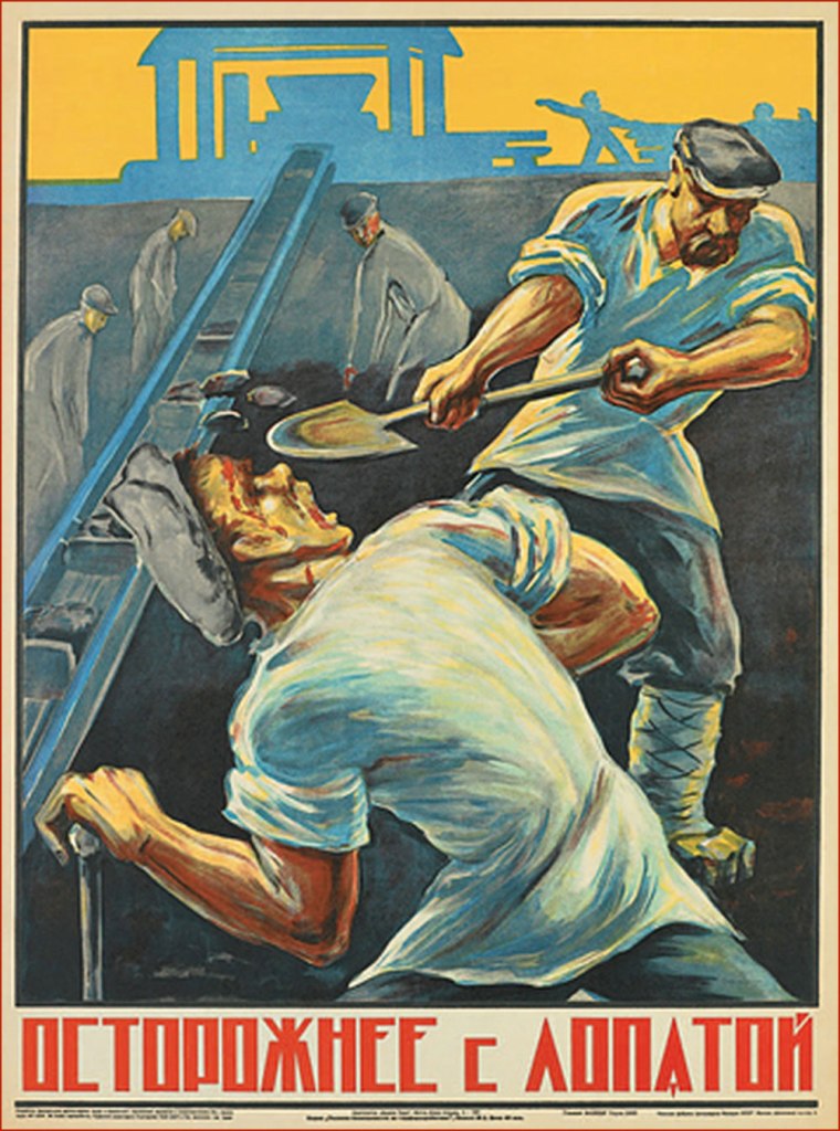
These images are undeniably striking, featuring bold fonts and surprisingly graphic imagery sending one’s imagination into the unpleasantly tactile land of torn appendages and squirting blood. Produced in the early-to-mid 20th century, these were meant to bring home a specific message* during dark times when safety measures were sorely lacking and working personnel was mostly illiterate. Unfortunately, it’s rather difficult to find these posters in decent condition, so today’s selection was somewhat dictated by what could be located online. This leaves out, alas, a couple of particularly gory examples. Still, I think you’ll agree that these fit a Hallowe’en count-down in graphics, if not necessarily in spirit!
*Something that goes like ‘don’t stick your body parts into the machine‘ is a good beginning.
‘Beware of railway couplings‘ – the distorted face of the victim expresses the grotesque horror of a saint being impaled by a devil. These posters must have been a great opportunity for artists to try out different styles in the restrictive atmosphere of the early Soviet union.
‘I was drunk in the workplace!‘
‘Don’t open the lid of the brake before the machine stops completely‘
‘People working above – don’t stand under the scaffolding‘… unless getting your skull smashed by a wrench seems like fun, that is.
‘Don’t leave anything unsecured on the scaffolding‘
‘Mind the wheels! In 1925, 200 people were injured under tramways.‘
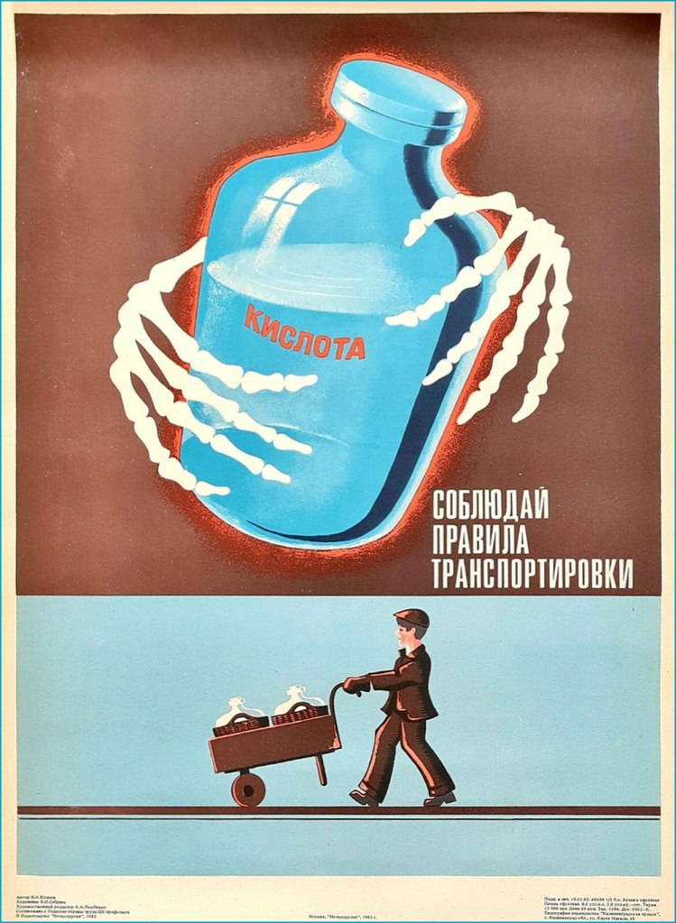
‘Acid – follow the rules for its transport‘
The USSR was not the only country to resort to such candidly illustrated images in an effort to improve safety (let’s face it, a worker with fingers missing is no longer a good worker) – for example, Holland seemed to have its share of posters of chopped off fingers and electrocution.
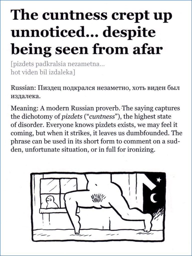
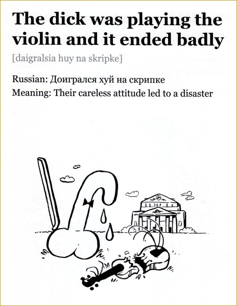
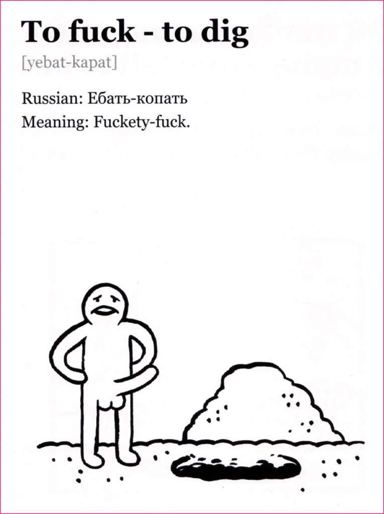
« The world of matis virtually inaccessible to foreigners studying Russian. It is too situational and semantically capricious, too dependent on ludic intonational subtleties. Mat is linguistic theatre, verbal performance art. It exploits the Russian language’s flexible range of suffixes and prefixes, and toys with phonetically similar words from the standard lexicon in order to generate anthropomorphic images. »
Invariably people ardently desire to learn bad words when encountering an immigrant who speaks a language they do not*. While one could surely write an essay arguing that the type of words used as expletives reveals something about the soul of the people in question (as a minimum, it’s a quick way to check what is considered more scandalous in that culture – genitals or religious terminology?), the allure of being able to say ‘fuck’ or whatever when it’s the only thing you can say in that language escapes me.
Idiomatic curses are another kettle of fish, a fascinating topic. Being the bearer of a language, one doesn’t often pause to think how weird a lot of sayings would sound to foreign ears. Russian cursing is quite popular in non-Slavic circles (see Elizabeth Olsen swearing at Conan in Russian on TBS…**), and its basic components are very straightforward (assorted body parts). However, there is considerable artistry involved in combining these blocks and spinning them into a scathing sentence that will inflict proper psychological damage to the target. This could be said about many cultures indeed, but I can confirm that the Slavs cherish their curse slang and go about using it with tender love and great gusto.
Journalist Elmira Kuznetsova and Canadian cartoonist and animator Jess Pollard have undertaken the charming task of (literally) translating and illustrating some choice Russian curses. I’ll quote from an article about this project:
« Jess is learning Russian and one night I was trying to translate to her the Russian curse “На хую я вертел.” The phrase translates as “I don’t care” but the literal meaning is “I spun it on my dick”. Just for laughs, Jess drew a sketch depicting random things being spun on male genitalia. We laughed so hard both at the image and at the absurdity of the literal translation, we decided to make more illustrations. This turned into a comic magazine that we called “An Illustrated Treasury of Russian Curses” that was printed in a batch of 50 copies and sold to our friends. »
Please consider the following as a sampler of A Treasury of Russian Curses (A selection of curses for community building, successful business, and ideal first dates) — I selected a few favourites from volumes I, II and III. Follow this project’s Instagram account, and support a cool idea by buying printed copies or PDFs over at Pollard’s website.
I’d like to point out that the word ‘dick’ selected for these translations doesn’t carry even half the clout of the Russian equivalent, which is one of the Really Bad Words, with arguably more punch than ‘fuck’. The non seven-armed eight-dicked person looks genuinely horrified.
This is a downright poetic and melancholic mental image. Poor little dick.
Co-admin RG rightly pointed out that the bird illustrated resembles a swallow far more than a sparrow.
You will not be surprised to learn that this rhymes in Russian. This scene (complete with Pollard’s favourite smoking raven/crow that appears on the cover of every collection, as well as on her website) is very Slavic indeed, evoking folklore in which a bogatyrmust choose which path to follow at crossroads (also note the typical helmet).
More like surfing — and infinitely more stylish, wouldn’t you say?
I give the highest recommendation to The unique power of Russia’s underground language, written by Victor Evrofeyev and published in The New Yorker (a beautifully translated version by Andrew Bromfield) on September 15, 2003. This post’s introductory paragraph is from it, but here are a few more quotes to whet your appetite:
«When I think of mat, I think of the monstrous energy field of that planet. Mat is a protean language in which archaic strata mix with modernity. It has a unique ability to break free of its erotic context and to characterize universal human feelings and conditions, to express admiration and contempt, ecstasy and catastrophe. »
« Although it retains its sense of blasphemy, mat, in its original form, was also a language of peasant revelry and the liberation of the flesh. In traditional folk culture, women sang obscene ditties as a challenge to their husbands or an invitation to their suitors. Pushkin’s bawdy early poem « Tsar Nikita and His Forty Daughters » describes a culture that has lost the cunt, or, rather, forty cunts: the Tsar dispatches his heralds in search of them and after arduous ordeals they are recovered. »
~ ds
* Life is full of such little repetitive ‘pleasures’, like having to tolerate jokes about magic mushrooms whenever talking about about how one likes to go mushroom picking…
** Why they’re both amused that a reference to the ‘female region’ can be used as a bad word in Russian is puzzling, as English easily offers ‘cunt’ as an equivalent.
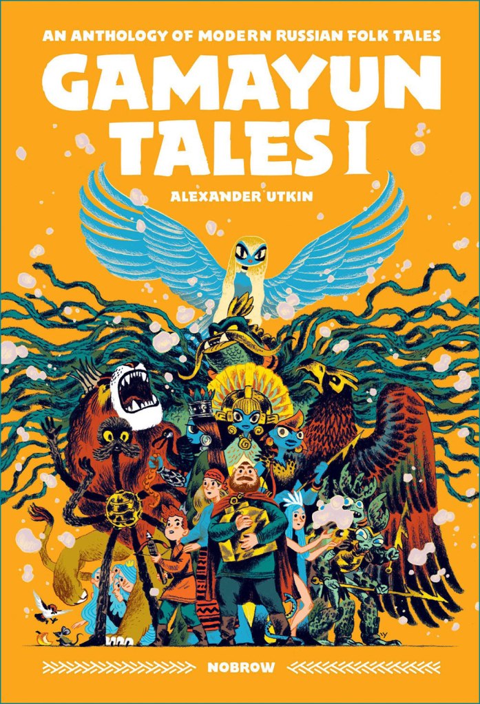
Today’s post started out as an introduction to Moscow-born Russian cartoonist and illustrator Alexander Utkin, whose family name translates to something duck-related (‘utka’ means ‘duck’)… a few other topics may have crept in on soft paws, but sticking to one thing was never my forte.
I came across Utkin’s work in a comic book store. The volume attracted me with its stylish cover and vivid colours, standing out among its shelf companions despite the fact that they were also quite vibrant, this being the children’s corner (thankfully a reliable refuge for colour that’s often shunned in modern comics – if you haven’t noticed the absence of colour in the modern aesthetic, see this documentary about Chromophobia, or Colors: Where did they go? An investigation for a discussion).
The book that introduced me to Utkin, although what I had first seen was the French edition (Le roi des oiseaux, 2020); this edition is from 2018 and published by Nobrow.
I like cases where one doesn’t have to choose between art and storytelling, when the former is lovely and the latter, substandard (or vice versa). Utkin’s illustrations are beautiful, and he coherently and engagingly tackles a topic that’s dear to my heart – namely Russian fairy tales. Remember I mentioned Baba Yaga (see Hallowe’en Countdown VI, Day 28) a few weeks ago? We will meet her again today (hide your children). We also encounter the legendary Gamayun, a prophet-bird (strangely, as a child I learned its name from the song Sirin, Alkonost, Gamayun* and not from reading folk tales) with no legs or wings, who propelled itself with its tail, and whose interrupted flight signalled death or misery. In a more modern interpretation, she morphed into a sort of bird of paradise with a woman’s face. Read about her and her ‘sisters’ Sirin and Alkonost here.
Published by Nobrow in 2020. Here’s a review of this collection.
Utkin’s Gamayun is a strange, vaguely female creature with huge eyes who narrates the stories (thus ‘Gamayun Tales’). There seems to be a resurgence of interest in all things folky** in many parts of the world, perhaps a desire to preserve some cultural heritage when faced with globalisation – in that sense, one can say that this series is part of that pattern. These revivals don’t often reach a Western audience, however, so it’s especially cool that Utkin’s forays into Slavic myths have been well received and enthusiastically lauded by French and English speakers as well.
Here are a few pages from Roi des oiseaux or The King of Birds, which are, respectively, the French and English versions of the same story… except that the French edition also contains La dispute (The Quarrel), which in English was plunked into Gamayun Tales I. It’s a bit confusing.
In case you were wondering, Utkin’s Gamayun series is technically intended for children. I’m in the habit of regularly raiding the children’s section for interesting stuff, but I can call it mother’s interest (never-you-mind that I am the mother of cats and plants, not little humans). Here are several pages from Gamayun Tales II – this story is called The Quarrel (and, as mentioned earlier, was part of the French edition of The King of Birds):
The following page are from Vasilisa and the Doll, which in English was published in Gamayun Tales II, and in French, as part of the La princesse guerrière (‘the warrior princess’) collection:
I promised you Baba Yaga, didn’t I? The way Utkin draws her predatory teeth reminded me of Canadian artist Emily Carroll, whose creepy stories often mention teeth (one might say it’s a leitmoteeth of hers – sorry for the terrible pun). Her work deserves a post of its own, but for now I restrain myself to mentioning that Carroll, clearly also a fan of traditional folklore, illustrated a graphic novel (written by Marika McCoola) about you-know-who, Baba Yaga’s Assistant (2015, Candlewick). Here is a tooth and style demonstration:
A few stylized pages tell the traditional story of Baba Yaga and the girl with the kind heart – you can read the tale (in English) here.
And here is what the slightly re-upholstered, modernized tale looks like.
Classic chicken legs!
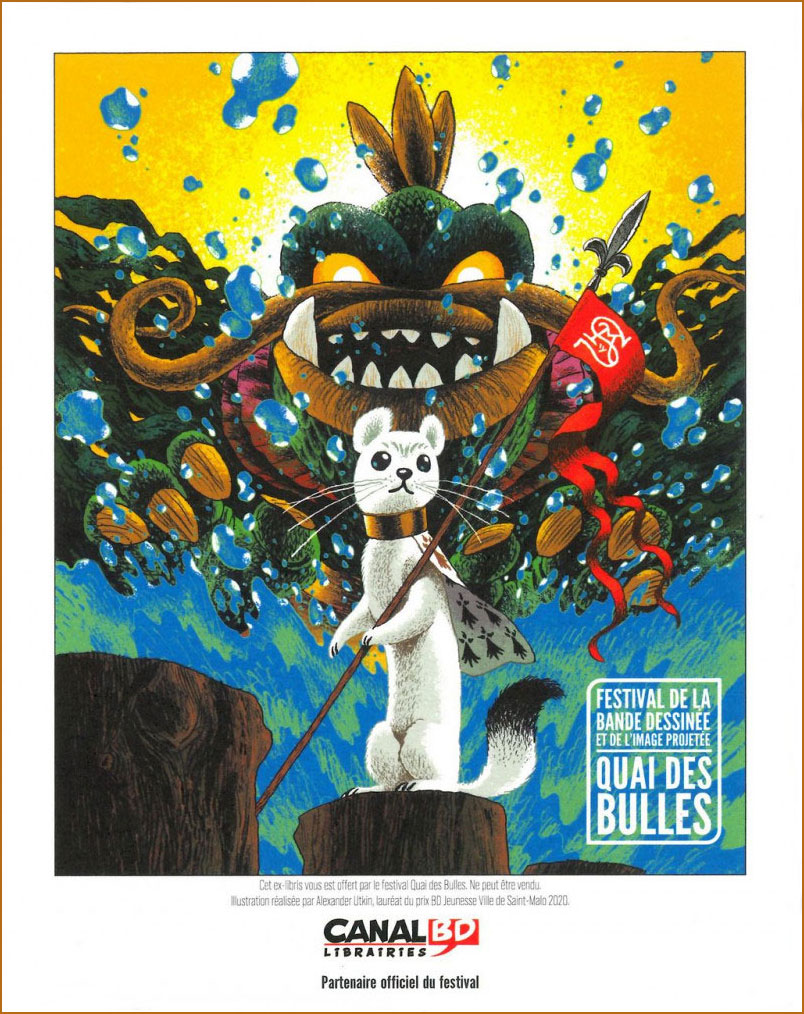
To get back to our main topic, I’ll leave you with this glorious poster Utkin illustrated for a French bédé (comics) festival in 2020:
*I highly recommend the whole album for those who like folk rock – it’s by the Russian band Akvarium.
**This includes the bevy of young woman trios and quartets (from Ukraine, Georgia, Poland, Finland, Germany…) popping up seemingly all over the place, singing traditional folk songs whilst walking around. Here is a charming example from Russia.
Most readers will be familiar with the East European witch Baba Yaga, she of the giant mortar, pestle, and chicken-legged-house. The Slavic tradition is rich in heroes and villains, but Baba Yaga is my definite favourite. Perhaps it’s because of her dichotomous nature – undeniably evil, kidnapping children to eat them and such, she also lends a very helpful hand to those she likes… depending on the vintage of the tale and who’s the narrator, and sometimes within the same story. Potato, pota-toh, right? She’s the kind of hag that cool women aspire to become when they’re old: a cantankerous, wise beldam who does whatever she pleases, lives alone in the middle of a forest with her cat, and tells anybody she doesn’t like to fuck off (or transforms them into something nasty to teach them a lesson).
Introduction to Vasilissa the Beautiful, illustrated by Ivan Bilibin, 1931. That’s Baba Yaga flying on top.
Interpretations of what she actually stands for abound, but to be honest I am not interested in her narrative origins, just the storytelling. She is a character who lives and breathes; it rather seems impolite to ask too many questions, lest one ends up in her oven, on the way to becoming dinner.
Folklorist Vladimir Propp‘s theory is probably the best regarded, and argues that she’s the guardian of the kingdom of the dead, with her house representing a grave (people of yore were buried in special houses built on top of tree trunks, with roots resembling chicken legs). She might have once been a deity of hills and forests, kind protector of villagers; or perhaps a goddess of harvest, punished by other gods who removed her beauty and left her a crone. Viy (yes, that Viy) is her father, and Koschei the Immortal (sometimes pictured as riding naked on his favourite horse) is either her son or her nephew. The fence around her house is built from human bones. I think she deserves her place in this year’s Halloween pantheon.
Anyway, here are a few of my favourite visual renditions of her…
Ivan Bilibin (1876-1942), co-founder of the Union of Russian Artists, is mostly remembered for his illustrations to Russian folk tales. His was the first version of Baba Yaga I was introduced to a a small child (as a matter of fact, I still have a collection of tales illustrated by him lying around somewhere). His style is easy to recognize, and full of details – while tsars and beautiful maidens get clothed in robes painstakingly adorned with golden filigree, forest scenes are crowded with branches, leaves, and mushrooms, giving the slightly claustrophobic impression of the trees closing in on the viewer. This is no civilised forest. This is a wild, slightly malicious entity that does not take kindly to strangers.
Baba Yaga in her natural habitat, the flying pestle. Ivan Bilibin, 1900.
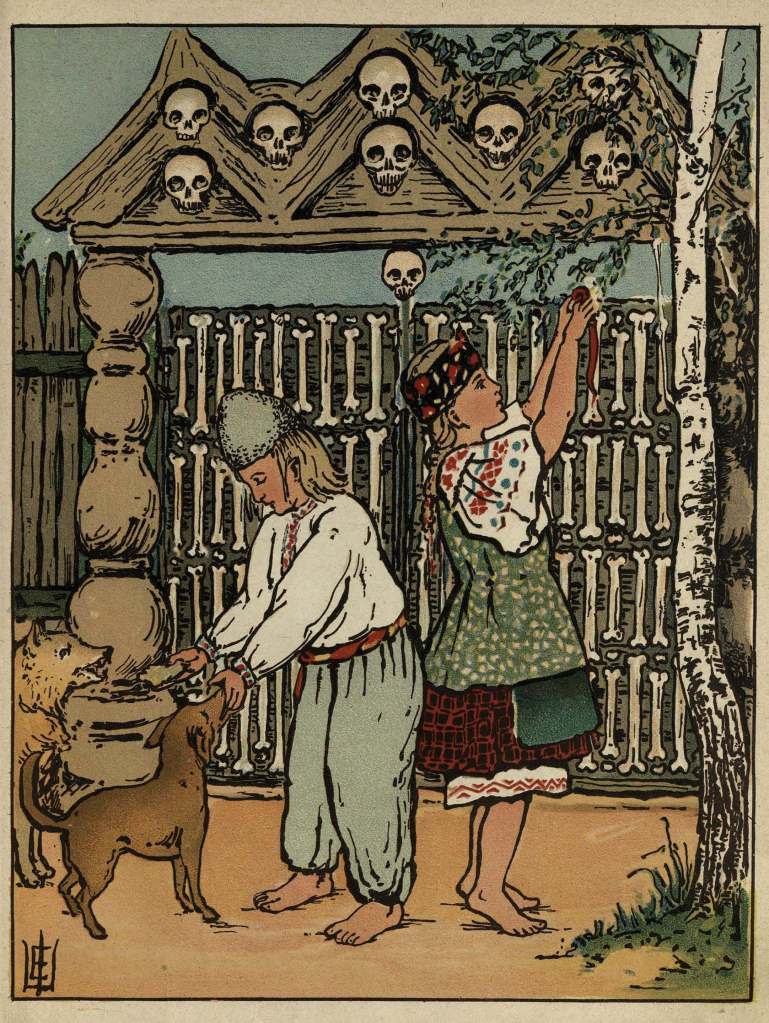
The following book from 1915 does not credit its illustrator, and I’m not knowledgeable enough to interpret their memorable signature (seen in the inside illustrations, bottom left).
Baba Yaga (this book was originally published in 1908, using the same painting, but with fewer background details; this edition is from 1915, illustrator still unknown).
Two illustrations from the inside, showing off Baba Yaga’s frequently present black cat, and her fence of human bones and skulls. Admire the decorative ‘devils dancing’ panel inside her hut. The cat can be easily bribed, and in one of the classic tales helps out the would-be victim get the best of Baba Yaga, after the young girl gives him some ham out of the kindness of her heart.
In the Western world, illustrator Nicolai Kochergin (1897-1974) is famous for his Soviet propaganda posters, but he is beloved by Russians who grew up around the so-called ‘golden age’ (1950s-1960s) of children’s book illustrations in the USSR. See a selection of the latter over at Tom Cochien’s Monster Brains Blog. WOT habitué Barney might be interested in his first-ever illustrated book, a Soviet translation of Twain’s A Connecticut Yankee in King Arthur’s Court, published in instalments in a magazine in 1928.
Although I technically grew up much after these illustrations were published, I think I can count myself lucky that my parents mostly surrounded me with old books.
An elephant pink crawled outta the sink and snuggled up in my bed A purple mole’s in the goldfish bowl, he’s trying to steal a drink*
Today’s post was originally planned as a panegyric to Larry Marder’s Beanworld, but I quickly realized that attempting to write about it was a bit like trying to dissect a joke. Here I am, then, doing a 180 degree turn to talk about a Soviet cartoonist.
Evgeniy Milutka (Евгений Милутка, b. 1946) was a teacher of Russian literature by profession, but his proclivities clearly lay elsewhere. After teaching in middle school for a few years, he officially switched to the career of a cartoonist in the early 1970s, and quickly rose to the ranks of the best known caricaturists in the USSR, in part thanks to his long-lasting (from mid seventies to mid eighties) collaboration with satirical magazine Krokodil(see Krokodil Smiles: Cartoons in the USSR).
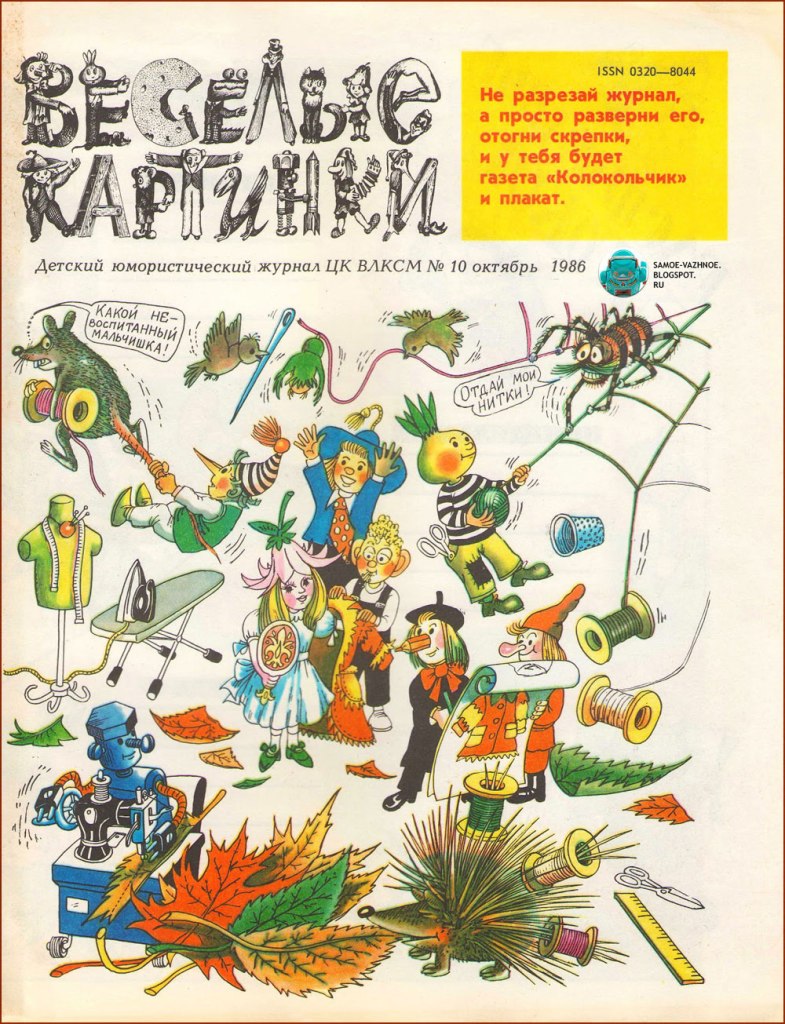
I am most interested, however, in the new, kid-oriented direction his work took in the 1980s, namely the cartoons/comics published within the pages of Веселые Картинки (something like ‘funny pictures’ in translation), a literature-bent humour magazine for kids. Founded in 1956, it was still sort-of around (with some financial issues) when I was a child, and my grandfather, who was always very preoccupied with making sure I grew up knowledgeable and smart (sorry, grandpa?), was kind enough to buy me a subscription.
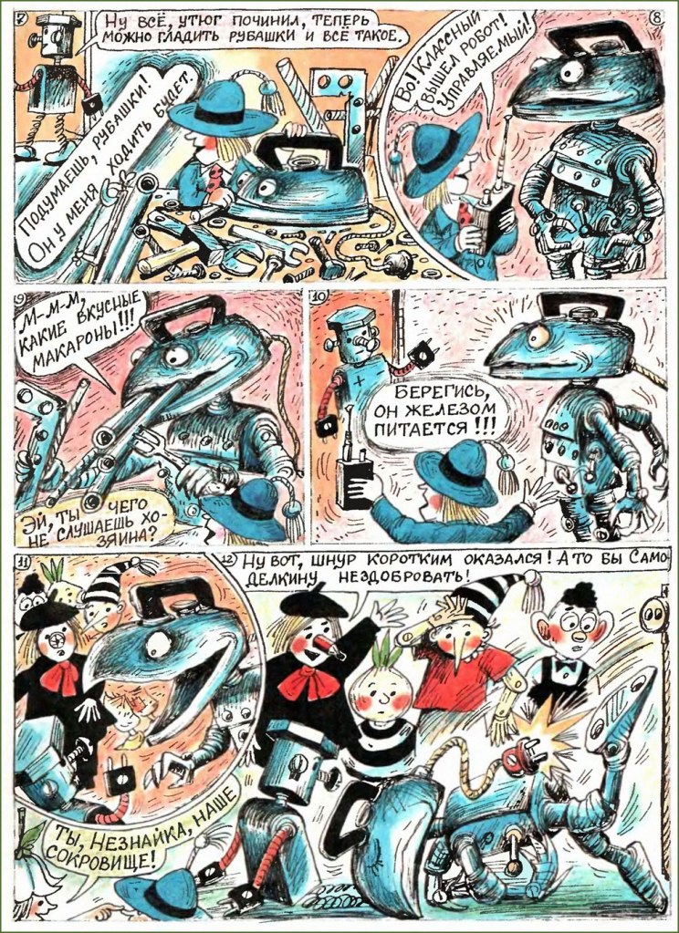
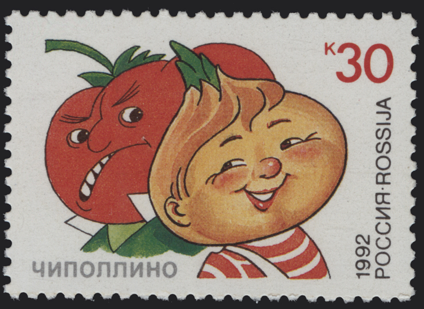
An issue from October 1986, with a cover by Milutka. It features the 8 ‘merry little people’ that were the mascots of this journal and whose adventures Milutka illustrated. This included Karandash (which in Russian means ‘pencil‘), the boy with the pencil nose; Cipollino (little onion), the boy with an onion head, from Gianni Rodari’s Cipollino, a tale that was so popular in the Soviet Union that we even have a Cipollino stamp; Buratino, the Russian Pinocchio; Neznayka, literally translated to ‘don’t know’, a favourite character from Nikolai Nosov‘s merry trilogy of fairy-tales; Petrushka, a character from Slav folk puppetry; Samodelkin, the boy robot whose name translates to something like ‘do-it-yourselfer’; Hurvínek, a character from a Czech puppet duo; and the only girl, Thumbelina.
The first thing that jumps out is that Milutka’s strips are really weird. Green elephants, watermelon men, mosquitoes capable of lifting a person, bats in a cavern made out of teeth, a giant spider wearing running shoes… a lot of it is most delirious delirium tremens. Milutka could aptly handle a variety of styles, but his basic, more recognizable modus operandi is extremely Slavic. The other interesting thing about his work, though you have to take my word for this, is how he squeezed in some distinctly unchildlike content into his strips. He was, after all, a caricaturist, with a keen eye honed by the sometimes subversive Krokodil.
Here is a selection from within the pages of Веселые Картинки from 1991 to 1996, which is pretty much the period I was able to follow in person.
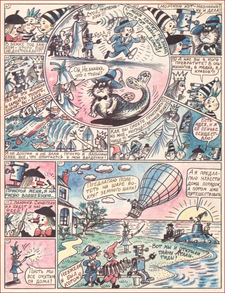
The sorceress gets accused of being evil by Thumbelina, ‘since you crash ships and airplanes‘. ‘I am nor evil nor good,‘ she responds, ‘I just take everything that barges into my kingdom.‘ Nezknayka gets turned into a mer-cat. (1991)
More metamorphosis! The kids keep asking the green elephant ‘what are you? Are you an ungulate? A mammal? Are you an insect? He’s probably an amphibian…‘ but to all their questions, he answers “I dunno…“, which is how they guess that it’s Neznayka in disguise. (1991)
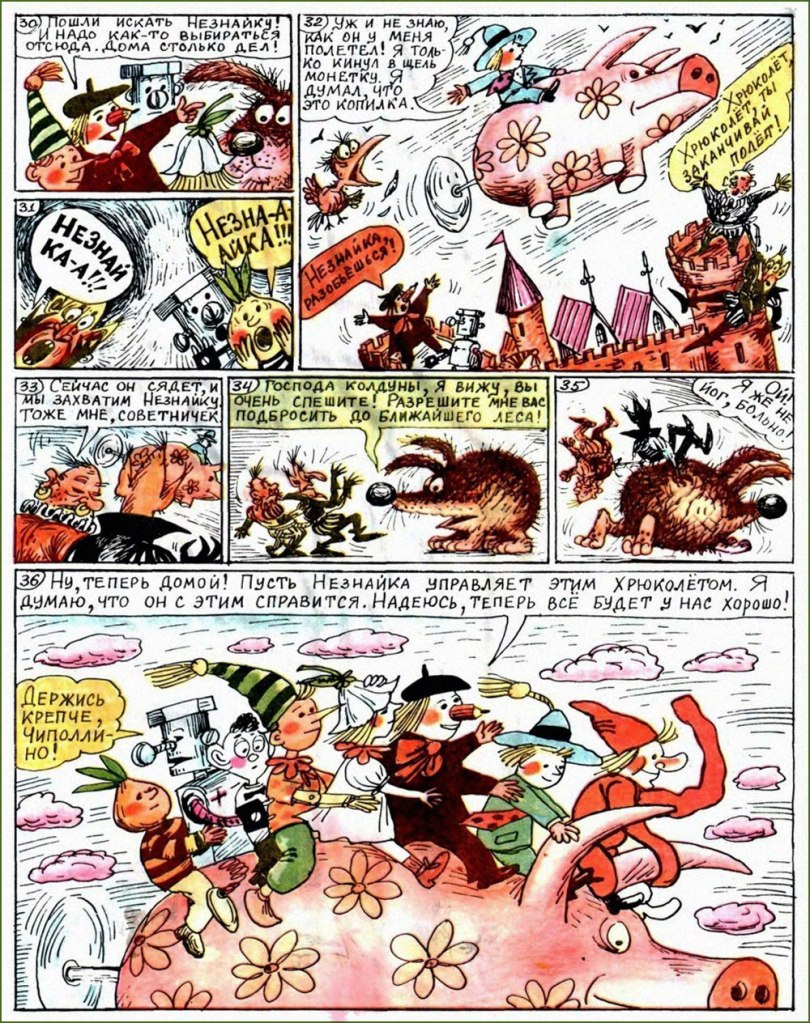
A sword-hog is turned back into a normal hedgehog once he’s fed an apple, and Neznayka, who’s named head advisor to the bad guys (everybody has untranslatable funny names), advises them to tie themselves together with a rope… (1994)
… after which the merry little people escape on a flying pig with a propeller in its ass (1994).
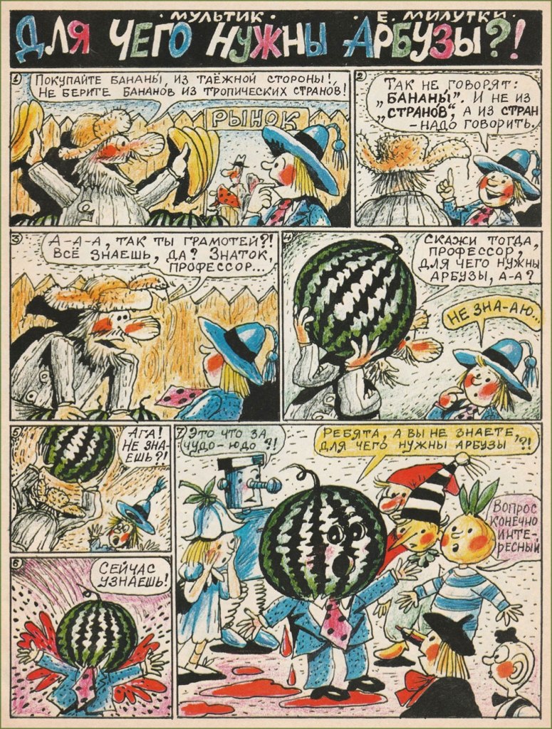
Watermelon man! “Kids, do you know what watermelons are good for?” “It’s an interesting question, of course” (1994).
This is spider named Filia, shod in very nice shoes. Isn’t he cute? (1994)
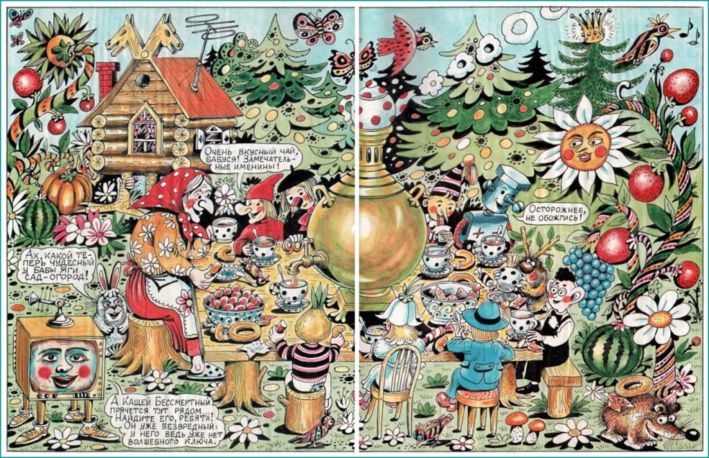
A splash page featuring a prototypical Babushka (actually a Baba Yaga in a good mood!) and an assortment of flora and fauna (1994)
After a lot of untranslatable puns on the word ‘vitamins’, the cat (who’s, once again, Nezknayka, having a pronounced tendency to transform into other creatures) is told to ‘eat the magic balls!‘ to turn back into himself. Thumbelina is also rescued from being… err, whatever that furry thing with the rolled-up nose is. (1995)
Neznayka invents a robot to do the ironing for him, but the robot is hungry for metal ‘macaroni’ (which we call anything pasta, usually some form of spaghetti) (1996).
A poster advertising the journal (1996), with mushrooms, a Pushkin reference, singing cats, some sort of flying elephant (?) with an accordion, a little furry bee-cat, and so on and so forth.
I hope you enjoyed these despite the language barrier! I’ll wrap this up with two fun illustrations from the early 90s:
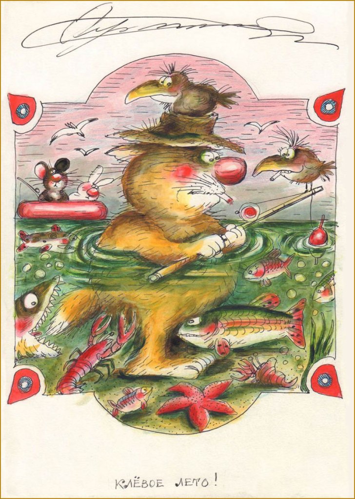
‘The flight of a bumblebee’
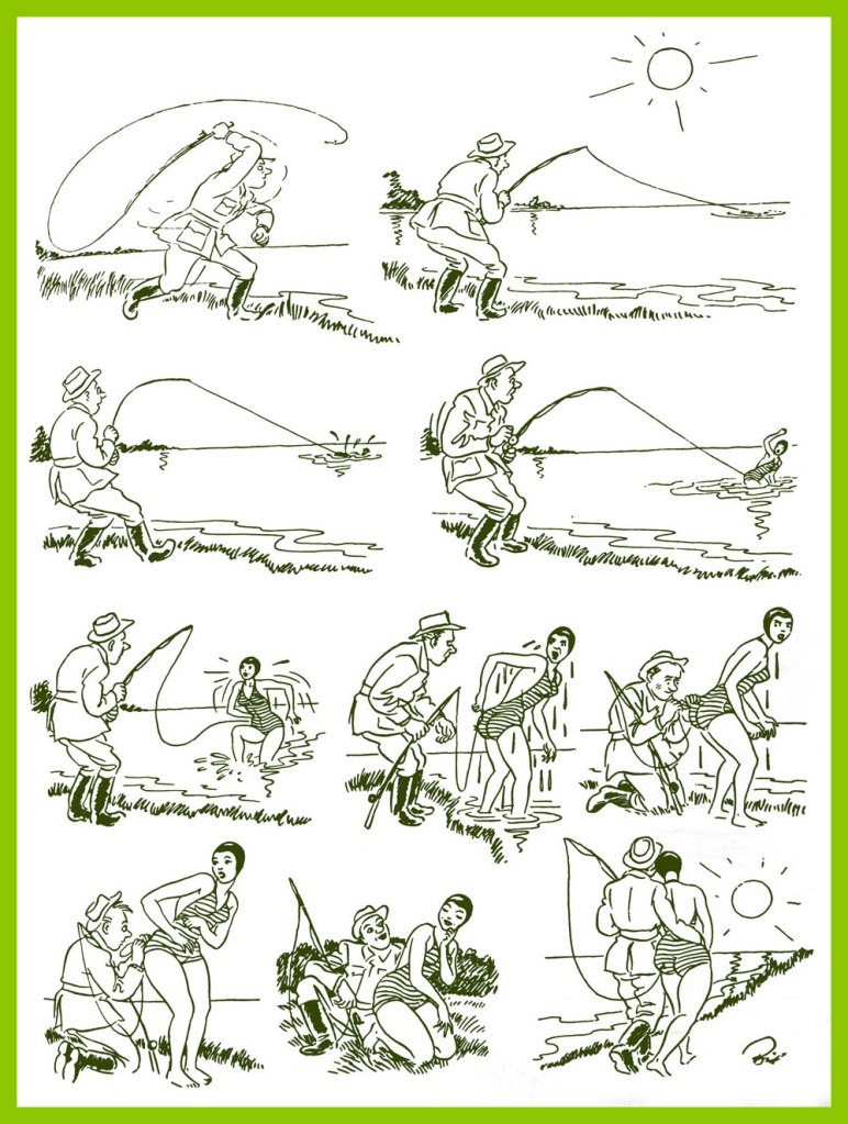
The title is a pun on fish biting and the summer being a neat one.
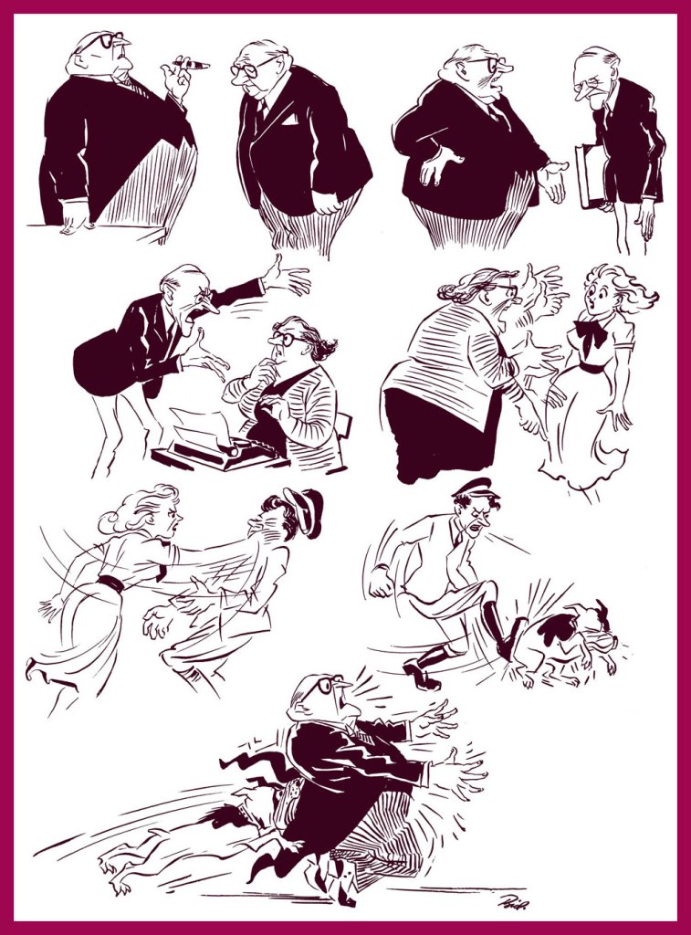
I’d like to talk about Danish Herluf Bidstrup (1912 – 1988), yet another talented artist of some renown during his lifespan, but who soon sank into the oblivion of time. His wild popularity in the Soviet Union at the height of his artistic prowess not only resulted in honourable mentions in various works of Russian literature, but also in the printing of a bevy of collections both old and new. He has also received numerous awards from the USSR (most notably, the Lenin Peace Prize – a bit of a contradiction in terms – and the Order of the Red Banner of Labour). Now he’s forgotten by most everyone… except by Russians, who still carry a torch for his cartoons, and publish new collections of his work to this day. He produced around five thousand cartoons during his lifetime, so there’s certainly plenty of material to collect!
In Moscow, circa 1953.
The openly anti-fascist Bidstrup had been contributing humorous drawings to various publications since 1935, but he truly found his voice in the underground (and illegal) newspaper, Land og folk, the offshoot of Denmark’s (also illegal) Communist party, which Bidstrup joined in 1943. While his work was also appreciated and published in East Germany, his obvious political stance significantly limited the scope of what could be printed. It even affected his career in his home country, as Denmark was economically dependent on then-Fascist Germany. Bidstrup himself considered that he was most accurately represented in the Soviet press, not only before and during WWII, but also after the war. In 1953, in a letter to his friend Soviet journalist Mikhail Kosov, translator of his work and main enthusiast, he wrote that « all Soviet anthologies which we have prepared together are a hundred times better than collections published in other countries… in the German version, I become more and more of a harmless humourist, and a completely toothless satirist. »
In a sense, Bidstrup can be compared to his contemporary, French artist Jean Effel (also a favourite of Soviet citizens): both were openly communists whose work confronted social injustice and inequality. But at the end of the day, artists aren’t much remembered for their ‘social conscience’: it’s their keen eye for everyday detail and sense of humour that allows cartoons to pass unscathed through decades, to touch and amuse us some seventy years on. In that sense, Bidstrup’s cartoons are arguably more ‘dated’, more tied to his politics than Effel’s, which perhaps explains why one encounters mentions of the latter a little more often. Still, there’s plenty there to admire and chuckle at.
Bidstrup Herluf: Drawings (2017, Mesheriakov Publishing House); such a nice shade of green.
The following images have been selected from the collection seen above and kindly scanned and framed by co-admin RG.
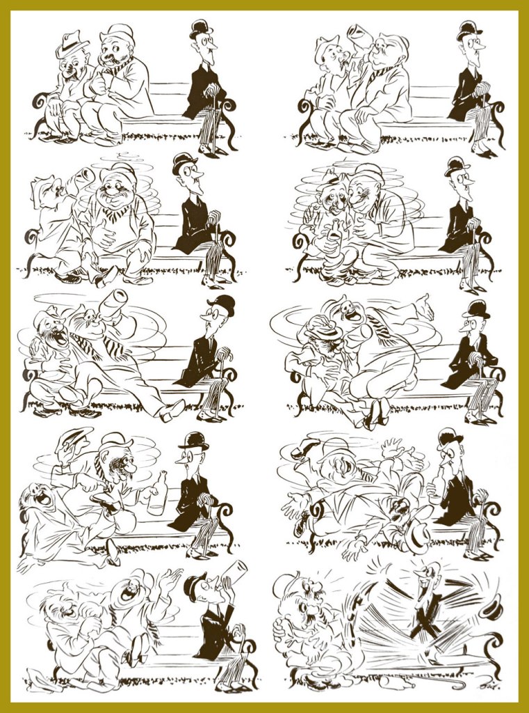
«The circle closes.»
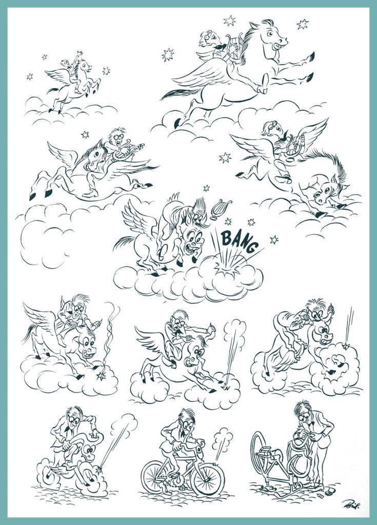
« On the wings of Pegasus. »
« Amateur photographer »
« Self-criticism »
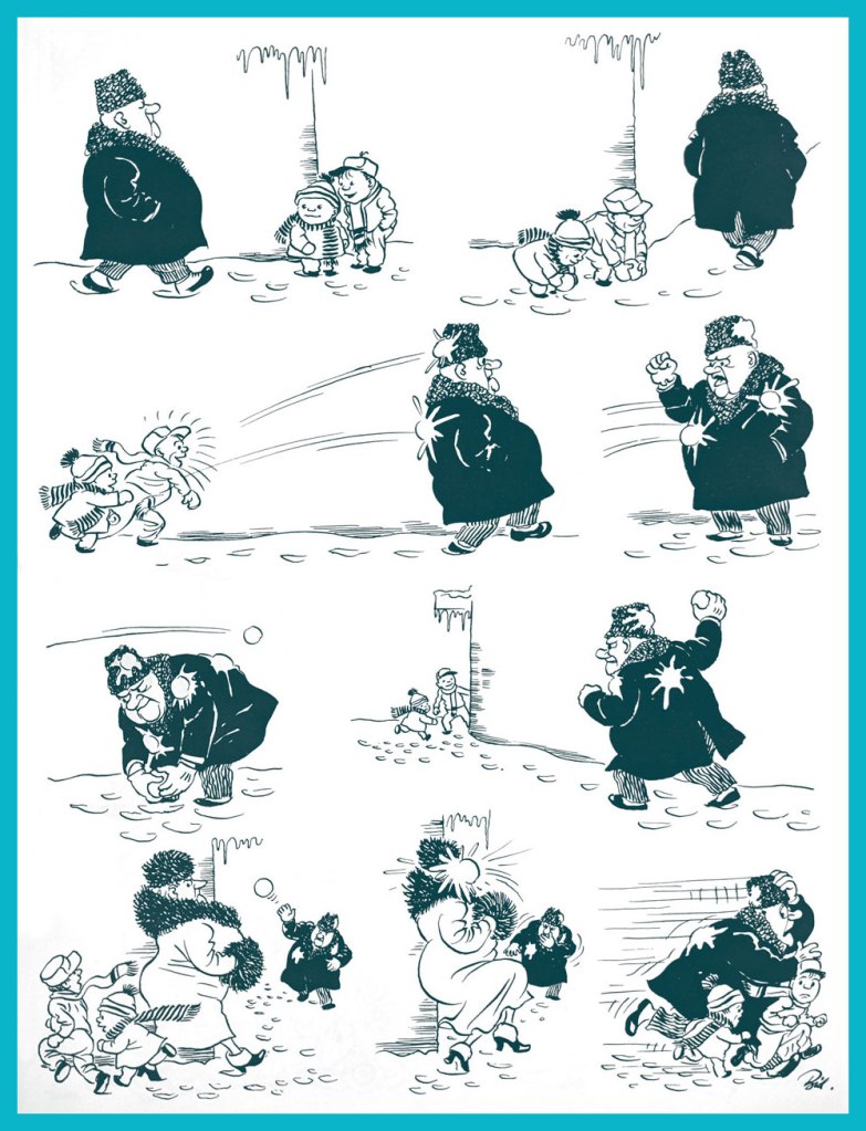
« Direct hit »
« Life’s journey »
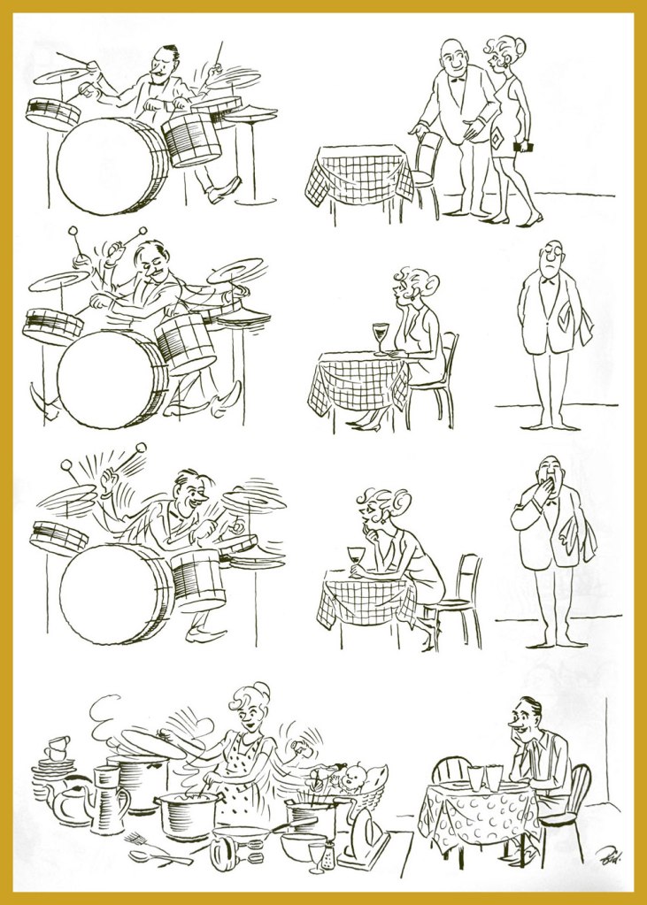
« Wife of a jazzman »
« Solitude »
« Fished out »
«The mirror of the soul »
« An extended game »
« A perfect example »
Finally, here is a charming cartoon that Soviet animation director Lev Atamanov produced in collaboration with Bidstrup during one of his many visits to the USSR.
I hope your enjoyed this walk down history’s lane. And if you’d like to see more, while Herluf Bidstrup may be relatively obscure, you can still see a nice collection of his cartoons here and here.


