Tentacle Tuesday Masters: Tom Gauld

It’s lovely to enthusiastically anticipate new oeuvres from a present-day cartoonist, or to have the opportunity to praise his work knowing that, perhaps, some of this praise will eventually reach him. I spend much time reading books written and drawn by people long gone, so it’s truly a pleasure to endorse cartoons by a contemporary artist.

In this case, this post was prompted by getting my hands on Department of Mind-Blowing Theories, which came out in April 2020. It took me a few months to get my hands on it, yes, but get to it I did.

Tom Gauld, hailing from a Scottish county with the romantic name of Aberdeenshire, is a self-declared SF/F nerd with a scientific bent, the latter proclivity acquired thanks to his grandfather, who was a marine biologist. To quote Gault, « he was a quiet and thoughtful man and I think because of him, the whole family had a respect for science and scientists. He subscribed to New Scientist and would give them to my Dad after he’d read them, so there were always copies around our house as I was growing up. » The first time I encountered Gauld’s strips, I thought he was a scientist, so accurate were his depictions of the struggles of the scientific community. As it turns out, this is a somewhat new and recent direction for him – he’s only been contributing to the New Scientist since 2014. His more literary-minded work has been published by The Guardian since 2005, and he has also created some lovely covers for The New Yorker (eight, to be more precise).

All material (except the first image) in this post has been scanned from You’re All Just Jealous of My Jetpack (2013, Drawn & Quarterly), a collection of selected strips published in The Guardian, and the aforementioned Department of Mind-Blowing Theories (2020, Drawn & Quarterly), his fifth book with this Montreal publishing company.

gauld_tom_barts_02
A print from a series of twenty four commissioned by Bart’s Hospital. These prints are installed throughout its Cystic Fibrosis Unit. « As part of Tom’s commission, he met with patients to gain insight into the particular circumstances of their condition, the hurdles they encounter, their hopes and fears in order to create a project that is relevant to their reality. The outcome is an urban park featuring humorous vignettes and unexpected elements. Each isolation room in the Unit displays a selection of prints from Tom’s Imaginary London Park series. Embedded within each image are an array of symbols that relate to an explanatory key, included in the rooms. Patients can imagine the variations in their own, as well as adjacent rooms. Due to frequent re-admission, patients can explore more of the work, and discover new vistas, when they return to the Unit and occupy a different room. »

GauldPsychActionA

GauldWhatToWorshipA
Gauld’s tentacles aren’t always front-and-centre, occasionally occupying a humble corner. I got Richard Dawkins, by the way.

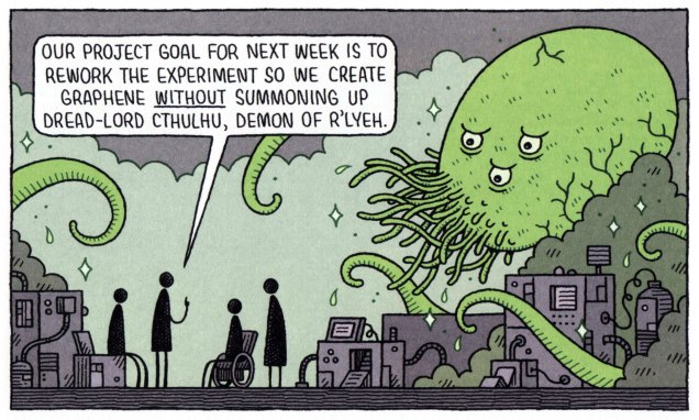
« There sometimes seems to be an idea that in order to be a scientist you have to put aside your humanity and become an emotionless logic-machine. I think that’s wrong, but some people (even some scientists) seem to believe it. There’s a thread running through the book of cartoons that depict scientists being human: Being unsure, bickering, misunderstanding, and messing things up. It’s much more fun (and realistic, I think) to depict flawed, klutzy humans than idealised successes. » |source|

GauldAFewThingsA
I’d worry most about the black cat on the ceiling – black cats are evil!

GauldBlackInkA

GauldRoversA

GauldDarkEnergyA

GauldEscapedA

GauldHazardsA

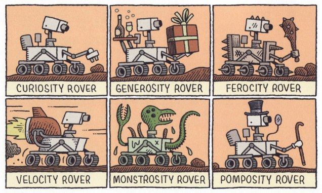
« I spent seven years at art school and tried all sorts of drawing styles, but when I got into drawing comics I found that a simple style worked best. I gave up trying to be “artistic” and just used the type of drawing I’d naturally revert to when I wasn’t thinking too much: the style I’d use for a silly cartoon to amuse a friend, or to draw a map or an idle telephone doodle. I’ve tried to improve as I’ve gone along, and I hope I’ll never be stuck with a fixed, unchanging style. I want the images to be simple and clear, but with a bit of human warmth, a bit of handmade wobble in the lines, to stop it seeming completely diagrammatic and cold. » |source|
GauldFutureCommuteA

And (arguably), the best for last…

GauldProjectGoalA

∼ ds

Deep in the Soup With Rick Griffin

« If you’re having a bad day, catch a wave. » — Frosty Hesson

How do you cool down in a heatwave? In this household, when the temperature soars and drags the humidity along, we reach for a soothing surfing movie, preferably one by peerless surf auteur Bruce Brown* (1937-2017). Last week, it was his 1959 opus, Surf Crazy, in which a group of SoCal surfers venture down to unsurfed Mexico, which in turn called to mind “Mexico“, an early ’70s underground two-pager recounting a similar sojourn.

Which, this nominally being a comics blog, leads us to the one and only artiste embodying and straddling both the underground cartoonist’s and surfer’s ethos, Rick Griffin!

SurferToonsA
An early Griffin collection, Surfer Toons (1964, John Severson), featuring his early creation, Murphy, likely inspiration for notorious jewel thief Murph the Surf‘s sobriquet.
GriffinBioA
A bio of  the young surfer-cartoonist from The Surfer vol. 3 no.3 (Aug.-Sept. 1962). The photo confirms that his Murphy strip was autobiographical.
GriffinFilmTruckA
« In 1964, a serious car accident left Rick unable to work for several months. Later that year, Surfer started a new series titled The Adventures of Griffin and Stoner. They were make-believe surf trips that Ron Stoner, a famous surf photographer, and Griffin were supposed to have taken around the world. » Stoner’s real-life adventures, however, were not so happy.
GriffinLaPlayaA
In this mid-to-late-60s illustration, we witness early signs of Griffin’s mature, more assured line. A simplified version of this piece would appear in The Surfer‘s March, 1972 issue.

MysticEyes01A

MysticEyes02A
Griffin’s tour-de-force adaptation of Them’s Mystic Eyes appeared in an issue of The Surfer in 1970. Witness how Griffin’s depiction of Murphy has evolved over the decade. The fancy helmet is a Hopi Indian ceremonial mask, a frequent artifact and motif in the artist’s subsequent œuvre. Weedy song, imho — and yet, meaning is where you find it.
PacificVibrationsA
Also from 1970: Griffin created this piece for his patron John Severson‘s surf documentary Pacific Vibrations, (in which he also appeared!) and it provides a fine example of Griffin’s matchless lettering**. And there’s that Hopi mask again. Though it was quite a popular poster in the 1970s, If you ask me, though, accomplished as it is, it utterly fails to evoke surfing.
TalesTubeWhiteBorderA
Tales From the Tube, as it originally appeared in 1972, inserted into an issue of Surfer Magazine (Vol. 12 no. 6); some copies exist separately, however. Also to be found within its pages: Roberts Crumb and Williams, Steve Clay Wilson, Bill Odgen, Glen Chase and Jim Evans.
GriffinTFTT_A
TFTT was later reissued (now with a price) in the regular comix format by The Print Mint. As you can see, Griffin reimagined and re-separated his colours. Which version do *you* prefer?

Mexico01A

Mexico02A
Visual splendour, not coherence, was always Griffin’s stock-in-trade. And why not? This travelogue premiered in Tales From the Tube.
5SummerStoriesA
More poster (and soundtrack) artwork for surfing documentaries, this time 1972’s Five Summer Stories and its 1976 sequel, Five Summer Stories Plus Four, directed by Greg MacGillivray, a prolific, award-winning director and cinematographer to this day.
TFTTPosterA
… another Tales From the Tube, another Surf doc affiche from ’76. « This film and the other surf films for which Griffin has done posters are not usually shown on the regular movie circuits. Their soundtracks are usually composed of rock music of various forms – soft to hard – with a few breaks for narration. The surfing scene throughout the world has grown large enough to support the production of many films each year. »
CowabungaStickerA
As you can see, Murphy abides. A 1993 sticker, with instructions.

-RG

*I’ll go even further: for me, it pretty much has to be Bruce Brown. His easy charm and wit, not to mention his untrained-yet-superb set of filmmaking skills leave other surfing cinéastes floundering in his wake. From what I’ve seen over the years, their work either seems too dry (ha!) or overdone and overeager. I’m still keeping an eye on the horizon, nevertheless. The relative unavailability of quality prints for most of these films is a hefty obstacle, while their soundtracks are far, far easier to find (e.g. Gone With the Wave, The Fantastic Plastic Machine…) 

**At this stage [1969], Griffin’s lettering almost ceased to be functional as legible typography. In fact, in even earlier work, he jokingly incorporated meaningless calligraphy into his posters. Rick pioneered and carried to an extreme in the 1960’s this disregard for the legibility of lettering, creating totally abstract forms the resemble letters. His particular style influenced and encouraged artists locally and throughout the world to reconsider all previous limitations that they were placing on stylized lettering and the ways that it could be used with other graphic forms.” From Gordon McLelland‘s monograph, Rick Griffin (1980, Perigee).

Tentacle Tuesday: Azpiri’s Unflappable Lorna

I recently stumbled upon a comic story that I really liked, posted on one of those websites of dubious legality bestrewed with ads. Oh, the plot didn’t make all that much sense, nor was it original… but I liked the art, bright and stylish. Lorna, the heroine, was drawn a bit like a fashion sketch from the 80s: big hair, blue eyeshadow, lots of leather and studs wrapped haphazardly over her sumptuous form.

I’m late to the party, for Spanish artist Alfonso Azpiri (1947-2017) has been around for a while. He was a frequent contributor to Heavy Metal Magazine – which explains why I haven’t come across his art before. I’ve never read it; I also haven’t seen the magazine-inspired movie Heavy Metal (from 1981), nor its follow-up, Heavy Metal 2000 (2000). My first glimpse of an exposure, oddly enough, to “the world’s greatest illustrated magazine” came by way of the video-game Heavy Metal: F.A.K.K. 2 (also from 2000), which I adored at the time, and have played several times. I’ve of course seen second-hand copies of the magazine lying around comic book stores, but they never seem interesting enough to pick up.

heavy-metal-f-a-k-k-2_6
Heavy Metal: F.A.K.K. 2  also had tentacles!

To get back to the topic at hand, Lorna is Azpiri’s most enduring character. She’s been compared to Barbarella, though I believe Jean-Claude Forest’s heroïne was a much more original and fresh creation. Still, Lorna has redeeming features, aside from the fact that it’s fun to follow the adventures of an almost-always naked buxom blonde with an attitude.

What I like about Lorna is her resilience – her enjoyment of trysts with animal, mineral and vegetal never stop her from looking for a way out and turning the tables on her various captors at the first opportunity. And speaking of doing squat thrusts in the cucumber patch, Lorna gets it on with everybody, independently of their species, origin, or chemical composition, organic or inorganic. I fail to see why a sack-like creature from another planet, a giant crustacean or a beetle-sized lizard would want to get it on with a human female, but oh, they do. A lot of stories from other authors balk at such unholy pairings*, setting them up only to have the damsel rescued at the last second, but Lorna is usually her own guardian angel, managing to escape…. after properly enjoying herself.

*Although Italian artist Paolo Serpieri‘s Druuna (also from Heavy Metal Magazine) comes to mind – she also gets assaulted by all manner of yucky things, but where Lorna has colourful fun, Druuna is getting painfully raped, so I by far prefer Lorna’s adventures.

So here are the adventures Lorna had with tentacles. If you want more Azpiri, this art portfolio is a good place to start; and if you want to sample Lorna’s adventures, you can read pretty much all of this stuff online here.

The following pages are from Lorna: Lost Shadows (2006). The original title is Sombras perdidas (2005). Both were published in Heavy Metal Magazine.

Alfonso-Azpiri-Lorna-Lost-Shadow

Alfonso-Azpiri-Lorna-Lost_Shadow2

« Azpiri’s earliest published work was done for Italian horror titles in the ’70s, but he expanded into fantasy and science fiction, with erotic themes a constant across all his work. He made his Heavy Metal debut in the July 1984 issue with a story called “Daymares/Nightdreams.” In all, his work appeared in over 30 issues of Heavy Metal; on three occasions, major chunks of issues were given over to Lorna stories (September 1998, March 2002, and March 2006). Heavy Metal also published hardcover English-language versions of his Lorna stories, as well as sketchbooks and portfolios. » |source|

The following is from The Eye of Dart-An-Gor (2005). In Spanish, this came out as Ojo de Dart-An-Gor in 2003. Both were published by Heavy Metal.

Alfonso-Azpiri-The Eye of Dart-An-Gor

Alfonso-Azpiri-The Eye of Dart-An-Gor-2

Two following page-and-a-half is from Lorna and Her Robot (2000). The original title was Lorna y su robot (1999). Both were published by Heavy Metal. I prefer Azpiri’s later style.

Alfonso-Azpiri-Lorna and Her Robot
Speaking of making it with a robot, I recommend taking a gander at Nuts And Bolts: 15 Times A Robot Got Lucky. Lorna is #10 of that list, and I highly recommend the comic at #2.

Alfonso-Azpiri-Lorna and Her Robot2

∼ ds

Treasured Stories: “Creeping Death” (1960)

« You can’t wake a person who is pretending to be asleep. » — Navajo saying (attributed)

I’ve written before of my appreciation of Joe Gill‘s long-running yet consistent ‘good guy with an edge‘ characterization of Billy Bonney, but I had stuck to the book’s exteriors, namely Warren Sattler’s watercolour covers from the final stage of the series’ original run. I’ve also — twice! (first here, then there) drawn attention to John Severin (1921-2012) and his colossal powers as a cover artist. Today, at long last, we dare to peer inside.

Some may wonder at the up-to-date slickness of our current selection. Bear with me. Sure, it’s old, sure, it’s obscure, and the original comic book it saw print in is on the pricey side… but it’s work that’s found some resolute champions in the intervening sixty years.

After the Charlton comics line made the switch to a mostly-reprints mode (circa 1977-78), executive editor (and cartoonist) George Wildman, possibly nudged along by his colleague Bill Pearson, endeavoured to harvest some dusty gems from the vast archives at his disposal. In this case, six consecutive issues (nos. 124-129) of the long-running Billy the Kid were aimed squarely at the discerning fans with a bold ‘All Severin Art‘ label.

Fast forward to just a couple of years ago. As the nefarious, multifarious Mort Todd* tells it: « I had the extreme honor of working with John for many years as a writer, penciller and editor. When comics creator Bill Black told me he had a complete run of John’s work on Billy the Kid in the form of Charlton’s original photostats, we decided to recolor the work and release it in two volumes. Since the original artwork is lost to history, these photostats are the closest things to the originals to reproduce from. »

When I approached him, Mr. Todd most graciously granted me permission to showcase an excerpt from his restoration of Messrs Gill and Severin’s efforts. If you enjoy this one, do check out morttodd.com for more goodies!

CreepingDeath01ACreepingDeath02ACreepingDeath03ACreepingDeath04A

CreepingDeath05A
Why this particular story? Doesn’t it strike you as ever-so-slightly timely? We all could use a happy ending, though, in these times of contagion and racial strife.
BillytheKid20A
And here’s the original comic book in which Creeping Death appeared, namely Billy the Kid no. 20 (Jan. 1960, Charlton). Your basic “collage of interior panels” cover. Then again, with John Severin, you’re spoiled for choice… and you do get your dime’s worth.
PAMBillyOrigin01A
Not to be confused with the historical William Bonney, Charlton’s Billy was the legendary bad boy’s first cousin, and he aimed to redress the damage done to the family name by its all-too-infamous black sheep. Read it here! Written by Joe Gill, with art by Pete ‘PAM’ Morisi, this tale appeared in Billy the Kid no. 15 (Feb. 1959, Charlton).

You may have noticed that this Billy the Kid fella displays some awfully progressive attitudes for 1959… and, some might say, even for today. And if you surmised that the story’s writer, Joe Gill, was a card-carrying liberal, you’d be way off the mark. He was, after all, Steve Ditko‘s favourite collaborator**. Gill was, instead, a bonafide conservative, fair-minded, intellectually honest, prudent, sagacious. It would appear that with time and shifting meanings and mores, this once-thriving breed has been overwhelmed by today’s  reactionaries, who arguably went so far as to usurp and absorb its very name.

CamelsMarionAdA
An R.J. Reynolds ad from the back cover of Coronet no. 177 (July, 1951). Put that in your T-Zone and smoke it!

By way of contrast, and speaking of cowboys… Marion Morrison*** (1907-79), better known as “Popular, handsome Hollywood Star John Wayne“, despite his renown as a so-called Conservative Icon, was no conservative… he was just another reactionary. I mean, just consider *his* stance towards African-Americans (« I believe in white supremacy until the blacks are educated to a point of responsibility. I don’t believe in giving authority and  positions of leadership and judgment to irresponsible people. ») or Native Americans

Meanwhile, Gill’s Billy the Kid, though thoroughly adept at quick marksmanship and fisticuffs, always sought to defuse conflict and avoid bloodshed through wits and compassion. His idea of paradise (just like his real-life cousin, come to think of it) was to head South of the border into México and hang loose among his amigos, who good-naturedly called him El Chivito.

-RG

*whose name basically means “Death Death” in French and German (albeit with an extra D); how cool is that?

**The comic book story/script writer? It doesn’t matter who follows the first. That first choice is Joe Gill.” — Mr. Ditko, from his preface to Steve Ditko’s 160-page Package no.3 (1999).

***And the likely inspiration for Shel Silverstein‘s story-song A Boy Named Sue, (popularized by Johnny Cash)…. or was it rather Jean Shepherd?

Tentacle Tuesday Masters: The Far Side of Gary Larson, Pt. 2

« Octopuses have a lot in common with other species that are known to thrive in cities—not only can they use human-made structures for shelter, but they’re highly adaptable and good at problem solving. So maybe we’re justified in adding to our list of neighbours, next to the raccoon at the sliding glass patio door and the coyote in the halo of the street lamp, the octopus casting its appraising eye from under the sunken hull of a rowboat. » |source|

Octopuses in a mundane, urban setting? Address yourself to Gary Larson!

As promised a couple of weeks ago, we’re back with another Larson-copia of tentacles! Pt. 1 can be found here. Again, thanks to co-admin RG for all the scanning and colouring work.

FarSideWhoseEyeA
If you think we’re somewhat stretching the definition of “tentacle”, I think the husband’s, err, feet definitely qualify.

FarSideSharkFrenzyA

FarSideGuessWhoA

FarSideSquidKidsA

FarSideSpoiledA
Incidentally, one the world’s largest sea creatures is the lion’s mane jellyfish, whose tentacles are the longest of them all (they can attain lengths up to 37 metres or 120 feet).

FarSideSquidBGoneA

FarSideShakeJarA

FarSideGallery4A
Letting us know what we’re in for straight away, even the cover of the fourth Far Side collection features a tentacle.

∼ ds

Some content on this page was disabled on June 3, 2022 as a result of a DMCA takedown notice from Gary Larson. You can learn more about the DMCA here:

https://wordpress.com/support/copyright-and-the-dmca/
Some content on this page was disabled on June 3, 2022 as a result of a DMCA takedown notice from Gary Larson. You can learn more about the DMCA here:

https://wordpress.com/support/copyright-and-the-dmca/
Some content on this page was disabled on June 3, 2022 as a result of a DMCA takedown notice from Gary Larson. You can learn more about the DMCA here:

https://wordpress.com/support/copyright-and-the-dmca/
Some content on this page was disabled on June 3, 2022 as a result of a DMCA takedown notice from Gary Larson. You can learn more about the DMCA here:

https://wordpress.com/support/copyright-and-the-dmca/
Some content on this page was disabled on June 3, 2022 as a result of a DMCA takedown notice from Gary Larson. You can learn more about the DMCA here:

https://wordpress.com/support/copyright-and-the-dmca/
Some content on this page was disabled on June 3, 2022 as a result of a DMCA takedown notice from Gary Larson. You can learn more about the DMCA here:

https://wordpress.com/support/copyright-and-the-dmca/
Some content on this page was disabled on June 3, 2022 as a result of a DMCA takedown notice from Gary Larson. You can learn more about the DMCA here:

https://wordpress.com/support/copyright-and-the-dmca/
Some content on this page was disabled on June 3, 2022 as a result of a DMCA takedown notice from Gary Larson. You can learn more about the DMCA here:

https://wordpress.com/support/copyright-and-the-dmca/

More Bob White, Lost Archie Artist

« That’s the last number, Lollipop! Time for me to go! » — Archie has to go mop the floor with Reggie

Well, I’ve already stated my case for neglected Archie artist Bob White (1928-2005), but persistent reader interest has (ever so gently) forced my hand in the matter. You crave more, and who am I to deny such a reasonable request? Besides, these suckers are rather thin on the ground.

Comics scholar Bart Beaty‘s experience appears to match mine in this regard. He notes, in Twelve-Cent Archie, his compelling study of the period, that « … high-grade copies of most Archie comics from this period do not seem to exist on the market. » And I heartily agree with his assessment that « much more available are copies that have been treated in the ways they were intended – copies that show the well-worn tattering of having been read and reread repeatedly by children. » The selfsame quandary arises with other loved-to-rags series such as DC’s Sugar and Spike, whose issues all-too-frequently turn up sans their paper dolls feature… and a story page or two on the reverse side.

Here, then, is my second batch of Bob White covers from his prime period, which, not so coincidentally, arguably matches the prime of Archie comics.

Archie124A
This is Archie no. 124 ((Dec. 1961, Archie); ah, that blessed period when the Archie line featured some truly bizarre situations. I’m afraid my picks will reflect this little bias of mine.
BettyVeronicaSummer8A
This is Archie Giant Series Magazine no. 8 (Sept. 1960, Archie)… only a few days until the summer solstice!
PalsNGals19A
This is Archie Giant Series Magazine no. 19 (Winter 1961-62, Archie).
Pep152A
This is Pep no. 152 (Jan. 1962, Archie), an absurdist upgrade of the corny old ‘multitasking teenager’ joke. I love the three-way visual match between Archie’s bowtie, Ronnie’s dress and the Martian’s peepers. Also, nicely-detailed TV shootout.
Pep155A
This is Pep no. 155 (June 1962, Archie), notably risqué in its implications. This Cat Person seems far more… assertive than her kin Simone Simon had been a couple of decades prior. Among the distinguishing  hallmarks of White’s artwork is his evident enjoyment and finesse when it came to drawing hands. Digit delineation dexterity is a rare gift, as any artist will attest.
Laugh143A
This is Laugh no. 143 (Feb. 1963, Archie). Aw, Reggie. It’s actually a rather flattering effigy… Betty would be delighted to take it off your hands!
Pep161A
This is Pep no. 161 (Mar. 1963, Archie), an exemplary use of the best-ever Archie line’s cover grid: it allowed for nicely-open vertical scenes, and the visuals had ample room to breathe. Bob White and Samm Schwartz took fullest advantage of the format.
Pep170A
This is Pep no. 170 (May 1964, Archie); an excellent composition, with just the right amount of detail.
B&VSummerFun28A
This is Archie Giant Series Magazine no. 28 (Sept. 1964, Archie); I’d keep my eyes on Betty instead, Archie: aside from being the more athletic of your girls, she’s also the one with the bat.
Pep173A
This is Pep no. 173 (Sept. 1964, Archie); given that Ronnie’s wearing a mouthpiece, is it off-base to assume that the telltale scarlet traces on Archie’s cheek were left by the fish on his right? The lip colours even match! 😉

-RG

Tentacle Tuesday: Geopolitacles

Many years after the fact, political caricatures are hard to appreciate properly, generally speaking – politicians’ names get forgotten, events become blurry in the collective memory, and what was surely witty and acerbic just seems incomprehensible.  They’re of great historical interest, and often of considerable artistic merit, too, but it’s not something I’m particularly interested in. That being said, nothing rekindles my enthusiasm like an octopus, especially if he’s sprawled all over the map of Europe, or, heck, the whole world. Power is an aphrodisiac!

People far more erudite than myself have written about political cartooning and its historical usage of octopuses. For a good overview of the subject, head over to an article published in Never Was Magazine. If you just like looking at pretty pictures, for a more comprehensive gallery of images I recommend The image of the OCTOPUS: six cartoons, 1882-1909, which breaks down components of six historical political caricatures of the tentacled kind, and Cartography’s Favourite Map Monster: the Land Octopus, superbly informative and thoroughly illustrated. There’s a also this fascinating article, but alas, in French, so only our French-speaking readers (of which we have quite a few) will be able to partake.

I have no system – I tried including images that aren’t seen too often in articles of this kind, or ones that are stylistically striking.

Squid-RussianPropaganda
Does this look like an American tycoon to you? Nah, I didn’t think so. His name is Wall-Squid (some pun on Wall Street, I think), and he was published in a Russian magazine in the 80’s. The quatrain underneath doesn’t really rhyme, so it won’t lose much in translation: « Everywhere he goes, this squid strangles Freedom, poisons and recklessly pokes into people’s lives. But those who do not heed the People’s anger risk losing their tentacles! » Subtle.

But let’s go back to the 19th century, seemingly the golden age of tentacled propaganda. The line between propaganda and social criticism is blurry, of course – with my environmentalist tendencies, I think of the following trio, all condemning stabs at Standard Oil, attacked for being an unlawful monopoly, as perfectly justified attacks drawing attention to a serious problem.

A-horrible-monster-1880
This one is from 1880, published in Daily Graphic. Standard Oil, “whose tentacles spread poverty, disease and death, and which is the primal cause of the nuisances at Hunter’s point“, is portrayed as an octopus with a somewhat vacant stare, as if it had no awareness of the havoc it’s wreaking.
TheMonsterMonopoly-1884A
The Monster Monopoly by Frank Beard, a cartoonist who helped usher in the American Prohibition. This was published in Judge in 1884.
Joseph Ferdinand Keppler-1904-Next
And again in 1904. Next! was published in Puck Magazine. This octopus is considerably meaner – its intent is to destroy.

Another monopoly that was detrimental enough to warrant an octopus caricature was the Railroad Monopoly:

The_Curse_of_California-G.F.Keller
The Curse of California (I believe it has many more, now) by George Frederick Keller, “its many tentacles controlling such financial interests as the elite of Nob Hill, farmers, lumber interests, shipping, fruit growers, stage lines, mining, and the wine industry“.

The following trio take on the same map, making for interesting compare-and-contrast material. The years may go by, but Russia continues to be grabby… Incidentally, as I am Russian, apparently these Tentacle Tuesdays of mine were pre-ordained by Fate.

Serio-ComicWarMap-1877

Serio-Comica-Carta-1878

Serio-ComicMapJapanese
The Japanese answer to the serio-comic octopus map of some decades past. created during the Russo-Japanese conflict of 1905.

Speaking of Russia…

HowCommunismWorks
Entertainingly, these days, one can purchase this image as a poster on Amazon or at Walmart.

And speaking of communism…

Pieuvre-france
« All European countries have vanquished communism – only France remains under threat. »

Lest I be accused of all this having no relevance whatsoever to today’s political climate… well, fortunately some traditions die hard, and tentacles as a representation of an all-encroaching evil are here to stay!

The-Nightmare-Mark-Bryan
Illustration by Mark Bryan. Painted in 2016, this is the artist’s vision of what a Trump presidency would be like.

I wasn’t going to let the other party off the hook… Or is it one and the same?

Putin-tentacles
Cartoon by Graeme Mackay.

≈ ds

Behind the Scenes, Back in the Day

« Television is like the invention of indoor plumbing. It didn’t change people’s habits. It just kept them inside the house. » — Alfred Hitchcock

A little while back, I chanced upon a handsome, lavishly-illustrated brochure (undated, but from 1976 or so) promoting the services of a Montréal television production company, which leads into this little history lesson.

JPL Productions Inc. was a subsidiary of Télé-Métropole*, Canada’s first private French-language television network. In 1965, France-Film president and Télé-Métropole founder Joseph-Alexandre DeSève sagely ensconced political cartoonist, illustrator, art director, television director, watercolourist… and even co-star of a timeless, Oscar-winning Norman McLaren short film, Jean-Paul Ladouceur (1921-1992) at the head of the newly-constituted ad production arm of his television operation. This was an era in which you might actually find bonafide creatives in positions of influence, before the age of financial ‘diversification’ and conglomerates** unleashed its full toxic bloom and creatives were henceforth sidelined and supplanted by bean counters.

Over time, JPL expanded the scope and range of its activities. I hardly need to go into details: that is precisely this publication’s purpose.

JPLFrontispiceA
The front cover. All artwork (uncredited… for shame!) by Bernard Groz.
JPLPrésenteA
JPL himself provides the introduction: « To tell you about us, to speak of our people, our accomplishments, our equipment, we told ourselves: “it can’t be done without images”. And so, this illustrated brochure. JPL Productions Inc. is a subsidiary of Télé-Métropole Inc., the largest private enterprise television station in America. We produce advertisements, documentaries, industrial films, feature films, slideshows, soundtracks, printed matter, soundtracks, etc.. We hope that the following pages will give you a sense of the scope of our business. Our illustrator could not include each member of our personnel in his drawings. He had to leave out 250 of them. When we speak of ourselves, we say that we are producers, designers, publicists, advertisers, creators, communicators, propagandists, persuaders, as well as a whole range of ‘-lists’ and ‘-ers’. Without doubt and without false pride we are right. But we… prefer to think of ourselves, first and foremost as makers of amazement. » Phew!

JPLStudioG_A

JPLStudioHA
An elephant running a vacuum cleaner? I’d like to see that commercial.

JPLMobile1AJPLMobile2A

JPLStudiosSonA
Four Sound Studios. Here and there, Groz threw in recognizable figures. In this one, the pianist (and the bandleader) are the talented Georges Tremblay, who composed and performed many a memorable (and often surprisingly elaborate) theme for Télé-Métropole’s émissions. To wit, the network released an LP’s worth of them, Les thèmes du 10. Here’s one, La couleur du temps, written for… the weather bulletin.
JPLScéniqueA
Stage Services: workshops, studios, salons.
CapitaineBonhommeA
Front cover of Le Capitaine Bonhomme au Mexique: Dynamite et… Tequila (1973, Hatier/Mondia); scripted by the Capitaine himself, ace raconteur Michel Noël (1922-1993) and illustrated by Bernard Groz. How much of Renaissance man was the Capitaine? Here’s his astounding biography (in French).
CapitaineMexique01A
Dynamite et Tequila‘s opening page. The beloved Capitaine Bonhomme, a Télé-Métropole fixture introduced in 1962, would follow his creator throughout his life. He was yarn-spinner in the grand old Münchausen / McBragg tradition, and his wide-ranging popularity in Québec has endured largely because he never patronized his audience and, as with much of the richest grade of humour, his wooly accounts were sprinkled with witticisms and allusions whose meaning(s) suited both juvenile and adult sensibilities. Here he is during a 1988 talk show appearance.

-RG

*« Present at the February 19, 1961 inauguration were Montréal’s Archbishop, Paul-Émile Léger, the city’s mayor, Jean Drapeau, and the Prime Minister of Québec, Jean Lesage, who declared that television has « great power, and therefore great responsibility. » Chew on that, Stan Lee fans!

**After mobster and parking lot maven Emmanuel “Manny” Kimmel inherited the assets of his partner Abner “Longie” Zwillman (“the Al Capone of New Jersey“) upon the latter’s death, he continued his plans for legitimization and diversification. After The Kinney Parking Corporation acquired a chain of funeral homes, Kimmel soon entrusted the business dealings to a canny young undertaker named Steve Ross. « Ross diversified into businesses that had no visible connection to the already odd marriage of caskets and parking spaces. He bought office cleaning services, DC Comics (publishers of Superman), MAD Magazine, and a talent agency. In 1969 Ross made a daring bid for Warner Brothers, the film studio and record company. » « Kinney acquired Warner for $400 million. » Quotes from William Poundstone‘s captivating Fortune’s Formula (2005).

And that, children, is how The Mob bought DC Comics. I always chuckle when fanboys claim, without a shred of evidence, that Charlton Comics (owned by the Santangelo family) were ‘mobbed up’. I guess to some people, it’s only the Mob if it’s eye-talian.

Tentacle Tuesday: Sea Breezes

« Il vente — C’est le vent de la mer qui nous tourmente… »

Yesterday, I finished reading an excellent book by French author Pierre Mac Orlan, best known for Quai des brumes (Port of Shadows), written in 1927 and transformed into a movie in 1938. In other words, a while ago! The title of the novel I joyously devoured is Le chant de l’équipage (1918), and it’s a grand tale of swashbuckling adventure on the high seas. Well, actually it’s a lot more complex than that, and it’s beautifully written. As it’s in the public domain, you can read it online here (but in French only, I’m afraid). As I’m still digesting scenes from the novel, so to speak (no, the équipage did not encounter an octopus on its journey), my mind’s eye is focused on the far-away sea… so today’s Tentacle Tuesday has been rerouted from its original concept into everything nautical. Let’s spend a little time inhaling the healthy sea-breeze, in a world of handsome ships and the people who make them sail.

Perhaps the following story does not depict your standard encounter with an octopus… but it’s indubitably a seafaring tale. The Eyes, illustrated by Pete Tumlinson, was published in Astonishing no. 30 (February 1954, Atlas):

Eyes-Atlas-Comics-Astonishing30-inside

Eyes-Atlas-Comics-Astonishing30-inside2
In the next page, the octopus-balls steal a lot of sunglasses (their discovery that ears are needed to wear glasses is off-panel, though).

Monsters from a Thousand Fathoms, scripted by Carl Wessler and illustrated by the Redondo Studio (RG: with a heavy dose of E.R. Cruz), was published in The Unexpected no. 185 (May-June 1978, DC):

Unexpected185-Monster-of-a-thousand-fathoms

Unexpected185-Monster-from-a-thousand-fathoms-2

Ads endeavouring to put the viewer into the shoes of an action-type he-man to sell some nonsense is nothing new. And yet, through this hackneyed jungle, sometimes a glimmer of real excitement comes through:

1951_Marvel-Family-60A
An ad published in The Marvel Family no. 60 (June 1951, Fawcett). Never mind the Cola (it’s still around, incidentally), but that fight scene was pretty well orchestrated, if you ask me!

Those of us who like to dream of adventure, but preferably from the comfort of our own homes, I have this strip:

Newspaper-1967-08
You can read all about the comic strip The Tracy Twins by Dik Browne in a lovely article from Hogan’s Alley.

Since the aforementioned The Tracy Twins got its wings in a colour supplement of monthly scouting magazine Boys’ Life in 1952, I will now smoothly segue into a related topic, or a bit of warning, if you like.

If you start out as a wide-eyed kid in search of sea-faring thrills, and meet an octopus, just like this:

AdventuresForBoys-December1954-Octopus
An issue of Adventures for Boys (December 1954, Bailey Enterprises).

You might end up, many years down the road, growing up to be, well… a little peculiar, shall we say.

MenA
I’m sure several parts of that 25-point check-list for sexual normalcy involves cephalopods. This is Men vol. 2 no. 8 (Aug. 1953, Atlas). Cover by Robert Emil Schulz.

And if that wasn’t sufficient, the same doctor has further advice for his readers in this slightly subsequent issue:

MenVol2No11A
Men vol. 2 no. 11 (Nov. 1953, Atlas). Cover by Robert Emil Schulz.

∼ ds