« History deals mainly with captains and kings, gods and prophets, exploiters and despoilers, not with useful men. » — Henry Louis Mencken
A few months ago, I was reading an old John Severin interview (in Graphic Story Magazine no. 13, Spring, 1971, Richard Kyle, editor) conducted by John Benson, and this passage stuck with me:
BENSON : Who are your favorite comics writers that you’ve worked with?
SEVERIN: I don’t even know who writes half the stories. Well, there are two guys, but they aren’t essentially comics writers. I like to work with Jerry DeFuccio and with Colin Dawkins. They write stories.
Which in turn led me to another Severin interview, this one conducted by Gary Groth in the early 2010s.
GROTH: In the back of the book, I’m looking at one issue of Son of Tomahawk actually, which I guess is a post-Tomahawk spin-off, but Frank Thorne does the lead feature and you did a really beautiful backup, I think one of your best strips during this period called Spoilers, that Jerry DeFuccio wrote.
SEVERIN: Really?
GROTH: You don’t sound like you have any recollection of this whatsoever.
SEVERIN: No, not at all. Oh, there’s an awful lot of stuff. Once I do a script and turn it in, it’s only with minor exceptions that I’ll remember the thing next week! I might remember it later on if somebody reminds me of something, but if somebody said, “What did you do last week?” I’d be damned if I know.
Severin’s reaction, to me, is a reminder of two things: first, that some artists (and fans!) are only interested in the visual aspects of comics. And second, that work conditions in the comics field (and most other commercially driven endeavours) are pretty inhumane if you have to just keep chugging on, with little time or impetus to look back and sniff the newsprint, let alone reflect.
Jerome ‘Jerry’ DeFuccio (1925 – 2001) was born on this day, ninety-eight years ago. While he’s most closely associated with his quarter-century stint as associate editor of Mad Magazine, readers of EC’s war/adventure titles know he could also pen, in excellent fashion, a thoroughly gripping yarn. Here’s one of the handful he later did for DC, for editor Joe Kubert. And while Son of Tomahawk wasn’t commercially successful, it was a highlight of its era, a truly adult comic book. See for yourself:
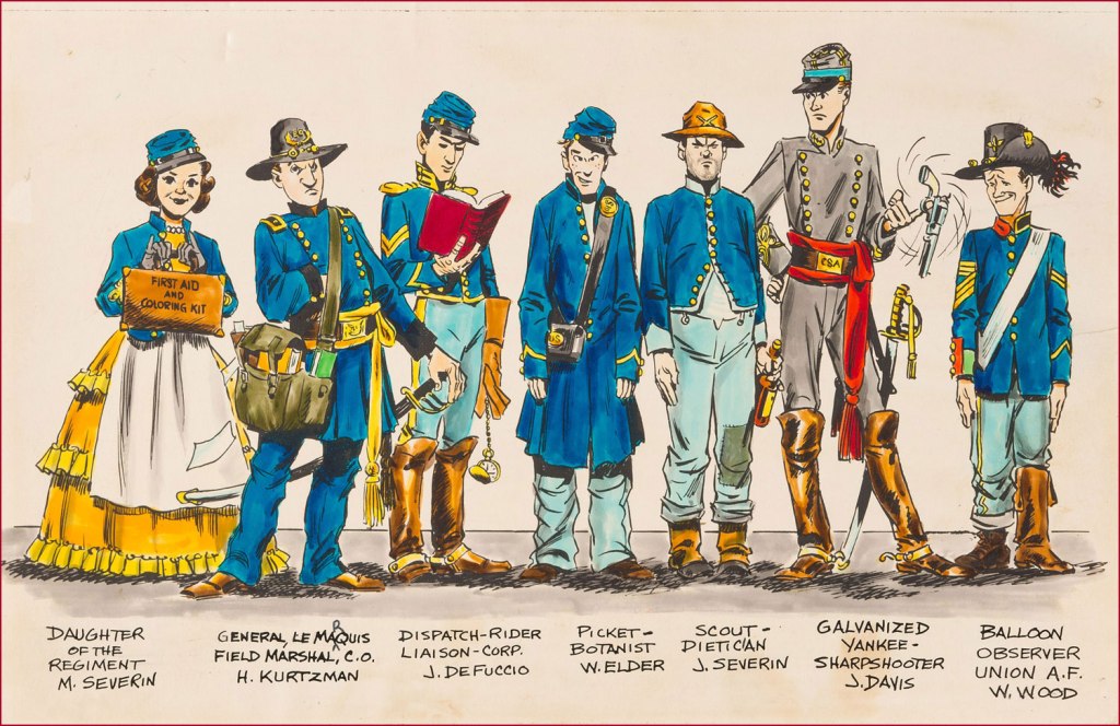
‘Spoilers!’ saw print in Tomahawk no. 135 (July-Aug. 1971, DC). Here’s a lovely illustration of some of the EC gang, in civil war drag . Like it says, DeFuccio’s third from the left. Ink and wash over graphite pencil on Bristol board. » Drawn in the 1950s, this piece saw print in 1983, in issue 9 of the excellent EC fanzine Squa Tront.
GROTH: Was DeFuccio working for Mad at that time?
SEVERIN: Yeah.
GROTH: It seems like you remained friends with DeFuccio for a very long time.
« Like everyone in his right mind, I feared Santa Claus. » — Annie Dillard
’twas 1982, and DC’s mystery anthology titles were dead or dying (the last one standing, The House of Mystery, had but a year or so left to go), and The Unexpected, published since 1956, was a mere two issues away from cancellation. Latter-day editor Dave Manak had done a fine job with the means at his disposal, wisely engaging Joe Kubert (1926-2012) to grace close to ten issues with his ever-elegant artwork.
This is perhaps the finest of the lot, a wistful, old-fashioned cover that dispenses with most of the clichéd Holiday iconography.
This is The Unexpected no. 220 (March 1982, DC). Pencils and inks by Joe Kubert with extra-fine lettering by Gaspar Saladino (1927-2016), truly a key element of the cover’s visual appeal. “Drive carefully, darling!” Is that woman worried about *everything*? Talk about fretful. Insurance agents must adore her. From the Fairhaven and Bon Marché allusions, one may presume that the events are set in the state of Washington.To give credit where credit is due, the unexplained bit with Santa’s hand on the phone is the story’s subtlest touch. He’s the one who phoned in the tip — anonymously, one presumes. Santa does not abide off-brand competition.
The issue’s lead, Holiday-themed story, boasts gorgeous art by powerful and versatile Puerto Rican cartoonist Ernie Colón (1931-2019), and it’s unusually well-coloured for the era (not to be confused with well-printed!), in that the shadings convey projected light and ambiance, not merely the prevalent, simplistic colour-by-numbers approach.
The writing, on the other hand…
Santa Is a Killer! is an artless hodge-podge of tropes, a kiddie rehash of Johnny Craig’s timeless “… and All Through the House” (Vault of Horror no. 35, Feb. 1954, EC), dressed up with the done-to-death-and-then-some “That — wasn’t *you*? Then — it must have been the –*choke* — real ghost / Satan / Santa Claus / Carlos Santana / Tooth Fairy / Larry “Bud” Melman!) “twist”. Did I mention that I love the art?
Since we strive to avoid repetition, and as my partner-in-mischief ds has already featured this legendary cover in her How do you like *your* Christmas? post, here instead is the original 1954 Silverprint proof, a colour guide for the printer’s edification and coloured by hand, presumably by EC’s resident chromatic conjuress, Marie Severin (1929-2018). Cover art by Johnny Craig.
It’s a little-known fact that VoH35’s dear, doomed wife’s peignoir was later snapped up for a pittance at an estate sale by a young rake by the name of Danny Rand. Soon, with a few minor alterations, he had himself a nifty (and silky!) crime-fighting ensemble. Just don’t ask ‘is that a ladies’ nightgown you’re wearing?‘ if you don’t want your features rearranged. This is Iron Fist no. 8 (Oct. 1976, Marvel). Cover art by John ‘Booster Cogburn‘ Byrne and Dan Adkins. And though « The Canadian Government has apologized for Bryan Adams on several occasions » (and presumably for Céline Dion and Justin Bieber also), I say it’s high time Canuck honchos proffered their excuses as to cuddly Mr. Byrne.
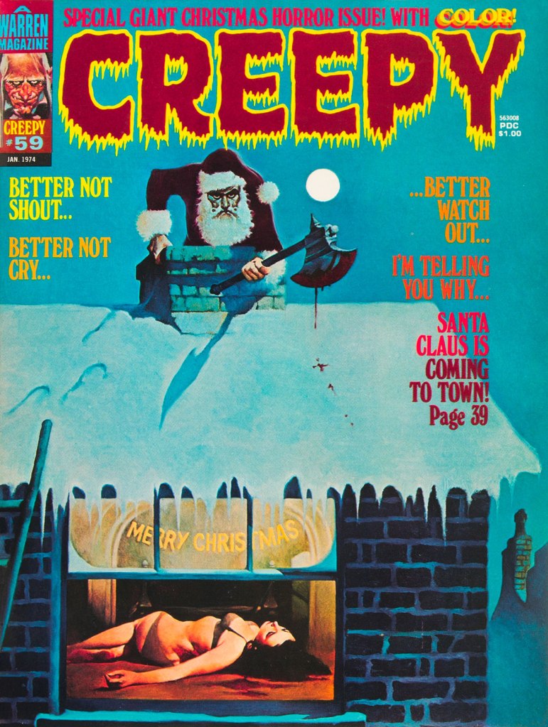
To give you some idea of how prevalent the ‘Santa as homicidal maniac’ notion was by the 1970s, here’s another semi-famous instance: this is Creepy no. 59 (Jan. 1974, Warren); cover by Spain’s Manuel Sanjulián (b. 1941). A year later, writer-director Bob Clark (Porky’s, A Christmas Story) would unleash his influential Black Christmas.
« She kept her ears permanently tuned to the chicken voices outside, so knew immediately when a coyote had crept into the yard, and barrelled screaming for the front door before the rest of us had a clue. » ― Barbara Kingsolver
Given how muted the holiday season is likely to be for most of us, and in light of how much our readers appear to enjoy our past Christmas offerings — (all year long!), I’d thought I’d get an early start on the festivities.
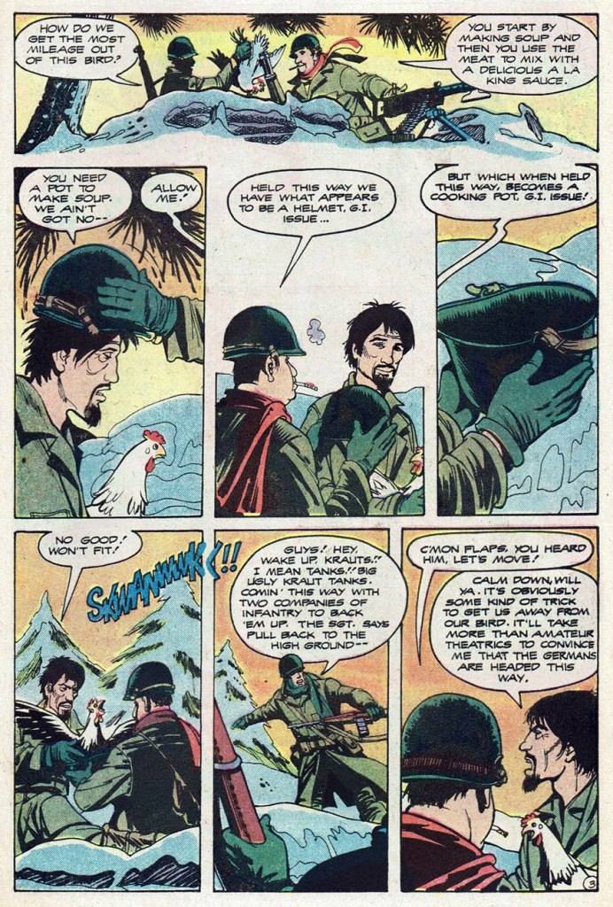
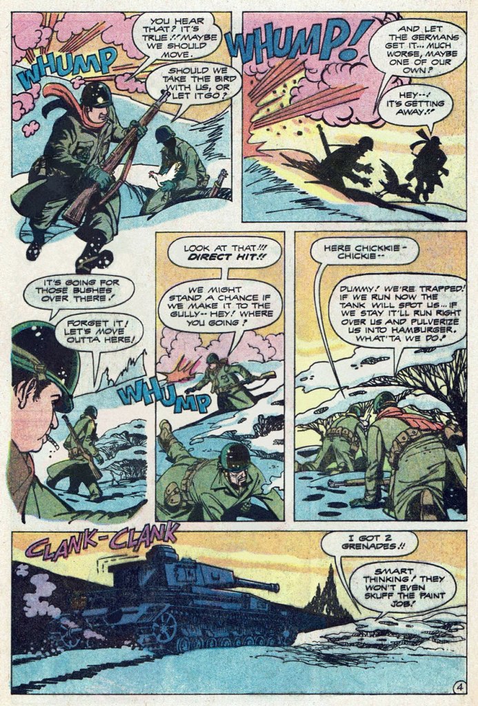
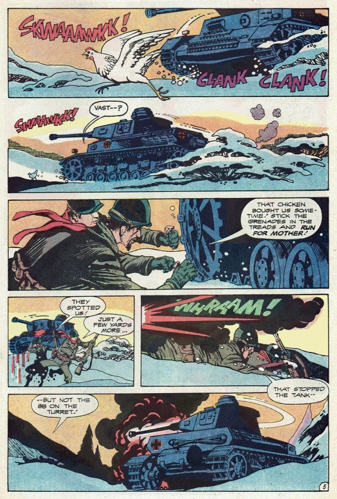
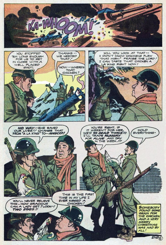
Here’s a fine, but truly obscure little Christmas fable. It was buried in the back of an issue of The Unknown Soldier, at a time when the DC war line was well into its final decline.
… as much of a ‘very merry Christmas’ one may possibly enjoy in the midst of war, far from home and loved ones, at any rate. I would have enjoyed seeing more of those two kind-hearted doofuses, Burf and Flaps… and their chicken mascot. I wonder what name they would have given her…
According to editor Paul Levitz, Christmas Dinner‘s script had been purchased six or seven years earlier by his predecessor Archie Goodwin but had lain fallow in the interim. It was written by one Janus Mitchell (his sole credit in comics, but we may be in the presence of pseudonymous shenanigans) and was finally assigned for illustration to Teny Henson (often credited in the US as ‘Tenny Henson, as he is here), one of my favourite creators from the ranks of the Filipino Komiks community. In America, Henson’s work mostly appeared in DC publications for about a decade (1974-83), beginning with the plum commissions of inking a returning Sheldon Mayer (post-cataract surgery) on his Rudolph the Red-Nosed ReindeerLimited Collectors’ Edition giants, and inking Ramona Fradon‘s pencils on DC’s underrated second revival of Plastic Man for a pair of issues. All in all, Teny flew under the fanboy radar, chiefly providing artwork for mystery and war short stories, and always at a high level of craft and inspiration.
I love the economy and precision of his line, his limpid storytelling, and his mastery of an aesthetic merrily at play in the sweet spot between the cartoonish and the representational. Fittingly, he went on to work in the animation field.
This is The Unknown Soldier no. 237 (Mar. 1980, so on the stands in Dec. 1979, DC), picking up its numbering from the venerable Star-Spangled War Stories; cover, of course, by Mr. Joe Kubert, though by no means among his finer moments — that ‘Nazis in ambush’ formula was getting pretty long in the tooth by then.
« No — I’m not alive! But we’ll have time to talk about that later! » — the accident-prone stranger
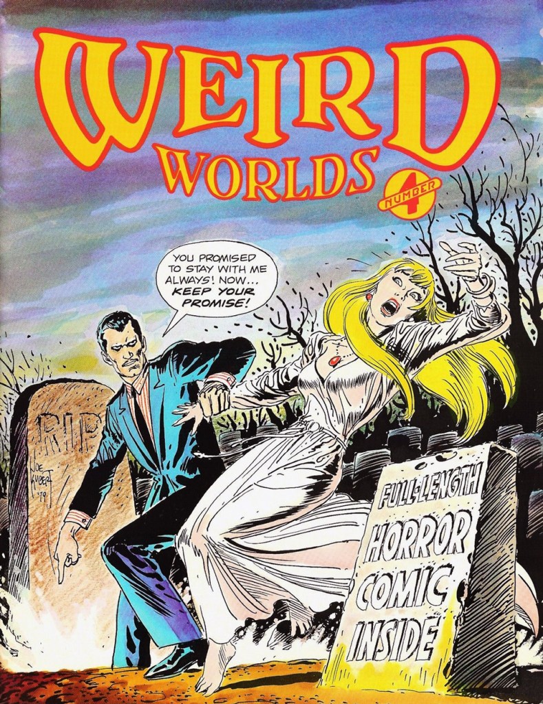
On the magazine front, Scholastic hit its peak in the mid-to-late 1970s with Dynamite (1974-92) Bananas (1975-84) and sundry periodicals aimed at various reading levels. Always comics-friendly, they struck a fruitful alliance with the fledgling Joe Kubert School of Cartoon & Graphic Art, thus granting precious early exposure to some of the institution’s promising early alumni, such as Stephen Bissette, Rick Veitch and John Totleben.
This is Weird Worlds no. 4 (1980, Scholastic). Cover by Joe Kubert. By ‘full-length’, they meant ‘four pages long’. Oh well.
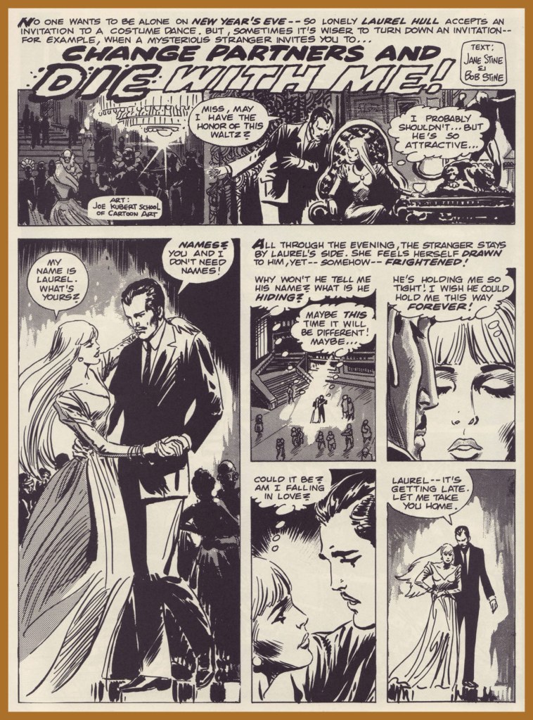
Professorial Joe Kubert leads his students into a moody collaboration with the guiding lights of Dynamite, namely the husband-and-wife team of Jane Stine and ‘Jovial’ Bob Stine (of later R.L. Stine fame and fortune).
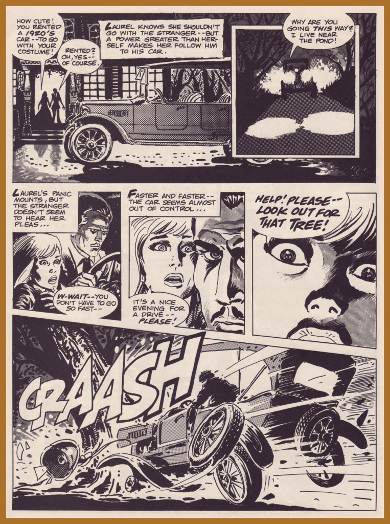
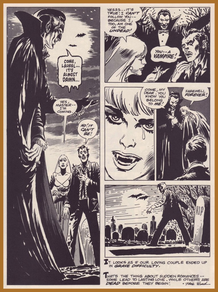
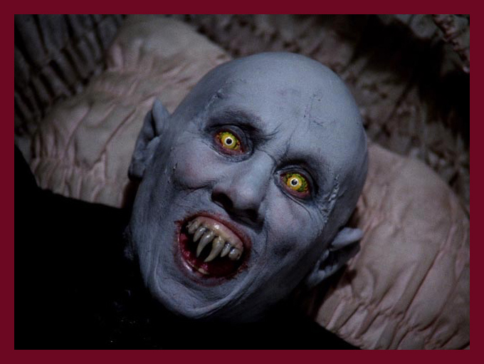
Well, Laurel could have fared far worse: her ‘Master’ is squarely in the then-fashionable Frank Langella / George Hamilton leading man mould. There was another alternative, of course:
You’ll enjoy Mr. Barlow. And he’ll enjoy you.
Weird Worlds didn’t set this world afire, enduring but eight issues. Still, Scholastic would return to mine the teenage affinity for all things spooky and on that occasion (and further ones) strike gold and raise goosebumps.
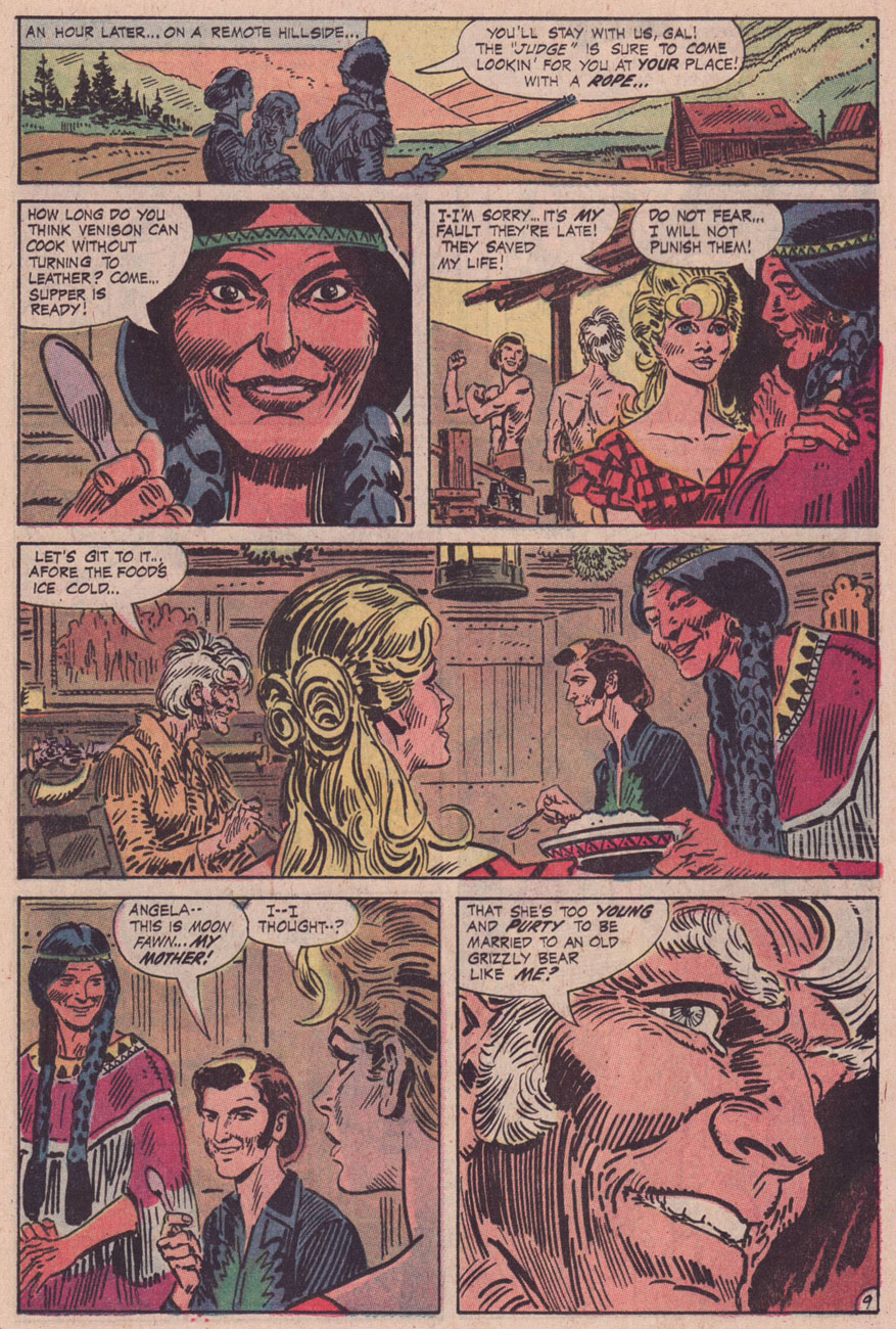
« Who are these men, Tomahawk? » « My Rangers! We fought against renegades… from Pennsylvania to Kentucky! When the country got too crowded, Moon Fawn and I moved out West… where a man has room to breathe! » — Tom Hawk sums up his change of station.
Inevitably, with the Silver Age and its superhero reascendancy, to the eventual detriment of all other genres, the historical adventure strip’s slow decline set in.
As Don Markstein put it:
« Toward the latter part of the ’50s, practically all DC comics ran aliens, monsters and other goofy sci-fi stuff on the covers, no matter how badly it clashed with the title’s subject matter — even war comics often sported dinosaurs in that position. And so, all through the late 1950s and early to mid ’60s, Tomahawk fought gigantic tree men, miraculously-surviving dinosaurs, mutated salamanders, and other menaces that seem somehow to have escaped the history books. There was even a giant gorilla among them, and putting a gorilla on the cover was also a contemporary trend at DC. »
It all comes down to the editor, and Tomahawk was long edited by Jack Schiff, who just adored that sort of (admittedly fun) claptrap, then by his associate Murray Boltinoff, who at least was more flexible.
To wit, with issue 116 (May-June 1968) came a change and a relative return to the feature’s roots. First, Neal Adams was brought in to provide covers, and the more outré aspects were phased out. With issue 119 (Nov.-Dec. 1968), the book’s final creative team was brought aboard: writer Robert Kanigher and illustrator Frank Thorne (1930-2021), eventual creator of Moonshine McJugs. Thorne replaced Fred Ray (1920-2001) who, while he wasn’t a Tomahawk originator, had been chronicling the mountain lion’s share of his exploits since 1947. He would draw a handful of short pieces for DC’s war books before leaving the comics field in the early 1970s, writing historical non-fiction and art directing and illustrating for publications Civil War Times Illustrated, American History Illustrated, True Frontier, The West and Yank (despite the title, not a porno mag).
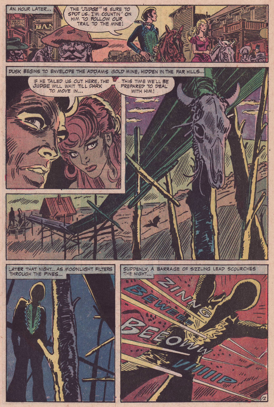
With the heart of the creative team in place, it was a change of editors that prompted Tomahawk’s final mutation, and arguably its most interesting: Joe Kubert took over the editorial reins, and the action was moved four decades or so forward in time. Tom ‘Tomahawk’ Hawk had settled down with a Native woman, Moon Fawn, sired a pair of sons, and was by then a lanky, crotchety old coot, but not quite helpless. His elder son Hawk was the protagonist, and they encountered frontier-style prejudice, greed, corruption, tribalism, paranoia… you guessed it: it was a ‘socially-relevant‘ comic, but hardly the cringe-fest that was the concurrent Green Lantern/Green Arrow. I daresay that Kubert and Kanigher’s respective politics were rather too complex for that.
This is Tomahawk no. 131 (Nov.-Dec. 1970, DC). Inside: Hang Him High!, written by Robert Kanigher and illustrated by Frank Thorne. I like how nonplussed Hawk is at the prospect of doing the Brand New Tennessee Waltz..
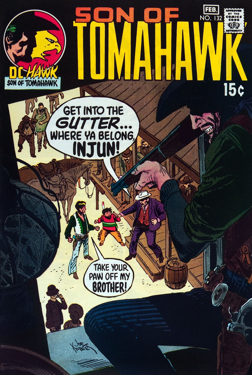
This is Tomahawk no. 132 (Jan.-Feb. 1971, DC). Inside: Small Eagle… Brother Hawk!, written by Robert Kanigher and illustrated by Frank Thorne.
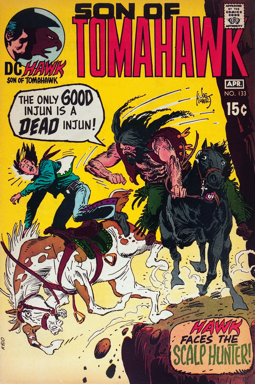
This is Tomahawk no. 133 (Mar.-Apr. 1971, DC). Inside: Scalp Hunter, written by Robert Kanigher and illustrated by Frank Thorne.
This is Tomahawk no. 134 (May-June 1971, DC). Inside: The Rusty Ranger, written by Robert Kanigher and illustrated by Frank Thorne.
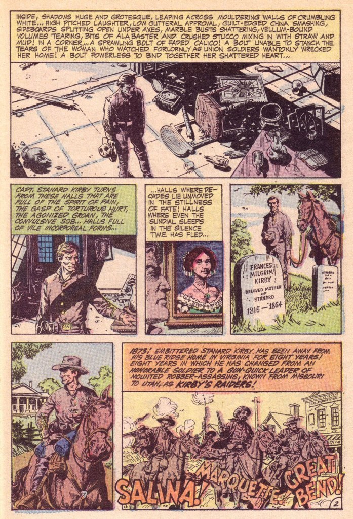
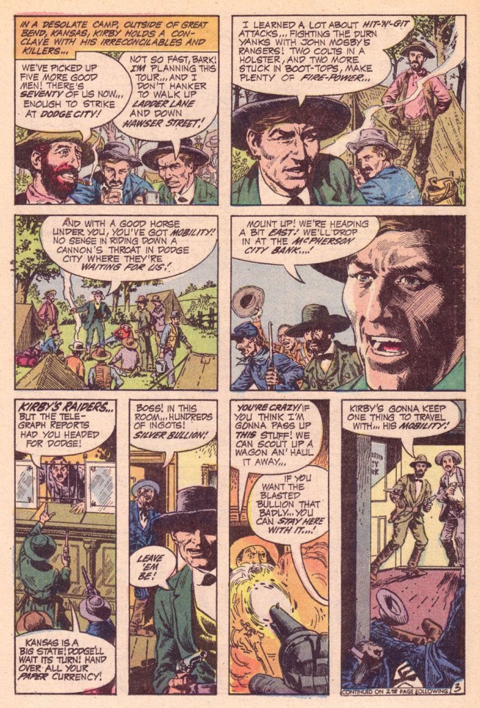
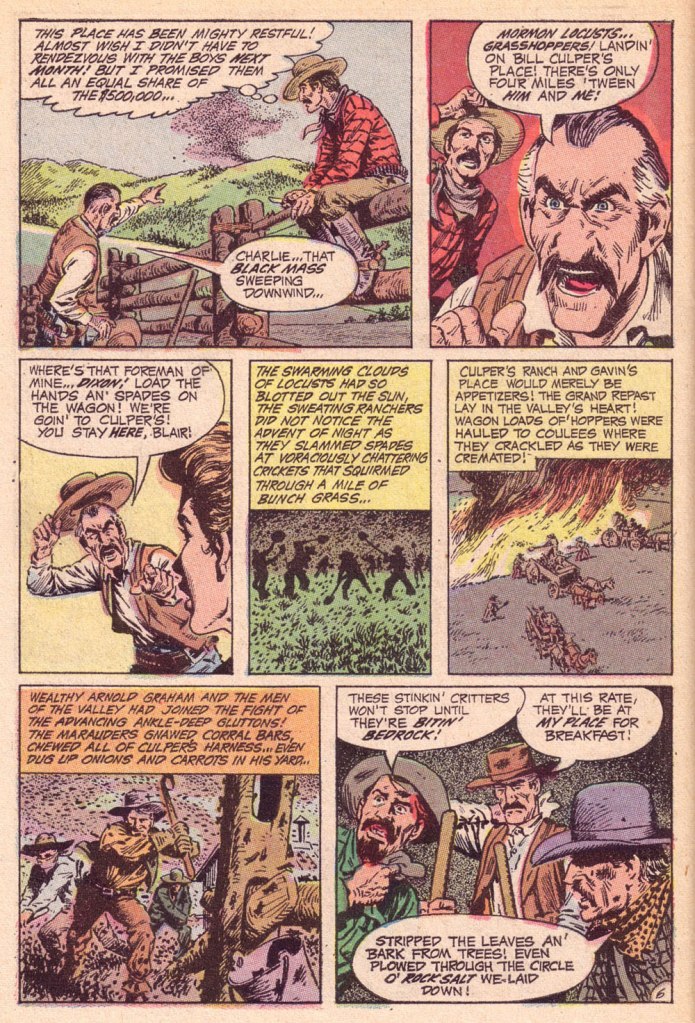
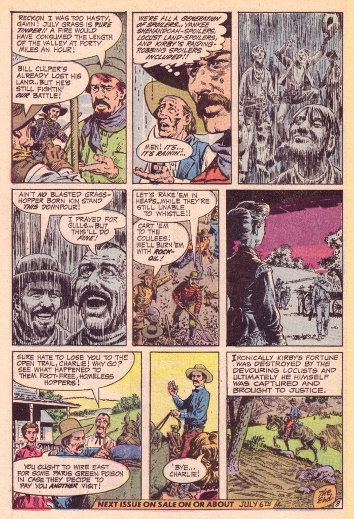
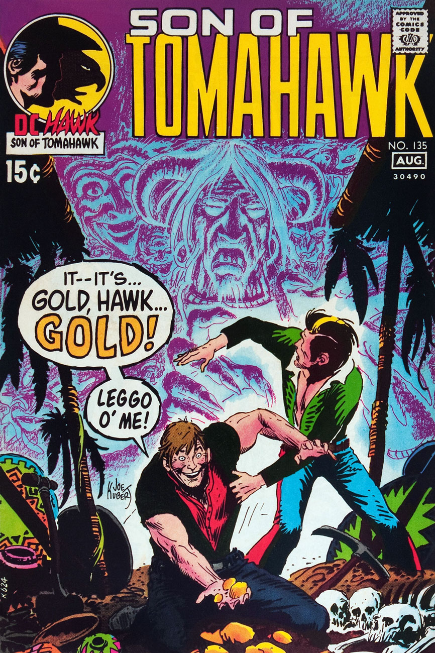
This is Tomahawk no. 135 (July-Aug. 1971, DC). Inside: Death on Ghost Mountain!, written by Robert Kanigher and illustrated by Frank Thorne, and the powerful Spoilers, written by Jerry DeFuccio and illustrated by John Severin. This was my admittedly random introduction to the series.
This is Tomahawk no. 136 (Sept.-Oct. 1971, DC). Inside: A Piece of Sky!, written by Robert Kanigher and illustrated by Frank Thorne, plus an extraordinary Firehair tale by Kubert… but then they all are.
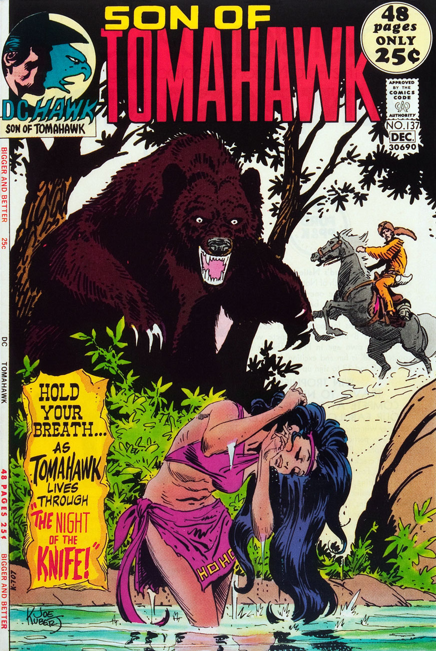
This is Tomahawk no. 137 (Nov.-Dec. 1971, DC). Inside: Night of the Knife!, written by Robert Kanigher and illustrated by Frank Thorne, plus a selection of fine reprints.
This is Tomahawk no. 138 (Jan.-Feb. 1972, DC). Inside: Christmas, written by Robert Kanigher and illustrated by Frank Thorne, as well as an assortment of worthy reprints boasting artwork by Nick Cardy, Sam Glanzman, Norman Maurer and Mort Drucker.
This is Tomahawk no. 138 (Mar.-Apr. 1972, DC). Inside: Death Council, written by Robert Kanigher and illustrated by Frank Thorne, plus a clutch of reprints illustrated by Fred Ray, Gil Kane, and none other than Frank Frazetta.
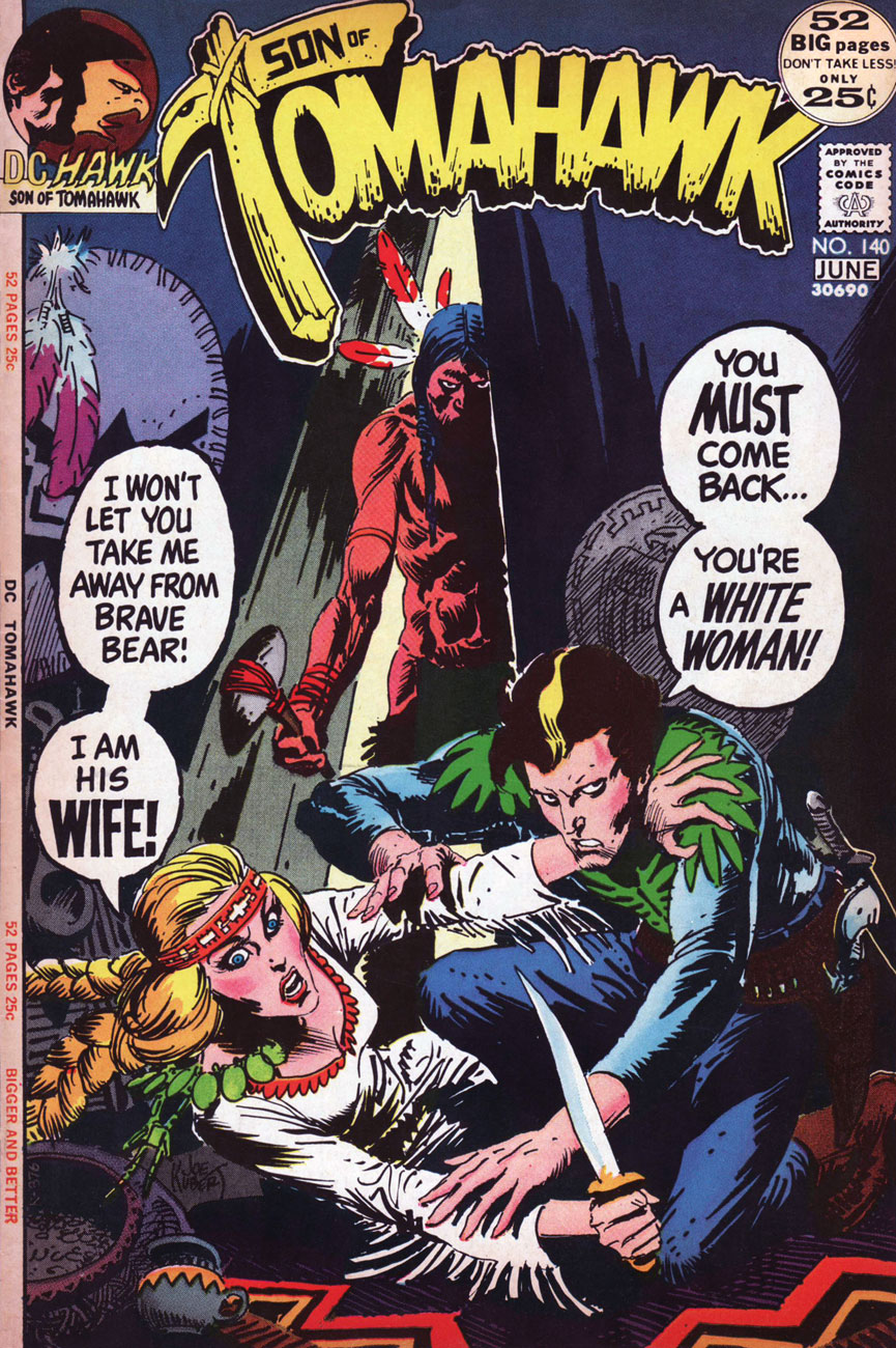
This is Tomahawk no. 140 (May-June 1972). Inside: The Rescue!, written by Robert Kanigher and illustrated by Frank Thorne. Gaspar Saladino‘s brand new logo, a rare misfire, was unveiled just in time for the book’s cancellation.
As for the interior art, I’d say it’s Frank Thorne’s finest work. The notorious Alexander Toth would of course disagreed, far preferring Thorne’s work when Thorne’s style bore a heavy… Toth influence (here’s an example from 1957.) For comparison, here’s a pair of interior pages from Tomahawk no. 131‘s Hang Him High!
Thanks to their production manager, Jack Adler, DC had the finest, most nuanced colouring in the field in the late 60s and early 70s.
Toth would, in (final) conversation with The Comics Journal publisher Gary Groth, in 1996, froth forth:
« I repeatedly warned Frank: “For Christ’s sake, get the hell away from Kubert. He’s not doing you any good. His influence on you is negative, not positive, so get the hell away from him and stop aping his style and stop putting on all that shit that you lived without for years. You did nice, clean, hard-lined stuff, and it’s been detrimental to your work.” He confessed: “Yes, Joe Kubert and his style are hard to resist.” So, yes he had the influence, and he liked it. Well, good luck. »
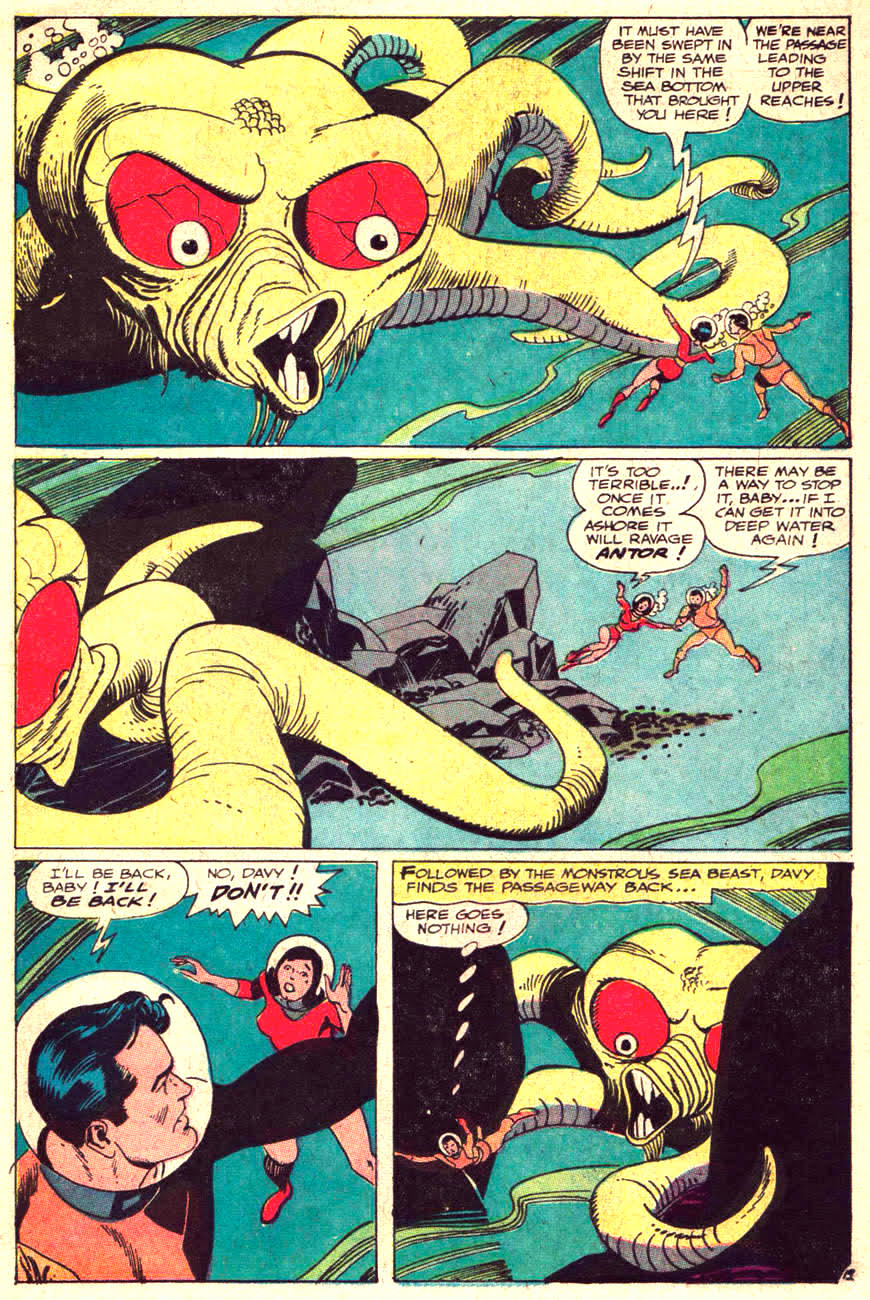
« Their bodies are mainly soft and pliant, with one major exception. In the centre of their web of tentacles lies a hard, sharp and murderous beak that resembles that of a parrot, is a tool for killing and dismembering prey… » (source)
When the story begs for an octopus intervention, artists can go the more-or-less realistic route, or take complete liberties with an octopus’ anatomy. Today I won’t talk about assorted tentacled zoological marvels one finds in comics – insert your choice of description into “… with tentacles”: dinosaurs, sharks, gorillas, robots, old hags, worms, bartenders, and so on. Yes, I can support my claims (email me if you want evidence… or just look through previous editions of Tentacle Tuesday).
Anyway, let’s say you want to draw a somewhat believable octopus – giant, sure, and plenty scary, but somewhat true to life. There’s a problem: frightening brutes generally have some sort of gaping maw, a set of incisors (preferably dripping with some revolting stomach acid), something they can visibly threaten the hero with. The octopus’ mouth is hidden under all that undulating mass of tentacles, pretty much where one would expect a normal creature’s anus to be, and definitely not next to his eyes. For that reason, in most octopuses sightings in comics, their mouths aren’t visible at all. But some artists, well, they want to have their cake and eat it, too. Here is a gallery of octopus mouths – we’ll start off with naturalistic ones, and make out way into that’s not how any of this works territory. I won’t include anything with a lamprey mouth, however.
Here’s the only clean attempt: the beast has a beak, there are no teeth in it, and the eyes are on the other sides of the octopus, where they’re supposed to be. Walter Simonson, you win this one!
Sword of Sorcery no. 5 (Nov-Dec 1973, DC), cover by Walter Simonson. Fafhrd, is that you?
In the next image, an attempt is made at something vaguely beak-like, but that dentition is definitely wrong. The octopus has some tiny teeth on its tongue which it uses to drill holes or scrape things out, and some razor-sharp hooks/teeth on its suckers, but nothing like normal teeth, which is why no octopus has ever needed dentures.
Doomsday In The Depths, scripted by Garder Fox and illustrated by Gil Kane, was published in Undersea Agent no. 6 (March 1967, Tower).
The other approach one could take is drawing something that looks like an especially irate parrot, but with tentacles. It is not entirely illogical, as the octopus’ mouth has been described as “similar to a parrot’s beak” by several people in the know.
Tentacles of Terror was published in Front Page Comic Book no. 1 (1945, Harvey). This page is drawn by Joe Kubert, at at least the signature attests to this – I admit I would have never guessed. There are much nicer Kubert tentacles over at Tentacle Tuesday Masters: Joe Kubert.
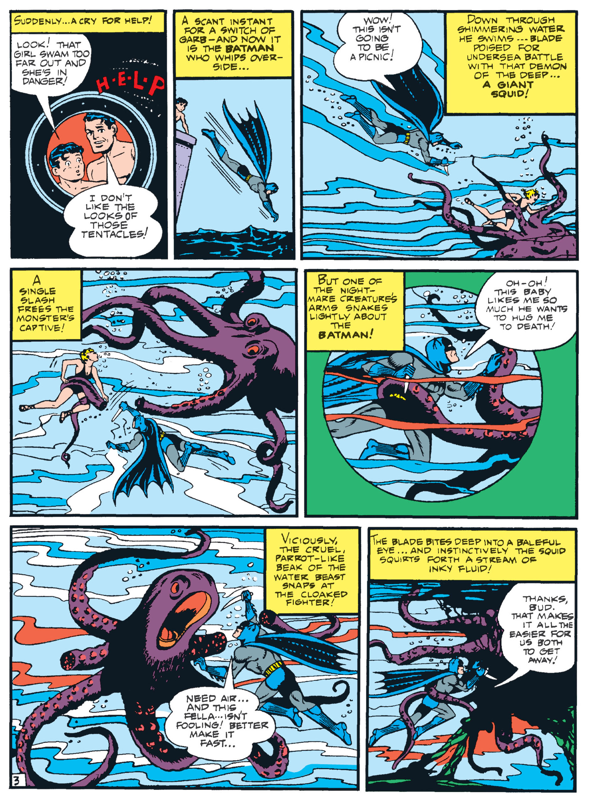
Batman recently had a whole Tentacle Tuesday to himself – here he is again, fighting a squid with very unsquid-like features. At first, he looks normal, but glance at the bottom of the left corner – how did he suddenly develop a beak where there was none to be seen several panels prior?
An excerpt from Four Birds of a Feather,Batman no. 11 (June-July 1942, DC), script by Bill Finger, pencils by Bob Kane (take that particular credit with a grain of salt), inks by Jerry Robinson, backgrounds and lettering by George Roussos.
Continuing the beak-and-parrot theme…
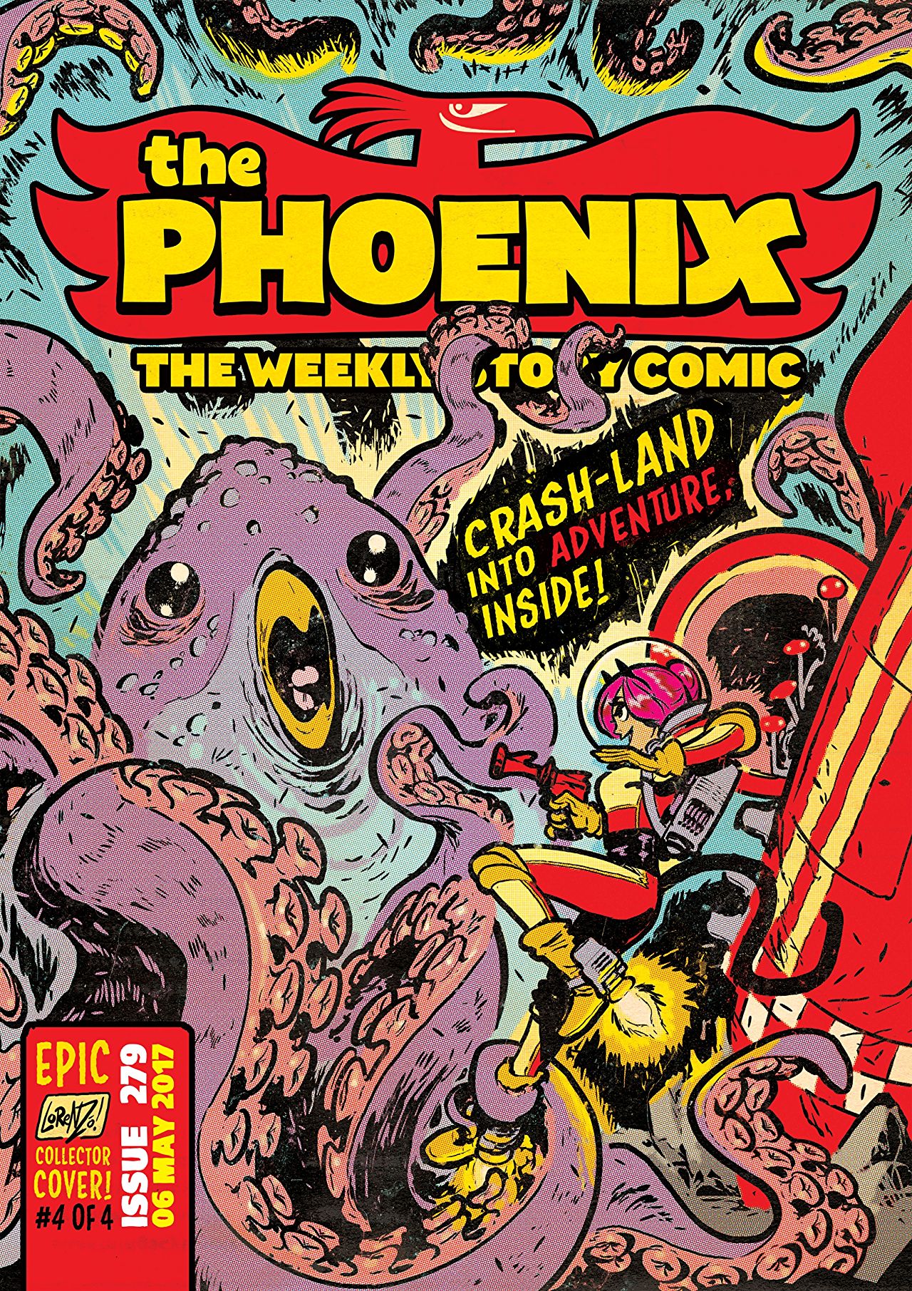
The Phoenix no. 279 (May 2017). Can anyone identify the cover artist?
A final note to this conversation about octopuses’ mouths – should you locate an octopus, pleasedon’t put it on your face (or any other body parts).
« Calm down, Harris… this is no teleportational phenomenon we’re dealing with… » — Hawkman, “Yo-Yo Hangup in the Sky!”.
In 1968, though DC was still handily outselling Marvel, the industry leader was beginning to feel the heat. Now, to be fair, not nearly as much as revisionists would surmise: Marvel’s top-seller, The Amazing Spider-Man, was only in twelfth place. Of course, Marvel was hobbled by distribution issues, but that problem would come to an end that very year.
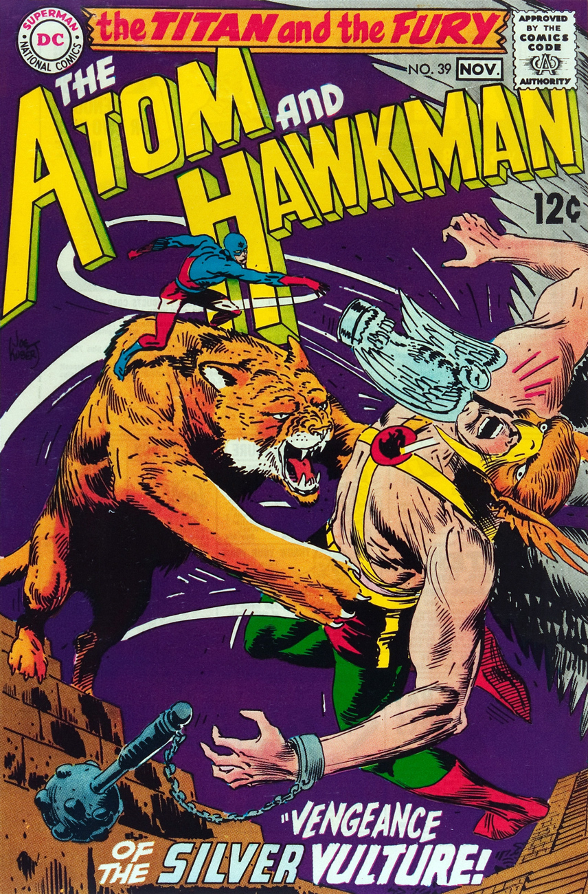
Anyway, as neither of DC’s solo titles The Atom (38 issues, June-July 1962 – Aug.-Sept. 1968) nor Hawkman (27 issues, Apr.-May 1964 – Aug.-Sept. 1968) were doing all that well (both of them missed the top sixty in 1968), it was decided to attempt to merge the books in order to perhaps save them. Well, it didn’t work, but some splendid covers were created, and that’s what brings us here.
The Atom and Hawkman no. 39 (numbering continued from Atom’s book, not Hawkman’s), November 1968. Insides by Robert Kanigher, Murphy Anderson and Joe Giella. Which one’s the Titan and which the Fury? They take turns. Check it out here.
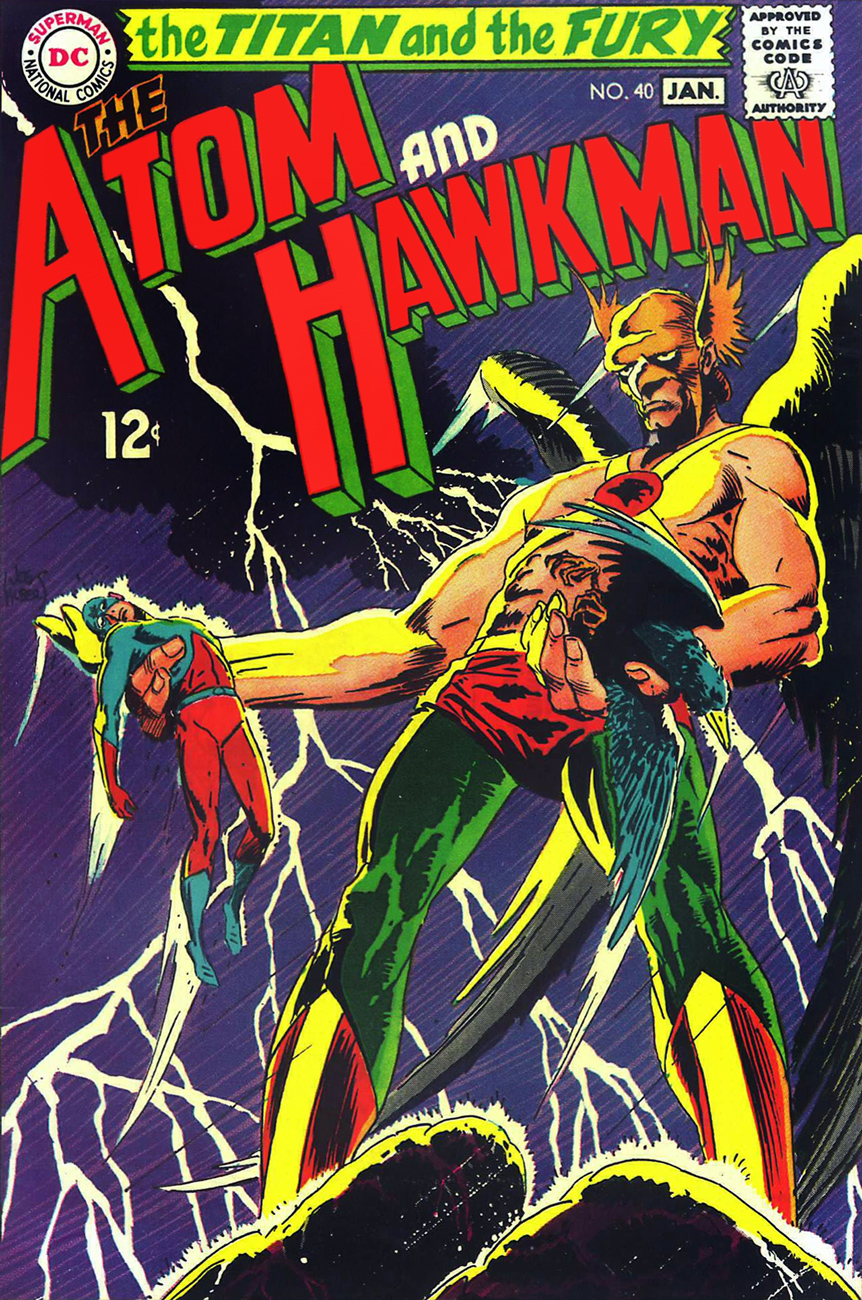
The Atom and Hawkman no. 40 (Jan. 1969) holds a rare treat: a highly unusual pairing, one that was only repeated once to my knowledge (in the following issue): Joe Kubert on pencils and Murphy Anderson on inks. The tale is The Man With an Inbuilt Panic Button, scripted by Gardner Fox. Peruse it here while you can.
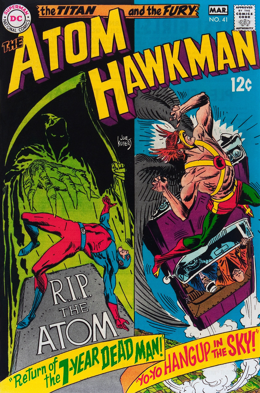
My candidate for the slightest cover of the Atom/Hawkman combo title, but only since the competition is so fierce, and well, it’s kind of busy. This is The Atom & Hawkman no. 41 (Feb.-Mar. 1969), edited by Julius Schwartz and featuring Return of the Seven-Year-Dead Man, written by Gardner Fox, pencilled by Dick Dillin and inked by Sid Greene, and Yo-Yo Hangup in the Sky!, written by Fox, illustrated by Kubert and Anderson. Feast your eyes here.
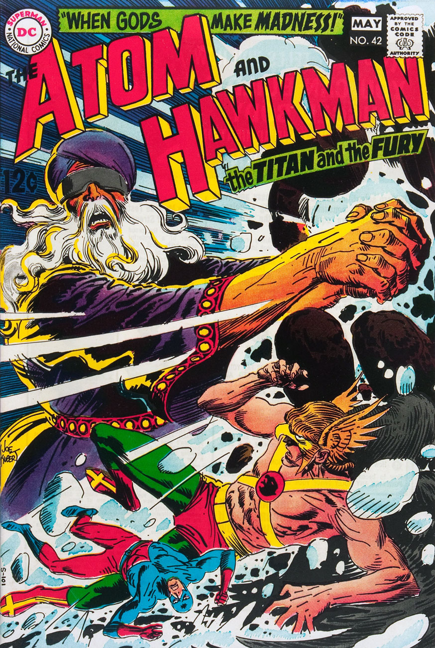
This is The Atom and Hawkman no. 42 (Apr.-May 1969). Read it here!
Robert Kanigher & Joe Kubert’s Gentleman Ghost, first appeared (so to speak) in Flash Comics no. 88 (Oct. 1947) had not been seen (hee hee) since the Golden Age, and he returned to pester Hawkgirl and Hawkman in Come to My Hanging, scripted by Kanigher and illustrated by Murphy Anderson. Meanwhile, The Atom stars in Buzzin’, Buzzin’ — Who’s Got the Buzzin’?, scripted by Dennis O’Neil, pencilled by Dick Dillin and inked by Sid Greene. This is The Atom and Hawkman no. 43 (June-July 1969). Read it here!
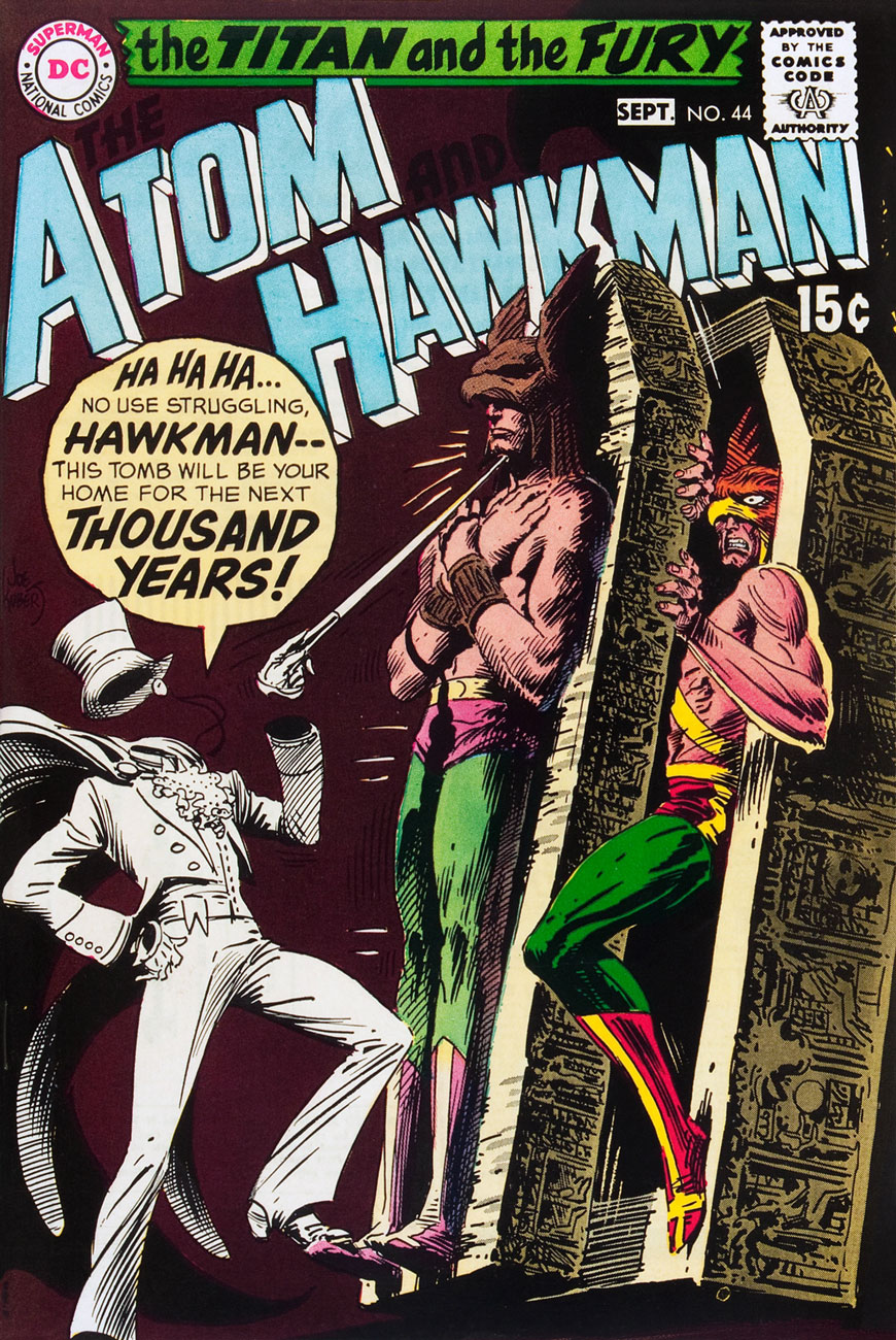
Kubert clearly relished delineating his Gentleman Ghost, and who could blame him? That sticky-fingered filcher is one snazzy-looking felon. This is The Atom and Hawkman no. 44 (Aug.-Sept. 1969). Read it here!
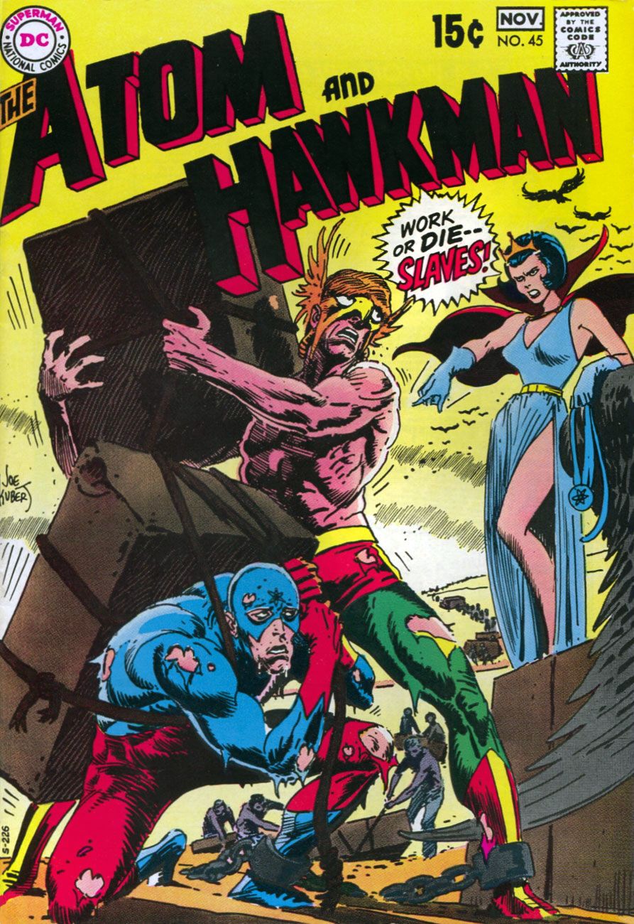
This is The Atom and Hawkman no. 45 (Oct.-Nov. 1969), featuring Queen Jean, Why Must We Die?, by Denny O’Neil, Dick Dillin and Sid Greene, whereas our heroes are enslaved by Ray “The Atom” Palmer’s girlfriend, Jean Loring. It was a common theme in DC Comics, just ask Superman and Green Lantern, for starters. Anyway, read the whacked-out tale here.
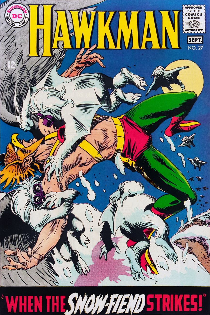
As a bonus, one could consider the final issue of Hawkman (no. 27, Aug.-Sept. 1968), the first entry in Kubert’s streak. Well, I do, and that’s that.
It is said that late each year, Thanagarians mark the winter solstice by taking to the snowy skies to join cuddly flying Yeti in frolic. Look at them cute lil’ buggers. When the Snow-Fiend Strikes! is scripted by Raymond Marais, pencilled by Dick Dillin and inked by Chuck Cuidera.
« When the blast of a rocket launch slams you against the wall and all the rust is shaken off your body, you will hear the great shout of the universe and the joyful crying of people who have been changed by what they’ve seen… »*
Greetings, dear astronauts! Today’s Tentacle Tuesday concerns itself with that “religious experience”, space travel… with tentacles in tow, of course. Some comics may announce their interplanetary theme by putting SPACE into the title of the series (and making sure it’s big and bold!), while others deploy a little subtlety and coyly refer to the unknown, or the unexpected. Either way, we’re in for a grand old time exploring space along with the brave men and women (err, mostly men) who found themselves exclaiming “ooh, tentacles!” while exploring some mysterious planet.
In chronological order, then…
Space Squadron no. 5 (February 1952, Atlas). The cover is *probably* by Joe Maneely.
Worlds Unknown no. 4 (November 1973, Marvel), (bad) cover by Dick Giordano. Some people have the knack for coming up with original and scary monsters, and some don’t. ’nuff said.
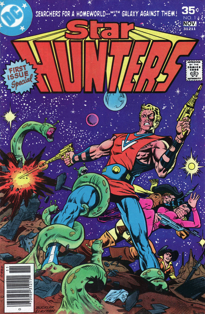
Star Hunters no. 1 (October-November 1977, DC), pencils by Rich Buckler and inks by Bob Layton. The green thingies may be snakes/dragons, not tentacles, but they’re doing a convincing impersonation.
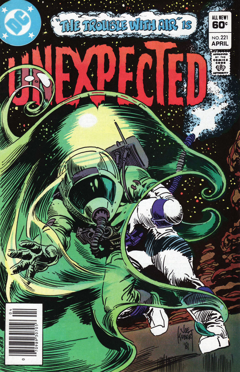
The Unexpected no. 221 (April 1982, DC), cover by Joe Kubert. Now *there’s* a convincingly moody and frightening cover – no big pyrotechnics, just a strong hint of suffocation by a strangely-shaped cloud of ectoplasm. Shudder.
Pulp Fiction Library: Mystery in Space (September 1999, DC). Cover by Mitch O’Connell. This 228-page anthology features a bunch of reprinted stories (from the early 50s to the the early 80s) originally published in Real Fact Comics, Mystery in Space, Strange Adventures and Action Comics.
The Goon no. 11 (March 2005, Dark Horse), cover by Eric Powell.
Incidentally, today I was given a nice gift at work: Buddha’s Hand, or the fingered citron, a type of citrus someone described as a “Monsanto-produced cross between calamari and a lemon”. How very appropriate for Tentacle Tuesday! Here’s a picture of my very own tentacled beauty:
« I have never listened to anyone who criticized my taste in space travel, sideshows or gorillas. When this occurs, I pack up my dinosaurs and leave the room.»*
« Here it is, Halloween again, and all the ghouls, goblins and other beasties are coming out of their secret lairs to frighten little kiddies… who are also emerging in weird, wild costumes to frighten the grown-ups, the stay-at-homes who hand over candy or whatever ransom is demanded in the traditional Halloween challenge! » — Joe Gill, « Trick or Treat »
It was the early 1980s, and DC’s mystery books, in decline since the mid-70s, were running their final mile. They’d hardly ever risen to greatness, writing-wise, and the visuals had, for too long, borne far more of their share of the pact. And when you switch art directors from Nick Cardy to Vince Colletta, it’s got to hurt *bad*. By 1980, the strongest stylists had moved on, replaced for the most part by bland youngsters champing at the bit to move on to superhero work. The farm league, basically.
So the vultures were circling. In the midst of all the bad or lazy decisions, the most heartening exception was the frequent use of Joe Kubert‘s all-but-boundless skills on the covers. I suspect they gave him free rein… it certainly appears that way. Technical skill, thematic originality, « mysterioso », even a deftly humorous touch… it’s all there. Bravo.
As even most comics fans of the period might be surprised that the mystery books were still around, I think it safe to assume that these pieces may be unfamiliar even to devoted Kubert fans. Enjoy!
As Tentacle Tuesday lazily unfurls its slimy appendages yet again, we come face-to-face with one of the comic greats, Joe Kubert. And, as luck would have it, his ability to draw pretty much anything extends to depictions of cephalopods.
Page from “It Was a Dark and Heavy Night…”, published in Heavy Metal Special Edition Vol. 11, no. 2 – 20 Years (January 1997).
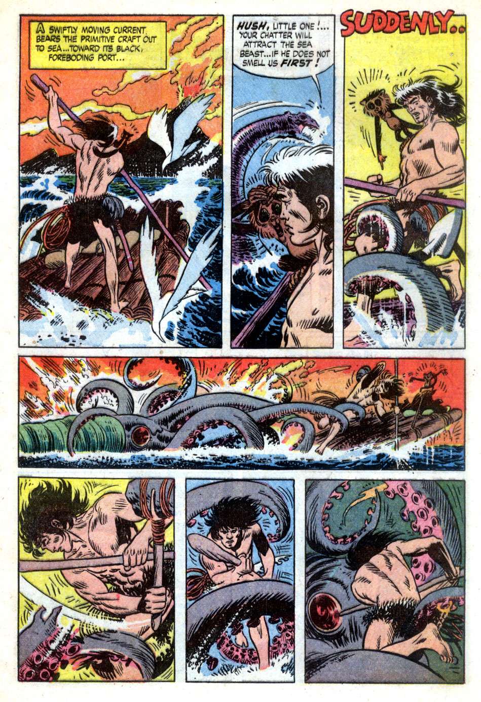
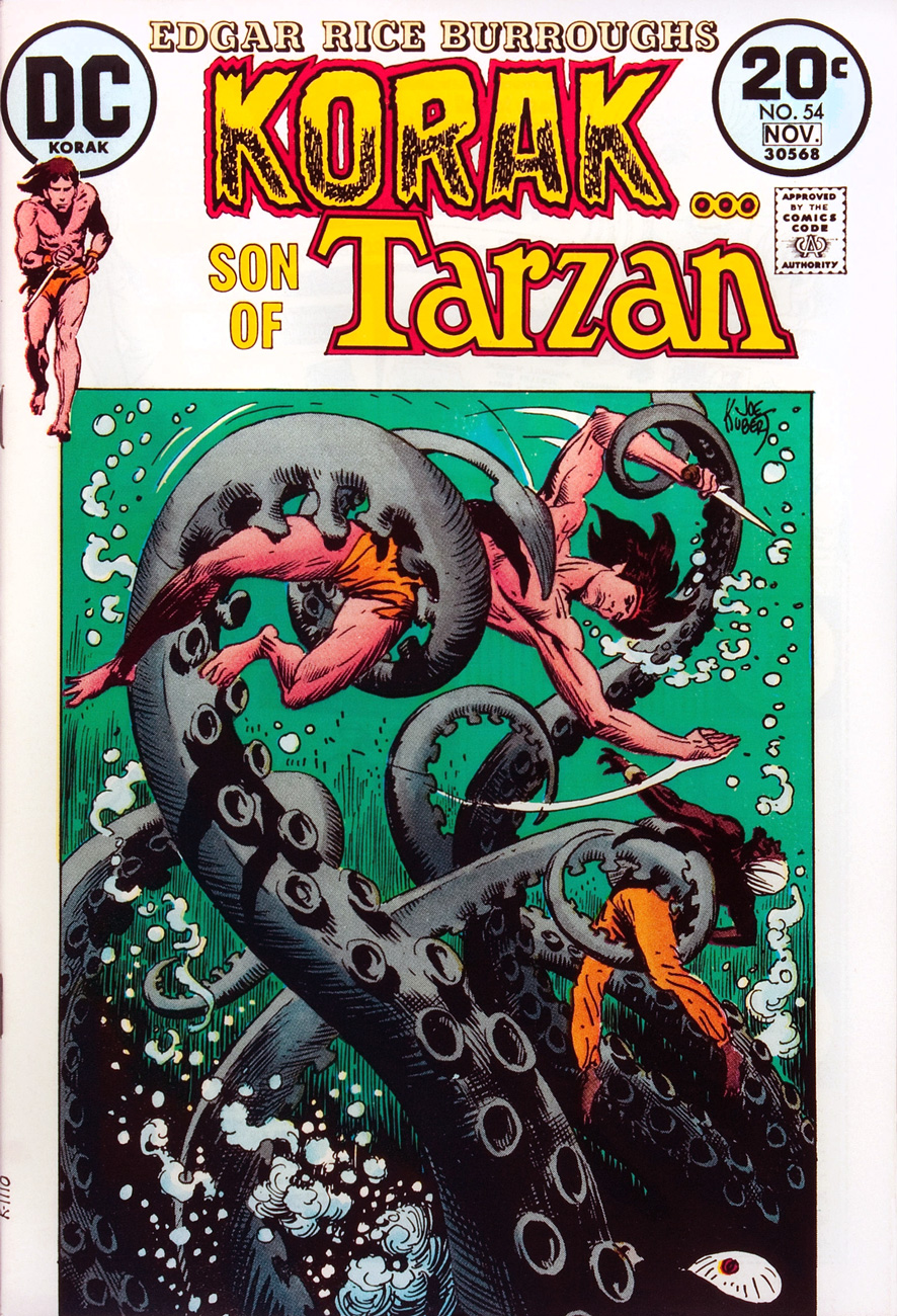
I’m less engrossed with Kubert’s work on prehistoric cavemen, archetypical feral youngsters or troglodyte adventurers (my interests lie more in the direction of Enemy Ace or Unknown Soldier, as well as Kubert’s solo projects like Abraham Stone). Nevertheless, Korak, his father Tarzan, and the unrelated Tor have all encountered tentacles in their eventful careers of dinosaur skirmishes and vine-swinging. (I also have to admit that if anybody could make me inquisitive about this sort of thing, it would be Kubert. I may yet reconsider, especially in the case of Tor, a comic Kubert both drew and plotted.)
Page from Tor no. 3 (May 1954). Read the whole issue here. The adorable monkey Tor is talking to is Chee Chee, his pet gibbon.
See Korak wrestle tentacles on this aquatic Joe Kubert cover! Korak (the ape name for “Killer”) was created by Edgar Rice Burroughs for his Tarzan novels. (Korak was the hero of The Son of Tarzan from 1915; in other novels he was but a young boy, incidental to the plot). This is Korak, Son of Tarzan no. 54 (October-November 1973). This issue has Robert Kanigher and Murphy Anderson on the main story.
It’s not only prehistoric men who have to put up with tentacles – Scandinavian royalty has to deal with them, too.
The Brave and the Bold no. 24 (June-July 1959). The main two stories, “The Trail of the Black Falcon” and “Curse of the Dragon’s Moon”, both scripted by Bob Haney and drawn by Kubert, are frankly silly.
Moving into a slightly different direction….
Mystery in Space no. 115 (January 1981). In a Kubert illustration, even monsters have soulful, anguished eyes.
Weird War Tales no. 77 (1979). Do all three dooms involve tentacles, by any chance?
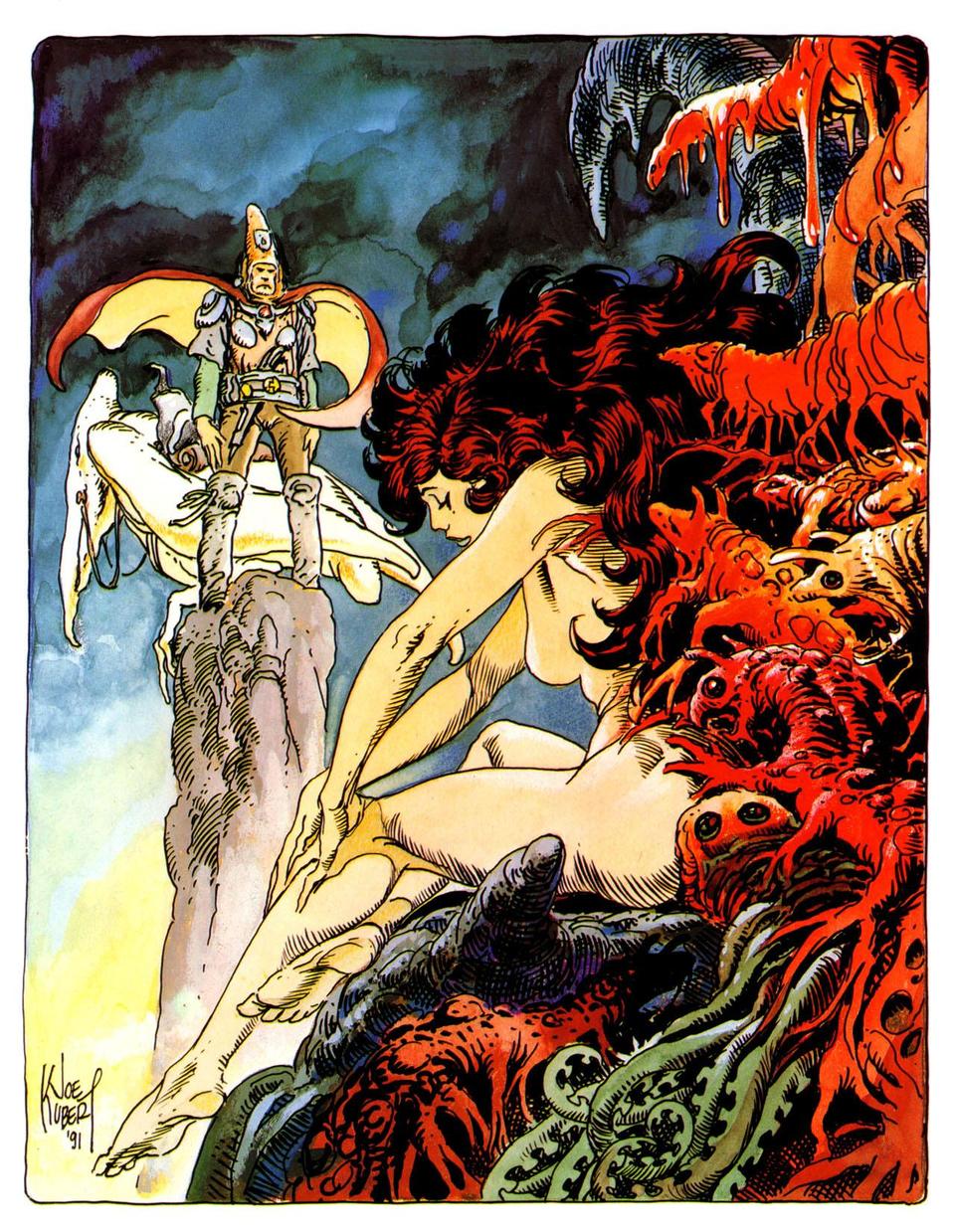
Kubert’s tribute to Arzach, a comic series by Mœbius. Interesting to see Kubert sort-of imitating someone else’s style – however, the feet, hands and tentacles are obviously his.