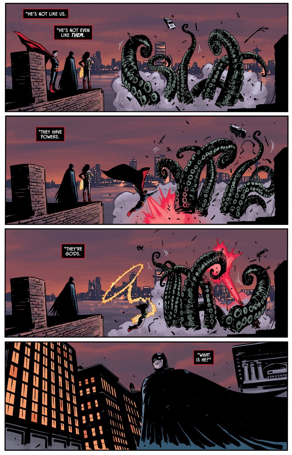
« All realities, all dimensions are open to me! » — Prince
Growing up, Lee Elias (1920-1998) never was a particular favourite of mine. A handful of stories in DC’s mystery titles aside — and I’ve grown to love those — I probably came across his work for Marvel’s Human Fly series, and I was always disappointed when Elias, not my beloved Frank Robbins, turned up in the credits. For the record, Elias drew ten of the nineteen HF issues, and Robbins drew six, plus five covers.
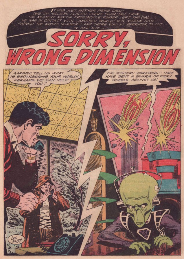
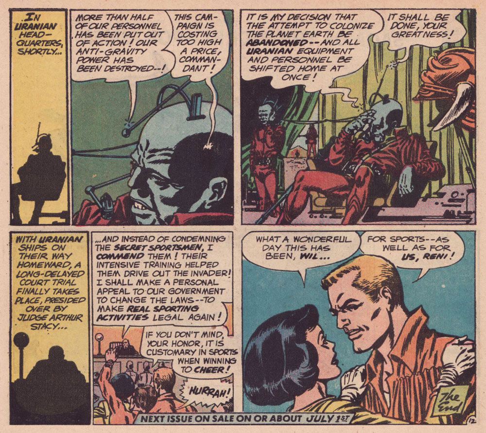
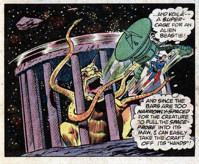
Over time, I noticed his gloriously gruesome cover work with art director-designer Warren Kremer for Harvey’s Pre-Code Horror titles of the early 1950s. His work on DC’s Adam Strange in the mid-1960s is best forgotten — there is only one Adam Strange, and it’s Carmine Infantino‘s (with trusty inker Murphy Anderson along for the Zeta Beam ride, of course). However, I adore Elias’ brief run (with writer Dave Wood) on Ultra the Multi-Alien, the splendidly wacky feature that replaced Adam Strange in Mystery in Space (issues 103 to 110, 1965-66).
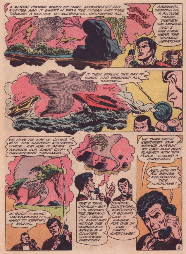
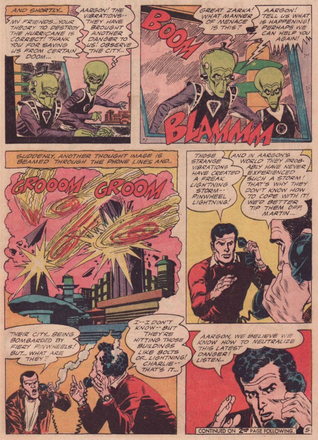
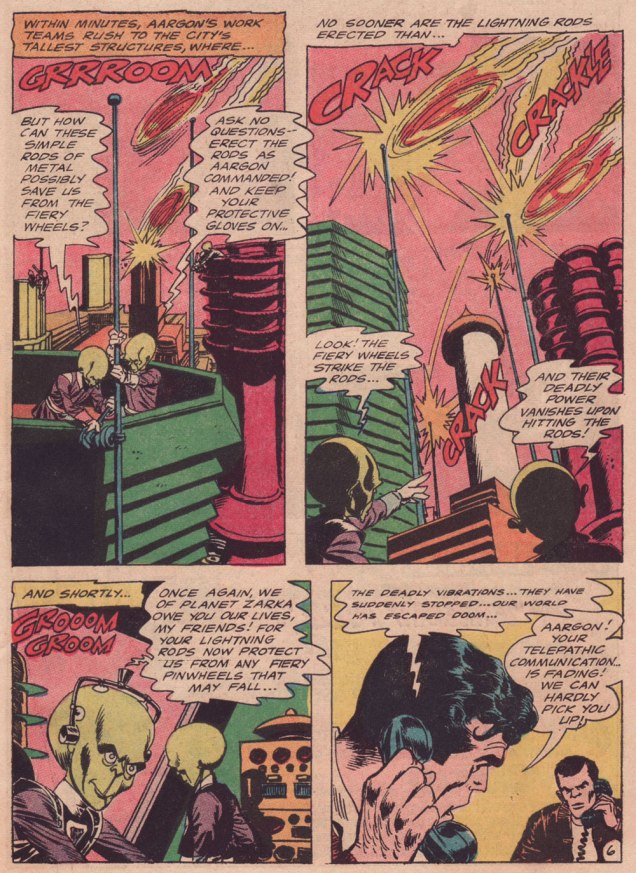
Why am I so fond of this particular story? It’s the little things: for once, a story in a Jack Schiff-edited title makes some semblance of adhering to scientific — or at least science-fictional — principles; here, Elias designed an alien race that, given their grumpy, unprepossessing mugs, would typically have been cast as villains, but instead turn out perfectly honourable; the story’s human protagonists give aid to strangers in need, never asking for a thing in return: no Zarkan mineral rights, no salacious dirt on J’onn J’onzz, just selfless dedication to doing the right thing and the satisfaction of averting a crisis. How refreshingly old-fashioned, a cooling balm for these harrowing times.
-RG
p.s. my partner ds should return to our blog soon… she’s at present battling a mild case of writer’s block, so I’m filling in.
« I was a peaceful sedentary man, a lover of a quiet life, with no appetite for perils and commotions. But I was beginning to realise that I was very obstinate. » — John Buchan
Over the course of several posts, I’ve extolled at length Carmine Infantino‘s skill as a cover designer. Yet the ability to envision and execute a single static image does not automatically translate into the skill of clearly and tidily breaking down a story into a suite of sequential panels, in much that same way that a superbly dexterous surgeon may be incapable of writing legibly. It pleases me to declare that Mr. Infantino’s no one-way specialist.
Infantino describes the evolution of his visual thinking: « The use of negative and positive shapes inside the panel had to mean something. So, to me, if the shapes didn’t draw the eye in, then they weren’t worthwhile. I had to move and change the shape to make it work for me. And that’s what I did. For me beforehand, the figure was the most important thing, and nothing else in the panel mattered. But later on, I found out that it was the total figure I had to worry about. » (all Infantino quotes excerpted from The Amazing World of Carmine Infantino: an Autobiography (2000, Vanguard Productions; edited by J. David Spurlock)
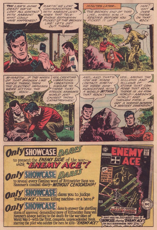
I’ve long wanted to feature this particular tale… for both script and artwork reasons. However, my copy was in Mysteries in Space: The Best of DC Science Fiction Comics (Apr. 1980, Simon and Schuster/Fireside; Michael Uslan, editor)… and I’d be all-but-guaranteed to destroy this beloved book in any attempt to scan from it. But — aha! — I’ve recently acquired a copy of DC Special no. 13 (Jul.-Aug. 1971), which granted the tale its first encore. Game on!
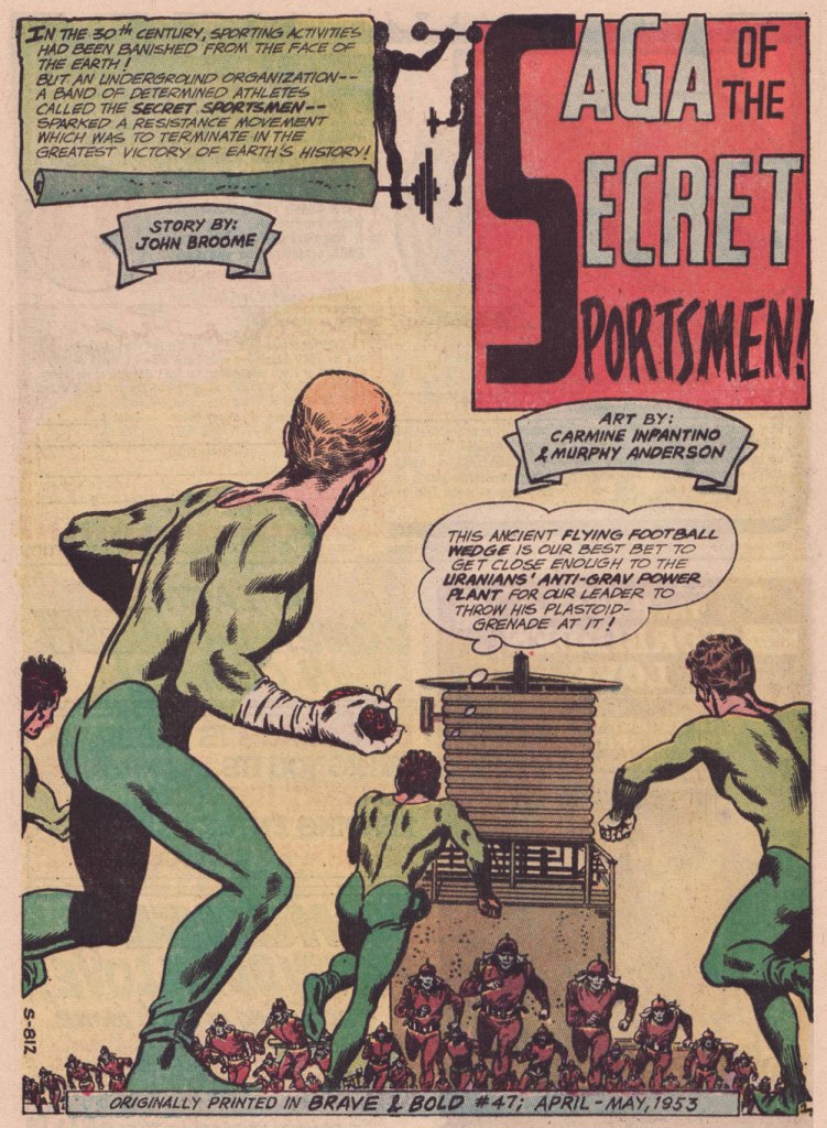
Someone slightly goofed here : The Brave and the Bold no. 47 was published in April-May 1963, not 1953.
.
« The silhouettes I used in ‘Strange Sports Stories‘ [featured in The Brave and the Bold nos. 45-49] were innovations. Julie [editor Julius Schwartz] gave me the script and said, ‘We want this book to look different.” That’s all he said, and I went home and what I devised to make it look different was by using silhouettes as a dramatic device. The action starts in the silhouette, and then you go to the conventional panel, and the action follows through. One might almost call it an animated treatment. »
.
.
.
.
.
.
.
.
.
As smooth and effective as the Infantino-Anderson pairing looks, there was some friction behind the scenes. Infantino explains: « I was beginning to experiment at the time and I threw anatomy out in favor of a higher level of design. Murphy was an excellent draftsman and I’d try to explain what I was trying to achieve to him but this was quite contrary to his own sensibilities. The more stylized I became, the more he thought the work had to be ‘fixed up‘. At one point, he asked for a raise because he had to change my work so much. What he thought he had to ‘fix‘ was the new style I was most excited about. »
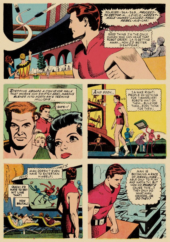
Our featured story shares a central perspective with Russ Manning‘s rightly celebrated Magnus, Robot Fighter, whose inaugural issue had come out a mere two months earlier — though with that close a gap, it’s most likely a simple case of coincidence.
A relevant page from Magnus, Robot Fighter 4000 A.D. no. 1 (Feb. 1963, Gold Key); story and art by Manning, with input from editor Craig Chase, who initially pitched the idea of a SF hero to the publisher.
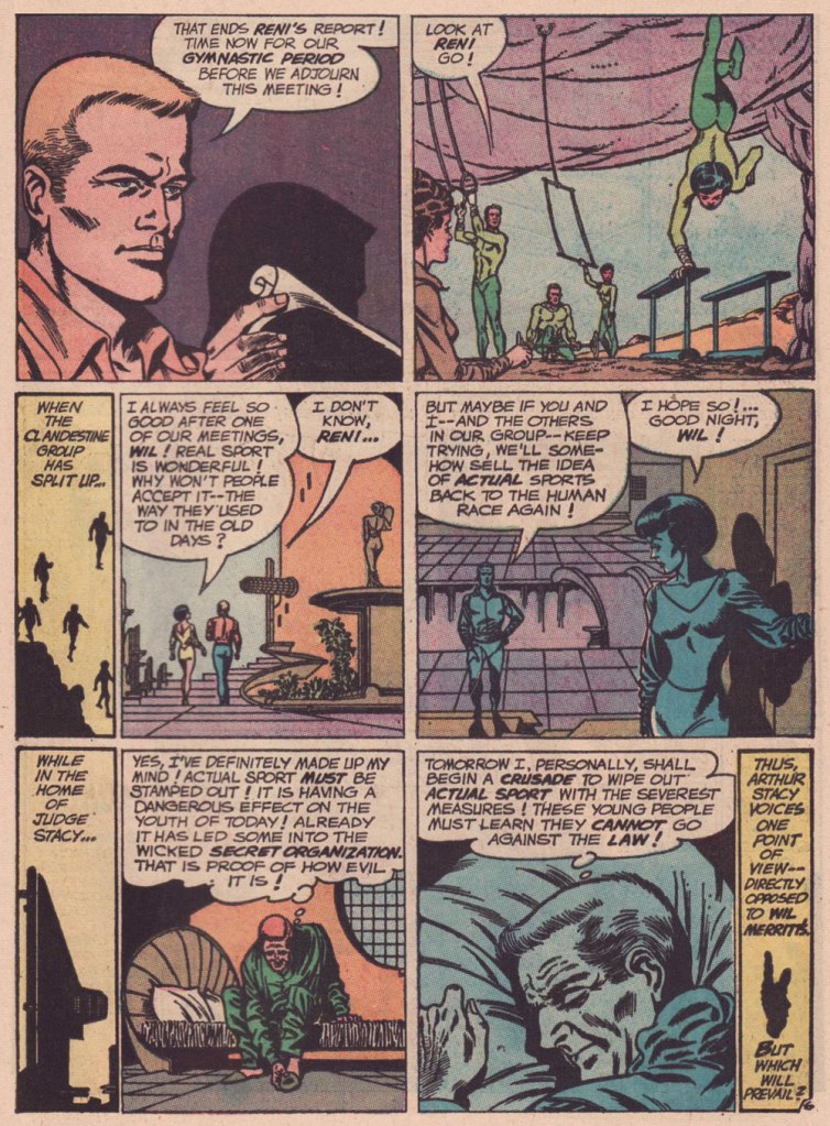
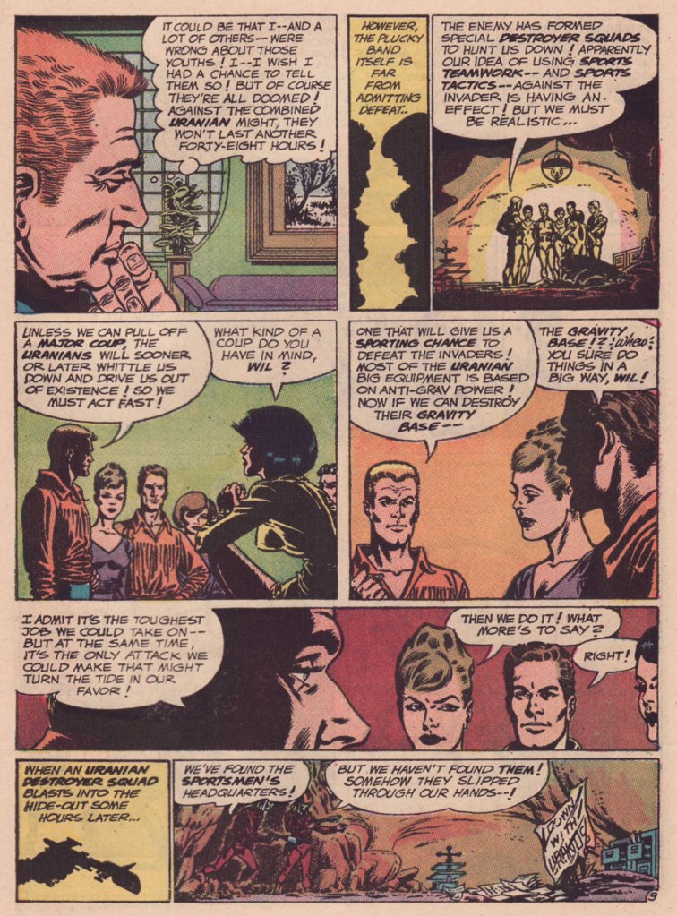
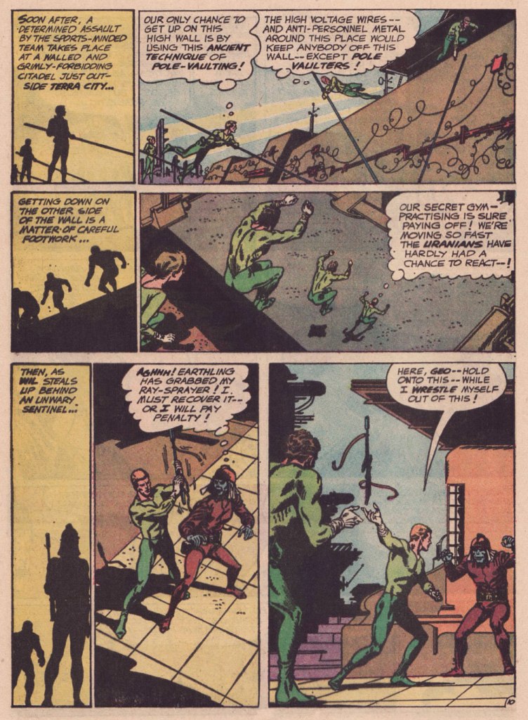
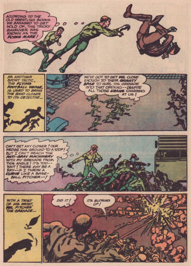
Are we getting less physically able with every succeeding generation, as our elders have been claiming for eons? Is it just a mistaken, shallow assessment arising from tone-deaf obduracy and bad faith — or have our forerunners all been correct about a general and ongoing decline?
« I was always concerned more with the visuals than with the copy — and the visuals had to be provocative! » — Infantino*, in a nutshell.
To recap, under the parameters I’ve set for this category a hot streak is a series of outstanding consecutive covers by a single artist (inkers may vary) on the same comic book title. Since it’s my party, I occasionally make allowances (e.g. allowing entry to a scruffier, but still presentable, specimen), but it’s more challenging and more fun to play it straight.
By my reckoning, there are very few truly great cover artists to begin with, and their output is often stifled by indifferent, incoherent or hostile art direction, poor lettering and colouring choices beyond the unfortunate artist’s control, lack of interest in the imposed subject matter… you get the picture. And there’s also the difficulty of getting a decent streak going when the editor keeps shuffling cover artists.
The artist in his suit and tie (and cigar!) days at DC.
I’ve gone on at length (I refer you in particular to Hot Streak: Nick Cardy’s Aquaman, Previously) about the gargantuan amount of work Carmine Infantino (1925-2013) knocked out conceiving comic book covers during his executive years at DC (1966-75), but most of his best designs were executed by others. I mean the man was already doing the work of five people, what more could he do?
« At DC Comics, I worked round the clock, including weekends, and never taking a vacation in the 10 years I served there. I not only was creating new titles, designing most of the covers, plotting stories and going on the road for the distribution of the magazines, plus doing radio shows and then running out to California to be totally included with Puzo and the producers creating the Superman movies I &II. Time got so tight that I would design covers on the way to the airport and have the driver deliver them to Sol Harrison, who in turn gave them to the waiting artists. I would be at my desk from 7 a.m. to 9 p.m. It began to be a destructive grind. »
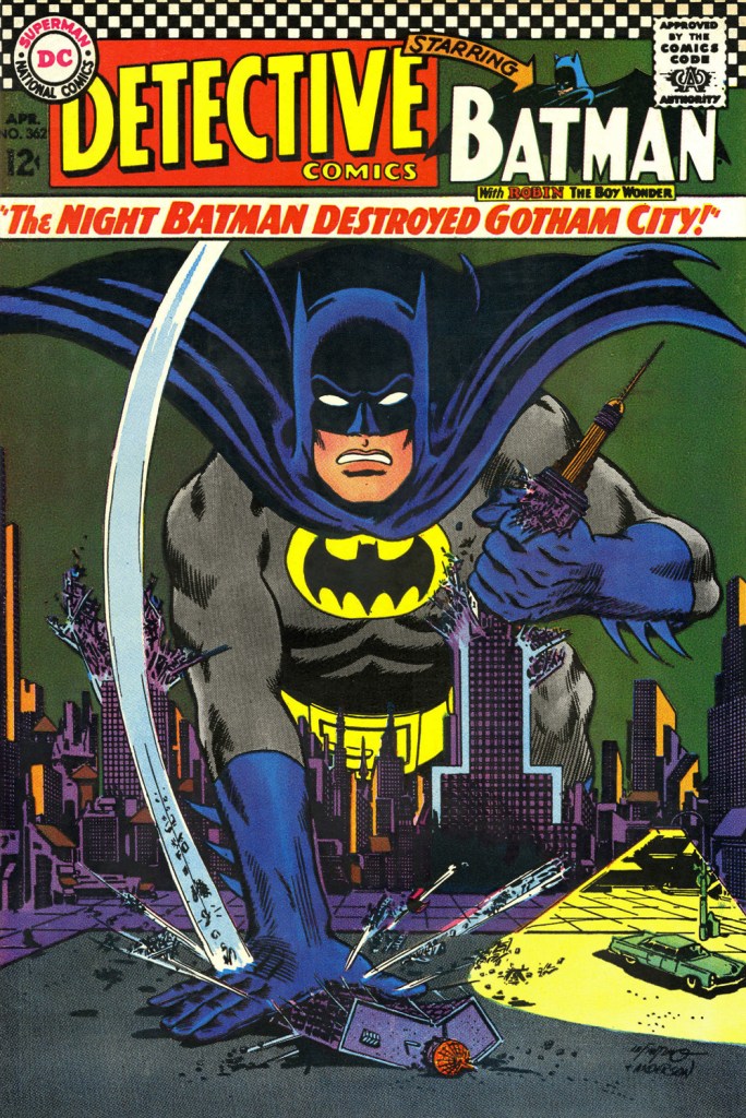
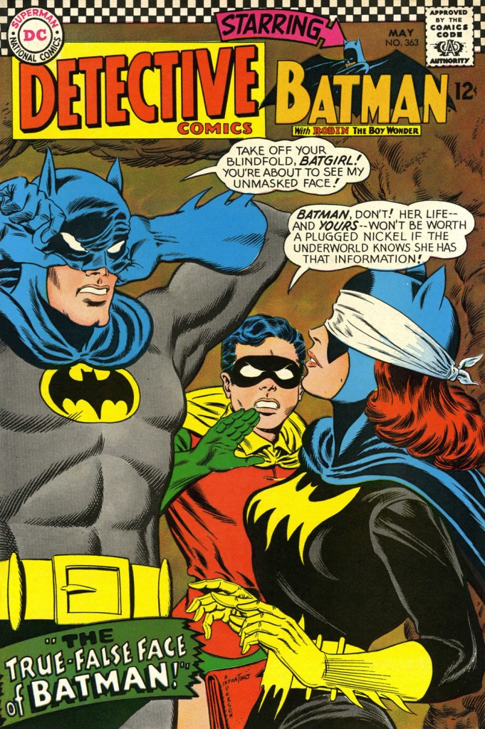
While Carmine is most closely associated with Silver Age characters The Flash and Adam Strange, I couldn’t discern, in these titles, a run of sufficiently stellar *and* consecutive covers (Flash nos. 139-142 and Mystery in Space nos. 69 to 71 come closest… do bear in mind that I have no consideration for ‘key’ issues or ‘famous’ or ‘event’ covers). It’s no real surprise that Infantino’s design work rose to a crescendo of accomplishment and consistency when he was made the company’s de facto art director, late in 1966. And what was he working on at the time? Batman. So, since Detective no. 261 bears a ho-hum cover and no. 269 is pretty spiffy, but the work of Gil Kane, here’s Mr. Infantino’s hot streak:
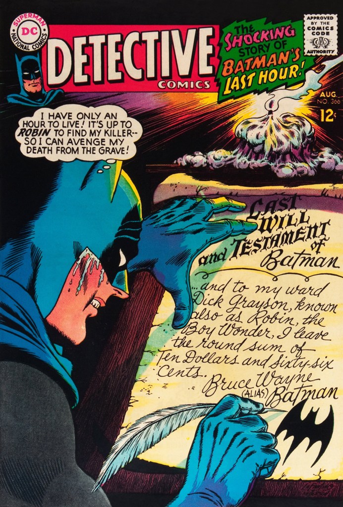
This is Detective Comics no. 362 (Apr. 1967, DC), pencilled by Infantino and inked by Murphy Anderson. Carmine wasn’t a fan of the so-called ‘Go-Go Checks’, that checkerboard pattern that once famously adorned those distinctive yellow NYC cabs. He didn’t mince words, either: « What a ridiculous thing: it was the stupidest idea we ever heard because the books were bad in those days and that just showed people right off what not to buy. ». Certainly, in the case of Detective Comics, they left the top of the page far too cluttered.This is Detective Comics no. 363 (May 1967, DC), featuring (this) Batgirl‘s second appearance. She’d been created by editor Julius Schwartz and Infantino at the request of the hit Batman TV show‘s producers, figuring that the series needed a heroine for a little extra spice. Art by Infantino and Anderson.This is Detective Comics no. 364 (June 1967, DC). Roy Reynolds, alias The Getaway Genius, was a fun civilian villain whose finest hour, in my view, came at the tail end of 1973 with Batman no. 254‘s King of the Gotham Jungle! (written by Frank Robbins, pencilled by Irv Novick and inked by Dick Giordano), when he was unexpectedly caught between the Batman and the Man-Bat. I wouldn’t be surprised to learn that a Batmaniac or three had reconstructed this Joker edifice in their backyard or basement, out of Lego blocks or papier mâché… or actual bricks.
Carmine really went to town on this one, and it’s rightly earned its place in the hall of classics. This is Detective Comics no. 365 (July, 1967, DC). The cover story, The House the Joker Built! is scripted by John Broome, pencilled by Bob Kane ghost Sheldon “Shelly” Moldoff and inked by Joe Giella.Speaking of design, here’s the masterful Ira Schnapp‘s house ad for Detective 365, as it appeared in Green Lantern no. 54 (July, 1967, DC), among other titles.This is Detective Comics no. 366 (Aug. 1967, DC); I love those moody colours and light effects, that tell-tale Infantino candle and the mysteriously parsimonious inheritance bequeathed to Robin.This is Detective Comics no. 367 (Sept. 1967, DC), an intriguing preview of Where There’s a Will — There’s a Slay!, written by Gardner Fox, pencilled by Infantino, inked by Sid Greene. I wonder how many young readers enthusiastically destroyed the cover to assemble the puzzle…
Note also the improved logo placement (a return to issue no. 327 original ‘new look’ logo, actually), giving the layout a chance to… breathe a bit better. The Batman cameo at top left is still de trop.
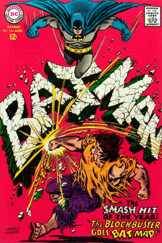
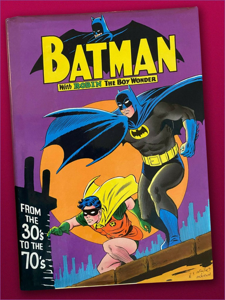
This is Detective Comics no. 368 (Oct. 1967, DC). Infantino reportedly created the covers first, and editor Schwartz assigned his writers to work up a scenario to fit. This one could not have been a cakewalk. Gardner Fox was the unlucky recipient of that gargantuan task.Since it’s not an issue of Detective, this cover’s not *technically* part of the streak… but as it features Batman, and it appeared between issues 365 and 366 of Detective, I’m throwing it in. Infantino and Anderson’s literal and figurative blockbuster of a cover for Batman no. 194 (Aug. 1967, DC). Its cover aside, a pretty ho-hum issue. The book and the character were in urgent need of another overhaul, and it was just around the corner. « When Donenfeld saw this cover, he had a fit! He said, ‘I don’t see the logo on top!’ I said ‘You don’t have to — you’ve got Batman up there!’ »Aw, heck — here’s Ira Shnapp’s accompanying house ad, a work of art in itself, wouldn’t you agree?Speaking of immortal Infantino Batman images: « Aurora wanted action shots of their models, so I did this rough layout, sent it to them, and they liked it! I had a moon behind him, but they dropped it. The tree created the design. I was very high into design at this point (1964) — the design was pouring out of me! ». Here’s a look at the finished model.I couldn’t very well leave out what’s possibly the most famous of Carmine’s Bat-scenes: this is Batman From the 30’s to the 70’s (1971, Crown Publishers) a splendid hardcover anthology. Its cover adapts an Infantino-Anderson mini-poster that originally saw print in Detective Comics no. 352 (June 1966, DC) and bore instead the inscription « Best Bat-Wishes Batman and Robin ». Superman, Wonder Woman and Captain Marvel, er… ‘Shazam’ also got their own historical anthology in this format.
-RG
*unless otherwise specified, most Infantino quotes are drawn from his excellent, profusely visual 2001 autobiography (with J. David Spurlock), The Amazing World of Carmine Infantino (Vanguard Publishing).
« Let’s just say you weren’t born to be an octopus… only a poor fish! »
Salutations on this most diverting day of the week, Tentacle Tuesday! Today, we take a little trip to the 60s… but perhaps not the 60s as you remember them, those who were around back then.
Rip Hunter… Time Master no. 3 (July-August 1961); pencils by Ross Andru, inks by Mike Esposito.
Rip Hunter was created by Jack Miller and Ruben Moreira – the “Time Master” part is explained by Hunter’s invention, the Time-Sphere, that allows him (obviously) to travel through time. Other characters in Rip’s world include his girlfriend, Bonnie Baxter, and Bonnie’s kid brother Corky (who’s being grabbed by a tentacle on this cover). Maybe Corky was spotted as an imposter because he’s wearing jeans instead of yellow pantaloons? Fashion can be quite goofy in some of these far-away, long-long-ago kingdoms…
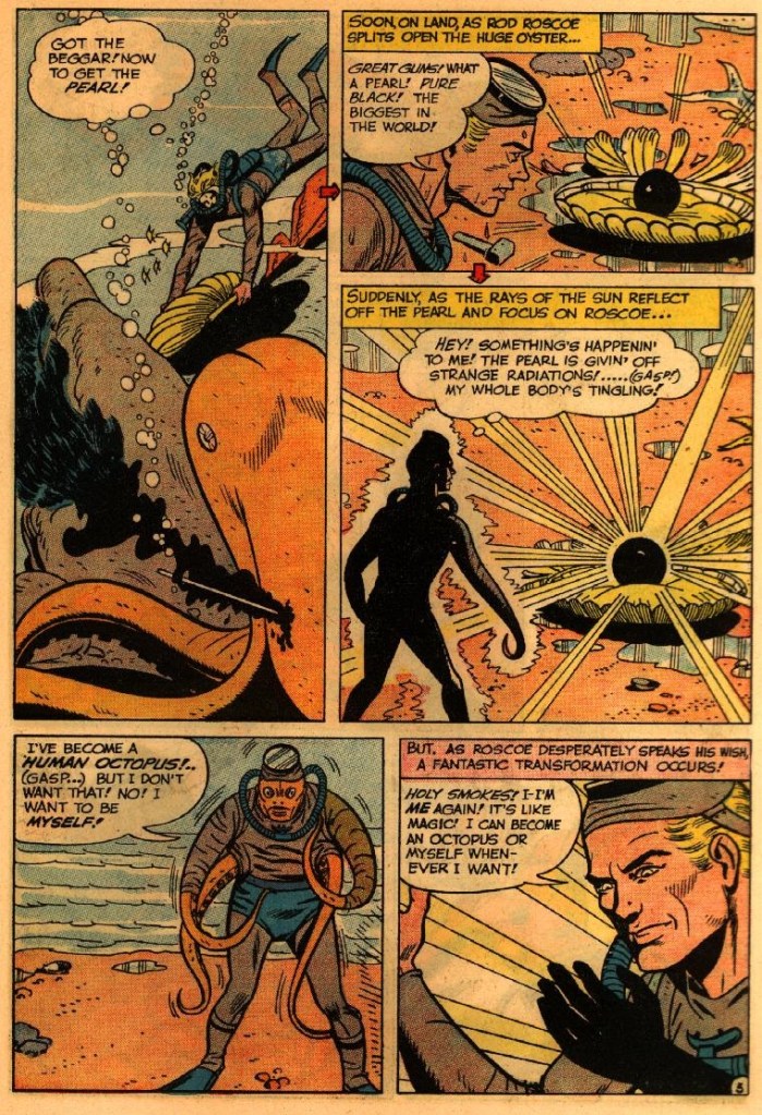
Page from The Duke with the Creature Powers, scripted by Jack Miller, pencilled by Ross Andru and inked by Mike Esposito.
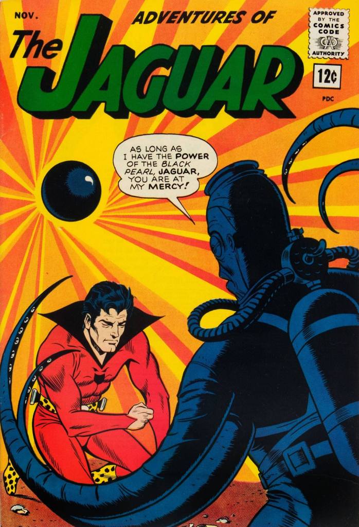
When The Jaguar gets into trouble with The Human Octopus, you know the Jag is going to come up trumps, mostly due to the fact that he has all powers of the animal kingdom at his disposal, whereas the Octopus has to make do with some unconvincing tentacles and an evil stare. The Jaguar (or zoologist Ralph Hardy, in his everyday life) was created by Robert Bernstein and John Rosenberger as part of Archie’s “Archie Adventure Series”.
This is the last issue of this series: Adventures of the Jaguar no. 15 (November 1963, Archie), with a cover by John Giunta.
Some fodder for your nightmares? Of course!
Who wouldn’t want to become a HUMAN OCTOPUS!…? The Jaguar versus the Human Octopus! was scripted by Robert Bernstein and illustrated by John Giunta.
I believe Hawkman needs no introduction (although I will mention that he was created by Gardner Fox and Dennis Neville!), and we don’t have time for one, anyway, seeing as he’s currently stuck between a dragon and some tentacled nest-creature.
JLA’s roster has rotated throughout the years, but for the sake of this post, only the seven original members will get cephalopod tussling privileges! Here they are, with the conspicuous absence of Batman and Superman who are no doubt rushing behind the scenes to rescue everybody (but don’t worry, we’ll get to them as well):
The Brave and Bold no. 28 (February-March 1960, DC). Cover pencilled by Mike Sekowsky and inked by Murphy Anderson.
I’ll start with Superman, otherwise he’ll get offended – you know how susceptible he can be. Rather, a double whammy of Superman and Flash, who stumble upon some rather adorable (aside from their propensity to eating people) tentacled aliens. Of course our superheroes decide to make a race out of it, because concentrating on saving some planet or other is clearly not exciting enough – and Batman just happened to be hanging around to give the starting signal. Some afternoons are just that quiet. Race to Save the Universe!, scripted by Denny O’Neil, pencilled by Dick Dillin and inked by Joe Giella, was published in World’s Finest Comics no. 198 (November 1970, DC).
Nevertheless, this dynamic duo does allow itself to get distracted from its marathon, just long enough to defeat this green cutie:
Don’t underestimate kittens.
Incidentally, Superman already has a Tentacle Tuesday all to himself (Tentacle Tuesday: It’s a Bird! It’s a Plane! It’s a Tentacle!) Still, here he is collaborating (more like ‘rescuing’) Jimmy Olsen from an intriguing green (why must they always be green?) monstrosity with worm-like tentacles. Ugh, not the most appealing. These pages are from The Voyage of the Mary Celeste II!, scripted by Jerry Siegel, pencilled by Curt Swan and inked by George Klein and published in Superman’s Pal, Jimmy Olsen no. 75 (March 1964, DC).
DC’s “Big Three” – its most iconic and popular – are of course Superman, Batman and Wonder-Woman. As far as the latter is concerned, as much as I love this character, seeing as we already have two Tentacle Tuesdays posts in her honour – Tentacle Tuesday: H.G. Peter and Wonder Woman lend a hand and Tentacle Tuesday: More Golden Age Wonder Woman Wonders! – I think I’ve said everything I had to say on the subject. Thus, we move on to Batman, albeit briefly because there is also Tentacle Tuesday: All Aboard the Batmarine! to peruse. He’ll have to share the stage with Superman, but I’m sure he’ll be a good sport about it.
World’s Finest Comics no. 110 (June 1960, DC). Pencilled by Curt Swan and inked by Sheldon Moldoff.
The cover story is The Alien Who Doomed Robin, scripted by Jerry Coleman and inked by Sheldon Moldoff.
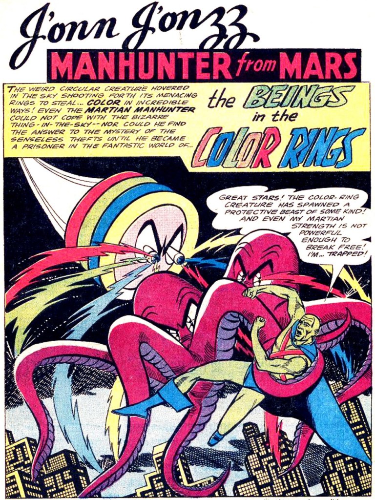
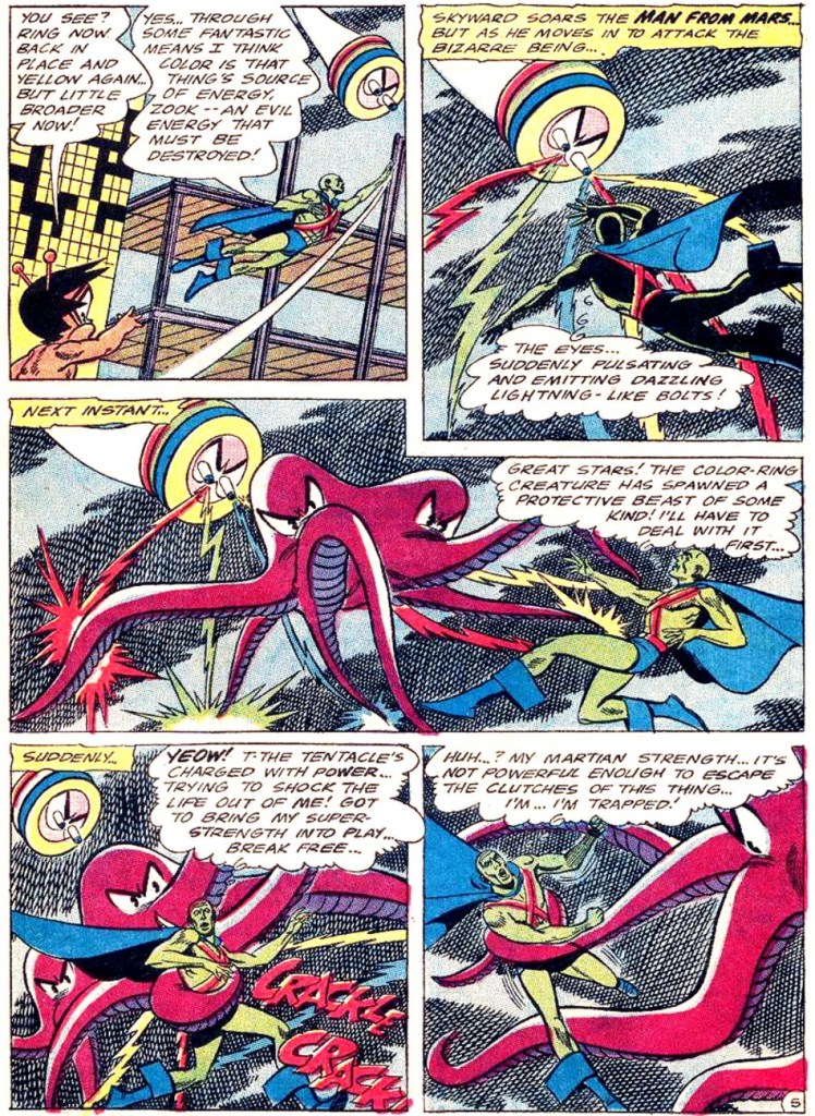
Our next JLA member is the Martian Manhunter, whom I have a strange soft spot for. It’s well known that girls just can’t resist green skin! In honour of this bias, here are not one, but two excerpts from stories featuring tentacles front and centre.
First, two pages from The Beings in the Color Rings, scripted by Dave Wood and illustrated by Joe Certa, published in House of Mystery no. 148 (January 1965, DC).
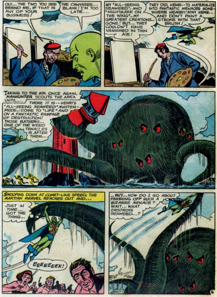
And for dessert, a page from The Supernatural Masterpieces!, scripted by Dave Wood and illustrated by Joe Certa, published in House of Mystery no. 150 (April 1965, DC).
Naturally, Aquaman has encountered more than a handful of octopuses in his long undersea career – I went on about that in some length in Tentacle Tuesday: Aquaman and his Octopus Sidekicks. I have plenty more where that came from, so there surely be a part II to that particular tale… in the meantime, here is a rather striking cover that didn’t make it into that post.
The Brave and the Bold no. 73 (August-September 1967, DC). Cover pencilled by Carmine Infantino and inked by Charles Cuidera.
The cover story is Glag the Destroyer, scripted by Bob Haney, pencilled by Howard Purcell and inked by Sal Trapani.
Last… and maybe least, because I could never warm up to him… is Green Lantern. The following pages are from a story pencilled by Gil Kane, who doesn’t generally get glowing reviews from WOT. Nevertheless co-admin RG wrote an ingenious post combining our common dubiousness about Kane and percolated it through specifically Green Lantern covers – the result is Hot Streak: Gil Kane’s Green Lantern, which impressed, if not quite convinced, me.
Funny Thing Happened on the Way to Earth!, scripted by John Broome, pencilled by Gil Kane and inked by Vince Colletta, was published in Green Lantern no. 70 (July 1969, DC).
I hope you enjoyed this overview of the Justice League of America as filtered through the rather eccentric lens of tentacles.
« Jerry Grandenetti started out ghosting The Spirit, and nobody… NOBODY… captured the spirit of The Spirit better. Not content to stay in Will Eisner’s shadow forever, he forged his own unique style leading to a highly successful comics career lasting decades. » — Michael T. Gilbert
Since my very first encounter with his work, Jerry Grandenetti (1926-2010; born ninety-five years ago today, another Thursday April 15th) has endured as one of my true artistic heroes. But he’s not celebrated much at all.
Though he’s worked extensively on The Spirit, he’s treated as a bit of a footnote in the Eisner hagiography. His DC war work is well-regarded, but he’s inevitably overshadowed by the Joe Kubert – Russ Heath – John Severin trinity. Besides, by and large, the war comics audience doesn’t overlap much with the spandex long johns crowd. Grandenetti has only very occasionally and timidly dipped a toe into the super-heroics fray, and he was far too unusual for overwhelming mainstream acclaim.
In fact, aside from the couple of converts I’ve made over the years, I can only think of three fellow torch-bearing aficionados: Michael T. Gilbert (who digs best the early, Eisner-employed Jerry); Stephen R. Bissette (who favours the spooky 60s and 70s work); and Don Mangus, who’s most into the DC war stuff. I daresay I enjoy it all, but my taste is most closely aligned with Mr. Bissette’s on this particular point. Let’s sample a bit of everything, insofar as it’s feasible to sum up a career spread out over five decades… in a dozen-or-so images.
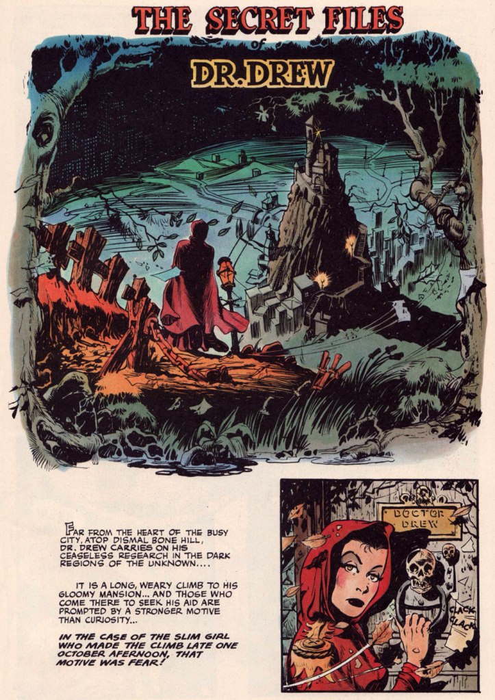
Opening splash from The Secret Files of Dr. Drew: Sabina the Sorceress, written by Marilyn Mercer and lettered by Abe Kanegson, from Rangers Comics no. 56 (Dec. 1950, Fiction House); this version hails from a reprint (Mr. Monster’s Super Duper Special no. 2, Aug. 1986, Eclipse) using the surviving original art; it was recoloured by Steve Oliff.
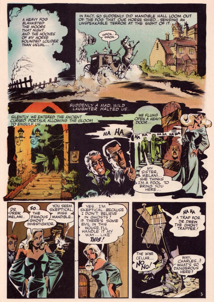
Page 3 from The Secret Files of Dr. Drew: Curse of the Mandibles!, written by Marilyn Mercer and lettered by Abe Kanegson, from Rangers Comics no. 55 (Oct. 1950, Fiction House); this version hails from a reprint (Doc Stearn… Mr. Monster no. 4, Dec. 1985, Eclipse) using the surviving original art; it was most tastefully recoloured by Steve Oliff.
In 1954, the powers-that-be at National Periodical Publications (you know, DC) gave Grandenetti some latitude to experiment with their War covers. Grandenetti produced an arresting hybrid of painted and line art. The process involved a grey wash painting that was photostatted, with flat colour laid over the resulting image. The first few attempts yielded striking, but nearly monochromatic results. A bit farther down the pike, the production department got more assured in its technical exploration.
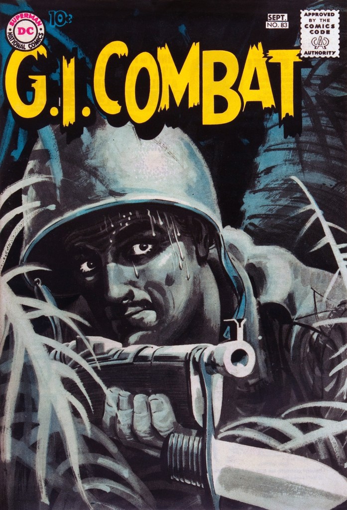
This is G.I. Combat no. 77 (Oct. 1959, DC); wash tones and colouring by Jack Adler, who recalled, in a 1970s interview: « It was suggested that we start doing washes for covers, and we were talking about doing it for so damned long, but nobody attempted it. I think Grandenetti did the first one, an army cover with someone floating in the water. I think that was the first wash cover that was done. That one ended up looking like a full color painting. »
This is G.I. Combat no. 83 (Aug.- Sept. 1960, DC); wash tones and colouring by Jack Adler. In 1995, Robert Kanigher, Grandenetti’s editor on the DC war books and a frequent collaborator, recalled: « Jerry liked to experiment and I had to sit on him to get him to stop it. Especially in his covers, which were outstanding, when I forced him to draw as realistically as possible. »
Original art from The Wrath of Warlord Krang!, smothered in dialogue and exposition by Stan Lee, from Tales to Astonish no. 86 (Dec. 1966, Marvel); inks by Bill Everett. Namor‘s constant random shouts of ‘Imperius Rex!‘ make him sound like a sitcom character with Tourette’s. As far as I’m concerned, it’s possibly been the most annoyingly asinine slogan in comics since Stan stole ‘Excelsior!‘ from Jean Shepherd.
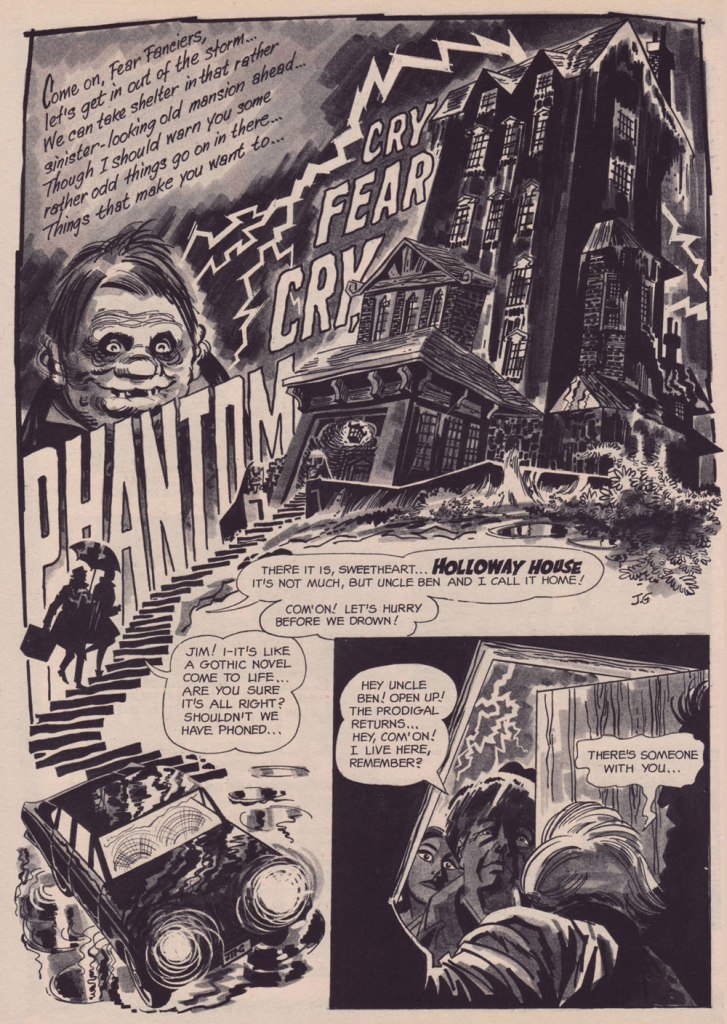
The opening splash from Cry Fear, Cry Phantom, written by Archie Goodwin, from Eerie no. 7 (Jan. 1967, Warren). In the mid-60s, presumably tiring of being pigeonholed as a war artist at DC, Grandenetti made the publishers’ rounds, doing a bit of work for Tower, Gold Key, Charlton, Marvel, Cracked (check it out here) and most memorably Warren where, after ghosting a few stories for Joe Orlando, he unleashed his innovative expressionistic style.
DC was generally hesitant to entrust its more established properties to the more “out there” artists. In the cases of Grandenetti and Carmine Infantino, the solution was to match them with the weirdness-dampening inks of straight-arrow artist Murphy Anderson. And you know what? It did wonders for both pencillers and inker.
This is The Spectre no. 6, October, 1968. A tale told by Gardner Fox (and likely heavily revised by hands-on editor Julius Schwartz, a man who loved alliterative titling) and superbly illustrated by the Grandenetti-Anderson team. Steve Ditko aside, Jerry Grandenetti had no peer in the obscure art of depicting eldritch dimensions (you’ll see!)
Page 13 from Pilgrims of Peril! written by Gardner Fox, from The Spectre no. 6 (Sept.- Oct. 1968, DC); inked by Murphy Anderson. Dig the salute to a trio of real-life spooky writers, all of whom editor Julius Schwartz knew well, having even served as Lovecraft’s literary agent late in the man’s life. By the tail end of the 1960s, Lovecraft’s work was finally making some commercial inroads, thanks largely to Arkham House co-publisher Derleth‘s unflagging diligence.
Page 22 from Pilgrims of Peril! written by Gardner Fox, from The Spectre no. 6 (Sept.- Oct. 1968, DC); inked by Murphy Anderson.
Page 2 from Men Call Me the Phantom Stranger, written by Mike Friedrich, from Showcase no. 80 (Feb. 1969, DC); inks by Bill Draut. This story reintroduced an obscure character from the early 50s, which Grandenetti had drawn a couple of times during his six-issue run. The Phantom Stranger has remained active ever since, but most writers (save Alan Moore, wouldn’t you know it?) don’t really know what to do with him. This, however, is my very favourite PS appearance. Draut, a slightly old-fashioned penciller by this time was, as a slick inker, a wonderful fit for Grandenetti’s confidently loopy layouts.
Page 3 from The Haunting!, written by Jack Oleck, from House of Mystery no. 183 ((Nov.-Dec. 1969, DC). Grandenetti pencils and inks: undiluted!
Page 2 from Eyes of the Cat, written by Robert Kanigher, from House of Mystery no. 189 (Nov.-Dec. 1970, DC); inks by Jerry’s fellow Will Eisner ghost Wallace Wood. The inspired combination of Grandenetti’s adventurous layouts and the velvety unctuousness of Wood’s finishes are a match made in heaven, but one Woody wasn’t fond of. Oh well.
So there you are. Just the tiniest tip of the iceberg. Happy birthday, Mr. Grandenetti!
« It was exactly an assembly line. You could look into infinity down these rows of drawing tables. » — Gil Kane
Some of our more sensitive readers may have noticed that we’ve been none too gentle with Gil Kane (1926-2000) in the past, dealing him some rather rough lumps at times. But that’s not the whole story: in taking stock of such a protracted and prolific (dare I say profligate?) career as his, much of it inevitably spent on autopilot, one must be discerning. In other words, I like some of Kane’s work, but there’s plenty of it I don’t care for. Still, WOT’s rule of thumb is that if we altogether loathe an artist and/or his work, we’ll just turn a blind eye.
And speaking of the sense of sight, what makes a great comic book cover? Must be my art school training and subsequent work in advertising tipping the scales, but to me, design and layout reign primordial as ingredients… as values. I’m often dismayed at many a would-be critic’s apparent method of assessing an image’s artistic worth, namely: how many popular characters does it feature? Is it action-packed? Is the issue sought-after and expensive? Does it feature a famous character’s début? Is it drawn by a fan-favourite artist who unquestionably can do no wrong… because he’s a fan-favourite artist who unquestionably can do no wrong? (and how dare you claim otherwise!)
Gil Kane reportedly generated around eight hundred covers for Marvel in the 1970s… of all levels of craft and quality. With that kind of frenzied output, it’s impressive that most were perfectly serviceable, given that there certainly was no time for meticulous, sober planning. They were generally over-captioned (not Kane’s fault!) and crassly sensationalistic, but that’s what Marvel sought and settled for.
It’s a shame that Kane and his former classmate at the School of Industrial Art (back in the early 40s!), DC lynchpin Carmine Infantino didn’t get on too well, because their Silver Age collaborations had a special spark… must have been the animosity. It had been noted by the DC brass, as early as the late 50s, that Carmine’s covers reliably caught prospective buyers’ attention and dimes. And so, by 1967, he was unofficially designing most of the publisher’s covers, and certainly the covers of all titles edited by Julius Schwartz. Green Lantern was among these.
So we turn today’s spotlight on a hot streak of seven. Kane gets his name in the title, but it would be more accurate to say they were Infantino-designed, Gaspar Saladino-lettered, Jack Adler-coloured, Gil Kane-pencilled and Murphy Anderson and Sid Greene-inked covers. The streak begins after Green Lantern no. 54’s downright poor cover, and ends with the interruption of Kane’s impressively long run of consecutive issues.
We begin with Green Lantern no. 55 (Sept. 1967, DC). Harmonious, easy-to-parse arrangement of numerous elements and exemplary integration of text. Design by Infantino, pencils by Kane, inks by Murphy Anderson, lettering by Gaspar Saladino, colours by Jack Adler. Oh, and lest we forget: logo designed by Ira Shnapp (circa 1964), classic Green Lantern uniform designed by Kane (circa 1959).
This is Green Lantern no. 56 (Oct. 1967, DC). Kane was never much for varying his monsters (see below). Pencils by Kane, inks by Anderson.
For a bit of comparison on how things were done from company to company, this is Tales to Astonish no. 91 (May, 1967, Marvel). This is what happens when there’s no planning or attention to detail: in an already-crowded cover, did we really need that ugly box advising us of the presence of The Abomination? He’s right there! (maybe the abomination refers to the cover itself). And the foreshortening nightmare that is the baddie’s left arm was so dire that, when a fan commissioned Arthur Adams to produce a recreation of this cover (which, things being as they are, many surely consider ‘iconic’)… he wisely corrected the anatomy and tweaked the poor composition. Interesting how Marvel’s heavy-fingered yes-man, art director John Romita Sr., was always game to “fix” Ditko and Kirby art, but saw nothing wrong with this one.
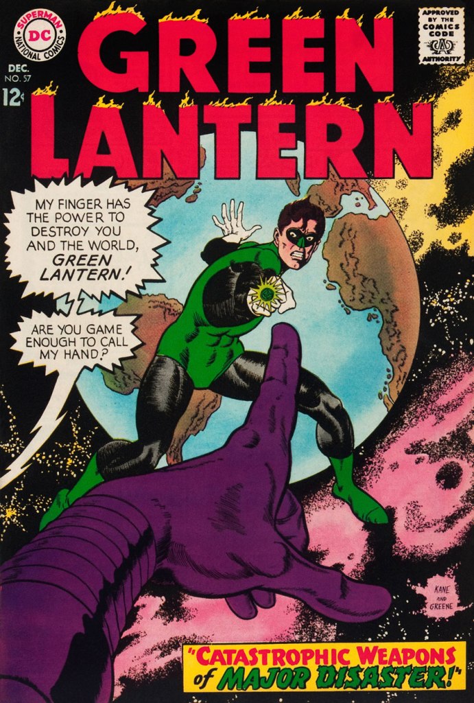
This is Green Lantern no. 57 (Dec. 1967, DC), featuring Catastrophic Weapons of Major Disaster!, written by Gardner Fox, pencilled and inked by Kane. Cover by Kane and Greene… love the placement of the signatures!
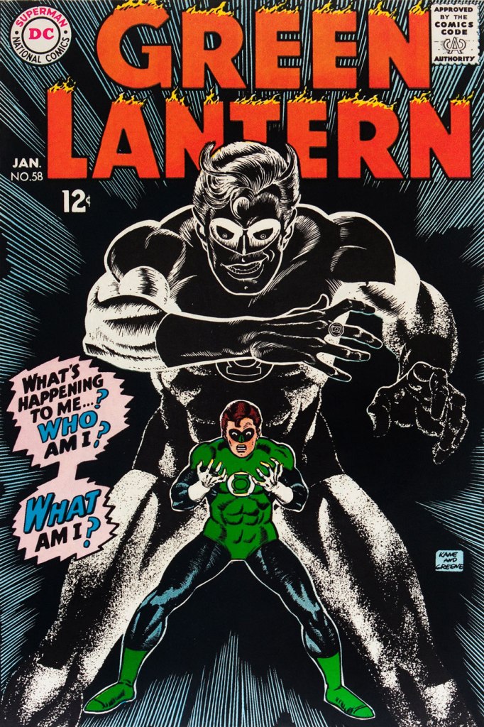
This is Green Lantern no. 58 (Jan. 1968, DC), featuring Peril of the Powerless Green Lantern! (a Julius Schwartz title if there ever was one), written by Gardner Fox, pencilled by Kane and inked by Greene. I’m not overly fond of the Kane-Greene mix, but Sid Greene, as a penciller-inker did some splendid work on the Star Rovers series (1961-64), co-created and scripted by Gardner Fox.
An issue whose price few can afford unless they bought it off the racks, this is Green Lantern no. 59 (March 1968, DC); pencils by Gil Kane, inks by Murphy Anderson. Featuring the introduction of GL alternate Guy Gardner, who was to be dubiously re(jack)-booted in the 1980s, by Steve Englehart and Joe Staton, as a jackass with an ugly uniform and a worse haircut. Never mind the fact that the Green Lantern Corps would never bestow power and stewardship on such an immature and pompous loose cannon.
This is Green Lantern no. 60 (April 1968, DC); an evident Infantino design, with pencils by Kane and inks by Anderson… which interestingly ends up producing a prototype of Brian Bolland‘s distinctive style… a decade early.
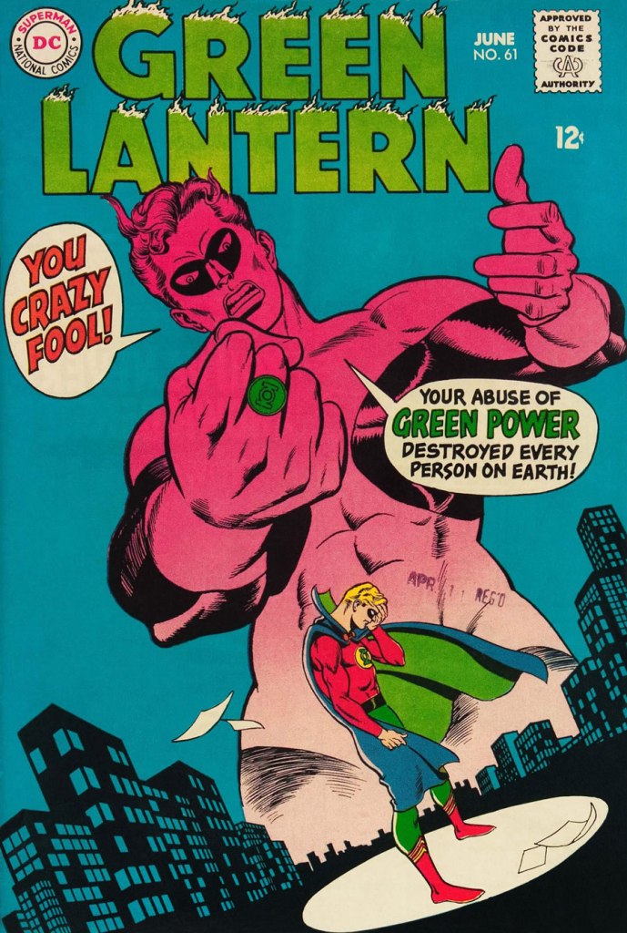
This is Green Lantern no. 61 (June 1968, DC); pencils by Kane, inks by Greene, and featuring (groan) Thoroughly Modern Mayhem!, scripted by Mike Friedrich, pencilled by Kane and inked by Greene. Co-starring Alan Scott, the Golden Age Green Lantern.
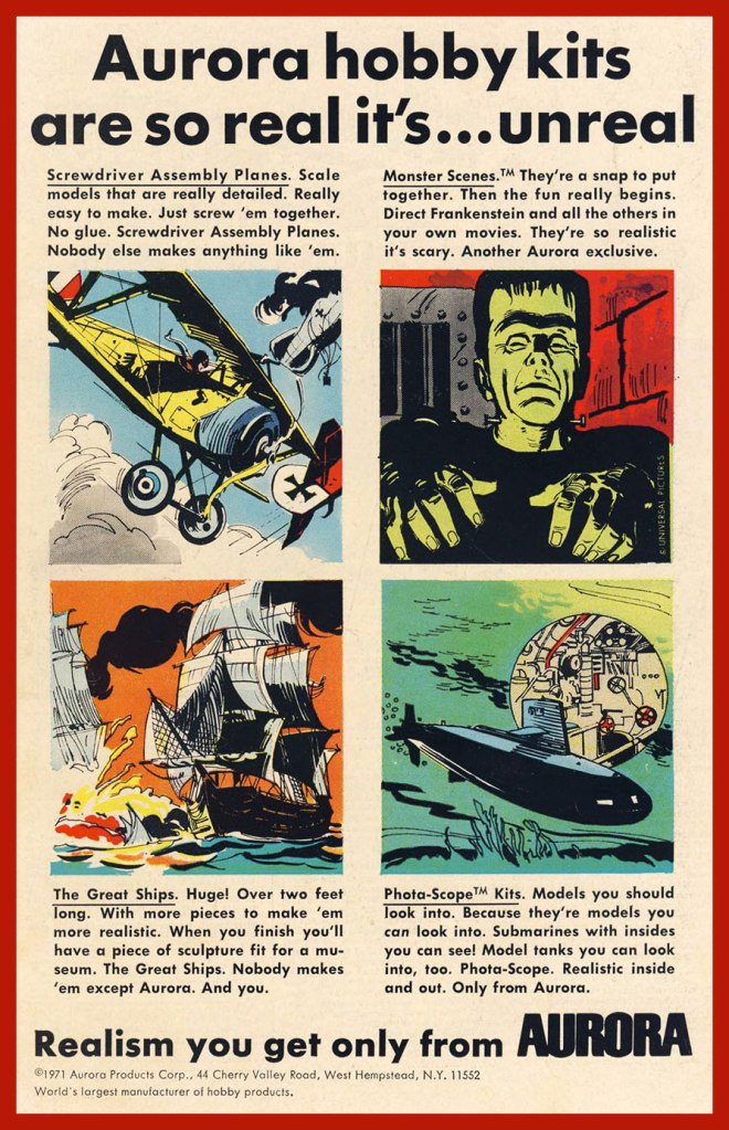
« The world will come to an end, but the monster models will still be around. » — James Bama, who went on to paint artwork for over twenty of Aurora’s kit boxes.
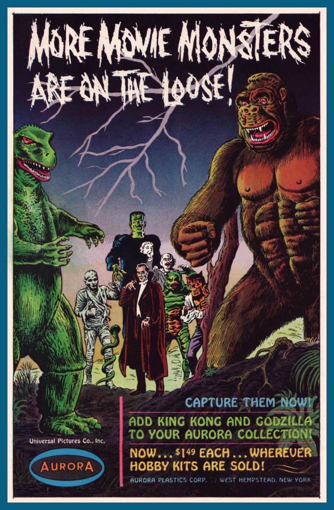
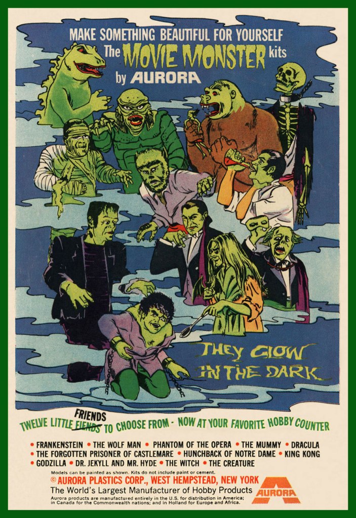
Well-executed comic book ads were often just as enticing (and sometimes more, depending on the title) as the contents proper. A prime example, this lovely Aurora Monster Kit campaign, announcing the epochal model maker’s forays out of the Universalménagerie of misunderstood fiends with Toho’s Godzilla and RKO’s King Kong.
The first Aurora monster model advertisement, it appeared in various DC Comics titles dated November and December, 1963.
The ad ran on the back cover of various DC titles in late 1964. In this case, House of Secrets no. 69 (Dec. 1964). The artwork is almost certainly that of Mr. Murphy Anderson, who goes uncredited, but is betrayed by the characteristic finesse of his inking.
A couple of the models that usually received considerably less attention got their turn in the spotlight in this ad that appeared on the back cover of select DC titles cover-dated October, 1965.
Incidentally, if you were wondering, indeed, the giant monsters cost more… 50 cents more. A bunch more empty bottles to collect, son.
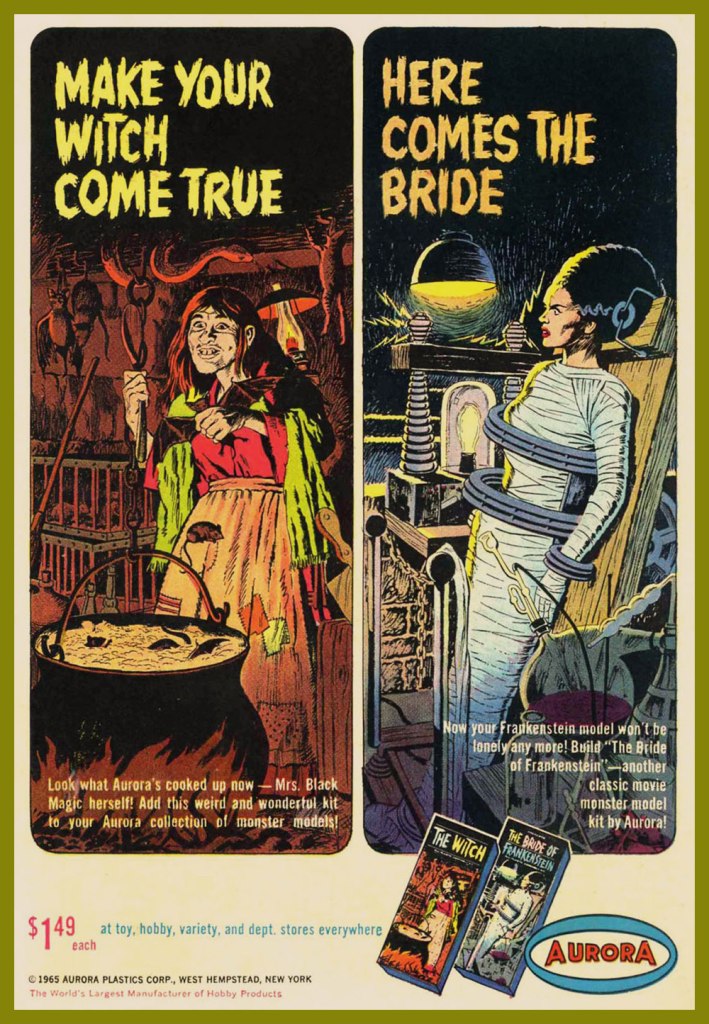
In the late ’60s, a new twist was added: phosphorescence! A cool idea, it however made painting the models, a tricky task to begin with, even less rewarding, as opacity was a bitch to achieve. It worked okay if you had mostly light-coloured The Mummy, but otherwise… This advert appeared on the back cover of DC Comics dated October, 1969… and thereabouts.
The Spring, 1970 collection.
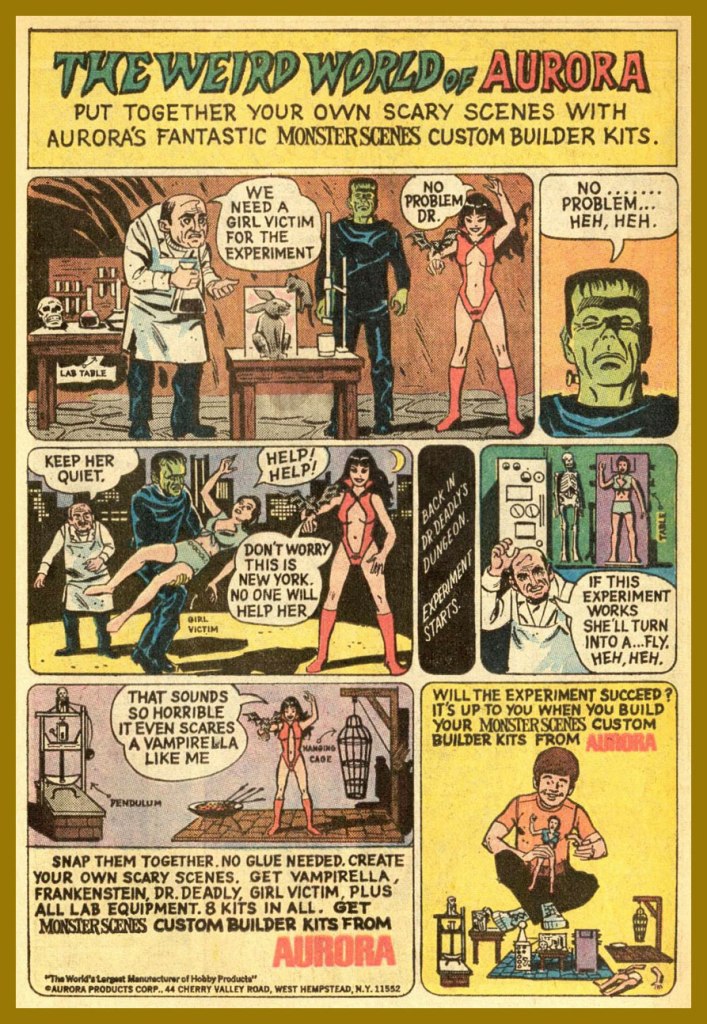
Here’s where Aurora’s close business relationship with Warren Magazines became most evident, with the appearance of a Vampirella model kit. Controversy ensued, once moms caught a glimpse of Junior’s new model kit, the heirloom of his bedroom. Speaking of controversy, Vampirella’s quip about New York was likely a barb about the infamous Kitty Genovese case. This pitch showed up in various DC titles, again, in and around June, 1971.
Warren sold a lot of Aurora kits via his mail order business, and a decision was made to include his character in the line rather than risk dissolving a partnership. Unpainted, she appeared to be virtually naked. Her counterpart, the Victim, sported hot pants and a halter top; a dress or flowing skirt was deemed impractical in order to have her fit on the torture rack.[ source ]
This beautifully-designed ad showed up in October, 1971 DC titles.
At this point, the diluted message is a hint that the bloom is off the rose. An ad from November, 1971.
As a bonus, here’s Big Frankie, the seldom-seen, long-unavailable Aurora grail (until its relatively recent reissue). As the largest Aurora model of all, BF fetched, at the time, an astronomical $4.98; now it goes for a hundred smackers, so don’t complain. Take a look at the big fella!
Though the original Aurora issues of these classic kits are mostly rare as hen’s teeth, enterprising contemporary kit companies have reissued these babies, and you now can actually afford to free the monsters from the confines of their box and assemble and paint ‘em. Mint in Box? Pfui!
« Even without the benefit of philosophical reflection, anyone who has spent some time in an enclosed space with an excited bat knows what it is to encounter a fundamentally alien form of life. » (Thomas Nagel, What is it like to be a bat?)
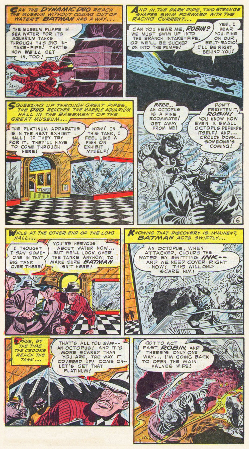
Bats and octopuses, now there’s a combination that doesn’t often occur in nature – while both are admirable, fascinating animals, they’re not linked by lifestyle or environment, and neither is the other’s prey. Batman, on the other hand, has definitely tangled with many tentacled monsters in his time (which proves that he’s not a bat). I’m sure today’s post didn’t unearth *all* the octopuses that Batman has had the pleasure of defeating, especially those of a more modern vintage (with mostly horrible art, which is why I’m not too worried)… but today’s selection, you will have to admit, is quite fair.
The Voyage of the First Batmarine!, scripted by Edmond Hamiton, pencilled by Dick Sprang and inked by Charles Paris, was published in Batman no. 86 (September 1954).
Bat-Mite Meets Mr. Mxyzptlk(he must be from Poland, with a name like that), scripted by Jerry Coleman, pencilled by Dick Sprang, and inked by Sheldon Moldoff, was published in World’s Finest Comics no. 113 (November 1960):
I totally squee-ed when I saw this panel.
Justice League of America no. 27 (May 1964), with the cover pencilled by Mike Sekowsky and inked by Murphy Anderson:
The inside story, The “I” Who Defeated the Justice League! is scripted by Gardner Fox, pencilled by Mike Sekowsky, and inked by Bernard Sachs:
Batman no. 357 (March 1983). Cover pencilled by Ed Hannnigan and inked by Dick Giordano:
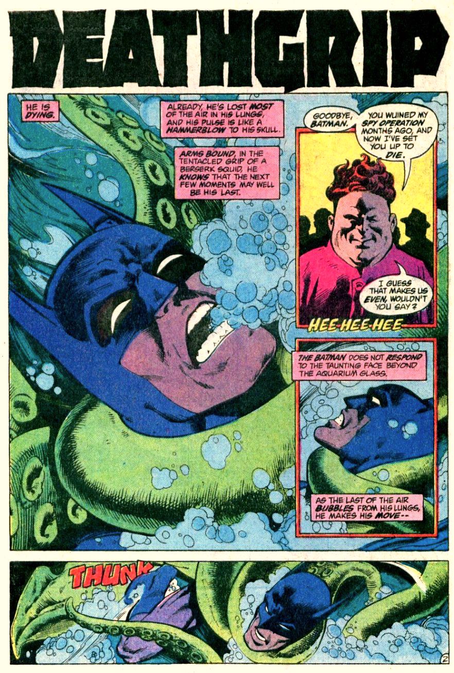
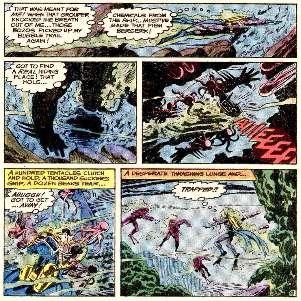
The cover story, Squid, is scripted by Gerry Conway, pencilled by Don Newton, and inked by Alfredo Alcala:
Since they threatened us with the continuation of the story, I followed up, and dug up more tentacles. Deathgrip, scripted by Gerry Conway, pencilled by Don Newton and inked by Dick Giordano, was published (as promised) in Detective Comics no. 524 (March 1983):
Enigma of the Death-Ship!, scripted by Bob Haney and illustrated by Jim Aparo, was published in The Brave and the Bold no. 142 (July-August 1978):
I mentioned modern comics, earlier – I’ve chosen two examples published relatively recently, with passable art.
The pompously titled Leaves of Grass, Part 3: Comedown!, scripted by Alan Grant, pencilled by Dave Taylor and inked Stan Woch, was published in Batman: Shadow of the Bat no. 58 (January 1997):
Knightmares, Part 4, scripted by Tom King and illustrated by Jorge Fornes, was published in Batman no. 66 (May 2019):
To conclude on a more pleasant note…
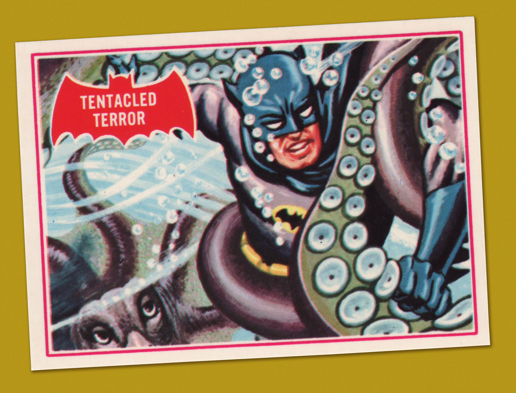
Tentacled Terror, number 8 in Topps‘ 1966 Batman ‘Red Bat’ trading card set, boasting painted artwork by Norman Saunders.
A favourite trope of tentacular obsession in comics is populating stories with monsters boasting exceptionally long arms (sometimes more than one pair) that they can wind around stuff with ease. In other words, monsters with tentacle forelimbs. You’d have to abstain from comics altogether to never encounter that of which I speak (or stick to slice-of-life comics, I guess). A little demonstration is in order.
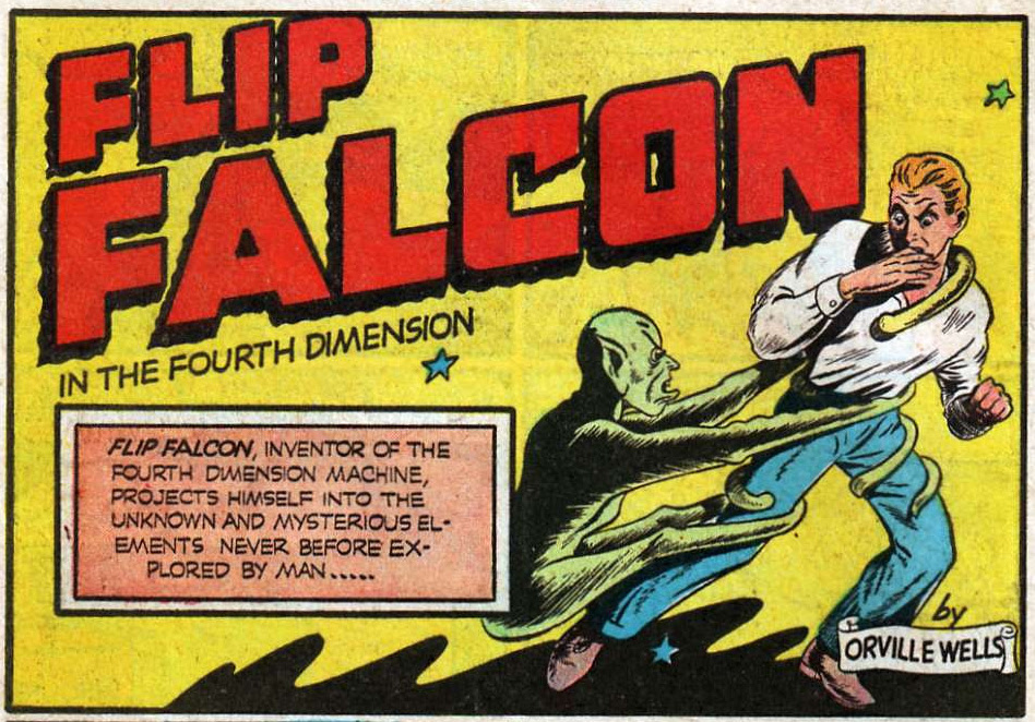
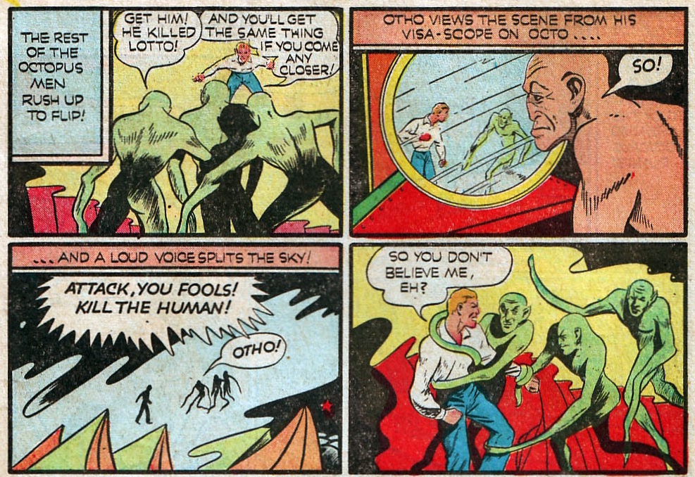
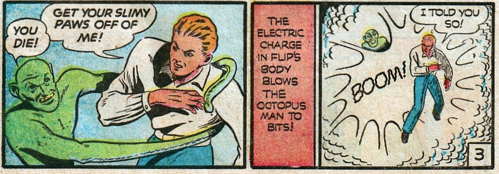
Here’s a trick question: what kind of being lives on planet Octo? Duh: Octo-men! The following Flip Falcon story, illustrated by Don Rico (and not “Orville Wells”, despite claims to the contrary), was printed in Fantastic Comics no. 17 (April 1941).
Interesting that “dog” is used as a slur even on planet Octo, despite there clearly being no canines around.
Nasty little brutes, aren’t they?
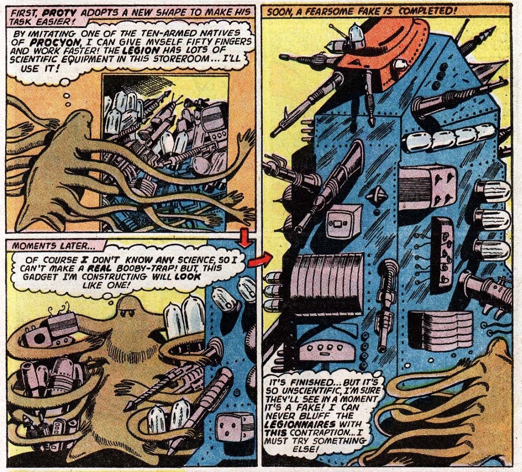
The Super-Tests of the Super-Pets! (scripted by Edmond Hamilton, penciled by John Forte and inked by Sheldon Moldoff) is every bit as goofy as it sounds. I actually enjoyed reading it, much to my own amazement. Anyway, while Proty II (Chameleon Boy’s pet) transforms into quite a few creatures to pass the super-test, he clearly favours tentacular forms (and who could blame him?) This was published in Adventure Comics no. 322 (July 1964).
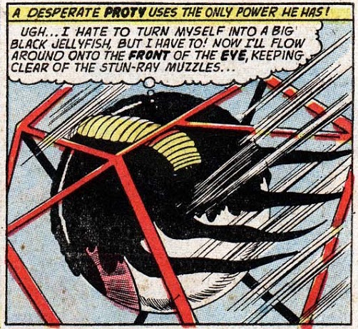
Speaking of Proty II and ectoplasm, a dozen issues later, the Legion decides to visit his home planet, which is just full of these jello-marshmallow doughboys, Protean citizens all. Part I: The Unknown Legionnaire and Part II: The Secret of Unknown Boy! (both parts scripted by Edmond Hamilton, penciled by John Forte and inked by Sheldon Moldoff) were published in Adventure Comics no. 334 (July 1965).
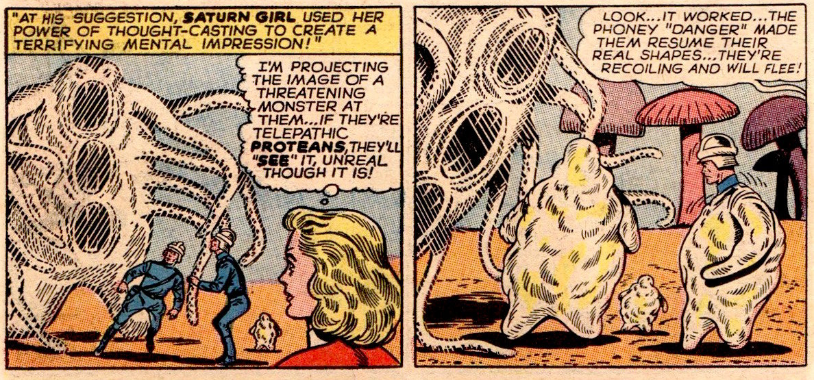
To terrify Proteans, whose appendages are borderline tentacles, Saturn Girl decides to conjure up a… monster with tentacles.
In case you didn’t believe me that Proteans have “tentacles”.
The shape-shifting Proteans turn into more streamlined versions of themselves, with more pronounced tentacles. I swear, everyone is obsessed.
Next, I’d like to regale you with a fight scene illustrated by Murphy Anderson (yum!): Scourge of the Human Race!, scripted by Gardner Fox and published in Hawkman no. 15 (August-September 1966).
Isn’t it a lovely last panel?
If I Can’t Be Clark Kent… Nobody Can!, published in Action Comics no. 524 (October 1981), scripted by Martin Pasko, penciled by Curt Swan and inked by Frank Chiaramonte, offers us a nice helping of tentacles.
If I should see an octopus Lift its arms out of the sea Or see its shadow rising up Cross the rooftops above the streets I’d follow those dancing limbs To the spinning edge of the sky Where all the boats fall off the world Into the octopus’s eye