« Jerry Grandenetti started out ghosting The Spirit, and nobody… NOBODY… captured the spirit of The Spirit better. Not content to stay in Will Eisner’s shadow forever, he forged his own unique style leading to a highly successful comics career lasting decades. » — Michael T. Gilbert
Since my very first encounter with his work, Jerry Grandenetti (1926-2010; born ninety-five years ago today, another Thursday April 15th) has endured as one of my true artistic heroes. But he’s not celebrated much at all.
Though he’s worked extensively on The Spirit, he’s treated as a bit of a footnote in the Eisner hagiography. His DC war work is well-regarded, but he’s inevitably overshadowed by the Joe Kubert – Russ Heath – John Severin trinity. Besides, by and large, the war comics audience doesn’t overlap much with the spandex long johns crowd. Grandenetti has only very occasionally and timidly dipped a toe into the super-heroics fray, and he was far too unusual for overwhelming mainstream acclaim.
In fact, aside from the couple of converts I’ve made over the years, I can only think of three fellow torch-bearing aficionados: Michael T. Gilbert (who digs best the early, Eisner-employed Jerry); Stephen R. Bissette (who favours the spooky 60s and 70s work); and Don Mangus, who’s most into the DC war stuff. I daresay I enjoy it all, but my taste is most closely aligned with Mr. Bissette’s on this particular point. Let’s sample a bit of everything, insofar as it’s feasible to sum up a career spread out over five decades… in a dozen-or-so images.
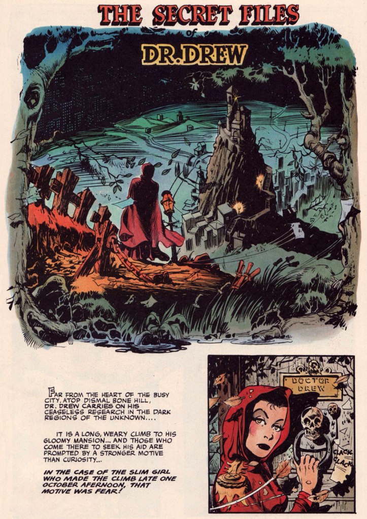
Opening splash from The Secret Files of Dr. Drew: Sabina the Sorceress, written by Marilyn Mercer and lettered by Abe Kanegson, from Rangers Comics no. 56 (Dec. 1950, Fiction House); this version hails from a reprint (Mr. Monster’s Super Duper Special no. 2, Aug. 1986, Eclipse) using the surviving original art; it was recoloured by Steve Oliff.
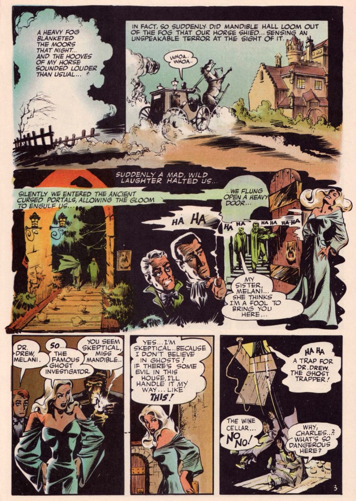
Page 3 from The Secret Files of Dr. Drew: Curse of the Mandibles!, written by Marilyn Mercer and lettered by Abe Kanegson, from Rangers Comics no. 55 (Oct. 1950, Fiction House); this version hails from a reprint (Doc Stearn… Mr. Monster no. 4, Dec. 1985, Eclipse) using the surviving original art; it was most tastefully recoloured by Steve Oliff.
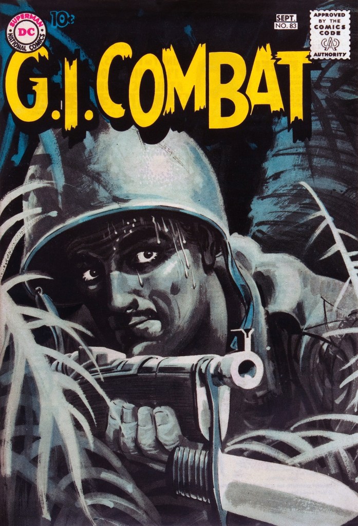
In 1954, the powers-that-be at National Periodical Publications (you know, DC) gave Grandenetti some latitude to experiment with their War covers. Grandenetti produced an arresting hybrid of painted and line art. The process involved a grey wash painting that was photostatted, with flat colour laid over the resulting image. The first few attempts yielded striking, but nearly monochromatic results. A bit farther down the pike, the production department got more assured in its technical exploration.
This is G.I. Combat no. 77 (Oct. 1959, DC); wash tones and colouring by Jack Adler, who recalled, in a 1970s interview: « It was suggested that we start doing washes for covers, and we were talking about doing it for so damned long, but nobody attempted it. I think Grandenetti did the first one, an army cover with someone floating in the water. I think that was the first wash cover that was done. That one ended up looking like a full color painting. »
This is G.I. Combat no. 83 (Aug.- Sept. 1960, DC); wash tones and colouring by Jack Adler. In 1995, Robert Kanigher, Grandenetti’s editor on the DC war books and a frequent collaborator, recalled: « Jerry liked to experiment and I had to sit on him to get him to stop it. Especially in his covers, which were outstanding, when I forced him to draw as realistically as possible. »
Original art from The Wrath of Warlord Krang!, smothered in dialogue and exposition by Stan Lee, from Tales to Astonish no. 86 (Dec. 1966, Marvel); inks by Bill Everett. Namor‘s constant random shouts of ‘Imperius Rex!‘ make him sound like a sitcom character with Tourette’s. As far as I’m concerned, it’s possibly been the most annoyingly asinine slogan in comics since Stan stole ‘Excelsior!‘ from Jean Shepherd.
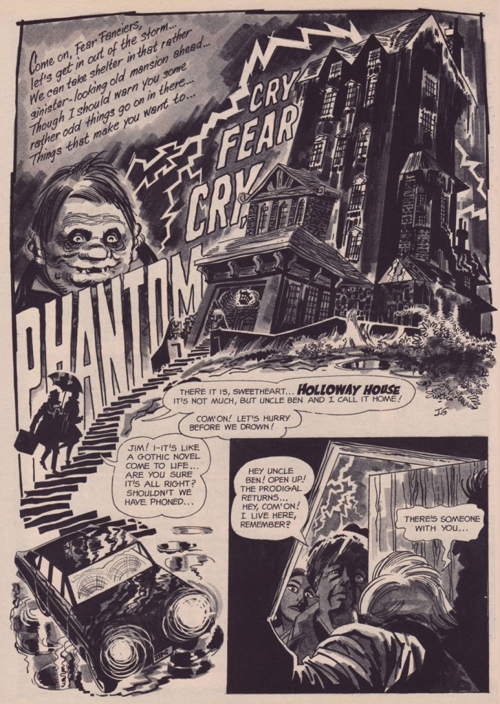
The opening splash from Cry Fear, Cry Phantom, written by Archie Goodwin, from Eerie no. 7 (Jan. 1967, Warren). In the mid-60s, presumably tiring of being pigeonholed as a war artist at DC, Grandenetti made the publishers’ rounds, doing a bit of work for Tower, Gold Key, Charlton, Marvel, Cracked (check it out here) and most memorably Warren where, after ghosting a few stories for Joe Orlando, he unleashed his innovative expressionistic style.
DC was generally hesitant to entrust its more established properties to the more “out there” artists. In the cases of Grandenetti and Carmine Infantino, the solution was to match them with the weirdness-dampening inks of straight-arrow artist Murphy Anderson. And you know what? It did wonders for both pencillers and inker.
This is The Spectre no. 6, October, 1968. A tale told by Gardner Fox (and likely heavily revised by hands-on editor Julius Schwartz, a man who loved alliterative titling) and superbly illustrated by the Grandenetti-Anderson team. Steve Ditko aside, Jerry Grandenetti had no peer in the obscure art of depicting eldritch dimensions (you’ll see!)
Page 13 from Pilgrims of Peril! written by Gardner Fox, from The Spectre no. 6 (Sept.- Oct. 1968, DC); inked by Murphy Anderson. Dig the salute to a trio of real-life spooky writers, all of whom editor Julius Schwartz knew well, having even served as Lovecraft’s literary agent late in the man’s life. By the tail end of the 1960s, Lovecraft’s work was finally making some commercial inroads, thanks largely to Arkham House co-publisher Derleth‘s unflagging diligence.
Page 22 from Pilgrims of Peril! written by Gardner Fox, from The Spectre no. 6 (Sept.- Oct. 1968, DC); inked by Murphy Anderson.
Page 2 from Men Call Me the Phantom Stranger, written by Mike Friedrich, from Showcase no. 80 (Feb. 1969, DC); inks by Bill Draut. This story reintroduced an obscure character from the early 50s, which Grandenetti had drawn a couple of times during his six-issue run. The Phantom Stranger has remained active ever since, but most writers (save Alan Moore, wouldn’t you know it?) don’t really know what to do with him. This, however, is my very favourite PS appearance. Draut, a slightly old-fashioned penciller by this time was, as a slick inker, a wonderful fit for Grandenetti’s confidently loopy layouts.
Page 3 from The Haunting!, written by Jack Oleck, from House of Mystery no. 183 ((Nov.-Dec. 1969, DC). Grandenetti pencils and inks: undiluted!
Page 2 from Eyes of the Cat, written by Robert Kanigher, from House of Mystery no. 189 (Nov.-Dec. 1970, DC); inks by Jerry’s fellow Will Eisner ghost Wallace Wood. The inspired combination of Grandenetti’s adventurous layouts and the velvety unctuousness of Wood’s finishes are a match made in heaven, but one Woody wasn’t fond of. Oh well.
So there you are. Just the tiniest tip of the iceberg. Happy birthday, Mr. Grandenetti!
I did not care for Grandenettis’s art in Charlton and Tower comics in the ’60s. Then I bought EERIE #7 in ’67 and when I saw his work in “Cry Fear, Cry Phantom,” it was a WOW! moment for me and I became a fan.
But I confess, I had forgotten about him all these years until I stumbled over your site yesterday.
Hi Neal! Well, Grandenetti’s style is, by and large, an acquired taste. And, lucky you, you know exactly when and where you acquired it!
I do think that his early Warren work represented an experimental turning point, and one hell of an artistically-fruitful one. His mid-60s restlessness, when he (often briefly) produced work for just about every comics publisher, came after working for a long time under Bob Kanigher’s editorship on the DC war books. He could have just stayed in that safe spot: Kanigher liked his work… but he was stifling him, insisting he keep it ‘as realistic as possible’.
In hindsight, I’m happily surprised that DC let him retain the wildness of his Warren work. Sure, the stakes were lower and the oversight looser on the mystery books, but I guess if editor Joe Orlando was willing to sign his name to Grandenetti’s work (at both DC and Warren), he must have really been fond of the style. And the idea of teaming up Grandenetti and Wood was a stroke of genius… even if Woody reportedly didn’t enjoy the experience.
I’m very, very glad to have brought him back to your recollection. Thanks for subscribing, and stay tuned… we will indeed keep it coming!
Hah! The only page above that I don’t care for is the Wood-worked page!
Any bound books collecting any of Jerry’s stuff that you know of? I’d love to see all his Warren stuff in one place. (Although given that so many of those books have minuscules print runs with high cover prices that then skyrocket after the title is out-of-print, I probably wouldn’t be able to afford it anyway.)
Neal — you wrote:
“Hah! The only page above that I don’t care for is the Wood-worked page!”
Now that’s ironic. I wonder… is the particular artistic combo that you find underwhelming, or the page itself? We’d need a larger sample! I marvel at Wood on Grandenetti, but I admit that it’s almost a case of gilding the lily, like when Ditko or Bill Everett would ink Kirby. A waste of precious resources, a task best left to the unspectacular likes of Dick Ayers and Chic Stone… or a pedestrian penciller who could ink beautifully, like Joe Sinnott. Wood rightly complained about the publishers who hired him to ink faster pencillers, knowing that the end result would look like his work, but at a lower rate.
There’s the great Dr. Drew collection I mentioned, and there’s plenty of his work in DC’s ‘Showcase Presents’ series (looking sharp in B&W), and of course there are all those expensive hardcover collections of Creepy, Eerie and Vampirella, but Jerry didn’t receive the solo superstar treatment afforded to Ditko, Toth, Wrightson and Corben… he was always more of a cartoonist’s cartoonist, for what it’s worth. And yeah, I just keep my eyes open around the second-hand book bins, because I don’t even dare peek at online prices (the shipping alone would dissuade me).
The inking looks like it was done by a Wood wannabe, not the master himself. It’s too staid, whereas the inks on the pages above it jump off the page.
I bought The Spectre when DC revived him in the mid-’60s, even though I wasn’t much of a fan of much of anything that DC did artwise—including Murphy Anderson. I certainly wasn’t impressed when Grandanetti started drawing him.
I just checked the Dr. Drew book and the “cheapest” copy was on Abe Books for $48 (cost plus shipping). This is about what the used Creep/Eerie book collections go for. Maybe someday I will have a spare ten grand and will buy a couple hundred of these collections, but for now, I just get to bitch and moan about how “expensive” they are.
PS: In the late ’60s, as Marvel started looking (and “feeling”) more and more like DC, DC got adventurous and hired some interesting new artists. One of my faves was Nick Cardy and his work on the Bat Lash character. I would have loved to see a few movies made with the younger Brad Pitt as Bat . . .
Neal — you wrote:
>I just checked the Dr. Drew book and the “cheapest” copy was on Abe Books for $48 (cost plus shipping). This >is about what the used Creep/Eerie book collections go for. Maybe someday I will have a spare ten grand and >will buy a couple hundred of these collections, but for now, I just get to bitch and moan about how “expensive” >they are.
I got curious and took a look myself on my usual source, bookfinder.com, and discovered something unusual: you’re right about the $48 figure, but for once, it would actually much cheaper for me, as a Canadian, to score a copy. $34 CAD, not bad!
>PS: In the late ’60s, as Marvel started looking (and “feeling”) more and more like DC, DC got adventurous and >hired some interesting new artists. One of my faves was Nick Cardy and his work on the Bat Lash character. I >would have loved to see a few movies made with the younger Brad Pitt as Bat . . .”
While it’s true that DC hired some interesting new artists in the late 60s, mainly through some poaching of Charlton’s regulars (Ditko and Aparo among the artists, and Steve Skeates and Denny O’Neil the writers, with Dick Giordano along for the ride), but that’s not Cardy’s case. He’d been with DC since the 1950s, producing competent but rather unexciting (imho) work. It wasn’t until Carmine Infantino rose in the ranks and installed *artists* as editors that things truly got go-go-going. Preaching what he’d been practicing all along, Infantino actively encouraged artistic boldness, and no-one benefited more from this new freedom than Cardy. Together, Infantino and Cardy designed all of the covers, and Cardy drew the lion’s share of them.
Bat Lash was indeed (and remains) awesome. Did you know he was co-created by the great Sergio Aragonés? I’ve been planning to showcase the magnificent run of Bat Lash covers, but Cardy’s spent a lot of time in the spotlight on the blog, so I’m giving others their turn before I return to Nick. And Brad Pitt might have made a great Bat Lash… looks aside, he does possess the right balance of gravitas and goofy self-deprecation for the part.
I probably “knew” all those things about Cardy and Bat Lash (I read all the original history-of-comics books and lapped up The Comics Journal for years) but decades of dissolute and dissipated living have taken their toll on my memory.
I will read your Cardy articles, beginning with “Hot Streak: Nick Cardy’s Aquaman, Previously” (which I glanced at and was wowed by the Cardy cover art).
I probably didn’t notice those Cardy covers at the time because nothing could have made me even think to look at an Aquaman comic book at that time.


Great stuff.
LikeLiked by 1 person
I guess you can tell it was a labour of love. Grandenetti’s work grabbed me right away, and never let go. In the best way possible. 😉
LikeLiked by 2 people
Many thanks for acknowledging the eternal daftness of “Imperius Rex.”
“a sitcom character with Tourette’s” — ha!
LikeLiked by 2 people
I did not care for Grandenettis’s art in Charlton and Tower comics in the ’60s. Then I bought EERIE #7 in ’67 and when I saw his work in “Cry Fear, Cry Phantom,” it was a WOW! moment for me and I became a fan.
But I confess, I had forgotten about him all these years until I stumbled over your site yesterday.
Now I am a subscriber here so keep on keepin’ on!
LikeLike
Hi Neal! Well, Grandenetti’s style is, by and large, an acquired taste. And, lucky you, you know exactly when and where you acquired it!
I do think that his early Warren work represented an experimental turning point, and one hell of an artistically-fruitful one. His mid-60s restlessness, when he (often briefly) produced work for just about every comics publisher, came after working for a long time under Bob Kanigher’s editorship on the DC war books. He could have just stayed in that safe spot: Kanigher liked his work… but he was stifling him, insisting he keep it ‘as realistic as possible’.
In hindsight, I’m happily surprised that DC let him retain the wildness of his Warren work. Sure, the stakes were lower and the oversight looser on the mystery books, but I guess if editor Joe Orlando was willing to sign his name to Grandenetti’s work (at both DC and Warren), he must have really been fond of the style. And the idea of teaming up Grandenetti and Wood was a stroke of genius… even if Woody reportedly didn’t enjoy the experience.
I’m very, very glad to have brought him back to your recollection. Thanks for subscribing, and stay tuned… we will indeed keep it coming!
LikeLiked by 1 person
Hah! The only page above that I don’t care for is the Wood-worked page!
Any bound books collecting any of Jerry’s stuff that you know of? I’d love to see all his Warren stuff in one place. (Although given that so many of those books have minuscules print runs with high cover prices that then skyrocket after the title is out-of-print, I probably wouldn’t be able to afford it anyway.)
LikeLike
Neal — you wrote:
“Hah! The only page above that I don’t care for is the Wood-worked page!”
Now that’s ironic. I wonder… is the particular artistic combo that you find underwhelming, or the page itself? We’d need a larger sample! I marvel at Wood on Grandenetti, but I admit that it’s almost a case of gilding the lily, like when Ditko or Bill Everett would ink Kirby. A waste of precious resources, a task best left to the unspectacular likes of Dick Ayers and Chic Stone… or a pedestrian penciller who could ink beautifully, like Joe Sinnott. Wood rightly complained about the publishers who hired him to ink faster pencillers, knowing that the end result would look like his work, but at a lower rate.
There’s the great Dr. Drew collection I mentioned, and there’s plenty of his work in DC’s ‘Showcase Presents’ series (looking sharp in B&W), and of course there are all those expensive hardcover collections of Creepy, Eerie and Vampirella, but Jerry didn’t receive the solo superstar treatment afforded to Ditko, Toth, Wrightson and Corben… he was always more of a cartoonist’s cartoonist, for what it’s worth. And yeah, I just keep my eyes open around the second-hand book bins, because I don’t even dare peek at online prices (the shipping alone would dissuade me).
LikeLiked by 1 person
The inking looks like it was done by a Wood wannabe, not the master himself. It’s too staid, whereas the inks on the pages above it jump off the page.
I bought The Spectre when DC revived him in the mid-’60s, even though I wasn’t much of a fan of much of anything that DC did artwise—including Murphy Anderson. I certainly wasn’t impressed when Grandanetti started drawing him.
I just checked the Dr. Drew book and the “cheapest” copy was on Abe Books for $48 (cost plus shipping). This is about what the used Creep/Eerie book collections go for. Maybe someday I will have a spare ten grand and will buy a couple hundred of these collections, but for now, I just get to bitch and moan about how “expensive” they are.
PS: In the late ’60s, as Marvel started looking (and “feeling”) more and more like DC, DC got adventurous and hired some interesting new artists. One of my faves was Nick Cardy and his work on the Bat Lash character. I would have loved to see a few movies made with the younger Brad Pitt as Bat . . .
LikeLike
Neal — you wrote:
>I just checked the Dr. Drew book and the “cheapest” copy was on Abe Books for $48 (cost plus shipping). This >is about what the used Creep/Eerie book collections go for. Maybe someday I will have a spare ten grand and >will buy a couple hundred of these collections, but for now, I just get to bitch and moan about how “expensive” >they are.
I got curious and took a look myself on my usual source, bookfinder.com, and discovered something unusual: you’re right about the $48 figure, but for once, it would actually much cheaper for me, as a Canadian, to score a copy. $34 CAD, not bad!
>PS: In the late ’60s, as Marvel started looking (and “feeling”) more and more like DC, DC got adventurous and >hired some interesting new artists. One of my faves was Nick Cardy and his work on the Bat Lash character. I >would have loved to see a few movies made with the younger Brad Pitt as Bat . . .”
While it’s true that DC hired some interesting new artists in the late 60s, mainly through some poaching of Charlton’s regulars (Ditko and Aparo among the artists, and Steve Skeates and Denny O’Neil the writers, with Dick Giordano along for the ride), but that’s not Cardy’s case. He’d been with DC since the 1950s, producing competent but rather unexciting (imho) work. It wasn’t until Carmine Infantino rose in the ranks and installed *artists* as editors that things truly got go-go-going. Preaching what he’d been practicing all along, Infantino actively encouraged artistic boldness, and no-one benefited more from this new freedom than Cardy. Together, Infantino and Cardy designed all of the covers, and Cardy drew the lion’s share of them.
Bat Lash was indeed (and remains) awesome. Did you know he was co-created by the great Sergio Aragonés? I’ve been planning to showcase the magnificent run of Bat Lash covers, but Cardy’s spent a lot of time in the spotlight on the blog, so I’m giving others their turn before I return to Nick. And Brad Pitt might have made a great Bat Lash… looks aside, he does possess the right balance of gravitas and goofy self-deprecation for the part.
LikeLiked by 1 person
I probably “knew” all those things about Cardy and Bat Lash (I read all the original history-of-comics books and lapped up The Comics Journal for years) but decades of dissolute and dissipated living have taken their toll on my memory.
I will read your Cardy articles, beginning with “Hot Streak: Nick Cardy’s Aquaman, Previously” (which I glanced at and was wowed by the Cardy cover art).
I probably didn’t notice those Cardy covers at the time because nothing could have made me even think to look at an Aquaman comic book at that time.
LikeLiked by 1 person
In the article “Nick Cardy’s Aquaman, Previously,” I especially like the covers for 38, 41, and 44.
In “Nick Cardy’s Aquaman,” my faves are 49, 50, 52, and 53.
Thanks again!
LikeLiked by 1 person