« May the man who has his finger on the button have a lovely day today / Hope nothing hangs him up or ticks him off or bums him out in any way / Lord, help him keep his cool cause he could pull the final curtain on my play / May the man who has his finger on the button have a lovely day today. » — Larry Wilkerson (as warbled by Bobby Bare)
The idea for this post came to me a couple of days ago, and this afternoon, while cobbling together the visual components, it dawned on me that today’s Memorial Day (Remembrance Day for Canadians, and ‘Victory Day‘ for those afflicted with brain worms and/or syphillis), and therefore quite à propos.
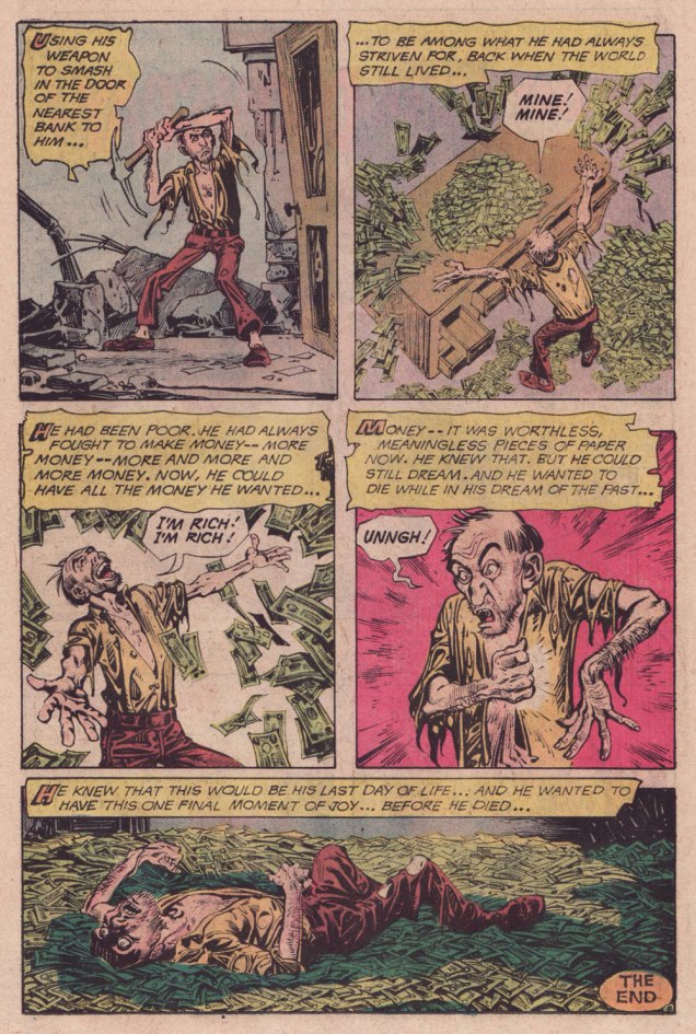
DC’s The Day After Doomsday series first turned up — of all places — in the pages of The Witching Hour, a page and a half bit of filler fluff by Len Wein and Jack Sparling. It must have struck a chord, if not with readers, then with its creators, for the feature stubbornly kept a-rising from its post-apocalyptic grave.
In spite of its episodic and arguably slight nature, TDBD enjoyed surprising longevity. It truly found its home in the Joe Orlando-edited Weird War Tales (1971-1983, DC’s gateway title for war fans into ‘horror’ and vice versa), where most of its dispatches saw print. You never know what’s going to catch on with the unwashed masses.
A most humble beginning for a series, this brief scene appeared in The Witching Hour no. 9 (June/July 1970, DC). Script by Wein, art by Jack Sparling (1916-1997). Dick Giordano, editor.
.
Humour rears its homely head in the concurrently appearing second instalment — too close to call! — this one from House of Secrets no. 86 (June/July 1970, DC). Same creative team.
.
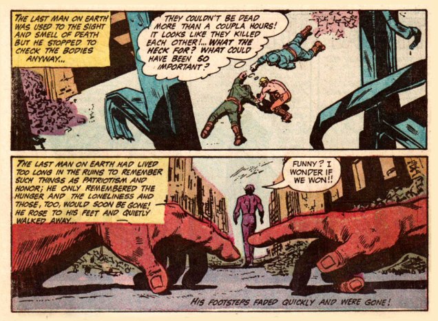
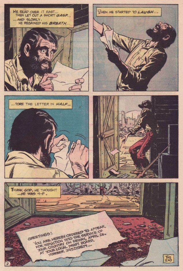
My candidate for the series’ finest hour, this episode elegantly riffs both on the Vietnam War Draft and on Fredric Brown‘s classic 1948 short-short ‘Knock‘, wherein «The last man on Earth sat alone in a room. There was a knock on the door… » 4-F, incidentally, signifies « Registrant not acceptable for military service. To be eligible for Class 4-F, a registrant must have been found not qualified for service in the Armed Forces by an MEPS under the established physical, mental, or moral standards. » And let’s hear it for perennially under-appreciated artiste Bill Draut (1921-1993).
That issue had a splendid cover, and so here it is!
This is Weird War Tales no. 30 (Oct. 1974, DC); cover pencils and inks by Luis Domínguez, from a probable design by publisher Carmine Infantino.
.
A scroogey teaming of WOT? favourites Steve Skeates and Alfredo Alcala, this turned up in Weird War Tales no. 35 (March 1975, DC). I’ll bet they had trouble deciding whether to run it in Plop! or WWT.
.
Finally, this one appeared in Weird War Tales no. 48 (Sept./Oct. 1976, DC). Script by Skeates, art by Buddy Gernale.
« I opened my magazine (What did you see?) / I saw Mr. France (What did he have?) / A girl on each shoulder (What else?) / And one in his pants » — 10cc, Sand in My Face (1973)
You may think of this post as a companion piece, a spinoff of its predecessor. I’d had for some time, in the back of my mind, the notion to showcase some obscure French ‘human sculpture’ ads, but it needed more. Comments on the previous post provided the spark.
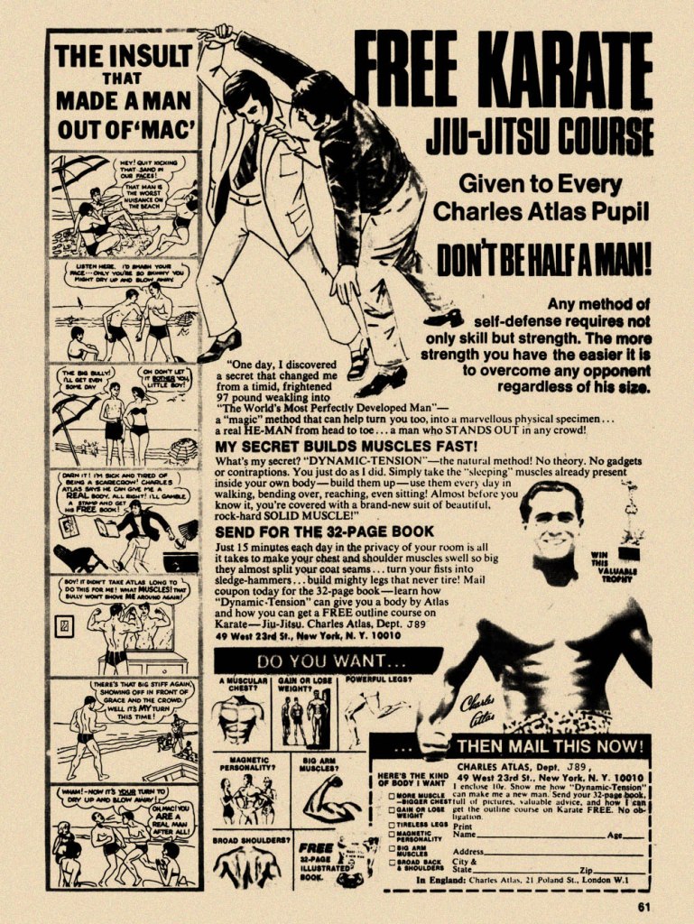
Is there a more classic “humble immigrant makes good in the USA” yarn than that of Angelo Siciliano, born in 1892 in the tiny Italian town of Acri? The Smithsonian has told the full, colourful story, so I’ll spare you a rehashing of it.
Let’s just say that young Siciliano worked hard to overcome adversity and redeem his puny physique, and the rest is the stuff of legend. The principles of ‘dynamic tension‘ and his immortal moniker aside, Angelo’s finest brainstorm was to employ the lowly but then-ubiquitous medium of comic books to introduce his product and its natural audience to each other. Let’s take the tour!
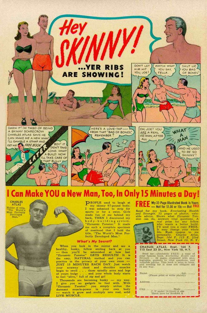
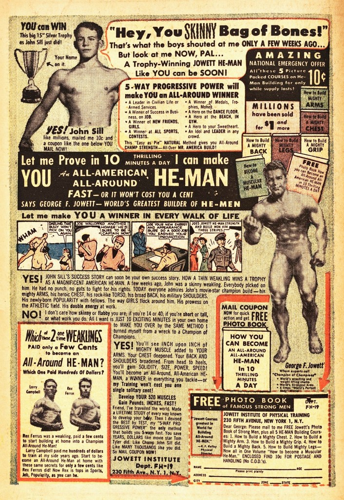
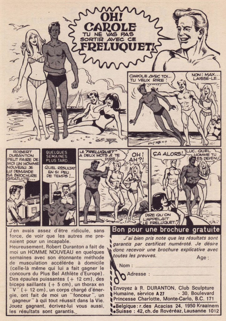
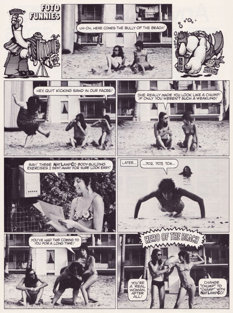
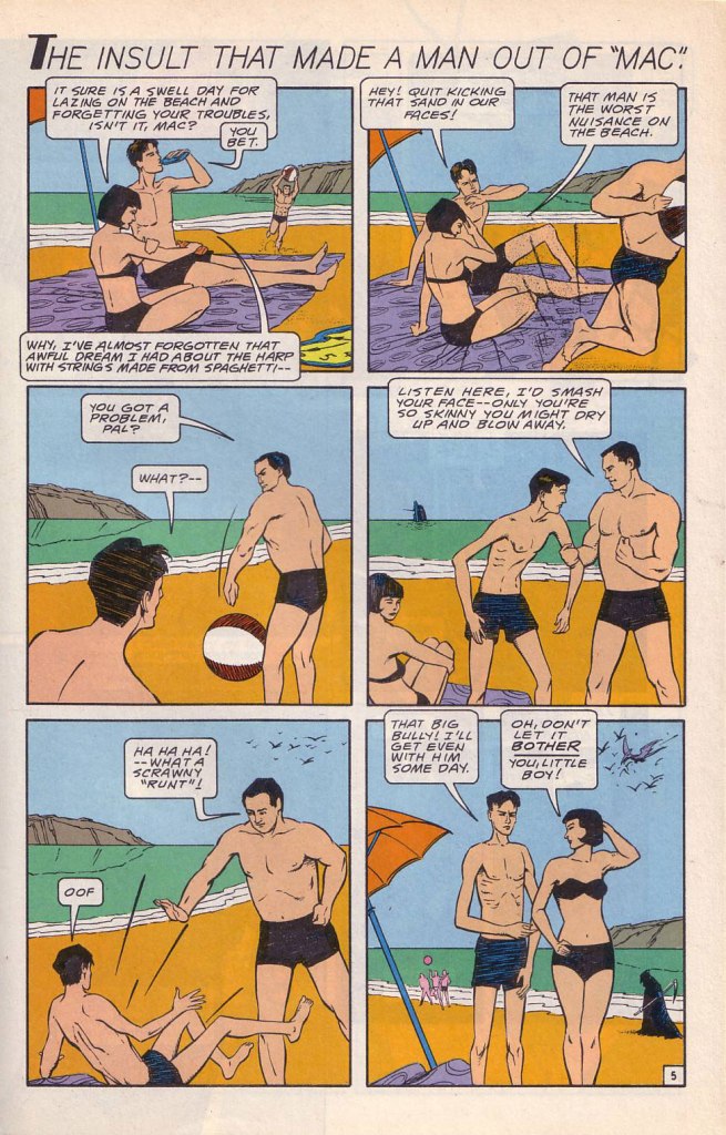
While the Charles Atlas ads began running in the 1930s, this is probably their classical expression. This one saw print as the back cover of Mad no. 14 (Aug. 1954, EC). Its opening insult even inspired Miles Heller’s 1995 salute to the great old comic book ads, Hey Skinny!There was inevitably fierce competition in the self-improvement field. This entry, from the U.S. Nature Products Corp., appeared in Stan Lee’s oh-so-macho Man Comics no. 10 (Oct. 1951, Atlas).Lots and lots of copy — but the all-important cartoon hook is present and accounted for. From the pages of Firehair no. 9 (Fall 1951, Fiction House). The Jowett Institute of Physical Training wants you to get buff! To be fair, George F. Jowett got there first.This is surely the definitive version, with the unforgettable tag line and ‘hero of the beach’ conclusion. I pulled this one from The Witching Hour no. 25 (Nov. 1972, DC), which hit newsstands just a few months before Mr. Atlas passed away, aged 80, on Christmas Eve. I can’t help being amused: French publisher Arédit, whose digest-sized collections of (mostly) reprints of US comics proudly bore the tag « Comics for adults », featured very few outside ads… and those were almost exclusively for self-defense and body-building systems. Here’s a sample trio. This one appeared in Maniaks no 4 (Fall, 1971). This title featured reprints of DC Silver Age ‘humour’ comics… all but the only actually funny one (that would be Sugar and Spike, of course).Oh, I’m sure the ERB Estate got their cut. And who might that R. Duranton fellow be? Four times Mr. France, for one thing! Here he appears with Louis de Funès in a famous scene from Le Corniaud, a 1965 farce starring beloved stars André Bourvil / De Funès and directed by Gérard Oury. This one’s from Kamandi no. 4 (Summer 1976, Artima), which featured reprints of various 60s and 70s DC adventure comics. It was an affordable way to catch up on material one might have missed — or couldn’t afford!This refreshing gender-switched lampoon comes from the pages of National Lampoon no. 26 (May, 1972), the ‘Men!’ issue, guest-edited by Anne Bats, No other credits, dammit. The opening page (of four) of Steve Skeates and Sergio Aragonés‘ wacky satire, from the pages of Plop! no. 2 (Nov.-Dec. 1973, DC). There have been truly countless spoofs of the Atlas adverts… most of them quite dire. Once more, I’ll spare you.By the mid-1970s, with America in the kung-fu grip of martial arts fever, it’s understandable that many a young man was envisioning Bruce Lee‘s lithe, compact physique as an alternative to the hulking musclemen of yore. The Charles Atlas company tried to cover all bases with this ad; from — speaking of old-time musclemen — Doc Savage no. 2 (Oct. 1975, Marvel).
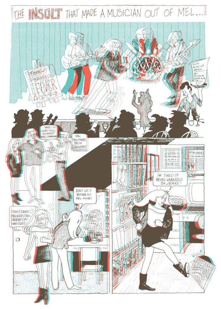
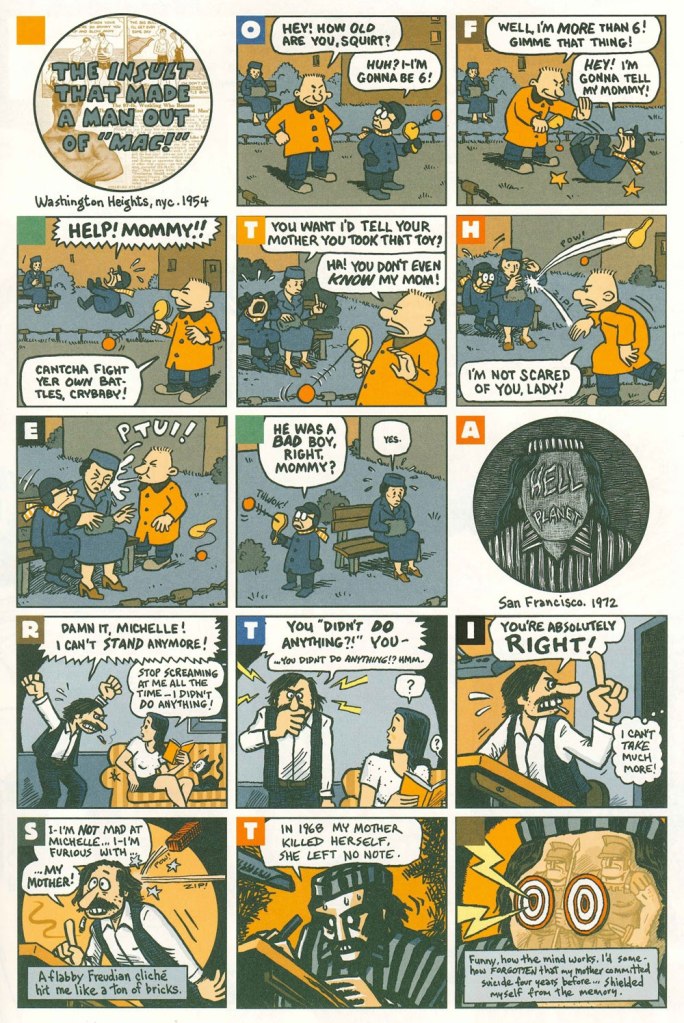
Ah, yes — those days when ‘Bruce‘ was the stereotypical gay name. From the ‘Playboy Funnies’ section of the magazine’s November, 1977 issue.And for something a bit off the beaten path: this is The Insult That Made a Musician Out of Mel, scripted by Rebecka Wright, illustrated by Blanche Santa Ana, with 3-D effects by Ray Zone, from Wimmen’s Comix no. 12 (Nov. 1987, Renegade Press), edited by Angela Bocage and Rebecka Wright.Does this look familiar? This is the first page of Flex Mentallo’s origin tale, as it appeared in Doom Patrol no. 42 (Mar. 1991, DC), written by Grant Morrison, with art by Mike Dringenberg and Doug Hazlewood. I have no idea whether Atlas had a sense of humour, but his successors sure didn’t, as evidenced by the lawsuit they filed against DC Comics over this clear — if brazen — case of satire. I much prefer the TV show version of Flex, I confess.Peter Kuper deftly used the cliché to take a jab at George Bush Sr.’s image and the first Gulf War. Dated and irrelevant? Trying to prove your ‘manhood’ remains distressingly au courant… just consider these two schmucks, to cite but one recent example. And hey, here’s “Stormin’ Norman lying on T.V.” From Bleeding Heart no. 1 (Winter 1991-92, Fantagraphics).Art Spiegelman digs deeper and makes more discerning use of the raw materials at hand with The Insult that Made a Man out of “Mac!”, first previewed in The Virginia Quarterly Review and then collected in Breakdowns Portrait of the Artist as a Young %@?*! (Oct. 2008, Pantheon).
« Carefully, the old man utters a cacophonous incantation… then lets his mind go blank. » — Stephen Skeates
We recently (last March 30) lost a fine fellow and writer in Steve Skeates (1943-2023). I’ve long appreciated his work, as I felt he was among the very few ‘mainstream’ comic book writers who could actually be funny, not to mention gripping or thought-provoking*, whatever the situation demanded.
At its peak, his writing also stood out by virtue of its containing actual creative ideas rather than the usual mishmash of bromides and creativity-stifling continuity that the fanboys clamoured for.
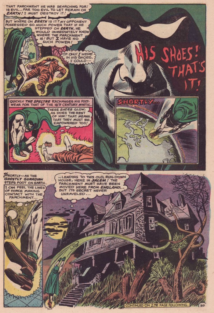
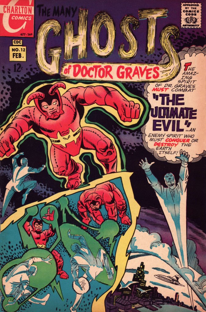
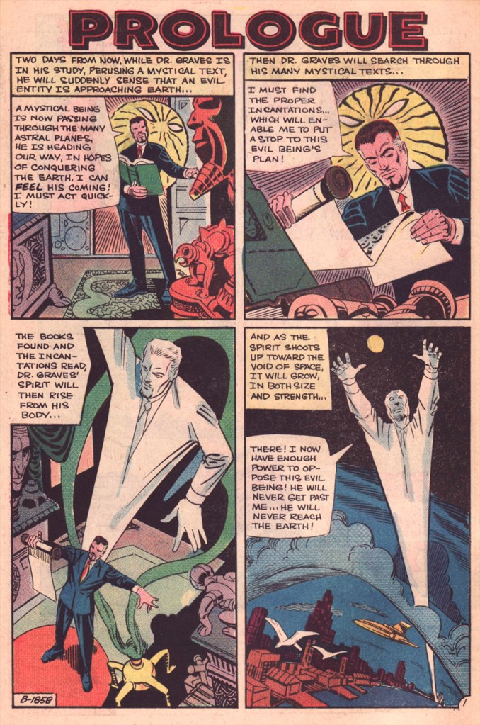
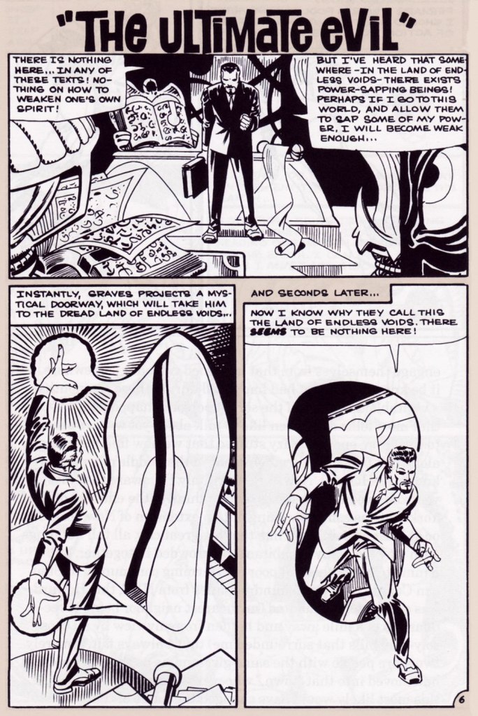
Today, I’ll showcase a bicephalous favourite, The Spectre in « The Parchment of Power Perilous » and Dr. Graves in « The Ultimate Evil », both springing from the same author… and the same plot.
How did this come to pass? Skeates told the story in an article entitled « Graves Acting Strangely: The Ultimate Evil Reconsidered », published in Charlton Spotlight no. 5 (Fall 2006, Argo Press, Michael Ambrose, editor).
« … at that particular point in time, I was totally unaware of the unique manner in which Julie [Schwartz ] approached his profession, typically in the dark when it came to the fact that this longtime comic book icon was far more actively involved in the plotting process than any other editor up at DC. […] I ambled into Julie’s well-kempt office armed with an intricate plot… something I had stayed up half the night before constructing, working, reworking, polishing and repolishing, only to have Julie read it over, extract a couple of ideas he liked, and unceremoniously toss the rest of it away. […] the two of us set about constructing what basically amounted to a brand-new plot based on those couple of ideas of mine that Julie liked, ideas that had somehow gotten his creative juices flowing. »
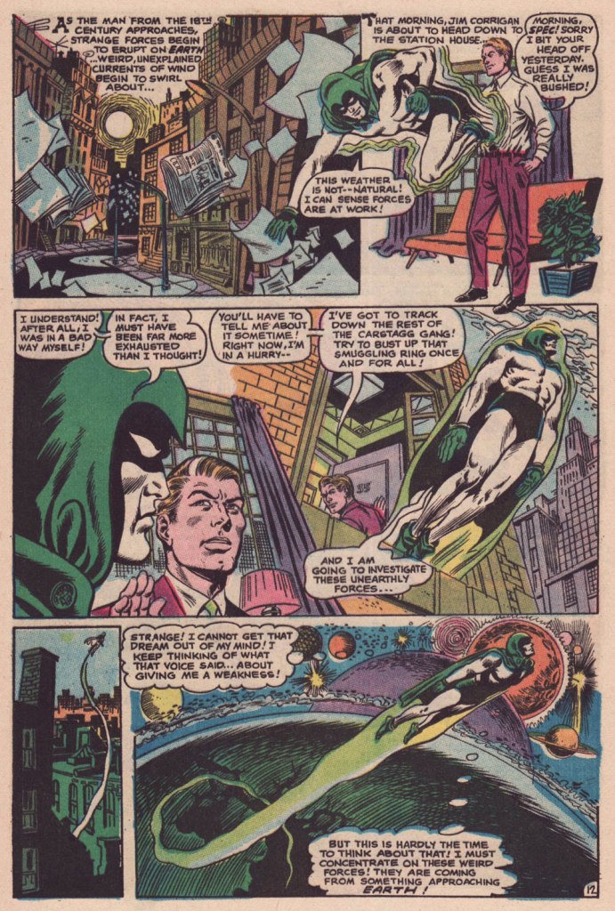
Charles J. “Jerry” Grandenetti (1926-2010) shows to breathtaking advantage his mad compositional virtuosity, anchored by Murphy Anderson’s rational inks. Skeates again: « … inker Murphy Anderson was the perfect stabilizing force, his meticulously detailed inks reining in Grandenetti’s insanity just enough so that even the latter’s wildest notions — colliding planes (no, not aircraft — planes of existence), his frequent disdain for panel borders, the same character shot from two or three separate angles within seemingly the same panel, etc. — became perfectly understandable, making the story so much utter fun to follow (even for someone like me who obviously knew exactly where it was going. ) »Grandenetti’s two previous issues on the title, illustrating Gardner Fox’s Pilgrims of Peril (check out a stunning excerpt here) and The Ghost That Haunted Money!, had demonstrated that he likely was the only match for Ditko when it came to depicting hallucinatory other-dimensional vistas. Let’s face it, just about all who followed Ditko on Doctor Strange either half-heartedly aped Ditko’s designs or drew other dimensions as if they were Wally Wood’s outer space (or Dali’s The Persistence of Memory). Well, save for Tom Sutton, I guess. Grandenetti could have done a great job, but honestly, I like his career as it is. The day Steve Ditko walked away from Doc Strange is the day the character ceased to exist, as far as I’m concerned.Five pages from The Spectre n. 8 (Jan.-Feb. 1969), edited by the… mighty hand of Schwartz. Special kudos to the uncredited colourist (though DC’s assistant production manager Jack Adler surely supervised), who did a superlative job, making discerning use of bold contrasts and close harmonies. It would have been so easy to end up with a garish mess!
Unlike (with one notable exception, initials SD) his colleagues who scampered from Charlton to DC along with editor Dick Giordano (Denny O’Neil and Jim Aparo, for instance) in the late 1960s, Skeates maintained his Charlton work for a time. He explained: « I simply possessed too much affection for what I was producing for that Derby, Connecticut company to do anything along those lines. » Skeates enjoyed « … contributing to Charlton’s take on the “mystery” anthology, ghostly compilations somehow edgier, funkier, and far more fun than those produced by DC and Marvel. »
« Furthermore, unlike DC, Charlton didn’t require that I first submit a plot outline, get it approved, and then write my story. Instead, I could just suddenly turn in a finished product, on spec, a way of working I very much preferred — diving right in with the plot idea only sketchily there, not boxed in even by myself but allowing the story to work itself out, to go where it wanted to go. » Amen.
The one time we saw the Doctor M. T. Graves truly get his mystical groove on was in this tale of two Steves, Skeates and Ditko, a splendid bit of recycling-but-not-quite.
And he’s how the whole ball of wax coalesced: « I suddenly remembered that fairly intricate Spectre plot that Julie had long ago summarily tossed aside. Hey, y’know, I might just be able (especially if I placed most of my emphasis on those portions that Julie hadn’t extracted, working on the bulk of my original plot while rather downplaying those couple of ideas that Julie and I had built our new plot on) to transform that baby into a workable Dr. Graves adventure! »
This is The Many Ghosts of Doctor Graves no. 12 (Jan.-Feb. 1969, Charlton). Edited by Sal Gentile.
« Boom! I was into it, writing this story nearly as fast as I could type. Of course, to in effect have Graves play the role of the Spectre, I could see no way around making certain alterations to my protagonist’s makeup, making him far more mystically powerful than he had ever before seemed, more like Marvel’s Doctor Strange than anyone else…
Yet I could see no real problem in any of that, unless of course someone up at Charlton wound up doing something supremely silly like assigning the art for this story to none other than Ditko himself — which, as it turned out, is exactly what happened! »
Some — perhaps all, who knows? — of this tale’s original art (or at least production photostats) has survived, and gives us the opportunity to gaze upon Ditko’s artwork in its raw state, so to speak.
Hail and farewell, Mr. Skeates. You will be missed.
I was startled to discover that after several years of WOT blogging, we still have no post dedicated to Sergio Aragonés. Perhaps this is in part because his art is ubiquitous – throughout his long career, he has contributed manifold pages to various DC publications, created an enduring barbarian parody, scripted and drawn (mostly solo but also in collaboration) an impressive number of mini-series published by Fantagraphics, Dark Horse and Bongo Comics, produced various comic-con paraphernalia, etc. And this is not to mention his lasting contributions to Mad Magazine (which I did discuss, though not at length, in A MAD dash… inside) – something in the magnitude of twelve thousand gags spread over 57 years and 491 issues of Mad.
A sequence from A Mad Look at Sharks from Mad no. 180 (January 1976, EC).
He’s also a charming, universally-liked man whose bigger-than-life persona has ensured that his participation in anything is always surrounded by fun anecdotes. It is my great pleasure to share this abridged compendium of Aragonés tentacles, of which there are many, as he enthusiastically added them into doodles and margins with great glee (and, as we know, « he has quite literally drawn more cartoons on napkins in restaurants than most cartoonists draw in their entire careers *», so just imagine how many tentacles are scattered throughout his work).
Room 13 one-pager, scripted (and edited) by Joe Orlando. This was published in House of Mystery no. 190 (Jan-Feb 1971, DC).
Incredibly, we still haven’t written a post dedicated to the great Plop! (this post is starting to sound like a to-do-in-the-nearest-future list), though Hallowe’en Countdown III, Day 30 did include a story from number 1. Plop!, “The New Magazine of Weird Humor!“, certainly included a lot of cephalopods in its 24 issues and I will doubtlessly get around them one of these days. In the meantime, here’s a very appropriate page from Plop! no. 16:
This closing page of Plop! no. 16 (September 1975, DC) was scripted by Steve Skeates.
Galloping forward through some twenty years, we briefly land at Marvel, namely these two pages from Groo the Wanderer no. 98 (February 1993, Marvel), co-plotted and scripted by Mark Evanier.
Sergio Aragonés Funnies, published between 2011 and 2014 by Bongo Comics, boast 12 issues of really enjoyable, remarkably varied material. For those who may think that Aragonés is one-trick pony who can only do ‘silly’ humour, this series offers many auto-biographical stories, some of them surprisingly poignant and heart-felt. Not to say that it’s not devoid of humour – the more serious stuff (including social criticism in the form of animal parables) is nestled among pages of slap-stick humour and imaginative goofiness, from one-pagers to longer stories that take most of an issue to develop. Aragonés also shares some background on his approach to stories, allowing us to peek into his imagination and possibly answer that hackneyed question that plagues all manner of writers, ‘where do you get your ideas from?’ If an anthology of Funnies is ever published, I’ll happily purchase it.
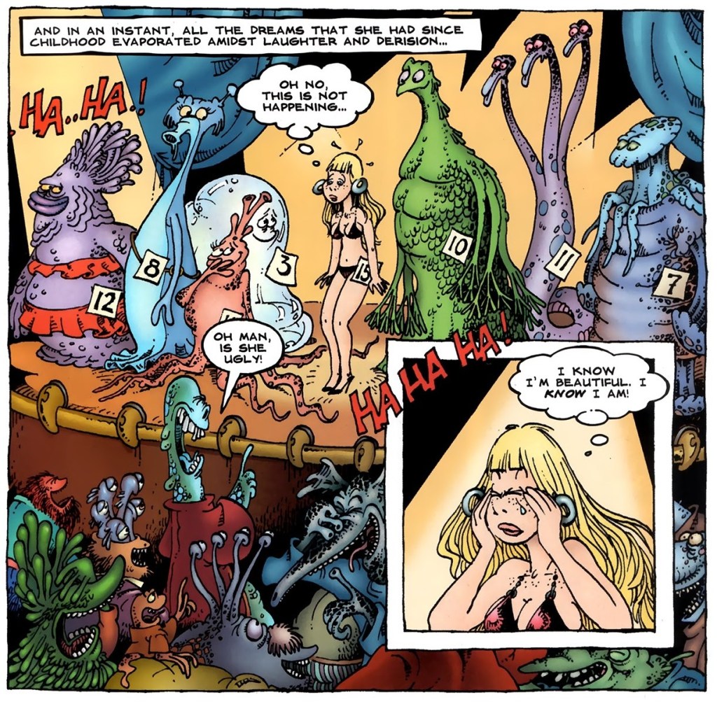
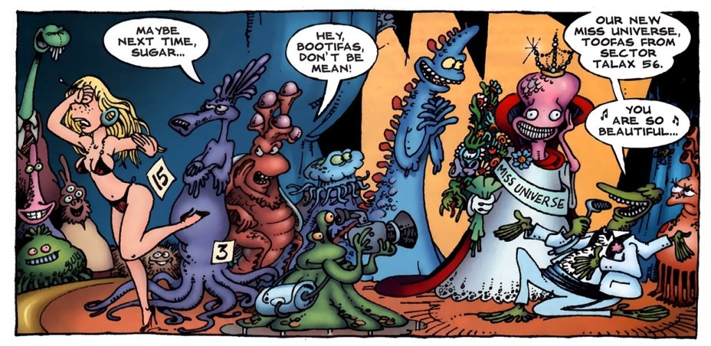
Excerpts from Kira and the Beauty Contest, published in Sergio Aragonés Funnies no. 2 (August 2011, Bongo Comics):
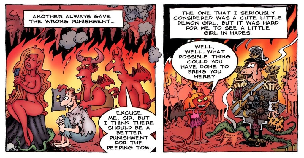
Panels from Sergio’s Inferno, published in Sergio Aragonés Funnies no. 3 (September 2011, Bongo Comics):
Finally, a panel from the back cover of Sergio Aragonés Funnies no. 10 (October 2013, Bongo Comics). Nevermind what the joke is, I just really like that octopus (as well as his other sea friends).
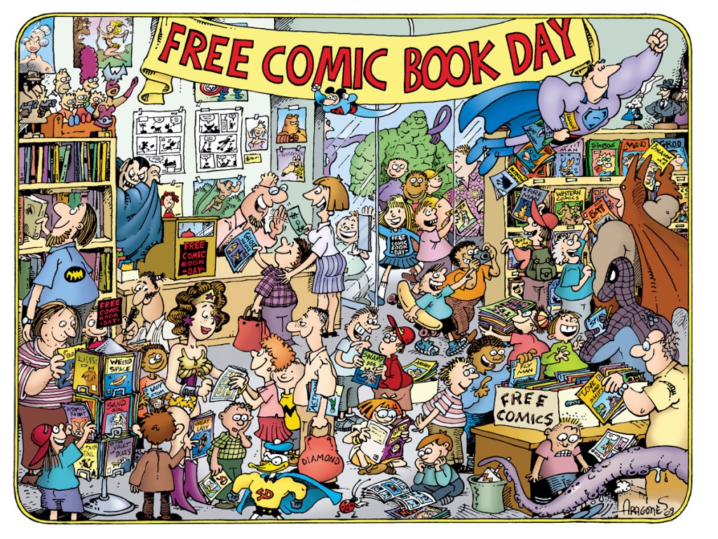
I mentioned materials related to Comic-Cons, so I would be amiss to not include at least one image of something vaguely related!
This design was created for the ‘Free Comic Book Day Commemorative Artist T-shirt’ in 2010.
I’ll end this post with a classic Aragonés anecdote, as told by Mark Evanier. This happened while these two were participating in filming The Half-Hour Comedy Hour television show for NBC in 1983, on which the model Jayne Kennedy was a guest. [source]
« This was one of the most beautiful women in the world. And she wore this dress that was very revealing, so much so the censors wouldn’t let us put her on the air in it without adding some material. So we’re all talking to her, the writers and whoever, just in awe of this woman. And Sergio comes walking in looking like a homeless person, carrying his portfolio. And Jayne sees him and she shouts, ‘Sergio!’ and she runs over and starts kissing him passionately.
They’d worked together before, it turned out. But Johnny Carson comes walking out into the hallway and he thinks Jayne Kennedy is being sexually assaulted by a homeless person in the NBC hallways. He came over to make sure she was okay. She said it was fine, that she knew him, and I said, ‘It’s okay, he’s a cartoonist.’
So Johnny gives that classic look and he says, ‘I knew I should have taken up drawing.’ »
« Suffering sea snakes! Can this really be happening, Aquaman? » — Aqualad has a query.
I just realised, a few days ago, that I’d left something hanging for too long: nearly two years ago, I turned the spotlight on a series of Aquaman covers, casually (in my debonair way) letting it be known that there existed another, earlier, and even longer (well, by one) run of exemplary Aquaman covers. The time has come to see whether I was talking through my hat… or not.
Now, at the risk of repeating myself, it must be stated that, since we’re dealing with DC’s late Silver Age, there’s more to any given cover than a signature. DC’s recently-ascended art director, Carmine Infantino, had a hand in designing virtually every DC cover between late 1966 and early 1976. How strong a hand varied from cover to cover, of course. A good designer sometimes knows when to hold back and be invisible, or just about.
Infantino always strove to improve himself and update and hone his skills. Well into his career (he’d started in 1940 at Timely), he pulled an unexpected (and very smart) move. As he recalled it in The Amazing World of Carmine Infantino (2000, Vanguard Productions):
« Around 1960, I went back to school again, this time to study under a gentleman named Jack Potter at the School of Visual Arts. What Jack taught me about design was monumental, and I went through a metamorphosis working with him. I’d sit there confused and he’d tear the work apart. But then it was a light bulb going off – bam! – and I’d understand everything he was getting at.
After studying with Potter at the SVA, my work started to grow by leaps and bounds. I was achieving individuality in my work that wasn’t there before.
I threw all the basics of cartooning out the window and focused on pure design. Everything I did was design-oriented. That was quite the challenging task. But that’s where Potter’s teaching took me.
… I started putting hands in captions, that was decorative. He taught us to do everything decoratively. I’d always found captions very dull. So I thought I’d break the captions into smaller paragraphs and use hands to get people to read them. I regularly pushed design and perspective to the extreme. »
And speaking of reinvention, I must also salute Nick Cardy’s own mid-career creative burst. Prior to the mid-60s, Cardy had always been one of those genteel, tasteful but entirely unexciting journeymen, the way most DC editors liked ’em. I can think of precious few long-timers that managed to convincingly reinvent themselves and greatly raise their game, well into their career, without utterly misplacing their original identity (that disqualifies you, Keith Giffen) in the process. Alex Toth, Jerry Grandenetti and perhaps Sheldon Mayer come to mind…
At any rate, when Infantino got together with Cardy on those covers, all hell broke loose, in the best possible way.
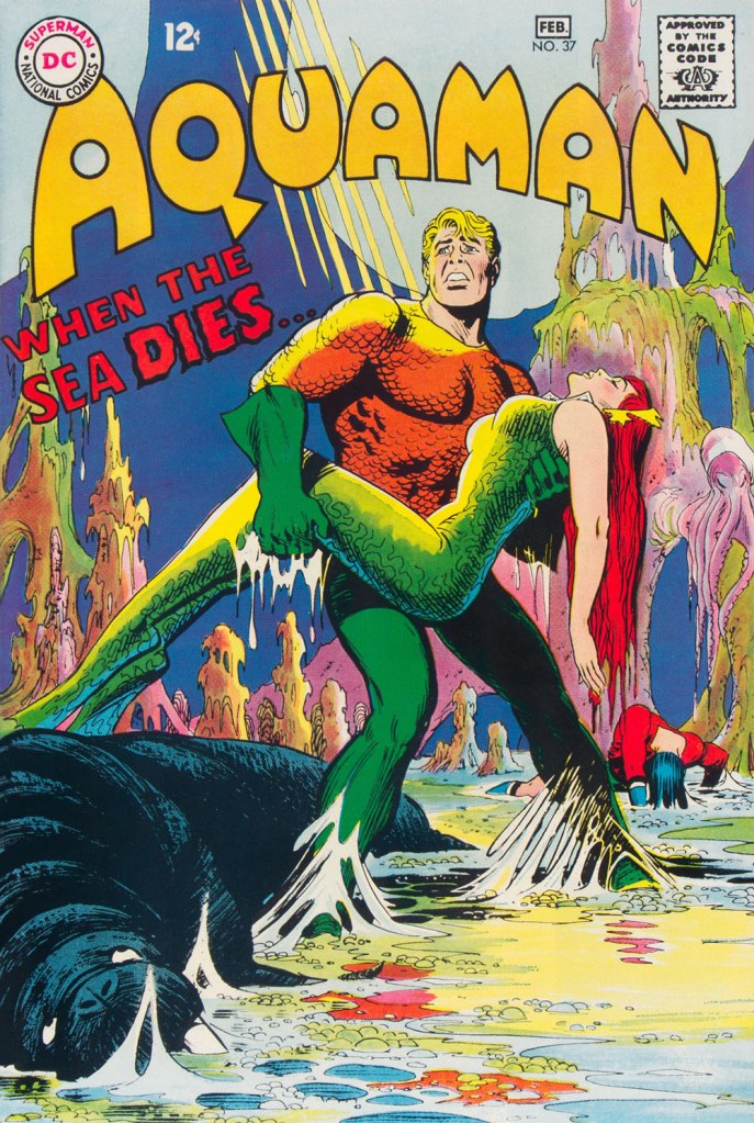
This is Aquaman no. 37 (Jan.-Feb. 1968, DC). The despondent walrus, bottom left, is family pet ‘Tusky’. Oh, and my apologies for ever-so-slightly poaching some potential Tentacle Tuesday material.
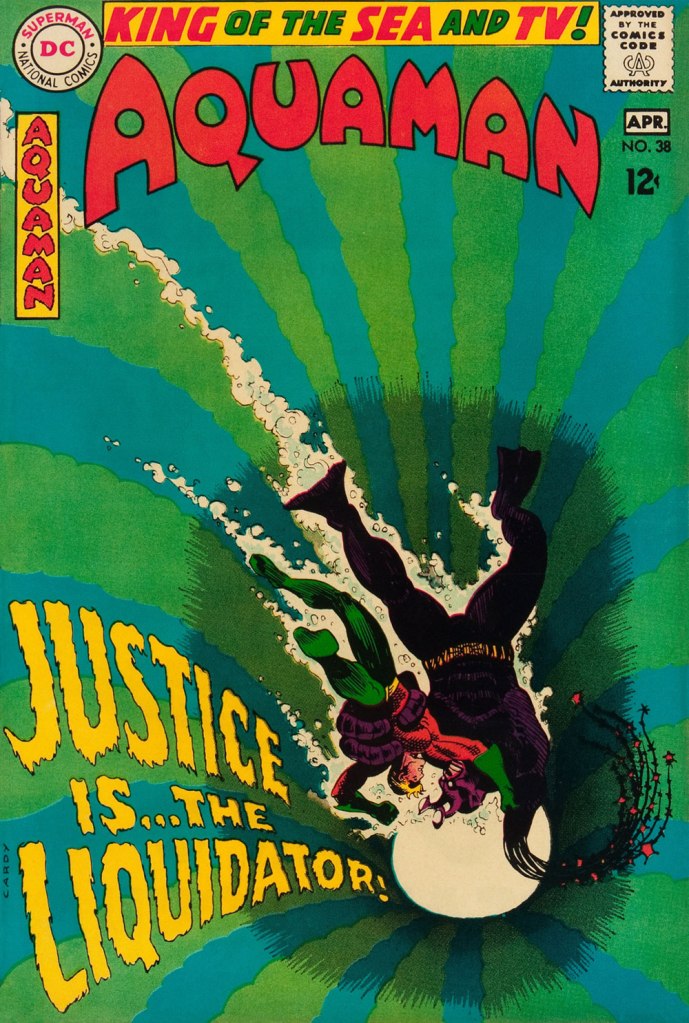
This is Aquaman no. 38 (Mar.-Apr. 1968, DC). I wonder what’s up with the redundant vertical logo, top left.
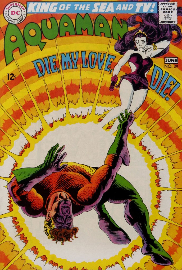
In case you’re wondering about Aquaman’s expanded regal duties (“and TV!“), they were showing repackaged reruns of his half of the previous year’s Superman / Aquaman Hour of Adventure. A Filmation production, so don’t expect too much if you haven’t seen it. But back to the comic book: this dazzling scene announces the saga of “How to Kill a Sea King!”, as our amphibious hero seeks to thwart a hostile Venusian takeover of Earth and sea. Script by Bob Haney, art by Cardy. This is Aquaman no. 39 (May-June 1968, DC). Oh, and the hottie? That’s “Aliena”. A real bolt of ‘inspiration’ there, Mister Haney.
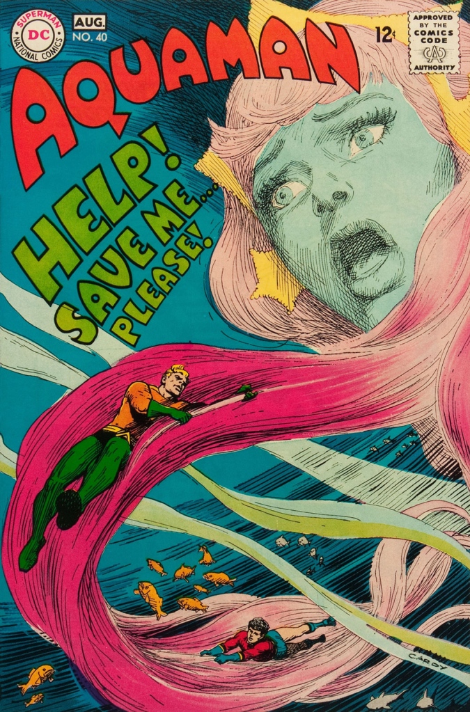
This is Aquaman 41, (July.-Aug. 1968, DC). Such dynamically-designed fun! This is where the new creative team of Stephen Skeates and Jim Aparo joins new editor Dick Giordano (his second issue), but Cardy remains on covers… because Aparo, who resided a couple of states over, couldn’t attend the cover conferences.
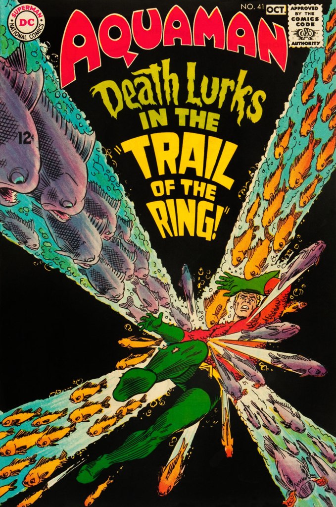
This is Aquaman 41, (Sept.-Oct. 1968, DC), a highlight among highlights from the redoubtable team of Infantino (publisher-designer), Cardy (penciller-inker), Giordano (editor), Jack Adler (production manager and colourist), and, inside, Skeates (writer) and Aparo (penciller-inker-letterer). There’s a texture to the colour work (most evident on the foreground piraña… a freshwater fish, incidentally) that’s unusual for comics of that period. I wonder how it was achieved…
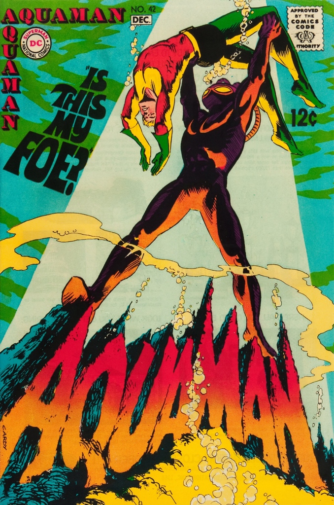
This is Aquaman no. 42 (Nov.-Dec. 1968, DC).
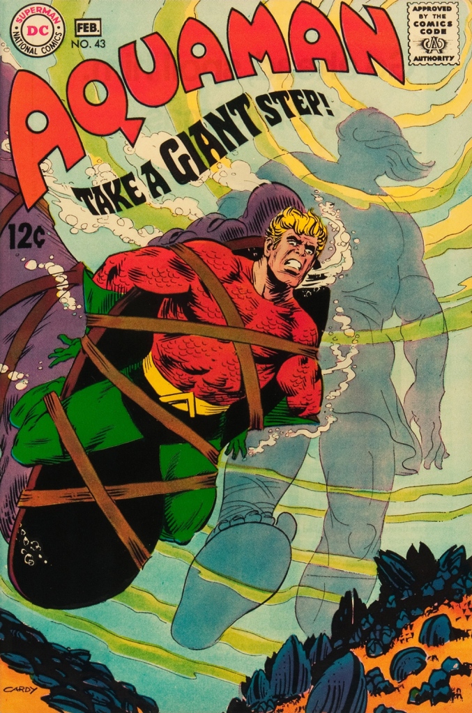
This is Aquaman no. 43 (Jan.-Feb. 1969, DC). Face-first in a bed of mussels, with several tons of pressure? Yikes.
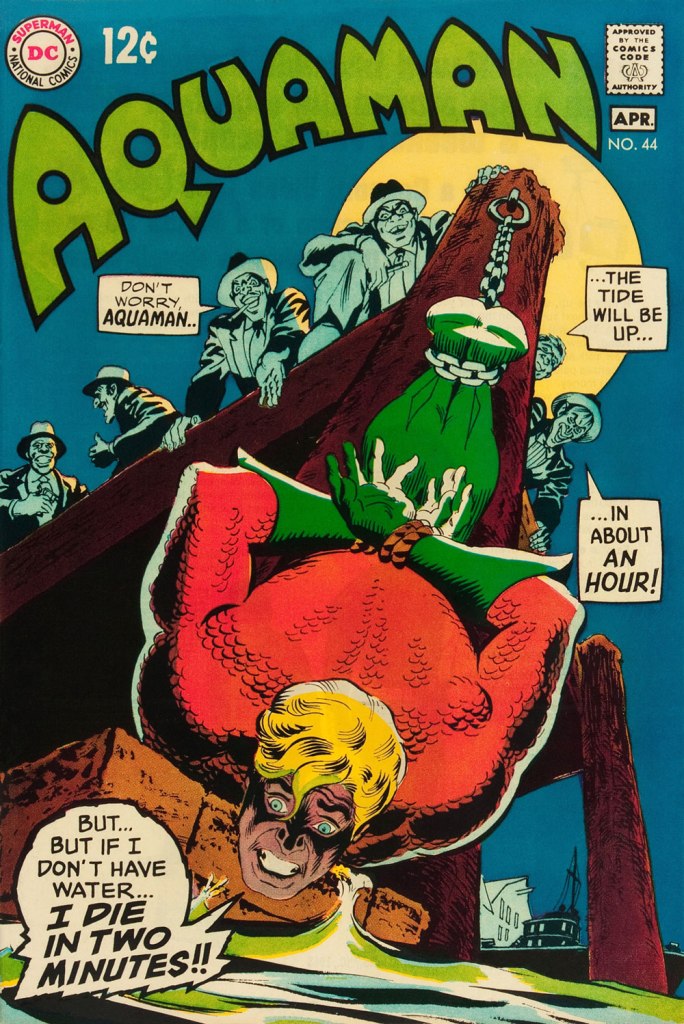
This is Aquaman no. 44 (March-April 1969, DC). I love how, despite the gravity of the situation, the mobsters are kind of cartoony. Cardy would most fruitfully mine this tragicomic vein in the brilliant but short-lived western Bat Lash (1968-69).
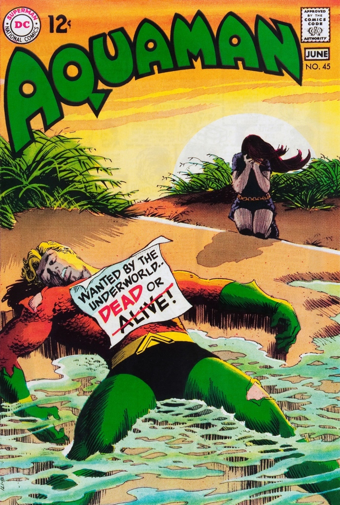
This is Aquaman no. 45 (May-June 1969, DC), concluding Skeates and Aparo’s two-parter, the self-explanatory “Underworld Reward”. An undeniably epochal cover by Mr. Cardy. To wit, so compelling and mysterious is this scene that it’s merited an astute blogger’s impressively in-depth analysis… well worth a peek.
« ... and suddenly, an ordinary business day becomes a day of horrible visions… »
When he was introduced in 1951 (Star Spangled Comics no. 122), Dr. Terrance Thirteen was a perfect fit for the DC universe: a skeptic who, in the nominally-rational world he inhabited, got to elucidate and debunk all sorts of mock-supernatural shenanigans. When the ghost-breaker made his return in the late 60s (as a foil to his also-returning contemporary The Phantom Stranger), however, the world had changed. The editorial balance had shifted in favour of the mystical, and Dr. 13 wasn’t as fortunate as the kids from Scooby Doo: he now faced bonafide manifestations from the beyond, but he wouldn’t have any of it, becoming a blind, overbearing ideologue in the vein of filmic non-believers Dana Andrews in Night of the Demon (aka Curse of the Demon) or the fabulous Peter Wyngarde in Night of the Eagle(aka Burn, Witch, Burn… adapted from Fritz Leiber’sConjure Wife).
And things got worse and worse over the years; by now Dr. 13 is treated as a joke and a punching bag (even Matt Howarth blew it, a rare misfire), but that’s the general climate in the modern mainstream: most long-running characters, even the heroes, with a scientific background (Henry Pym, Reed Richards, Tony Starket al) are frequently depicted as arrogant, misguided and often downright insane.
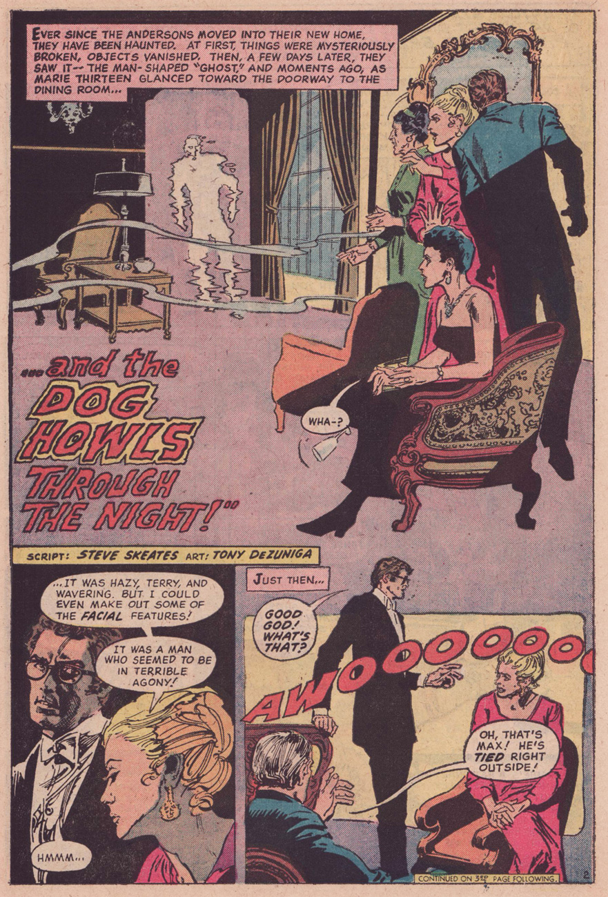
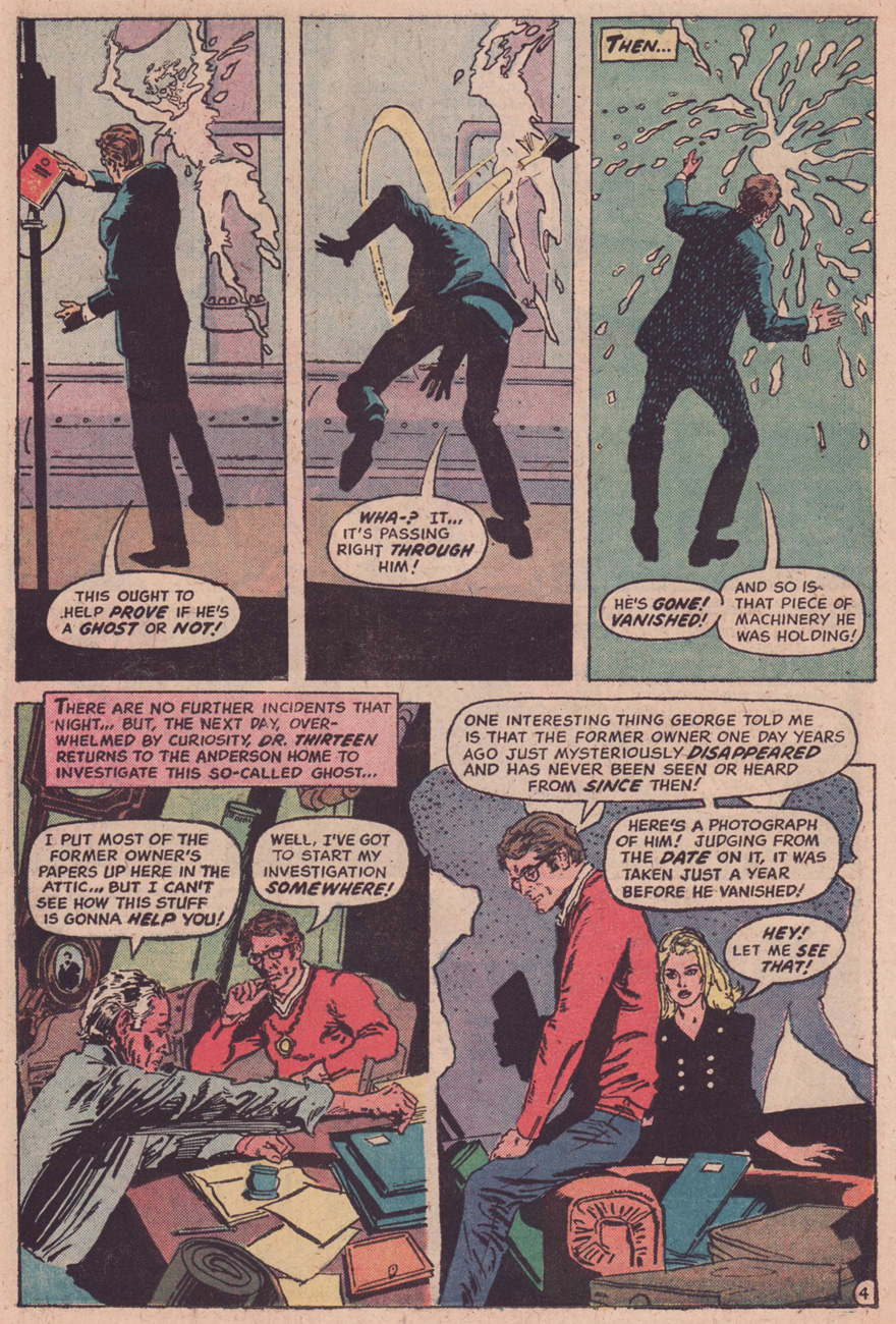
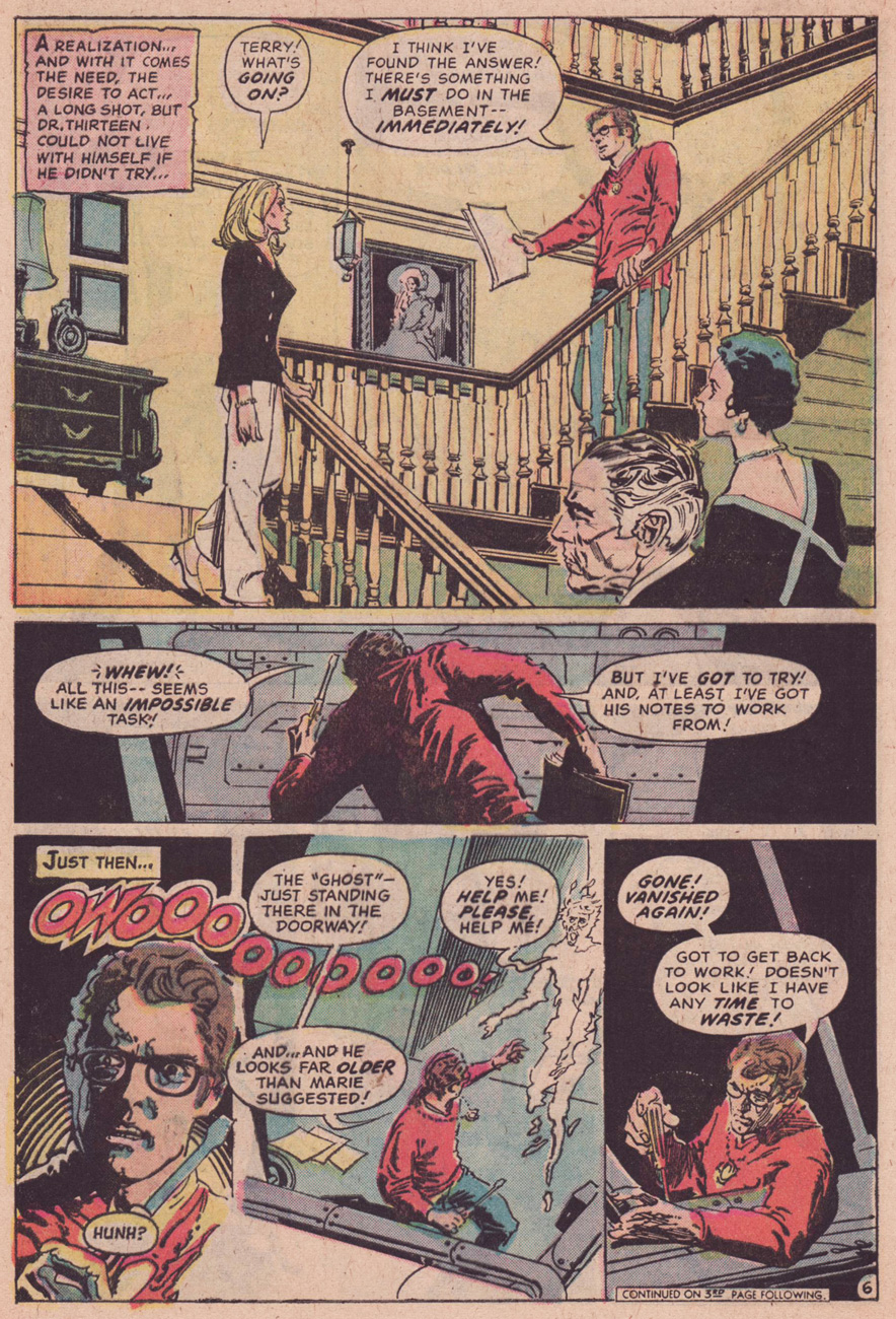
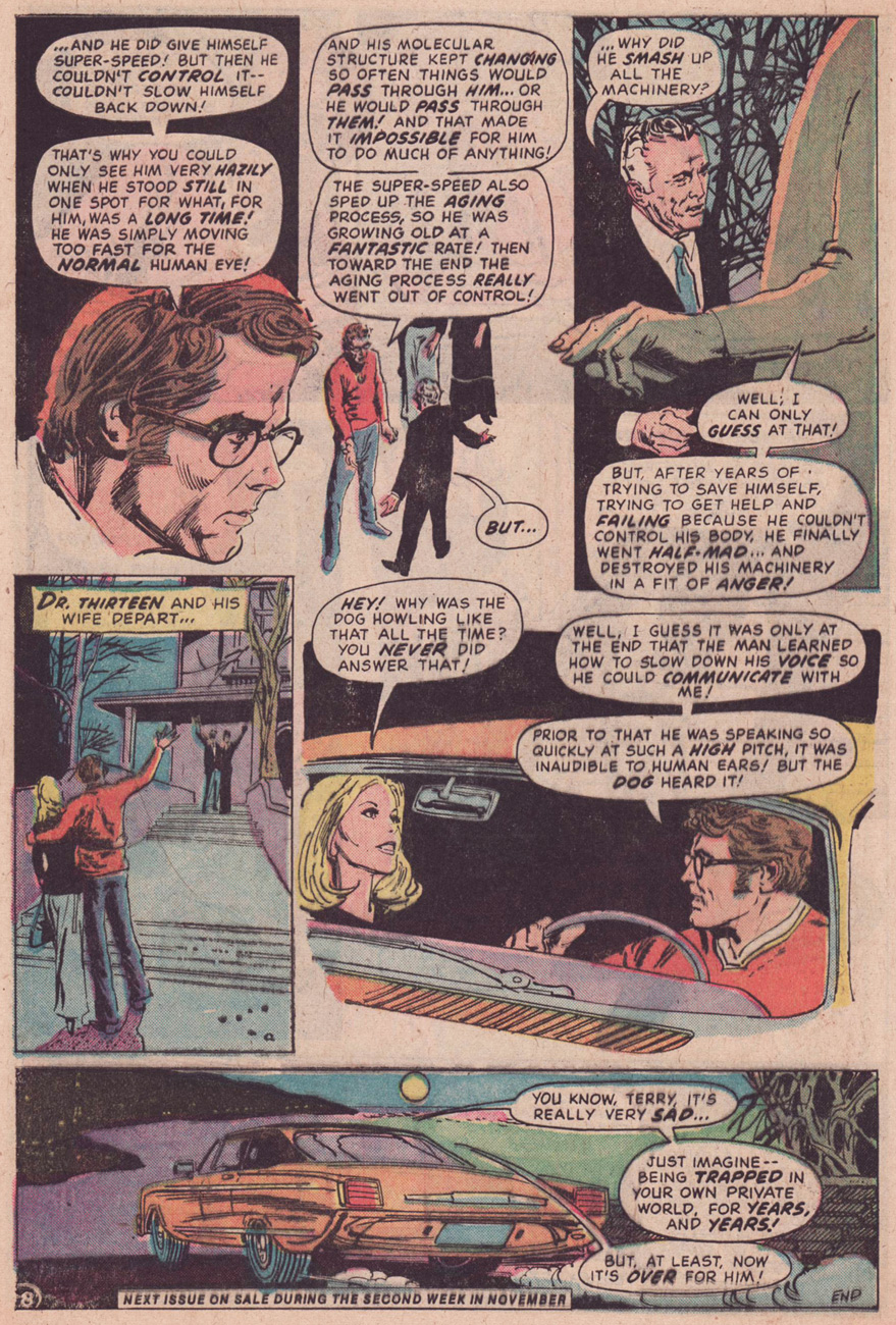
For a brief time in the early 1970s, Dr. 13 was handled by a sympathetic and skillful writer who understood what the man stood for and what made him tick. For a full example, check out our earlier post on another Dr. 13 case, … and the Dog Howls Through the Night! (1974).
Scripter Skeates stated, a few years ago: « I quite like this story, especially the beautiful psychedelic scary artwork DeZuniga provided (an artist I very much enjoyed working with; he also illustrated a number of my Supergirl tales), plus the ending in which I somehow decided to treat this yarn as though it were a cautionary tale, the lesson learned being that one shouldn’t commit murder! For the longest time a copy of this comic wasn’t in my collection , but a couple of years ago I came upon a copy at a convention — the price-tag was a bit high due to the origin story that’s also in there! When I told my wife I had shelled out forty bucks for a comic with a story of mine in it that didn’t even have credits on it, she concluded that I was the one who was quite definitely insane!! »
Some people automatically conflate “goofy” with “childish”, but goofiness comes in many guises: from the charmingly nonsensical to the playfully quirky, from the clearly brilliant but confusing to the fucking stupid. (It’s also a snow-boarding term – How do I tell if I’m Goofy or Regular?) Today’s Tentacle Tuesday is goofy, all right, but more in the category of seemingly drug-induced codswallop. Another word for Dial H for Hero is wacky; distinctly wacky, so wacky that (as co-admin RG put it) it’s hard to really dislike it.
Maybe I should backtrack for those in the audience who are not familiar with the concept of Dial H for Hero. Robby Reed, a lucky (?), plucky teenager with a propensity to shout “Sockamagee!” in moments of excitement, stumbles upon some sort of magical thingamajig in a cave that enables him to become a superhero at the drop of hat (well, a turn of a dial). The process has unpredictable and uncontrollable results, in the sense that Robby has no idea who he will become, or what powers will be at his fingertips.
I have nothing against the idea of a rotary phone cum magical dial – that idea is rather interesting, given that rotary phones are indeed mysterious objects to the current generation – but I find the stories a tad too random to be enjoyable. Yet that’s the aspect that some readers clearly relished. To quote a letter from House of Mystery no. 172 (January-February 1968) from Bethesda, MD’s Irene Vartanoff.
« One of the best things about DIAL H FOR HERO is the huge amount of imagination put into each story. When at least two new heroes with new powers, costumes, weaknesses, bodies, etc. have to appear in each story, it may make your writers rack their brains and work overtime, but the results are fantastic. »
Given all the transformations Robby has gone through and the many bad guys he has had the pleasure of defeating, it is unavoidable that he would 1) encounter some villains with tentacles 2) acquire some tentacles himself. Dial H for Highball on *your* old-fashioned phone, if you still have one gathering dust in the attic, and enjoy this gallery of fun nonsense.
The very first appearance of Robby Reed and his magical dial, and already we have tentacles:
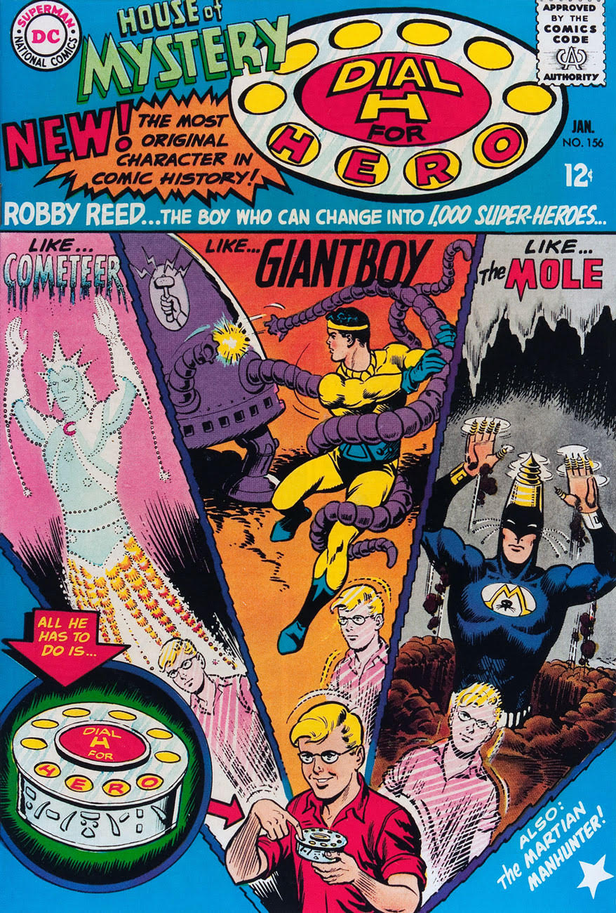
House of Mystery no. 156 (January 1966), cover by Jim Mooney. This is a good demonstration of how random some of the superheroes generated by the machine are.
This is the first Dial H for Hero story, and as such it has no other title. Scripted by Dave Wood, drawn by Jim Mooney. [RG: panel three looks suspiciously like the work of George Tuska. Ghosting… or swiping? Hmm…]I mentioned that Robby himself sometimes sprouts tentacles. Here’s a good example:
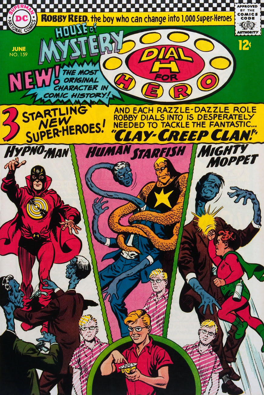
House of Mystery no. 159 (June 1966), cover by Jim Mooney. Another issue, another gallery of improbable heroes and villains…
Human Starfish Robby Reed conveniently improves upon the concept of a normal starfish, developing prehensile appendages to capture a very stretchy criminal. The Clay-Creep Clan is written by Dave Wood, and drawn by Jim Mooney.
Jim Mooney was responsible for Dial H for Hero‘s art for many issues, from the onset of the series with House of Mysteryno. 156 (January 1966) to House of Mystery no. 170 (October 1967). Dial H for Hero lasted three more issues after Mooney’s departure. As luck would have it, no. 171 and no. 172 bring our most striking examples of tentacles yet. (The final DHFH issue, House of Mysteryno. 173, features a cover by Jack Sparling, with insides by Charles Nicholas and Sal Trapani.)
Arguably the prettiest cover of this post (my favourite, at any rate):
Back to fighting tentacles! House of Mystery no. 171 (December 1967), cover by Nick Cardy.
The Micro-Monsters! is written by Dick Wood and illustrated by Frank Springer.
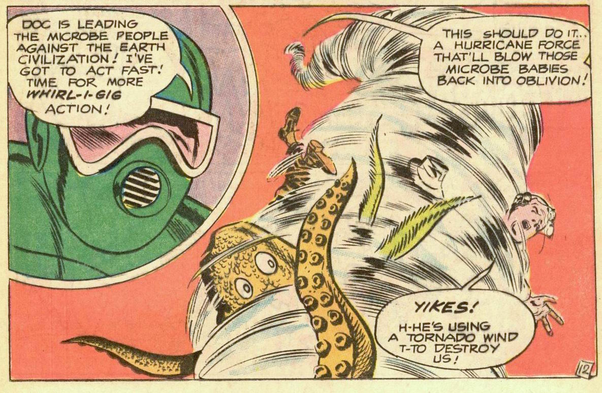
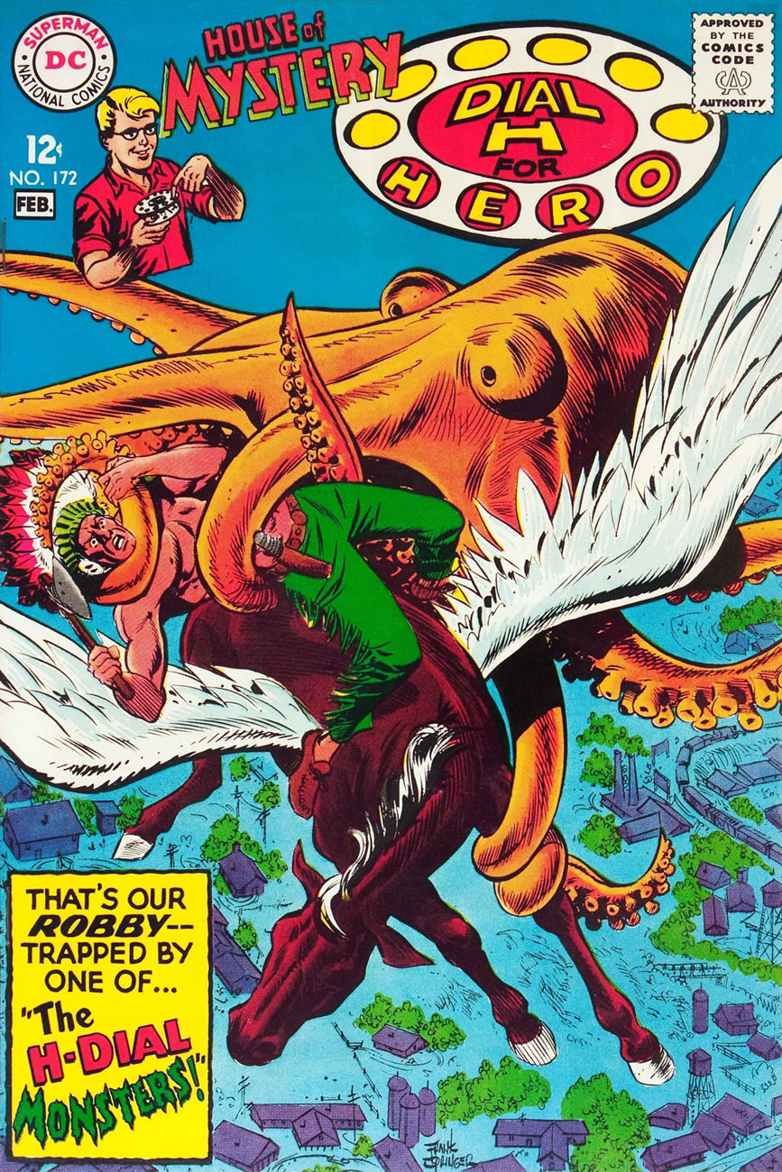
House of Mystery no. 172 (January-February 1668), cover by Frank Springer.
The Monsters From the H-Dial! is written by Dick Wood and illustrated by Frank Springer.
How does Chief Mighty Arrow defeat the flying octopus? Why, by shooting jet-propelled feathers from his headdress, of course.
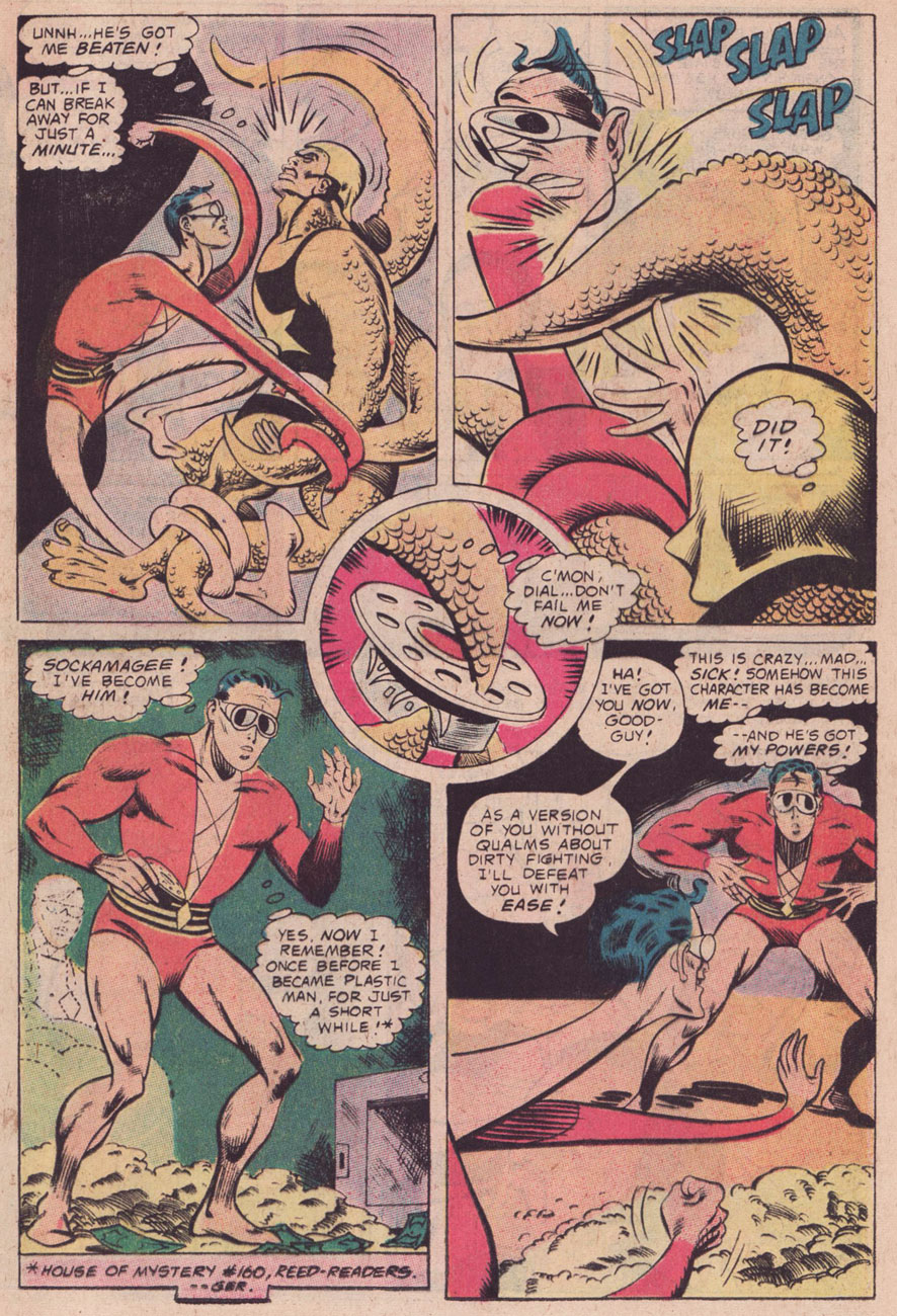
The last thing I’d like to mention is that my favourite Robby Reed appearance was in an issue of Plastic Man, of all places – to be more precise, in Plastic Man no. 13 (June-July 1976). In If I Kill Me, Will I Die? (read it here!), scripted by Steve Skeates, pencilled by Ramona Fradon and inked by Bob Smith, Reed not only gets to take on Plas (in more ways than one), but also falls deeply and magically in love with a professional hog-caller. Also, tentacles. Adorable *and* exciting!
When you think of Aquaman, what is the first thing that comes to mind? Is he a brooding, tragic hero? A hapless sap whose prowess extends no further than throwing a starfish at his assailant? A talented swimmer, defender of Earth’s oceans?
« The image of the superhero riding on a chariot made of fish—sporting that classic orange top and green pants—sealed the depths-dweller in public memory as a doofy champion, despite defenders who insist there’s more to Aquaman than talking to fish and riding them places. While later depictions of the character emphasized his serious side, Aquaman jokes abounded especially in the 90s and 2000s—largely thanks to a school of young male animators, including Seth MacFarlane and South Park’s Matt Stone and Trey Parker, who couldn’t help but poke fun at Aquaman’s ineffectual reputation. »|source|
I believe the aforementioned Aquaman’s defenders are slightly missing the point. What’s wrong with catching a ride from a fish, or getting a helping hand from an octopus? In Aquaman’s world, octopuses play the role of indispensable helpers, using their tentacles as lassos, bludgeons and tourniquets, or forming acrobatic formations to give Aquaman a boost. Does this somehow make this superhero wimpy? Do we seriously still believe that treating animals with kindness, or collaborating with them, is emasculating? No wonder this world is going to hell in a handbasket. The audience for superhero comics sometimes seems to be quite devoid of imagination (or a sense of humour).
« Jokes about his wholesome, weak portrayal in Super Friends and perceived feeble powers and abilities […] led DC to attempt to make the character edgier or more powerful in comic books. Modern comic book depictions have attempted to reconcile these various aspects of his public perception, casting Aquaman as serious and brooding, saddled with an ill reputation, and struggling to find a true role and purpose beyond his public side as a deposed king and a fallen hero. » |source|
Okay, I’ve grumbled, and now I’ll move on to the tentacles. Take a seat astride your favourite jellyfish, strap in your fins, and let’s go!
Aquaman, the child of an undersea explorer who learned how to breathe and live underwater “by training and a hundred scientific secrets”, was created in 1941 by Paul Norris and Mort Weisinger. During the Golden Age of comics, he fought various evil guys (usually from water-related professions: sailors, marine biologists, pirates… and Axis villains, too). The whole thing started becoming really interesting (imho) in 1956 (coincidentally, with the advent of Silver Age), when Aquaman acquired his sidekick Topo the Octopus:
Topo’s first appearance! « Aquaman’s Undersea Partner », drawn by Ramona Fradon, published in Adventure Comics no. 229 (October 1956).
Ramona Fradon handled Aquaman from 1951 to 1959, when she became pregnant and had to temporarily withdraw from the comics field until 1963. She deserves a separate post, really, especially since I love her art. In the meantime, read The Woman Who Made Aquaman a Star. As for Topo, I don’t have to explain why I’m fond of the idea of an octopus sidekick.
A few nice Fradon pages:
«The Town That Went Underwater», drawn by Ramona Fradon. It was published in Adventure Comics no. 246 (March 1958).
Another panel from « The Town That Went Underwater ».
A panel from « The Undersea Hospital! », scripted by Robert Bernstein and drawn by Ramona Fradon. This issue, Adventure Comics no. 262 (July 1959), has not one, but two fun animal stories: the other one – also lovable, imaginative nonsense – is « The Colossal Superdog », scripted by Otto Binder and drawn by George Papp.
Another panel from « The Undersea Hospital! ». Don’t you love the idea of a seaweed stretcher with eel supports?
In 1961, Nick Cardy started working on Aquaman with Showcase no. 31 (March-April 1961). When the sea king got his own title in 1962, Cardy became the regular artist, drawing inside stories and covers until Aquaman no. 39 (May-June 1968), and staying as the cover artist until Aquaman no. 56 (April 1971).
« Cardy proved adept at drawing sea creatures; his fluid, swirling water currents helped create a captivating, eye-pleasing undersea world. He became a fan favorite, not only because of his superb story-telling ability, solid figure work and facile inking, but because of the way he rendered Mera, Aquaman’s girlfriend. Cardy’s women had curves, not angles, and seemed to exist in three dimensions on the two-dimensional page. He never stopped trying to elevate his work, until the later covers in the series were among the most striking and imaginative of the publisher’s entire line.» (source: Comics Journal’s eulogy for Nick Cardy)
Well, that’s high praise indeed, but is it deserved? I can confirm that Cardy covers were really inventive. As for the interior art, let’s take a peek, as these stories conveniently overflow with tentacles.
There’s tentacles getting tangled, the octopus equivalent on panties in a twist…
Panel from « The Invasion of the Fire Trolls », scripted by Jack Miller and drawn by Nick Cardy, published in Aquaman no. 1 (January-February 1962).
Panel from « The Aquaman from Atlantis », scripted by Jack Miller and Nick Cardy, published in Aquaman no. 3 (May-June 1962).
An army of octopus fighters…
Page from « The Menace of Alien Island », scripted by Jack Miller and drawn by Nick Cardy, published in Aquaman no. 4 (July-August 1962).
I promised you acrobatics, so here are some octopuses doing a cheerleading routine (Aquaman forgot his pompoms at home):
Aquaman no. 9 (May-June 1963). « The menace of the Aqualad-Creature » is scripted by Jack Miller and drawn by Nick Cardy.
It’s not *all* octopus tentacles. Page from « The Secret Mission of King Neptune», scripted by Jack Miller and drawn by Nick Cardy, printed in Aquaman no. 9 (May-June 1963).
Continuing our tentacle shenanigans…
Any jerk who refers to an octopus as a “fish” deserves what’s coming to him. Page from « The Doom from Dimension Aqua », scripted by Jack Miller and drawn by Nick Cardy, published in Aquaman no. 11 (September-October 1963).
As usual, mind fuckery rears its ugly head whenever romance is part of the plot. “I could kill you! But I really love you, actually!” An eye roll and a sigh. Panels from « The Wife of Aquaman », scripted by Jack Miller and drawn by Nick Cardy, published in Aquaman no. 18 (November-December 1964).
Page from « The Wife of Aquaman », scripted by Jack Miller and drawn by Nick Cardy, published in Aquaman no. 18 (November-December 1964).
One of those Nick Cardy covers we were discussing earlier, so you can decide for yourself whether his women are all angles or all curves:
Aquaman no. 22 (July-August 1965), cover by Nick Cardy.
« The Trap of the Sinister Sea Nymphs », published in Aquaman no. 22 (July-August 1965) art by Nick Cardy.
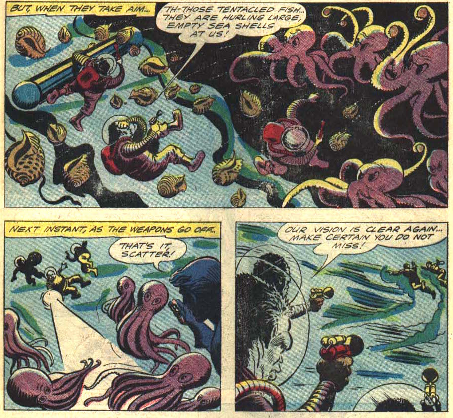
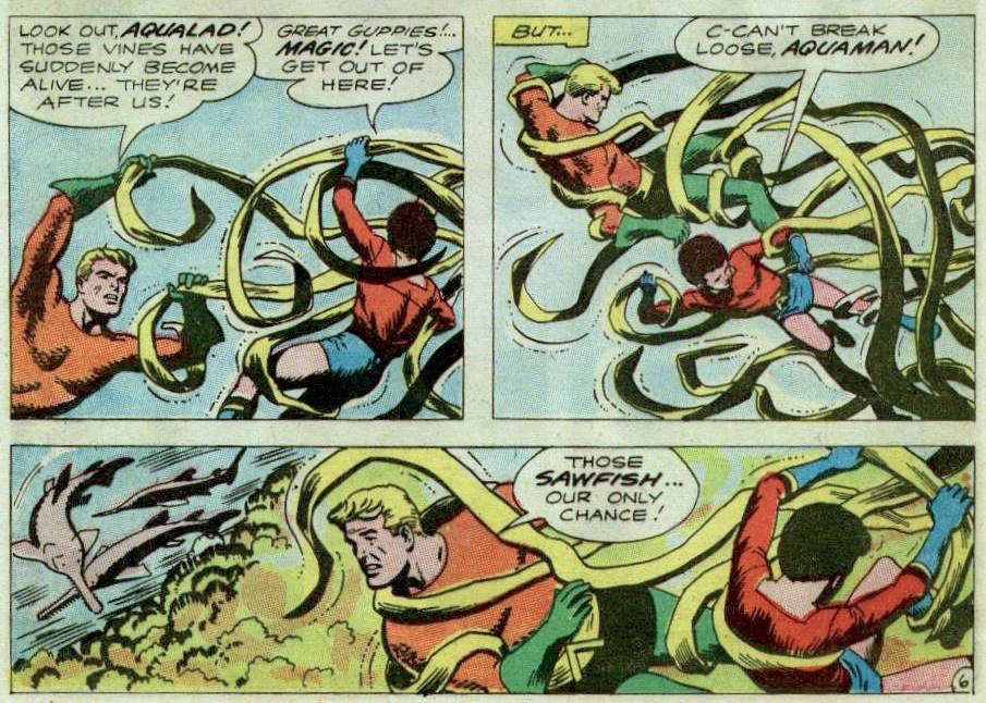
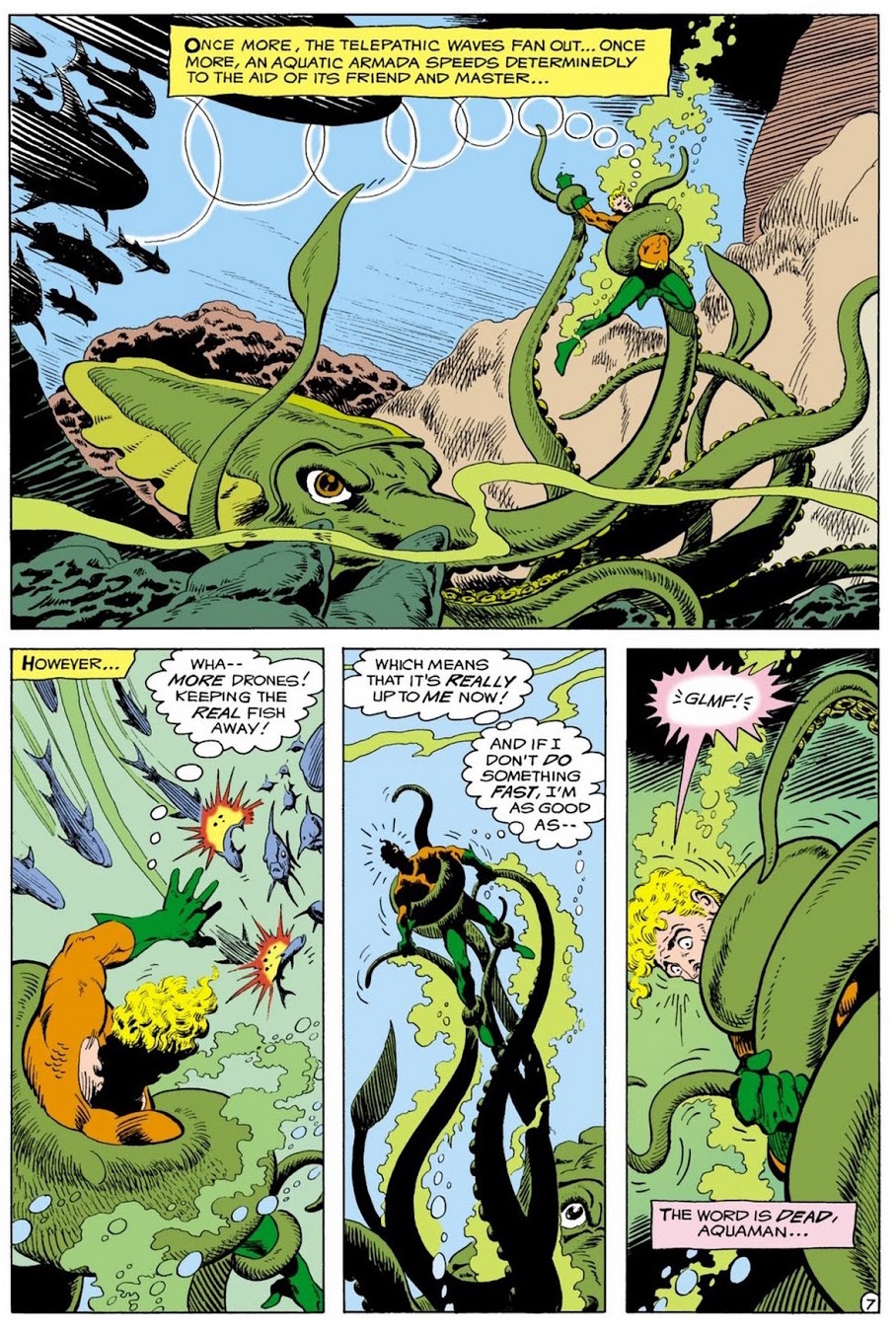
With Aquaman no. 40 (July-August 1968), Jim Aparo replaced Cardy on the inside art. Issues no. 40 to no. 47 (September-October 1969) were scripted by Steve Skeates (a definite favourite of this blog; read co-admin RG’S post “… and the Dog Howls Through the Night!”) and drawn by Jim Aparo. This creative team is a favourite of many an Aquaman fan. Voilà:
Page from « Return of the Alien! », scripted by Steve Skeates and drawn by Jim Aparo, printed in Aquaman no. 55 (January-February 1971).
Panel from « Return of the Alien! », scripted by Steve Skeates and drawn by Jim Aparo, printed in Aquaman no. 55 (January-February 1971).
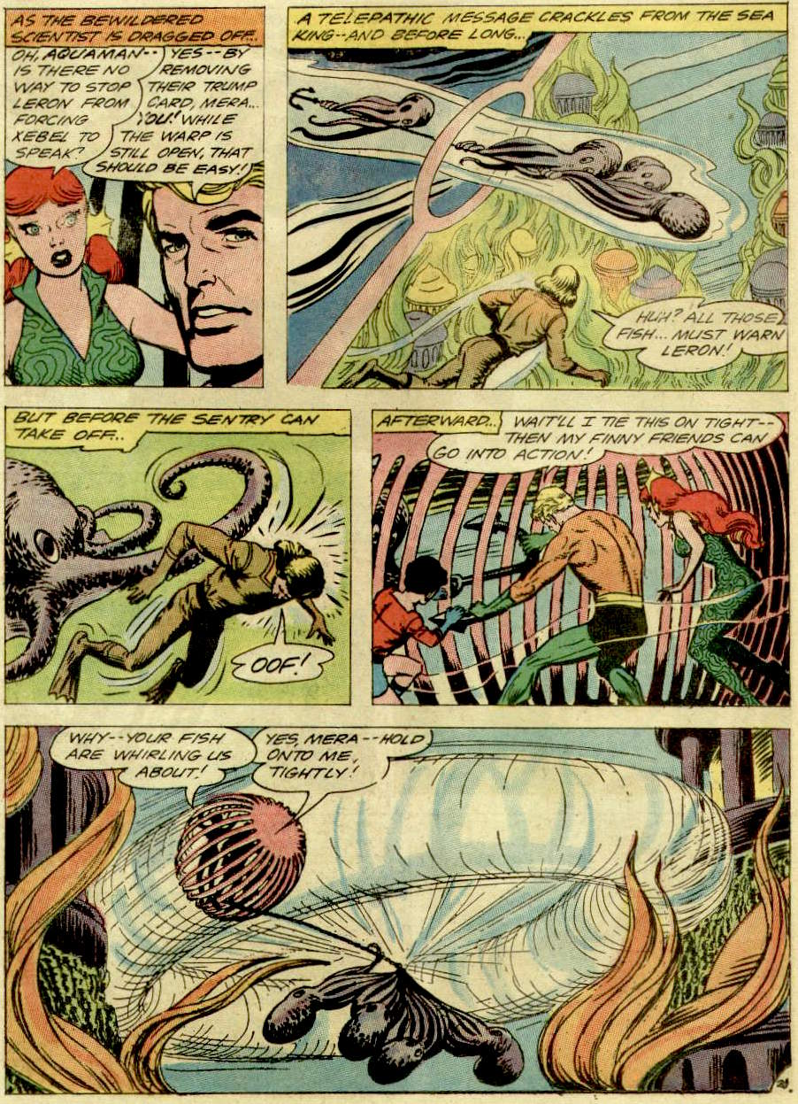
More Jim Aparo (sans Skeates):
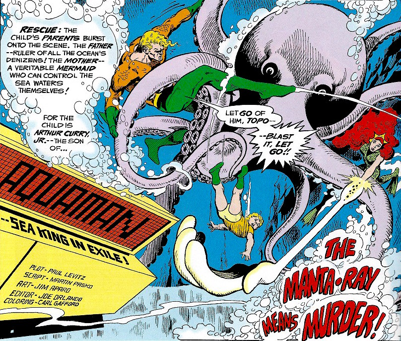
« The Manta-Ray Means Murder! », scripted by Paul Levitz and Martin Pasko and drawn by Jim Aparo, published in Adventure Comics no. 446 (July-August 1976).
Aquaman no. 57 (August-September 1977), cover by Jim Aparo. I’m angry at that stupid “you could be in the Superman movie” sign that’s far more distracting than it has any right to be.
Page from « A Life for a Life », scripted by David Michelinie and drawn by Jim Aparo, published in Aquaman no. 57 (August-September 1977).
Another page from « A Life for a Life ».
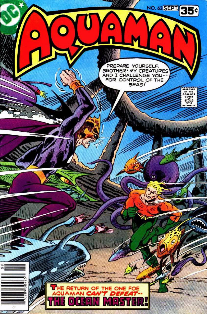
Aquaman no. 63 (August-September 1978), cover by Jim Aparo.
You can read issues Aquaman issues no. 1 through to 63 here.
One last thing… I happen to be the proud owner of a piece of original art by Ramona Fradon (of fairly recent vintage), given to me by my sweetie. Lucky me!
Keep your octopus pals happy and you’re guaranteed a fulfilling relationship.
In this installment of Tentacle Tuesday, we shall bear witness to a somewhat surprising facet of superhero life: superheroes sometimes struggle with tentacles, too.
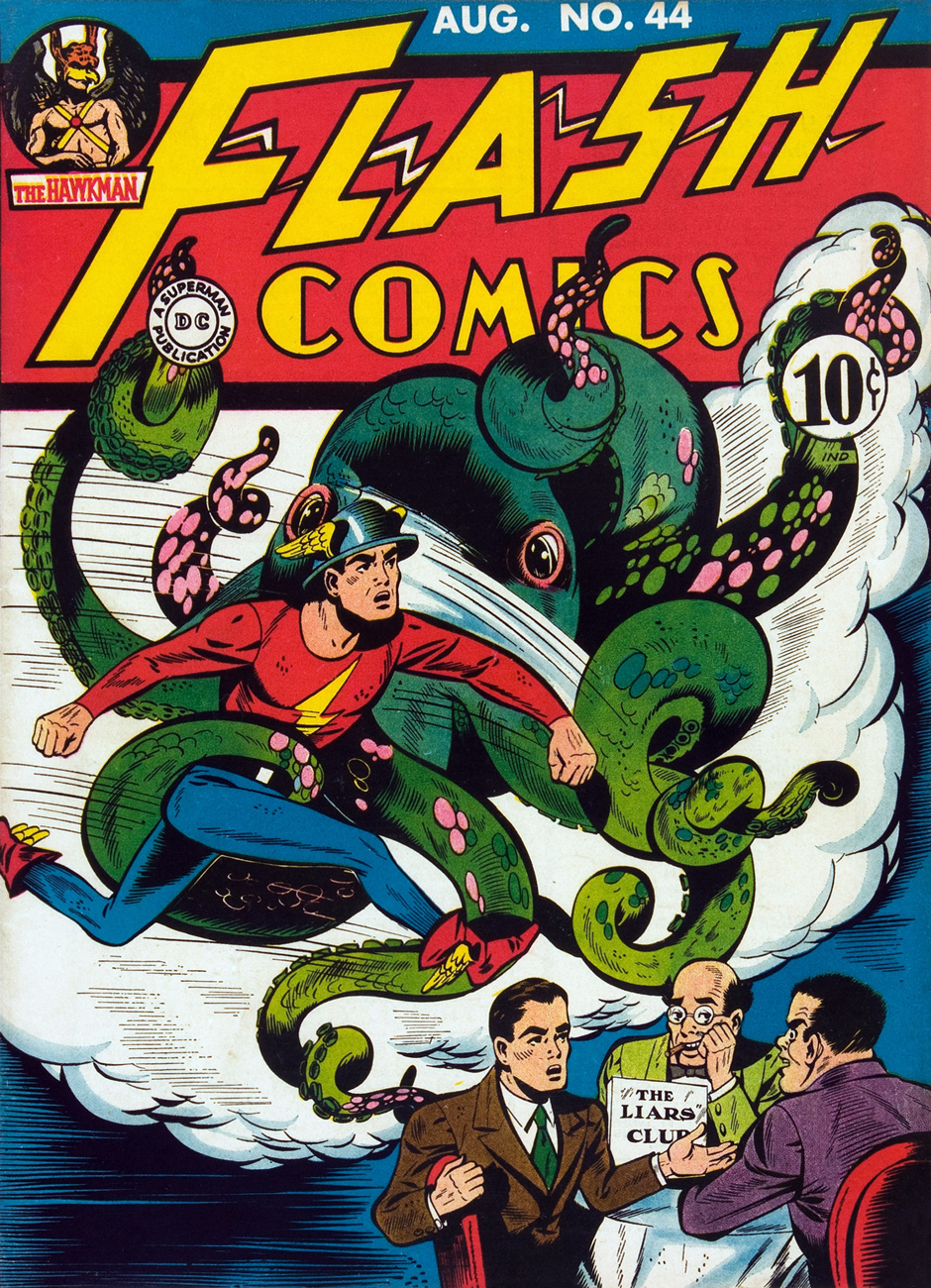
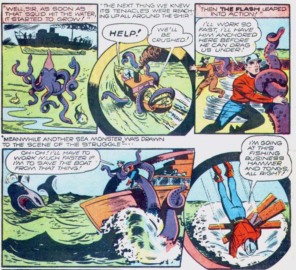
To kick off the festivities (and to respect a chronological order of creation and publication), here’s The Flash narrating a story of woe, his almost-deadly encounter with a green monstrosity (Judging by its coquettish pink tentacles, the monster wanted to woo him, not snuff him out.)
Flash Comics no. 44, 1943. Cover by Lou Ferstadt (1900-1954), and here’s a bit of trivia: in addition to being a comics artist, he was a muralist, creating works for the RCA buildings and the 8th Street Subway station in NYC.
« The Liar’s Club », scripted by Gardner Fox and drawn by Lou Ferstadt, concerns itself with three men (one of whom is Jay Garrick, secretly The Flash) holding a fibbing contest to determine who can tell the biggest Flash-whopper.
Sadly, this tale was not the winner in the contest.
The Flash may have been embroiled in some purely imaginary tentacles, but his Earth-One counterpart’s teenage sidekick (it’s complicated), Kid Flash, encountered the real deal.
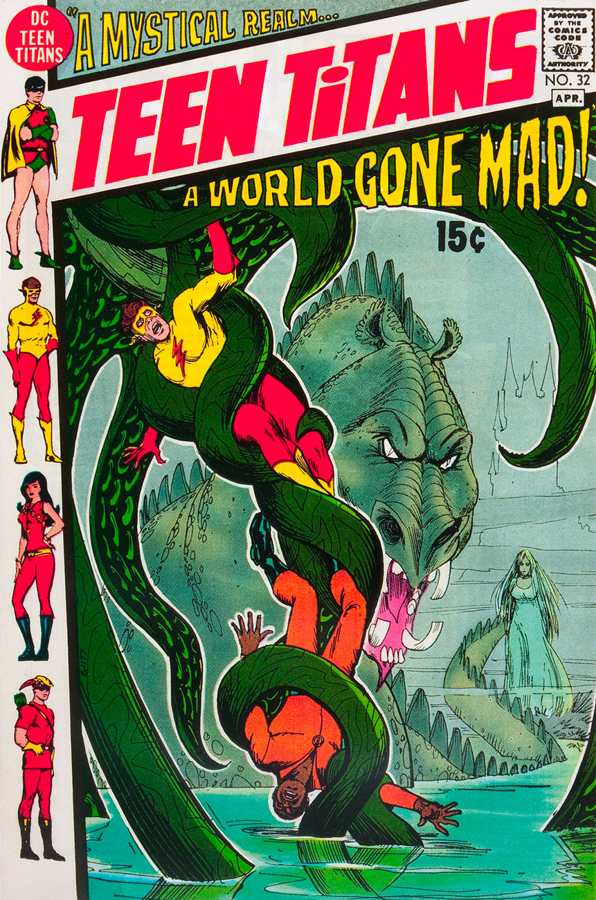
Teen Titans no. 32, March-April 1971. Drawn by Nick Cardy.
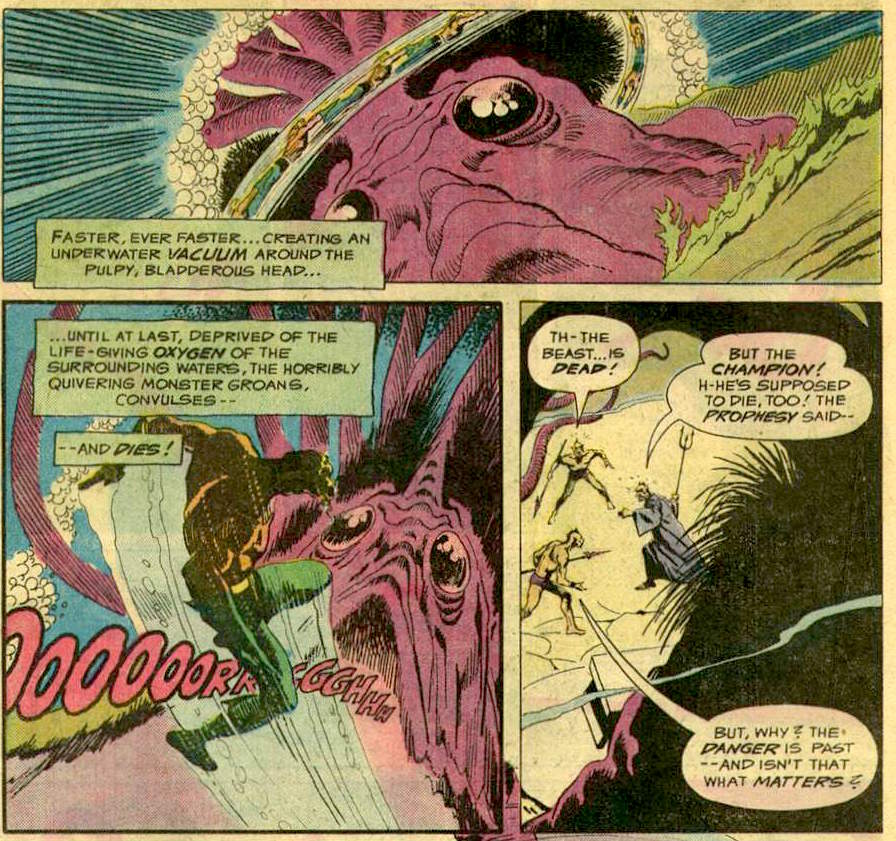
« A Mystical Realm, A World Gone Mad », scripted by Steve Skeates and drawn by Nick Cardy, is actually a pretty good read (with good art!), and I don’t even like superheroes. Just check out the beautiful results of a time travel experiment going wrong (when does one ever go right?), including the evil red eyes of a glaring octopus:
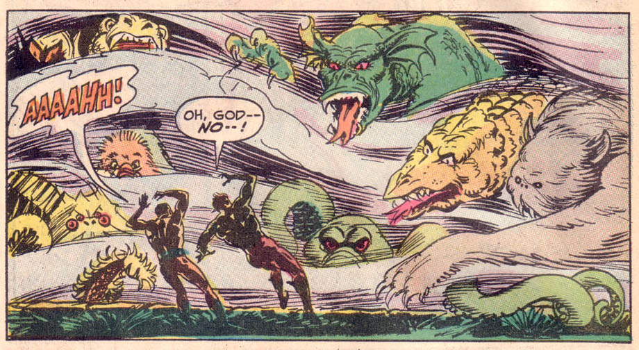
If we throw a whole bevy of superheroes at a tentacled monster, are they going to fare any better?
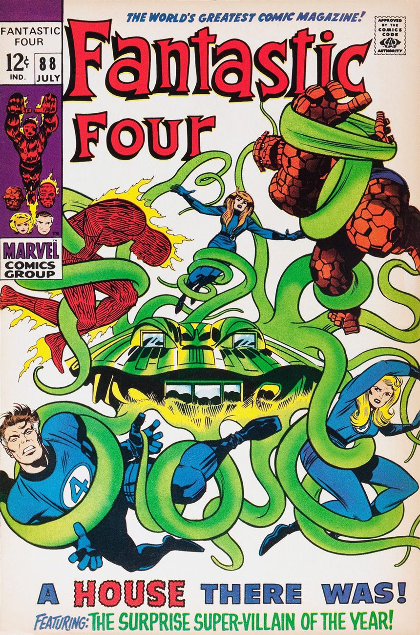
Fantastic Four no. 88, 1969. Pencils by Jack Kirby, inks by Joe Sinnott, letters by Sam Rosen. However… A house there was. Tentacles there weren’t.
This cover promises lots of tentacular fun. Instead of that, the Fantastic Four (and an infant) go looking for a new residence, something quiet and secluded – and the house that’s offered to them by a real estate agent appears to be haunted. At the very least, it causes migraines, gradually makes its inhabitants go blind, and shoots stun bolts out of its walls. The usual crap. I don’t want to tell you which super-villain is behind this mischief, but I will, however, point out that the bastard doesn’t have tentacles. Not even one. And neither does his lousy house.
The Flash is small fry, the Fantastic Four are mincemeat, but let’s see how Superman, the most superhero-like superhero of them all, fares when confronted with tentacles.
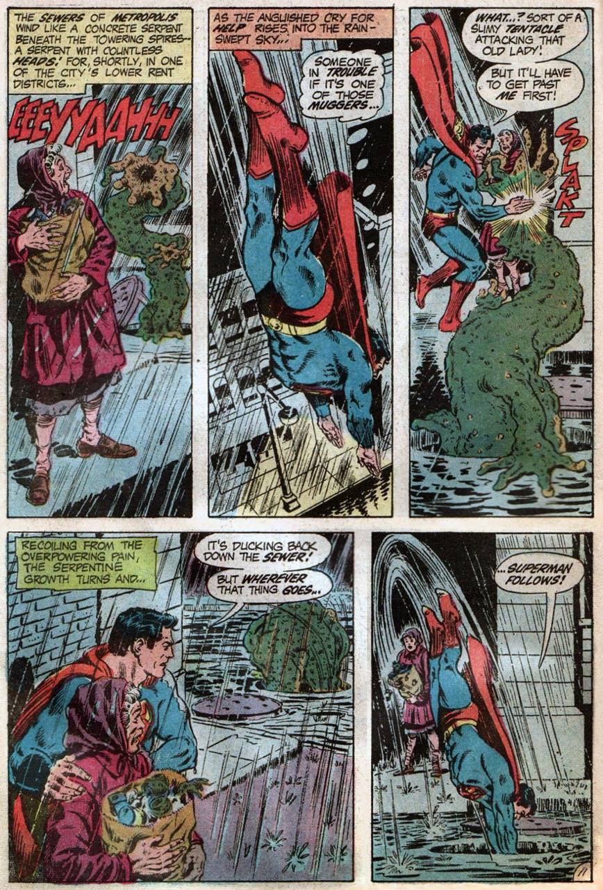
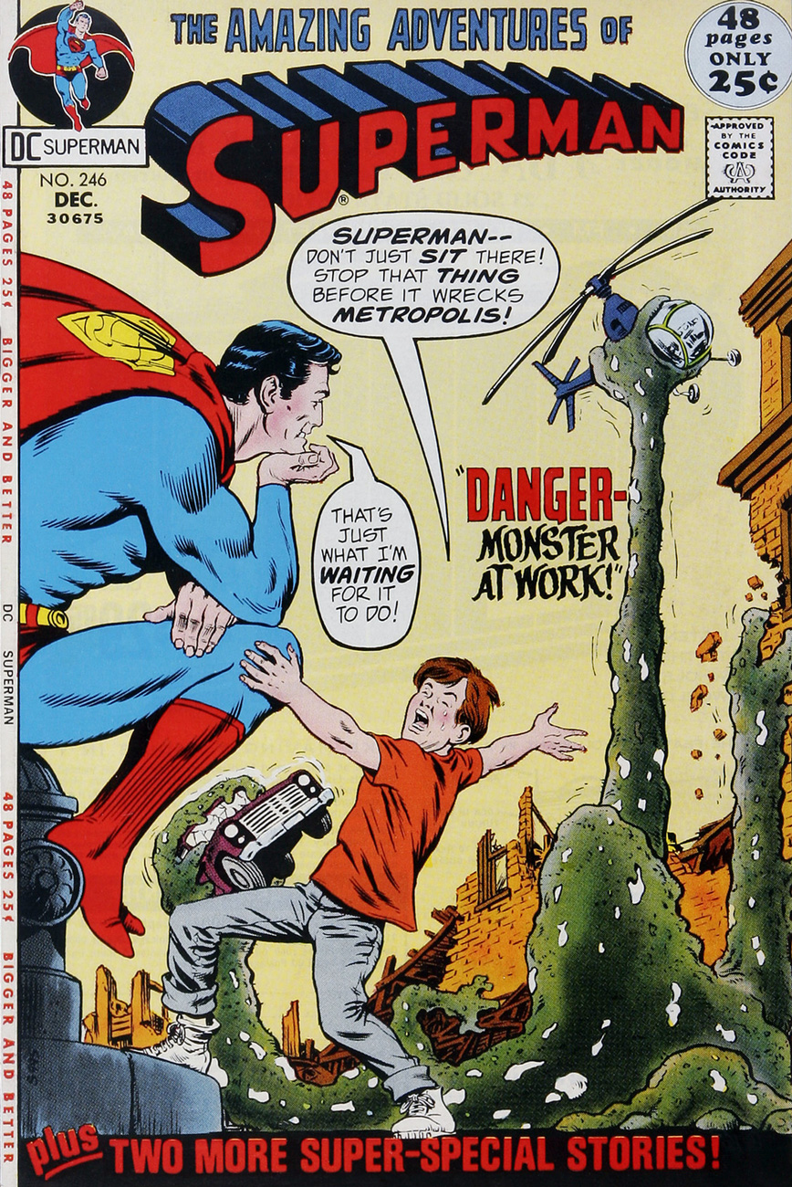
In “Danger — Monster at Work!”, the villain is a protoplasmic glob: some algae mutates after a lab accident and becomes an out-of-control, garbage-devouring, tentacled monster. Now, trash disposal is important, but when Superman realizes that everything on earth is impure to some degree, he has to stop the seaweed monstrosity before “it cleans Metropolis right off the map!”
This story was published in Superman no. 246 (December 1971), with a script by Len Wein, pencils by Curt Swan and inks by Murphy Anderson.
Incidentally, there *is* actually an algae farm that’s suspended over a highway in Geneva, Switzerland that gobbles up CO2 produced by car engines. I hope they’re keeping a close eye on it…
Tentacles? Well, “grasping appendages” anyway – let’s be generous. Superman no. 246, December 1971; pencilled by Curt Swan, inked by Murphy Anderson.
How about if we take a superhero who’s quite at ease with water, who can breathe H2O and communicate with sea life?
“Nope, sorry, still gonna gobble you.”
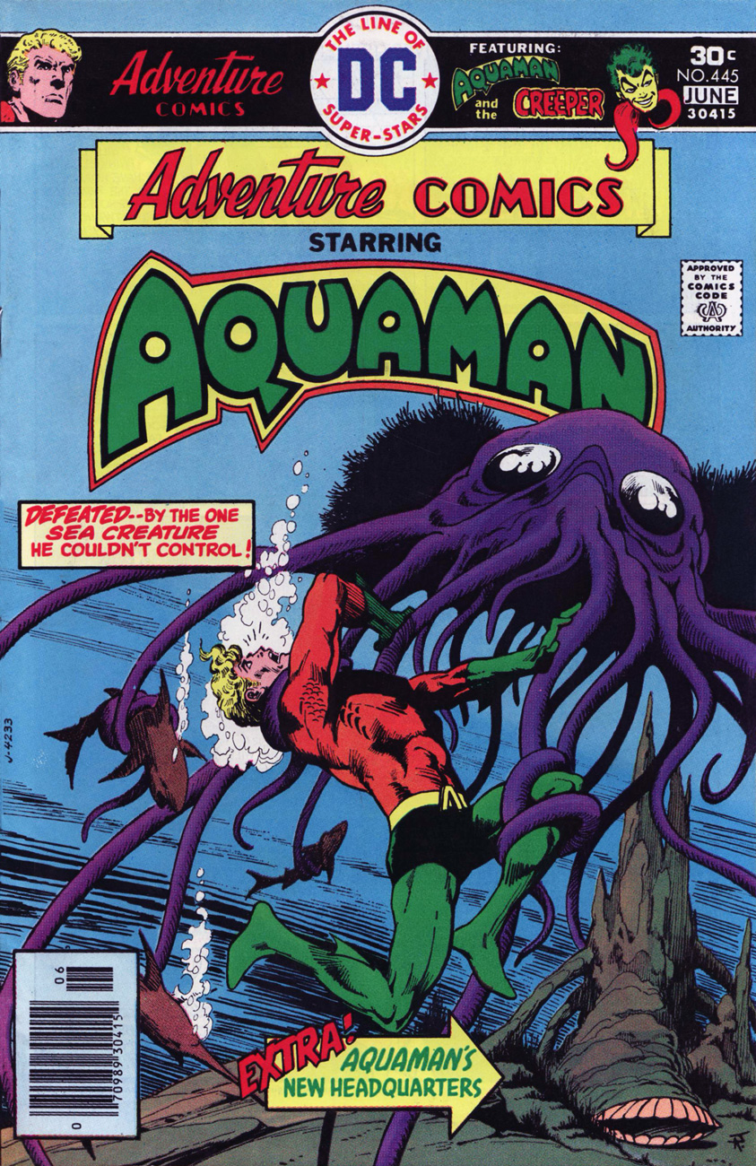
Adventure Comics no. 445 (May 1976). Cover by Jim Aparo, with colours by Tatjana Wood.
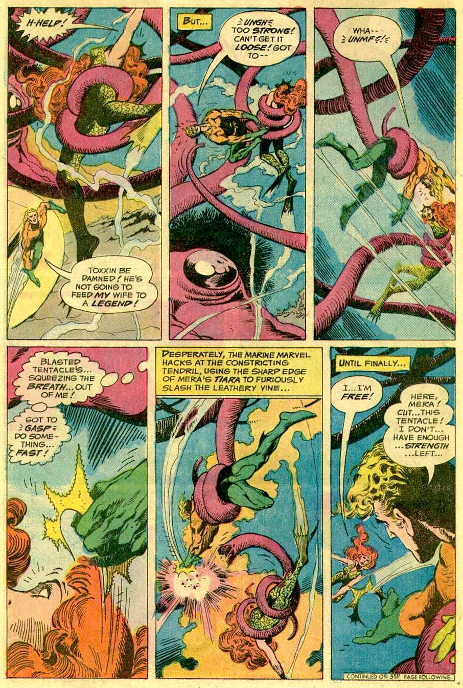
This imposing figure of an octopus (even though he’s referred to as a “plant-thing” by Aquaman) is Krakor, the tentacled antagonist from “Toxxin’s Raiders” – the cover story written by Paul Levitz & David Michelinie and drawn by Jim Aparo.
Oh, no! What is our hero going to do? Why, dispatch the octopus in the most far-fetched manner possible, of course!
In conclusion, no superhero is immune from a harrowing encounter with a tentacled creature… but sadly, the latter is more often than not annihilated in the struggle. Next time, I’ll make sure to present you with some material in which the octopus gets the upper hand, so to speak!
On this fine day, we pay tribute to shifty scribe Chester P. Hazel (who sometimes goes by the unlikely nom de plume of Steve Skeates). It is whispered that Stephen, along with his nefarious twin Warren Savin, first invaded this plane of existence on January 29, 1943. That would make him/them/it seventy-five earthly rotations old, should these windblown tattles hold any credence.
Happily, in this case, picking out a Skeates favourite to share was no ordeal: I’d been meaning for some time to shine a light on one of his neglected gems, one that salt-rubbingly ran without proper attribution in The Phantom Strangerno. 34 (Dec. 1974-Jan. 1975, DC Comics.)
The cases of Dr. Terrance Thirteen, ghost breaker, must have been easier to write back in the 1950’s, when DC Comics’ default setting in its mystery titles was to explain away the supernatural element before the curtain call. DC’s resident skeptic first shared his insights in Star Spangled Comics, his feature lasting from issue 122 (November, 1951) to issue 130 (July, 1952). He then moved to The House of Mystery for a handful of appearances, then faded away. He returned to action, along with his also long-dormant colleague and foil The Phantom Stranger, in 1969’s Showcase no. 80. In the Supernatural Seventies, all poor Dr. Thirteen could do is vainly and stubbornly play the cards of reason and logic against a house deck stacked to inevitably favour the uncanny and the unreal. He was doomed to be a comic book version of The X-Files’ Dana Scully, Fritz Leiber‘s Norman Saylor (Conjure Wife, 1943) or Night of the Demon‘s Dr. John Holden, all skeptics coming off as hopelessly obdurate and clueless in light of the “facts”.
Sounds like today’s so-called post-fact world… in which we need true skeptics (as opposed to deniers) and cool, rational minds more than ever.
Anyway, it wasn’t the first time wily Skeates had faced such a storytelling impasse: he’d had to ring the changes on pacifist character Dove (of Steve Ditko’s eternally squabbling Hawk & Dove) within a universe of hard-slugging super vigilantes.
Dr. Thirteen bounced around various DC titles in the early-to-mid 70s. This is the series’ last bow in the back pages of The Phantom Stranger, and ironically its finest hour, alongside the penultimate entry, The Ghosts on the Glasses, which ran in Adventure Comicsno. 428 (August, 1973.) In both cases, the inspired artwork is that of Filipino master Tony DeZuñiga (1932 – 2012), who was clearly in his element.
A character likens the dead scientist’s ill-fated velocity experiments to comic book character The Flash… but it’s a cinch that what the impish* Mr. Skeates really had in mind was Virgil “Guy” Gilbert, aka Lightning, whose début, The Deadly Dust! he had scripted back in 1965 (T.H.U.N.D.E.R. Agents no. 4, April 1966). Here’s a relevant excerpt, featuring art by Mike Sekowsky and Frank Giacoia.
In closing, a biographical blurb from DC’s T.H.U.N.D.E.R. Agents Archives, circa 2002: « A native and longtime resident of the Empire State, Steve Skeates began his work in comics as an assistant editor at Marvel Comics in 1965 – a job which he quickly abandoned in favor of writing comics as a full-time freelancer. Over the next twenty years he did work for nearly every major comics publisher, including DC, Marvel, Charlton, Tower, Warren, and Gold Key. Since leaving mainstream comics in the mid-1980s, he has worked as a reporter, bartender, and Zamboni operator, as well as publishing his own comics titles, which he continues to do from his home base in Fairport, New York. »
Happy birthday, Mr. Skeates, and thanks for everything!


 ~ ds
~ ds