Tentacle Tuesday: Tenta-come-lately

I have this tendency to overlook comics published more recently than 20 years ago. It’s not a conscious bias on my part (aw, who are we kidding?), and yet…  Why would I waste precious time trying to find something “modern” (which is a flexible concept, anyway) that’s half-decent instead of enjoying the bounty of excellent comics produced in the 60 (if not 70) years preceding the 2000s?

Having said that, tentacles are more popular than ever in the comics field – a panacea for a number of storytelling foibles, a piquant ingredient to offset blandness, a freaking deus ex machina. Unfortunately, almost all of the post-2000 comics graced by the appearance of tentacles are of the butt-ugly persuasion – for a number of reasons, although I could probably narrow them down to three or so (piss-poor anatomy, a cold metallic gleam over everything, terrible colours). Modern comics also have the lovely feature of having like a bazillion variant covers for each issue.

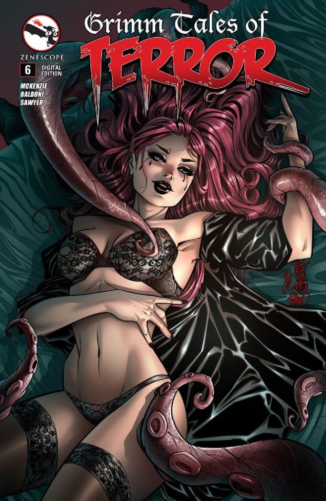
I could go on with covers like this one all day:

GrimmTalesofTerror6
Grimm Tales of Terror no. 6 (January 2015), pencilled by Giuseppe Cafaro and inked by Simone Di Meo.

That’s not ugly enough for you? The pretty girl is knocking out all capacity for rational thought? Are you forgiving the artist for thinking fabric needs about a thousand crinkles and folds to look, ahem, realistic? Okay, how about something like this?

Action Comics #6
A panel from “When Superman Learned to Fly”, published in Action Comics no. 6 (April, 2012). Pencilled by Andy Kubert and inked by John Dell.

Everybody knows that if you’re going to combat tentacles, you should make sure your stance is wide enough to be completely impractical and then fight them off with your crotch. While you’re doing that, your cape will develop a mind of its own and will start lifting off your shoulders. That is normal and aids in battle. Throw some terribly witty dialogue in, triple check that the men have their hands curled up in manly fisticuffs even if they’re not really connected to their wrists, and you’re all set for an Action Scene!

Okay, okay, I’ll wrap up my rant now. Let’s look at some… decent comics.

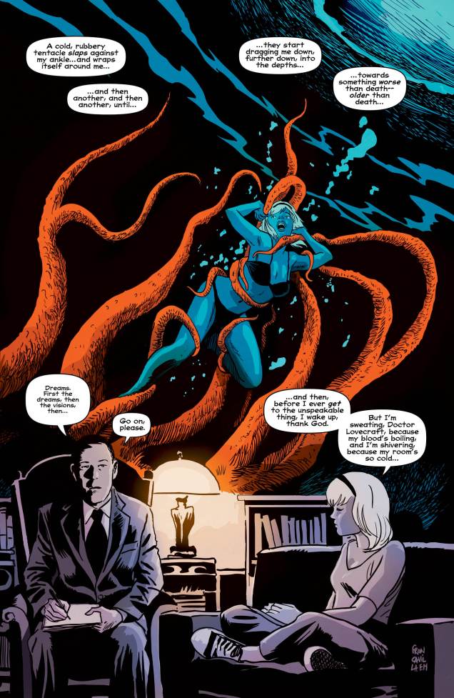
“Doctor Lovecraft” made me do a serious eye-roll, but at least the story is interesting. Read the issue here. Note the teal-and-orange in this one:

Afterlifewith-archie6
A page from « Betty R.I.P. Chapter One – Witch in the Dream House », published in Afterlife with Archie no. 6 (October 2014). Scripted by Roberto Aguirre-Sacasa, art by Francesco Francavilla.

I’m going to throw a spoiler your way with the following splash. It’s from the same issue as the previous page, so guess who gets to be bride of Cthulhu. (A more-than-slightly absurd thought. What would a Great Old One want with a human female, even if she’s a witch?) For more spoilers, head over to the Afterlife with Archie: the 13 Scariest Moments. I am aaalmost considering picking up the series. Maybe. As soon as I’m done with the piles of comics covering pretty much every surface of my office.

AfterlifewithArchie6-Cthulhu

Moving on: I never thought I’d be posting *anything* from My Little Pony franchise, but the “pastels” of this scene are rather well done. Also, these freaking ponies are annoying, so seeing them strangled is somewhat satisfying.

Mylittlepony-FrienshipIsMagic-27
My Little Pony: Friendship is Magic no. 27 (January 2015). Cover by Andy Price.

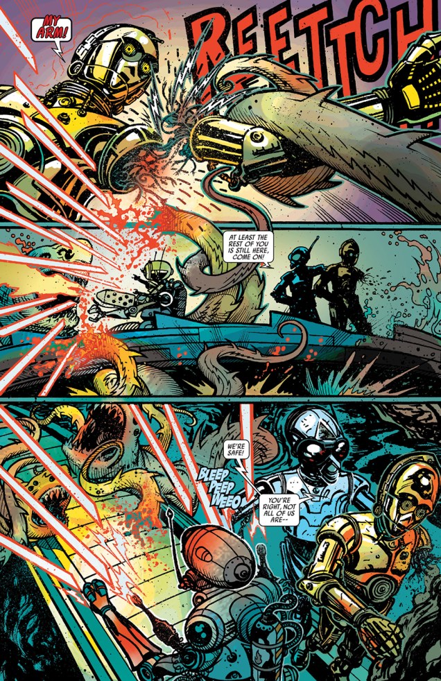
It’s even more preposterous that I should be sharing a Star Wars page, for fuck’s sake, but I like the art (pray note: more blue and orange!).

StarWarsSpecial-C3PO-Number1
«The Phantom Limb» is scripted by James Robinson and drawn by Tony Harris, and was published in Star Wars Special: C-3PO no. 1 (June 2016). Figure out why a tentacled monster is interested in a robot here.

~ ds

Dateline: Frontline – The Cary Burkett Interview, Part 2

« A reader has the right to ask for all the facts; he has no right to ask that a journalist or historian agree with him. » — Herbert Matthews

And we’re back with part two of our examination of Cary Burkett and Jerry Grandenetti‘s Dateline: Frontline (we’re not forgetting the famously-ambidextrous Ric Estrada, who took over illustrative duties in the second half of the series). In part one, Mr. Burkett graciously opened for us a window on the series’ genesis. In light of these privileged behind-the-scenes gleanings, as well as a reading of the series’ springboard text, Phillip Knightley’s The First Casualty, I formulated  a series of follow-up questions, of which we present the first half, along, of course, with Mr. Burkett’s insightful and modest responses, followed by chapter 2 of the first D:F trilogy.

Who’s Out There: Was there much deliberation on your part regarding the specific setting of the series?

Cary Burkett: I vaguely recall that in an early meeting with Paul Levitz we mentioned the possibility of setting the series during the Vietnam war. Or rather, I think he may have mentioned it. But I never had any interest in that from the beginning. That war was too close at the time, and I didn’t think I could do it. Research was a lot harder to do in those days, and I was too green as a writer to want to tackle that controversy.

If my memory is right, I think he left it up to me, and I very quickly settled on the World War II setting. There were a lot of reasons in my mind for that, including the wealth of research material available.

But the biggest thing was the fact that the U.S. started out as “neutral” in that war. I felt a story arc right away of a young reporter who began as a “neutral” observer, wanting to be an objective journalist, but over a series of events finding himself unable to keep from being drawn in and taking sides, despite his proclaimed neutrality.

At the time I didn’t know how long the series might last, but it was my intention to gradually move Wayne Clifford from a naïve journalist with laudable ideals into a conflicted character grappling with the very gray areas of war reporting and the messy questions of patriotism and propaganda.

WOT: In writing the series, did you ever find yourself at odds with the, er, ‘official record‘ of history?

CBI wouldn’t say that exactly. The truth is, I had only a sketchy knowledge of World War II history, and little idea of what the “official record” said. So I set about to educate myself.

One really good current documentary at the time was The World at War narrated by Laurence Olivier. I watched a number of episodes of that. What I realized from watching it was how much the history I had heard and read was centered on how the U.S. and England had won the war. This documentary was one of the first western pieces which really pointed out the importance of the Russian contribution.

That led me to other research and made me want to do a series of stories set in Russia. Of course, the insane difficulties of trying to report the truth during a war in the middle of Russia appealed vastly to me and provided a lot of opportunities for conflict on a lot of levels. I felt I barely scratched the surface in those Russia stories.

One thing about doing research; you start to get interested in all the little details. You want to include much more than you really can. You have to be careful to let the story reveal the details when it is important to the story, but not to let the research itself become the story.

I struggled with that in writing those Russia stories, because much of what I was finding out was really eye-opening to me. What I knew about the war in Russia I had learned mainly from watching Hogan’s Heroes. In that TV comedy, the Nazis all feared being sent to the Russian front, so you knew it was cold and terrible. But that’s about all I knew.

When I began to read about the scope of the tragedy and brutality of the war in Russia, I wanted to bring the reality of it into my stories. I wanted to shove it all in somehow. But my stories were a mere 6 pages long in each issue, so I had to just try to give little glimpses that implied a lot more.

Stephen King’s advice to writers is to “kill your darlings”, that is, to get rid of your pet favorite bits so they don’t bog down the story. Those Russia stories were ones where I felt I had to keep killing those “darlings” over and over.

WOT: Was there any friction with DC’s brass, or was the series too far under the radar for them to notice? If so, did that allow you more leeway?

CBWe were definitely way under the radar, but I don’t think that the stories would have caused any stir even if they had been noticed. I don’t think there was anything subversive or strongly controversial about them. They were different from the usual comic book war stories, but not in a way that would cause any issues.

The lead stories of the books featured Gravedigger, or later, The Unknown Soldier. These were the stories that were there to sell the book, and these would have gotten more scrutiny. They were the typical action-oriented comic book war stories, sometimes just a step away from fantasy. Sometimes not even a step.

With a long-running lead character in a war series, you have to be a bit looser with timelines in the war. I suppose it’s a convention of the genre that the character might pop up in Okinawa in one story, then many issues later have a story related to D-Day, even though D-Day would have happened well before Okinawa.

Maybe it’s because the main character was a journalist who was dedicated to getting the facts right, but I decided that my timeline was going to be accurate. The series would start with the U.S. as a neutral country, and we would later see the USA join the war, and all of the historical events would follow in the order they occurred.

WOT: Was the rotation of backup features decided from the start? Was it some sort of commercial compromise?

CBI don’t really know. I think the idea was mainly to have variety in the backups. It was a common template for older DC titles like Action Comics or Adventure Comics in the ‘60’s. One issue would have a Green Arrow backup, the next maybe Aquaman.

My own speculation is that as an editor, Paul was drawn to that kind of setup, and felt it gave the reader a little something extra. That’s just my own thought, he never told me that. But I know he was a comics fan, and I think he was glad to have a place where Enemy Ace could still fly through the pages of a DC Comic.

WOT: Given the wealth of material you dug up in the course of your research, it must have required considerable effort of concision to craft such spare chapters. Did you go through a lot of drafts?

I did struggle to find ways to get my stories into the six-page frame and did quite a few re-writes, trying to balance the pace so the story didn’t seem rushed but also had enough meat.

There were compromises, for sure. In what I considered to be one of the key stories, Clifford, still a neutral reporter, takes a rifle and kills an Axis soldier attempting to kill his English friend. I had been leading up to this decision since the beginning of the series. Here he is forced to admit that he is neither neutral nor objective as he thinks of himself.  I would have loved to have had a bit more room to let that sequence play out with more significance.

No doubt, I could have done a better job even in the space I had. In the end, I felt that it came out a bit weak and contrived.

WhoThereLogotype

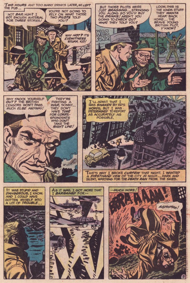
Now, let’s rejoin Wayne Clifford and his buddy Ed Barnes, who were, when we saw them last, off to the pub…
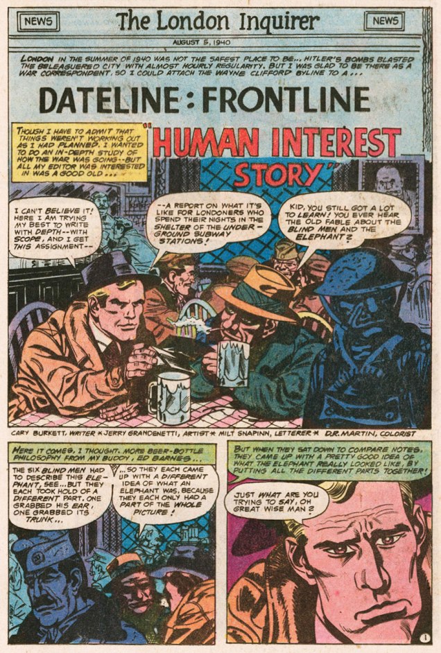
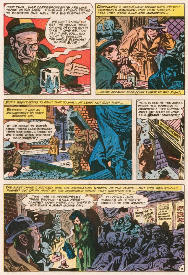
Dateline2London01ADateline2London02ADateline2London03ADateline2London04ADateline2London05ADateline2London06A

That’s it for now! Stay tuned for the conclusion of our talk with Cary Burkett, along with part three of Dateline:Frontline’s London trilogy.

-RG
Vic Prezio at Warren, Part Two

« These dreams? Hallucinations… or whatever you call them! It was on a business trip… in the middle of nowhere… I’ll never forget it! » — Alex Colby, who swears he saw them.

When people talk about Warren magazines cover artists, the name of Vic Prezio is rarely brought up. Well, someone has to, and it might as well be me. It doesn’t help that he only painted a handful of covers for Warren, but hell, I love them all in their pulpy glory.

Prezio is better known for his over-the-top men’s adventure magazine covers and, to a lesser extent, his Magnus: Robot Fighter covers for Gold Key. Mostly anonymous work, though. It’s a filthy business.

In Part One, we looked at Prezio’s Creepy Covers. As it’s « age before beauty », Cousin Eerie now gets his turn to bow.

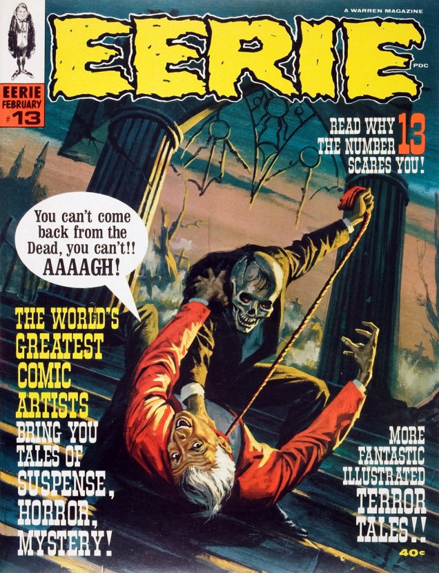
PrezioEerie13A
« Don’t you dare presume to tell me what I can and can’t do, Sheldon! » Some guys turn mean when their male pattern baldness spreads to their entire face.

An inspiring reminder of why you shouldn’t let the naysayers drag you down (even six feet under). Be all that you can be, on this side of the grave and beyond!

Eerie no. 13, Feb. 1968. This issue features an adaptation, by Russ Jones and Frank Bolle, of one of H.P. Lovecraft and August Derleth‘s posthumous (in H.P.’s case) collaborations, Wentworth’s Day, another emprunt from Christopher Lee’s Treasury of Terror (Pyramid Books, 1966).

Intrigued? Check it out here: http://thehorrorsofitall.blogspot.ca/2010/06/wentworths-day-hp-lovecraft.html

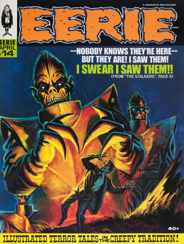
PrezioEerie14A
This alien encounter is *not* going to turn out all fuzzy-friendly.

Prezio’s painting conveys vividly the high paranoia of Archie Goodwin and Alexander Toth‘s The Stalkers, reprinted in this issue from Creepy no. 6, just a couple years old by then. Warren Publications were *not* in good shape at the time, having lost more of their key talent and left to the bare minimum of original material, including, thankfully, the covers. The out-of-left-field success of Vampirella would swoop in and save the enterprise in 1969. Close call!

PrezioEerie15A
Possibly the lesser entry amongst Prezio’s Warren pieces, but still an attractive cover, if not exactly terrifying. Somehow, it brings to mind Aurora model kit art more than it does a Warren cover (still, comparison to early-ish James Bama should hardly be considered a slag.)
PrezioEerie21A
« AAAAAAAAAGAH! What is it? » I’ve often pondered that very question myself, sometimes while perusing this “throbbing” issue.

Another striking (if a bit rushed-looking) Prezio cover, this time representing Slight Miscalculation by writer Bill Parente and artists Bill Fraccio and Tony Tallarico. The much-maligned Fraccio and Tallarico often worked together under the joint nom de plume of Tony Williamsune (it is said that Tallarico pulled most of the weight.)

Here’s a really nice job they created for issue 16 of Charlton’s Haunted (June, 1974.) I love the boldness of that heavy brush, swirly style: http://fourcolorshadows.blogspot.ca/2013/04/come-see-our-ghost-tony-williamsune-1974.html.

PrezioEerie22A
This time out, the cover story is H2O World by Larry Ivie, Al Williamson, and his Fleagle Gang acolyte and mentor Roy G. Krenkel, a reprint from Creepy no. 1 (1964).

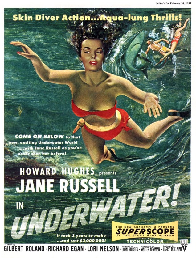
The girl looks familiar, though…

JaneRussell_Underwater 1955A
From a 1955 film poster…
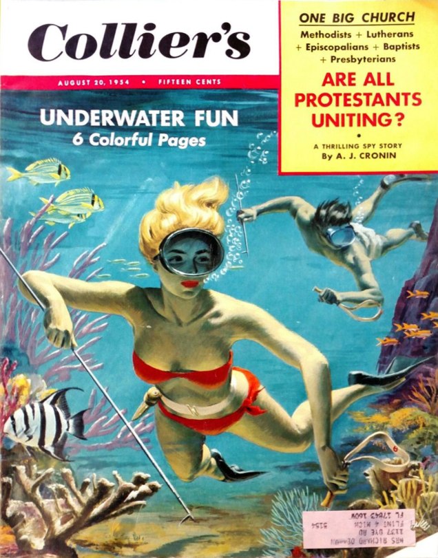
ColliersAug20_1954A
… itself swiping heavily from a 1954 Collier’s cover painted by Bill Baker. « You’ll find skin-diving now from Maine to California, wherever there is enough water for a person to plunge into. Divers, like the spearfishing pair on our cover, have made it America’s fastest-growing sport. » I’ll bet she’d rather dive with her husband, armed with a spear, than in the darkness with overly-friendly monsters.
PrezioEerie24A
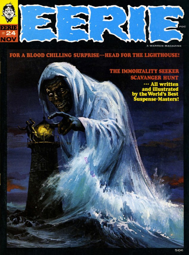
Prezio’s final Eerie cover (he would paint a couple of beauties for FMOF the following year), this lugubrious tableau from the bone-chilling month of November 1969, is likely my favourite Prezio. It illustrates Bill Parente and Michael Royer‘s Head for the Lighthouse!

Warren seemed, at this point, without a decent in-house copy editor. Witness the cover’s “Scavanger” Hunt, and inside, a story mistitled « The Wrong Tennant ».

Tennants
« Wrong Tennant? You don’t say! I’d read *that*! »

All tomfoolery aside, this wraps up our survey of Mr. Prezio’s work at Warren. Hope you enjoyed the ride!

-RG

Mordillo’s Flights of Fancy

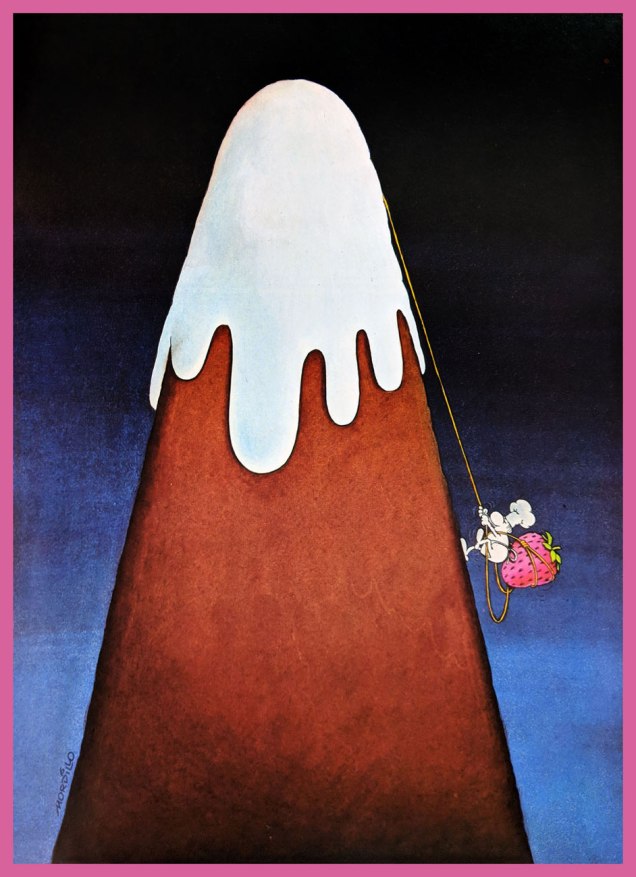
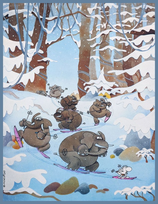
Guillermo Mordillo (1932 – 2019), known simply as Mordillo, was an Argentine artist of  Spanish parentage. Through his long and productive career, he released more comic albums than you could shake a stick at… and at 86, was still active in the comics field. His easily recognizable style, love of bright colours and oft-surreal humour make his work memorable despite his persistent profligacy.

It would be impossible to provide an overview of his body of work in one post, but it is my pleasure to furnish a fun sampling of his œuvre. Most images below have been gleaned from Opus 5 (Glénat, 1984) and Safari (Glénat, 1990), unless indicated otherwise.

MordilloChauve-SourisA

MordilloLabyrintheA

MordilloMontagneA

Mordillo-PirateShip

MordilloChaperonA

MordilloOiseauxA

MordilloSkiA

The following two images were scanned from early 1970s issues of Pif Gadget.

MordilloEiffelA

MordilloTennisA

In the mid-70s, Mordillo’s cartoons were used by Slovenian artist Miki Muster to create Mordillo, a series of cartoon animations that ended up being 400 “episodes” long (for a total of 300 minutes – each episode is under a minute). These droll snippets were broadcast in over 30 countries between 1976 and 1981. Should you have a few minutes to spare for a chuckle or two, have a look at this video (recorded by somebody in Germany on VHS tape in the 90s and, many years later, uploaded to Youtube – what lovely, contorted pathways some of these things take).

Visit Mordillo’s website here. More cartoons? More animated cartoons?

Mordillo-Argentina

~ ds

Tentacle Tuesday Masters: Brian Bolland

« Or… uh, huh… with the severed neck of a dead ostrich… Yow! Tentacles! Long wriggly tentacles! Woo-WOO! »

Ah, Brian Bolland, the British artist that generally comes to mind when one mentions Judge Dredd. This was certainly *my* introduction to him, and my so-called initiation went over with a bang! (Which is to say, I fell in love with his art instantly. It took me a little longer to learn to appreciate Judge Dredd stories illustrated by other artists.) His crisp line adorns many, many comic titles, and I’m not going to enumerate all the pies he’s had his fingers in. I can, however, kill two birds with one stone by combining Wonder Woman Tentacle Tuesday part 2 (part 1 can be found here) with Bolland tentacles along other lines.

Actually, DC’s 1987 Wonder Woman series is a treasure trove of tentacles even without Mr. Bolland. However, some of these covers are frankly too ugly to feature here (I have high standards, in case you hadn’t noticed), while he can be relied on to always provide us with eye candy and an engaging composition.

BollandWW75A
Wonder Woman no. 75 (June, 1993).

Bolland is reputedly fond of his work on Wonder Woman covers, marking that it was “one of the few occasions he actually sought work rather than being sought for work.”

WonderWoman86-BrianBolland
Wonder Woman no. 86 (May, 1994).

A bonus WW illustration as a special treat, albeit a follicular extension of the definition of a tentacle, I confess. Well, it *is* Movember.

BrianBolland-WonderWoman-vs-EggFu
A pin-up published in Wonder Woman no. 120 (April, 1997): Wonder Woman vs Egg Fu!

TentacleTuesdayIcon

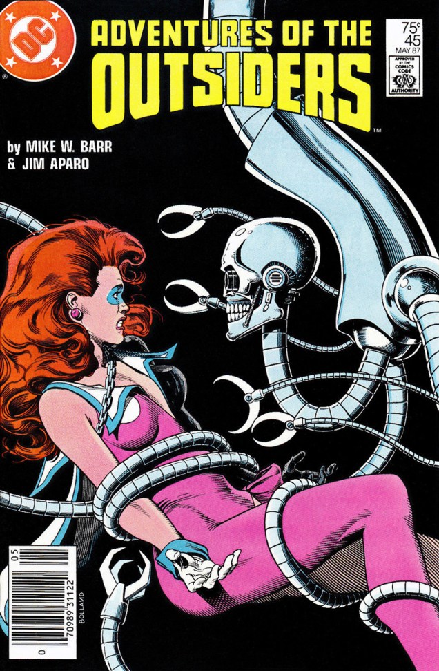
Moving on from the powerful, intrepid Wonder Woman to smaller crawfish, we have this maiden in an incredibly silly costume, which Bolland managed to somewhat redeem, mostly by hiding the stupid bow and differently-coloured boot on her left leg.

BrianBollandOutsiders45A
Adventures of the Outsiders no. 45 (May 1987). Mechanical tentacles are all well and good, but it’s Duke of Oil‘s inane grin I like best.

The maiden’s name, by the way, is Looker (!), presumably because the team who created her (Jim Aparo and Mike W. Barr) couldn’t think of a better moniker for a woman who went from a mousy bank teller to a cocotte (oh, sorry, I meant “coquette”) with superpowers. Pardon me going off-topic, but I really must illustrate: here’s what her costume looks (oh, har har) like in its full frontal glory.

BatmanandtheOutsiders31
Batman and the Outsiders no. 31 (March 1986), cover by Alan Davis.


And a last piece of balderdash:

« Her original costume was manufactured from a material unique to Abyssia; one way fabric, which was invisible from one side. This allowed her to keep her costume handy but not visible. She would turn the clothing out to make it visible. »


Moving on to classic Bolland with creepy-crawlies, fatal beauties and grotesque sub-humans, we have this delightful poster:

BrianBolland-peoplelikeusv2
An advert Mr. Bolland created for Forbidden Planet, « London’s Newest Science Fiction and Comics Book Shop! » in the early 80s. You can admire it (and other designs) in action, so to speak.

And a last madcap entry, amusingly full of non-sequiturs:

BrianBolland-AxelPressbutton
A page from « Silver Sweater of the Spaceways », featuring Zirk, and published in Axel Pressbutton no. 1 (November, 1984), scripted by Steve Moore and illustrated by… well, you know.

~ ds

Vic Prezio at Warren, Part One

« Stop that whimperin’, Emma — or I’ll lay into ya like a butcher in a cowpen! » — Raymond Marais, Rescue of the Morning Maid

The mysterious, but nonetheless well-remembered journeyman pulp illustrator, Vic Prezio, though chiefly associated with the infamous Men’s Sweat adventure magazines (« Weasels Ripped my Flesh! ») also produced notable work for Dell (The Outer Limits, Kona, Naza, Brain Boy, Frogmen…), Gold Key (Magnus, Robot Fighter) and Warren, and that’s just the tip of the iceberg. I did say he was a journeyman.

In all, Prezio produced, for the Warren Magazine line, six covers for Famous Monsters of Filmland, some of them classics, four for Creepy and six for Eerie. And that’s not all: Prezio painted a pair of covers for FMOF companion title Monster World (no. 2, Jan. 1965, and no. 4, June 1965); these would have been his earliest Warren contributions. Thanks to eagle-eyed Michael Prince for bringing these last to my attention!

Today, we’ll admire Uncle Creepy’s dodgy wares, and reserve Cousin Eerie’s mouldy goodies for part two. The FMOF issues regrettably fall outside our purview, but for the record, these are numbers 35, 36, 38, 39, 67 and 68. Check ’em out.

PrezioCreepy18A
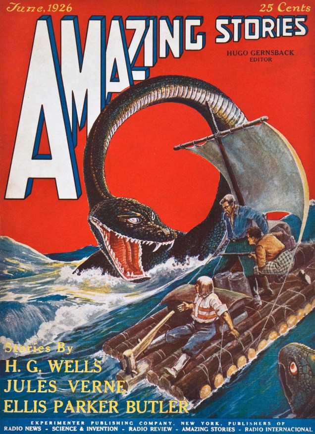
Oh, it’s just your lousy luck: you finally get your best girl alone on your raft, then along comes this humongous critter to put a damper on the romantic mood. Prezio brings the scene to life for issue 18 of Creepy (Jan. 1968)… but I can’t quite shake the feeling that said scene looks sort of familiar…
AmazingStoriesJune1926A
Ah, that must be it. I see there used to be two snakes involved.
PrezioCreepy19A
« I say, are you the chap that’s been short-sheeting my bunk every night? » 
Mr. Prezio’s nasty (in a good way) cover painting gives us a glimpse of Rudyard Kipling‘s (by way of Craig Tennis & Johnny Craig) The Mark of the Beast (1890), reprinted from Christopher Lee’s Treasury of Terror (Pyramid Books, 1966).
PrezioCreepy19ORIG_A
A look at the original painting, which thankfully survives. Can’t take such things for granted.
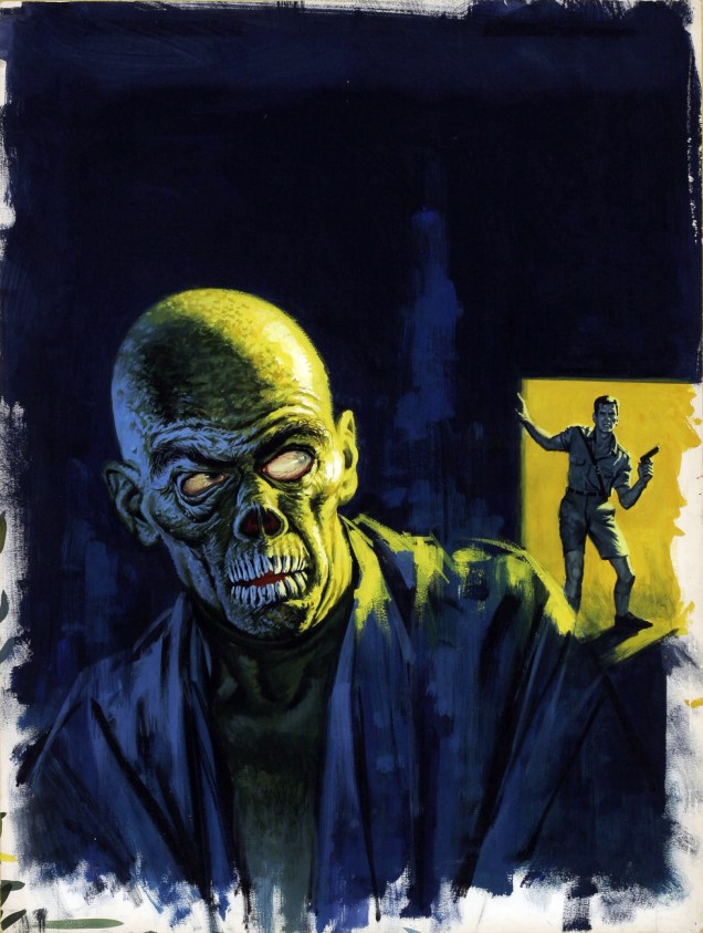
PrezioCreepy28A
« Good Lord! » I wonder what that ‘one thing’ is. Prezio’s cover for Creepy no. 28 (Aug. 1969) is based on Archie Goodwin and Dan Adkins‘ story The Doorway, reprinted in this issue. Read it here, if you must.
PrezioCreepy28ORIG_A
Some editorial second-guessing went on, as evidenced by the most consistent colour scheme of the original painting. It’s a great piece, so it works all the same.
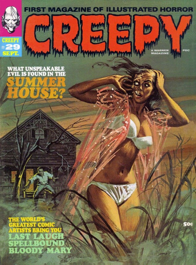
PrezioCreepy29A
« Come back, baby! Sure, my saliva’s a bit… corrosive, but you’ll get used to it! »
Vic Prezio’s twist on the then-prevalent gothic romance trope of the gorgeous, scantily-clad damsel-in-distress running away from some castle or mansion. This is Creepy no. 29 (Sept. 1969).
PrezioCreepy29ORIG_A
Now, Vic’s original painting: the image was flipped for publication (as if you couldn’t tell), which was probably a sound decision. Left to right motion is more visually natural and dynamic.

Well, that’s it for now. Next time, we’ll check out Mr. Prezio’s Eerie covers, so stay tuned.

-RG

Tentacle Tuesday Masters: Patrick Dean

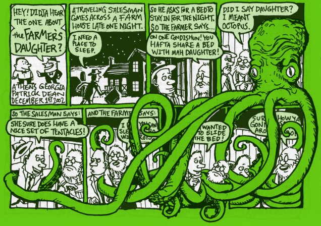
« Did I say daughter? I meant octopus. »

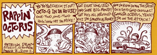
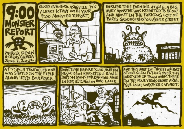
If you’re looking for gory tentacles, fountains of flesh and mounds of blood (err… unless it’s the other way around?), screaming hordes being devoured by a famished cephalopod with a mean streak… go look at our other Tentacle Tuesdays posts, for today’s entry is not for you.

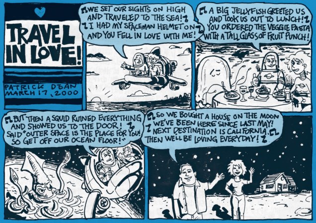
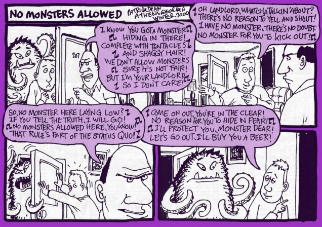
HoweverPatrickDean-OctopusPoetry, those of you who like a friendly octopus and can appreciate understated wit and off-beat humour, stick around as we travel into a land created by Patrick Dean (not British Ambassador to the States). A word of warning – people randomly bursting into song and cohabiting with monsters is quite normal here.

Monsieur Dean likes monsters – nay, loves them – but he likes to contemplate them in their quieter moments: wooing a potential mate, politely asking for a BLT sandwich, watching a Julia Roberts movie or even reciting poetry.


PatrickDean-Octopus

All images in this post have been scanned from Big Deal Comics & Stories numbers 1 through 4 (published from 2000 to 2004), and lovingly coloured by my co-admin-cum-partner. I reread them recently in my ceaseless quest for tentacles, and while I remembered really enjoying them a few years back, I had forgotten how good they were. A lot of comics of a random, episodic nature are very much hit or miss, but these little gems are all gold, if you pardon my mixed metaphor. For instance, here’s PD’s summary of #3:

« More assorted one page strips. 28 pages of witches, cities, investigators, sailors, big shows, haunted houses, bees, record collections, band directors, roommates, octopuses, ham, radio towers, rainy days, treasure maps, J.D. Salinger, pork chops, and four leaf clovers. »

What kind of stone-hearted, dull-witted person would say “nope, not interested” to that? Luckily, not all Big Deal Comics are sold out – three issues are still available for purchase.

BigDeal1-PatrickDean-CathyA
The best part of Cathy’s letter is… well, you guessed.

Those musical interludes I coyly alluded to earlier? Here.

BigDeal-PatrickDean-JellyfishA

BigDeal2-PatrickDean-NoMonstersA

BigDeal3-PatrickDean-RappinA

BigDeal3-PatrickDean-ReportA

The best saved for last? I think so!

BigDeal3-PartrickDean-FarmerA

Don’t forget to visit Patrick Dean’s website, visit his FB page, or admire more of his art here.

~ ds

Dateline: Frontline – The Cary Burkett Interview, Part 1

« All studies of propaganda tell what a powerful weapon it is; that since armies fight as people think, it is essential to control that thought. This means some form of managing the news, and the only question is the degree to which the news should be managed openly and the degree to which it should be managed subtly. » ― Phillip Knightley, The First Casualty: The War Correspondent as Hero, Propagandist, and Myth-maker from the Crimea to Vietnam

In most collectors’ lives, there’s a degree of more casual, automatic accumulation. Things you pick up for a song, just because the opportunity arises, and that you file away, planning half-heartedly to look them over when you find the time. As a devoted Jerry Grandenetti fan, I always pick up his work… but I favour some genres over others. Mr. G has crafted, for instance, a lot of war comics for DC over the years (1952-1984!), most of which I haven’t seen. For me, it’s always been about his horror/mystery work. So… I had picked up, somewhere along the line, a consecutive pair of issues of DC’s Men of War (26 issues, 1977-80), numbers 9 and 10, featuring the first two parts of a Dateline: Frontline backup sequence, « Bathtub Blues » and « Glory Soldier ». I was very, very impressed.

Now, most of DC’s war books were scripted by a small cadre of authors, namely the indefatigable Robert Kanigher, as well as Bob Haney, Ed Herron, Jack Miller… but mostly Kanigher. In the Seventies, things changed a bit, with solid help and variety coming from Frank Robbins and David Michelinie on The Unknown Soldier, for instance. I had encountered Cary Burkett’s name here and there, being a regular reader of Batman titles The Brave and the Bold and Detective Comics, where he scripted backups (Nemesis, Batgirl) and the occasional lead feature. But this was… different. Hard-hitting, quite free from convention, and damn well buried in the back of a second-tier war book.

I hunted down the rest of the D:F series, and my initial impression did not fade… quite the contrary, indeed. The third serial (MoW 21-23), set on the Russian front, actually brought some tears to my eyes. Why was this feature so little-known? Oh, I know… the usual reasons. But I wanted to find out more, and the next logical step was to reach out to the series’ surviving author, who was happy to oblige, to my delight. And so here we are. The stage is yours, Mr. Burkett.

Dateline: Frontline recollections, by Cary Burkett

« Paul Levitz was editor of a new war comic called ‘Men of War‘ featuring a character called ‘Gravedigger’.  He wanted to have backup stories in each issue, and he came up with the title ‘Dateline: Frontline‘ and the idea that it would feature a war correspondent as the main character. I was working as his assistant at the time (1976), and he asked me to do a series of 3 six-page stories.

He pointed me toward a book called ‘The First Casualty‘ by Philip Knightley. The title was inspired by a famous quote ‘The first casualty when war comes, is truth‘.  The book was a history of war correspondents from early days of reporting through the Vietnam War. It became a basis for the new comic series in terms of setting up the inner dilemma of the main character, which was how to report ‘the truth’ in time of war.

I chose to set the series in World War II and named the main character Wayne Clifford. My idea was that he would begin his career as a war correspondent being very idealistic and naïve. Over the series of stories, he would come face to face with wartime situations which challenged his assumptions about news reporting, war, ‘truth’ and about himself.

That, in a nutshell, was the core of the series.  I chose to set the narration in first person, which I guess is pretty much the standard in comics now, but was not common then.

After the first 3 stories, Paul asked me to continue the series. But we kept the idea that the series would be done in groups of 3 related stories.

I did a lot of research to depict true, historic wartime settings which I hoped would show more aspects of war than to just have the hero ‘fight the enemy’ and stop the Führer’s latest grand plan.

Paul had gotten Jerry Grandenetti to be the artist on the series from the very beginning. I admit, when I first heard this, it didn’t thrill me. I was not that familiar with Grandenetti’s work, but I had seen a few stories he had done and had been put off a bit by his strange, exaggerated style.

But when I saw his art for my first DF story, I realized why he was such a respected artist. His expressionistic kind of style emphasized certain qualities that gave a distinctive mood to the story.

But what I felt the most strongly was that Grandenetti understood how to make the story flow. If you could let yourself be drawn into the visual universe he created, it would come alive. The sequences of images he created would merge into one storytelling stream.

I didn’t know at the time that Grandenetti had worked on The Spirit with Will Eisner, but that strong storytelling aspect of his art was what I responded to most when I saw Jerry’s work on my stories.

My Dateline:Frontline stories were done ‘full-script’, meaning I wrote out full panel-by-panel breakdowns for the artist to follow. And I could see how Jerry would take my panel descriptions and make them flow into each other. If I was going for a specific kind of pace or mood with a sequence, Jerry immediately knew what I was after, and knew how to emphasize it visually.

I worked with very few artists who had Jerry’s instinctive grasp of this and his skill for executing it. »

DatelineLondon01ADatelineLondon02ADatelineLondon03ADatelineLondon04ADatelineLondon05ADatelineLondon06A

Each Dateline: Frontline episode was conceived to stand on its own, but be part of a larger trilogy. This London entry, the series’ introduction, appeared in Men of War No. 4 (Jan. 1978). In part two of our talk with Cary Burkett, we’ll feature the second London chapter, « Human Interest Story » and our guest will generously answer some of WOT’s questions.

Incidentally, but not coincidentally, one hundred years ago today, on the 11th  of November, 1918, the Armistice of Compiègne was signed, formally ending the First World War. The event is commemorated each November 11 as Armistice Day or Remembrance Day.

Make-War-No-MoreA
This eloquent little tag appeared at the end of DC’s war stories, at least those edited by Joe Kubert, in the early 1970s.

Continue to Part 2 of the Cary Burkett interview.

-RG
Will Eisner’s The Spirit at Harvey and…

« It was long past midnight on a hot, wet June night many years ago… Central City lay choking for breath in an eerie fog… »

In this, part three of our chronicle following as we can the meandering and sometimes mystifying odyssey of Will Eisner’s The Spirit, we reach the most outré segments of the former Denny Colt’s road.

In a unique twist, The Spirit’s next residence, nearly a decade after his Fiction House run, had nothing at all to do with Will Eisner… in terms of securing his assent, that is.

It was down to the fabulously sketchy Israel Waldman, one of those fringe-dwelling characters who made the comics industry such a colourful snake pit. To quote the Grand Comics Database: « I.W. Publications (1958-1964) was part of I.W. Enterprises, and named for the company’s owner, Israel Waldman. Reportedly, Waldman came into possession of a printing company and among the assets were the production materials for several hundred comic books previously published by various publishers as well as a limited amount of previously unpublished material. Waldman equated possession of production materials as the right to reprint and I.W. became notable for publishing unauthorized reprints of other companies’ comics, often with new covers, as Waldman’s windfall did not often include the production materials for covers. The later half of the company’s existence, it published comics under the Super Comics name. Usually these companies were out of business, but not always. »

IWThe-Spirit11A
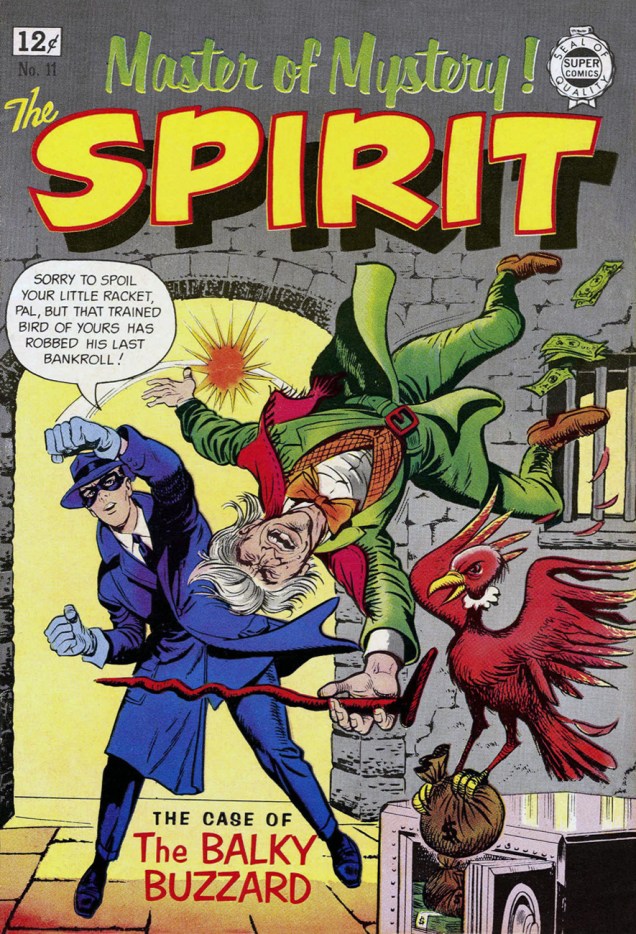
This is The Spirit no. 11 (1963), featuring The Man Who Killed The Spirit (Mar. 24, 1946), cover-featured The Case of the Balky Buzzard (Apr. 21, 1946), Carrion’s Rock (May 19, 1946), all scripted by Eisner, as well as Honeybun and Flatfoot Burns shorts. Cover by Joe Simon (“Joe, did you even read the story you’re depicting?“). This one was well worth one’s hard-earned twelve pennies. Read it here.
IWThe-Spirit12A
This is The Spirit no. 12 (1964), featuring, this time, a trio of WWII-era Spirit stories scripted by Manly Wade Wellman and Bill Woolfolk and illustrated by Lou Fine, rounded off with a pair of Flatfoot Burns shorts by Al Stahl . Cover again by Joe Simon. Read it here.

If memory serves, Waldman’s comics craftily bypassed the Comics Code (another exception!) and the newsstands, being exclusively sold in sealed bags of three in bargain-basement department stores. To bait the hook, Waldman paid top dollar for new cover artwork, approaching established pros like Ross Andru (who actually delivered some fun stuff, unlike his unforgivably atrocious turn as DC’s main cover artist in the late 1970s), John Severin, Jack Abel, and in these two cases, Jacob Kurtzberg‘s old partner, Joe Simon.

Unsurprisingly, Waldman skimped on all other materials, particularly the paper his comics were printed on, which means that I.W./Super Comics are pretty hard to come by these days in any kind of decent state, so they’re ironically pricey.

A few years later, Eisner struck a deal with another rascal (albeit one with cleaner fingernails), Alfred Harvey of Harvey Comics, Stan Lee‘s only credible competition in the credit-usurping, I created-the-Universe stakes. Again, two issues, but this time with some new Eisner material, including origin stories for The Spirit (his third, but definitive one), and his arch-nemesis Zitzbath Zark, which you may know as purple glove enthusiast The Octopus.

HarveySpirit1A
Harvey’s The Spirit no. 1 (Oct. 1966), featuring the new Origin of the Spirit by Eisner, and classics Lorelei Rox (Sept. 19, 1948), Two Lives (Dec. 12, 1948), Agent Cosmek/Visitor (Feb. 13, 1949), The Story of Rat-Tat the Toy Machine Gun (Sept. 4, 1949), Ten Minutes (Sept. 11, 1949), Thorne Strand (Jan. 23, 1949), Gerhard Shnobble (Sept. 5, 1948), all scripted by Eisner, save Ten Minutes, which hails from the mind of Jules Feiffer.
Spirit2A
Harvey’s The Spirit no. 2 (March, 1967) features the brand-new Octopus: The Life Story of the King of Crime and 2-pager The Spirit Lab, plus a generous helping of fine oldies, namely Plaster of Paris (Nov. 7, 1948), The Deadly Comic Book (Feb. 27, 1949), Rudy the Barber (Oct. 22, 1950), The Story of Sam, the Saucer That Wanted to Fly (Sept. 17, 1950), Sam Chapparell (Oct. 10, 1948), La Cucaracha (Nov. 19, 1950), The Halloween Spirit of 1948–Ellen Meets Hazel (Oct. 31, 1948), all scripted by Eisner… the book wraps up with a preview of the next issue, which never saw print. And so it goes…

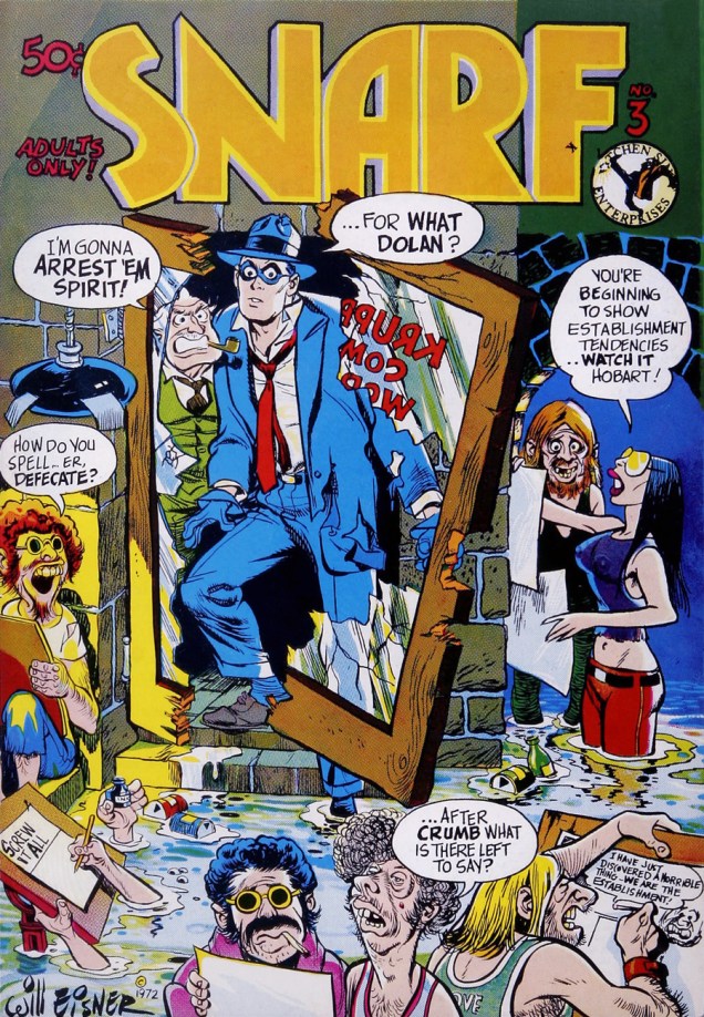
Mr. Eisner then finally had the good fortune to run into an honest man, who would prove in time to be his most steadfast ally: Mr. Denis Kitchen. Their first collaborations were a bit tentative, but quite sympathiques, with Eisner kind of slouching towards the Underground, his creation even cover-featured on Kitchen’s long-running humour anthology Snarf.

Snarf3EisnerA
This is Kitchen Sink Enterprises’ Snarf no. 3 (Nov. 1972), featuring an original Eisner cover.
SpiritKitchenSink1A
Another two-issue run! Kitchen Sink’s The Spirit no. 1 (Jan. 1973), featuring a new cover by Eisner, and precious relics Max Scarr’s Map (Apr. 14, 1946), Caramba (Nov. 10, 1946), Return to Caramba (Nov. 17, 1946), The Rubber Band (June 23, 1946), plus a few brand-new short pieces.
SpiritKitchenSink2A
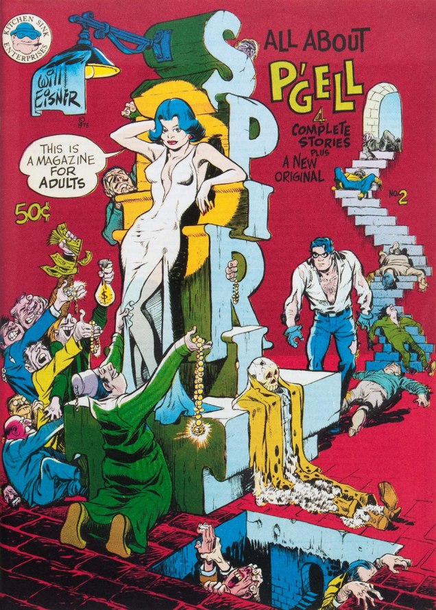
Kitchen Sink’s The Spirit no. 2 (Nov. 1973), featuring a new Eisner cover, an original four-pager, The Capistrano Jewels, and, as boasts the cover, all about P’Gell, with Meet P’Gell (Oct. 6, 1946), The School for Girls?? (Jan. 19, 1947), Competition (Aug. 3, 1947) and The Duce’s Locket (May 25, 1947).

Next time out: some interesting times with Warren.

-RG

Tentacle Tuesday: the Savagery of Conan’s Savage Sword

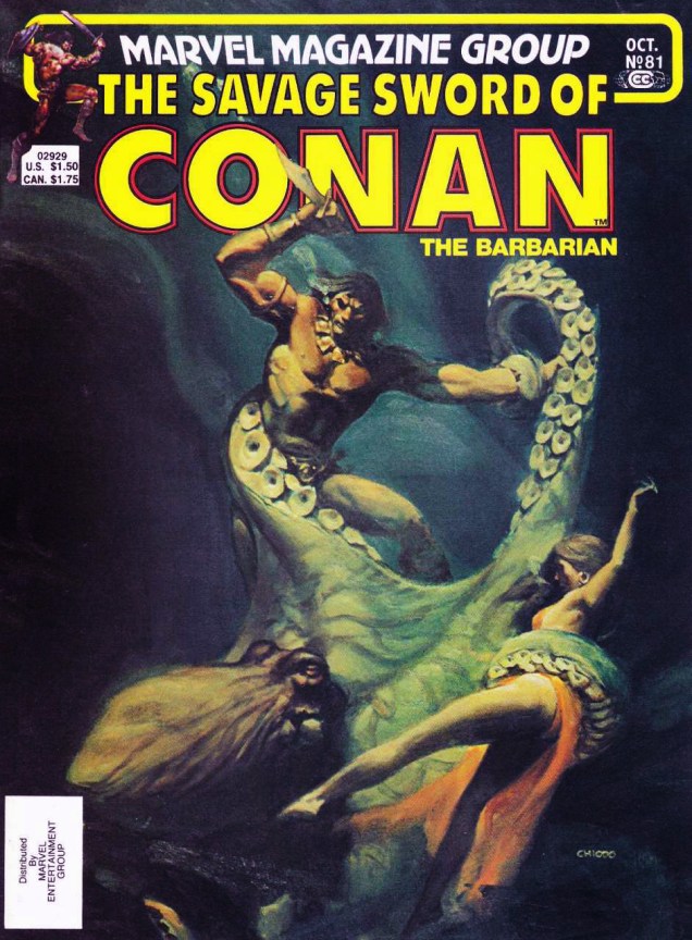
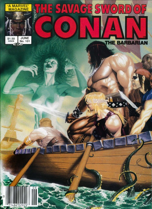
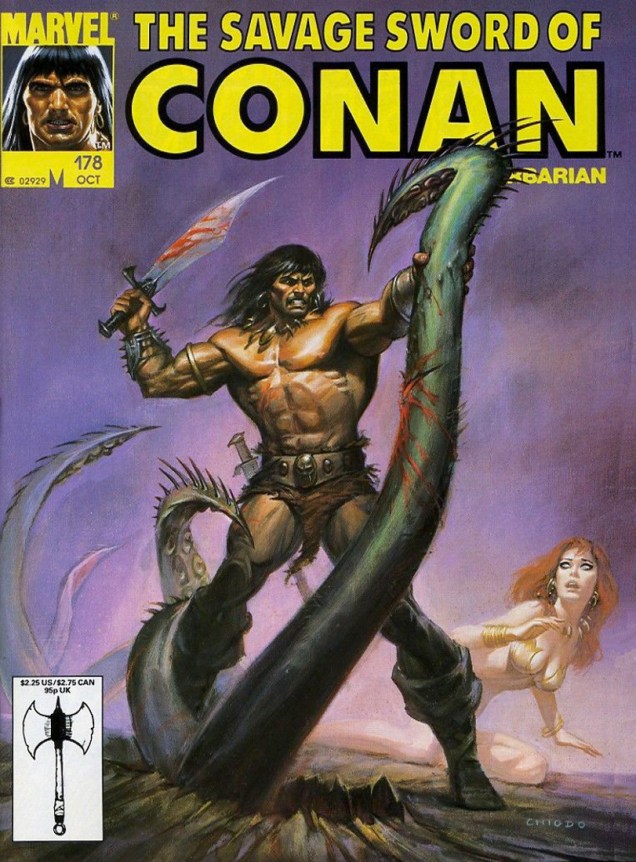
Marvel’s looong-running Savage Sword of Conan (published 1974 – 1995) was not restrained by the Comics Authority Code, being a magazine. So what did the illustrators and writers involved do with all this freedom? They heaped piles of gore and violence (badass violence) into the stories, and they made sure most Conan covers contained (1) naked damsels; (2) a heroic chopping-off-things-with-my-sword pose; (3) tentacles. If there was a shortage of cephalopods that month, other tentacle-like props would be happily used: elephant trunks, serpents ‘n’ snakes, dragon tails, and other grabby appendages.

I recommend reading The 10 Most Brutal Moments from Savage Sword of Conan the Barbarian! f̶̶̶o̶̶̶r̶̶̶ ̶̶̶a̶̶̶ ̶̶̶g̶̶̶o̶̶̶o̶̶̶d̶̶̶ ̶̶̶g̶̶̶i̶̶̶g̶̶̶g̶̶̶l̶̶̶e̶̶̶ for a good look at just how, erm, badass and savage and brutal Conan is. And when you’re done with that, take a gander at today’s line-up of tentabulous and tentarrific covers in which Mr. Conan slashes and hacks his way through rapacious monsters!

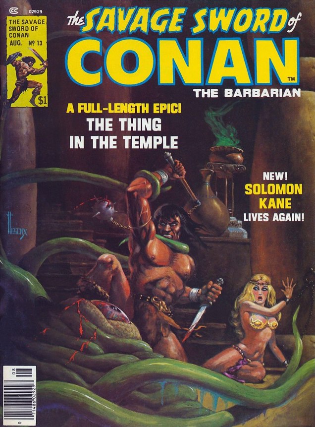
SavageswordofConan13
The Savage Sword of Conan #13 (July 1976), painted by Richard Hescox. Mostly undressed cutie (who may actually be a drag queen?): check. Bloody knife: check. Murderous, glazed-over eyes, a mask of hate and sadism on Conan’s face: double check. Poor scared octopus who was minding his own business… sigh, I’m afraid he’s mincemeat.
TheSavageSwordOfConan20
The Savage Sword of Conan #20 (July 1977), cover painted by Earl Norem. Braless beauty: check. Interestingly, Conan seems to have only one nipple. The sword hasn’t been plunged it, yet, but I’m sure it will take no time at all.

Incidentally, this is what our Slithering Shadow looks like from another angle:

Barbarian-“The Slithering Shadow,”
Pencils by John Buscema, inks by Alfredo Alcala.
SavageSwordofConan23
The Savage Sword of Conan #23 (October 1977), cover painted by Earl Norem. It’s a little-known fact that if you squeeze a woman by the midriff, her boobs pop out. At least Red Sonja is a little more feisty than the average helpless maiden.
The-Savage-Sword-of-Conan-#81
The Savage Sword of Conan #81 (October 1982), painted by Joe Chiodo. Completely exposed woman in lingerie: check. Has she wandered in from a gothic romance in which she was roaming the halls at night, dressed in naught but a flimsy nightie? Oh, sorry, wrong trope.
The-Savage-Sword-of-Conan-#101
The Savage Sword of Conan #101 (June 1984), painting by Michael Golden (‘when in doubt– smudge!‘). Man, Conan has a heck of a square, prominent chin. I almost didn’t include this cover because of the ridiculous anatomy – the front guy’s arm looks like a bovine leg (complete with hoof??), and Conan’s thigh and its bulging muscles don’t seem to be attached to his body – but the tentacles beckoned.

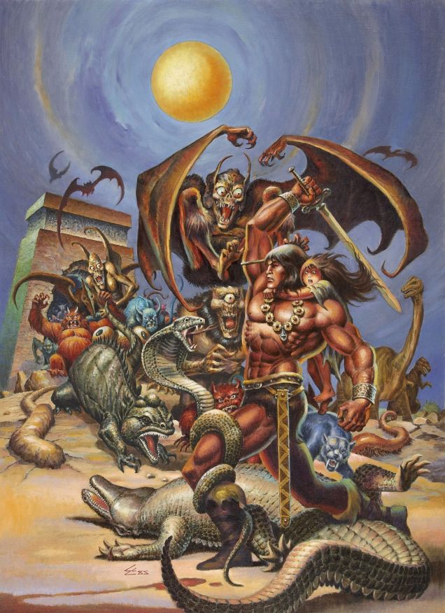
The following may be my favourite cover of today’s post, so here’s the original painting so we can admire the myriad details properly. For a second, I was worried that it couldn’t become part of today’s roster for lack of tentacles, but a scene of this type just *had* to have at least one tentacled creature. This has several, I am happy to report, though sometimes it’s hard to tell who’s who (and what’s what) in this glorious tangle of tails, wings and appendages.

The Savage Sword of Conan #123
Original painting for the cover of The Savage Sword of Conan #123 (April 1986). Painted by Ernie Chan. Note that there is no, I repeat no naked woman on this cover, just a scared child of indeterminate gender. And Conan doesn’t look like a complete asshole. Ernie Chan, you made my day. ❤ ❤
TheSavageSwordofConan178
The Savage Sword of Conan #178 (October 1990), painted by Joe Chiodo. Back to our regular program: violent He-Man hero, ghostly mostly-naked chick (who doesn’t have an ass at all, it seems, while her legs are mysteriously floating in the mist generated by the animal heat and moisture given off by Conan).
The Savage Sword of Conan #190.jpg
The Savage Sword of Conan #190 (October 1991), cover painted by Earl Norem. Wait, Conan is wearing a vest? And he looks younger and almost scared? What’s happening?

~ ds