While that chain of events is a fascinating bit of history, what I’m here to celebrate is a sequence of classic covers by recent — 2024 recent — Will Eisner Comic Awards Hall of Fame inductee Creig Valentine Flessel (1912-2008). Flessel produced eighteen of the first nineteen Detective Comics covers (the premiere issue bore a striking, but rather primitive drawing by associate editor Vin Sullivan), visibly gaining assurance and verve as he sped along. By my reckoning, however, it’s only with the eleventh issue that he solidly hit his stride, which he never let up until the assignment passed into other hands… and then came Batman.
Anyway, here they are: no hand-holding, no patronising, superfluous captions… just graphic purity — and sweat-soaked, pulpy thrills galore.
This is Detective Comics no. 11 (Jan. 1938, DC).This is Detective Comics no. 12 (Feb. 1938, DC).This is Detective Comics no. 13 (Mar. 1938, DC).This is Detective Comics no. 14 (Apr. 1938, DC).This is Detective Comics no. 15 (May 1938, DC).This is Detective Comics no. 16 (June 1938, DC).This is Detective Comics no. 17 (July 1938, DC).This is Detective Comics no. 18 (Aug. 1938, DC). Even as a relatively sheltered white teenager, I could easily tell that Sax Rohmer‘s Fu Manchu stories were racist (and sexist as well) « Yellow Peril » tripe… even in the context of their era, they went the extra mile. This is Detective Comics no. 19 (Sept. 1938, DC), Flessel’s final cover for the title.
Flessel would turn up all over the place. Gary Groth writes, introducing his definitive, career-spanning Flessel interview:
« Flessel never became an auteur with a truly recognizable narrative voice or characters that he could call entirely his own. He was so skilled and versatile that he became an artistic chameleon, a commercial propensity that served him well throughout his career. He wrote and drew stories for the earliest published comic books: More Fun, Detective Comics and Adventure; worked for the advertising firm of Johnstone and Cushing; assisted Al Capp on Li’l Abner and worked with Charlie Biro on Crime Does Not Pay in the ’50s; spent the ’60s and early ’70s drawing David Crane, a comic strip about a minister in a small town and segued seamlessly into an eight-year gig doing The Tales of Baron Von Furstinbed for Playboy. »
Detail (the whole spread would have been impossible to scan properly) from one of Flessel’s long-running series of Eveready Batteries adverts, done in the employ of the celebrated Johnstone and Cushing ad agency (this one’s from 1951). On his The Fabulous Fifties blog, Ger Apeldoorn showcases a number of these lovelies — check ’em out!Flessel turned up as Jerry Grandenetti‘s inker on my favourite issue of Joe Simon and Grandenetti’s much-maligned, short-lived but quite charming Prez (no. 4, Feb.-Mar. 1974, DC). Notwithstanding the — intentionally — fanciful elements of the Wild in the Streets-inspired social satire, old hand Simon had a much firmer grasp on how politics actually work than did any of the earnest, self-consciously ‘relevant’ comics writers of the day. And one can only sigh nostalgically at days when the worst thing that might slither into the White House was a mere vampire…
Flessel’s ability to depict ladies of the buxom and comely variety had certainly played a role in his landing a gig assisting Al Capp on Lil’ Abner for a couple of years in the late 1950s. At the time, Capp spent much of his time touring college campuses and berating the younger set, as was his wont.
Said virtuosity in the light-hearted and erotic stood him in good stead for an eight-year gig on The Tales of Baron Von Furstinbed for The Playboy Funnies; this one’s from the January, 1983 issue of Playboy Magazine. And here’s another, for good measure.
In closing, a brief exchange from The Comics Journal interview — please do go and read the whole thing, it’s a gem!
GROTH: I have a note that you had something to do with Superboy from 1958 to ’59.
FLESSEL: I did one. You know, it’s frightening; it’s like going out and drinking a lot of martinis and doing a job and not remembering.
« Poison’s not bad. It’s a matter of how much. » — Keith Richards
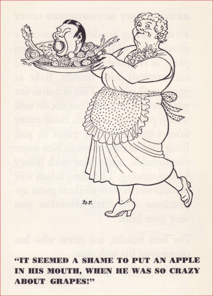
Regular readers of this blog will perhaps recall my fondness for those little Peter Pauper Press books of Mount Vernon, NY — at least those of the publisher’s halcyon years (1928-1981). I’ve cast a light on their edition of Ambrose Bierce’s The Devil’s Dictionary and, in the course of last year’s countdown, their Comic Epitaphs From the Very Best Old Graveyards.
This time around, I’m tackling one of the rare and fairly expensive ones* — that I’m aware of — Cooking to Kill: the Poison Handbook (1951), which proposes « Comic recipes for the Ghoul, Cannibal, Witch & Murderer. Stewing and potting mothers-in-law. Tested recipes for spoiled brats, business rivals, and strayed lovers. »
« Anybody can kill vulgarly. But we should be above the brutal, the direct, the unappetizing approach. This little book will teach you to tickle the palates of your guests so that they will be happy to linger at your table, charmed to malinger, and grateful to take off for the Great Adventure with the taste of your superlative cooking still on their lips! » — from Prof. Ebezener Murgatroyd’s preface to his ‘gentle reader’.
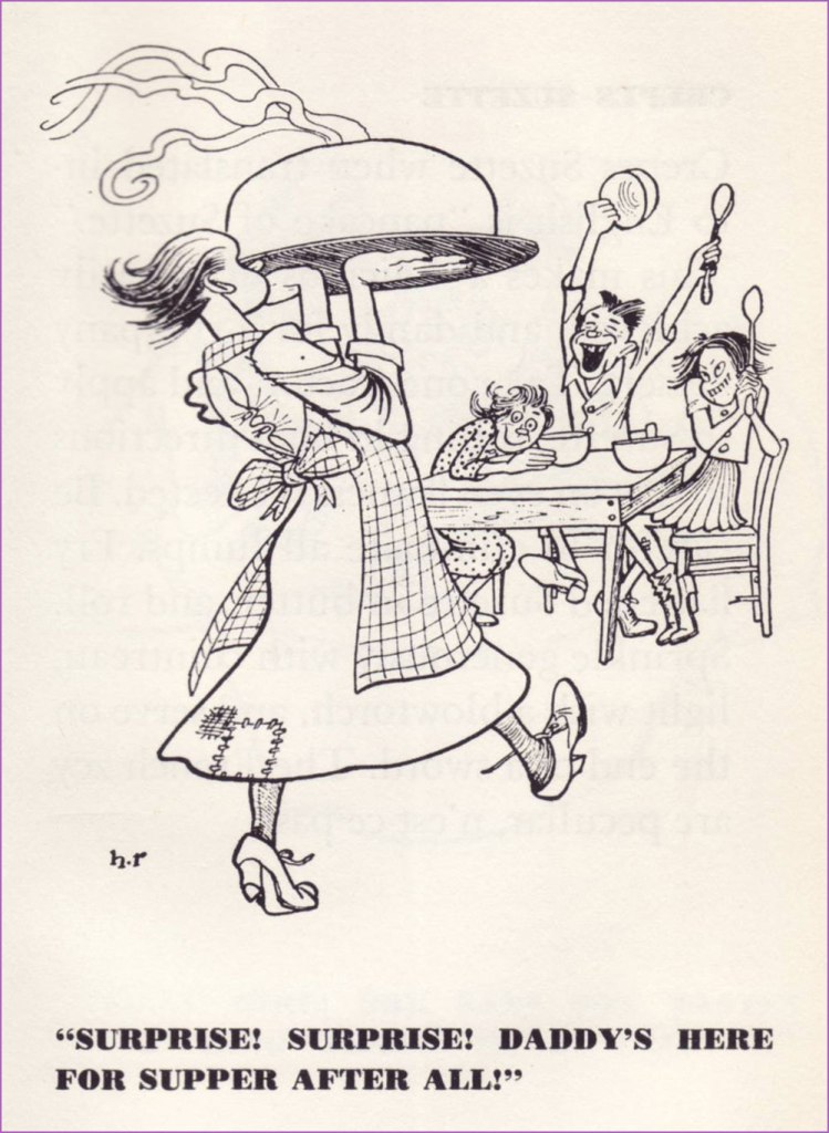
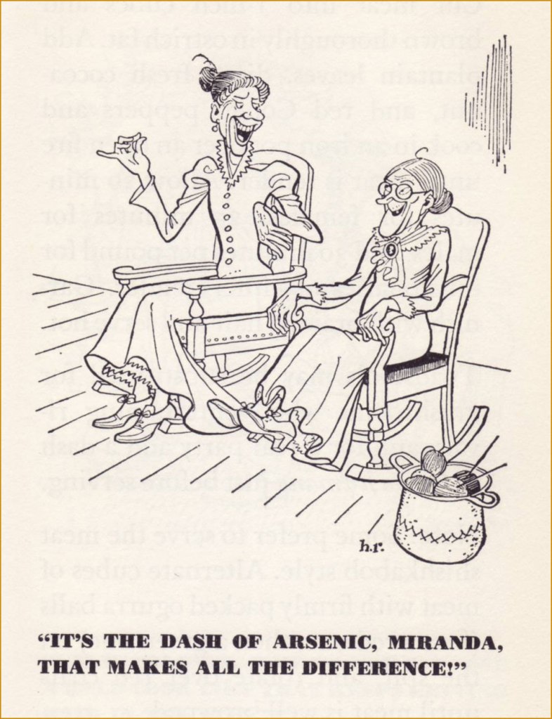
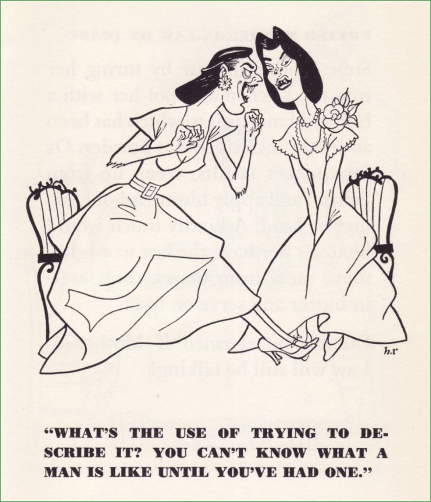
The book is magnificently illustrated by Herb Roth (1887-1953), who spent much of his career toiling as H.T. Webster‘s assistant and ghost. Roth enjoyed a long association with the Peter Pauper Press, illustrating its very first two books, Faithless Sally Brown and Faithless Nellie Gray.
« Head Cheese garni à la Salomé » « Tomato Surprise (Asp in the Grass): this luncheon delicacy should be served only to ladies, as you will find their charming soprano shrieks particularly rewarding. »It’s hard to not think of Joseph Kesselring’s fabled Arsenic and Old Lace, written in 1939.« Walnut Balls: smash nuts with a hammer, fashion into balls and fry in deep fat until a golden brown. Delicious withcoq au vin. »« Chocolate Noose… will help you to execute a crime of considerable chic, and will add a je ne sais quoi to the court proceedings. »« Stuffed Spoiled Brat: select a fine specimen which has been spoiling for a good long time, and capture at opportune moment. » « Crêpes Suzette: take one tractor, and apply to Suzette, rolling in both directions so that an even flatness is achieved. Be careful to eliminate all lumps. Fry flattened Suzette in butter, and roll. Sprinkle generously with Cointreau, light with a blowtorch, and serve on the end of a sword. The French zey are peculiar, n’est-ce pas? »« Marinated Leeks: take a leek, marinate in French dressing, and combine with tender green peas. Serve with asparagus for a very special flavour. Sprinkle with cyanide for that final touch! »« Potted Mother-in-Law: stew Mother-in-law by luring her into the kitchen and pot her with a beaker of martinis to which has been added a pinch of potent powder. Or for quicker results, creep up from behind and apply blunt end of hammer to head. A kindly touch would be to let her have the last word. Remove meat from bones, chop, stew in butter and serve on toast. »This brings to mind those gleefully morbid rhymes about Little Willie, essentially the original Gashlycrumb Tiny. A sample: Willie saw some dynamite/Couldn’t understand it quite/Curiosity never pays/It rained Willie seven days.Why, some enterprising soul has even created these exclusive earrings! Just don’t sport them during the investigation and/or trial. Nobody likes a braggart.
-RG
*the single most sought-after PPP entry is without question Kathryn Paulsen‘s Witches’ Potions and Spells (1971). Just try getting your hands on a cheap copy!
« Better to have a lousy character than no character at all. » — Alain Delon (Nov. 8, 1935 – Aug. 18, 2024)
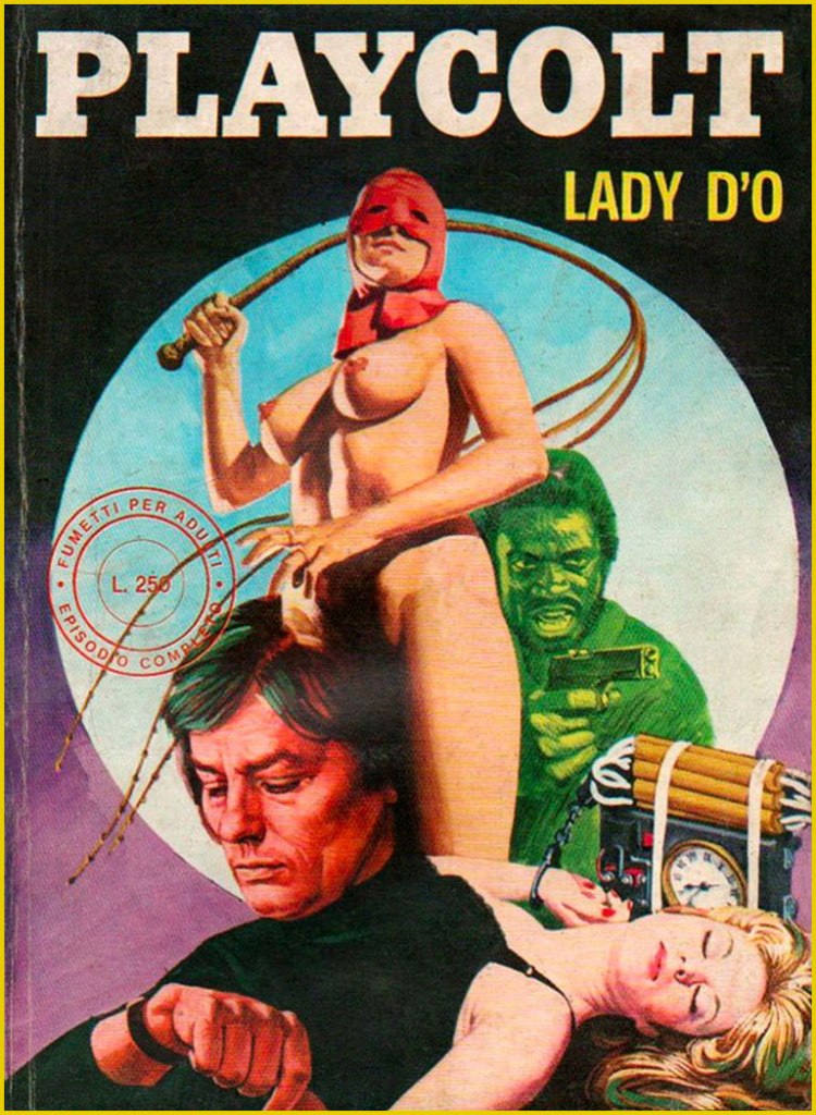
Quite recently, we lost monstre sacréAlain Delon. He was a complicated man, a bit of a prickly bastard, but he sure made a lot of great movies*. But comics, you ask? Well, I’m sure he never asked for it, but like many a celebrity (Jean-Paul Belmondo, Ornella Muti…) his famous countenance was appropriated by those incorrigible rascals at Edifumetto and Ediperiodici.
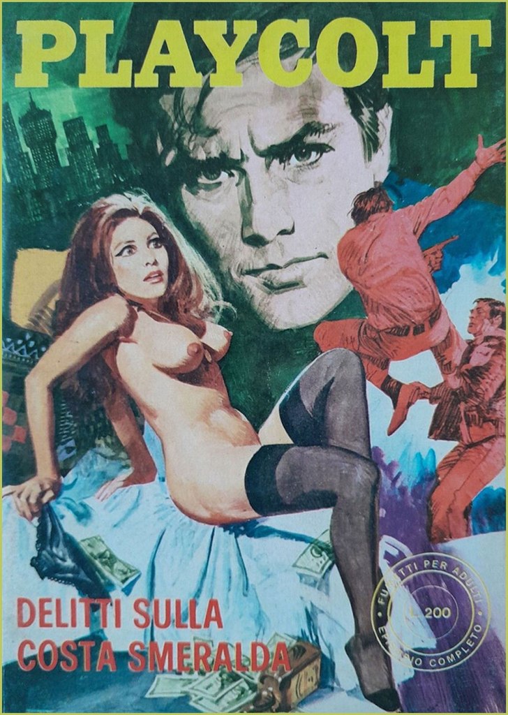
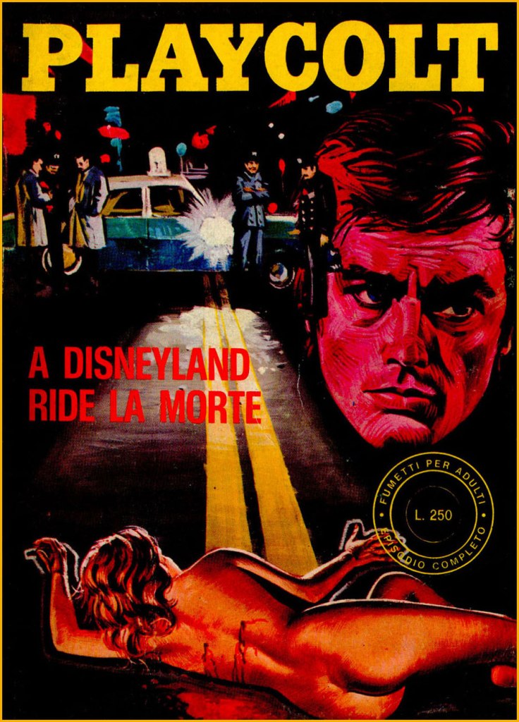
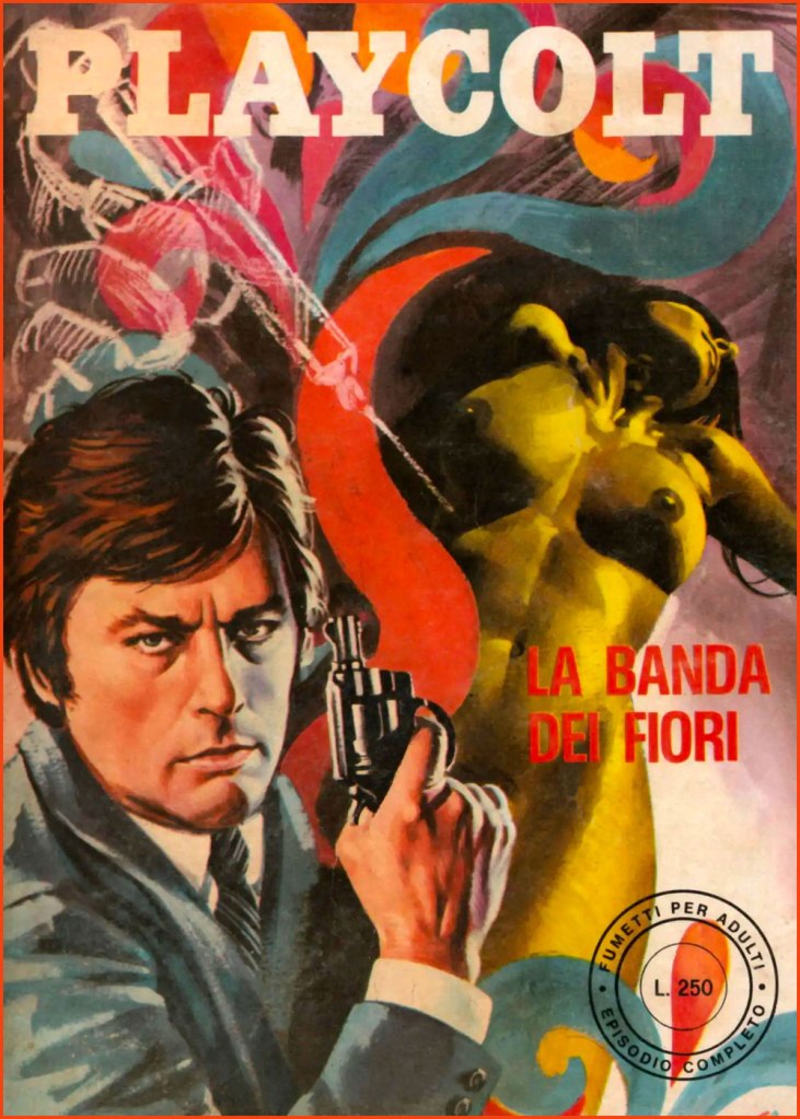
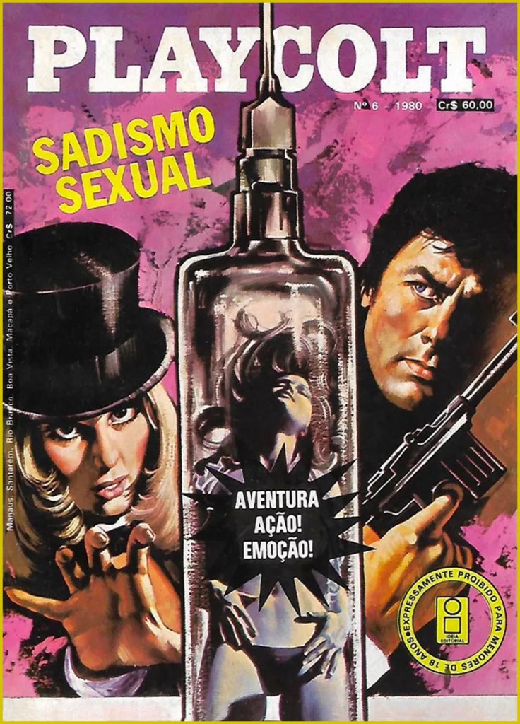
So Alain Delon became… « Alain Velon, a billionaire playboy who lives on an island “a 3-hour flight from New York“. He spends his private life conquering women in a continuous stream even if he is already engaged to the film actress Lizzy Scarlett, but “due to his innate sense of justice” he periodically transforms into Playcolt, a sort of superhero. His enemy is Linda Darnel, also a billionaire: sadistic and fetishist, she turns into the anti-heroine Za the Dead. Another historical rival is the always sadistic but lesbian Mandrakka. »
Now don’t get me wrong: these are virtually unreadable, poorly drawn, sadistic, illogical, reactionary misogynistic claptrap. But the covers are fascinating in their gonzo way, randomly cobbling together purloined bits from famous likenesses to established logos. You’d think this brazen wave of wholesale filching would have led to swift and decisive legal action from several stars’ solicitors, not to mention Hugh Hefner’s… but it seems not. This was, after all, the Italy that gave us Silvio Berlusconi.
« To the Sound of Punches »; this is Playcolt Series II no. 9 (Nov. 1973, Edifumetto). Cover art by Carlo Jacono, a nice piece, but celebrity likenesses evidently weren’t among his strong suits.« Crimes on the Emerald Coast »; this is Playcolt Series II no. 14 (Aug. 1973, Edifumetto). This one’s *possibly* the work of Alessandro Biffignandi… or his studio.« The Golden Rain » (ahem); this is Playcolt Series II no. 23 (Dec. 1973, Edifumetto). Another Jacono, another botched likeness.« The Divine Sadist »; this is Playcolt Series III no. 1 (July 1974, Edifumetto). « Death laughs in Disneyland »; this is Playcolt Series III no. 11 (June 1974, Edifumetto). « There’s a mess in the middle of the sea »; a 1980 Brazilian edition reprinting Playcolt Series III no. 18 (Sept. 1974) in Portuguese. « The Flower Gang »; this is Playcolt Series III no. 22 (Nov. 1974, Edifumetto). I have no concrete evidence, but the technique displayed here reminds me strongly of British illustrator-cartoonist Ron Embleton (1930-1988), co-creator of Oh, Wicked Wanda! and illustrator of the immortal Captain Scarlet closing credits.No need for a translation, is there? A 1980 Brazilian edition reprinting Playcolt Series IV no. 1 (Jan. 1975) in Portuguese. « Operation Puzzle »; this is Playcolt Series IV no. 12 (Nov. 1975, Edifumetto). Cover painted by the prolific Emanuele Taglietti, who handled quite a few covers in this series. Here’s an impressive gallery of these.« The White Shark »; this is Playcolt Series IV no. 35 (May 1976, Edifumetto). Sharks were all the rage that year.« To Love a Hole »; a 1980 Brazilian edition reprinting Playcolt Series IV no. 2 (Jan. 1975). Dig that strategic blurb placement; the Italian edition was not so coy. Clearly a reference to the previous year’s hit ‘erotic’ film, L’histoire d’O; this is Playcolt Series IV no. 27 (Jan. 1976, Edifumetto). It’s funny how the Delon photos used span his career up to that point, which yields visual whiplash when you go from the Delon of Plein Soleil to the jaded, grizzled one of, say, Monsieur Klein or La mort d’un pourri from one issue to the next.« Terror in California »; this is Playcolt Series IV no. 44 (Oct. 1976, Edifumetto). The obligatory Jaws cash-in. Say what you will, those Italians didn’t miss a trick.
There was, concurrently, another Delon homage in Jean Ollivier and Raffaele Carlo Marcello‘s successful Docteur Justice, a humane but hard-hitting series about a physician and expert judoka who roams the globe’s trouble spots for the World Health Organization. There was even a film adaptation in 1975, with John Phillip Law essaying the title role… and co-starring Delon’s ex — and only — wife, Nathalie. Among Pif Gadget’s adventure series, it was only bested in popularity by the prehistoric blond heartthrob Rahan. I’ll tell you more about it one of these days.
-RG
*So claims the Russian pop song entitled Взгляд с экрана, and who are we to doubt it?
« It’s easy, from our 21st-century perspective, to condemn Waldman as nothing but a sleazy bottom-feeder eking out a precarious living by pirating the marginal dregs of an industry he was only peripherally a part of. » — Don Markstein
It’s been suggested to me several times that I should devote some column space to Rostislav “Ross Andru” Androuchkevitch (though my co-admin ds certainly has, by dint of the man’s long stint on Bob Kanigher’s regressive Wonder Woman), but the trouble is, unlike the many of my generation who, presumably more through circumstance than discernment, imprinted on Andru and Gerry Conway*‘s The Amazing Spider-Man (1973-76), I had already lost all interest in Spidey after Steve Ditko‘s rightly acrimonious 1966 departure; I just wasn’t buying what they were selling.
My own, somewhat less agreeable run-in with Andru was through his ill-advised residency as DC’s principal cover artist (under “art director” Vinnie Colletta) paired up with Dick Giordano**, who reportedly slapped inks, and likely some coffee, on a few covers each day before catching his train to work.
However, as I always say, with a career that lengthy and prolific, there’s bound to be exceptions. Which brings me to a comment a dear friend and old comrade in ink-slinging made — just this week! — regarding an Andru cover I featured during last month’s Hallowee’n Countdown:
« Mmmm… that Ross Andru cover. Such a delightful classic! Who knew he was so good back then compared to his later work, which was pretty damn awful. »
So, like John Severin, Andru (with inking partner, for better — though mostly for worse — Mike Esposito in tow) was approached by Israel Waldman to gussy up his shoddy, oft-illegal reprints.
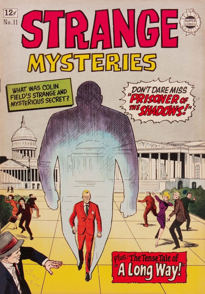
Redoubtable comics historian Don Markstein (1947-2012) did a breathtaking job of compiling a dossier of the whole I.W./Super Comics operation, complete with the cross-referencing of most — if not all — the ‘borrowed’ properties and personages. Essential reading if you’re at all intrigued by crafty reprobates of Waldman’s ilk.
This is Doll Man no. 11 (1963, Super Comics). Read it here!This is Strange Mysteries no. 11 (1963, Super Comics). Read it here! The 60s Marvel colouring gimmick of leaving the background grey to make the foreground figures stand out (not to mention spare much time and effort) leads me to think that resident Marvel hues-man Stan Goldberg (no Rube he) may have been moonlighting for Izzy Waldman. This is Danger no. 12 (1963, Super Comics). Read it here!
Mr. Markstein on The Black Dwarf: « The first question, of any character, is — why? Putting on a bizarre outfit to battle crime on an unpaid, freelance, anonymous basis seems pretty strenuous, requiring strong motivation. But his isn’t much. He just hates crime, no particular reason cited.
Next, what’s with the name? He was shorter than average, but not so short he qualified as a Little Person. Santa Claus would reject him on sight. And would identifying himself as a dwarf instill fear in criminals, confer fighting prowess on himself, or in any other way be an asset in his war on evildoers? It just sends a message that he’s small, so the evildoers can probably beat him up. At least he made up for his shortcomings by packing a gun. »
This is Mystery Tales no. 16 (1964, Super Comics). Read it here!This is Strange Planets no. 16 (1964, Super Comics). Read it here!This is Danger no. 16 (1964, Super Comics). Read it here! I was tempted to quip that it takes tremendous chutzpah to hire the then-current Wonder Woman artist to illustrate a cover featuring one of her numerous knock-offs… but I’m pretty sure Waldman, hardly a comics insider, didn’t know and didn’t care.
Of this particular breed of characters, Markstein wrote: « Superheroes first turned up in American comic books just before World War II, and flourished during the early war years. Especially flourishing were a sub-species of superhero that wrapped themselves in the U.S. flag like a cheap politician. Inexplicably, these are referred to as “patriotic” heroes, indicating that wearing the flag like Captain Freedom or Miss Victory was deemed a mark of patriotism higher and more… »
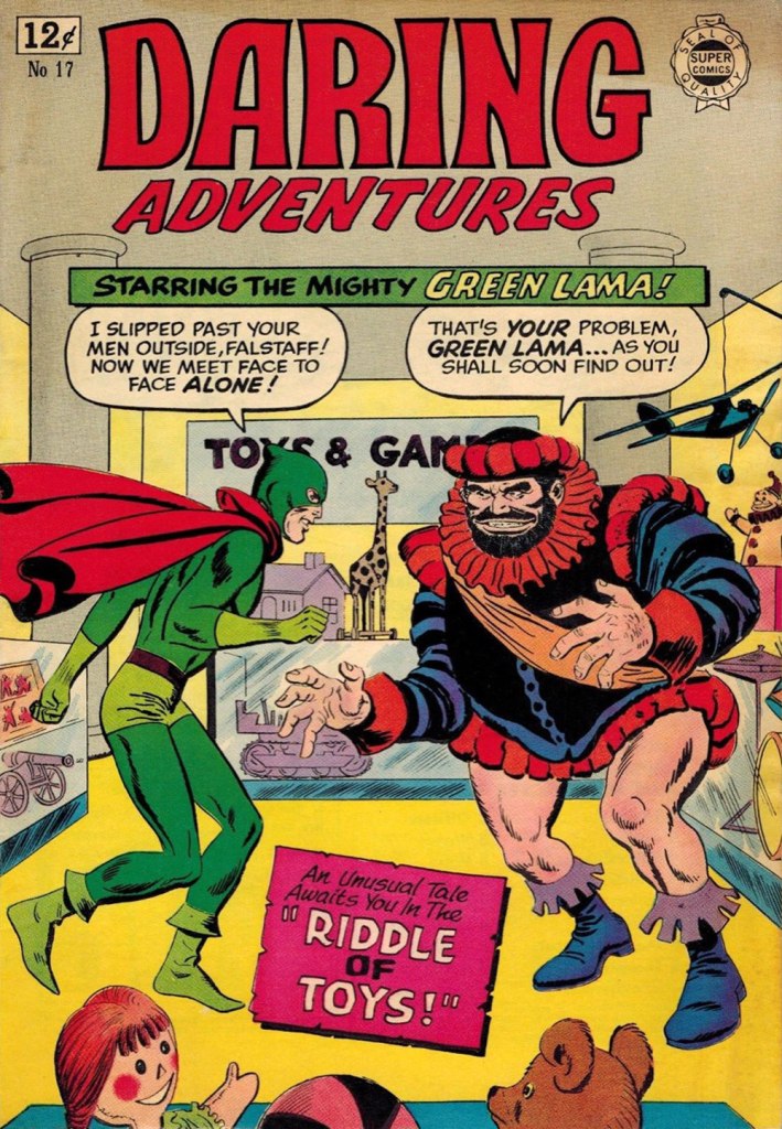
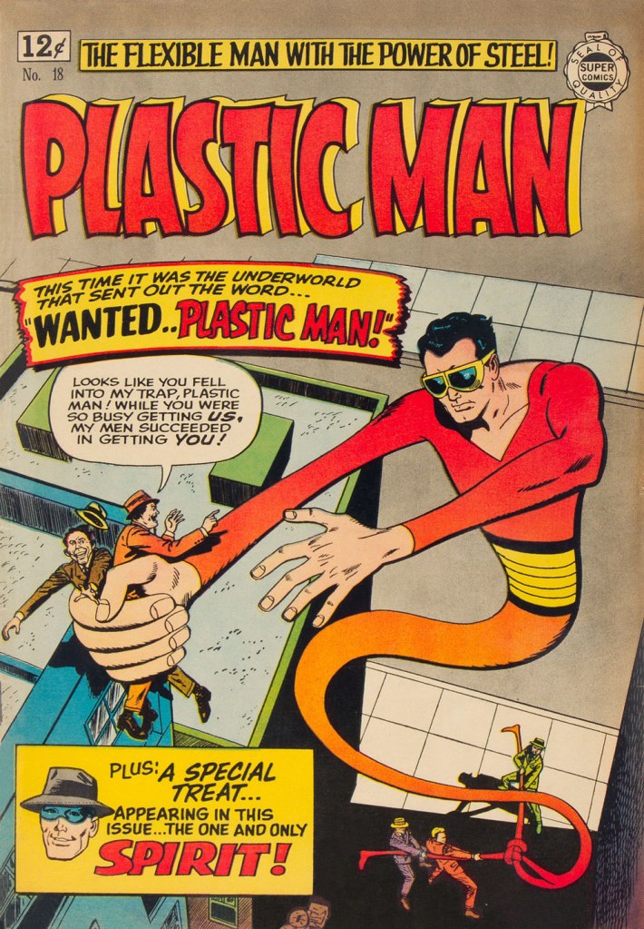
This is Fantastic Adventures no. 16 (1964, Super Comics). Read it here!This is Strange Mysteries no. 17 (1964, Super Comics). Read it here!This is Daring Adventures no. 17 (1964, Super Comics). Read it here! « May I have this dance, Green Lama? » « Why, I thought you’d never ask, Falstaff! »This is Police Trap no. 18 (1964, Super Comics). Read it here! In my opinion, this is one of the best-composed of Andru’s Super/I.W. covers: very nice sense of depth, though the effect would play out far better without the quite superfluous ‘We proudly present...’ blurb, which breaks the visual flow. I think the guy on the left is a bit ticklish. This is Plastic Man no. 18 (1964, Super Comics). This is actually a pretty spiffy issue, featuring classic work by masters Jack Cole and Will Eisner. Read it here! DC, who owned the character — having bought it from its original publisher, Quality, when it left the field (along with Doll Man, Phantom Lady, Blackhawk…) — would resurrect Plas in 1966. That didn’t click. It wasn’t until the Steve Skeates / Ramona Fradon revival of 1976-77 that someone managed to grasp the appeal of Jack Cole’s unique creation. But again, sales were low. In 1980, Andru would again depict Plastic Man on Adventure Comics covers spotlighting Jean-Claude “Martin Pasko” Rocheford and Joe Staton‘s unfunny, misguided and mercifully brief run. And hey, if you’d always longed to see Andru’s version of Eisner’s The Spirit, this is all you get!
-RG
*Harlan Ellison on Conway, circa 1979: « I mean, the first time I met Gerry Conway, who the hell would’ve known that Gerry Conway would single-handedly ruin the entire comics industry. He’s a classic example of the deification of no-talent in all industries. He’s not good, but he has it in on Thursday. And that’s all they care about. You know, fill them pages. » [ source ]
**taking over from Mike Esposito and actually making him look good in comparison!
« Addams’ idea of a bracing day’s outing is to visit an insane asylum. He takes a kind and friendly interest in the inmates and will chat with them unselfconsciously by the hour. “They have a refreshing conversational approach,” he says. » — John Kobler
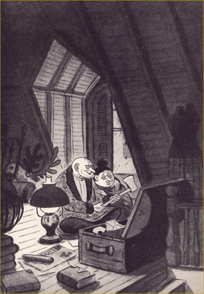
For this, the penultimate entry in this year’s Hallowe’en, I’ve reached for one of the most prized items in my collection: a book I apparently picked up for 10 dollars in the 1990s… it’s a bit hazy. It was originally given to (or by) one ‘Sadleir’ on December 25, 1950.
Coming upon the tome while browsing the general humour section, I vaguely recall being intrigued by its title, ‘Afternoon in the Attic’, and upon realising that it was illustrated by Charles Addams, the deal was sealed.
Since most of you won’t make it past the paywall, here’s part of the author’s New York Times obituary:
« John Kobler, a writer whose early days on the crime beat resounded in an enduring biography of Al Capone, died on Monday in Manhattan. He was 90.
He was born in Mount Vernon, N.Y., and was a 1931 graduate of Williams College. He worked for various news organizations as a reporter before editing the crime reportage of PM, a 1940’s New York tabloid.
In World War II he was a civilian intelligence officer posted to North Africa, Italy and France, where he was attached to the United States Embassy. He returned to freelance for The New Yorker, Colliers, Vanity Fair and The Saturday Evening Post. His first book, published in 1938, was ”The Trial of Ruth Snyder and Judd Gray.’‘ It interwove trial testimony with commentary about a notorious 1927 murder case. ”Some Like It Gory” (1940) and ”Afternoon in the Attic” (1950) were collected essays about bizarre crimes and creepy characters. ”Afternoon’‘ was illustrated by Charles Addams.
He was best known for ”Capone: The Life and World of Al Capone,” a biography published in 1971 and reissued most recently in 1992 by Da Capo Press. It remains in print, as does ”Ardent Spirits: The Rise and Fall of Prohibition” (Da Capo, 1993).
He also wrote biographies about Henry Luce (1968), John Barrymore (1977) and Otto Kahn (1989), the banker and arts patron. His favorite among them was ”The Reluctant Surgeon: A Biography of John Hunter’‘ (1960), the 18th-century Scottish anatomist and precursor of modern surgery (1960). » [ source ]
My copy had already shed its dust jacket by the time it came into my possession, but the cover image was also used as a frontispiece.While Kobler provides what’s likely the definitive biographical essay on Charles Addams (at 10 1/2 pages), Addams, in return, gives us this picture presumably worth the proverbial thousand words.
For this post, I’ll stick to a single essay, the one entitled « Next Week: Murder in a Madhouse ».
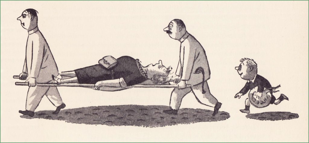
The introductory illustration…« Satisfied customers », quips the caption.
« The seats in front of me were occupied by an American family — father, mother, two girls and a small boy. “I just can’t bear it,” mother was saying, “I just won’t look.” The girls were chewing their programs which bore the Grand Gignol trade mark – a bat with a man’s head. The small boy, who I felt sure was a connoisseur of American comics, sat unruffled and superior. “Kid stuff,” he snarled. “Quiet!” said father, who seemed uncertain what his proper attitude ought to be. “The curtain’s going up.”
The climax bursts with all the restraint of a fire alarm. While Hunchback and Normandy Woman pinion Louise’s arms, One-Eye goes after the cuckoo bird with a knitting needle. Blood splashes all over everybody. (“Heavens!” mother gasped, forgetting not to look.) Louise’s screams shiver the scenery.
But a super climax is yet to come. Hunchback and Normandy Woman, suddenly fearful of what they have done, turn on One-Eye and force her face down upon a hot stove where it sizzles in a jet of smoke and flame like a barbecued mutton chop…
That was enough for father. He herded his family through the exit amid the shrill protests of the small boy who did not want to miss the rest of the program. What he missed included a maniac who disembowels small boys, a woman who gets shot in the head by a gangster and, sandwiched between for comic relief, a bedroom farce with lines never intended for little pitchers to hear, all of it staged with determined realism. »
« I can resist anything except temptation. » — Oscar Wilde
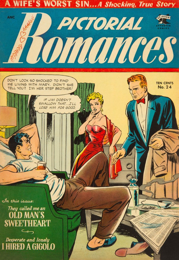
A master from the Golden Age of comics, Matt Baker (1921-1959) is surprisingly well-remembered today. Part of it stems from his singular biography — he was a successful African-American cartoonist, an especial rarity in that era — but his posterity chiefly rests on the quality of his comic book covers.
Looking around, I see that much has been written about him in recent years. But I don’t see any mention of what strikes me about his work: in essence, it creeps me out. But I understand: Baker, as a black man, must have observed and experienced affairs of the heart from a different perspective.
Don’t get me wrong: it’s technically superb, of course. But it’s the tone that I find jarring. Baker’s covers stand out by virtue of their darkly cynical realism. A lot of these situations could only end in tragedy, from unwanted pregnancy to Black Dahlia scenarios. These comic books bore generic tag lines about ‘exciting romances’, ‘love stories’ and ‘romantic adventures’, but Baker’s covers instead feature entrapment and extortion, blackmail, rape and other forms of illicit sex, procuring and corruption…
Perhaps I’m reading too much into these yellowing bits of old paper. But there stands the fact that inside these comic books, the tone changes: we receive the usual tidy moral homilies at the conclusion of every story. Yet the covers, with their unresolved scenarios, retain their haunting power.
Here’s my evidence. See what you think!
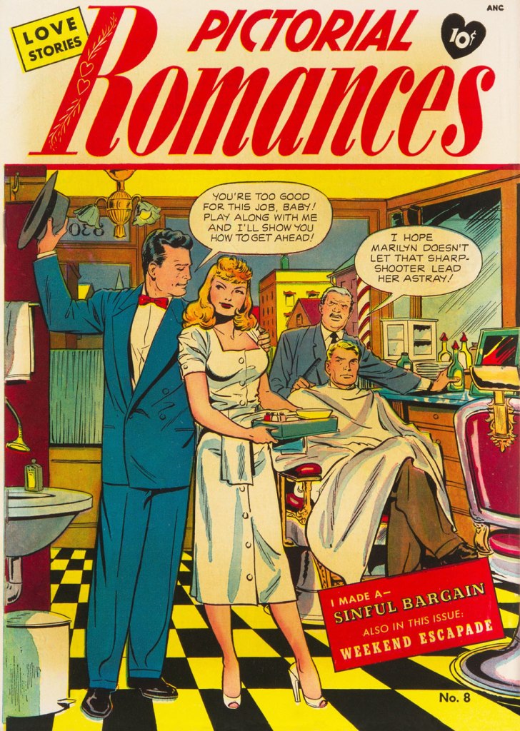
This is Pictorial Romances no. 8 (July 1951, St. John). Read the issue here.This is Wartime Romances no. 2 (Sept. 1951, St. John). Hilda seems to basically behave like Baker’s Canteen Kate, a character that makes me cringe in much the same way as Katharine Hepburn’s character in Bringing Up Baby, even without the mannered accent. This is Teen-Age Temptations no. 2 (June 1953, St. John). I sense a case of Section 2423 about to transpire. Read the issue here.This is Diary Secrets no. 18 (June 1953, St. John). Soliciting is evidently far less demeaning than going on welfare. Read the issue here.This is Teen-Age Romances no. 32 (July 1953, St. John). Oh, that Pat’s a keeper.This is Diary Secrets no. 19 (Aug. 1953, St. John). In 1953, a twenty dollar bill could buy you two hundred comic books, not to mention a jailbait date or twelve. Read the issue here.This is Wartime Romances no. 17 (Sept. 1953, St. John). No respect for the wingman. A rare case of two creeps who deserve one another. Read the issue here.This is Pictorial Romances no. 24 (Mar. 1954, St. John). Read the issue here.This is Teen-Age Temptations no. 8 (June 1954, St. John). For once, the cover matches the inside story. Read the issue here.This is Cinderella Love no. 25 (Dec. 1954, St. John). Drunk gringos slumming it over the border, down México way… what could go wrong? At least we can rest assured that the whole ‘waking up in a tub full of ice cubes, short one kidney‘ is an urban legend. But the plot of Elton John and Bernie Taupin’s 1975 classic, Grow Some Funk of Your Own, remains a distinct possibility.This is Teen-Age Romances no. 40 (Dec. 1954, St. John). With the Comics Code looming, the scenes depicted on St. John’s covers got sanitised into looking like any other romance comic book of the era. But I daresay Baker’s work was better than ever — I mean, look at that delicate, yet confident and expressive line. Read the issue here.A portrait of the dapper artist. Regrettably, work became scarce during the post-Code years, and Baker was reduced to hacking out page fillers for Vince Colletta’s studio. It’s an honest living, sure, but a waste, since nothing looks more like a dashed-out Colletta-inked romance than another dashed-out Colletta-inked romance.
Baker, cursed with a heart ailment, died tragically young at age 38 in 1959.
« Contained in these works were not only all the important philosophical developments of modern society… there were even answers to as yet unposed questions. » — Cypher has an epiphany
This week’s topic reminded me of the crucial role an enlightened comic shop owner, especially pre-internet, could play in one’s edification in the medium. Case in point: while I can’t consider him a mentor, my old comic shop guy, being adventurous and open-minded, made a lot of obscure titles available, without necessarily pushing them on his customers. And in a world of ‘super-heroes or bust’, such availability is crucial.
Which brings us to Mr. Brad Teare (b. 1956, Moscow, Idaho). I’ve always had special fondness for comics that bloomed outside the usual channels, like hardy plant life rising up in cracks and miraculously subsisting on nearly nothing.
You know, like this.
From what I can tell, Teare’s first professional comics work appeared in a non-consecutive pair of issues of Heavy Metal magazine, during that blessed but oh-so-brief ‘Tundra‘ period when surprisingly enlightened Teenage Mutant Ninja Turtles co-creator Kevin Eastman published, at considerable loss (between 9 and 14 million simoleons), some of the finest comics of the 1990s.
Eastman had purchased Heavy Metal in January, 1992. In the March issue, Brad Teare’s Cypher made its first of two appearances in HM, in marked contrast to the magazine’s prevalent ‘dystopias with titties for arrested adolescents’ aesthetic.
The following year, Teare self-published (under the Crypto Graphica banner, out of Providence, Utah, pop. 7,000 or so) Cypher no. 1, with a cover clamouring that it contained the ‘Complete Cypher Trilogy!’. Teare intended to produce further issues, but the market evidently wasn’t built for it. The book is so obscure that even the Grand Comics Database (GDC) has never heard of it. But my comic shop guy did place an order, and found at least one receptive reader eager to snap up a copy. I waited and waited for a second issue, but in vain.
This is Cypher no. 1 (1993, Crypto Graphica). Have I mentioned how much I enjoy the artistic technique of ‘scratchboard’? I have indeed!This back cover one-pager from Cypher no. 1 has never been reprinted, I believe.
Then, four years down the road, Gibbs-Smith, “a proud independent publisher and distributor“, founded in 1969, also Utah-based… and still around, assembled and issued a compact (22,5 x 16 cm) hardcover Cypher collection, gathering material that Teare must have intended for at least a couple more issues of his series. Aside from an oddly ‘meh’ cover, overworked and underwhelming, it’s a gorgeous package. It also has managed to fly below the GCD’s radar all these years.
Cypher finds himself new employment. This is the version from Cypher no. 1; perhaps because of the smaller format, the collected edition replaced Teare’s lovely, expressive hand-lettering with a computer font.A spooky sample from ‘Minotaur‘, from the 1997 Gibbs-Smith collected edition.
In the meantime, Teare kept his hand in, providing a pair of highlights to DC/Paradox Press’ well-written but frustratingly visually scattershot The Big Book Of series (1994-2000), also finding success as a freelance illustrator (Random House, The New York Times, Sony, Turner Interactive, Flying Buffalo) in all manners of media.
From The Big Book of Urban Legends (Dec. 1994, Paradox Press/DC).From 1997, a typical spread from the charming Dance, Pioneer, Dance! Written by Rick Walton, it offers a slightly fictionalised account of the westward migration of Brigham Young and a band of his fellow Mormons.From The Big Book of Vice (March 1999, Paradox Press/DC). A fascinating bit of history!
Though he’s nowadays a celebrated and prolific painter of the Utah landscape, he hasn’t altogether turned his back on comics, bless his soul. The final chapter of Cypher (to date?), ‘Sub-Wayward’, introduced, in the story-within-a-story tradition, scientist turned reluctant underground hero The Subterranean. And so, long story short, we find ourselves with a Teare book that’s readily available (for the time being)!
« This comic details the thrilling origin of The Subterranean from his humble beginnings at HyperLabs in New York City to his role as sole defense against a terrible evil perpetrated by the Thanatos twins, former colleagues at HyperLabs. This character of The Subterranean is a spin-off from the critically acclaimed graphic novel Cypher. »
« In Hawaii they say, “aloha.” That’s a nice one, It means both “hello” and “good-bye”, which just goes to show, if you spend enough time in the sun you don’t know whether you’re coming or going. » — George Carlin
By and large, the notorious 1990s trend of autobiographical (at times navel-gazing) comics was undermined by its practitioners’ dearth of meaningful life experience and insight. Obviously, there’s been plenty of notable exceptions, before and since: on the insight front, for one, Canadian David Collier is an undervalued master of the documentary form.
As for life experience, puissant Dennis P. Eichhorn (1945-2015) put all the pasty, effete cartoonists to shame with his spectacularly turbulent, bold-type life. A gifted writer and storyteller, well-versed in the comics medium, he galvanised the creativity of his many collaborators, a broad yet aptly-selected crew of graphic practitioners, many of whom he’d met in the course of his lengthy writing and editorial stint with Seattle’s fabled The Rocket weekly.
I initially assumed I’d run into trouble in settling on the one story to showcase, but nope… right away, I knew just the ticket… a ticket to the Big Island.
Monkey See, Monkey Do, written by Eichhorn and illustrated by Gene Fama, first saw print in Real Stuff no. 11 (Jan. 1993, Fantagraphics); there, it appeared in black and white, but was coloured, presumably by Fama himself, for Swifty Morales Press’ lovingly-done 2004 Real Stuff anthology.The issue originally featured a Charles Burns cover coloured by Jim Woodring (another master of autobiography, en passant). Burns presumably wasn’t too keen on the original palette (whose murkiness, to be fair, rather overwhelmed his drawing), so he recoloured it himself for the anthology. This is the all-Burns version. Compare, if you will, to the Woodring rendition. A candid shot of our fair young author on a visit to Seattle, circa 1992, with Mr. Eichhorn, along with a friendly member of the local ethylic intelligentsia, who successfully lobbied for inclusion in the shot. You decide who’s who.
-RG
p.s. It would be easy to assume that āhole is just a fancy way of saying ‘asshole’, but it isn’t *necessarily* so; to wit:
āholen. An endemic fish (Kuhlia sandvicensis) found in both fresh and salt water. The mature stage is āhole, the young stage āholehole. Because of the meaning of hole, to strip away, this fish was used for magic, as to chase away evil spirits and for love magic. It was also called a “sea pig” (puaʻa kai) and used ceremonially as a substitute for pig. Foreigners were sometimes called āhole because of the light skin of the fish. He āhole ka iʻa, hole ke aloha, āhole is the fish, love is restless [of āhole fish used in love magic]. [ source ]
« Krigstein was a heartfelt sort of warm guy, but always in conflict. He was getting sick and tired of being embroiled and embattled. He fought hard to keep interested, but began getting cynical. » — Gil Kane, or Eli Katz if you prefer, fellow K-Man.
Over seven hundred posts in, why have we never featured Bernard Krigstein, despite the fact that both of us absolutely adore his work? Part of the reason is that so much of value and insight has already been written on the subject, and part of it is that he’s hard to write about, which makes the existing literature even more remarkable and worth treasuring. And yet, there’s still so much left to say!
Hell, since it’s his birthday (born on March 19, 1919, he would now be one hundred and three years old), I’ll give it a try.
I’m not quite certain what precisely was my proper introduction to Mr. Krigstein’s œuvre: it was either my encounter with the whimsical The Hypnotist! (written by Carl Wessler, originally published in Astonishing no. 47, March 1956, Atlas), as reprinted in Weird Wonder Tales no. 19 (Sept. 1976, Marvel), or with Pipe-dream, scripted by Johnny Craig and reprinted in Nostalgia Press’ Horror Comics of the 1950’s (1971, edited by Bhob Stewart, Ron Barlow and original publisher Bill Gaines… mine was the French-language edition). I enjoyed the first one just fine, but the latter blew my young mind, not that I was equipped to fully appreciate it. Kudos to the editors for including the tale, because it really stood out amidst the tried-and-true and somewhat formulaic EC classics. It had no heavy, easily digested moral, it was illustrated in a sketchy, vaporous, elastic style that bore no resemblance to its more conventional company, to say nothing of the writing.
Pipe-dream originally appeared in Vault of Horror no. 36 (Apr.-May 1954, EC); written by Johnny Craig (who was also editor). This version was recoloured from original Silverprints by Marie Severin for Greg Sadowski‘s rather sublime B. Krigstein Volume One (2002, Fantagraphics).
As it turns out, even the story’s colourist, a young Marie Severin, had some severe misgivings about it: as she noted many years later, « I can’t remember a thing about coloring ‘Pipe Dream‘ the first time. I rushed through it because I found it so depressing. The whole subject was so dingy to me. I was just a kid, you know — I didn’t want to know anything about dope. When I saw it again, it brought back all those negative feelings. I suppose I shielded myself from them by doing it quickly. Now that I’ve lived a while I can appreciate its beauty, and I’m better equipped to color it. »
To be fair, she had done her usual fine job on it.
Having come late to the EC stable, Krigstein didn’t get too many cover opportunities. This is his second, and final shot, Piracy no. 6 (Aug.- Sept. 1955, EC)… and, I daresay, a classic. Krigstein sure could paint the elements evocatively: from the same year, an illustration from Herman Melville’s Moby Dick (Pocket Library Series no. 28, 1955).A 1949 photo of the radiant artist, having just been awarded First prize in black and white graphics by the Brooklyn Society of Artists. I think that part of what makes me favourably disposed towards Krigstein is that he’s a dead ringer for my accountant, a most worthy fellow himself.
If one could find any fault in Greg Sadowski’s definitive two-volume Krigstein monograph, it’s that his research missed one crucial entry in his subject’s funnybook bibliography… the last, and longest one! Here’s hoping for an updated edition, some sweet day.
It took another hardy historian, England’s Paul Gravett, to uncover the fascinating, final piece of the puzzle. It turned up in Gravett’s The Mammoth Book of Best Crime Comics (2008, Running Press). A comic book spinoff of the television series based in turn upon Salvatore Albert Lombino‘s (aka Evan Hunter, Ed McBain, Hunt Collins, Curt Cannon, Richard Marsten, D.A. Addams and Ted Taine) 87th Precinct series, it appeared in the final year of Dell’s Four Color series. So here are a few extracts (as Mr. Gravett would surely call them) from Blind Man’s Bluff; scripter unknown, pencilled and inked by Krigstein, from Four Color no. 1309, June 1962, Dell). By all means, read the whole thing here!
Gravett says of the tale: « Illustrated by the EC Comics genius Bernie Krigstein, it was described by him as ” … the most fantastically absurd story that has ever been typed or presented to an artist… ” A painter himself at the time, Krigstein quit the series after rejecting the unknown writer’s second script and pursued his art career, sadly never to draw comics again. Despite his misgivings, his swansong has a bizarre fascination to it. »
Well, that about wraps it up. See what I mean about how much there is to say? All this blather, and I never even got around to introducing the villains of the piece, Kanigher and Lee.
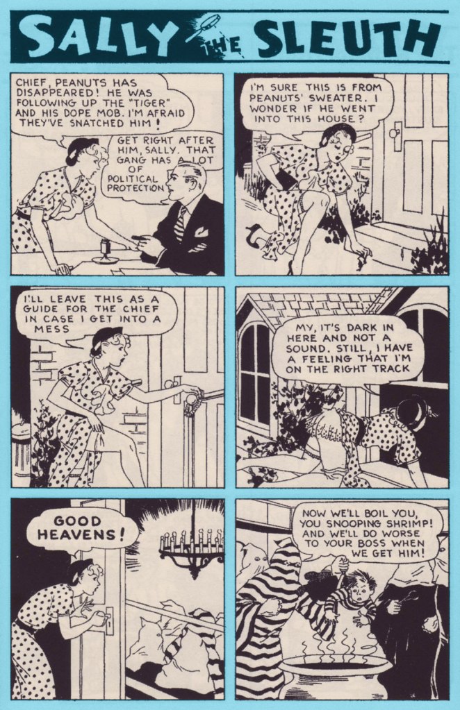
She’s audacious, savvy, and she’s always cheerful. Here she is, the infamous Sally the Sleuth by Adolphe Barreaux*. First things first, to give us a timeframe: this strip was published in “pulp” magazine Spicy Detective Stories between 1934 and 1943, then moved to Speed Detective Stories in a new format** until 1950 then, finally, to Crime Smashers until the comic’s demise in 1953.
Sally the Sleuth features a tightrope act that’s not that easily achieved: fearless, self-sufficient Sally is so adept at spotting (and landing into the middle of) trouble that she frequently requires outside help to be rescued in the nick of time, with the role of the rescuer oft being played by her boss, the Chief, who usually bursts in through the door. What’s interesting is the way this rather typical damsel-in-distress set-up does not take anything away from our sense of Sally as a take-charge, go-getting kind of gal. She does not hesitate to bat her eyelashes or flash a gam when needed, but she’s neither the usual femme fatale archetype that appeared so often in contemporary comics, nor the innocent-yet-gorgeous victim. When captured, she spits (sometimes literally) in the face of her would-be killers; when she gets rescued, it was because she left instructions with Peanuts, her kid assistant, or schemed to leave the Chief enough clues to locate her if she hit a bad patch.
Strategic panty drop! Page two from “Tourist Trade” (June 1938, Spicy Detective Stories).
It may surprise a modern reader that an American comic from the mid-thirties (1935! consider this number again if it hasn’t sunk in yet!) should be so casual about a topless female when present-day consumers of culture freak out at the very sight of a nipple (and that goes for male nipples as well). Of course pulp magazines and comics weren’t read by staunch defenders of High Morals and Propriety, but it was nevertheless a hugely popular medium, and Spicy Detective Stories, where Sally got her débutante ball, certainly abounded in unclad women in tales of booze, butchery and concupiscence.
The cover of Spicy Detective Stories no. 4 (June 1935), in which The Tiger’s Lair (see below) appeared.
Which brings me to my next point: tension created by the play between the predictable and the unforeseen. Sally always, always ends up in a state of advanced déshabillé. That is an enjoyable given. Much like panties drop to the floor if a woman should be carrying celery, Sally’s dress and underwear fly off at the gentlest of tugs. However, just how it is accomplished varies wildly from week to week. One wouldn’t think that were so many interesting ways of getting accidentally undressed. And these stories are harsh, no doubt about it: scenes of torture and murder vary from the comparatively sedate (getting whipped, slapped, shot) to sensationalist (death by venomous snake or spider) to viscerally uncomfortable (cannibalism with more than a dash of necrophilia, being boiled alive, impalement).
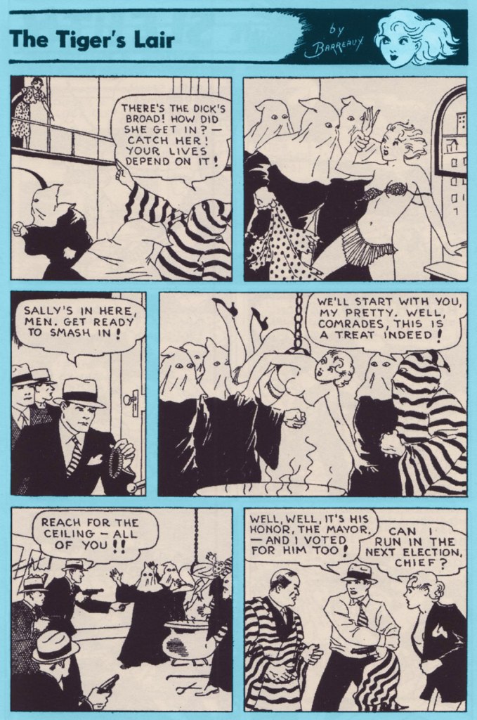
The complete “The Tiger’s Lair” (June 1935, Spicy Detective Stories).
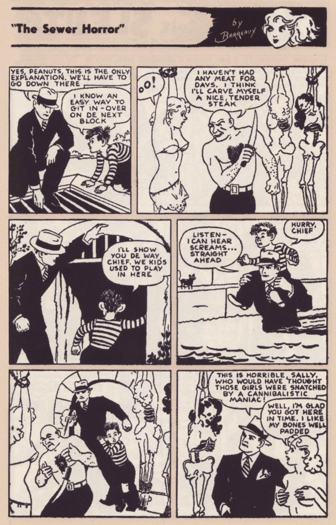
Sally’s stoicism as she’s about to be carved up is nothing short of miraculous. Page two from “The Sewer Horror” (December 1937, Spicy Detective Stories).
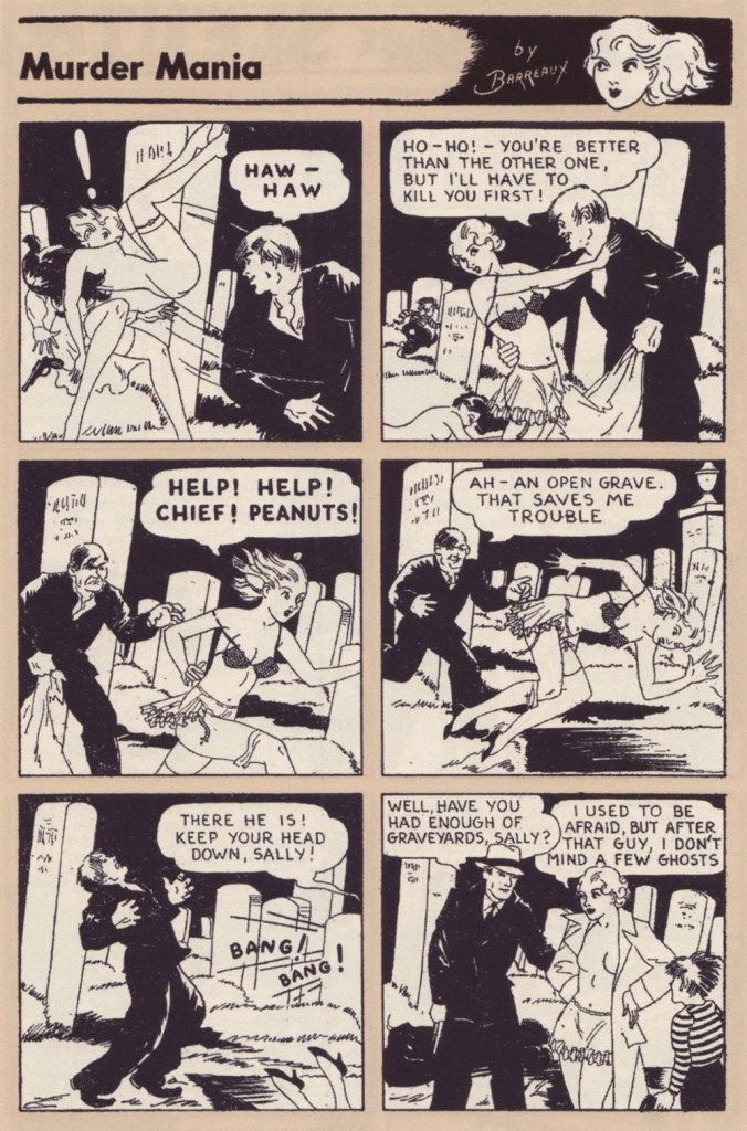
Page two from “Murder Mania” (April 1935, Spicy Detective Stories).
Page two from “The Missing-Models Mystery” (April 1937, Saucy Detective Stories).
Though of course it’s the nudity is sexualised, I love the ease with which Sally does it, completely unperturbed by having a bare chest whether she’s surrounded by hoodlums, talking to her boss, or racing through a crowded hotel. There’s a certain innocence in it, as if we were watching a frolicking Dedini nymph. Despite being so frequently assaulted, she does not at all come off as a victim.
Some top-rate lassoing from Peanuts! They’re trying to make it look like a suicide, but I’m not sure why a woman would want to jump off a roof naked. Page two from “Love Nest Loot” (September 1935, Spicy Detective Stories).
Earlier-day Sally (1934-1943) is supposedly ‘ditzy and naive’ (source), but I think one should not mistake cheerfulness or pragmatism for naïveté. She navigates the seedy parts of town with aplomb and talent, efficiently following clues, taking on many roles to infiltrate criminal organisations or simply glean information. Sally may have to rely on the Chief to extricate her from yet another predicament, but he is a sort of handsome stock figure with little personality, mostly sitting around his office and agreeing when Sally says ‘I should investigate this!’
Page two from “Coke for Co-eds” (January 1938, Spicy Detective Stories).
Sally also doesn’t judge other women; her moral compass is firmly pointed to bringing all manner of crooks to justice, but she’s a no-nonsense kind of girl when it comes to standards of female behaviour. Page two from “Sin Ship” (October 1936, Spicy Detective Stories).
Page one from “Toy of Fate” (January 1937, Spicy Detective Stories).
Sally the Sleuth has historical importance, if only for the panel borrowed by Frederic Wertham for his Seduction of the Innocent report from a Sally the Sleuth: Death Bait (1950) story. In the wonderfully written introduction to the Sally the Sleuth Collection, comics historian Tim Hanley goes a step further, saying “without Sally the Sleuth, there would be no Superman. Without the pulp heroine with a penchant for solving crimes in a state of undress, there would be no Batman either.” It can be (and has been) argued that he is giving this strip too much credit***, but there will be no argument that Sally is an important figure. Because I’m a philistine, what’s most important to me… is that it’s a great read.
~ ds
* As far as Barreaux, born Adolphus Barreaux Gripon, is concerned, there are much better places to read about his biography than on this blog, mostly due to the fact that biographies kind of bore me. I specifically direct you here for a detailed biography, and here for more information about Barreaux’ mixed heritage and the variety of genres he illustrated.
** This post only includes strips from the earlier, 1934-1943 version, because I by far prefer it to what came later, although I may be in the minority. The art got arguably better once Sally moved to Speed Detective stories, and stories also got longer, allowing for more elaborate plots. However, Sally was now some sort of international spy, travelling to ‘exotic’ countries and having to contend with native Hula dancers, superstitious savages in Indian jungles, Nazis, Japanese master-minds, and so on. She got disrobed less frequently, but the charming innocence of the strip, despite its violence and simple but effective art, is what makes Sally so appealing to me.
*** Hanley has been clearly reproached for this by some readers, and so elaborated on his blog:
My introduction begins with the grandiose claim that there would be no Superman without Sally the Sleuth, but it’s true. Long before Harry Donenfeld launched DC Comics, he was a publisher of pulp magazines that featured lurid crime stories. Sex was a major focus, and the dirty stories were a popular product. In 1934, Adolphe Barreaux convinced Donenfeld to expand outside of prose and add some comics to his books, and the “Sally the Sleuth” strip in Spicy Detective was their first attempt. It proved popular and more followed. Eventually, Donenfeld got into the comics game full time in the late 1930s, first with Detective Comics and later with Action Comics. Once Superman and Batman took off with young readers, more series followed and the comic book business became Donenfeld’s priority. But it all started with Sally.