« I am fond of pigs. Dogs look up to us. Cats look down on us. Pigs treat us as equals. » — Winston Churchill
Recently, I’d been drawing a blank as to the topic of my next post. So I did what one does in such distressing circumstances: I pulled something at random from the nearest bookshelf — just filled a couple of days earlier, conveniently.
And it paid off: my hand landed upon a screwball, one-shot digest published by a near-defunct Harvey Comics. Its contents? A hodgepodge of 1950s horror and SF tales, including, for instance, Bob Powell‘s classic Colorama (1953) and some of his Man in Black (1957-58) stories. Ninety-five cents well spent.
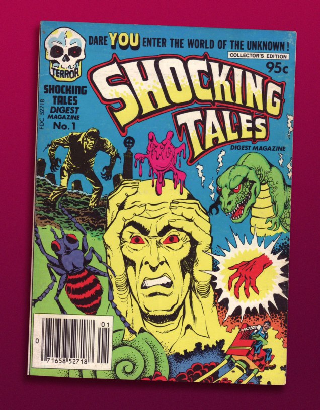
This is Shocking Tales Digest Magazine no. 1 (Oct. 1981, Harvey).
The finest riches in dem dar hills, however, consist in some rather obscure — given its regal pedigree — Jack Kirby material from the late 1950s, reportedly written, pencilled and inked by The King.
However, given the dodgy printing quality of a comics digest, I had to pull out my second-oldest Kirby Komic (the most ancient being December 1952’s Black Magic no. 5 — read it here!) and very, very carefully scan the relevant pages. Oh, the sacrifices I make for this blog! 😉
.
.
.
.
.
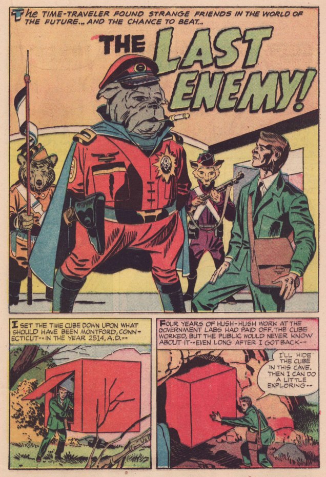
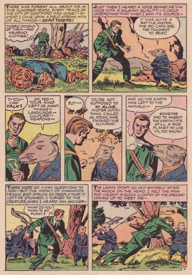
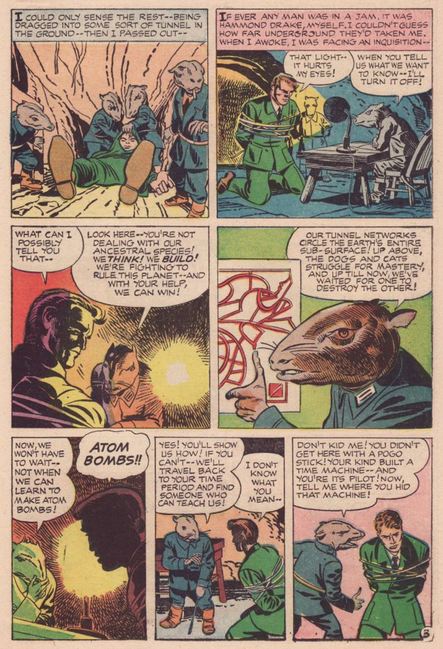
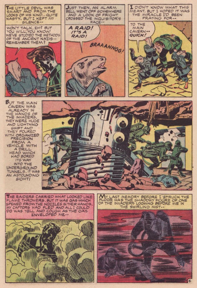
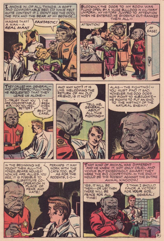
Kirby has often been unfairly slagged for ‘riffing on’ the popular Planet of the Apes franchise, but The Last Enemy predates the 1968 film’s source, Pierre Boulle‘s 1963 novel La planète des singes by some six years… and besides, the ‘animals taking over’ theme has a long history in science-fiction. To name but a pair of antecedents, there’s Lester Del Ray‘s The Faithful (from 1938) and Clifford Simak‘s City (linked stories published between 1944 and 1951 and amalgamated in 1952).
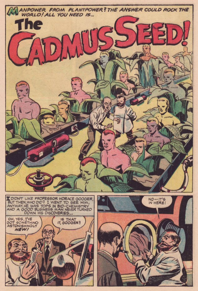
Here’s a second story, which I like even better, thanks to its humorous touches. Several of its plot ideas could have been expanded upon in OMAC, had Kirby been granted time and opportunity.
.
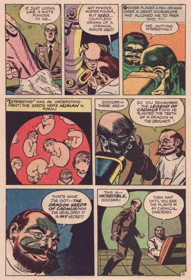
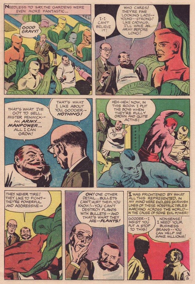
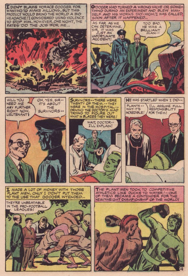
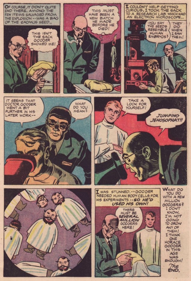
Learn all about the aforementioned Legend of Cadmus and amaze your friends (or bore them to tears, depending on the quality of your circle)!
.
.
.
I suppose I can take Babs having her favourite pooches cloned, but I shudder at the prospect of, ahem, certain people being genetically reproduced on an industrial scale. Another argument for nailing that particular Pandora’s box shut for good.
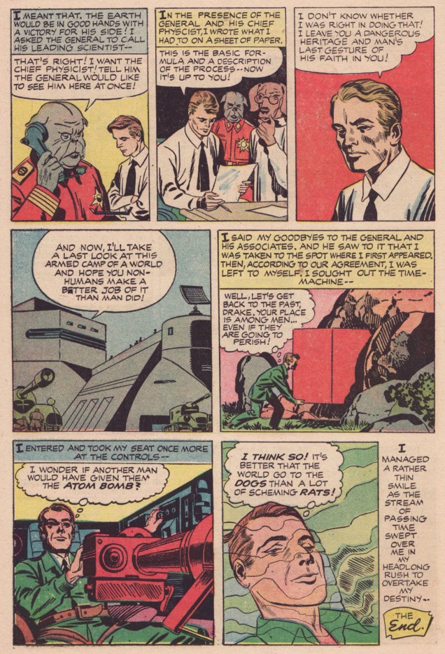
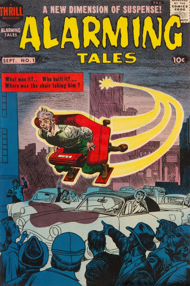
Both yarns appeared in this jam-packed. all-in-colour-for-a-dime wonder, Alarming Talesno. 1 (Sept. 1957, Harvey). I was fortunate enough to pick up a copy for peanuts, eons ago — but fret not, you can read it gratisright here.
Cover artwork by Joe Simon (main figure) and Kirby (everything else). Further details on this issue can be found here… and you can read the rest of it here!
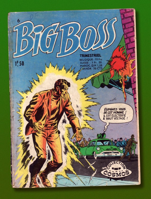
This is Big Boss no. 6 (Oct. 1971, Arédit-Artima); cover by Ruben Moreira.
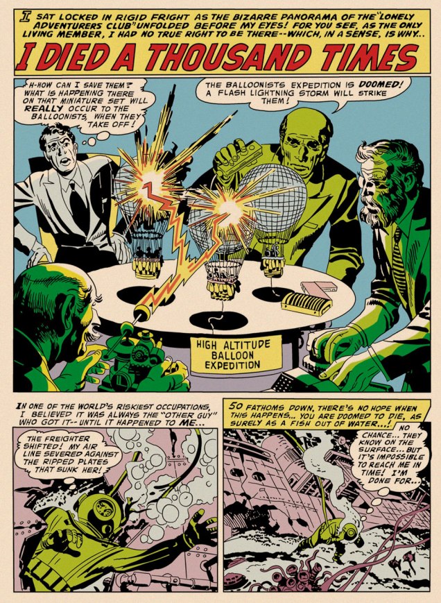
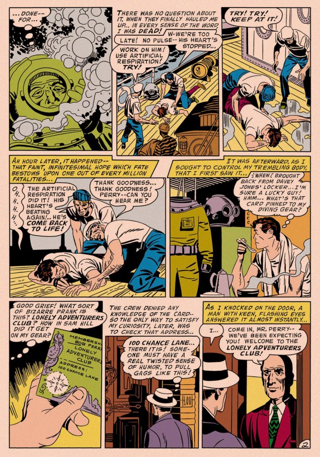
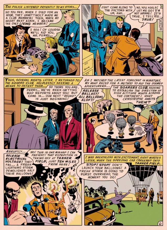
One might be inclined to say that, with its themes of adventurers cheating death or living on borrowed time, I Died a Thousand Times inspired Kirby’s Challengers of the Unknown, except that Ace, Rocky, Prof and Red had burst into print a few months earlier. Suffice it to say that they sprang from the same fertile well. It’s always intriguing to observe how the particular seed of an idea can be grown in a myriad of directions.
If you’ll forgive me the intrusion, this is how the opening panel appeared in the Big Boss reprint. In order to make things more readable in the digest format — and in black and white — Arédit‘s in-house art department routinely reframed and even augmented the artwork, with varying degrees of competence and success. This is one of the more accomplished efforts. The story’s writer is unknown (though it features a most Kirbyesque plot); it was pencilled and likely inked by King Kirby, and originally appeared in My Greatest Adventure no. 16 (July-Aug. 1957, DC); edited by Whitney Ellsworth; Jack Schiff; Murray Boltinoff and George Kashdan… let’s just say DC *was* a tad heavy on the management side in those days.
Though Kirby’s standalone short stories of this period are as charming and inventive as you’d expect, this modest trove of material has by and large been neglected. While a handful of these tales (The Thief of Thoughts; The Creatures from Nowhere!; The Cats Who Knew Too Much!; The Man Who Betrayed Earth; The Negative Man; and The Stone Sentinels of Giant Island) were semi-randomly reprinted in the early 1970s when DC had lots of pages to fill, this one didn’t resurface in North America until 2011’s pricey-then-and-pricier-now hardcover Jack Kirby Omnibus no. 1.
« This is the very center of everything there is. A huge black hole eating up the galaxy. The end of everything. » — Clifford D. Simak
Early in the Fall of 1979, I was pleasantly surprised to discover some new work by Jack Kirby in our weekend paper’s comics section. Things had been awfully quiet on the Kirby front since late 1978, the ‘King’ having unhappily — and quite understandably — left Marvel for the second time that decade.
This new work was part of the long-running anthology strip Walt Disney’s Treasury of Classic Tales (1952-1987). I dutifully collected the shabbily-printed comics sections and patiently hoped for an improved presentation.
The October 28, 1979 Sunday strip, as it appeared in newsprint. Incidentally (and unoffically) here’s the whole story.The surviving original art page from the same date, for comparison.
Western Publishing, usual licensee of Disney product since its acrimonious split from Dell in 1962, then issued a Black Hole adaptation, in both a slick magazine and comic book format. But — holy bait-and-switch! — it wasn’t the Kirby version!
A typical page from the Western Publishing adaptation. Written by Mary Carey and illustrated by Dan Spiegle (1920-2017), a perennial favourite of the publisher’s. Another mystery: since Spiegle had earlier proven himself well-capable of capturing likenesses, one must assume that the decision to dispense with likenesses of Anthony Perkins and Ernest Borgnine and replace them with those of, I dunno, ‘Weird’ Al Yankovic and Ontario prime minister Doug Ford must have come down from on high. But… why?
I’ve been musing over these riddles ever since (in my spare time). Recently, I decided to act by putting the question to one who was there… namely Mr. Michael Royer, who’s been most gracious to us with his time and recollections (check out our three-part interview with MR!) — and continues to be!
RG: Mr. Royer, I’ve long been baffled as to why Disney (or Western Publishing, at any rate), thought it necessary to commission two separate comics adaptations of The Black Hole. I’ve always surmised that Kirby was considered too wild for them, but that’s just speculation on my part.
Since you were working for Disney at the time, and you inked the Kirby adaptation, I presume that you played some kind of role behind the scenes as well. Could you share some of the facts with me (and my readers)?
MR: Jack Kirby was selected to draw THE BLACK HOLE Sunday comic strip on MY recommendation. Gold Key editors always selected their OWN artist for similar licensed material… plus they were in no position to pay their artist the fee I got Jack. I inked and lettered HOLE and made necessary changes to the robots to protect the image for toy, etc. sales trademarks. Jack was an impressionist and I made the robots “on model.”
Jack became so bored with the scripts, that were done “storyboard” like by someone who had NO understanding of how to make comic art interesting and exciting, that he asked me to layout the FINAL Sunday page, which I did. I had told the powers that be at Disney that Jack must get his originals back but, of course, being Disney, they did not return them as they had promised. Jack only got the remaining pages not yet sold by the Circle Galleries after threatening Disney with a lawsuit. Disney gave me one of the Sunday originals because someone had spilled a cup of coffee on it.
The head of our Creative Services dept. at Disney was not a big fan of Kirby* and after I had inked the first Sunday he had another staff artist “fix” the faces, which stood out like what they became: inept changes. I yelled “DON’T CHANGE THE FACES!” They gave in to my warning.
It was an interesting time back then. Bob Foster and I were the ONLY artists in Creative Services who had worked in comic books and strips. They would never take our word about things until our department head, Bob and I, were on a conference call with Sylvan Beck (King Features Strip Editor in New York) and then they believed what we had to say about the ways a Sunday strip could be drawn to fit many formats. It was very frustrating at times knowing more than your “bosses.”. But… it is the same old story. Middle management was loaded with MBAs who didn’t know shit from shinola! We used to joke that if one had an MBA anyone could get hired at Disney… You didn’t have to know a damn thing about anything else except how to get the MBA.
RG:I’ve read somewhere that the Black Hole scripts were the work of Carl Fallberg. I mean, if that’s true, surely he wasn’t the one who storyboarded the script, as it’s a bit hard to reconcile ‘NO understanding of how to make comic art interesting and exciting’ with a visual artist of Fallberg’s calibre… might he have delegated the task to some flunky?
MR:It was Fallberg… storyboard layouts for each panel/page. I liked Carl and he was a nice man, but he had no idea how to “jazz” up the film visually and Jack wasn’t about to rock the boat, by being his usual inventive self. The script layouts were just like the film… boring. Just a blow by blow of what was going on in the film. The comic strip could have been exciting if Carl hadn’t just “stuck” to the movie. But, perhaps I am being too critical. Carl was probably “following orders” from our department head. When I tried out to do strip art for Disney in the late 60s or early 70s that same department head told me NOT to worry about “likenesses” of the actors. So when I told in my samples they were turned down because “no one looked like the actors.” Gawrsh…as Goofy would say. As I said… Bob Foster and I were the only guys in Creative Services who had ever been intimately involved in comic book or strip art production in our department. Things did change a bit eventually.**
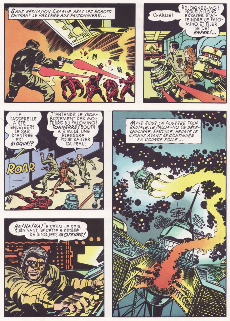
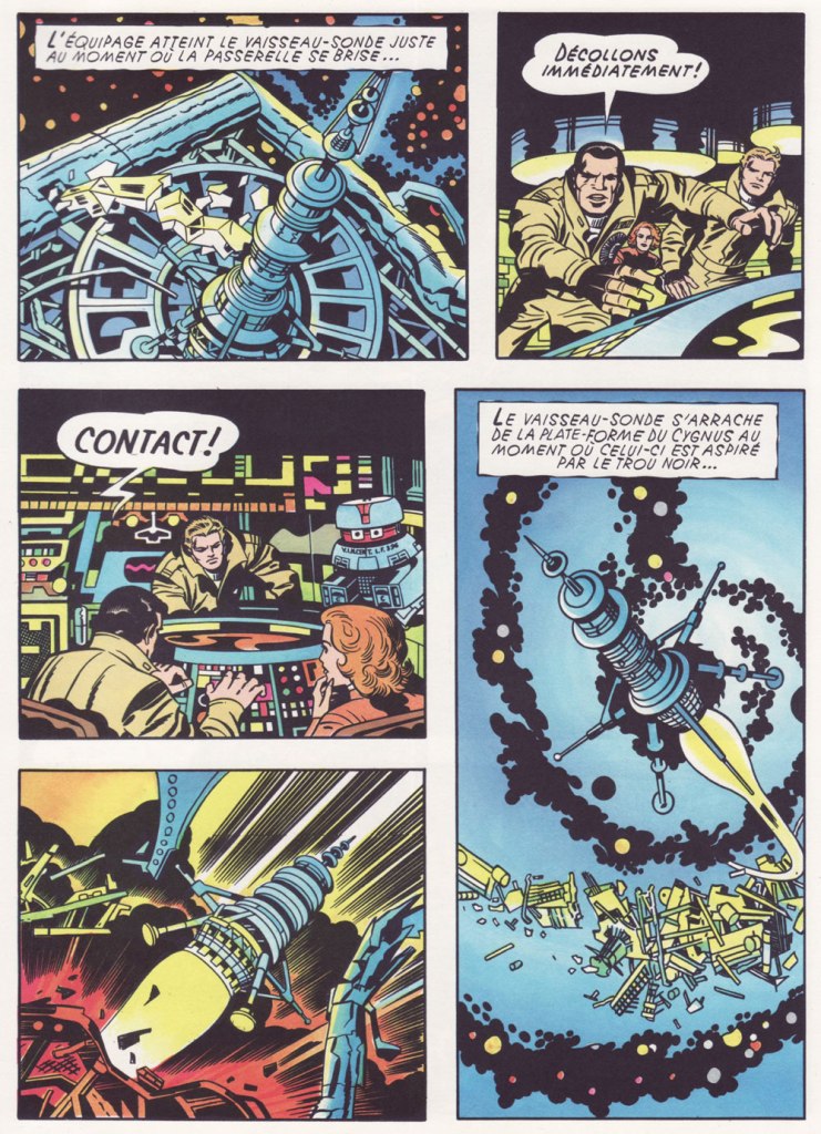
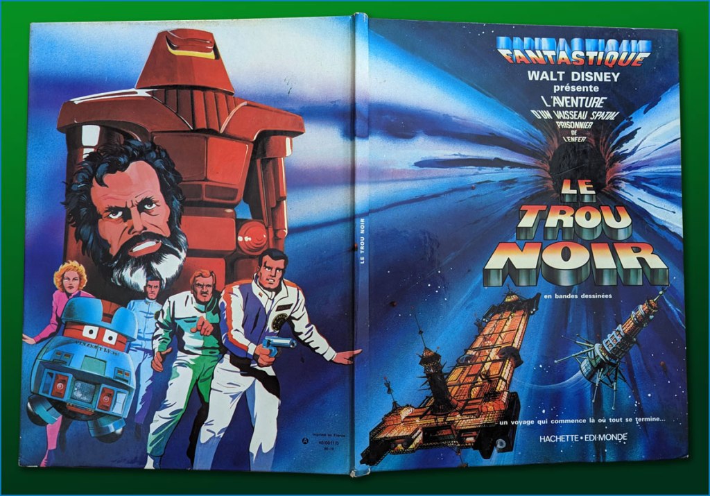
I’ve heard it said that the Kirby Black Hole material has never been reprinted or collected in full… which is only true if you only count English-language editions. I happen to have on hand the well-produced French collected edition (Fall 1980, Edi-Monde/Hachette). It was serialised earlier in the weekly Le Journal de Mickey (published continuously since 1934!).I’ve mostly gone with the action sequences. In an episode of Sneak Previews, film critics Gene Siskel and Roger Ebert perceptively assessed The Black Hole‘s shortcomings.Here’s a look at the hardcover collection in question, with its amusing cod-Kirby painted back cover.
I leave the final words to Mr. Royer, along with my earnest appreciation of his gregarious generosity!
MR:As a point of interest (or none at all), I designed and drew the Sunday page BLACK HOLE title panel as well as lettering, correcting robots and inking. I have a full set of B&W proofs if any one is interested in putting them into print. Offered to loan them to IDW but I guess they weren’t interested. My price must have been too high. Two comp copies of whatever they printed. LOL sigh.
*this was decades before Disney became perfectly fine with reaping billions upon billions from Kirby’s creations.
« Gamma rays are the sort of radiation you should avoid. Want proof? Just remember how the comic strip character “The Hulk” became big, green, and ugly. » — Neil deGrasse Tyson
It may seem a counterintuitive notion, but some artistic virtuosi, while draftsmen supreme, may be sorely lacking in pure design chops, while some otherwise unremarkable craftsmen design splendidly. The same general principle applies to a colour sense, or handwriting. As the cliché goes, the most skilled brain surgeon’s penmanship may just yield sloppy gibberish, what’s wittily described as chicken scratch writing.
My point in this case is that, while Herb Trimpe (1939-2015) has never ranked among the comics industry’s glory boys, I consider him one of its finest cover artists. It’s a special skill and quite a scarce one…
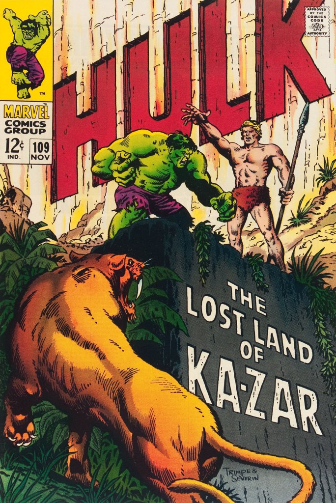
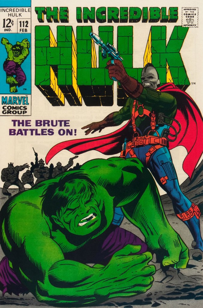
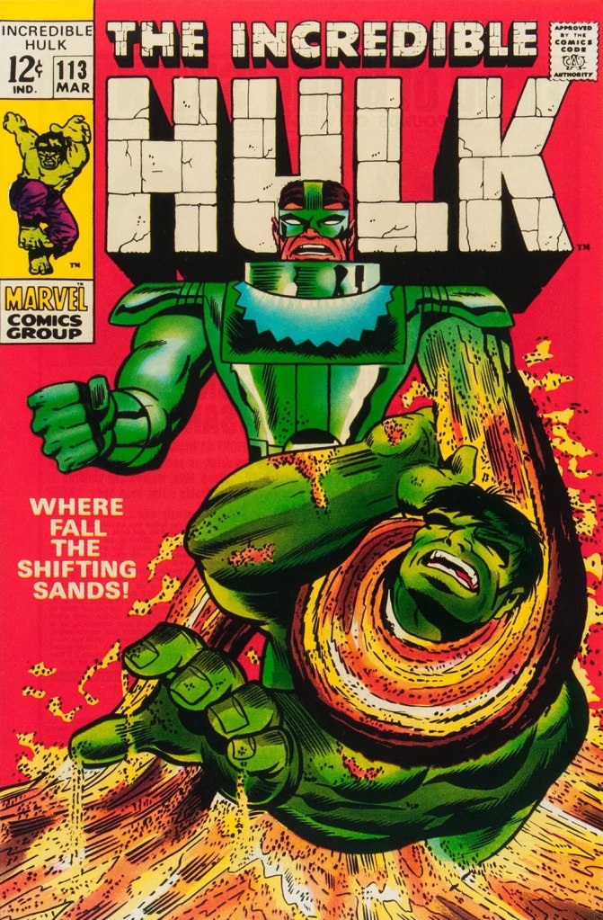
Herb’s streak begins with The Incredible Hulk no. 109 (Nov. 1968, Marvel), his first cover for the series. And yes, being seconded by one of comics’ all-time finest inkers (and cover artists!) didn’t hurt, but this is flawless layout work in the first place. This is The Incredible Hulk no. 110 (Dec. 1968, Marvel), again boasting John Severin inks (and quite likely Marie Severin colours).This surviving piece of production art grants us the opportunity to admire the splendid inks. I honestly don’t know what Ka-Zar was hoping to achieve here, though. Trimpe also produced another, rejected, version of this cover (scroll down, it’s near the bottom) the action tackled from quite a different angle. Featured in IDW’s ultra-fancy, signed-and-numbered limited run in the ‘where can I fit this damn monster?’ Artist’s Edition format in 2015, it demonstrates just how tight Trimpe’s pencil work was.This is The Incredible Hulk no. 111 (Jan. 1969, Marvel). Dan Adkins takes over the inker’s chair. This is The Incredible Hulk no. 112 (Feb. 1969, Marvel). Notice how innocent of hype and verbiage these covers are? This is The Incredible Hulk no. 113 (Mar. 1969, Marvel). I always preferred the simplicity of The Sandman’s garb as envisioned by his creator, Steve Ditko. He was depicted as a bully in a striped green and black sweater, which was fine for a guy able to turn his body into sand. When Jack Kirby redesigned him, he gave him a cool-looking, but frankly rather impractical getup.
And that’s where this streak ends, as far as I see it: the following few issues feature decent covers, but nothing outstanding. But there were scores of excellent Trimpe Hulk covers to come. The blocky dynamism of his visuals, so easy to underrate, made his covers a reliable breath of fresh air in the mire of formulaic and overwritten Marvel 1970s covers (et tu, Gil Kane?)
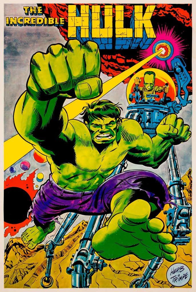
As a bonus, here’s a 1970 Marvelmania poster, one in a series of products exclusively available through mail-order. Nowadays, any of them routinely fetches princely sums. If you think Herb’s perfectly nailed the King Kirby aesthetic with this one, you wouldn’t be far wrong, but there’s a twist. The drawing was designed and pencilled by Kirby, then in the process of leaving Marvel for DC. Trimpe was asked to ink the drawing, redraw the Hulk’s face in his own style, and delete Kirby’s signature. I forget just where I read about this, but Trimpe had some heavy moral qualms about being made a party to this petty act of malice.
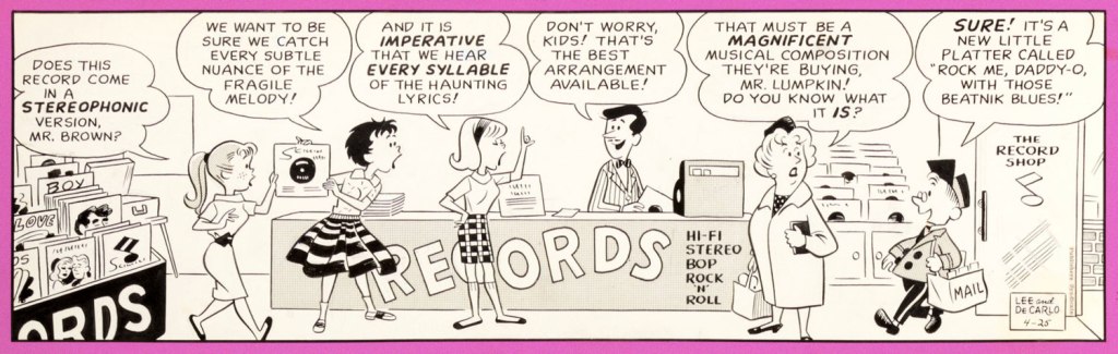
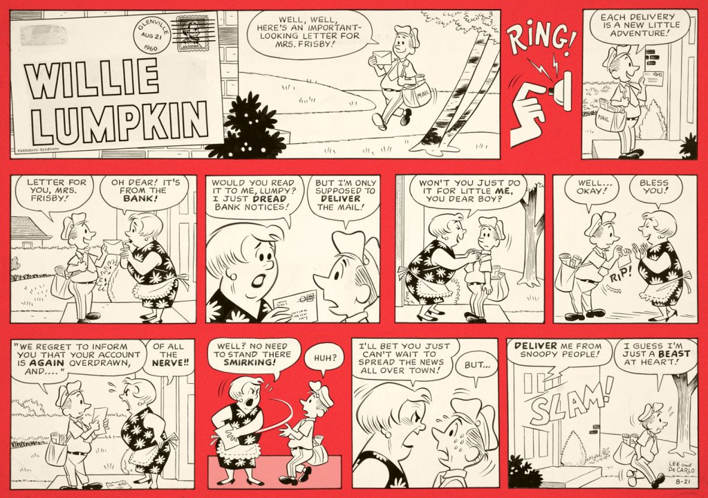
Willie Lumpkin was created by Dan DeCarlo and Stan Lee when Harold Anderson, the head of Publishers Syndicate (which merged into Hall Syndicate, which was eventually purchased by Hearst and is now part of King Features…) wanted a ‘bucolic’ newspaper strip set in some small town. The ‘friendly mailman’ idea is supposed to be Anderson’s, the family name Lee’s.
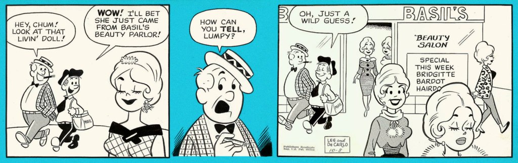
I cannot say that it’s a very funny strip (well, it was written by Lee, need we say more?), but it has a certain charm, and DeCarlo’s art is highly enjoyable, even though one occasionally feels like one has stumbled into an Archie story. DeCarlo liked drawing cheesecake, and we enjoy looking at it (for the heavy guns, visit RG’s Dan DeCarlo at Humorama (1956-63)), but in this case it is the other characters I am interested in, the kids with dirt behind their ears, spinster aunties in funny glasses, and of course the adorably bookish Lumpkin, the glue that holds the denizens of this small town together.
The strip ran from December 1959 to May 1961. Here are a few pickings —
I stayed mostly away from the aforementioned cheesecake, but here is an example of it:
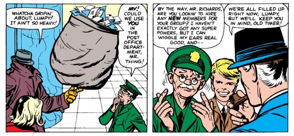
If the name Lumpkin rings some sort of different bell for you, it might be because he got incorporated into the Marvel universe in 1963 – a much older Lumpkin became the Fantastic Four‘s mail carrier with issue no. 11 (February 1963):
Pencilled by Jack Kirby and inked by Dick Ayers.
Over his Marvel years, his back story expanded and expanded, reminding me of the Russian expression ‘a stopper for every barrel’. He seemed to have been shoved into every plot that needed some secondary character to do something, delivering letters left and right, getting wounded multiple times during various epic battles, and accidentally ending up immortal (as of 2019). Same old, same old. I bet he preferred his quieter days among courting teenagers and middle-class families.
« Ward’s beautiful buxotics operate in a strange separate universe, in which all women are gorgeous voluptoids, all men oafish, saucer-eyed drooling dupes. » — Chris ‘Coop‘ Cooper
Well, I certainly wasn’t planning to hog all the blogging this week, but there were birthdays and other hopefully mitigating factors. While today is the great Will Eisner‘s birthday, it’s likely to overshadow that of a fellow Golden Age toiler, one with an equally intriguing career, but with a trajectory quite divergent from Eisner’s own.
Bill Ward (1919 – 1998) was also born on this day, one hundred and three years ago. Ward started out in comics with the Jack Binder shop, turning out material for Fawcett’s line of characters (Captain Marvel and his family, Bulletman…); he soon found himself working for Quality Comics, most notably on Blackhawk (an Eisner co-creation, it should be noted). He inched closer to his true passion when assigned to Quality’s romance line.
Ward’s cover for Love Diary no. 1 (Sept. 1949, Quality). Artistically speaking, this is what a fully committed Ward can produce.
In the mid-50’s, when came the brutal, censorship-induced compression of the comic book industry, Ward smoothly shifted to producing girlie cartoons for Abe Goodman’s Humorama line, becoming its star and most prolific performer, thanks to his popularity and prodigious speed. He was aided in this by his choice of tool and technique: the conté crayon on newsprint. While everyone else was working on 8″ x 12″ illustration board, Ward was using a soft, beige paper of a size (18″ x 24′) and texture familiar to any art student who’s taken a life drawing class. With this type of stock, he could produce texture rubbings and achieve smooth, sensual sheens ideal for rendering highlights of hair and stockings. Said Ward: « It didn’t take me long to figure out that the quicker you could do the work… the more money you could make. » Over the course of a quarter-century, he wound up producing around 9,000 drawings for the Humorama line.
As Ward recalled of his early training in Binder’s studio, « [Binder] trained me to do layout, which is the most difficult part of art. » To wit, layout never counted among Ward’s strengths. A lot of his pinup work is undermined by poor staging, often grotesque proportions, and absolutely minimal attention to non-erotic detail.
A typical example of a Ward girlie cartoon produced using the conté crayon. This one first turned up in Comedy no. 51 (Jan. 1960, Marvel); in a typical work-for-hire arrangement, for a flat fee (in Ward’s case, 7 dollars a cartoon, topping out at the princely sum of $30 near the end of his 25-year run), Goodman retained all reprint rights (and reprint he did, liberally) and kept the original art, which he sold to collectors for several times its original cost, naturally. Nowadays, these pieces exchange hands for several thousand dollars.
Now, had I ever wondered what Ward’s pencils would look like, if inked by Bill Everett? I readily confess I hadn’t. But upon learning that such a momentous collision once occurred, my mind was set slightly reeling.
Another weathered fellow combatant in the trenches of the Golden Age, Everett (1917-73), unlike Ward, always gave his best, whatever the conditions. Right to the end, despite his rapidly declining health, Everett was, incredibly, producing top-flight work.
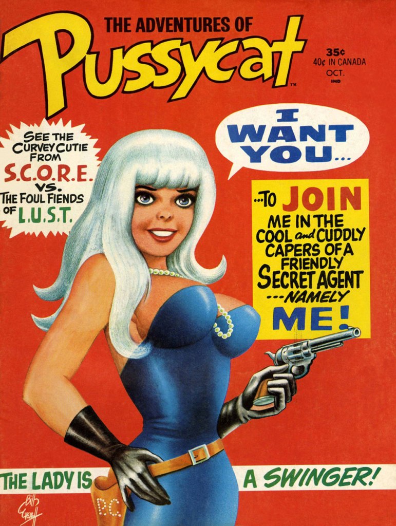
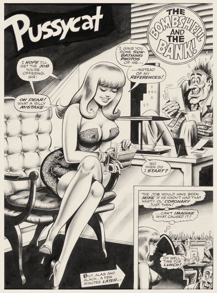
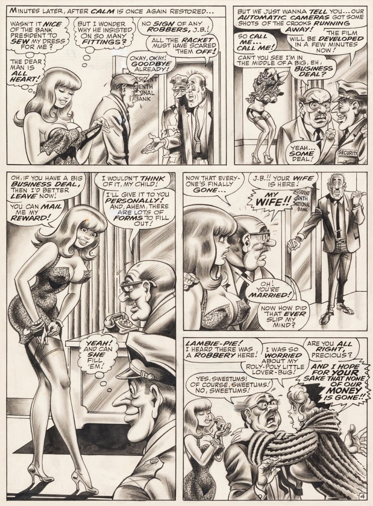
This is The Adventures of Pussycat no. 1 (Oct. 1968, Marvel). Cover by Bill Everett. Highly sought after today, this scarce, magazine-size one-shot is merely a reprint collection of some of Pussycat’s ‘adventures’ from various Goodman Playboy knockoffs, and one of a gazillion contrived acroynym-based attempts to cash in on the ubiquitous 007 craze of the 60’s. It does contain the first Pussycat tale, illustrated by Wally Wood, who would soon go on to his own entry in the super-spy stakes, Tower’s T.H.U.N.D.E.R. Agents. Concentrate on the artwork. The less said about the writing (was it Stan the Man or Larry the Lieber? We’ll likely never know), the better. As usual, any American attempt at French is mangled, even at a mere two words and two syllables (for the record, it should read either “C’est fini!” or “C’est la fin!“). Pensively squinting while adjusting his pince-nez, a ‘curator’ at Heritage Auctions made this uproarious whopper of a claim: « The figures of Pussycat look to be by Bill Everett and everything else is Bill Ward. » So you think Bill Ward drew everything… except the one thing he was interested in drawing? These folks don’t seem to know how comics are produced.“The Bombshell and the Bank!“, never reprinted, saw print in Male Annual no. 6 (1968).This is The Mighty Thor no. 171 (Dec. 1969, Marvel). Jack Kirby pencils, Bill Everett inks. Coming late in Kirby’s run, what a vigorous breath of fresh air after years of lazy erasures!
In the 60’s, Ward also provided covers for various soft-core novels, such as this one from Satellite Publications’ ‘After Hours’ imprint. He even wrote some of them, notably under the alias of ‘Bill Marshall’. His fellow Quality Comics alumnus Gil Fox also penned many of these potboilers under a staggering array of aliases.
This is Side Street (1966, After Hours). I’ve noticed over the years that certain artists of a more single-minded frame of mind can’t be bothered to devote much attention to anything but the object of their obsession. Such was the case with Bill Ward, and with the passing years, ever increasingly so. Exhibit A: has Ward ever seen an actual dog?Which reminded me of this classic, by another ‘can’t be bothered’ master of ‘Good Girl’ art, Alberto Joaquin Vargas Chavez (1896-1982). Another howler from the comedians at Heritage: « This early masterpiece, one of the greatest pin-ups the artist ever painted, was reproduced as a full-color double-page spread in Vargas, Taschen, 1990. Alberto Vargas thought so highly of this lot and the following two stunning paintings that he retained them in his personal collection. » I wouldn’t presume to criticise Vargas’ depiction of the female form, but on the other hand, this is Exhibit B: has Vargas ever seen an actual cat? Don’t worry, Alberto, you’re not alone in this affliction: neither has Neal Adams.
« From the body of one guilty deed a thousand ghostly fears and haunting thoughts proceed. » — William Wordsworth
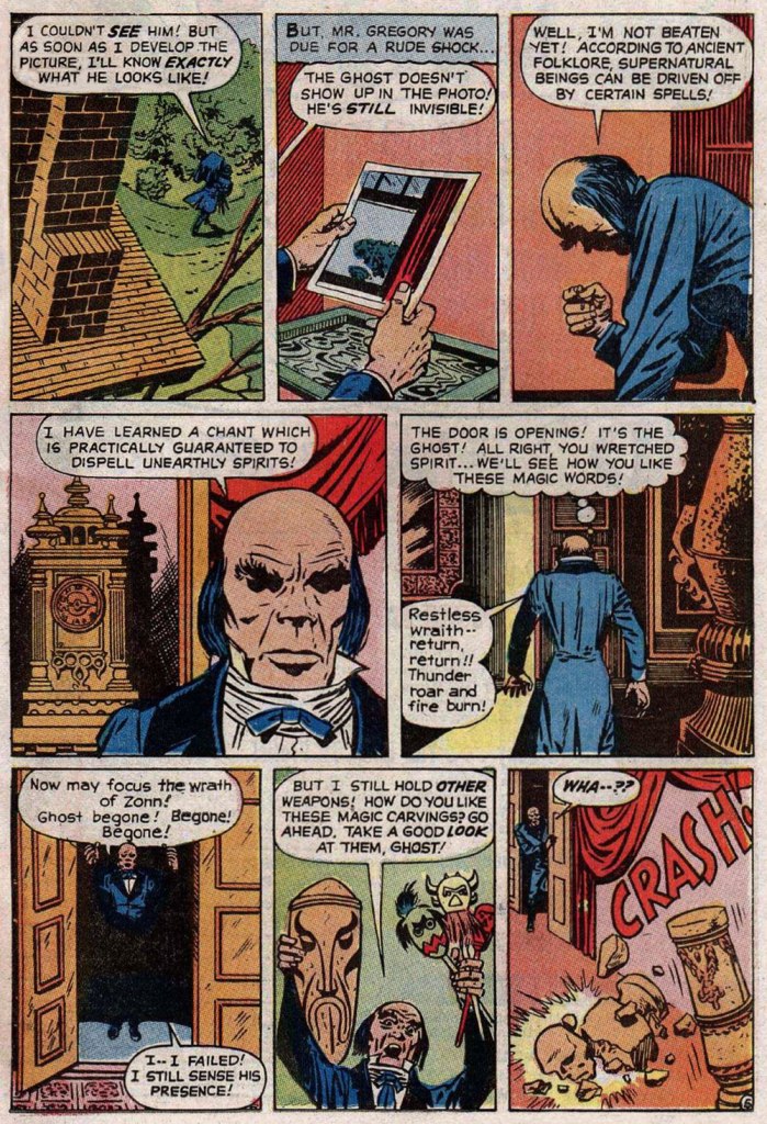
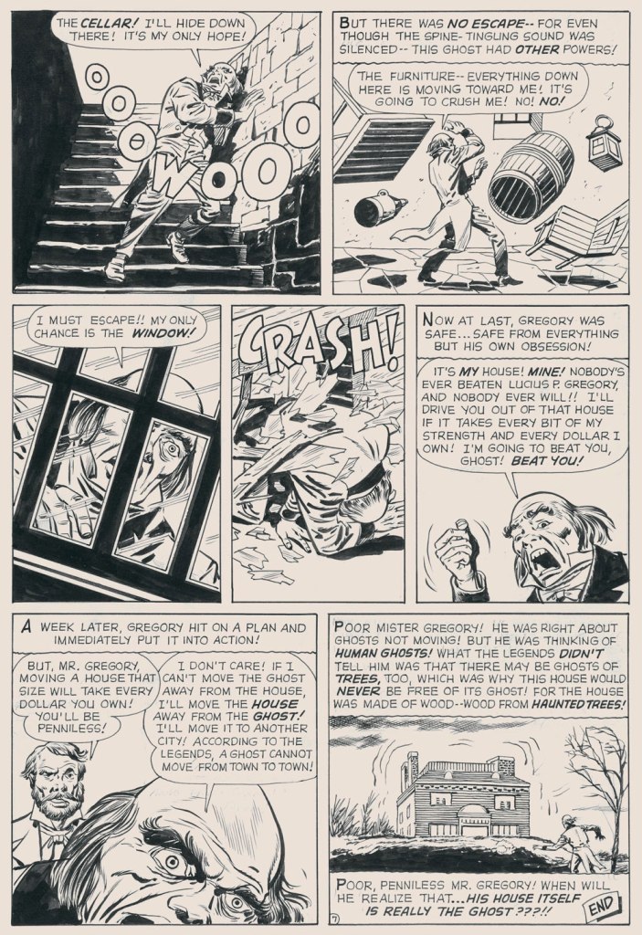
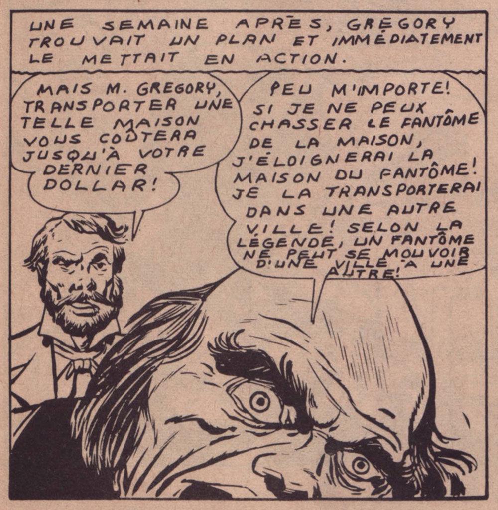
Today’s selection is an early, early favourite of mine. I first encountered it in French, in the pages of Capitaine America no. 8 (Aug. 1971, Les Éditions Héritage); back in those days, Québécois printer-packager Payette & Simms would reprint, in black and white, recent Marvel comics in their ‘Format Double’ package, a terrific deal at 25 cents: you got two issues’ worth, no ads, plus a bonus short story. P&S’ paper stock and printing were better than Marvel’s — but their lettering and translation work generally left much to be desired*.
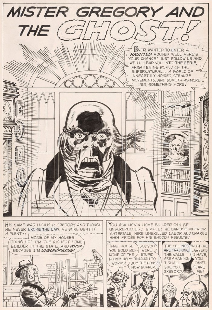
In this case, despite the allure of the slickly sumptuous Gene Colan / Joe Sinnott artwork, the issue’s out-of-nowhere high point was (you guessed it!) a modest little story plucked from the predawn of the so-called ‘Marvel Age’, Mister Gregory and the Ghost!, from a pre-Thor issue of Journey Into Mystery (no. 75, Dec. 1961). Many may disagree with me on this one, but boy, those post-Kirby issues of Cap’n ‘merica just serve to demonstrate what happens without a perpetual motion plot engine like Jack Kirby to propel and guide the series: when you try to introduce new foils for the hero, you get bonehead non-ideas like biker gangs, a jealous scientist in the body of a gorilla, or in issue 123’s Suprema, the Deadliest of the Species!, a brother-and-sister hypnosis act who drive around a gadget-filled tanker truck that magnifies Suprema’s power by way of a *very* 70’s medallion her brother wears around his neck. Then Cap feels its vibrations (“Ping!”) through his shield, and … oh, I won’t spoil the thing’s idiotic charms any further for you: read it here.
This is Journey into Mystery no. 75 (Dec. 1961, Marvel); pencils by Jack Kirby, inks by Dick Ayers, colours by Stan Goldberg.
Ahem — back to Mister G and his Ghost. It’s not exactly a masterpiece of writing either (Larry Lieber?), but it presents Kirby at his moody, understated best. Upon seeing it in colour, I realised how providential my monochromatic encounter had been. While the story’s been reprinted a few times (in 1966, 1971, and in 2020 in a fancy and pricey hardcover omnibus), the printing’s always been pretty shoddy. As you’ll see.
But… it seems that most, if not all of the original art survives, so we’ll make the most of the situation and mix our sources as needed — hope the effect isn’t too jarring!
I find Kirby’s layout for this page to be especially ingenious and interesting.I’ve used the recoloured reprint from Fear no. 4 (July, 1971, Marvel), which was an improvement over JIM75’s, albeit a slight one.
-RG
*here’s an example of Éditions Héritage’s lovely calligraphy, from this very story:
« Don’t change your tack when the timbers crack On the dark and the rolling sea… » *
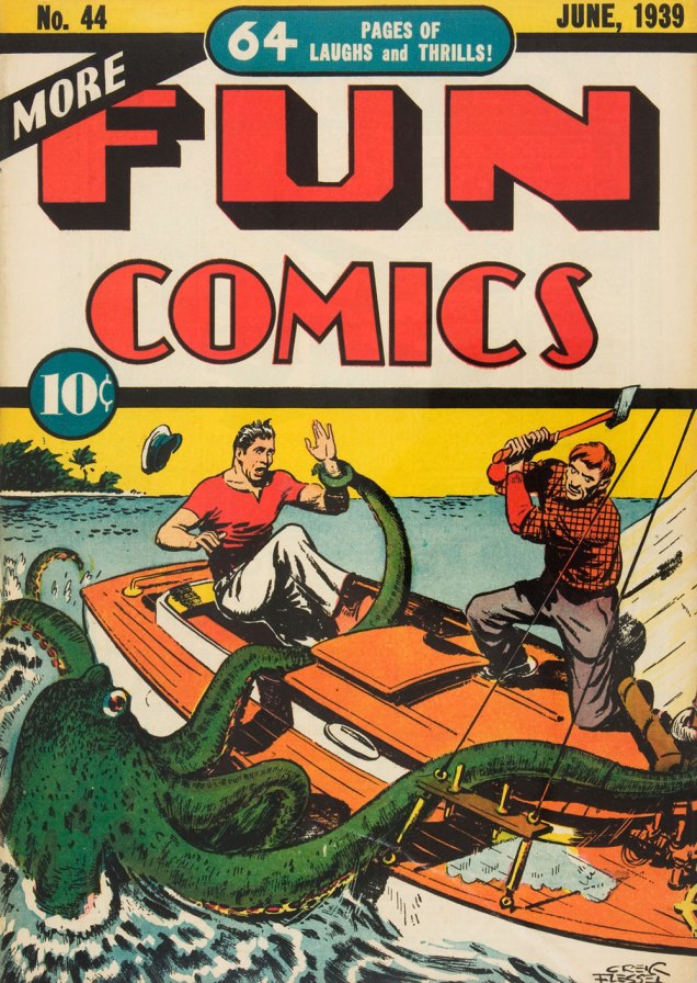
I am relatively indifferent to tales of adventure, but the siren song of the ocean sometimes prompts me to venture into reading tales about ruthless pirates or valorous seafarers and the perilous voyages they undertake on ships big and small, magnificent or modest. Who hasn’t felt a thrill at spotting a handsome vessel on the water, even if that water is but a canal running through the city? The other point of interest of this discussion is that where there’s an ocean and a ship upon it, there is a (preferably) giant octopus somewhere nearby, only waiting to shred the ship’s hull to smithereens and voraciously gobble up its shipmates.
Here is a modestly-sized yet utilitarian boat with a handsome octopus in tow. Maybe he just wanted to climb on deck to rest a while, like this otter?
More Fun Comics no. 44 (June 1939). Cover by Creig Flessel.
A similar boat (I don’t know whether it’s my profound lack of knowledge of boats that makes it seem that way) was attacked by a bigger, scarier – downright malevolent! – octopus some twenty years later. See Kyle “Ace” Morgan, Matthew “Red” Ryan, Leslie “Rocky” Davis and Walter Mark “Prof” Haley scramble for safety while an enraged octopus seeks to devour them! Oh, sorry, I’m being melodramatic.
Challengers of the Unknown no. 77 (Dec. 1970 – Jan. 1971, DC). Pencilled by Jack Kirby, inked by Jack and Rosalind (Roz) Kirby.
This cover has actually been recycled from Showcase no. 12 (Jan.-Feb. 1958, DC), where the background was yellow and the water a more normal shade of blue-white. I do like how the octopus stands out against a black background, however (and the multi-coloured water really sets off his beady, evilly-glowing green eyes!)
Of course these encounters also take place within the stories, as opposed to on the cover.
Page from The Outcasts of the Seven Seas, scripted by Bob Haney, pencilled by Howard Purcell, and inked by Sheldon Moldoff, was published in Sea Devils no. 23 (May-June 1965).
Time to move underwater, a very natural setting for an octopus attack. Here we have a submarine tenderly wrapped in tentacles:
Page from The Human Torch in the Clutches of the Puppet Master!, (over)scripted by Stan Lee, pencilled by Dick Ayers and inked by George Roussos. This story was published in Strange Tales no. 116 (Jan. 1964, Marvel).
Last but not least, I’ve kept this neat little submarine until the end:
Voyage to the Deep (IDW Publishing, 2019), a collection of Dell Comics’ short-lived, four-issue series published from 1962 to 1964 and illustrated by Sam Glanzman. Note the introduction by WOT favourite Stephen Bissette!
Glanzman is also a favourite of ours, though we haven’t talked about him much (yet). In case you’re wondering what the insides of one of those issues looked like – good, they looked really good! Note the octopus proudly perched in the middle of the page.
Page from Voyage to the Deep no. 1 (September-November 1962, Dell). Art by Sam Glanzman.
« The beginning of wisdom is to call things by their proper name. » — Confucius
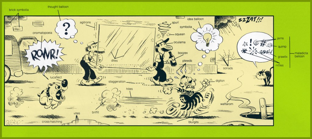
To a bibliophile, shelf space is precious. In recent years, I’ve happily purged my library of many a bulky and obsolete reference tome. With the sheer mass of information that’s migrated online, it’s frequently far simpler to tap a few key words than to scan the shelves in order to pull out and peruse some quaint and curious volume of forgotten lore. Frequently — but not always. One significant exception is my copy of What’s What, accurately touted as « a visual glossary of everyday objects — from paper clips to passenger ships ». Obviously, it covers the expected doohickeys and other dinguses, contraptions and doodads, esteemed constituents of our flora and fauna… but, on occasion, it drifts deep into left field, and that gives it spice. To wit, its entry on cartooning:
Cartooning: Many one-panel cartoons use captions or labels below the illustration for dialogue or explanation. Those appearing on the editorial pages of newspapers are called editorial or political cartoons and usually feature an exaggerated likeness, or caricature, of some well-known figure, as the main character. Comics, or comic books, use cartooning throughout. A complete shericasia, or shallop, is used by a cartoonist to depict a complete swing at an object, be it a golf ball or another person.
This most edifying illustration was the work of Mike Witte (b. 1944), who later chucked this charming infusion of the old ‘big foot’ school of cartooning to settle into an in-demand but pasteurised version of Ralph Steadman‘s style (itself, I would argue, a more grotesque version of Ronald Searle‘s approach). Still, bully for him — it’s a hard business to earn a proper living in. Sure, the classic big foot tradition already had a modern master in Elwood Smith… but the more the merrier! (and speaking of Onomatopeia…)
Mort Walker‘s Beetle Bailey Sunday strip from July 9, 1978, a most judicious choice, was dissected.
Here’s my well-thumbed, yellowing copy of What’s What: it’s the first book trade edition (Nov. 1982, Ballantine), copies of which, or the updated edition, circa the early 1990s, can still be obtained dirt cheap. And “Nose leather?” Awww.
To this array of clever cartooning terms, we simply must remedy one omission, and it’s a crucial one: Kirby Krackle!
A page from Nazi “X” (Captain America no. 211, July 1977, Marvel) with the wild and wooly Arnim Zola – the Bio-Fanatic – flexing his mental muscles. Written, pencilled and edited by Jack Kirby, inked and lettered by our dear Mike Royer, and coloured by Glynis Wein.
Another example, to make sure everyone gets it straight? The sky’s ablaze with Kirby Krackle in this ominously magnificent splash from Kamandi no. 24 (Dec. 1974, DC) and its tale of The Exorcism! Written, pencilled and edited by Jack Kirby, inked and lettered by Douglas Bruce Berry, and most likely coloured by Jerry Serpe.
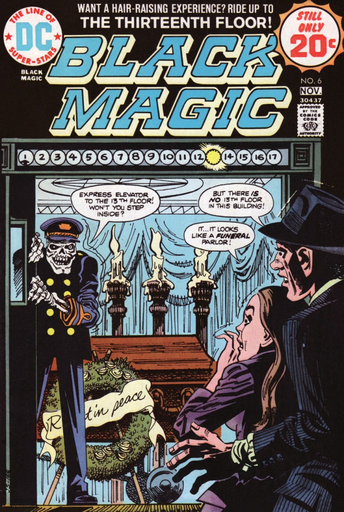
A Jack Kirby cover scene gets winningly recast for the 70s by Jerry Grandenetti, himself a contributor to the original series. This is Black Magic no. 6 (Oct.-Nov. 1974, DC).
When I was a kid (of twelve or so, if memory serves), I found a muddy and mildewed copy of this issue in the woods, which tremendously added to its allure, if not its readability.
And since I’ve mentioned it, here’s the original Kirby cover, regrettably one of the King’s least engaging, if you ask me. This is Black Magic no. 11 (vol. 2 no.5, Apr. 1952, Prize).
Well… little did I know what a protracted history this particular little scenario had. Let’s return to the presumed beginning, or at least the industrial age version.
Around the turn of the last century, the prolific English writer Edward Frederic Benson (1867 – 1940) wrote a story entitled The Bus Conductor [ read it here ] that saw print in Pall Mall Magazine in 1906. It was quite well-received, then began to widely make the rounds… as putative fact.
Things kicked into high gear in the mid-1940s, as the tale was recounted as an oft-heard anecdote in editor Bennett Cerf‘s 1944 short story anthology, Famous Ghost Stories, which contained a Benson contribution… but not The Bus Conductor.
That same year, Cerf shared the anecdote with the legion of readers who picked up his highly-entertaining (and still dirt-cheap and easy to find, over three-quarters of a century later, which gives you a sense of its original success and ubiquity) book of anecdotes, Try and Stop Me. The pertinent chapter was the splendidly-titledThe Trail of the Tingling Spine. As examined earlier on this blog, this chapter was used by EC Comics’ Bill Gaines and Al Feldstein as what they termed ‘springboards’ for their earliest stories.
Cerf’s version, from Try and Stop Me:
When an intelligent, comely girl of twenty-odd summers was invited for the first time to the Carolina estate of some distant relatives, their lovely plantation fulfilled her fondest expectations. She was given a room in the west wing, and prepared to retire for the night in a glow of satisfaction. Her room was drenched with the light of a full moon.
Just as she was climbing into her bed, she was startled by the sound of horses’ hooves on the gravel roadway. Curious, she walked to the window and saw, to her astonishment, a magnificent old coach pull up to an abrupt stop directly below her. The coachman jumped from his perch, looked up and pointed a long, bony finger at her. He was hideous. His face was chalk-white. A deep scar ran the length of his left cheek. His nose was beaked. As he pointed to her, he droned in sepulchral tones, “There is room for one more!” Then, as she recoiled in terror, the coach, the horses and the ominous coachman disappeared completely.
The girl slept little, but the next day she was able to convince herself that she merely had a nightmare.
The next night, however, the horrible experience was repeated. The same coach drove up the roadway. The same coachman pointed at her and exclaimed, “There is room for one more!” Then, as before, the entire equipage disappeared.
The girl, now panic-stricken, could scarcely wait for morning. She trumped up some excuse to her hosts and left immediately for home.
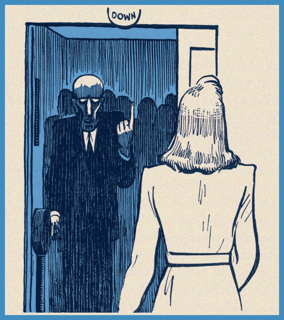
Upon arrival, she taxied to her doctor from the station and told him her story in tremulous tones. The doctor persuaded her that she had been the victim of a peculiar hallucination, laughed at her terror, and dismissed her in a state of infinite relief. As she rang for the elevator, its door swung open before her.
The elevator was very crowded, but she was about to squeeze her way inside — when a familiar voice rang in her ear. “There is room for one more!” it called. In terror, she stared at the operator.
Try and Stop Me was lavishly and diversely illustrated by The New Yorker great Carl Rose, which surely must have contributed considerably to its success. I’d say Simon and Grandenetti were quite familiar with this striking image.
He was the coachman who had pointed at her! She saw his chalk–white face, the livid scar, the beaked nose! She drew back and screamed… the elevator door banged shut.
A moment later the building shook with a terrible crash. The elevator that had gone on without her broke loose from its cables and plunged eighteen stories to the ground. Everybody in it, of course, was crushed to a pulp.
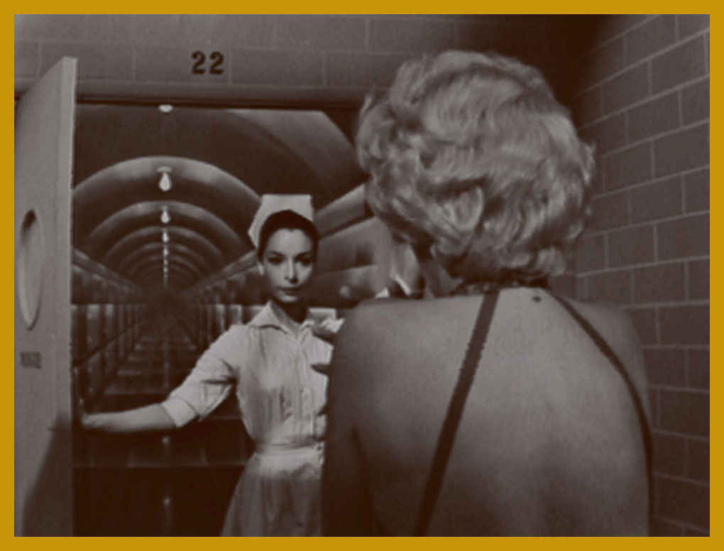
On to the Sixties: Rod Serling also drew upon the Cerf anecdote as grist for his The Twilight Zone episode Twenty Two (season 2, episode 17, aired Feb. 10, 1961). Here’s a pivotal scene from it.
Well, that’s certainly easier on the eyes than that gaunt vulture of an elevator operator… but no less menacing. You may recognize Mr. Spock’s future bride, Arlene Martel.
The Twilight Zone’s continuing popularity pretty much killed the scenario’s urban legend potency (Snopes.com checked it out!) In 1999, Urban legend authority Jan Harold Brunvand wrote, in his Too Good to Be True – The Colossal Book of Urban Legends:
According to my readers when I wrote a newspaper column in 1989 about the old ‘Dream Warning’ legends, The Twilight Zone version was the only one most of them knew. After numerous reruns, the TV episode had virtually replaced the folk legend in the popular mind. Every reader who wrote me following my column mentioned this episode, with one exception, and this person mentioned that he saw the plot enacted in a mid-1940s film, called Dead of Night. I’ll bet my legend-hunting license that this film, too, borrowed from the Cerf version.
I wouldn’t make that wager if I were you, Mr. Brunvand… since Dead of Night properly credits Benson.
To give you a sense of how effectively these stories flit and flicker across storytelling modes and media, power pop wizard Scott Miller (1960-2013) opened his band Game Theory‘s 1988 album, Two Steps From the Middle Ages, with a haunting ditty entitled Room for One More, Honey, an acknowledged quotation of the Twilight Zone episode.