Brad Teare: Scratching Away at Truth

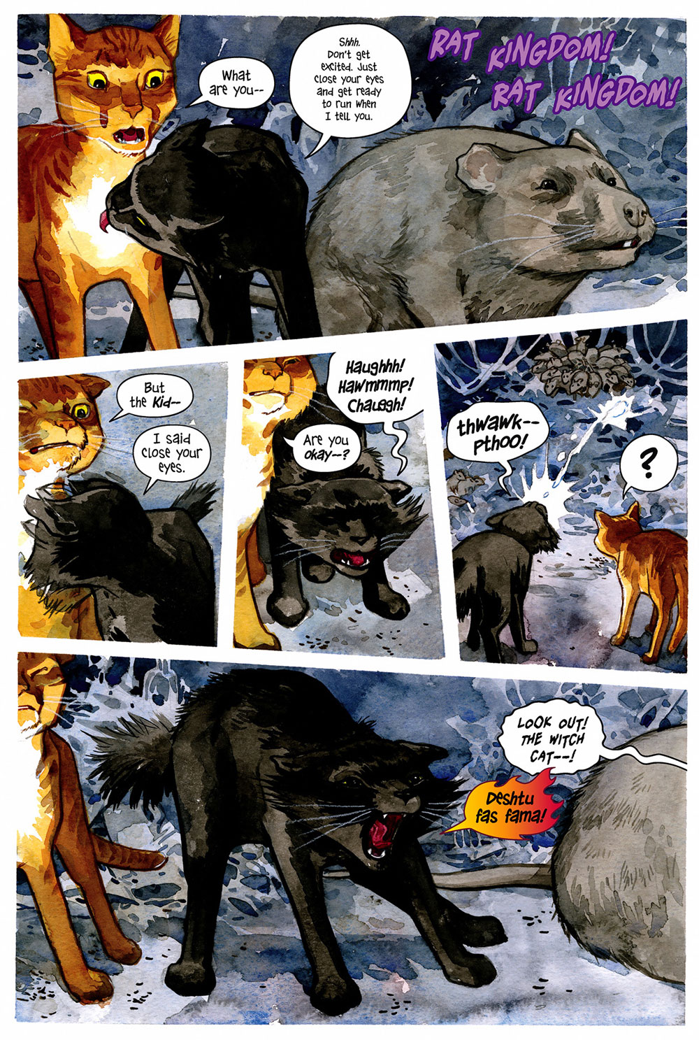
« Contained in these works were not only all the important philosophical developments of modern society… there were even answers to as yet unposed questions. » — Cypher has an epiphany

This week’s topic reminded me of the crucial role an enlightened comic shop owner, especially pre-internet, could play in one’s edification in the medium. Case in point: while I can’t consider him a mentor, my old comic shop guy, being adventurous and open-minded, made a lot of obscure titles available, without necessarily pushing them on his customers. And in a world of ‘super-heroes or bust’, such availability is crucial.

Which brings us to Mr. Brad Teare (b. 1956, Moscow, Idaho). I’ve always had special fondness for comics that bloomed outside the usual channels, like hardy plant life rising up in cracks and miraculously subsisting on nearly nothing.

You know, like this.

From what I can tell, Teare’s first professional comics work appeared in a non-consecutive pair of issues of Heavy Metal magazine, during that blessed but oh-so-brief ‘Tundra‘ period when surprisingly enlightened Teenage Mutant Ninja Turtles co-creator Kevin Eastman published, at considerable loss (between 9 and 14 million simoleons), some of the finest comics of the 1990s.

Eastman had purchased Heavy Metal in January, 1992. In the March issue, Brad Teare’s Cypher made its first of two appearances in HM, in marked contrast to the magazine’s prevalent ‘dystopias with titties for arrested adolescents’ aesthetic.

The following year, Teare self-published (under the Crypto Graphica banner, out of Providence, Utah, pop. 7,000 or so) Cypher no. 1, with a cover clamouring that it contained the ‘Complete Cypher Trilogy!’. Teare intended to produce further issues, but the market evidently wasn’t built for it. The book is so obscure that even the Grand Comics Database (GDC) has never heard of it. But my comic shop guy did place an order, and found at least one receptive reader eager to snap up a copy. I waited and waited for a second issue, but in vain.

This is Cypher no. 1 (1993, Crypto Graphica). Have I mentioned how much I enjoy the artistic technique of ‘scratchboard’? I have indeed!
This back cover one-pager from Cypher no. 1 has never been reprinted, I believe.

Then, four years down the road, Gibbs-Smith, “a proud independent publisher and distributor“, founded in 1969, also Utah-based… and still around, assembled and issued a compact (22,5 x 16 cm) hardcover Cypher collection, gathering material that Teare must have intended for at least a couple more issues of his series. Aside from an oddly ‘meh’ cover, overworked and underwhelming, it’s a gorgeous package. It also has managed to fly below the GCD’s radar all these years.

Cypher finds himself new employment. This is the version from Cypher no. 1; perhaps because of the smaller format, the collected edition replaced Teare’s lovely, expressive hand-lettering with a computer font.
A spooky sample from ‘Minotaur‘, from the 1997 Gibbs-Smith collected edition.

In the meantime, Teare kept his hand in, providing a pair of highlights to DC/Paradox Press’ well-written but frustratingly visually scattershot The Big Book Of series (1994-2000), also finding success as a freelance illustrator (Random House, The New York Times, Sony, Turner Interactive, Flying Buffalo) in all manners of media.

From The Big Book of Urban Legends (Dec. 1994, Paradox Press/DC).
From 1997, a typical spread from the charming Dance, Pioneer, Dance! Written by Rick Walton, it offers a slightly fictionalised account of the westward migration of Brigham Young and a band of his fellow Mormons.
From The Big Book of Vice (March 1999, Paradox Press/DC). A fascinating bit of history!

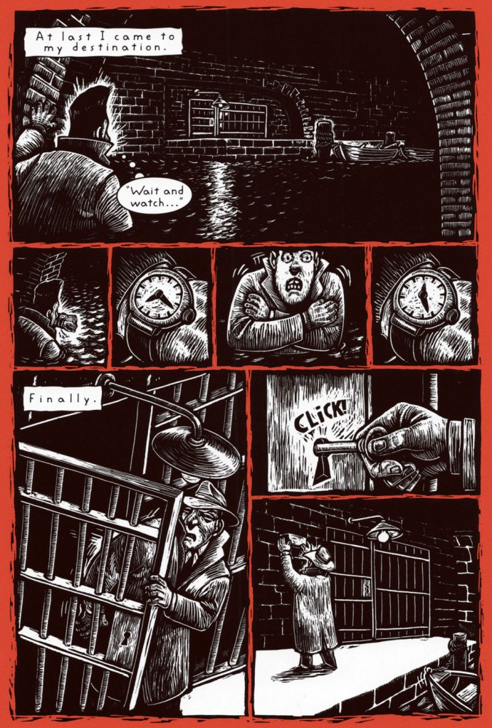
Though he’s nowadays a celebrated and prolific painter of the Utah landscape, he hasn’t altogether turned his back on comics, bless his soul. The final chapter of Cypher (to date?), ‘Sub-Wayward’, introduced, in the story-within-a-story tradition, scientist turned reluctant underground hero The Subterranean. And so, long story short, we find ourselves with a Teare book that’s readily available (for the time being)!

« This comic details the thrilling origin of The Subterranean from his humble beginnings at HyperLabs in New York City to his role as sole defense against a terrible evil perpetrated by the Thanatos twins, former colleagues at HyperLabs. This character of The Subterranean is a spin-off from the critically acclaimed graphic novel Cypher. »

In parting, here’s a video of Mr. Teare demonstrating the impasto technique in acrylics.

-RG

Diggin’ Up the Bone Orchard: Beasts of Burden

Our heatwave is nowhere as bad as the one afflicting Europe right now, but it’s a heatwave nevertheless, and to cool off I felt like traipsing down the icy corridors of horror. Evan Dorkin‘s series Beasts of Burden, the tale of a (predominantly) canine crew who fight the supernatural to keep their small town community safe, fits the bill: though including elements of adventure, mystery, and humour, it’s genuinely tense in places (and features enough blood and grue to keep the average gorehound satisfied). One expects a comic in which all protagonists are animals to evoke baby-talk sounds of endearment, not send chills down the spine of the more sensitive reader, and yet…

Beasts of Burden no. 1 (September 2009), cover by Jill Thompson.

However, I’ll warn you that a fondness for animals is a prerequisite for enjoying this comic, lest you miss the emotional punch to the gut of moments like a dog searching for her lost puppies, or animals mourning the loss of their friend. Despite the paranormal threats these pooches (and cat!) have to deal with, I would say that it’s that emotional horror that makes these stories memorable, especially to a modern reader well-versed in zombies, werewolves, and witchcraft (yawn, how cliché…) I am quite allergic to animals getting hurt in stories, but Beasts of Burden never feels manipulative in that regard: shit definitely happens, but is overcome through teamwork and courage.

This comic also features loving watercolours by Jill Thompson (according to the DC Comics website, ‘most well-known female comic book artist‘… not sure how they measured that), who’s not only great at evocative woodsy landscapes in all seasons, but also a deft hand at convincing portraits of animals. I have seen too many comic artists who cannot draw a convincing cat or dog (let alone a horse, a true test of artistry…) to take that for granted. This post only spotlights material from the collection Beasts of Burden: Animal Rites (2010, Dark Horse), as Thompson was later on replaced by Benjamin Dewey, whose art I suppose I could bear… if only the standard desaturated colouring job wasn’t the final nail in that coffin. It’s a bitter pill to swallow after Thompson’s bright, organic art.

All stories featured in this post are written by Evan Dorkin and illustrated by Jill Thompson.

A page from Stray, published in Dark Horse Book of Hauntings (August, 2003). This was the first Beasts of Burden story to be published; the characters got more fleshed out, both in writing and in art, later on.
Page from The Unfamiliar, published in The Dark Horse Book of Witchcraft (July 2004). My favourite season is fall, so I couldn’t resist featuring a page of autumnal-blaze trees and black cats.
Another page from The Unfamiliar, published in The Dark Horse Book of Witchcraft (July 2004). The normally orange Orphan (who needs a better name, but at least he gets called ‘Orph’ a lot later on) gets dyed black as a subterfuge. This story is pretty goofy (two witches come to town to summon Sekhmet), and my least favourite of the early batch, but at least it has a lot of black cats.
Pages from Let Sleeping Dogs Lie, published in The Dark Horse Book of the Dead (June, 2005), in which Daphne (the black witch cat, who later becomes a part of the regular cast) returns with revenge on her mind.
Page from A Dog and His Boy, published in The Dark Horse Book of Monsters (December 2006).
Page from The Gathering Storm, published in Beasts of Burden no. 1 (September 2009), the moment at which this became an official series, as opposed to a series of one-shot stories. The whole ‘plague of frogs’ thing is of course instantly reminiscent of B.P.R.D., a Dark Horse series that originally appeared in Hellboy.
Another page from The Gathering Storm, published in Beasts of Burden no. 1 (September 2009); the moment when the gang officially becomes watchdogs. Most of the dogs have collars, but can dash around with ease, barely ever running into humans.
Art for the cover of Beasts of Burden no. 2 (October 2009).
Pages from Lost, published in Beasts of Burden no. 2 (October 2009), a genuinely shocking moment – hurting a human goes against these dogs’ normal code.
Pages from Something Whiskered This Way Comes, published in Beasts of Burden no. 3 (November 2009). This story highlights the somewhat tense relationship between Orphan and his romantic interest/enemy Daphne, the black magic cat from an earlier story.
Page from Grave Happenings, published in Beasts of Burden no. 4 (December 2009).

Beasts of Burden is still ongoing, with the latest installment, Occupied Territory (illustrated by Benjamin Dewey, alas), published in July 2021.

~ ds

Hot Streak: Carmine Infantino’s Detective Comics

« I was always concerned more with the visuals than with the copy — and the visuals had to be provocative! » — Infantino*, in a nutshell.

To recap, under the parameters I’ve set for this category a hot streak is a series of outstanding consecutive covers by a single artist (inkers may vary) on the same comic book title. Since it’s my party, I occasionally make allowances (e.g. allowing entry to a scruffier, but still presentable, specimen), but it’s more challenging and more fun to play it straight.

By my reckoning, there are very few truly great cover artists to begin with, and their output is often stifled by indifferent, incoherent or hostile art direction, poor lettering and colouring choices beyond the unfortunate artist’s control, lack of interest in the imposed subject matter… you get the picture. And there’s also the difficulty of getting a decent streak going when the editor keeps shuffling cover artists.

The artist in his suit and tie (and cigar!) days at DC.

I’ve gone on at length (I refer you in particular to Hot Streak: Nick Cardy’s Aquaman, Previously) about the gargantuan amount of work Carmine Infantino (1925-2013) knocked out conceiving comic book covers during his executive years at DC (1966-75), but most of his best designs were executed by others. I mean the man was already doing the work of five people, what more could he do?

As he told Gary Groth in a definitive interview (The Comics Journal no. 191, Nov. 1996, Fantagraphics):

« At DC Comics, I worked round the clock, including weekends, and never taking a vacation in the 10 years I served there. I not only was creating new titles, designing most of the covers, plotting stories and going on the road for the distribution of the magazines, plus doing radio shows and then running out to California to be totally included with Puzo and the producers creating the Superman movies I &II. Time got so tight that I would design covers on the way to the airport and have the driver deliver them to Sol Harrison, who in turn gave them to the waiting artists. I would be at my desk from 7 a.m. to 9 p.m. It began to be a destructive grind. »

While Carmine is most closely associated with Silver Age characters The Flash and Adam Strange, I couldn’t discern, in these titles, a run of sufficiently stellar *and* consecutive covers (Flash nos. 139-142 and Mystery in Space nos. 69 to 71 come closest… do bear in mind that I have no consideration for ‘key’ issues or ‘famous’ or ‘event’ covers). It’s no real surprise that Infantino’s design work rose to a crescendo of accomplishment and consistency when he was made the company’s de facto art director, late in 1966. And what was he working on at the time? Batman. So, since Detective no. 261 bears a ho-hum cover and no. 269 is pretty spiffy, but the work of Gil Kane, here’s Mr. Infantino’s hot streak:

This is Detective Comics no. 362 (Apr. 1967, DC), pencilled by Infantino and inked by Murphy Anderson. Carmine wasn’t a fan of the so-called ‘Go-Go Checks’, that checkerboard pattern that once famously adorned those distinctive yellow NYC cabs. He didn’t mince words, either: « What a ridiculous thing: it was the stupidest idea we ever heard because the books were bad in those days and that just showed people right off what not to buy. ». Certainly, in the case of Detective Comics, they left the top of the page far too cluttered.
This is Detective Comics no. 363 (May 1967, DC), featuring (this) Batgirl‘s second appearance. She’d been created by editor Julius Schwartz and Infantino at the request of the hit Batman TV show‘s producers, figuring that the series needed a heroine for a little extra spice. Art by Infantino and Anderson.
This is Detective Comics no. 364 (June 1967, DC). Roy Reynolds, alias The Getaway Genius, was a fun civilian villain whose finest hour, in my view, came at the tail end of 1973 with Batman no. 254‘s King of the Gotham Jungle! (written by Frank Robbins, pencilled by Irv Novick and inked by Dick Giordano), when he was unexpectedly caught between the Batman and the Man-Bat.
I wouldn’t be surprised to learn that a Batmaniac or three had reconstructed this Joker edifice in their backyard or basement, out of Lego blocks or papier mâché… or actual bricks.

Carmine really went to town on this one, and it’s rightly earned its place in the hall of classics. This is Detective Comics no. 365 (July, 1967, DC). The cover story, The House the Joker Built! is scripted by John Broome, pencilled by Bob Kane ghost Sheldon “Shelly” Moldoff and inked by Joe Giella.
Speaking of design, here’s the masterful Ira Schnapp‘s house ad for Detective 365, as it appeared in Green Lantern no. 54 (July, 1967, DC), among other titles.
This is Detective Comics no. 366 (Aug. 1967, DC); I love those moody colours and light effects, that tell-tale Infantino candle and the mysteriously parsimonious inheritance bequeathed to Robin.
This is Detective Comics no. 367 (Sept. 1967, DC), an intriguing preview of Where There’s a Will — There’s a Slay!, written by Gardner Fox, pencilled by Infantino, inked by Sid Greene. I wonder how many young readers enthusiastically destroyed the cover to assemble the puzzle…

Note also the improved logo placement (a return to issue no. 327 original ‘new look’ logo, actually), giving the layout a chance to… breathe a bit better. The Batman cameo at top left is still de trop.

This is Detective Comics no. 368 (Oct. 1967, DC). Infantino reportedly created the covers first, and editor Schwartz assigned his writers to work up a scenario to fit. This one could not have been a cakewalk. Gardner Fox was the unlucky recipient of that gargantuan task.
Since it’s not an issue of Detective, this cover’s not *technically* part of the streak… but as it features Batman, and it appeared between issues 365 and 366 of Detective, I’m throwing it in. Infantino and Anderson’s literal and figurative blockbuster of a cover for Batman no. 194 (Aug. 1967, DC). Its cover aside, a pretty ho-hum issue. The book and the character were in urgent need of another overhaul, and it was just around the corner. « When Donenfeld saw this cover, he had a fit! He said, ‘I don’t see the logo on top!’ I said ‘You don’t have to — you’ve got Batman up there!’ »
Aw, heck — here’s Ira Shnapp’s accompanying house ad, a work of art in itself, wouldn’t you agree?
Speaking of immortal Infantino Batman images: « Aurora wanted action shots of their models, so I did this rough layout, sent it to them, and they liked it! I had a moon behind him, but they dropped it. The tree created the design. I was very high into design at this point (1964) — the design was pouring out of me! ». Here’s a look at the finished model.
I couldn’t very well leave out what’s possibly the most famous of Carmine’s Bat-scenes: this is Batman From the 30s to the 70s (1971, Crown Publishers) a splendid hardcover anthology. Its cover adapts an Infantino-Anderson mini-poster that originally saw print in Detective Comics no. 352 (June 1966, DC) and bore instead the inscription « Best Bat-Wishes Batman and Robin ». Superman, Wonder Woman and Captain Marvel, er… ‘Shazam’ also got their own historical anthology in this format.

-RG

*unless otherwise specified, most Infantino quotes are drawn from his excellent, profusely visual 2001 autobiography (with J. David Spurlock), The Amazing World of Carmine Infantino (Vanguard Publishing).

Making the Rounds With Willie Lumpkin

Willie Lumpkin was created by Dan DeCarlo and Stan Lee when Harold Anderson, the head of Publishers Syndicate (which merged into Hall Syndicate, which was eventually purchased by Hearst and is now part of King Features…) wanted a ‘bucolic’ newspaper strip set in some small town. The ‘friendly mailman’ idea is supposed to be Anderson’s, the family name Lee’s.

I cannot say that it’s a very funny strip (well, it was written by Lee, need we say more?), but it has a certain charm, and DeCarlo’s art is highly enjoyable, even though one occasionally feels like one has stumbled into an Archie story. DeCarlo liked drawing cheesecake, and we enjoy looking at it (for the heavy guns, visit RG’s Dan DeCarlo at Humorama (1956-63)), but in this case it is the other characters I am interested in, the kids with dirt behind their ears, spinster aunties in funny glasses, and of course the adorably bookish Lumpkin, the glue that holds the denizens of this small town together.

The strip ran from December 1959 to May 1961. Here are a few pickings —

I stayed mostly away from the aforementioned cheesecake, but here is an example of it:

If the name Lumpkin rings some sort of different bell for you, it might be because he got incorporated into the Marvel universe in 1963 – a much older Lumpkin became the Fantastic Four‘s mail carrier with issue no. 11 (February 1963):

Pencilled by Jack Kirby and inked by Dick Ayers.

Over his Marvel years, his back story expanded and expanded, reminding me of the Russian expression ‘a stopper for every barrel’. He seemed to have been shoved into every plot that needed some secondary character to do something, delivering letters left and right, getting wounded multiple times during various epic battles, and accidentally ending up immortal (as of 2019). Same old, same old. I bet he preferred his quieter days among courting teenagers and middle-class families.

For more Sunday strips (in colour!) gathered by Ger Apeldoorn, head over to his wonderful The Fabulous Fifties blog, or peruse Apeldoorn’s collection of black and white dailies.

~ ds

Wally Wood’s Incompleat Plopular Poetry

« Poetry: the best words in the best order. » — Samuel Taylor Coleridge

Here’s a seldom-seen 1970’s Wally Wood treat: he concocted this irreverent alphabet for Plop! (1973-76), DC Comics’ surprisingly solid yet nearly forgotten gallows humour anthology — forgotten? oh, it’s the same old recipe: just let the material remain out of print for nearly half a century (and counting)*, fold in gradually the dust and grime of neglect, and let wither, uncovered, until utter oblivion is achieved.

While Plopular Poetry is minor ‘woodwork’, it represents some of the best produced by poor Woody at this late stage in his life.

Published in Plop! no. 18 (Nov.-Dec. 1975, DC).
Published in Plop! no. 19 (Jan.-Feb. 1976, DC).
Published in Plop! no. 20 (Mar.-Apr. 1976, DC).
Published in Plop! no. 21 (May-June 1976, DC).
Published in Plop! no. 22 (July-Aug. 1976, DC).
Published in Plop! no. 23 (Sept-Oct. 1976, DC). According to his protégé Ralph Reese, this is Woody doing his own lettering on the poems.
… and that was it. Plop! had run its course, cancelled with its 24th issue, five letters short of an alphabet. Published in Plop! no. 24 (Nov.-Dec. 1976, DC). Were the five final letters ever produced? I’ve been keeping my eyes open all these years… but I’m still waiting.

As a bonus…

Wood’s cover preliminary for Plop! no. 19’s cover boy, Smokin’ Sanford. Rendered in blue pencil on paper.
A more refined version of Sanford, rendered in graphite over blue pencil.
This is Plop! no. 19 (Jan.-Feb. 1976, DC), Wood’s fourth and final cover for the title, with sidebars and logo design by Sergio Aragonés; edited by his buddy from the EC days (and even earlier), Joe Orlando. Do I detect another, highly meticulous hand in the inking (Ralph Reese comes to mind, but he says he never worked on Plop!, and if one of us is wrong, odds are it’s me), or is Sanford’s wacky tobaccy messing with my mind?
And here’s a glimpse into the creative process! Note the disappearance, in the end, of Sanford’s threads and spectacles.

-RG

*aside from a pair of obscure digest reprints in the mid-eighties.

Treasured Stories: “Jonnie Love and the Go-Go Girls” (1969)

People have quite a range of definitions as to what constitutes romance. For some it’s novels of werewolf romance, others prefer completely mind-boggling Fabiosa stories (‘Unborn triplets crashed my husband’s love‘), and some ship (I learned this term from a younger colleague) characters from whatever TV show happens to be in vogue.

If you were a teenager in the ’50s, 60s, or 70s, you probably would have read romance comics, immensely popular at the time. Charlton Comics published a whole bevy of them, and co-admin RG has amassed a respectable collection. For weeks now I’ve been reading issues of Teen-Age Love during my lunch hour, specifically for their Jonnie Love stories. Introduced in Teen-Age Love no. 61 (November 1968) as the ‘new teen swinger’ – ‘he has a way with a guitar and a way with girls!’, Jonnie lingered within its pages for quite a while, having all kinds of adventures, hanging out with new conquests and lost souls in every issue. As advertised, he was indeed good with a guitar. Joe Gill, who was scripting the stories, wrote him as a kind of chevalier errant, wandering from town to town (with the ultimate goal of going back to his hometown, which he never achieves), offering a helpful hand to damsels in distress who are running away from predatory men, disciplinarian fathers, or just the solitude of a small town.

Jonnie Love stories appeared in 31 issues overall, but I’m most intrigued by those published in Teen-Age Love issues numbers 61-74, as they were created by the same tip-top team: scripted by Joe Gill, pencilled by Bill Fraccio and inked by Tony Tallarico (see RG’s (Fondly) Remembering Tony Tallarico).

It was actually rather difficult which tale to feature, for they’re all pretty good, and I had to decide on some sort of optimal concomitance of a good plot and how the story was told visually. The final decision was Jonnie Love and the Go-Go Girls, published in Teen-Age Love no. 63 (April 1969), which I think strikes a good balance between plotting and interesting art, and is a fairly typical example of Jonnie’s behaviour in general.

Cover illustrated by the Bill Fraccio and Tony Tallarico combo. Dig the classy tattoo on the girl’s leg, courtesy of the previous owner of this comic (where are you now, Mamie?) The kissing couple in the top left corner is a preview of another story drawn by Vince Colletta. The protagonist is a brunette, whereas Jonnie often consorts with blondes (perhaps a sort of a short-hand for an attractive woman).

This story has several things going for it – an entertainingly evil manager, a grotty dance club, the go-go-dancers, and of course the protagonist, a farmer’s daughter who ran away from her parents to make it big in showbiz (the lines dreaming of glory/twitching like a finger on a trigger of a gun‘ come to mind). ‘Cute‘, notes Jonnie, ‘but there are tens of thousands with as much talent‘. Some romance stories set out to stun their readers with ritzy places, glamorous dates, and finding a rich prince charming; others feature women who give up a life of success for simpler living – a small town, a farm, a cabin in the woods. The latter moral always feels a bit stilted, even aside from me feeling bad for women who have to give up a career they worked so hard to achieve (mostly because such plots are retrograde, and it’s all-too-seldom considered that a woman can marry and continue working).

In Jonnie Love yarns, there is a strong undercurrent of returning ~Home~, home from which one foolishly ran away and which beckons lonesome wanderers back to its comforting womb. The plots are imbued with bittersweet longing for this homecoming, and that is what lingers most in one’s mind after finishing the stories. Yet the people depicted in them are outcasts; Jonnie himself was outed as a weirdo in both dress and thoughts by the people in his home town, which is why he left it in the first place. Returning is hardly the panacea it’s supposed to be (unless one is willing, this time around, to ‘fit in’ properly), and while some of these nomads do manage to make it back, our main character is doomed to forever roam strange towns, sleep in fields, and share sweet kisses with girls he knows he’ll never see again. Rather a tragic figure, really.

~ ds

Patrice Leconte: All Was Normal and Calm…

« An editorial team that gathers within a magazine such as Pilote constitutes a true family, as it’s a small group and everybody knows everybody. There’s friendship, admiration, competition, hijinks and the pleasure of being together, even if we didn’t take the bus to Quiberon together in the summer. » — Patrice Leconte

It would be terribly reasonable to presume that Patrice Leconte‘s elegant passage through the world of Franco-Belgian was, on the part of the future cinematic auteur (the Les Bronzés series, Monsieur Hire, Le mari de la coiffeuse, Ridicule, L’homme du train — my favourite, and even an animated film, Le magasin des suicides… quite a range!) some sort of dilettantish detour, but it wasn’t… is it ever? — quite so simple. As he recalls it:

« As a child, I dreamed of nothing but cinema. Well, I also dreamed of drawing. As they say, I went up to Paris and went to film school. But I kept on drawing. And I was a Pilote reader. I wrote to [ Marcel ] Gotlib, who responded, looked at my drawings, showed them to René Goscinny, who liked them, invited me to the office and found me likeable, published my drawings and encouraged me to carry on, which I did. For five years. 1970 to 1975. I was happy. Then I shot my first film [the frankly unpromising Les vécés étaient fermés de l’intérieur, co-scripted with Gotlib] and everything began to unravel, because I haven’t made anything but films since, and I gave up comics. »

La vie telle qu’elle est — a title that a cinephile of Leconte’s ilk could simply *not* have failed to nick from pioneering cinéaste Louis Feuillade (1873-1925, whose immortal Fantomas, Judex and Les vampires serials still thrill) and his 1911-1913 series of films bearing that name… seventeen in all!
The tale appeared in Pilote no. 603 (May, 1971, Dargaud), and here’s the cover. René Goscinny, publication director; Jean-Michel Charlier and Gérard Pradal, editors in chief; Albert Uderzo, art director.

Humble to a fault, Leconte is well aware of his limitations as a “classical” draughtsman (largely beside the point in his case, imho, as he’s a superb designer and stylist):

« I think that my personal touch was tied to my drawing handicap, that self-taught aspect which meant than I absolutely had to find a workaround. I’ve always held to the rule that constraints constitute a first-rate engine of creation, coupled with the magical notion of “let us make qualities of our flaws“. Well, it works! »

By all means, read the full conversation with Leconte about his bédé days, conducted by Jean-Luc Brunet and Vivian Lecuivre en 2007. It is, however, in French, but we currently have the technological means to let you grasp the gist of it.

By the way, Leconte’s got a new feature out, an adaptation of Georges Simenon‘s 45th Jules Maigret novel, Maigret et la jeune morte (“Maigret and the Dead Girl“, first published in 1954), starring deplorable human being but splendid actor Gérard Depardieu. Among Simenon’s eighty Maigret books, this must surely be the most adaptable, as this marks the fifth time this novel is brought to the screen! The trailer looks great.

-RG

Several Shades of M. K. Brown

« Women: what do they want? They might want to float into the sky while hosting a brunch party. They might want a couple of handsome cops to come over and get rid of a snake problem. They might seek a doctor’s treatment for ‘wise-ass disease‘ or fantasize about revenge and forgiveness at the dentist’s office. And what about men? Mr. Science just wants to carry out his pointless experiments. Earl D. Porker, Social Worker, converses with household items and forgets the cat food. One fellow’s head is a basket of laundry. »

Not much is known about the personal life of the mysterious M. K. Brown*. From her official website, we know that she grew up in Connecticut and New Brunswick, but that’s pretty much it. On the other hand, details from her long and prolific career abound**: she was a mainstay at the National Lampoon Magazine between 1972 and 1981 (including the regular series Aunt Mary’s Kitchen); a frequent contributor to various magazines, most notably Playboy, The New Yorker, and Mother Jones; creator of the animated series Dr. N!Godatu, which ran in the Tracey Ullman Show in 1987 for a mere 6 episodes (two more remain unaired) until it was supplanted by the Simpsons; illustrator of children’s books… and so it goes.

A button featuring Aunt Mary, who probably would get on like a house on fire with Sylvia (see Nicole Hollander’s Sylvia: Wit, Wisdom and Cats).

In more recent years, Brown has been hanging out at The American Bystander, which I discovered by accident when co-admin RG (whose intuition for quality is fairly unfailing) picked up an issue of this magazine. A delightful surprise.

Despite the scope of her oeuvre and her very recognizable style, she’s not nearly as well known as she deserves to be. Fantagraphics, coming, as usual, to the rescue, published a sort of best-of in 2014, titled Stranger Than Life: Cartoons and Comics 1970-2013. Interestingly, this collection did little to dispel the clearly purposefully cultivated mystique. Whereas usually one expects an introduction with the author’s birth date and a quick summary of their childhood and proclivities, in this case M.K. Brown remained firmly ensconced within her initials*** and shrouded in pleasant mystery.

* I will mention straight away that she was married to equally eccentric cartoonist B. Kliban (another WOT favourite), not because a woman’s worth is in being a wife to her husband, but because ‘M.K. Brown married to B. Kliban’ has a harmonious ring to it.

** From the category of things not entirely related to her career, she is also an enthusiastic horse owner and rider [source].

*** Her name is Mary Kathleen, which I first found on the Wiki page for B. Kliban, later confirmed through a podcast she was featured on (more about this later).

The first episode of Dr. N!Godatu. Janice’s voice (for those on a first-name basis!) is provided by Julie Payne.

Brown is clearly a female cartoonist, in the sense of never eschewing topics that a doltish reader would expect a woman to talk about just because it’s a ‘female’ leitmotif. She can start with something mundane like a hostess organizing a party, put a surreal spin on it, pepper it with playful language, and end up with a concoction that’s devilishly acerbic, quite strange, and very funny. Bill Griffith put it well – she ‘makes the personal universal, makes the universal personal‘. The result seems quite polarising; it’s the sort of thing you instantly click with, or something so foreign that it’s unappealing. Is any of it dated, as I’ve seen some people suggest? Not in the slightest. Human relationships haven’t changed much over the years, though we like to pat ourselves on the back for being so much more evolved. Focusing on the fact that someone is wearing a suit with shoulder pads (which are, by the way, coming back into fashion) to decide it’s no longer relevant to modern life is daft.

Here are some examples scanned from Stranger than Life of different vintages, lightly colourized by co-admin RG.

This one features Brown’s alter-ego, ‘White Girl’. « She can’t dance or sing the blues, but cluelessly does both anyway. It’s fun to speak through this character. I’m very fond of her. »

Here are three pages from more recent years, which also showcase Brown’s watercolours:

Published in The American Bystander no. 1 (Fall, 2015).
Published in The American Bystander no. 2 (Spring, 2016).
Published in The American Bystander no. 5 (Summer, 2017).

The American Bystander conducted a fun, hour-long podcast with Brown in 2016. I am a visually oriented person, and have immense trouble sitting through a podcast, so I had to tell myself I had to listen for the sake of this blog post – I hope you appreciate this sacrifice. It was a pleasure to listen to Brown, who sounds exactly like I pictured it, though I was somewhat underwhelmed by some of the softball questions she was asked – questions interviewer (in this case, Gil Roth) usually asks of a cartoonist, ‘what were your art influences?’, ‘what explains your sense of humour?’ I believe this has more to do with me than with the actual interview – I by far prefer to glean some understanding of a person through their work, as opposed to discussions about their work (which is a slightly strange stance for a blog writer). There is, however, a fun anecdote about how she used to put up her paintings on the walls to work on them, and had to cover her sleeping nocturnal husband and the bed he was on with plastic not to splatter him with paint. Brown also mentions that she has a stash of drawings which she could never get published because they’re too risqué – oh, how we would all love to see those! Click here if you’d care to listen to it!

~ ds

A Sweet, Refreshing Slice of Watermelon

« To prevent enabling oppression, we demand that black people be twice as good. To prevent verifying stereotypes, we pledge to never eat a slice a watermelon in front of white people.* » — Ta-Nehisi Coates

On a scorching day last week, we were at home digging into a particularly tasty watermelon.

As neither of us grew up in the U.S. of A., the simple act of eating juicy pastèque has not been tainted, as it has for many, by racism and stereotypes. We’ve been allowed to appreciate the watermelon for itself, as a healthy, refreshing, tasty treat. A lightbulb came on as I recalled a relevant sequence in one of Spain Rodriguez‘s ‘Fred Toote’ stories, set in the 1950’s Buffalo of his youth — and so here it is:

Bargain Dave tells it like it is! The Son of Hercules first appeared in Blab! no. 12 (Autumn 2001, Fantagraphics), but the ideal place to find it is in Cruisin’ With the Hound: the Life and Times of Fred Tooté (2012, Fantagraphics), which collects the whole (motor)cycle. I’ve previously featured another tale of Spain’s youthful exploits, Treasured Stories: «Tex’s Bad Dream or ‘The Egg Lady’s Revenge’» (1988).

And that’s not all: a few days later, a friend’s news feed presented me with a most insightful, eye-opening *and* heartbreaking tweet:

« It seems almost silly to say that watermelons have been racialized, but that is exactly what happened in this culture. » Here’s the full article, a fascinating summary of the issue from Dr. David Pilgrim of Ferris State University’s Jim Crow Museum of Racist Memorabilia, written in response to the rather hostile comment of “Judging from the pictures on your website, you seem to be saying to me that black people don’t like watermelons? Sometimes you liberals make me shake my head.
« Boys Stealing Watermelons Bank. Made by Kyser & Rex of Philadelphia, PA. circa 1894. When a lever is pressed and the coin deposited, a dog runs out to keep the boys from their prize. »
Comics pioneer Gustave Verbek (1867-1937), known as Verbeek after he “moved to the United States, where an immigration officer misspelled his name“, tackles a familiar subject in his Upside-Downs strip of Aug. 7, 1904 . Don’t forget to read it upside down for the second half of the story! My warmest thanks to Sunday Press‘ Peter Maresca for providing me with this rare image.
A piece in graphite on manila by James Ellsworth “Worth” Brehm (b. 1883 – d. 1928) illustrating one of Booth Tarkington‘s ‘Penrod’ novels, circa the 1910s. Seems like any and all scamps — of all races — would raid the watermelon patch, given half a chance.
An ice cream advertising sign, circa 1922. If you’ll bear with me, here’s a longish, must-read quote from the indispensable Wicked Words by Hugh Rawson (1989, Crown Publishers, New York):

Pickaninny. A black child. Thus, from a book that was being sold in 1987 in order to raise money for the state of California’s observance of the bicentennial of the United States Constitution. ” If the pickaninnies ran naked it was generally from choice, and when the white boys had to put on shoes and go away to school they were likely to envy the freedom of their colored playmates” (Fred Albert Shannon, essay on slavery, 1934, in The Making of America, W. Clean Skousen, ed., 1985).

Pickaninny arose among slaves in the West Indies, where it was recorded as early as 1653. The original users based the term either on the Portuguese pequenino, little child, or its Spanish equivalent. They employed the term affectionately, of course, and, on the evidence of Captain Frederick Marryat, who was a sensitive recorder of language, applied it to little children generally, regardless of color, e.g. “And den, Mass Easy, you marry wife – hab pickaninny — lib like gentleman” (Mr. Midshipman Easy, 1836).

But no white person can get away with this today. The essential informality of the word makes it seem too condescending, too offensive, to most modern sensibilities. The California Bicentennial Commission, in fact, halted the sale of The Making of America, and issued a formal apology for having authorized it in the first place, after this use of pickaninny was called to their attention (along with other matters, the text also concluding that “slave owners were the worst victims of the system [of slavery].”

One Sheet poster from Donald’s Garden (RKO, 1942), written by Ralph Wright and directed by Dick Lundy. « During WWII, Americans were expected to help their country in the war effort by participating in “Victory Gardens.” This was a measure to conserve produce domestically so food could be shipped to the troops overseas. » Watch it here!
This is Krazy Krow no. 2 (Fall 1945, Timely). Racist stereotype or not? It’s not always the case, as R.C. Harvey soberly argues in an excellent article on Walt Kelly‘s Pogo, Sometimes a Watermelon Is Just a Watermelon. Here’s a sample: Harvey — « This is ultimately a failure to understand what the watermelon stereotype actually entails. Surely you realize that there’s nothing intrinsically degrading in liking to eat watermelon. Watermelon was one of the props in a general stereotype of the African American as filled with infantile enthusiasm, easily distracted and reduced to paroxysms of delight at the rattling of dice, the smell of fried chicken, or the sight of a watermelon. This is not what’s happening in Kelly’s story at all. But then, Andrae hardly seems to have an idea of his own on this subject at all. Rather, he has a grab bag of received notions, incompletely understood and haphazardly applied. Watermelon equals racism, that is all you know and all you need to know. »
A slice of Mal Eaton’s delightful Rocky Stoneaxe ( Peter Piltdown); undated, but since it bears the Stoneaxe name, it’s post-1953 and saw print in the pages of Boy’s Life Magazine. Eaton’s a local favourite, and my co-admin ds has twice written about his signature creation. First came Mal Eaton’s Peter Piltdown, then Tentacle Tuesday Masters: Mal Eaton — Peter Piltdown Goes Fishing!
And now for something more progressive: called ‘the most successful Jewish ad campaign of all time’ (*explicitly* Jewish would be my caveat), the truly classic Levy’s rye bread campaign was launched in 1961 and lasted into the 1970s, spawning along the way countless imitations, parodies and ripostes, including, circa 1967, the You Don’t Have to be Negro to Love Watermelon seen here front and centre. Keen readers surely will have spotted the unmistakable deadpan mug of the rightly legendary Buster Keaton, bottom left.
According to a New York Times article, « Malcolm X liked the poster featuring the black child so much that he had himself photographed alongside it. »
Given the right writer, I’ve always enjoyed the Dilton-Moose pairing more than the Moose-Midge combo. The boy genius and the dunce are genuine friends, while Midge only serves as a vehicle for Moose’s jealousy and as a way to land Reggie in traction. This one appeared in Archie’s Joke Book Magazine no. 46 (May 1960, Archie). Writer unknown, art by Joe Edwards (1921-2207).
A page from Little Audrey and Melvin no. 4 (November 1962, Harvey); kudos to Melvin — I can’t even get a proper boomerang to return to me, let alone a piece of rind used in its stead.
I suppose your stomach acids would have done the trick just as well, Lotta. A page from Little Lotta no. 65 (May 1966, Harvey).
A special watermelon sequence by the Lieber Bros, Stan & Larry, with inks by Mike Esposito (moonlighting as Mikey DeMeo); this is from The Parents of Peter Parker!, published in The Amazing Spider-Man Special no. 5 (Nov. 1968, Marvel).
And finally, a collaboration between prankster and cultural scholar Sam Henderson and late-in-life eccentric poet Ernest Noyes Brookings; it appeared in Duplex Planet Illustrated no. 7 (March 1994, Fantagraphics), edited by David Greenberger. And if you’ve enjoyed the visual version, try the 1991 musical adaptation by Maestro Subgum & The Whole!

-RG

*He’s not even slightly exaggerating: the heinous stereotype just won’t die.