« In the bleak midwinter, frosty wind made moan, Earth stood hard as iron, water like a stone; Snow had fallen, snow on snow, snow on snow, In the bleak midwinter, long ago. » — Christina Rossetti
Christmas is nearly upon us, but while a great many will opt to retreat into the miasma of nostalgia to forget what an annus horribilis it’s been, I’ve picked something a bit more appropriately sombre in tone to nail down the occasion.
But with a more hopeful chaser… to balance things out a bit.
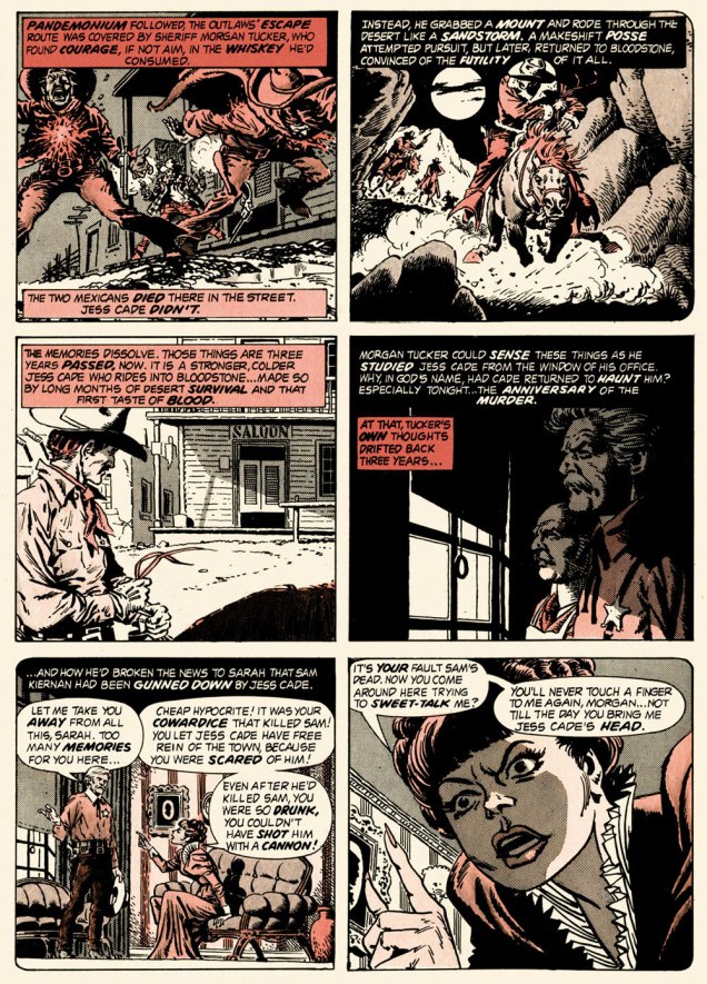
When the indefatigable Carmine Infantino (1925-2013) stepped down from his multi-hatted rôle of publisher, editor-in-chief, cover designer and art director — and so on — at DC, he found that no-one was beating his door down to offer him a similar position.
So he went back to drawing, as a freelancer. As Infantino put it: « Jim Warren was the first comics publisher to contact me after DC. I said “I’ll do work for you, but nothing full-time because I’m busy with other things.” He said, “Okay, whatever you’re willing to give me.” I wasn’t really comfortable with the Warren material — it was the sexiest work I’d ever done! Jim had an older audience and wanted it that way. My feelings about the material never affected the mutual respect Jim and I had for one another. » [ source ]
All told, Infantino pencilled around forty stories for Warren in a span of four years. There was even a brief period when he just about monopolized individual issues of Creepy and Eerie, which was offset by pairing him with wildly disparate inkers. Sometimes the results sang, sometimes they croaked.
Here’s a case of rarely combined styles that nevertheless meshed beautifully: Infantino and John Severin. Let’s face it, who’s more reliably excellent than Mr. Severin?
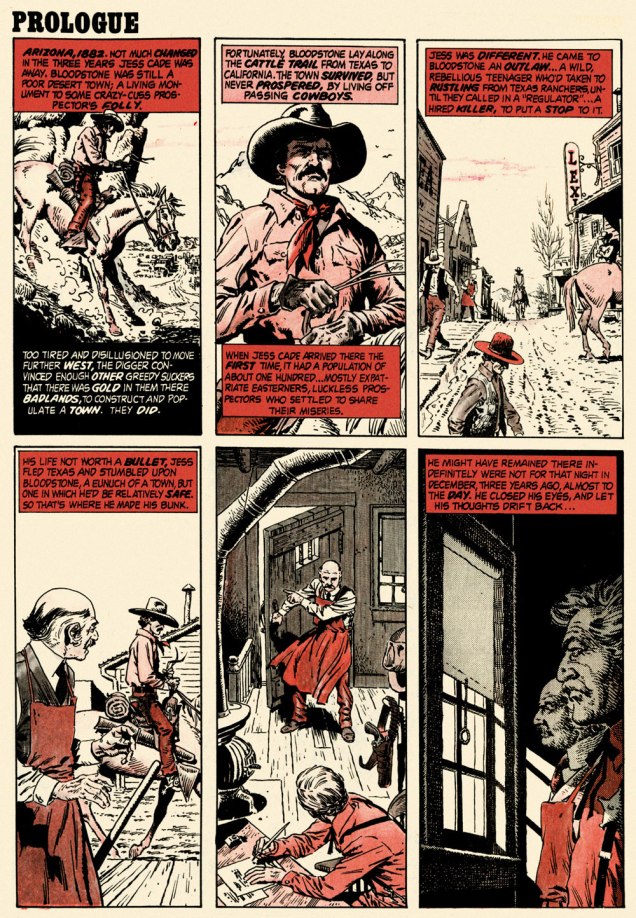
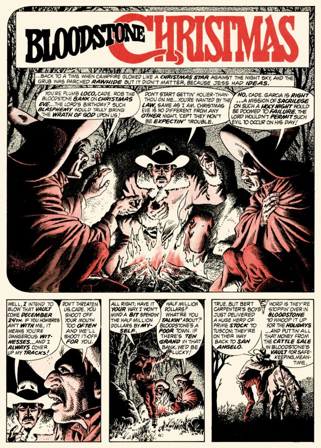
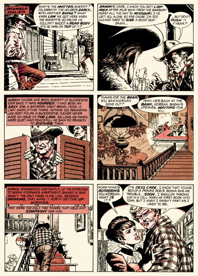
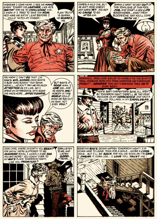
And so this is… Bloodstone Christmas, written by Gerry Boudreau, pencilled by Infantino, and inked by John Powers Severin (1921-2012).
.
.
.
.
.
.
.
I won’t pretend that the entire cast isn’t peopled with stock characters, but its sting in the tail lands satisfyingly, prefiguring the flavour of weird westerns by Joe Lansdale, for one.
.And now, for something sweeter.
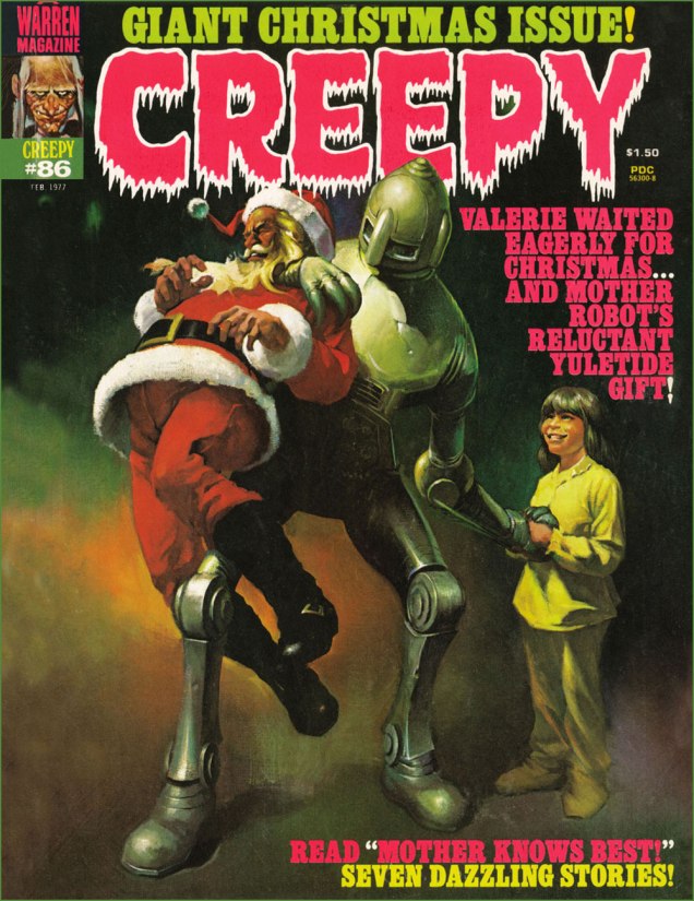
This is Creepy no. 86 (Feb. 1977, Warren). Cover by Ken Kelly (1946-2022).
And now, for the sweeter part of our double-header.
.
.
Night Prowler was an early collaboration by Swamp Thing‘s co-creators, writer Len Wein and artist Bernie Wrightson. It was published in House of Mystery no. 191 (Mar.-Apr. 1971, DC). Joe Orlando, editor.
Oh, and Happy Holidays to you, esteemed readers!
-RG
p.s. Oh, and speaking of carmine, the colour, not the man: I just read, a few days ago, in Steve Ettlinger‘s superb Twinkie, Deconstructed (2007), that « the fascinating, rich magenta carmine, also known as cochineal, is extracted from the dried body of the female cochineal insect », and that « the output of the Canary Islands is used almost exclusively to colour the Italian apéritif Campari. » Caveat emptor, then! Ironically, « carmine dye is produced from the acid that females naturally secrete to deter predators. » Not, however, industrious humans.
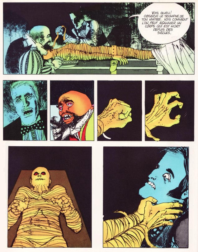
Today’s offering features plenty of colour… which in my humble opinion does not detract in the slightest from a sombre, autumnal atmosphere with chills as palpable as thick mist. While you would not be amiss in deciding that this art comes from a European hand, it’s not a French one, despite the language most of the following pages are in.
Josep Maria Beà i Font, usually shortened to and credited as José Beá, is a Spanish comics artist — born in 1942 — who’s happily still with us. Fans of Warren-published comics may recognize his distinctive style, as he wrote *and* illustrated quite a few (around thirty) stories published in Vampirella, Creepy and Eerie, starting with The Silver Thief and the Pharoah’s Daughter published in Vampirella no. 13 (Sept. 1971). It seems that he is another of those love-’em-or-hate-’em artists, as while doing some research for this post, I stumbled upon more than one instance of opinions such as ‘my least favourite Warren artist‘ or ‘passable art‘. This is fortunately balanced out by those who seek out Beà’s stories, going as far as delving into Spanish comics while not being able to speak the language.
A panel from the terrifically gruesome story Head Shop, illustrated by Beá and written by Don Glut and published in Eerie no. 39 (April 1972)
Beá’s collaboration with Spanish publishing house Buru Lan Ediciones starting in 1970 marked his return to comics after a 8-year break taken to focus on his painting. Specifically, it’s within the pages of its anthology Dráculathat Beá started first scripting his own stories. These became available to an anglophone audience when The New English Library reprinted a number of its issues under the name Dracula(now there’s an easy translation).
The cover of a Dracula Annual from 1973, published by The New English Library. I found this image on the lovely When Churchyards Yawn blog, go pay their post a visit! The illustration is by Esteban Maroto, a frequent face at Warren in the 1970s.
« New English Library issued 12 English-language versions of the publication, which was originally produced by Buru Lan in Spain. The New English Library publication ended after 12 issues, although it continued for many issues afterwards in Spain. Only the first 6 issues were included in the Dracula book produced by Warren, but one can probably track down the remaining 6 English language issues if they try hard enough. »
The following pages are taken from a French-reprint collection title Les nuits de l’épouvante, published by Dargaud in 1973 (I stumbled upon it years ago in a used bookshop, and instantly took to the art despite having no idea who Beá was). The dates I provide for their publication in English are from The New English Library’s Dracula, not the Spanish Drácula.
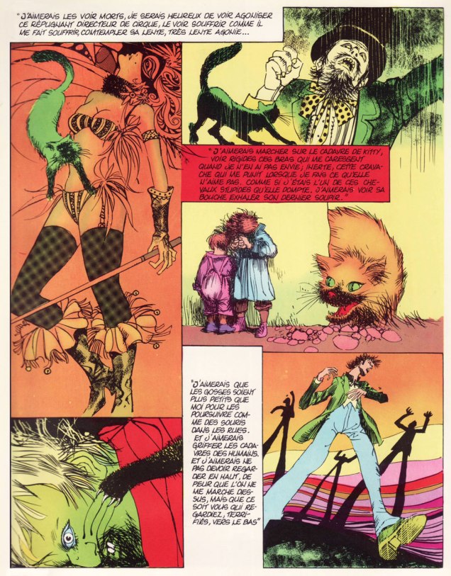
The following two pages are taken from Le serpent (written by Beà and Sadko*, illustrated by Beà), or The Snake, originally published in Dracula no. 3 (Oct. 1972):
La momie (written by Maroto, illustrated by Beà), or The Mummy, published in Dracula no. 4 (Nov. 1972) features some more memorable strangling scenes:
Finally, I would be remiss not to include some pages from Beà’s Sir Leo series, originally created for Drácula. Handsome Sir Leo is an English aristocrat who, in typical fashion, has walked away from his birthright… and walked into the arms of the supernatural, many dangerous adventures ensuing. The following two pages are from Sir Leo – le chat (written by Luis Vigil, illustrated by Beà), or The Cat, originally published in Dracula no. 8 (Dec. 1972). Read it here.
« Someone at Dell Comics decided it’d be swell to turn famous monsters into superheroes — an idea whose time never came. And just to make sure there were bad, they hired Tony Tallarico to draw them. » — — James Schumeister, with the sort of brickbat typically lobbed at Mr. Tallarico.
Last week, we lost, at the venerable age of eighty-eight, the controversial, much-maligned Tony Tallarico (Sept. 20, 1933 – Jan. 7, 2022). The case of Mr. Tallarico’s reputation is typical of mainstream US cartoonists who generally eschewed the superhero genre. His mistake, I suppose, is that he drew a handful of them, and in his own distinctive fashion to boot, thus sealing his doom in Fanboy court.
Yet there’s far more depth and variety to Tallarico’s career, and that’s should be remembered. Besides, those superhero comics were just light-hearted, unpretentious fun. Obviously not what the continuity-addicted True Believers craved.
Let’s take a tour of some of the highlights!
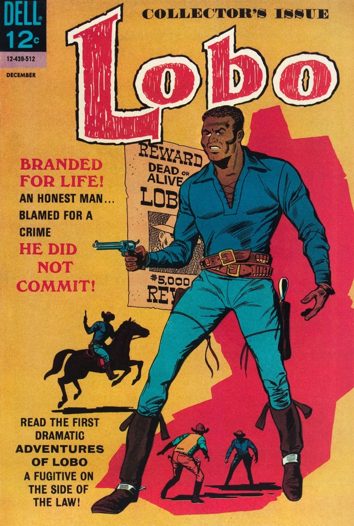
A page from Crazy Quilt, one of three stories Tallarico illustrated for my personal candidate for greatest horror comic book of all time, the unlikely one-shot Tales From the Tomb (Oct. 1962, Dell). Script and storyboard by John Stanley. Read the rest (complete with, fittingly, its analysis) of Crazy Quilthere. Arguably, if Tallarico’s going to be remembered in comics and general history, it may be for this once-obscure but significant mid-60s creation. This is Lobo no. 1 (Dec. 1965, Dell Comics). Tallarico and writer D.J. Arneson hold different views as to the character’s genesis, as Canadian researcher Jamie Coville discovered in 2016. To his credit, Coville simply let the former collaborators present their respective side of the story. Read the resulting interviews here! And do check out the début issue itself, along with Tom Brevoort’s analysis… right here.
As reported in Alter Ego no. 106 (Dec. 2011, TwoMorrows): « On May 20, 2005, Tony Tallarico received the Pioneer Award, given for his co-creation of the first African-American comic book hero, Lobo, a post-Civil War cowboy who appeared in two issues of his own Dell/Western title. The honor was given at a ceremony held at Temple University in Philadelphia, Pennsylvania. »
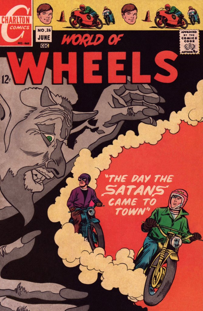
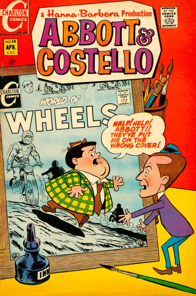
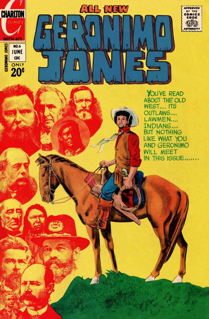
A Tallarico ad from Eerie no. 20 (March 1969, Warren); Tony enjoyed keeping things in the family, and so young “Danny Smith” was actually Tony’s wife’s nephew, Danny Grosso. My thanks to Tony’s daughter Nina for graciously divulging this bit of inside info! Cryptozoologists take note! Creepy no. 26 (April 1969, Warren); script by editor Bill Parente. I just adore Uncle Creepy’s pose (great use of props!), not to mention the question mark mullet. Should be the hit of the next tonsorial season!Joe Gill and Tallarico took over the handlebars of one of Charlton’s established hot-rodders, Ken King. Following the direction blazed by their predecessor, Jack Keller, King had become “the Most Hated Man on Wheels!” (in Drag-Strip Hotrodders no. 13, Jan. 1967, Charlton) after being unjustly accused of wrecking his best friend, Jerry Gerard, aka “The Nicest Guy in Racing” during a meet. The series’ unremittingly bleak portrayal of the racing scene is fascinating, and Gill and Tallarico wisely kept the pace. This is World of Wheels no. 26 (June 1969, Charlton); cover by Tallarico.An in-house ad from Eerie no. 23 (September 1969, Warren), technically Vampirella’s first published appearance. Art by “Tony Williamsune”, the collective nom de plume adopted by frequent collaborators Tallarico and William ‘Bill’ Fraccio. According to Tallarico, their collaboration was quite fluid: both contributed to layout, pencils and inks, but Tony was the extroverted go-getter, while Bill was the quiet one. A “Williamsune” splash from Creepy no. 31 (February 1970, Warren). Tallarico on his association with Fraccio: « I would pencil some, he would ink some, visa versa y’know one of those things. I was really the guy that went out and got the work. Bill never liked to do that. It would depend. If he was working on something else I would start a project too and do pencils. It was a fun time. » [ source ]This is Abbott & Costello no. 14 (April 1970, Charlton), featuring the beloved veteran comedians’ crossover with the aforementioned Ken King. The look of the series is based upon Hanna-Barbera‘s 1967-68 The Abbott and Costello Cartoon Show rather than on the duo’s classic movies and routines. Besides, Lou Costello having passed away in 1959, his part was voiced by Stan Irwin (with Bud Abbott as… Abbott). Preceding the advent of Jonah Hex by some months* in the Weird Western stakes, Geronimo Jones was a truly oddball oater series, in the best sense of the term. Created by Tallarico (script and inks) and José Delbo (pencils), Geronimo’s adventures ran for 9 issues (plus one that remains unpublished), from September, 1971 to January, 1973. Geronimo himself was essentially a young pacifist seeking his quiet place in the Old West, in the finest tradition. However, strange encounters and occurrences keep thwarting his laudable goal. And none is more outlandish and shocking than what he comes up against in this issue, cover warning and all. This is Geronimo Jones no. 6 (June 1972, Charlton). The GCD credits the cover to Delbo alone, but the use of collage and halftone wash are telltale Tallarico trademarks… not to mention his distinctive lettering. My guess therefore is: pencils by Delbo, layout, inks and collage by Tallarico.Tallarico and Fraccio did only a handful of stories in this wild, swirly style, including four for Charlton: The Curse of the Vampire in The Many Ghosts of Dr. Graves no. 44 (Jan. 1974, Charlton); this one, Come See Our Ghost… in Haunted no. 16 (June 1974, Charlton); The Reuger Formula in Haunted no. 24 (Nov. 1975) and A Solemn Oath! in Ghostly Tales no. 118 (Nov. 1975). Let me assure you that the sort of bold inking on display here, while deceptively simple in appearance, takes unerring confidence and skill to achieve. Bravissimo!
By the mid-70s, with his main comics accounts defunct or dormant (Dell, Treasure Chest, Charlton), Tallarico, ever the astute and tireless businessman (another rare trait among cartoonists) simply stepped up and diversified his efforts, branching out and creating a market for himself. « In the 70s the whole business went kaput. Luckily I was able to transfer over into doing children’s books. I’ve been doing children’s books ever since. My wife went though a count several months ago. It was over a thousand titles. That’s a lot of children’s books. »
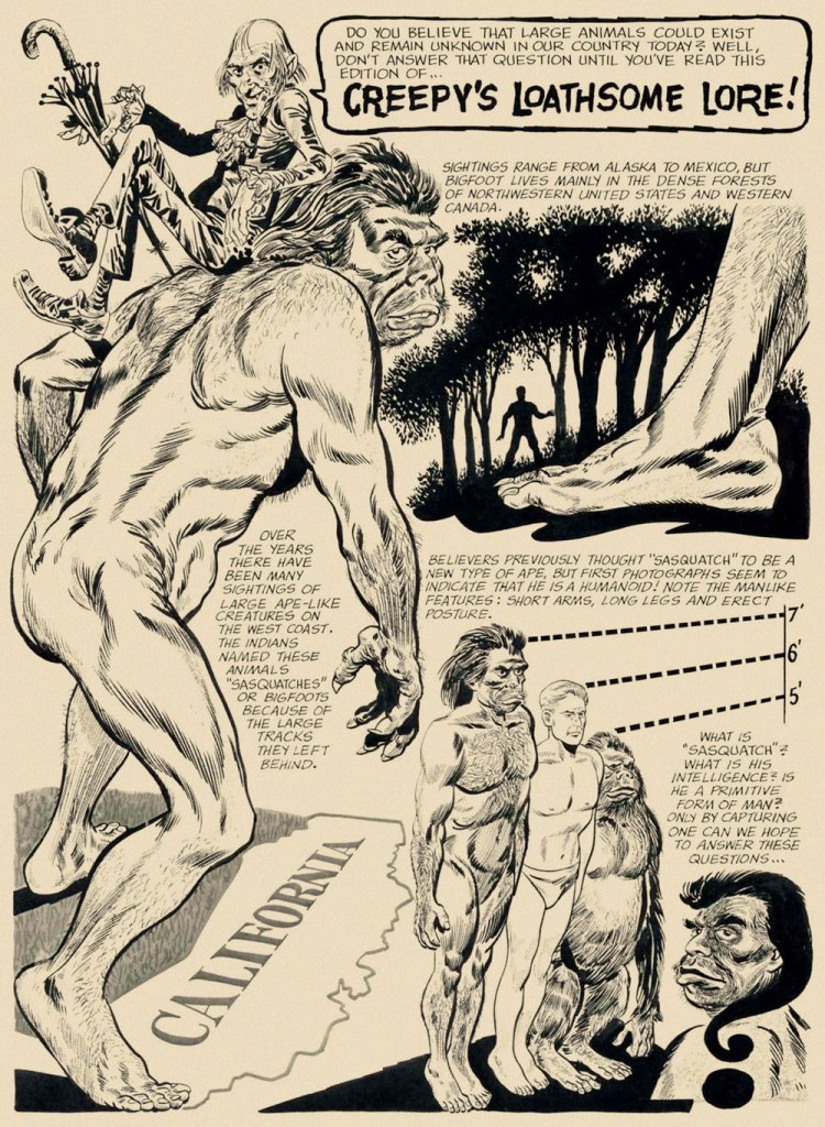
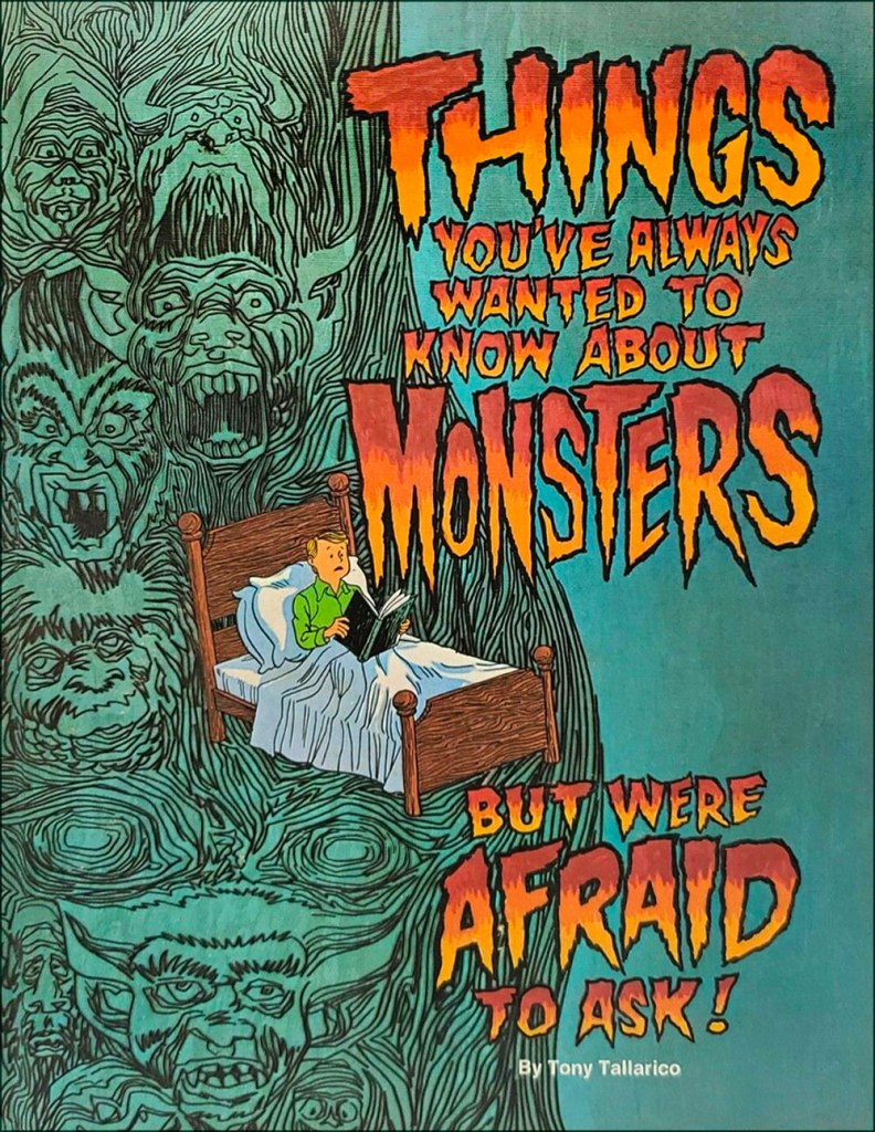
Here’s a lovely one: Things You’ve Always Wanted to Know About Monsters (1977, Grosset & Dunlap). From the author’s introduction: « My sincere thanks to the many motion picture studios who produced these great monster films. They have kept many a generation of fans ‘monsterized‘. My thanks to my parents, who did not forbid me to see these films when I was a boy. Instead, they brought out in me many of the questions that appear in this volume. They always stressed that monsters are another form of fictional entertainment. My thanks to my wife Elvira, and my daughter Nina**, who stood by while my son and I made a mess of the living room as we selected the many pictures that appear here. »
I should point out that I haven’t forgotten one of my favourite Tallarico projects, namely his charming work on the Bobby Sherman “Getting Together” comic book (7 issues, Feb.-Oct. 1972, Charlton)… it’s just that I’ve already addressed the topic: check out Let’s Hear It for Bobby Sherman!
I don’t know whether I’ll change anyone’s mind about Mr. Tallarico’s work, but I believe I can rest assured I gave it my best shot.
-RG
*Hex was introduced in All-Star Western no. 10 (Feb.-Mar. 1972, DC).
**My closest brush with the Tallaricos came in 2015 when I helped his daughter Nina identify and source some artwork she was selling on eBay for her dad. In my experience, a very nice lady. My sincere condolences to the bereaved family.
« Like everyone in his right mind, I feared Santa Claus. » — Annie Dillard
’twas 1982, and DC’s mystery anthology titles were dead or dying (the last one standing, The House of Mystery, had but a year or so left to go), and The Unexpected, published since 1956, was a mere two issues away from cancellation. Latter-day editor Dave Manak had done a fine job with the means at his disposal, wisely engaging Joe Kubert (1926-2012) to grace close to ten issues with his ever-elegant artwork.
This is perhaps the finest of the lot, a wistful, old-fashioned cover that dispenses with most of the clichéd Holiday iconography.
This is The Unexpected no. 220 (March 1982, DC). Pencils and inks by Joe Kubert with extra-fine lettering by Gaspar Saladino (1927-2016), truly a key element of the cover’s visual appeal. “Drive carefully, darling!” Is that woman worried about *everything*? Talk about fretful. Insurance agents must adore her. From the Fairhaven and Bon Marché allusions, one may presume that the events are set in the state of Washington.To give credit where credit is due, the unexplained bit with Santa’s hand on the phone is the story’s subtlest touch. He’s the one who phoned in the tip — anonymously, one presumes. Santa does not abide off-brand competition.
The issue’s lead, Holiday-themed story, boasts gorgeous art by powerful and versatile Puerto Rican cartoonist Ernie Colón (1931-2019), and it’s unusually well-coloured for the era (not to be confused with well-printed!), in that the shadings convey projected light and ambiance, not merely the prevalent, simplistic colour-by-numbers approach.
The writing, on the other hand…
Santa Is a Killer! is an artless hodge-podge of tropes, a kiddie rehash of Johnny Craig’s timeless “… and All Through the House” (Vault of Horror no. 35, Feb. 1954, EC), dressed up with the done-to-death-and-then-some “That — wasn’t *you*? Then — it must have been the –*choke* — real ghost / Satan / Santa Claus / Carlos Santana / Tooth Fairy / Larry “Bud” Melman!) “twist”. Did I mention that I love the art?
Since we strive to avoid repetition, and as my partner-in-mischief ds has already featured this legendary cover in her How do you like *your* Christmas? post, here instead is the original 1954 Silverprint proof, a colour guide for the printer’s edification and coloured by hand, presumably by EC’s resident chromatic conjuress, Marie Severin (1929-2018). Cover art by Johnny Craig.
It’s a little-known fact that VoH35’s dear, doomed wife’s peignoir was later snapped up for a pittance at an estate sale by a young rake by the name of Danny Rand. Soon, with a few minor alterations, he had himself a nifty (and silky!) crime-fighting ensemble. Just don’t ask ‘is that a ladies’ nightgown you’re wearing?‘ if you don’t want your features rearranged. This is Iron Fist no. 8 (Oct. 1976, Marvel). Cover art by John ‘Booster Cogburn‘ Byrne and Dan Adkins. And though « The Canadian Government has apologized for Bryan Adams on several occasions » (and presumably for Céline Dion and Justin Bieber also), I say it’s high time Canuck honchos proffered their excuses as to cuddly Mr. Byrne.
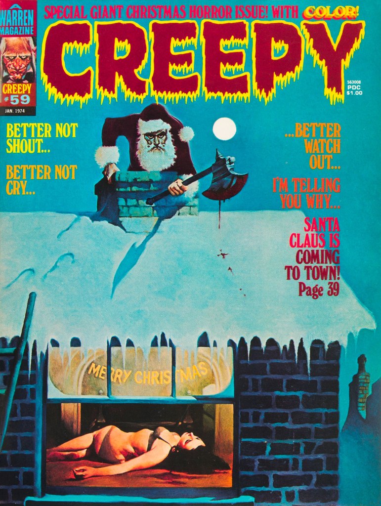
To give you some idea of how prevalent the ‘Santa as homicidal maniac’ notion was by the 1970s, here’s another semi-famous instance: this is Creepy no. 59 (Jan. 1974, Warren); cover by Spain’s Manuel Sanjulián (b. 1941). A year later, writer-director Bob Clark (Porky’s, A Christmas Story) would unleash his influential Black Christmas.
« Jerry Grandenetti started out ghosting The Spirit, and nobody… NOBODY… captured the spirit of The Spirit better. Not content to stay in Will Eisner’s shadow forever, he forged his own unique style leading to a highly successful comics career lasting decades. » — Michael T. Gilbert
Since my very first encounter with his work, Jerry Grandenetti (1926-2010; born ninety-five years ago today, another Thursday April 15th) has endured as one of my true artistic heroes. But he’s not celebrated much at all.
Though he’s worked extensively on The Spirit, he’s treated as a bit of a footnote in the Eisner hagiography. His DC war work is well-regarded, but he’s inevitably overshadowed by the Joe Kubert – Russ Heath – John Severin trinity. Besides, by and large, the war comics audience doesn’t overlap much with the spandex long johns crowd. Grandenetti has only very occasionally and timidly dipped a toe into the super-heroics fray, and he was far too unusual for overwhelming mainstream acclaim.
In fact, aside from the couple of converts I’ve made over the years, I can only think of three fellow torch-bearing aficionados: Michael T. Gilbert (who digs best the early, Eisner-employed Jerry); Stephen R. Bissette (who favours the spooky 60s and 70s work); and Don Mangus, who’s most into the DC war stuff. I daresay I enjoy it all, but my taste is most closely aligned with Mr. Bissette’s on this particular point. Let’s sample a bit of everything, insofar as it’s feasible to sum up a career spread out over five decades… in a dozen-or-so images.
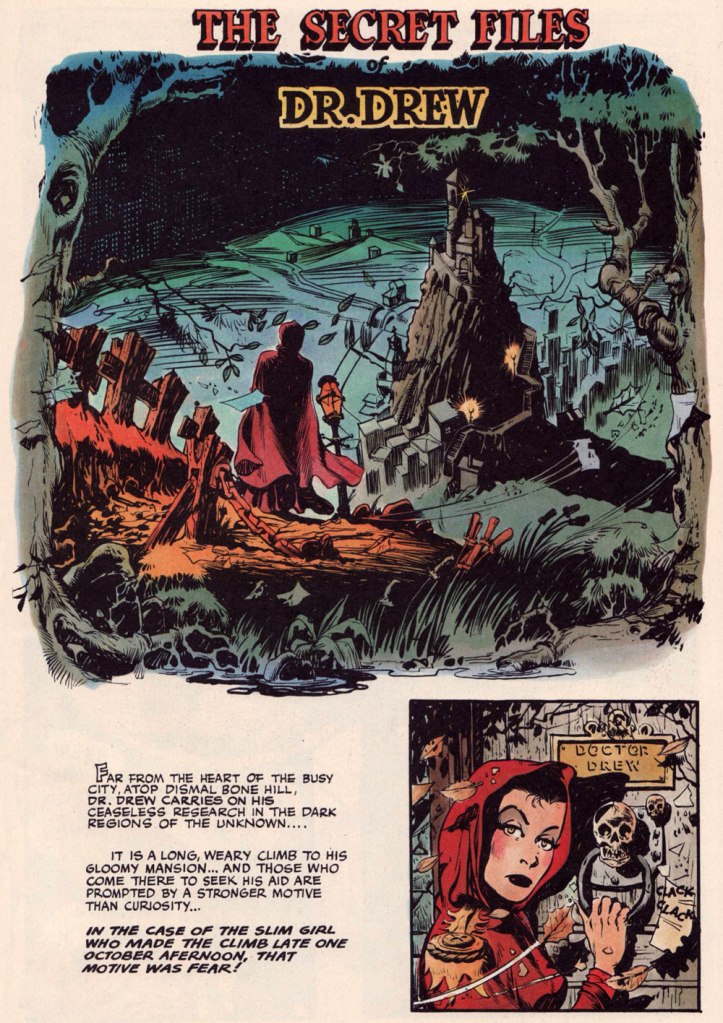
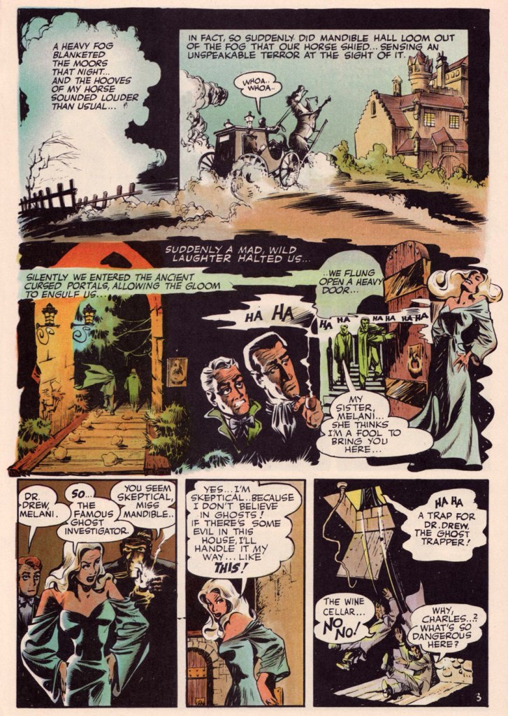
Opening splash from The Secret Files of Dr. Drew: Sabina the Sorceress, written by Marilyn Mercer and lettered by Abe Kanegson, from Rangers Comics no. 56 (Dec. 1950, Fiction House); this version hails from a reprint (Mr. Monster’s Super Duper Special no. 2, Aug. 1986, Eclipse) using the surviving original art; it was recoloured by Steve Oliff.
Page 3 from The Secret Files of Dr. Drew: Curse of the Mandibles!, written by Marilyn Mercer and lettered by Abe Kanegson, from Rangers Comics no. 55 (Oct. 1950, Fiction House); this version hails from a reprint (Doc Stearn… Mr. Monster no. 4, Dec. 1985, Eclipse) using the surviving original art; it was most tastefully recoloured by Steve Oliff.
In 1954, the powers-that-be at National Periodical Publications (you know, DC) gave Grandenetti some latitude to experiment with their War covers. Grandenetti produced an arresting hybrid of painted and line art. The process involved a grey wash painting that was photostatted, with flat colour laid over the resulting image. The first few attempts yielded striking, but nearly monochromatic results. A bit farther down the pike, the production department got more assured in its technical exploration.
This is G.I. Combat no. 77 (Oct. 1959, DC); wash tones and colouring by Jack Adler, who recalled, in a 1970s interview: « It was suggested that we start doing washes for covers, and we were talking about doing it for so damned long, but nobody attempted it. I think Grandenetti did the first one, an army cover with someone floating in the water. I think that was the first wash cover that was done. That one ended up looking like a full color painting. »
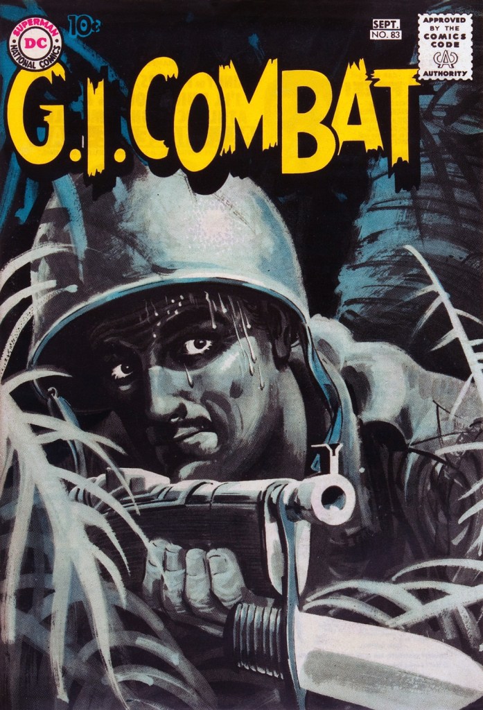
This is G.I. Combat no. 83 (Aug.- Sept. 1960, DC); wash tones and colouring by Jack Adler. In 1995, Robert Kanigher, Grandenetti’s editor on the DC war books and a frequent collaborator, recalled: « Jerry liked to experiment and I had to sit on him to get him to stop it. Especially in his covers, which were outstanding, when I forced him to draw as realistically as possible. »
Original art from The Wrath of Warlord Krang!, smothered in dialogue and exposition by Stan Lee, from Tales to Astonish no. 86 (Dec. 1966, Marvel); inks by Bill Everett. Namor‘s constant random shouts of ‘Imperius Rex!‘ make him sound like a sitcom character with Tourette’s. As far as I’m concerned, it’s possibly been the most annoyingly asinine slogan in comics since Stan stole ‘Excelsior!‘ from Jean Shepherd.
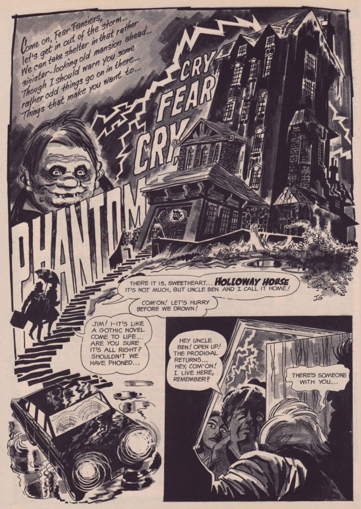
The opening splash from Cry Fear, Cry Phantom, written by Archie Goodwin, from Eerie no. 7 (Jan. 1967, Warren). In the mid-60s, presumably tiring of being pigeonholed as a war artist at DC, Grandenetti made the publishers’ rounds, doing a bit of work for Tower, Gold Key, Charlton, Marvel, Cracked (check it out here) and most memorably Warren where, after ghosting a few stories for Joe Orlando, he unleashed his innovative expressionistic style.
DC was generally hesitant to entrust its more established properties to the more “out there” artists. In the cases of Grandenetti and Carmine Infantino, the solution was to match them with the weirdness-dampening inks of straight-arrow artist Murphy Anderson. And you know what? It did wonders for both pencillers and inker.
This is The Spectre no. 6, October, 1968. A tale told by Gardner Fox (and likely heavily revised by hands-on editor Julius Schwartz, a man who loved alliterative titling) and superbly illustrated by the Grandenetti-Anderson team. Steve Ditko aside, Jerry Grandenetti had no peer in the obscure art of depicting eldritch dimensions (you’ll see!)
Page 13 from Pilgrims of Peril! written by Gardner Fox, from The Spectre no. 6 (Sept.- Oct. 1968, DC); inked by Murphy Anderson. Dig the salute to a trio of real-life spooky writers, all of whom editor Julius Schwartz knew well, having even served as Lovecraft’s literary agent late in the man’s life. By the tail end of the 1960s, Lovecraft’s work was finally making some commercial inroads, thanks largely to Arkham House co-publisher Derleth‘s unflagging diligence.
Page 22 from Pilgrims of Peril! written by Gardner Fox, from The Spectre no. 6 (Sept.- Oct. 1968, DC); inked by Murphy Anderson.
Page 2 from Men Call Me the Phantom Stranger, written by Mike Friedrich, from Showcase no. 80 (Feb. 1969, DC); inks by Bill Draut. This story reintroduced an obscure character from the early 50s, which Grandenetti had drawn a couple of times during his six-issue run. The Phantom Stranger has remained active ever since, but most writers (save Alan Moore, wouldn’t you know it?) don’t really know what to do with him. This, however, is my very favourite PS appearance. Draut, a slightly old-fashioned penciller by this time was, as a slick inker, a wonderful fit for Grandenetti’s confidently loopy layouts.
Page 3 from The Haunting!, written by Jack Oleck, from House of Mystery no. 183 ((Nov.-Dec. 1969, DC). Grandenetti pencils and inks: undiluted!
Page 2 from Eyes of the Cat, written by Robert Kanigher, from House of Mystery no. 189 (Nov.-Dec. 1970, DC); inks by Jerry’s fellow Will Eisner ghost Wallace Wood. The inspired combination of Grandenetti’s adventurous layouts and the velvety unctuousness of Wood’s finishes are a match made in heaven, but one Woody wasn’t fond of. Oh well.
So there you are. Just the tiniest tip of the iceberg. Happy birthday, Mr. Grandenetti!
Sometimes tentacles are positioned so close to the head that one gets the impression they’re sprouting directly from it. Whether accidental or not, the result is quite horrific – sometimes in a good way, if one enjoys the creepy and bizarre. In this Tentacle Tuesday, we’ll come across literal cases of octopus-instead-of-head, beard-tentacles (stylish!) and alien cepha-cerebellum-pods, which I hope will catch on as a term.
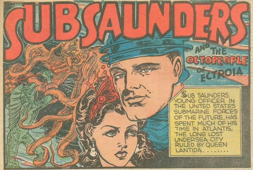
The following has been taken from The Octopeople of Ectroia, illustrated by Henry Kiefer, and published in Fantastic Comics no. 8 (July 1940, Fox Comics). If the introductory panel gives but a brief glimpse of the creature we are about to encounter…
… the splash page gives us an eyeful of her charms. Now we know what Baba Yaga would look like with tentacles instead of her usual limp grey tresses. Incidentally, a few days ago an enterprising fellow won enough support (and funding) from the Lego community to make his Lego Baba Yaga idea an (eventual) reality. She would come with her traditional hut on hen’s legs, a black cat and “everyday useful things” like horseradish drinks. Needless to say, I want one.
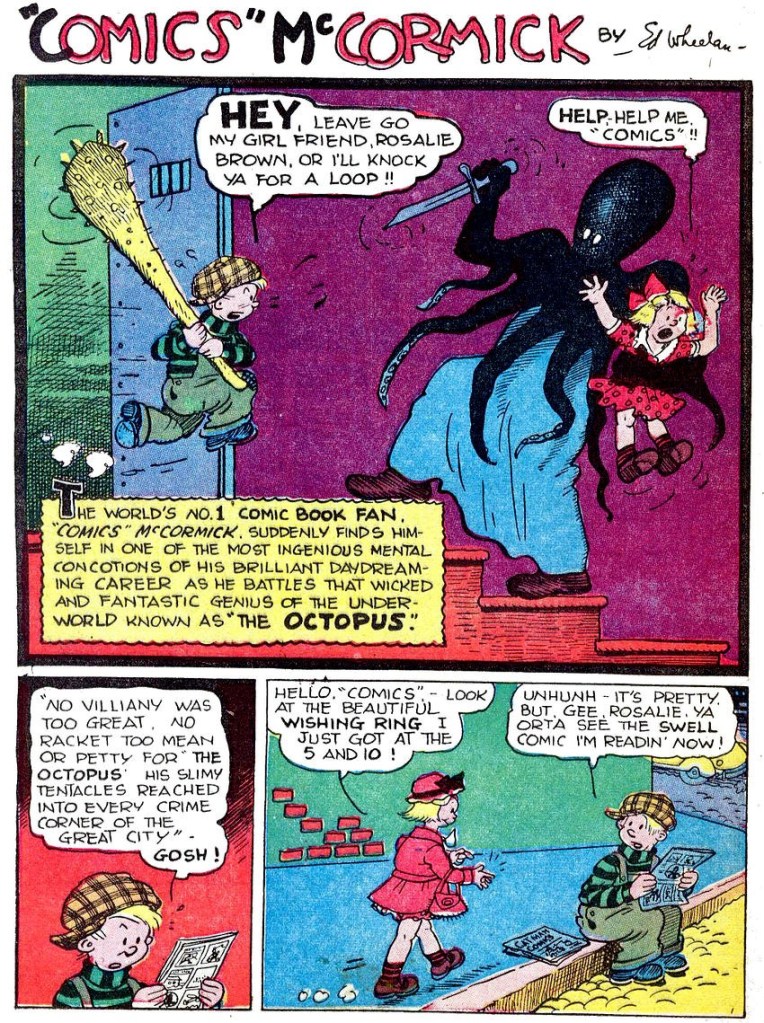
“Comics” McCormick has had more than just one encounter with cephalopod-headed men! The following is the cover of Fat and Slat no. 4 (Spring 1948, EC Comics), illustrated by Ed Wheelan.
And here is a page from The Octopus, printed in Terrific Comics no. 3 (May 1944, Helnit Publishing). Is it the same villain? Well, nearly: they’re Octopus-Man and Octopus, differentiated only by the costumes they sport under all those tentacles.
Edgar S. Wheelan (1888-1966) was the creator of Fat and Slat and “Comics” McCormick, and he is well remembered for his introduction of some cinematic techniques to comic strips. Of special significance is his Minute Movies, created for the George Matthew Adams Newspaper Service. This series of animated shorts not only had its stars (and continuity!), but also made full use of techniques that weren’t usually employed in comics, like close-ups, long shots and head shots with title cards.
The following sequence is an oldie-but-goodie from the oft-quoted Origin of the Species!, scripted by Bill Gaines and Al Feldstein, and illustrated by Feldstein. It was first published in Weird Fantasy no. 8 (July-August 1951, EC Comics). For those of you who may not have read it and are wondering whether those tentacled beasts were somehow the progenitors of the human race… no, they weren’t. As for the plot, it raises more questions than it answers, which I believe is not atypical of a Feldstein tale (from those I’ve read, they tend to be like a movie with plenty of drama and special effects, but little sense).
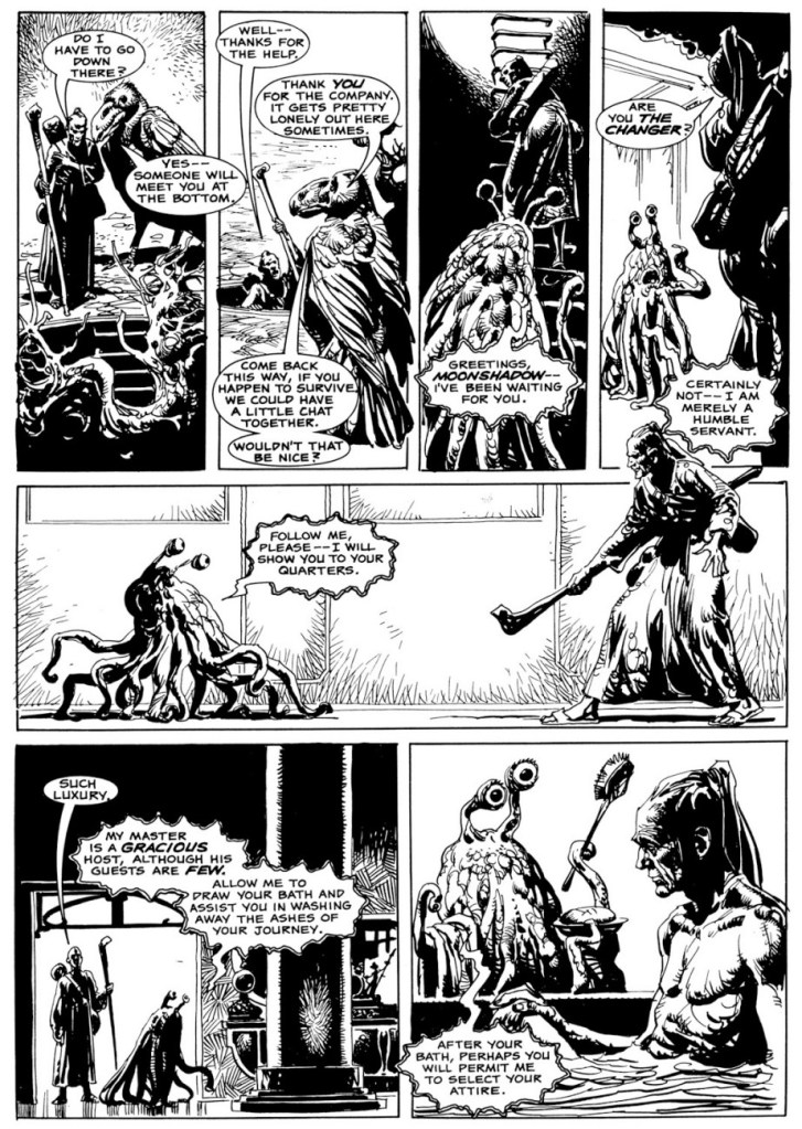
I recently came across a 3-part story published in Eerie numbers 91 to 93 that I quite liked: the tale of Moonshadow, the assassin who never failed, scripted by Bob Toomey and illustrated by José Ortiz. As luck would have it, two of the instalments were rife with tentacles!
The following page (and also the preceding panel) is from Suzanna Don’t You Cry, part 2 of the tale, published in Eerie no. 92 (May 1978, Warren).
Last but hardly least, a page from Kingdom of Ash, published in Eerie no. 93 (June 1978, Warren).
Fast forwarding some twenty years, we land in the middle of a pirate tale – and what suits a pirate more than a headful of tentacles (and a peg-leg)? This page is from Autopsy in B-Flat, written and illustrated by Gary Gianni and first published in Hellboy: Almost Colossus no. 1 (June 1997, Dark Horse) as a back-up feature. Gianni’s The Monstermen stories have since been collected separately.
What we gather from this dialogue is that octopus pirates like pork.
Finally, I think I promised some tentacles in lieu of beard, and the early stages of this guy’s transformation surely qualify:
This creature appears in the pages of Nocturnals: Black Planet (October 1998, Oni Press), with all plotting and art handled by auteur Dan Brereton. Actually the pages of this collection are so rife with tentacles that I’m going to force myself to be succinct.
Another instance of tentacles-as-hair:
Cover for Nocturnals: Black Planet (October 1998, Oni Press).
Thanks to friend Barney for pointing this last batch out!
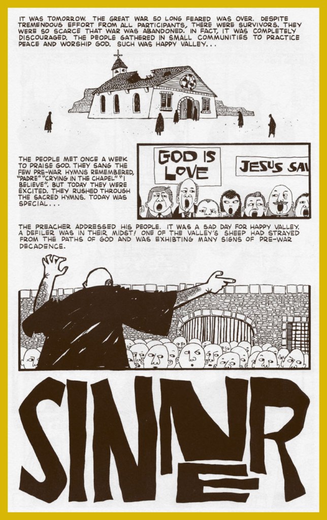
« If you’re going to be a sinner, be the best sinner on the block. » — Anton Szandor LaVey
I’m afraid the appeal of Archie Goodwin’s (1937-1998) writing has always escaped me. As you’d expect with a career as busy and prolific as his was, there are notable exceptions*. But I think, as is often the case in comics, he gets a lot of credit for tepid, formulaic writing that happens to be masterfully illustrated. You know, like just about every story from the early Creepy and Eerie (Goodwin was editor and principal writer of the Warren line for its first four years or so) with their groan-inducing ‘shock’ endings: “But I’m a vampire, and we don’t like competition around here!” or “We ghouls don’t cotton much to werewolves!” or “You’ve guessed my secret too late — I’m a witch!” or “For I am… Death!“
On the other hand, he was a fine editor and, by all accounts, a terrific human being. In 2013, Mark Evanier put it this way: « At a time when some editors in comics were notorious for treating their freelancers with disrespect and yelling, Goodwin had a sterling reputation. He always would. Archie was nice. He was honest. »
It is to his great distinction that even such divisive, eternally-acerbic figures as Jim Shooter (« First and foremost, everyone loved Archie. Archie had a manner about him that you just couldn’t not like him. While he was tough as nails, and he was probably the best that passed through this business, he managed to do it without offending anyone. He managed to be respected and remain friends with everyone and do his job. ») and Alex Toth (« None of us were working there [at Warren ] for the money, because there wasn’t much. We were working there to work with Archie. ») reserved naught but effusive praise for the man.
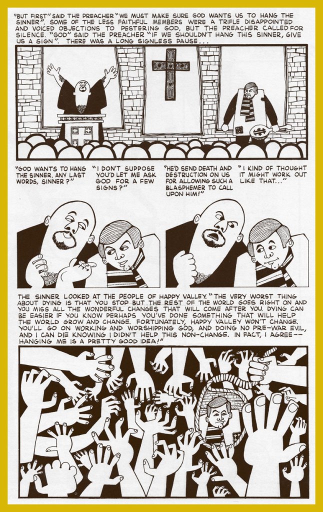
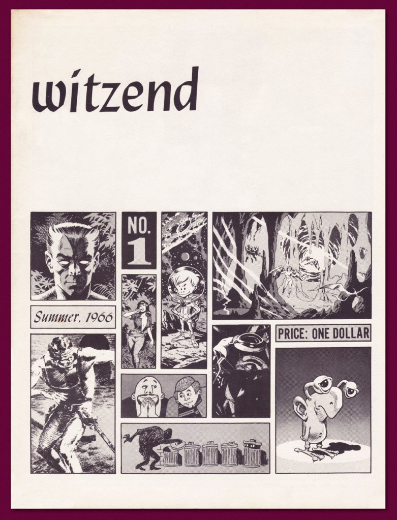
But you know what I really like about Archie? His drawing, which was all-too-rarely showcased. While he did adjoin thumbnails layouts to his scripts, Goodwin’s drawings rarely appeared in print, aside from some jokey editorial asides at Marvel in the 1980s. Here’s Sinner, written and illustrated by Goodwin, from Wally Wood’s prozine Witzend no. 1 (Summer 1966).
Sinner would be reprinted a few times, notably in the second issue of Marvel’s Heavy Metal knockoff Epic Illustrated (Summer, 1980), edited** by Goodwin. Marvel had passed on the Métal Hurlant licensing rights and, when Heavy Metal proved a smash hit, launched their ersatz. Such is the way of Marvel.
This is Witzend no. 1, featuring a splendid cover layout by Goodwin…. it’s harder than it looks, especially when it looks this good… and given the relatively primitive means employed. I tell you, Archie missed his calling.
Goodwin’s, adobe, clean line and silhouette graphic approach has always reminded me of this fine album cover from a few years earlier, which is to say 1963. It was designed by A&M Records art director Peter Whorf (yes, the legendary Whipped Cream & Other Delights cover was also one of his).
Despite all this, Archie Goodwin’s greatest claim to fame simply has to be the tremendous legwork he did as Nero Wolfe’s assistant.
« Archie Goodwin’s first prose story was published by Ellery Queen’s Mystery Magazine, which warned him he could not use Archie Goodwin as a pen name because it was a Rex Stout character in the Nero Wolfe books. According to Goodwin’s wife Anne T. Murphy, the magazine’s editors ‘then were so delighted when he wrote back to say that it was his real name that they used the anecdote as the introduction to the story, which ran in the July 1962 issue.’ »
-RG
*Notable exceptions: The Success Story, with art by Al Williamson (Creepy no. 1, 1964) has actual bite. Despite its rote-EC-revenge-from-beyond-the-grave finale, it’s a bitter parody of real-life comic-strip parasites such as Don Sherwood (Dan Flagg, The Partridge Family) and Alfred Andriola (Kerry Drake). There’s the tragically moving Island at World’s End, illustrated by Gray Morrow (Eerie no.4, July 1966). And a handful of inspired little tales that truly fired up the creativity of a freshly-emancipated Steve Ditko: Collector’s Edition (Creepy no. 10, Aug. 1966); Second Chance! (Creepy no. 13, Feb. 1967); Deep Ruby! (Eerie no. 6, Nov. 1966); and my very favourite, Room With a View (Eerie no. 3, May 1966… their first collaboration!). If anyone’s interested, the Goodwin-Ditko outings have been handsomely collected in Creepy Presents: Steve Ditko (2013, Dark Horse).
It must be said that Goodwin knew how to match a plot with the proper illustrator. As he explained, « I always tried to write the stories for individual artists. Sometimes, I’d ask them if there was a certain setting or a certain kind of story they were interested in, and I also knew what they did best. » It’s a shame that, overall, the stories themselves were so timid and unambitious, so mired in the glories of the past. Some people can’t help pulling their punches, I suppose.
**To give you a fair idea of Marvel’s delusions of corporate grandeur at the time, Epic Illustrated no. 2‘s convoluted and deceptive editorial credits read thus: Stan Lee (editor); Archie Goodwin (editorial director); James Shooter (consulting editor); Marian Stensgard; Louise Jones; Larry Hama; Ralph Macchio (editorial); Roy Thomas (contributing editor); Maggie Thompson (contributing editor); Don Thompson (contributing editor). Dollars to doughnuts that Goodwin and Louise Jones did all the actual work.
« Naturally there was quite a ruckus when everyone found out who… and what Rah was. But there wasn’t any rules concernin’ the eligibility of a mummy to play ball, so the Jets’ victory stood… » — from Roger McKenzie’s The Return of Rah
Carrying on with our irregular survey of significant Warren cover artists whose names and reputations are somewhat less inextricably linked with the publisher than the usual suspects, and thereby sometimes overlooked. Fresh out of art school, and on his way to a truly remarkable, award-peppered career, Don Maitz (born 1953, Plainville, CT) graced a brace of Warren Mags with some of his earliest professional imaginings, which I’ve gathered here.
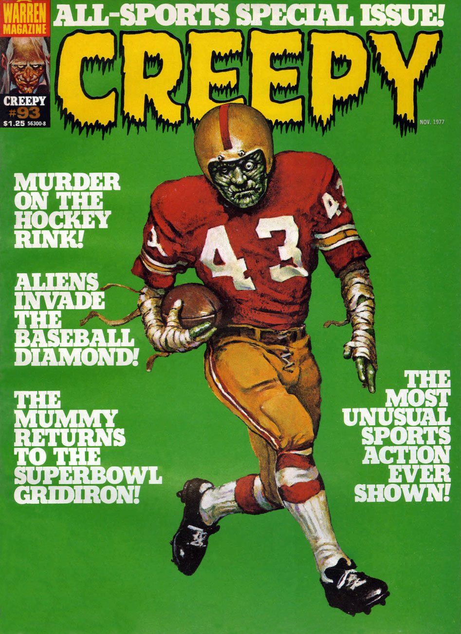
A lot of people apparently don’t much care for Warren’s late 70s sports-themed issues, but I like ’em, given that they feature a trove of gorgeous Carmine Infantino artwork, when he was experimentally-paired with a dizzying assortment of inkers (in this issue, John Severin, Alfredo Alcala, Alex Niño… and, well, Dick Giordano). At their best, the sports issues allowed him to revisit with more latitude (though less ingenuity, I’d argue) the Strange Sports Stories format he’d initiated in 1962 with writer Gardner Fox and editor Julius Schwartz. This is Creepy no. 93 (Nov. 1977, Warren). Senior editor Louise Simonson* (née Mary Louise Alexander) was commendably trying to spice up what had become a stale formula, but it turned out that there just wasn’t sufficient overlap between Warren readers and sports fans. A more staggered release programme might have cushioned the blow: as it was, Warren readers got two sports-centric issues in November 1976, then another pair in November 1977.
I hope that headline was meant ironically, because (spoiler alert), the humans are the monsters and the aliens… aren’t, in Bill Mohalley and Nicola Cuti’s Deathball 2100 A.D., a sordid, derivative (Rollerball + Death Race 2000, geez) and heavy-handed tale made uglier by Dick Giordano’s usual stiff, graceless visuals. Nice cover, though. This is Eerie no. 88 (Nov. 1977, Warren).
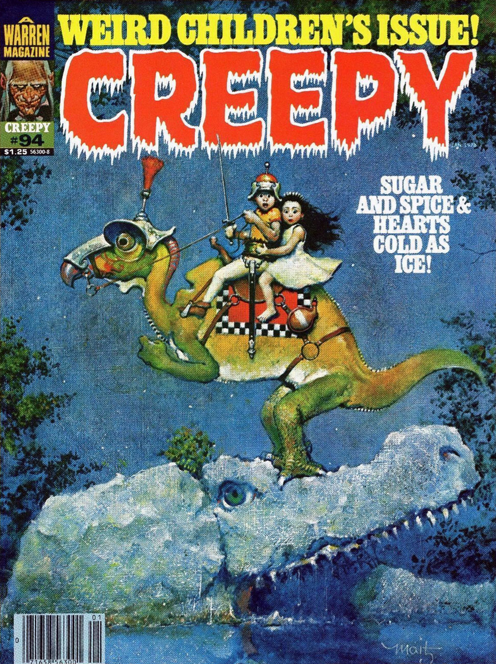
Well, now! This marvellous vision, marking quite a tonal break from the usual Warren diet, corresponds to no particular tale within this ‘bad seed’ issue, yet teems and brims with story, with nary malice… but so much wonder. A bold move on the part of editors Simonson and Nick Cuti. This is Creepy no. 94 (Jan. 1978, Warren).
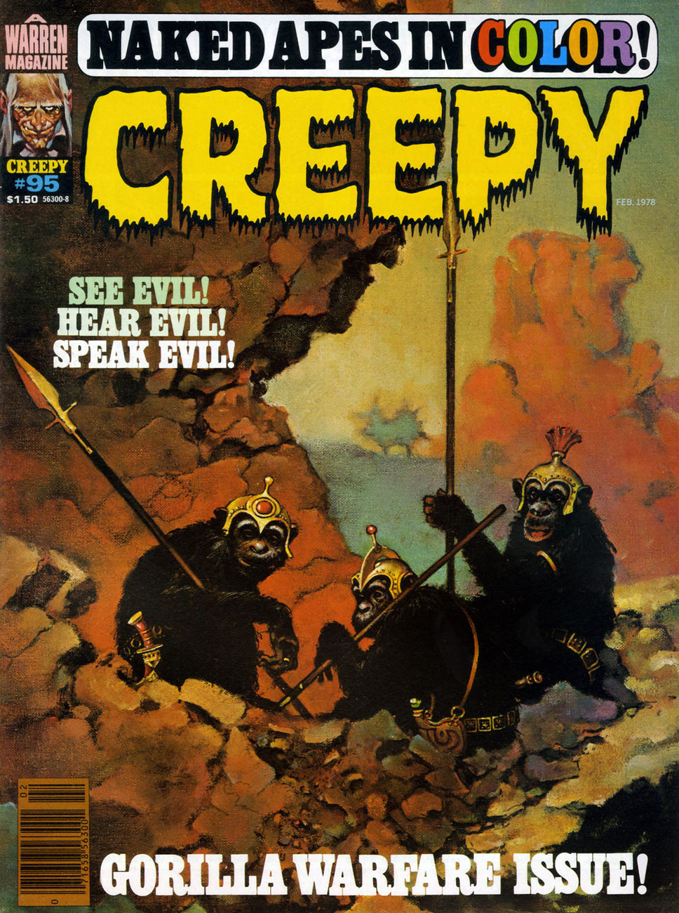
This handsome simian trio deserves better than their association with Cary Bates and Esteban Maroto‘s rather juvenile, Lord Greystoke-slandering Murder on the Vine. You’ve done better, boys. This is Creepy no. 95 (Feb. 1978, Warren), a cover bearing more than a mere whiff of Frazetta.
The probability of violent demise aside, isn’t this just the most unctuously idyllic autumnal scene? This is Eerie no. 91 (March 1978, Warren).
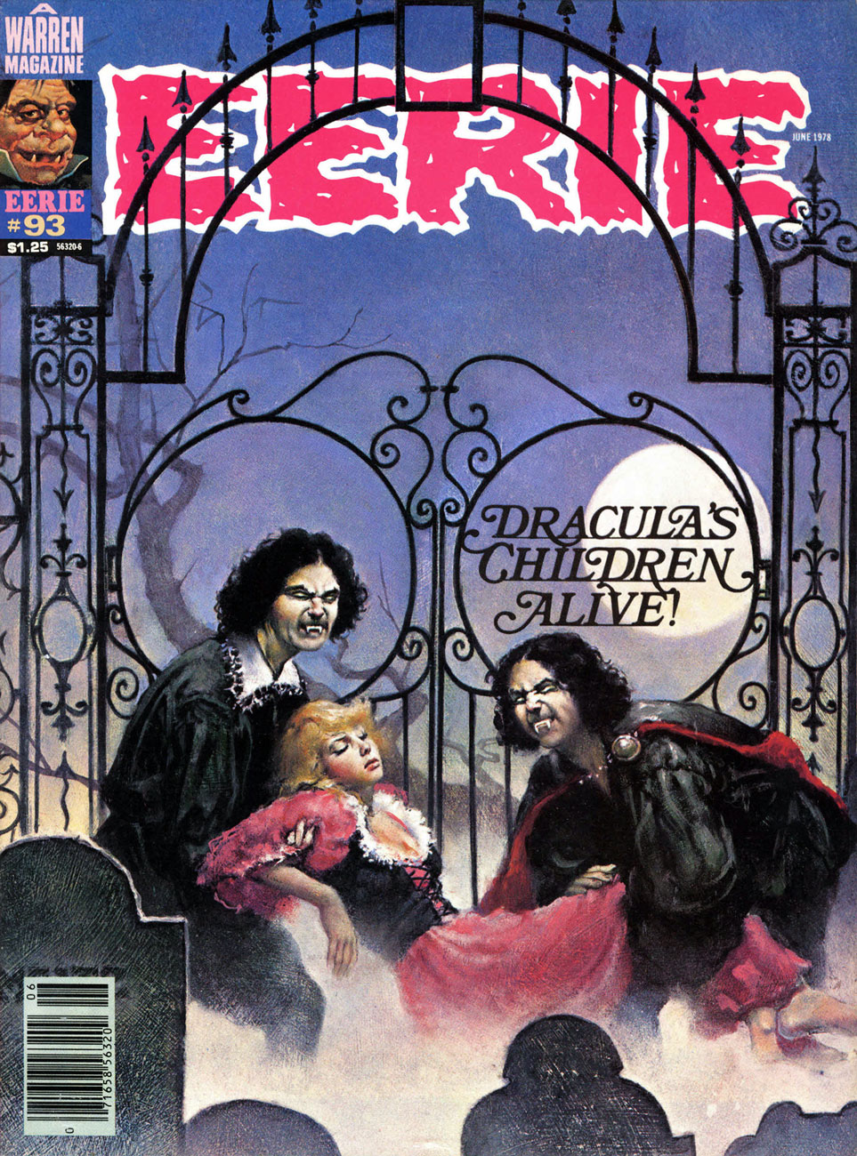
Though this one is to my mind the lesser entry in the parade, I must concede that it’s presented in exemplary fashion: the colour choices, the placement of the type, even the integration of that unholy blight, the bar code. This is Eerie no. 93 (June 1978, Warren).
Young master Maitz’s final Warren cover (chronologically speaking): this is Eerie no. 94 (Aug. 1978, Warren), illustrating Nicola Cuti and Leo Durañona‘s Honor and Blood. « Can the child born out of an unholy union between man and vampire grow up to lead a ‘normal’ life? You can’t escape the sins of your parents. Their errors ripple faintly down the generations! » “Er, what’s with the deer head?”, you may ask. The answer, from the story: « The bride was never to see the weak, corrupted face of her human husband. She wedded the Elk, symbol of the Beast. »
« A lowly elk, “symbol of the Beast”?Maaa, you’re just making shit up, Nick. » The feeling on that point seems, in fact, quite unanimous.
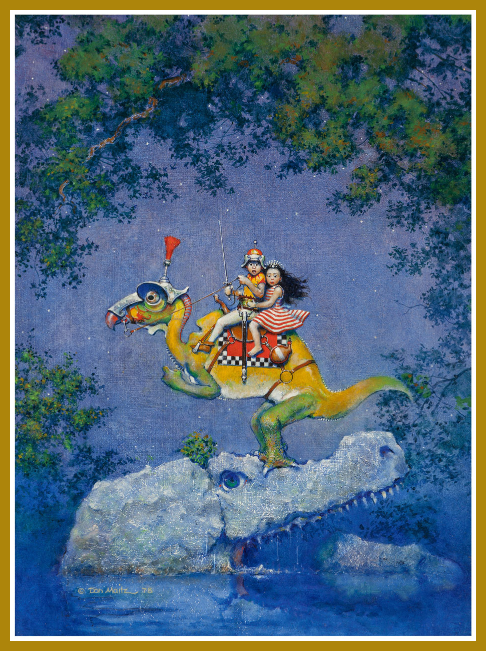
And here’s a privileged peek at Mr. Maitz’s Creepy 94 cover painting original (Mixed media on Masonite, 24” x 18”), which, as it turns out, is entitled Unsafe Footing, which makes me love it even more.
As a rum enthusiast, I am naturally aware of the Captain Morgan brand… whose mascot (circa 1982) is, as it happens, Maitz’s most familiar creation… to date. Prost!
By now, we have surely established that in the compendium of made-up monsters, tentacles are an artistic short-cut for evoking an especially terrifying creature. As it turns out, if there’s one way to make an already spine-chilling abomination even scarier, it’s to equip its gaping maw with teeth. Be it fangs borrowed from some unfortunate vampire, the implausibly symmetrical dentures of a TV show host, or clearly carnivorous, sharkish chompers, artists have been inserting teeth where no teeth should be long before you or I were born.
« But Grandmother! What big teeth you have! », once quipped Little Red Riding Hood in the 19th century, and this fear of teeth has clearly followed us into the Modern Age.Take a look —
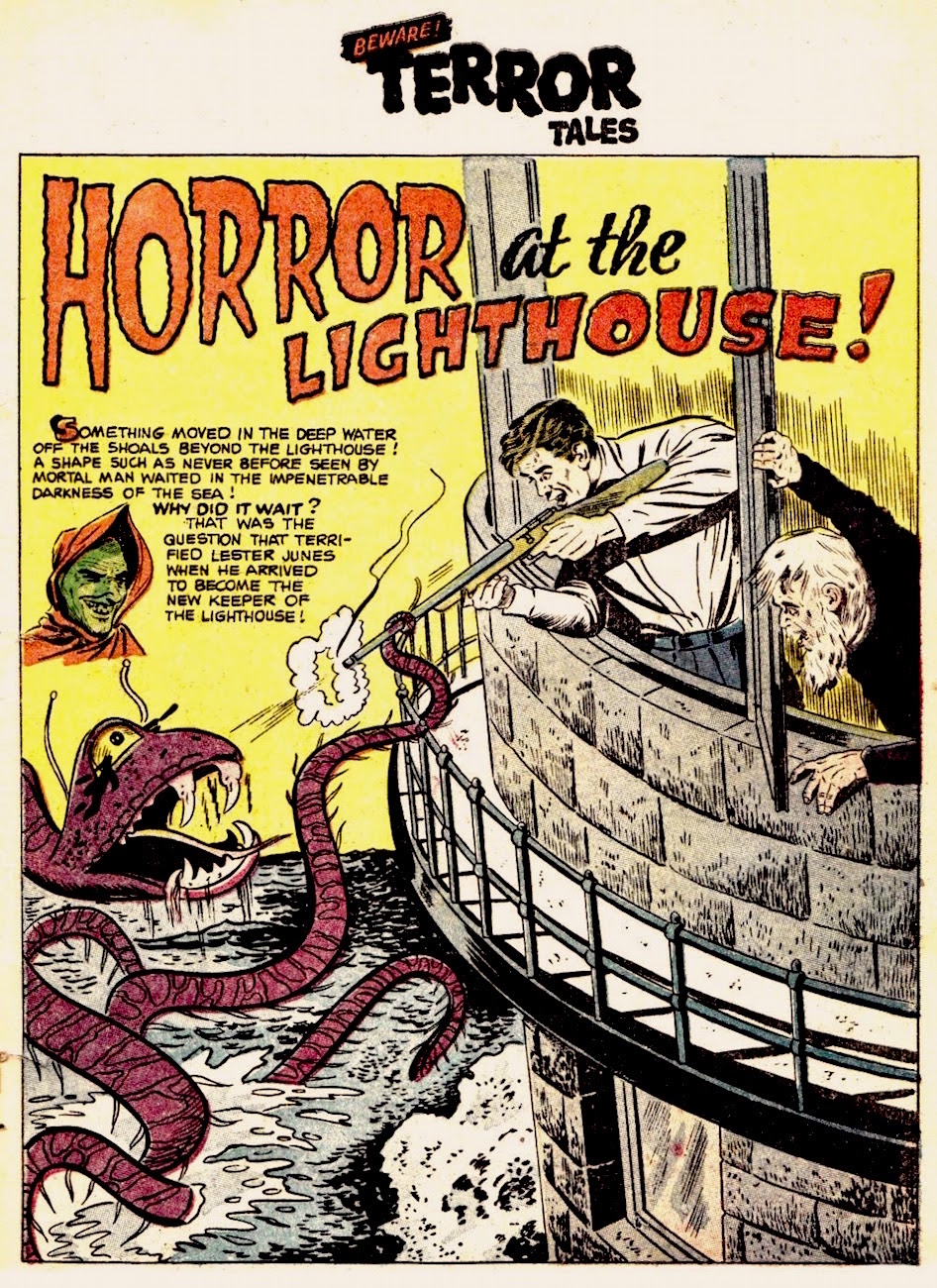
Sheldon Moldoff was probably thinking of a snake’s fangs when he came up with this cutie:
A page from Horror at the Lighthouse!, published in Beware! Terror Tales no. 6 (Fawcett Comics, March 1953). Scripted by Bill Woolfolk, drawn by Sheldon Moldoff. Read the full story at The Horrors of It All.
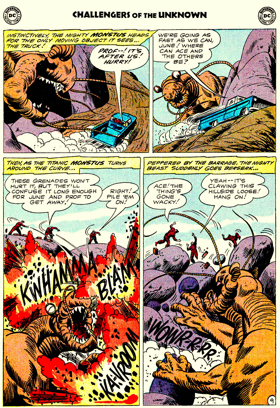
This cross between a dinosaur and a mole (or is that more of an ant?) boasts an enviable set of sparklingly white dentition:
Challengers of the Unknown no. 22 (Oct-Nov 1961), cover by Bob Brown.
Aw. You’d go “wacky”, too, if some jerk piled on grenades on you.
One thing you can say about tentacled monsters, it’s that they sure keep their denticulations (yes, it’s a word) impeccably clean. Maybe they choose their victims based on that, like cats gleefully enjoying the crunch of a good teeth-cleaning croquette?
Holy crap, look at those white chompers (that are about to get a little marred with blood, gristle and whatnot)! Weird Mystery Tales no. 9 (Dec 1973 – Jan 1974), cover by Luis Dominguez.
On the other hand, some monsters could have used a set of braces (this one is an orphan, which is why it had to make do with a British set of teeth).
Eerie no. 131 (June 1982), cover by Rudy Nebres. Can you imagine trying to chew anything with such a set?!
A somewhat similar (but a lot less overcrowded) set of ivories for gnawing and gnashing can be spotted in water:
A collectible card (from sometime in the 2000s) by illustrator Chet Phillips.Here you can admire his series about Japanese monsters, or visit his website, chetart.com.
This toothy post is now at its end – happy brushing (and flossing — it’s important!) to all, and ’til next Tentacle Tuesday!
~ ds
p.s. Not particularly related to comics, but I found this photograph distinctly on the side of scary:
Captioned « Women in London sit down for express teeth whitening ». I think they’re about to be transformed into aliens, or contaminated with some deadly germ, or perhaps just burnt to a crisp by some mysterious rays. Have I been reading too many comics?
You know how women aren’t advised to go out after dark, or to go to parties in revealing clothing because they might get raped and/or murdered? (This is purely a comic blog and we play nice, so I’m not developing that line of thought any further.) In the comic world, until relatively recently, that sort of thing couldn’t really be shown, but aren’t tentacles a rather handy stand-in for more realistic (and far scarier) violence? The only point I wish to state is that a woman can’t even go for a fucking walk without encountering tentacles. Swimming? Just forgetaboutit. Sitting quietly on a log? As long as you’re female, the tentacles will still find you, it scarcely matters whether you’re clad in a swimsuit, a gunny sack, or a parka. If the monster finds you a tad overdressed, it will just rip your clothing off – problem solved!
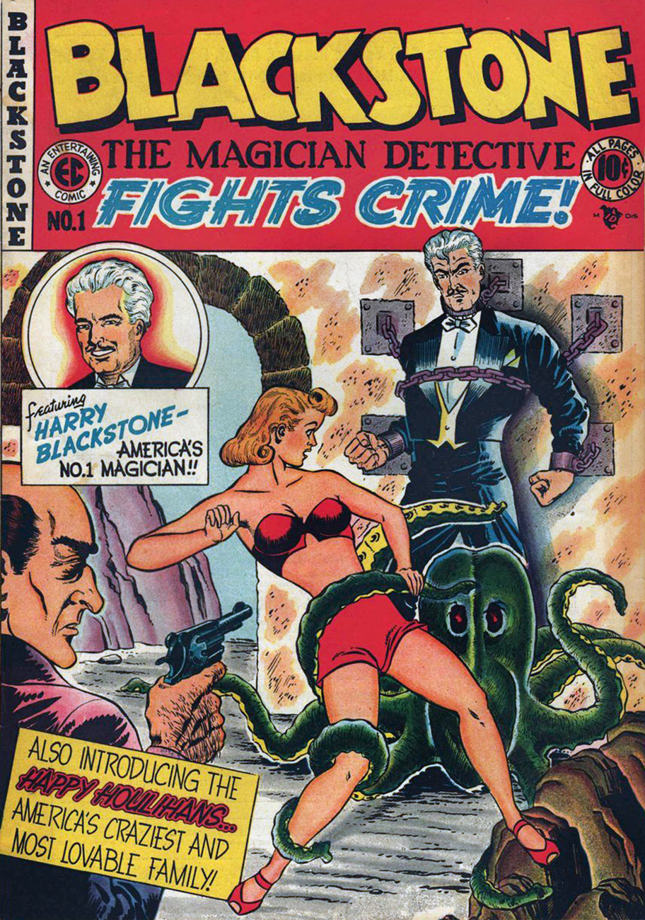
Blackstone no. 1 (Fall 1947, EC). Blackstone, Master Magician was created in 1946 by Elmer Cecil Stoner (1897-1969; one of the first black comic book artists!) for Vital Publications. The comic had a remarkably short life – one issue published by EC Comics (the one you’re currently looking at), and three more issues published by Timely. Somehow this was enough to spawn a radio series that aired from 1948 to 1950.
Stoner, who worked for a plethora of golden age companies (Timely, Fawcett, EC, Dell…) attracted some pretty heavy criticism in recent years. « Stoner’s drawing is the visual equivalent of fingernails scraped across a slate, and whenever he had a chance to botch the perspective, the composition, or even the inking, he did so with brio », opines Ron Goulart in his Great History of Comic Books. One could make the point that the above cover demonstrates this: the characters seem to be floating, not connected at all with one another or the landscape. However, whatever one thinks of his art, it has to be admitted even by the staunchest critic that Stoner was a pioneer who carved out a path for other African-American artists.
« On December 16, 1969, Elmer Stoner passed away. Since then he has been largely forgotten by the comic book industry and overlooked as a trailblazer. He was no Jackie Robinson, his presence in the comic industry didn’t alter its course. He did, however, pave the path for Al Hollingsworth, Matt Baker, Ezra Jackson, Cal Massey and for every African-American artist who followed. Stoner’s life is worthy of further exploration and his story deserving of wider recognition. He should not remain invisible. » |source, an article by Ken Quattro that’s well worth reading!|
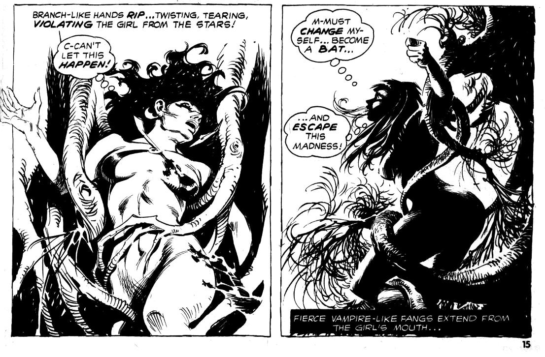
« Miriam and Hester were insane. They took the severed head of a dead man, and sewed it back onto his body. Then, they stripped away their clothes and conjured up a demon! » As usual, Vampirella stories make perfect sense. The Nameless Ravisher, scripted by Flaxman Loew and drawn by Leopold Sanchez, was published in Vampirella no. 40 (March 1975, Warren). Flaxman Loew, by the way, was the somewhat ridiculous nom-de-plume of British Mike Butterworth. His stories seemed to get criticized a lot in the letters’ section, so maybe he deliberately picked a moniker guaranteed to be misspelled. One thing’s for certain – he had a vicious streak, qualified by a fan as a “fizzy, nasty run”. Read the full issue here, if you must; I can’t recommend it.
Thank you for underlining the VIOLATING in the narration, Mr. Script Writer (what can you expect out of a man named Flaxman Loew?) – otherwise we would have never figured it out. This story also contains awe-inspiring quotes like « Vampirella! Rend her! Rip her! Now! », and « the water comes… and comes… ravishment by water…! »
You know how I said that swimming is not recommended unless you want a tentacular encounter? Do keep that in mind, especially with summer just around the bend:
Alpha Flight no. 14 (Marvel, September 1984). Cover by John Byrne. Co-admin RG would like to inform everyone that Lake Ontario is not teal-coloured. I’d rather take my chances with the octopus rather than be rescued by that horrible-looking man, but that’s just me (or Byrne’s so-called art).
A closer look at Heather’s rescuer:
Puck is a dwarf, okay, but why does it seem like Byrne has never seen an actual dwarf in his life?
A page from « Biology Class », scripted and drawn by John Byrne. So why doesn’t the athletically-minded Puck jump into the water instead of Heather? She tells him not to: « Stop! You know you can’t swim worth spit! » (Err…?) Is it just me, or do the “deep and dark waters of Lake Ontario” look like a swimming pool?
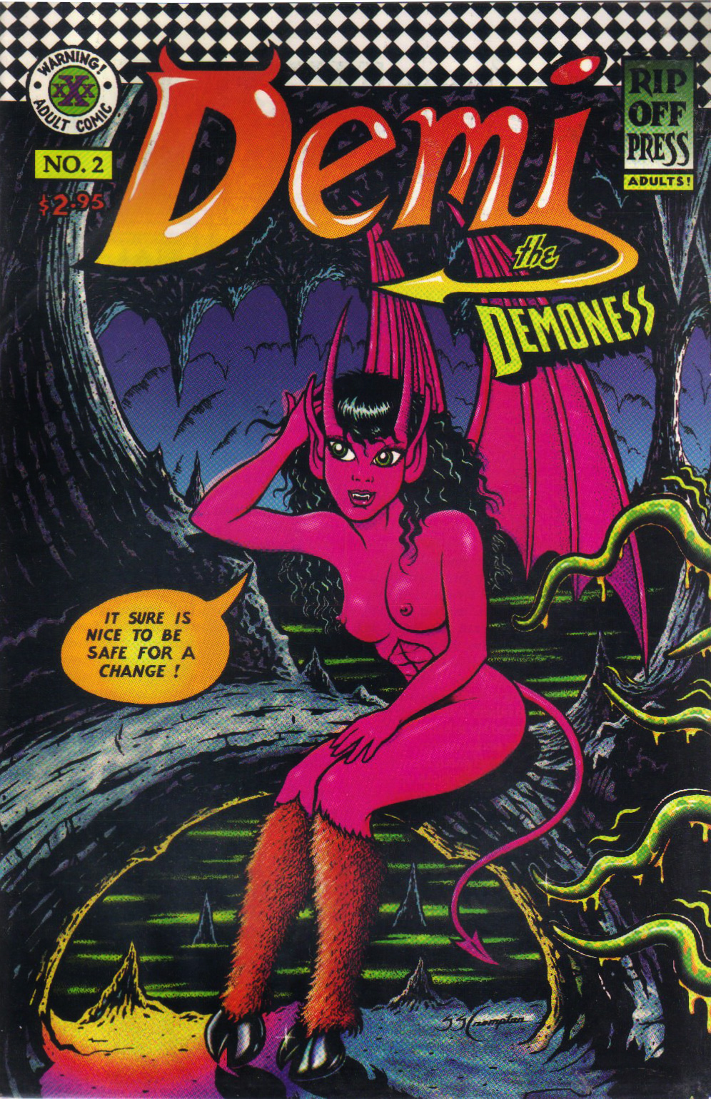
O, cute Demi with your gleaming hooves, beware of the quiet before the (sexy) storm! Demi the Demoness no. 2 (1993, Rip Off Press). The cover is by Demi’s Canadian creator, Steven S. Crompton.
Crompton’s art is not *great*, but it has definite charm: somewhat childlike and proudly cartoony, it underlines Demi’s innocence perfectly, her huge puppy eyes beckoning to the reader while she gets ravished by yet another toothy monster, well-endowed Pegasus, or frisky cat goddess. And I don’t mean to make it sound like she’s lying back and thinking of England, either – in most cases, she’s an enthusiastic participant in the sexy shenanigans.
« Over 35 different Demi the Demoness comics have been published. Numerous artists and authors have worked on Demi comics over the years, including Frank Brunner, Tim Vigil, Seppo Makinen, Philo, Ryan Vella, Gus Norman, Enrico Teodorani, Silvano, Diego Simone, Jay Allen Sanford, and many others. Demi has appeared in numerous comics crossovers with other characters, including Shaundra, Captain Fortune, Mauvette, Vampirooni, Cassiopeia the Witch, Djustine, Crimson Gash, and adult film stars Tracey Adams, Tabitha Stevens, Deja Sin, and Bonnie Michaels.» |source|
Page from « The cumming of Lamasthu », published in Demi the Demoness no. 4 (1994, Rip Off Press). Art by Steven S. Crompton.
Page from « The Cumming of Lamasthu », published in Demi the Demoness no. 4 (1994, Rip Off Press). Art by Steven S. Crompton.
You can read a dozen Demi issues on My Hentai Comics… the link is very much not safe for work, unless you work for a sex-obsessed Lord Cthulhu or something. But I can guaran-damn-tee a lot of tentacles!
Cadillacs and Dinosaurs no. 2 (March 1994, Topps). Cover by Dick Giordano, who shouldn’t have been let anywhere near Mark Schultz’ characters. I see the lizard has decided to photobomb this romantic scene (the skeleton guy is clearly about to drop Felicia into the murky swamp water.. that’s teal-coloured for some reason… hardly swampy!)
Inside, we get Blood and Bones, Part II: Swamp Things (scripted by Roy Thomas and drawn by Dick Giordano), a Mœbius 2-pager, a couple of pages of captioned Schultz dinosaur illustrations, and – just in time to save this issue from being thoroughly dreadful – Sailor, Take Warning!, scripted by Roy Thomas and drawn by Steve Stiles.
See? Definitely tentacles. Every self-respected brain has ’em.
Felicia’s pose looks distinctly unnatural, but she’s doing a good job of letting everyone know she has an impressive bust (a girl has priorities, even while unconscious). Giordano doesn’t seem to know that human hands curl up when at rest.
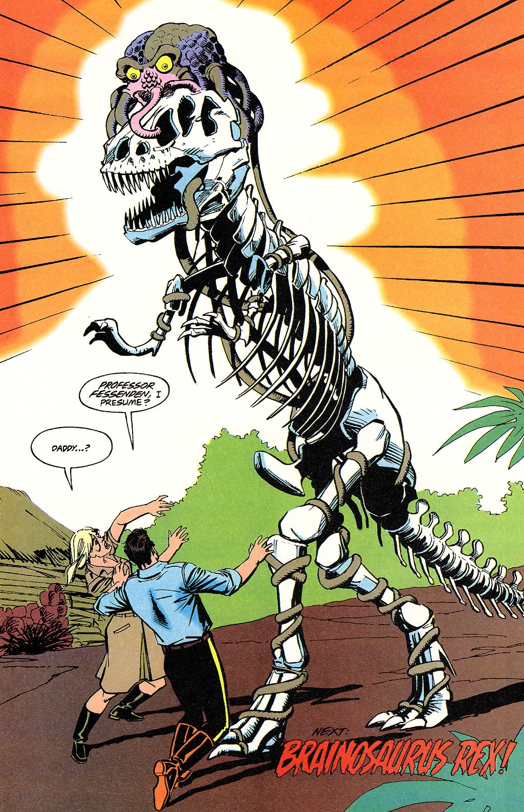
You know what Blood and Bones, Part II: Swamp Things has, aside from a suspiciously blue and limpid swamp? Dinosaurs. More specifically a T-Rex skeleton controlled by a brain with tentacles, who’s actually the father of one of the characters! It takes a Roy Thomas to cobble up such classic plots.
Maybe, instead of Brainosaurus Rex, he should have been called Daddysaurus, or maybe even Papasaurus Rex?
I hope I have impressed upon you the absolute necessity of caution when taking a stroll – whether your path lies next to a large body of water or leads through a forest. Above all, do not perch on a log when you need a rest, or lean against a tree. Hanging out with magicians is also not recommended.
Until next Tentacle Tuesday, I remain tentacularily yours…