« I am fond of pigs. Dogs look up to us. Cats look down on us. Pigs treat us as equals. » — Winston Churchill
Recently, I’d been drawing a blank as to the topic of my next post. So I did what one does in such distressing circumstances: I pulled something at random from the nearest bookshelf — just filled a couple of days earlier, conveniently.
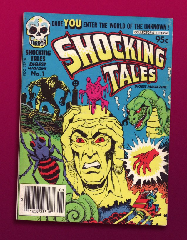
And it paid off: my hand landed upon a screwball, one-shot digest published by a near-defunct Harvey Comics. Its contents? A hodgepodge of 1950s horror and SF tales, including, for instance, Bob Powell‘s classic Colorama (1953) and some of his Man in Black (1957-58) stories. Ninety-five cents well spent.
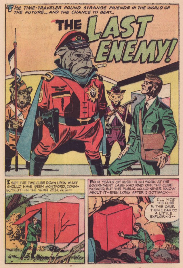
The finest riches in dem dar hills, however, consist in some rather obscure — given its regal pedigree — Jack Kirby material from the late 1950s, reportedly written, pencilled and inked by The King.
However, given the dodgy printing quality of a comics digest, I had to pull out my second-oldest Kirby Komic (the most ancient being December 1952’s Black Magic no. 5 — read it here!) and very, very carefully scan the relevant pages. Oh, the sacrifices I make for this blog! 😉
.
.
.
.
.
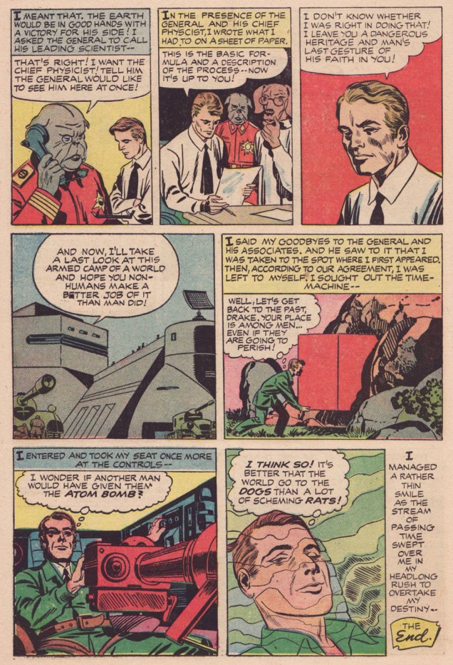
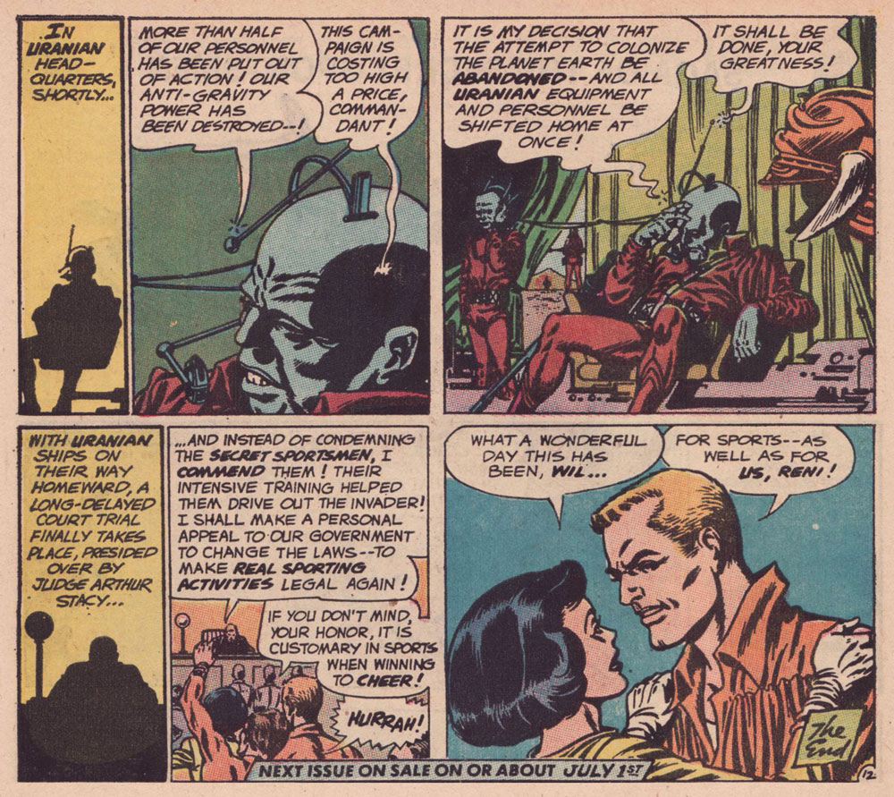
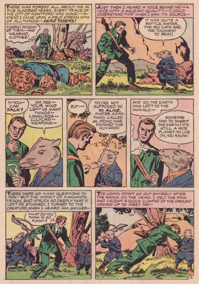
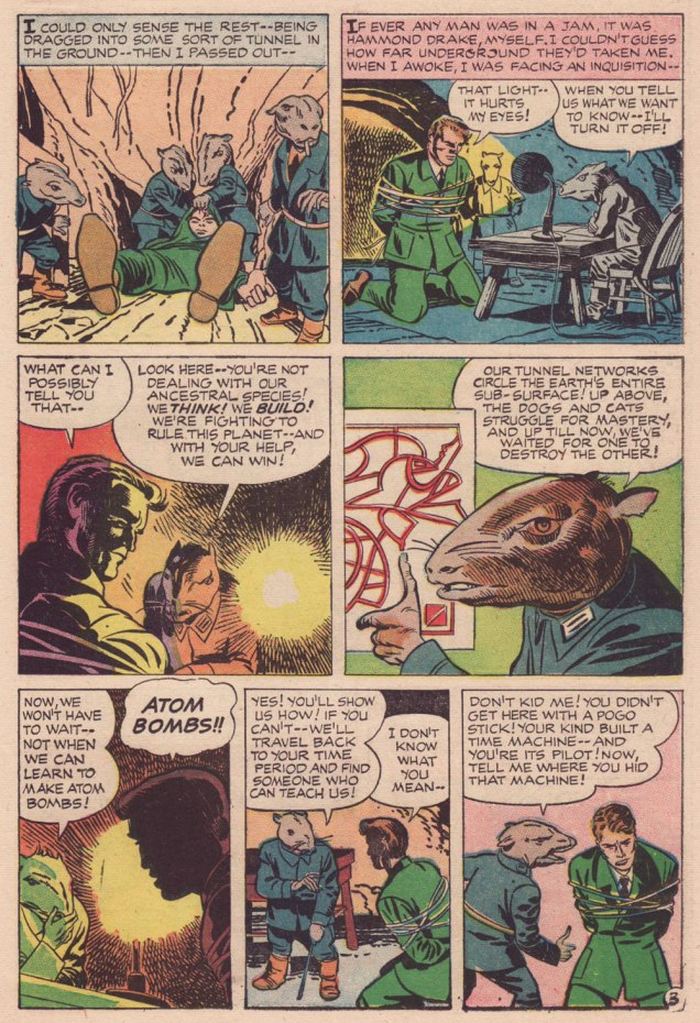
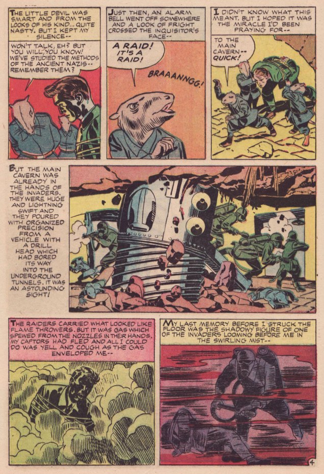
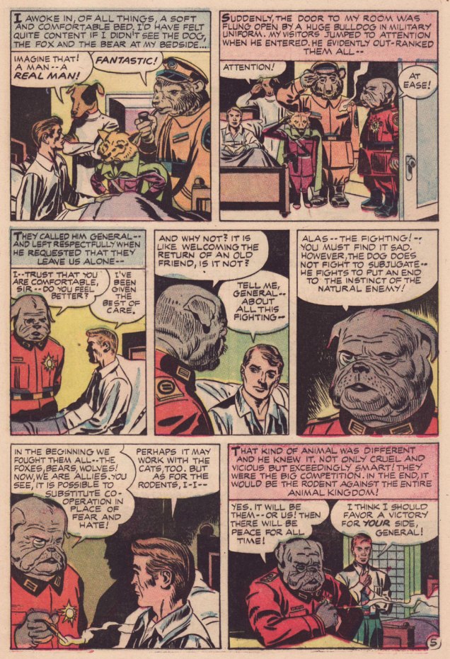
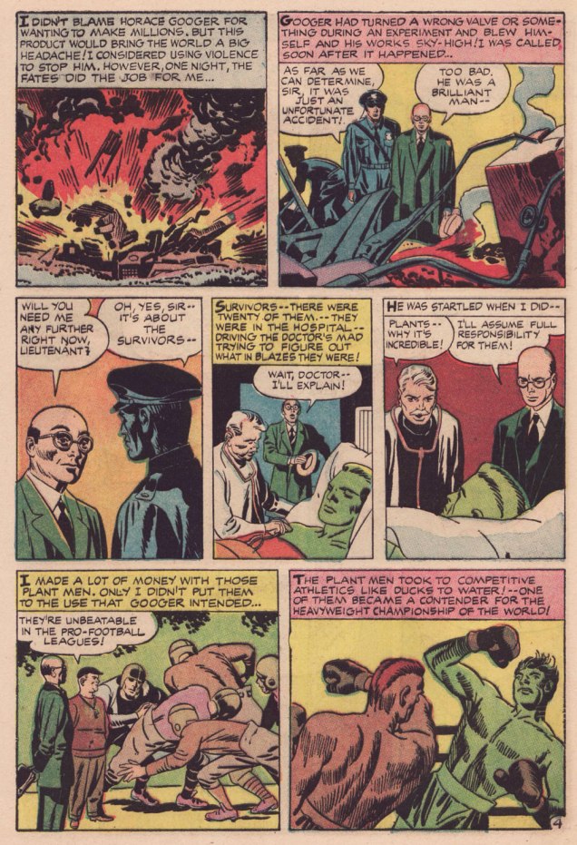
Kirby has often been unfairly slagged for ‘riffing on’ the popular Planet of the Apes franchise, but The Last Enemy predates the 1968 film’s source, Pierre Boulle‘s 1963 novel La planète des singes by some six years… and besides, the ‘animals taking over’ theme has a long history in science-fiction. To name but a pair of antecedents, there’s Lester Del Ray‘s The Faithful (from 1938) and Clifford Simak‘s City (linked stories published between 1944 and 1951 and amalgamated in 1952).
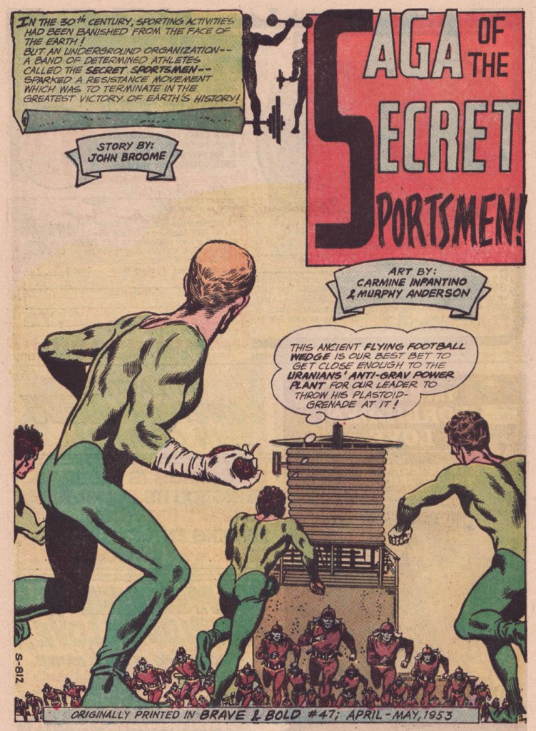
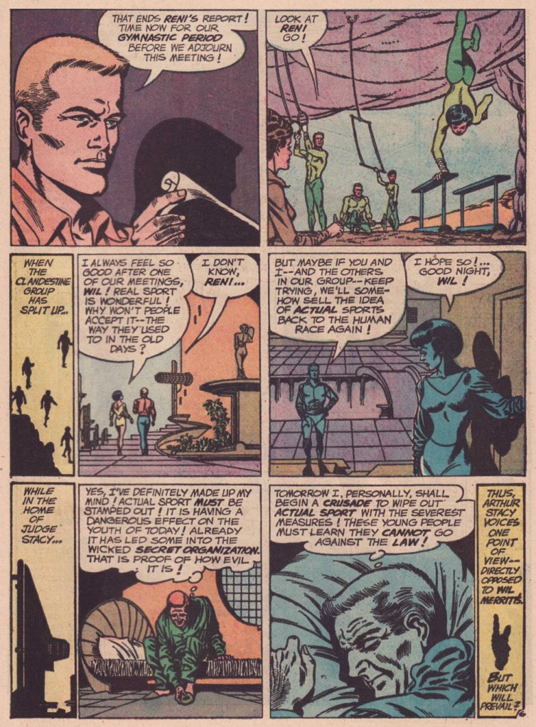
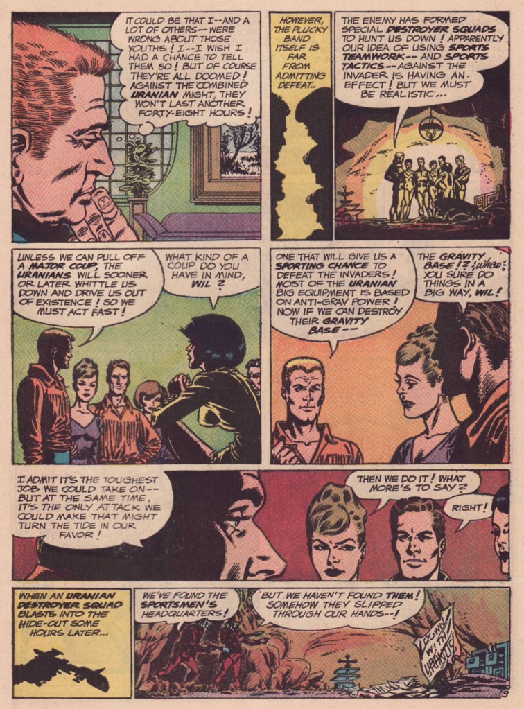
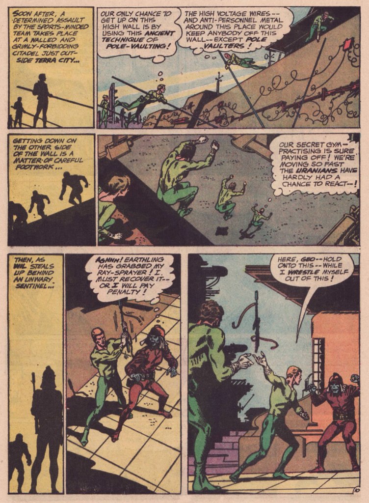
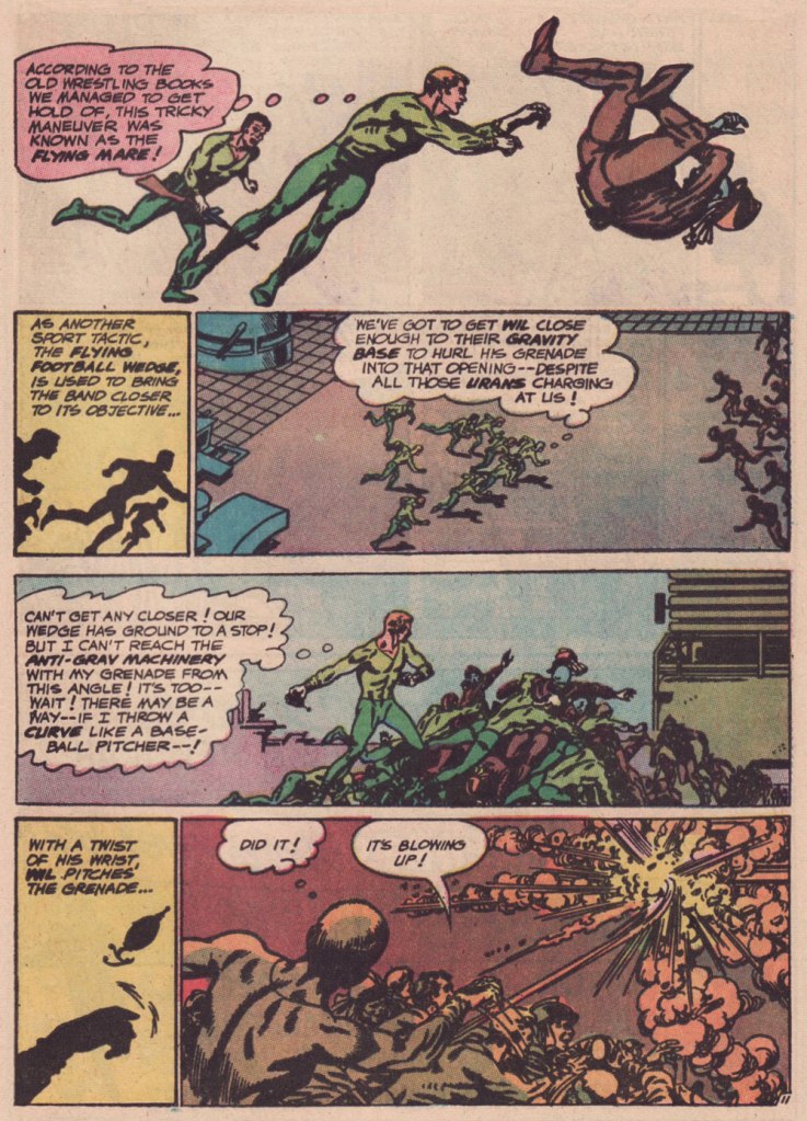
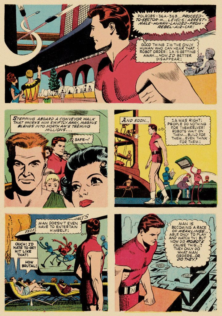
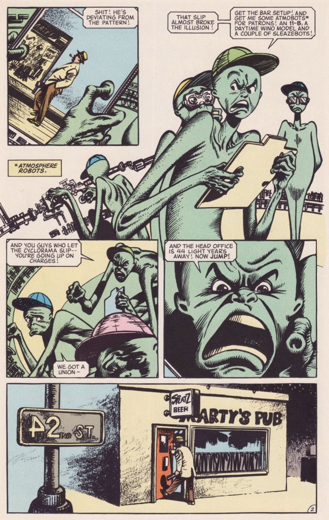
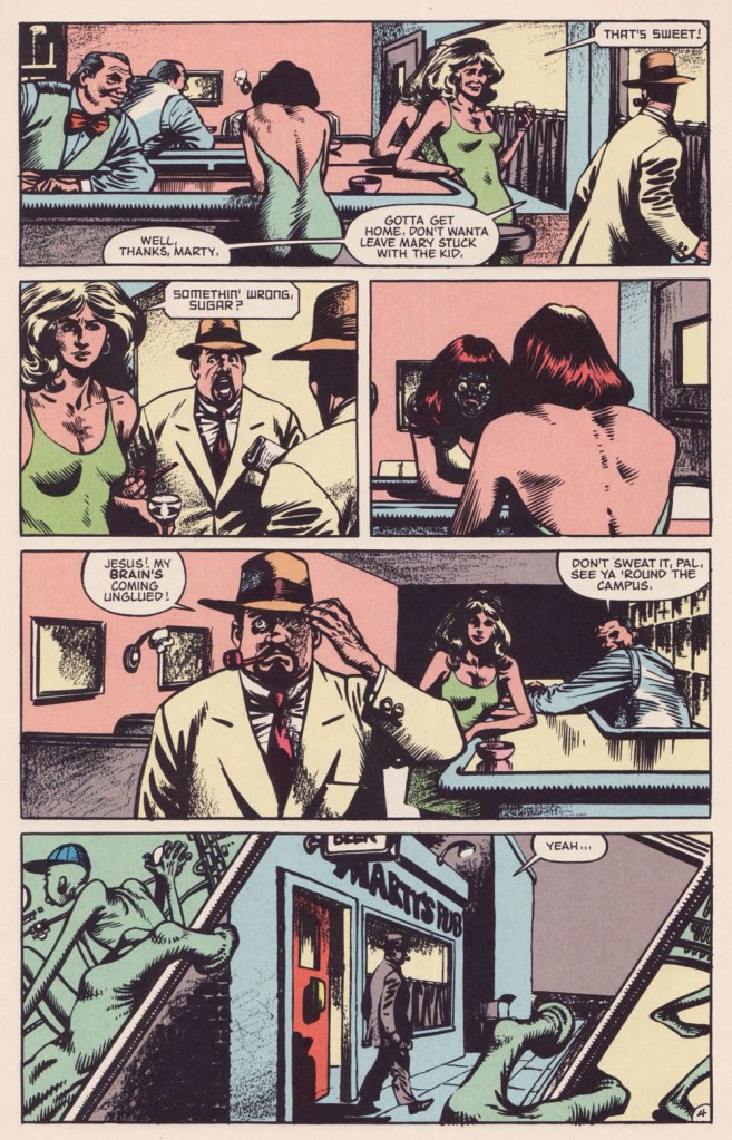
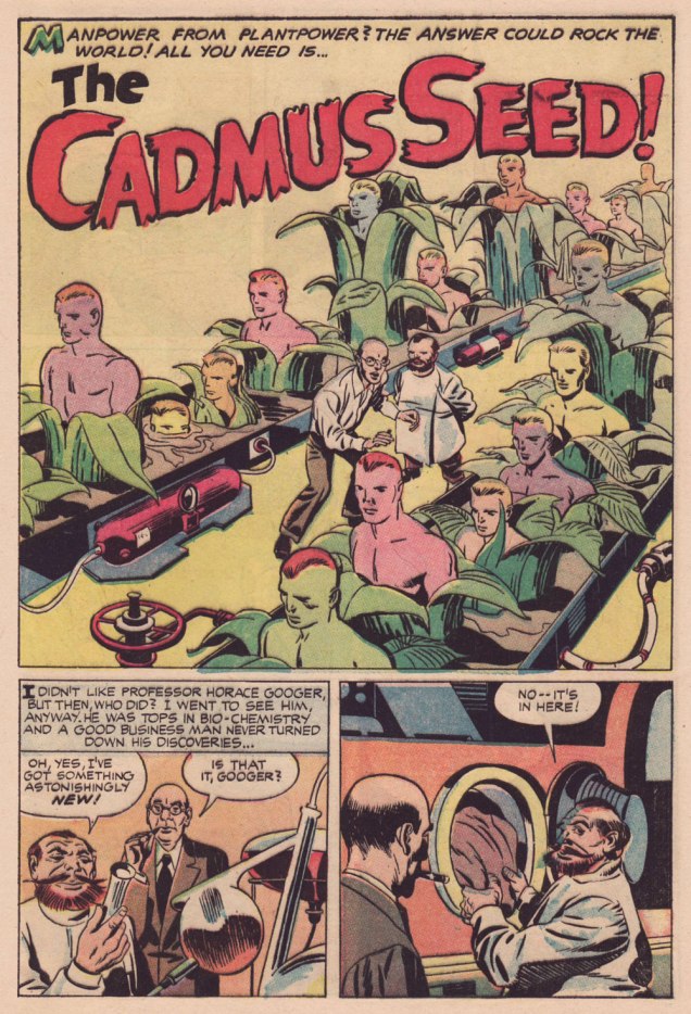
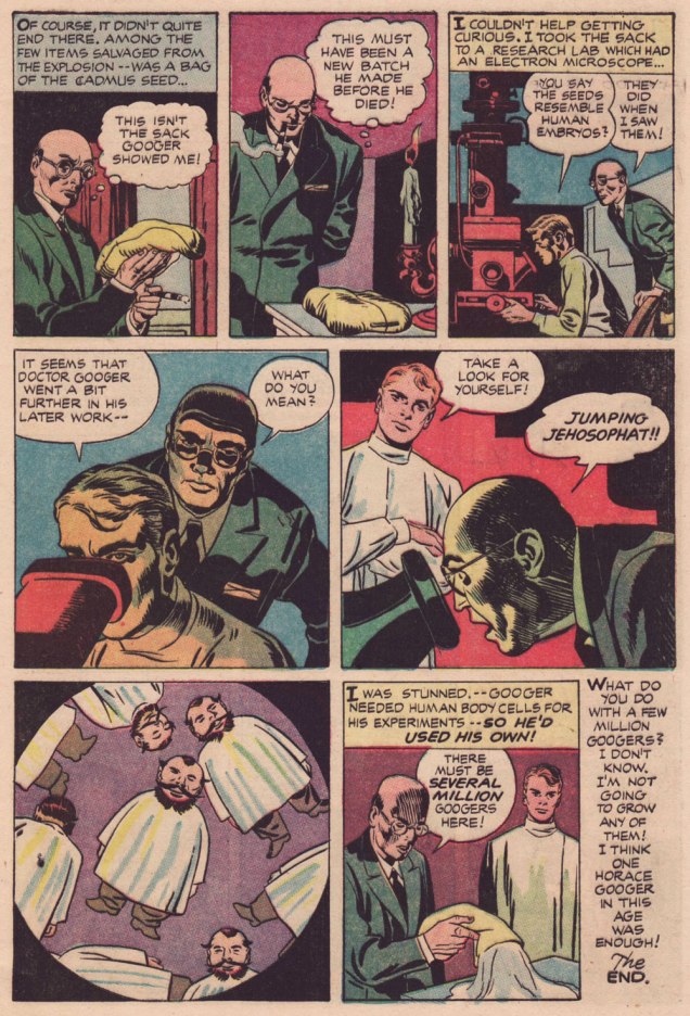
Here’s a second story, which I like even better, thanks to its humorous touches. Several of its plot ideas could have been expanded upon in OMAC, had Kirby been granted time and opportunity.
.
.
.
.
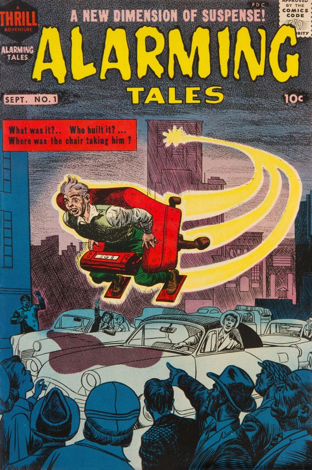
Both yarns appeared in this jam-packed. all-in-colour-for-a-dime wonder, Alarming Tales no. 1 (Sept. 1957, Harvey). I was fortunate enough to pick up a copy for peanuts, eons ago — but fret not, you can read it gratis right here.
-RG