« What is it about me, Pops? Am I different than normal people? »
One (more) thing I’ve learned in this world is that the vast majority of people, from the man or woman in the checkout line to the hard core of comics aficionados… can’t tell Archie artists apart, let alone name any of them.
If you scratch deep enough, one name will come up, like pebbles from a fallow field: Dan DeCarlo. I’m reminded of the annual restaurant poll a local alternative weekly used to hold: McDonald’s unfailingly took its category in a landslide, because of its ubiquitous familiarity. And so it is with Archie artists: DeCarlo must be the best because… well, that’s what we’ve always been told.
If you ask me, much of his peers’ work gets attributed to him. For instance, check out our gallery of Bob White covers. That Archie’sMad House no. 27 cover, in particular…
WOT’s pick for top artist on the Archie totem is handily Samm Schwartz (1920 – 1997). He’s easily the smoothest, most inventive storyteller in the Archie universe. Despite his skill as a cover designer during Archie’s best years (1959-1965, a figure proposed by cartoonist-scholar Seth and worth carving in stone), there were no Schwartz covers chez Archie after 1965.
The likely reason? In ’65, Schwartz was hired away by Wally Wood‘s Tower Comics (by managing editor Harry Shorten, a former Archie writer-editor) to serve as their art director. While there, he conceived Tower’s relatively prolific teen humour line, featuring Tippy Teen, Go-Go and Animal, and Teen-In, often glibly dismissed as “Archie clones“, by people who clearly haven’t read the work. We’ll return to these eventually.
Now comes the clincher: Schwartz in turn hired some of his former Archie colleagues to pitch in (presumably at higher page rates); DeCarlo (a handful of stories in early issues of Tippy Teen), Harry Lucey (a decent batch, actually) and reportedly Bob White (no sign of him, though). But the bulk of the work was done by Schwartz and future Archie artist Doug Crane.
Now the Archie people didn’t like this one bit; it was a clear case of sedition, a threat to their tidy little work camp system. After the industry’s near-collapse in the mid-1950s, there weren’t a lot of options in the tight-knit little club that remained; let’s not forget that even Jack Kirby was driven to such humbling desperation in the early 1960s. It was all too easy to be blackballed. The Goldwater clan, Archie’s reigning dynasty, took careful note of Schwartz’s break for freedom and the names of his accomplices. After Tower called it a day in 1969, Schwartz went to DC for a year, but it didn’t take. He was forced to return to Archie, which certainly suited the publisher since Schwartz’s signature title, Jughead, had been wilting away in his absence.
The terms of his return are unknown… but against all odds, Samm proceeded to create the finest work of his career, pencilling, inking and lettering hundreds of inspired Jughead stories until, well, until he couldn’t any more. But no covers, considered a plum job: these went exclusively to DeCarlo (with an occasional Lucey) and later to versatile mediocrity Stan Goldberg, aping DeCarlo’s style and random design sense*.
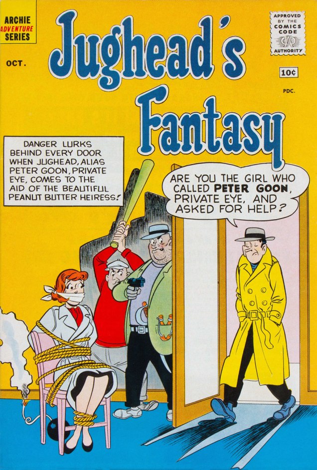
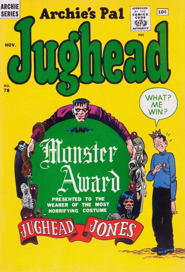
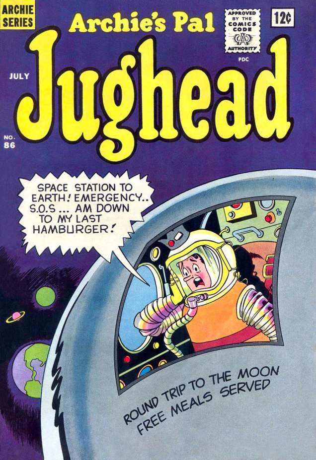
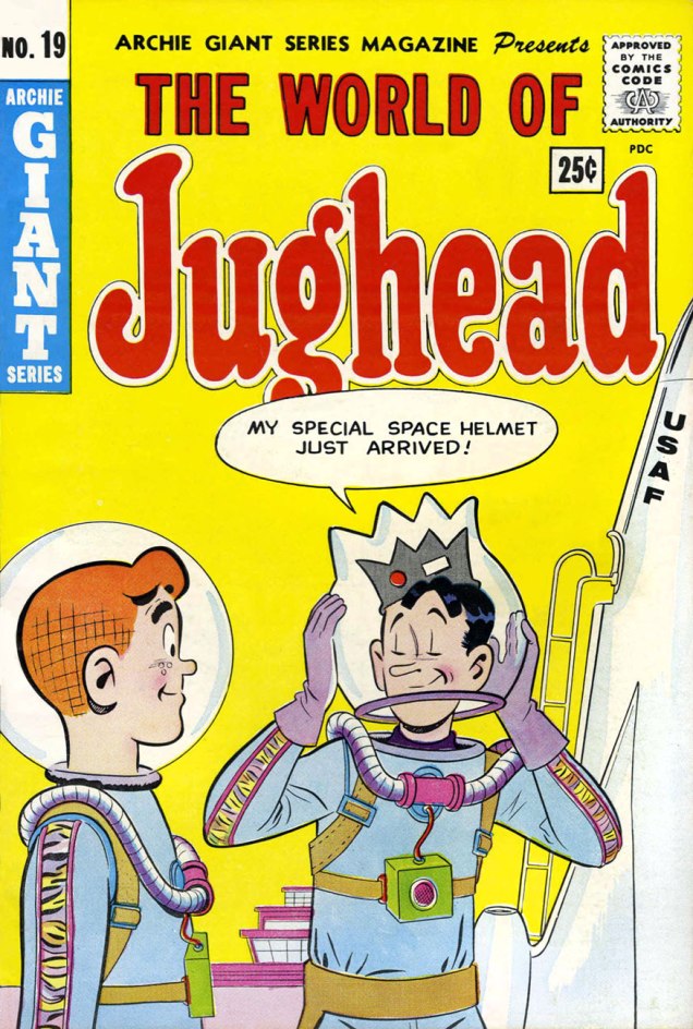
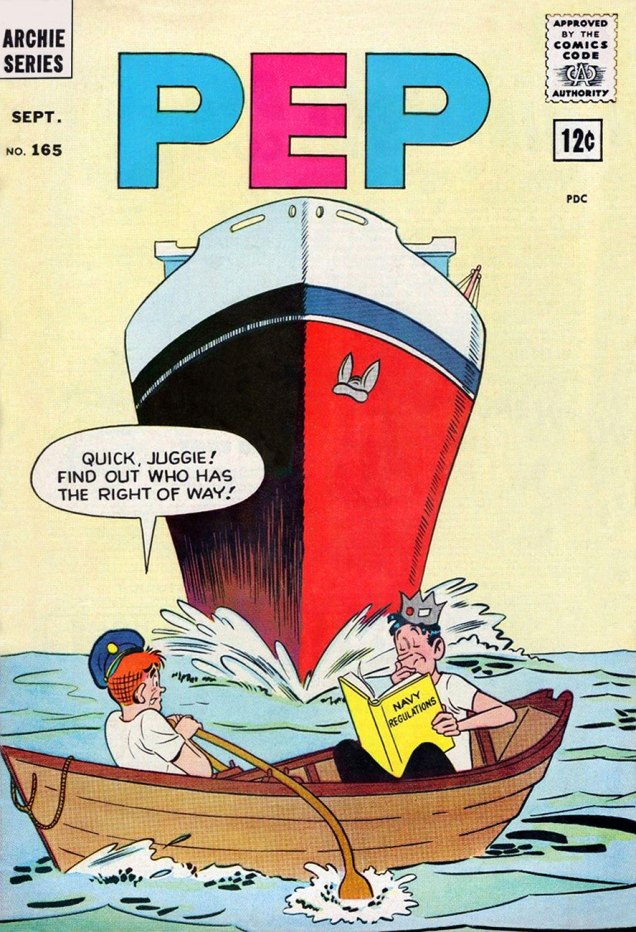
Jughead’s Fantasy no. 2 (Oct. 1960); a parody of the excellent 1958-61 detective show… and yes, Peter Gunn did get conked on the head an awful lot.Archie’s Pal Jughead no. 78 (Nov. 1961)Archie’s Pal Jughead no. 81 (Feb. 1962). Check out Reggie’s body language, in particular.Archie Giant Series Magazine no. 17 (Archie’s Jokes, Summer 1962). There goes Archie, into the next county.Laugh Comics no. 136 (July 1962)Archie’s Pal Jughead no. 86 (July 1962)Archie’s Pal Jughead no. 89 (Oct. 1962)Er, interesting choice of space pioneers, USAF. Could this mission be some sort of tax dodge? Perhaps Mr. Lodge has a financial stake in it, and gently “suggested” Archie for the possibly one-way trip. Archie Giant Series Magazine no. 19 (World of Jughead, Dec. 1962)Pep no. 165 (Sept. 1963). My college graphic design teacher told our class that a poster should be “One Angry Fist”, which certainly applies to comic book covers, and this is a fine, fine example of making the most of a format.Archie’s Mad House no. 33 (June 1964)Archie’s Girls Betty and Veronica no. 102 (June 1964). The new, definitely not improved cover layout of the Archie line rears its homely head.Mr. Samm Schwartz, date unknown, though the cars should certainly serve as a clue.
To quote his daughter, Joanne Colt, from the introduction of 2011’s The Best of Samm Schwartz (it isn’t, but it’s pretty good): « He drew for Archie until his death on November 13, 1997, my birthday. There was an unfinished story on his drawing board. »
-RG
*the way I see it, the difference between a Bob White or a Samm Schwartz cover and a DeCarlo is the difference between a considered, effective layout and the act of pointing a camera at random and snapping the shutter. To be fair to DeCarlo, his girlie cartoons for Martin Goodman’s Humorama were excellent, and his first half-decade at Archie (60-65) was fine… then the company wore him down into a sad hack and the unfortunate protagonist-victim of a cautionary tale.
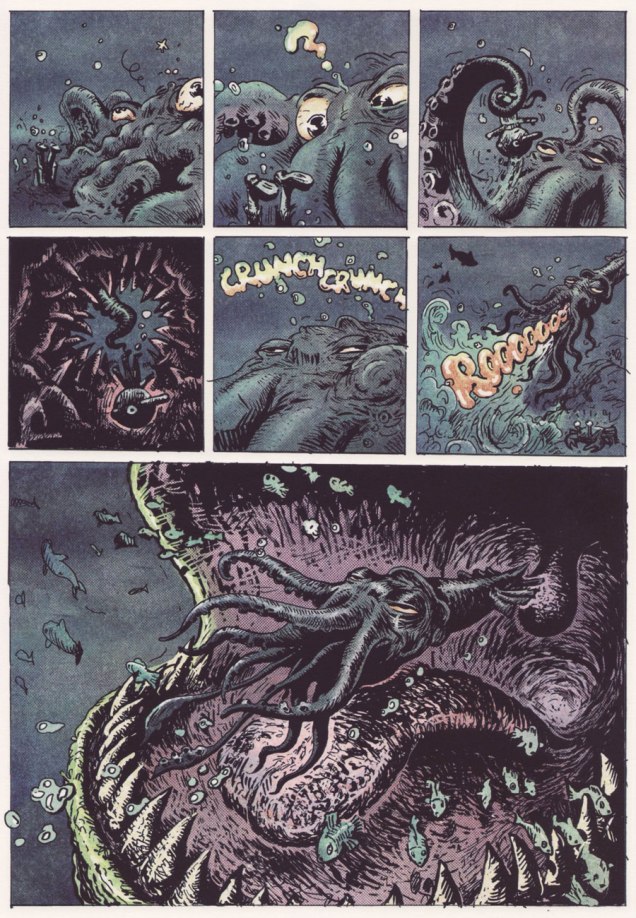
You know how women aren’t advised to go out after dark, or to go to parties in revealing clothing because they might get raped and/or murdered? (This is purely a comic blog and we play nice, so I’m not developing that line of thought any further.) In the comic world, until relatively recently, that sort of thing couldn’t really be shown, but aren’t tentacles a rather handy stand-in for more realistic (and far scarier) violence? The only point I wish to state is that a woman can’t even go for a fucking walk without encountering tentacles. Swimming? Just forgetaboutit. Sitting quietly on a log? As long as you’re female, the tentacles will still find you, it scarcely matters whether you’re clad in a swimsuit, a gunny sack, or a parka. If the monster finds you a tad overdressed, it will just rip your clothing off – problem solved!
Blackstone no. 1 (Fall 1947, EC). Blackstone, Master Magician was created in 1946 by Elmer Cecil Stoner (1897-1969; one of the first black comic book artists!) for Vital Publications. The comic had a remarkably short life – one issue published by EC Comics (the one you’re currently looking at), and three more issues published by Timely. Somehow this was enough to spawn a radio series that aired from 1948 to 1950.
Stoner, who worked for a plethora of golden age companies (Timely, Fawcett, EC, Dell…) attracted some pretty heavy criticism in recent years. « Stoner’s drawing is the visual equivalent of fingernails scraped across a slate, and whenever he had a chance to botch the perspective, the composition, or even the inking, he did so with brio », opines Ron Goulart in his Great History of Comic Books. One could make the point that the above cover demonstrates this: the characters seem to be floating, not connected at all with one another or the landscape. However, whatever one thinks of his art, it has to be admitted even by the staunchest critic that Stoner was a pioneer who carved out a path for other African-American artists.
« On December 16, 1969, Elmer Stoner passed away. Since then he has been largely forgotten by the comic book industry and overlooked as a trailblazer. He was no Jackie Robinson, his presence in the comic industry didn’t alter its course. He did, however, pave the path for Al Hollingsworth, Matt Baker, Ezra Jackson, Cal Massey and for every African-American artist who followed. Stoner’s life is worthy of further exploration and his story deserving of wider recognition. He should not remain invisible. » |source, an article by Ken Quattro that’s well worth reading!|
« Miriam and Hester were insane. They took the severed head of a dead man, and sewed it back onto his body. Then, they stripped away their clothes and conjured up a demon! » As usual, Vampirella stories make perfect sense. The Nameless Ravisher, scripted by Flaxman Loew and drawn by Leopold Sanchez, was published in Vampirella no. 40 (March 1975, Warren). Flaxman Loew, by the way, was the somewhat ridiculous nom-de-plume of British Mike Butterworth. His stories seemed to get criticized a lot in the letters’ section, so maybe he deliberately picked a moniker guaranteed to be misspelled. One thing’s for certain – he had a vicious streak, qualified by a fan as a “fizzy, nasty run”. Read the full issue here, if you must; I can’t recommend it.Thank you for underlining the VIOLATING in the narration, Mr. Script Writer (what can you expect out of a man named Flaxman Loew?) – otherwise we would have never figured it out. This story also contains awe-inspiring quotes like « Vampirella! Rend her! Rip her! Now! », and « the water comes… and comes… ravishment by water…! »
You know how I said that swimming is not recommended unless you want a tentacular encounter? Do keep that in mind, especially with summer just around the bend:
Alpha Flight no. 14 (Marvel, September 1984). Cover by John Byrne. Co-admin RG would like to inform everyone that Lake Ontario is not teal-coloured. I’d rather take my chances with the octopus rather than be rescued by that horrible-looking man, but that’s just me (or Byrne’s so-called art).
A closer look at Heather’s rescuer:
Puck is a dwarf, okay, but why does it seem like Byrne has never seen an actual dwarf in his life?
A page from « Biology Class », scripted and drawn by John Byrne. So why doesn’t the athletically-minded Puck jump into the water instead of Heather? She tells him not to: « Stop! You know you can’t swim worth spit! » (Err…?) Is it just me, or do the “deep and dark waters of Lake Ontario” look like a swimming pool?
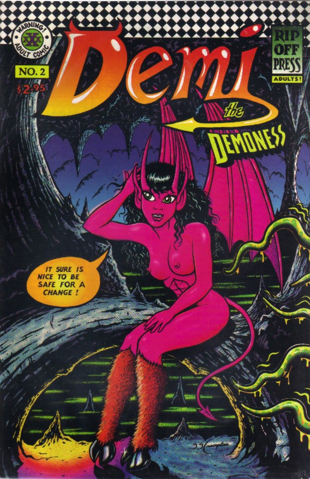
O, cute Demi with your gleaming hooves, beware of the quiet before the (sexy) storm! Demi the Demoness no. 2 (1993, Rip Off Press). The cover is by Demi’s Canadian creator, Steven S. Crompton.
Crompton’s art is not *great*, but it has definite charm: somewhat childlike and proudly cartoony, it underlines Demi’s innocence perfectly, her huge puppy eyes beckoning to the reader while she gets ravished by yet another toothy monster, well-endowed Pegasus, or frisky cat goddess. And I don’t mean to make it sound like she’s lying back and thinking of England, either – in most cases, she’s an enthusiastic participant in the sexy shenanigans.
« Over 35 different Demi the Demoness comics have been published. Numerous artists and authors have worked on Demi comics over the years, including Frank Brunner, Tim Vigil, Seppo Makinen, Philo, Ryan Vella, Gus Norman, Enrico Teodorani, Silvano, Diego Simone, Jay Allen Sanford, and many others. Demi has appeared in numerous comics crossovers with other characters, including Shaundra, Captain Fortune, Mauvette, Vampirooni, Cassiopeia the Witch, Djustine, Crimson Gash, and adult film stars Tracey Adams, Tabitha Stevens, Deja Sin, and Bonnie Michaels.» |source|
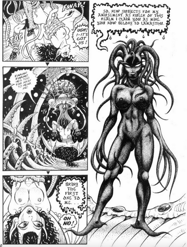
Page from « The cumming of Lamasthu », published in Demi the Demoness no. 4 (1994, Rip Off Press). Art by Steven S. Crompton.Page from « The Cumming of Lamasthu », published in Demi the Demoness no. 4 (1994, Rip Off Press). Art by Steven S. Crompton.
You can read a dozen Demi issues on My Hentai Comics… the link is very much not safe for work, unless you work for a sex-obsessed Lord Cthulhu or something. But I can guaran-damn-tee a lot of tentacles!
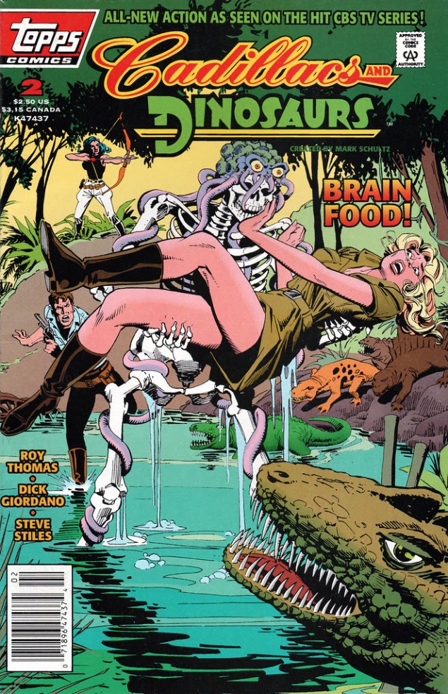
Cadillacs and Dinosaurs no. 2 (March 1994, Topps). Cover by Dick Giordano, who shouldn’t have been let anywhere near Mark Schultz’ characters. I see the lizard has decided to photobomb this romantic scene (the skeleton guy is clearly about to drop Felicia into the murky swamp water.. that’s teal-coloured for some reason… hardly swampy!)
Inside, we get Blood and Bones, Part II: Swamp Things (scripted by Roy Thomas and drawn by Dick Giordano), a Mœbius 2-pager, a couple of pages of captioned Schultz dinosaur illustrations, and – just in time to save this issue from being thoroughly dreadful – Sailor, Take Warning!, scripted by Roy Thomas and drawn by Steve Stiles.
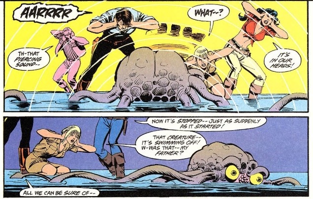
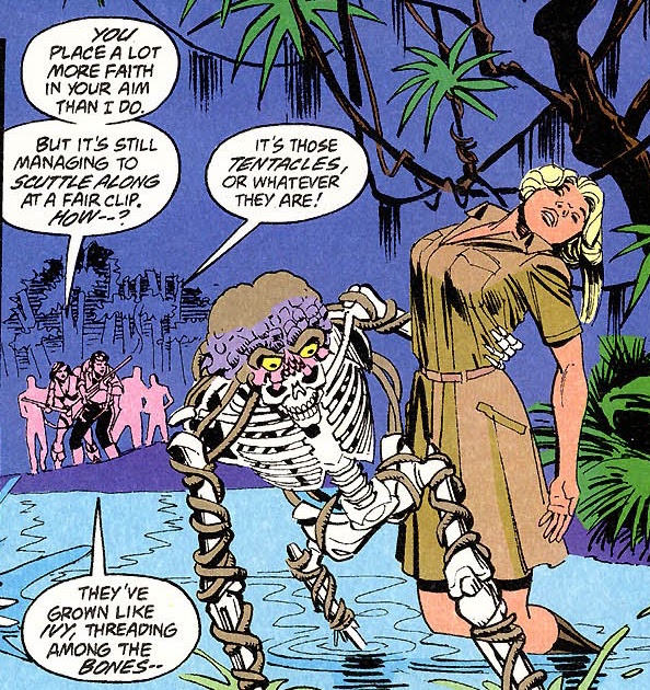
See? Definitely tentacles. Every self-respected brain has ’em.Felicia’s pose looks distinctly unnatural, but she’s doing a good job of letting everyone know she has an impressive bust (a girl has priorities, even while unconscious). Giordano doesn’t seem to know that human hands curl up when at rest.
You know what Blood and Bones, Part II: Swamp Things has, aside from a suspiciously blue and limpid swamp? Dinosaurs. More specifically a T-Rex skeleton controlled by a brain with tentacles, who’s actually the father of one of the characters! It takes a Roy Thomas to cobble up such classic plots.
Maybe, instead of Brainosaurus Rex, he should have been called Daddysaurus, or maybe even Papasaurus Rex?
I hope I have impressed upon you the absolute necessity of caution when taking a stroll – whether your path lies next to a large body of water or leads through a forest. Above all, do not perch on a log when you need a rest, or lean against a tree. Hanging out with magicians is also not recommended.
Until next Tentacle Tuesday, I remain tentacularily yours…
« Everybody thinks that this civilization has lasted a very long time but it really does take very few grandfathers’ granddaughters to take us back to the dark ages. » — Gertrude Stein
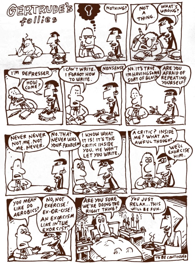
Several years ago, while browsing in the comics section of a rather lousy bookstore (by which I mean a book shop in which none of the employees know a thing about books, let alone are actual readers… I suspect that this is becoming more common, with predictable results), I stumbled upon an oddball item, a faded-looking, obscure comic strip collection lost amidst the monotonous stacks of DC ‘n’ Marvel superhero fare and the perennial dusty Garfield and Doonesbury paperbacks.
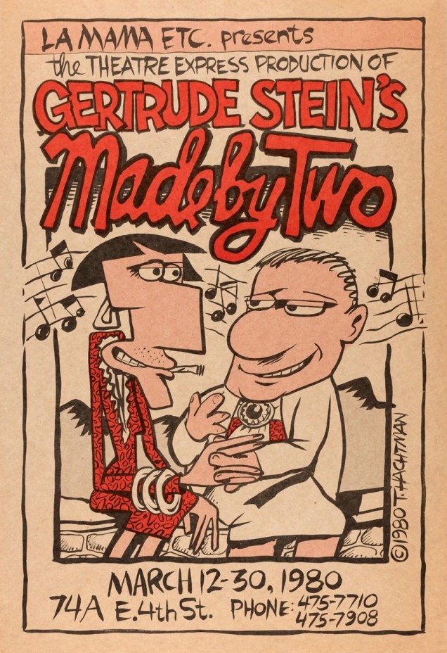
This was Fun City (1985), the second recueilof Tom Hachtman‘s newspaper strip Gertrude’s Follies, which at the peak of its circulation appeared in… well, one paper, but a good one, at least. That was the SoHo Weekly News (1973-82). After the weekly’s demise, a handful of episodes appeared in the fast-fading National Lampoon. Much, much later (which is to say currently) the strip lives on within the pages of American Bystander, an astonishingly well-staffed humour magazine. I smell doom.
Anyway, here’s Hachtman’s recollection of the strip’s genesis, from a 1980 interview conducted by Maxine Fisher for Funnyworld no. 22 (”The world of Animated Films and Comic Art”):
TH: I knew of them, but I didn’t know much about them. And then I saw a photograph of them [by none other than Man Ray] sitting in a room at the home on the rue de Fleurus in Paris. I looked at this famous lesbian couple sitting across from one another — so far apart– and I thought: ”Look at that! One of them is fat, and the other one’s skinny. That’s funny. They’re just like a comedy routine. I wonder if they had any fun.” It didn’t look like they were having any fun in that picture; they just looked like they were posing for a picture. But I thought: ”maybe they ran around and had lots of fun.” So I started drawing pictures of them, and drawing pictures of their friend Pabs, and looking at pictures of them, and looking at pictures of Picasso.
Anyway, I started drawing Gertrude and Alice and Pabs and Hemingway and putting them into situations in my sketchbook.
I knew if would make a nice comic strip in a newspaper. And that narrowed it down. Here was a comic strip about a lesbian couple and all their artist friends. There weren’t too many newspapers that were going to publish this. In fact, I thought, there’s only one. And I started to watch the SoHo News, wondering where it would fit. Where would they put this thing? Would they give me a whole page to do a comic strip?
More juicy details from another interview, this one conducted in 2018 by Martin Kozlowski:
MK: One of the unique features of the strip is the blending of Jazz Age Paris and Punk Rock New York. Was that a deliberate strategy or did it naturally evolve?
TH: I was living in NYC in the 1970s. I only know Paris from movies and books. That’s right; I have never been to Paris. So, when I draw a mailbox I am too lazy to research what a mailbox looks like in Jazz Age Paris. I just draw a mailbox as I know it. I have been told that my readers in Paris find this very amusing. So, the blending happens — naturally.
Oh, I’ll bet dear old Dr. Pretorius would be right chuffed with this Alice Bride. « To a new world of gods and monsters! », as the good doc famously exclaimed.Our heroines in a more (or less) realistic vein. In the usual order: Gertrude, Bucket, Alice.Despite, or perhaps because of the liberties he takes with these semi-sacred historical figures, Hachtman’s Gertrude appears to be rather beloved of the keepers of Gert and Alice’s mad flame. For example: « I look at the cover of the soon-to-be-reborn Follies several times a day and have a laugh each time. Too funny, Hemingway’s teeth, silly Picasso avec crayon, Basket’s slobbering excitement and Alice’s cigarette charm!! And Gert, yes sir, she is fierce!!! Rose flying like arrow ready to hit Alice’s nose. This can’t get any better! I hear the brooch ringing… Bravo! » –– Stein scholar Renate StendahlThe auteur, circa the late 70s. Say, what’s that he’s sporting?Un mini-parasol, une ombrelle. For shade, not protection from the rain. Hachtman was fond of road-testing some of the props employed by his players. Gives the strip that je ne sais quoi of authenticity, don’t you know.
If you like what you see, you may rejoice in the fact that Gertrude’s Follies has lately become more widely available (whilst retaining its elusive cachet) thanks to the efforts of Now What Media. Amble over to their website, where they provide a generous sampling of strips and biographical information, not to mention the possibility of acquiring the collections.
« Les artistes, c’est comme les pieuvres: ils crachent de l’encre pour se cacher. » — Julos Beaucarne*
It is time (again) for some French tentacles! (Upon closer inspection, a lot of these actually prove to be Belgian, but my point still holds.) We have all kinds in today’s post: tentacles merry and frightening, realistic or cartoony. There’s even an octopus in a bra (but don’t skip ahead)!
Created for Le journal de Tintin in 1963 by Raymond Reding, Vincent Larcher was a professional football player who often used his athletic prowess to defeat evil guys (he also occasionally played football). The first Vincent Larcher story had no supernatural elements, and didn’t seem to make much of a ripple amidst Tintin’s audience. After a 4-year hiatus, Reding re-introduced Vincent Larcher, this time throwing him into a three-part tale with a mad scientist (as usual, hellbent on world domination) and scary aliens. This was later christened the Olympio Trilogy in honour of Olympio, Larcher’s telepathically gifted friend, who was an important figure in these stories. The pages below are from Le zoo du Dr. Ketzal, part three of the aforementioned trilogy, published in Tintin Magazine issues 1039 to 1059 (1969).
The friendly pooch fraternizing with octopuses is Pif, the mascot of Pif Gadget (« gadget » referred to the fact that each issue of the magazine was accompanied by some thingamajig to amuse the youngsters). Pif Poche were pocket-sized collections of short Pif strips (“poche” means pocket in French), meant to be easily carried to trips, picnics, and probably school as well. Pif was created by José Cabrero Arnal in 1948, who gradually abandoned the strip by the 1960s while other artists took over.
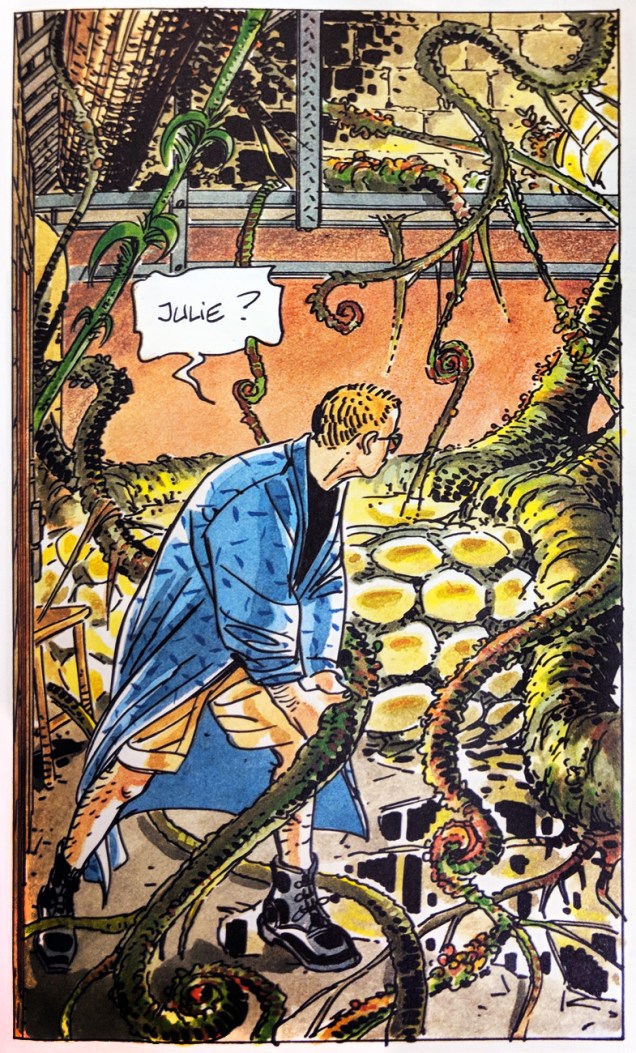
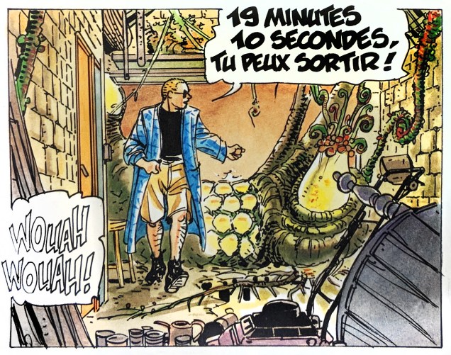
The following panels are from the series Tropique des étoiles by Christian Lamquet, more precisely from volume 4, Le réveil des poussières (1996, Claude Lefrancq).
« 19 minutes, 10 seconds, you can come out! » Experiments performed on a young woman seldom turn out as intended.
My next peace offering to the cephalopod gods comes in the form of a very loose interpretation of Carlo Collodi‘s Pinocchio, imagined by French artist Winschluss (real name Vincent Paronnaud) and executed with the help of some friends, most notably Cizo on colours. Winschluss’ art can be quite nice, but it gets a massive boost from the first-rate colouring job, so I’d like to emphasize that Cizo deserves a lot of credit for that (the tentacle pages are actually rather dark, as the action occurs undersea, but just take my word for it).
This graphic novel received a few prizes and has been lauded by many parties, but somehow I’ve managed to be quite unaware of its existence until recently. (Frankly, I am somewhat tired of picking up comics that are supposed to be superb and end up being just mediocre, so I don’t tend to pay much attention to awards and other plaudits.) A friendly comic book store clerk pointed it out to me, explaining that it was brought in by an older gentleman whose granddaughter had presented the book to him as a gift, but it wasn’t his thing at all. I was quickly won over by the art, and the story, well… it’s not for the faint-hearted or easily offended, but it’s a good one.
Winschluss’ Pinocchio was originally published in 2008 by Les Requins Marteaux, but has been reprinted several times in French (in increasingly fancier editions) as well as translated into English in 2011.
« French comics artist Winshluss leaves his robot child hanging beneath a giant lollipop on a hill for a good quarter of his largely dialogue-free adaptation, as regimes fall, fake prophets rise and a pizza delivery girl is saved from torture at the hands of seven dwarves. It’s a grim, puerile and rather brilliant update, combining chaotic, inked panels and gorgeous full-colour paintwork to great effect. Pinocchio, designed as a killing machine, is plunged from crisis to crisis by a series of greedy men and women, his story interrupted by a tortured detective, a grieving couple and Jiminy the cockroach. » |source|
Actually, don’t take my word for anything, you can admire the colours in this preview:
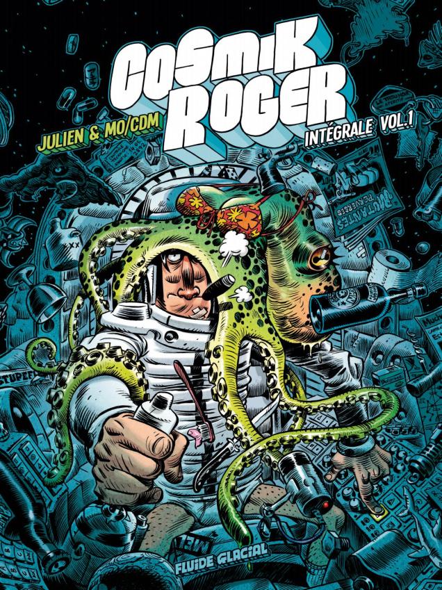
Cosmik Roger is a sci-fi/humour comic series scripted by mo/CDM (no, seriously, that’s his nom de plume, and no, I don’t know what it stands for) and drawn by Julien/CDM (real name Julien Solé – they used to go to school together, which apparently led them to adopting the same stupid monicker). This is the cover of the collected Cosmik Roger (volume 1), published in 2018 by Fluide Glacial.
Today, 102 years ago (!), on May 18th, 1917, William Blake Everett came into the world. He did not become a poet like his ancestor William Blake, nor a politician like Richard Everett, another famous forebear, who founded the city of Springfield, Massachusetts. Bill Everett’s father wanted him to become a cartoonist, and his wish came true, though the elder Mr. Everett died long before before the rebellious Bill found his place in the comics industry.
Bill Everett is best known for creating Namor the Sub-Mariner (visit out Tentacle Tuesday: Prince Namor for an overview of this character’s story and adventures… or read The Brilliance of Bill Everett’s Sub-Mariner, Marvel’s Superman, a great article from Sequart Magazine), but he also had his hand in the creation of Daredevil and Simon Garth, Zombie. Everett excelled in many genres – superheroes, horror, fantasy, science-fiction – but today, since there are far too many covers to feature, I will force myself to focus on horror. Welcome to the ghoulish gallery of my favourite Bill Everett covers! (They’re not necessarily the goriest or scariest – sometimes it’s a mood of quiet menace or a striking composition that sways me.)
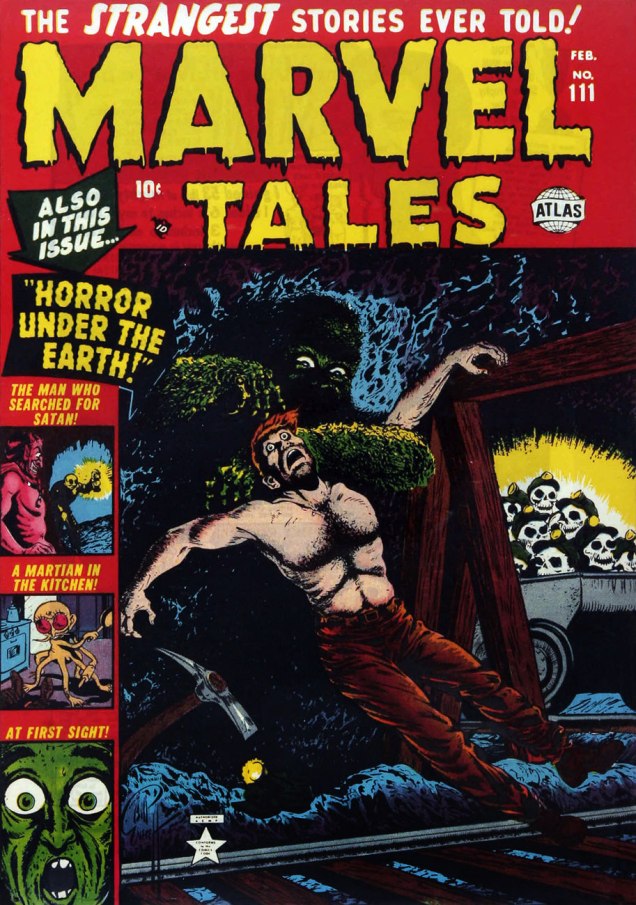
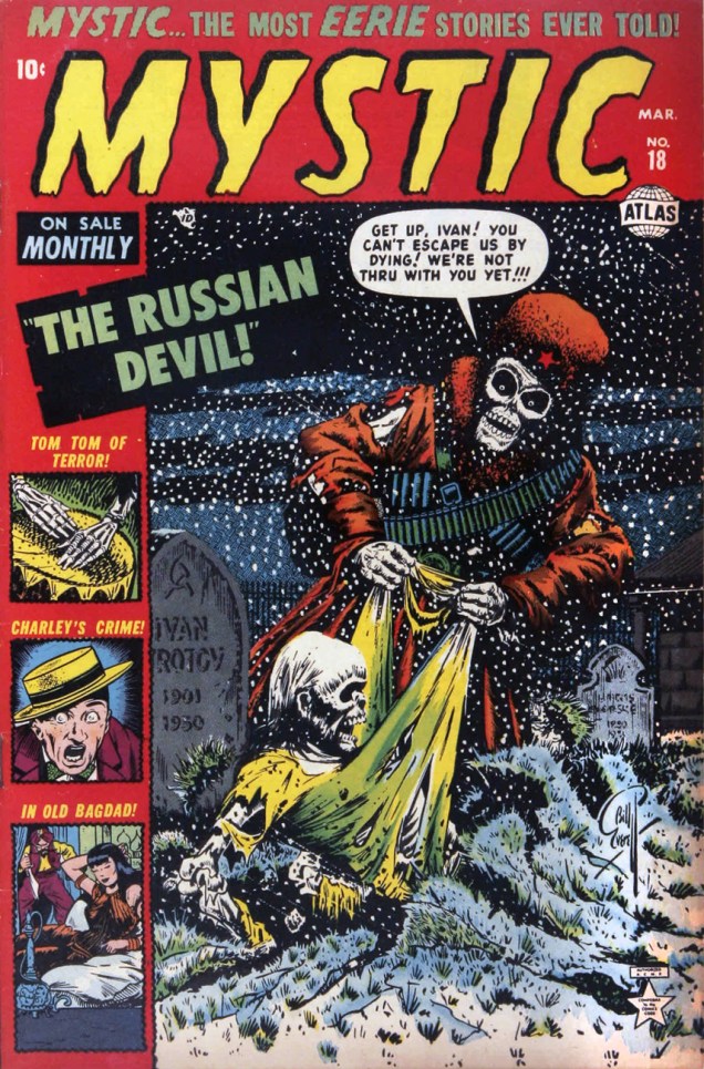
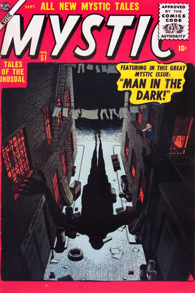
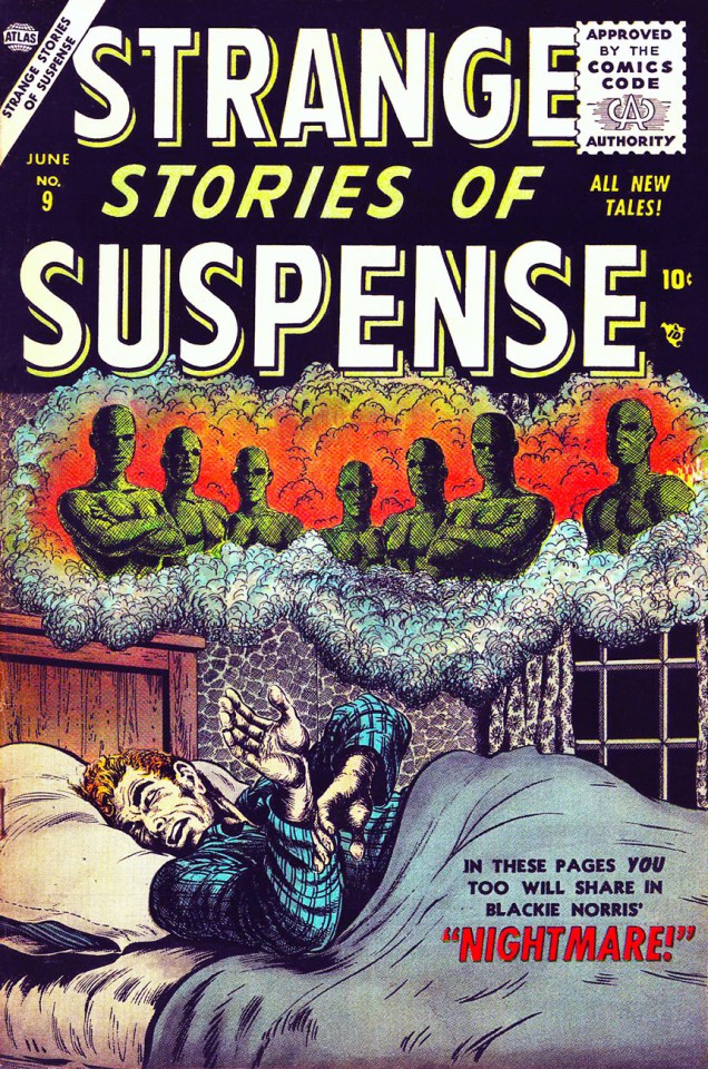
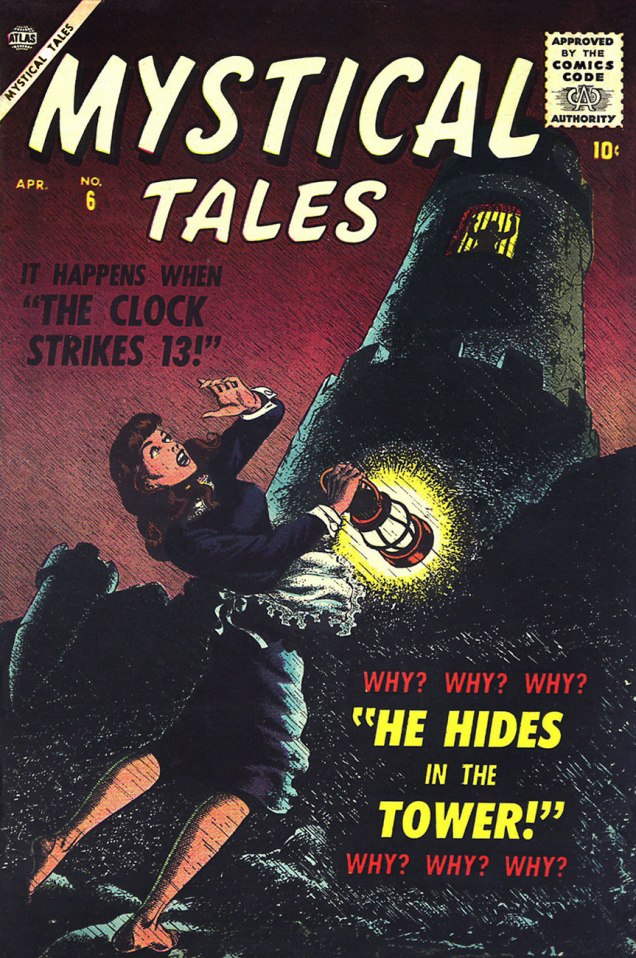
Venus no. 19 (April 1952). The silent, smirking watchers in the corner are far creepier than the skeleton embracing her!Astonishing Tales no. 15 (July 1952). Do a lot of daughters address their fathers by their first name?Marvel Tales no. 111 (February 1953)Mystic no. 18 (March 1953).Journey Into Mystery no. 9 (June 1953)Marvel Tales no. 117 (August 1953)Mystic no. 51 (September 1956). I love these silent covers where the menace is suggested rather than shown in detail.Strange Stories of Suspense no. 9 (June 1956)Marvel Tales no. 151 (October 1956). Here it’s the composition I especially like – the giant hair isn’t that scary.Mystical Tales no. 6 (April 1957). I admit the WHY? WHY? WHY? amuses me WHY? WHY? WHY?; – one inquiry should have sufficed. Speaking of “WHY?”… Why is she barefoot? Those rocks have to be treacherously slippery at the best of times, let alone in a rainstorm.
« We’re not very accepting of people who act strangely. » — Chester Brown
Scott Russo’s Jizz, published by Fantagraphics in 1991-93 (10 issues in all), was a fearless, often downright incendiary and frequently fascinating repository of vitriol from the heart and soul of Mr. Russo. As his own drawing style was pretty rudimentary (but clean and distinctive), the auteur drew upon collage, détournement and plain old text pieces for variety. Russo may have been embittered and misanthropic, but the entertainment he proffered was quite deliberate; a fine, dexterous trick to pull off.
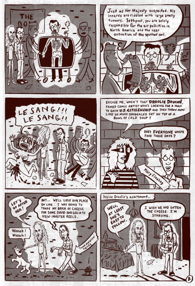
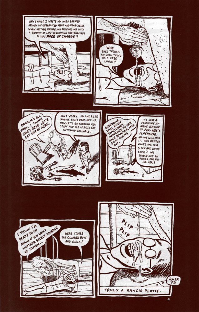
Here, from Scott Russo’s Jizz no. 10 (March 1993, Fantagraphics), is his merciless but spot-on takedown of publisher Drawn & Quarterly‘s stable of neurotics: Julie Doucet, Joe Matt, Chester Brown and Seth, rendered in a breathtakingly accurate facsimile blend of their respective styles and schticks. Script by Russo, art by his trusted confederate ‘Master’ Jeff Wong. Not particularly ‘safe for work‘, I should say.
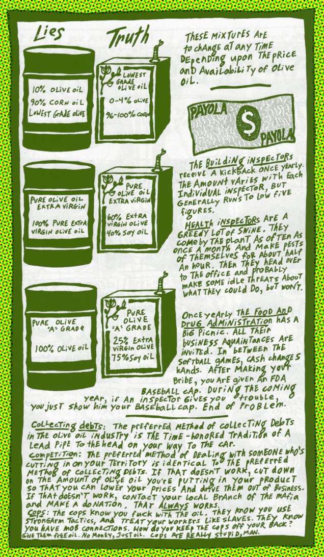
From Scott Russo’s Jizz no. 7 (Sept. 1991, Fantagraphics). I’ll always be grateful to Mr. Russo for this scathing exposé of the Olive Oil industry. My girlfriend at the time was taking a chemistry class at McGill University, during which they subjected various brands of olive oil to chemical analysis and essentially confirmed Russo’s claims. Now I merely snicker and shrug when I see someone shell out big bucks for the stuff… sometimes there’s no sense in trying to convince anyone.
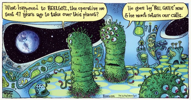
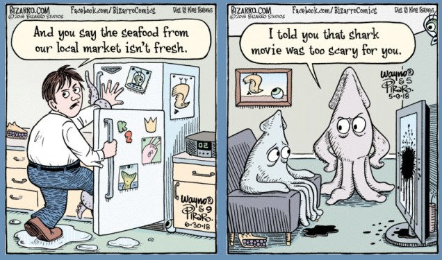
Dan Piraro‘s Bizarro is a ubiquitous newspaper comic that usually doesn’t need much in the way of introduction. Favourite strips are widely shared by fans – cut out or photocopied from newspapers (or, more recently, printed from a website) to be pasted on office doors, cubicle walls and school binders. As a matter of fact, that’s where I spotted my first Bizarro strip: scotch-taped to the office door of my college English teacher. Oh, I’ve seen them before, of course, but this was the first time I consciously noticed one of them. Teachers of all stripes seem to have a thing for Bizarro – I had a university psychology professor once who actually collaborated with Piraro on some strips, an achievement of which he was justifiably proud.
As usual, one can rely on the intrepid Tom Heintjes of Hogan’s Alley to conduct a worthwhile interview with whichever artist one is interested in. Read it here: Mondo Bizarro: The Dan Piraro Interview. I’m not going to compete with Heintjes’ ability to summarize, so I’ll just quote:
« Since Bizarro’s January 22, 1986, debut, Piraro has taken his panel in directions simultaneously surreal and topical. In a comic universe where world-weary talking dogs exist alongside nihilistic housewives, Piraro gives his cartoons heft by skewering his own bêtes noires: wasteful consumerism, environmental destruction, corporate greed and sheeplike people, to name a few. Though his humor is never didactic, Piraro’s work is remarkable in its unwillingness to pander, even when the occasional panel borders on the inscrutable. For example, he once used the Etruscans as a punchline; if you skipped history class that day, tough. Since sustained excellence like Bizarro‘s is rare in any medium, his willingness to shepherd his panel into its third decade is great news for comics fans and for the more than 200 papers that carry the strip. Though Piraro maintains that Bizarro is a comic strip for people who don’t read comic strips, we all know better: Bizarro is a comic strip for people who love comic strips. »
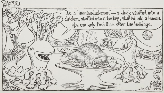
Piraro is not the only cartoonist spoofing social conventions, endowing animals with the gift of human speech or forging surreal situations out of everyday occurrences… but he does it consistently well. His easily recognizable, flowing art style is the frosting on the cake, and very nice frosting it is, too. Yet who can grasp the scope of such prodigious output? Bizarro collections (there have been thirteen of them – fitting number, isn’t it?-, all quite out of print) generally end up in the discount bin of bookstores (often neighbours to disheveled anthologies of Gary Larson‘s The Far Side, another omnipresent yet somehow underappreciated strip). For all my affection for Piraro’s goofy world, I only own Bizarro and Other Strange Manifestations of the Art of Dan Piraro (Harry N. Abrams Publisher, 2006). Some of the strips in this post have been scanned from it (others were found in the trackless depths of the Internet.)
Pleasantly, Piraro wears his politics, heart and sympathies on his (rather accommodatingly large) sleeve:
Most Bizarro cartoons feature a recurring object or creature (added value for a comic strip that’s already rich in detail). Some of my favourites: the Eyeball of Observation, the Pie of Opportunity (a piece of pie – blueberry, I think), the Dynamite of Unintended Consequences, or Firecracker of Pop (a dynamite stick), the Fish of Humility (or at least its tail), and my very favourite, the Bunny of Exuberance. One can just tell that Piraro enjoys his work. What kind of jerk still enjoys drawing the same strip after 30 years*?!
« We all have our time machines. Some take us back, they’re called memories. Some take us forward, they’re called dreams. » — Jeremy Irons
Today, we note the birth anniversary of the powerful French bédéistePaul Gillon (May 11, 1926- May 21, 2011). Working in a classical, realistic style, he began his career in comics with the weekly Vaillant. For daily newspaper France-Soir, he co-created the daily soap opera strip 13, rue de l’Espoir (1959-1962, scripted by Jacques Gall and François Gall), strongly inspired by Elliot Caplin and Stan Drake’s The Heart of Juliet Jones, but set in Paris.
Then, in 1964, for the short-lived bédé newspaper Chouchou (an eight-pager published for a mere 14 issues, a tragedy!), Gillon co-created, with scripter J.C. Valherbe (alias Jean-Claude Forest, of Barbarella fame), one of the great classics of French science-fiction comics, Les naufragés du temps (“Castaways of Time”). Several wonderful features (for instance, Georges Pichard‘s Ténébrax) were left stranded by Chouchou’s demise, including (literally) Les naufragés.
Fortunately, its authors deemed its premise too worthy to let the matter drop forever. Nearly a decade on, Gillon tweaked the saga’s opening pages and resumed the narrative, which France-Soir published. Forest scripted the first four collections (1974-76), then Gillon took full command of the strip, which found a warm new home in Métal hurlant from 1977 right to the end of the series with Le cryptomère (The Cryptomeria), collected in 1989.
Les naufragés’ premise is this: In 1990, a man (Chris) and a woman (Valérie) are placed into suspended animation. A thousand years hence, the man is picked up and woken. Where’s the woman?, he wants to know. A futuristic bout of cherchez la femme ensues, to make a long story short.
Forest, wrote, in 1967, of his original plans for the saga: « Chris was searching for an image. After many adventures, he manages to find Valérie only to realize that this image no longer fitted that of his dream. »
The sequence presented here comprise the second, third and fourth pages of the first tale, as they appeared in Chouchou in 1964. Say, that cool metal creature reminds me of one of the most ridiculous Marvel super-baddies of the 1960s, disgruntled government employee Alexander Gentry, aka… (see below for the answer).
The first album in the series, L’étoile endormie (The Sleeping Star) – 1974The fourth album in the series, L’univers cannibale (The Cannibal Universe) – 1976The fifth album in the series, Tendre chimère (Sweet Illusion) – 1977
A peek at a page of original art from album 3, Labyrinthes (1976):
Stan Lee and Don Heck‘s The ‘Dreaded’ (ha!) Porcupine, or what happens when neither Steve Ditko nor Jack Kirby are on hand to design your costume (and ghost-write your story). Incidentally, Stan, porcupines don’t project their quills. Here he is depicted by Kirby, from the cover of his inaugural appearance, in Tales to Astonish no. 48 (October, 1963).
« Yet another bloodthirsty alien invasion, led by a mad dictator with a brain harvested from a 60 year-old corpse. I get one of those every third Thursday… »
D’you know what today is? Well, Tentacle Tuesday, obviously. It’s also Radio Day. More relevantly to this post, however, May 7th is also the birthday of one Michael Terry Gilbert, confidant to the formidable Mr. Monster (a.k.a. Strongfort “Doc” Stearn) and fellow tentacle lover (at least judging from how many cephalopod-shaped creatures appear in his stories).
We’ve briefly mentioned Mr. Monster in Tentacle Tuesday: Superheroes Redux; now is the time to joyfully gallop through some more tentacle offerings from the merry crew of psychotic artists led by that sagacious shepherd, Michael T. Gilbert. Many happy returns, Sir!
Doc Stearn… Mr. Monster no. 1 (Eclipse, January 1985). Cover by Michael T. Gilbert.
Doc Stearn… Mr. Monster no. 5 (Eclipse, February 1986), cover by Michael T. Gilbert. The unwritten rules dictates that Mars inhabitants *must* have tentacles, and Gilbert clearly has respect for venerable traditions. Plus, they’re much cuter this way. Coochie-coochie-coo…
« The original Doc Stearne was a two-fisted adventurer along the lines of pulp hero Doc Savage, of whom he may have been intended as a knock-off. He was created by cartoonist Fred Kelly, whose other known credits are somewhere between sparse and nonexistent. Kelly did him for a small, virtually unremembered Canadian publisher called Bell Features (probably not related to Bell Syndicate, distributor of Mutt & Jeff, Don Winslow of the Navy and more). When Gilbert was asked to contribute to Vanguard Illustrated, the apparent purpose of which was to develop new properties for Pacific Comics to exploit, he drew on Kelly’s character as inspiration. The first new Mr. Monster story appeared in the seventh issue, which came out in 1984 without a specific cover date. Gilbert’s version was a fanatical monster hater, extreme not only in his attitude, but in his design and in every move he made. » |from Don Markstein’s Toonopedia|
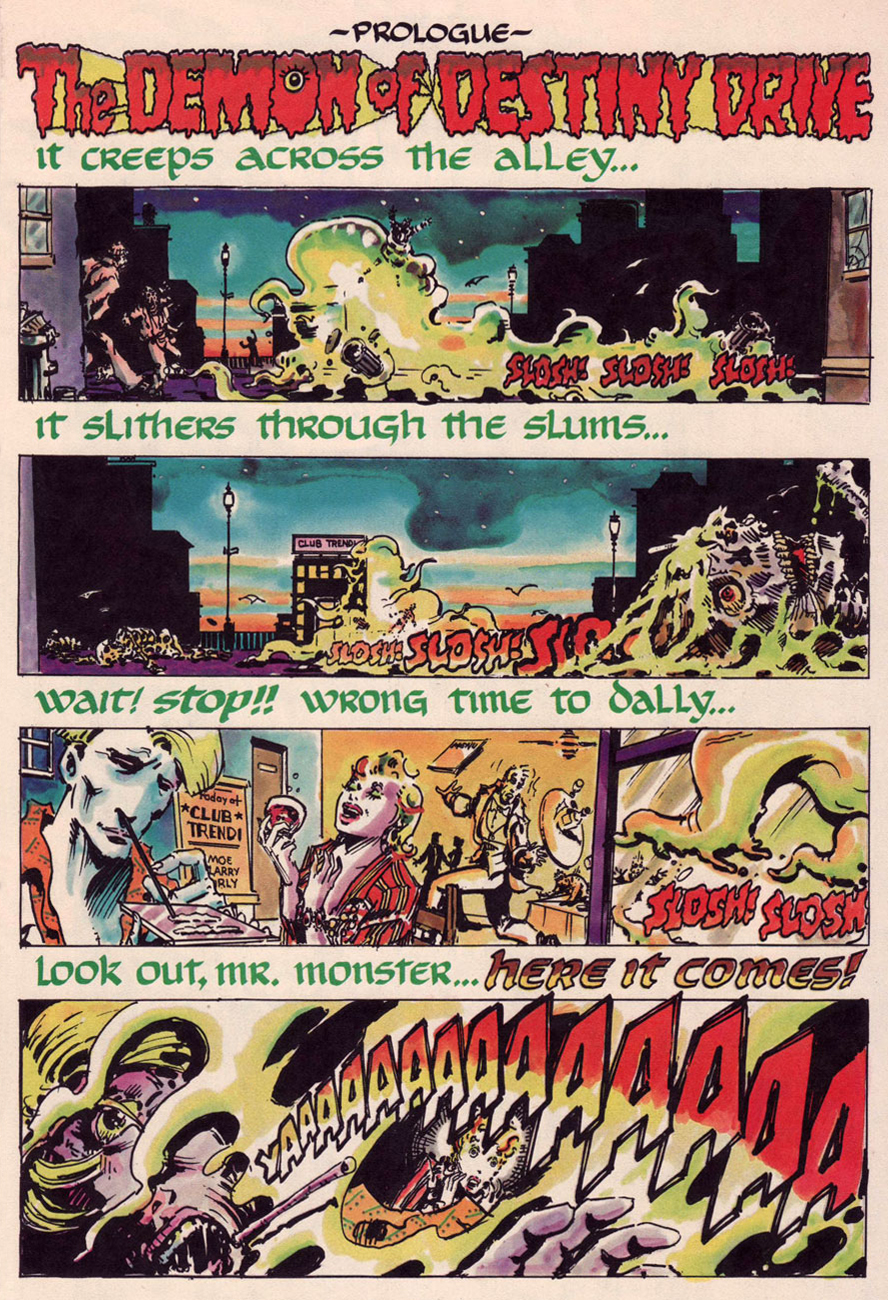
« The Demon of Destiny Drive », art by Michael T. Gilbert, published in Doc Stearn… Mr. Monster no. 5 (Eclipse, February 1986).
« Mr. Monster’s Atomic Condenser » by Michael T. Gilbert was published in Doc Stearn…Mr. Monster no. 10 (Eclipse, June 1987).
Is that an Oculothorax, by any chance? « Terror in 6-D », with script and layouts by Michael T. Gilbert and pencils and inks by Don Simpson, was published in Doc Stearn…Mr. Monster no. 10 (Eclipse, June 1987). Read the issue here.
« Wish You Were Here », script and layout by Michael T. Gilbert, inks by Dave Gibbons, was printed in Mr. Monster Attacks! no. 1 (Tundra, August 1992).
Want to know whether Mr. Bulletproof Monster ever gets back with Rosie? Read Mr. Monster Attacks! no. 1 (Tundra, August 1992) here.
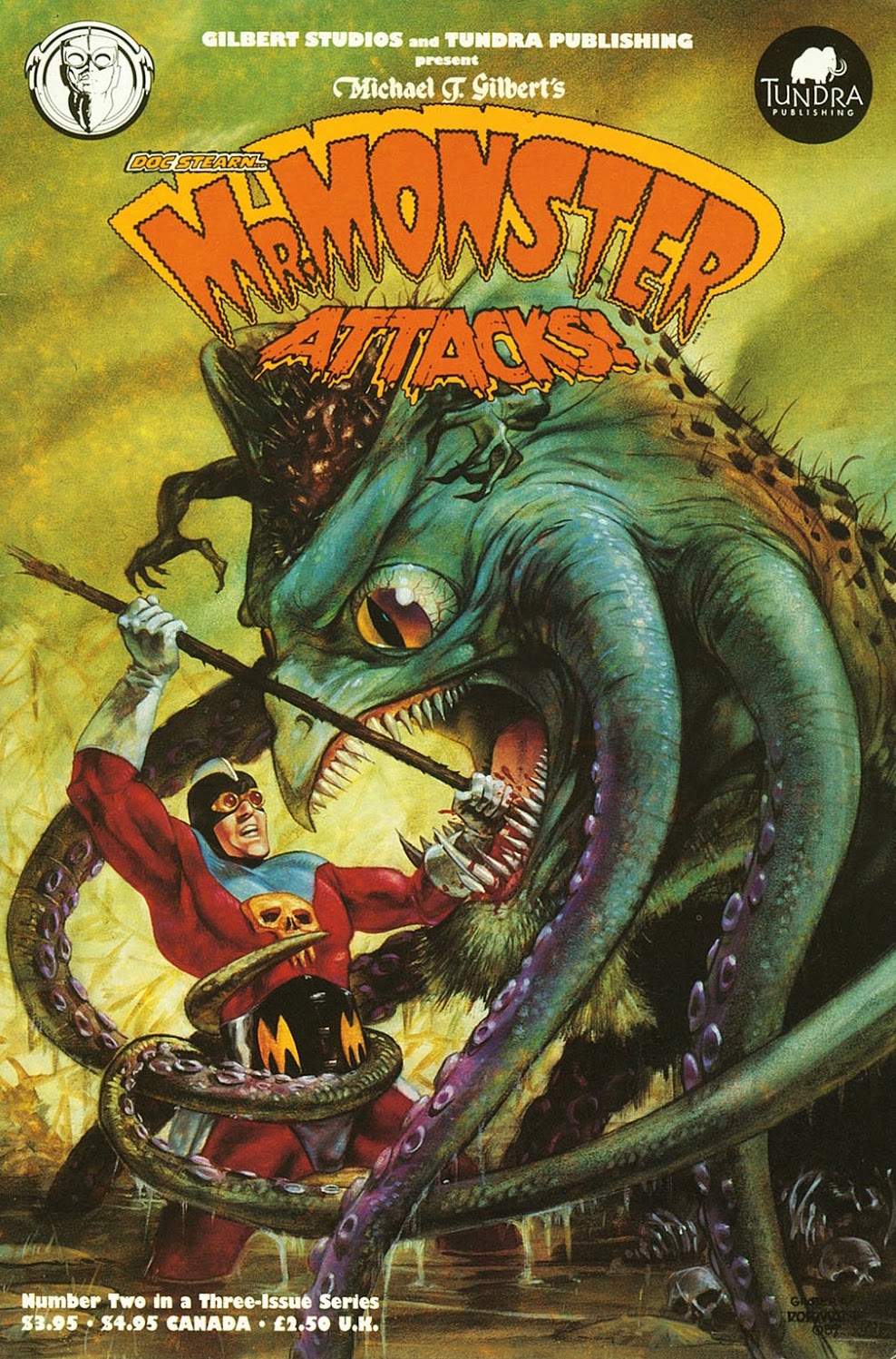
Mr. Monster Attacks no. 2 (Tundra, September 1992), cover pencilled by Michael T. Gilbert, and painted by Dave Dorman.
Back cover of Mr. Monster Attacks no. 2 (Tundra, September 1992), drawn by Bernie Wrightson and Michael T. Gilbert. Read the issue here.
« Lair of the Lizard Ladies », written and laid out by Michael T. Gilbert, and pencilled, inked and coloured by Simon Bisley, was printed in Mr. Monster Attacks! no. 3 (October 1992).
Kelly, Mr. Monster’s Girl Friday, has been touched by his noodly appendage in this story featuring murderous tentacle spaghetti. « Just Desserts », scripted by Janet Gilbert (wife of Michael T. Gilbert) and drawn by Tom Buss, was printed in Mr. Monster Attacks! no. 3 (Tundra, October 1992). Read the full issue here.
« Ulp! That reminds me. I’m late for my 4:00! There’s a giant man-eating eyeball about to devour Cleveland! So if you’ll excuse me… »
« When a man steals your wife, there is no better revenge than to let him keep her. » — Sacha Guitry
Here’s my contender for the most adult thing ever published in a Warren Magazine, as opposed to adolescent. It was also Wally Wood’s final significant contribution to his bibliography (though it was created around 1971); by the time of its belated publication Wood’s work had degenerated into depressing, crude porn before he tragically took his own life in November, 1981. As Witzend sadly proved, most comics creators, when handed a creative carte blanche, would merely regurgitate the same old thing they were doing for the mainstream, but with the addition of tits and/or gore. This, however, whilst featuring a generous dollop of T&A, is another breed of beast. It was published, of all places, in Warren’s SF anthology 1984 (issue 5, Feb. 1979). Go figure.
The marvellous Bhob Stewart queried Nick Cuti about the story during a roundtable gathering of former Wood assistants in Derby, Connecticut, in July 1985. The discussion later appeared in Against the Grain: MAD Artist Wallace Wood, edited by Stewart (2003, TwoMorrows Publishing)
Bhob: You worked on “Last Train to Laurelhurst“? [the story’s original title] Cuti: « As a matter of fact, I’m in it on the opening page. That’s me — right there [points to foreground figure in splash.] I used to wear muttonchops in those days. We wrote that together; Woody came up with the basic storyline, and I wrote a lot of dialogue. I hated his ending. I said, ‘Woody, you really ought to change the ending.’ The ending was that the guy blasted his faithless wife and her lover and then walked away. I said, ‘Gee, that’s what he’s intending to do in the very beginning. There’s no switch at the end. If you change it around somehow, it would make it a little bit more surprising.’ So he went home and rewrote the ending. I thought that the ending he came up with was far superior and made it a really brilliant story, to really tell you what life can be like.
Ernie Colón did the pencils. It was Woody’s idea, and I wrote some of the script, I don’t know how much because we used to toss things back and forth all the time when I was at the studio.It was for a magazine called Pow that never came to be. [Jim] Warren had approached Wood to do an adult humor magazine which would have had serious stories, very sexy, something that adults would enjoy reading. Unfortunately, Woody and Warren had diametrically opposed personalities, and they couldn’t seem to get together on it.
There was a funny story: Ernie had done the pencils with a soft pencil, and Woody and I were wondering what the heck we could do to make sure it didn’t get smudged. I was very carefully going over the pencils with an eraser to get out the smudges. I came in the next day with the pencils and said, ‘I found the perfect way to avoid smudging the pencils.’ Woody said, ‘What?’ And I said, ‘I sprayed them.’ Woody’s face dropped, and he almost reached over the strangle me before I stopped him and said, ‘Hey, Woody, I’m only kidding!’ [laughter] Because when you spray something, you can’t erase the pencils any more. You would have ink and pencil on the same paper. He almost had a heart attack right there; his mouth dropped open, and he said, ‘Oh, no!’ Then he started laughing after I told him it was only a joke. Later, when I walked into the house, and Marilyn said, ‘Oh, Woody, Nick’s here. You know, the fellow who sprays all your pencils?’ Obviously, he had thought enough of the joke to tell her about it. »
Speaking of Pow, here’s a cover sketch Wood did in 1971.An adult humour magazine? I guess they hadn’t quite settled on the tone.


 The marvellous
  An adult