« My collection of criminal creeps will get a real charge of hokey hassle of heroes! » — The Collector
Just last week, I read the bittersweet news that after half a century or so*, the evergreen, once-ubiquitous Archie Comics Digests are kaput… which brings us, in the usual roundabout fashion, to today’s post.
Though it’s been nearly three years since our big move, I expect to carry on practicing box archeology for a good long while, if not indefinitely. A couple of months ago, I dug out an Archie Digest I had picked up at my local newsstand back in 1981… and quite possibly never read. Until this year.
I’ve mentioned before that comics distribution was extremely spotty in my neck of the woods, so I often found myself glaring and wincing at the racks in desperation and taking home some ungainly specimen*. This was such a case, obviously.
This is Captain Hero Comics Digest Magazine no. 1 (1981, Archie). Stan Goldberg’s cover is unspectacular, but better than his usual. Earlier this week, I got a good chuckle out of someone stating online that Goldberg “could do a damn good Dan DeCarlo“. I’d have to agree: Goldberg, at his peak, was nearly on the level of DeCarlo at his worst. Think I’m kidding? Here’s an example.
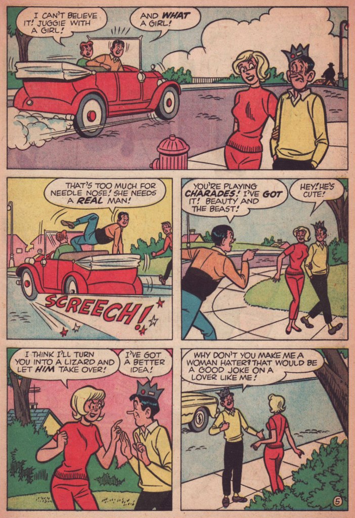
The Riverdale-Gang-as-Superheroes of the mid-1960s, just another bit of trend chasing** by the Archie brass, has never elicited much beyond a shrug from me. It certainly was intended as a cynical, junky cash grab by the higher-ups, but… sometimes it rose above the brief.
Bart Beaty wrote, in his 12 Cent Archie (2015, Rutgers University Press), that « On the whole, while the Pureheart material is remembered — and collected in contemporary trade editions — for its novelty within the Archie universe, it is clear that the innovation was not a particular success. The combination of Archie sensibilities and superheroes paid few dividends. »
Well, innovation wouldn’t quite be the term I’d opt for, but while the Pureheart stories are as underwhelming as surmised, but since Jughead, Reggie (as Evilheart) and Betty (as Superteen) are more interesting characters than plain ol’ Arch, it is fitting that their exploits are more compelling.
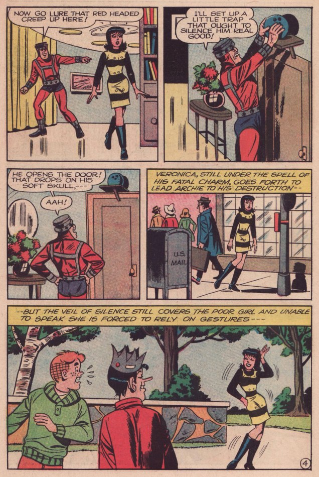
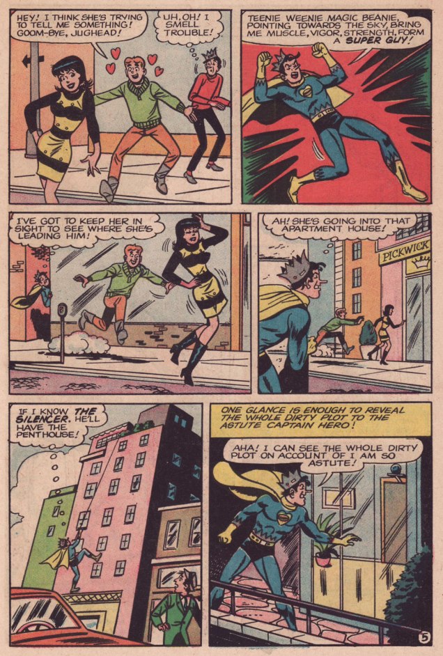
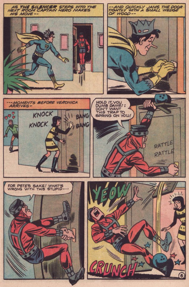
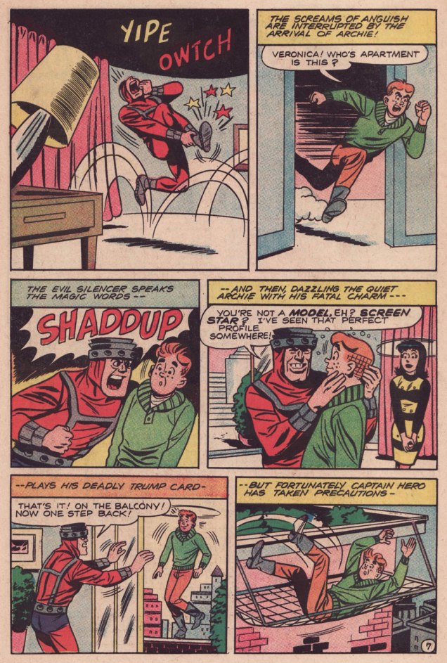
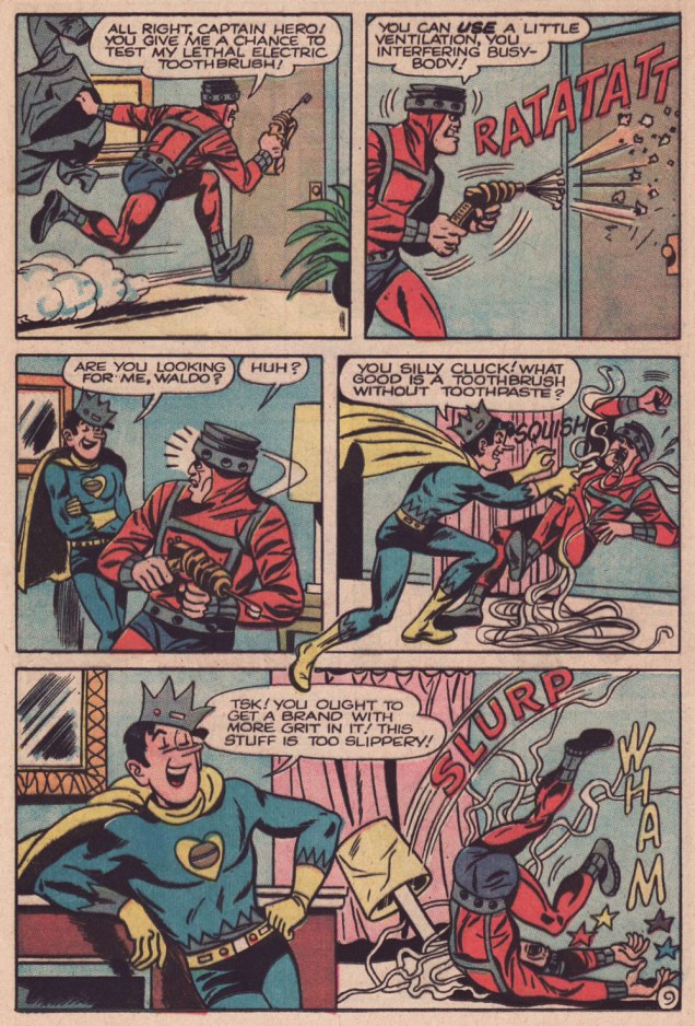
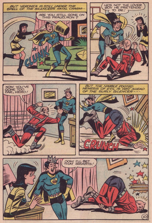
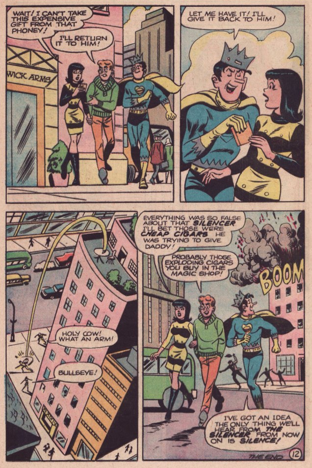
Here’s The Silencer Strikes, originally presented in Jughead as Captain Hero no. 5 (June 1967, Archie). The uncredited creators are presumably Frank Doyle, scripter; Bill Vigoda, pencils.
.
.
.
.
.
.
.
.
.
.
.
While Bill Vigoda (1920-1973) is hardly anyone’s favourite Archie artist, he does a creditable job here; he’s having more fun with this material than he did on the regular Jughead title, where he had the unenviable task of replacing (ha!) Samm Schwartz.
I certainly wasn’t going to use the digest for scanning, as the format’s production values weren’t much of a consideration: this was disposable entertainment, period. But I found an affordable — and in glorious condition — copy of the issue I wanted, and the printing didn’t let me down. My thanks to Keith for bringing it home!
**namely the rise of Marvel’s superheroes and the success of the campy Batman tv show, if you must know.
***Though they reaped the most bountiful rewards from the format, Archie were tardy — as usual — in adopting the digest: for instance, Gold Key had tried it out in 1968 with some Disney reprints, followed by collections of their mystery titles. DC had issued a one-shot Tarzan Digest in 1972. Marvel issued its own — slightly larger — digest in 1973, The Haunt of Horror, but it wasn’t comics, but a doomed attempt at reviving the moribund ‘Pulp’ format; finally, Archie entered the fray two months later, with Archie Comics Digest no. 1. Only Harvey lagged behind; unless I’m mistaken, it wasn’t until 1977 that some Richie Rich digests hit the glutted market.
« Well, as everyone knows, once witchcraft gets started, there’s no stopping it. » — Mikhail Bulgakov
Another, day, birthday post? Well, it’s still a mighty special occasion, as we’re celebrating the one-hundred and fourth birth anniversary of our beloved Samm Schwartz (1920-1997).
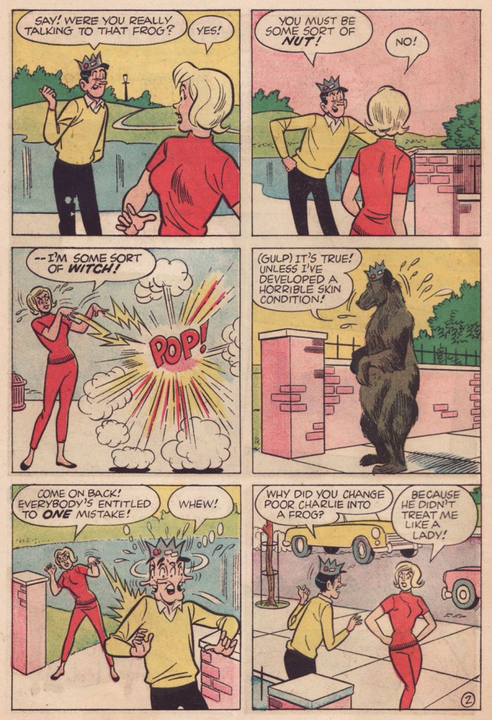
One year ago to the day, we gave you Love in Broom, first of a loosely connected two-parter (‘loosely connected’ is the strongest dose of ‘continuity’ one could expect from the Archie folks in those days).
Of course, the now-named Samantha the witch — and the rest of the cast, notably Jughead and Reggie — appear to have forgotten all about their earlier encounter… but that’s just fine: the burden of continuity is one I’m glad to see sloughed. The chief constant is that our witch has quite a yen for Jug.
Switch Witch first appeared in Archie’s Pal Jughead no. 123 (Aug. 1965, Archie). It was presumably scripted by George Gladir (not coincidentally co-creator of Sabrina the Teenage Witch a couple of years earlier), and unmistakably illustrated by Mr. Schwartz. Of Mr. Gladir, Mark Evanier wrote: « Even when they had no credits, you could generally spot a George Gladir script. They were a little wackier, a little sillier, a little more human in their humor. And oh, yes — they were usually fresher than the ones crafted by younger writers. » This certainly fits the bill.
I had to buy three different copies of this issue to get a complete one… and it’s still a brittle mess. But hey, my ordeal, your benefit!
I was recently asked to feature some more Archie artists (other, that is, than my perpetual favourites Samm Schwartz and Bobs Montana and White); while I suppose Orlando Busino (1926-2022) is perhaps an oddball choice to fulfill such a request, it’s his birthday today — he would be ninety-eight years old… but hey, ninety-five is still a pretty good run.
Mr. Busino passed but briefly — but oh so memorably — through the halls of Archie: from 1960 to 1962, before he understandably went off to greater success and better-paying gigs: The Saturday Evening Post, Reader’s Digest (I can confirm that they paid really good rates), McCalls, Good Housekeeping, Boys’ Life… you name it.
Mark Evanier recalls fondly that short Archie stint, where Busino was among the few artists allowed to work outside of the house style and march to his own tune: « I first became familiar with his work, as did my pal Scott Shaw!, during a brief period when Busino worked for the Archie people. His work appeared in Archie’s Madhouse and a wonderful, not-sufficiently-recognized comic book called Tales Calculated to Drive You…BATS. It was kind of like “What if Charles Addams had produced MAD?” Scott and I both remember exactly which newsstand we were patronizing in December of 1961 when we glimpsed the cover of Bats #3 and grabbed up our respective copies. » [ source ]
Signor Busino’s lovely cover for the first issue of Tales Calculated to Drive You Bats (Nov. 1961, Archie).
However, our featured tales hails from Tales Calculated to Drive You Bats no. 3 (Mar. 1962, Archie):
And here’s a little something extra from Archie’s Madhouse no. 14 (Aug. 1961, Archie).
Painting your nose the right shade of dill pickle green would also work.
« If you saw a heat wave, would you wave back? » — Stephen Wright
Time to carry on with one of my pet quixotic missions, that of advocating the glory of Samm Schwartz (1920-1997), my very favourite Archie artist… and one of my favourite cartoonists, period.
Having acquired over the years most of the Jughead issues I could afford — for the most part cheap, but thankfully numerous — I’ve now reached the stage of acquiring scattered issues of assorted Archie titles featuring one or two Schwartz stories… along with often appalling page fillers by painfully lesser lights. To lessen the blow, I usually skip the Schwartz story — which usually opens the book… savvy thinking on their part, I’ll admit — then return to it so as to end on a high note.
I was hesitating between two stories, but since they’re both quite short, why choose? Hence the programme double.
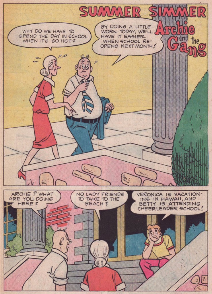
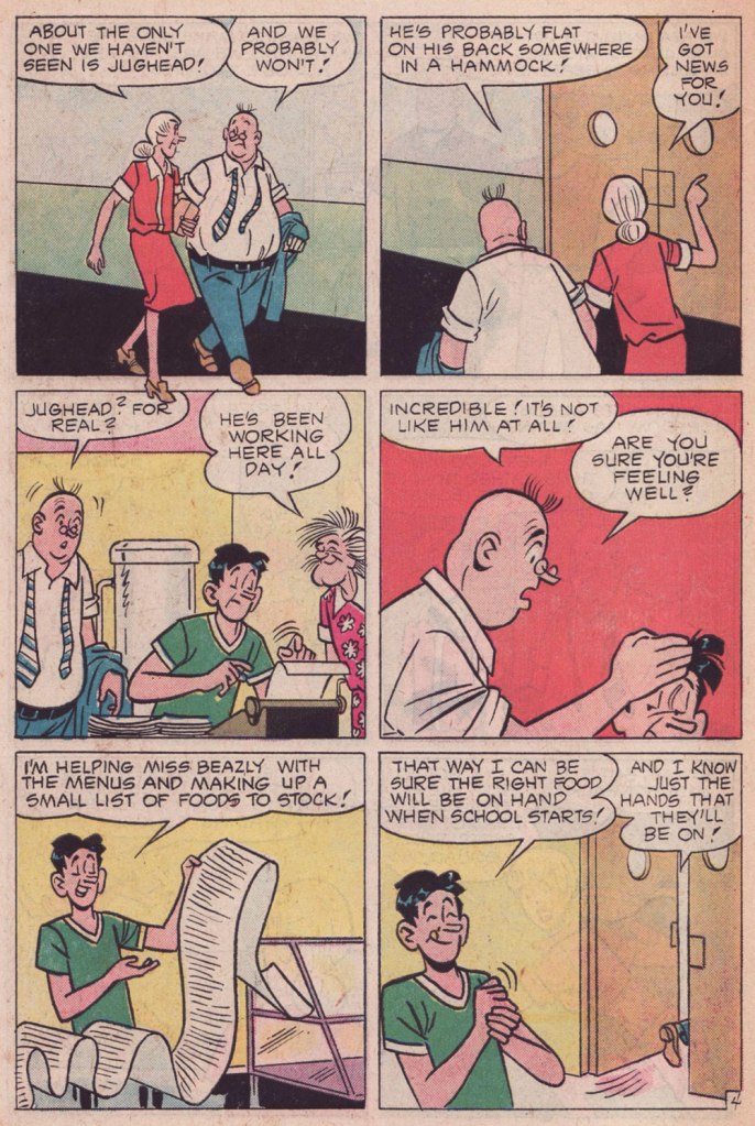
« Summer Simmer » first appeared in Archie’s TV Laugh-Out no. 35 (Nov. 1975, Archie). Scripted by George Gladir, this story has the distinction of not particularly striving to be funny, instead focusing on character and situation.. which is totally distinct from the all-too-frequent straining for laughs and failing Archie blueprint. This sort of outlier is what makes the search worth the bother.
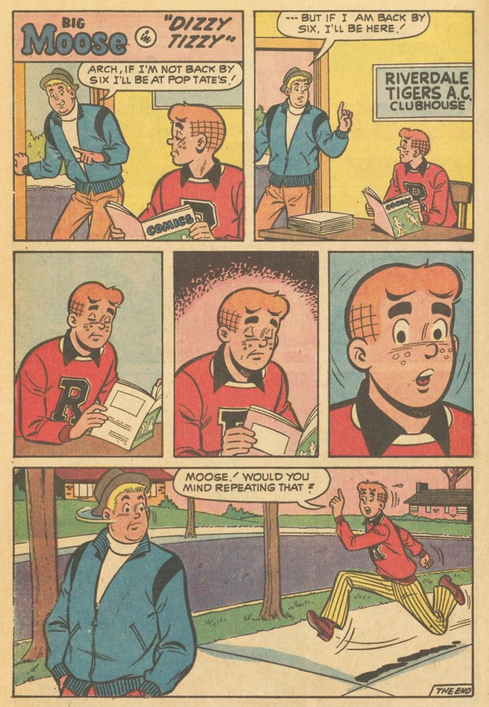
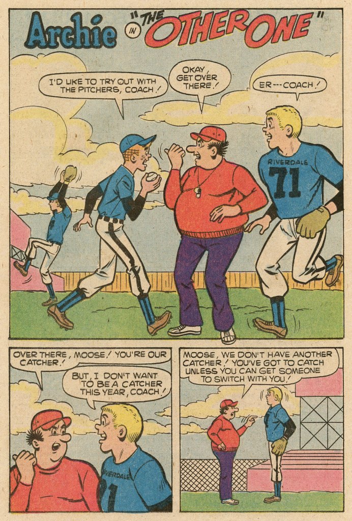
« The Defender » originally saw print in Pep no. 235 (Nov. 1969, Archie). Not only does Marmaduke “Moose” Mason get a rare turn in the spotlight, but it’s an unusually favourable depiction. It was most likely scripted by Frank Doyle.
It must be mentioned that Schwartz often tweaked the scripts he was assigned, but incognito. His collaborators trusted him, giving him free rein. Besides, let’s face it, the stakes were depressingly low.
« Our Betty Cooper is still the girl next door – she literally lives next to Archie. And she’s the blonde all-American girl; she’s so sweet and forgiving, gives people the benefit of the doubt and second chances, wears her heart on her sleeve. But she’s also incredibly broken on the inside, for many different reasons. » — Lili Reinhart
As a whole, comic book artists are not a happy lot, and for good reason. During the Golden Age, at least, there were countless publishers, so one could move around if unsatisfied with the working conditions.. even if meant finding out that things were rotten all over. After the mid-1950s, when the field violently contracted — you know the story — leaving scant players standing, you pretty much had to take the work, and the abuse, as they came. And certain publishers frowned upon ‘their’ creators playing what little remained of the field.
Kurt Schaffenberger had steady work at DC, but presumably — and understandably — sought to keep his options open, so he moonlighted for ACG, often under a pseudonym, probably unaware that the ‘competitor’ was covertly owned (at least in part) by DC co-founder and co-owner Harry Donenfeld. One can imagine Kurt’s distress when ACG folded in 1967. From what I can surmise, he did, in 1970, a lone, inexplicable cover for Stanley Morse… wildly outside his range but still kind of awesome. And then… he quietly boarded a bus to Riverdale.
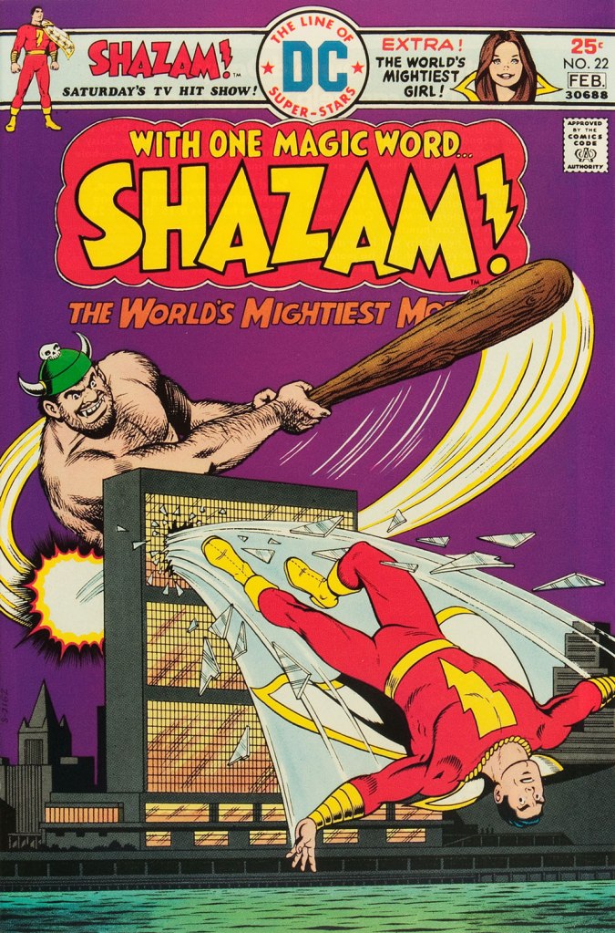
A page from Voice of Doom; script by Frank Doyle, pencils by Schaffenberger, inks by Jon D’Agostino. Published in Archie’s TV Laugh-Out no. 16 (Dec. 1972, Archie).The, er… punchline from Peace of Mind. Script by Frank Doyle, pencils by Schaffenberger, inks (likely) by Chic Stone; published in Archie’s TV Laugh-Out no. 18 (Mar. 1972, Archie).Drawing for Archie wasn’t too much of a stretch for Kurt; whether it was Reggie or The Big Red Cheese getting knocked on his ass, he had his stock posture. This is Shazam no. 22 (Jan-Feb. 1976, DC). Pencils and inks by Mr. Schaffenberger.
A couple more samples from Mr. Schaffenberger’s all-too-brief Archie period — solid, well-paced, ably-designed and economical storytelling:
A slightly surreal one-pager from Archie’s Joke Book Magazine no. 150 (July 1970, Archie).A page from Luck Struck, published in Archie’s Pals ‘n’ Gals no. 73 (Oct. 1972, Archie); note the Captain Marvel tank top young Mr. Andrews is sporting!
And then, there’s the case of Sal Amendola, a Neal Adams protégé whose reputation in comic books largely rests on a single Batman story, 1974’s ‘Night of the Stalker’, a highly praised tale whose chief conceit is that Batman never utters a word and weeps bitterly at the end. I’d apologise for the spoilers, but honestly, it’s been half a century, what mystery is there to dispel?
An excerpt from Detective Comics no. 439 (Feb.-Mar. 1974, DC); I’ll rarely say this, but Dick Giordano’s inks are an asset in this case, not a liability. The story’s scripting credits are at once hilarious and a bit sad: Steve Englehart, script; Vin and Sal Amendola, plot; and… “from an incident as described by Neal Adams.” Yeah, Neal; that’ll surely earn you a Pulitzer.
Anyway, after his turn in the Bat-spotlight and 1975’s Phoenix, one of the short-lived Atlas-Seaboard‘s more daring titles, Amendola turned up at… Archie. And it was not a good fit.
This, in fact, was the springboard for this post: a couple of years ago, I encountered an Archie story that so grotesquely missed the mark — stylistically speaking — that it bordered on the fascinating. You guessed it, Sal Amendola, utterly out of his element, not to mention, surprisingly… his depth.
Here are a pair of pages from Coach Reproach, published in Everything’s Archie no. 71 (Dec. 1978, Archie), script by George Gladir, pencils by Amendola, inks by Jon D’Agostino.
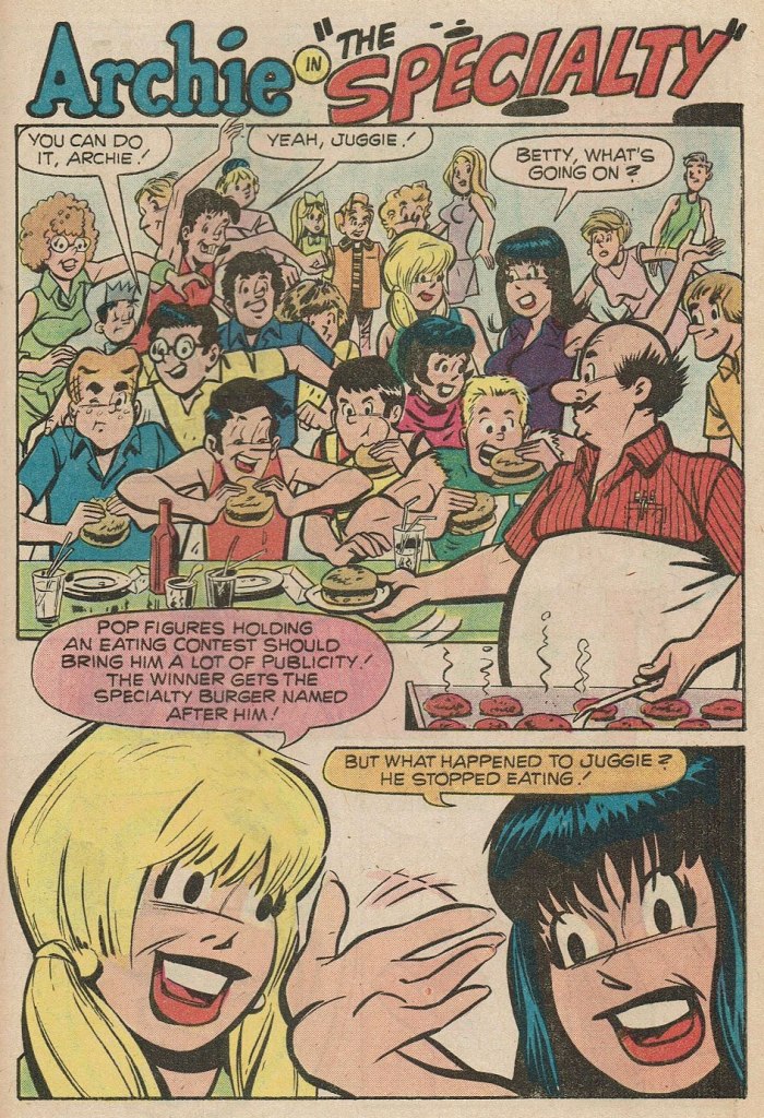
Where to begin? In the first panel, you give Archie a stiff, unnatural pose and you follow it up by repeating it on a background character in the very next panel. And Arch is due for a nasty case of whiplash if he keeps trying to make like Linda Blair.At this point, I’m thinking Sal had learned plenty from his mentor on how to utterly fail at comedy.If what I’ve observed about pitching stances is worth anything, Archie’s about to get brained by a baseball. Ginger boy is also looking right past Coach Kleats. Despite the low bar — issues of quality control were rampant at Archie in the 1970s — this is impressively incompetent storytelling,What happens when you never learn basic inking principles: one creates depth by using thinner lines — and less detail — on background characters, otherwise… visual chaos ensues, as demonstrated here. And Sal’s Betty and Veronica sorely need a brand of shampoo that won’t leave their hair so oily and limp… but the anatomy is beyond help. This is the opening page of The Specialty, from Pep no. 342 (Oct. 1978, Archie).
Schaffenberger’s fellow Golden Age veteran, Gene Colan, also found himself moonlighting in the 1960s. In his case, it was for Marvel, under the alias of ‘Adam Austin’, but also for Dell (just a couple of covers mid-decade) and more significantly for Warren Magazines. In the 1970s, he concentrated on Marvel and was, in the chaos that was the so-called ‘House of Ideas’ at the time, the single most reliable artist in the maelström: surely none can match his seventy consecutive — and meticulously detailed — issues of Tomb of Dracula, in addition to lengthy runs on Howard the Duck, Daredevil, Captain America, Doctor Strange and so forth.
« When writer Jim Shooter became Marvel’s editor-in-chief in the late ‘70s, the tension between Colan and the younger authors came to a head. By 1980, Shooter and Colan were totally at odds with one another over Colan’s approach to storytelling. »
« [Shooter] was harassing the life out of me. I couldn’t make a living,” Colan said. “He frightened me, he really did. He upset me so bad I couldn’t function.” Just as she had urged Colan to quit one job [in] the 1960s, wife Adrienne begged him to leave Marvel in 1980. After delivering his resignation, Colan was asked to sit down and seek resolution with Shooter and publisher Mike Hobson. Colan agreed to the meeting, but declined any overtures to stay at Marvel. “Shooter was in the same room,” Colan recalled, “and I said, ‘That man’s not gonna change. He is what he is. Whether it’s six days, six months or six years, it’s not going to be any different, so I’m not going to put up with it for another minute.‘ » [ source ]
He then scampered over to DC for a few years. His production there was hit-and-miss, but his Batman run (1981-86) was outstanding, pairing him with some of the rare inkers who could do his nuanced pencils justice: Klaus Janson, Tony De Zuñiga (to my amazed delight!) and especially Alfredo Alcala.
But once his contract ran out, he was out knocking on doors again. Against all odds, Archie beckoned.
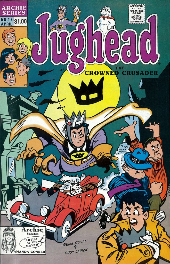
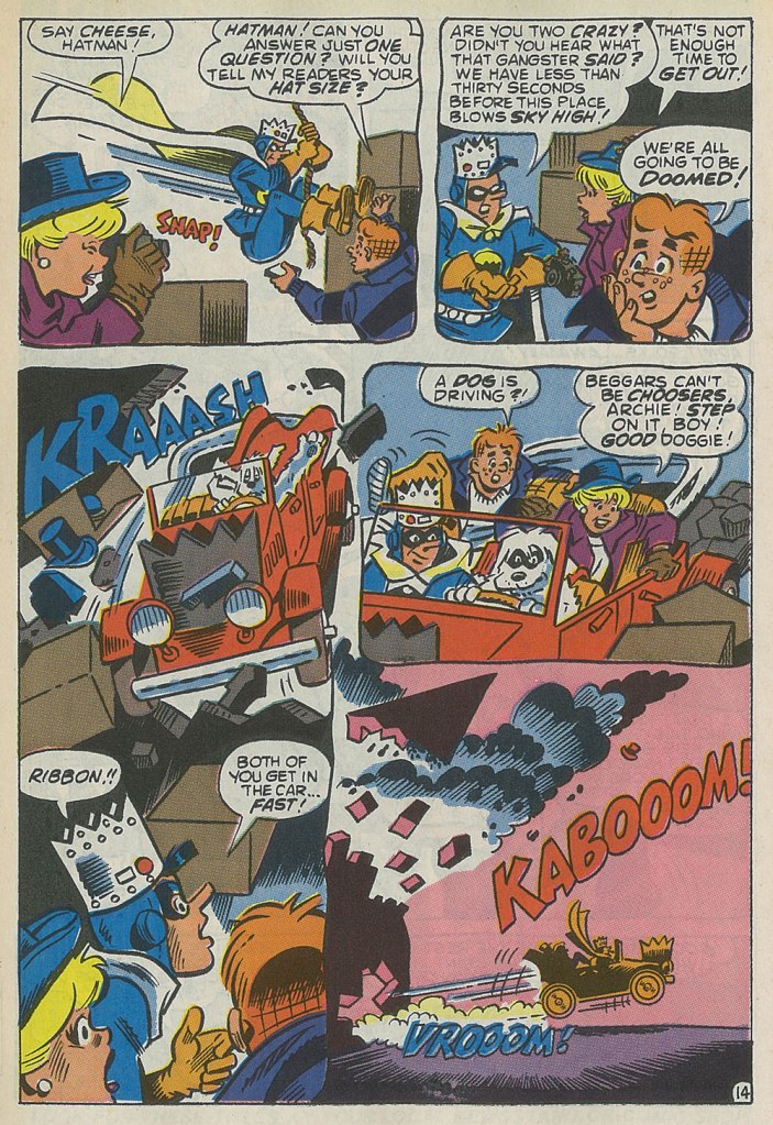
This is the cover — dreadful, I’m afraid — of Jughead no. 17 (Apr. 1990, Archie), reviving the opportunistic, Batman TV show-derived ‘Riverdale Gang as superheroes’ de trop move of the mid-1960s, with even less aplomb. But then the Archie folks were plumbing an especially low point with such ‘experimental’ titles as Jughead’s Diner, Archie 3000, Dilton’s Strange Science, Jughead’s Time Police, Archie’s R/C Racers, Explorers of the Unknown, and of course The Adventures of Bayou Billy.An action-packed — and Colan-shambolic — excerpt from that issue’s Hatman saga, written by Robert Loren Fleming, pencilled by Colan and inked by Rudy Lapick. Notwithstanding his sticking out like the proverbial sore thumb, Colan clearly had a ball working on his Archie stories. He brought some urgently needed chutzpah to a perilously stale formula.A page from Will the Real Archie Please Stand Up!, published in Life with Archie no. 273 (July 1989, Archie), wherein Archie is mistaken for his doppelgänger, a foreign prince named Kafoufi… but of course. Pencilled *and* scripted by Colan, which is most unusual. Oh, and inked by Mr. Lapick, who doesn’t quite know what to do with those ol’ Colan worm-fingers, seen wriggling in panel five.
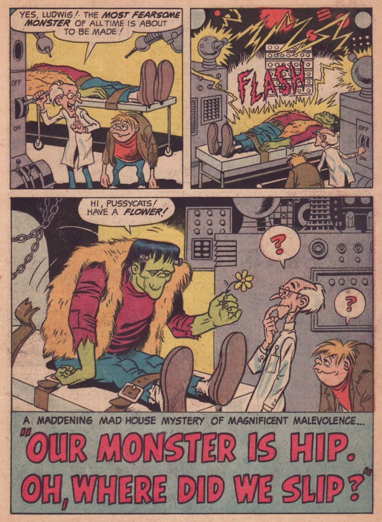
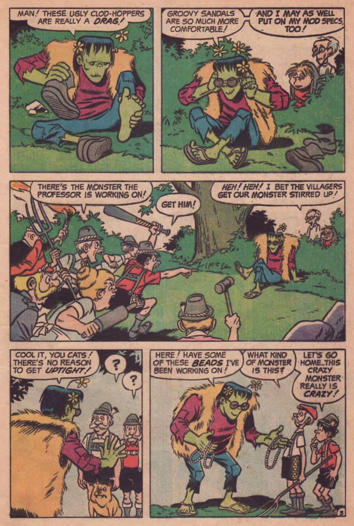
« If anything, I consider myself non-violent. I’m from the hippy era, peace, love, groovy. » — Rick James
1968 wasn’t exactly a banner year for Harry Shorten and Wally Wood‘s Tower Comics (1965-69); Wood’s flagship title, T.H.U.N.D.E.R. Agents, was down to running a mixture of reprints and inventory, and a mere two issues were cover-dated 1968. A final number, the 20th, limped onto newsstands a full year after its predecessor.
So it’s understandable that Wood started casting around for plan B. He gave Archie a try. It didn’t take… surely his fellow Tower editor and Archie refugee Samm Schwartz must have tried to warn him. Oh well.
« Our Monster Is Hip. Oh, Where Did We Slip? », most likely scripted by Archie mainstay George Gladir (1925-2013), appeared in Archie’s Madhouse no. 64 (Oct. 1968).
As far as I know, this was the only story Wood drew for Archie Comics, at least in their usual humorous mode. In the ’70’s, he would provide finishes over Jack Abel‘s pencils on one story (« Devil Rider », Red Circle Sorcery no. 10, Dec. 1974) for the interesting but short-lived, Gray Morrow-directed Red Circle Comics Group, a more ‘mature’ Archie offshoot… and that’s it.
« Real art must always involve some witchcraft. » — Karen Blixen
Ah, another Samm Schwartz story! And no wonder: born on October 15, 1920, Mr. S would be ninety-seven today.
“Love in Broom“, scripted by George Gladir and inked by Vincent DeCarlo, saw print in Jughead no. 116 (Jan. 1965, Archie). That amorous witch would return in Jughead no. 123‘s ‘Switch Witch‘. In the Archie universe, that’s *almost* continuity!
Since Jughead no. 116 had a strictly non-oddball cover by Harry Lucey, here’s a more thematically fitting one from local chouchouBob White. This is Archie no. 126 (Apr. 1962, Archie).
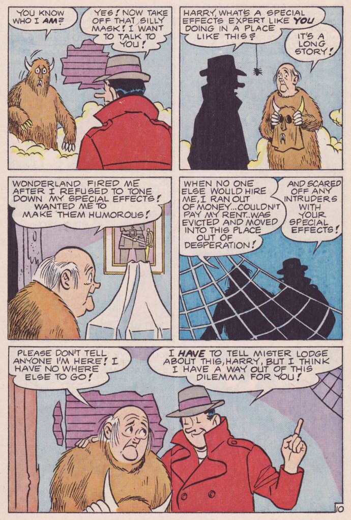
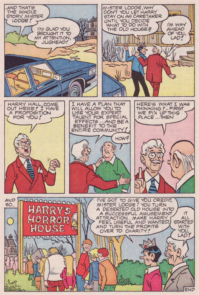
« Special effects are characters. Special effects are essential elements. Just because you can’t see them doesn’t mean they aren’t there. » — Laurence Fishburne
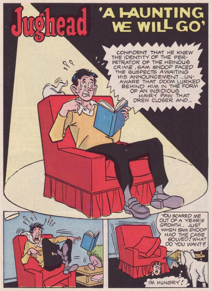
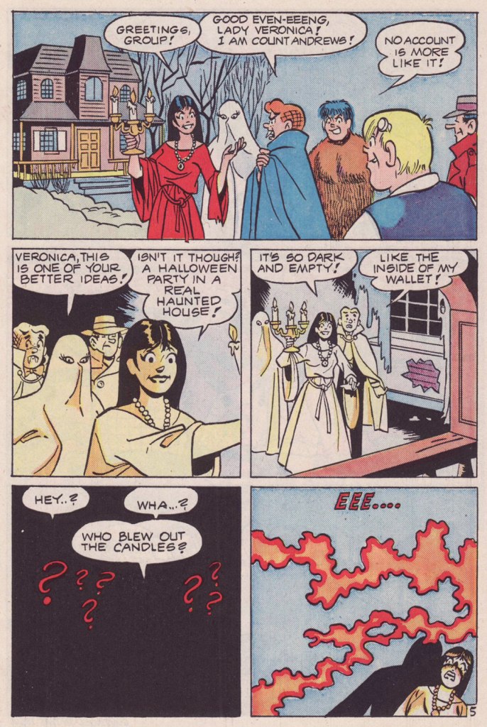
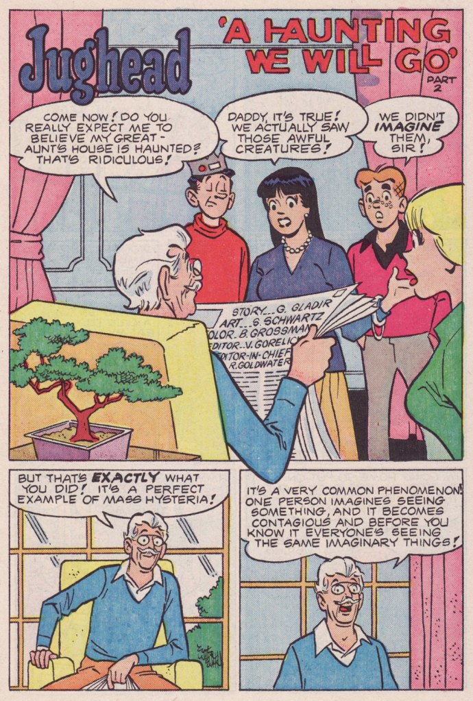
Spookiness is afoot in Riverdale! Here’s a lovely George Gladir (script) & Samm Schwartz (pencils, inks and letters) saga to suit the season. I love those longer tales, which in this case allows for a larger-than-usual cast and a more leisurely pace.
‘A Haunting We Will Go’ was originally published in Archie Giant Series Magazine no. 564 / The World of Jughead (Sept. 1986, Archie). Oh, and colours by Barry Grossman.
« The people who are always hankering loudest for some golden yesteryear usually drive new cars. » — Russell Baker
We’re having a bit of a scorcher over here, so I’m doing my bit to compensate with a piece set in wintertime.
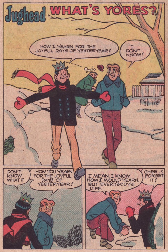
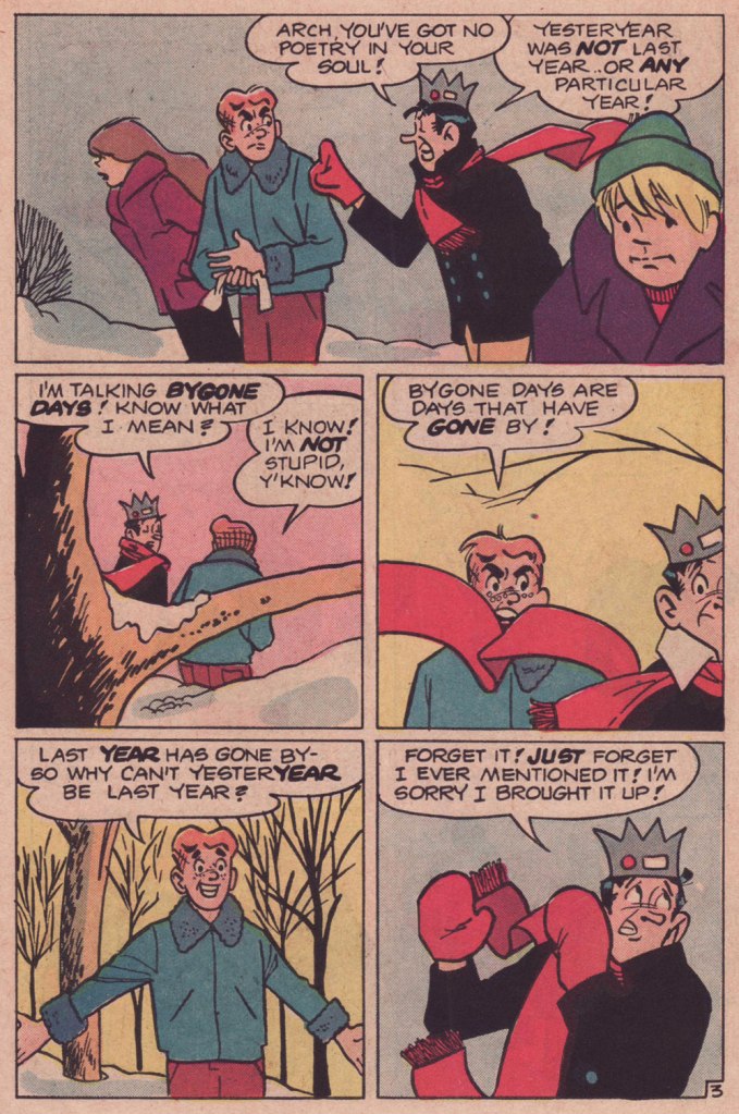
As we surely all know, Archie stories (in the comics at least) are formulaic to a fault. This static state of affairs plays a considerable part in their comforting nature. Sure, all fashions and trends are embraced and discarded, but the characters don’t evolve in any significant, permanent way. No lesson ever sticks.
So on the rare occasion when a writer deviates from the formula, it really shows. This tale, I daresay, is such a specimen. Virtually plotless, it’s a precursor, by more than half a decade, of that rule-breaking « show about nothing »: Seinfeld (1989-1998).
While nothing much happens here in terms of plot, this is a difficult trick to pull, in any medium: as it mainly consists of yadda yadda yadda (but witty yadda yadda yadda… another daunting level of difficulty), it’s talking heads all the way, so you need some great performers who know how to keep an audience engrossed through the minimal means at their disposal.
In comics, this calls for a great illustrator, a master of body language and the art of the mise en scène, namely Samm Schwartz (1920-1997). I shudder — and not with delight — to envision this particular script landing in the hands of a lesser light, which is to say practically anyone in the Archie stable save Bob Montana (but he’d died in 1975) or Harry Lucey (retired and in poor health by then). While he was never credited for anything but his artwork, Schwartz enjoyed a free hand with his regular collaborators’ scenarios (George Gladir and especially Frank Doyle), with their blessing. And he was always enriching his backgrounds with delightful pantomime mayhem.
What’s Yores? originally appeared in Jughead no. 321 (Feb. 1982, Archie). Script by Frank Doyle, pencils, inks and letters by Mr. Schwartz.
Craving more Schwartz? Go on, help yourself to the full spread right here.
« Bicycles are pieces of art. You get that combination of kinetic engineering, but then, besides the welds, the paint jobs, the kind of the sculpture of it all is quite beautiful. Bikes have such great lines, and all different styles. » — Robin Williams
I’ve been cycling a lot more of late. I’d been using my bike less frequently in recent years, unnerved by the increasingly frantic (and distracted, not a good combo) vehicular traffic of the city. But with my wife taking an interest in the activity, I found myself with a reason to get back in the saddle. This spring, we found a newly opened bike shop, earthy, grimy and unpretentious, where we got our bikes expertly tuned up.
I’ve always loathed those cliquish hipster joints that, in addition to selling overpriced junk, also seem responsible for the ubiquity of those middle-aged, over-equipped, spandex-clad Sunday cyclists, who feel it their sacred duty to pass you, whatever the pace, weather or road conditions, looking for all the world like overstuffed sausages in their lycra casings. The sporting analogue, if you will, of the rich kid who ‘needs’ the most expensive guitar in the shop… never mind that he can’t play a note.
You hopefully will indulge me in this little exercise in nostalgia. I miss the days when our bikes got us around, granted us greater autonomy and kept us in shape. This lifestyle took a backseat in the 1980s, when the BMX craze began to overstate the extreme and the competitive facets of the sport. Now, it’s all ultimate sport this and boot-camp fitness that. Ah, whatever happened to plain old utilitarian fun?
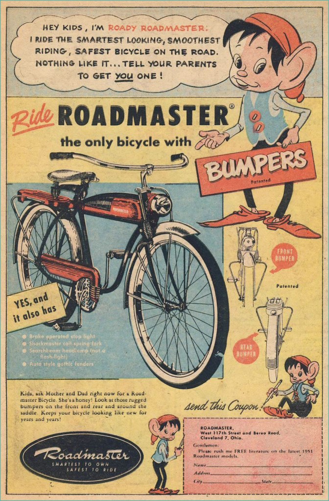
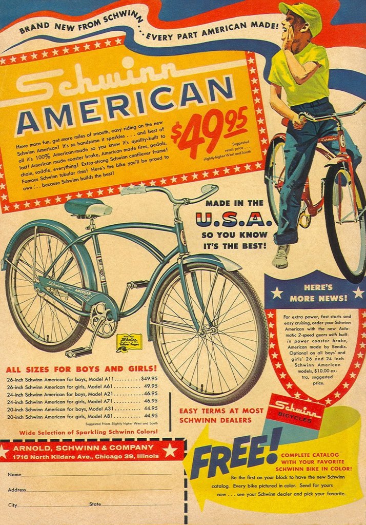
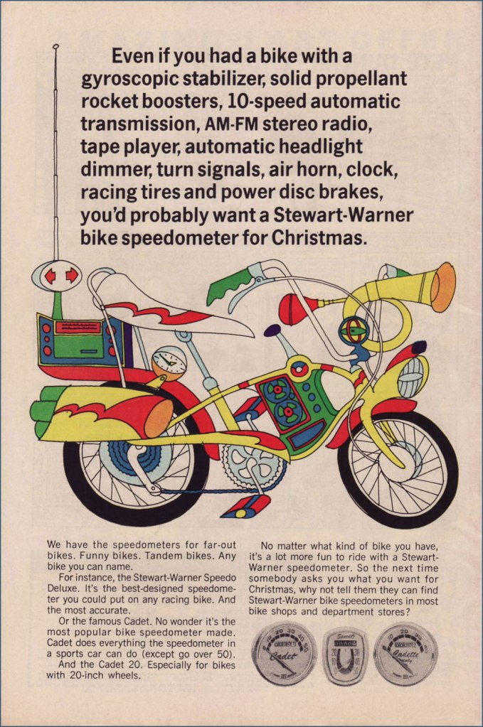
Judging from this ad (circa July, 1951), bicycle makers were trying to make their steeds mimic the clunky look of the era’s motorcycles. Aesthetics would soon improve. Here’s a fairly typical ad, circa 1961. Free catalogue, not to mention a healthy dollop of American jingoism, like it or lump it. Speaking of Schwinn, check out their well-produced promo comics Bicycle Book, from 1949.Ah, yes, the U.S. Royal twins, Roy and Al. In the tradition of the accidentally named Smith Brothers, “Trade” and “Mark”. Unsurprisingly, scouting magazine Boys’ Life was an ideal market for bike-themed ads. This one appeared in the May, 1966 issue. Artist unknown… anyone?You can tell how important the bicycle scene was: not only were manufacturers hawking bicycles, but there was also the ‘aftermarket’ trade of gizmos and doodads. I’ve long supposed ‘speedometer’ to be a dumbed-down term for a tachometer. Even after consulting this ‘helpful’ chart, I’m still not convinced it isn’t. To quote sometime Beach Boys lyricist, DJ and racing enthusiast Roger Christian: “Tach it up, tach it up / Buddy, gonna shut you down.“
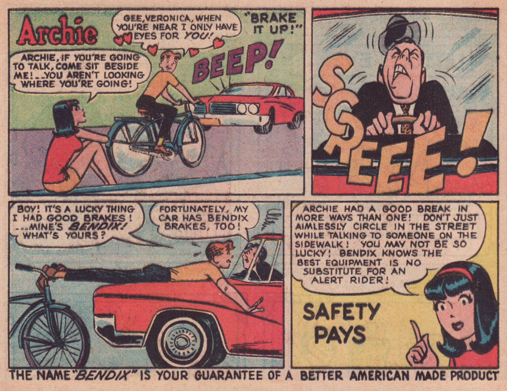
Through much of the 1960s, Bendix (the corporation, not Bill!) commissioned a long-running series of custom ads featuring the Riverdale Gang, illustrated by resident Archie artist Harry Lucey.
This one’s from April, 1965.Archie, the voice of reason? Only in ads and public service announcements. This one’s from October, 1966.This one’s from July, 1968.Ah, that’s more like the Archie Andrews we’re accustomed to. This one’s from August, 1968. I daresay we’ve all encountered too many such ‘cyclists’.An apt reminder that the rich kids always did boast the best, most up-to-date equipment, whatever the sport. Also, I can’t help but think that the cape and tiger tail are just kind of… reckless. Clearly, corporate shill Tigerboy is failing to heed the lessons of Isadora Duncan’s tragic death. Thanks to the ever-thrilling Jack Davis artwork, this is the unsurpassed classic among bicycle ads. It appeared in select DC and Archie titles cover-dated November, 1968. While banana seats may be considered in most quarters as retro kitsch, I earnestly hold that they were bold and cool. Aesthetic and structural experimentation had arrived at the forefront of the cycling industry. This ad appeared in comics cover-dated February, 1969. And here’s a look at a (flawlessly) surviving model. Man, the elegance of those lines!
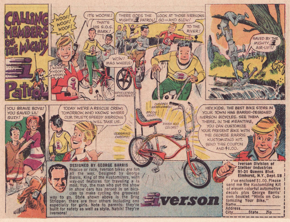
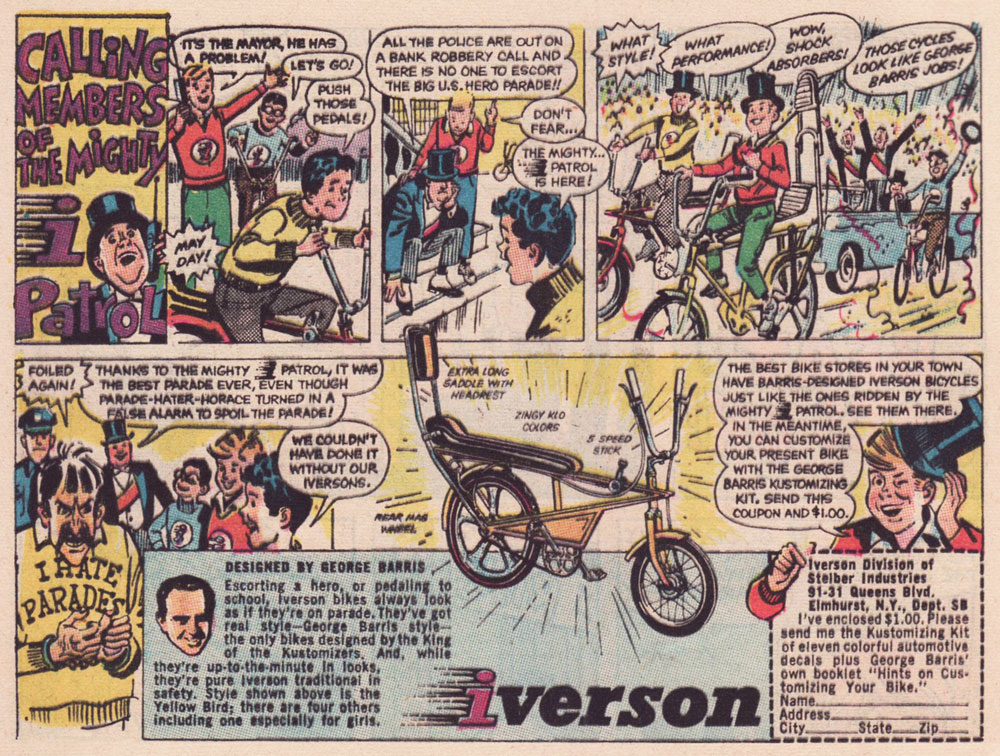
As the 1960s drew to a close, another series of custom comics ads appeared — just under the wire. They spotlight the creations of the famous ‘King of the Kustomizers’, George “Barris” Salapatas (1925-2015), very much in demand thanks to his recent triumph with the Batman tv show’s Batmobile.
This one appeared in various DC titles cover-dated November, 1969. If I had to take a stab at artistic attribution, I would go with the versatile Creig Flessel (1912-2008). Something tells me that in real life, the human chain stunt the Mighty i Patrol pulls would have led to four drowned kids instead of just one — but I’m sure Woofie would have dog-paddled his way to safety.This one appeared in DC titles cover-dated December, 1969. Read a gripping first-hand account of working on the assembly line at the Iverson bicycle factory, circa 1975!I’m assuming that the kid with the sombrero nicked it from Bazooka Joe’s kid brother Pesty. This final adventure saw print in DC titles cover-dated January, 1970.This, however, is the advert that really worked on me. When I got my first grown-up ten speed bike, a few years later, it was a Browning, which lasted me at least a quarter-century, until it snapped right at the load-bearing juncture of the rear fork… the one place where even welding wouldn’t help.
I switched to my backup, a hybrid bike I bought in 1987. It’s still running beautifully. In terms of value for money, a well-maintained bicycle is pretty unbeatable.
My well-thumbed copy of Adventure Cycling in Europe (1981). « Say, Uncle John, did Browning replace you with a pretty-boy model for your comic book ad? » « They sure did, but you know what’s even worse? » « I don’t know, Uncle John, what is? » « I don’t even have a nephew either! » All kidding aside, though it’s over forty years old, it’s still an insightful, entertaining and helpful book. When you go low-tech, change occurs at a slower, more forgiving pace.
I leave you with a song, whence comes the title of this article. It’s from a lesser-known but excellent Donovan album, Open Road, from 1970.


