« The people who are always hankering loudest for some golden yesteryear usually drive new cars. » — Russell Baker
We’re having a bit of a scorcher over here, so I’m doing my bit to compensate with a piece set in wintertime.
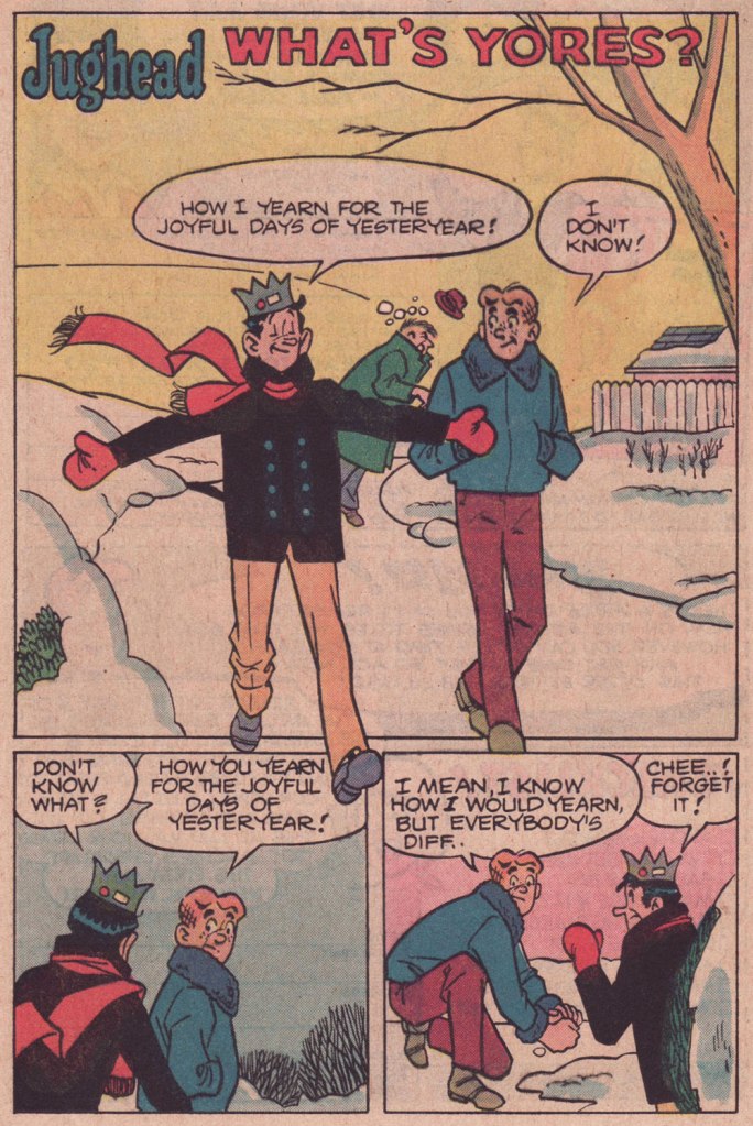
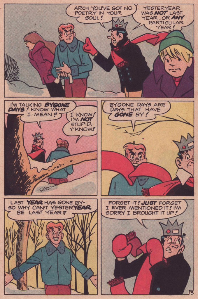
As we surely all know, Archie stories (in the comics at least) are formulaic to a fault. This static state of affairs plays a considerable part in their comforting nature. Sure, all fashions and trends are embraced and discarded, but the characters don’t evolve in any significant, permanent way. No lesson ever sticks.
So on the rare occasion when a writer deviates from the formula, it really shows. This tale, I daresay, is such a specimen. Virtually plotless, it’s a precursor, by more than half a decade, of that rule-breaking « show about nothing »: Seinfeld (1989-1998).
While nothing much happens here in terms of plot, this is a difficult trick to pull, in any medium: as it mainly consists of yadda yadda yadda (but witty yadda yadda yadda… another daunting level of difficulty), it’s talking heads all the way, so you need some great performers who know how to keep an audience engrossed through the minimal means at their disposal.
In comics, this calls for a great illustrator, a master of body language and the art of the mise en scène, namely Samm Schwartz (1920-1997). I shudder — and not with delight — to envision this particular script landing in the hands of a lesser light, which is to say practically anyone in the Archie stable save Bob Montana (but he’d died in 1975) or Harry Lucey (retired and in poor health by then). While he was never credited for anything but his artwork, Schwartz enjoyed a free hand with his regular collaborators’ scenarios (George Gladir and especially Frank Doyle), with their blessing. And he was always enriching his backgrounds with delightful pantomime mayhem.


Craving more Schwartz? Go on, help yourself to the full spread right here.
-RG

Perhaps its a blind spot on my part, but I find it hard to get past the weird late 40s college tropes (Jughead’s bizarre crown, Archie’s haircut, the old-fashioned morays passed off as contemporary) incoherently mixed with suburban American blandness circa 1980s.
I think I’d have to see examples of different artists tackling Archie, to make any distinctions about drawing quality; I can’t see past the conventions of the house style that hadn’t varied in 4 decades.
Then there are the odd background ticks: the can randomly balanced on the fence, waiting for Archie’s snowball: who put it there? Why? Jughead’s weird anaconda scarf with a mind of its own, zigzagging about the frames despite no other evidence of wind… a store called the “Choklit Shoppe”? Really?
Everything appears geared towards making 13 year old girls feel perfectly safe… perhaps I’m being critical in the wrong ways and have not looked at Archie comics closely enough…!
LikeLike
Hi Steve! You wrote:
>Perhaps its a blind spot on my part, but I find it hard to get past the weird late 40s college tropes (Jughead’s bizarre crown, >Archie’s haircut, the old-fashioned morays passed off as contemporary) incoherently mixed with suburban American >blandness circa 1980s.
Hey, it’s not unlike any comic strip getting on in years.
>I think I’d have to see examples of different artists tackling Archie, to make any distinctions about drawing quality; I can’t >see past the conventions of the house style that hadn’t varied in 4 decades.
You’re giving me pause here: perhaps I should put together a guide to the main Archie artists to illustrate and demonstrate the vast differences in approach and levels of talent at hand.
>Then there are the odd background ticks: the can randomly balanced on the fence, waiting for Archie’s snowball: who put it >there? Why?
It’s fair to assume that Archie himself did it, but that would be a story of its own, surely.
>Jughead’s weird anaconda scarf with a mind of its own, zigzagging about the frames despite no other evidence of wind…
I suspect a possible double standard here: would it bother you so if, say, the physics of Batman’s ever-swirling cape were in question? Speaking as a graphic designer, I’m delighted to see Jughead’s scarf take on a life of its own. It’s all about composition and negative space!
>a store called the “Choklit Shoppe”? Really?
I doesn’t surprise me in the least! In Canada, we had (and still do, as it turns out) a soda pop company called ‘The Pop Shoppe’. It’s typical brand naming, and certainly wasn’t incongruous even in the 1980s (when I encountered the brand myself). https://www.thepopshoppe.com
>Everything appears geared towards making 13 year old girls feel perfectly safe…
That’s their ever turning over audience, and they can be forgiven for not forsaking it. It’s certainly the least of their sins. 😉
> perhaps I’m being critical in the wrong ways and have not looked at Archie comics closely enough…!
Ah, life’s too short for that. Most Archie comics are atrocious, formulaic dreck… but the good stuff is worth the detour, as far as I’m concerned. But one’s mileage may vary, of course. I’m doing my best to illustrate my point, hopefully, some of it will get across.
Cheers!
LikeLike
The Archie line’s greatest strength is its formulaic nature. The creatives don’t have to work on the characters and background. That leaves room for the creativity to shine.
Steve’s inability to recognize different artists baffles me. Bob Montana started it rolling, Harry Lucey polished it, Samm Schwartz perfected Jughead and a certain nonchalant style. There have been other artists, but the less said about Bill Vigoda (and whoever wrote and/or lettered his stories) the better.
LikeLike