« So, you see the little snot on the right side, move it two inches to the left and add a little bit of green gleam to it. » — Mark Newgarden, doing some art direction
If this one looks sharper than you’d expect, it’s because it’s shot from a larger version of the Wacky card that Norman Saunders (re)painted for Topps’ Wacky Posters series, circa 1973.
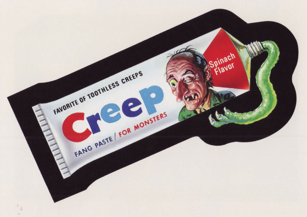
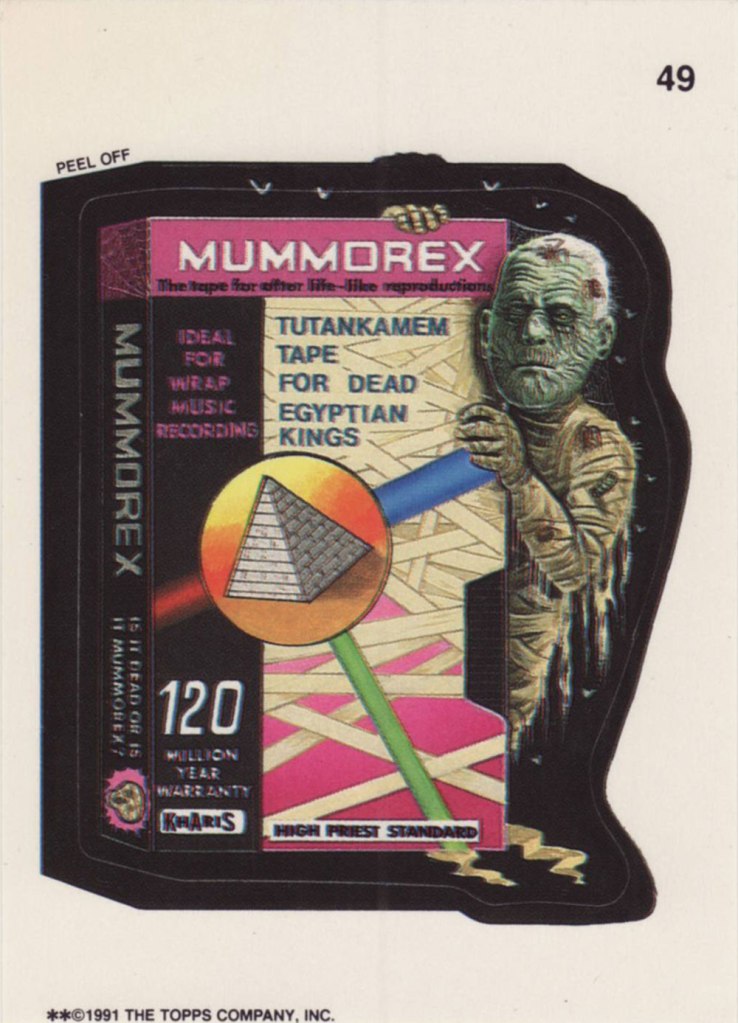
Ladies and gentlemen, Drew Friedman! « In 1991, I was creating many concept sketches and pencil drawings for the TOPPS company, including for their latest set of the hugely popular sticker series “Wacky Packages”. Mark Newgarden was the editor and art director for the 1991 series, and the writers for the card fronts included Newgarden, Jay Lynch, Jordan Bochanis, John Mariano and myself. I drew about 22 tight pencil images which would (with one exception) be painted by the illustrator Patrick Pigott. » If you enjoy being privy to an artist’s creative process, by all means do yourself a favour and feast your peepers on this gallery of Friedman’s roughs, finishes, used and unused pieces. In this (mummy) case, it’s Friedman pencils, finished art by Tomas Bunk.
From the 6th Series (1974, Topps). Most likely painted by Norm Saunders.
From the 8th Series (1974, Topps)… though mine’s a 1980’s reprint. Painted by Norm Saunders.
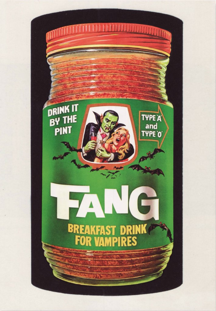
From the lucky 13th Series (1975, Topps). Another fine Saunders vintage. Topps would find Mr. Saunders most difficult to replace.
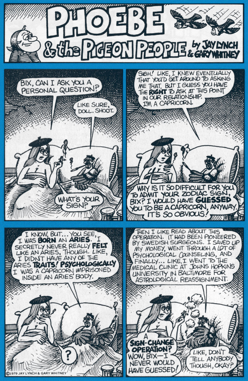
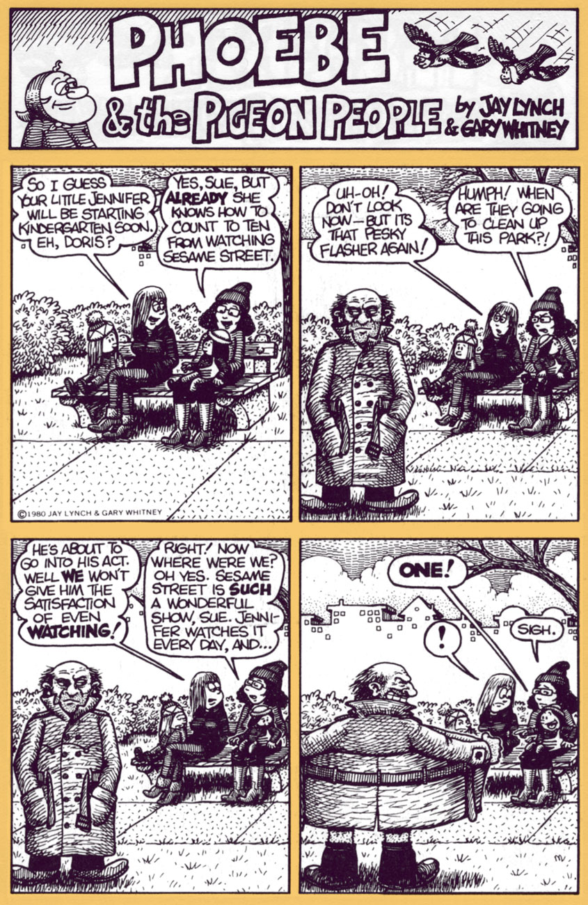
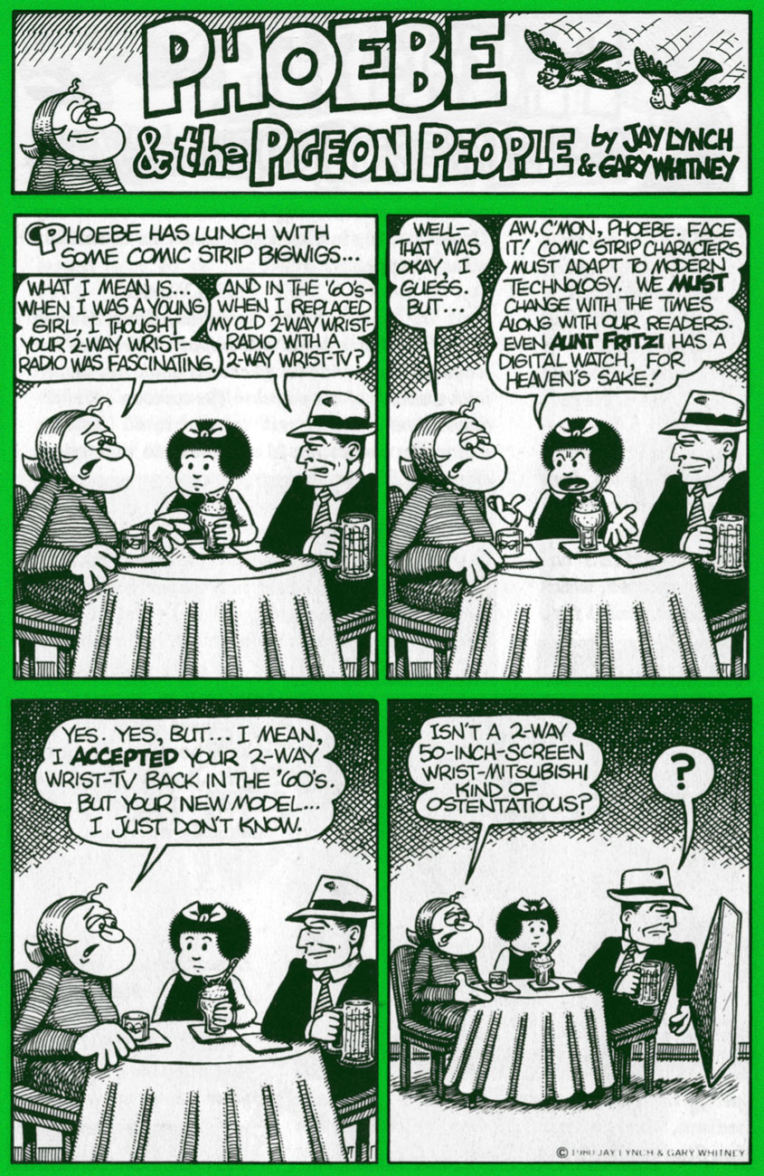
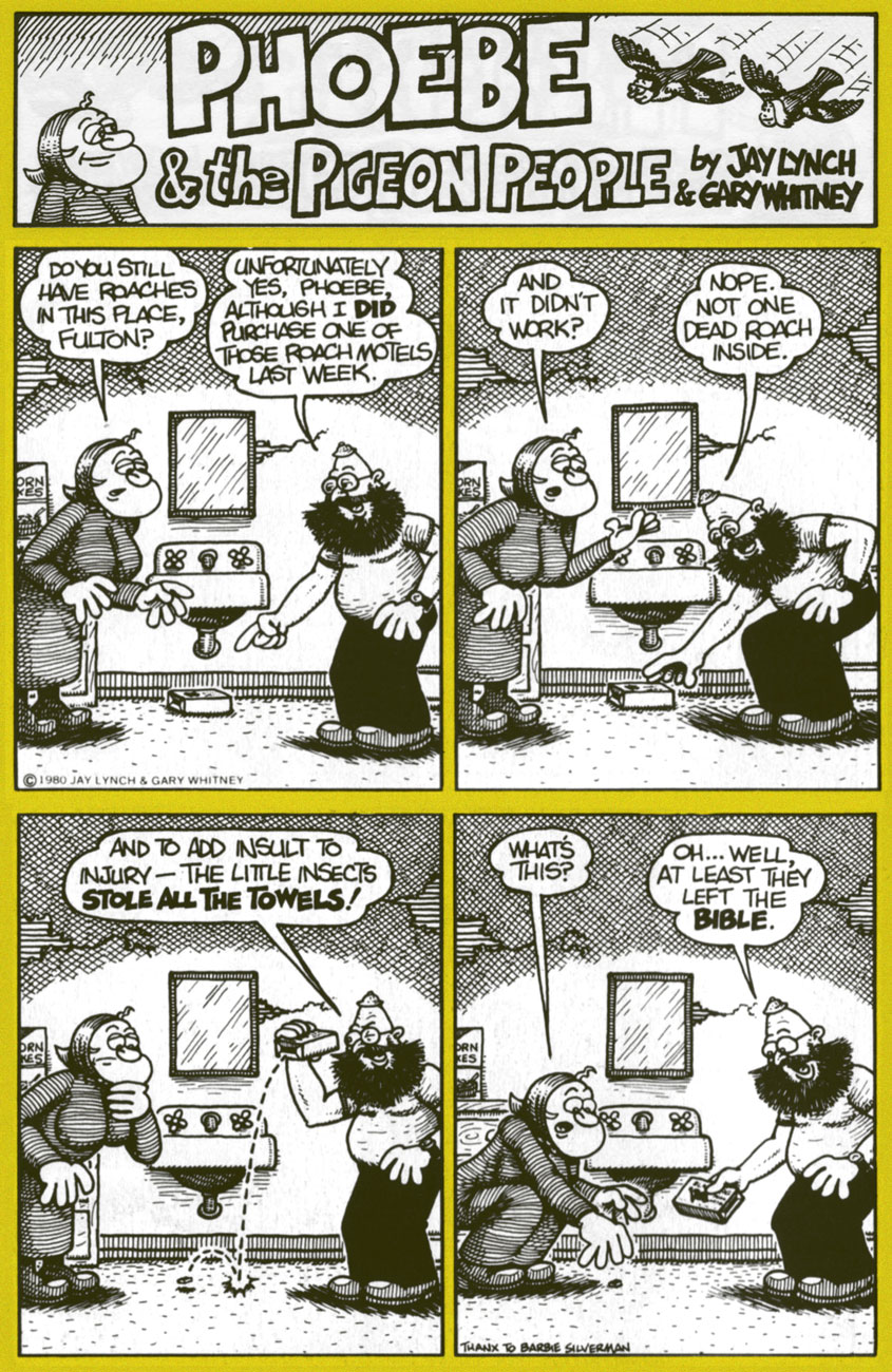
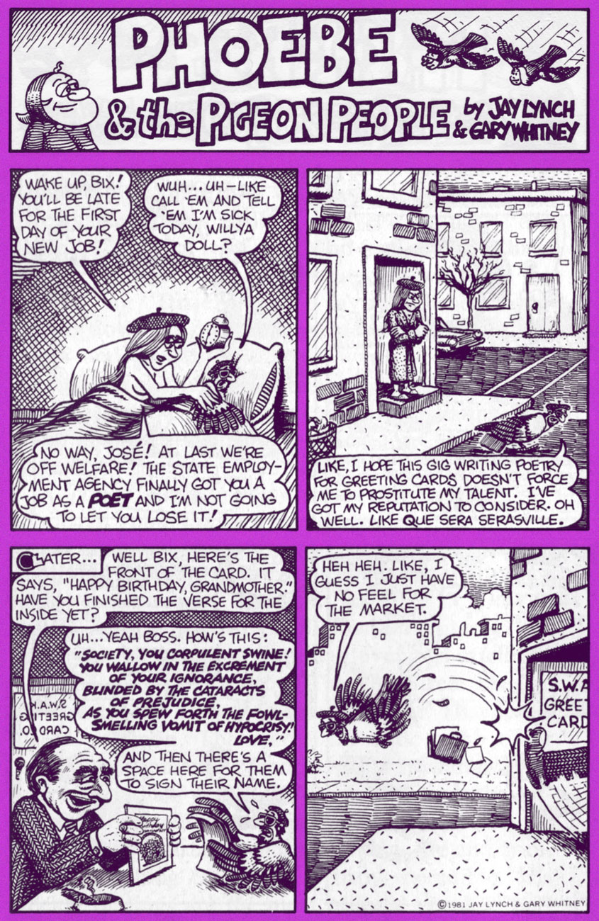
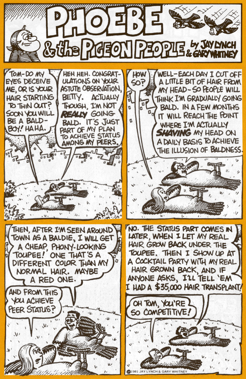
Today, we’ll shine a light upon his epochal comic strip Phoebe and the Pigeon People. Here’s how it was hatched:
« In April 1978, Lynch teamed up with cartoonist Gary Whitney to produce weekly Phoebe and the Pigeon People strips. Lynch wrote them and Whitney drew them. “It was very easy and it got us invited to cocktail parties”, said Lynch. “We wanted to do a strip that would appeal to secretaries, rather than a strip that would appeal to the comic fan type person.”
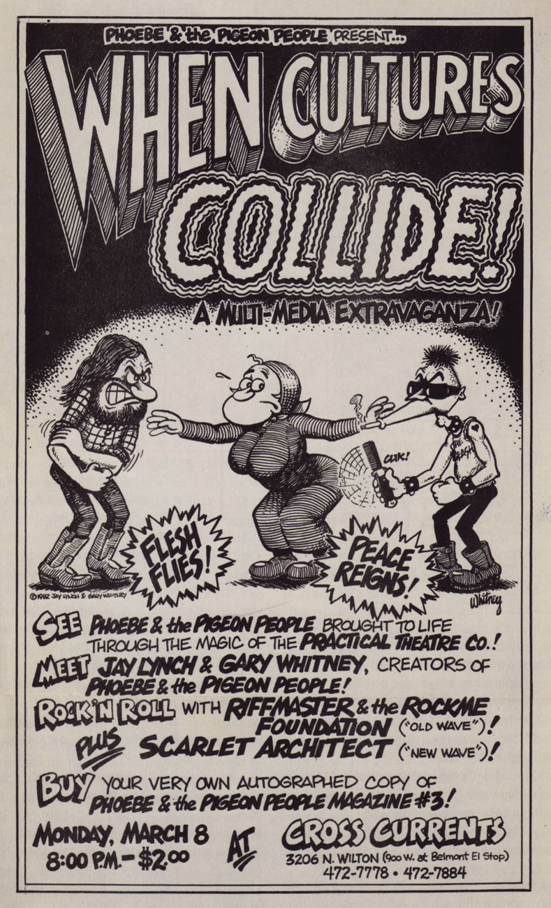
« Lynch and Whitney launched a stage show based on the characters, called When Cultures Collide, with an improvisational theater troupe, The Practical Theater. The performance included a battle of the bands between rock and new wave musicians. » (quoted from Ink & Anguish, a Jay Lynch Anthology, 2018, Fantagraphics)
P&TPP was another one of those captivatingly freewheeling features that popped up during the heady heyday of alternative weeklies. A while back, we devoted a post to Tom Hachtman‘s Gertrude’s Follies, which bloomed in a similarly unlikely fertile milieu. In Phoebe’s case, The Chicago Reader was the publication it called home during its impressive 1978-1996 run.
A 1982 poster for the event in question. Art by Gary Whitney.
For a few years now, they’ve (in this case, a shadowy outfit vaguely named “Alternative Comics“) been promising us a Phoebe collected edition. We’re still waiting. Hey, if the publisher needs more time to do the job right, so be it… but expectations are accordingly high.
Amazon’s blurb is an ominous portent: « The under-achieving Phoebe and friends hang out with beatnik people-headed jazz-loving beat-philosophy cooing pigeons in a park in Chicago. »
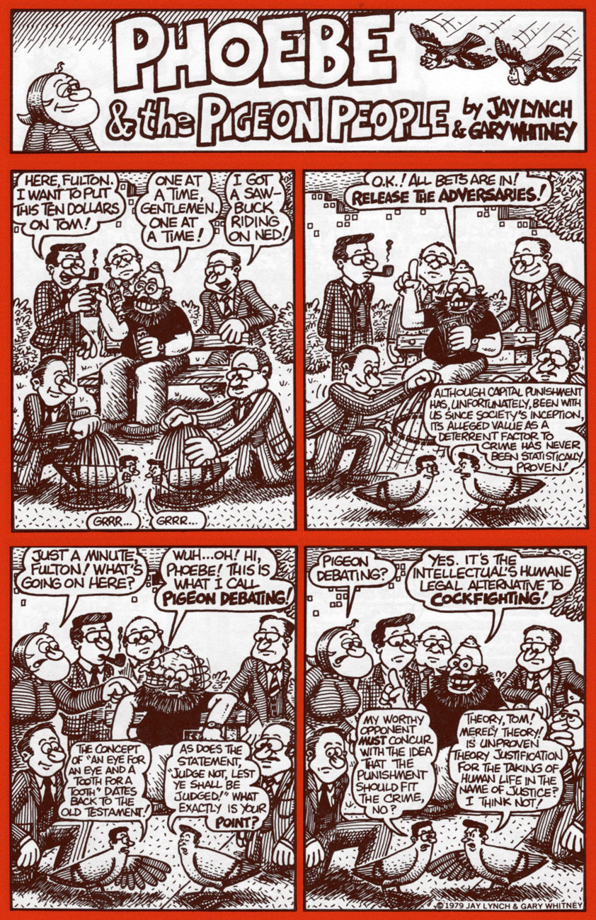
Uh, not even close. Here are a few highlight from the strip’s first four years, pulled from the pages of Kitchen Sink’s valiant three-issue run (1979-81); read these selections and you’ll know more about the strip than whoever wrote that blurb. You’re welcome!
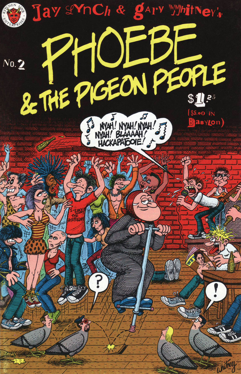
Phoebe & The Pigeon People no. 2 (May 1980, Kitchen Sink).
Clearly, these strips are so rooted in their time period that they retain no relevance whatsoever to today’s world and its social and political mores.
Ah, politicians: Plus ça change, plus c’est la même chose. I’d love to see some of our finer young minds take a crack at such an opportunity. One can still dream, right?
In Phoebe’s world, there was always plenty of room for the meta-contextual.
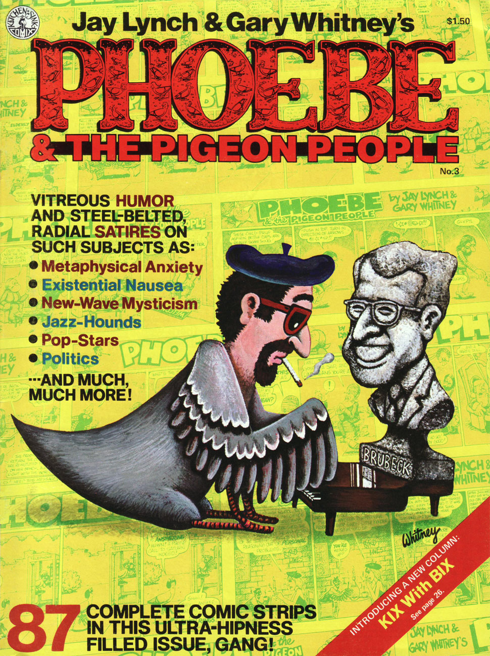
This is the magazine-size Phoebe & The Pigeon People no. 3 (July 1981, Kitchen Sink). Until the omnibus arrives, this is your best bet. Read the run right here, friends!
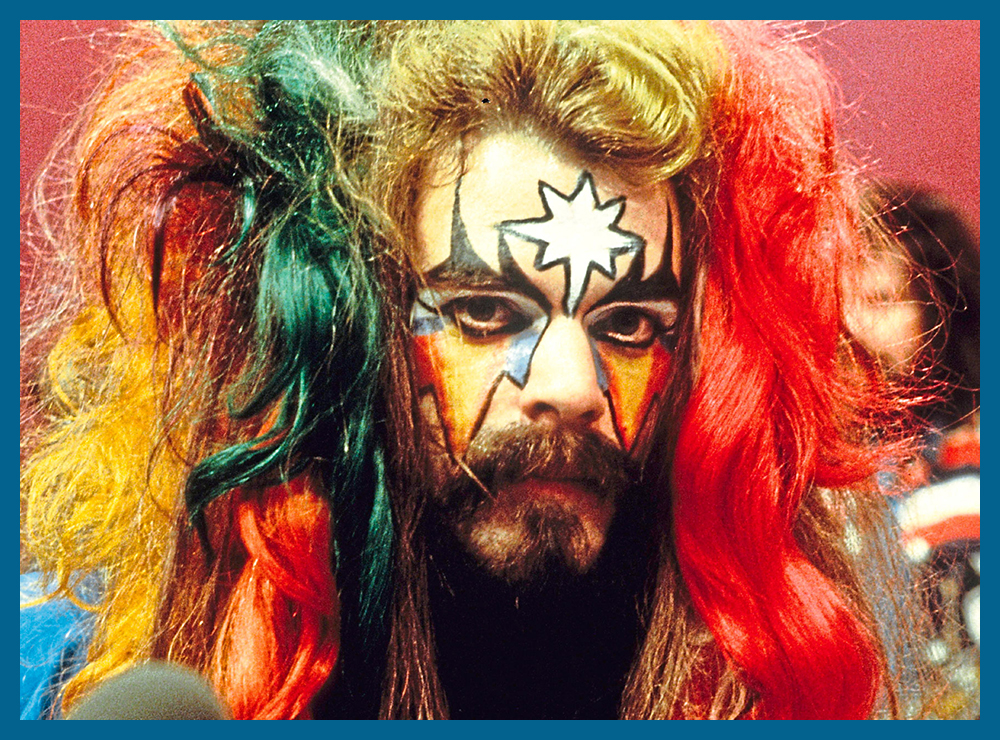
Our loveable auteurs and some of their cast, enjoying the Chicago winter. That’s Mr. Lynch on the left, Whitney on the right.
I particularly love the strip’s anything-for-a-joke ethos: as was Lynch’s wont, he ran the gamut from lowbrow to highbrow, from squeaky-clean to salacious, from sunny side up to scrambled. Let’s face it, that bizarre premise would have challenged and defeated most would-be humourists within a few weeks, let alone a decade-and-a-half.
Jay Lynch, dapper elder, as he appears in the short film There’s Something Weird About Jay Lynch (2014, filmed and edited by John Kinhart). Watch it here!
« So to this my life has come: there’s meaning in a piece of gum » — Parthenon Huxley, Bazooka Joe
We recently lost another fine cartoonist in Howard Cruse (May 2, 1944 – Nov. 26, 2019), and while he’s most frequently celebrated for his pioneering work in Queer comix and his graphic novel Stuck Rubber Baby, I’m much fonder of his comparatively ‘lightweight’ humorous work. In other words, I’ll take the wacky short stories over the Ponderous Magnum Opus, thank you.
And things don’t get any lighter than Bazooka Joe, now do they?
In 1983, Howard Cruse was engaged by Topps to redesign Bazooka Joe and illustrate a new set of strips, the series’ first true update since co-creator* Wesley Morse‘s passing in 1963. Topps, figuring on more-or-less total turnover of its kiddie audience, had been rotating batches of strips every seven years, drawing on the vast hoard of unpublished strips left by Morse, and now and then hiring freelancers to pad out the lot.
An unpublished Howard Cruse instructional comic, mid-1980s. Cruse recalled: « I always liked this strip because it’s practically the only time I was invited to draw the character at a size large enough to allow some stylistic personality. » I added the colouring, just because.
Howard Cruse Bazooka Joe model sheet, prepared for 1983 revamp.
Cruse’s model sheet for the rest of the 1983-vintage cast.
Chameleonic cartoonist R. Sikoryak, who contributed gags to the second Cruise series, posits that « One of the pleasures of the traditional comic strip is the conciseness of words and pictures, and the Bazooka format takes this compression about as far as humanly possible. As with haiku, there is a great power in the constraints that must be respected in obeying a format. »
Samples of the 1983-84 vintage.
Jay Lynch explains: « Despite the brand managers and marketing companies responsible for the various revamps of Bazooka Joe over the years, and their valiant attempts to make the characters and the gags more ‘hip‘, I’ve always thought that the primary appeal of these tiny comics was their overall lameness. Back when I wrote Bazooka Joe, I’d usually start by going through turn-of-the-century joke books and rewriting the ancient quips to turn the 1908 ragtime aficionados into 1990’s heavy-metal enthusiasts… »
Some thoughtful suggestions from Cruse for the 1988 crop.
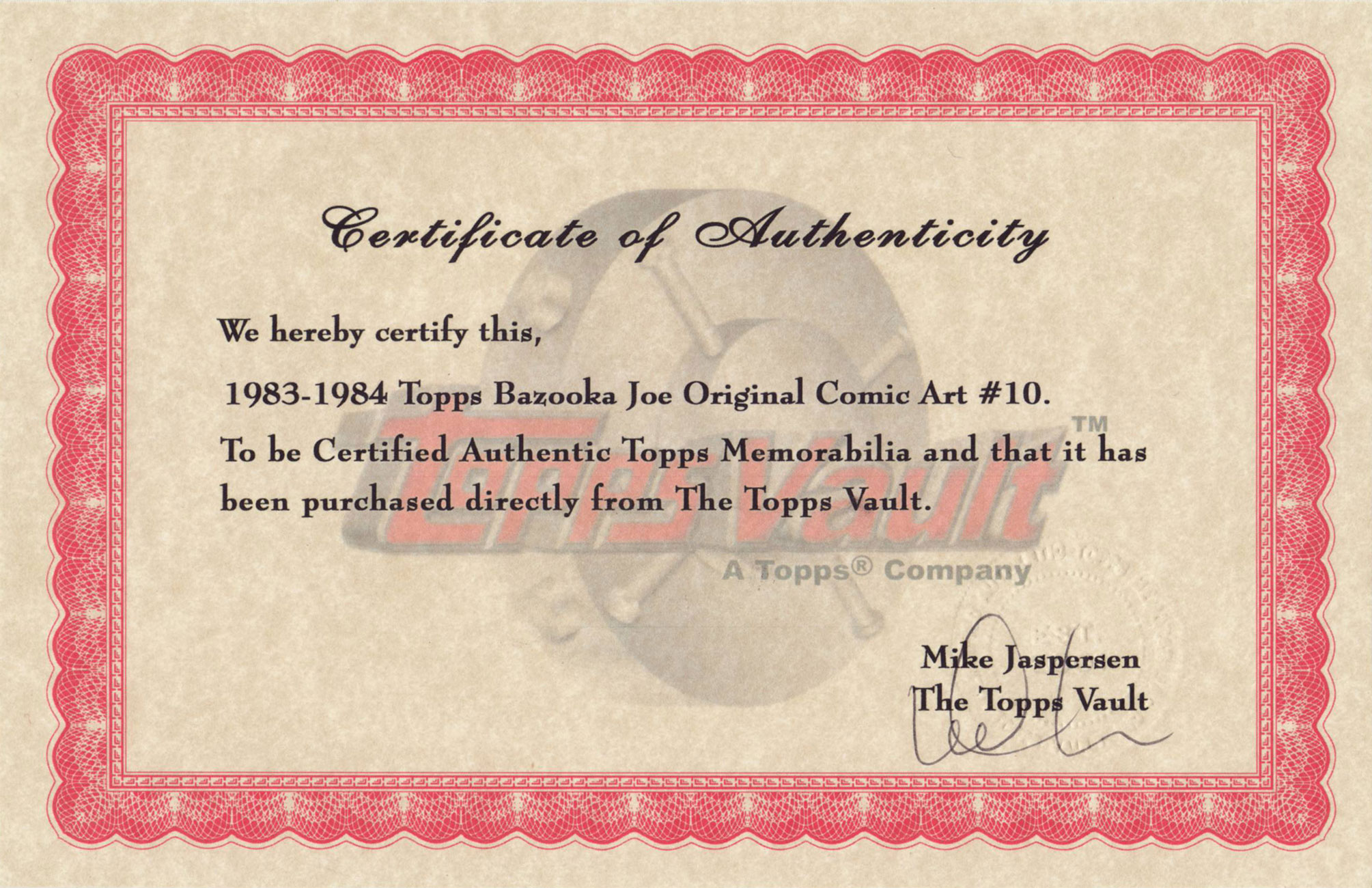
From my personal collection, original artwork supposedly from the 1983-84 batch… but something doesn’t add up. Incidentally, actual size is 3 x 3 5/8 inches.
The accompanying certificate of authenticity raises more questions than it answers. To wit, as Mr. Cruse elucidates: « When I was asked… to reconceive Bazooka Joe as a teenager and provide him with a new ‘gang‘, the only holdover from the earlier tykes… was Mort, the weird sidekick who wore a turtleneck pulled up to his eyes. Len [Brown] and Art Spiegelman… thought the ultra-lengthy turtleneck was a bit – in fact, was literally – over the top, though. So for my first series of strips the sweater’s collar was brought down below Mort’s chin… Apparently this change disturbed some nameless traditionalists at Topps, so when I was hired to draw a second batch of strips in 1988, the turtleneck was restored to its original position… » In that case, if my original is from the ’83-’84 series, why is Mort’s turtleneck in its traditional, and proper place?
Another certificate, this one appearing on the back of Bazooka Jerk (Garbage Pail Kids Giant Series Stickers no. 1, from 1986). Illustrated by Howard Cruse.
Then, in 1990, when the time came for another series, Topps opted to subcontract the work to a marketing company that dismissed Cruise’s work as « too goofy », according to Jay Lynch. Then Lynch, Pete Poplaski and Grass Green took up the gauntlet, which is a fascinating tale in itself… but one for another day.
If such lowly cartoon ephemera hold even the slightest sway over you, you’ll likely be very interested in Topps’ Bazooka Joe and His Gang (2013, Abrams ComicArts, edited by Charles Kochman), which proved an invaluable resource in cobbling together this post.
« Bazooka Joe has become the personification of the lowest form of humor. And this is why he’s one of the most widely known comics characters on the planet. Sure, the jokes were cornball. But that’s their appeal. » — Jay Lynch
-RG
*with Topps executive (and Golden Age comic book artist) Woody Gelman.
I’ve always been fond of this oddball little ad, which appeared in mid-70s comic books (in this case, a late 1974 DC 100-pager). It certainly demonstrates the considerable influence that pioneers such as Thimble Theatre creator Elzie Segar had on many an underground cartoonist.
If the advertised products had been iron-ons (à laRoach Studios*) instead of finished t-shirts, they’d be easier to find today. The Mickey Rat shirt is still being produced these days, though likely a grey market item… same as it ever was. On the other hand, I can find neither hide nor hair of the Hebrew Shazam shirt. Anyone? (2025 update: it’s available again here! A grateful tip of the hat to eagle-eyed reader Michael C. Rookard,)
A bountiful spread from The Natural Trading Company’s Mail-Order Catalog, which proposed T-Shirts – Posters – Art Prints – Buttons – Records – Comics… count me in!« Pinball Wizzard, you say? »
Here’s a bit of background on the Crazy World shirt, designed by (or swiped from) John Van Hamersveld, the genius behind the unforgettable The Endless Summermovie poster: « The face emblazoned across the chest of Mick Jagger in a 1972 New Musical Express feature on the Rolling Stones had a rich history according to its creator. The iconic image was the product of a mescaline and marijuana jag, after which Van Hamersveld was left with the enduring image of a man’s face with a big, toothy, wide smile. From a portrait of Jimi Hendrix he had made in 1968, Van Hamersveld came up with the Johnny Face logo the following year, which he used for promoting his own work. »
And there’s Mick, just like the man said.One of the current offerings. Oh, definitely a bootleg.
For me at least, it’s hard to look at Johnny Face without seeing in it echoes of The Face of Steeplechase, Coney Island’s widely-grinning mascot.
Trivia time: can you name the infamous individual behind the 1966 demolition of the beloved Steeplechase amusement park? Find the answer here.
As for the artist who crafted the Natural Trading Company ad, I was drawing a blank until a few years ago, when the wonderful Jay Lynch (1945-2017) kindly lifted the veil on that particular mystery: Jerry Kay was the stylish culprit. Much appreciated, Mr. Lynch!
– RG
*not to be confused with the originalRoach Studios, of course…
« Within this general framework of unbridled insanity, we got in our digs at corporate culture. » – Jay Lynch (1945-2017)
One could be reasonably forgiven for thinking that most cultural staples of one’s youth had just gone away after they slipped beneath one’s radar, or the craze fizzled out. Not so with Topps’ resilient Wacky Packages… they go away for a few years, then resurface in times of greater need. One does have to wonder what their exact audience is, though: some of these jokes and allusions take direct aim at adult sensibilities. Case in point: 2006’s « Brokeback Mountain Duo, The Drink You Wish You Could Quit » (courtesy of twisted masterminds Jay Lynch and John Pound).
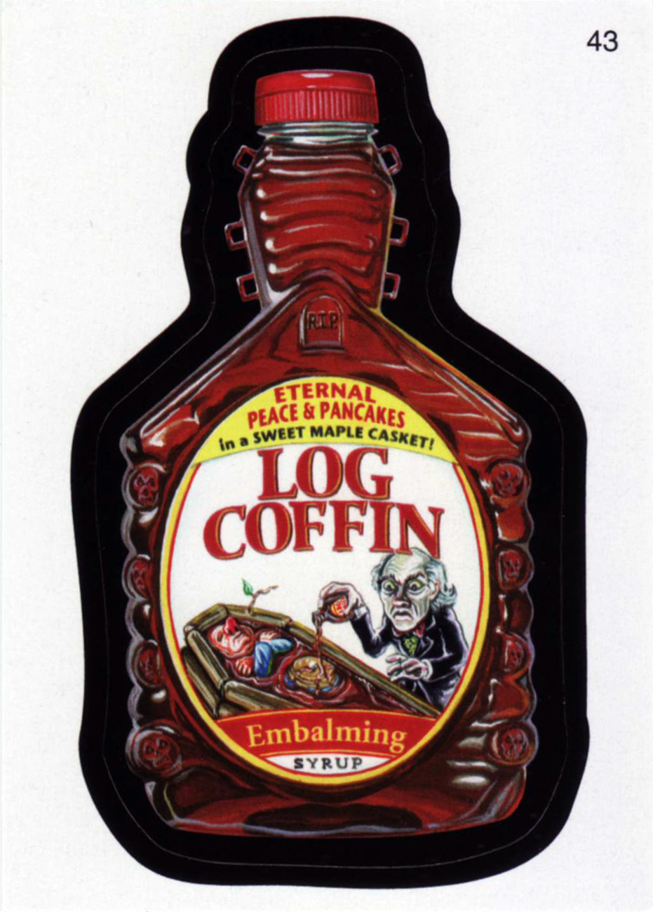
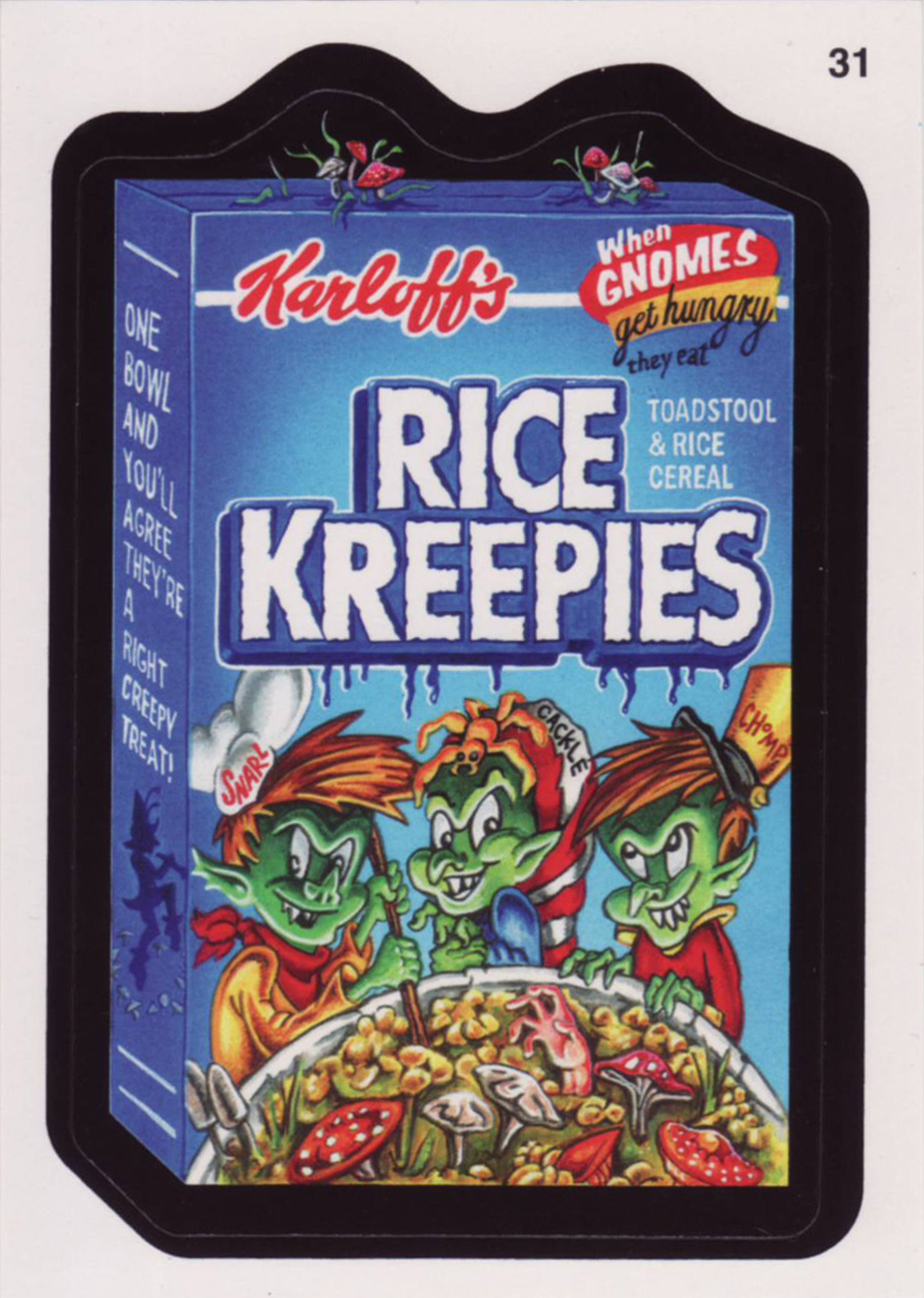
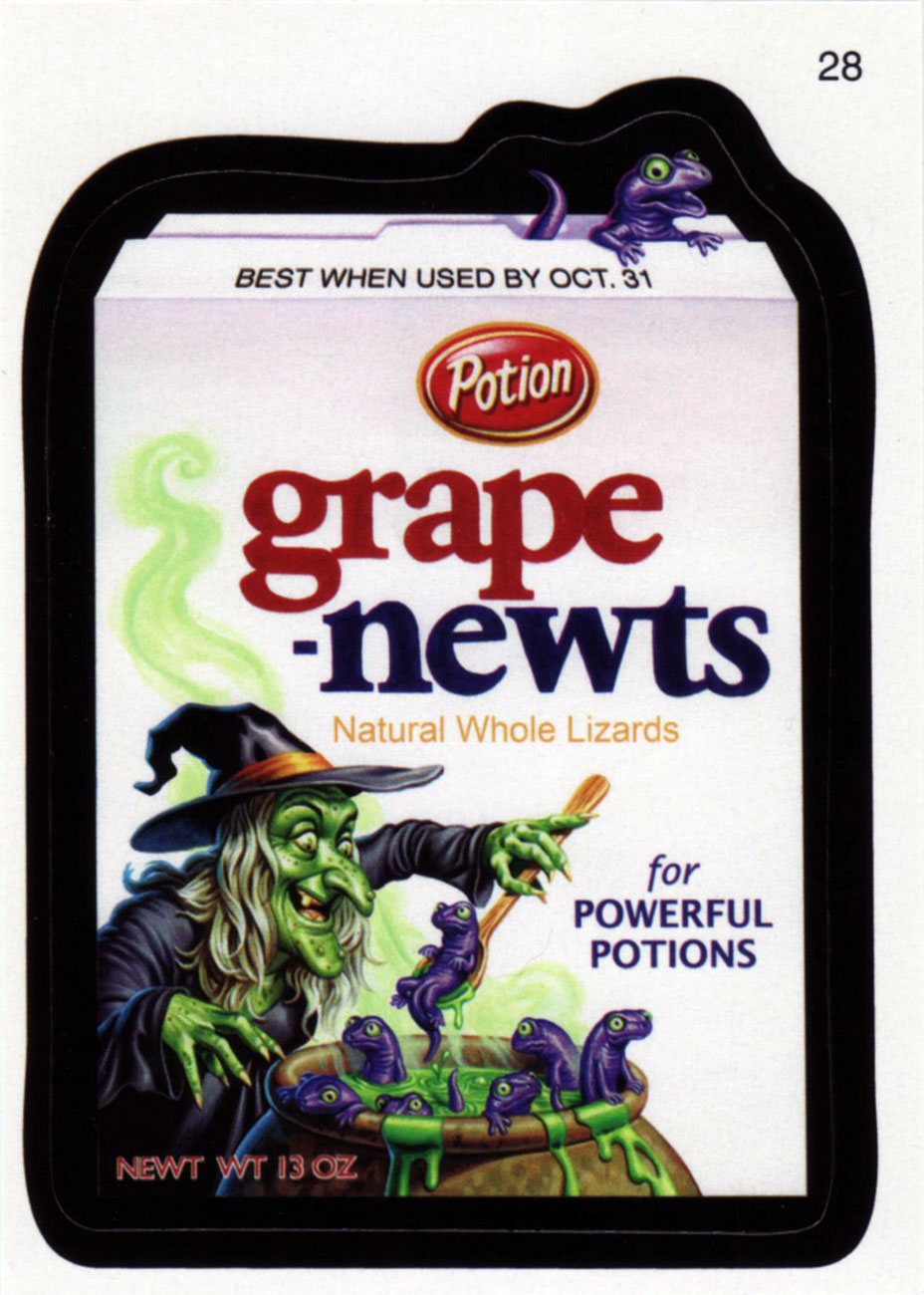
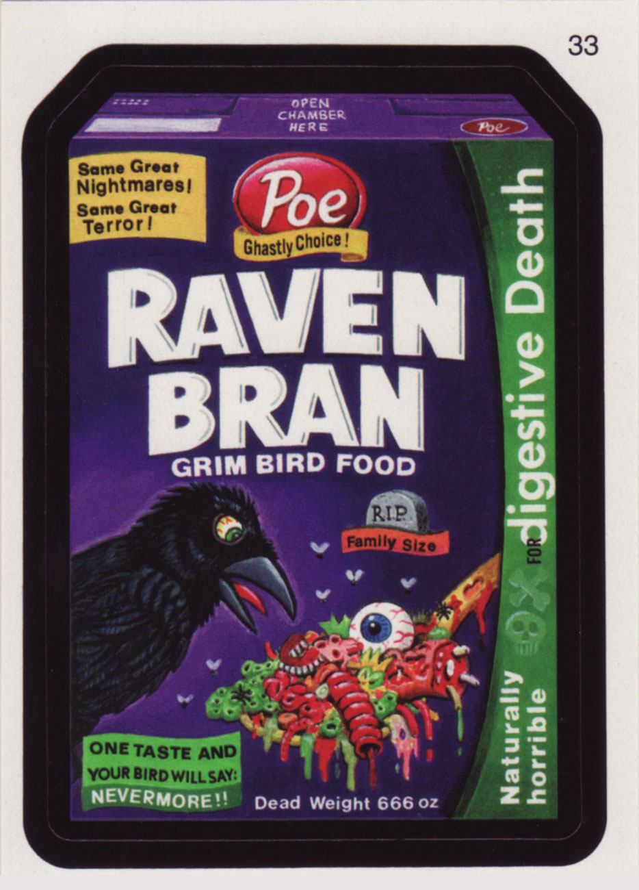
Without further ado, instead of the old stickers you fondly but perhaps dimly recall, here are some recent ones you most likely haven’t encountered (though the objects of parody will be familiar), with the properly spooky thematic accent, of course.
Let’s commence Tentacle Tuesday on a ticklish note (tentacles are itchy, you know, especially when they’re crawling up one’s leg) with Rip Off Comics no. 23, “the rip-snorting science fiction issue!”
Typical: the good-looking gal has to defend herself and her goofy-looking idiot of a partner from tentacles, claws, fangs, and other typical dangers of deep space. Rip Off Comics no. 23 (summer 1989), cover by Hal S. Robins, with colours by Guy Colwell. Look closely at the tiny drawings hiding inside “Rip Off”, and you’ll see Fat Freddy’s cat bouncing around merrily! Actually, you’ll see pretty much the whole cast of Furry Freak Brothers, and then some.
If a tentacle creeps out from the pages of a book you’re reading to gently prod you, you know you’ve made the right choice of reading material.
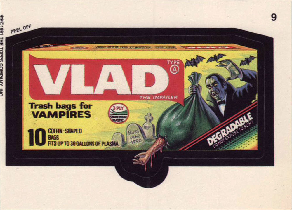
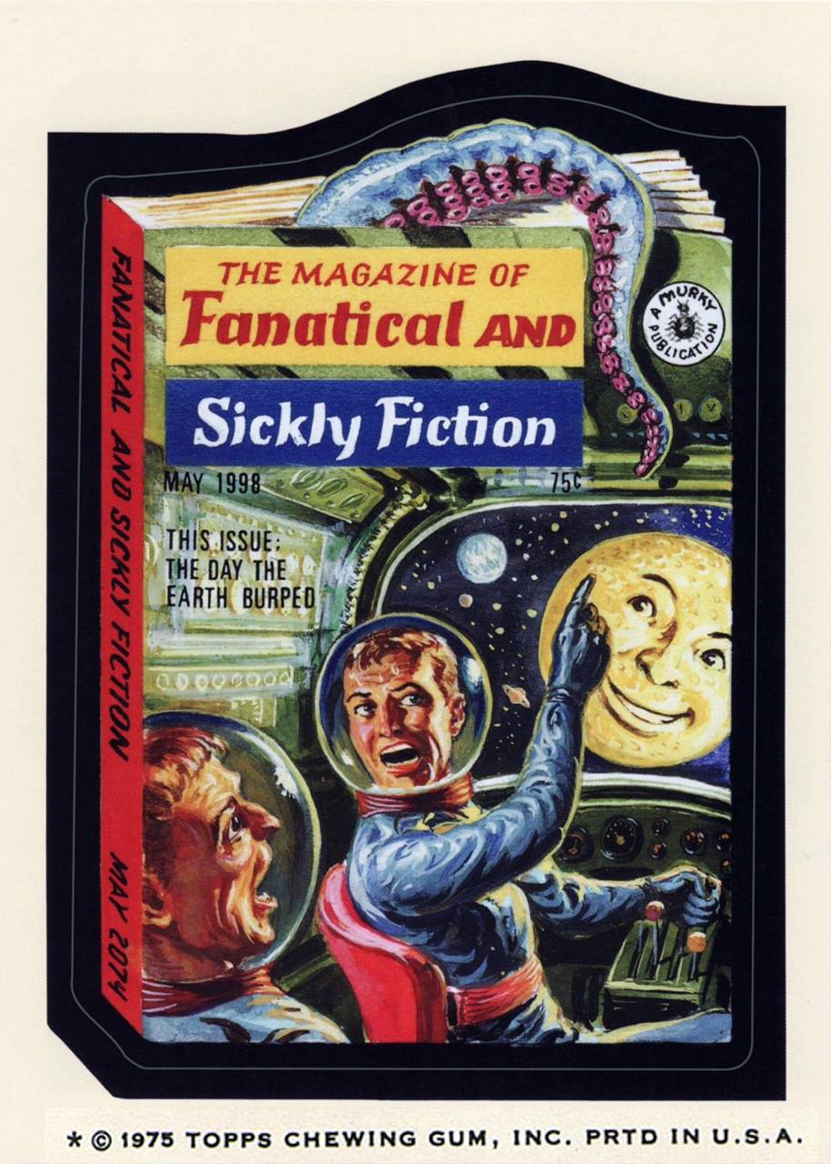
This Wacky Packages card (from the 14th series, released in April/June 1975) is painted by Norman Saunders from a concept by Jay Lynch (which looks like this). Given that the moon is grinning at them, I think these two are high on something (I’m willing to accept tentacles in space, but I draw the line at anthropomorphized satellites).
Sometimes tentacles masquerade as waves, but we know better! Dunno why some sea god would want a cyborg chunk of metal, though.
Rom no. 1, July 2016 (IDW), a variant cover from something called « Retailer Incentive ». Art by the ever-decorative and undeniably stylish P. Craig Russell, who unfortunately seems to mostly have squandered his talents on operatic and fairy tale adaptations (not counting a few marvelous short stories). Some people’s thing, no doubt, but not mine!
Rom the Spaceknight was a toy created by three men (Scott Dankman, Richard C. Levy and Bryan L. McCoy) in 1979. His creators called him COBOL (a programming language), but he was renamed into ROM (« read only memory ») by the executives of Parker Brothers, the company that bought rights to the this « beeping, thinking toy » (which Time predicted would « end up among the dust balls under the playroom sofa »). As part of a promotional effort, Parker Brothers promptly licensed him to Marvel. Rom the toy was a commercial failure, but Rom the comic book went on to last 75 issues, beeping its last bleep in 1986 (not counting the comic’s revival by IDW in 2016).
The comic may have passed from Marvel’s hands into IDW’s, but the description still seems to have been written by a hyper-ventilating lummox flinging spit everywhere as he croaks: “WE’VE BEEN INVADED AND ONLY A SPACE KNIGHT CAN SAVE US! Now the ongoing tale of ROM begins in earnest! Christos Gage, Chris Ryall, and David Messina kick off the wildest new series of the year as Rom’s war with the DIRE WRAITHS hits close to home in ‘Earthfall, part 1!’ ‘The long-beloved and even longer absent space hero returns at long last! First, we brought back MICRONAUTS! And Now… ROM! As if Rom’s return wasn’t enough, wait’ll you see how this one ends!” Brr.
So far, the tentacles featured have been rather on the tame side. Let’s have something properly terrifying…
Lance Lewis (Space Detective) and his girlfriend Marna may be in a tight spot… but I’m sorry, I’m having trouble imagining the terror of being overcome by these teeny-tiny octopuses. They’re just too dang cute, clinging to Marna’s legs like puppies begging for food. Startling Comics no. 53, 1948, the last issue of this series. Cover by Alex Schomburg (1905-1998), a prolific Puerto Rican artist (this is signed as Xela).
Oh well, terror petered out today. I guess this Tentacle Tuesday is not going to scare anybody witless. There’s always next time!
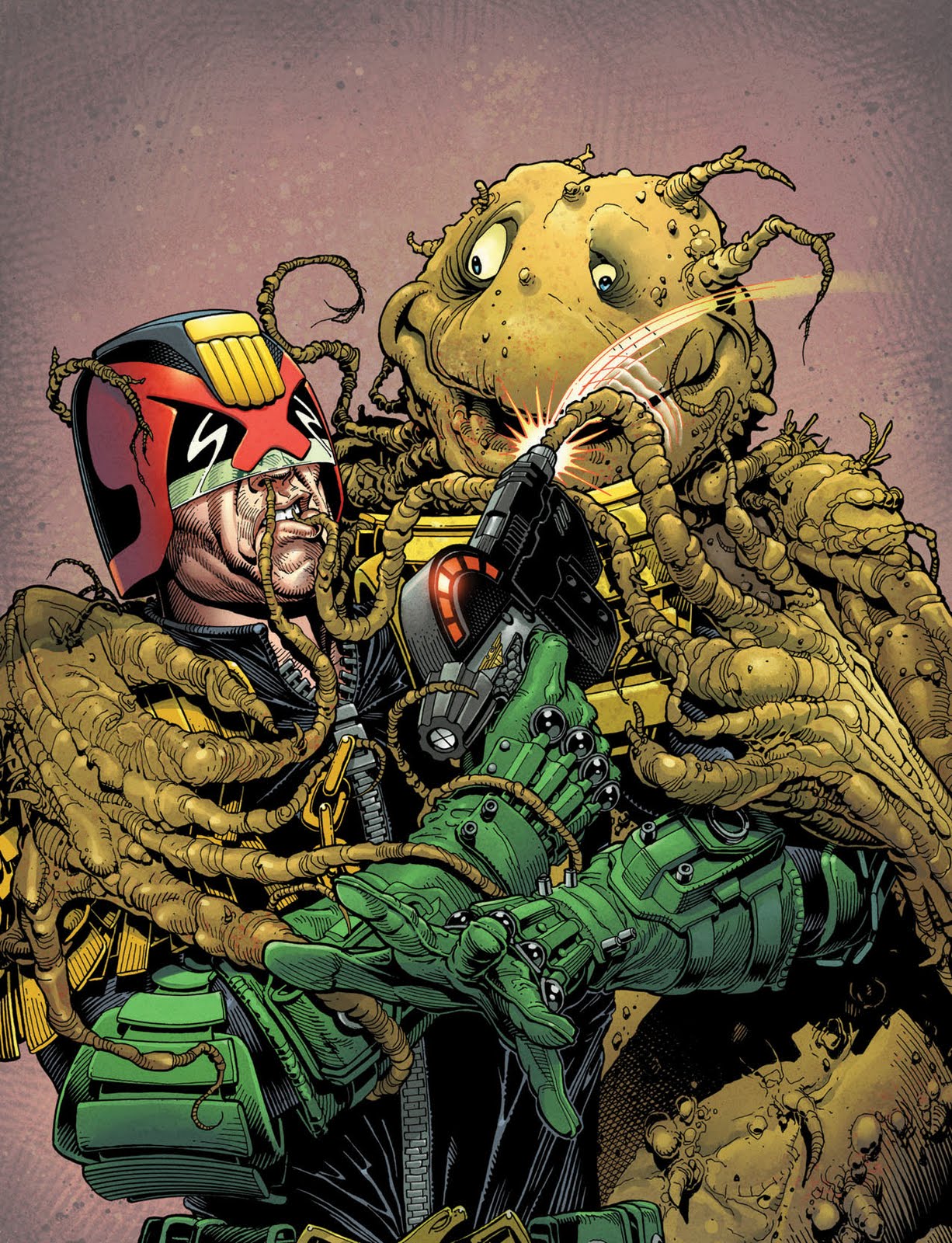
Tentacles gleefully probing various orifices, that’s what my mind is on this Tentacle Tuesday. We well know that octopuses not only tend to strangle their victims, but also get close up and personal with their anatomy.
Just look at this adorable (did I say “adorable”? Maybe I meant “horrifyingly ugly”? I always get these two mixed up) cutie wrap Judge Dredd in his affectionate embrace.
I’ll let Pete Wells, owner of the « 200 A.D. Covers Uncovered » blog, explain the Couch Potatoes: « Behold, the god-like Cliff Robinson’s fantastic cover for Prog 1726, which features the welcome return of the Couch Potatoes. Another crazy Mega-City fad, the couch potatoes were lovable humanoid/vegetable lifeforms that sat in front of the Tri-D, repeating common phrases to its owner – think of a Little Britain fan and you’ll get the idea. The creatures were outlawed by the Justice Department when it transpired that they were super-evolving and feeding on their owners! »
Head over to Wells’ blog to watch this cover evolve from a preliminary sketch into a full-blown vision of tentacular glory.
A page from « Children of the Future », drawn by Paolo Eleuteri Serpieri, published in a special edition of Heavy Metal called « Son of Heavy Metal », May 1984. Looks like the children of the future shall be some unholy octopus-human breed. Amusingly, the lecherous multi-tentacled sleazeball is still named Octo despite having many, many more appendages than just 8.
Serpieri is an Italian comic book writer and artist whose main interest is erotica. (His style is not really my thing, but hey, tentacles unite all.) He’s quite well-known for Druuna, a sci-fi/fantasy comic, which is more like an excuse to draw as many accouplements as possible.
Bonus image: Druuna and tentacles! Art by Paolo Eleuteri Serpieri. At least this ass-and-boob shot makes *some* anatomical sense – Druuna’s spine is still in place.
Lambiek Encyclopedia laconically notes that “Serpieri’s highly detailed portrayals of well-endowed heroines have earned him the undisputed title of “Master of the Ass”. Now Serpieri clearly has a huge interest in women’s asses, and he draws them lovingly, but so do a lot of other artists. Undisputed by whom? History is silent on this topic.
You can see more of his stuff here, which is definitely NSFW, unless you work in a brothel.
Sometimes you’re just minding your own business, and suddenly something green and scabrous sticks itself into your mouth. Jayzey Lynch is of course Jay Lynch, the artist of this cover (Snarf no. 2, August 1972). “Good lord!”, indeed.
M. Steven Fox of Comix Joint wrote a riveting (as usual) review of Snarf no. 2. Read it here.
« Who would have thought, in 1974, as I cruised the aisle of the San Francisco Safeway with Art Spiegelman, hunting for likely targets, that our little barbs sent at consumerism and package design would have such staying power? » — Bill Griffith, creator of Zippy the Pinhead
Topps’ legendary Wacky Packages, the bane of school authorities at their peak in the 1970s, have been opening kids’ eyes in the art of tipping over sacred cows for generations. Since everyone’s presumably well-versed in the classics (essentially the initial 1967 and 1973-75 burst of creativity), it wouldn’t be a bad idea to showcase some newer fare. In the wake of an internet-fuelled wave of nostalgic popularity, the Wackies rose again with their All-New Series (2004-), and their quality is every bit as impressive as it ever was… thanks in part to a plethora of new products to lampoon, greater creative latitude for the perpetrators, a motley crew of grizzled veterans and homely new faces.
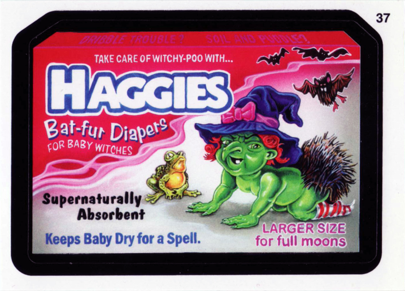
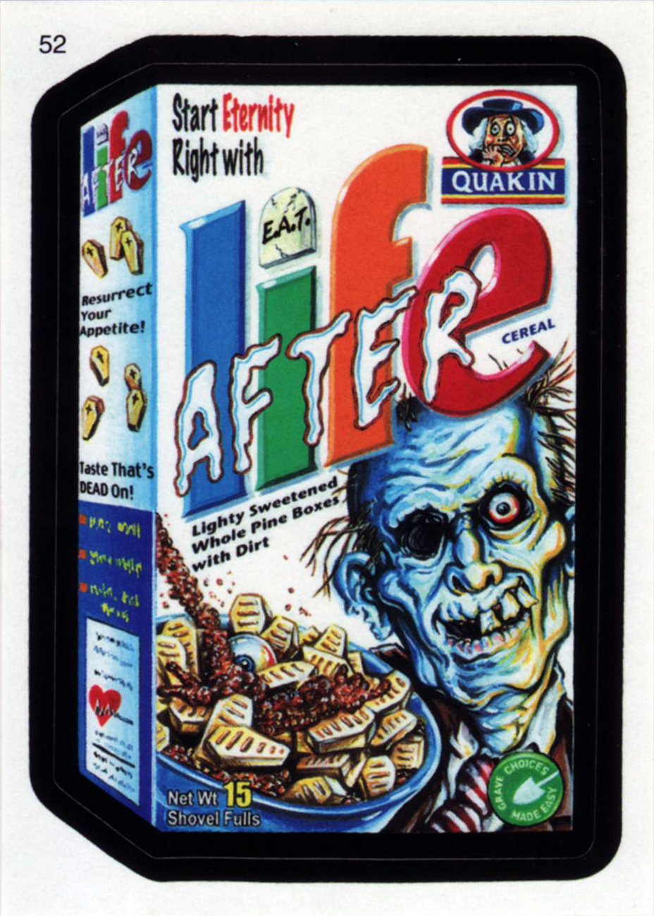
For your contemplation, here’s a trio of Hallowe’en-appropriate cards from new series 7 (2010).