« I opened my magazine (What did you see?) / I saw Mr. France (What did he have?) / A girl on each shoulder (What else?) / And one in his pants » — 10cc, Sand in My Face (1973)
You may think of this post as a companion piece, a spinoff of its predecessor. I’d had for some time, in the back of my mind, the notion to showcase some obscure French ‘human sculpture’ ads, but it needed more. Comments on the previous post provided the spark.
Is there a more classic “humble immigrant makes good in the USA” yarn than that of Angelo Siciliano, born in 1892 in the tiny Italian town of Acri? The Smithsonian has told the full, colourful story, so I’ll spare you a rehashing of it.
Let’s just say that young Siciliano worked hard to overcome adversity and redeem his puny physique, and the rest is the stuff of legend. The principles of ‘dynamic tension‘ and his immortal moniker aside, Angelo’s finest brainstorm was to employ the lowly but then-ubiquitous medium of comic books to introduce his product and its natural audience to each other. Let’s take the tour!
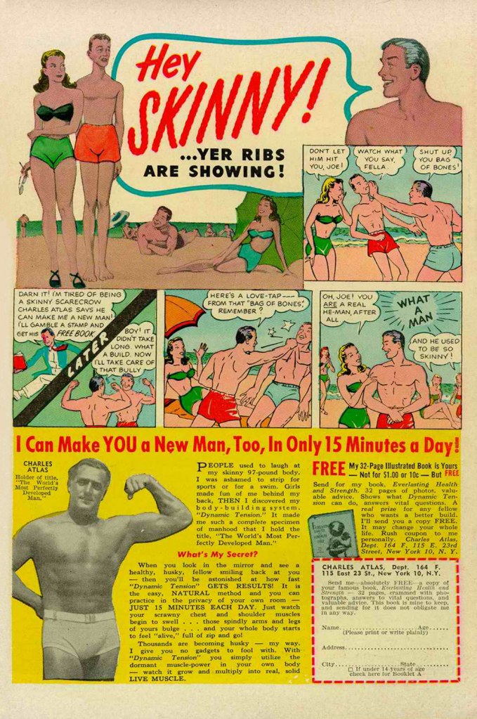
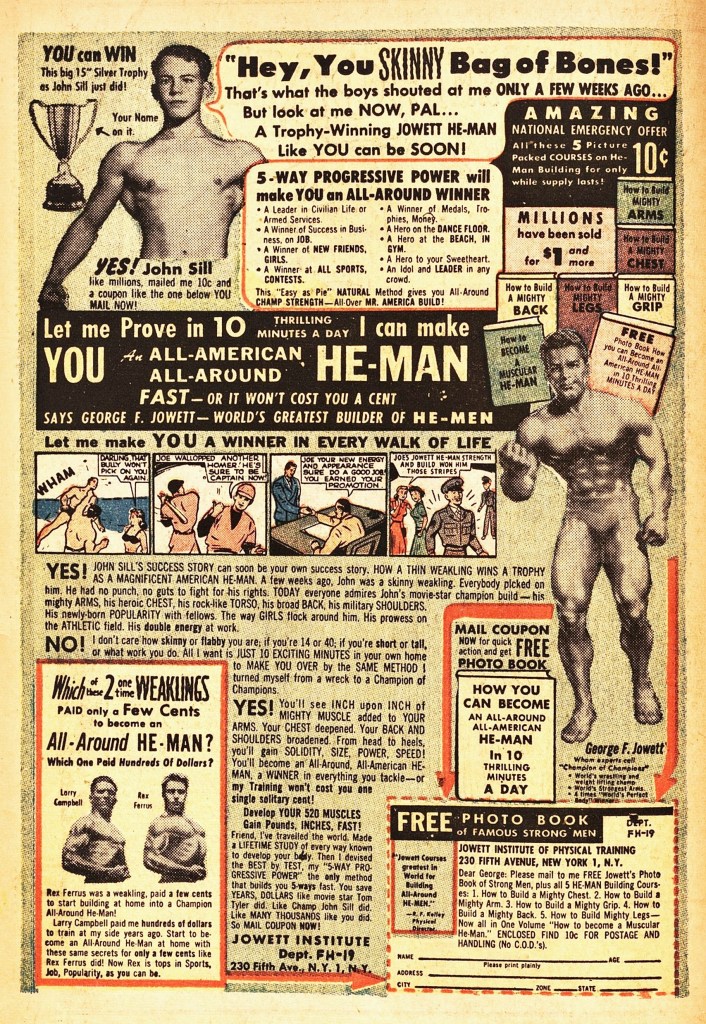
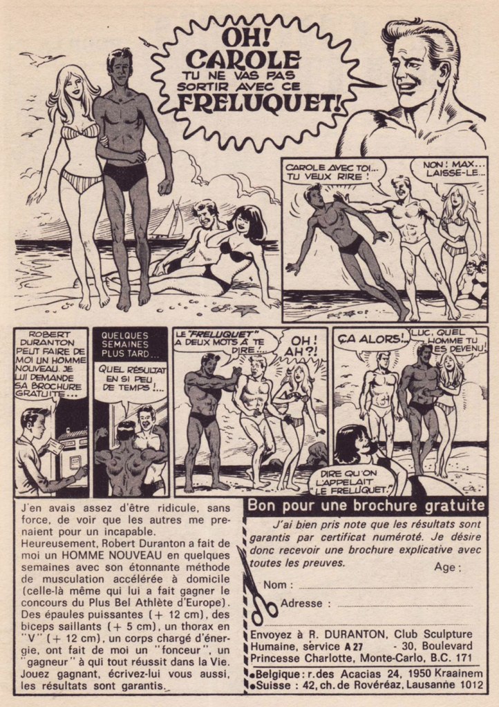
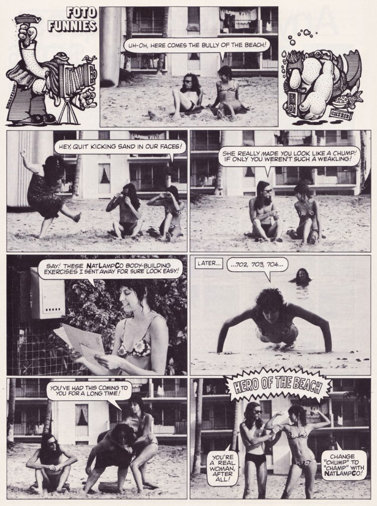
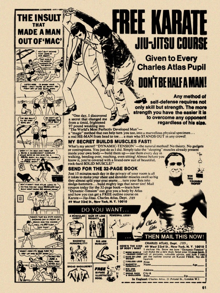
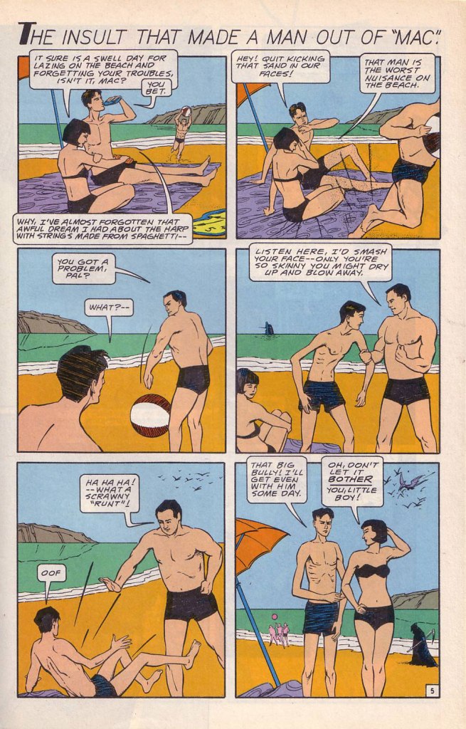
While the Charles Atlas ads began running in the 1930s, this is probably their classical expression. This one saw print as the back cover of Mad no. 14 (Aug. 1954, EC). Its opening insult even inspired Miles Heller’s 1995 salute to the great old comic book ads, Hey Skinny!There was inevitably fierce competition in the self-improvement field. This entry, from the U.S. Nature Products Corp., appeared in Stan Lee’s oh-so-macho Man Comics no. 10 (Oct. 1951, Atlas).Lots and lots of copy — but the all-important cartoon hook is present and accounted for. From the pages of Firehair no. 9 (Fall 1951, Fiction House). The Jowett Institute of Physical Training wants you to get buff! To be fair, George F. Jowett got there first.This is surely the definitive version, with the unforgettable tag line and ‘hero of the beach’ conclusion. I pulled this one from The Witching Hour no. 25 (Nov. 1972, DC), which hit newsstands just a few months before Mr. Atlas passed away, aged 80, on Christmas Eve. I can’t help being amused: French publisher Arédit, whose digest-sized collections of (mostly) reprints of US comics proudly bore the tag « Comics for adults », featured very few outside ads… and those were almost exclusively for self-defense and body-building systems. Here’s a sample trio. This one appeared in Maniaks no 4 (Fall, 1971). This title featured reprints of DC Silver Age ‘humour’ comics… all but the only actually funny one (that would be Sugar and Spike, of course).Oh, I’m sure the ERB Estate got their cut. And who might that R. Duranton fellow be? Four times Mr. France, for one thing! Here he appears with Louis de Funès in a famous scene from Le Corniaud, a 1965 farce starring beloved stars André Bourvil / De Funès and directed by Gérard Oury. This one’s from Kamandi no. 4 (Summer 1976, Artima), which featured reprints of various 60s and 70s DC adventure comics. It was an affordable way to catch up on material one might have missed — or couldn’t afford!This refreshing gender-switched lampoon comes from the pages of National Lampoon no. 26 (May, 1972), the ‘Men!’ issue, guest-edited by Anne Bats, No other credits, dammit. The opening page (of four) of Steve Skeates and Sergio Aragonés‘ wacky satire, from the pages of Plop! no. 2 (Nov.-Dec. 1973, DC). There have been truly countless spoofs of the Atlas adverts… most of them quite dire. Once more, I’ll spare you.By the mid-1970s, with America in the kung-fu grip of martial arts fever, it’s understandable that many a young man was envisioning Bruce Lee‘s lithe, compact physique as an alternative to the hulking musclemen of yore. The Charles Atlas company tried to cover all bases with this ad; from — speaking of old-time musclemen — Doc Savage no. 2 (Oct. 1975, Marvel).
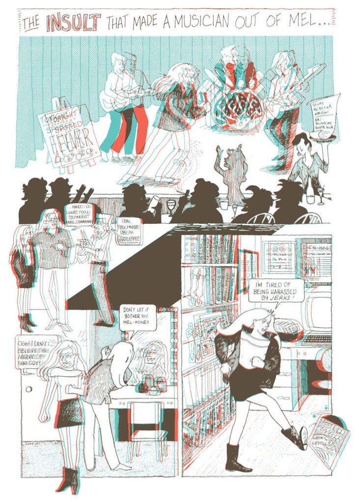
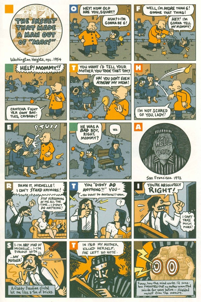
Ah, yes — those days when ‘Bruce‘ was the stereotypical gay name. From the ‘Playboy Funnies’ section of the magazine’s November, 1977 issue.And for something a bit off the beaten path: this is The Insult That Made a Musician Out of Mel, scripted by Rebecka Wright, illustrated by Blanche Santa Ana, with 3-D effects by Ray Zone, from Wimmen’s Comix no. 12 (Nov. 1987, Renegade Press), edited by Angela Bocage and Rebecka Wright.Does this look familiar? This is the first page of Flex Mentallo’s origin tale, as it appeared in Doom Patrol no. 42 (Mar. 1991, DC), written by Grant Morrison, with art by Mike Dringenberg and Doug Hazlewood. I have no idea whether Atlas had a sense of humour, but his successors sure didn’t, as evidenced by the lawsuit they filed against DC Comics over this clear — if brazen — case of satire. I much prefer the TV show version of Flex, I confess.Peter Kuper deftly used the cliché to take a jab at George Bush Sr.’s image and the first Gulf War. Dated and irrelevant? Trying to prove your ‘manhood’ remains distressingly au courant… just consider these two schmucks, to cite but one recent example. And hey, here’s “Stormin’ Norman lying on T.V.” From Bleeding Heart no. 1 (Winter 1991-92, Fantagraphics).Art Spiegelman digs deeper and makes more discerning use of the raw materials at hand with The Insult that Made a Man out of “Mac!”, first previewed in The Virginia Quarterly Review and then collected in Breakdowns Portrait of the Artist as a Young %@?*! (Oct. 2008, Pantheon).
« I wish I could blend into the background / I’ve no excuses for my lack of guts / What is it about me that draws attention? » — Kevin Godley & Lol Creme, Punchbag
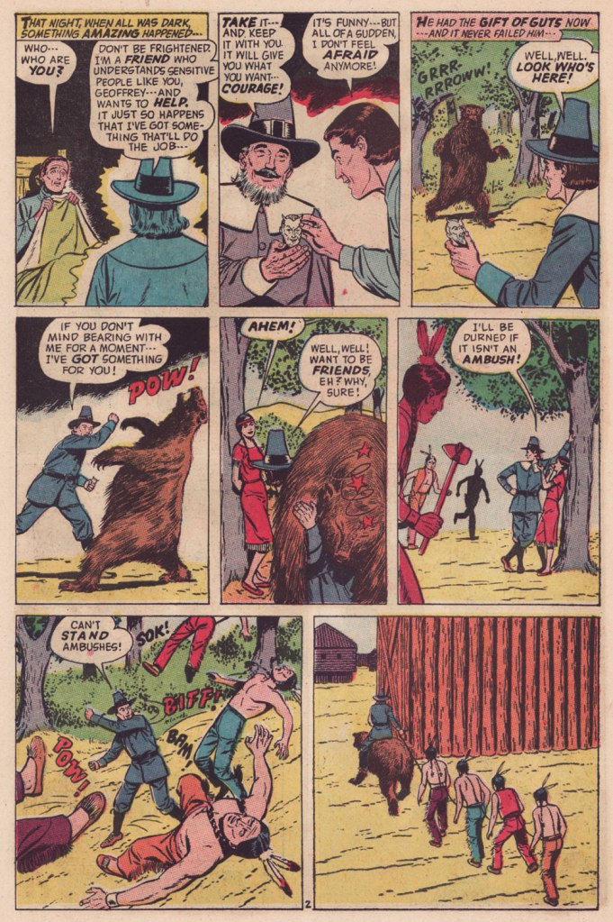
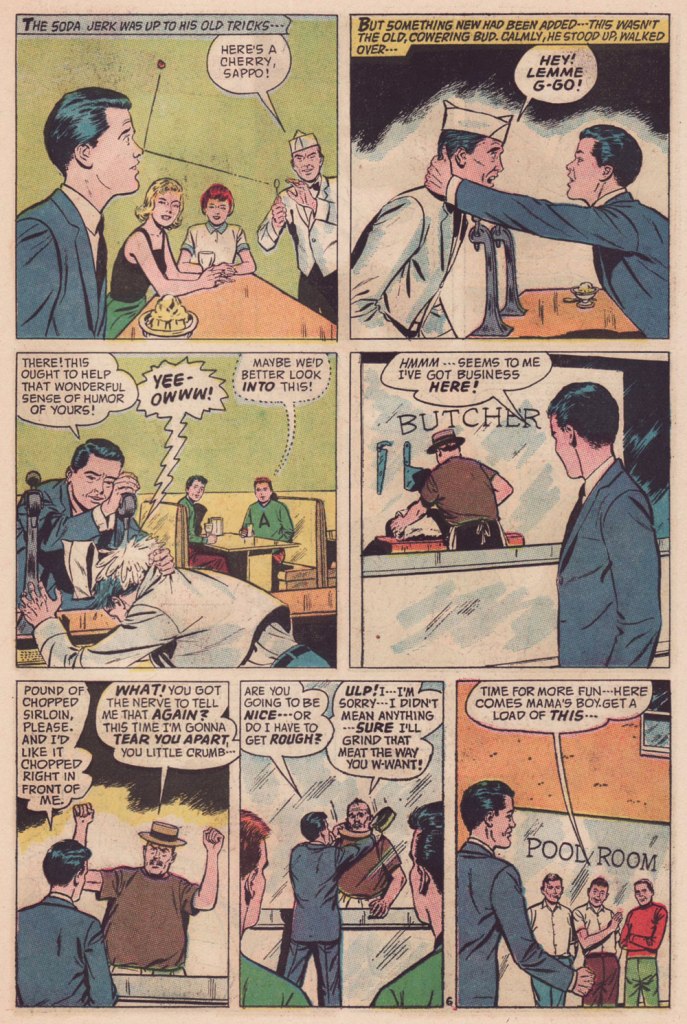
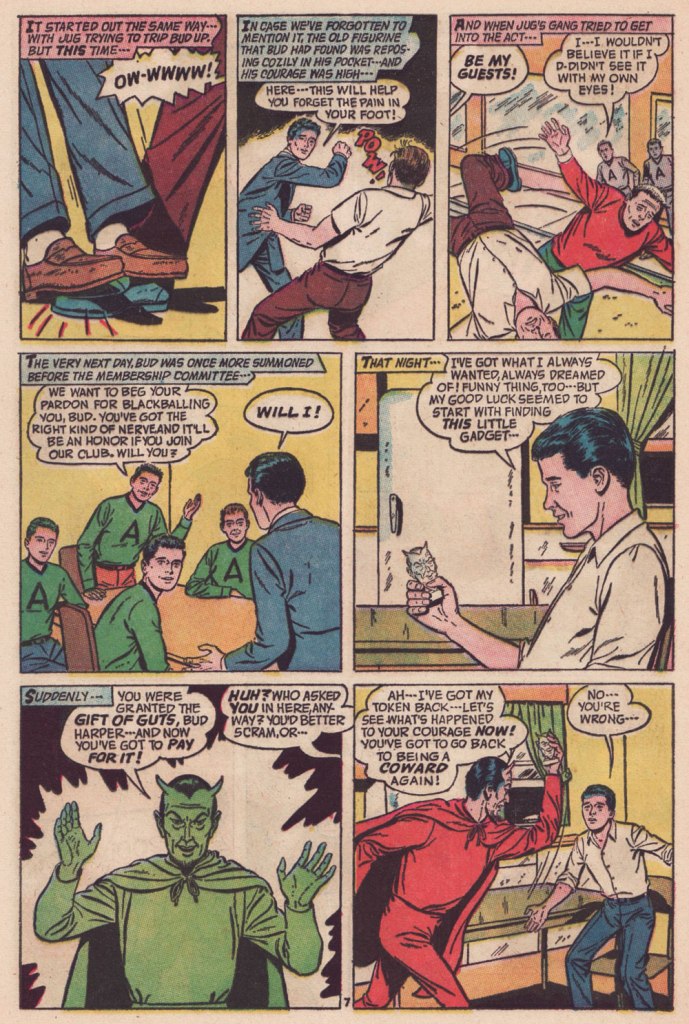
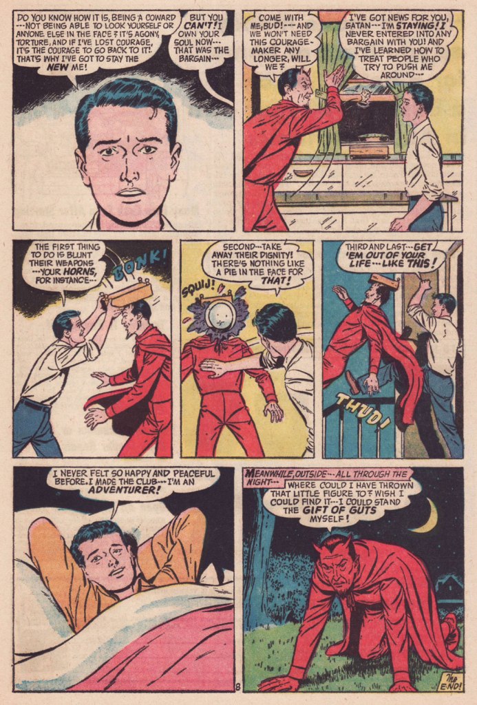
Today, let’s delve into the little-frequented wilds of that underrated little publisher that could, American Comics Group (ACG), 1943-67. The brand is chiefly recalled today for a pair of notable features: ACG pioneered the ‘horror’ anthology comic book with its Adventures Into the Unknown (1948-1967, 174 issues) and, in 1958, brought Herbie Popnecker, Richard Hughes and Ogden Whitney‘s ‘little fat nothing‘ to an unwary and undeserving world. ACG was co-founded and, briefly, co-owned by one of the field’s great villains, Harry Donenfeld.
But that’s all trivia in the end. ACG’s special appeal rests for the most part on the shoulders of one man of many monikers: writer-editor Richard E. Hughes (1909-1974).
I’ve already enumerated the man’s bona fides a couple of years back, when I featured one of his most celebrated (by ACG readers) tales, The People Versus Hendricks!, so I refer you to that particular entry.
As Hendricks’ tale was a rather tragic one, and since his dry wit ranked high among Hughes’ preeminent attributes, what do you say we set him loose for a demonstration of said lighter side?
Though many a notable illustrator passed through ACG’s doors — under his given name or otherwise — it’s undeniable that Hugues’ most consistently effective comrade-in-arms was the forenamed Mr. Whitney. Don’t let his low-key, ‘square’ approach deceive you: here’s a master storyteller at play.
Read on, febrile friends of ol’ Faust!
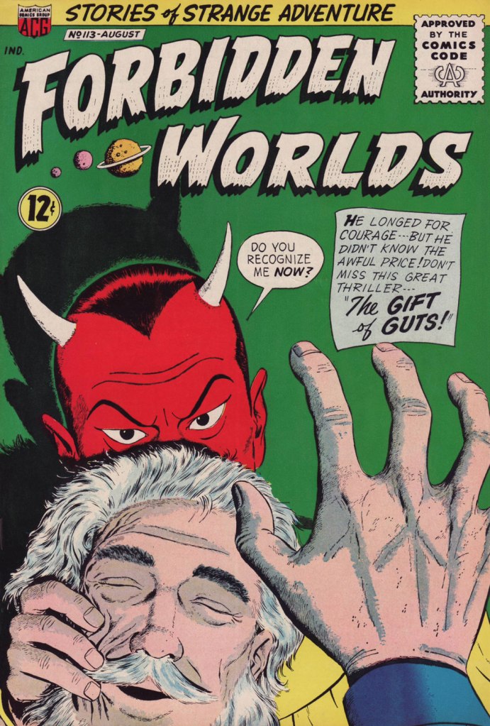
« Squij! » is now one of my favourite sound effects.The Gift of Guts was cover-featured in Forbidden Worlds no. 113 (Aug. 1963, ACG). Pencils and inks by Ogden Whitney.
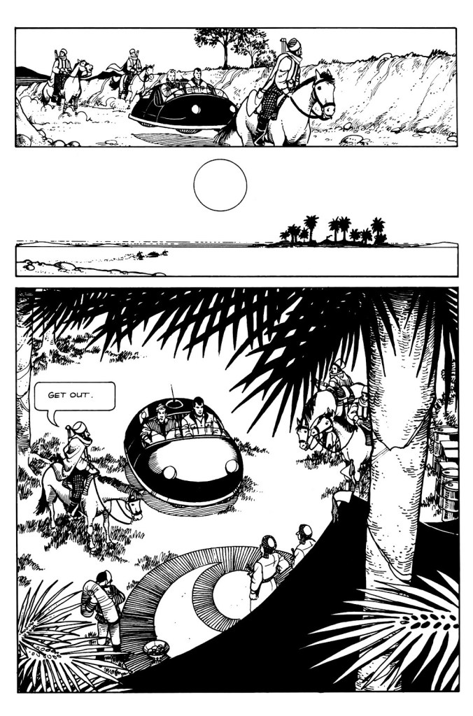
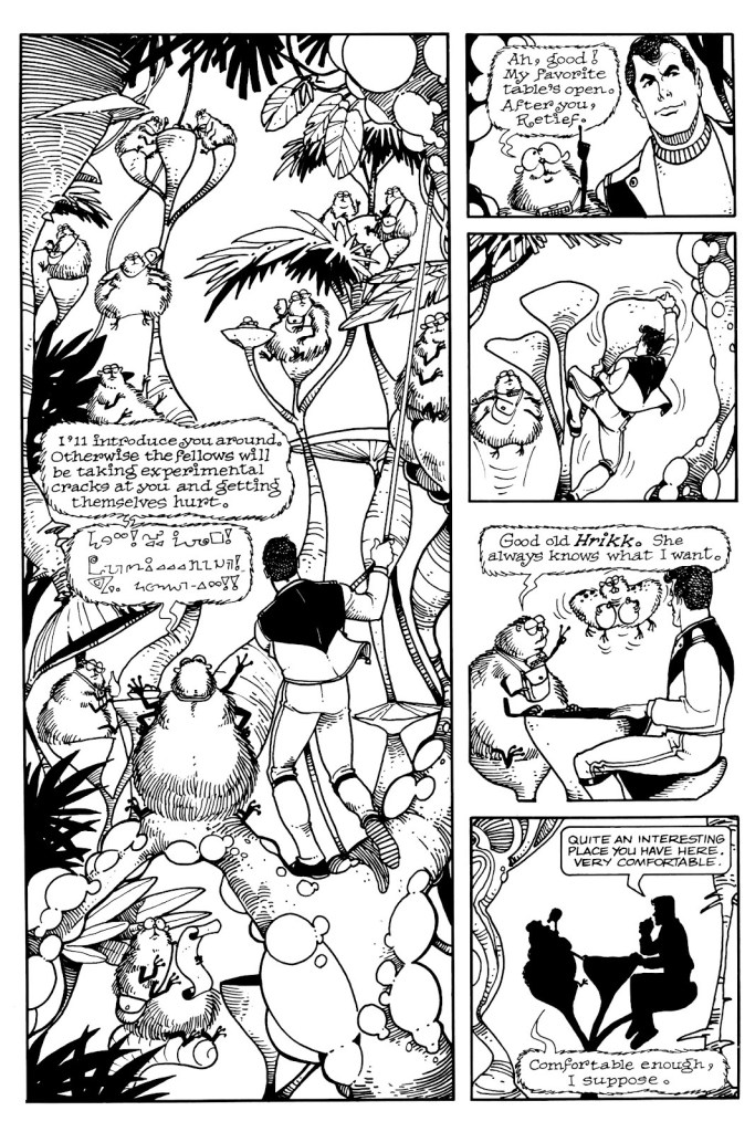
Looking at my shelves, one would be inclined to believe that I am a huge Keith Laumer fan, which wouldn’t be really true. A few of these books have Richard Powers covers (always worth collecting, even if one is not particularly interested in reading the actual book), but the rest have mostly been purchased after I encountered Laumer’s Retief character… in comic book form.
Which is not to say that Laumer’s Retief series is not worth a read, especially if you like a satirical approach to bureaucracy with a geo-political bent. Jame Retief, diplomat for the Corps Diplomatique Terrestrienne*, is the pragmatic voice in an organization mostly focused on excessive paperwork, meaningless awards, and pompous exchanges (in proper attire, naturally) between planetary representatives, all of this governed by a complex system of protocols and other galimatias. Anybody who’s worked for any kind of big company will be able to relate. Laumer served a stint as a vice consul for the United States Foreign Service, so doubtlessly he accumulated a lot of material for this. The novels rarely ascend beyond amusing, though, and the funny bits sometimes feel like somebody’s trying to be Conscientiously Funny.
Writer Jan Strnad, who has a long list of credits under his belt, having worked for pretty much all major comic publishers as well as contributing articles to The Comics Journal and writing novels, and artist Denis Fujitake** adapted several Retief stories into comic book form in the late 80s. These were published by Mad Dog Graphics. This team did such a bang-up job that I by far prefer them to the Laumer material, and no small element of this adaptation’s success is the clean art by Fujitake that brings to vivid life these characters. There were 6 great issues overall (1987-1988), collected in 1990 into Retief!: The Graphic Album.
Let’s have a look at some of my favourite moments. All of the below are excerpts from Keith Laumer stories by Strnad and Fujitake, drawn by Fujitake, and lettered by Gary Kato.
Apparently Laumer himself has always pictured Retief as having dark hair, so one might even say that these comics are closer to his vision than, say, the covers of Retief novels published by Baen Books, where he’s a sort of ditsy blonde*** with a lot of guns and mostly undressed women. I own a few of these… and yuck, one might as well stick to the electronic version.
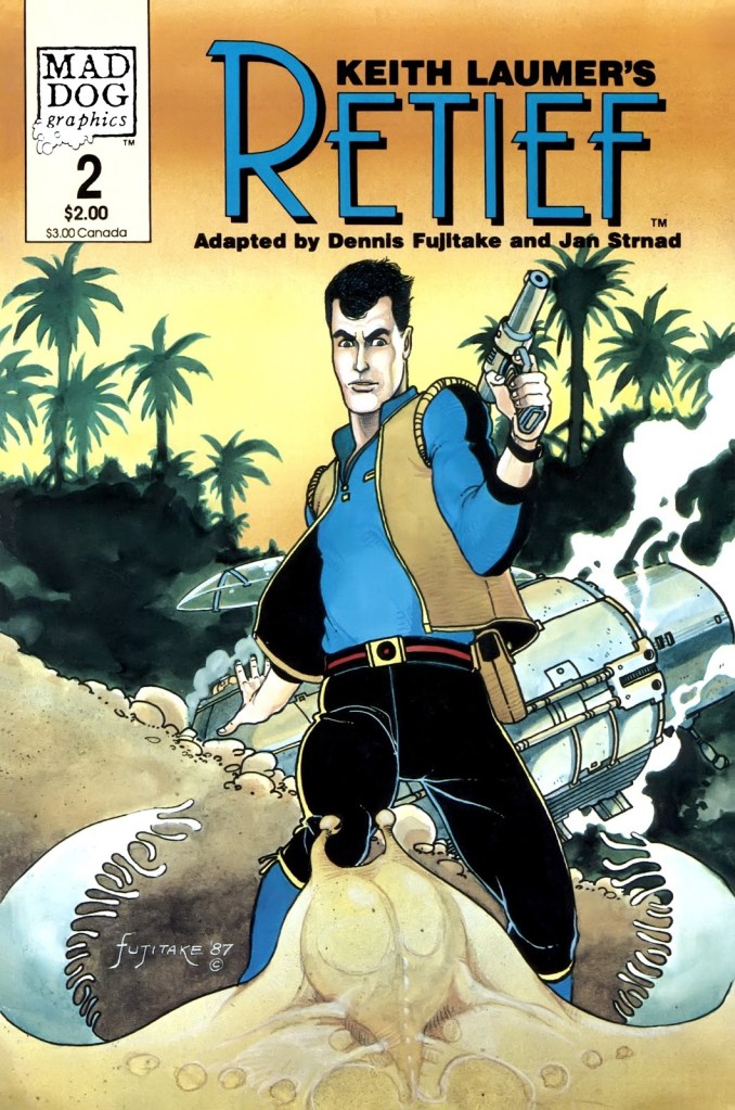
Keith Laumer’s Retief no. 1 (April 1987)
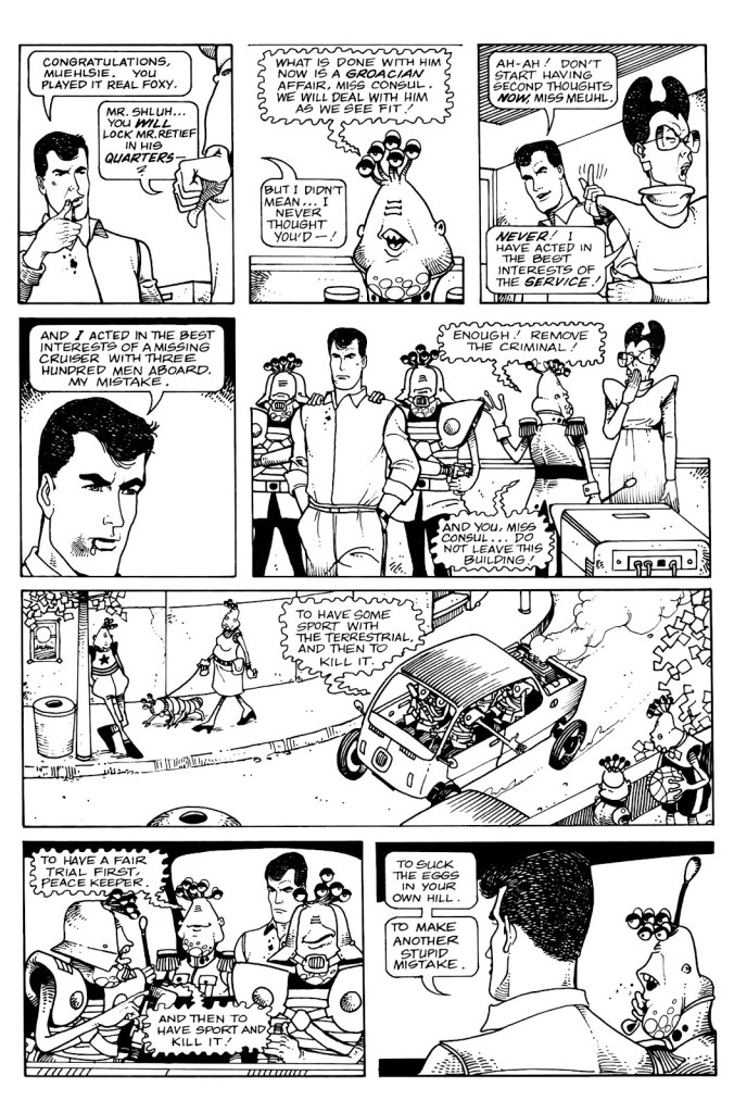
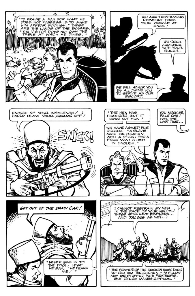
Page from Policy. Issue number 1 introduces us to the sneaky and unscrupulous Groaci, whose representative Mr. Fith has his fingers and 5 eye appendages in all pies. There are plenty of action scenes in Retief, but Fujitake’s art makes an even ordinary conversation fun to watch.
One of the closing pages from Policy, in which Miss Meuhl satisfyingly suffers a slight breakdown (when your values clash with reality, it’s generally an unpleasant process).
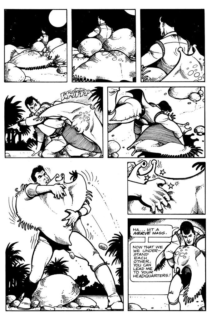
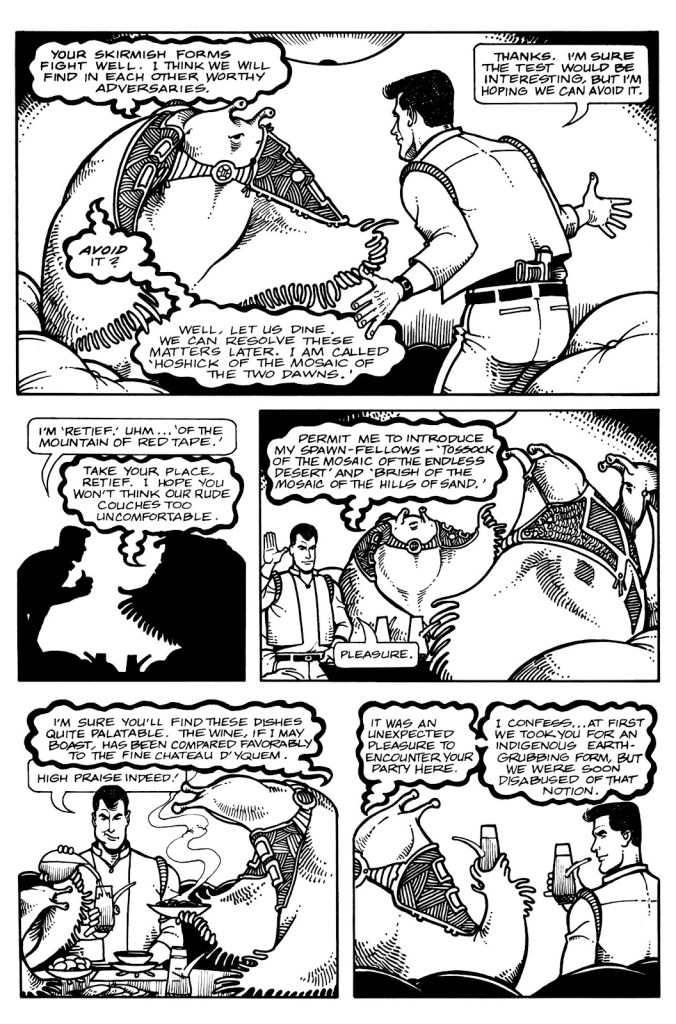
Keith Laumer’s Retief no. 2 (June 1987)
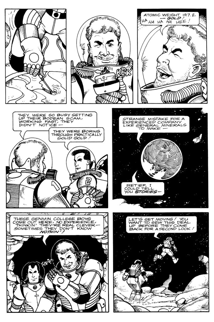
Shades of Brain Bats of Venus, anyone? Page from Sealed Orders, from issue no. 2.
Another page from Sealed Orders, in which Retief is shown to be a bon vivant who can appreciate alien fare.
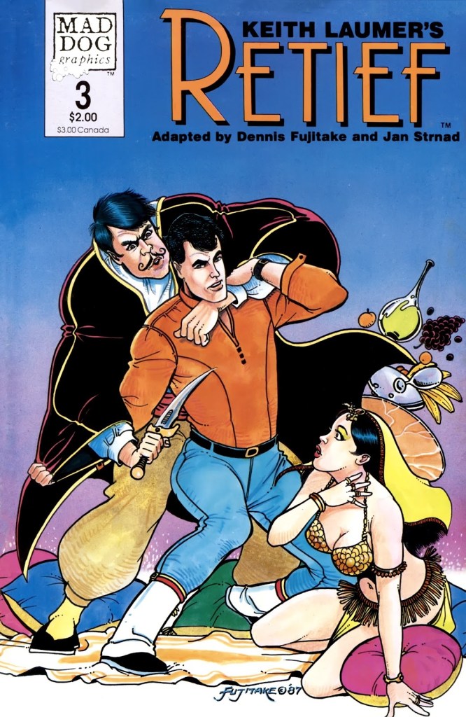
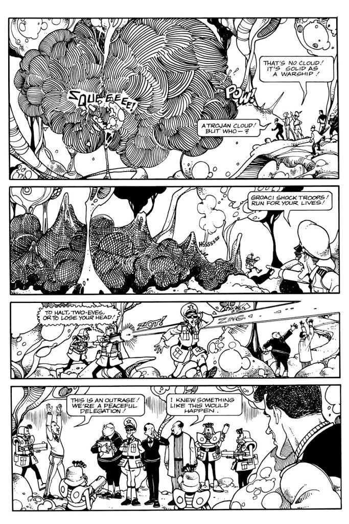
Keith Laumer’s Retief no. 3 (August 1987). One can’t say the series abounds with buxom women (or women at all, really – aside from the secretary who lost her marbles in the first issue), the Corps Diplomatique Terrestrienne is manned entirely by, well, men. Fujitake draws beautiful babes, though, few and far and between as they are.
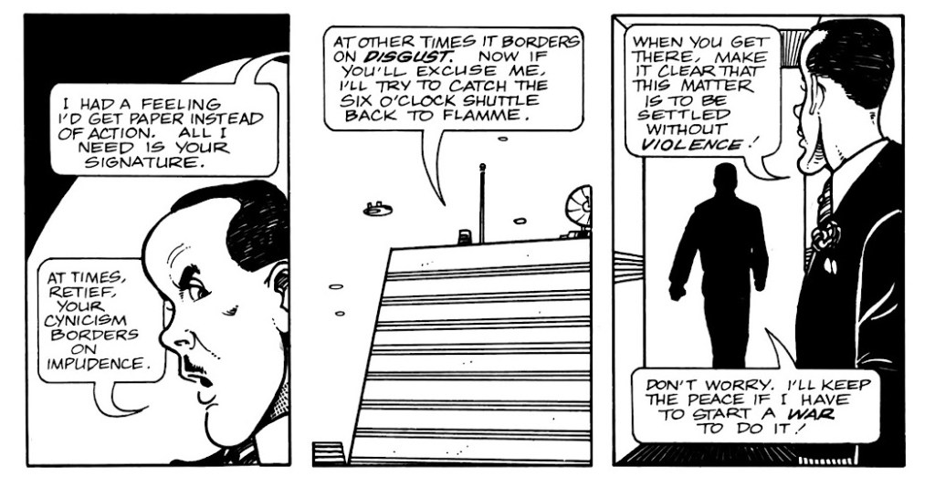
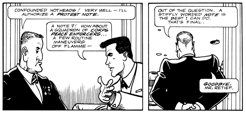
Page from Protest Note, published in no. 3. Retief visits a variety of environments, and Fujitake draws them all with equal conviction.
A fun page from Protest Note with some idiomatic banter.
Page from Saline Solution, published in Keith Laumer’s Retief no. 4 (October 1987). Retief may be a rather refined sort with a taste for fine wine and his own brand for diplomacy, but he does not hesitate to mingle with the plebeian masses – or side with the underdog, which Sam here is a representative of.
Page from Ultimatum, published in Keith Laumer’s Retief no. 5 (January 1988). It must have been a lot of fun to design aliens from a description in a short story, and give them speech bubbles to match (the advantage of hand lettering which, as mentioned previously, is handled by Gary Kato).
The pompous Mr. Magnan (the one in the sort-of baseball cap) has a long stick up his ass, but he’s not without charm, whereas Mr. Ambassador entirely deserves the rag in his mouth (and more).
Page from The Forest in the Sky, published in no. 6.
The hamster-like critters of The Forest in the Sky are adorable.. and voracious, especially their youth.
~ ds
*In French, ‘Terrestrienne’ is feminine (if it were an actual word… ‘Terrestre’ would be the right one) and ‘corps’ is masculine, so there’s a grammatical problem in its title.
** Strnad has also collaborated with Fujitake on Dalgoda, published by Fantagraphics from 1984–1986, which will be the subject of another post as soon as I reread the series. Any day now!
*** unsurprising, given that Baen’s Retief cover model was blue-eyed, blond 1980’s hunk Corbin Bernsen, whom you may recall from L.A. Law.
P.S. There is another comic adaptation from 1989, published by Malibu, with scripts by Bruce Balfour, pencils by Darren Goodhart, and inks by Alan Larsen. One word – ew.
I had initially figured to make this post coincide with World Bicycle Day, but misremembered the date (it’s on the third of June). I briefly considered bumping my post in favour of a pollution-themed one, given the close-to-home current events, but it struck me that people are likelier to need a respite from catastrophe than a reminder of it.
Since I must save up material for my Hallowe’en Countdown all year ’round in order to keep the frenetic pace it requires, I sometimes regret, in other parts of the annum, not featuring spooky stories as often as I’d like. I’ll make an exception this time, since this is more of a summer story with a light touch.
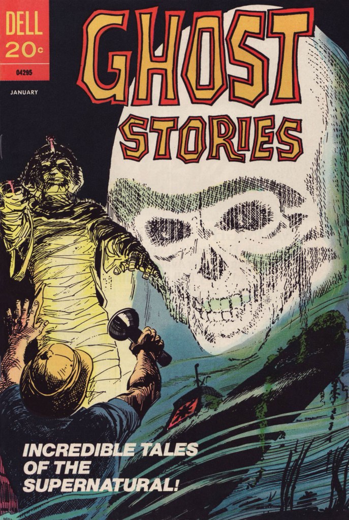
This particular issue of Ghost Stories has the — dubious, I’ll grant — distinction of being the last original comic book published by the once-mighty Dell Comics. How mighty? Well, in 1960, they were smugly ensconced at the top, as they had been for most of the industry’s history. Until the following year: « As publishers began raising prices from the 10¢ mark comics had been at for a quarter of a century, Dell misread the market and went to 15¢ when everyone else went to 12¢. »
That was the beginning of the end for Dell, triggering a long, humiliating slide, going from locomotive to caboose. By 1970, they were just reprinting what little of their once-glorious back catalogue they still retained rights to. I believe their final trio of titles, all reprints, were cover-dated October, 1973 — among them the final issue of Ghost Stories, a straight up reprint of 1966’s no. 16.
I’m not sure why this all-new issue even came to be. Perhaps this was inventory material some editor at Dell saw no point in squandering. If so, this sagacious frugality is appreciated.
This is Ghost Stories no. 35 (Jan. 1973, Dell); cover by Jack Sparling (1916-1997).
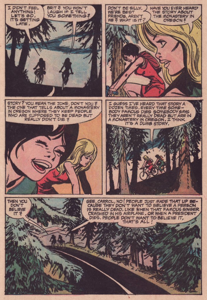
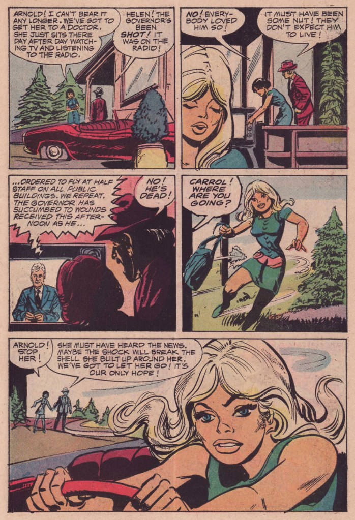
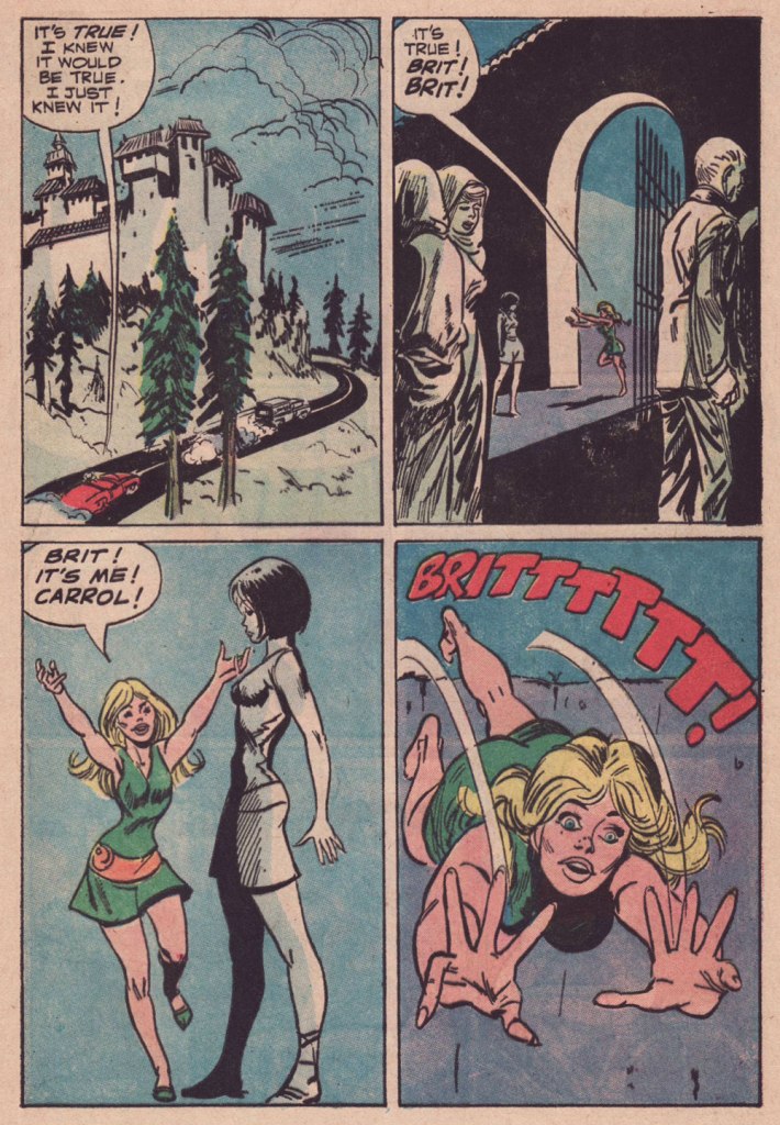
Now, I won’t argue that this is one of Jack Sparling‘s most stellar jobs… it was obviously dashed off in workmanlike fashion, even in comparison to the other tales in the issue. But I really like its themes, which tick a lot of boxes for me, cycling and folklore foremost among them.
I tried to find out whether this purported ‘story about the monastery in Oregon‘ (Mount Angel Abbey being the likeliest model) had any currency in popular culture, and came up empty. Well, essentially. While it’s undeniable that “Conspiracy theories frequently emerge following the deaths of prominent leaders and public figures“, I do think the uncredited and unknown author of this yarn came up with a clever little angle… who’s to say it won’t catch on some day? Unlikelier things have come to pass.
-RG
p.s. It occurs to me that this story handily passes the Bechdel Test, surely a rarity in a mainstream comics story of this vintage.
p.p.s. Another tale in this ‘vanished celebrity’ tradition would be Gerald Kersh‘s superb, Edgar-winning The Oxoxoco Bottle aka The Secret of the Bottle. Read it here!
Theresa Hilda Fellman, later Theresa Hilda D’Alessio after marriage, generally known as Hilda Terry (1914-2006), holds the historical footnote of being the first woman to be accepted into the National Cartoonists Society. When her nomination was submitted in 1949 (by her husband Gregory D’Alessio, himself a cartoonist), the organization offered great resistance to the idea – apparently they were worried that men wouldn’t be able to curse if ladies were present. They eventually relented, even though it took a year of discussions as well as the loquacious support of a few male cartoonists like Milton Caniff and Al Capp. Terry was inducted, along with Edwina Dumm and WOT favourite Barbara Shermund, in 1950.
And so Terry tends to get mentioned in articles about female cartoonists because of her ground-breaking inclusion in the NCS. She proceeded to nominate yet more female cartoonists as soon as she got in, so this was a good demonstration of the foot-in-the-door being used for good. Obviously that deserves praise, but focusing on the aforementioned trail-blazing tends to overshadow Terry’s main comic strip Teena, which is genuinely fun – a point that might not be obvious, given that it’s about teenage girls and written for teenage girls.
Teena evolved from a newspaper Sunday feature (It’s a Girl’s Life) that got renamed as one of its protagonists grew in popularity. It was distributed by King Features Syndicate, and ran from 1944 until 1964.
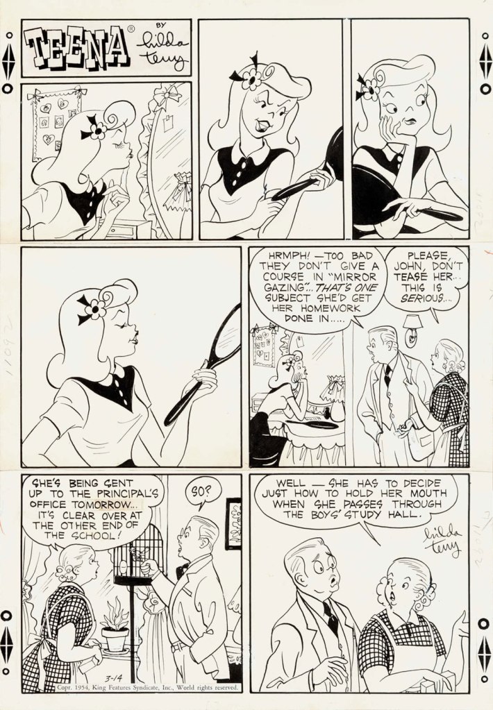
Original art for the Sunday strip from March 14th, 1954.
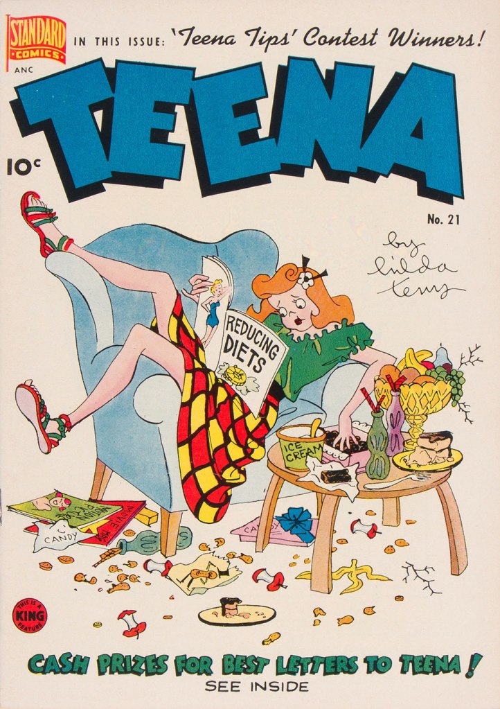
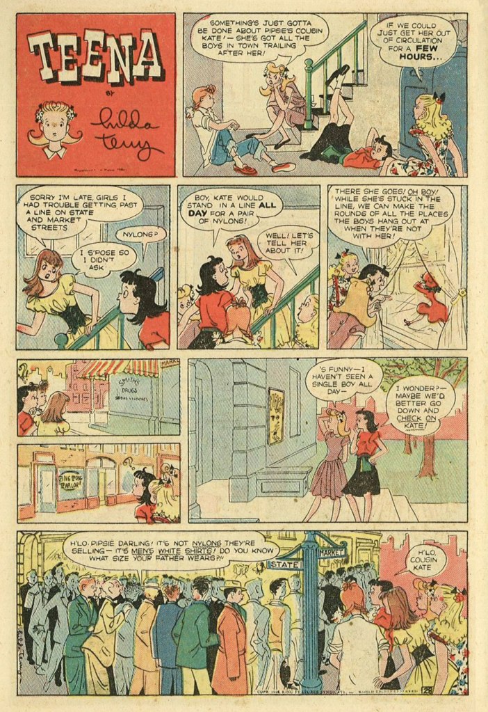
Teena no. 21 (November 1949), published by Pines. These comics books featured mostly newspaper strip reprints.
Teena’s girls are skinny, leggy creatures in motion, always perched in a peculiar manner on benches, draped over chairs (or trees), or lying cross-legged on beds. They may not have the manic savagery of Bonnie and Pepsi of Trots & Bonnie, but their sense of restlessness and a kind of misdirected lust give a similar, true-to-life, vibe (except that thanks to a three-decade difference in mores, while Pepsi is deciding on the optimal length and girth of her next beau’s appendage, Bonnie is planning the height and neck measurement of her future husband – it’s six and two threes). A lot of stories are based on (stereo)typical teenage behaviour – an obsession with clothing and appearance and general ne’er-do-wellness – but conversations often take place while something else is occurring in the background. Unlike a lot of similar comics, Teena feels like it’s set in a real world where people have to sleep and eat (and not just for the sake of a punchline). The dialogues are often staid, but the frame they’re in is dynamic, with art that may seem a bit sketchy at first, but reveals a wealth of detail upon inspection. For an analysis I really liked, head over to the Mike Lynch Cartoons blog.
Original art from the July 23rd, 1961 Sunday strip.
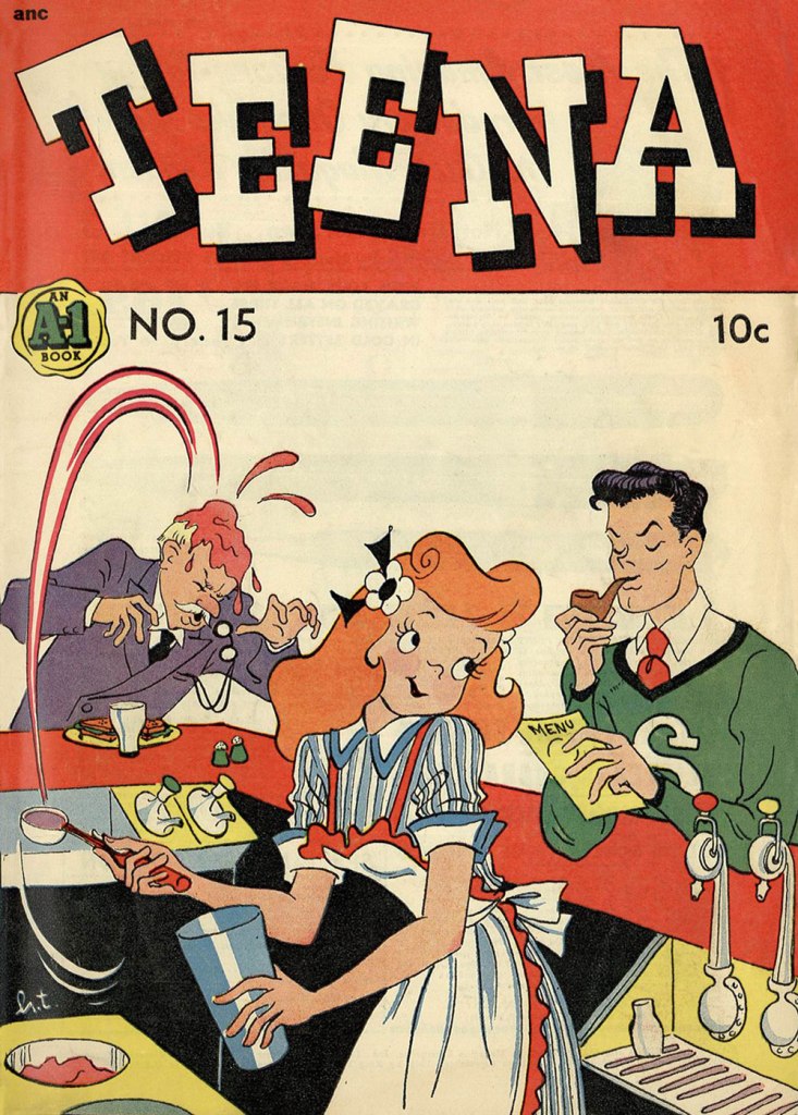
Teena no. 15 (August 1948), published by Magazine Enterprises.
Terry went a bit (or is that a lot?) off her rocker in her later years, seemingly harbouring a conviction that she was the reincarnation of a Salem witch (I am not sure whether she thought the latter was an actual witch, or just an innocently executed woman).
For more Sunday strips in colours, visit the Ragged Claws. You can also read a bunch of scans of comic books over at Comic Book + – the scan quality leaves something to be desired, but I still went though a couple of issues with great enjoyment. We really need a proper Teena collection!
I also highly recommend this amazing article about powder etc. compacts marketed for teenage girls with a great gallery of designs.