Hallowe’en Countdown IV, Day 31

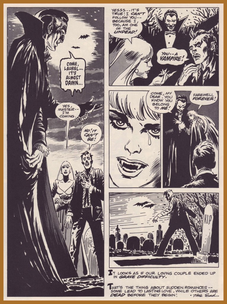
« I grew up in a farm town in the Midwest, where not much exciting happened. I liked the idea of lives lived at night and the shadowy characters who lived in that demi-monde.Michael Emerson

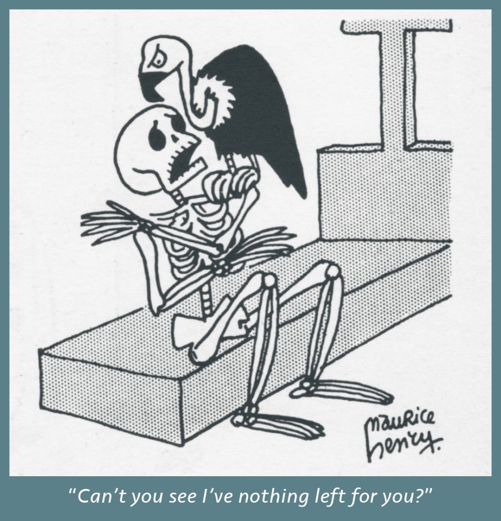
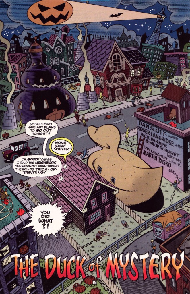
And our final slot goes to… the eminent Mr. Roger Langridge!

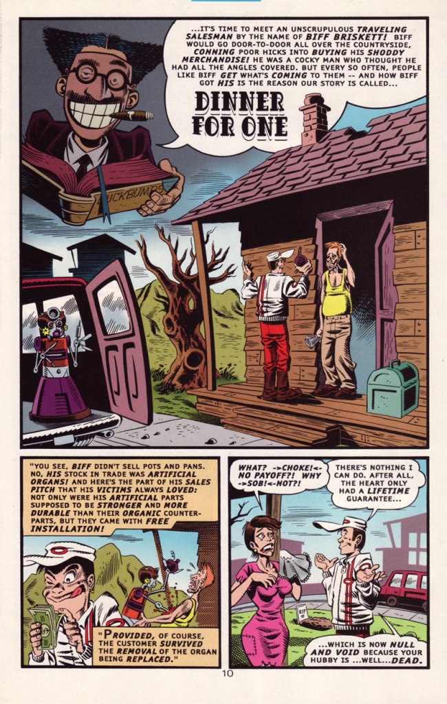
An average, ‘nuclear’ family moves to a small town in the Midwest, which turns out to be mind-numbingly strange… a fact entirely lost on the clueless parental units. Sound familiar?

It’s obvious, given the time frame (five years late), that Gross Point was, to be charitable, keenly influenced by the television show Eerie, Indiana (1991-92)… whose short run (just one season and a mere nineteen episodes… plus fifteen novels!) belies its lasting appeal and influence.

But, and there’s a sizeable ‘but’… both series provide considerable, often subversive entertainment, and come from a long line of high-concept, cœlacanth-out-of-aqua sagas. You might say that Gross Point stands as a darker, yet goofier Eerie, Indiana. Incredibly, it was still approved by the clearly-agonizing, utterly irrelevant Comics Code Authority!

This is Gross Point no. 5 (Dec. 1997, DC), the Halloween special… but then again, as they say, “Every day is Halloween in Gross Point“. Cover by Sean Taggart.

The facetious small print:

Gross Point is a fictitious town, not to be confused with that differently-spelled one in Michigan. The magazine Gross Point is a work of satire. The stories, characters and incidents mentioned in this magazine are entirely fictional. No resemblance to actual persons, living or dead, or comatose, deformed, deranged, disfigured, dismembered, disembodied, discarnate, decaying, reincarnated, undead, immortal, reanimated, telepathic, pyritic, telekinetic, magical, transformed, trans-channelled, enchanted, cursed, possessed, monstrous, cannibalistic, demonic, vampiric, reptilian, lycanthropic, subterranean, mummified, extra-terrestrial, or interdimensionally-stranded, is intended or implied, or should be inferred. Any similarity to same without satiric purpose is coincidental.

The Pickett family’s colourful neighbourhood in Gross Point. Sublime pencils and inks by Roger Langridge. He truly brought a sense of place to his work on GP.
Tight as a duck’s arse!” This is the issue when we find out — at last! — the answer to the mystery of the duck-shaped house next door.
Groucho, who else? DC clearly panders to the late 90s teen set with a hybrid parody of its own late 60s mystery anthology title and a legendary Depression-era comic. Well, it works for me, but what do *I* know?
A sizeable part of why this is Gross Point’s finest hour: Langridge gets to trot out his rather credible EC-vintage Wally Wood/Will Elder ersatz.
… and then goes full-on Mad-style Will Elder! This bourgeois chiller scared the Dickens out of the local youths.

In Issue two, we are told that:

Gross Point differs from most new DC titles in recent memory in that it was internally created. The concept from the series was the brainchild of the internal development program of the Special Projects Group, headed by Group Editor Martin Pasko [ né Jean-Claude Rochefort, in Montréal, QC ], who is also this title’s editorial overseer.

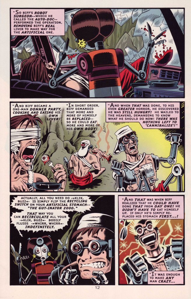
In other words, Created by committee, which accounts for the utter lack of originality… which is yet no impediment to its ultimate worth.

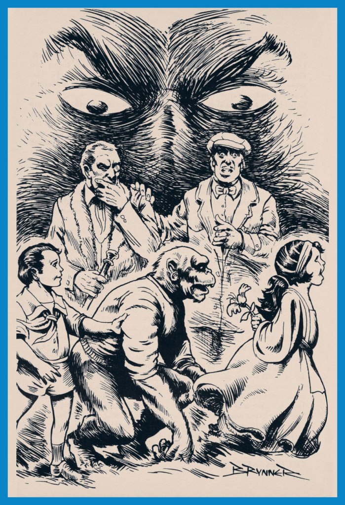
However, and a big However it is, some savvy, enlightened creative moves were made, most of all by recruiting stupendous penciller/inker Langridge, as well as Sean ‘S.M’ Taggart (perhaps a bit of nepotism, what with him married to a DC editor, but never mind, he’s good) and writers Dan Slott and Matt Wayne, among others.

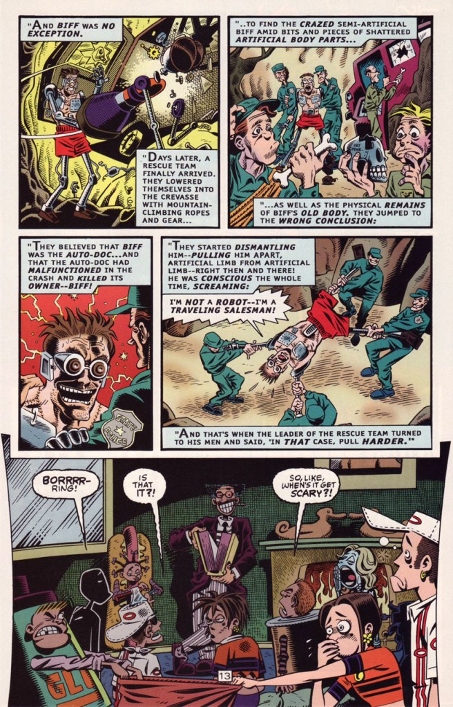
The series lasted a not-too-shabby fourteen issues, which you can still get your calloused mitts on dirt cheap online and in the quarter bins, as it’s never been collected. I daresay it might have been a smash hit… if, say, Scholastic had published it.

Well, that wraps up another year’s selection! If you’re craving more, then the 93 entries of the previous trio of Hallowe’en Countdowns are (un)naturally at your disposal.

First there was… Hallowe’en Countdown I

And it was followed by… Hallowe’en Countdown II!

then came… Hallowe’en Countdown III!

Have a good one, warts and all — just be cautious out there!

-RG

Hallowe’en Countdown IV, Day 30

« The world will come to an end, but the monster models will still be around. » — James Bama, who went on to paint artwork for over twenty of Aurora’s kit boxes.

Well-executed comic book ads were often just as enticing (and sometimes more, depending on the title) as the contents proper. A prime example, this lovely Aurora Monster Kit campaign, announcing the epochal model maker’s forays out of the Universal ménagerie of misunderstood fiends with Toho’s Godzilla and RKO’s King Kong.

The first Aurora monster model advertisement, it appeared in various DC Comics titles dated November and December, 1963.
The ad ran on the back cover of various DC titles in late 1964. In this case, House of Secrets no. 69 (Dec. 1964). The artwork is almost certainly that of Mr. Murphy Anderson, who goes uncredited, but is betrayed by the characteristic finesse of his inking.
A couple of the models that usually received considerably less attention got their turn in the spotlight in this ad that appeared on the back cover of select DC titles cover-dated October, 1965.

Incidentally, if you were wondering, indeed, the giant monsters cost more… 50 cents more. A bunch more empty bottles to collect, son.

In the late ’60s, a new twist was added: phosphorescence! A cool idea, it however made painting the models, a tricky task to begin with, even less rewarding, as opacity was a bitch to achieve. It worked okay if you had mostly light-coloured The Mummy, but otherwise… This advert appeared on the back cover of DC Comics dated October, 1969… and thereabouts.
The Spring, 1970 collection.
Here’s where Aurora’s close business relationship with Warren Magazines became most evident, with the appearance of a Vampirella model kit. Controversy ensued, once moms caught a glimpse of Junior’s new model kit, the heirloom of his bedroom. Speaking of controversy, Vampirella’s quip about New York was likely a barb about the infamous Kitty Genovese case. This pitch showed up in various DC titles, again, in and around June, 1971.

Warren sold a lot of Aurora kits via his mail order business, and a decision was made to include his character in the line rather than risk dissolving a partnership. Unpainted, she appeared to be virtually naked. Her counterpart, the Victim, sported hot pants and a halter top; a dress or flowing skirt was deemed impractical in order to have her fit on the torture rack. [ source ]

This beautifully-designed ad showed up in October, 1971 DC titles.
At this point, the diluted message is a hint that the bloom is off the rose. An ad from November, 1971.
As a bonus, here’s Big Frankie, the seldom-seen, long-unavailable Aurora grail (until its relatively recent reissue). As the largest Aurora model of all, BF fetched, at the time, an astronomical $4.98; now it goes for a hundred smackers, so don’t complain. Take a look at the big fella!

Though the original Aurora issues of these classic kits are mostly rare as hen’s teeth, enterprising contemporary kit companies have reissued these babies, and you now can actually afford to free the monsters from the confines of their box and assemble and paint ‘em. Mint in Box? Pfui!

– RG

Hallowe’en Countdown IV, Day 29

« A face like an oyster, huh?‘ Danny Lomax repeated, and swallowed hard. ‘That’s what it’s going to look like?‘ Nick Deene chuckled and nodded. ‘If there’s anything deader-looking than a watery blue oyster that’s been open too long,‘ he said, ‘I don’t know what it is. » — Robert Arthur, The Believers (1941)

Today, we’ll peer through filmy years past at another example of cultural cross-pollination: a notion is born, seemingly out of nowhere, then it ineffably catches the collective fancy and is in some fashion absorbed into folklore, scattered like grain by wind and whisper. Then some soul, blessed with a way with words, polishes it for publication and some editor buys it for peanuts. Another wordsmith reshuffles and refines it, sprinkling some notions of his own, perhaps a glint of sardonic humour. Hungry for material, radio gets hold of the setup and reshapes it a little to fit another medium. Late one night, some comic book hack hears that presentation, and recollects its essence, some years on, in a frantic rush to fill some pages and scrape together a meagre living. Or perhaps he saw it in a competitor’s rag. Bah, no-one’ll remember… or give a toss. “I’ll give it a stab from another angle!

First, there was… well, I’m not sure. But let’s begin with Henry Russell Wakefield‘s short story Ghost Hunt (either 1938 or 1948… sources differ), in which…

A radio host broadcasts a live ghost hunt in a house in London where there have been “no less than thirty suicides”. Most have run from the house at night to throw themselves off the cliff and into the nearby river. The radio broadcaster is joined by a paranormal investigator. The investigation proves all-too successful in this chilling story.

Then appeared, a couple of years hence, Robert Arthur Jr.‘s excellent The Believers [ read it here! ], published in the venerable Weird Tales‘ July, 1941 issue.

The Believers is a classic horror story by Robert Arthur. It’s about a radio host who decides to broadcast a live show from a haunted house. This story is also known as “Do You Believe in Ghosts?” and it was based on an older story by H. Russell Wakefield called “Ghost Hunt”. It also inspired a horror comic story and an episode of Tales From The Crypt, both of which were called “Television Terror”.

The Believers was featured in this 1963 Random House collection (which Robert Arthur himself edited as well as authored), under its alternate title of Do You Believe in Ghosts?. The splendiferous wraparound cover is by Arthur Shilstone (1922-2020).

In 1949 came a successful radio adaptation, courtesy of the popular Suspense show. This was likely the most influential iteration of the tale, the super-spreader, if you will.

And more that just the one ‘horror comic story’ was inspired by this singular scenario. In 1952, The Unknown (or at least uncredited, which amounts to the same thing) Writer came up with The Walking Ghost, which will now break up the tedium of text, text, text, and provide you with some welcome visuals by Messrs. Mike Sekowsky on pencils and Bill Walton on inks.

This adaptation (if you will) strikes a middle ground between the Wakefield and the Arthur approaches.

The Walking Ghost was reprinted decades later in Crypt of Shadows no. 3 (May, 1973, Marvel), where I first encountered this tale, and this bit of dialogue was modified to better (but not by much) fit the times:

And what exactly was the matter with “Uncle Miltie“? Doesn’t having the biggest schlong in Hollywood buy you any respect anymore? The Twilight Zone wasn’t even a radio show!
The Walking Ghost first saw print in Strange Tales no. 11 (Oct. 1952, Atlas); cover by Bill Everett. It didn’t even rate the cover.

-RG

Hallowe’en Countdown IV, Day 28

« The world dies over and over again, but the skeleton always gets up and walks. » — Henry Miller

A few months back, while assembling a post about polymorphic French surrealist Maurice Henry (1907-1984), I marvelled and chuckled at his multitude of skeleton-themed cartoons. I made a mental note to devote a Hallowe’en post to them… and that memo only floated to the top of my consciousness a couple of days ago. Just in time!

(1935)
(1936)
(1938)
(1940)
(1941)
(1947)
(1950)
(1950)
(1958)
This one doesn’t feature skeletons, but I had to include it, given how stunningly *dark* it is for its (or any) era… can you imagine something like this published in the USA in… 1935? For more context, here’s the Bluebeard ditty.
In closing, and just for kicks: sixteen faces of the playfully photogenic Monsieur Henry. This one-man assembly featured on the back cover of Maurice Henry 1930-1960 (1961, Jean-Jacques Pauvert), a remarkable collection.

Trust me, I’m only scratching the surface of this man’s genius. If you’ll bear with me, we’re not done with him.

-RG

Tentacle Tuesday: It’s a Bird! It’s a Plane! It’s a Tentacle!

« A kryptonian octosaur — the most fearsome creature of my long-dead home planet — here — on earth! »

Since Batman was already awarded a Tentacle Tuesday back in April (see Tentacle Tuesday: All Aboard the Batmarine!), it is time to allocate one to the other superhero that crops up all the freaking time, namely good old “Supes” (for those who are on familiar terms with him). I won’t hide from you that I have very little interest in the adventures of the aforementioned character, but I made a pledge to follow tentacles wherever they may lead me. The octopus of comics demands sacrifices!

The Man of Steel. The Last Son of Krypton. The Son of Jor-El. Metropolis’ favorite son. The Man of Tomorrow. Champion of the Oppressed. The Big Blue Boy Scout. The iconic Cape. The definitive Flying Brick. The Big Good of The DCU. The Superhero.

[source]

First, we have a number of inside pages of varying interest, depicting tentacles both organic and mechanical —

A page from The Superman Super-Spectacular!, scripted by Edmond Hamilton, pencilled by Curt Swan and inked by George Klein, was published in Action Comics no. 309 (February 1964).
A page from The Demon Under the Red Sun!, scripted by Otto Binder and illustrated by Al Plastino, was published in Superman no. 184 (February 1966).
The Demon Under the Red Sun!, part two. Superman wields his rapier-like wit to defeat the poor beastie. This was years before the Flying Spaghetti Monster!
A page from The Power of the Parasite, scripted by Jim Shooter and illustrated by Al Plastino, was published in Action Comics no. 361 (March 1968).
A panel from The Monster Who Unmasked Superman!, scripted by Cary Bates, pencilled by Curt Swan and inked by Murphy Anderson, was published in Action Comics no. 431 (January 1974).
The Monster Who Unmasked Superman!: aggressive tentacle grabbery ensues.
Page from Balance of Power!, scripted by Len Wein, pencilled by Dick Dillin and inked by Dick Giordano, was published in Justice League of America no. 111 (May-June 1974).
A page from …With But a Single Step!, scripted by Marv Wolfman and illustrated by Gil Kane, was published in Action Comics no. 545 (July 1983).

As a tastier, second part of our programme, I offer you an intriguing cover by Dave Gibbons:

Superman Annual no. 11 (September 1985)

And a page (or three) from what co-editor RG calls “the ultimate Superman story” (and I will absolutely take his word for it) — For the Man Who Has Everything… scripted by Alan Moore and illustrated by Dave Gibbons.

The tentacle mantle is taken up by other characters — pesky, clingy little buggers, aren’t they? « It’s called a Black Mercy. It’s something between a plant and an intelligent fungus. It attaches itself to its victims in a form of symbiosis, feeding from their bio-aura. Why, it gives them their heart’s desire…. », explains Mongul, the ‘benefactor’ who got Superman into this spot of trouble.

Mongul gets his comeuppance! And his heart’s desire of world domination, courtesy of the Black Mercy.

¤ ds

Hallowe’en Countdown IV, Day 27

« No — I’m not alive! But we’ll have time to talk about that later! » — the accident-prone stranger

On the magazine front, Scholastic hit its peak in the mid-to-late 1970s with Dynamite (1974-92) Bananas (1975-84) and sundry periodicals aimed at various reading levels. Always comics-friendly, they struck a fruitful alliance with the fledgling Joe Kubert School of Cartoon & Graphic Art, thus granting precious early exposure to some of the institution’s promising early alumni, such as Stephen Bissette, Rick Veitch and John Totleben.

This is Weird Worlds no. 4 (1980, Scholastic). Cover by Joe Kubert. By ‘full-length’, they meant ‘four pages long’. Oh well.

Professorial Joe Kubert leads his students into a moody collaboration with the guiding lights of Dynamite, namely the husband-and-wife team of Jane Stine and ‘Jovial’ Bob Stine (of later R.L. Stine fame and fortune).

Could it be?

Well, Laurel could have fared far worse: her ‘Master’ is squarely in the then-fashionable Frank Langella / George Hamilton leading man mould. There was another alternative, of course:

You’ll enjoy Mr. Barlow. And he’ll enjoy you.

Weird Worlds didn’t set this world afire, enduring but eight issues. Still, Scholastic would return to mine the teenage affinity for all things spooky and on that occasion (and further ones) strike gold and raise goosebumps.

-RG

Hallowe’en Countdown IV, Day 26

« … a radical series of crappy jokes & trashy art mopped out of the Bowery’s least washed lavatories. Fueled on bologna sandwiches, black coffee & cheap cigarettes, these are the ugly buttons that scream ‘America‘ to an America that has forgotten itself. » — a tasty bit of hype from Goblinko

Fabled pulp illustrator Norman Saunders (a definite favourite around these parts) is legitimately appreciated for his body of work, but I do believe he isn’t sufficiently lauded for his humorous work. After all, he could hold his own against the likes of Basil Wolverton and Wally Wood, and how many of his peers could lay claim to such a lofty achievement?

A passage from his son David’s definitive monograph, the simply and fittingly titled Norman Saunders:

Ugly Buttons came out in 1967 to exploit the popular trend of protest buttons with witty sayings. The macabre humor of Ugly Buttons reflects their Halloween release date as well as the morbid comedy of popular TV shows like The Addams Family and The Munsters. Norm Saunders created half [ eleven, actually ] of the twenty-four images in this set, while Wally Wood created the other half.

A sample of the original packaging…
I’m sorry… but that bat is just so adorable…
You can see why these are perfect Hallowe’en fodder!
Macabre, and with a tidy moral to boot! At a nickel apiece, an undeniably excellent value.
Well, perhaps not *strictly* altogether moral.
The final Saunders button, shot from the original art. This looker was entitled Peek-a-Boo.
One of the original boxes, which held 24 packs. Featured buttons Here’s Looking at You and I’m a Cool Ghoul were designed by Wally Wood.

Collectors find this set very difficult to complete. Although the series was a popular success in 1967, the buttons appear to have rarely survived. This is perhaps attributable to the design of the tin back pin, which was made in Japan with a hair-trigger clasp that instantly popped open and fell off.

Here’s one of the underperforming bad boys in question. To be fair, this one’s still holding together, which surely has earned it some kind of goodwill, a half-century hence. Those old enough (enough, enough!) will recall when ‘Made in Japan’ was an indicator of shoddy goods. All that’s been turned on its head since, interestingly. The Japanese people have admirably overcome much adversity, that’s evident.

By the way, I don’t know just how sanctioned these reissues are, but the cool cats at Goblinko have made these lovely buttons available once more, presumably sturdier and certainly at a perfectly reasonable price (forty times the original, I’ll grant you… but you do get to pick).

-RG

Hallowe’en Countdown IV, Day 25

« He was offered a sloe gin fizz in a pink frosted glass by a young woman who removed her glass eye and sucked on it while discussing the moral imperatives of the sponge boycott in Brooksville, Florida. » — Harlan Ellison, ‘Neon’.

In 1973, Marvel was trying all sorts of things to bolster its market presence. They even dared to tread where even the venerable Weird Tales had never quite succeeded. The Haunt of Horror was a prose fiction digest that strongly showed its comics roots. It offered a mixture of classic material (Fritz Leiber’s Conjure Wife, a piece by Robert E. Howard) and of contemporary genre practitioners: Harlan Ellison, Ramsey Campbell… featuring a score of illustrations slapped together by Marvel’s less superhero-limited alumni, namely Gene Colan, Mike Ploog, Frank Brunner, Walt Simonson and Dan Green. After two issues, Marvel called the whole thing off, licking its wounds, but soon revived the title as a b&w comics magazine, this time eking out five issues (May 1974 – Jan. 1975) plus a 1977 issue of Marvel Preview.

This is The Haunt of Horror no. 1 (June, 1973), edited by Gerry, no, make that *Gerard* Conway (in full ‘take me seriously, I’m not just a hack comics writer!‘ mode), with a striking cover by Gray Morrow.

As for me, I picked it up for the rare short story by the nonpareil R. A. Lafferty, Ghost in the Corn Crib.

Dan Green‘s illustration for Lafferty’s story.
One of Frank Brunner‘s illustrations for John K. Diomede (alias George Alec Effinger)’s The First Step.
Werewolf by Night originator Mike Ploog didn’t have to stretch far beyond his comfort zone for this illustration for Alfred Angelo Attanasio‘s Loup Garou (french for Werewolf, if you still feel the need to ask).
It’s nigh-impossible to fully scan some these images without destroying the source document, but here’s the opening splash for Haunt of Horror’s publication of Fritz Leiber’s 1943 classic Conjure Wife, adapted in the movies as Night of the Eagle (in the UK) and Burn, Witch, Burn (in the US). Here, a fine, committed but uncredited Gray Morrow pebble board illustration is ‘corrected’ by Marvel’s number two Yes Man (Consulting Editor Rascally Roy Thomas would surely be numero uno), who replaces whichever figure Gray had drawn by an image of Mary Jane Watson, not even bothering with the slightest effort to match the style. John Sr. had gotten plenty of practice ‘fixing’ Kirby and Ditko, so Gray Morrow was just ‘all in a day’s work‘.
Gene Colan was called upon to whip up a few quick pieces for the rest of the feature.
The Haunt of Horror ran just one more issue, graced by a lovely, quite pulpy cover by the nonpareil Frank Kelly Freas, whose efforts Romita Sr. has also seen fit to ‘fix’. See Unknown World of Science-Fiction no. 1 (Jan. 1975). This, however, is The Haunt of Horror no. 2 (Aug. 1973, Marvel). Come to think of it, that evil priest kind of anticipates a latter-day Nicolas Cage, doesn’t he?

In the end, you might say that this short-lived publication is best known for a screwup: indeed, the notoriously disorganized Marvel Bullpen messed up the page order of Harlan Ellison‘s contribution to the first issue, Neon. Never one to let such things slide, Harlan made sure that a correct version was printed in the second issue. Score one for the good guys.

-RG

Hallowe’en Countdown IV, Day 24

« Catholicism is not a soothing religion. It’s a painful religion. We’re all gluttons for punishment. » — Madonna Ciccone

Here’s a seasonal goodie from gag cartoonist Marvin Townsend (1915–1999) and his adorable “Ali” pantomime strip, which appeared, beginning in 1962 in, of all places, the Catholic comic book anthology Treasure Chest of Fun & Fact (Geo. A. Pflaum Publisher), distributed to parochial school students between 1946 and 1972.

Originally published in Treasure Chest vol. 21, no. 4 (Oct. 21, 1965). For more Townsend in a spooky vein, look no further than this post from our previous countdown.

Denominational and religious concerns aside, Treasure Chest of Fun and Fact, a publication generally avoided like any of the Ten Plagues of Egypt by your average comic book fan, was, wouldn’t you know it, chock full of excellent work by the likes of Bernard Baily, Fran Matera, Bob Powell, Reed Crandall, Joe Sinnott, Graham Ingels, Joe Orlando, Murphy Anderson, Jim Mooney, Paul Eismann… and these are some of the artists. The material was also engagingly written and often truly captivating. And they weren’t above paying a bit of lip service to that ol’ Pagan Holiday, Hallowe’en.

This was one in a highly-entertaining series of studies of classroom “types” by Frank Huffman. It appeared in Treasure Chest vol. 22, no. 12 (Feb. 9, 1967).
A piece by E. B. Wagner, this one saw print in Treasure Chest vol. 23, no. 4 (Oct. 19, 1967). Note the Leroy Lettering!
The back cover of Treasure Chest vol. 22, no. 4 (Oct. 20, 1966, Geo. A. Pflaum). Artist unknown, regrettably. Love that stylish auto-gyro witch!

-RG

Hallowe’en Countdown IV, Day 23

« A detective sees death in all the various forms at least five times a week. » — Salvatore Albert Lombino, aka Ed McBain, aka Evan Hunter

Spanning nearly a full century since yesterday’s instalment, we now move ahead to a recent work from my favourite European bédéiste of the past quarter-century, David Beauchard, better known as David B. (b. 1959).

Among the traits I most admire in Monsieur Beauchard are his artistic integrity and his explorative drive. To wit, here he evokes the grimy spirit of late 19th century feuilleton serials, providing a narrative consisting of illustrated chapter headings… devoid of the main text. The reader is left to fill in the narrative gaps, enlisted in a bold compact with the artist and required to draw upon his own imagination.

A few choice excerpts (I left out the bits with tentacles… it’s not my department, after all!):

Le mort détective was issued just last year (yes, roughly an eternity ago) by rightly-celebrated French publisher L’Association.
So it begins… with the title page, naturally.
1 – The mysterious messenger: “The Flayers have returned…‘ chanted the strange apparition”.
2 – The skinned dwarf: “But who needs a dwarf’s skin… and to what ignoble purpose?“, panted the Dead Detective…
6 – The dwarf-skin coat: “The Great Old Man is a priest of the Yellow Dwarf God‘, murmured the Dead Detective to the Girl of a Thousand Daggers…”
10- The macabre post: “The Bad Postman distributes mysterious mailings.”
11- The word from the Hereafter: “The severed head exhaled a terrifying prophecy.”
22- The mass grave: “The Girl of a Thousand Daggers has sent a bouquet.“, he said in a dying voice.
41 – “The altar of fear: “Let’s flee!‘, exclaimed the Girl of a Thousand Daggers.”
68 – “The Devouring Love: Explanations were brutal between the Girl and the Dead One.”
69 – “The Flash War: … ‘Birnam Forest walks towards Dunsinane‘, recited the Dead Detective.”

-RG