« This world is run by clowns who can’t wait for it to end. » — Too Much Joy, ‘Clowns‘
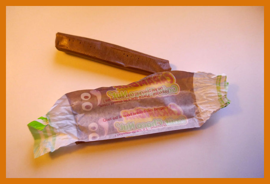
Well, the topic of this post kind of snuck up on me. I’ll explain: last Saturday, as we were out of Russian marinated mushrooms (a simply unacceptable state of affairs in this household), we ventured into a European deli in quest of something to tide us over until we could properly restock. They had some button mushrooms in oil, fair enough. As we reached the counter to tally up our purchases, something caught my eye: a display for a French confection called Carambar, which I’d known about for most of my life, but never encountered in the wild.
After a moment’s hesitation (which baffled my partner), we picked up a sample and added it to our bounty.
It happens that Caram’ Bar (as it was called until 1977, when the apostrophe was dropped) ties into a minor childhood incident whose recollection elicits, in equal parts, snickers of amusement and pangs of guilt. It was in, oh, the second or third grade. We were standing in rows, about to return to class after recess. I turned to my neighbouring classmate, and asked him whether he knew… oh, never mind — it went exactly like this:
“Mister Pipo! I will pose you a riddle!” “Do you know what the difference is between a Caram’ Bar…” (I love riddles!) “… and a Super Caram’ Bar?” (They’re the same!) “But of course not, Mister Pipo!” “The Caram’ Bar was this long…“
“The Super Caram’ Bar is THIS LONG!” The full-length Super Caram’ Barfumetti, as it appeared in the pages of Pif Gadget no. 171 (May 1972, Vaillant).
Regrettably, the back of my hand connected with my classmate’s nose, not his cheek, and he wound up with a nosebleed. Désolé, Germain!
The acquired item.
…. unwrapped. CaramBar wrappers have, since the 60s, famously featured corny gags, which once were selected from entries provided by consumers. A kid whose joke got the nod could win his weight in candy. Here’s one of the pair I got here (the other doesn’t work in English)… Q: Why are elephants grey? A: Because if they were pink, they’d get confused with strawberries. It may come as no surprise that in France, a ‘blague Carambar’ has become shorthand for a lame joke.
The preceding Super Caram’ Bar ad was quite unusual in that it was a full-colour three-pager, which must have cost the candy maker a bundle. Indeed, it only ran au complet once or twice; thereafter, only its concluding page appeared.
Looking back at this campaign, I wondered whether these clowns were merely company mascots, or something more. As it turns out, Sergio (né Serge Drouard in 1950, so 21 years old at the time) was in the early stages of a remarkable career in the circus, first as Clown blanc Sergio (here are a brief video profile from 1970 and a lovely 1975 performance at Paris’ legendary Cirque d’hiver) and then as ringmaster M. Fidèle. Now seventy, he more-or-less retired after the 2010-2011 season. As for poor Pipo, I’m afraid I don’t know. He’s similar to the famous Dutch clown Pipo de Clown, but they’re merely homonyms.
Clowns are a curious proposition. Kids used to (presumably) find them amusing and endearing, but several generations of thin, gruelling antics and downgrading of the brand and métier, not to mention the sinister hijinks of the infamous Pogo the clown, have flipped the cultural perception of these once-beloved entertainers. At this point, Coulrophobia is impressively widespread, and not just among the wee ones.
For my part, I’m not so eager to condemn en bloc. Your run-of-the-mill, unqualified local kids’ show, mall-opening Bozo is but a faint, hopelessly distorted echo of the great clowns of history. They were the fruits of a complex, nuanced and codified tradition with its thick, gnarled roots in early 16th century Italy’s Commedia dell’ Arte.
But I don’t need to reach quite that far: I grew up on Radio-Canada’s absurd, minimalist masterpiece Sol et Gobelet (1968-71). Sol (Marc Favreau) was a naïve tramp clown who creatively mangled language and logic and Gobelet (Luc Durand) was the poetic, reasonable, refined Pierrot type. Here’s a classic episode. Such is the duo’s cultural significance that a public library (Favreau) and a nearby public park (Durand) have been christened in their posthumous honour.
And since we’re on comics and clowns, here’s a bonus short tale.
« Sergio has also learned that one must never try to catch a falling performer. One should only push them to redirect their path and cushion their fall. One day at the Paradis latin, he had no choice but to tackle in flight a trapeze artist who was about to land on a table. The outcome : a few collapsed vertebrae. » Also, « When a lion attacks, it always goes for the testicles. » Keep these sage verities in mind, next time you’re under the big top!
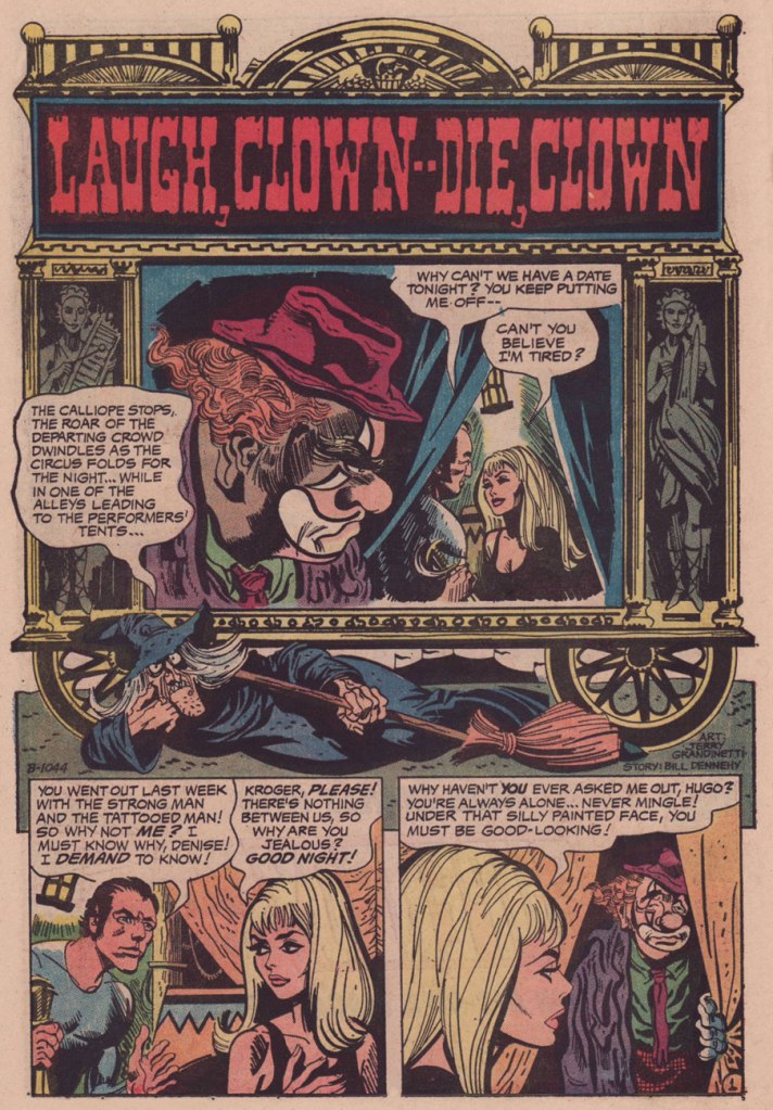
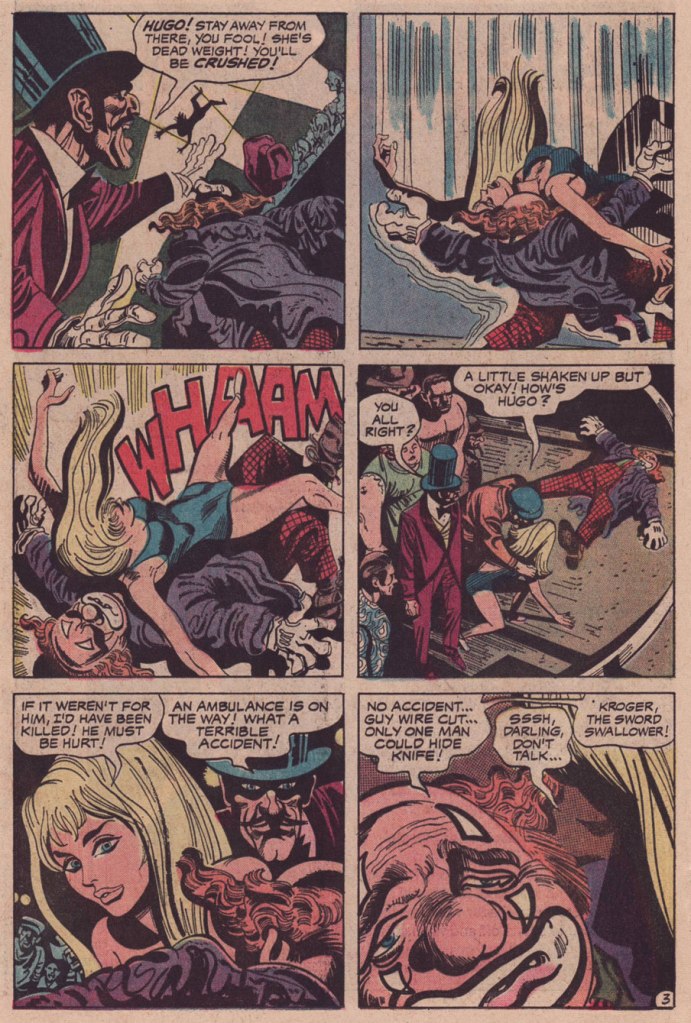
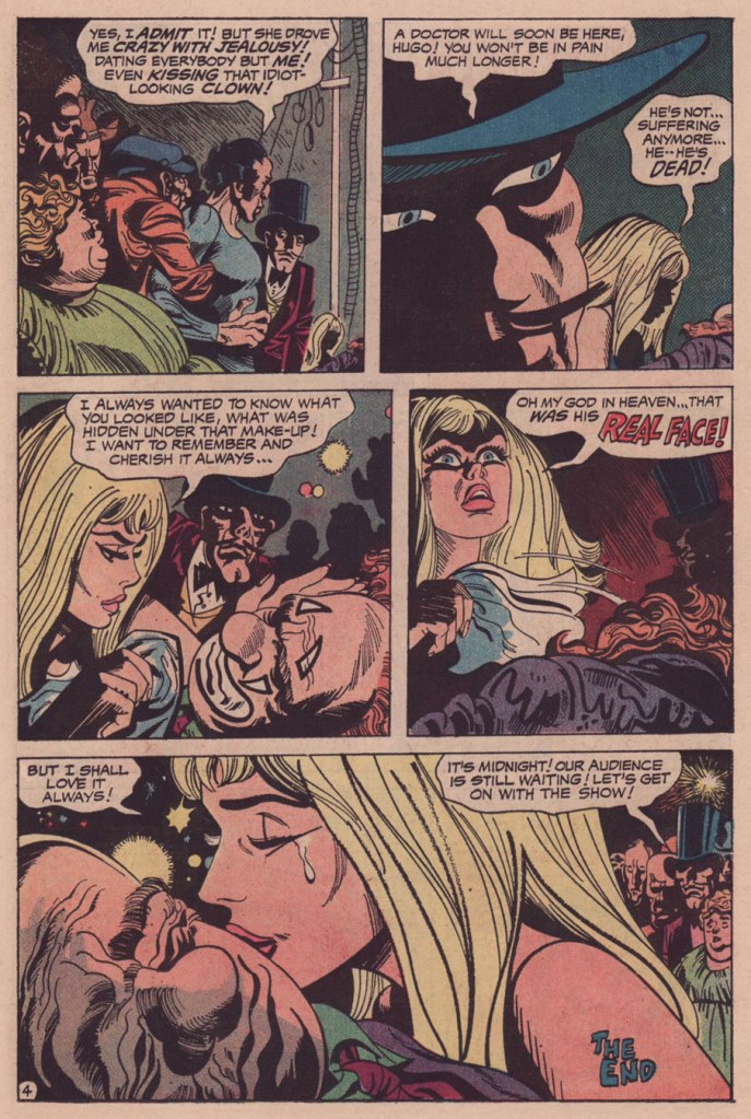
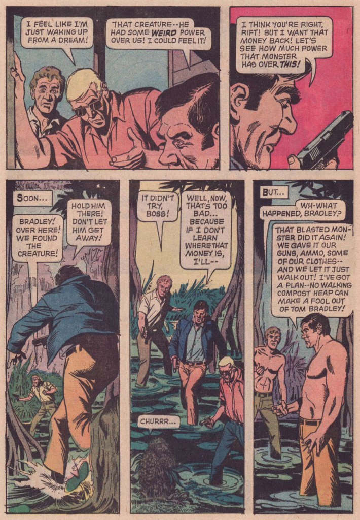
Laugh Clown — Die, Clown appeared in It’s Midnight… The Witching Hour no. 21 (June-July 1972, DC). It was scripted by editor Murray Boltinoff under his Bill Dehenny nom de plume and illustrated by Jerry Grandenetti.
While LCDC is the flimsiest of stories, just a troupe of stock characters going through their hoary paces, Grandenetti’s artwork elevates the affair. It’s as if, having precious little to work with, the artist opted to push against the material, moulding it oddly, imbuing the proceedings with unstated implications. Consider, for instance, how sinister is the depiction of the ringmaster. Nothing in the dialogue or plot indicates that the man is up to anything untoward or malicious, quite the contrary. The second panel of page four is quintessential Grandenetti.
And how was my first Carambar, you may ask. We both tried it, and… were singularly underwhelmed. Perhaps it was a question of freshness, but it was disappointingly brittle in the beginning, almost chalky, hardly what you’d expect from a caramel product. Then it just fell apart and faded, like third-rate taffy.
« I found something in one of my pockets. It was about as big as your shoe, but it was shaped like a rocket! » — a not-at-all ambiguous statement from litigious chuckler Bozo the Clown.
I’d like to thank my Italian collega for making sure this title was in impeccable Italian, and for not backing away slowly when I asked her, completely out of the blue and without context, how to say “pardon my tentacle”. Most people would have run.
Welcome to our Latin Tentacle Tuesday! Poor Italy is the brunt of quite a few jokes, and even most positive articles about it are nothing but shallow fluff designed to sell airplane tickets and inspirational posters about food and love. All I can say is that Italians love their tentacles as much as any other hot-blooded nation. 😉
Più was a comics magazine licensed from Pif Gadget in 1982. Just like its fountainhead, Più offered a gadget with every issue, which, as I understand from nostalgic posts about it on various blogs, was a prime selling point among its young and enthusiastic clientele. As for comics, reprints of some French comics straight from Pif’s pages were rounded out with fresh Italian material. Given that Pif was publishing quite a few Italian artists at that time, this only seems fair! And on the subject of the latter, co-admin RG, whom I may call a Pif historian with no fear of controversy, has written a number of posts about the writers and artists featured within Pif Gadget’s pages during its heyday… a good place to start digging in is my favourite of these posts, Jean Cézard and Arthur le fantôme.
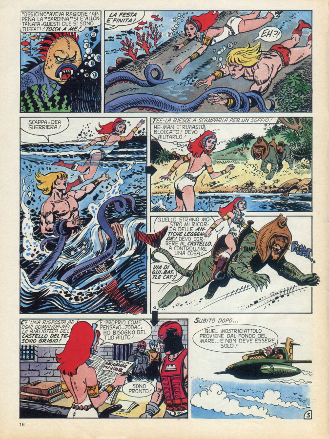
Moving on: the following Masters of the Universe pages are from Negli Oceani di Eternia, published in Più no. 76 (March 1984, Editoriale Domus).
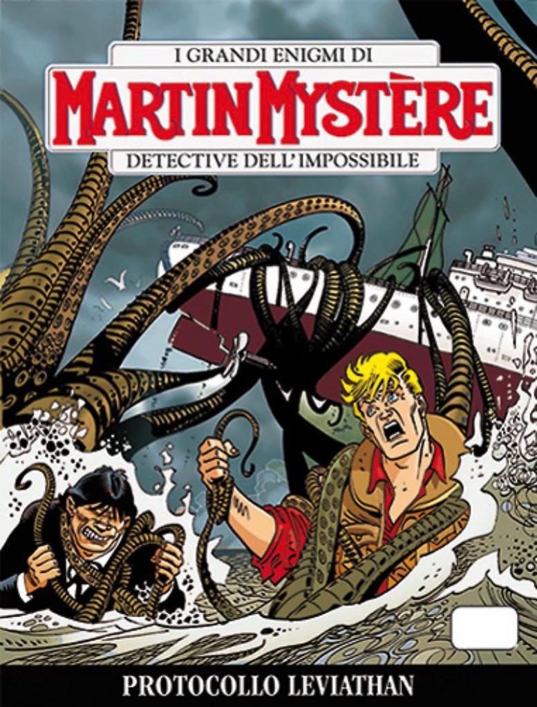
Created by writer Alfredo Castelli and artist Giancarlo Alessandrini, Martin Mystèreis an exceedingly popular comic book series (as a matter of fact, the best selling comic book in Italy – in case you’re wondering what that means, around 20 thousand copies a month)*. Its title comes from the eponymous main character, Martin Jacques Mystère, the usual walking collection of tropes: good looking art historian, archaeologist-anthropologist à la Indiana Jones, collector of rare objects, and so on. No self-respecting adventurer goes around without a sidekick, and Mystère’s assistant is Java, an amazingly strong, quite mute Neanderthal man (speaking of tropes, that one is a doozy). One might also say that he’s quite international: an Italian-created American character with a French name who lives in New York City and frequently helps its finest to elucidate crimes…
*I stand corrected by one of our readers, who pointed out that Italy’s most popular comics series is Tex, which sells around 200 thousand copies a month (compared to Martin Mystère’s 20 thousand). Thanks, Darko!
Martin Mystère no. 103 (October 1990). Cover by Giancarlo Alessandrini.
Martin Mystère no. 328 (August 2013). Cover by Giancarlo Allesandrini.
This series started in 1982, and is still around, so you can just imagine how many tentacles Martin has tangled with in some 378-odd issues. Yet high-res images are scarce online, so I asked co-admin RG to whip up this nifty collage of some of his tentacular exploits:
Issues no. 163, no. 181, no. 237 and no. 297, with covers by Giancarlo Allesandrini.
Our next (and last stop) is another very popular series, Zagor. Its beginnings go all the way to 1962 (ancient, no doubt), when editor/writer Sergio Bonelli and artist Gallieno Ferri banded together to concoct a comic book series.
Its protagonist Zagor, or Patrick Wilding, is another American. If Martin Mystère represented the suave, erudite adventurer-about-town, Zagor is a kind of avenger-slash-protector, of the “be peaceful or I’ll beat the crap out of you” school. His origin story makes for rather uncomfortable reading: after tracking down massacring a whole family branch of Abenaki Indians to avenge his parents’ death and realizing that he made a boo-boo (by finding evidence that his father was a murdering, power-abusing sadist who was killed purely in retribution for his criminal acts… which is another can of worms), he decides to redeem his sins by ensuring peace between different Indian tribes and trappers by whatever means necessary.
Zagor no. 42 (December 1968), illustrated by Gallieno Ferri and written by Guido Nolitta (Sergio Bonelli’s nom de plume).
Inside art from Zagor no. 42, illustrated by Gallieno Ferri and written by Guido Nolitta.
His sidekick? Chico, a walking stereotype down to his full name (Chico Felipe Cayetano Lopez Martinez y Gonzales) whose presence is played for some mean laughs. «He is short, fat, extremely clumsy and voracious, corrupt, boastful, but also likeable.» Um, yeah, that sounds likeable, all right. If you’re thinking that Chico is also obsessed by food (he’s Mexican and fat, right?) and that it gets him into all sorts of stupid peril, you are perfectly correct. Gordo, this is not.
Interestingly, Zagor is most popular outside of his native Italy. Specifically, he retains popularity in the former Yugoslavian republics (Bosnia, Herzegovina, Slovenia, Croatia, Serbia…) and Turkey. Stories continue to be published in Italian up until this day, but from what I’ve been able to gather, the books sell at a much brisker pace once they’re translated to languages spoken by inhabitants of the aforementioned countries.
Zagor no. 626 (September 2017). Cover by Alessandro Piccinelli. Okay, so those are not tentacles per se, but it says TENTACOLI! right on the cover, so I’m not arguing.
Zagor no. 662 (September 2020). Cover by Alessandro Piccinelli.
« It’s a lot easier to draw rubble when deadlines hit. » — Guy Davis
Today, on his birthday, we seize the occasion to salute prodigious autodidact Guy Davis and to look upon his works, no despair necessary.
Born in Michigan on November 20, 1966, Guy Davis started out in comics in 1981 with a SF strip, Quonto of the Star Corps, published (he suspects his dad had something to do with it) in local newspaper The Clarkston News.
From there, he delved into sword and sorcery with The Realm (1986-1988, Arrow), then made significant strides toward his mature style with punk saga Baker Street (1989-1991, Caliber).
He then hit the majors, devoting most of the 90s to pencilling and inking the bulk of Sandman Mystery Theatre‘s quite respectable run (70 issues + 1 annual, 1993-1999, DC/Vertigo), Matt Wagner‘s darkly revisionist chronicles of Wesley Dodds, the Golden Age Sandman… pre-yellow-and-purple togs.
I must confess that I wasn’t, at this point, particularly fond of Davis’ style. His endearingly schlubby, potato-schnozzed characters had yet to work their charm upon me. But the writing was compelling, Davis’ storytelling was strong and clear, so I stuck around.
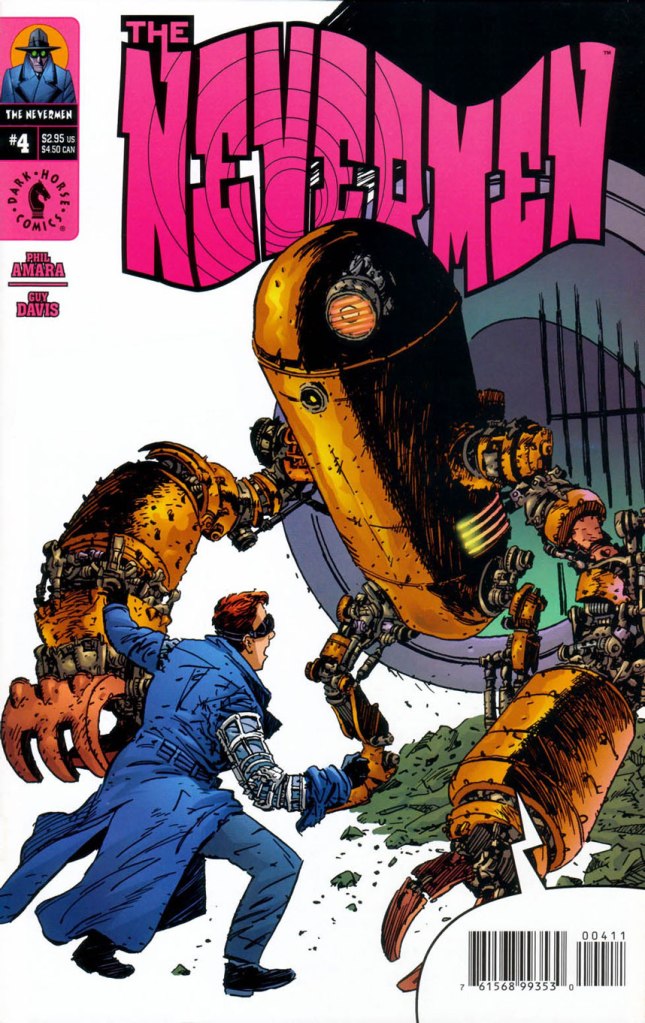
However, I’m not ambivalent at all when it comes to his subsequent work, wherein he ditched his often awkward cross-hatching, his inking improved by leaps and bounds in expressiveness, and he was at long last paired with a colourist that fully grasped his singular style.
This is The Nevermen no. 4 (Aug. 2000, Dark Horse). Cover by Guy Davis.
Page 22 of Nevermen no. 1 (May 2000, Dark Horse). Written by Phil Amara, pencils and inks by Davis, colours by Dave Stewart.
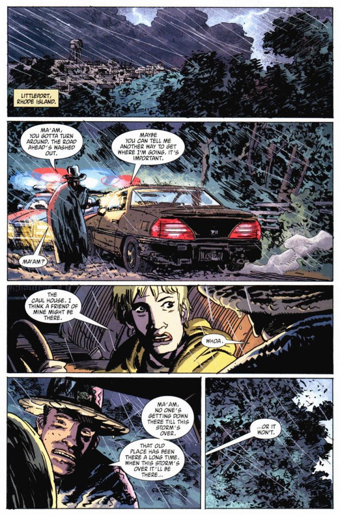
Page 8 of The Nevermen no. 4 (Aug. 2000, Dark Horse). Same personnel…
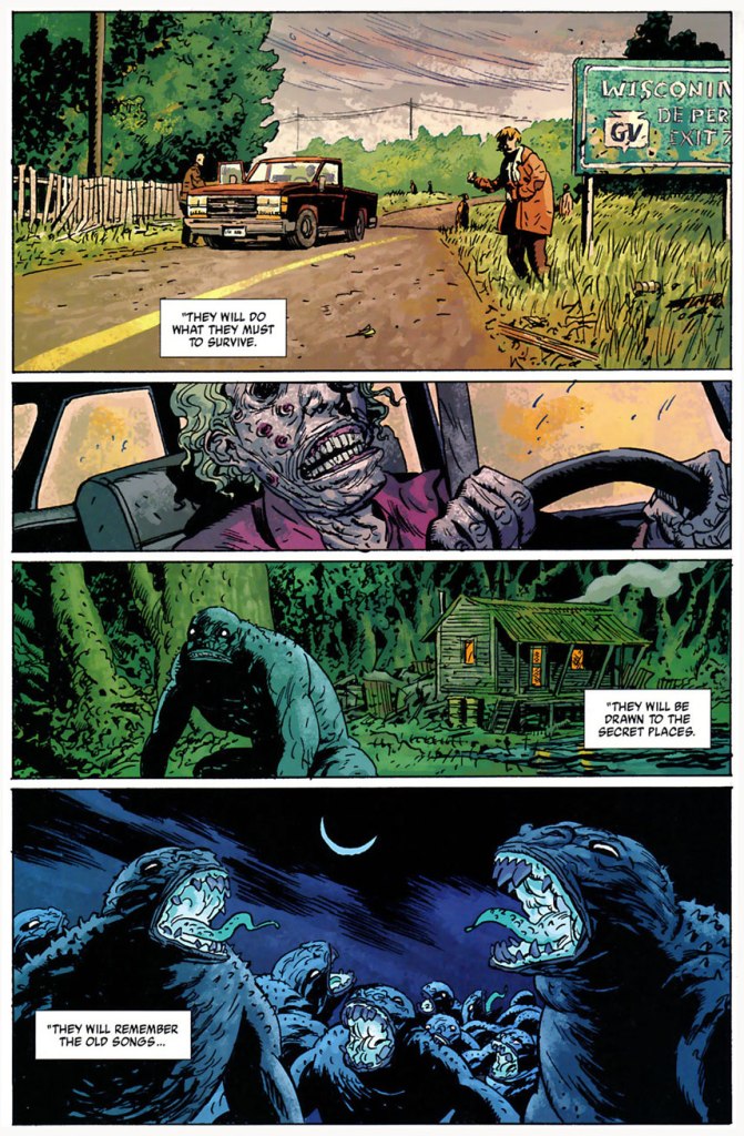
Page 15 of B.P.R.D. Plague of Frogs no. 1 (Mar. 2004, Dark Horse). Story by Mike Mignola, pencils and inks by Davis, colours by Dave Stewart.
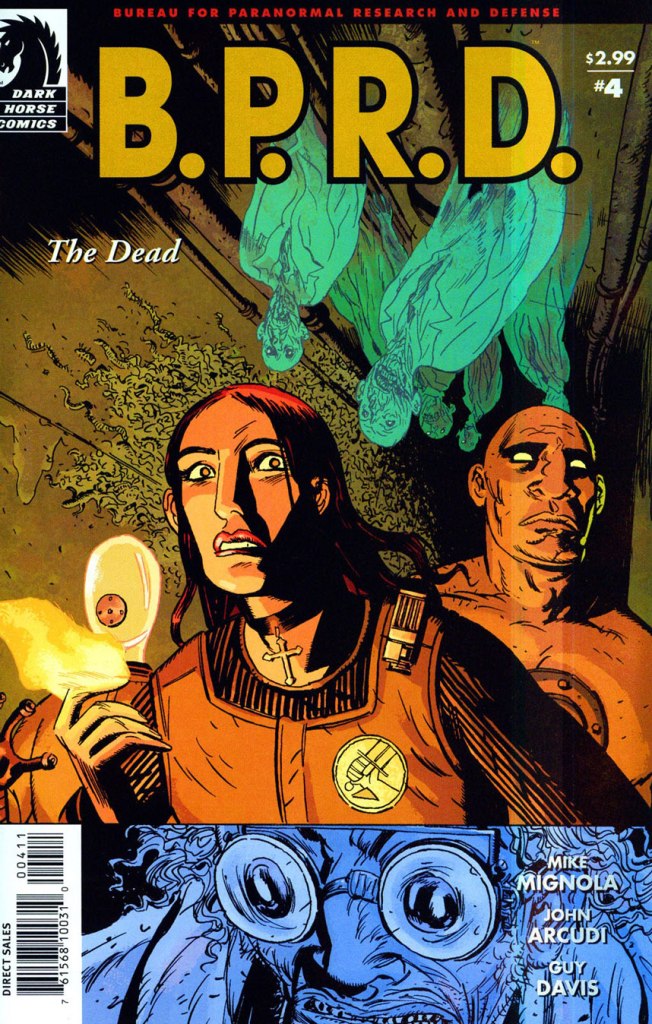
Page 22 of B.P.R.D. The Dead no. 3 (Jan. 2005, Dark Horse). Story by Mignola and John Arcudi, pencils and inks by Davis, colours by Dave Stewart. Shot from the original art, courtesy of, er… the author’s collection.
And in case you’ve ever wondered just what a good colourist can contribute to the finished product, let alone the finest colourist in the business. Ladies and gentlemen, Mr. Dave Stewart!
Guy Davis on his collaboration with Dave Stewart:
I was never never happy with my work in color — I hated the idea of it — until [ Dave Stewart ] started coloring me in B.P.R.D. He had this textured brush look that was just perfect for my linework. My linework is not clean, and before Dave, everybody who’d color me would do a standard house style. They wouldn’t adapt for each artist, and that’s what makes Dave so amazing is that he adapts his style for the art as opposed to trying to shoehorn one style of coloring — which a lot of colorists do — into every artist’s style.
(from an interview conducted by Eric Nolen-Weathington and published in Modern Masters Volume 24: Guy Davis, 2010, TwoMorrows)
Page 22 of B.P.R.D. The Dead no. 3 (Jan. 2005, Dark Horse), by the aforementioned.
This is B.P.R.D. The Dead no. 4 (Feb. 2005, Dark Horse). Cover by Davis and Stewart.
Page 11 of B.P.R.D. The Dead no. 4 (Feb. 2005, Dark Horse). Note that Stewart doesn’t fall back on one go-to, characteristic colour palette; he has range. Muted, saturated, bright or dark… he uses what the situation calls for. That’s what a true artist does.
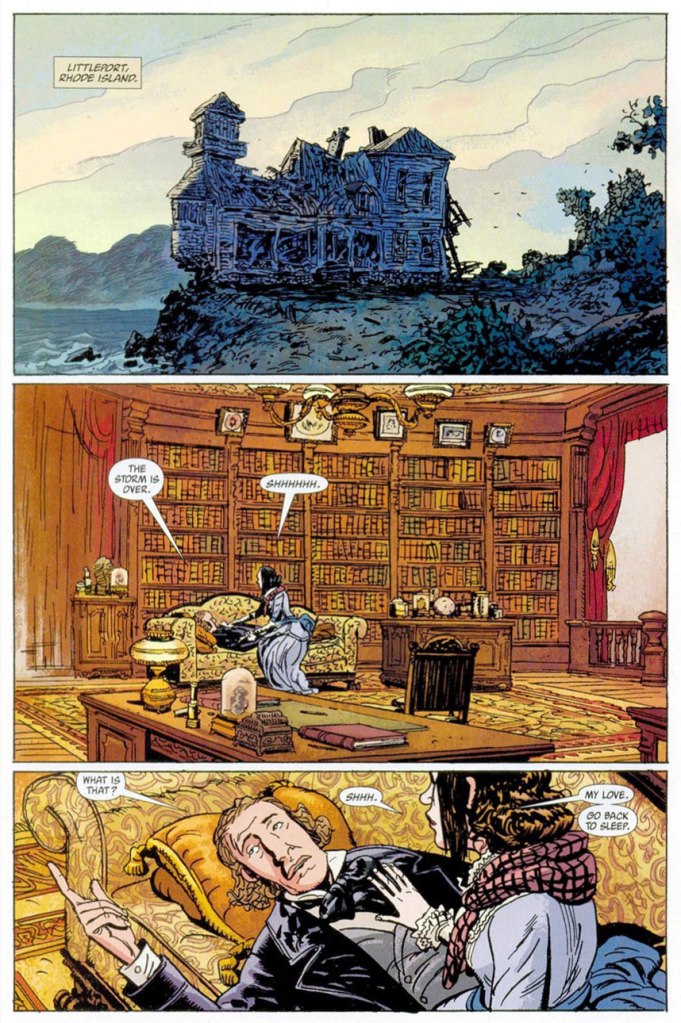
Page 18 of B.P.R.D. The Dead no. 5 (Mar. 2005, Dark Horse). Now *that* is a library.
With his love and mastery of period detail and the human proboscis, wouldn’t you say that Davis would have been the ideal candidate to depict legendary pulp hero The Shadow? A 2005 drawing excerpted from Guy Davis Sketch Macabre Volume 2 (Oct. 2006).
Frankly, I don’t think Mr. Davis ever received his due in comics; he remained an artist’s artist, reliable and productive, but relatively unsung. On B.P.R.D., he allowed Mr. Mignola to envision events and visions on a far, far grander scale than Hellboy’s creator could have realised by himself. After Davis resigned from the title and exited the comics field for challenges and well-earned success, artistic and financial, in the realms of film and video games, there simply wasn’t anyone able to fill the void he’d left.
Happy birthday, thanks for everything and all the best to you, Mr. Davis!
-RG
p.s. In selecting artwork for this essay, I forced myself to exclude any and all instances of tentacles, and trust me, there were plenty. We haven’t made it official yet, but if anyone ever deserved the title of Tentacle Master…
« My imagination grew wilder, the most unexpected associations flared up in my mind, and as I kept trying, the reception room kept filling with strange objects. Many of them were born, apparently, out of the subconscious, the brooding jungles of hereditary memory, out of primeval fears long suppressed by the higher levels of education. They had extremities and kept moving about, they emitted disgusting sounds, they were indecent, they were aggressive and fought constantly. I was casting about like a trapped animal. All this vividly reminded me of the old cuts with scenes of St. Anthony’s temptations. » [source]
Today’s topic does not involve a man becoming a cockroach: that has been discussed often enough. My current area of interest concerns the many strange and striking ways in which a living form becomes a completely different form under the influence of a supernatural power or its natural inclination, of witchcraft or the whimsy of a writer whose imagination flares up much like it did for poor A. I. Privalov, depicted above trying to create a a sandwich and a cup of coffee and ending up with a roomful of horrors…
This strange creature surely illustrates the perils of getting stuck mid-metamorphosis!
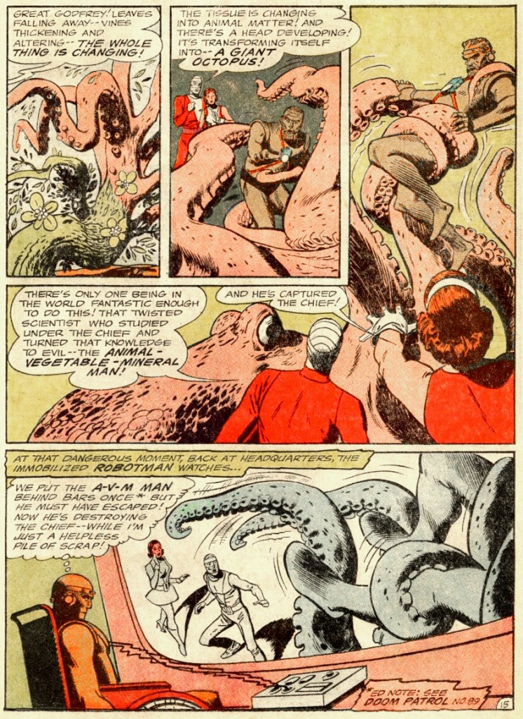
The Doom Patrol no. 95 (May 1965). Cover by Bob Brown. While transforming into god-knows-what, Dr. Sven Larsen is careful to preserved his impeccably coiffed chevelure. Perhaps he inspired Ted Baxter.
In Return of the Animal-Vegetable-Mineral Man, scripted by Arnold Drake and illustrated by Bruno Premiani, the Doom Patrol battle a scientist crazed with power-lust (while dealing with trouble of their own, like being unable to control their powers – it was apparently decided that a scientist who can become anything he likes is not interesting enough).
That this AVM (animal, vegetable, mineral) man decided to transform into an octopus will not surprise regular readers of Tentacle Tuesday: we know that the octopus is the most perfect form there is!
In the rest of the story, AVM also transforms himself into electric eels, tungsten birds, a building-tall neanderthal man, liquid mercury, a grizzly bear, etc., but it’s all a bit of a let-down after the giant octopus, if you ask me.
I’ll continue with this rather evocative cover by Bernie Wrightson, in which we get a preview peek at a gruesome scene just a few seconds before it actually happens.
House of Mystery no. 204 (July 1972). Cover by Bernie Wrightson.
It all starts with a nasty dream of cranberry jelly…
… and ends with an unwelcome transformation of future bride into hungry monster. In this case, a pretty girl is not so much like a melody, but yet another helping of aforementioned cranberry jelly… perhaps I should have kept this story until Christmas.
All in the Family was scripted by Mary Skrenes and Bernie Wrightson; illustrated by Bernie Wrightson.
If this story of transmogrification made your teeth itch, just have a gander at the following histoire d’amour…
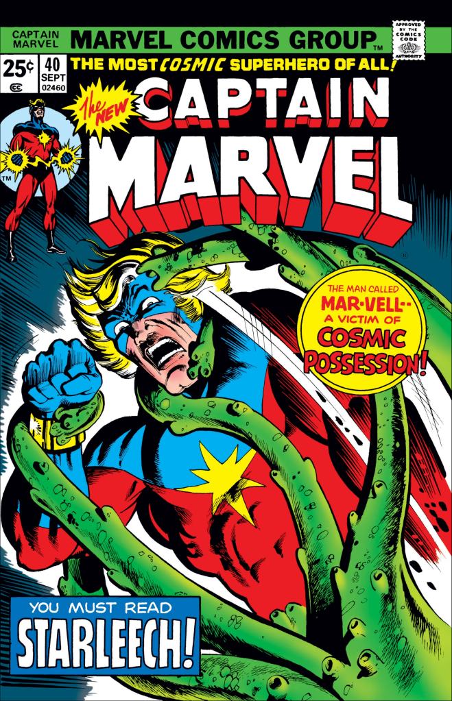
Captain Marvel no. 40 (September 1975). Cover pencilled by Al Milgromand inked by Klaus Janson.
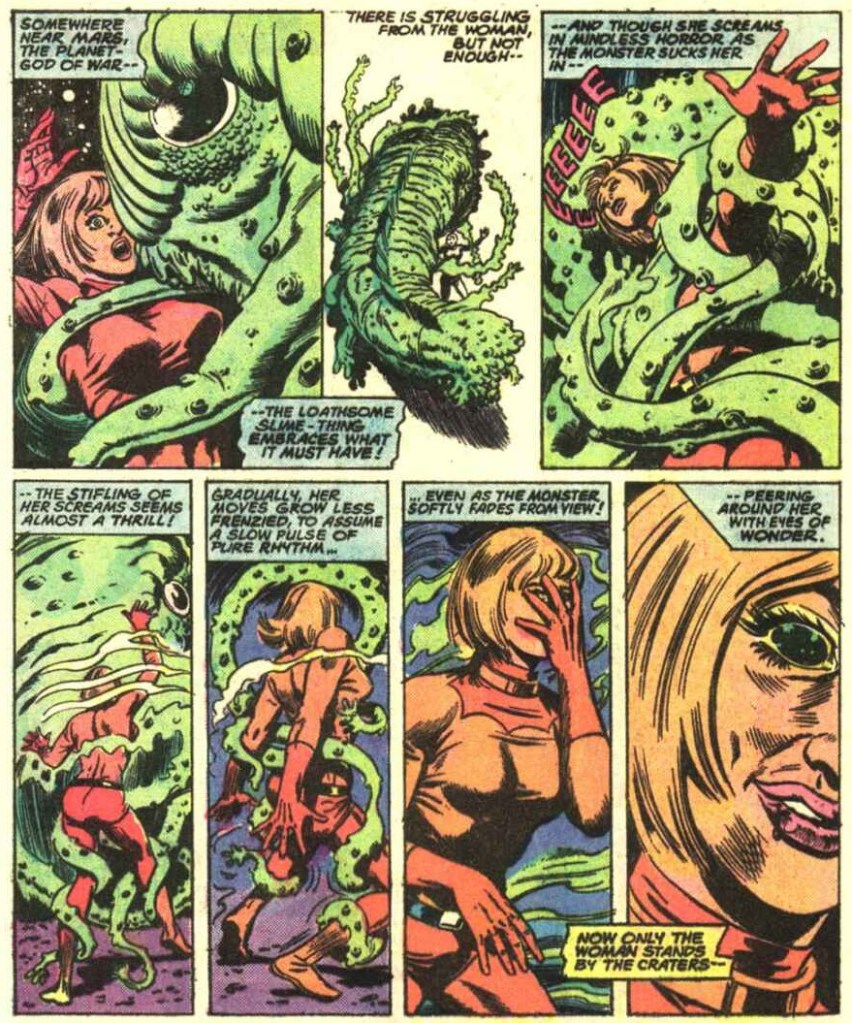
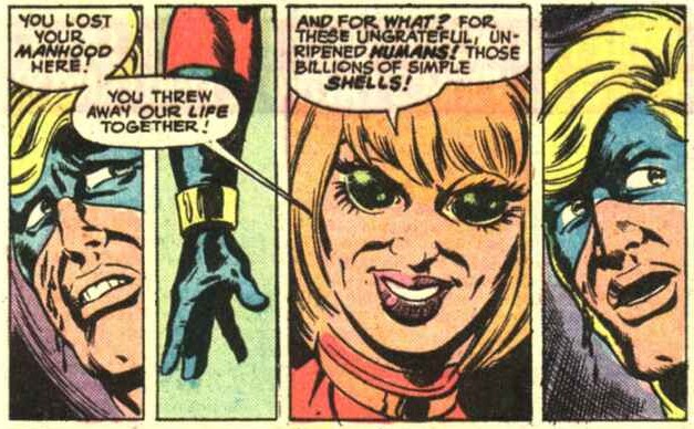
No, hold your horses, I’m not implying anything untoward about Captain Marvel. That thing he’s tangled up with is his lover (or should I say ex-lover) Una. Just a little case of demonic possession!
Um, those are not “eyes of wonder”, more like a demented gaze.
Will Captain Mar-vell be able to kill the woman he loves, even if she’s more of a shell inhabited by a tentacled psychic monstrosity, and despite having lost his manhood, whatever that was?
Stay put for the exciting finale of Rocky Mountain ‘Bye! was scripted by Steve Englehart and Al Milgrom, pencilled by Milgrom, and inked by Al McWilliams!
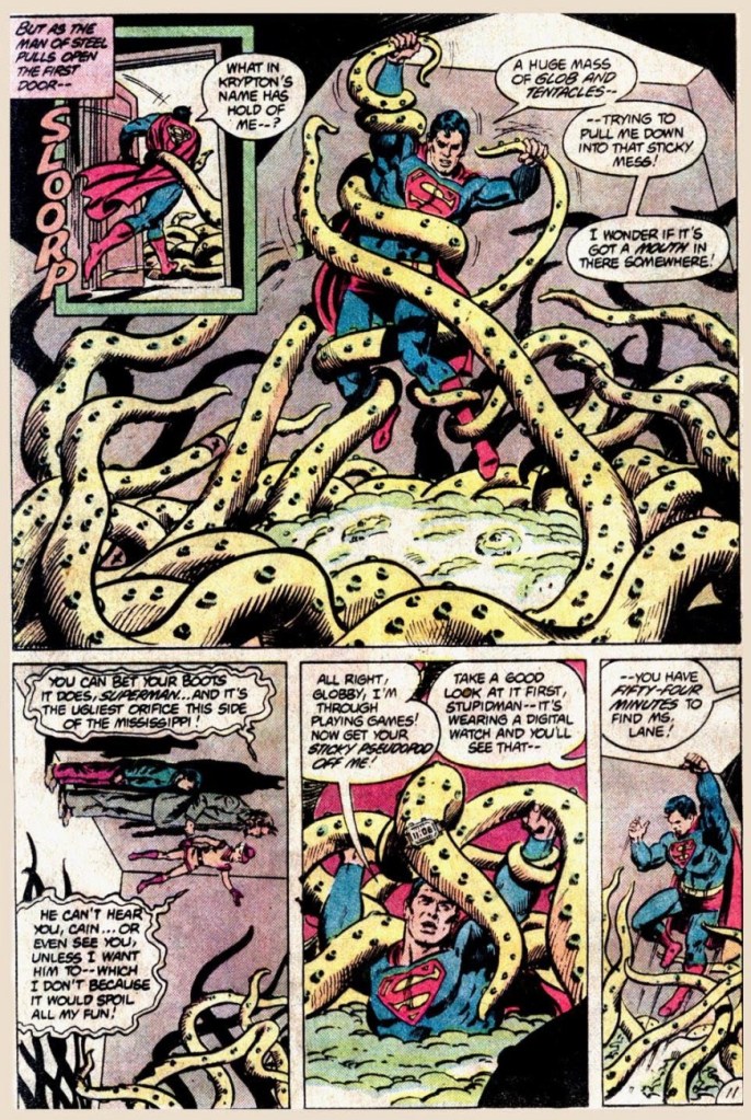
What do we have here? A harmless trick-or-treating kid transformed by Mr. Mxyzptlk into a malefic octopus? It’s business as usual for Superman in this goofy tale (who, incidentally, was the star of Tentacle Tuesday: It’s a Bird! It’s a Plane! It’s a Tentacle!) I’m sure most children would relish the opportunity to become an actual ghost or werewolf…
But I am not convinced that anybody would want to be transformed into, err, “Globby”.
Nothing as stylish as an octopus with a digital watch.
These pages were from The Haunting Dooms of Halloween!, scripted by Dan Mishkin, pencilled by Curt Swan and inked by Tony de Zuñiga, published in DC Comics Presents no. 53 (January 1983).
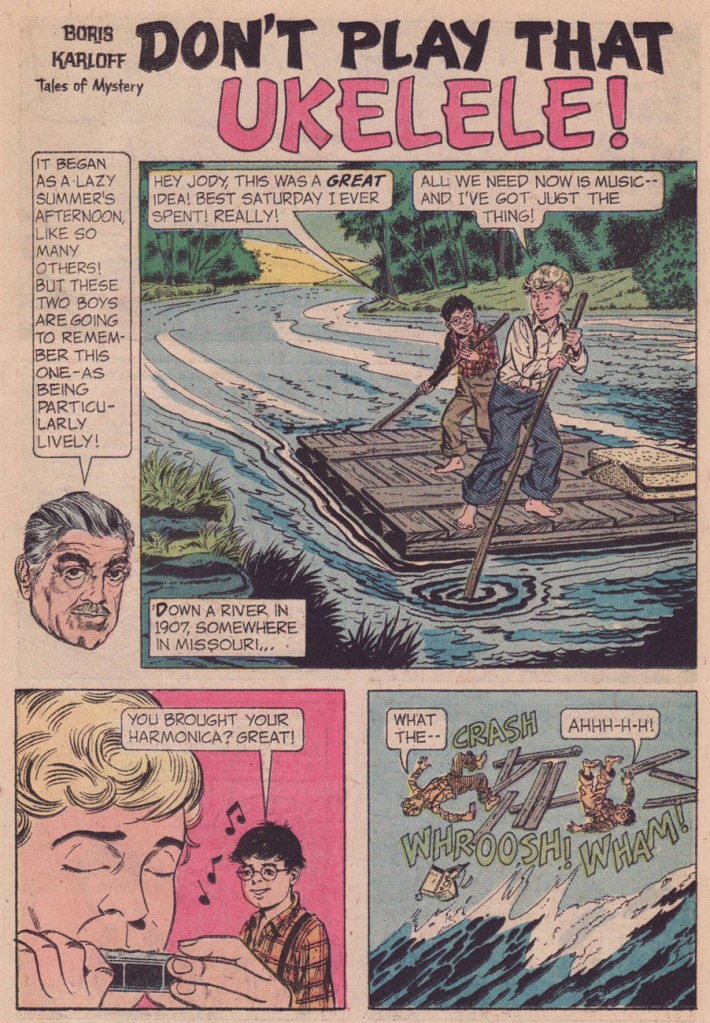
« There’s something about guitars, they’re just so big, you know what I mean? You’re just like, ‘Ugh!’ It just seems so overwhelming. And the ukulele is, like, the opposite of overwhelming. » — Zooey Deschanel
While the inside artwork also had its charms, the weak link in the chain was the writing. Pedestrian and formulaic, most of its anonymous load was borne by Paul S. Newman, one of the comics industry’s great cranker-outers. And so things ran their humdrum course, even with the arrival of talented DC expatriate Arnold Drake in the early 1970s. I strongly suspect rampant conservatism on the part of the editors, as even normally-compelling authors produced the same generic plots, ground out like under-seasoned sausage.
Then occurred a curious bump in the road: the unheralded, near-anonymous arrival of future Clown College alumnus*Connor Freff Cochran (1954-), who scripted (as Freff, when credited — a rarity at GK) a number of short tales for Gold Key’s anthology titles for a few years (1974-1977). Of those I’ve read, most docilely follow the publisher’s tame editorial formula. But there are exceptions, and they really do stand out. Here’s such a pair, which I’m boldly attributing to Mr. Cochran.
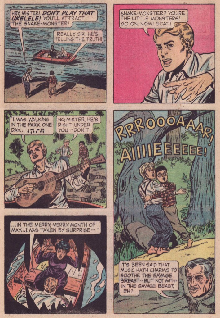
Interesting that writer Freff opted here for the obscure, alternate spelling of ukulele. Speaking of which, how do you think ‘ukelele‘ is pronounced? You might be surprised. Check here for the answer. And, er… 1907? “One of the earliest appearances of the word ukulele in print (in the sense of a stringed instrument) is in the Metropolitan Museum of Art’s Catalogue of the Crosby Brown Collection of Musical Instruments of All Nations published in 1907.” [ source ]Man, that lake monster looks familiar. I smell a swipe.And for the full multimedia experience, you can sing and strum along with George!
Ahem — sloppy research on Freff’s part:
The ukulele was popularized for a stateside audience during the Panama–Pacific International Exposition, held from spring to autumn of 1915 in San Francisco.
It is therefore highly unlikely that anyone on the American continent would have been plucking a uke, let alone that two random Missouri farmboys would spot a specimen from a distance. Not to mention the fact that the uncredited and unknown artist (no, it’s notBill Molno, dear ignoramuses at the GCD) drew… a plain old guitar. Let’s face it, a banjo or even a mandolin would have made more sense.
In his defense, Freff recalled:
« I absolutely did write “Don’t Play That Ukulele!” But I don’t deserve the ding for the misspelling — that was the letterer’s error, which no one fixed. I will cop to not knowing (in 1975) that the ukulele wasn’t introduced stateside until 1915…but even there the story is a bit more complicated than it appears on the surface. When I pitched the idea it was a guitar that brought doom down on our unfortunate swain, same as it wound up being drawn. But editor Paul Kuhn thought a ukulele was intrinsically funnier than a guitar, and he’s absolutely right about that. I remember us both giggling over the title when we came up with it. »
At fourteen, he and his family moved to Placentia, California, east of Los Angeles, where he graduated from El Dorado High School a year ahead of the normal schedule. One of his fellow students had combined the words “friend” and “Jeff ” to coin the name “Freff ”— and while at first this remained only a nickname, by 1970 he had started signing his artwork that way, as well. Like many artists, Cochran entered the science fiction field doing “freebie” drawings for fanzines. His first paid job were pen and ink drawings for Andrew Porter’s semi-prozine Algol, done in 1972. In the same year he dropped out of Fullerton Junior College after two months of art classes to live on his own. He worked in various fields to make a living and “The rest was all just self-directed study and experimentation,” he says, adding “as a young pro, just starting out, I was lucky enough to be mentored ever-so-slightly by two of my early faves in the field: Kelly Freas and Jack Gaughan. At Kelly Freas’s suggestion Cochran moved to New York in September 1973 and started looking for work as an illustrator.
When that was not forthcoming, Cochran attended the Ringling Brothers and Barnum & Bailey Clown College — class of 1974.
In that year he got his first big break from Jim Baen, the new editor of Galaxy and If. Baen needed people who would work fast and cheap and put up with being paid late — in other words, the perfect opportunity for beginning artists like Cochran. By this time he was aware that other professional artists and cartoonists were named “Cochran”— and feeling that using his initials “JC” would be presumptuous — the artist in 1976 went to court and legally adopted “Freff ” as his professional nom de brush, and kept it during his years of magazine illustrating. Baen was so taken with the name that he put it on the cover of Cochran’s first cover for IF, as if Cochran was an author with a story in the magazine. After that “Freff ” did a lot of work for Baen, primarily interiors in black-and-white. He also did drawings for Cosmos, Isaac Asimov’s SF, and did cover work for publishers such as Dell, Berkley, and Doubleday. Cochran was selected to be one the artists in the special 1975 NASA/Smithsonian Artists Tour. After early success illustrating Zelazny’s “Amber” novels for Galaxy, followed by cover art and interior illustrations for a set of hardcover novels by Zelazny for Gregg Press in the early 1980s, Cochran became disgruntled over nonpayment for the use of his art in foreign editions of John Varley’s novel Titan, for which he had done a frontispiece and 16 illustrations—and the argument led to the end of Cochran’s illustrating in the field.
He turned to other endeavors, but briefly “dipped a toe back into the waters by collaborating on the first (and only) issue of an SF comic book called D’Arc Tangent” in 1982–1983. He did inking and penciling for DC and Marvel comics: Star Trek** and Tomb of Dracula***.
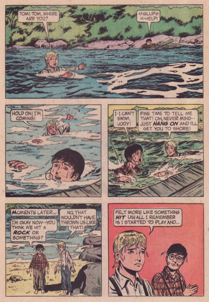
This is Boris Karloff Tales of Mystery no. 64 (Oct. 1975, Gold Key), featuring a painted cover by Argentine master Luis Dominguez. Don’t Play That Ukelele! isn’t even the cover story… there’s just a lot of aquatic peril in this particular issue.
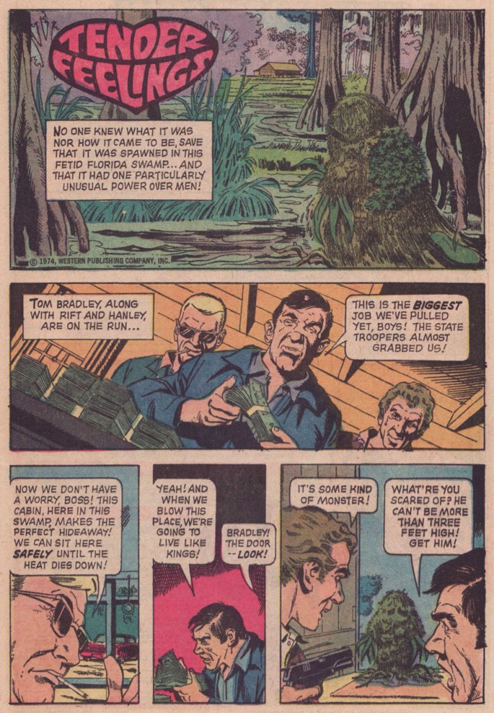
And here’s the uncredited, utterly batty Tender Feelings, recognizably illustrated by another hardworking Argentine, José Delbo. It saw print in Boris Karloff Tales of Mystery no. 53 (Apr. 1974, Gold Key).
Part of my reasoning for attributing authorship of Tender Feelings to Freff is his penchant for light, deftly humorous tales that conclude with several characters meeting dismal ends. Churrr...
But… nope. The mystery of this mordant little tale remains whole. Freff helpfully eliminated himself as a suspect, and proposed some intriguing leads:
« I can’t take credit for “Tender Feelings.” I certainly wish I could, since it’s a delightful mashup/piss-take on DC’s Swamp Thing and Marvel’s Man-Thing. But nope — not me.
The publication date I find online for that story is April 1974. But Gold Key titles usually hit the stands a month ahead of the printed date, and editors Wally Green and Paul Kuhn liked to have a solid backlog of finished stories on hand. That puts the likely writing window for “Tender Feelings” somewhere around August 1973, which means there’s a chance that “Tender Feelings” was written by Len Wein himself. Len did a lot of uncredited Gold Key stories, starting around 1969, but he stopped in late summer 1973. It would have been absolutely in keeping with his sense of humor to write something like “Tender Feelings” as a happy sendoff for himself.
My best second guess after that would be John David Warner…though if I really had to bet, I’d bet on Len. In any case, whoever did it was lightyears better than the usual Gold Key writer. Glad to see them get this recognition. »
-RG
*Class of ’74. As Freff himself stated: « The Really Famous Guy from our session was Bill Irwin, who went on to a great stage, TV, and film career, and was the first performer to win a Genius Grant from the MacArthur Foundation.) I did originally intend to apply for the ’73 class, but I learned about it too late to make that year’s deadline. So I went to NYC instead to pursue art, while waiting for my next chance to roll around.. »
**he inked two drawings (one of them a double-paged splash) in Who’s Who’s in Star Trek (1987). That seems to be all.
***a pair of frontispiece illustrations in Tomb of Dracula (the magazine, that is: six issues, published Oct. 1979 – Aug. 1980); he also conducted a fine interview with Stephen King, published in issues 4 and 5 of TOD. Freff provides some illumination: « plus the framing graphics for the magazine’s title/table of contents page, plus I got to ink a bunch of ads for the magazine. The one I know they used involved inking Gene Colan’s pencils, which was hella fun and a childhood dream come true. I grew up on Gene’s work in DAREDEVIL, DOCTOR STRANGE, IRON MAN, CAPTAIN MARVEL, etc, and he was easily as big an influence on my visual thinking as people like Jack Kirby, Steve Ditko, Neal Adams, or Jim Steranko. (I got to achieve another childhood comics dream when I got to re-pencil, ink, and color a Curt Swan drawing for the October 1988 cover of KEYBOARD magazine.)
I did a lot more writing than artwork at Marvel, but most of it was nonfiction material in their b&w magazines — 100+ articles for PLANET OF THE APES, DEADLY HANDS OF KUNG-FU, CELEBRITY, NOSTALGIA ILLUSTRATED, THE TOMB OF DRACULA, etc. »
… in which we continue our exploration of tentacles slithering their way into Franco-Belgian comics!
In an orderly fashion, please.
The other day, a friend heartily recommended a certain movie to me, pointing out that it was ‘ancient’ and therefore probably available online for free. When I checked the year, it turned out to have been from 1995 which, excuse me, hardly qualifies as prehistoric. What can be considered ‘old’, then, people in their early thirties will ask? Why, this magazine cover, for instance.
Le Petit journal illustré (May 21st, 1922). The bottom says “a drama at the bottom of the sea”, with details of how a diver was attacked by an octopus and cannot get out his knife to fight against his repellent aggressor.
Skipping some thirty years ahead, I believe we’re still in “old” territory.
A page from « Zette reporter : Aventure en Pacifique », published in Lisette n° 38 (September 16th, 1956). Script by François Drall, illustration by Yvan Marié. The girls, after witnessing a fight between a giant shark and octopus, now seek to escape the clutches of the victor’s eight appendages.
Lisette was a comics magazine specifically aimed at female readership (to be more precise, it was marketed to girls between 7 and 15 years old). The interesting part is that it often featured articles about traditionally men-dominated careers, some of which had only been very recently accessible to women… for instance, an interview with Anne Chopinet (one of first women accepted in l’École polytechnique) and a reportage on women air pilots back when this was an almost exclusively man-only club.
Moving on to further, more energetic octopus-evading tactics… we have Bob Morane, originally a hero harking from adventure books written by prodigiously prolific Belgian novelist Henri Vernes, and published by Belgian éditeurMarabout. The number of adventures Morane has lived through is rather staggering: around 200 novels + about 80 comics albums. Now there’s a challenge for the serious collector!
Original art fromBob Morane et l’oiseau du feu(1960). Illustrated by Dino Attanasio.
Scripted by Antoine Raymond (a.k.a. Vicq), illustrated by Will, 1962.
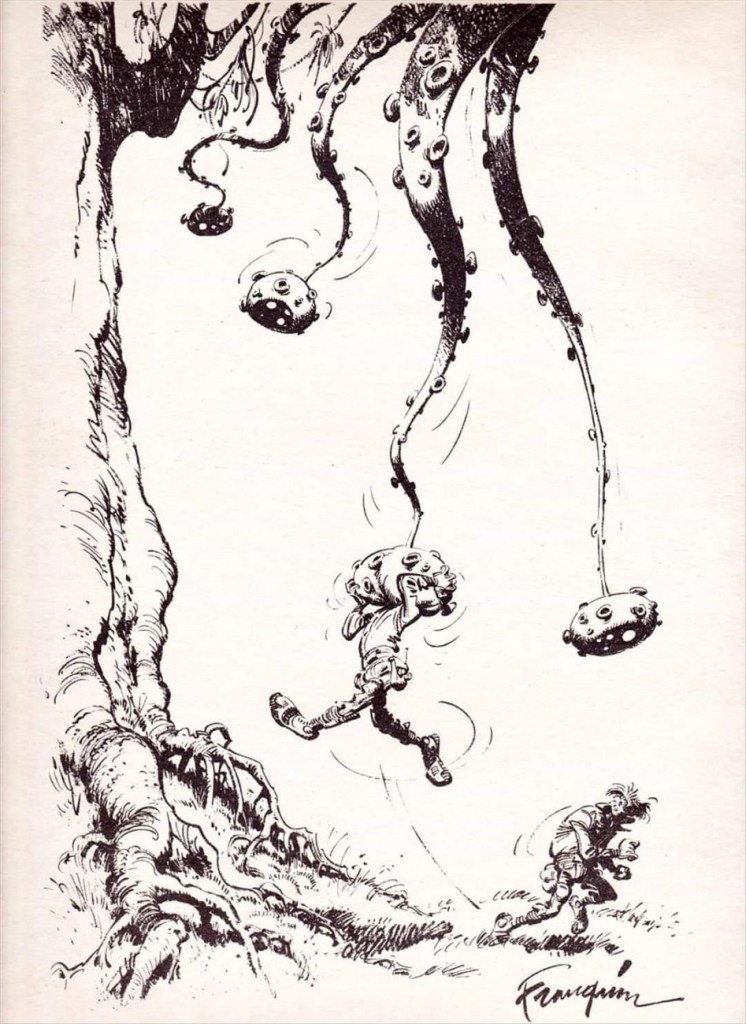
Co-admin RG called André Franquin‘s œuvre “an embarrassment of riches” in his Faites gaffe, monsieur Franquin! post. I thoroughly agree, and am very pleased to report (though this is in no way surprising) that tentacles are part of his vast répertoire.
Pages from what’s collectively known as Idées noires (Franquin’s Last Laugh in English). These dark strips and cartoons were Franquin’s « l’humour du désespoir », the humour of despair, and appeared in Le trombone illustré (Spirou’s magazine supplement) in 1977 and, with the discontinuation of the latter, moved to Fluide Glacial until 1983.
I’d better stop here. After all, I wouldn’t want to go as far as ‘modern’ times… say, from the 90s and onward, although it’s scary to think that was still 30 years ago!
« In my youth I thought of writing a satire on mankind! but now in my age I think I should write an apology for them. » — Horace
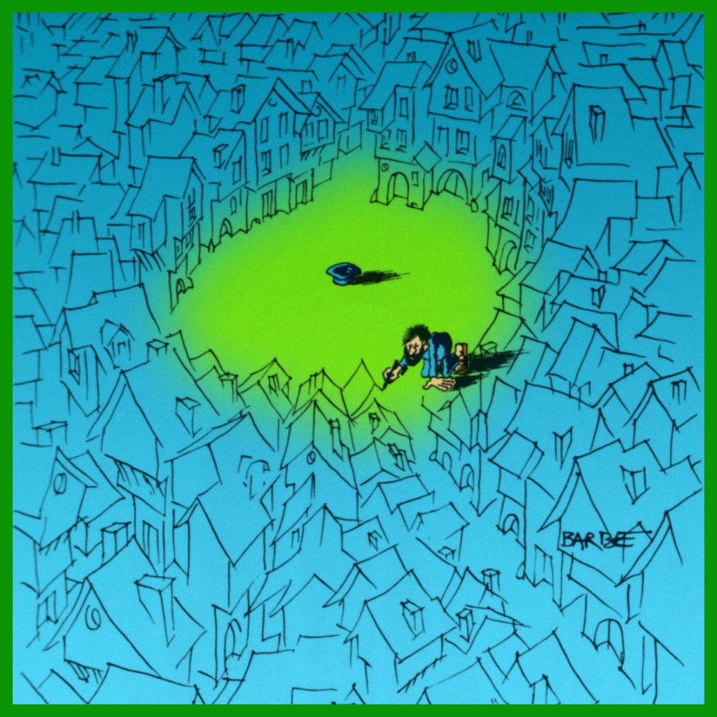
Cartoonist and illustrator André-François Barbe (1936-2014) was born in Nîmes, France.
After an abortive stint in the French air force, he spent a few years fiddling around in Air France’s employ. His earliest professional drawings saw print in the venerable Le Rire (1894-1971) in 1958. After a few years of tentative, but increasingly encouraging results, he finally made his decisive move in 1965, joining the shaky ranks of full-time cartoonists.
Fittingly, Barbe was an unabashedly chatty man in person… while his work scarcely required words.
A self-portrait of the bewhiskered (of course!) young artiste at his easel.
Remember how deep our television sets used to be?
This one anticipates a similar concept later mined by his Argentine contemporary, Guillermo Mordillo. To wit, check out co-admin ds’ Mordillo gallery… you’ll know just which cartoon I mean.
Like Gerard Hoffnung before him, Barbe was a connaisseur of classical music. He would frequently return to this theme.
By the early 1970s, Barbe was increasingly devoting his pen and his interest to erotic subjects, and that’s the work he’s most associated with. Though that material held greater commercial clout, the work remained flawlessly executed and formally explorative… at least at first. Then, I’d argue that it became a bit of a cul-de-sac. Personally, I’ve always found it a bit chilly in its execution, quite a liability for erotica. Your kilométrage may vary.
Speaking of distances, Barbe was always a bit of a routard, an adventurous traveller. Here’s one instance of particular interest:
In the 1980s, on the initiative of his brother Michel Barbe, a history and geography teacher in Marseille, he took part in a conference given by Haroun Tazieff on the subject of volcanism. Owing to the quality of his drawing skill, he was allowed to accompany, in 1982, an exploratory scientific journey to the volcanic region of the Djibouti Rift. This expedition, led by Lucy co-discoverer Maurice Taieb, enlisted 32 professors who explored the basalt flows in the Assal Lake depression.
-RG
*a handy description I’ve rifled from the ever-erudite Jacques Sternberg.
Back in August, I promised to follow Tentacle Tuesday: Dark Horse, Pt. 1 with another instalment of cephalopod material issued by this publisher. The time, as they say, has come! While I’m not always on board with the comics they opt to publish (rarely, I might even say), I do like today’s selections.
Dark Horse obtained the licence to produce James Bond comics in 1992. The result is a number of series and stand-alone comics – Serpent’s Tooth was the first, a three-part miniseries. The following two pages are from Serpent’s Tooth Part III: Mass Extinction, scripted by Doug Moench and illustrated by Paul Gulacy, published in James Bond 007: Serpent’s Tooth no. 3 (February 1993).
You decide for yourself which James Bond this is .
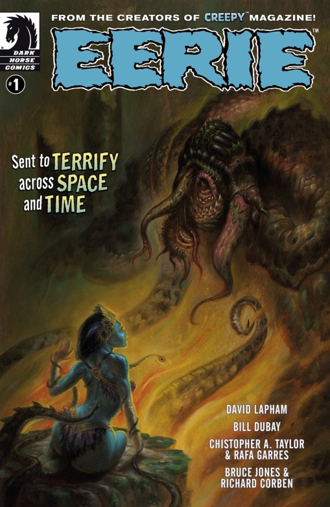
In 2007, Dark Horse stepped into a partnership with New Comic Company, who had earlier acquired from Warren the rights to Creepy and Eerie. The result was the gradual publishing of ‘archival’ hardcover collections of all issues of Creepy and Eerie magazines. In 2009, DH launched the ‘new’ Creepy Magazine, which mostly featured new stories, sprinkled with the odd reprint. A revived Eerie soon joined it.
Dark Horse’s revival of the classic Warren magazine is a mixed bag – this issue for instance, features several new stories and a reprint from 1970 (Life Species by Bill DuBay). This is Eerie no. 1 (July 2012). Cover by Jim Pavelec.
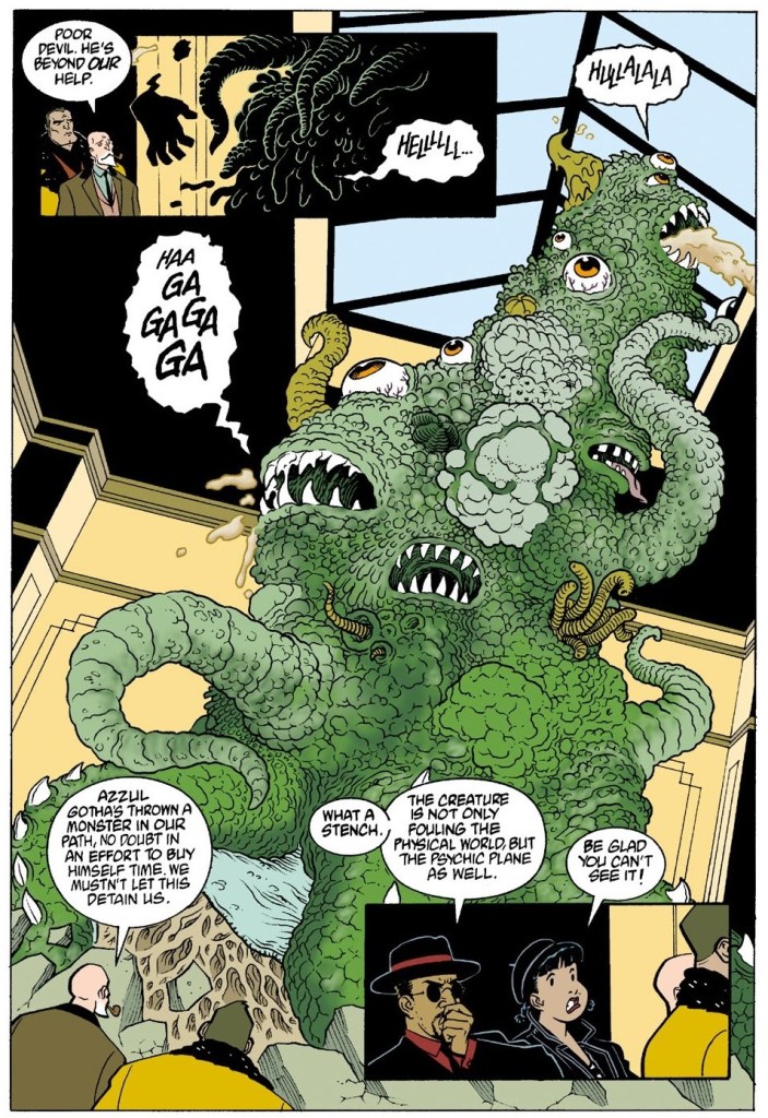
The next story is Tentacle Master Mike Mignola‘s ‘Champion of the Worms‘, which held my lazy interest for a few pages… until I found out that it’s actually quite good. What a pleasant surprise for one who had such low expectations! It also brims over with tentacles. The following three pages are from ZombieWorld: Champion of the Worms (October 1997), scripted by Mignola and illustrated by Pat McEown.
Not everybody can boast to such a classy octopus hat!
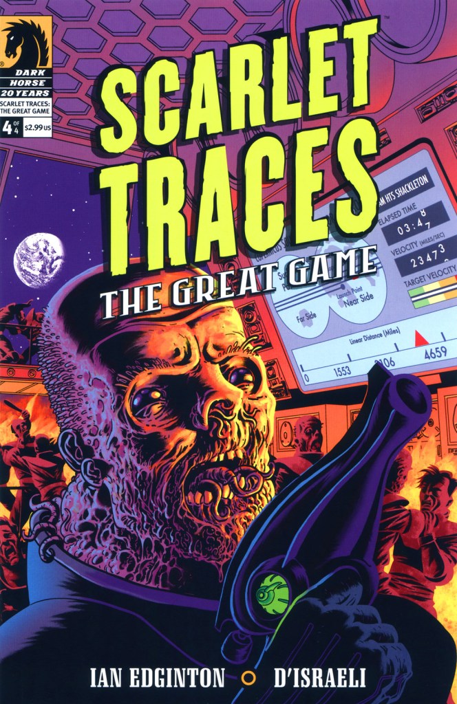
Last but not least… Scarlet Traces is a sort of sequel to Ian Edginton and D’Israeli‘s adaptation of H. G. Wells‘ The War of the Worlds, with heavy Dan Dare and Doctor Who references. This story wears its Englishness on its sleeve!
Scarlet Traces: the Great Game no. 4 (October 2006). Art by British artist D’Israeli, whose real name is actually Matt Brooker.