Panning the murky old print stream for the odd glimmering nugget
Painted Covers: Warren Magazines
Publisher James Warren understood the importance of a strong cover, so he didn’t scrimp in that department. Most famously, he called upon Frank Frazetta, but a host of extremely capable painters displayed their talents over the years: Basil Gogos, Luis Dominguez, Vic Prezio, Ken Kelly, Berni Wrightson, Tom Sutton, Manuel Sanjulian, Kenneth Smith, Gray Morrow, Pat Boyette, Terrance Lindall…
« In the bleak midwinter, frosty wind made moan, Earth stood hard as iron, water like a stone; Snow had fallen, snow on snow, snow on snow, In the bleak midwinter, long ago. » — Christina Rossetti
Christmas is nearly upon us, but while a great many will opt to retreat into the miasma of nostalgia to forget what an annus horribilis it’s been, I’ve picked something a bit more appropriately sombre in tone to nail down the occasion.
But with a more hopeful chaser… to balance things out a bit.
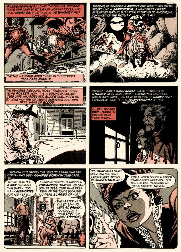
When the indefatigable Carmine Infantino (1925-2013) stepped down from his multi-hatted rôle of publisher, editor-in-chief, cover designer and art director — and so on — at DC, he found that no-one was beating his door down to offer him a similar position.
So he went back to drawing, as a freelancer. As Infantino put it: « Jim Warren was the first comics publisher to contact me after DC. I said “I’ll do work for you, but nothing full-time because I’m busy with other things.” He said, “Okay, whatever you’re willing to give me.” I wasn’t really comfortable with the Warren material — it was the sexiest work I’d ever done! Jim had an older audience and wanted it that way. My feelings about the material never affected the mutual respect Jim and I had for one another. » [ source ]
All told, Infantino pencilled around forty stories for Warren in a span of four years. There was even a brief period when he just about monopolized individual issues of Creepy and Eerie, which was offset by pairing him with wildly disparate inkers. Sometimes the results sang, sometimes they croaked.
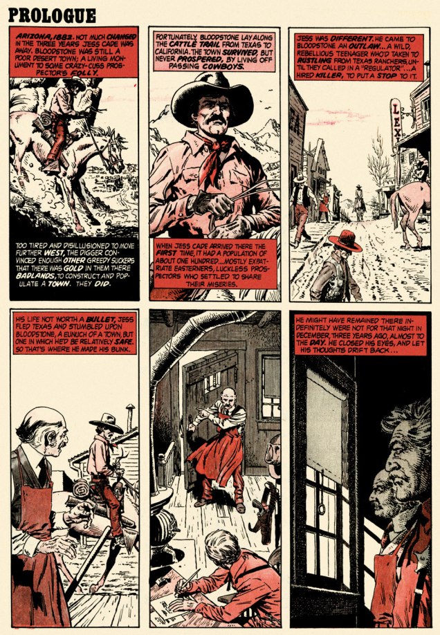
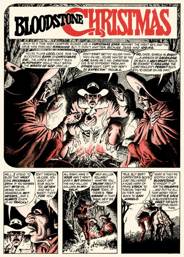
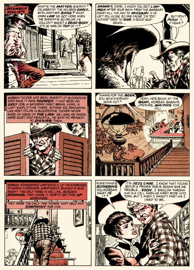
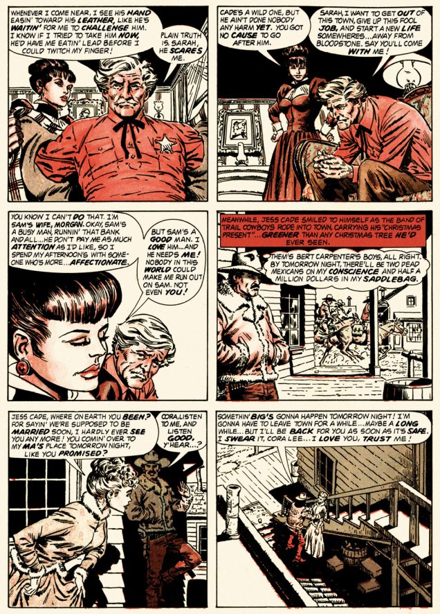
Here’s a case of rarely combined styles that nevertheless meshed beautifully: Infantino and John Severin. Let’s face it, who’s more reliably excellent than Mr. Severin?
And so this is… Bloodstone Christmas, written by Gerry Boudreau, pencilled by Infantino, and inked by John Powers Severin (1921-2012).
.
.
.
.
.
.
.
I won’t pretend that the entire cast isn’t peopled with stock characters, but its sting in the tail lands satisfyingly, prefiguring the flavour of weird westerns by Joe Lansdale, for one.
.And now, for something sweeter.
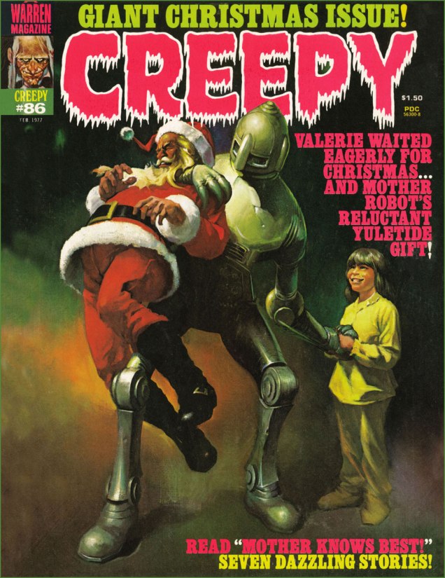
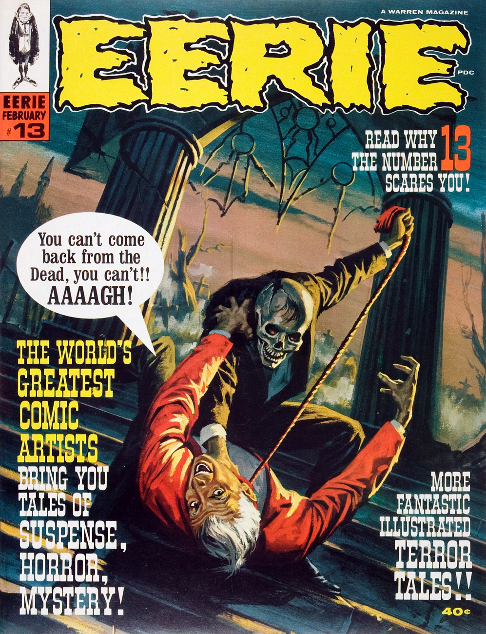
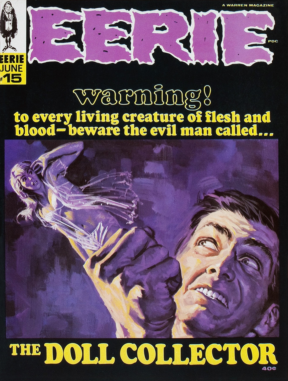
This is Creepy no. 86 (Feb. 1977, Warren). Cover by Ken Kelly (1946-2022).
And now, for the sweeter part of our double-header.
.
.
Night Prowler was an early collaboration by Swamp Thing‘s co-creators, writer Len Wein and artist Bernie Wrightson. It was published in House of Mystery no. 191 (Mar.-Apr. 1971, DC). Joe Orlando, editor.
Oh, and Happy Holidays to you, esteemed readers!
-RG
p.s. Oh, and speaking of carmine, the colour, not the man: I just read, a few days ago, in Steve Ettlinger‘s superb Twinkie, Deconstructed (2007), that « the fascinating, rich magenta carmine, also known as cochineal, is extracted from the dried body of the female cochineal insect », and that « the output of the Canary Islands is used almost exclusively to colour the Italian apéritif Campari. » Caveat emptor, then! Ironically, « carmine dye is produced from the acid that females naturally secrete to deter predators. » Not, however, industrious humans.
« Naturally there was quite a ruckus when everyone found out who… and what Rah was. But there wasn’t any rules concernin’ the eligibility of a mummy to play ball, so the Jets’ victory stood… » — from Roger McKenzie’s The Return of Rah
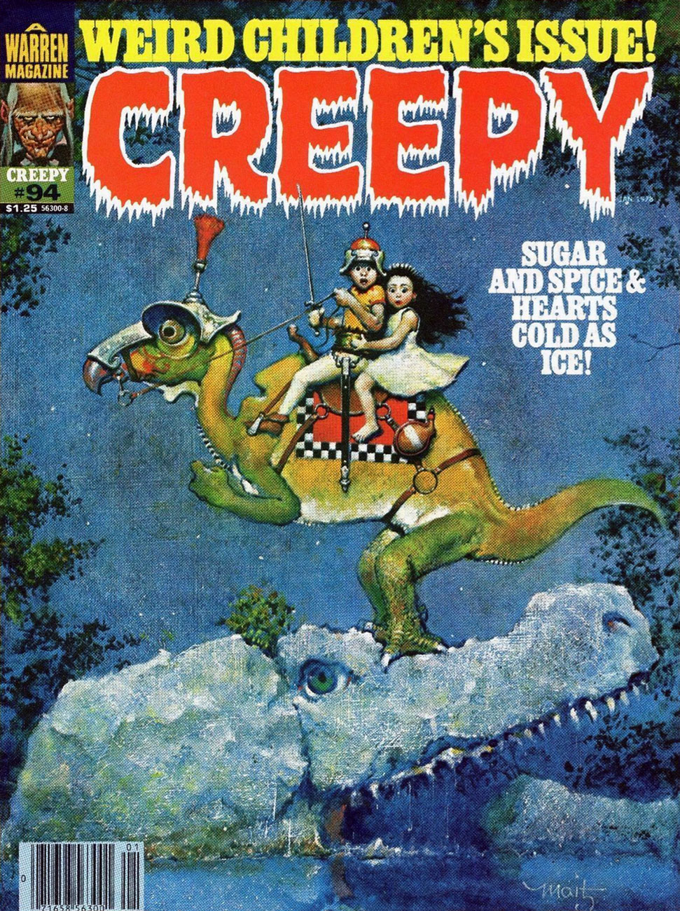
Carrying on with our irregular survey of significant Warren cover artists whose names and reputations are somewhat less inextricably linked with the publisher than the usual suspects, and thereby sometimes overlooked. Fresh out of art school, and on his way to a truly remarkable, award-peppered career, Don Maitz (born 1953, Plainville, CT) graced a brace of Warren Mags with some of his earliest professional imaginings, which I’ve gathered here.
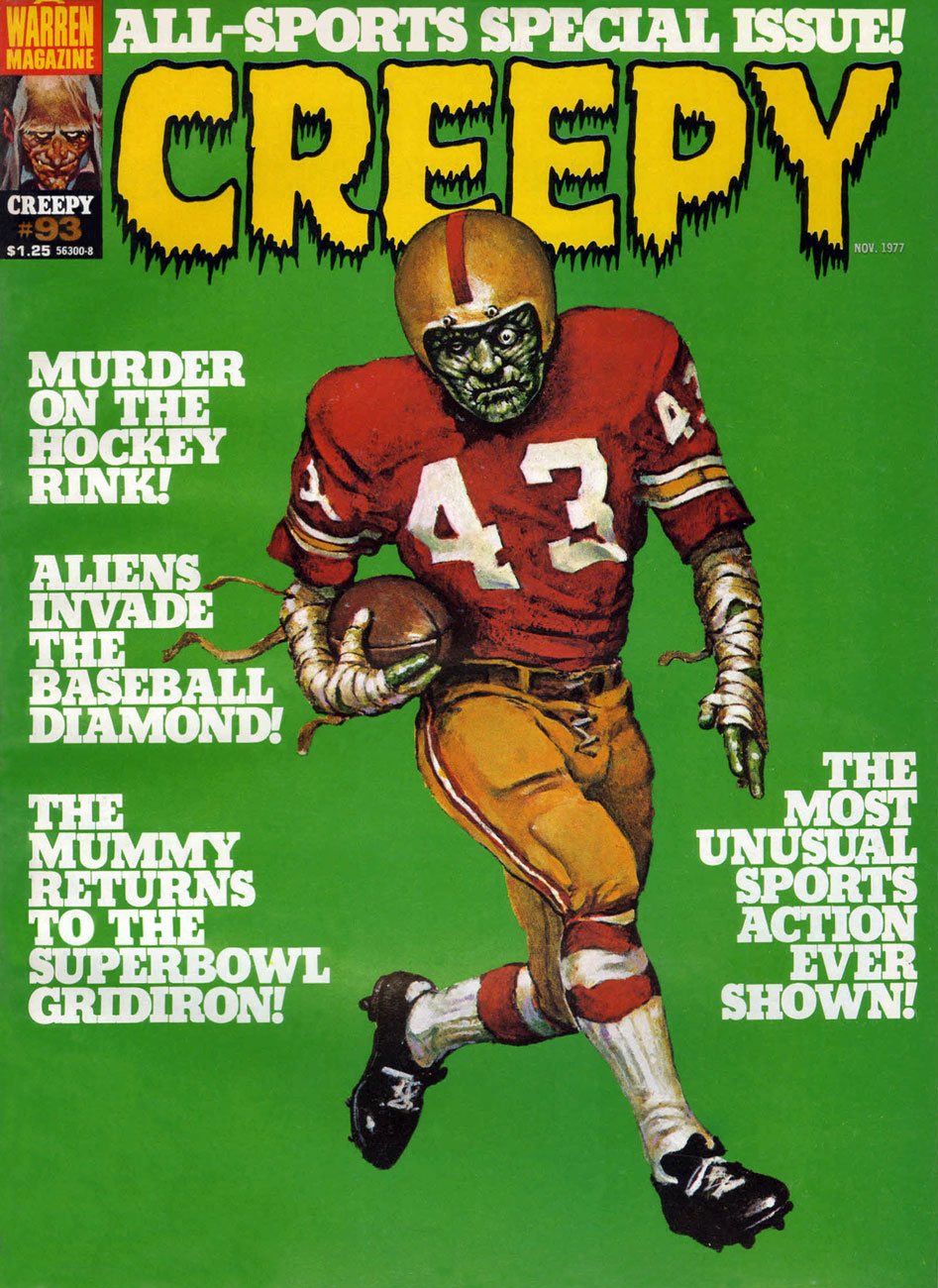
A lot of people apparently don’t much care for Warren’s late 70s sports-themed issues, but I like ’em, given that they feature a trove of gorgeous Carmine Infantino artwork, when he was experimentally-paired with a dizzying assortment of inkers (in this issue, John Severin, Alfredo Alcala, Alex Niño… and, well, Dick Giordano). At their best, the sports issues allowed him to revisit with more latitude (though less ingenuity, I’d argue) the Strange Sports Stories format he’d initiated in 1962 with writer Gardner Fox and editor Julius Schwartz. This is Creepy no. 93 (Nov. 1977, Warren). Senior editor Louise Simonson* (née Mary Louise Alexander) was commendably trying to spice up what had become a stale formula, but it turned out that there just wasn’t sufficient overlap between Warren readers and sports fans. A more staggered release programme might have cushioned the blow: as it was, Warren readers got two sports-centric issues in November 1976, then another pair in November 1977.
I hope that headline was meant ironically, because (spoiler alert), the humans are the monsters and the aliens… aren’t, in Bill Mohalley and Nicola Cuti’s Deathball 2100 A.D., a sordid, derivative (Rollerball + Death Race 2000, geez) and heavy-handed tale made uglier by Dick Giordano’s usual stiff, graceless visuals. Nice cover, though. This is Eerie no. 88 (Nov. 1977, Warren).
Well, now! This marvellous vision, marking quite a tonal break from the usual Warren diet, corresponds to no particular tale within this ‘bad seed’ issue, yet teems and brims with story, with nary malice… but so much wonder. A bold move on the part of editors Simonson and Nick Cuti. This is Creepy no. 94 (Jan. 1978, Warren).
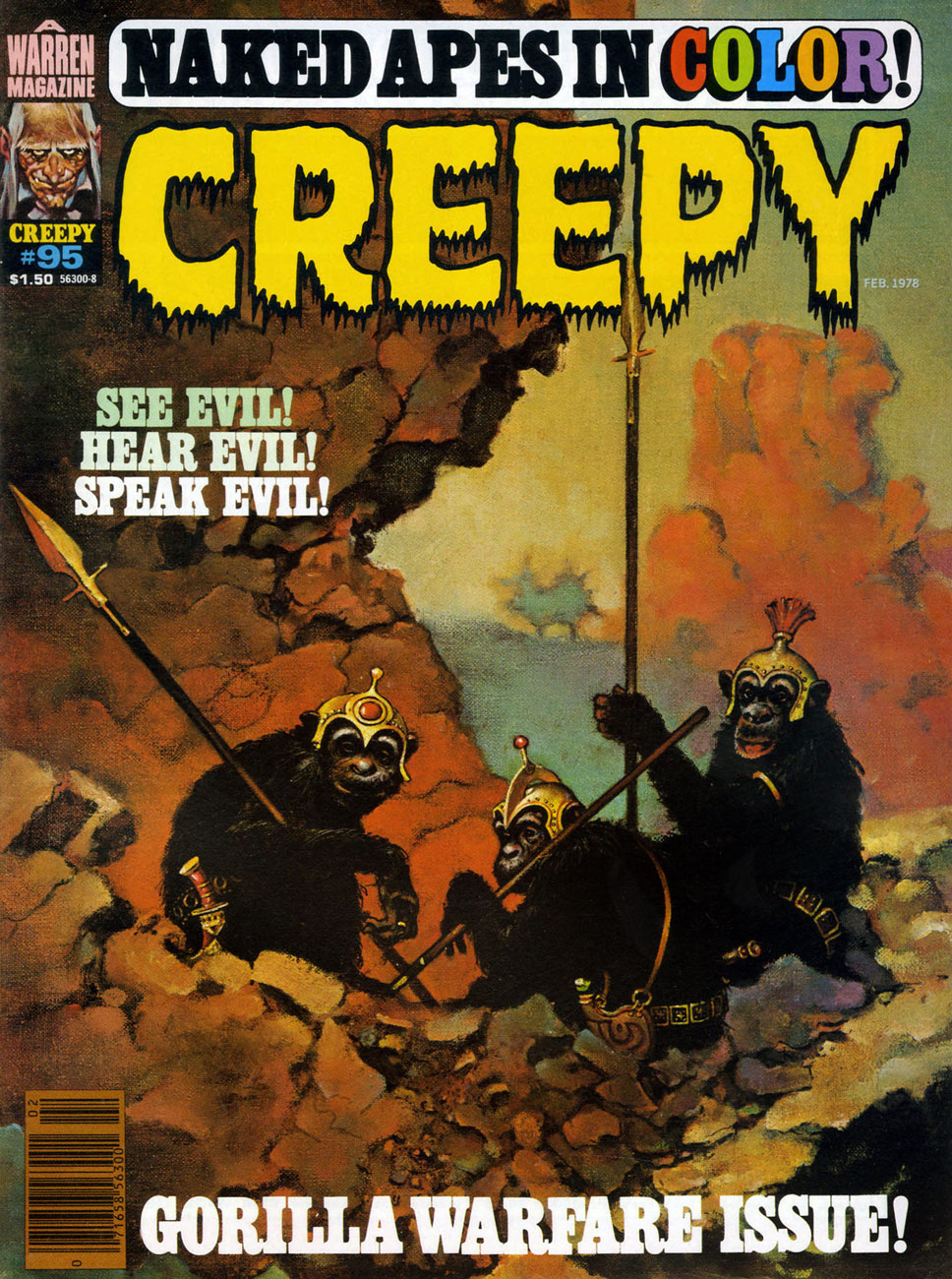
This handsome simian trio deserves better than their association with Cary Bates and Esteban Maroto‘s rather juvenile, Lord Greystoke-slandering Murder on the Vine. You’ve done better, boys. This is Creepy no. 95 (Feb. 1978, Warren), a cover bearing more than a mere whiff of Frazetta.
The probability of violent demise aside, isn’t this just the most unctuously idyllic autumnal scene? This is Eerie no. 91 (March 1978, Warren).
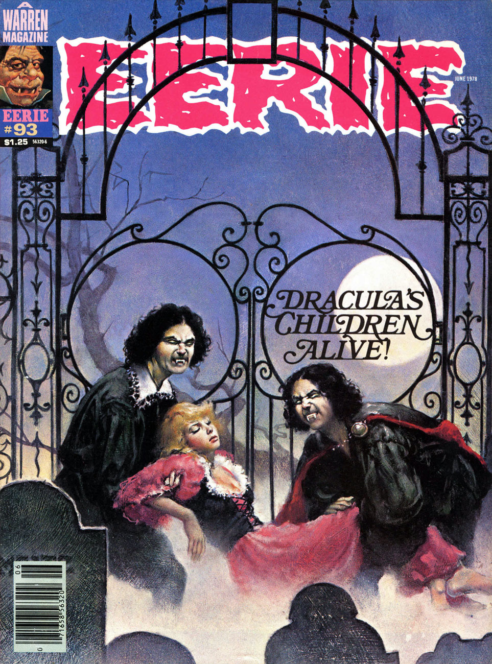
Though this one is to my mind the lesser entry in the parade, I must concede that it’s presented in exemplary fashion: the colour choices, the placement of the type, even the integration of that unholy blight, the bar code. This is Eerie no. 93 (June 1978, Warren).
Young master Maitz’s final Warren cover (chronologically speaking): this is Eerie no. 94 (Aug. 1978, Warren), illustrating Nicola Cuti and Leo Durañona‘s Honor and Blood. « Can the child born out of an unholy union between man and vampire grow up to lead a ‘normal’ life? You can’t escape the sins of your parents. Their errors ripple faintly down the generations! » “Er, what’s with the deer head?”, you may ask. The answer, from the story: « The bride was never to see the weak, corrupted face of her human husband. She wedded the Elk, symbol of the Beast. »
« A lowly elk, “symbol of the Beast”?Maaa, you’re just making shit up, Nick. » The feeling on that point seems, in fact, quite unanimous.
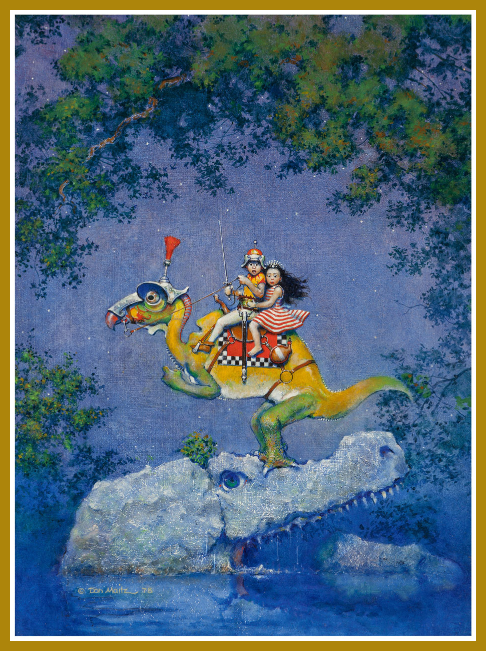
And here’s a privileged peek at Mr. Maitz’s Creepy 94 cover painting original (Mixed media on Masonite, 24” x 18”), which, as it turns out, is entitled Unsafe Footing, which makes me love it even more.
As a rum enthusiast, I am naturally aware of the Captain Morgan brand… whose mascot (circa 1982) is, as it happens, Maitz’s most familiar creation… to date. Prost!
« Quodo seemed to be a paradise. It was a lush green planet of peace and solitude. Then the pilot met the blonde… » — Nicola Cuti, “Weird World”
Kenneth Smith (1943-), the fantasy artist, inhabits the same body as Kenneth Smith, the retired philosophy professor and incorrigible obfuscator. Whereas someone like, say, Bertrand Russell would make his point clearly and concisely, Kenneth would just pile it higher and higher, leaving the reader entangled in a maze of syntax and syllogism.
Since you may not be familiar with the man’s infamous column in The Comics Journal, Dramas of the Mind, here’s a typical quotation from the man, where he, er… takes on “obscurantism”:
« In characterizing realities no less than in taking positions on issues, consciousness generalizes, i.e. genericizes: in articulating or formulating, it reduces things, even our own selves, to forms, abstractions, idealizations, types, archetypes, simplisms. “Thinking” is an activity that ultimately grounds or resolves itself in the satisfying, self-certain form of orthodoxies, preconceptions, uncriticized and imperative norms; and it is overwhelmingly inept to recognize just how pathetic, parasitic or placental is its relation to its “own” fundamental norms of understanding and valuation. Rarely if ever does any act of thinking grow so laserlike or iconoclastically intensive as to escape from the dense miasma of what is acceptable. To think what actually is is even more contranatural for humans than to see what actually is: as subjectivizing as “seeing” is, “thinking” is many degrees or magnitudes more saturated with conditioned biases, delusions, self-deceptions. A program of hygiene or asepsis for the sanity, acuity and clarity of syncretic or wholesided thinking—a discipline of orthotics for sobering, grounding and polemicizing of well-formed gnoseonoesis—is needless to say unknown in modernity. Not just language but virtually all of intellect, education, culture, etc. have been adapted into utilities, tools whose very aspectivity militates against the nakedness of “evidence,” which is to say, against candor and against truth: regardless of what it may be called, “evidence,” even the most obvious and blatant, is in actuality not so “evident” to most people, and the modern development of “sophistication” or “education” typically worsens the obscurantism. »
For all that, I’ll take a guy with such an overflowing abundance of vocabulary and ideas that he doesn’t know when to quit… over most of the boneheads frequently passing for writers nowadays. Still, if you don’t mind, we’ll (mostly) stick to his Warren artwork today.
Creepy no. 35 (Sept. 1970). Regardless of its month of release, its lovely shades of emerald bring thoughts of springtime to mind.
Creepy no. 36 (Nov. 1970), unique amidst Smith’s Warren covers in that it presents the human form in a somewhat less… grotesque fashion.
This is Creepy no. 41 (Sept. 1971). Owing to its lower than usual print run, this ranks amongst the scarcest Warren issues.
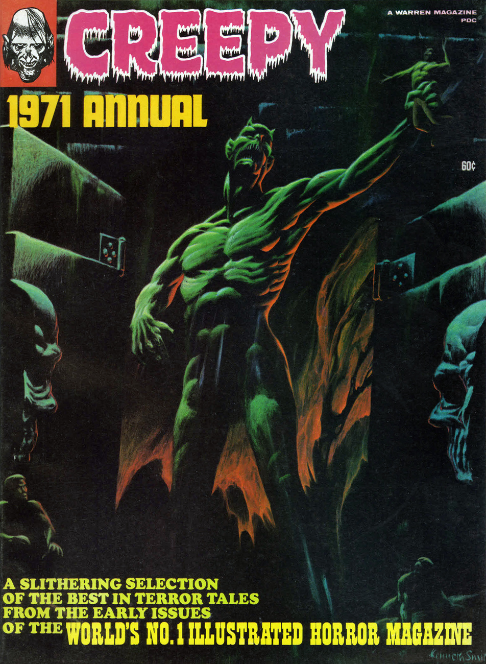
This is Creepy 1971 Annual, all reprints, but quite a choice roster of them: Ditko, Toth, Boyette, Craig, Crandall, Sutton, Adams, and Torres.
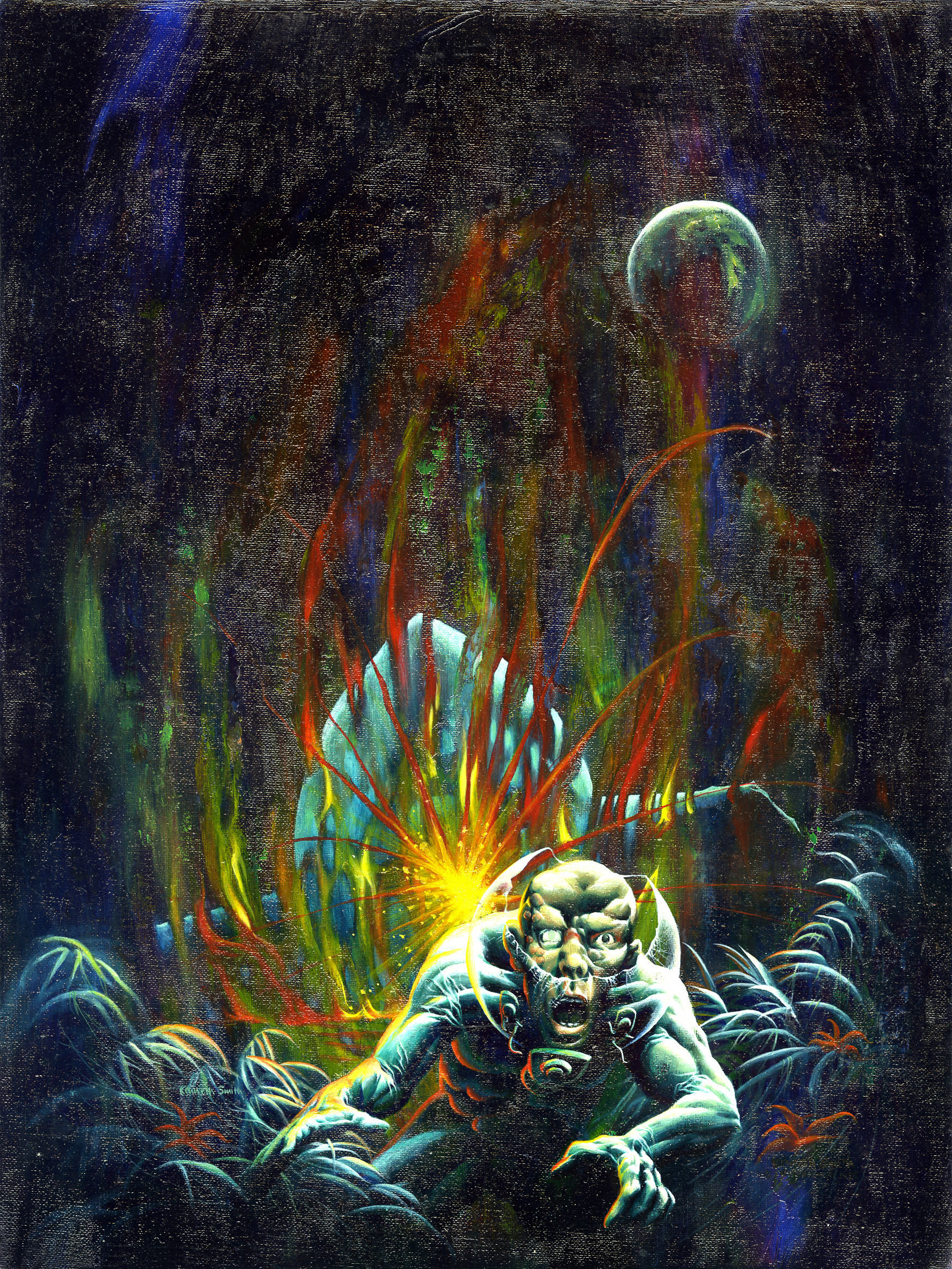
And here we have Mr. Smith’s last, and arguably least, Warren cover. Only a detail of the full painting was used. Eerie 1971 Annual also features naught but reruns.
And this is the original painting in its entirety. Sorry about the glare, but this is likely the only publicly available image of this privately-owned piece.
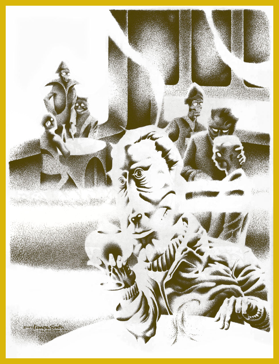
Bonus time: Mr. Smith created this lovely piece to illustrate R.A. Lafferty‘s masterful short story Mr. Hamadryad. I first encountered them* in the anthology Prime Cuts no. 1 (Jan. 1987, Fantagraphics). Hey, any fan of Old Man Lafferty’s is someone I’d happily clink glasses with. Cul sec, Mr. Smith!
« I believe that Mr. Hamadryad was the oddest-looking person I had ever seen. Surprisingly I regarded him so, for I first became aware of him in The Third Cataract Club in Dongola, and some very odd-looking gentlemen came into The Third Cataract. If you cock an eyebrow at someone in that place, then he’s really odd. » — R.A. Lafferty
*Smith’s illustration first graced Lafferty’s tale in the limited edition (1000 copies) collection Golden Gate and Other Stories (1982, Corroboree Press, MN). However, “Mr. Hamadryad” first turned up in STELLAR I (Judy-Lynn Del Rey, ed., 1974).
« According to statistics, millions of Americans read millions of the most carefully written crime and crime detection stories in the world! Expertly told… and prepared, after exhaustive research — the best of these are, in effect, lessons in crime and criminal psychology!Yet could you, sitting in the trolley or bus or subway at night, pick out the killer sitting opposite you? » — The Killer (Dec. 8, 1946)
Welcome to the fourth entry in our chronicle of the variegated ambulations of the former Denny Colt. Begin if you will, as we did, with his time at Quality, then follow his path through Fiction House, then on to Harvey, Super and Kitchen Sink; at that point, you’ll be all caught up.
Okay, now that we’re all here, let’s pose and answer the next burning question: how did The Spirit come to make landfall at Warren Magazines? Thankfully, we’re spared the motions of idle speculation in this case, since Jim Warren himself revealed all in the course of an interview with Jon B. Cooke, published in The Warren Companion (2001):
JW: « I would have mortgaged everything I owned to publish Will Eisner — to be involved in anything Will Eisner was doing. I called Will and said, ‘Mr. Eisner, I’d like to take you out to lunch.‘
I knew Will was talking to Stan Lee about The Spirit and that DC was interested in his company, American Visuals. I also knew that Harvey Comics had done a couple of Spirit reprints and that they might be interested again. I had to move fast.
So I took him out to lunch, sat him down, and said, ‘There’s no possible way that I’m going to let the great Will Eisner escape. You are someone I have revered since 1940, when I saw the very first Spirit section in the Philadelphia Record with that splash page that changed my life. Do you think I’m going to let you go to Stan Lee, whom I ‘hate’ and ‘despise’ as a competitor? Do you think I’m going to lose you to that unrepentant sociopath? You’re just going to be a computer number to Marvel; they have a factory, where they cookie-cut comics, turning out 400* titles a month!’
And I saw the expression in Will’s face — he had his pipe in his mouth at the time, just like Commissioner Dolan — and I could see that I had him. »
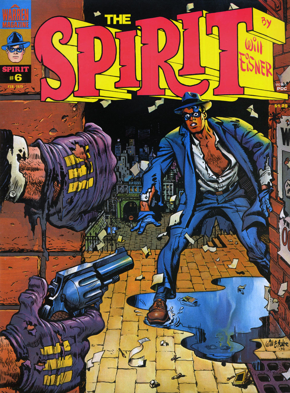
Let’s have a look at some covers. Most of the sixteen (plus the colour Special) are terrific, but I skipped a few of the lesser ones: issue one is a not-quite successful Eisner-Basil Gogos painted collaboration, and issue two is just okay. Issue 11 is another Ken Kelly painting over Eisner pencils, and 12 to 16 are composites using inside panels. Fine, but facultative. And now, on to the gems!
This is The Spiritno. 3 (Aug. 1974), reprinting eight post-WWII stories: Black Alley (June 5, 1949), Fox at Bay (Oct. 23, 1949), Surgery… (Nov. 13, 1949), Foul Play (March 27, 1949), The Strange Case of Mrs. Paraffin (March 7, 1948), The Embezzler (Nov. 27, 1949), The Last Hand (May 16, 1948) and Lonesome Cool (Dec. 18, 1949). Cover pencils and inks by Eisner, colours by Richard Corben.
This is The Spiritno. 4 (Oct. 1974), reprinting eight post-WWII stories: Life Below (Feb. 22, 1948), Mr. McDool(Oct. 12, 1947), The Emerald of Rajahpoor (May 30, 1948), Ye Olde Spirit of ’76 (July 3, 1949), The Elevator (June 26, 1949; in colour), The Return of Vino Red (Sept. 25, 1949), The Guilty Gun… (June 6, 1948), and Flaxen Weaver (Dec. 11, 1949). Cover colours by Ken Kelly.
This is The Spiritno. 5 (Dec. 1974), reprinting eight post-WWII stories: The Return (Aug. 14, 1949), The Spirit Now Deputy (Apr. 24, 1949), The Hunted (May 1st, 1949), The Prediction (June 19, 1949), The Deadly Comic Book (Feb. 27, 1949; in colour), Death, Taxes and… The Spirit (Mar. 13, 1949), Hamid Jebru (May 18, 1949), and Ice (Jan. 2, 1949). Cover colours by Ken Kelly.
« You cannot stop me now… I am at the threshold of immortality… Yowch! » This is The Spiritno. 6 (Feb. 1975), featuring seven black & white (and one full-colour) presentations of tales from the 1940s: Showdown (Aug. 24, 1947), The Wedding (May 2, 1948), The Job (May 9, 1948), The Lamp (July 27, 1947), Glob (March 6, 1949; in colour), The Winnah! (Dec. 3, 1950, This is ‘Wild’ Rice (Apr. 4, 1948) and Taxes and the Spirit (Apr. 16, 1950). Cover colours by Ken Kelly.
This is The Spiritno. 7 (Apr. 1975), reprinting eight post-WWII stories: The Big Sneeze Caper (Feb. 6, 1949), Hoagy the Yogi (Pt. I) (Mar. 16, 1947), Hoagy the Yogi (Pt. II) (Mar. 23, 1947), Cheap Is Cheap (June 13, 1948), Young Dr. Ebony (May 29, 1949; coloured by John Laney); A Moment of Destiny (Dec. 29, 1946); The Explorer (Jan. 16, 1949); and A Prisoner of Love (Jan. 9, 1949). Cover colours by Ken Kelly.
This is The Spiritno. 8 (Apr. 1975), reprinting eight post-WWII stories: “Sand Saref” (Jan. 8, 1950), “Bring In Sand Saref…” (Jan. 15, 1950), “Thorne Strand” (Jan. 23, 1949), “A Slow Ship to Shanghai” (Jan. 30, 1949), “Assignment: Paris” (May 23, 1948; coloured by Michelle Brand), “A Pot of Gold” (Apr. 3, 1949), “Satin” (June 12, 1949), and “Visitor” (Feb. 13, 1949). Cover colours by Ken Kelly.
This is The Spiritno. 9 (Aug. 1975), reprinting eight post-WWII stories: The Candidate (Aug. 21, 1949); White Cloud (Aug. 28, 1949); Stop the Plot! (Dec. 5, 1948); Lovely Looie (Apr. 10, 1949); The Space Sniper (May 22, 1949; in colour); The Vernal Equinox (Mar. 20, 1949); Black Gold (June 15, 1947); and Two Lives (Dec. 12, 1948). Cover colours by Ken Kelly.
« The Octopus is at it again. This time his thugs have the Spirit cornered. Has his incredible luck finally run out? A tense moment captured by Will Eisner and Ken Kelly. » Evidently, Warren’s readership wasn’t content with line art covers, fancily wrought and gorgeous as they were; so Ken Kelly was brought in to slap some paint over a tight Eisner layout et voilà! An interesting hybrid, but I’m not quite convinced of its necessity. This is The Spiritno. 10 (Oct. 1975), reprinting a whopping ten post-WWII stories: Heat (July 15, 1951); Quiet! (July 22, 1951); Death Is My Destiny (March 4, 1951); Help Wanted (April 29, 1951); The Origin of the Spirit (From Harvey’s The Spirit No. 1; in colour); Sound (Sept. 24, 1950); A Time-Stop! (Jan. 7, 1951); The Octopus Is Back (Feb. 11, 1951); Hobart (Apr. 22, 1951) and The Meanest Man in the World (Jan. 28, 1951).
Among my favourite features of the Spirit’s Warren run are the single, well-selected, lushly-coloured story appearing in each of the first ten issues. This, from no. 1, is page 4 of El Spirito (Feb. 1st, 1948). The Octopus’ buxom accomplice is Castanet. While I’m strictly underwhelmed by Rich Corben’s interchangeable tales of bald, lumpy, donkey-donged bodybuilders roaming the land and forever risking ritual castration at the hands of amazon tribes, his colour work here is simply sublime.
As you can see, the panel montages were extremely well-done; The Spirit Special (1975) handily gathered in one place the colour stories from issues one to ten. According to the GCD: « Available through mail purchase only, just over 1500 are thought to have been printed. »
In closing, this final, telling exchange from the Jim Warren interview:
Jon Cooke: Do you recall dealing with Denis Kitchen about The Spirit? Jim Warren:Will had given his word — and his word is his bond — for Denis to reprint The Spirit (this was before Will and I negotiated a deal). Denis had spent money on preparing the reprints. Will said to me, « It would be a nice gesture if you would reimburse Denis, who is a good guy, for the material he’s already prepared. » I think Will looked on me kindly when I said « Absolutely. » (What Will doesn’t know if that if he had asked for me to give Denis a Rolls-Royce, I would have driven it to Wisconsin myself!)
*an exaggeration, of course, but a pointed one. At the time, Marvel *was* doing its worst to flood the market in order to starve its competitors.
« These dreams? Hallucinations… or whatever you call them! It was on a business trip… in the middle of nowhere… I’ll never forget it! » — Alex Colby, who swears he saw them.
When people talk about Warren magazines cover artists, the name of Vic Prezio is rarely brought up. Well, someone has to, and it might as well be me. It doesn’t help that he only painted a handful of covers for Warren, but hell, I love them all in their pulpy glory.
Prezio is better known for his over-the-top men’s adventure magazine covers and, to a lesser extent, his Magnus: Robot Fighter covers for Gold Key. Mostly anonymous work, though. It’s a filthy business.
In Part One, we looked at Prezio’s Creepy Covers. As it’s « age before beauty », Cousin Eerie now gets his turn to bow.
« Don’t you dare presume to tell me what I can and can’t do, Sheldon! » Some guys turn mean when their male pattern baldness spreads to their entire face.
An inspiring reminder of why you shouldn’t let the naysayers drag you down (even six feet under). Be all that you can be, on this side of the grave and beyond!
This alien encounter is *not* going to turn out all fuzzy-friendly.
Prezio’s painting conveys vividly the high paranoia of Archie Goodwin and Alexander Toth‘s The Stalkers, reprinted in this issue from Creepy no. 6, just a couple years old by then. Warren Publications were *not* in good shape at the time, having lost more of their key talent and left to the bare minimum of original material, including, thankfully, the covers. The out-of-left-field success of Vampirella would swoop in and save the enterprise in 1969. Close call!
Possibly the lesser entry amongst Prezio’s Warren pieces, but still an attractive cover, if not exactly terrifying. Somehow, it brings to mind Aurora model kit art more than it does a Warren cover (still, comparison to early-ish James Bama should hardly be considered a slag.)
« AAAAAAAAAGAH! What is it? » I’ve often pondered that very question myself, sometimes while perusing this “throbbing” issue.
Another striking (if a bit rushed-looking) Prezio cover, this time representing Slight Miscalculation by writer Bill Parente and artists Bill Fraccio and Tony Tallarico. The much-maligned Fraccio and Tallarico often worked together under the joint nom de plume of Tony Williamsune (it is said that Tallarico pulled most of the weight.)
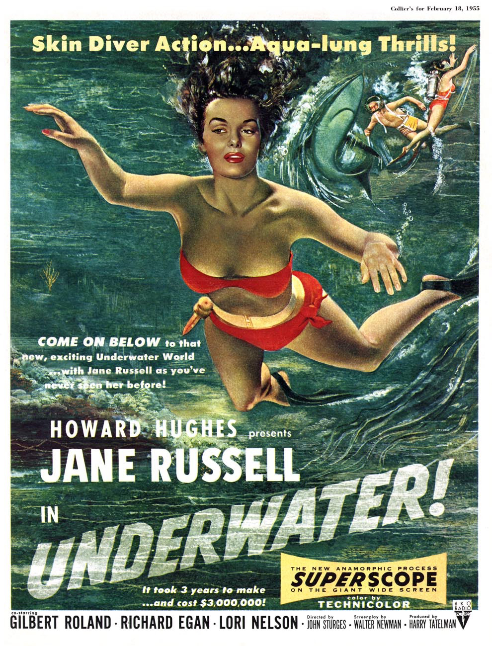
This time out, the cover story is H2O World by Larry Ivie, Al Williamson, and his Fleagle Gang acolyte and mentor Roy G. Krenkel, a reprint from Creepy no. 1 (1964).
… itself swiping heavily from a 1954 Collier’s cover painted by Bill Baker. « You’ll find skin-diving now from Maine to California, wherever there is enough water for a person to plunge into. Divers, like the spearfishing pair on our cover, have made it America’s fastest-growing sport. » I’ll bet she’d rather dive with her husband, armed with a spear, than in the darkness with overly-friendly monsters.
Prezio’s final Eerie cover (he would paint a couple of beauties for FMOF the following year), this lugubrious tableau from the bone-chilling month of November 1969, is likely my favourite Prezio. It illustrates Bill Parente and Michael Royer‘s Head for the Lighthouse!
Warren seemed, at this point, without a decent in-house copy editor. Witness the cover’s “Scavanger” Hunt, and inside, a story mistitled « The Wrong Tennant ».
« Wrong Tennant? You don’t say! I’d read *that*! »
All tomfoolery aside, this wraps up our survey of Mr. Prezio’s work at Warren. Hope you enjoyed the ride!
« Stop that whimperin’, Emma — or I’ll lay into ya like a butcher in a cowpen! » — Raymond Marais, Rescue of the Morning Maid
The mysterious, but nonetheless well-remembered journeyman pulp illustrator, Vic Prezio, though chiefly associated with the infamous Men’s Sweat adventure magazines (« Weasels Ripped my Flesh! ») also produced notable work for Dell (The Outer Limits, Kona, Naza, Brain Boy, Frogmen…), Gold Key (Magnus, Robot Fighter) and Warren, and that’s just the tip of the iceberg. I did say he was a journeyman.
In all, Prezio produced, for the Warren Magazine line, six covers for Famous Monsters of Filmland, some of them classics, four for Creepy and six for Eerie. And that’s not all: Prezio painted a pair of covers for FMOF companion title Monster World (no. 2, Jan. 1965, and no. 4, June 1965); these would have been his earliest Warren contributions. Thanks to eagle-eyed Michael Prince for bringing these last to my attention!
Today, we’ll admire Uncle Creepy’s dodgy wares, and reserve Cousin Eerie’s mouldy goodies for part two. The FMOF issues regrettably fall outside our purview, but for the record, these are numbers 35, 36, 38, 39, 67 and 68. Check ’em out.
Oh, it’s just your lousy luck: you finally get your best girl alone on your raft, then along comes this humongous critter to put a damper on the romantic mood. Prezio brings the scene to life for issue 18 of Creepy (Jan. 1968)… but I can’t quite shake the feeling that said scene looks sort of familiar…
Ah, that must be it. I see there used to be two snakes involved.
A look at the original painting, which thankfully survives. Can’t take such things for granted.
« Good Lord! » I wonder what that ‘one thing’ is. Prezio’s cover for Creepy no. 28 (Aug. 1969) is based on Archie Goodwin and Dan Adkins‘ story The Doorway, reprinted in this issue. Read it here, if you must.
Some editorial second-guessing went on, as evidenced by the most consistent colour scheme of the original painting. It’s a great piece, so it works all the same.
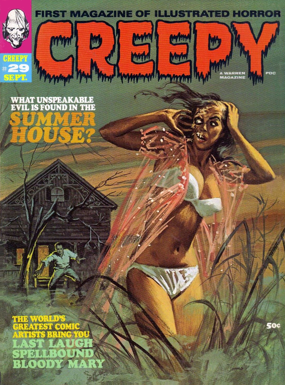
« Come back, baby! Sure, my saliva’s a bit… corrosive, but you’ll get used to it! » Vic Prezio’s twist on the then-prevalent gothic romance trope of the gorgeous, scantily-clad damsel-in-distress running away from some castle or mansion. This is Creepy no. 29 (Sept. 1969).
Now, Vic’s original painting: the image was flipped for publication (as if you couldn’t tell), which was probably a sound decision. Left to right motion is more visually natural and dynamic.
Greetings, tentacle lovers! I’m here with a new batch of Warren-published tentacles – this time, some he-men macho types get tangled up in them, though damsels predominate as usual. Don’t forget to visit part I: Tentacle Tuesday: Warren and Its Many Tentacles.
One thing that can easily be generalized from tentacular covers is that women frequently have a lot more fun on them than their male counterparts. To wit:
Vampirella no. 39 (January 1975). Cover by Ken Kelly. The gal may not be Vampirella, but damn, she’s enjoying herself. I admit that having tentacle-shaped fingers would be… practical.
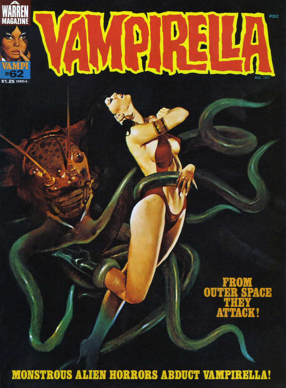
As for poor Vampi, she seems to encounter tentacles wherever she goes.
Vampirella no. 62 (August 1977), cover by Spanish artistEnrich, whose real name was Enrique Torres-Prat.
The cover story, Starpatch Quark & Mother Blitz (scripted by Bill DuBay and illustrated by Jose Gonzalez), contains some spectacular, spiky, nasty tentacles.
I tried saying « prasptam… hoodjum… billigam… POOT! », but no tentacled creature materialized. How very disappointing. I’d also like to know what kind of slap makes a « SPAKKT! » noise.
The non-librarian girl in question is Vampi. Her eyeballs get ripped out by some vengeful queen and get accidentally conjured onto the desk of some random girl with an abusive husband, during which time blind, suffering Vampi is kidnapped by aliens while a handsome youth uses his father’s psychic connection with Vampi’s eyes to watch through them as they are retrieved by a tentacled monster, and… oh, never mind. Go read the story yourself.
The original cover art of Vampirella no. 105 (May 1982), painted by Enrich. It was printed much darker, so one can barely see tentacles. Fuck that, I say! Let us admire the green creature in its full glory! (And its unfortunate slight family resemblance to Jabba the Hutt…) His gaze seems to be appraising Vampirella – “hm, I wonder if she would be as tasty a snack as she looks?”
The printed version of said issue.
The cover story sounds like fun… let’s take a peek.
I’m sorry, but that is not what “Blobs and Behemoths” made me think of. I was expecting something in the class of Cthulhu, not an overweight human walrus with tentacles! Panel from “Horrors of Heartache City”, scripted by Bill DuBay and illustrated by Jose Gonzales (apparently this team specializes in tentacles).
« You’re worried that little Orphee is thinking of making a meal of that luscious girl…? He’s turned down everything from the choicest prime rib to the slimiest of insects, which leads me to believe that he filters nourishment from the very air! »
So much for scientific theories.
I think I promised you some men fighting tentacles. Sigh, so be it.
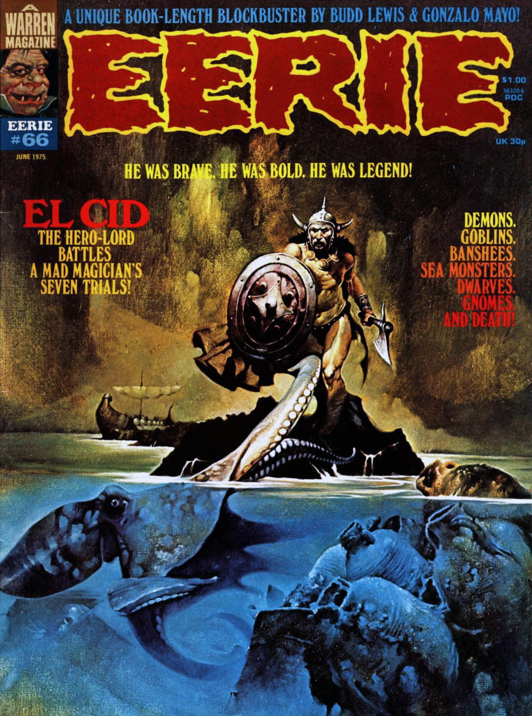
Eerie no. 66 (June 1975), cover by Manuel Sanjulian.
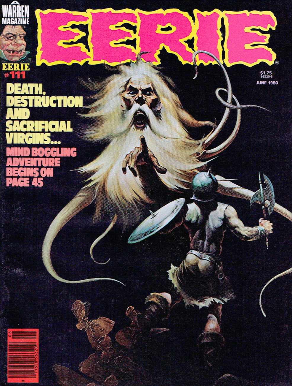
Eerie no. 111 (June 1980), cover by Ken Kelly. What’s scarier than an old wizard with a majestic beard whipping in the wind? An old wizard whose head is attached to tentacles, obviously.
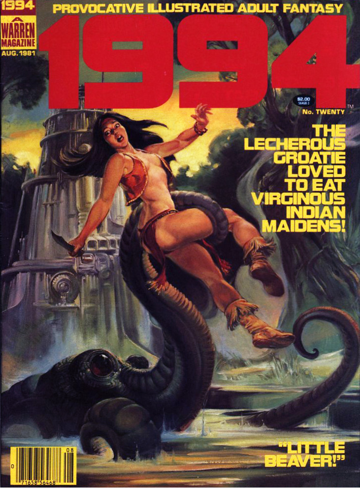
1994 no. 19 (June 1981), cover by Jordi Penalva. I am totally fascinated by the girl’s expression. Whatever the tentacles behind her are doing, they’re doing it right. As for the guy, he looks like a sanctimonious asshole, from his scowl to his hairy legs.
I had to know what the hell is “The Holy Warrior” about. “Godless commie heathens”? Oh, very subtle, 1994. Given the mention of kicking the living crud out of ’em, it’s tempting to assume that this is satire… unless the author has an amputated sense of humour. I couldn’t find any scans of the story online, but someone on a Very Creepy Blog kindly summarized it as:
“Third is “The Holy Warrior!” by Delando Niño (art) and John Ellis Sech & Bill DuBay (story). This story takes place in a future where there are Jesus clones. Our hero, the Holy Warrior, is seeking to rescue one, which is just a child, from communist enemies. He is able to do so, but the two of them are so hungry that he ends up killing the clone and eating him! Quite a bizarre and heretical ending for this story.”
And I thought that Vampi story was written by someone on drugs. Same author, mind you (Bill DuBay) – there’s definitely a pattern… of nonsense, balderdash and malarkey.
By the way, you can read a bunch of Warren publications online – for free! – here.
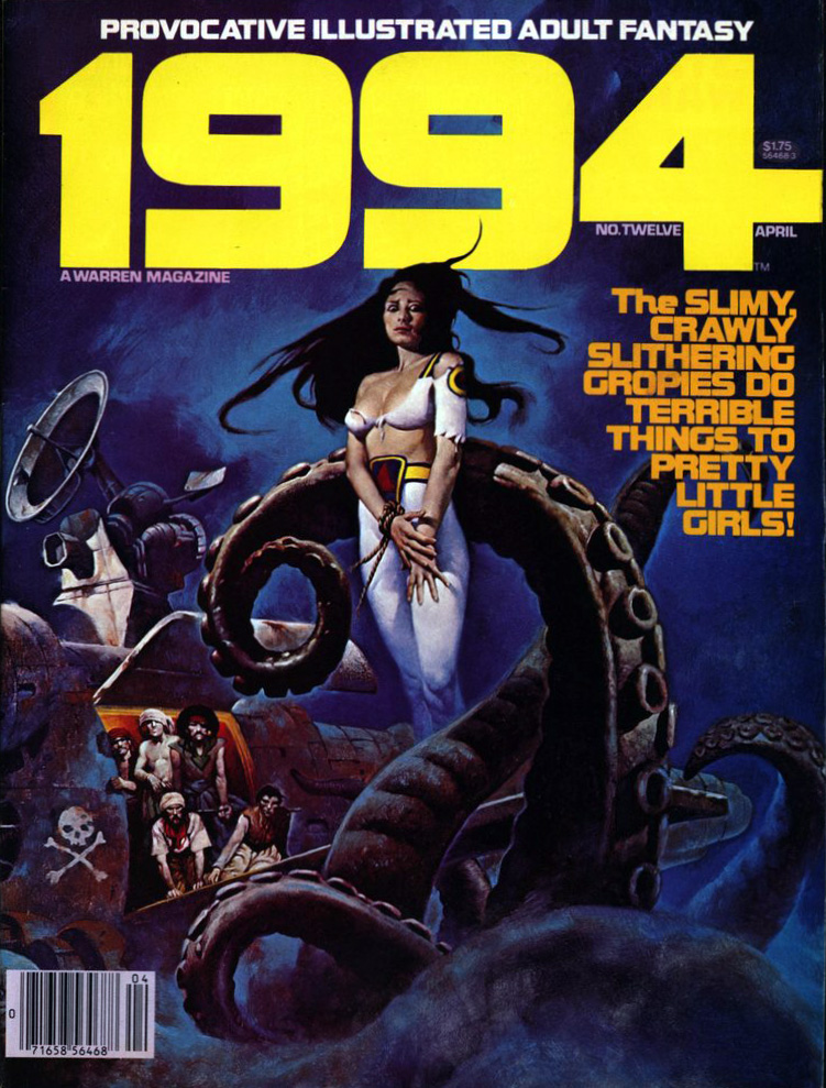
Welcome to Tentacle Tuesday! Today’s edition features beautifully painted covers from series published by Warren, and oh boy oh boy, are there are a lot of tentacles to be found there! To borrow a title from the first cover we’ll be ogling today, “THE SLIMY, CRAWLY SLITHERING GROPIES DO TERRIBLE THINGS TO PRETTY LITTLE GIRLS!” It’s a tad lacking in subtlety, but summarizes the state of things quite nicely.
On with the show…
1994 no. 12 (April 1980). The cover was painted by Sanjulián (his real name is Manuel Pérez Clemente), a Spanish painter who started working for Warren publishing in 1970. The girl’s demure pose coupled with her terrified eyes is quite striking.
1994 no. 20 (August 1981). Cover by Nestor Redondo, an exceptional Filipino artist.
I wouldn’t expect cephalopods to care for patriarchal, machismo standards of female purity, but apparently Lecherous Groatie (great nickname) wants his maidens virginous (which isn’t even a word, you guys). “Little Beaver!”, you say? Way to go in being offensive to both tentacled creatures *and* Indians. This issue also contains the story “The Russians Are Coming… All Over America!”, a title which I, for one, find hilarious.
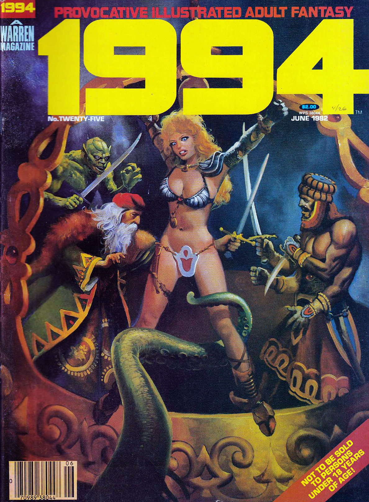
1994 no. 25 (June 1982). Cover by Lloyd Garrison. Aaah, a rare silent cover. It’s clear enough: Ukranian Santa will surely rescue the maiden, if he doesn’t get too distracted by her ass or Chinese-takeout container-inspired undergarment.
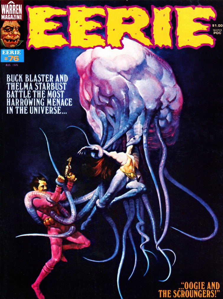
Leaving 1994 behind (although technically we’re going back in time), and moving on to Eerie, we get to tentacles that look like worms coming out of a lumpy, squishy brain – the joy of any good anatomical pathologist.
Eerie no. 76 (August 1976). The cover the aforementioned Sanjulián, who has quite the talent for painting extremely realistic textures, as demonstrated by this rather unsettling cover.
One understands the guy’s desperate attempts to get free, but why is the woman so placid, serenely exposing herself to the creature’s grasp? I guess Tentacle Tuesday doesn’t have the same effect on everyone. Interestingly, Sanjulián seems to have tweaked his art for the cover – here’s his original painting, in which the girl’s face is clearly visible.
Let’s visit good old Vampi and see what sort of cephalopod encounters she’s had.
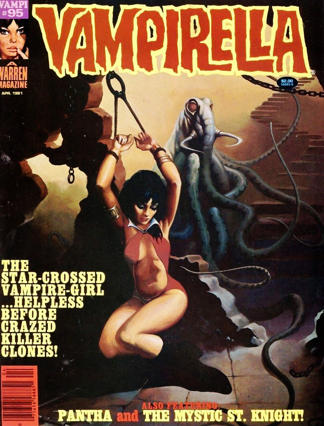
Vampirella no. 101 (December 1981); art by Noly Panaligan (who, by the way, is another Filipino artist).
The tentacled creature in question is the “star-beast” advertised on the cover – an alien (suspiciously similar to an octopus) who, as usual, tries to take over the earth by breeding (which for some reason involves a lot of nude & nubile college students as sacrifices) and is killed when Vampirella crashes a car into it. Starting on an epic, inter-planetary scale and ending it all with a banal road accident is a bit of an anti-climax.
Is this Vampirella’s last encounter with tentacles, you ask? Don’t be silly – of course not. As the Russians say, « and yet again the little hare will go out for a walk. »
Vampirella no. 95 (April 1981), cover by Ken Kelly. “O Mr. Walrus-with-tentacles, please don’t hurt little old me!”
More? Well, okay, one last cover.
Creepy no. 67 (December 1974), cover by Ken Kelly (not one of his better efforts, to be honest). We’ll return to sweet ol’ Bowser on another occasion.
« That minuscule ogre on the throne must be the King. What a peculiar little man. »
In 1978-79, the rightly-celebrated English fantasy artist Patrick James Woodroffe (b. Halifax, West Yorkshire, on October 27, 1940; d. May 10, 2014), fresh from his high-profile paperback (much Moorcock!) and album cover assignments (including Judas Priest’s splendid Sad Wings of Destiny), hired out his talented brush with Warren Publishing long enough to produce ten covers, a varied, eye-catching and often unusual lot. Let’s make the rounds, shall we?
« He isn’t a *bad* sort. He just lets his temperamental gonads get the best of him! » Using a laser rifle on a dragon? Hardly seems sporting, does it?
One of Warren’s post-Star Wars, all-reprint cash grabs of the era… but it’s got a Woodroffe cover.
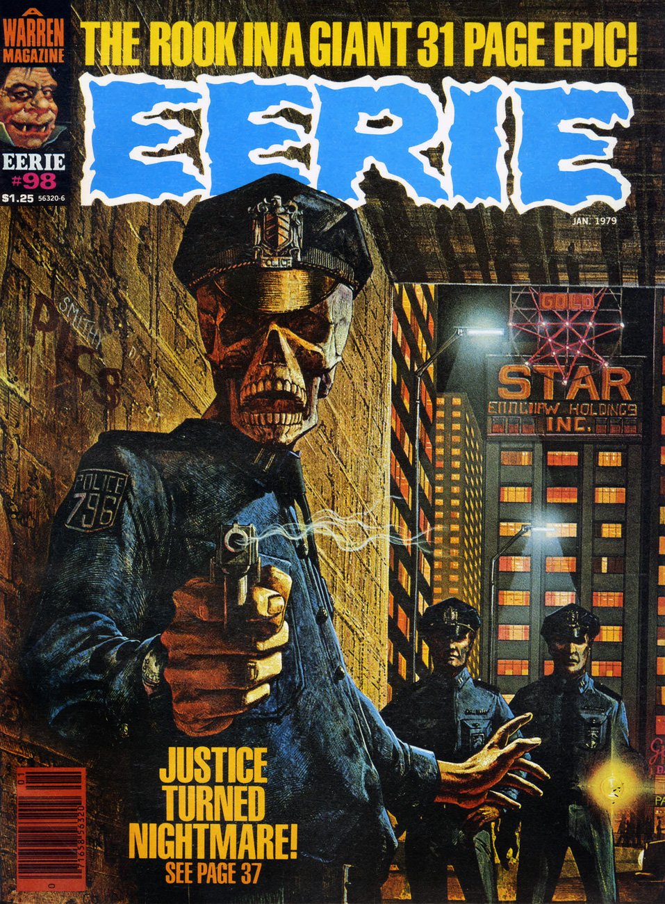
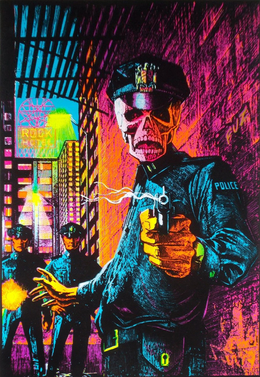
Eerie no. 98 (January, 1979) Likely the darkest of the set in terms of subject matter. Visually, it certainly brings to mind the visual vibe of John Carpenter’s They Live, still nearly a decade away.
Interestingly, the piece has also made the rounds, in a modified version (flipped, for one thing), as a “black light” poster titled « In the Name of the Law ». Speaking of the law, was the artist duly compensated?
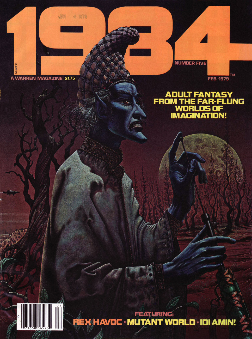
Don’t mess with the Surly Smurf! This dusky scene is dated 1975, so it’s safe to assume it wasn’t created expressly for this publication. This is Warren’s 1984 no. 5 (February, 1979.) Aside from the usual sex fantasies and space operetta from the usual suspects, the issue holds a single nonpareil gem, Nicola Cuti’s I Wonder Who’s Squeezing Her Now?, gorgeously brought to life by Ernie Colón and Wally Wood.
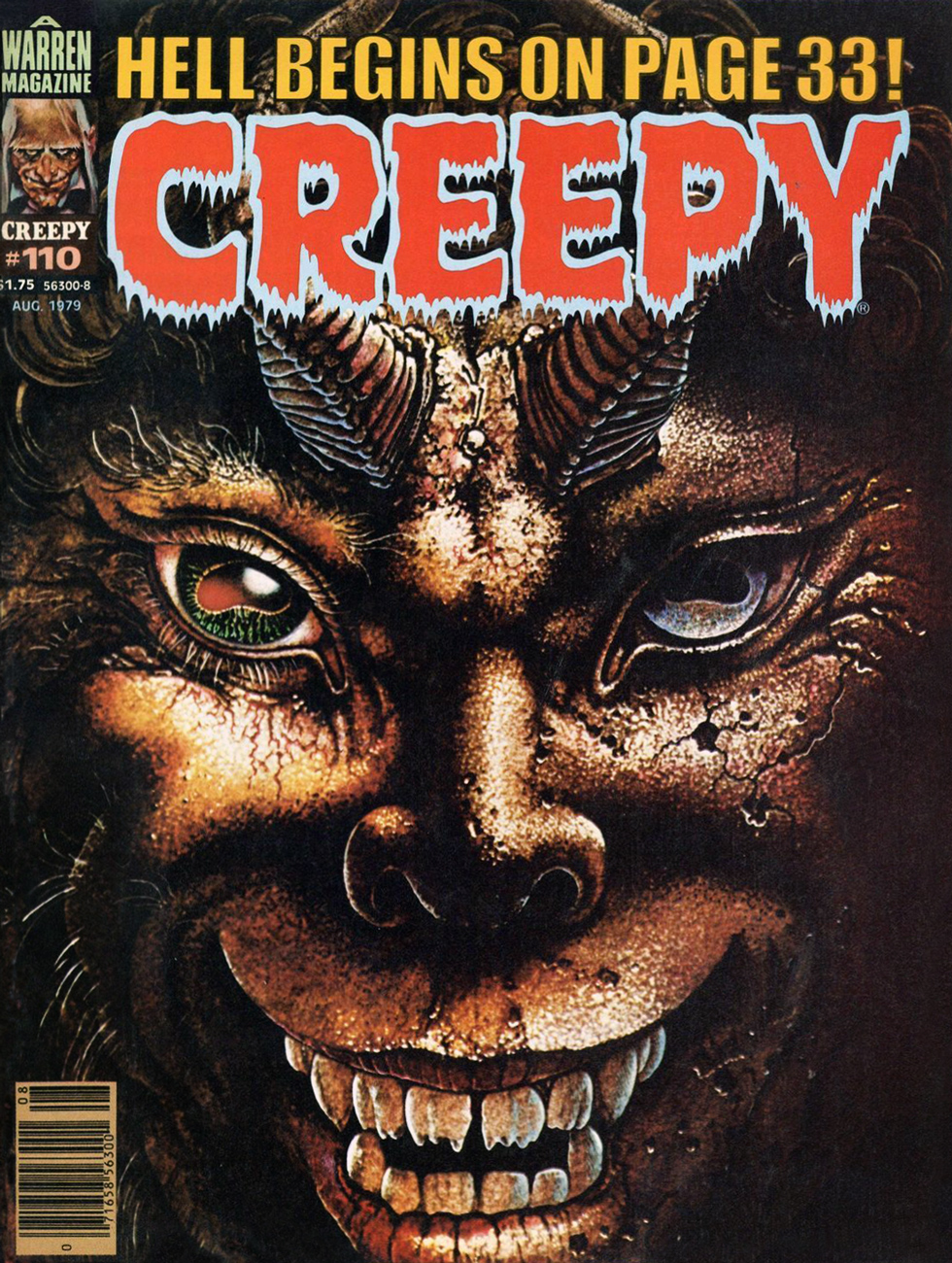
« You may think this all strange nonsense; it may be strange, but it is true, and the ancients knew what lifting the veil means. They called it seeing the god Pan. » — Arthur Machen With his second and final Creepy cover (no. 110, August, 1979), Woodroffe lifts the veil, and how, on a troubling closeup of a gleefully sinister Greek God of the Wild.
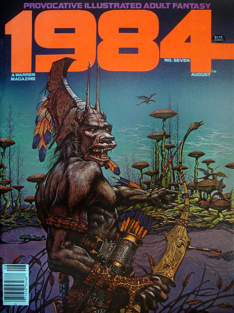
« Well, if that ain’t about the unfriendliest thing I’ve ever heard of… » 1984 no. 7 (August, 1979.)
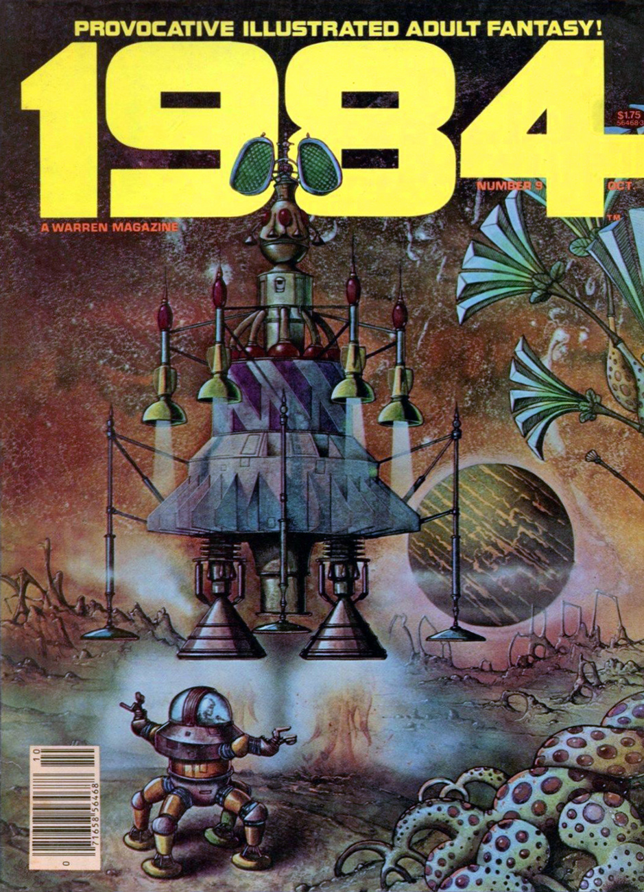
Aw, missed your ride home. This is 1984 no. 9 (October, 1979.)
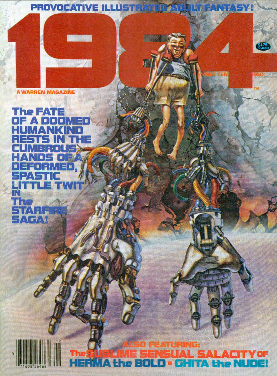
As it turns out, one couldn’t have picked a better artist to depict « the cumbrous hands of a deformed, spastic little twit », though he seems like a sweetheart, really. On this whimsical note ends our survey of Mr. Woodroffe’s Warren covers. This is also the last issue of 1984 under that title; it would leap a decade ahead to “1994” and carry on for another nineteen issues.
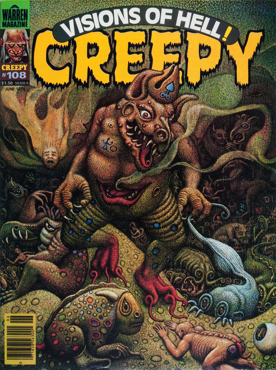
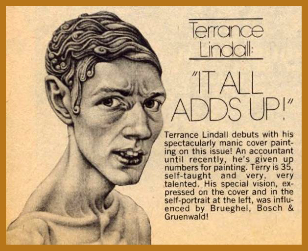
As the close of the 1970s neared, James Warren‘s magazine empire was inexorably crumbling. I like to imagine that it was decided, in desperation, that a little fiddling was in order… just a smidgen. Some enlightened soul (my pick is new editor Chris Adames) got the notion to bring on board Terrance Lindall (1944-) to produce some covers for the magazines. He painted a mere five, but made each one memorable, to say the least, evoking justified comparisons to Matt Fox, Lee Brown Coye, sans oublier the venerable Hiëronymus Bosch.
Well, then, let us bask in the comforting, bucolic visions of Terry Lindall at Warren, in their order of publication. Makes you want to pack a picnic lunch and go for a leisurely ramble through the countryside with your faithful Hound of Tindalos.
Creepy no. 108 (June, 1979.)
Eerie no. 103 (August, 1979.)
Creepy no. 116 (March, 1980.)
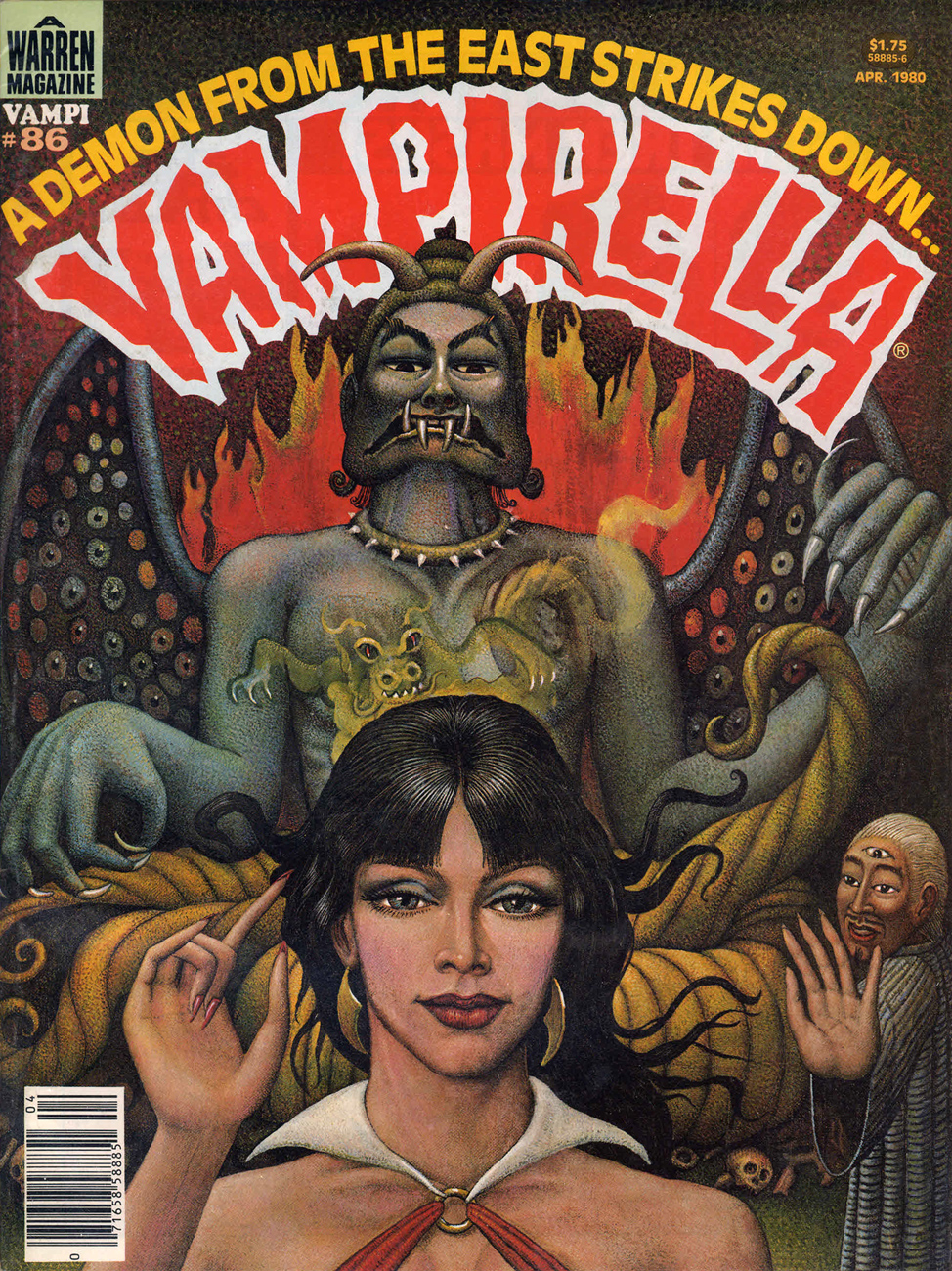
What do you know? Terrance Lindall actually manages to make perennial fanboy wankbait Vampi look downright classy. This is Vampirella no. 86 (April, 1980.)
And all too soon, it’s over, with Creepy no. 127 (May, 1981.)
Oh, how Creepy’s long-time readers must have wailed and moaned at these singular, quease-inducing mise-en-scènes! “Bring back Boris Vallejo!”
Nowadays, Lindall earns his keep as co-director and chief administrator of the Williamsburg Art and Historical Center in Brooklyn, New York. Doesn’t he just perfectly look the part?
The new kid’s mini-bio, as it appeared in Creepy 108 (June, 1979).