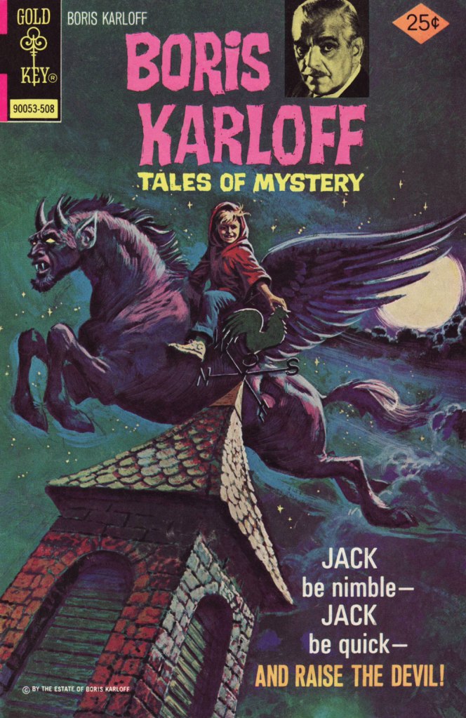
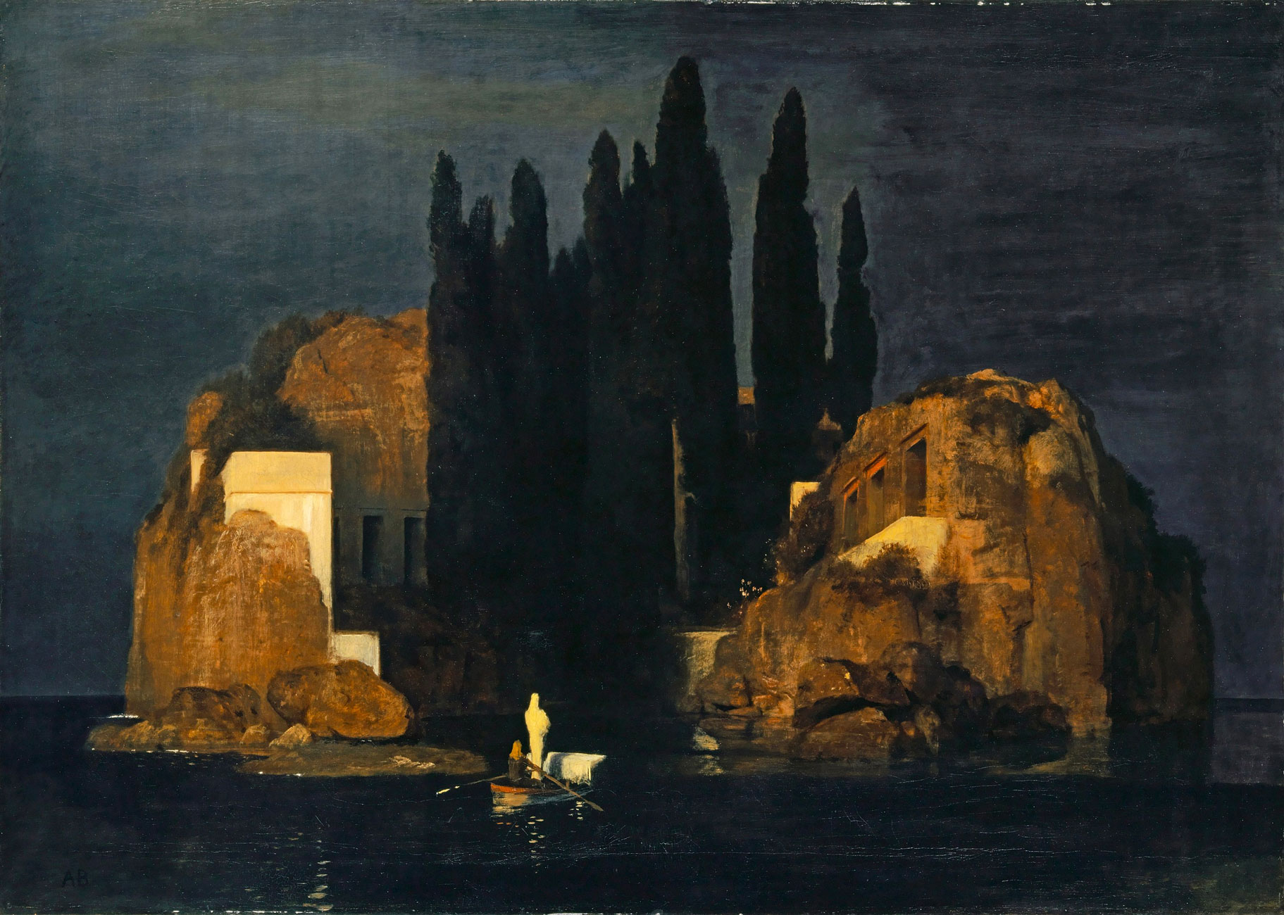
« I see a wolf-like thing coming over a dark river — at the shallows — just above a waterfall, the starlight shining up his pelt. I see a brown oak leaf blowing far up in the sky. I see a small bat flying. I see many other things, running under the forest trees and slipping through the highest branches; and they’re all coming this way! » — Ray Bradbury, The Homecoming (1946)
In the early 1960s, before Warren Magazines handled the task more decisively, there was a minor reunion of EC alumni — Joe Orlando, Reed Crandall, George Evans, Wally Wood, Williamson and Torres — at Gold Key. It resulted in some lovely art but minor, toothless stories. Even without the Comics Code, Gold Key’s material was safe as milk.
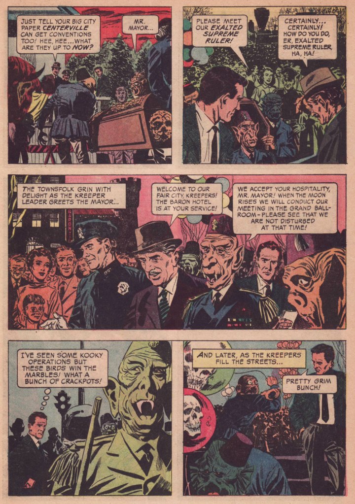
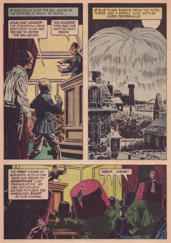
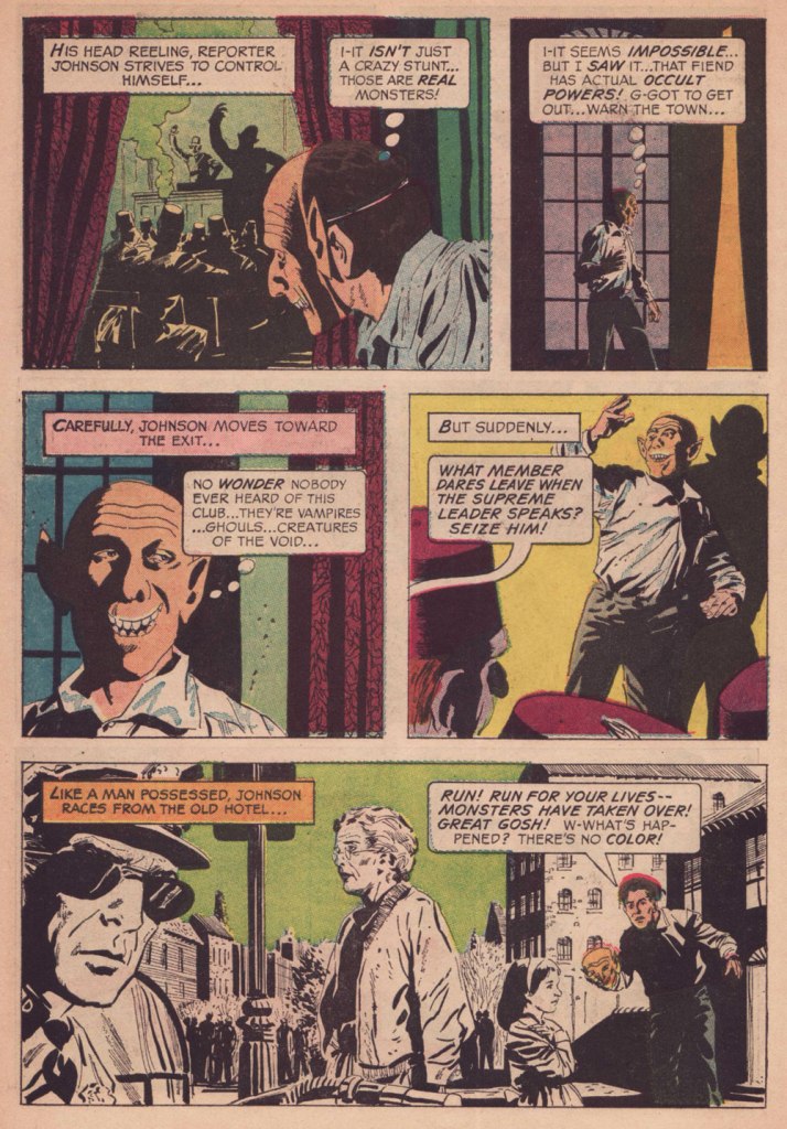
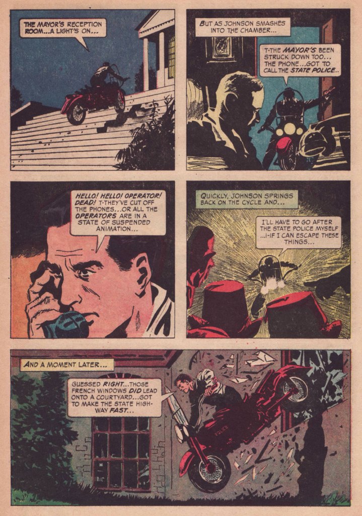
Here’s my favourite of the lot, a tale published in Boris Karloff Tales of Mystery no. 12 (Dec. 1965, Gold Key). I’ve probably tipped my hand with my choice of quote: “The Convention” reminds me of Mr. Bradbury’s timeless The Homecoming [ read it here ].
I like the point the story makes about how most towns — particularly their elected officials — will put up with a lot of obnoxiousness and outright toxicity if it fills up the hotels, bars, restaurants… and whorehouses.Really, a burning cross to vanquish evil… in 1965, given the headlines of the day? By the way, Angelo, that’s not a good Karloff.
Typically for Gold Key comics of that period, no credits are provided, but I’m strongly inclined to attribute authorship to Dave Wood (1926-1974), who happened to work for both Gold Key and DC at the time. It’s his kind of plot. Furthermore, as we’ve learned from the case of Steve Skeates, Julius Schwartz and The Spectre, there are instances when editorial changes to your original plot are significant enough that you can sell it again to someone else… and mum’s the woid.
What am I getting at? Why, our bonus, a cover-featured Dave Wood gem from the following year and with a quite familiar theme.
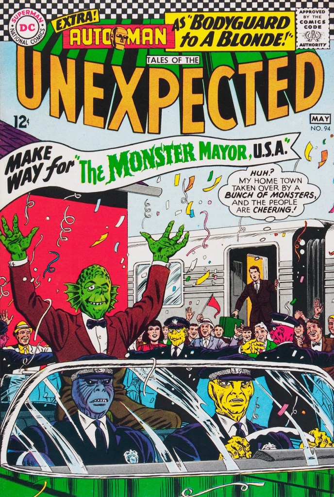
« Our appearance makes little difference… so long as we are in power! » Evidently, political cynicism is nothing new. DC’s Jack Schiff-edited “mystery” titles were a lot of utter bushwah, but oddly mesmerising if one surrendered to the spirit of the thing. And to a Bernard Baily and Mort Meskin fan, they offered a pretty sweet cornucopia. “The Monster Mayor, U.S.A.” is one of a series of oddball situations triggered by an invisible (but green!) sentient cloud from outer space called “The Green Glob“. The sort-of series ran in TOTU 85 to 98, then 100, 102 and 103. Weirdies!
This is Tales of the Unexpected 94 (April-May, 1966). Cover by Murphy Anderson.
-RG
*One might reasonably argue that Tatjana Wood (née Weintraub in 1926), who anonymously assisted her then-husband on some EC stories, is also eligible. She’s ninety-seven if she’s a day!
Ah, the nineteen seventies… and their Satanic panic, in which we can recognize so closely the roots (or at least relatives) of today’s disinformation maelstrom, before the politicisation and weaponisation of septic paranoia and lies had become honed to such an anti-science. In a lot of sordid ways, Lawrence Pazder was an Andrew Wakefield of his day.
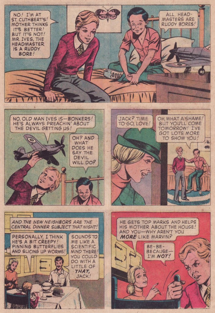
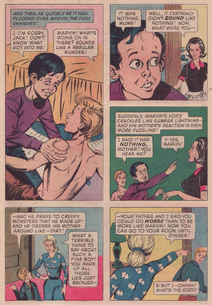
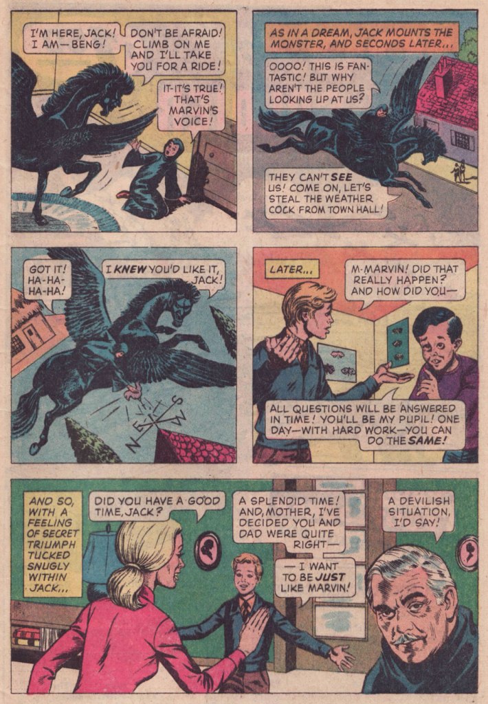
Here’s a story that I first encountered around the time of its release, remembered, but didn’t revisit until a couple of weeks ago, when a good friend (merci, Keith!) helpfully snapped up a copy for me. This deceptively dark tale was created by writer Arnold Drake (I surmise), penciller John Celardo and mysterious inker Wanda Ippolito, who may have a been a spouse or relative of Celardo’s. It’s odd to find someone else inking Celardo, as this was his chief, most enduring and distinctive strength. For comparison’s sake — and presumably, reading enjoyment — here’s another Drake-Celardo outing, The Anti-13!
I won’t make any claims that this is great art: by this time, Gold Key’s printing was shoddy, they barely bothered with the colouring (straight Magenta and Cyan and Yellow everywhere — how lazy can you get?)… but I treasure this one because of the story. Given its moral — what moral? — it’s hard to imagine The Comics Code Authority giving this one a pass, as it merrily violates several of its key precepts. I’ve got another such blasphemous entry in the pipeline… this one duly Code-Approved! Just you wait…
I had a childhood friend who was a lot like Marvin (minus the devil worship — for all I know)… he was incredibly talented, but also scarily unpredictable, and not in a good way. One day, he just disappeared.
On the other hand, the accompanying cover is spectacular.
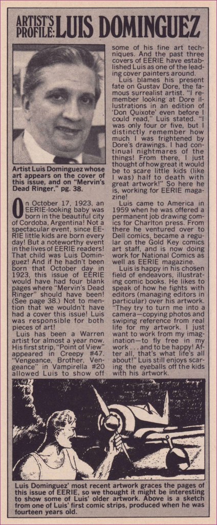
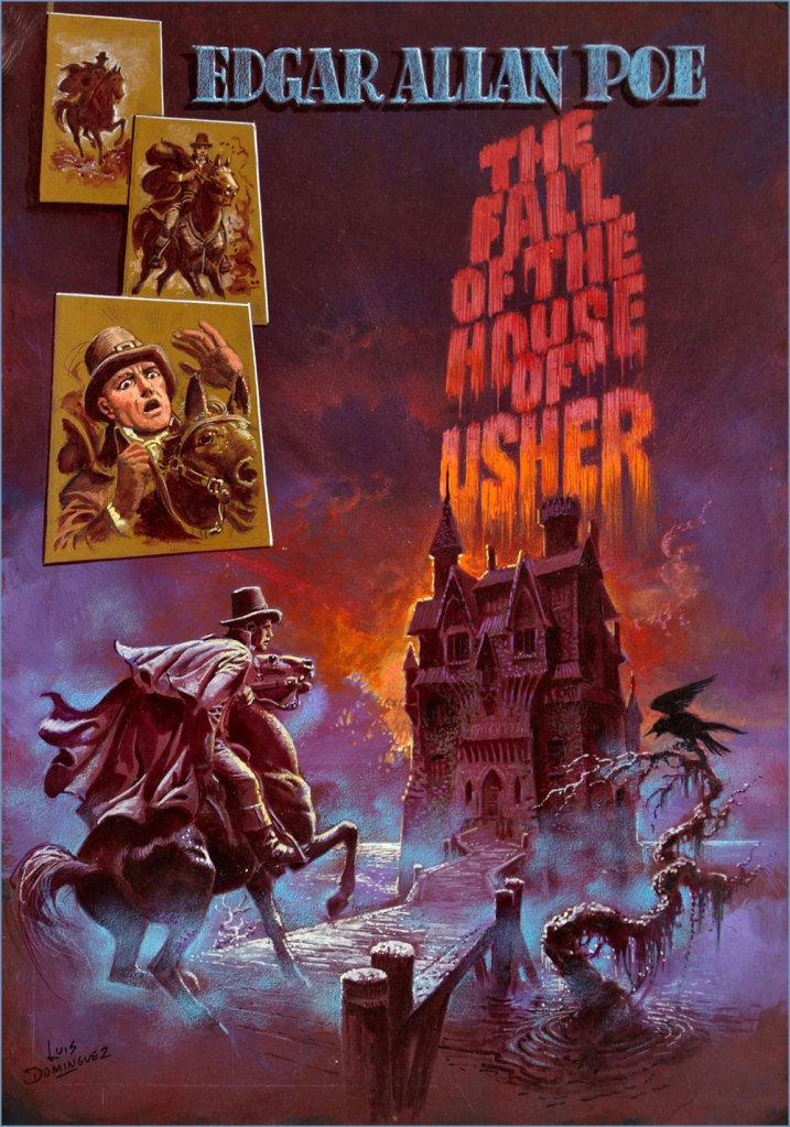
« Why Can’t You Be More Like Marvin? » originally appeared in Boris Karloff Tales of Mystery no. 63 (Aug. 1975, Gold Key), which bore this masterfully disquieting cover by Luis Domínguez. It would have made it into my Domínguez retrospective, Luis Domínguez (1923-2020): A Farewell in Twelve Covers but for the fact that I didn’t own a decent copy of the issue.
And as (nearly) always, a bonus for context: Celardo had a long and fruitful career, and I’m sure one of its highlights was to number among Fiction House’s elite cadre of cover artists. I’ve said it before, but despite their mind-numbing repetitiveness, FH covers were tops in the Golden Age in terms of draftsmanship and production values.
Aw, poor Ka’a’nga — always left at home to feed the jackals while Ann Mason goes off on escapades with her other boyfriends. And who insisted on adopting them in the first place? Ann, that’s who! This is Jungle Comics no. 98 (Feb. 1948, Fiction House). Judging from his ability in the jungle antics genre, it’s no wonder that Celardo was picked to illustrate the real thing (at least comics-wise): the Tarzan comic strip, from 1954 to 1968, between Bob Lubbers (another FH cover artiste!) and Russ Manning. And here’s one of Celardo’s Tarzan Sundays (March 27, 1954, United Feature Syndicate).
« I was already doing a lot of splendid research reading all the books about ghosts I could get hold of, and particularly true ghost stories – so much so that it became necessary for me to read a chapter of Little Women every night before I turned out the light – and at the same time I was collecting pictures of houses, particularly odd houses, to see what I could find to make into a suitable haunted house. » — Shirley Jackson
This one’s from the department of historiated text. What text? “those fiction pieces that nobody read” in comic books, prose pages mandated by the United States Postal Service. The USPS insisted that comic books «… have at least two pages of text to be considered a magazine and qualify for the cheaper magazine postage rates. »
By the Sixties, most of these pages consisted of letters to the editor, but not every company followed this practice. After EC pioneered the letters page idea in the early 1950s, ACG, DC, Archie and Marvel followed suit. But not Dell/Gold Key, Harvey and Charlton.
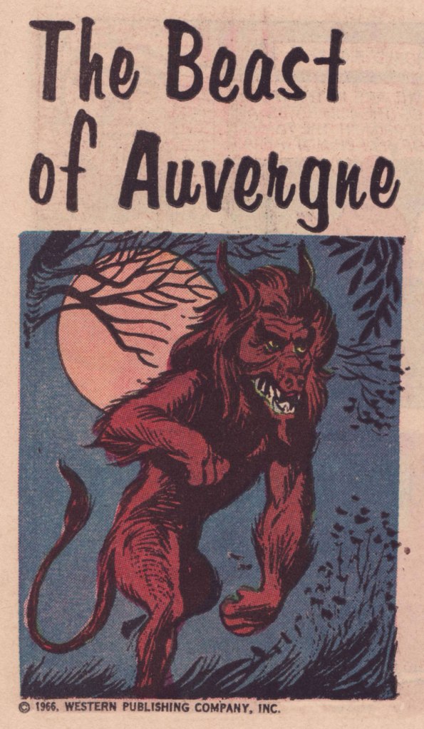
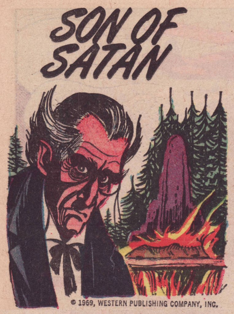
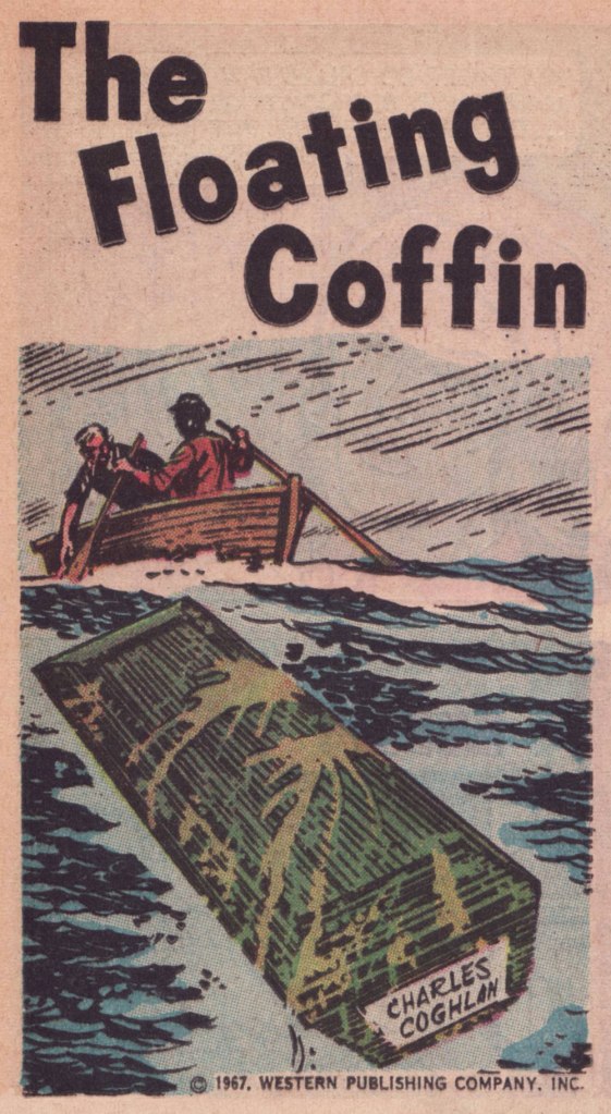
For its mystery titles, Gold Key naturally opted for a ‘unusual history’ format, enlisting, to provide spot illustrations, veteran cartoonist Joe Certa, best known for his co-creation of and long run (1955-1968!) on J’onn J’onzz, the Martian Manhunter and his stylish run on Gold Key’s Dark Shadows comic book series (1969-76). While Certa started out with a pretty mainstream approach, as the Sixties wore on, his style got increasingly angular, spare and expressive. Personally, I love it… but I know it’s not for all palates.
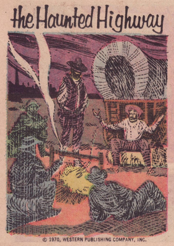
This one appeared in Boris Karloff Tales of Mystery no. 17 (Mar. 1967, Western); « It was more than two centuries ago when the monstrous creature known simply as ‘the Beast’ appeared in the province of Auvergne, in France. » Perhaps you’ve seen the action-packed, *slightly* fictionalised cinematic account of the events, 2001’s Le pacte des loups, aka Brotherhood of the Wolves.This one’s from Boris Karloff Tales of Mystery no. 28 (Dec. 1969, Western); « When Gustave Labahn appeared in Munich, Germany in 1890, he was indeed a man of mystery. Nothing was known of his except that he was tall, lithe and powerful, with strangely hypnotic eyes, and a possessor of unlimited wealth. »This one, from Boris Karloff Tales of Mystery no. 28 (Dec. 1969, Western) states: « He was a man of a hundred names and countless identities. No one knew his true origin. It was said he was descended from an evil medieval warlock. Others said he was a reincarnation of the Count de St-Germain… a man who claimed to be more than 2,000 years old. He called himself Raoul Plessy, but his followers he was known as La bête… The Beast. »Appearing in Boris Karloff Tales of Mystery no. 50 (Oct. 1973, Western), this one concerns the 1793 murder of French revolution leader Jean-Paul Marat by Charlotte Corday. Exceptionally, the art on this one is the work of John Celardo, a lovely, delicate composition.One from Grimm’s Ghost Stories no. 5 (Aug. 1972, Western). The cat’s name is Satan, we are told.From Ripley’s Believe It or Not! no. 8 (Feb. 1968, Western), this piece tells the story of a coffin that found its way home to one of my favourite places, Canada’s Prince Edward Island. Here’s a more sober account of the legend.From Ripley’s Believe It or Not! no. 15 (Feb. 1968, Western), this one concerns the purported haunting of Scotland’s Meggernie Castle.A cozy one from Ripley’s Believe It or Not! no. 21 (Aug. 1970, Western): « In the northeastern corner of Mississippi, near the town of Aberdeen, lies a stretch of deserted country road which has lately become known as one of the most haunted spots in the United States. »A great drawing from Ripley’s Believe It or Not! no. 41 (July 1973, Western); The text opens with « Ash Manor House in Sussex, England, was over six hundred years old when bought in 1934 by a man named Keel. Mr. Keel did not believe in ghosts. Neither did his attractive wife. »This hails from Ripley’s Believe It or Not! no. 42 (Aug. 1973, Western). The piece recounts anecdotes about such thespians as Burl Ives, Jackie Gleason, Rudolph Valentino and our beloved Vincent Price.And here are a couple of samples of full pieces to give you an idea of how they looked in print. This thoroughly seasonal one saw print in Grimm’s Ghost Stories no. 6 (Nov. 1972, Western).
One more? Here’s a favourite from The Twilight Zone no. 42 (Mar. 1972, Western):
« Painting is the art of hollowing a surface. » — Georges Seurat
If you’ll forgive me the venial but gauche sin of quoting myself… three years ago, I posited:
« Luís Ángel Domínguez, reportedly born ninety-five years ago to the day… and still among the living… as far as we know. I like to envision him warmly surrounded by several generations of loved ones and well-wishers, an impish gleam in his eye. »
I found it sadly infuriating that such an important and accomplished artist’s latter-day whereabouts and circumstances were so shrouded in mystery… and largely, it would seem, indifference. The usual story: he didn’t really do superheroes.
Neither Lambiek nor the Grand Comics Database have anything to add on the subject, but a spot of digging turned up that he indeed was still alive until recently, though purportedly afflicted with Alzheimer’s in his waning years. Then I found what may well be his… very basic obituary, placing his date of birth exactly one month off (unsurprisingly, since accounts have long varied) and his date of death as July 1st, 2020, in Miami, FL. Unless something more definitive comes along, it’ll have to do.
I think we can all agree that ninety-six years is a pretty good run, even with the doleful decline near the end. Let’s look back on what’s surely his peak decade in comics, the 1970s. My picks have nothing to do with ‘key’ issues, character débuts or popular crossovers. I’ve judged these on artistic merit, keeping the pernicious influence of nostalgia at arm’s length.
First, a little biographical background! This helpful piece appeared in the pages of Eerie no. 44 (Dec. 1972, Warren), which also boasted a Domínguez cover… albeit reproduced too small.
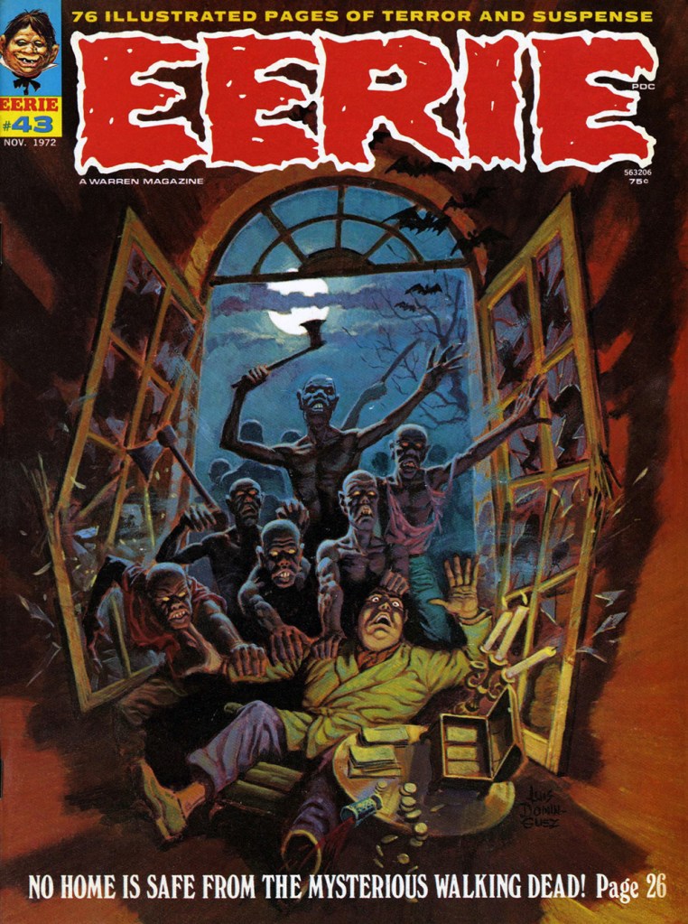
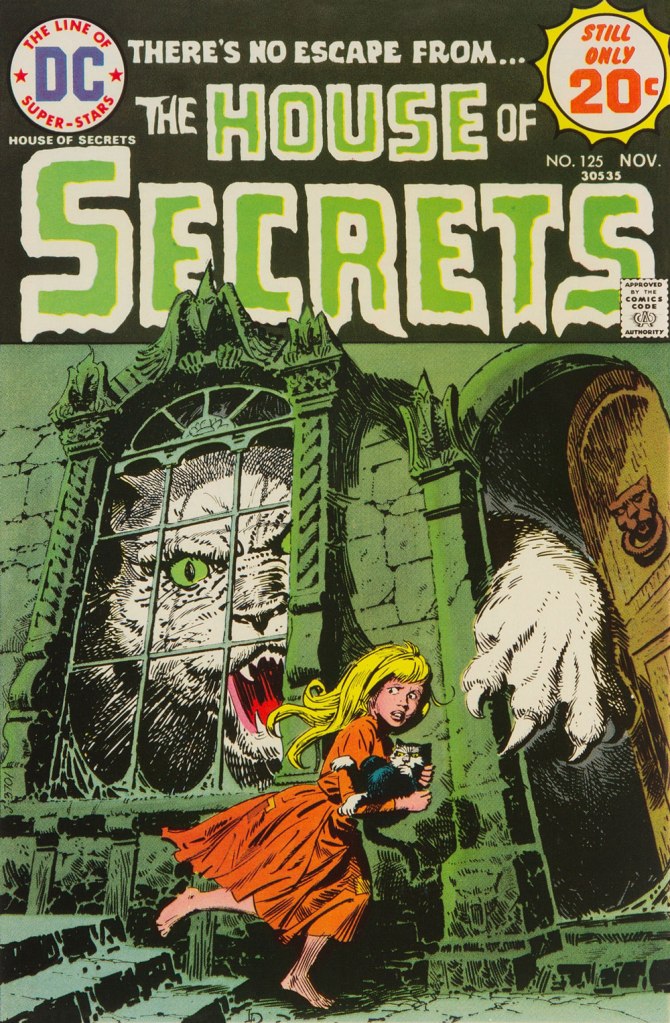
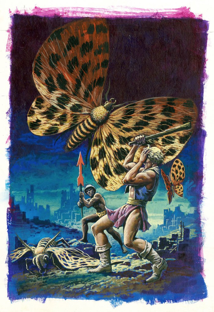
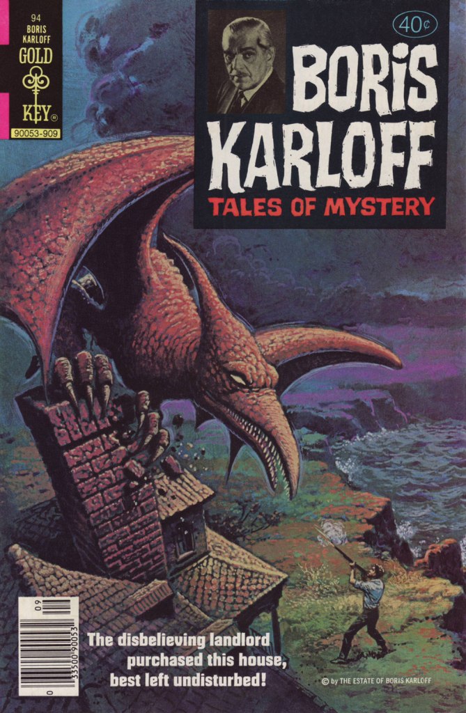
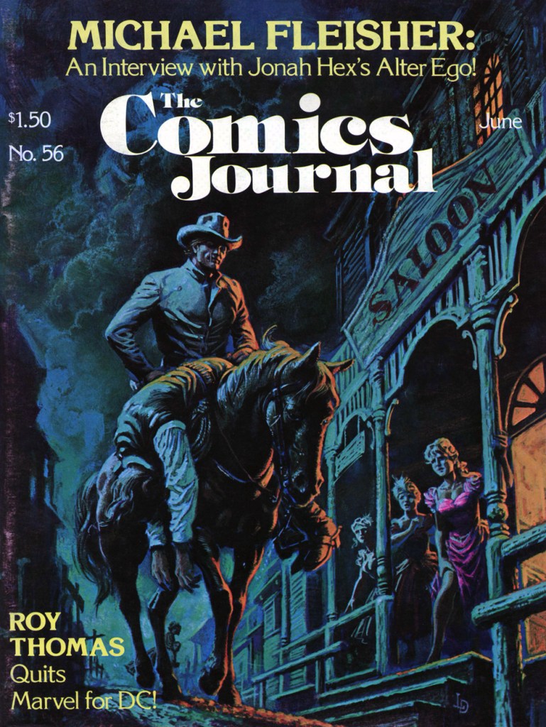
The folks at Warren were apparently first in North America to recognise and call upon señor Domínguez’s masterly painting skills. This is Famous Monsters no. 93 (Oct. 1972, Warren).My personal favourite of his too-few Warren covers, this is Eerie no. 43 (Nov. 1972, Warren).While Luís had been steadily working on the insides of Gold Key comics since 1967, it wasn’t until 1974 that they gave him a crack at a cover. That was either this one, Space Family Robinson no. 40, or Boris Karloff Tales of Mystery no. 55, both cover-dated July, 1974… (incidentally, the GCD misattributes to him several of his colleague George Wilson‘s paintings).DC hardly ever used painted covers, but they did keep Domínguez busy as a cover artist. I assure you, this ambitiously-muted cover must have been a printer’s nightmare. This is The Phantom Stranger no. 32 (Sept. 1974, DC), a great issue that features Arnold Drake and (returning to the Stranger after a 27-issue absence!) Bill Draut‘s It Takes a Witch! and a gorgeous Michael Fleisher–Nestor RedondoBlack Orchid backup.This is House of Secrets no. 125 (Nov. 1974, DC). For once, Domínguez also illustrates the cover-featured story, E. Nelson Bridwell‘s Catch as Cats Can!Then of course, Marvel soon after got in on the act. This is Dracula Lives no. 9 (Nov. 1974, Marvel). I would have picked the even better previous issue, but I’ve already featured it, so you get to enjoy both!The printed version of this piece, featured as the cover of UFO Flying Saucers no. 5 (Feb. 1975, Gold Key) pales in comparison with the surviving original art, so that was an easy choice.This issue’s original art also survived, and seeing both versions is most instructive as an insight into production manager Jack Adler’s methods. This is House of Mystery no. 235 (Sept. 1975, DC), and the original can be viewed here. As an aside, this issue’s The Spawn of the Devil, written by Maxene Fabe and drawn by Ramona Fradon, is the only DC horror story I ever found scary. Perhaps editor Joe Orlando should have hired women more often!Another one whose printed version fails on the reproduction front, this is Mighty Samson no. 31 (Mar. 1976, Gold Key), the title’s final issue. Let’s again rejoice at the original art’s survival!This is Boris Karloff Tales of Mystery no. 94 (Sept. 1979, Gold Key); I hold that Dominguez’ three finest consecutive covers came near the end of Gold Key’s Karloff anthology and, wouldn’t you know it? … we have already featured the other two. You’ll find issue 92 here, and issue 93 (and its original art) in one of ds’ posts, which also showcases another top-flight contender, which I couldn’t use for reason of… tentacles, Dagar the Invincible no. 11. This is The Comics Journal no. 56 (Fantagraphics, May 1980). According to masthead notes, « Luís Dominguez’s painting was originally scheduled for the fourth issue of DC’s Digest Comic, “Jonah Hex and Other Western Tales“, but the title was cancelled with no. 3. » The magazine’s larger size certainly affords us a better view of this richly detailed scene.And as bonus, this mysterious, undated, possibly unpublished cover painting to Edgar Allan Poe‘s famous tale. Acrylic on board, 36 x 50 cm (14″ x 20″). The corners confirm that Domínguez worked from dark to light (which largely accounts for his marvellously luminous colours) and faint lines (on this and other works) indicate that he used a grid to scale up his preliminary sketches accurately.
For more Domínguez delights, just click on this link and explore away! I daresay that I only managed to keep it to an even dozen (difficult!) choices because we’ve already spotlighted many of his finest covers.
« There’s something about guitars, they’re just so big, you know what I mean? You’re just like, ‘Ugh!’ It just seems so overwhelming. And the ukulele is, like, the opposite of overwhelming. » — Zooey Deschanel
While the inside artwork also had its charms, the weak link in the chain was the writing. Pedestrian and formulaic, most of its anonymous load was borne by Paul S. Newman, one of the comics industry’s great cranker-outers. And so things ran their humdrum course, even with the arrival of talented DC expatriate Arnold Drake in the early 1970s. I strongly suspect rampant conservatism on the part of the editors, as even normally-compelling authors produced the same generic plots, ground out like under-seasoned sausage.
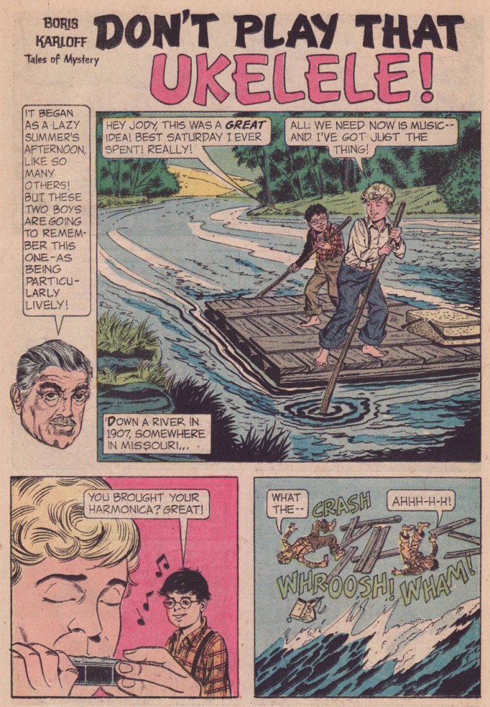
Then occurred a curious bump in the road: the unheralded, near-anonymous arrival of future Clown College alumnus*Connor Freff Cochran (1954-), who scripted (as Freff, when credited — a rarity at GK) a number of short tales for Gold Key’s anthology titles for a few years (1974-1977). Of those I’ve read, most docilely follow the publisher’s tame editorial formula. But there are exceptions, and they really do stand out. Here’s such a pair, which I’m boldly attributing to Mr. Cochran.
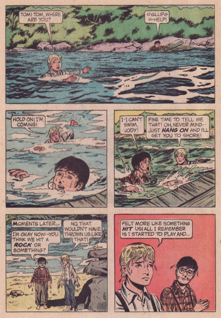
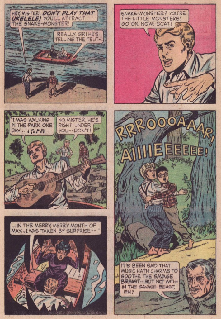
Interesting that writer Freff opted here for the obscure, alternate spelling of ukulele. Speaking of which, how do you think ‘ukelele‘ is pronounced? You might be surprised. Check here for the answer. And, er… 1907? “One of the earliest appearances of the word ukulele in print (in the sense of a stringed instrument) is in the Metropolitan Museum of Art’s Catalogue of the Crosby Brown Collection of Musical Instruments of All Nations published in 1907.” [ source ]Man, that lake monster looks familiar. I smell a swipe.And for the full multimedia experience, you can sing and strum along with George!
Ahem — sloppy research on Freff’s part:
The ukulele was popularized for a stateside audience during the Panama–Pacific International Exposition, held from spring to autumn of 1915 in San Francisco.
It is therefore highly unlikely that anyone on the American continent would have been plucking a uke, let alone that two random Missouri farmboys would spot a specimen from a distance. Not to mention the fact that the uncredited and unknown artist (no, it’s notBill Molno, dear ignoramuses at the GCD) drew… a plain old guitar. Let’s face it, a banjo or even a mandolin would have made more sense.
In his defense, Freff recalled:
« I absolutely did write “Don’t Play That Ukulele!” But I don’t deserve the ding for the misspelling — that was the letterer’s error, which no one fixed. I will cop to not knowing (in 1975) that the ukulele wasn’t introduced stateside until 1915…but even there the story is a bit more complicated than it appears on the surface. When I pitched the idea it was a guitar that brought doom down on our unfortunate swain, same as it wound up being drawn. But editor Paul Kuhn thought a ukulele was intrinsically funnier than a guitar, and he’s absolutely right about that. I remember us both giggling over the title when we came up with it. »
At fourteen, he and his family moved to Placentia, California, east of Los Angeles, where he graduated from El Dorado High School a year ahead of the normal schedule. One of his fellow students had combined the words “friend” and “Jeff ” to coin the name “Freff ”— and while at first this remained only a nickname, by 1970 he had started signing his artwork that way, as well. Like many artists, Cochran entered the science fiction field doing “freebie” drawings for fanzines. His first paid job were pen and ink drawings for Andrew Porter’s semi-prozine Algol, done in 1972. In the same year he dropped out of Fullerton Junior College after two months of art classes to live on his own. He worked in various fields to make a living and “The rest was all just self-directed study and experimentation,” he says, adding “as a young pro, just starting out, I was lucky enough to be mentored ever-so-slightly by two of my early faves in the field: Kelly Freas and Jack Gaughan. At Kelly Freas’s suggestion Cochran moved to New York in September 1973 and started looking for work as an illustrator.
When that was not forthcoming, Cochran attended the Ringling Brothers and Barnum & Bailey Clown College — class of 1974.
In that year he got his first big break from Jim Baen, the new editor of Galaxy and If. Baen needed people who would work fast and cheap and put up with being paid late — in other words, the perfect opportunity for beginning artists like Cochran. By this time he was aware that other professional artists and cartoonists were named “Cochran”— and feeling that using his initials “JC” would be presumptuous — the artist in 1976 went to court and legally adopted “Freff ” as his professional nom de brush, and kept it during his years of magazine illustrating. Baen was so taken with the name that he put it on the cover of Cochran’s first cover for IF, as if Cochran was an author with a story in the magazine. After that “Freff ” did a lot of work for Baen, primarily interiors in black-and-white. He also did drawings for Cosmos, Isaac Asimov’s SF, and did cover work for publishers such as Dell, Berkley, and Doubleday. Cochran was selected to be one the artists in the special 1975 NASA/Smithsonian Artists Tour. After early success illustrating Zelazny’s “Amber” novels for Galaxy, followed by cover art and interior illustrations for a set of hardcover novels by Zelazny for Gregg Press in the early 1980s, Cochran became disgruntled over nonpayment for the use of his art in foreign editions of John Varley’s novel Titan, for which he had done a frontispiece and 16 illustrations—and the argument led to the end of Cochran’s illustrating in the field.
He turned to other endeavors, but briefly “dipped a toe back into the waters by collaborating on the first (and only) issue of an SF comic book called D’Arc Tangent” in 1982–1983. He did inking and penciling for DC and Marvel comics: Star Trek** and Tomb of Dracula***.
This is Boris Karloff Tales of Mystery no. 64 (Oct. 1975, Gold Key), featuring a painted cover by Argentine master Luis Dominguez. Don’t Play That Ukelele! isn’t even the cover story… there’s just a lot of aquatic peril in this particular issue.
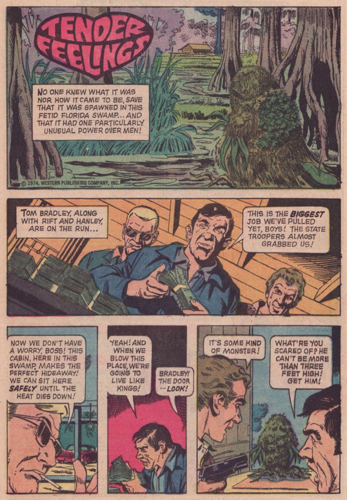
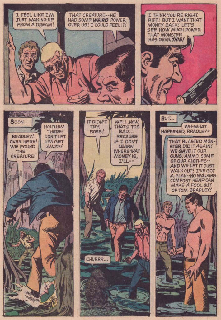
And here’s the uncredited, utterly batty Tender Feelings, recognizably illustrated by another hardworking Argentine, José Delbo. It saw print in Boris Karloff Tales of Mystery no. 53 (Apr. 1974, Gold Key).
Part of my reasoning for attributing authorship of Tender Feelings to Freff is his penchant for light, deftly humorous tales that conclude with several characters meeting dismal ends. Churrr...
But… nope. The mystery of this mordant little tale remains whole. Freff helpfully eliminated himself as a suspect, and proposed some intriguing leads:
« I can’t take credit for “Tender Feelings.” I certainly wish I could, since it’s a delightful mashup/piss-take on DC’s Swamp Thing and Marvel’s Man-Thing. But nope — not me.
The publication date I find online for that story is April 1974. But Gold Key titles usually hit the stands a month ahead of the printed date, and editors Wally Green and Paul Kuhn liked to have a solid backlog of finished stories on hand. That puts the likely writing window for “Tender Feelings” somewhere around August 1973, which means there’s a chance that “Tender Feelings” was written by Len Wein himself. Len did a lot of uncredited Gold Key stories, starting around 1969, but he stopped in late summer 1973. It would have been absolutely in keeping with his sense of humor to write something like “Tender Feelings” as a happy sendoff for himself.
My best second guess after that would be John David Warner…though if I really had to bet, I’d bet on Len. In any case, whoever did it was lightyears better than the usual Gold Key writer. Glad to see them get this recognition. »
-RG
*Class of ’74. As Freff himself stated: « The Really Famous Guy from our session was Bill Irwin, who went on to a great stage, TV, and film career, and was the first performer to win a Genius Grant from the MacArthur Foundation.) I did originally intend to apply for the ’73 class, but I learned about it too late to make that year’s deadline. So I went to NYC instead to pursue art, while waiting for my next chance to roll around.. »
**he inked two drawings (one of them a double-paged splash) in Who’s Who’s in Star Trek (1987). That seems to be all.
***a pair of frontispiece illustrations in Tomb of Dracula (the magazine, that is: six issues, published Oct. 1979 – Aug. 1980); he also conducted a fine interview with Stephen King, published in issues 4 and 5 of TOD. Freff provides some illumination: « plus the framing graphics for the magazine’s title/table of contents page, plus I got to ink a bunch of ads for the magazine. The one I know they used involved inking Gene Colan’s pencils, which was hella fun and a childhood dream come true. I grew up on Gene’s work in DAREDEVIL, DOCTOR STRANGE, IRON MAN, CAPTAIN MARVEL, etc, and he was easily as big an influence on my visual thinking as people like Jack Kirby, Steve Ditko, Neal Adams, or Jim Steranko. (I got to achieve another childhood comics dream when I got to re-pencil, ink, and color a Curt Swan drawing for the October 1988 cover of KEYBOARD magazine.)
I did a lot more writing than artwork at Marvel, but most of it was nonfiction material in their b&w magazines — 100+ articles for PLANET OF THE APES, DEADLY HANDS OF KUNG-FU, CELEBRITY, NOSTALGIA ILLUSTRATED, THE TOMB OF DRACULA, etc. »
Voyage to the Bottom of the Sea no. 2 (July 1965). Cover by George Wilson.
Todd Franklin of Neato Coolville has actually transformed this cover into a groovy wallpaper (go to his website to download the high-res version).
Voyage to the Bottom of the Sea no. 13 (August 1968). Cover by George Wilson.
Brothers of the Spear no. 7 (December 1973), cover by George Wilson.
That previous cover has borderline tentacles, I agree, but the completist in me insisted on its inclusion. Also, it’s entertaining.
The Tree That Walks is illustrated by Jesse Santos. The story tags as detailed by GCD are «chariots; draft elands; giant carnivorous plants; human skeletons; leopard; rock slides; saddle elands». I had to look up “elands” (it’s an antelope). How much more entertaining can one get?
Tales of Sword and Sorcery Dagar the Invincible no. 11 (April 1975). Cover by the underappreciated Luis Dominguez.
A beautiful cover this may be, but the insides are distinctly underwhelming. The title story, It Lurks by Moonlight, is scripted by Don Glut and illustrated by Filipino artist Jesse Santos, who seemed like a likable artist with a wide-ranging career… but his art is not my cup of tea.
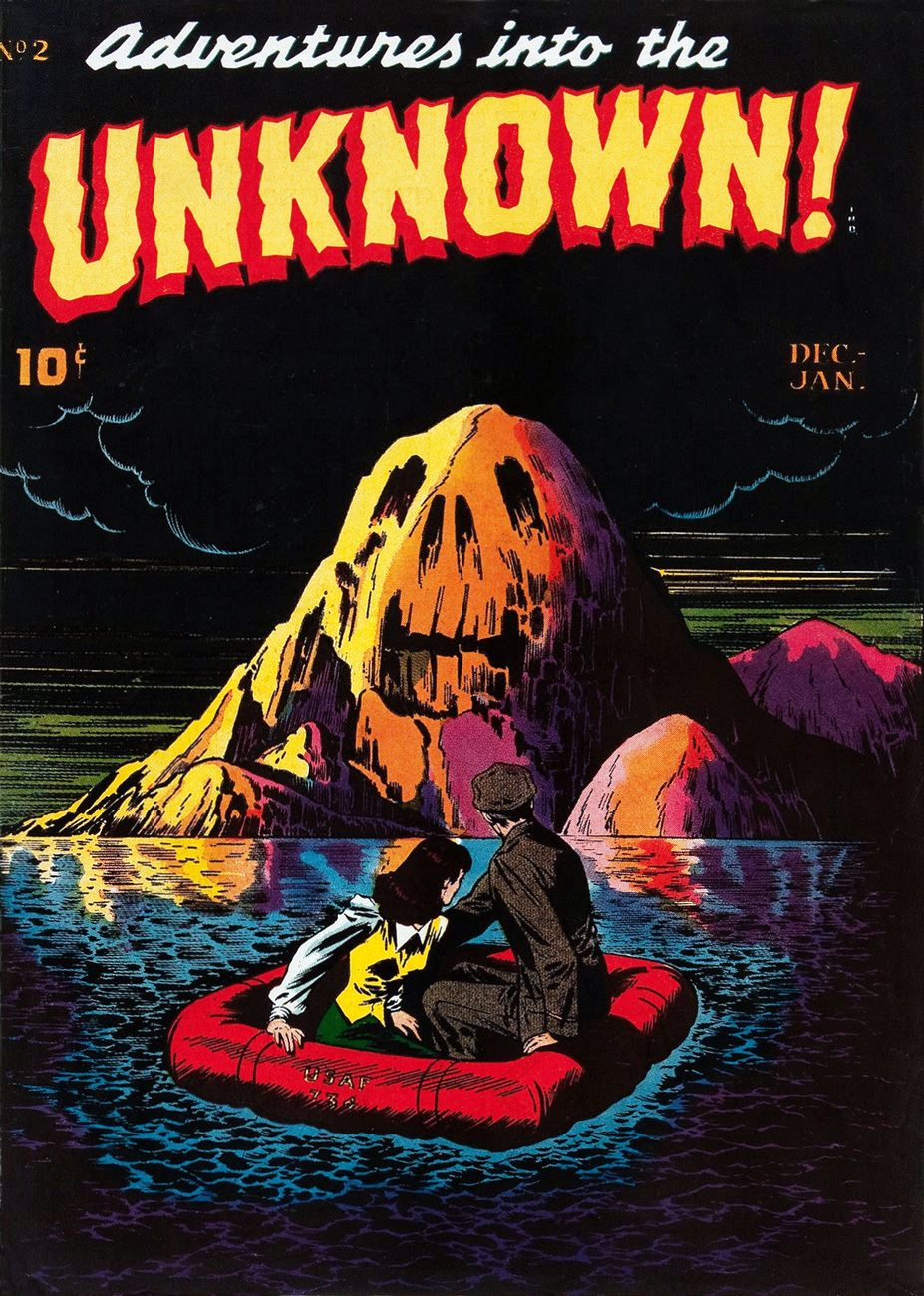
« Spine-chilling tales of suspense, horror, and the supernatural—prepare yourself for Adventures into the Unknown! »
This American Comics Group (ACG) entry is generally considered the first title fully committed to the supernatural genre in the history of US comics. And this arresting, Isle of the Dead-styled tableau graces the cover of the title’s second issue (December, 1948). Art by Edvard Moritz. Most of the stories were scripted by horror legend and H.P. Lovecraft disciple Frank Belknap Long (read his The Hounds of Tindalos and forfeit your soul!) Speaking of which, the entire issue’s contingent of chills and thrills is available right here for your pleasure and leisure.
This is Adventures Into the Unknown! no. 2 (Dec. 1948 – Jan. 1949, ACG).
Today’s tentacle adventure brings us a bounty of Gold Key covers.
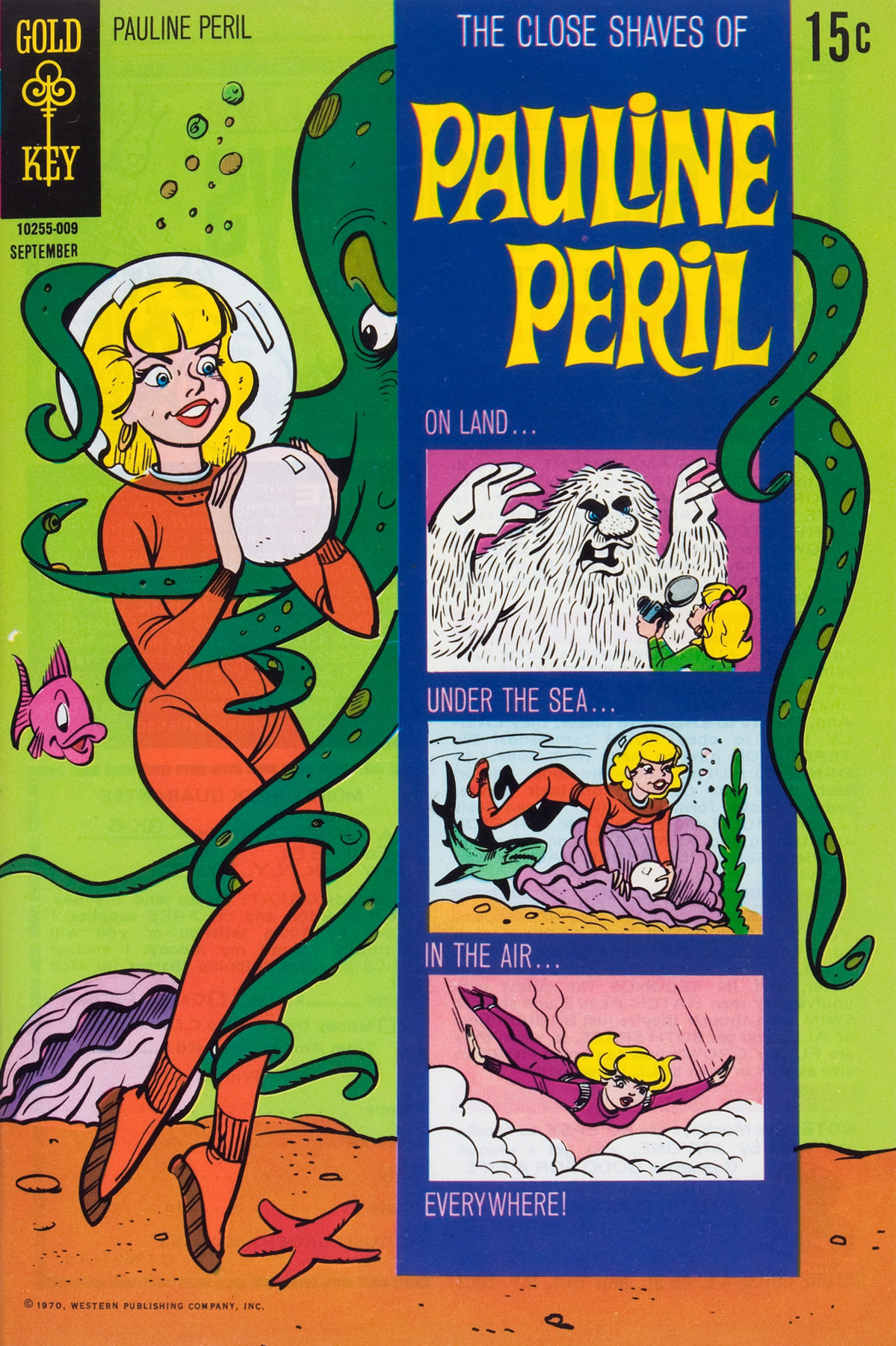
The Close Shaves of Pauline Peril no. 2 (September 1970). Cover by Jack Manning. I love the Pauline Peril series – it’s such loveable nonsense, with dynamic art and fusillade-style dialogue. However tempting it may be to jump to that conclusion, It’s not a comic-book adaptation of a TV cartoon. Read a whole issue (number four, to be more precise, the last one) at, appropriately, the Ominous Octopus Omnibus blog.
Hanna-BarberaThe Addams Family no. 3 (April 1975). The adorable cover is by Bill Ziegler. Is there anything groovier than a froggy belt-buckle? I think not.
Looney Tunes no. 11, 1976. Cover artist unknown. The boat has been filled beyond legal capacity, and no-one’s wearing their mandatory Mae West. The Safety Octopus is here to ensure that the offending parties are brought up to standards (or at least given a tentacle slap on the wrist).
And just to offset all the cartoony, cutesy stuff, here’s a cover featuring an epic struggle, a life-or-death situation, a decisive skirmish between Man and Beast. (I’ll let you guess which is which, though.)
Boris Karloff Tales of Mystery no. 37 (October 1971), cover by George Wilson. Here we have a tentacled creature – “Sea-Beast” for friends – defending a village of innocent people against some sort of flaming monstrosity by shooting water from its tentacles (trunks?) at the flames. Hey, somebody should hire it as a firefighter!
Ahoy, landlubbers! Today’s Tentacle Tuesday goes back to the good ol’ days of nautical journeys, ships crushed by mighty tentacles, and brave men who end their lives as snacks for the mighty cephalopod.
Printed in Pilote Hors série aventure no 17 bis (October 1975, Dargaud). The story is titled L’Antoinette Pécuchet, from the cycle Les histoires de Pemberton, written and illustrated by Sirius (real name Max Mayeu, Belgian cartoonist).
After most of the crew is swallowed up by the starving octopus, our narrator gets the bright idea to stick some dynamite into the pocket of the next sacrificial lamb and lights it just before he’s eaten. “The octopus savoured Nolasque with a healthy appetite. Suddenly, she hiccuped loudly, like a burping baby… Pale, she threw us a glance of bitter reproach, and dove into the water, never to be seen again.”
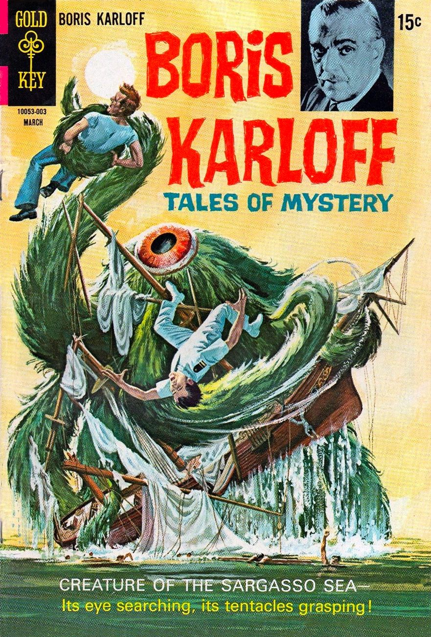
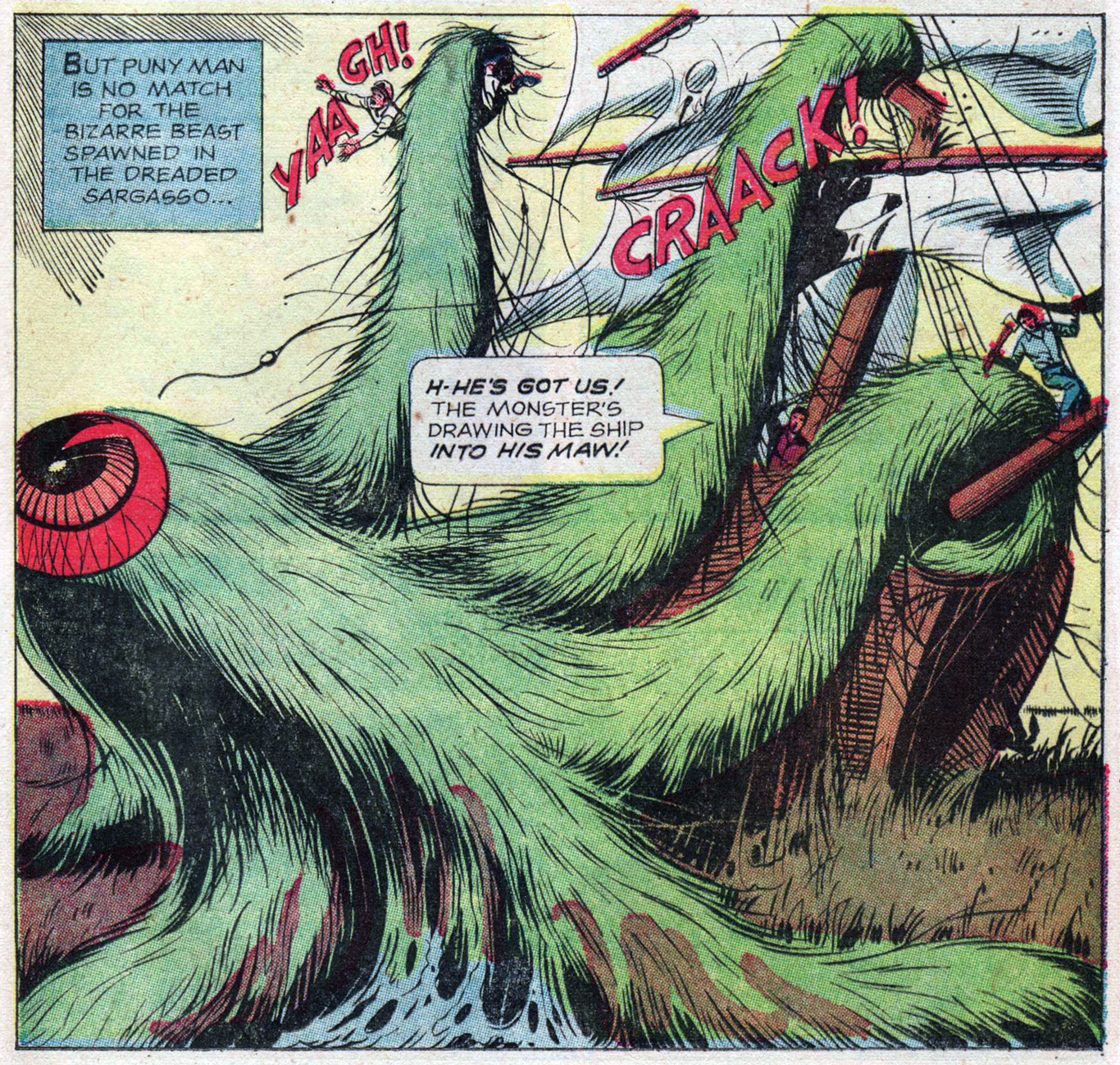
Speaking of the Sargasso Sea (frequently depicted in fiction as a perilous area where ships go to die, mired in Sargassum seaweed, unable to escape), here’s another vignette about that mysterious spot. Incidentally, it is the only sea that doesn’t have land boundaries, enclosed by the Gulf Stream on the west side, the Canary Current on the east, the North Atlantic Current on the North and the North Atlantic Equatorial Current on the South. No wonder people thought it was full of mystery and danger! Even I, more or less immune to the siren’s call of wild maritime adventure, feel a little thrill at its mention. *Ahem* back to comics.
Boris Karloff Tales of Mystery no. 29 (March 1970), painted cover by George Wilson.
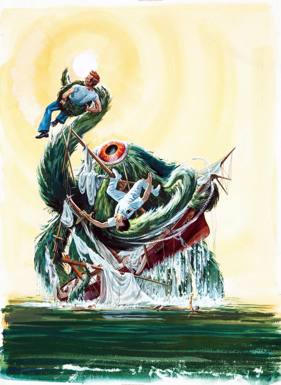
As is often the case, the original painting has a lot more detail than the printed version:
The original painting for “Creature of the Sargasso Sea” by George Wilson.
What does this peculiar, one-eyed beast look like closer up, one might ask? Something like this:
A page from Creature of the Sargasso Sea, pencils by John Celardo and inks by Sal Trapani. Furry octopuses are my favourite!
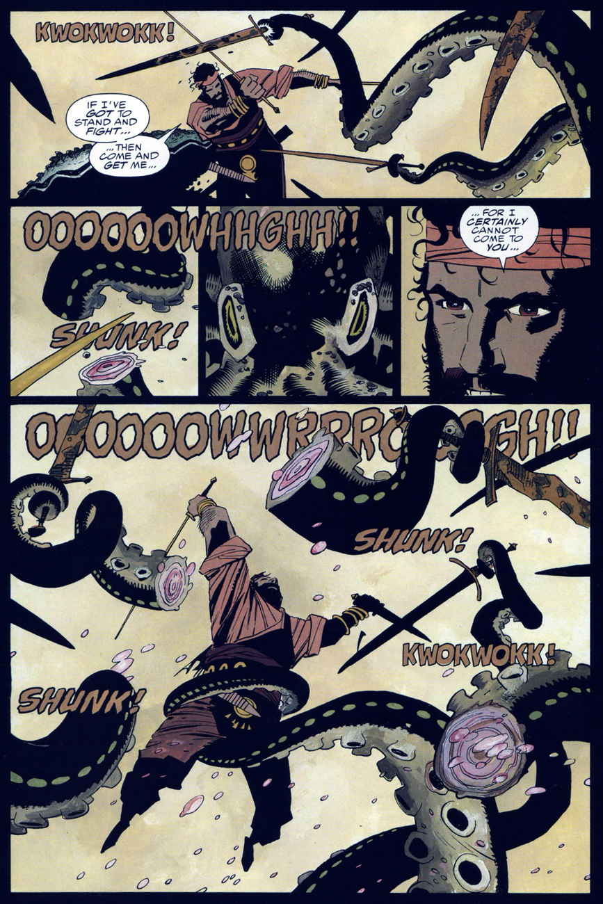
The sea can bring many (other) strange things, including a sword-wielding octopus… who should have stayed in the water, where he had the home advantage, instead of attempting to wage battle on sort-of land.
A couple of pages from Fafhrd and The Gray Mouser, a comic adaptation of Fritz Leiber’s cycle of sword-and-sorcery stories. Adaptation by Howard Chaykin, art by Mike Mignola, who’s inked by Al Williamson. This 4-issue series was anthologized in 2007 by Dark Horse; these pages were scanned from Book 4, published in 1992 by Epic Comics.
One can only hope to be as stylish while fighting a many-tentacled monster.
« Are all your projects this dangerous, Dr. Solar? »
Dateline: 1962. Printer-packager Western Publishing had just dealt its biggest client, Dell Comics, its slow death sentence (by mutual agreement, it is diplomatically claimed), though Dell should have seen it coming: for decades, Western Publishing Co. had « secured the rights, created the comics, printed them and shipped them out for Dell. Dell acted as the publisher and distributor and did the billing and paid Western for its creatively manufactured products*. » In 1962, Western cut out the middleman and launched its Gold Key imprint (1962-1984.)
Enter, briefly, revolutionary illustrator Richard M. Powers (1921-1996), who successfully wed representational and abstract art for his paperback covers of the 50s and 60s, bringing science-fiction visuals an unprecedented visual maturity. Don’t merely take my word for it: treat your peepers to a gander at his work. You may well find that you know it already.
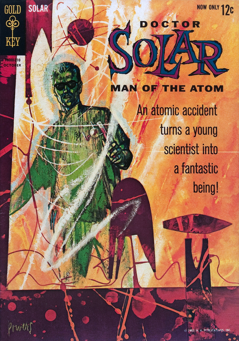
What with a Cold War on, in the early 60s, atom-powered heroes were understandably in vogue. Charlton even had two: after Al Fago‘s 1955 creation Atomic Rabbit, came Joe Gill & Steve Ditko‘s Captain Atom. In 1962, the newly-founded Gold Key threw their hat into the nuclear furnace with the advent of Doctor Solar, Man of the Atom. He was created by writer Paul S. Newman and editor Matt Murphy.
Doctor Solar, Man of the Atom no. 1 (October, 1962)
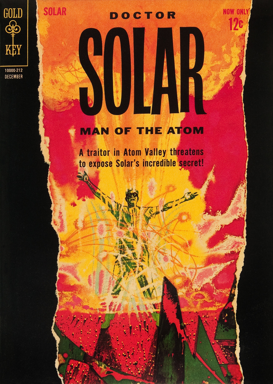
Doctor Solar, Man of the Atom no. 2 (December, 1962)
So far so good, right? And then… we may never know exactly what transpired, but I assume that some art director at Western Publishing chose to second-guess Mr. Powers… smothering the tonal and compositional balance of his painting (« can’t… bear… negative space! »), and likely depriving the outfit of Powers’ further services. He was at his peak, was being offered assignments than he could hope to fulfill, assignments surely more lucrative and friction-free. He wisely scooted along.
The printed version:
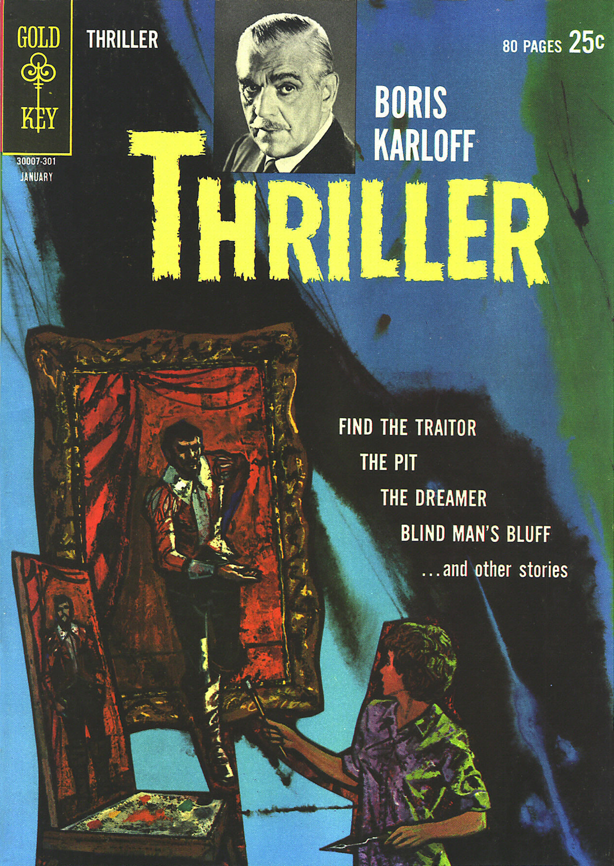
Boris Karloff Thriller no. 2 (January, 1963.) It was decades before I realized that this ho-hum comic book cover was the work of Richard Powers. In truth, the scales only fell from my eyes when I caught a peek of the original art. The printed version is so tame, so drained of its power(s) that the issue didn’t even appear in Jane Frank’s checklist of book covers in her fine The Art of Richard Powers (Paper Tiger, 2001).
See? Now *that* is clearly Powers. « Just slap a 60% cyan overlay over the dang thing, Gertrude. It’s too effin’ artsy! »
And the tale might have ended there, but here’s the curveball: in the mid-to-late Seventies, Powers provided the fading publisher with a pair of gorgeous, but seldom-seen cover paintings.
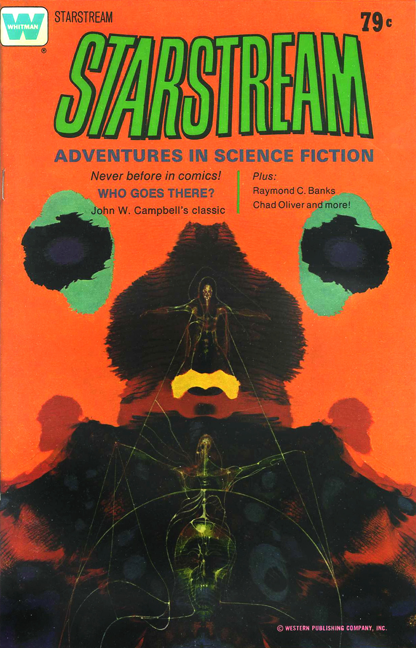
A lovely Rorschach blot of a cover for the inaugural issue of Starstream, issued in 1976 under Western’s Whitman imprint. Starstream‘s four issue-run offered sober adaptations of smartly-chosen science-fiction short stories by the exalted likes of Theodore Sturgeon, Robert Bloch, A.E. Van Vogt, Robert Silverberg, Isaac Asimov, Larry Niven, Jack Williamson, et al.
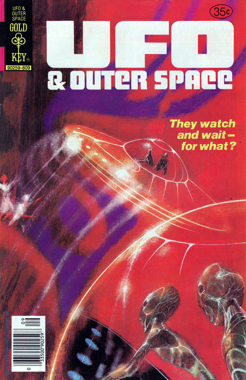
Let’s hear it for unearthly-looking extraterrestrials. With their translucent skin, these guys remind me of unhatched fish. The fifth and final cover created by Richard M. Powers, this is UFO & Outer Space no. 17 (continued from UFO Flying Saucers), published in September, 1978.
See what I mean?
If memory serves, my own Powers epiphany took place in the autumn of 1982, in Lennoxville, a small college town in the Eastern Townships of Québec. There was this little bookstore… and its fine selection of 60s horror and science-fiction paperbacks, priced in the 35-to-50-cents range. The kind of place book lovers dream about stumbling upon, and wake up dismayed to find themselves in the real world… empty-handed.
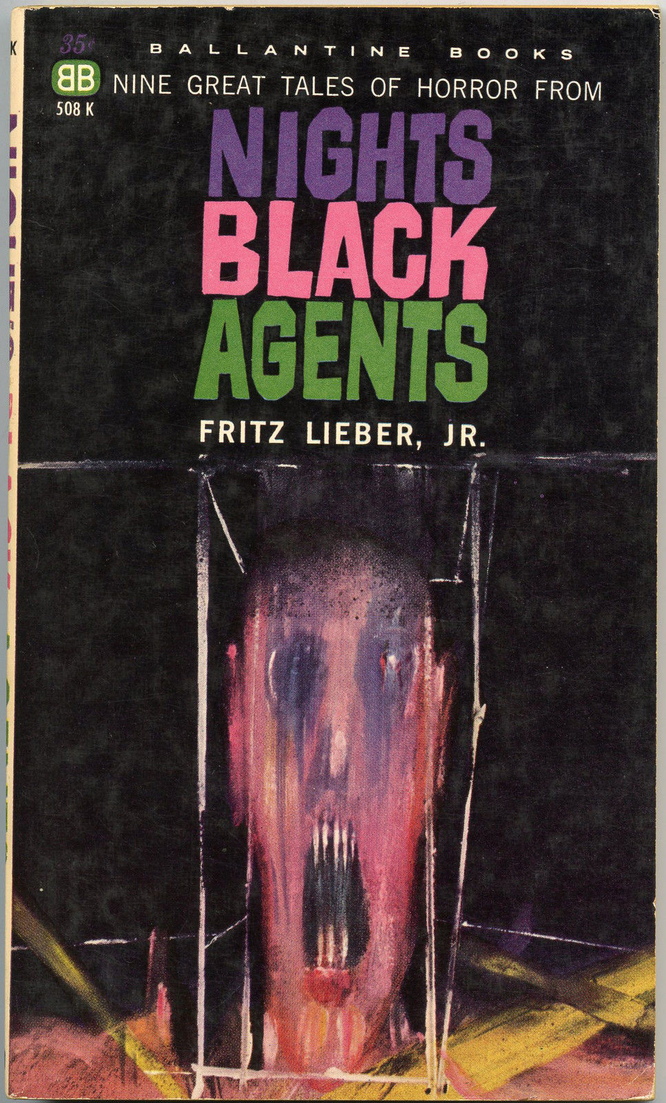
My favourite (inside and out) of the lot I picked up that day? Fritz Leiber’s (despite the name being misspelled on the cover) Night’s Black Agents (June 1961, Ballantine Books). If you’ve had a similar thrill of discovery with Powers’ art, please do tell us about it!