As co-admin RG recently pointed out, we are in the middle of a move, which is not terribly conducive to long, contemplative posts, so I suppose this one could be called a bit of filler. I (for one) am always happy to look at some pretty pin-ups, and no labyrinth of boxes is going to stand in my way.
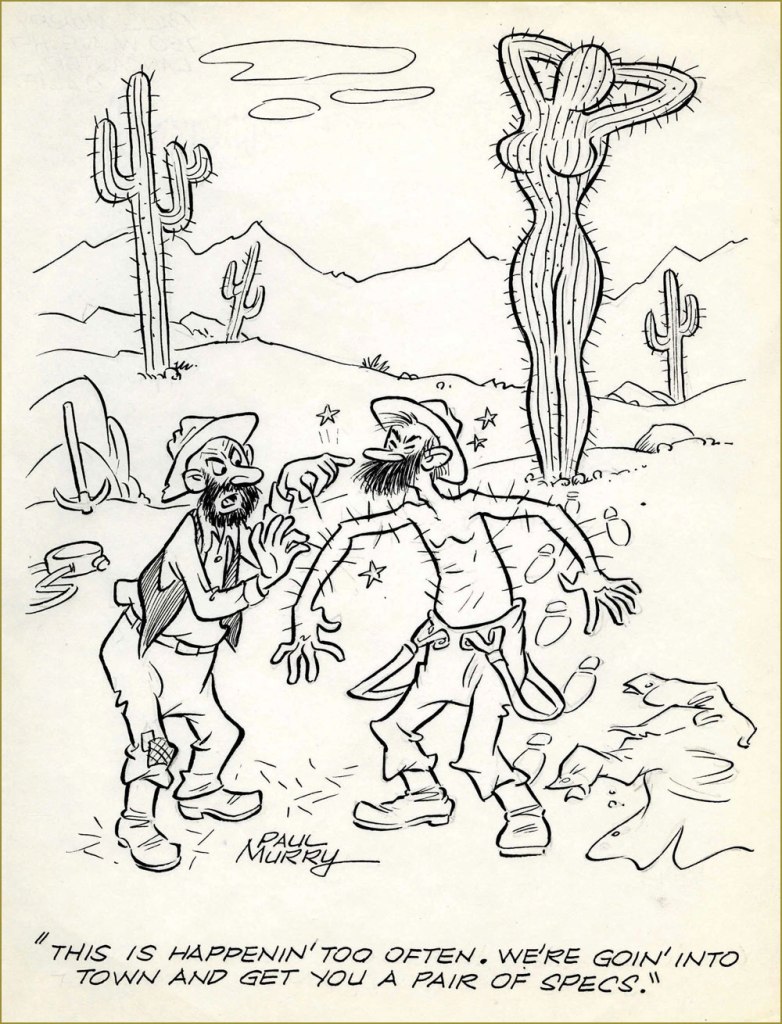
If you’re at all interested in Dell or Gold Key comics, you’re likely already familiar with the work of Paul Murry (1911-1989), whose Disney characters regularly appeared in their pages between 1946 and 1984. His life followed an interesting path – a farmer in his native Missouri, he started working for the animation department of Disney Studios in the late 1930s, then branched out into Disney’s comic department in 1943, working on newspaper strips (Uncle Remus and His Tales of Brer Rabbit in the mid-40s, the fun Buck O’Rue in the early 50s) and the aforementioned Dell/Gold Key Disney imprints.
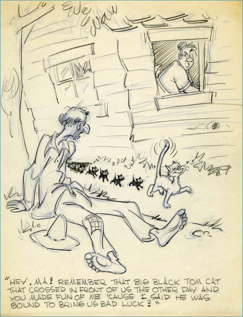
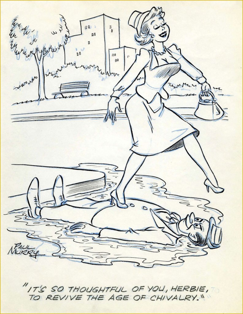
Murry also drew girlie cartoons, and quite good ones, too. Working in animation yields handsome artistic dividends, but one might also say that Murry, with his discerning eye for dynamic anatomy, was made for it. Here’s a batch of them from the 40s and 50s.
… with the exception of this one, which is from the 30s, and ‘attributed’ to Murry – good enough for me.
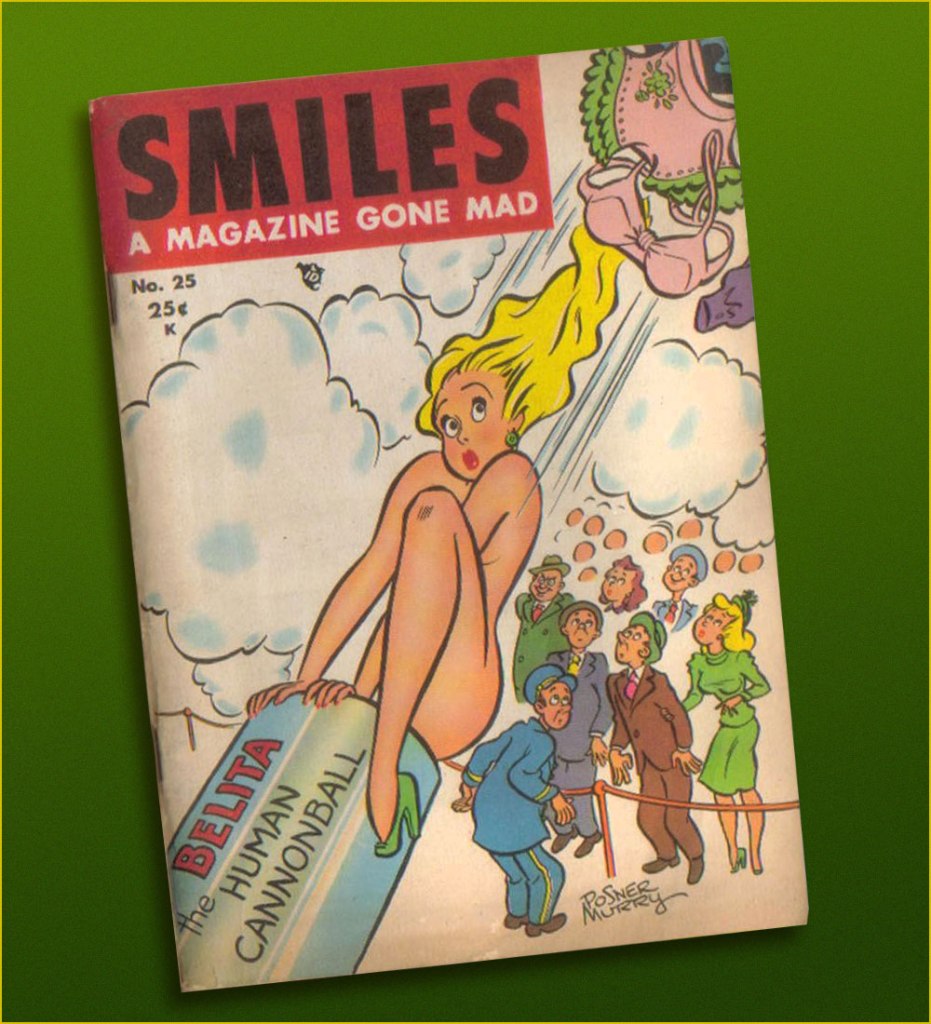
Smiles no. 25 (spring 1948) – ‘Posner Murry’ is one of his aliases.
You can peruse more images at the Sekvenskonst blog (including a sequence of Murry Monday posts!)
Random fact of the day: in Russian, cats make a ‘murr’ sound (pronounced like ‘moo-rrr’, with a rolled R at the end), and that explains the title of this post.
Today, Paul Reubens (born Paul Rubenfeld on Aug. 27, 1952) celebrates (in the coolest style, to be sure) his seventieth birthday. What’s he got to do with comics? Well, he obviously reads them, and his alter-ego, Pee-wee Herman, once met legendary small-scale comics hero Bazooka Joe.
This momentous occasion took place on the back of card no. 18 (of 33) from Topps’ delirious Pee-wee’s Playhouse set (1988). Introductions were arranged by that dapper bon vivant, Mark Newgarden.
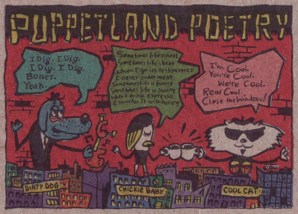
This is happily one of those rare occasions when the word ‘Fun’ is accurately evoked. While Mr. Reubens wasn’t directly involved with the conception and concoction of this splendid ‘Pak’, he signed off on every aspect of it — no generic licenced product, this.While the front of the cards bore the standard, time-tested ‘photographs with captions’ images, the backs is where the anarchic action was. Here are a few samples. Note the unbleached cardboard, which adds a certain primitive je ne sais quoi.“Remember — you are an ARTIST!”The Puppetland Band, those adorable beatniks, were always favourites.Cartoonists Mark Newgarden and Kazimieras ‘Kaz‘ Prapuolenis write in!
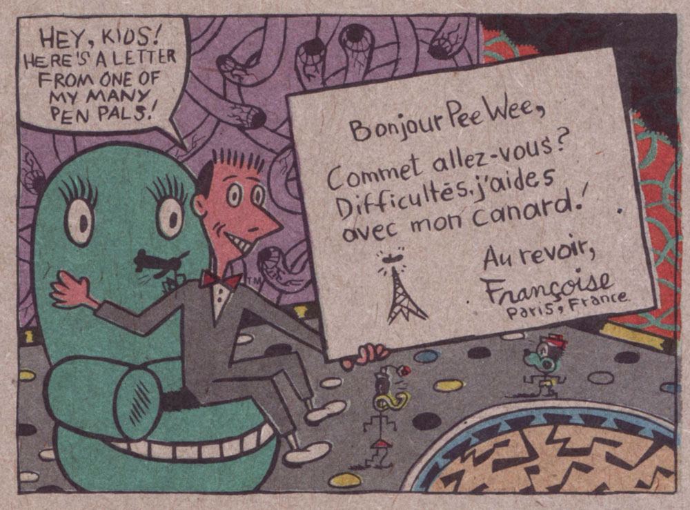
Funny, I would have expected Françoise Mouly‘s french to be better than this. Perhaps that’s why she moved to NYC. A sheet of stickers… featuring, front and centre, Roger from Monsterland (‘Look’ was the secret word that week).Temporary (sorry) tattoos. It was just to difficult to pick just one sheet, so here are two. The “Pee-wee Copter”, front and back.If you think you recognized the distinctive stylings of messrs. Charles Burns on the front and those of J.D. King* on the back… kudos on your discerning eye, keen one.
At one time, during Pee-wee’s heyday, I dated for a few months this girl from a, to put it mildly, conservative family. Her little brother was expressly forbidden from watching Pee-wee’s Playhouse, for fear that ‘it might turn him gay’. Live and learn… do check out this smart list of The Best 25 Pee-wee’s Playhouse Moments.
Happy birthday Paul, and a great weekend to you, Pee-wee!
Bonus time: in a case of ‘biting the hand that feeds’, Topps issued this snarky entry as part of its 1991 Wacky Packages series. Concept, writing and layout by Mark Newgarden, painted art by John Pound.
– RG
*a grateful tip of the hat to Mark Newgarden for the inside dope!
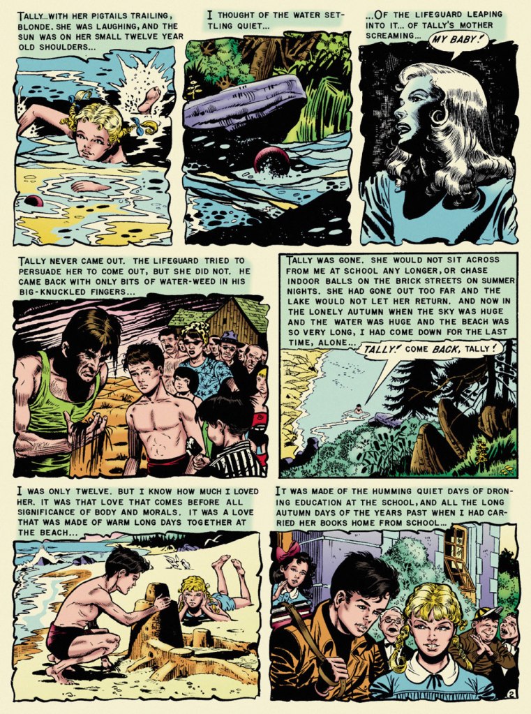
« And by the time they reached the shore of the quiet lake the sun was clouding over and fog moved in across the water so swiftly and completely that it frightened Doug to see it move, as if a great storm cloud from the autumn sky had been cut loose and sank to engulf the shore, the town, the thumping, happy brass band. » — Ray Bradbury, Farewell Summer (1980)
With summer on the wane — never mind the heat and humidity! — it seems fitting to feature, on the one hundred and second anniversary of Ray Bradbury’s birth, what’s possibly my very favourite EC comics adaptation of his work, Al Feldstein and Joe Orlando‘s ‘The Lake’. The other contenders jockeying for the top spot would be Johnny Craig‘s ‘Touch and Go!‘ (from the story ‘The Fruit at the Bottom of the Bowl‘) and Bernie Krigstein‘s ‘The Flying Machine‘. This mournful coming-of-age story was a speck of maturity in a boundless hinterland of juvenilia. I was agreeably surprised to find that there are some who concur with me on that point:
« It is hard for me to imagine how the 1953 comic book reader must have reacted when they picked up Vault of Horror #31 and read “The Lake” (adapted by Feldstein and Joe Orlando). The same month, Batman was fighting a crime predicting robot and Superman was helping to peel potatoes for Lois Lane during her stint in the Women’s Army Corps. So to go from that to this, a hauntingly sophisticated tale of a young boy obsessed with the death of his childhood sweetheart, must have been mind-blowing. »
Now, I trust I don’t have to school you about the life and times of Mr. Bradbury (1920-2012). Were it the case, I’d still skip the lesson, thanks to this 1953summary, which will suit our current purposes just fine:
The good folks at EC comics, namely those in charge — proprietor William Maxwell Gaines and his loyal acolyte and second-worst artist, Al Feldstein — decided to adapt the works of young Ray… without bothering to first secure his blessing. After a few (splendid) adaptations, Bradbury shrewdly wrote: « Just a note to remind you of an oversight. You have not as yet sent on the check for $50.00 to cover the use of secondary rights on my two stories ‘The Rocket Man’ and ‘Kaleidoscope.’ . . . I feel this was probably overlooked in the general confusion of office work, and look forward to your payment in the near future. ». By 1953, the collaboration was well established, and so…
Bless her soul and all that, but I found Marie Severin‘s latter-day recolouring for Fantagraphics’ ‘definitive’ edition to be on the garish side, so I’ve toned it down somewhat. Computers aren’t for everyone. Russ Cochran‘s stunningly ambitious and still-definitive The Complete EC Library featured John Benson, Bill Mason and Bhob Stewart‘s insightful and in-depth interviews and notes. Here’s what Benson wrote about The Lake:
« One of the few serious errors in the EC Bradbury adaptations is Joe Orlando’s imagery in ‘The Lake‘. Ignoring the many clues in the text (the long beach, the sand, the incoming waves) and taking his cue only from the title, Orlando drew a mountain lake, with pines and rushes, and a lodge in the background. But Bradbury’s lake was Lake Michigan, and this is a story that draws on the special poignance of the first autumn days at a large tidal beach. Had Orlando drawn on his undoubted experiences of the Atlantic seashore, he would have come much closer to the spirit of the original.
Readers who compare the dialogue in the EC version with the full version of the story in The October Country will find some seemingly inexplicable differences. The explanation is not that Feldstein cavalierly tampered with Bradbury’s text but quite the opposite. Feldstein was faithful to the story as it appeared in the May 1944 Weird Tales and in Bradbury’s first book anthology Dark Carnival (now long out of print). It was Bradbury himself who rewrote passages for this and other stories in The October Country, published after the EC adaptations. »
Orlando’s a funny guy. Like Harry Harrison, he started out as a friend, collaborator and friendly competitor of Wally Wood‘s. Unlike Harrison, who left the comics field to become a successful SF writer, Orlando was briefly able to more-or-less keep pace with Wood. It must have been nerve-wracking and of course quite unsustainable. While I hold that Orlando’s most aesthetically accomplished art job is ‘A Rottin’ Trick!‘ from Tales from the Crypt no. 29 (Apr.-May 1952, EC) and his most significant has to be anti-racist parable ‘Judgment Day!‘, from Weird Fantasy no. 18 (Mar.-Apr. 1953, EC), ‘The Lake‘ triumphs, thanks to its writing. After his peak of ’52-’53, Orlando’s art deteriorated fast. He made a bit of comeback in the mid-60s (the ‘Adam Link‘ stories at Warren were highlights) but… that’s when he was more often than not signing his name to Jerry Grandenetti‘s work. He found his niche as an editor at DC, and whatever artwork he produced thereafter seemed, to me, rushed and half-hearted. But he was a pretty good editor!
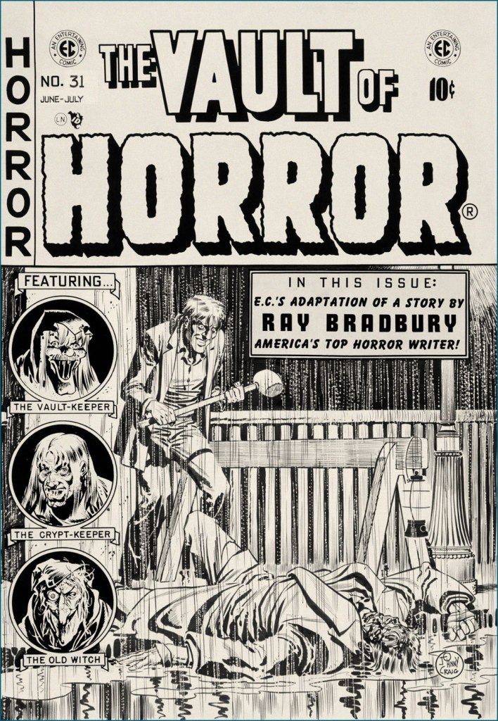
It’s a bit incongruous that what must be EC Comics’ quietest, most ruminative horror story should appear under one of its most violent (‘hard hitting’ comes to mind… literally) covers. Johnny Craig’s work could be — and generally was — quite understated, but on days when he wasn’t in that particular restrained frame of mind… look out! This is the original cover art from Vault of Horror no. 31 (June-July 1953, EC).
In closing, a word of warning: you’ll be seeing precious little of us in the coming month of September, as we’re preparing ourselves for a major change of domicile. We’ll be living in boxes for a spell, but I’m hoping to be back in time for the annual Hallowe’en Countdown. The show must go on!
« Pretty soon, they had me working at the stat machine and the PhotoTypositor, or touching up stripper photos for the Trocadero Burlesk ads. Mostly putting some underwear on them. I may as well have been Vincent Van Gogh, for all I knew. I was in heaven. » — Brooks recalls his formative years
At first blush, I’ve immensely admired cartoonist-illustrator-historian (and so on) Lou Brooks (1944-2021) and his assured line. An ever-eager autodidact, Brooks handily achieved a feat that sets the mind a-reeling: soaking up ‘low’ illustration styles and the essence of faceless pictorial ephemera (think comic book ads, matchbooks, bar coaster and napkin art…), Brooks miraculously derived, from this primeval soup, his unique style, paradoxically bland (by design!) yet instantly recognizable.
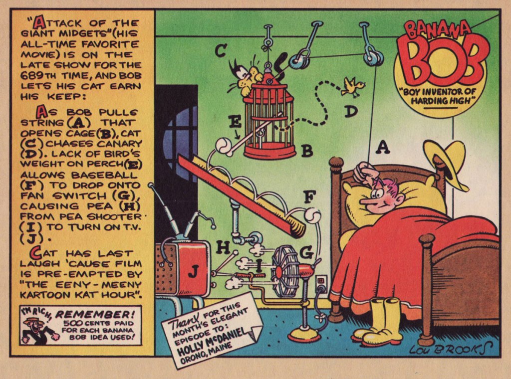
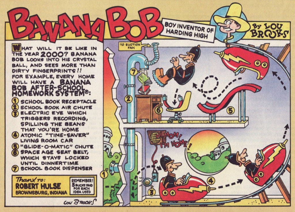
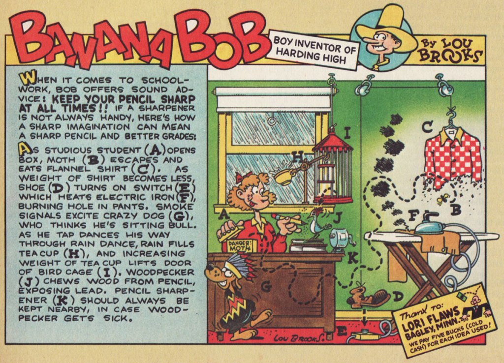
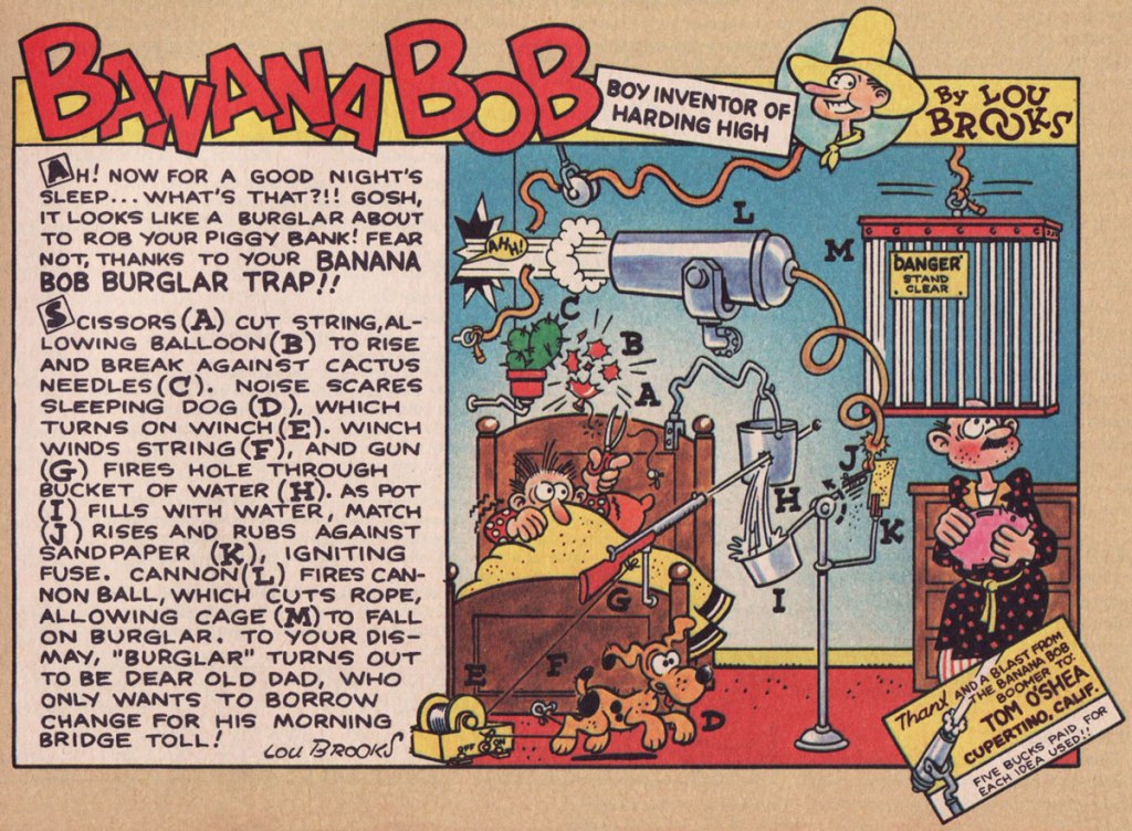
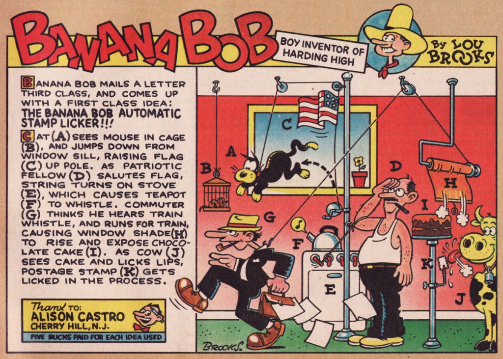
One of Brooks’ earliest jobs in the badlands of professional cartooning was a strip he produced for Scholastic‘s Bananas (1975-84), a skewing-slightly-older companion to the publisher’s big hit Dynamite (1974-92). Banana Bob, “Boy Inventor of Harding High” exploited the time-honoured gizmo formula hatched in 1912 by Rube Goldberg with the twist that here, the doodads were contrived by readers and given visual interpretation by Brooks. Banana Bob ran for the mag’s first twenty-nine issues.
With the early strips, Brooks was still fine-tuning the works. With a dozen or so under his belt, he hit his stride. This one’s from Bananas no. 12.From Bananas no. 13. Foo! There’s our pal, Bill Holman’s Spooky the cat (though he’s lost his bandage)!From Bananas no. 16.From Bananas no. 18.From Bananas no. 19. And add a dash or two of Bill Holman… Brooks knew his stuff, all right.From Bananas no. 20.From Bananas no. 21. I see shades of a Jay Lynch influence!From Bananas no. 24.From Bananas no. 25.From Bananas no. 26.From Bananas no. 27.From Bananas no. 28.… and the series’ full-page finale, from Bananas no. 29, aka the 1979 Bananas Yearbook.
Though Brooks had already developed his trademark style — as evidenced by other illustrations he did for Bananas — he didn’t fully employ it on the Banana Bob strip. If memory serves, here’s where I first encountered a full-fledged Lou Brooks wallop, and I suspect I’m not alone in this (our younger readers are likelier to have first come across his exemplary revamp of the old Monopoly game):
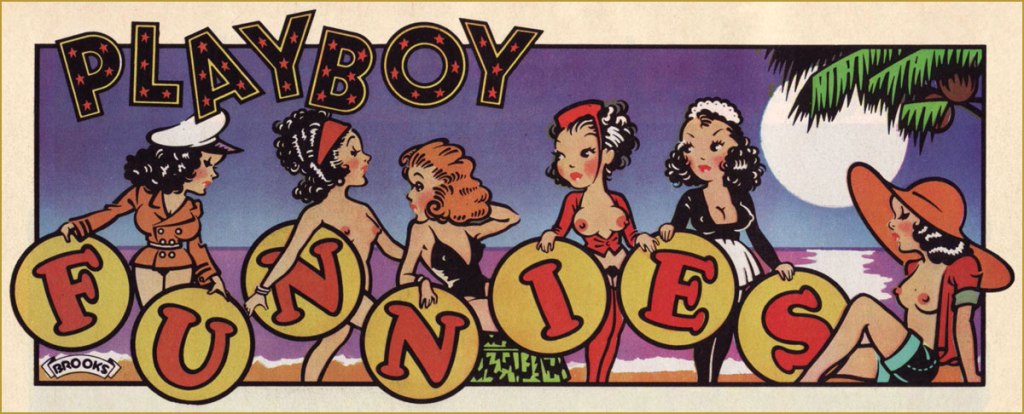
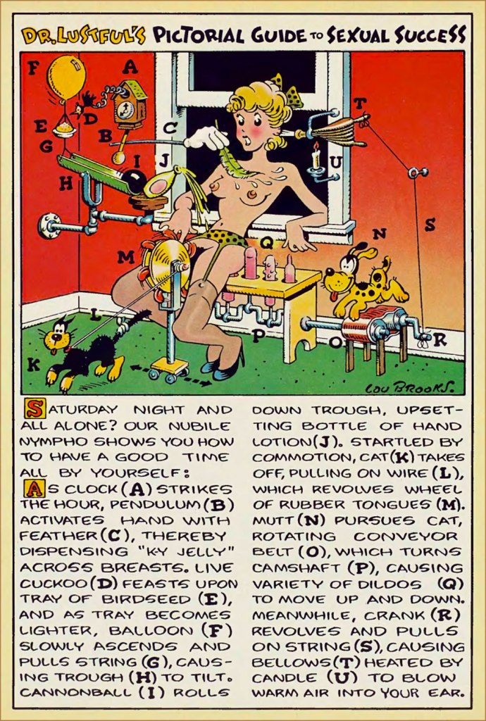
As Brooks evidently knew a good theme when he had one, here’s his Goldberg Variation for Playboy:
From Playboy’s December, 1977 issue, and featuring another fun guest appearance by Spooky the cat.
… and speaking of Mr. Spiegelman, here’s a collaboration between titans. It appeared in the January, 1980 issue of Playboy.
Of course, there’s so much more to Lou Brooks than one could conceivably cover within a mere blog post. To that end, we have a handy little biopic entitled A Guy Named Lou — filmed entirely in Illustr-O-Vision!
Brooks was an assiduous chronicler of the history of reprographics — don’t miss his jaw-dropping Museum of Forgotten Art Supplies. While he did a bit of everything to keep himself amused and occupied, he never lost sight of his vocation, of his one true love — I mean, he was in a band (with Bill Plympton!), but it was called Ben Day and the Zipatones!
« Somebody said that drawing a page of comics ought to be as easy as writing a letter to a friend. So I did just that. I took a bit of paper and drew in ink whatever came into my head. I tried to surprise myself. If I made a mistake it would just have to stay there.» — Brian Bolland
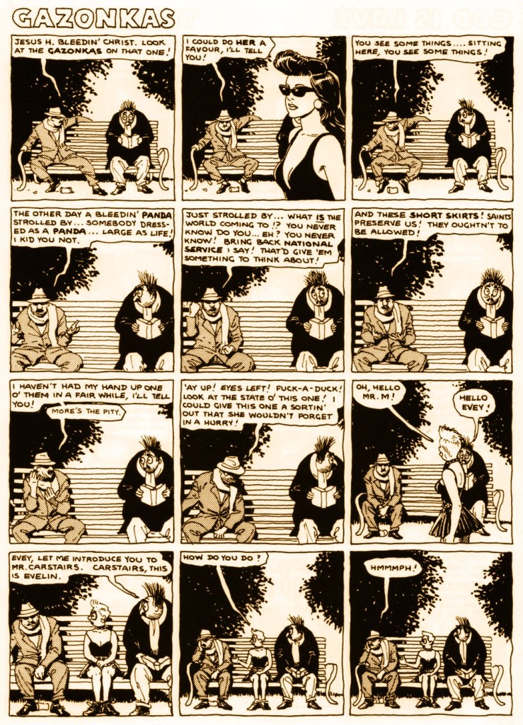
Brian Bolland‘s habitual style is easy to recognize, and co-admin RG and I are both fond of it. But there was a time when the normally meticulous Bolland decided to do something different, something much more sketchy and spontaneous. The result was the vaguely Armenian-sounding Mr. Mamoulian, who doesn’t look much like one of Brian Bolland’s ankle-biters (unless one is the proud owner of a perceptive eye)… until he encounters some pretty women, which are a dead giveaway.
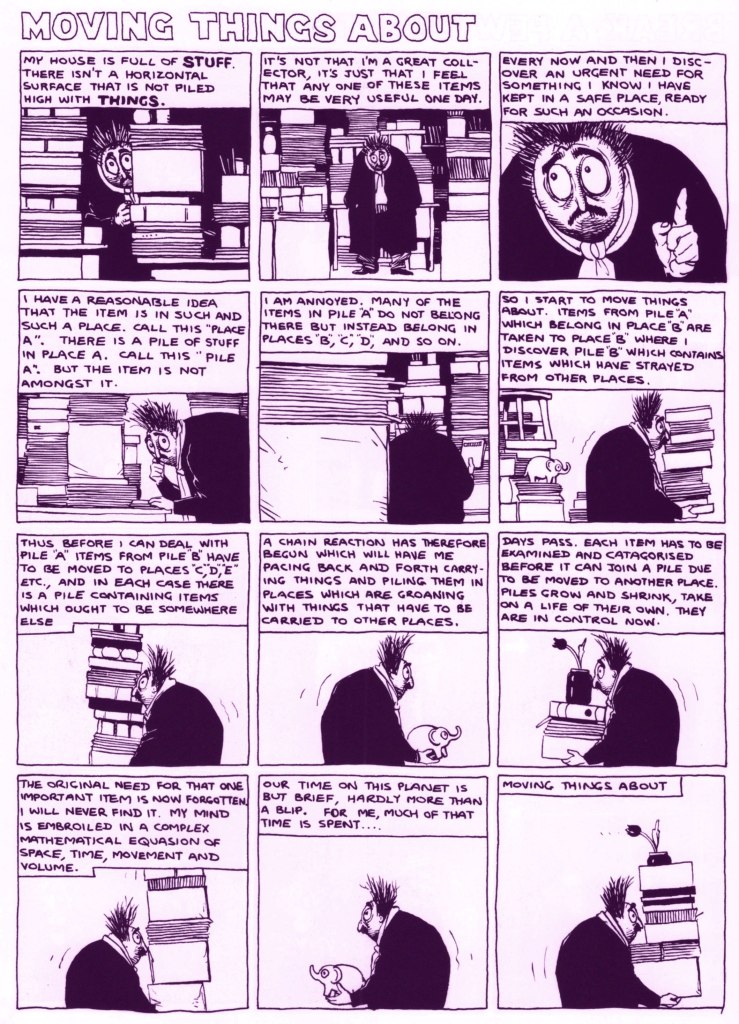
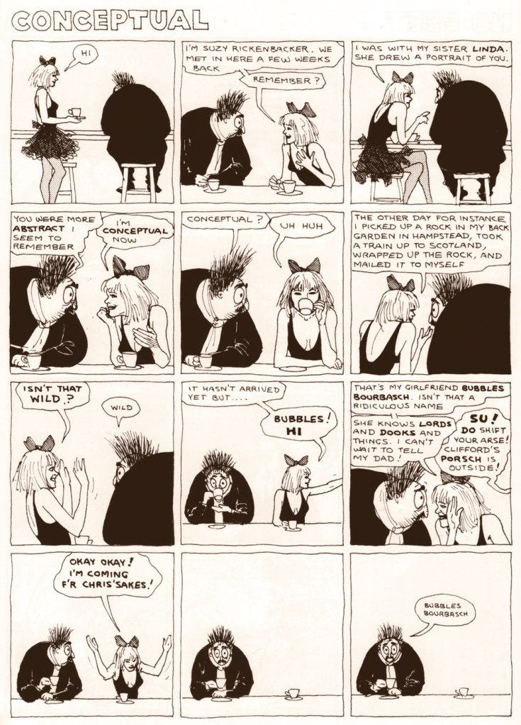
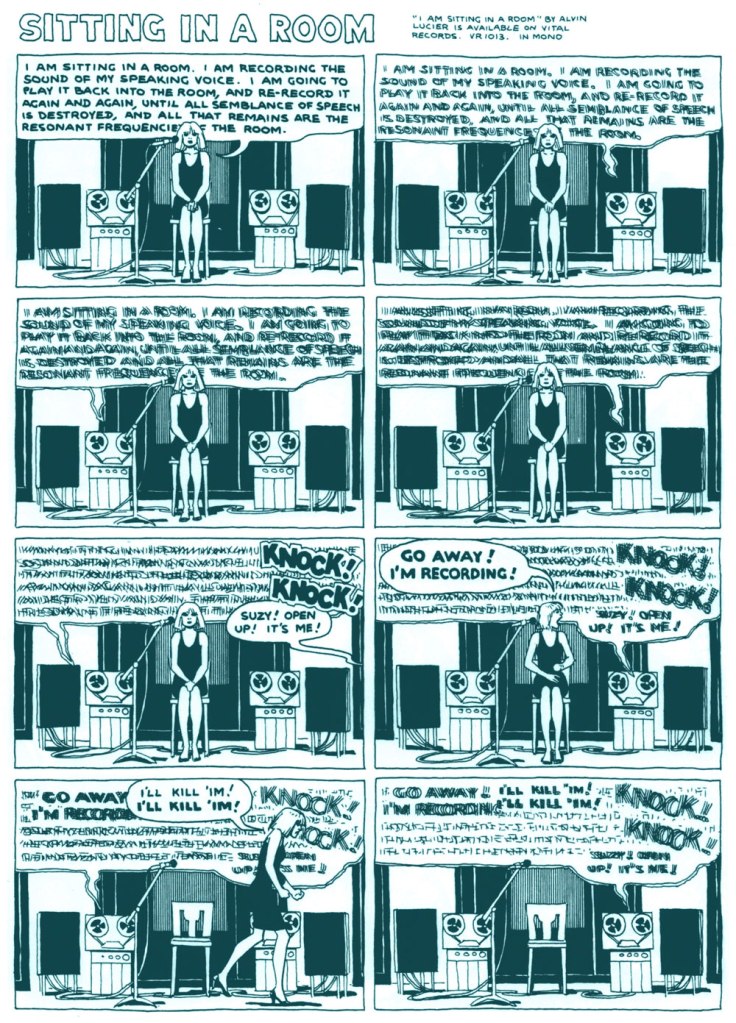
Mr. Mamoulian, a pervy sort of ‘older’ (40-ish?) guy prone to bouts of nihilism and crippled by self-doubt, engages in the sort of things listless people do, when they are not quite sure how to occupy their time*: sit on park benches while others are at work, shuffle stuff around their apartment from point A to point B (and back again), enjoy a cuppa, and stare at the ceiling after waking up in the middle of the night. He is obsessed with feminine beauty, but uneasy with the ramifications of being obsessed with it. Rattled by the passage of time, irked by life’s idiosyncrasies, trapped in and by his body, he’s nevertheless a silly and rather comforting presence as we follow him on one of his aimless traipses around the rainy countryside, witness one of his exchanges with his imaginary naked lady friend (Bubbles Bourbasch), or coo at his surprisingly congenial friendship with punkette Evelin Shit-Face.
* These days, of course, one just stares into a cellphone/binge-watches a show on whatever streaming service, which is prompted by the same impulse, but it somewhat less romantic.
The proverbial beautiful English weather.
The early days of the fragile friendship between Mamoulian and Evie (who, for all her punky pretensions, is a rather well-mannered, thoughtful young woman).
Mamoulian is silent – does he condone Mr. Carstairs’ patter? Disapprove of it? Probably a bit of both. In the end, it’s his behaviour that matters – Evie is a person to him. As for Mr. Carstairs, he’s a spot-on portrayal of a first-class hypocrite.
Here Mamoulian’s reflections are reminiscent of the philosophical musings of Marc Hempel’s Genital Ben.
Mr. Mamoulian is arguably a peephole right into Bolland’s id, but it’s not at all an uncomfortable experience (unlike, say, peeking into the mind of Chester Brown, who creeps me out in a big way), even when the strip goes creepily dreamlike, or addresses uncomfortable topics (for some, the couple of bondage-related pages – not included here to avoid ruffling feathers – would be it; apparently ‘Bolland is noted by some for his use of bondage imagery‘, though I honestly think that’s a bit of an overstatement). In the end, Mamoulian’s character is casually tapping into many sources of frustration and confusion that rattle around most human heads. He is relatable.
Bolland calls Mr. Mamoulian ‘not very good’, but I obviously disagree with this assessment, as you’ve probably noticed by now. I love the sketchiness of the art, its surreal energy. The strip is, by turns, hilarious, depressing and always very, very British (and not just because of the continuous tea-drinking). I believe we can all relate to Mamoulian’s struggles with being alive, and the notions of freedom and art. We also get tantalizing glimpses of punk and metal scene through Evie and Steve’s interludes.
Mr. Mamoulian’s first encounter with Bubbles (off screen), who is later to visit him at night as her imaginary nude self. Interestingly, it seems to be her name, not her looks, that stuns his imagination.
One of American Suzy’s many conceptual experiments.
In terms of style, both in terms of art and storytelling, I suppose this strip fits comfortably into a set of British semi-autobiographical strips from the mid to late 80s – Eddie Cambpell’s Alec and Glenn Dakin’s Abraham Rat, for example, both of them also gloriously funny and contemplative and excellent. As a matter of fact, Mr. Mamoulian was first published in Paul Gravett‘s Escape Magazine* (read a lovely article about it here**), home of Cambell and Dakin’s strips as well…
* Mr. Mamoulian first appeared in Escape no. 11 (1987).
** To quote from the aforementioned article, Glenn Dakin in The Comics Journal no. 238, October 2001, explained that Escape “provided a focal point for people. People would meet up and discuss their dreams and ideas and get together as friends or have arguments and fall out and sometimes even if somebody annoys you or if somebody didn’t seem to have respect for your work, that would be enough to fill you with enough anger to go out there and try to prove them wrong.” Recently, John Bagnall told me, “To some readers at the time, Escape Artists were sometimes generalized as the school of strips “where nothing happened”, but their approaches were actually much more disparate. As for the social scene, there was a loose sense of unity when we would meet up in London, though naturally not everyone got on well or were even huge fans of certain people’s work.
« The people who are always hankering loudest for some golden yesteryear usually drive new cars. » — Russell Baker
We’re having a bit of a scorcher over here, so I’m doing my bit to compensate with a piece set in wintertime.
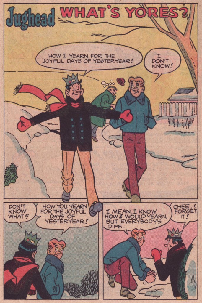
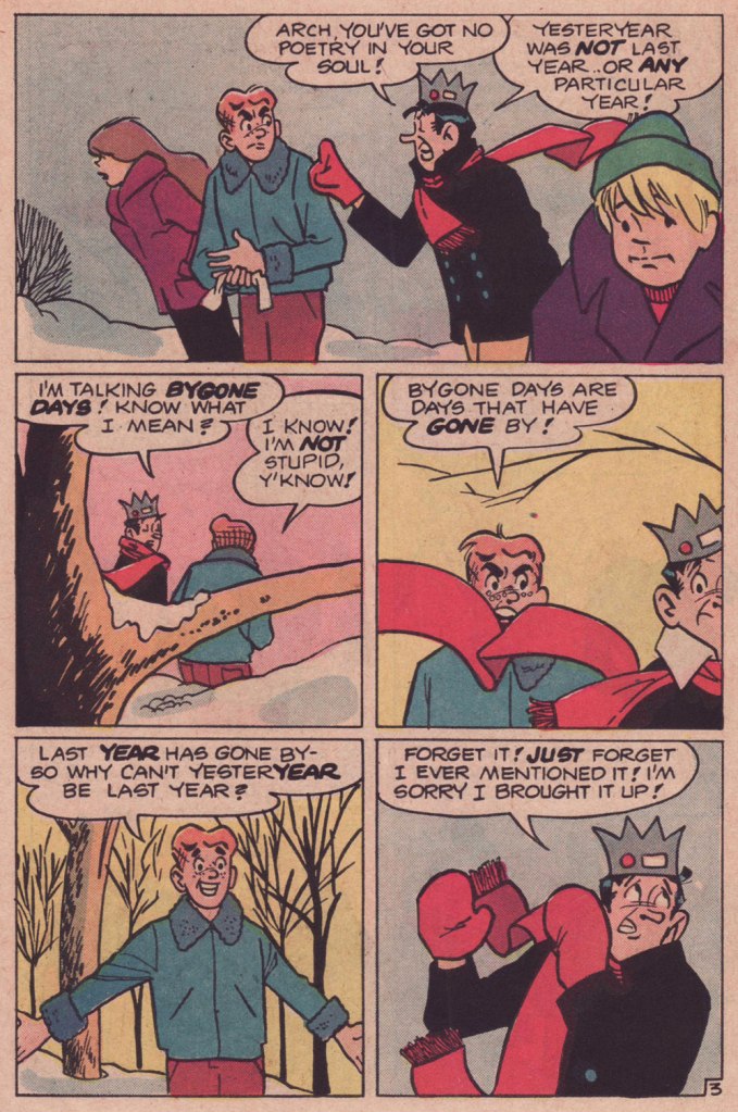
As we surely all know, Archie stories (in the comics at least) are formulaic to a fault. This static state of affairs plays a considerable part in their comforting nature. Sure, all fashions and trends are embraced and discarded, but the characters don’t evolve in any significant, permanent way. No lesson ever sticks.
So on the rare occasion when a writer deviates from the formula, it really shows. This tale, I daresay, is such a specimen. Virtually plotless, it’s a precursor, by more than half a decade, of that rule-breaking « show about nothing »: Seinfeld (1989-1998).
While nothing much happens here in terms of plot, this is a difficult trick to pull, in any medium: as it mainly consists of yadda yadda yadda (but witty yadda yadda yadda… another daunting level of difficulty), it’s talking heads all the way, so you need some great performers who know how to keep an audience engrossed through the minimal means at their disposal.
In comics, this calls for a great illustrator, a master of body language and the art of the mise en scène, namely Samm Schwartz (1920-1997). I shudder — and not with delight — to envision this particular script landing in the hands of a lesser light, which is to say practically anyone in the Archie stable save Bob Montana (but he’d died in 1975) or Harry Lucey (retired and in poor health by then). While he was never credited for anything but his artwork, Schwartz enjoyed a free hand with his regular collaborators’ scenarios (George Gladir and especially Frank Doyle), with their blessing. And he was always enriching his backgrounds with delightful pantomime mayhem.
What’s Yores? originally appeared in Jughead no. 321 (Feb. 1982, Archie). Script by Frank Doyle, pencils, inks and letters by Mr. Schwartz.
Craving more Schwartz? Go on, help yourself to the full spread right here.
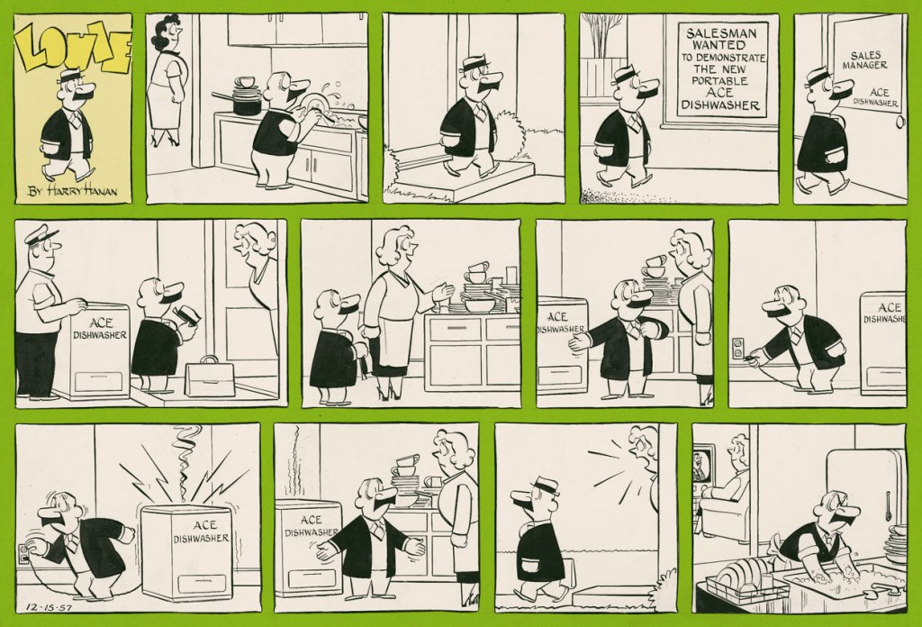
I’ve talked about Harry Hanan‘s Louie before (see Louie Reads Some Ghastly Comics), but as this post dates from the early-ish days of WOT, it included only one image. My opinion of it has also changed. I called it an ‘endearing’ strip, but I’ve come to feel that the overall effect of watching this schlemiel fail at absolutely everything, day after day, is rather bleak. On the other hand, this daily drudgery makes his rare moments of joy stand out in stark contrast.
‘Hen-pecked’ husbands are a favourite topic of all manner of comedians, so in that regard Louie is not an interesting character; as a matter of fact, his insignificance and inability to stand up for himself reek of desperation, and he evokes a mixture of condescension and pity from the attentive reader. I like him best when he’s out alone, observing something weird happening à la Mr. Mum, getting the short end of the stick from inanimate objects – anything is better than being scolded and shoved around by his wife, really.
The series ran from 1947 until 1976. At the very beginning, Louie was an unlucky criminal; when the strip garnered some popularity and English-born Hanan moved to the United States, his character became an honest man, though he seemed to hold a number of different jobs, from the classic door-to-door salesman to soda jerk. He was considerably sprightlier and full of mischief, and instead of his ever-present wife towering over him, he had a shifting cast of females staring with incomprehension at his antics.
Daily from August 2, 1952, seventy years ago and change!
Three daily strips from 1954.
Sunday strip from December 15, 1957.
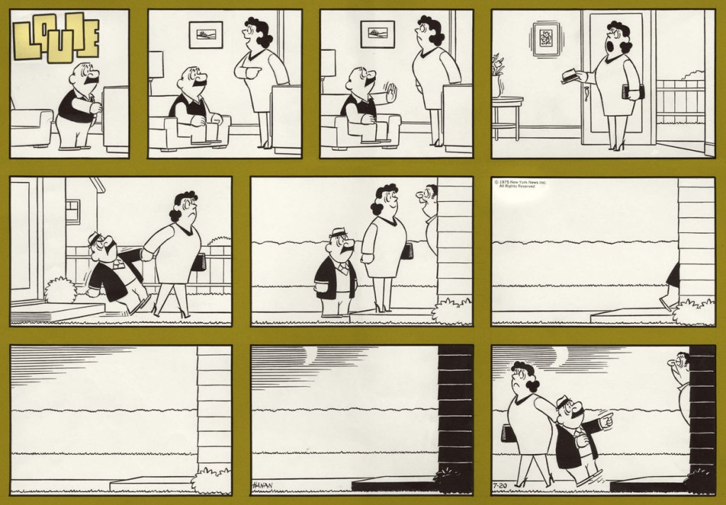
By the 70s, Louie is more of a tired shambling shell, constantly getting yelled at by his wife, his boss, or just about anybody, really. Still, some fun moments occur —
Strip from January 1, 1970. This is the one that made me think of its contemporary (and infinitely superior, sorry) strip Mr. Mum.
Strip from May 3, 1972. Attempts to discipline others as payback for the moments when you are the one being ordered around always backfire…
Strip from January 10, 1972. Once Louie abandoned his omnium gatherum of jobs, he settled down as a typical office worker with an equally typical tyrannical boss.
Strip from 1972 (exact date unknown). The wife looks downright vindictive, which is interesting since quilters I know tend to have the facial expressions of any person engaged in a beloved craft – enthusiastic, peaceful, or concentrated…
Strip from November 14, 1972. An office worker, and one of British origin at that, surely would have an umbrella in his possession?
Sunday strip from July 20, 1975, in which Louie gets (meekly) combative.
The line between domestic comedy and domestic tragedy is a thin one – one of my grandfathers, though not a loser, distinctly marched in the direction indicated by his wife (my grandmother), so I have developed an allergy to that kind of relationship early on. Your mileage with Louie may vary!