« In the bleak midwinter, frosty wind made moan,
Earth stood hard as iron, water like a stone;
Snow had fallen, snow on snow, snow on snow,
In the bleak midwinter, long ago. » — Christina Rossetti
Christmas is nearly upon us, but while a great many will opt to retreat into the miasma of nostalgia to forget what an annus horribilis it’s been, I’ve picked something a bit more appropriately sombre in tone to nail down the occasion.
But with a more hopeful chaser… to balance things out a bit.
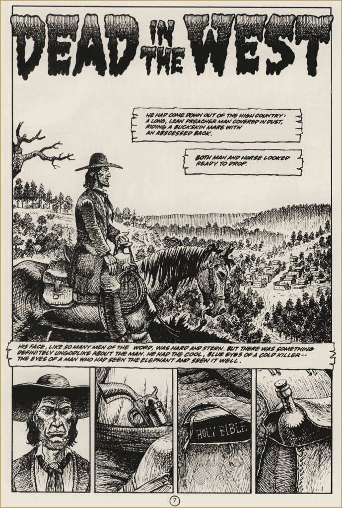
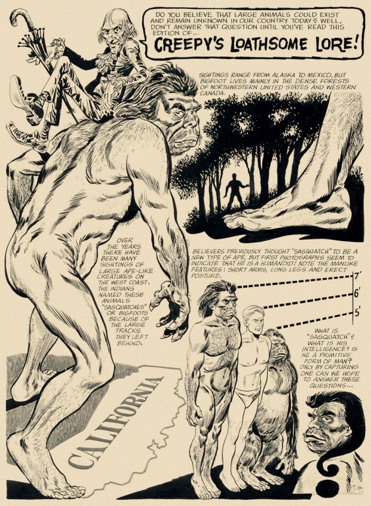
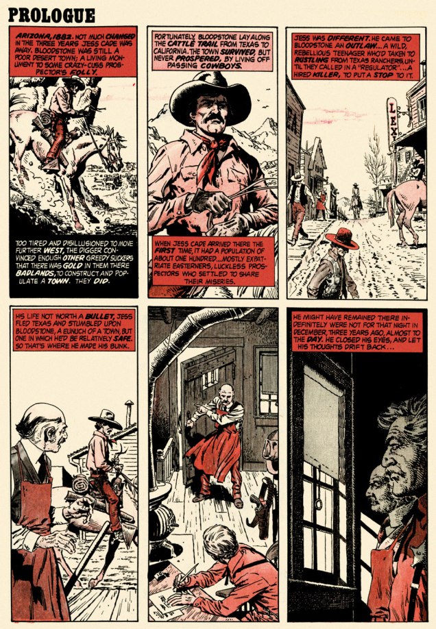
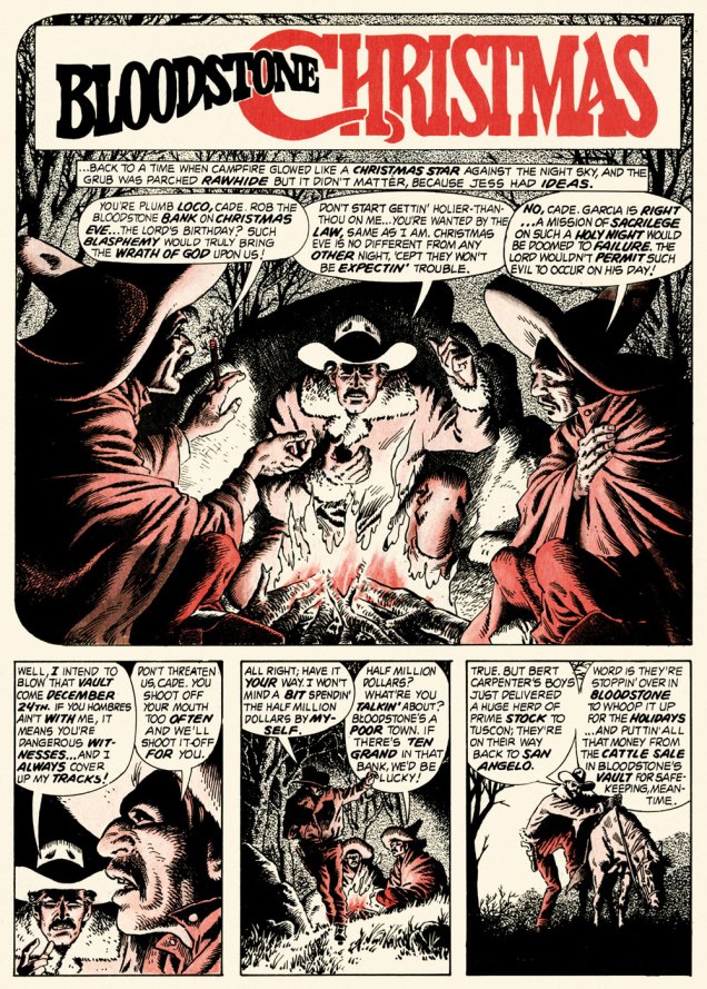
When the indefatigable Carmine Infantino (1925-2013) stepped down from his multi-hatted rôle of publisher, editor-in-chief, cover designer and art director — and so on — at DC, he found that no-one was beating his door down to offer him a similar position.
So he went back to drawing, as a freelancer. As Infantino put it: « Jim Warren was the first comics publisher to contact me after DC. I said “I’ll do work for you, but nothing full-time because I’m busy with other things.” He said, “Okay, whatever you’re willing to give me.” I wasn’t really comfortable with the Warren material — it was the sexiest work I’d ever done! Jim had an older audience and wanted it that way. My feelings about the material never affected the mutual respect Jim and I had for one another. » [ source ]
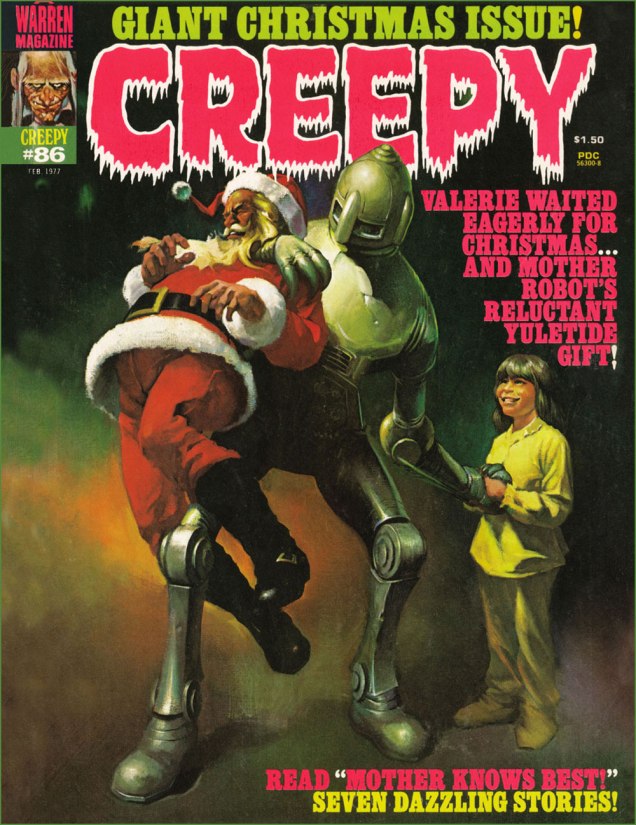
All told, Infantino pencilled around forty stories for Warren in a span of four years. There was even a brief period when he just about monopolized individual issues of Creepy and Eerie, which was offset by pairing him with wildly disparate inkers. Sometimes the results sang, sometimes they croaked.
Here’s a case of rarely combined styles that nevertheless meshed beautifully: Infantino and John Severin. Let’s face it, who’s more reliably excellent than Mr. Severin?
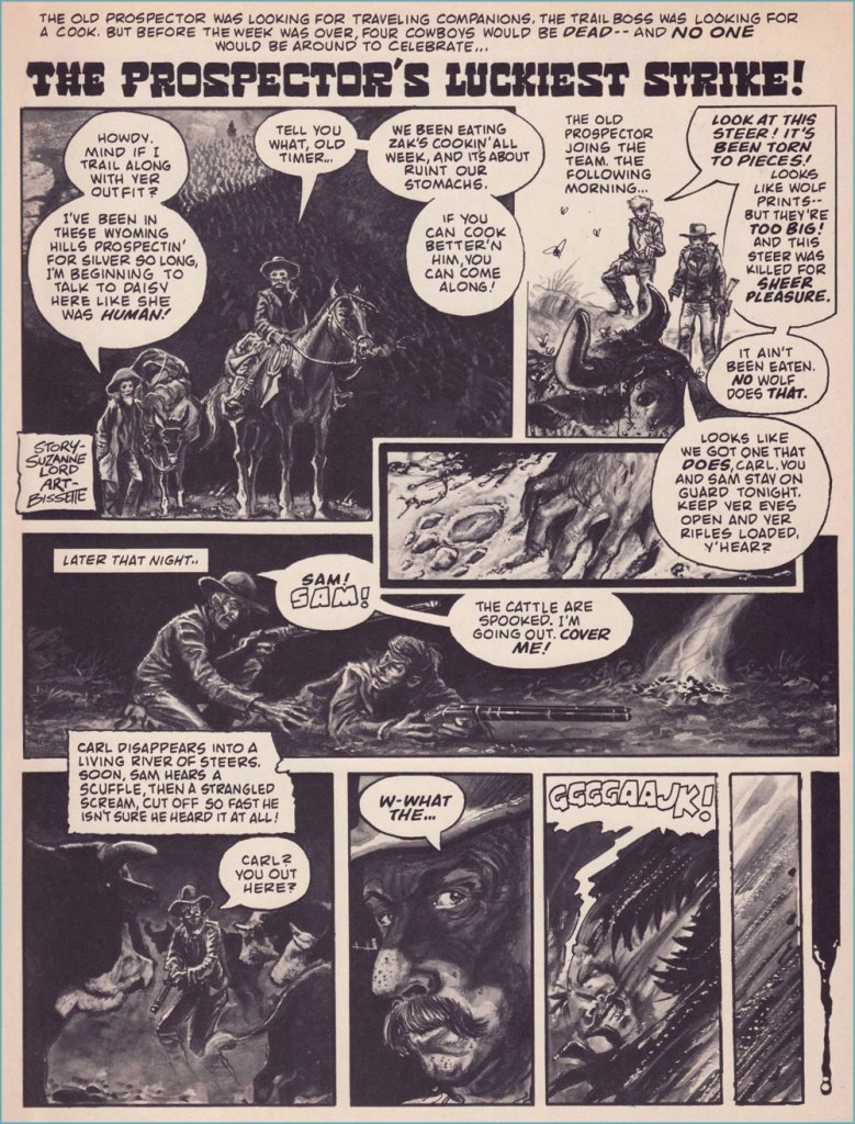
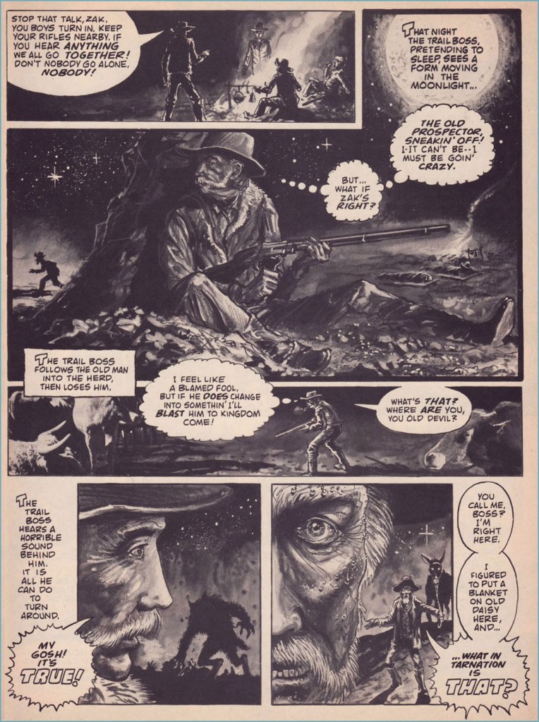
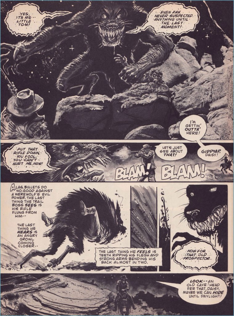
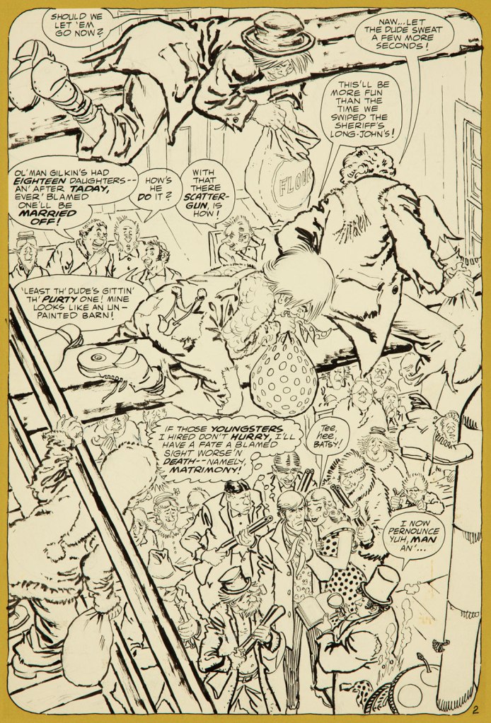
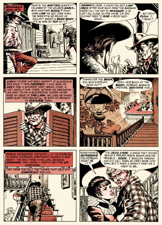
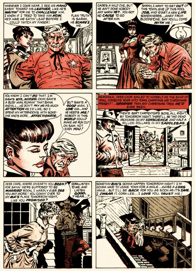
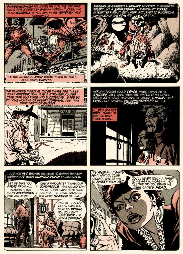
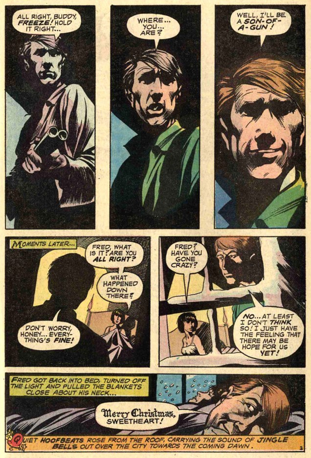
And so this is… Bloodstone Christmas, written by Gerry Boudreau, pencilled by Infantino, and inked by John Powers Severin (1921-2012).
.
.
.
.

.
.

.

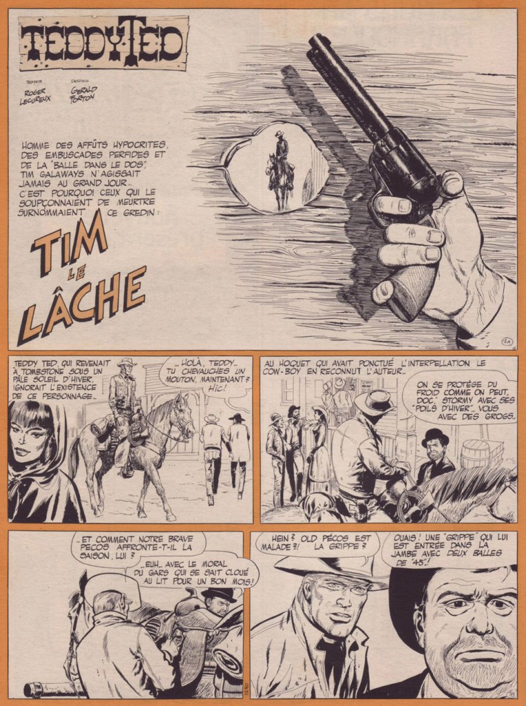
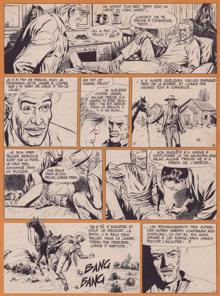
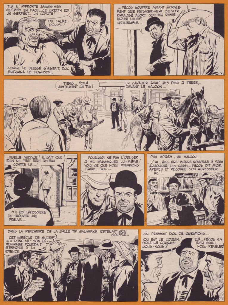
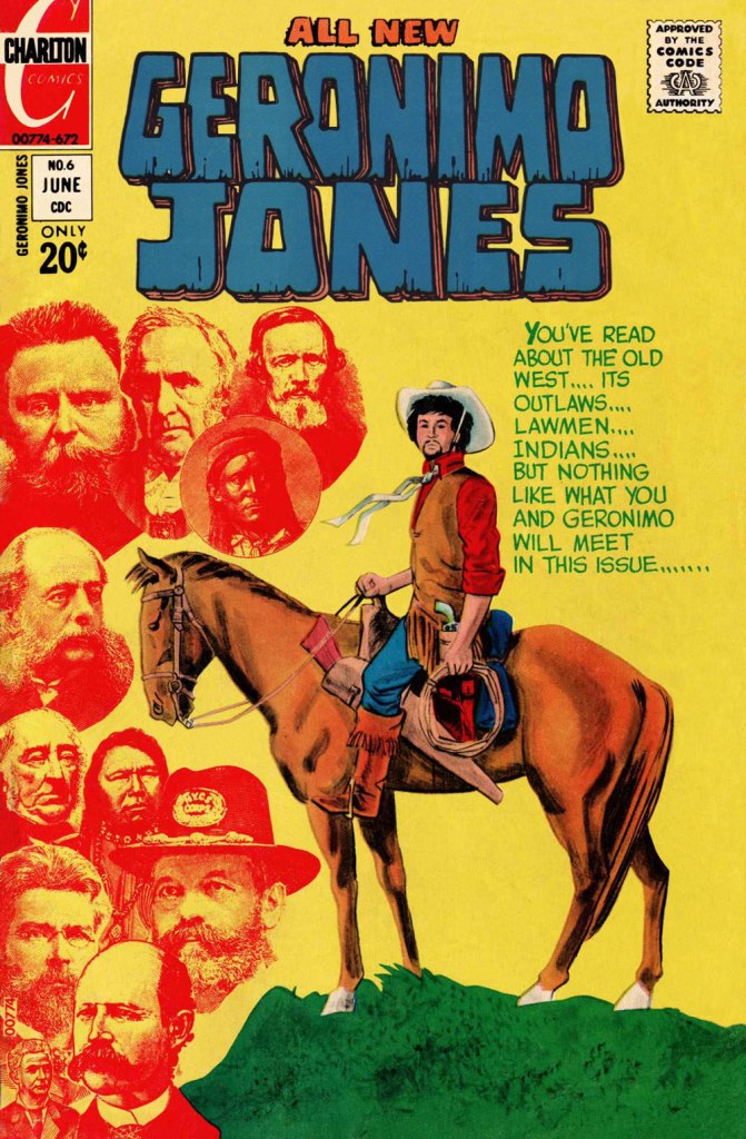
.And now, for something sweeter.
And now, for the sweeter part of our double-header.

.

.
Oh, and Happy Holidays to you, esteemed readers!
-RG
p.s. Oh, and speaking of carmine, the colour, not the man: I just read, a few days ago, in Steve Ettlinger‘s superb Twinkie, Deconstructed (2007), that « the fascinating, rich magenta carmine, also known as cochineal, is extracted from the dried body of the female cochineal insect », and that « the output of the Canary Islands is used almost exclusively to colour the Italian apéritif Campari. » Caveat emptor, then! Ironically, « carmine dye is produced from the acid that females naturally secrete to deter predators. » Not, however, industrious humans.