Treasured Stories: “Frozen Kisses!” (1970)

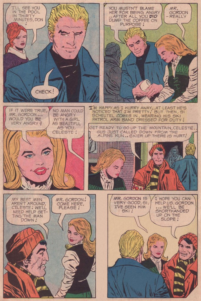
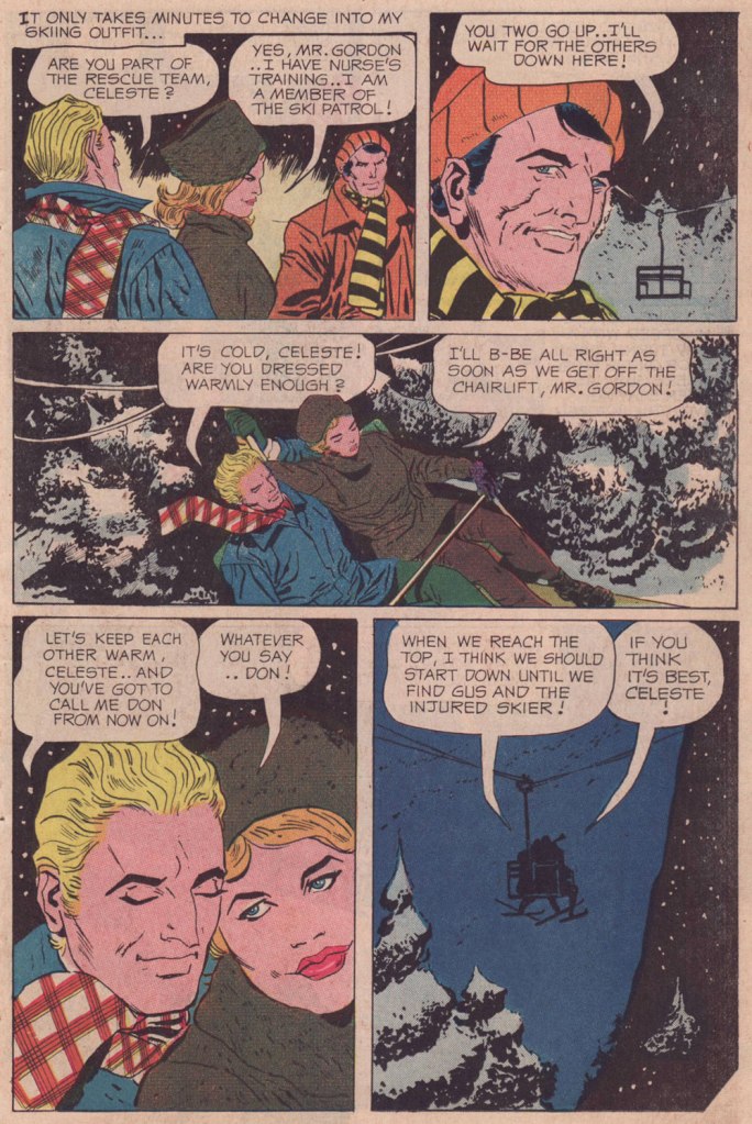
Co-admin RG has previously written about Pat Boyette (1923-2000), an artist we both hold in very high regard (see his Pat Boyette — Hillbilly Makes Good post if you missed it at the time), so there’s no need to delve into his biography. He’s a mainstay of Charlton Comics, but there aren’t too many romance stories around with his art, so I was pleasantly surprised to stumble across Frozen Kisses!, signed Bruce Lovelace (one of Boyette’s cute pseudonyms), in Secret Romance no. 10 (December 1970, Charlton).

Boyette can draw anything (even horses, the usual test for an artist’s ability!), but for me it’s the way he renders faces that’s really special. In his hands, it is instantly clear what to expect of each character. The hubris of villains shows as clear as day in each wrinkle of their face, treachery lives in the corner of their eyes; the bold gaze of the courageous challenges the injustices of life; the devious throw calculating glances from under veiled lids. That is not to say that everybody broadcasts their intentions in a Boyette story – a minute shift, and the face of a villain can suddenly subtly hint at a kind smile, or the mouth can distort, revealing a seemingly undaunted man to be a spineless weakling.

But what I like best is the way Boyette depicts women, young or old. Their strong eyebrows and willful expression signals an alluring strength of personality; such a woman will stop at nothing in pursuit of her goal, whether the goal is virtuous or evil, humble or grandiose. Never mentally broken, even in hopeless situations, his heroïnes would rather literally die than to submit to someone they despise. They’re also really elegant, even innocent young maidens possessing a kind of appealing gravitas (in that, Boyette’s women remind of Jack Kirby‘s) that normally is the territory of much older and wiser women.

Although there are pleasant exceptions, romance comic plots tend to follow a rather rigid pattern – there are maybe 5 or 6 ‘typical’ templates, with small deviations to provide an semblance of variety. Boyette art would make any story enjoyable, but in this case we were also blessed with a spunky, independent heroine that’s a pleasure to watch in action. Frozen Kisses! is actually a cynical story: our leading lady, Celeste, is a scheming sort who chooses a ‘target’ based on his good looks, but also on his showmanship and money. On the other hand, it’s hard to feel sorry for Don’s beautiful-but-vapid companion, and Celeste’s quick thinking and athleticism are genuinely attractive. She doesn’t tone it down in order not to offend the fragile sensibilities of the male (I hate stories in which girls lose at chess, in tennis or whatever else on purpose, not to turn the guy off).

~ ds

Master of Wit, Wisdom, and Weirdness: Howard Cruse

« The autobiographical narrations by Cruse examining everything from Acid and UFOs, to TV punditry and death itself are priceless! So read on, and enjoy the work of a true master of wit, wisdom, and weirdess! And tell you friends to buy this book! It’s just a matter of time before all copies are seized and burned! For soon a cleansing will surely be upon us! » —Jay Lynch*

Alabama cartoonist Howard Cruse (1944-2019) is usually recognized as the author of Stuck Rubber Baby (1995), a serious graphic novel about a young gay man whose life gets swept up in the American Civil Rights Movement. It was lauded by many, some praising it for its ability to demonstrate that comics can appeal to adults (Harvey Pekar), some for its place in the comic book canon as the ‘Great American Graphic Novel’ (Justin Hall). I am not denying its historical importance, of course, but I am slightly allergic to this idea of the Important Work of Art™.

Once upon a time, my favourite Cruse material was Barefootz (more about further down), but that has changed over the years. My current treasured possession (gift of co-admin RG!) is Dancin’ Nekkid With the Angels (1987, Kitchen Sink Press), which collects some previously unpublished material as well as stories that appeared in various underground publications (Snarf, Bizarre Sex, Gay Comix, of which Cruse was a founding editor**, Dope Comix…) as well as in Village Voice, Heavy Metal, etc. The book was published in a print run limited to 1,082 copies, and strangely enough, some are still available for purchase here, a sad testament to Cruse’s relative lack of renown.

This anthology includes its share of my favourite Cruse pieces (to name a few, Unfinished Pictures, about an artist overstimulated by his own art; the absolutely brutal Creepy Snuff Porn, a satirical piece about the Meese commission of pornography; Dirty Old Lovers, featuring two older gays, Clark Stobber and Luke Tewba, prowling the streets in search of goofy, sexy fun), but the one that lingers most in memory, having sub-rented a permanent room in my brain, is the pitch-perfect, heart-breaking Billy Goes Out (1980), interestingly not even included in the best-of collection The Best Sides of Howard Cruise (2012, Boom Town). Here it is.

Since I mentioned it earlier, I’d also like to include two pages from Barefootz, a pleasantly surreal, somewhat drug-fueled strip. Its sense of humour is a gentle one, though it demands an ability to enjoy free-form association and controversial topics (death, abortion, cannibalism…), although the latter are inserted with such childlike enjoyment that I am hard-pressed to imagine somebody taking offense. The strip debuted in a university newspaper in 1971, migrating a year later to a few Denis Kitchen publications (Snarf, Commies from Mars, Marvel-packaged Comix Book), and then to its very own home, Barefootz Funnies.

« Compared to fellow underground comic creators, Cruse’s Barefootz character was easy to label “too cute” to be underground, and legend has it that Barefootz Funnies was widely despised by many artists from the era. Barefootz Funnies took an interesting journey from 1975 to 1979. When Barefootz debuted as a comic character in 1971, Cruse was still in the closet about being gay. Cruse later admitted the character was not the most representative of his own personality, since Barefootz wasn’t gay. But in Barefootz no. 2, Cruse revealed that Barefootz’s artist buddy Headrack was gay. This type of revelation ran counter to Barefootz’s reputation as being too cutesy to be part of the underground comic revolution. Cruse’s publicly emerging sexual orientation in real life was leading him to become more bold in his comics, which created ambivalence about the cartoony style and nature of the Barefootz character. Cruse finished the series with one final issue, which featured the cathartic “Barefootz Variations,” a story that summed up his mixed feelings about Barefootz and about cartooning itself. » [source at ComixJoint]

Barefootz himself is a man with inexplicably large and always bare feet, who lives with hundreds of cockroach roommates and a petulant under-the-bed monster called Gloria who coughs up frogs when she’s displeased.

This is Barefootz Funnies no. 2 (Apr. 1976, Kitchen Sink).

~ ds

* I don’t think I’m imagining the note of bitterness in Jay Lynch‘s voice when he says that ‘cleansing will surely be upon us‘; a cartoonist who has lived through the purges of the U.S. Supreme Court’s 1973 ruling on obscenity, followed by the aforementioned Meese Commission on pornography in 1986, which severely limited the retail outlets carrying underground comics and empowered humourless censors, surely has cause to be embittered.

** In 1979, Denis Kitchen asked Cruse to be an editor of an anthology featuring the work of gay comic artists. Although he hadn’t officially come out as gay at that point, Cruse decided that to refuse would be cowardly, and the first issue of Gay Comix was published in 1980.

K Is for Krigstein!

« Krigstein was a heartfelt sort of warm guy, but always in conflict. He was getting sick and tired of being embroiled and embattled. He fought hard to keep interested, but began getting cynical. » — Gil Kane, or Eli Katz if you prefer, fellow K-Man.

On any given day, K could easily stand for Kurtzman, Kliban, Kirby, Kubert, Kremer (or Krenkel, Kaz, Kupperman, Keller, Kim, Kuper, Kricfalusi, Kristiansen, Kiefer, Kirchner, Kinstler, Kamb, Kida…): what’s just another letter in everyday life is one of comics’ mightiest signifiers.

Over seven hundred posts in, why have we never featured Bernard Krigstein, despite the fact that both of us absolutely adore his work? Part of the reason is that so much of value and insight has already been written on the subject, and part of it is that he’s hard to write about, which makes the existing literature even more remarkable and worth treasuring. And yet, there’s still so much left to say!

Hell, since it’s his birthday (born on March 19, 1919, he would now be one hundred and three years old), I’ll give it a try.

I’m not quite certain what precisely was my proper introduction to Mr. Krigstein’s œuvre: it was either my encounter with the whimsical The Hypnotist! (written by Carl Wessler, originally published in Astonishing no. 47, March 1956, Atlas), as reprinted in Weird Wonder Tales no. 19 (Sept. 1976, Marvel), or with Pipe-dream, scripted by Johnny Craig and reprinted in Nostalgia Press’ Horror Comics of the 1950’s (1971, edited by Bhob Stewart, Ron Barlow and original publisher Bill Gaines… mine was the French-language edition). I enjoyed the first one just fine, but the latter blew my young mind, not that I was equipped to fully appreciate it. Kudos to the editors for including the tale, because it really stood out amidst the tried-and-true and somewhat formulaic EC classics. It had no heavy, easily digested moral, it was illustrated in a sketchy, vaporous, elastic style that bore no resemblance to its more conventional company, to say nothing of the writing.

Pipe-dream originally appeared in Vault of Horror no. 36 (Apr.-May 1954, EC); written by Johnny Craig (who was also editor). This version was recoloured from original Silverprints by Marie Severin for Greg Sadowski‘s rather sublime B. Krigstein Volume One (2002, Fantagraphics).

As it turns out, even the story’s colourist, a young Marie Severin, had some severe misgivings about it: as she noted many years later, « I can’t remember a thing about coloring ‘Pipe Dream‘ the first time. I rushed through it because I found it so depressing. The whole subject was so dingy to me. I was just a kid, you know — I didn’t want to know anything about dope. When I saw it again, it brought back all those negative feelings. I suppose I shielded myself from them by doing it quickly. Now that I’ve lived a while I can appreciate its beauty, and I’m better equipped to color it. »

To be fair, she had done her usual fine job on it.

Having come late to the EC stable, Krigstein didn’t get too many cover opportunities. This is his second, and final shot, Piracy no. 6 (Aug.- Sept. 1955, EC)… and, I daresay, a classic.
Krigstein sure could paint the elements evocatively: from the same year, an illustration from Herman Melville’s Moby Dick (Pocket Library Series no. 28, 1955).
A 1949 photo of the radiant artist, having just been awarded First prize in black and white graphics by the Brooklyn Society of Artists. I think that part of what makes me favourably disposed towards Krigstein is that he’s a dead ringer for my accountant, a most worthy fellow himself.

If one could find any fault in Greg Sadowski’s definitive two-volume Krigstein monograph, it’s that his research missed one crucial entry in his subject’s funnybook bibliography… the last, and longest one! Here’s hoping for an updated edition, some sweet day.

It took another hardy historian, England’s Paul Gravett, to uncover the fascinating, final piece of the puzzle. It turned up in Gravett’s The Mammoth Book of Best Crime Comics (2008, Running Press). A comic book spinoff of the television series based in turn upon Salvatore Albert Lombino‘s (aka Evan Hunter, Ed McBain, Hunt Collins, Curt Cannon, Richard Marsten, D.A. Addams and Ted Taine) 87th Precinct series, it appeared in the final year of Dell’s Four Color series. So here are a few extracts (as Mr. Gravett would surely call them) from Blind Man’s Bluff; scripter unknown, pencilled and inked by Krigstein, from Four Color no. 1309, June 1962, Dell). By all means, read the whole thing here!

Gravett says of the tale: « Illustrated by the EC Comics genius Bernie Krigstein, it was described by him as ” … the most fantastically absurd story that has ever been typed or presented to an artist… ” A painter himself at the time, Krigstein quit the series after rejecting the unknown writer’s second script and pursued his art career, sadly never to draw comics again. Despite his misgivings, his swansong has a bizarre fascination to it. »

Well, that about wraps it up. See what I mean about how much there is to say? All this blather, and I never even got around to introducing the villains of the piece, Kanigher and Lee.

-RG

Wyatt Earp, Ubiquitous Comic Book Marshall

« Fistfightin’ may not be your style, Marshall Earp! If you want to crawl, I’ll let ye off easy! »
« Crawl, Irish John? I’m going to tie a knot in your cauliflower ears! » — ‘Hired to Die’ (1965)

Happy one hundred and seventy-fourth birthday to Wyatt Berry Stapp Earp (March 19, 1848 – January 13, 1929), bison hunter, teamster, bouncer, saloon-keeper, gambler, brothel owner, pimp, miner, boxing referee, constable, city policeman, county sheriff, and, lest we forget, comic book hero… for several publishers at once!

This is Wyatt Earp no. 6 (Sept. 1956, Atlas); ultra-detailed cover by Bill Everett, colours by Stan Goldberg.
This is Wyatt Earp no. 9 (March 1957, Atlas); cover by John Severin, colours by Goldberg.
This is Wyatt Earp no. 11 (May 1957, Atlas); cover by John Severin, colours by Goldberg.
This is Wyatt Earp no. 15 (Feb. 1958, Atlas); cover by Joe Maneely, colours by Goldberg.
To cash in on the success of The Life and Legend of Wyatt Earp (1955-61) tv series, Dell also threw their Stetson into the ring. This is Hugh O’Brian, Famous Marshal Wyatt Earp (sheesh!) no. 13 (Dec. 1960-Feb. 1961, Dell), the final issue.

Mr. Earp had an especially notable run at Charlton (and by far the best title logo), with sixty-one issues of his very own title published between 1956 and 1967. And with Joe Gill scripts, so it’s solid stuff. This is Wyatt Earp, Frontier Marshal no. 61 (Dec. 1965, Charlton); cover by Pat Masulli and Rocco Mastroserio. I’d saved this one for this occasion, having withheld it from my M/M showcase The Masulli-Mastroserio Cover Deluge of ’65!

This is Wyatt Earp, Frontier Marshal no. 64 (July 1966, Charlton); cover by Mastroserio, lettering by Jon d’Agostino.
This is Wyatt Earp, Frontier Marshal no. 69 (June 1967, Charlton); cover by Mastroserio.
This is Wyatt Earp, Frontier Marshal no. 72 (Dec. 1967, Charlton), the fiery finale of *that* run. Another effective cover by Mr. Mastroserio, who passed away a few months later, aged a mere 40.
And here’s a shot of the real-life Mr. Earp. Don’t look so glum, hombre — it’s your birthday!

-RG

Quelle jungle? Quelle folie!

“Oh, another cutesy animal comic”, you may sigh upon glimpsing the preview for this post. Indeed, today’s exhibit A abounds in puns and features a cast of almost every kind of animal one could think of. However, under its cute façade lurks surprising savagery and a kind of philosophical resignation to life’s little foibles.

We’re talked about a number of comics published within the pages of Pif Gadget, here’s another one to join the gang: La jungle en folie, written by Christian Godard and illustrated by Mic Delinx. The title of the series was selected as a nod to Walt Disney’s 1967 animated film The Jungle Book, then at the height of its popularity in France. The pivotal events of 1968, known as May 68, a period of civil unrest in France that paralyzed its economy and marked the minds of the authors and their fellow citizens, surely had something to do with the cynicism of this strip:

« André Glucksmann recalled May 1968 as “a moment, either sublime or detested, that we want to commemorate or bury…. a ‘cadaver,’ from which everyone wants to rob a piece.” His comments sum up the general cynicism and ambivalence of many on the French left when it comes to May ’68: “The hope was to change the world,” he says, “but it was inevitably incomplete, and the institutions of the state are untouched.” Both student and labour groups still managed to push through several significant reforms and win many government concessions before police and De Gaulle supporters rose up in the thousands and quelled the uprising (further evidence, Anne-Elisabeth Moutet argued this month, that “authoritarianism is the norm in France”). »

Just like fairy-tales, animal fables are often quite brutal (whether Aesop’s or La Fontaine’s, to name two widely-known sources), but it’s not easy to get this of mixture to rise just right: too much brutality, you sink into a quagmire of sadism; too much fluff, and it’s just a filler in a magazine. I would argue that La Jungle en folie hits the right balance: the right amount of wit with plenty of nastiness snuck in. Escapism this isn’t, not quite. The doctor is talented but has no issue with sending patients to their death. The inspector is obsessed with finding the guilty party even if it means putting innocents behind bars. Taxmen snatch their (literal) chunk of fur from the backs of unionized workers. Office workers search for the meaning of life (and fail to find it). Wives throw stuff at their husbands’ heads, talentless troubadours are all in love with the same frigid coquette. This world is a very recognizable one, even if it’s a tiger conversing with a worm (or a rhinoceros with a trout).

As for nastiness, one story immediately comes to mind – when Eustache the elephant gets a proboscis-otomy to shorten his trunk (he dreams of having a ‘Greek profile’), the cut-off part ends up at the butcher’s, as the latter buys chopped-off body parts from the doctor to resell as meat. The trunk is sold to Gros Rino as sausages, and by the time Eustache realizes he was better off with his old appendage and looks for it, it is too late, alas – the ‘sausages’ are being grilled over an open fire, and Gros Rino refuses to part with his breakfast, anyway…

Pif Gadget no. 159 (March 1972). Vegetarian tiger Joé (he only eats apples) and food-fixated Gros Rino are best pals.

The first, one-page strip was published in Pif no. 34 (October 13th, 1969). The strip was a quick success, even making it to some covers starting with issue no. 56 (March 1970). After a hiatus in 1974, during which La jungle en folie continued to be published in ‘albums’ by Belgian publishing house Rossel, the strip returned to Pif in 1977 and stayed until 1986, while albums continued to be regularly published until 1988, for 20 published albums overall. They have now been collected in six volumes of Intégrale; the pages below are all taken from Intégrale 1, which includes Les aventures de Joé le tigre, Salut la compagnie! and La conquête de l’espace.

Cage et masti-cage. ‘Cage‘ is self-explanatory, and ‘masticage‘ is the act of chewing (think ‘mastication’). In this story, Auguste the crocodile decides to free Joé’s winged pet, explaining that no bird is made to be imprisoned. ‘You see, Auguste,’ pensively says Joé, ‘I’ve never exactly figured out whether it’s a cage to imprison, or a cage for protection…’ The naive bird gets eaten by a wolf (who lures it into his gaping maw by lying under a ‘the tunnel of horror’ sign). In the final panel, a discussion takes place: what’s the most beautiful word? Liberty, equality or fraternity? Take your pick…
Médor debout (Médor is a typical French name for a dog, the French ‘Fido’). The two pooches take turns walking each other, with the moral (delivered by the noisy magpies – les pies – who always get the last word at the end of the story) of ‘you can make anybody walk on all fours for a few compliments’.
Klaxonneries (klaxonner means to honk one’s horn). Anatole the octopus is a very dutiful agent de circulation (traffic officer)… but the clarity of his gestures leaves something to be desired. I like the variety of animals and means of transport.
Horreurscope (horroscope), probably my favourite strip. After asking Gertrude the trout for her astrological sign (she’s Pisces, of course), Joé reads her horoscope: it speaks of the possibility of dangerous accidents, especially asphyxiation. Skeptical Gertrude thinks it’s ridiculous that a fish should worry about asphyxiation… but in the end, can one escape destiny? Joé decides not to intervene – and suggests Gros Rino should cook her ‘à l’étouffée‘.

I associate La jungle en folie with one-page strips, but it’s worth taking a little detour into longer stories. The next two pages are Coup de tabac, in which the doctor and Joé try to convince vulture Adhémar to quit smoking. Adhémar is adamant, however: for him, smoking is a question of survival. We learn why in the next page…

‘Here’s today’s advertising message, try to not make spelling mistakes’, says his boss, and Adhémar flies into the skies to write a message in cigar-smoke – “tobacco is poison”.

‘Not great… this guy lost faith in what he’s doing. He’s getting old. I’ll have to look into it…’ says the wolf-boss, as Mortimer the snake remarks ‘a young man’s enthusiasm, it’s all that’s real and true!’

The next two pages are Bouche-dégout, a pun on ‘bouche d’égout‘, drain (dégoût means disgust). Potame le toubib, the doctor, won’t listen to Joé’s explanation of what ails his friend the dragon, jumping to medical conclusions and insisting that Timoléon should speak for himself – with blazing results.

‘Speak more softly, he’s not deaf.’

~ ds

Why the Long face? The Lighter Side of Batman

« The best thing for rich people to do is become Batman. » — Karl Heinrich Marx*

So we’ve got another dour, dark, mumbly, violent, grim ‘n’ gritty Batman movie making the rounds. I’ll pass — I’m afraid that’s not my Batman of choice. But I’m certainly game to provide an alternative view.

This is World’s Finest no. 32 (Jan.-Feb. 1948, DC); cover art by Hamilton, Ontario’s Win Mortimer (1919-1998), just one in a long, memorable series of frequently goofy scenes featuring this heroic trio.
A cute one from John Gallagher (1926 – 2005), twice (1957, 1971) the winner of the National Cartoonists SocietyBest Gag Cartoonist‘ Award and elder brother of Heathcliff creator George Gately Gallagher. It was published in scouting monthly Boys’ Life‘s July, 1966 issue, smack dab in the heart of Batmania. We ran another bit of bat-drollery from John in an earlier post.
This is Mad Magazine no. 105 (Sept. 1966, EC); cover by Norman Mingo (1896-1980).
A pivotal page from ‘Alias the Bat-Hulk’ written by Bob Haney, pencilled by Mike Sekowsky and inked by Mike Esposito, from The Brave and the Bold no. 68 (Oct.-Nov. 1966, DC), edited by George Kashdan. We’re featured the issue’s fabulously batty cover in our earlier tribute to Mike Sekowsky. Bless you, gentlemen — you truly understood what fun meant and what comics should be.
Prolific Argentine cartoonist Vic Martin (in his homeland, he drew the strip “Salvador” for Medio Litro magazine) moved to the US in the early 1950s, crafting a respectable body of work in the comic book field, chiefly for Ziff-Davis, before migrating to men’s magazines and girlie digests. By the 1970, he’d found a home with Cracked Magazine (He handled the Hudd & Dini feature), while also freelancing for Sick and Crazy. Everything but Mad, really. This particular cartoon comes from the March, 1967 issue of Avant Publishing’s “Escapade”. As Pat Masulli is listed under “production” in the masthead, a Charlton connection is more than likely. And speaking of “Leapin’ lizards!“, Martin would later (1973-74) work on the Little Orphan Annie comic strip.
From Plop no. 9 (Jan.-Feb. 1975, DC); Writer unknown, art by Kurt Schaffenberger.
This one’s from Plop! no. 20 (Mar.-Apr. 1976), DC); idea by Don ‘Duck’ Edwing, art by Dave Manak.
Dan Piraro‘s May 21, 1995 Bizarro Sunday strip. Between Piraro and his canny accomplice, Wayno, there have been scores of excellent bat-japes over the years. I must confess that the term ‘bat-bat’ triggers other associations. « To the Man-Mobile! »
This is Pictures Within Pictures, a 1998 watercolour by Mitch O’Connell (not to be confused, of course, with this beloved, near-homonymous fella — yes, I can just hear Beavis and Butthead chortling). The piece is full of references to various Golden Age comics made infamous by Fredric Wertham‘s Seduction of the Innocent. For instance, er… Batman‘s speech balloon quotes from this particular comic book‘s opening splash. On a sobering note, let’s not forget that the 1950’s furore over comic books, as absurd as it may have seemed, still has relevance today.
In a more deadpan vein, here’s the opening splash of Chip Kidd and Tony Millionaire‘s madcap homage to the very earliest of Batman’s exploits, with nods a-plenty to the 1943 film serial. “The Bat-Man” originally appeared in Bizarro Comics (Aug. 2001, DC).
Another most decidedly dynamic duo, Eddie Campbell and Hunt Emerson, assembles to concoct an affectionate, thoughtful and yes, funny look at one of Batman’s most bizarre-yet-neglected members of the Bat’s rogues’ gallery, Lenny Fiasco, aka The Eraser, introduced in Batman no. 188 (Dec. 1966, DC) with The Eraser Who Tried to Rub Out Batman! This sequel, Who Erased the Eraser? also made its original appearance in Bizarro Comics (Aug. 2001, DC), edited by Joey Cavalieri.
Here’s one (June 12, 2014) from Pulitzer Prize-winning (1981) editorial cartoonist Mike Peters (b. 1943). It’s from his unevenly written but always gorgeous comic strip Mother Goose and Grimm (created in 1984 and still going strong in over 800 newspapers worldwide). Like his colleagues Piraro and Wayno, Mr. Peters can scarcely resist a good bat-gag, so this is just one in a crowd of many.
Everyone’s familiar with the famous playground song and staple of crooner Robert Goulet’s répertoire, right? The web is rife with visual adaptations, but this was my favourite, the work of Matthew S. Armstrong and available as a handsome t-shirt.

-RG

*the second-funniest Bat-related thing I encountered online this week is this attribution of a Batman (created in 1939) quote to Marx (1818-1883).

The funniest was the following deeply ironic quote from pathological liar and glory hog Bob Kane: « How can an article about me or the Batman be the true story when I am not consulted or interviewed? »

NYC and the Impressionable Young Artist: Peter Kuper’s Drawn to New York

« In the summer of 1977, New York City was bankrupt. Times Square was run-down and dangerous at night, subways were decrepit, with floor-to-ceiling graffiti and no air-conditioned cars in the underground roast. A garbage strike left mountains of uncollected trash and evil-looking rats scurrying underfoot. A serial killer, Son of Sam, terrorized the city and when a blackout hit in July, looters tore up the town.
I was in heaven.
»

I first encountered American artist Peter Kuper (b. 1958) through Mad’s Spy vs. Spy feature, which he took over as scripter and illustrator with Mad Magazine no. 356 (April 1997). At that point, I had only seen creator Antonio Prohías‘ take on that strip, and I was impressed with Kuper’s style and energy.

But my favourite of his books is Drawn to New York: an Illustrated Chronicle of Three Decades in New York City (2013, PM Press), both for the wide variety of styles used in this loosely-themed collection of strips, doodles and sketches, and for its beating urban heart. It captures a part of New York City that I love – not its glamour nor its electricity-guzzling lights, and definitely not its famous fops and varnished coquettes, but its boisterous mix of cultures and the seedy, scaly alligator underbelly. It’s not the same city it was in the mid 70s and early 80s – the era of Kuper’s reminiscences on the subject – but you can still spot remnants of the past in older neighbourhoods.

As mentioned earlier, Kuper executes a number of styles with ease, but he is most easily recognized by that ‘spray-painted stencil thing’ he does so well, as well as his favourite palette of dark reds:

One of the more memorable stories of Drawn to New York is the following three pager, following the nocturnal adventures of Peter and his friend Adam as they scale a bridge and awkwardly navigate the social etiquette involved in engaging the services of a blowjob prostitute:

The healing and restorative powers of a view from a sky-high bridge at night cannot be overestimated.

Here’s one of the many cynical pieces:

The following is a page from the mute Twenty-Four Hours, which chronicles the strikingly different lives of NYC denizens as they go about their day:

All the above images are excerpted from Drawn to New York, but I’d also like to include a bonus: a strip published in Bleeding Heart no. 5 (August 1993, Fantagraphics) which fits today’s theme rather well.

~ ds

Odd Pairings: Bill Ward & Bill Everett

« Ward’s beautiful buxotics operate in a strange separate universe, in which all women are gorgeous voluptoids, all men oafish, saucer-eyed drooling dupes. » — Chris ‘Coop‘ Cooper

Well, I certainly wasn’t planning to hog all the blogging this week, but there were birthdays and other hopefully mitigating factors. While today is the great Will Eisner‘s birthday, it’s likely to overshadow that of a fellow Golden Age toiler, one with an equally intriguing career, but with a trajectory quite divergent from Eisner’s own.

Bill Ward (1919 – 1998) was also born on this day, one hundred and three years ago. Ward started out in comics with the Jack Binder shop, turning out material for Fawcett’s line of characters (Captain Marvel and his family, Bulletman…); he soon found himself working for Quality Comics, most notably on Blackhawk (an Eisner co-creation, it should be noted). He inched closer to his true passion when assigned to Quality’s romance line.

Ward’s cover for Love Diary no. 1 (Sept. 1949, Quality). Artistically speaking, this is what a fully committed Ward can produce.

In the mid-50’s, when came the brutal, censorship-induced compression of the comic book industry, Ward smoothly shifted to producing girlie cartoons for Abe Goodman’s Humorama line, becoming its star and most prolific performer, thanks to his popularity and prodigious speed. He was aided in this by his choice of tool and technique: the conté crayon on newsprint. While everyone else was working on 8″ x 12″ illustration board, Ward was using a soft, beige paper of a size (18″ x 24′) and texture familiar to any art student who’s taken a life drawing class. With this type of stock, he could produce texture rubbings and achieve smooth, sensual sheens ideal for rendering highlights of hair and stockings. Said Ward: « It didn’t take me long to figure out that the quicker you could do the work… the more money you could make. » Over the course of a quarter-century, he wound up producing around 9,000 drawings for the Humorama line.

As Ward recalled of his early training in Binder’s studio, « [Binder] trained me to do layout, which is the most difficult part of art. » To wit, layout never counted among Ward’s strengths. A lot of his pinup work is undermined by poor staging, often grotesque proportions, and absolutely minimal attention to non-erotic detail.

A typical example of a Ward girlie cartoon produced using the conté crayon. This one first turned up in Comedy no. 51 (Jan. 1960, Marvel); in a typical work-for-hire arrangement, for a flat fee (in Ward’s case, 7 dollars a cartoon, topping out at the princely sum of $30 near the end of his 25-year run), Goodman retained all reprint rights (and reprint he did, liberally) and kept the original art, which he sold to collectors for several times its original cost, naturally. Nowadays, these pieces exchange hands for several thousand dollars.

Now, had I ever wondered what Ward’s pencils would look like, if inked by Bill Everett? I readily confess I hadn’t. But upon learning that such a momentous collision once occurred, my mind was set slightly reeling.

Another weathered fellow combatant in the trenches of the Golden Age, Everett (1917-73), unlike Ward, always gave his best, whatever the conditions. Right to the end, despite his rapidly declining health, Everett was, incredibly, producing top-flight work.

This is The Adventures of Pussycat no. 1 (Oct. 1968, Marvel). Cover by Bill Everett. Highly sought after today, this scarce, magazine-size one-shot is merely a reprint collection of some of Pussycat’s ‘adventures’ from various Goodman Playboy knockoffs, and one of a gazillion contrived acroynym-based attempts to cash in on the ubiquitous 007 craze of the 60’s. It does contain the first Pussycat tale, illustrated by Wally Wood, who would soon go on to his own entry in the super-spy stakes, Tower’s T.H.U.N.D.E.R. Agents.
Concentrate on the artwork. The less said about the writing (was it Stan the Man or Larry the Lieber? We’ll likely never know), the better. As usual, any American attempt at French is mangled, even at a mere two words and two syllables (for the record, it should read either “C’est fini!” or “C’est la fin!“). Pensively squinting while adjusting his pince-nez, a ‘curator’ at Heritage Auctions made this uproarious whopper of a claim: « The figures of Pussycat look to be by Bill Everett and everything else is Bill Ward. » So you think Bill Ward drew everything… except the one thing he was interested in drawing? These folks don’t seem to know how comics are produced.
The Bombshell and the Bank!“, never reprinted, saw print in Male Annual no. 6 (1968).
This is The Mighty Thor no. 171 (Dec. 1969, Marvel). Jack Kirby pencils, Bill Everett inks. Coming late in Kirby’s run, what a vigorous breath of fresh air after years of lazy erasures!

In the 60’s, Ward also provided covers for various soft-core novels, such as this one from Satellite Publications’ ‘After Hours’ imprint. He even wrote some of them, notably under the alias of ‘Bill Marshall’. His fellow Quality Comics alumnus Gil Fox also penned many of these potboilers under a staggering array of aliases.

This is Side Street (1966, After Hours). I’ve noticed over the years that certain artists of a more single-minded frame of mind can’t be bothered to devote much attention to anything but the object of their obsession. Such was the case with Bill Ward, and with the passing years, ever increasingly so. Exhibit A: has Ward ever seen an actual dog?
Which reminded me of this classic, by another ‘can’t be bothered’ master of ‘Good Girl’ art, Alberto Joaquin Vargas Chavez (1896-1982). Another howler from the comedians at Heritage: « This early masterpiece, one of the greatest pin-ups the artist ever painted, was reproduced as a full-color double-page spread in Vargas, Taschen, 1990. Alberto Vargas thought so highly of this lot and the following two stunning paintings that he retained them in his personal collection. » I wouldn’t presume to criticise Vargas’ depiction of the female form, but on the other hand, this is Exhibit B: has Vargas ever seen an actual cat? Don’t worry, Alberto, you’re not alone in this affliction: neither has Neal Adams.

This, er… pussycat brings to mind botched attempts at taxidermy and/or artwork restoration.

-RG

Oh, the Places He’s Been: Happy Birthday, Dr. Seuss!

« Theodor Geisel spent his workdays ensconced in his private studio, the walls lined with sketches and drawings, in a bell-tower outside his La Jolla, California, house. Geisel was a much more quiet man than his jocular rhymes suggest. He rarely ventured out in public to meet his young readership, fretting that kids would expect a merry, outspoken, Cat in the Hat-like figure, and would be disappointed with his reserved personality. » — Susan Cain

Today, we honour Theodor Seuss Geisel (1904-1991), born one hundred and eighteen years ago and better known under his nom de plume of Dr. Seuss (one of several, such as Dr. Theophrastus Seuss, Dr. Theodophilus Seuss, Theo LeSieg, L. Pasteur, D.G. Rossetti, and Rosetta Stone. The man loved a good pseudonym.) And no, he wasn’t actually a doctor, though he contributed to more people’s well-being than most physicians could dream of. His alma mater, Dartmouth College, did bestow upon him an honorary doctorate, in 1956. Furthermore, it renamed, in 2012, its medical school (fourth oldest in the United States, founded in 1797) Geisel School of Medicine at Dartmouth in recognition of the good man’s financial contributions over the years. Cool, uh?

Moreover, « Geisel’s birthday, March 2, has been adopted as the annual date for National Read Across America day, an initiative on reading created by the National Education Association. »

It certainly did in my case — when I wanted to learn English as a kid, his books were the ones I reached for. Results!
Geisel’s cover for Judge‘s March, 1933 issue.
A sample of his 1930’s magazine work. Dang — now I can’t get that song out of my head.
And another. Teetotallers may not know (or they may know too well, hence the abstinence) that DT stands for the latin delirium tremens, or alcohol withdrawal-induced delirium. As for these beasts, you’ll have cause to worry if you should See Them Everywhere, and not merely aboard Goah’s Ark.
« Long before his success as Dr. Seuss, Theodore Geisel (Dartmouth Class of 1925), designed advertisements for Flit, Standard Oil Company’s wildly popular spray-pump insecticide which later contained DDT. Over the course of 17 years, Geisel’s humorous advertisements helped make Flit a household name throughout the 1930s and 1940s. At the time, liberal spraying of pesticides around people, animals, and crops was highly encouraged with little regard to potential environmental impacts. » [ source ]. This particular ad hails from 1930.
Given the scope of Geisel’s genius and the length of the ad campaign, there are many, many highlights.
More like ‘Bug Game Hunter’!
Over the years, these ads came in every format.
A 1941 poster for Flit. The casual, harum-scarum use of dangerous chemicals may seem quaint to our jaded modern eye, but it goes on, all right. Personally, I cringe when I encounter ads for Procter and Gamble’s Febreze, for instance. Seems a tad irresponsible to me, given the risks.
This is the opening installment of Hejji, Geisel’s very short-lived (April 7 to June 23, 1935, twelve episodes in all — read them all here) Sunday comic strip, the man’s sole entry into the syndicated comic strip arena, preceding by a couple of years the publication of his first book, And to Think That I Saw It on Mulberry Street (1937). Hejji was oh-so-briefly published by William Randolph Hearst’s King Features Syndicate. Fickle, fickle!

« In these pages Dr. Seuss was already introducing us to his wonderful talent for creating unusual and delightful creatures. Hejji and his master “The Mighty One” would meet many an odd creature like Bearded Bees, Wombats, and the great Pitzu bird. All of these would be encountered in the attempt to impress the object of “Mighty One’s love, “The Fair One”. Unfortunately, as the legend goes, Seuss was let go during great depression job cuts by William Randolph Hearst. Of course Seuss would later go on to create his extraordinary children’s books including Cat in the Hat, and The Grinch that stole Christmas. Hejji pages are some of the rarest and most sought-after on the comic-strip market. Printed exclusively as Tabs and only carried in a few newspapers, their rarity is as great as the popularity of their creator. As a result, each and every page carries the highest premium. » [ source ]

In 1982, Darmouth College commissioned none other than Everett Raymond Kinstler to paint this portrait (oil on canvas) of his esteemed colleague.

-RG