« You should be ashamed, Mr. Lash! Making such noises in front of the children! »
Bat Lash was introduced with issue 76 (August, 1968) of DC’s launching pad title Showcase, wedged between the respective débuts of Hawk and Dove and Angel & the Ape. At various stages of his conception, the character of Bartholomew “Bat” Aloysius Lash reportedly went through the hands of Carmine Infantino (who designed or at least supervised all of the following covers), Joe Orlando, Sheldon Mayer and Sergio Aragonés. Sergio plotted and thumbnailed the mise en scène, Dennis O’Neil added dialogue, then Nick Cardy pencilled and inked. For such a product-by-committee, Bat Lash is quite remarkably good — but then consider the talent involved!
Mind you, I make no claims of originality for Bat — he was distinctly a product of the times, when the vogue of Spaghetti Western had peaked* and ironically left its (off)brand on its model. By the time — in 1968 — its market reached its apex, the Italian Oater idiom threatened to congeal into a morass of clichés, becoming, as these things tend to go, (over)ripe for self-parody. Intentional and otherwise.
I surmise that the key model for Bat Lash was the ever-charming Mario Girotti**, reportedly enlisted thanks to his resemblance to the intense but one-note Franco Nero, even replacing the latter in his star-making, titular role of Django (1966) for a 1968 sequel, Prepare a Coffin, Django.
Ripe for its time it may have been, but I suppose that American audiences were still quite allergic to jarring tonal shifts in their entertainment (now commonplace), and would be for some time — just ask, say, John Carpenter. So the blend of light comedy and dark drama that Bat Lash proposed must have been difficult to market.
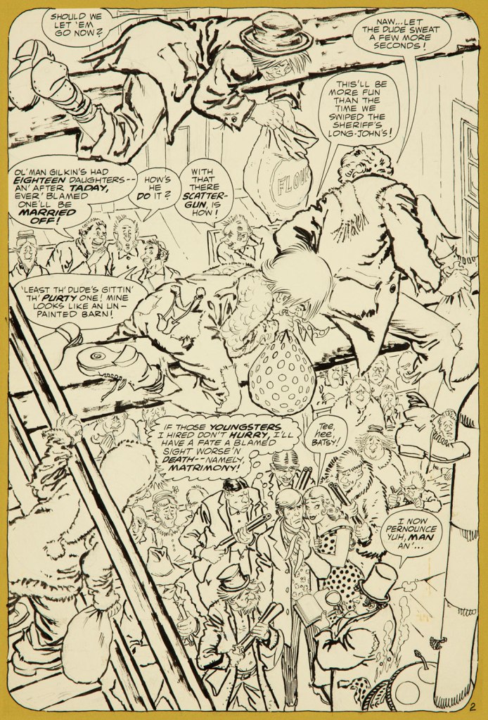
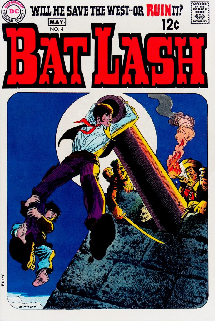
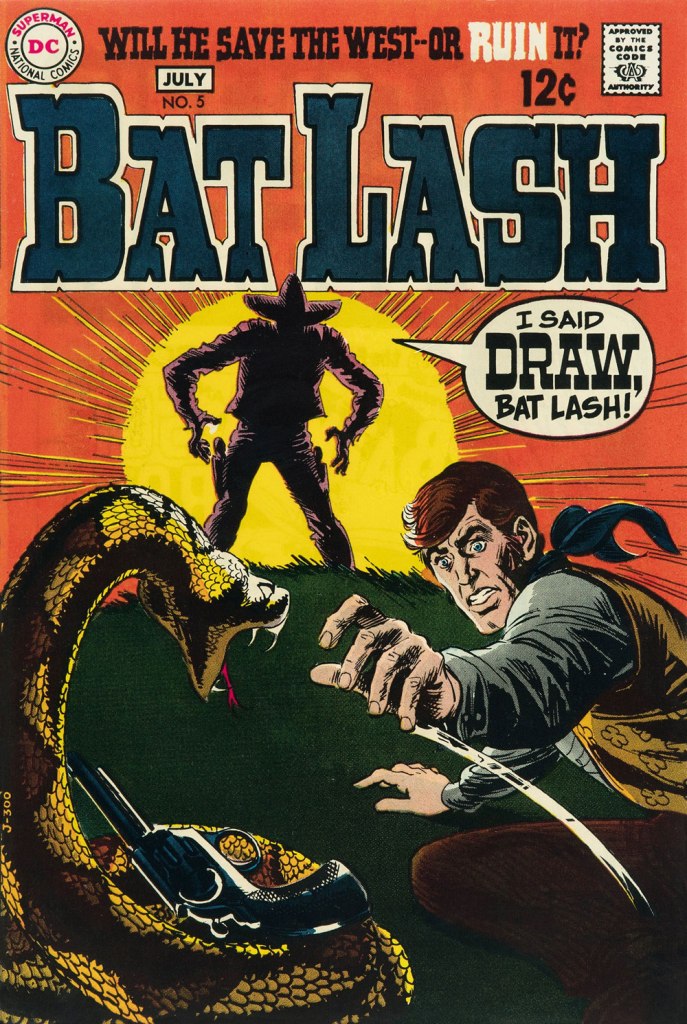
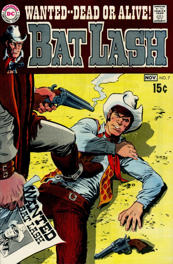
Our streak begins with Bat Lash no. 2 (Dec. 1968-Jan. 1969, DC) since the covers of Showcase no. 76 and Bat Lash no. 1 were good, but not — imho — great. I daresay this one is, in fact, the finest of the lot, with Cardy at his most Tothian.A peek inside the same issue, for contrast: lively and loose inking over rock-solid pencilling, and miles away from the tone of the cover. My guess is that some people weren’t happy.Bat Lash no. 3 (Feb.-Mar. 1969, DC) highlights the comedic side of the feature, which all but evaporated by the last two issues.This is Bat Lash no. 4 (Apr.-May. 1969, DC). Dig Cardy’s expert use of the ‘drybrush‘ technique on the stones.This is Bat Lash no. 5 (June-July 1969, DC). I’m reminded of a similar, later cover featuring one of Bat’s successors, Jonah Hex. The price goes up and the comedy… just goes. This is Bat Lash no. 6 (Aug.-Sept. 1969, DC).… and there goes the original tagline. This is the final issue, Bat Lash no. 7 (Oct.-Nov. 1969, DC)… and so must end this particular hot streak.
And now, some choice bonuses!
From issue 7, editor Orlando gives us some cheeky insight into the creation of an issue of Bat Lash.And plotter Aragonés provides some visual direction. To give you a sense of the less flippant, but not altogether grim, tone of the later issues, this is page two from issue 7. DC Comics of that period were quite ambitious with the limited means of the four-colour reproduction process, using plenty of backlighting and projected light… quite another level.
I was *delighted* to see ol’ Bat Lash turn up in the Weird Western Tales of DC’s outstanding Justice League Unlimited animated series, , along with some of his distinguished colleagues. In the usual order: Ohiyesa ‘Pow Wow’ Smith, El Diablo, Bat Lash, Jonah Hex.
-RG
* “In 1968, the wave of spaghetti Westerns reached its crest, comprising one-third of the Italian film production, only to collapse to one-tenth in 1969.” [ source ]
« I opened my magazine (What did you see?) / I saw Mr. France (What did he have?) / A girl on each shoulder (What else?) / And one in his pants » — 10cc, Sand in My Face (1973)
You may think of this post as a companion piece, a spinoff of its predecessor. I’d had for some time, in the back of my mind, the notion to showcase some obscure French ‘human sculpture’ ads, but it needed more. Comments on the previous post provided the spark.
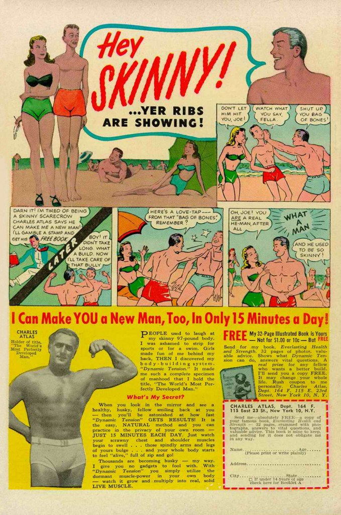
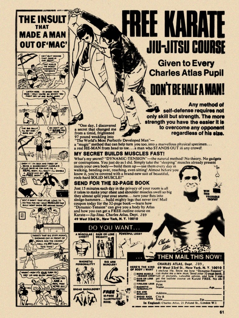
Is there a more classic “humble immigrant makes good in the USA” yarn than that of Angelo Siciliano, born in 1892 in the tiny Italian town of Acri? The Smithsonian has told the full, colourful story, so I’ll spare you a rehashing of it.
Let’s just say that young Siciliano worked hard to overcome adversity and redeem his puny physique, and the rest is the stuff of legend. The principles of ‘dynamic tension‘ and his immortal moniker aside, Angelo’s finest brainstorm was to employ the lowly but then-ubiquitous medium of comic books to introduce his product and its natural audience to each other. Let’s take the tour!
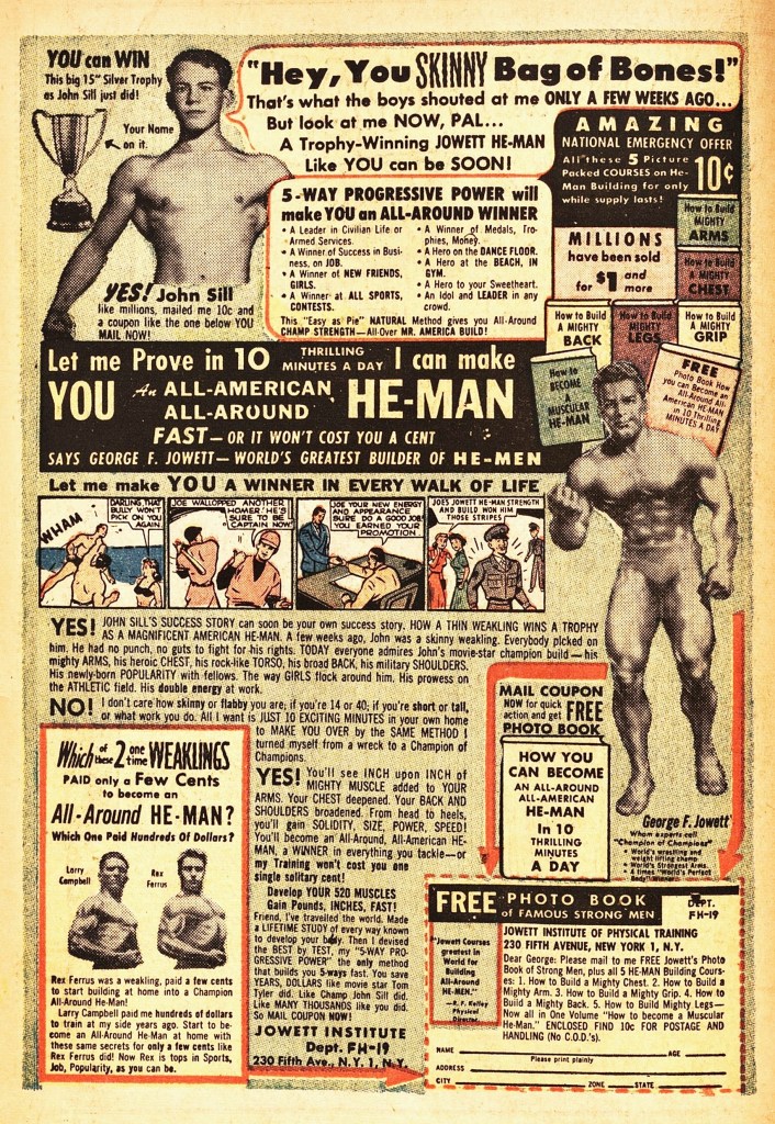
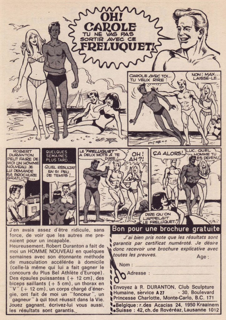
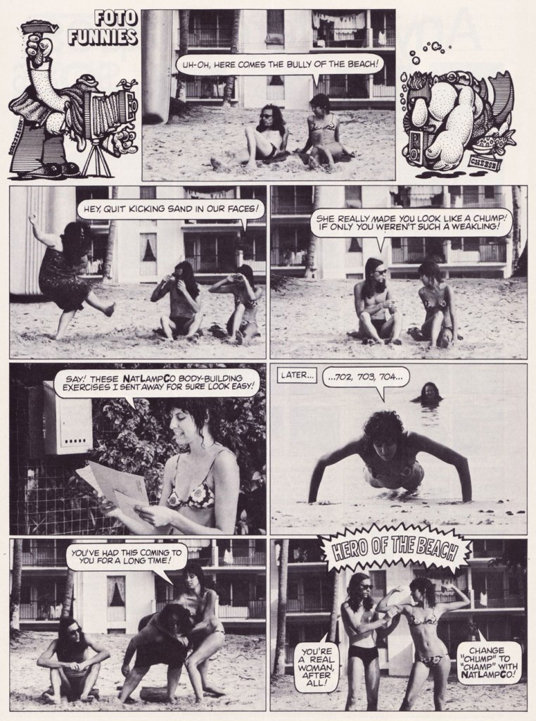
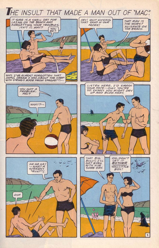
While the Charles Atlas ads began running in the 1930s, this is probably their classical expression. This one saw print as the back cover of Mad no. 14 (Aug. 1954, EC). Its opening insult even inspired Miles Heller’s 1995 salute to the great old comic book ads, Hey Skinny!There was inevitably fierce competition in the self-improvement field. This entry, from the U.S. Nature Products Corp., appeared in Stan Lee’s oh-so-macho Man Comics no. 10 (Oct. 1951, Atlas).Lots and lots of copy — but the all-important cartoon hook is present and accounted for. From the pages of Firehair no. 9 (Fall 1951, Fiction House). The Jowett Institute of Physical Training wants you to get buff! To be fair, George F. Jowett got there first.This is surely the definitive version, with the unforgettable tag line and ‘hero of the beach’ conclusion. I pulled this one from The Witching Hour no. 25 (Nov. 1972, DC), which hit newsstands just a few months before Mr. Atlas passed away, aged 80, on Christmas Eve. I can’t help being amused: French publisher Arédit, whose digest-sized collections of (mostly) reprints of US comics proudly bore the tag « Comics for adults », featured very few outside ads… and those were almost exclusively for self-defense and body-building systems. Here’s a sample trio. This one appeared in Maniaks no 4 (Fall, 1971). This title featured reprints of DC Silver Age ‘humour’ comics… all but the only actually funny one (that would be Sugar and Spike, of course).Oh, I’m sure the ERB Estate got their cut. And who might that R. Duranton fellow be? Four times Mr. France, for one thing! Here he appears with Louis de Funès in a famous scene from Le Corniaud, a 1965 farce starring beloved stars André Bourvil / De Funès and directed by Gérard Oury. This one’s from Kamandi no. 4 (Summer 1976, Artima), which featured reprints of various 60s and 70s DC adventure comics. It was an affordable way to catch up on material one might have missed — or couldn’t afford!This refreshing gender-switched lampoon comes from the pages of National Lampoon no. 26 (May, 1972), the ‘Men!’ issue, guest-edited by Anne Bats, No other credits, dammit. The opening page (of four) of Steve Skeates and Sergio Aragonés‘ wacky satire, from the pages of Plop! no. 2 (Nov.-Dec. 1973, DC). There have been truly countless spoofs of the Atlas adverts… most of them quite dire. Once more, I’ll spare you.By the mid-1970s, with America in the kung-fu grip of martial arts fever, it’s understandable that many a young man was envisioning Bruce Lee‘s lithe, compact physique as an alternative to the hulking musclemen of yore. The Charles Atlas company tried to cover all bases with this ad; from — speaking of old-time musclemen — Doc Savage no. 2 (Oct. 1975, Marvel).
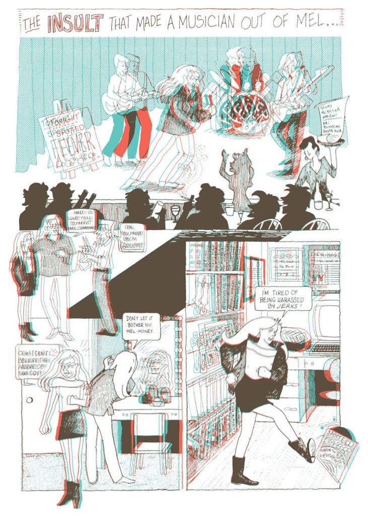
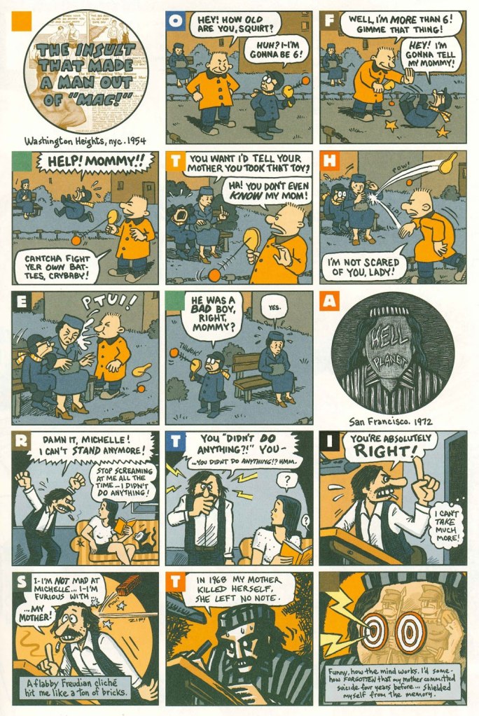
Ah, yes — those days when ‘Bruce‘ was the stereotypical gay name. From the ‘Playboy Funnies’ section of the magazine’s November, 1977 issue.And for something a bit off the beaten path: this is The Insult That Made a Musician Out of Mel, scripted by Rebecka Wright, illustrated by Blanche Santa Ana, with 3-D effects by Ray Zone, from Wimmen’s Comix no. 12 (Nov. 1987, Renegade Press), edited by Angela Bocage and Rebecka Wright.Does this look familiar? This is the first page of Flex Mentallo’s origin tale, as it appeared in Doom Patrol no. 42 (Mar. 1991, DC), written by Grant Morrison, with art by Mike Dringenberg and Doug Hazlewood. I have no idea whether Atlas had a sense of humour, but his successors sure didn’t, as evidenced by the lawsuit they filed against DC Comics over this clear — if brazen — case of satire. I much prefer the TV show version of Flex, I confess.Peter Kuper deftly used the cliché to take a jab at George Bush Sr.’s image and the first Gulf War. Dated and irrelevant? Trying to prove your ‘manhood’ remains distressingly au courant… just consider these two schmucks, to cite but one recent example. And hey, here’s “Stormin’ Norman lying on T.V.” From Bleeding Heart no. 1 (Winter 1991-92, Fantagraphics).Art Spiegelman digs deeper and makes more discerning use of the raw materials at hand with The Insult that Made a Man out of “Mac!”, first previewed in The Virginia Quarterly Review and then collected in Breakdowns Portrait of the Artist as a Young %@?*! (Oct. 2008, Pantheon).
«“Good grief!” yelled the ones that had stars at the first. “We’re still the best Sneetches and they are the worst. But, now, how in the world will we know,” they all frowned, “if which kind is what, or the other way round?” » — Dr. Seuss‘ The Sneetches (1961)
A few days ago, this news item piqued my interest: « The assistant director of communications for Olentangy Local School District abruptly stopped the reading of the Dr. Seuss book “The Sneetches” to a third-grade classroom during an NPR podcast after students asked about race. »
Naturally, since this sorry episode made its way around the world and rightly gave rise to quite the furore, the school district has since thrown its patsy under the bus.
This mention of Dr. Seuss’ timeless classic The Sneetches made me think of another slightly earlier parable of systemic racism, Bill Gaines, Al Feldstein and Joe Orlando‘s Judgment Day (1953), and the similarly telling reaction would-be guardians of bluenose morality had to it.
Initially, I thought posting such an already eminent story as ‘Judgment Day’ was a trifle too obvious. But then again, how famous can a standalone comic book story published seventy years ago be, in the true scale of things? Really, it can never be famous enough.
In the course of an excellent article, CBR.com’s Brian Cronin summed up the skirmish (spoiler alert! you may want to read the story first if you haven’t already):
« The last traditional comic book produced by EC Comics was 1955’s Incredible Science Fiction (a series that had just begun a few months earlier, taking over the numbering from Weird-Science Fantasy) #33.
The last story in the issue, “Eye for an Eye,” had to be pulled at the last minute due to objections by the Comics Code Authority.
So Gaines and editor Al Feldstein decided to reprint “Judgment Day” in its place.
However, Gaines and Feldstein were then told that this replacement story ALSO violated the Comics Code.
Judge Charles Murphy (administrator of the Code) said that they would have to change the astronaut from black to white if they wanted it to be included. This was not part of the Code at the time. Feldstein and Gaines felt that Murphy was just deliberately messing with them.
After being told that, clearly, the color of the astronaut’s skin was practically the whole point of the story, Murphy backed down a bit, but said that they would at least have to get rid of the perspiration on his skin. It could possibly be that Murphy felt that it was exploitative. I do not know, and neither did Feldstein nor Gaines, who only had their suspicions that they were being screwed with.
Feldstein and Gaines both refused to comply (I believe the terms they used included at least one use of the word “fuck“), and Gaines threatened a lawsuit and/or a press conference to shine a light on why exactly the story was objected to.
The story ran as is. »
And so here it is (boasting superior reproduction, thank you, technology):
Originally published in Weird Fantasy no. 18 (Mar.-Apr. 1953, EC). Beautifully understated, it’s easy to understand why its creators considered it a high point of their respective careers.
As is generally the case with such anecdotes, there are other accounts and explanations:
« At least three versions of the story about Gaines’ dispute with the CMAA exist. In an interview, Gaines said a story showing a black astronaut with sweat on his face was rejected because the code forbid ridicule of any religion or race. When he threatened to sue, the code administrator backed down. A second version of the story suggests that Gaines was not able to get approval for the comic, but printed it with the seal anyway. A third account, told by Gaines’ business manager, said the EC story was rejected because it featured robots, which challenged Code Administrator Charles Murphy’s religious beliefs that only man was granted the ability to think. »
I like that, no matter which angle or reality we consider, Judge Murphy never fails to, er… rise to the occasion.
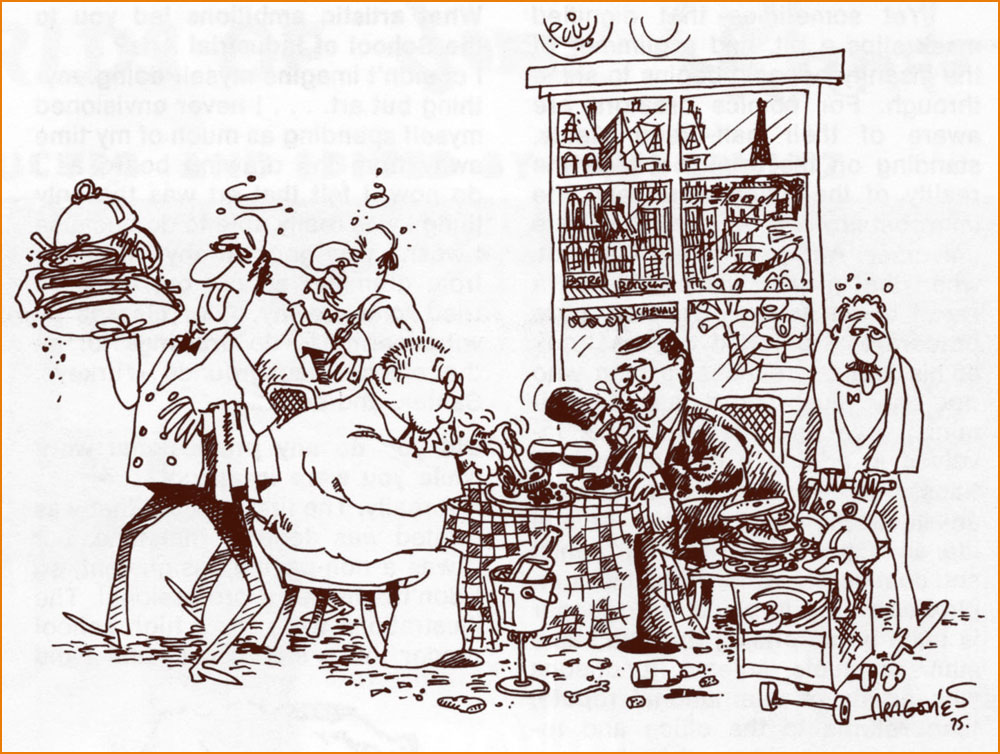
In closing, here’s a scrumptious cartoon anecdote about Messrs. Orlando and Gaines.
« Here’s Sergio Aragones‘ version of one of the many outings Joe Orlando and his publisher/pal Bill Gaines made to the best restaurants in Paris. While on one of the now famous MAD trips, Joe and Bill would eat 4 or 5 times a day! They went from restaurant to restaurant, always ordering the specialty of the house — with appropriate wines, of course! Yep — they’ve been on a very strict diet since (… but it hasn’t helped!) » Originally published in The ‘Special Joe Orlando Issue‘ of Amazing World of DC Comics (no. 6, May-June 1975, DC).
I was startled to discover that after several years of WOT blogging, we still have no post dedicated to Sergio Aragonés. Perhaps this is in part because his art is ubiquitous – throughout his long career, he has contributed manifold pages to various DC publications, created an enduring barbarian parody, scripted and drawn (mostly solo but also in collaboration) an impressive number of mini-series published by Fantagraphics, Dark Horse and Bongo Comics, produced various comic-con paraphernalia, etc. And this is not to mention his lasting contributions to Mad Magazine (which I did discuss, though not at length, in A MAD dash… inside) – something in the magnitude of twelve thousand gags spread over 57 years and 491 issues of Mad.
A sequence from A Mad Look at Sharks from Mad no. 180 (January 1976, EC).
He’s also a charming, universally-liked man whose bigger-than-life persona has ensured that his participation in anything is always surrounded by fun anecdotes. It is my great pleasure to share this abridged compendium of Aragonés tentacles, of which there are many, as he enthusiastically added them into doodles and margins with great glee (and, as we know, « he has quite literally drawn more cartoons on napkins in restaurants than most cartoonists draw in their entire careers *», so just imagine how many tentacles are scattered throughout his work).
Room 13 one-pager, scripted (and edited) by Joe Orlando. This was published in House of Mystery no. 190 (Jan-Feb 1971, DC).
Incredibly, we still haven’t written a post dedicated to the great Plop! (this post is starting to sound like a to-do-in-the-nearest-future list), though Hallowe’en Countdown III, Day 30 did include a story from number 1. Plop!, “The New Magazine of Weird Humor!“, certainly included a lot of cephalopods in its 24 issues and I will doubtlessly get around them one of these days. In the meantime, here’s a very appropriate page from Plop! no. 16:
This closing page of Plop! no. 16 (September 1975, DC) was scripted by Steve Skeates.
Galloping forward through some twenty years, we briefly land at Marvel, namely these two pages from Groo the Wanderer no. 98 (February 1993, Marvel), co-plotted and scripted by Mark Evanier.
Sergio Aragonés Funnies, published between 2011 and 2014 by Bongo Comics, boast 12 issues of really enjoyable, remarkably varied material. For those who may think that Aragonés is one-trick pony who can only do ‘silly’ humour, this series offers many auto-biographical stories, some of them surprisingly poignant and heart-felt. Not to say that it’s not devoid of humour – the more serious stuff (including social criticism in the form of animal parables) is nestled among pages of slap-stick humour and imaginative goofiness, from one-pagers to longer stories that take most of an issue to develop. Aragonés also shares some background on his approach to stories, allowing us to peek into his imagination and possibly answer that hackneyed question that plagues all manner of writers, ‘where do you get your ideas from?’ If an anthology of Funnies is ever published, I’ll happily purchase it.
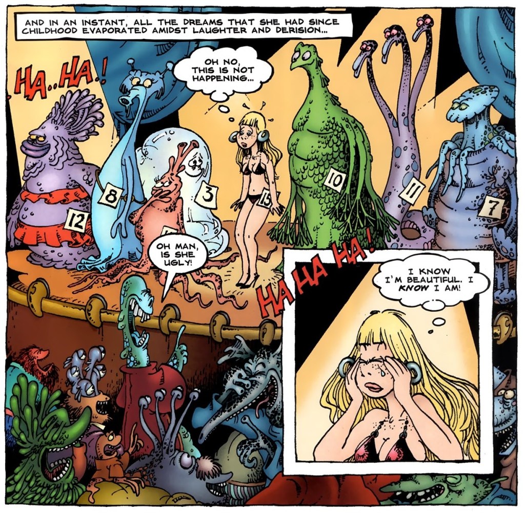
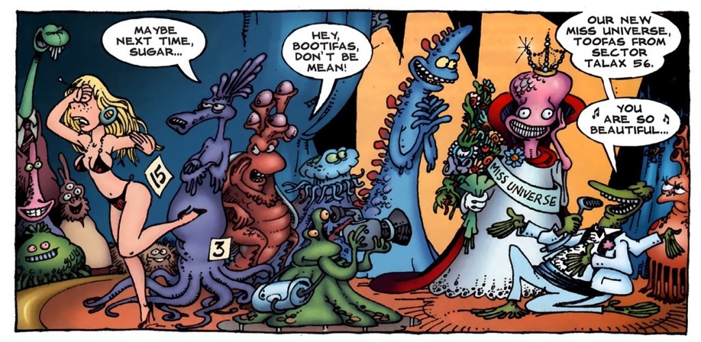
Excerpts from Kira and the Beauty Contest, published in Sergio Aragonés Funnies no. 2 (August 2011, Bongo Comics):
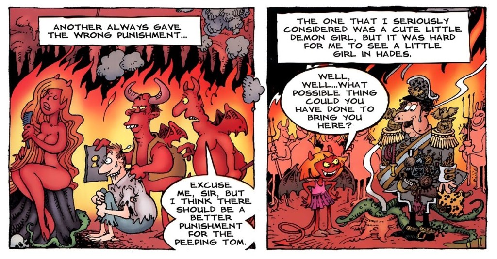
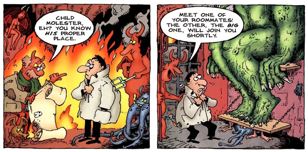
Panels from Sergio’s Inferno, published in Sergio Aragonés Funnies no. 3 (September 2011, Bongo Comics):
Finally, a panel from the back cover of Sergio Aragonés Funnies no. 10 (October 2013, Bongo Comics). Nevermind what the joke is, I just really like that octopus (as well as his other sea friends).
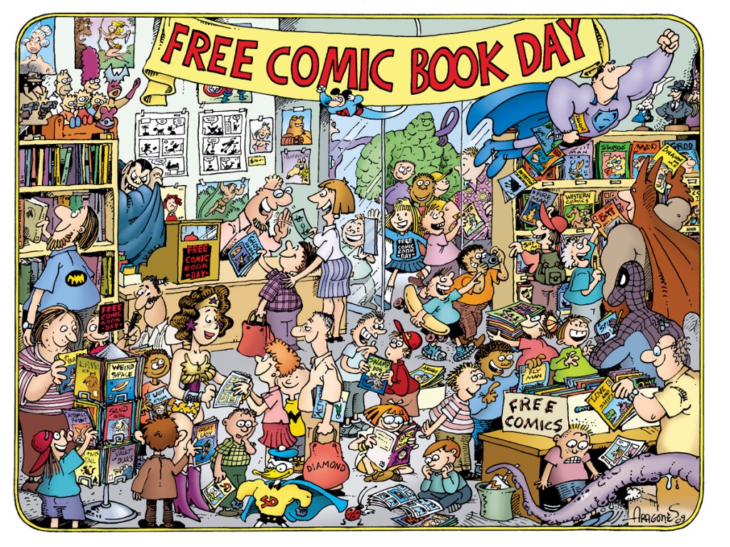
I mentioned materials related to Comic-Cons, so I would be amiss to not include at least one image of something vaguely related!
This design was created for the ‘Free Comic Book Day Commemorative Artist T-shirt’ in 2010.
I’ll end this post with a classic Aragonés anecdote, as told by Mark Evanier. This happened while these two were participating in filming The Half-Hour Comedy Hour television show for NBC in 1983, on which the model Jayne Kennedy was a guest. [source]
« This was one of the most beautiful women in the world. And she wore this dress that was very revealing, so much so the censors wouldn’t let us put her on the air in it without adding some material. So we’re all talking to her, the writers and whoever, just in awe of this woman. And Sergio comes walking in looking like a homeless person, carrying his portfolio. And Jayne sees him and she shouts, ‘Sergio!’ and she runs over and starts kissing him passionately.
They’d worked together before, it turned out. But Johnny Carson comes walking out into the hallway and he thinks Jayne Kennedy is being sexually assaulted by a homeless person in the NBC hallways. He came over to make sure she was okay. She said it was fine, that she knew him, and I said, ‘It’s okay, he’s a cartoonist.’
So Johnny gives that classic look and he says, ‘I knew I should have taken up drawing.’ »
Random fact of the day: in Mandarin Chinese, secret is “mimi”, whereas in French “mimi” means something like “cute”. Today’s post is not cute, but it is very much about secrets – DC secrets, to be more precise.
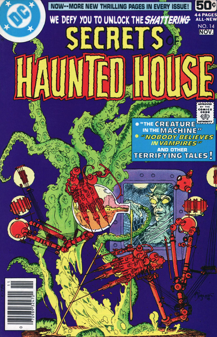
Secrets of Haunted House no. 14 (Oct-Nov 1978). Cover by Mike Kaluta.
The original art for this cover feels a little less cluttered:
Taking a peek at the insides, we will find that they have little to do with the cover, but tentacles are still present. The Discovery is scripted by Jay L. Zilber, pencilled by Juan Ortiz, and inked by Vince Colletta:
Tentacles also rudely intrude in Selina, a story scripted by Nicola Cuti and elegantly illustrated by Ramona Fradon and Bob Smith —
The thing about masks was too topical to not include.
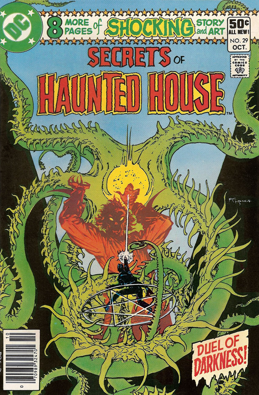
Secrets of Haunted House no. 29 (October 1980), cover by Mike Kaluta.
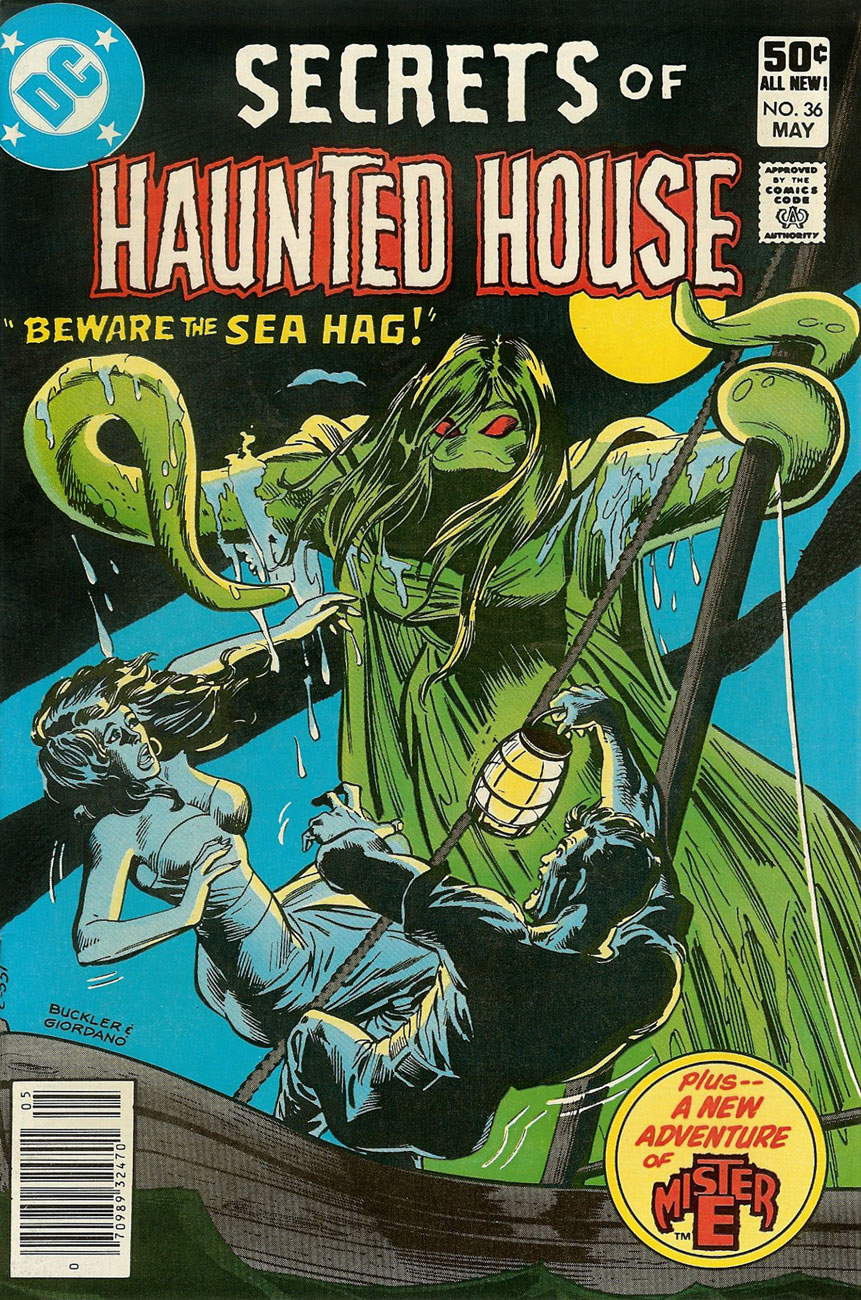
Secrets of Haunted House no. 36 (May 1981), cover pencilled by Rich Buckler and inked by Dick Giordano.
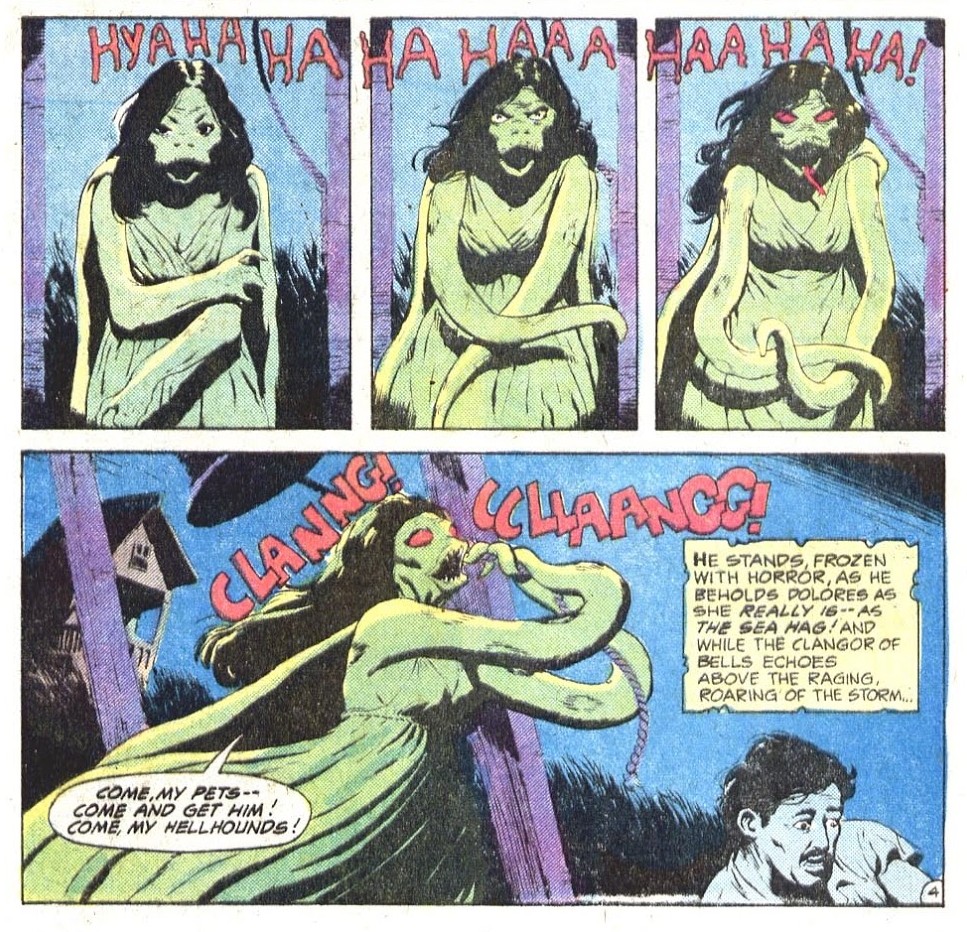
Beware the Sea Hag, the cover story, is scripted by Carl Wessler and drawn by Wade Hampton:
But, wait, this is not what the Sea Hag normally looks like! This is more like it:
Popeye the Sailor no. 73 (August 1964), cover by Bud Sagendorf. I wonder if the Sea Hag realises how much spinach reduces under heat.
Shifting to another sort of secrets (these are sinister rather than haunted), we have another tentacle apparition —
The Monster of Death Island is scripted by Maxene Fabe and drawn by Ruben Yandoc (i.e. Rubeny). It was published in Secrets of Sinister House no. 11 (April 1973).
This story, a sort of take on Bluebeard, is well worth reading, for the plot as well as the stunning art. I don’t want to reveal spoilers – you can read it here.
Since we’re discussing secrets, I might as well throw in TheHouse of Secrets… I will willingly admit that I have the hardest time keeping track of which is which.
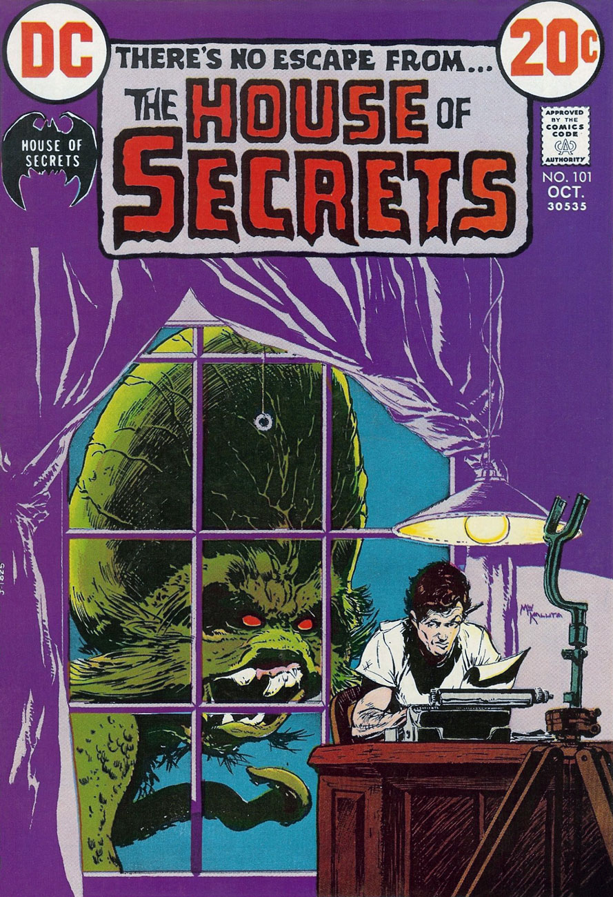
House of Secrets no. 101 (October 1972), cover by Mike Kaluta. This could have been a Mike Kaluta Tentacle Tuesday!
From House of Secrets no. 100 (September 1972). This page of Abel’s Fables is by Lore Shoberg.
Cain & Abelby Sergio Aragonés, printed in House of Secrets no. 103 (December 1972).
Okay, now that you’ve seen some Mad covers (see a MAD dash… outside) let’s have a peek at some inside art by the habitués.
One of my favourite MAD artists is Antonio Prohías (1921-1998). Hailing from Cuba (but being forced to emigrate thanks to an repressive government that wasn’t too fond of the concept of “free press”), he moved to New York in 1960. Apparently Prohias was in no hurry to learn English (and, in fact, his cartoons are silent). Here’s a cute anecdote involving Sergio Aragonés, courtesy of Wikipedia:
« Two years after Prohias’ debut in the magazine, cartoonist Sergio Aragonés made the trek from Mexico to New York in search of work. Because Aragonés’ command of English was then shaky, he asked that Prohias be present to serve as an interpreter. According to Aragonés, this proved to be a mistake, since Prohías knew even less English than he did. When Prohías introduced the young artist to the Mad editors as “Sergio, my brother from Mexico,” the Mad editors thought they were meeting “Sergio Prohías. Twelve years later, Mad writer Frank Jacobs reported that Prohias’ conversational English was limited to “Hello” and “How are you, brother?” Said Aragonés, who speaks six languages, “Even I could not understand him that well. »
Clearly, art was Prohias’ language, and we’re not at all complaining.
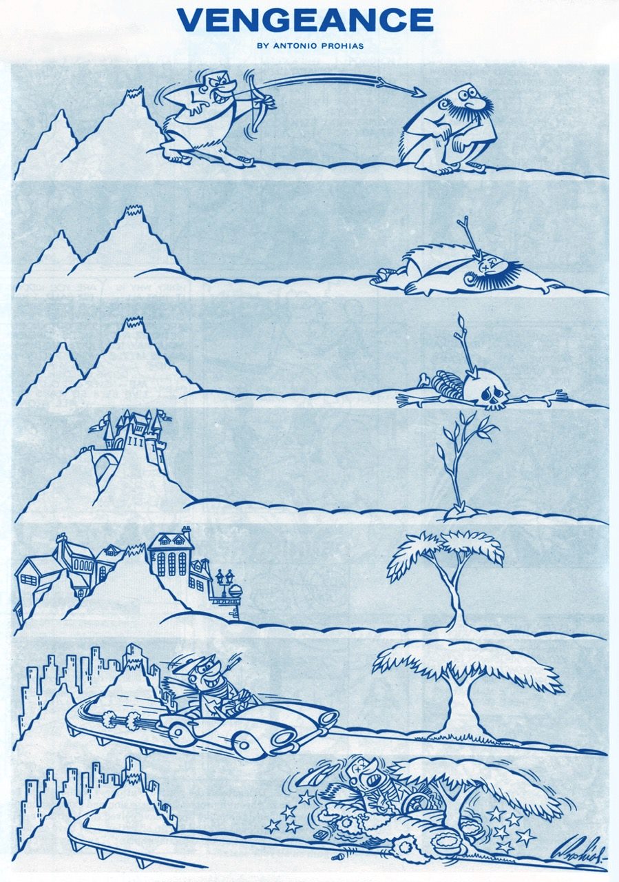
It pays to play the *long* game! “Vengeance” was published in Mad no. 66 (October 1961). Art by Antonio Prohías.
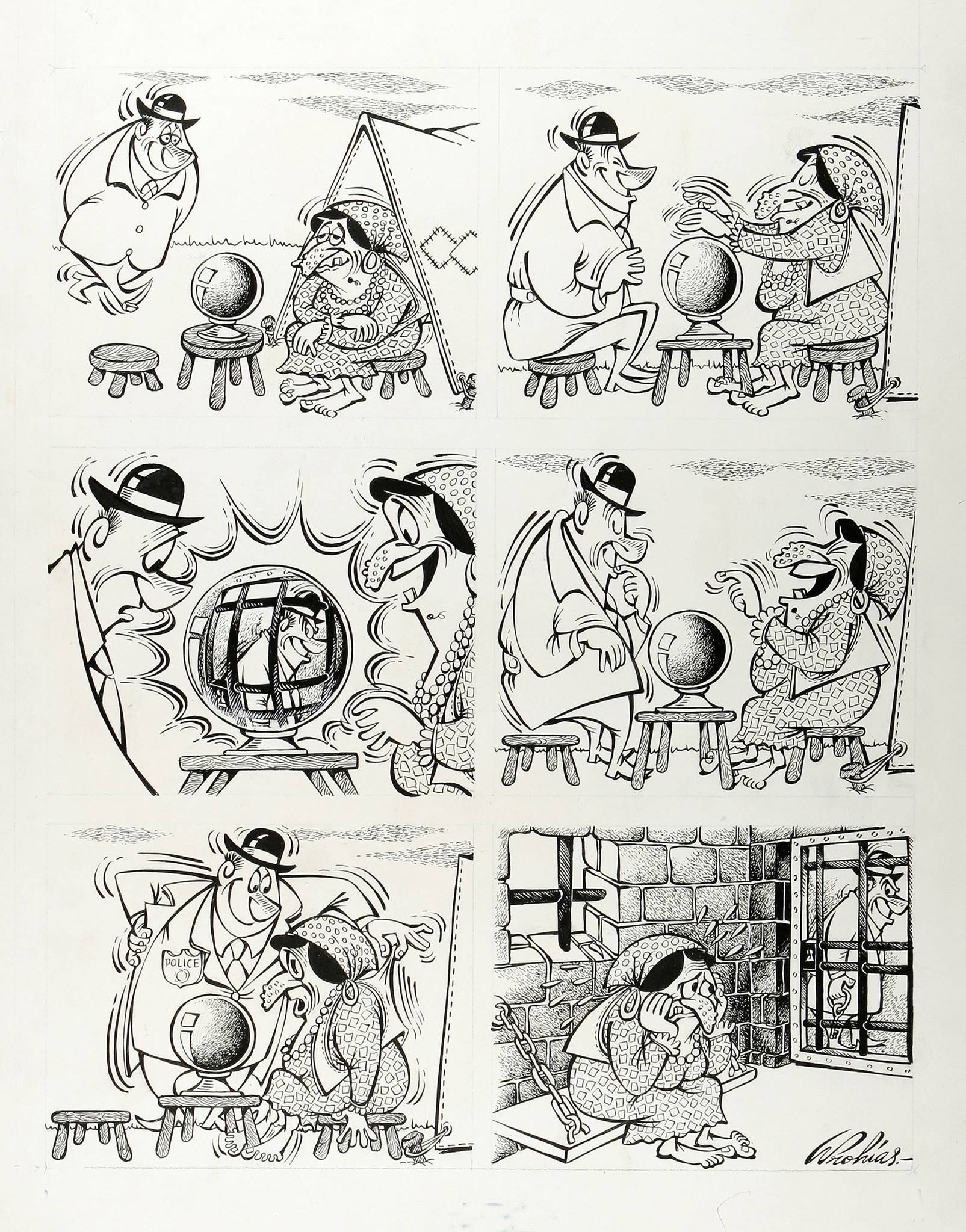
This it the original art for a gag called “The Old Ball Game”, created for Mad’s Fortune Kookie Dept. It was published in Mad no. 161, September 1973. Art by Antonio Prohías.
Original art for a strip published in Mad no. 253, March 1985. Ironically, I don’t particularly like Prohías’ Spy vs Spy, despite the lovely art and violent dismemberment scenes, much preferring Peter Kuper’s (much later, starting in 1997 up until today) version of this strip.
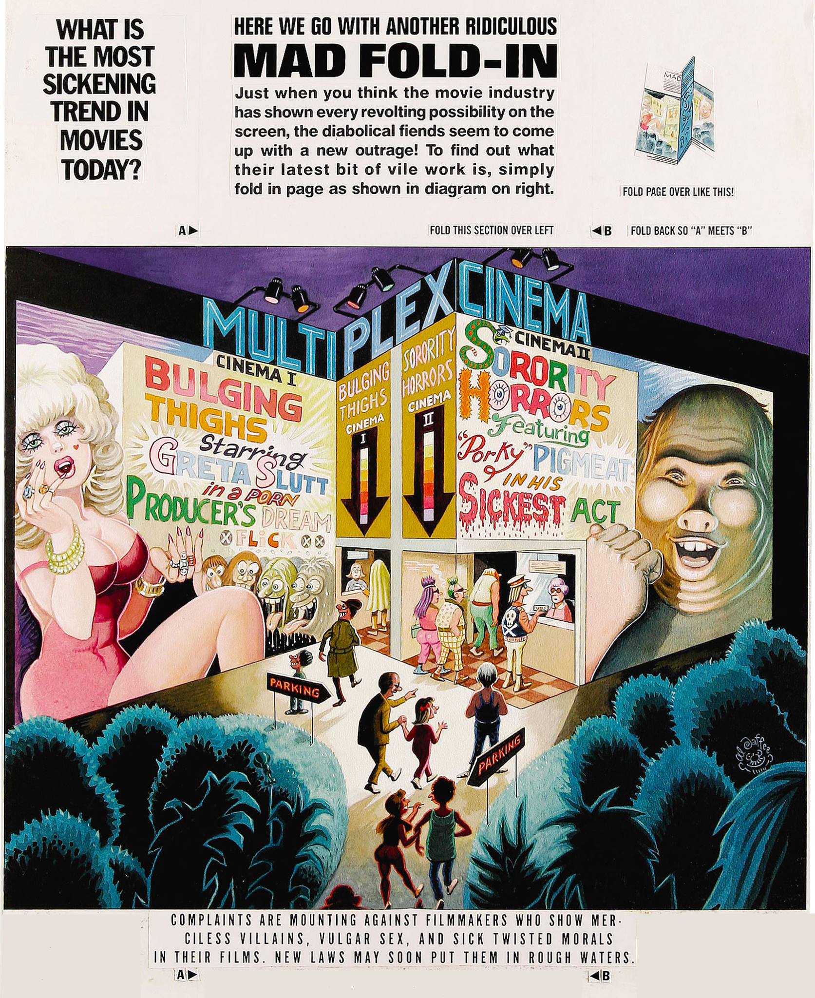
Next on our list is Al Jaffee, the “world’s oldest cartoonist” (Guinness World Records certified and everything!), Mad’s longest-running contributor, creator of the Mad Fold-In, mastermind of Snappy Answers to Stupid Questions.
This fold-in comes from Mad no. 297, September 1990. Drawn by Al Jaffee, it answers (maybe) the paramount question of “What is the most sickening trend in movies today?”( Since I can’t very well ask you to fold your computer screen, the answer is “Commercials in theaters.”)
Incidentally, Mad introduced fold-ins in 1964 – they were a most prominent feature of MAD Magazine, conceived, drawn and written by the aforementioned Jaffee. I’ll quote the man himself:
“Playboy had a foldout of a beautiful woman in each issue, and Life Magazine had these large, striking foldouts in which they’d show how the earth began or the solar system or something on that order — some massive panorama. Many magazines were hopping on the bandwagon, offering similar full-color spreads to their readers. I noticed this and thought, what’s a good satirical comment on the trend? Then I figured, why not reverse it? If other magazines are doing these big, full-color foldouts, well, cheap old Mad should go completely the opposite way and do an ultra-modest black-and-white Fold-In!”
I guess they folded (ahem) on the “black-and-white” part later on. Here’s another nice Al Jaffee production:
This cartoon dwelled on the back cover of Mad no. 214 (April 1980), and was written by Dave Manak & drawn by Al Jaffee.
In a 2010 interview, Jaffee said, “Serious people my age are dead.” That may just be the recipe for eternal life.
Moving on to another mainstay of MAD: Sergio Aragonés, an artist about whom Mad director Al Feldstein said “he could have drawn the whole magazine if we’d let him.” Prolific, delightfully funny, and (by all accounts) a really friendly guy, Aragonés (born in 1937) is still with us today.
A little gruesome hippy humour from Sergio Aragonés, published in Mad no. 139, December 1970.
My favourite recurring feature by Aragonés is “Who knows what evils lurk in the hearts of men? The shadow knows.“ Many years ago, I picked up a copy of “Mad’s Sergio Aragonés on Parade” at a second hand store. I didn’t know who he was, then, but I loved the sometimes tiny, always funny squiggly drawings immediately. (I also didn’t know who the Shadow was, so that reference was sailing right over my head.) Even though I have since then upgraded to the considerably heftier “Sergio Aragones: Five Decades of His Finest Works“, there’s no way I’m getting rid of my dog-eared, stained and shopworn copy – that’s the one I reach for when I need a chuckle.
Published in From Mad no. 131, December 1969, scanned from “Mad’s Sergio Aragonés on Parade“, and artistically coloured by co-admin RG.
Published in From Mad no. 129, September 1969, scanned from “Mad’s Sergio Aragonés on Parade“, and artistically coloured by co-admin RG.
Hurray for Aragonés, the weird hours he keeps (by his own admission), and the thousands of ideas bubbling in his head at any given time. “Sergio has, quite literally, drawn more cartoons on napkins in restaurants than most cartoonists draw in their entire careers“, said Al Jaffee, and glancing at the tiny drawings decorating the margins and in-between-panels of Mad magazine, one can easily believe it.
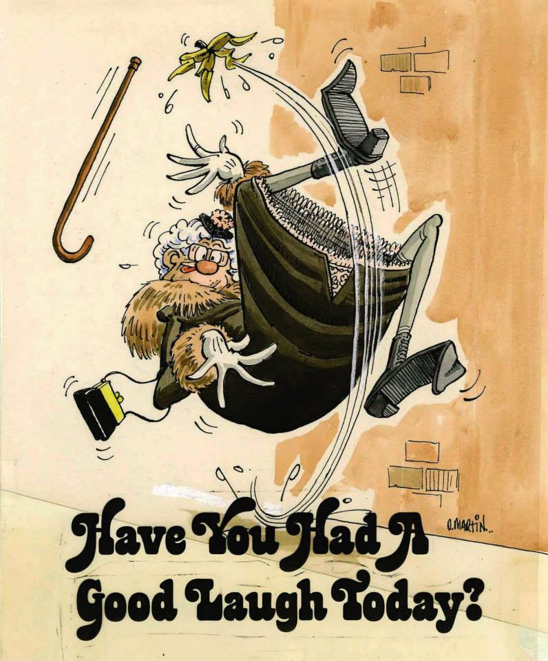
The other guy who just has to be mentioned is Don Martin (1931-2000), promoted as Mad’s Maddest Artist. Where else would we get our fix for goofy characters with comically large, hinged feet? I can just imagine the squeaking noises they make.
Well, *have* you? This Don Martin cartoon was used as one of the eight “Vital Message” mini posters offered with Mad Super Special no. 17 (1970). It makes me think of my mom’s parting admonition every time I would leave the house – “and don’t hit old ladies with an umbrella”. I am proud to say that I’ve followed her advice… so far.
Here’s a fun description of standard Don Martin characters (source):
« His people are big-nosed schmoes with sleepy eyes, puffs of wiry hair, and what appear to be life preservers under the waistline of their clothes. Their hands make delicate little mincing gestures and their strangely thin, elongated feet take a 90-degree turn at the toes as they step forward. Whether they’re average Joes or headhunters, Martin’s people share the same physique: a tottering tower of obloids. Martin puts the bodies of these characters through every kind of permutation, treating them as much like gadgets as the squirting flowers and joy buzzers that populate his gags: glass eyes pop out from a pat on the back; heads are steamrollered into manhole-cover shapes. All of this accompanied by a Dadaist panoply of sound effects found nowhere else: shtoink! shklorp! fwoba-dap! It’s unlikely Samuel Beckett was aware of Don Martin, but had he been he might have recognized a kindred spirit. »
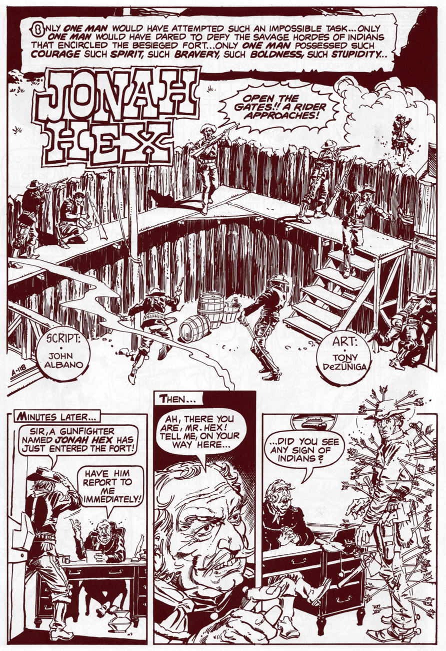
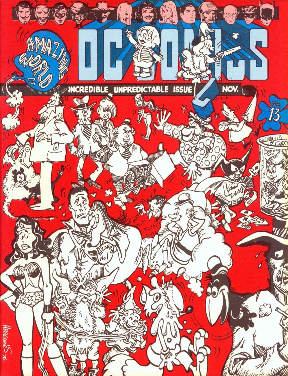
Jonah Hex originators John Albano (1922-2005) and Tony DeZuniga (1941-2012) take the piss out of their boy in a little tale that was, according to Paul Levitz, intended for a (self) parody title provisionally titled Zany (having cycled through the tentative monikers Black Humor and Weird Humor), and that never saw the light of day… This feature was the only one completed for the abortive endeavour, and it saw print in the Plop!-themed issue of The Amazing World of DC Comics (October, 1976), its thirteenth, of course. Incidentally, Plop!’s own cancellation was announced in that very issue of AWODCC. Bummer.
Why, yes… now that you mention it, an ice-cold root beer *would* be nice.
« Lying out in the ‘dessert‘ », Jonah? That was either a root-beer float mirage or a careless letterer’s oversight.
I would be earning myself a sound flogging if I didn’t share Sergio Aragonés‘ adroitly-done cover, so here it is.
Once upon a time (or, more precisely, a handful of years ago), we started a little weekly celebration of tentacle glory in comics and called it Tentacle Tuesday. (My husband came up with that alliteration; I hope he’s willing to share the credit for this pithy little phrase with others, as I honestly don’t know whether he was first to dream it up. By now, #tentacletuesday is a hashtag and there’s a Facebook page with that title). Yet “real life” (read: “a sad existence tragically devoid of octopuses”) got in the way, and although we’ve often thought about Tentacle Tuesday, no offerings were made at the Octopoda altar. We’d spot some glorious tentacles while reading comics, and wistfully dream of sharing them with a like-minded audience, but the impulse would pass, leaving behind vague but lingering regrets.
Well, we are back. Let’s keep Tentacle Tuesday going strong, for after all, comics and tentacles are among the universe’s greatest achievements. Let the cephalopod fiesta begin – we welcome you to this blog’s first-ever installment of Tentacle Tuesday!
Our first offering features, quite naturally, a Welcome Mat leading to a trapped, angry octopus, who seems to be indignant about being stuck in a pit with a bunch of uncouth, plebeian imaginary monsters. Claws, pincers, and talons, razor-sharp teeth and dendritic horns? Ha, *he* has tentacles! And if the other denizens of this trap are purely monster-under-the-bed material and act as if they’re drunks at a party, Mr. Octopus here is a professional who takes his job of being terrifying seriously.
This is a pin-up, if I may call it that, by the easily identifiable Sergio Aragonés, scanned from DC’s House of Mystery no. 189 (Nov./Dec. 1970). The giggling guy is Cain, the so-called host of the House of Mystery, and is every bit inclined to betray and double-cross as his Biblical namesake. Incidentally, number 189 is an excellent issue: Eyes of the Cat, with art by Jerry Grandenetti and Wally Wood, is both gorgeous and scary, with bonus points for prominently featuring a black cat (which Neal Adams made look like a rat on the cover – if you don’t believe me, try http://pencilink.blogspot.ca/2008/05/house-of-mystery-189-neal-adams-cover.html ) It is followed by The Deadly Game of G-H-O-S-T by Leonard Starr, and the issue wraps up elegantly with The Thing in the Chair with art by Tom Sutton.
⇔
In a slightly different vein, but equally lighthearted, is this cover of Abbott & Costello no. 16 (Aug. 1970, Charlton). I hope our readers shall be too polite to point out that Tony Tallarico, the artist, made tentacles look more like elephant trunks, or that this… creature… has but four of them, which would make him probably the only quadripartite octopus in existence (they’re supposed to have 8, for those of us who are a little hazy on the specifics). Now, if only Charlton paid by the tentacle rather than by the page…
This comics series was of course based on the American comedy duo of Bud Abbott and Lou Costello, of early 40s and 50s fame. Fast-forward to 1967, and with Costello having long passed on (in 1959), the pair was miraculously given a new, two-dimensional lease on life (hey, you take what you can get… comedy’s a vicious game!) through the auspices of Hanna-Barbera Productions, and Charlton landed the comics licence and ran with it… for a healthy twenty-two issues. The first eight or nine of these, featuring the madcap talents of artist Henry Scarpelli and (especially) scripter Steve Skeates, are the ones to seek out. You have been warned!