Panning the murky old print stream for the odd glimmering nugget
The Seventies, Ain’t It?
I hate that “Bronze Age” comics designation, with a beginning and end no-one seems to agree upon… because, well, it’s arbitrary. So let’s just focus on the numerical decade, shall we?
While I’m a late-blooming romance comics fan — the flamboyant Enrique Nieto drew me in, and I stuck around — I’m strictly a Charlton man: with precious few exceptions, DC’s take on the genre is histrionic and insincere. These were the books no-one at National wanted to be stuck editing. Also, and it’s always worth noting: wayyyy too much Vince Colletta. As for Marvel: Stanley Lieber was, not to put too fine a point on it, relentlessly sexist… ’nuff said?**
It’s not for nothing that Charlton was tops in romance, publishing a dozen or so titles at a time when the Big Two put forth a third of that number at most… with plenty of reprints tossed into the mix. Obviously, given Charlton’s tremendous romance output, it wasn’t all gold… but nuggets turned up with sufficient frequency to justify one’s continued interest.
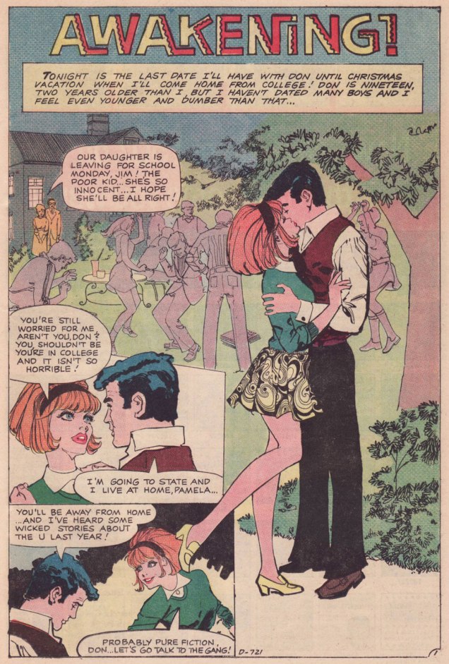
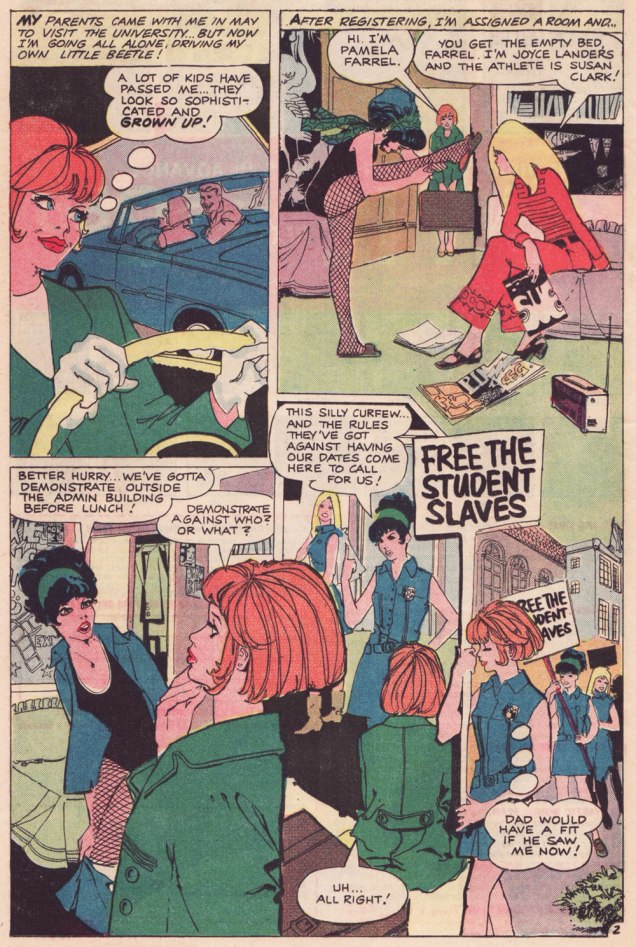
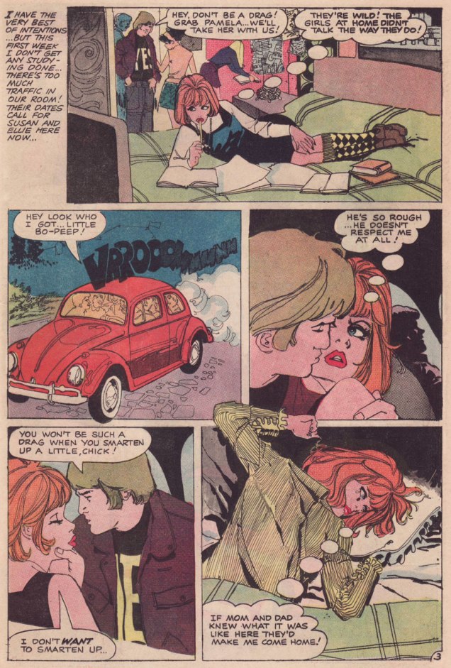
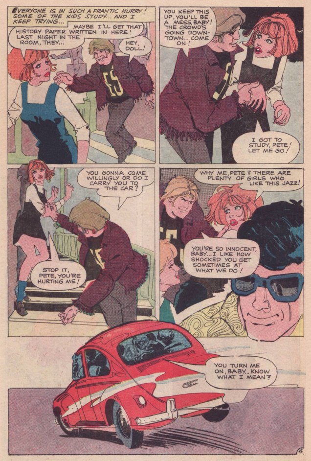
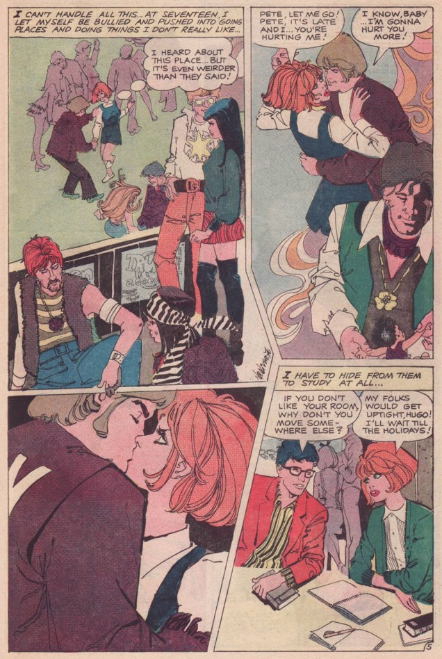
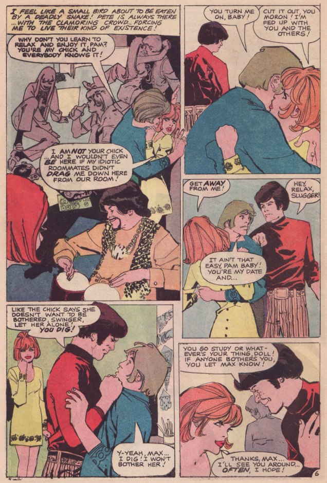
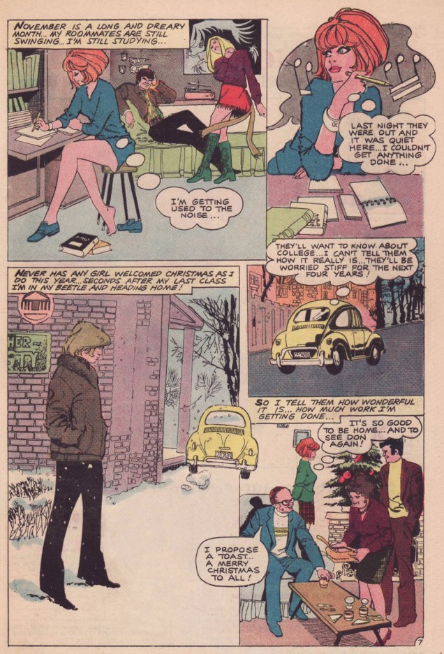
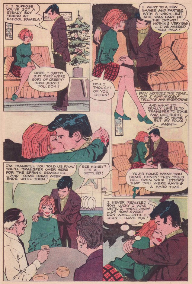
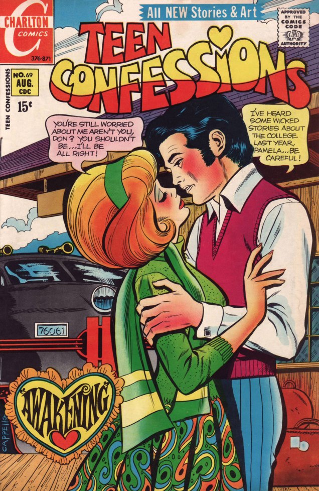
Let us then flash back to 1971, and a nugget from Teen Confessions no. 69 (Aug. 1971, Charlton). Almost certainly written by Joe Gill and definitely pencilled and inked by yet another talented Argentine, Nestor Olivera.***
.
.
Having the bully/sexual predator wear a big YES on his shirt — though never quite show it — is a cleverly appropriate touch on the part of the artist.
.
A typical Joe Gill touch: a character may be introduced, speak one line, advance the story, reinforce its logic… and never reappear. Take a bow, Hugo.Max makes the most of his chivalrous four-panel rôle; in a refreshing twist, there are no strings attached to his gallant turn.
.
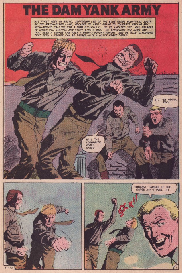
Parents who aren’t utter dimwits also frequently feature in Joe Gill’s romances. Awakening was the cover story. While former Colletta assistant Art Capello is credited — and he signed it, too — I strongly suspect the heavy hand of editor Sal Gentile in the layout and finishes. Why? Because Gentile’s leading men always tended to resemble actor George Chakiris.Compare and contrast: other than romance, the versatile Olivera demonstrated his chops in Charlton’s war titles. This is the opener of The Dam Yank Army, another Joe Gill yarn, cover-featured in Fightin’ Army no. 74 (June 1967; Dick Giordano, editor).
-RG
*By all means read the full interview for some insight (beware!) into Kanigher’s thinking. He continually caroms from insight to delusion, from sagacity to madness… just like his work, one might say.
**Re: Marvel… I may someday devote a post to the question of why early 70s Marvel romance’s dream man was presented as a dead ringer to the, er… controversial Jim Shooter. Probably mere coincidence.
***By ‘talented Argentine’ (Spanish-Argentine, technically), I refer to none other than José Luis García-López. Also from ’71, and in a totally different style, check out his Emancipated Amanda.
« I think people will believe anything about someone they haven’t seen for a while. » — Gabriel Kaplan
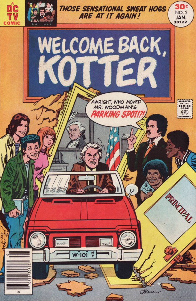
I’ve been meaning to do a Welcome Back, Kotter post for several years. But when I thought about it, I understood that hitching it to the show’s fiftieth anniversary made considerably more sense than, say, its forty-seventh. And while I adore William Johnston‘s sextet of tie-in novels, it would be quite a stretch for a comics blog to cover. Far closer to the mark lies Arnold Drake‘s trio of WBK storybooks, illustrated by Mel Crawford and Jack Sparling. But in the end, I bided my time and managed to get in touch with the scribe first assigned the Kotter Komic assignment, Elliot S! Maggin. And boy, am I glad I did. And so, fifty years to the day of the airing of its pilot episode*, let’s talk Kotter!
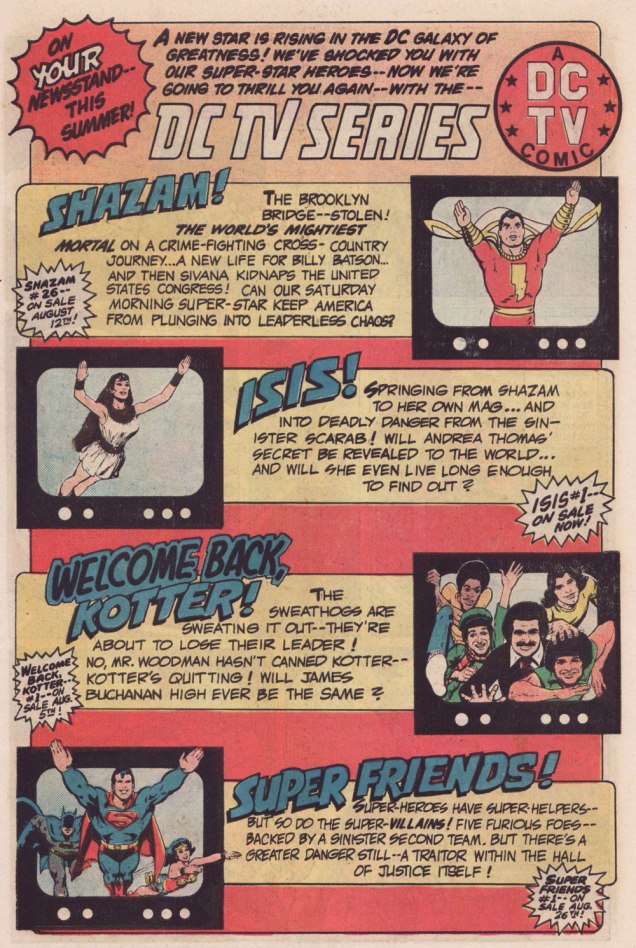
Remember the DC TV line? This ad ran in several DC titles over the summer of ’76.
WOT: First, a bit of context: correct me if I’m wrong, but in the early stages of your career writing comics, you always worked alongside editor Julius Schwartz. Then, in late ’75 or early ’76, something changed, and you began writing for other editors’ titles. What’s the story?
ES!M: Well, Julie was kind of proprietary about me for most of the time I was working with him.
WOT: A sideways sort of compliment.
ES!M: I guess. At some point, Dorothy Woolfolk was editing the Lois Lane book, and… he introduced me to her. She just came into his office for some reason. She said: « Oh, you know, you should write some stuff for me! » And he said « No, he’s very busy, go away! » And he chased her out of the office. And I’m thinking, « Oh, okay. That’s how we’re doing it. »
So I didn’t really go about… I didn’t really make friends with many of the other editors. I tried to make friends with Joe Orlando. You know, I’d have lunch with him once in a while, I guess.
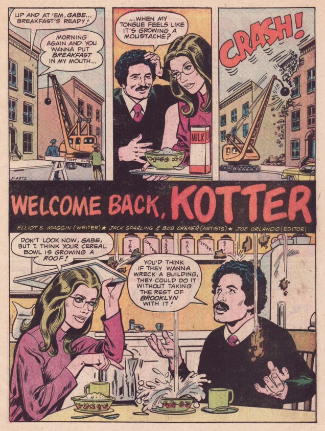
This is Welcome Back, Kotter no. 1 (Nov. 1976, DC); cover by Bob Oksner.
ES!M: But around the time Kotter came out…
You know, people used to hang out outside of Julie’s office door, listening to us plot, because it was so loud. We would yell and scream at each other constantly. He was this Jewish boy from the Bronx, and I was this Jewish boy from Brooklyn, and once I got comfortable working with a guy thirty-five years older than me, we’d just fight all the time. And every once in a while, we’d get serious.
WOT: Serious fighting, or serious work?
ES!M: Yeah, yeah! The fighting was work.
WOT: Sometimes that line is dreadfully thin.
ES!M: I guess at that point, he got mad at me, and I didn’t get work for a couple of weeks. I went to Joe, and I said: « What ya got? », and he said he’s doing this Welcome Back, Kotter book, and I said « Great! I watch that show, that’s fun. » So I wrote the first issue, and that was fine.
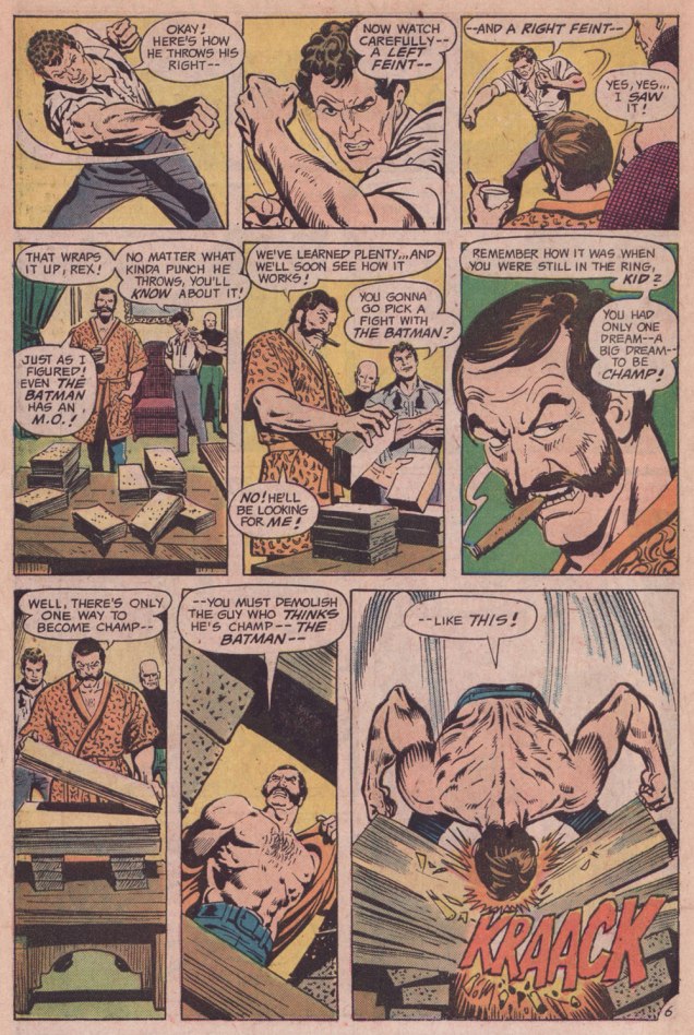
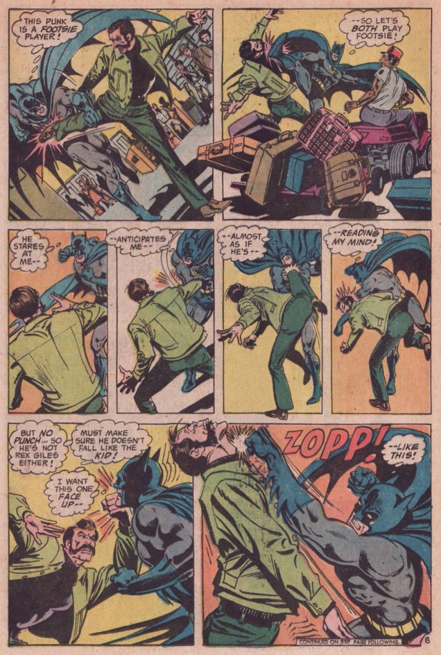
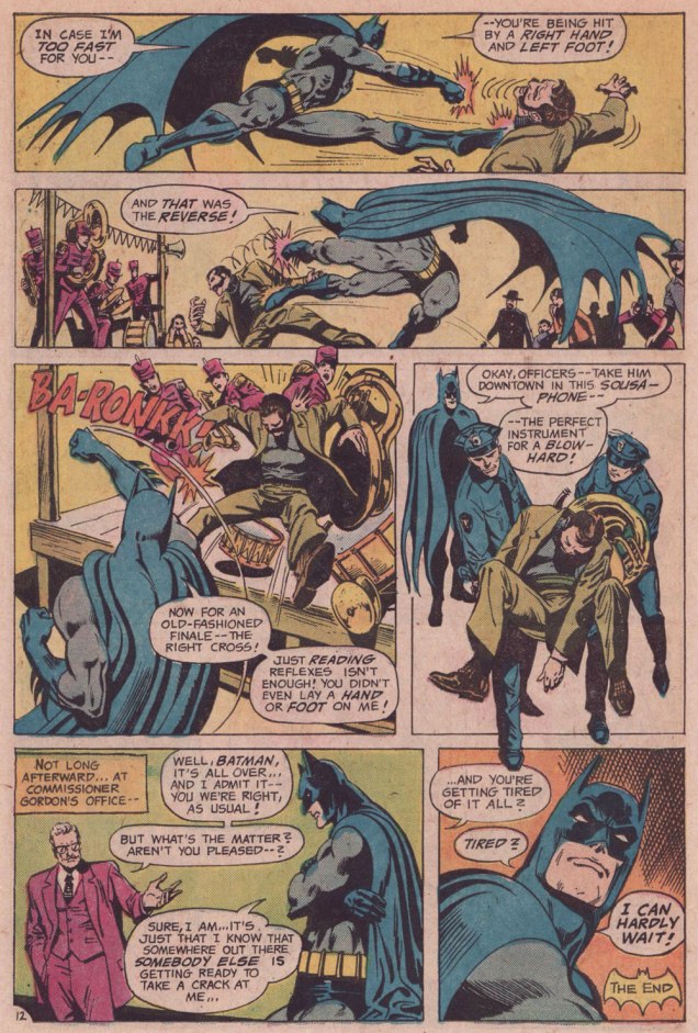
Here’s a quartet of pages from the première issue. Pencils by Sparling and finishes (and surely likenesses) by Oksner.
.
.
Aw, Maggin’s Mr. Pevey would have made a great addition to the TV show’s cast.
ES!M: They called me down in Carmine‘s office, to watch episodes of the show. It had been on maybe six weeks at that point. Episodes I had already seen, but I liked hanging out in Carmine’s office, because it was big, and he had a lot of toys around. So they set up this video tape… thing, and I watched the shows again, and I wrote the second issue.
This is Welcome Back, Kotter no. 2 (Jan. 1977, DC); cover by Oksner.Art-wise, the second issue seemed comparatively rushed, and sans Oksner, likenesses pretty arbitrary. See what I mean? The GCD attributes the inks to Sparling, but I lean towards Frank Springer.
ES!M: I was living in an apartment complex on Long Island, and there were all these kids around… little kids. And I would work at home, mostly. So they would hang around with me, whenever they realized I was home. They would… shoot me through the window or… something. At some point, whenever I’d write a gag, I would…
WOT: … run it past them?
ES!M: Yeah! And they’d laugh, and run off and play some more. And I figured, as long as they laughed, it was okay. Because they were hearing the voice of Barbarino, or whoever. At some point Travolta would say, « Uh? », or « Duh », or « What d’you think? », something dull, that he delivered in a funny way. And the kids related what I wrote to what Travolta did on screen, so they were getting it. And at some point I realized that Joe [editor Orlando] didn’t watch the show.
WOT: Oops.
ES!M: And he would then object to my Barbarino bits, or Horshack bits, or whatever. So I told him « You’ve got to watch the show, you’ll get it! » But you know, after maybe… how many issues did I write, three, four?
WOT: Just two, I’m afraid. You wrote the first couple, then Tony Isabella did one, then Mark Evanier…
ES!M: I’m sure he (Evanier) watched the show — he watched everything.
WOT: He was even the show’s story editor for part of its second season. So… then Bob Toomey wrote four issues, Scott Edelman two, and there was a leftover story by Evanier that saw print in the WBK Collector’s Edition in 1978.
ES!M: But Joe did not. I mean, he didn’t have time, and he was madly in love with his wife, and he didn’t watch television at all (laughs). He wasn’t paying attention to the source material.
WOT: That happens. But it seems a pretty unfortunate blind spot for a book’s editor.
ES!M: I wrote two issues, and at some point, Joe said: « You can’t write! ». He said « No, you can’t write! » A blanket condemnation of everything I’d ever done.
WOT: Oooh.
ES!M: By that time, I’d made up with Julie, and I was writing more Superman stuff. After that, wherever any of my fights with Julie got serious, I’d go down the street to Marvel, and do something there. Then I would make up with Julie, and they’d never see me again… until I had another fight with Julie.
That was my experience writing Kotter.
And here’s what undoubtedly has to be the Guernica, if you will, of Kotter art: Bob Oksner‘s superlative cover for Limited Collectors’ Edition C-57, from 1978, DC’s final — and finest — WKB publication. Feel free to open it in another tab for a fuller view… I provided a larger image so you can fully take in the wealth of details.
WOT: In closing, how are you keeping busy these days?
ES!M: I just wrote a book called Lexcorp. A novel. Which you should probably plug.
WOT: Done!
ES!M: It’s a first-person story that Lex Luthor tells. And he identifies himself as an unreliable narrator, like… Huckleberry Finn. But it does tell the story of how he saves the world. Stuff like that.
I’m working on another book, working on a time travel story. And my ex-wife asked me to write an autobiography so my grandchildren know who I am.
I have all these people I know with Pulitzer Prizes; and at some point in the autobiography, I wrote: « I have about a dozen Pulitzers floating around through my life, and none of them are mine. This book is available for consideration. »
WOT: Mr. Maggin, thank you so much for taking the time to share these stories with us!
-RG
*the pilot episode, for some reason, was aired third, on September 23, 1975, while the show premiered on the 9th of September with ‘The Great Debate‘ (featuring a wonderfully smarmy James Woods).
« The hardest tumble a man can make is to fall over his own bluff. » — Ambrose Bierce
Today, I’m going totally ‘mainstream’ on you for a change. Last week, I ventured into a movie theatre for the first time since 2019 (Knives Out was my last such outing) to see my first superhero film since 2012 (The Avengers was my last such outing). And so, while the new Superman epic wasn’t perfect, I found much to enjoy about it.
Among the ideas explored in the film was that baddie Lex ‘Elon’ Luthor, from carefully observing The Man of Steel over several years’ worth of skirmishes, had managed to analyse and codify his combat moves, in order to predict and counter them.
I was reminded of that angle serving as the basis of a favourite Batman story by my favourite Batman writer (and hardly anyone else’s, apparently), David Vern Reed (1914-1994). Despite its publication in a popular, long-running title, this tale is obscure to the point of never having been reprinted in English.
I’m terribly fond of the Schwartz-era Batman, especially the 1970s, because it’s relatively light on costumed supervillains, Batman acts like the detective — albeit a remarkably athletic one — he’s supposed to be, and the plots often hinge on ‘ordinary’ (though clever) criminals striving to outsmart Bats. A favourite example: Vern’s « The Underworld Olympics ’76! » (Batman 272-275, Feb.-May 1976) tetraptych. I think I can safely rule out childhood nostalgia: in my small town, distribution was quite spotty, so I never even *saw* those issues at the time, encountering them instead as an adult, decades on.
If I have a quibble about the art, it’s that Ernie Chan’s finishes mesh poorly with García-López’s usual rock-solid breakdowns. Perhaps it’s because Chan likes to have more to do; given that García-López, his own best inker, typically turns out pencil renderings that are utterly complete and tight as a drum, the job is quite unlike, say, Chan inking a Big John Buscema Conan job — as he so often did — wherein Chan has to do 80 percent of the work over Buscema’s sparse breakdowns, stock poses and rote shortcuts. In contrast, inking García-López essentially reduces the task to tracing over his flawless pencils, which can’t be all that stimulating, educational as it may be.
Speaking of Garcia-Lopez, a priceless anecdote: writer Andrew Helfer, a frequent collaborator, recalled, in his introduction to TwoMorrows’ Modern Masters Volume Five (2007): « … it was Jean Giraud, aka Mœbius, and he was staring at a drawing of Wonder Woman by José Luis García-López. « This García-López », he asked in a heavy French accent. « He uses models, no? » « No, » I answered, smiling. « Son of a bitch! » Mœbius hissed.
« Losing my mind, but I don’t care I see Donna everywhere Down by the lakeside, in a lawn chair Donna, Donna everywhere » — Too Much Joy
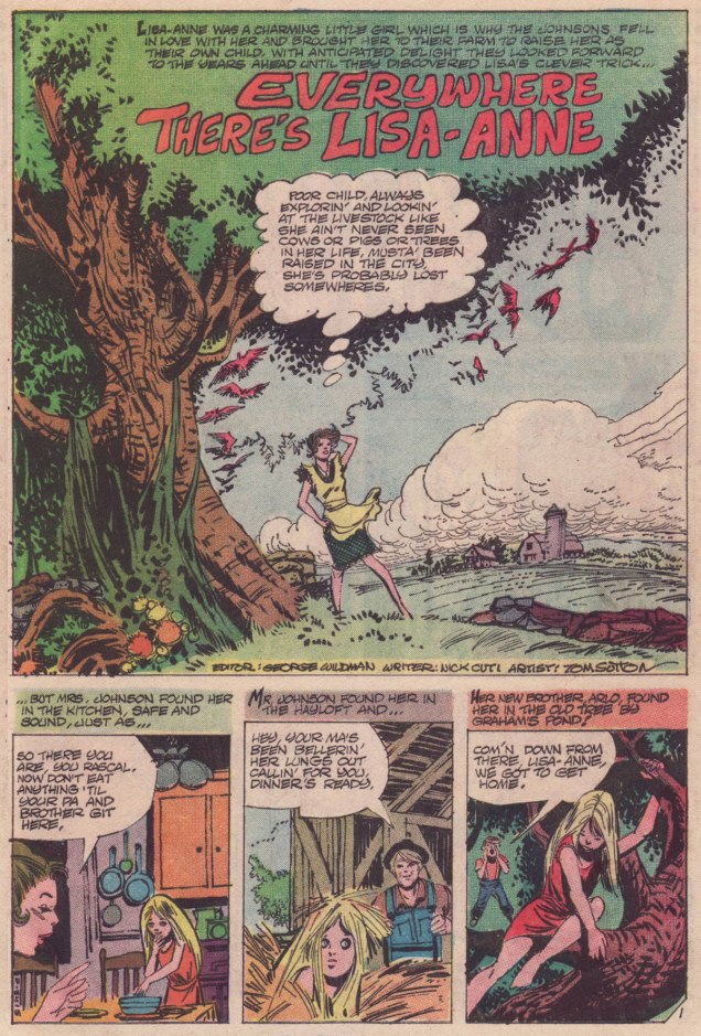
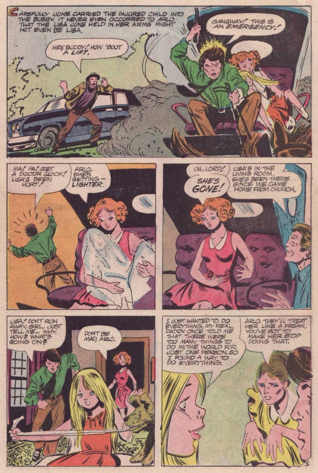
Today’s featured tale hails from Charlton’s groundbreaking anthology title Midnight Tales (1972-1976). It differs from the rest of the publisher’s mystery line in that it largely served as a vehicle and spotlight for Wayne Howard (1949-2007), who even received a ‘created by’ mention on the covers. My partner ds delved deeper into Midnight Tales minutiae in her Tentacle Tuesday entry « Plants Sometimes Have Tentacles, Too ».
« Everywhere There’s Lisa-Anne » saw print in Midnight Tales no. 6 (Nov. 1973, Charlton). It was written by Nicola Cuti, Howard’s co-conspirator (they had both apprenticed with Wally Wood), who provided the lion’s share of Midnight Tales scripts. It was illustrated by Tom Sutton and coloured by Mr. Howard.
What I enjoy about this snappy little tale is its graceful economy: it packs a lot of context and characters into its mere six pages, but flows so efficiently that it never feels rushed. It doesn’t attempt to explain what doesn’t need explaining, nothing is overstated, and none of the characters is a convenient idiot. No patronising hand-holding, just straight-ahead storytelling.
Let’s hope, for the Johnsons’ sake, that Lisa-Anne’s very convincing and the sheriff no laggard!
Lisa-Ann’s ubiquity reminds me of a favourite Cul de Sac Sunday strip… and any excuse to trot out the Richard Thompson is to be seized eagerly!
« True terror is to wake up one morning and discover that your high school class is running the country. » — Kurt Vonnegut
Tonight, we’re slumming it up on the cheap side of the tracks. If you thought — and I quite understand you on that point — that Myron Fass’ Eerie Publications were scraping the bottom of the barrel for their market share, then you likely weren’t aware of his fellow cheapjack opportunist Stanley Morse. For a bit of background on Fass, check out these entries from previous countdowns: Hallowe’en Countdown II, Day 1; and Hallowe’en Countdown VI, Day 27… so I don’t have to repeat myself.
Furthermore, here’s my brief introduction to the dodgy wonders of Morse’s ‘Stanley Publications’. I recently came upon all the short-lived line’s covers and was struck by their certain je ne sais quoi. Doubting my senses a little, I queried ds, and she concurred: it’s raw, it’s primitive, but not devoid of a bizarre sort of charm.
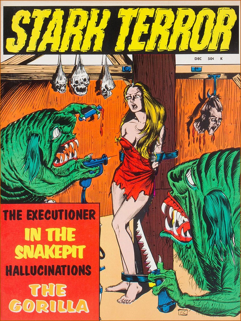
Here, then… is a gallery of the entire run of Stark Terror!
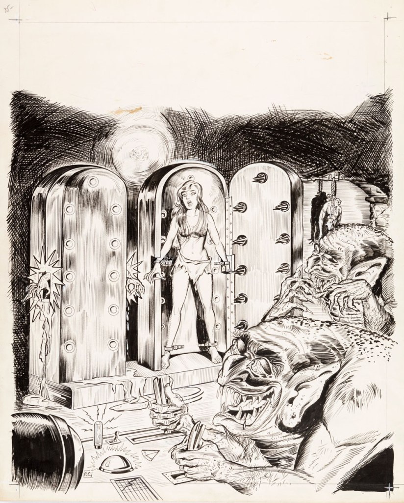
This is Stark Terror no. 1 (Dec. 1970, Stanley); cover art by Frank Carin (né Carino).This is Stark Terror no. 2 (Feb. 1971, Stanley); cover art by Carin.This is Stark Terror no. 3 (Apr. 1971, Stanley); cover art by Mexican illustrator Héctor Castellón .This is Stark Terror no. 4 (June 1971, Stanley); cover art by Carin.This is Stark Terror no. 5 (Aug. 1971, Stanley); cover art by Carin. Just in time for cancellation, a new logo, possibly by Ben Oda.As a bonus, here’s the surviving original art to the publisher’s Ghoul Tales no. 1 (Nov. 1970, Morse); artwork, again, by Mr. Frank Carin.
« Veteran genre-crosser Carin delivered this new-for-1970 cover, insinuating troll-like creeps into a mad-doctor/torture-chamber situation. (The published version contains a touch of self-censorship, obscuring one conspicuous element of nudity with layers of color.) Carin is an enigmatic figure in midcentury comics, traversing the idioms of Funny Animals, Good Girl Art, adventure, and lurid shock value. » [ source ]
« Better to have a lousy character than no character at all. » — Alain Delon (Nov. 8, 1935 – Aug. 18, 2024)
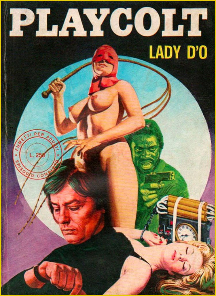
Quite recently, we lost monstre sacréAlain Delon. He was a complicated man, a bit of a prickly bastard, but he sure made a lot of great movies*. But comics, you ask? Well, I’m sure he never asked for it, but like many a celebrity (Jean-Paul Belmondo, Ornella Muti…) his famous countenance was appropriated by those incorrigible rascals at Edifumetto and Ediperiodici.
So Alain Delon became… « Alain Velon, a billionaire playboy who lives on an island “a 3-hour flight from New York“. He spends his private life conquering women in a continuous stream even if he is already engaged to the film actress Lizzy Scarlett, but “due to his innate sense of justice” he periodically transforms into Playcolt, a sort of superhero. His enemy is Linda Darnel, also a billionaire: sadistic and fetishist, she turns into the anti-heroine Za the Dead. Another historical rival is the always sadistic but lesbian Mandrakka. »
Now don’t get me wrong: these are virtually unreadable, poorly drawn, sadistic, illogical, reactionary misogynistic claptrap. But the covers are fascinating in their gonzo way, randomly cobbling together purloined bits from famous likenesses to established logos. You’d think this brazen wave of wholesale filching would have led to swift and decisive legal action from several stars’ solicitors, not to mention Hugh Hefner’s… but it seems not. This was, after all, the Italy that gave us Silvio Berlusconi.
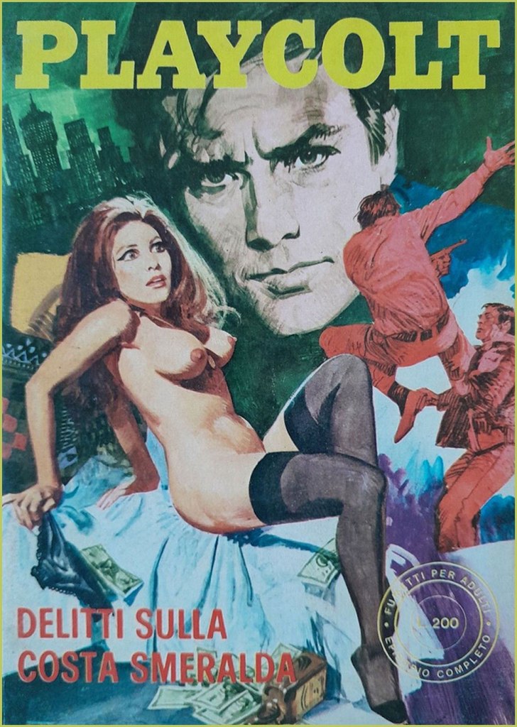
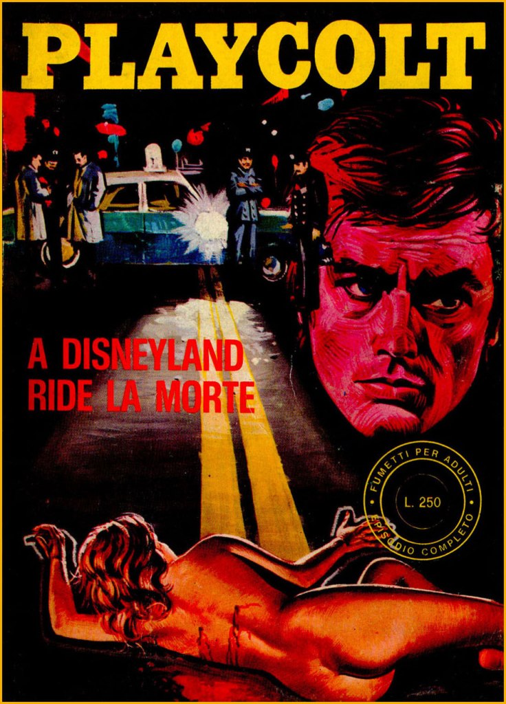
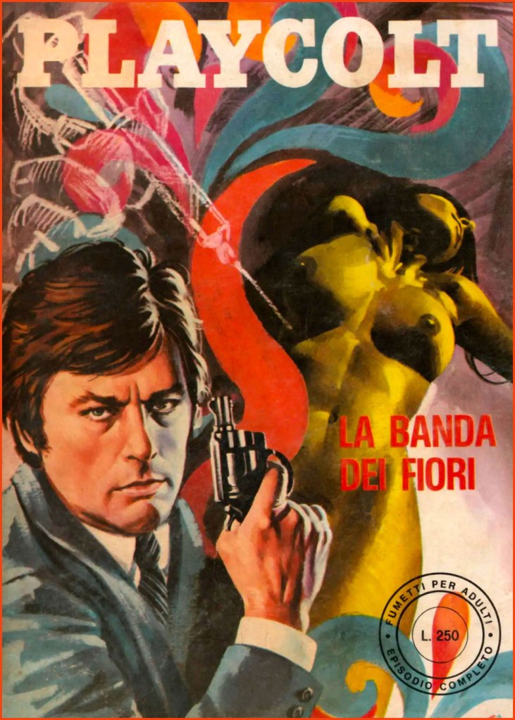
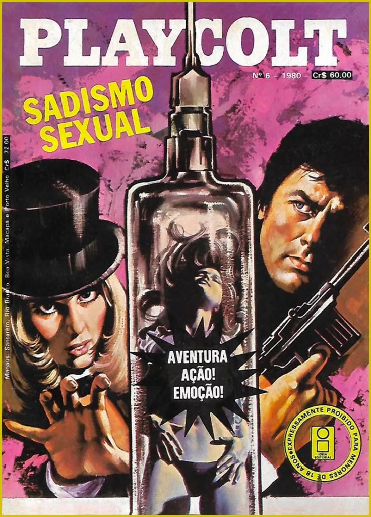
« To the Sound of Punches »; this is Playcolt Series II no. 9 (Nov. 1973, Edifumetto). Cover art by Carlo Jacono, a nice piece, but celebrity likenesses evidently weren’t among his strong suits.« Crimes on the Emerald Coast »; this is Playcolt Series II no. 14 (Aug. 1973, Edifumetto). This one’s *possibly* the work of Alessandro Biffignandi… or his studio.« The Golden Rain » (ahem); this is Playcolt Series II no. 23 (Dec. 1973, Edifumetto). Another Jacono, another botched likeness.« The Divine Sadist »; this is Playcolt Series III no. 1 (July 1974, Edifumetto). « Death laughs in Disneyland »; this is Playcolt Series III no. 11 (June 1974, Edifumetto). « There’s a mess in the middle of the sea »; a 1980 Brazilian edition reprinting Playcolt Series III no. 18 (Sept. 1974) in Portuguese. « The Flower Gang »; this is Playcolt Series III no. 22 (Nov. 1974, Edifumetto). I have no concrete evidence, but the technique displayed here reminds me strongly of British illustrator-cartoonist Ron Embleton (1930-1988), co-creator of Oh, Wicked Wanda! and illustrator of the immortal Captain Scarlet closing credits.No need for a translation, is there? A 1980 Brazilian edition reprinting Playcolt Series IV no. 1 (Jan. 1975) in Portuguese. « Operation Puzzle »; this is Playcolt Series IV no. 12 (Nov. 1975, Edifumetto). Cover painted by the prolific Emanuele Taglietti, who handled quite a few covers in this series. Here’s an impressive gallery of these.« The White Shark »; this is Playcolt Series IV no. 35 (May 1976, Edifumetto). Sharks were all the rage that year.« To Love a Hole »; a 1980 Brazilian edition reprinting Playcolt Series IV no. 2 (Jan. 1975). Dig that strategic blurb placement; the Italian edition was not so coy. Clearly a reference to the previous year’s hit ‘erotic’ film, L’histoire d’O; this is Playcolt Series IV no. 27 (Jan. 1976, Edifumetto). It’s funny how the Delon photos used span his career up to that point, which yields visual whiplash when you go from the Delon of Plein Soleil to the jaded, grizzled one of, say, Monsieur Klein or La mort d’un pourri from one issue to the next.« Terror in California »; this is Playcolt Series IV no. 44 (Oct. 1976, Edifumetto). The obligatory Jaws cash-in. Say what you will, those Italians didn’t miss a trick.
There was, concurrently, another Delon homage in Jean Ollivier and Raffaele Carlo Marcello‘s successful Docteur Justice, a humane but hard-hitting series about a physician and expert judoka who roams the globe’s trouble spots for the World Health Organization. There was even a film adaptation in 1975, with John Phillip Law essaying the title role… and co-starring Delon’s ex — and only — wife, Nathalie. Among Pif Gadget’s adventure series, it was only bested in popularity by the prehistoric blond heartthrob Rahan. I’ll tell you more about it one of these days.
-RG
*So claims the Russian pop song entitled Взгляд с экрана, and who are we to doubt it?
« If you saw a heat wave, would you wave back? » — Stephen Wright
Time to carry on with one of my pet quixotic missions, that of advocating the glory of Samm Schwartz (1920-1997), my very favourite Archie artist… and one of my favourite cartoonists, period.
Having acquired over the years most of the Jughead issues I could afford — for the most part cheap, but thankfully numerous — I’ve now reached the stage of acquiring scattered issues of assorted Archie titles featuring one or two Schwartz stories… along with often appalling page fillers by painfully lesser lights. To lessen the blow, I usually skip the Schwartz story — which usually opens the book… savvy thinking on their part, I’ll admit — then return to it so as to end on a high note.
I was hesitating between two stories, but since they’re both quite short, why choose? Hence the programme double.
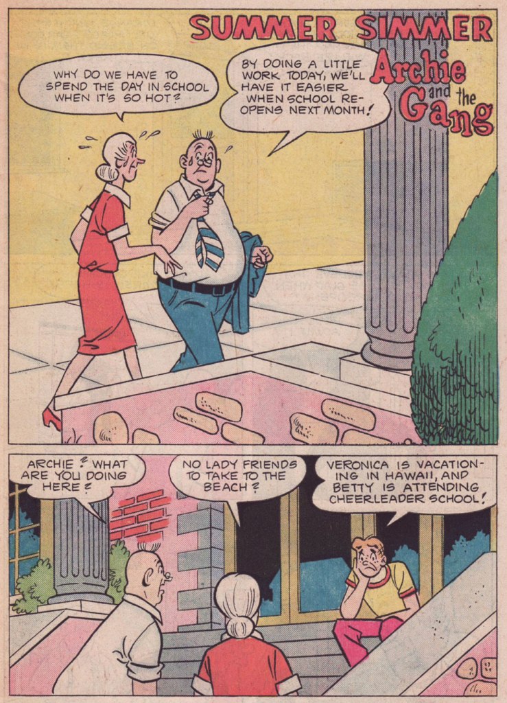
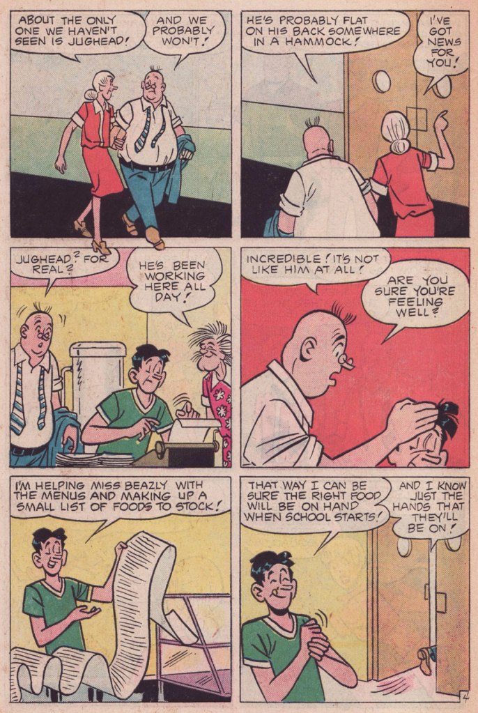
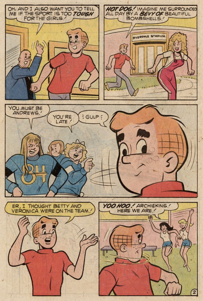
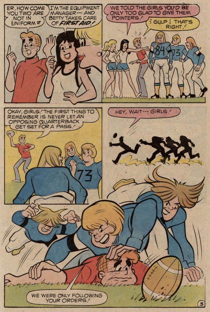
« Summer Simmer » first appeared in Archie’s TV Laugh-Out no. 35 (Nov. 1975, Archie). Scripted by George Gladir, this story has the distinction of not particularly striving to be funny, instead focusing on character and situation.. which is totally distinct from the all-too-frequent straining for laughs and failing Archie blueprint. This sort of outlier is what makes the search worth the bother.
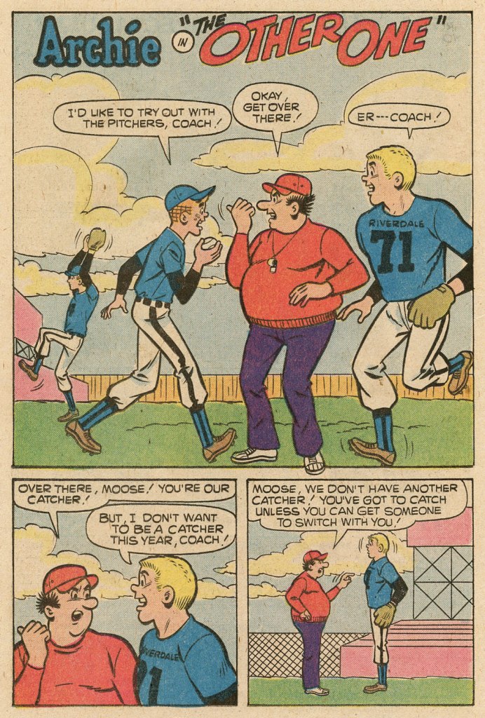
« The Defender » originally saw print in Pep no. 235 (Nov. 1969, Archie). Not only does Marmaduke “Moose” Mason get a rare turn in the spotlight, but it’s an unusually favourable depiction. It was most likely scripted by Frank Doyle.
It must be mentioned that Schwartz often tweaked the scripts he was assigned, but incognito. His collaborators trusted him, giving him free rein. Besides, let’s face it, the stakes were depressingly low.
In the spirit of saluting our heroes while they’re still around to get a boost from it…
A few weeks ago, I got wind of a delightful bit of news: that local favourite Russell Kommer Myers now holds, according to Guinness, the world record for Longest running daily cartoon strip by a single author. Perhaps because of his chug-along consistency, the prodigious Myers is generally taken for granted. Well — I’m happy to say — not in these parts: see our tribute post from a while back, Growing Old Gracelessly With Broom-Hilda, for further, abundantly illustrated praise.
Here’s some of what the folks at Guinness (not the Dublin ones) had to say:
« The longest running daily cartoon strip by a single author is “Broom-Hilda” by Russell Myers (USA), which has been in continuous publication for 53 years 292 days since first published by the Chicago Tribune Syndicate on 19 April 1970, as of 5 February 2024.
Russell was born “BT” (before television) and fell in love with comics and cartooning as a child. He started a collection of over 2,000 comic books, which he still has.
After years of having other comic strips rejected, Russell sold “Broom-Hilda,” which became an overnight success. He is a “one-man shop,” writing and drawing every strip himself, over 19,710 as of the 54th anniversary. »
For a little perspective, here’s what Lambiek had to say on the subject:
« He leaves previous record holders behind, like Frank Dickens (‘Bristow’, 51 years), Charles M. Schulz (‘Peanuts’, 49 years) and Marc Sleen (‘Nero’, 45 years). Yet Myers is still behind Ed Payne (‘Billy the Boy Artist’, 56 years), Fred Lasswell (‘Barney Google & Snuffy Smith’, 59 years), Jim Russell (‘The Potts’, 62 years) and Russ Johnson (‘Mr. Oswald’, 62 years, though this was a monthly comic). » Honestly, one is inclined to gently bring up the touchy, controversial issue of, ahem… assistants.
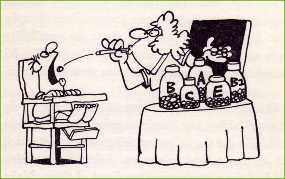
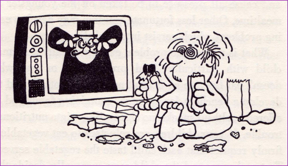
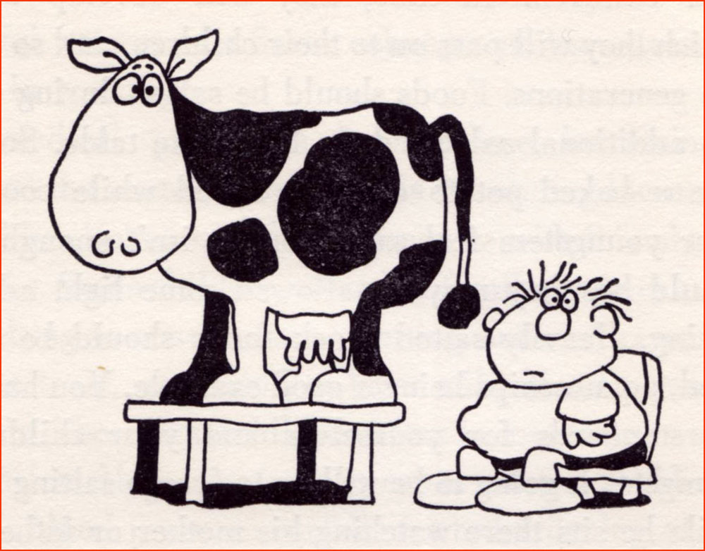
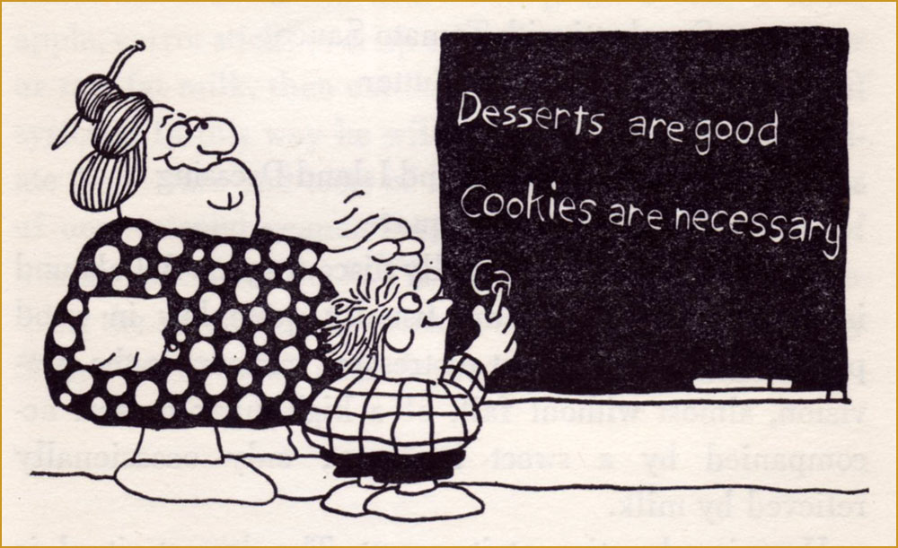
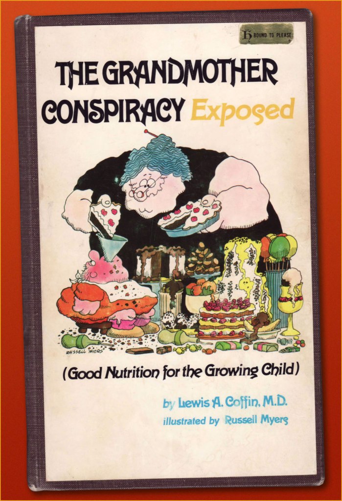
Having already dealt with Broom Hilda, let’s dig a little deeper. In 1974, early in his strip’s run, he contributed illustrations to California paediatrician Lewis A. Coffin’s book, The Grandmother Conspiracy Exposed (Good Nutrition for the Growing Child)… and did a lovely job. Given the ever-fickle nature of the dietary business — to say nearly nothing of its oft-political ramifications — Coffin’s book now seems of its time and place, but he was pretty progressive, and put forth a lot of sound notions. Here are some of Mr. Myers’ fun chapter illustrations:
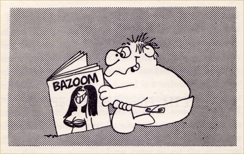
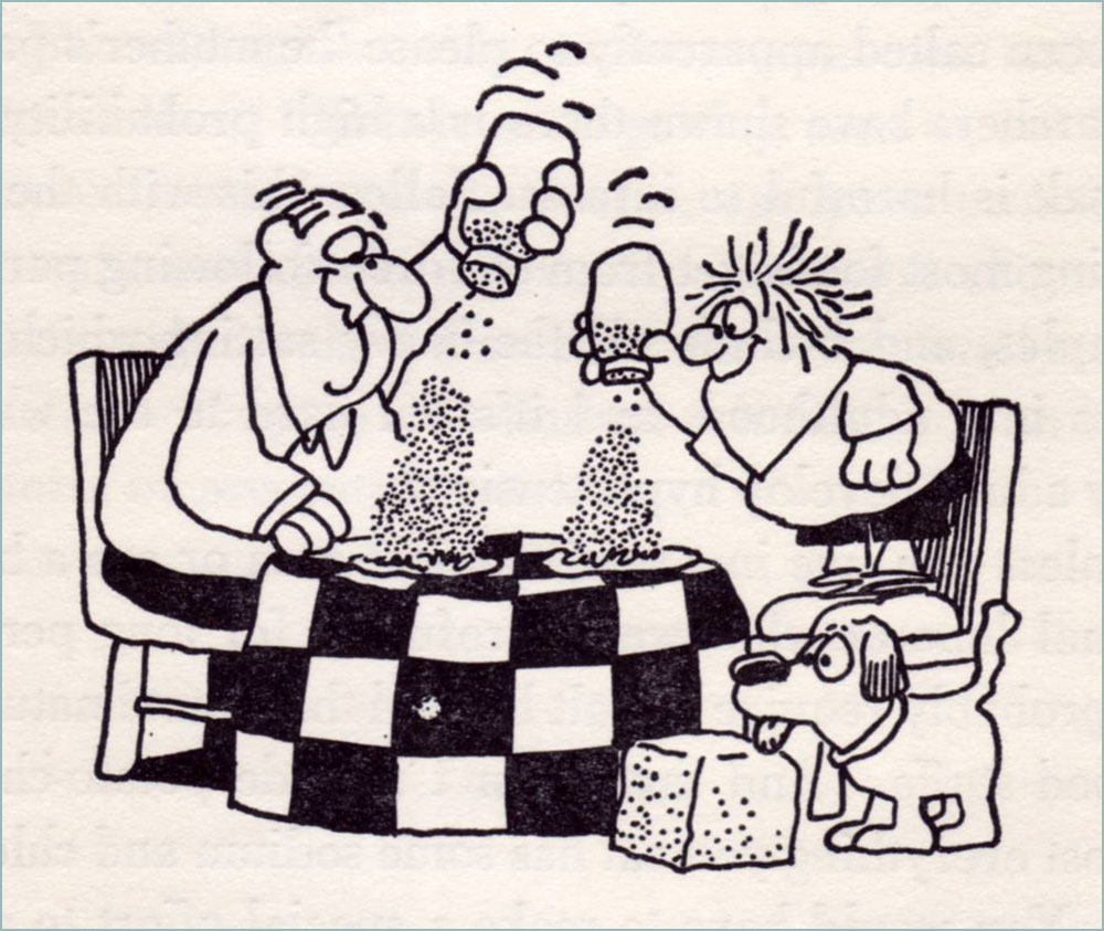
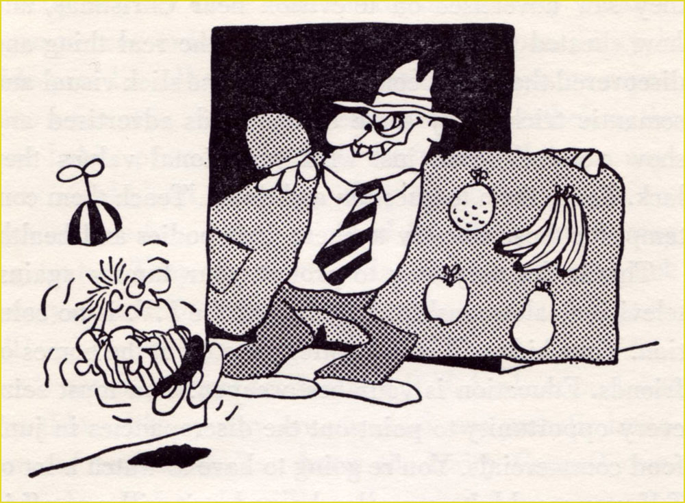
« The best way to get vitamins is to eat foods which contain them. »« The advantages of breast feeding are well known: lack of preparation, sterility, natural warmth, ready availability, proper nutritional balance of ingredients, prevention of anemia, attractiveness of container design, transfer of protective factors against disease, apparent lower incidence of allergic disease, relative absence of intolerance to milk, and all the emotional gain for both mother and child. » « Unless you live in a semi-tropical area or are a heavy manual labourer who sweats profusely for long periods, you probably require no salt beyond that found naturally in food stuffs. »« I believe that a person who has felt a sun-warmed, firm but ripe tomato in his hand, lifted it up to his nose and savoured the deep, earthy aroma, and tasted the full, tart-sweet taste, juice and seeds dripping down his chin, will never forget the look, feel, smell or taste of that real tomato, and will know how to pick out the best tomatoes in the supermarket, because he will have that supreme standard to measure them against. »« My children love raw vegetables. They dislike many cooked vegetables, often the same ones they like raw. While I’m not saying you should sell the stove, it seems they sense that something’s missing after cooking. » « For many years Americans felt secure in the belief that the government and, more specifically, the Food and Drug Administration was constantly screening all processed food for harmful additives. It has finally become evident that this is not the case. » « Most school systems have completely abdicated the responsibility for nutritional education and have totally misused their most potent teaching tool, example, in the name of economy. » « Your children will sneak around your back and gorge at the neighbour’s house, or will slither down to the local store and furtively cram candy-bars and soft-drinks down their deprived throats. »« It wasn’t until television came along that the finely honed art of brain-washing children came to full flower. »« … we know that the majority of peoples in the world not only don’t drink milk, but they would be quite ill if they did. »« You would naturally assume that your local school’s lunch program was nutritionally a good one. »And here’s my durably bound copy of this lovely tome, discarded early this century from the library of Alma College, a private Presbyterian liberal arts college in Alma, Michigan.
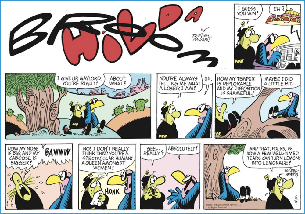
And since I’ve touched upon Mr. Myers’ Broom Hilda achievement, I would be remiss in not giving our readers a look at what he’s been up to lately. After all, an endurance record means little if the work itself has scant remaining merit. If you ask me, his timeless charm has weathered the years admirably well.
A Sunday strip from June 9, 2024.And a daily from June 15, 2024. Pretty sharp for a guy in his mid-eighties!
« Our Betty Cooper is still the girl next door – she literally lives next to Archie. And she’s the blonde all-American girl; she’s so sweet and forgiving, gives people the benefit of the doubt and second chances, wears her heart on her sleeve. But she’s also incredibly broken on the inside, for many different reasons. » — Lili Reinhart
As a whole, comic book artists are not a happy lot, and for good reason. During the Golden Age, at least, there were countless publishers, so one could move around if unsatisfied with the working conditions.. even if meant finding out that things were rotten all over. After the mid-1950s, when the field violently contracted — you know the story — leaving scant players standing, you pretty much had to take the work, and the abuse, as they came. And certain publishers frowned upon ‘their’ creators playing what little remained of the field.
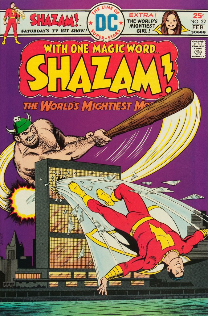
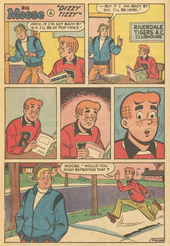
Kurt Schaffenberger had steady work at DC, but presumably — and understandably — sought to keep his options open, so he moonlighted for ACG, often under a pseudonym, probably unaware that the ‘competitor’ was covertly owned (at least in part) by DC co-founder and co-owner Harry Donenfeld. One can imagine Kurt’s distress when ACG folded in 1967. From what I can surmise, he did, in 1970, a lone, inexplicable cover for Stanley Morse… wildly outside his range but still kind of awesome. And then… he quietly boarded a bus to Riverdale.
A page from Voice of Doom; script by Frank Doyle, pencils by Schaffenberger, inks by Jon D’Agostino. Published in Archie’s TV Laugh-Out no. 16 (Dec. 1972, Archie).The, er… punchline from Peace of Mind. Script by Frank Doyle, pencils by Schaffenberger, inks (likely) by Chic Stone; published in Archie’s TV Laugh-Out no. 18 (Mar. 1972, Archie).Drawing for Archie wasn’t too much of a stretch for Kurt; whether it was Reggie or The Big Red Cheese getting knocked on his ass, he had his stock posture. This is Shazam no. 22 (Jan-Feb. 1976, DC). Pencils and inks by Mr. Schaffenberger.
A couple more samples from Mr. Schaffenberger’s all-too-brief Archie period — solid, well-paced, ably-designed and economical storytelling:
A slightly surreal one-pager from Archie’s Joke Book Magazine no. 150 (July 1970, Archie).A page from Luck Struck, published in Archie’s Pals ‘n’ Gals no. 73 (Oct. 1972, Archie); note the Captain Marvel tank top young Mr. Andrews is sporting!
And then, there’s the case of Sal Amendola, a Neal Adams protégé whose reputation in comic books largely rests on a single Batman story, 1974’s ‘Night of the Stalker’, a highly praised tale whose chief conceit is that Batman never utters a word and weeps bitterly at the end. I’d apologise for the spoilers, but honestly, it’s been half a century, what mystery is there to dispel?
An excerpt from Detective Comics no. 439 (Feb.-Mar. 1974, DC); I’ll rarely say this, but Dick Giordano’s inks are an asset in this case, not a liability. The story’s scripting credits are at once hilarious and a bit sad: Steve Englehart, script; Vin and Sal Amendola, plot; and… “from an incident as described by Neal Adams.” Yeah, Neal; that’ll surely earn you a Pulitzer.
Anyway, after his turn in the Bat-spotlight and 1975’s Phoenix, one of the short-lived Atlas-Seaboard‘s more daring titles, Amendola turned up at… Archie. And it was not a good fit.
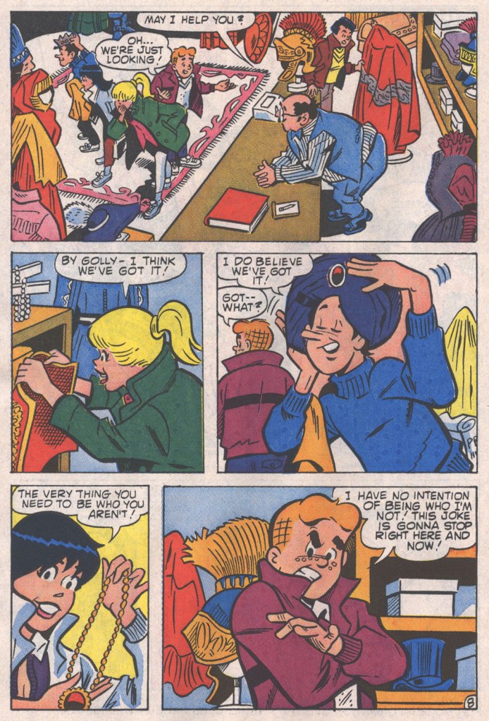
This, in fact, was the springboard for this post: a couple of years ago, I encountered an Archie story that so grotesquely missed the mark — stylistically speaking — that it bordered on the fascinating. You guessed it, Sal Amendola, utterly out of his element, not to mention, surprisingly… his depth.
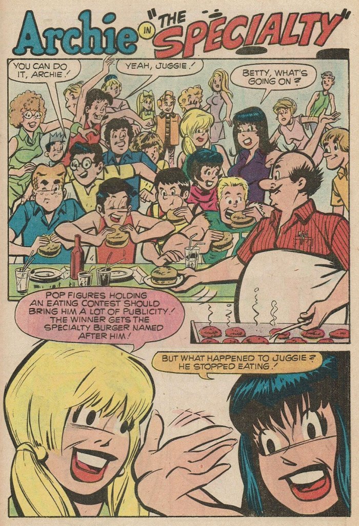
Here are a pair of pages from Coach Reproach, published in Everything’s Archie no. 71 (Dec. 1978, Archie), script by George Gladir, pencils by Amendola, inks by Jon D’Agostino.
Where to begin? In the first panel, you give Archie a stiff, unnatural pose and you follow it up by repeating it on a background character in the very next panel. And Arch is due for a nasty case of whiplash if he keeps trying to make like Linda Blair.At this point, I’m thinking Sal had learned plenty from his mentor on how to utterly fail at comedy.If what I’ve observed about pitching stances is worth anything, Archie’s about to get brained by a baseball. Ginger boy is also looking right past Coach Kleats. Despite the low bar — issues of quality control were rampant at Archie in the 1970s — this is impressively incompetent storytelling,What happens when you never learn basic inking principles: one creates depth by using thinner lines — and less detail — on background characters, otherwise… visual chaos ensues, as demonstrated here. And Sal’s Betty and Veronica sorely need a brand of shampoo that won’t leave their hair so oily and limp… but the anatomy is beyond help. This is the opening page of The Specialty, from Pep no. 342 (Oct. 1978, Archie).
Schaffenberger’s fellow Golden Age veteran, Gene Colan, also found himself moonlighting in the 1960s. In his case, it was for Marvel, under the alias of ‘Adam Austin’, but also for Dell (just a couple of covers mid-decade) and more significantly for Warren Magazines. In the 1970s, he concentrated on Marvel and was, in the chaos that was the so-called ‘House of Ideas’ at the time, the single most reliable artist in the maelström: surely none can match his seventy consecutive — and meticulously detailed — issues of Tomb of Dracula, in addition to lengthy runs on Howard the Duck, Daredevil, Captain America, Doctor Strange and so forth.
« When writer Jim Shooter became Marvel’s editor-in-chief in the late ‘70s, the tension between Colan and the younger authors came to a head. By 1980, Shooter and Colan were totally at odds with one another over Colan’s approach to storytelling. »
« [Shooter] was harassing the life out of me. I couldn’t make a living,” Colan said. “He frightened me, he really did. He upset me so bad I couldn’t function.” Just as she had urged Colan to quit one job [in] the 1960s, wife Adrienne begged him to leave Marvel in 1980. After delivering his resignation, Colan was asked to sit down and seek resolution with Shooter and publisher Mike Hobson. Colan agreed to the meeting, but declined any overtures to stay at Marvel. “Shooter was in the same room,” Colan recalled, “and I said, ‘That man’s not gonna change. He is what he is. Whether it’s six days, six months or six years, it’s not going to be any different, so I’m not going to put up with it for another minute.‘ » [ source ]
He then scampered over to DC for a few years. His production there was hit-and-miss, but his Batman run (1981-86) was outstanding, pairing him with some of the rare inkers who could do his nuanced pencils justice: Klaus Janson, Tony De Zuñiga (to my amazed delight!) and especially Alfredo Alcala.
But once his contract ran out, he was out knocking on doors again. Against all odds, Archie beckoned.
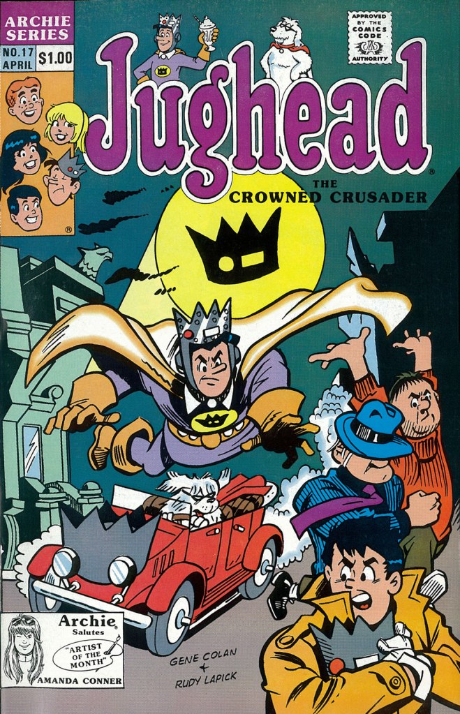
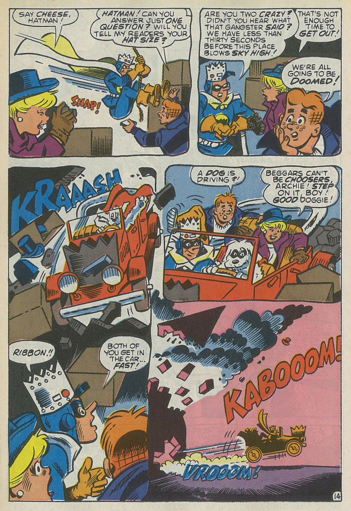
This is the cover — dreadful, I’m afraid — of Jughead no. 17 (Apr. 1990, Archie), reviving the opportunistic, Batman TV show-derived ‘Riverdale Gang as superheroes’ de trop move of the mid-1960s, with even less aplomb. But then the Archie folks were plumbing an especially low point with such ‘experimental’ titles as Jughead’s Diner, Archie 3000, Dilton’s Strange Science, Jughead’s Time Police, Archie’s R/C Racers, Explorers of the Unknown, and of course The Adventures of Bayou Billy.An action-packed — and Colan-shambolic — excerpt from that issue’s Hatman saga, written by Robert Loren Fleming, pencilled by Colan and inked by Rudy Lapick. Notwithstanding his sticking out like the proverbial sore thumb, Colan clearly had a ball working on his Archie stories. He brought some urgently needed chutzpah to a perilously stale formula.A page from Will the Real Archie Please Stand Up!, published in Life with Archie no. 273 (July 1989, Archie), wherein Archie is mistaken for his doppelgänger, a foreign prince named Kafoufi… but of course. Pencilled *and* scripted by Colan, which is most unusual. Oh, and inked by Mr. Lapick, who doesn’t quite know what to do with those ol’ Colan worm-fingers, seen wriggling in panel five.
« Arrows of neon and flashing marquees out on Main Street / Chicago, New York, Detroit and it’s all on the same street / Your typical city involved in a typical daydream / Hang it up and see what tomorrow brings » — Robert Hunter
Among the foremost pleasures of a brick-and-mortar bookstore is the increased odds of stumbling upon an item whose existence you never suspected: case in point, another cheap (one buck!) gem I scooped up in Ellsworth, ME’s The Big Chicken Barn last Autumn.
Now — I’ve long been a huge fan of the pseudonymous Cecil Adams‘ sassy syndicated answer column The Straight Dope (1975-2018), in no small part thanks to resident — all the merry way! — illustrator Michele ‘Slug’ Signorino‘s waggish accompanying cartoons, rendered in what he colourfully called his ‘smudge-a-dot technique’.
And so, last October, I grabbed a lovely Scholastic publication that had until now ably eluded my radar — 1978’s Junior CB Picture Dictionary, compiled and edited by Joan Downing and dexterously illuminated by the aforementioned Mr. Signorino. I was delighted to discover that he’s still happily active well into his Eighties: « he still works and does not intend to retire. “This isn’t work,” he said. »
This slim-but-priceless tome happens to tick several of my pet boxes: a somewhat (but not quite!) passé communication technology; a lively, singular species of jargon; a merrily anarchic illustrative style… and so forth. Let’s sneak a peek, then!
Checking My Eyelids for Pinholes: Tired; getting sleepy.City Kitty: Local police.County Mounty: Sheriff or county police.Draggin’ Wagon: Wrecker or tow truck.Eatem Up Stop: A truckstop.Flagwaver: Road construction worker.Haircut Palace: A low bridge or overpass. There’s one of these a couple of blocks up the street from where I used to live, but I suppose every big city has to live with that problem. In Boston, MA, the phenomenon is particularly colourful, as is called ‘Storrowing‘. Mama Bear: Female police officer.Mixing Bowl: Highway cloverleaf.Motor Mouth (Also: Ratchet Jaw): One who talks too much.Rat Race: Traffic during rush hour.Skating Rink: Road slippery from ice, snow, or rain.Super Skate: Sports car.Truckin’ Teenybopper: Young hitchhiker. The bulk of my first-hand experience with CB came from hitchhiking in my youth so I indeed was a truckin’ teenybopper myself! I’m still warmly grateful for the longest ride I ever got: from Portland, OR, to Long Beach, CA, thanks to a friendly truck driving man. He was actually headed for San Diego, but I was already over three thousand miles from home… and had to get back in time for college.Wall to Wall and Ten Feet Tall: Good CB reception. A visual reference to famous pooch ‘Nipper‘. Window Washer: Rain. Is that you, Dirty Danny?
For more dirt on the magnificent Signor Signorino, feast your peepers on this lovely 2022 profile. And in case you’re wondering “Does Slug have a book about his career?”, why yes, he certainly does!
I’ll let Steve Earle have the last jab at this one: « Everybody told me you can’t get far/On thirty-seven dollars and a Jap guitar/Now I’m smokin’ into Texas with the hammer down*/And a rocking little combo from the Guitar Town**. »