« The hardest tumble a man can make is to fall over his own bluff. » — Ambrose Bierce
Today, I’m going totally ‘mainstream’ on you for a change. Last week, I ventured into a movie theatre for the first time since 2019 (Knives Out was my last such outing) to see my first superhero film since 2012 (The Avengers was my last such outing). And so, while the new Superman epic wasn’t perfect, I found much to enjoy about it.
Among the ideas explored in the film was that baddie Lex ‘Elon’ Luthor, from carefully observing The Man of Steel over several years’ worth of skirmishes, had managed to analyse and codify his combat moves, in order to predict and counter them.
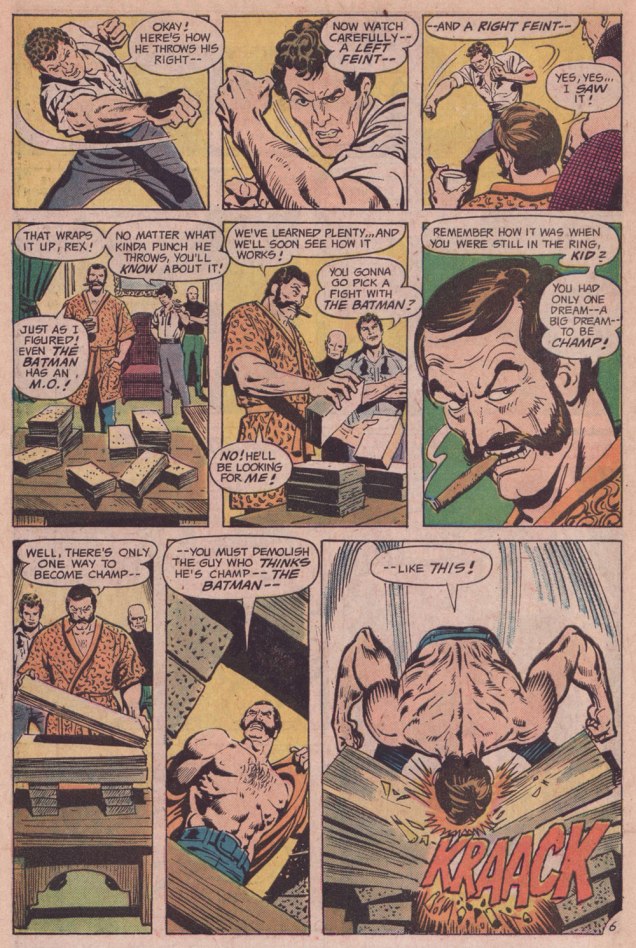
I was reminded of that angle serving as the basis of a favourite Batman story by my favourite Batman writer (and hardly anyone else’s, apparently), David Vern Reed (1914-1994). Despite its publication in a popular, long-running title, this tale is obscure to the point of never having been reprinted in English.
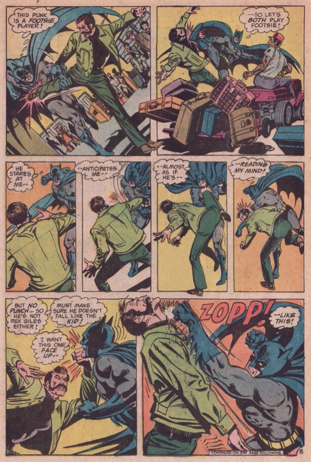
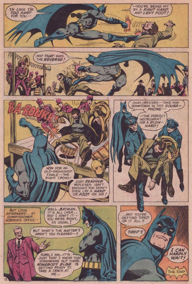
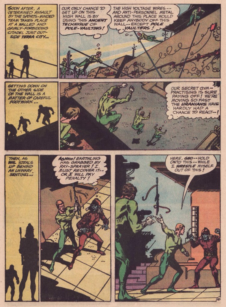
I’m terribly fond of the Schwartz-era Batman, especially the 1970s, because it’s relatively light on costumed supervillains, Batman acts like the detective — albeit a remarkably athletic one — he’s supposed to be, and the plots often hinge on ‘ordinary’ (though clever) criminals striving to outsmart Bats. A favourite example: Vern’s « The Underworld Olympics ’76! » (Batman 272-275, Feb.-May 1976) tetraptych. I think I can safely rule out childhood nostalgia: in my small town, distribution was quite spotty, so I never even *saw* those issues at the time, encountering them instead as an adult, decades on.
If I have a quibble about the art, it’s that Ernie Chan’s finishes mesh poorly with García-López’s usual rock-solid breakdowns. Perhaps it’s because Chan likes to have more to do; given that García-López, his own best inker, typically turns out pencil renderings that are utterly complete and tight as a drum, the job is quite unlike, say, Chan inking a Big John Buscema Conan job — as he so often did — wherein Chan has to do 80 percent of the work over Buscema’s sparse breakdowns, stock poses and rote shortcuts. In contrast, inking García-López essentially reduces the task to tracing over his flawless pencils, which can’t be all that stimulating, educational as it may be.
Speaking of Garcia-Lopez, a priceless anecdote: writer Andrew Helfer, a frequent collaborator, recalled, in his introduction to TwoMorrows’ Modern Masters Volume Five (2007): « … it was Jean Giraud, aka Mœbius, and he was staring at a drawing of Wonder Woman by José Luis García-López. « This García-López », he asked in a heavy French accent. « He uses models, no? » « No, » I answered, smiling. « Son of a bitch! » Mœbius hissed.
Like Hawkeye Pierce, Bob Oksner (1916-2007) was a gentleman who appreciated a cute overbite.
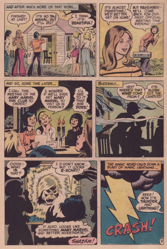
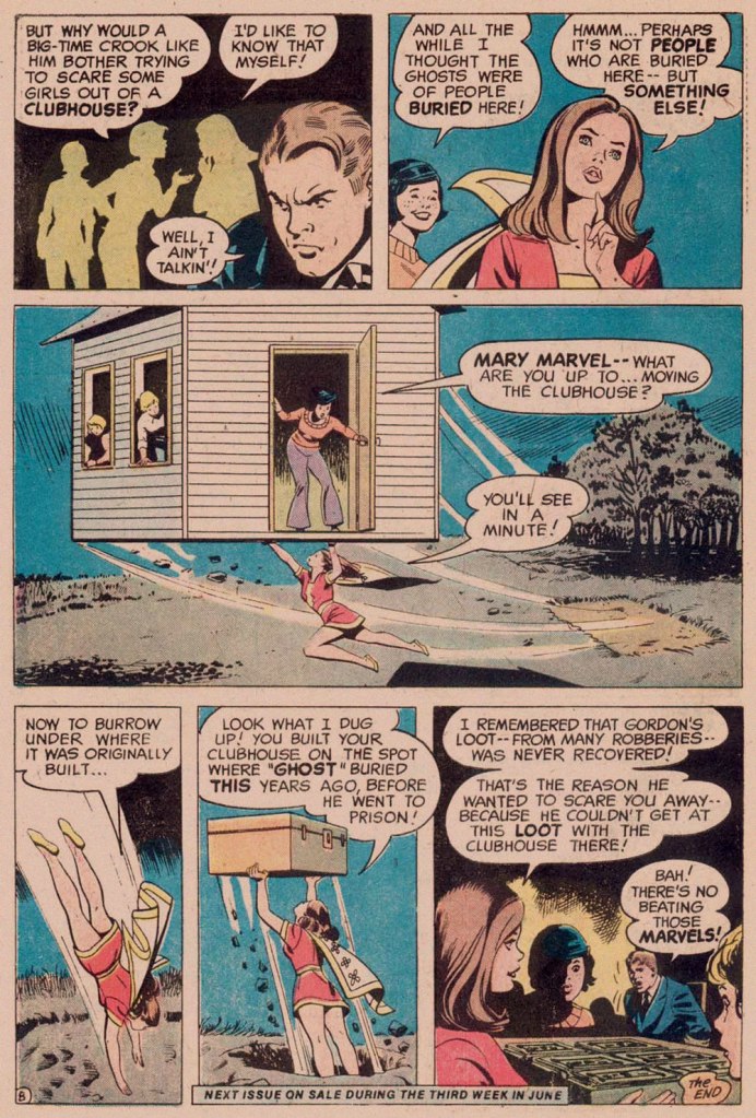
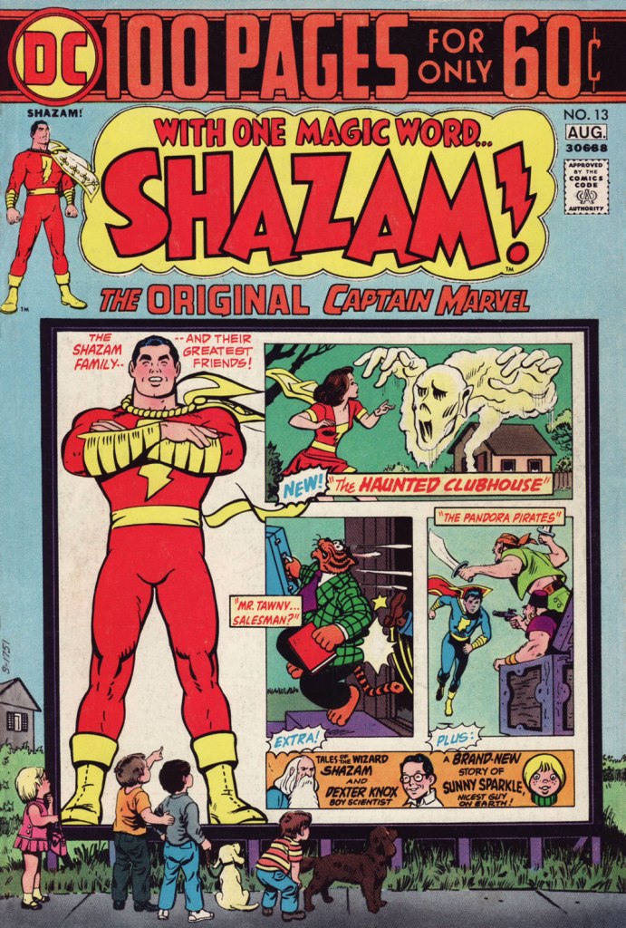
Here’s a seasonal Mary Marvel solo tale that originally saw print in the thirteenth issue of DC’s Shazam!, back in 1974. It was scripted by the erudite Edward Nelson Bridwell (1931-1987).
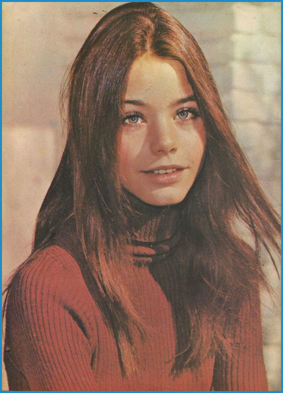
I can’t help but believe that Mr. Oksner might have modeled his Mary Marvel after model-actress and air harpsichordist Susan Dey. The flaw in that theory is that his girls had always looked like her — so it’s more of a case of Susan looking like an Oksner girl than the other way around.
« I fell in love with Laurie on the Partridge Family Yeah I stay up watching 70’s TV And I get off on 70’s TV » — John Easdale / Dramarama
This is Shazam! no. 13 (Jul.-Aug. 1974, DC). Cover art by Mr. Oksner.
« I was a peaceful sedentary man, a lover of a quiet life, with no appetite for perils and commotions. But I was beginning to realise that I was very obstinate. » — John Buchan
Over the course of several posts, I’ve extolled at length Carmine Infantino‘s skill as a cover designer. Yet the ability to envision and execute a single static image does not automatically translate into the skill of clearly and tidily breaking down a story into a suite of sequential panels, in much that same way that a superbly dexterous surgeon may be incapable of writing legibly. It pleases me to declare that Mr. Infantino’s no one-way specialist.
Infantino describes the evolution of his visual thinking: « The use of negative and positive shapes inside the panel had to mean something. So, to me, if the shapes didn’t draw the eye in, then they weren’t worthwhile. I had to move and change the shape to make it work for me. And that’s what I did. For me beforehand, the figure was the most important thing, and nothing else in the panel mattered. But later on, I found out that it was the total figure I had to worry about. » (all Infantino quotes excerpted from The Amazing World of Carmine Infantino: an Autobiography (2000, Vanguard Productions; edited by J. David Spurlock)
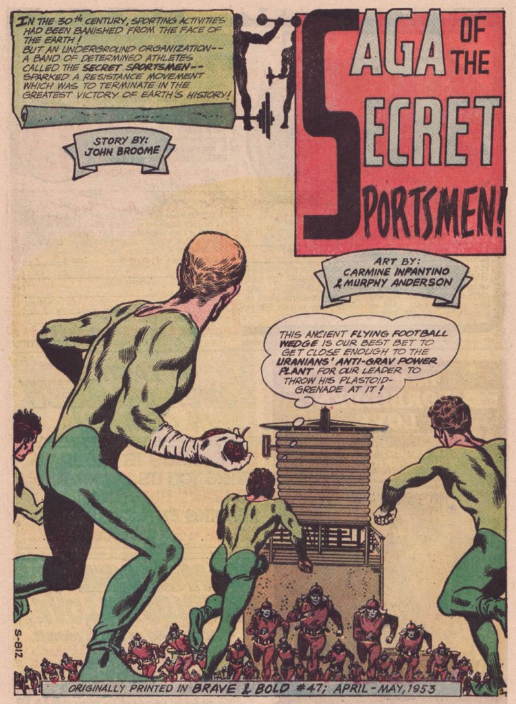
I’ve long wanted to feature this particular tale… for both script and artwork reasons. However, my copy was in Mysteries in Space: The Best of DC Science Fiction Comics (Apr. 1980, Simon and Schuster/Fireside; Michael Uslan, editor)… and I’d be all-but-guaranteed to destroy this beloved book in any attempt to scan from it. But — aha! — I’ve recently acquired a copy of DC Special no. 13 (Jul.-Aug. 1971), which granted the tale its first encore. Game on!
Someone slightly goofed here : The Brave and the Bold no. 47 was published in April-May 1963, not 1953.
.
« The silhouettes I used in ‘Strange Sports Stories‘ [featured in The Brave and the Bold nos. 45-49] were innovations. Julie [editor Julius Schwartz] gave me the script and said, ‘We want this book to look different.” That’s all he said, and I went home and what I devised to make it look different was by using silhouettes as a dramatic device. The action starts in the silhouette, and then you go to the conventional panel, and the action follows through. One might almost call it an animated treatment. »
.
.
.
.
.
.
.
.
.
As smooth and effective as the Infantino-Anderson pairing looks, there was some friction behind the scenes. Infantino explains: « I was beginning to experiment at the time and I threw anatomy out in favor of a higher level of design. Murphy was an excellent draftsman and I’d try to explain what I was trying to achieve to him but this was quite contrary to his own sensibilities. The more stylized I became, the more he thought the work had to be ‘fixed up‘. At one point, he asked for a raise because he had to change my work so much. What he thought he had to ‘fix‘ was the new style I was most excited about. »
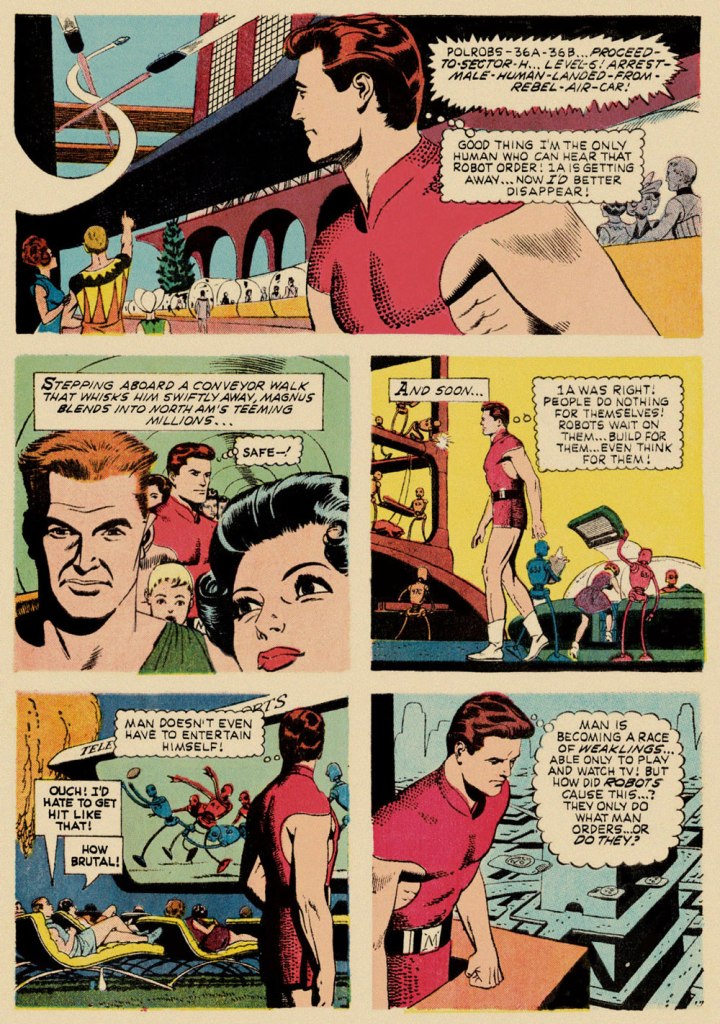
Our featured story shares a central perspective with Russ Manning‘s rightly celebrated Magnus, Robot Fighter, whose inaugural issue had come out a mere two months earlier — though with that close a gap, it’s most likely a simple case of coincidence.
A relevant page from Magnus, Robot Fighter 4000 A.D. no. 1 (Feb. 1963, Gold Key); story and art by Manning, with input from editor Craig Chase, who initially pitched the idea of a SF hero to the publisher.
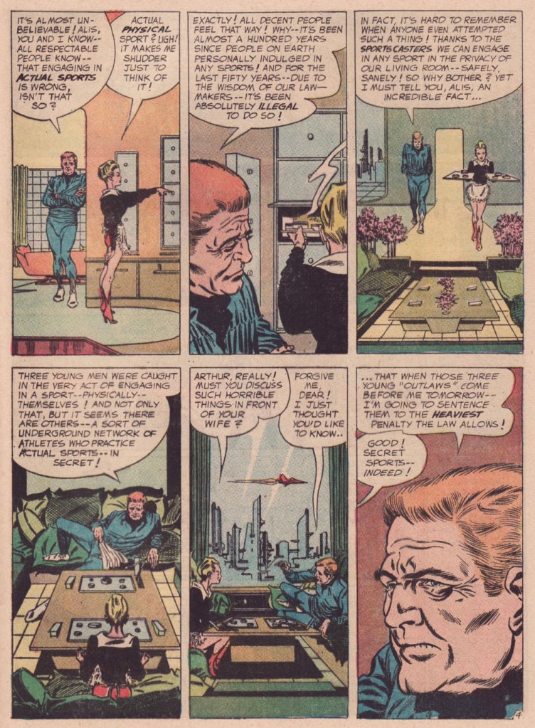
Are we getting less physically able with every succeeding generation, as our elders have been claiming for eons? Is it just a mistaken, shallow assessment arising from tone-deaf obduracy and bad faith — or have our forerunners all been correct about a general and ongoing decline?
« Physics should represent a reality in time and space, free from spooky action at a distance. » — Walter Isaacson
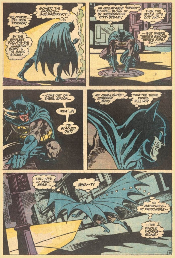
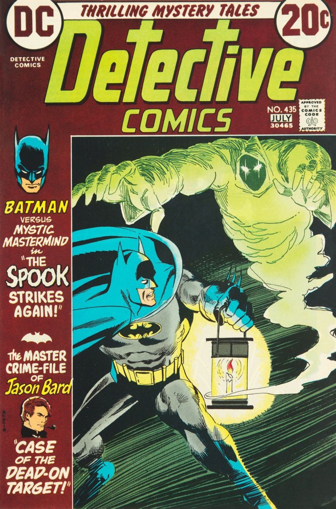
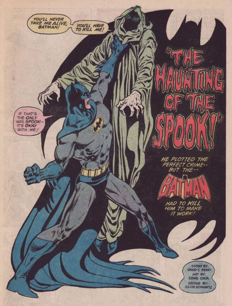
Who’s my favorite Batman foil? Why, The Spook, of course! A brilliant and patient (but twisted, natch) planner, engineer, escape artist and… businessman Val Kaliban was a most worthy opponent for the Batman in detective mode. Let’s sneak a gander at his earliest and most significant appearances.
This is Detective Comics no. 434 (Apr. 1973, DC). A middling cover, certainly not Michael Kaluta‘s best Batman cover… nor his worst. I mean, what’s Batman’s left leg doing exactly?
Here’s a fun sequence from the issue’s The Spook That Stalked Batman, scripted by Frank Robbins, pencilled by Irv Novick and inked by Dick Giordano.
This is Detective Comics no. 435 (June-July 1973, DC); an okay cover by Dick Giordano.Ah, finally… The Spook gets a cover worthy of his mettle. This is Batman no. 252 (Oct. 1973), cover design by Carmine Infantino, pencils and inks by Nick Cardy, and lettering by Gaspar Saladino (well worth mentioning!)
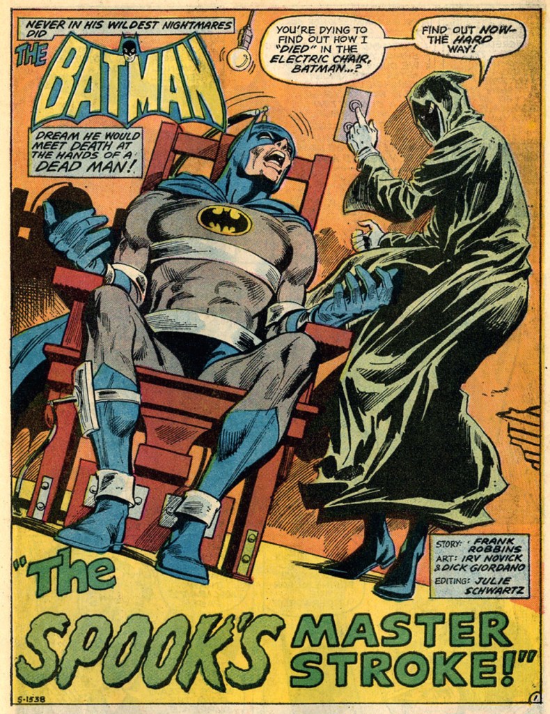
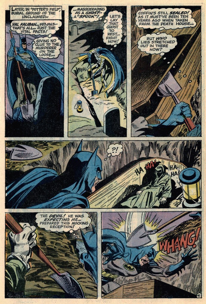
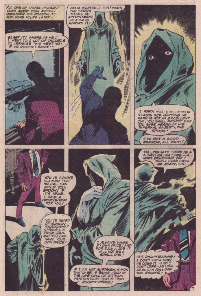
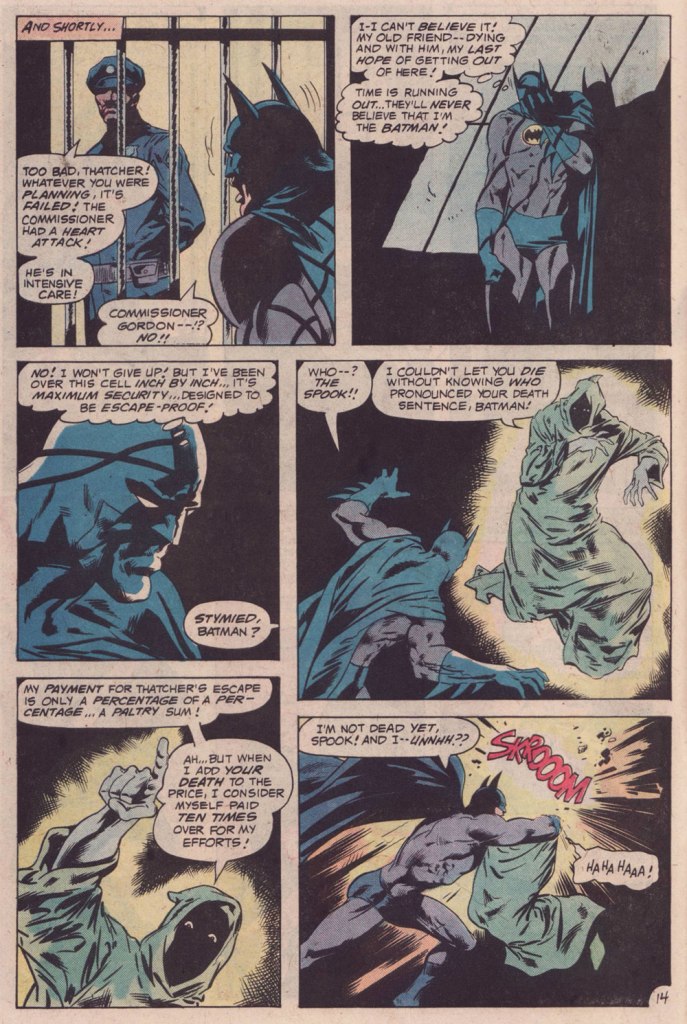
A pair of pages from the issue:
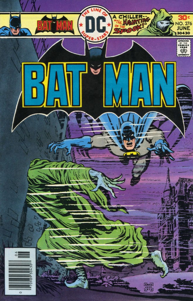
This is Batman no. 276 (June 1976, DC). For the first time, someone other than his creator, Mr. Robbins, handles The Spook. Fortunately, it was talented scribe David Vern (writing as David V. Reed), quite possibly my favourite Batman writer. A fine, moody cover by Ernie Chan.The Spook’s following appearance, in which Dick Giordano demonstrated he could come up with a crappy Andru-Giordano cover… all on his own. This is Detective Comics no. 488 (Feb.-Mar. 1980, DC).
The Spook’s Death Sentence for Batman, written by Cary Burkett, pencilled and inked by the splendid team of Don Newton and Dan Adkins, was a worthy send-off for this fine character. Beyond that… I don’t much care. The Spook is a difficult personage to write for, but he got three solid writers to chronicle his exploits, and that suits me just fine.
« Carefully, the old man utters a cacophonous incantation… then lets his mind go blank. » — Stephen Skeates
We recently (last March 30) lost a fine fellow and writer in Steve Skeates (1943-2023). I’ve long appreciated his work, as I felt he was among the very few ‘mainstream’ comic book writers who could actually be funny, not to mention gripping or thought-provoking*, whatever the situation demanded.
At its peak, his writing also stood out by virtue of its containing actual creative ideas rather than the usual mishmash of bromides and creativity-stifling continuity that the fanboys clamoured for.
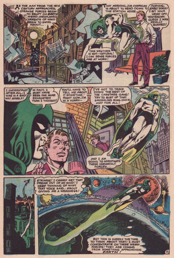
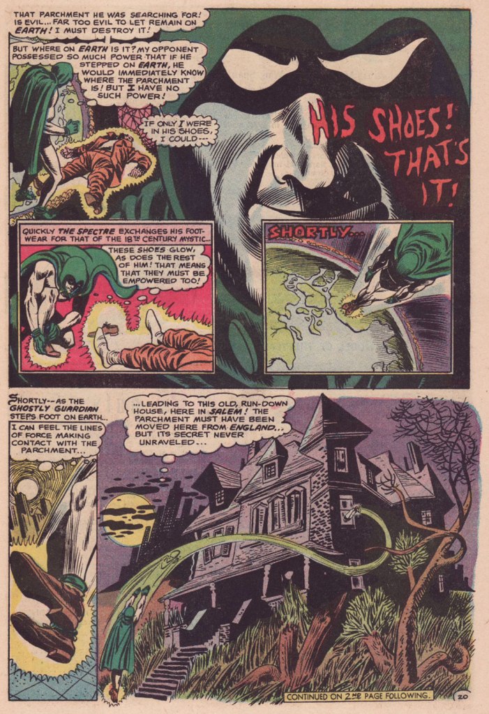
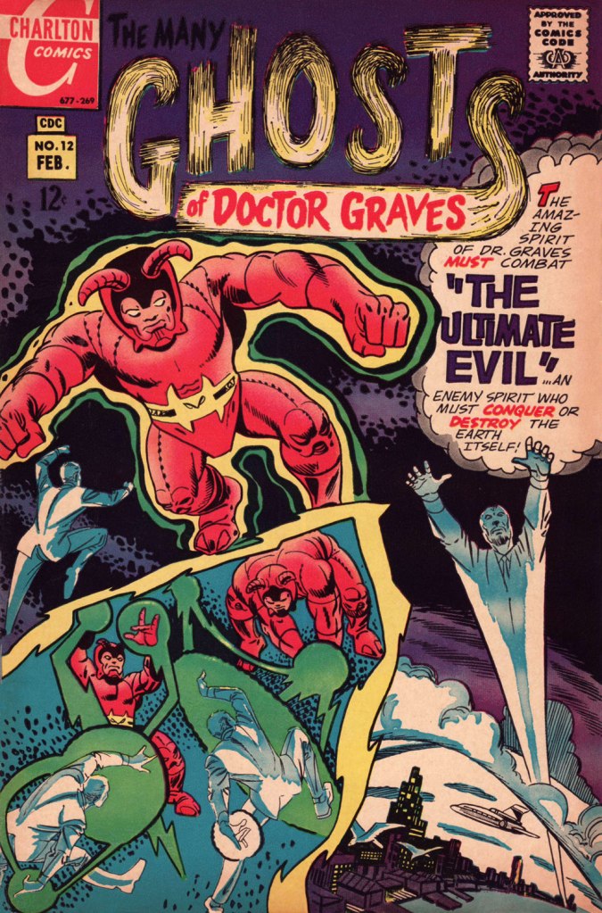
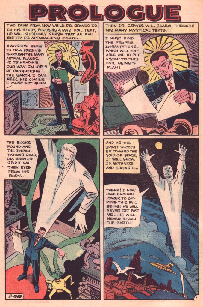
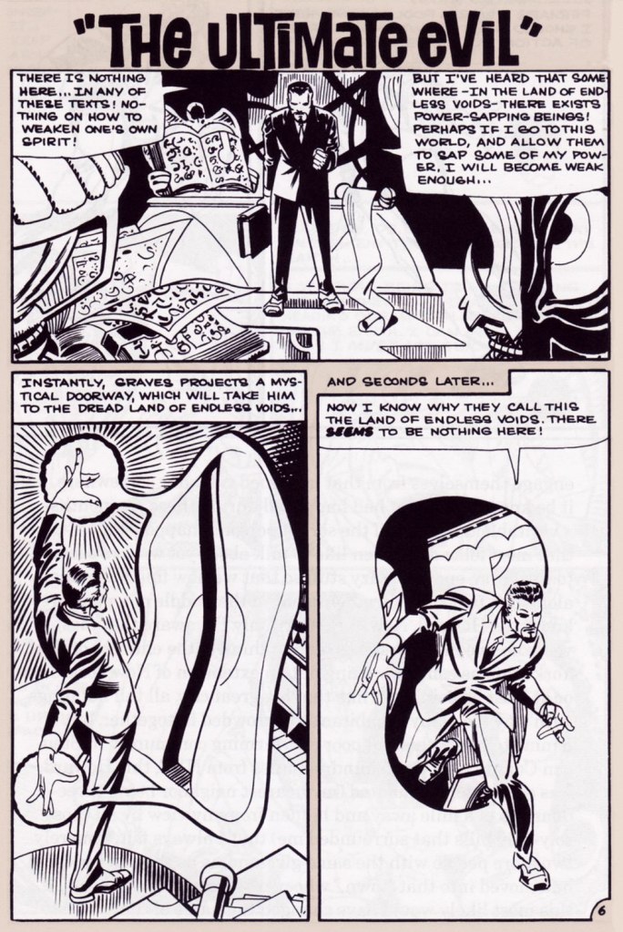
Today, I’ll showcase a bicephalous favourite, The Spectre in « The Parchment of Power Perilous » and Dr. Graves in « The Ultimate Evil », both springing from the same author… and the same plot.
How did this come to pass? Skeates told the story in an article entitled « Graves Acting Strangely: The Ultimate Evil Reconsidered », published in Charlton Spotlight no. 5 (Fall 2006, Argo Press, Michael Ambrose, editor).
« … at that particular point in time, I was totally unaware of the unique manner in which Julie [Schwartz ] approached his profession, typically in the dark when it came to the fact that this longtime comic book icon was far more actively involved in the plotting process than any other editor up at DC. […] I ambled into Julie’s well-kempt office armed with an intricate plot… something I had stayed up half the night before constructing, working, reworking, polishing and repolishing, only to have Julie read it over, extract a couple of ideas he liked, and unceremoniously toss the rest of it away. […] the two of us set about constructing what basically amounted to a brand-new plot based on those couple of ideas of mine that Julie liked, ideas that had somehow gotten his creative juices flowing. »
Charles J. “Jerry” Grandenetti (1926-2010) shows to breathtaking advantage his mad compositional virtuosity, anchored by Murphy Anderson’s rational inks. Skeates again: « … inker Murphy Anderson was the perfect stabilizing force, his meticulously detailed inks reining in Grandenetti’s insanity just enough so that even the latter’s wildest notions — colliding planes (no, not aircraft — planes of existence), his frequent disdain for panel borders, the same character shot from two or three separate angles within seemingly the same panel, etc. — became perfectly understandable, making the story so much utter fun to follow (even for someone like me who obviously knew exactly where it was going. ) »Grandenetti’s two previous issues on the title, illustrating Gardner Fox’s Pilgrims of Peril (check out a stunning excerpt here) and The Ghost That Haunted Money!, had demonstrated that he likely was the only match for Ditko when it came to depicting hallucinatory other-dimensional vistas. Let’s face it, just about all who followed Ditko on Doctor Strange either half-heartedly aped Ditko’s designs or drew other dimensions as if they were Wally Wood’s outer space (or Dali’s The Persistence of Memory). Well, save for Tom Sutton, I guess. Grandenetti could have done a great job, but honestly, I like his career as it is. The day Steve Ditko walked away from Doc Strange is the day the character ceased to exist, as far as I’m concerned.Five pages from The Spectre n. 8 (Jan.-Feb. 1969), edited by the… mighty hand of Schwartz. Special kudos to the uncredited colourist (though DC’s assistant production manager Jack Adler surely supervised), who did a superlative job, making discerning use of bold contrasts and close harmonies. It would have been so easy to end up with a garish mess!
Unlike (with one notable exception, initials SD) his colleagues who scampered from Charlton to DC along with editor Dick Giordano (Denny O’Neil and Jim Aparo, for instance) in the late 1960s, Skeates maintained his Charlton work for a time. He explained: « I simply possessed too much affection for what I was producing for that Derby, Connecticut company to do anything along those lines. » Skeates enjoyed « … contributing to Charlton’s take on the “mystery” anthology, ghostly compilations somehow edgier, funkier, and far more fun than those produced by DC and Marvel. »
« Furthermore, unlike DC, Charlton didn’t require that I first submit a plot outline, get it approved, and then write my story. Instead, I could just suddenly turn in a finished product, on spec, a way of working I very much preferred — diving right in with the plot idea only sketchily there, not boxed in even by myself but allowing the story to work itself out, to go where it wanted to go. » Amen.
The one time we saw the Doctor M. T. Graves truly get his mystical groove on was in this tale of two Steves, Skeates and Ditko, a splendid bit of recycling-but-not-quite.
And he’s how the whole ball of wax coalesced: « I suddenly remembered that fairly intricate Spectre plot that Julie had long ago summarily tossed aside. Hey, y’know, I might just be able (especially if I placed most of my emphasis on those portions that Julie hadn’t extracted, working on the bulk of my original plot while rather downplaying those couple of ideas that Julie and I had built our new plot on) to transform that baby into a workable Dr. Graves adventure! »
This is The Many Ghosts of Doctor Graves no. 12 (Jan.-Feb. 1969, Charlton). Edited by Sal Gentile.
« Boom! I was into it, writing this story nearly as fast as I could type. Of course, to in effect have Graves play the role of the Spectre, I could see no way around making certain alterations to my protagonist’s makeup, making him far more mystically powerful than he had ever before seemed, more like Marvel’s Doctor Strange than anyone else…
Yet I could see no real problem in any of that, unless of course someone up at Charlton wound up doing something supremely silly like assigning the art for this story to none other than Ditko himself — which, as it turned out, is exactly what happened! »
Some — perhaps all, who knows? — of this tale’s original art (or at least production photostats) has survived, and gives us the opportunity to gaze upon Ditko’s artwork in its raw state, so to speak.
Hail and farewell, Mr. Skeates. You will be missed.
« I was always concerned more with the visuals than with the copy — and the visuals had to be provocative! » — Infantino*, in a nutshell.
To recap, under the parameters I’ve set for this category a hot streak is a series of outstanding consecutive covers by a single artist (inkers may vary) on the same comic book title. Since it’s my party, I occasionally make allowances (e.g. allowing entry to a scruffier, but still presentable, specimen), but it’s more challenging and more fun to play it straight.
By my reckoning, there are very few truly great cover artists to begin with, and their output is often stifled by indifferent, incoherent or hostile art direction, poor lettering and colouring choices beyond the unfortunate artist’s control, lack of interest in the imposed subject matter… you get the picture. And there’s also the difficulty of getting a decent streak going when the editor keeps shuffling cover artists.
The artist in his suit and tie (and cigar!) days at DC.
I’ve gone on at length (I refer you in particular to Hot Streak: Nick Cardy’s Aquaman, Previously) about the gargantuan amount of work Carmine Infantino (1925-2013) knocked out conceiving comic book covers during his executive years at DC (1966-75), but most of his best designs were executed by others. I mean the man was already doing the work of five people, what more could he do?
« At DC Comics, I worked round the clock, including weekends, and never taking a vacation in the 10 years I served there. I not only was creating new titles, designing most of the covers, plotting stories and going on the road for the distribution of the magazines, plus doing radio shows and then running out to California to be totally included with Puzo and the producers creating the Superman movies I &II. Time got so tight that I would design covers on the way to the airport and have the driver deliver them to Sol Harrison, who in turn gave them to the waiting artists. I would be at my desk from 7 a.m. to 9 p.m. It began to be a destructive grind. »
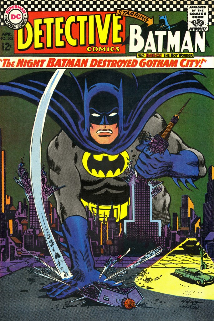
While Carmine is most closely associated with Silver Age characters The Flash and Adam Strange, I couldn’t discern, in these titles, a run of sufficiently stellar *and* consecutive covers (Flash nos. 139-142 and Mystery in Space nos. 69 to 71 come closest… do bear in mind that I have no consideration for ‘key’ issues or ‘famous’ or ‘event’ covers). It’s no real surprise that Infantino’s design work rose to a crescendo of accomplishment and consistency when he was made the company’s de facto art director, late in 1966. And what was he working on at the time? Batman. So, since Detective no. 261 bears a ho-hum cover and no. 269 is pretty spiffy, but the work of Gil Kane, here’s Mr. Infantino’s hot streak:
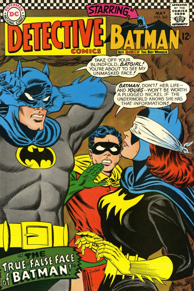
This is Detective Comics no. 362 (Apr. 1967, DC), pencilled by Infantino and inked by Murphy Anderson. Carmine wasn’t a fan of the so-called ‘Go-Go Checks’, that checkerboard pattern that once famously adorned those distinctive yellow NYC cabs. He didn’t mince words, either: « What a ridiculous thing: it was the stupidest idea we ever heard because the books were bad in those days and that just showed people right off what not to buy. ». Certainly, in the case of Detective Comics, they left the top of the page far too cluttered.This is Detective Comics no. 363 (May 1967, DC), featuring (this) Batgirl‘s second appearance. She’d been created by editor Julius Schwartz and Infantino at the request of the hit Batman TV show‘s producers, figuring that the series needed a heroine for a little extra spice. Art by Infantino and Anderson.This is Detective Comics no. 364 (June 1967, DC). Roy Reynolds, alias The Getaway Genius, was a fun civilian villain whose finest hour, in my view, came at the tail end of 1973 with Batman no. 254‘s King of the Gotham Jungle! (written by Frank Robbins, pencilled by Irv Novick and inked by Dick Giordano), when he was unexpectedly caught between the Batman and the Man-Bat. I wouldn’t be surprised to learn that a Batmaniac or three had reconstructed this Joker edifice in their backyard or basement, out of Lego blocks or papier mâché… or actual bricks.
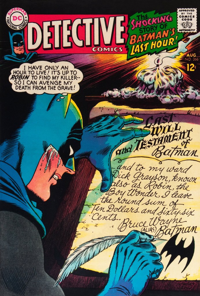
Carmine really went to town on this one, and it’s rightly earned its place in the hall of classics. This is Detective Comics no. 365 (July, 1967, DC). The cover story, The House the Joker Built! is scripted by John Broome, pencilled by Bob Kane ghost Sheldon “Shelly” Moldoff and inked by Joe Giella.Speaking of design, here’s the masterful Ira Schnapp‘s house ad for Detective 365, as it appeared in Green Lantern no. 54 (July, 1967, DC), among other titles.This is Detective Comics no. 366 (Aug. 1967, DC); I love those moody colours and light effects, that tell-tale Infantino candle and the mysteriously parsimonious inheritance bequeathed to Robin.This is Detective Comics no. 367 (Sept. 1967, DC), an intriguing preview of Where There’s a Will — There’s a Slay!, written by Gardner Fox, pencilled by Infantino, inked by Sid Greene. I wonder how many young readers enthusiastically destroyed the cover to assemble the puzzle…
Note also the improved logo placement (a return to issue no. 327 original ‘new look’ logo, actually), giving the layout a chance to… breathe a bit better. The Batman cameo at top left is still de trop.
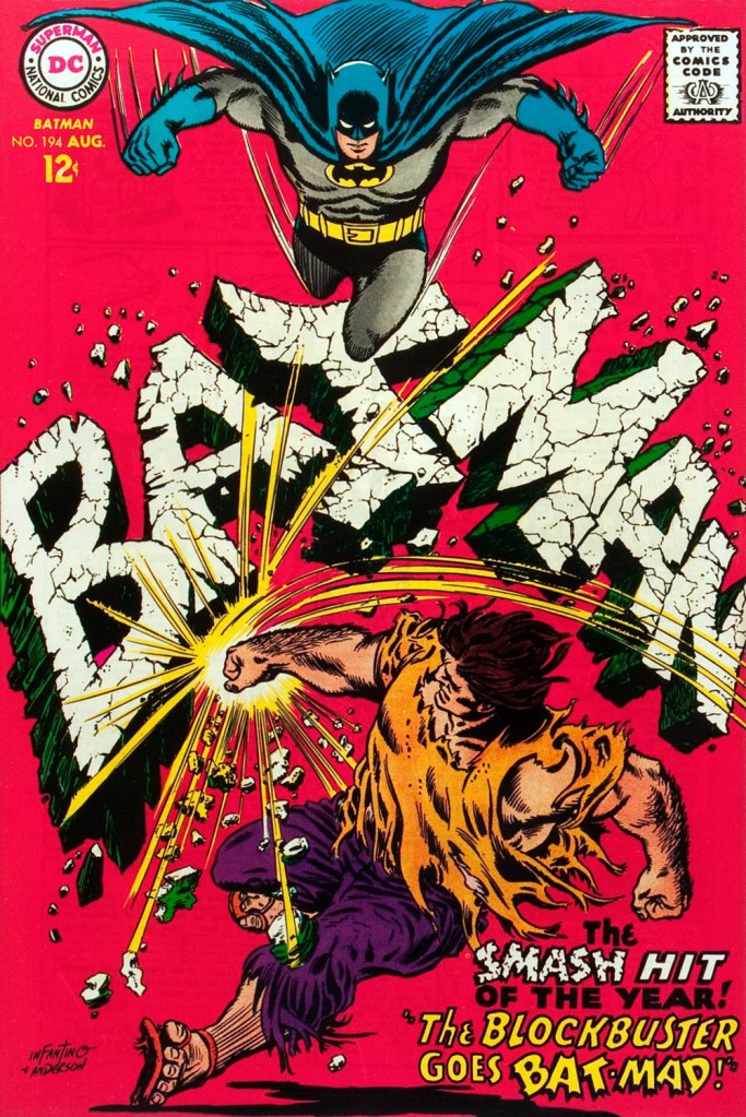
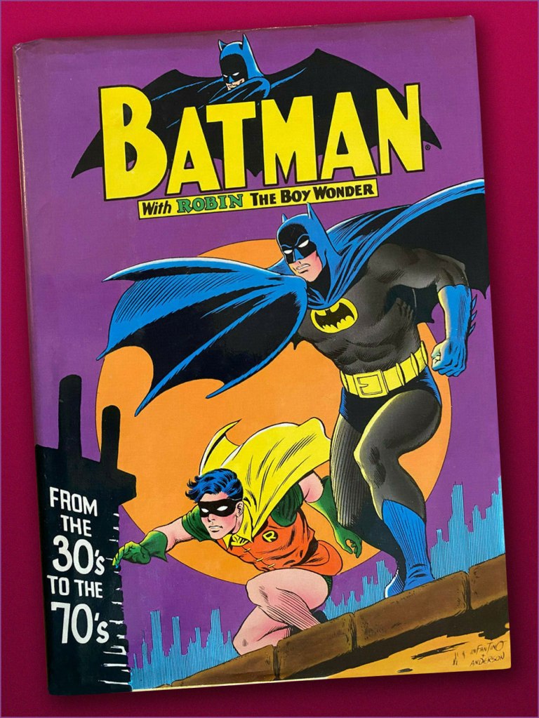
This is Detective Comics no. 368 (Oct. 1967, DC). Infantino reportedly created the covers first, and editor Schwartz assigned his writers to work up a scenario to fit. This one could not have been a cakewalk. Gardner Fox was the unlucky recipient of that gargantuan task.Since it’s not an issue of Detective, this cover’s not *technically* part of the streak… but as it features Batman, and it appeared between issues 365 and 366 of Detective, I’m throwing it in. Infantino and Anderson’s literal and figurative blockbuster of a cover for Batman no. 194 (Aug. 1967, DC). Its cover aside, a pretty ho-hum issue. The book and the character were in urgent need of another overhaul, and it was just around the corner. « When Donenfeld saw this cover, he had a fit! He said, ‘I don’t see the logo on top!’ I said ‘You don’t have to — you’ve got Batman up there!’ »Aw, heck — here’s Ira Shnapp’s accompanying house ad, a work of art in itself, wouldn’t you agree?Speaking of immortal Infantino Batman images: « Aurora wanted action shots of their models, so I did this rough layout, sent it to them, and they liked it! I had a moon behind him, but they dropped it. The tree created the design. I was very high into design at this point (1964) — the design was pouring out of me! ». Here’s a look at the finished model.I couldn’t very well leave out what’s possibly the most famous of Carmine’s Bat-scenes: this is Batman From the 30’s to the 70’s (1971, Crown Publishers) a splendid hardcover anthology. Its cover adapts an Infantino-Anderson mini-poster that originally saw print in Detective Comics no. 352 (June 1966, DC) and bore instead the inscription « Best Bat-Wishes Batman and Robin ». Superman, Wonder Woman and Captain Marvel, er… ‘Shazam’ also got their own historical anthology in this format.
-RG
*unless otherwise specified, most Infantino quotes are drawn from his excellent, profusely visual 2001 autobiography (with J. David Spurlock), The Amazing World of Carmine Infantino (Vanguard Publishing).
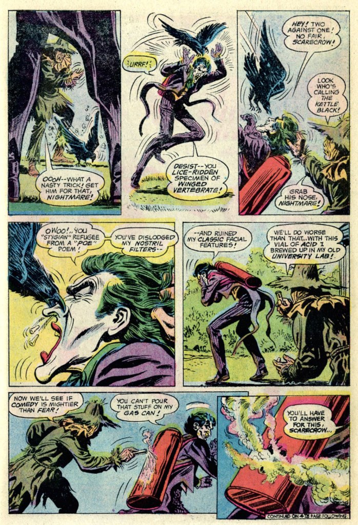
« Every scarecrow has a secret ambition to terrorize. » — Stanisław Jerzy Lec
I can’t help but feel that a villain who makes time in his nefarious schedule for taking his, er, pooch for regular walks can’t be *all* bad. Likewise for a rogue who appreciates the cleverness and joie de vivre of a raven.
This is The Joker no. 8 (July-August 1976), featuring The Scarecrow’s Fearsome Face-Off!, which was edited by Julius Schwartz (in case the alliterative title hadn’t tipped you off), scripted by Elliot S! Maggin, pencilled by the always-solid Irv Novick and inked by Tex Blaisdell. Cover by Ernie Chan (as Ernie Chua).
In the mid-70s, The Clown Prince of Crime held his own book for ten issues (nine of which appeared at the time… the tenth only seeing print in… 2019!), and its stories chiefly (and rather winningly) focussed on his squabbles with other members of The Batman’s rogues’ gallery (certainly the finest in comics). I haven’t followed the dodgy shenanigans of the back issue marketplace in decades, but I was amused and bemused by the lofty prices that this otherwise-innocuous little series commands. Overflow from his cinematic popularity, perhaps?
I like the way Professor Crane works. Over these past couple of years, this last two panel sequence has probably come to pass in real life more often than one would care to count.
The Joker adopting a hyena as a companion was but a cruel cover dodge, but The Scarecrow‘s pet raven, Nightmare, is present and accounted for, superbly crafty and most efficient, just like the genuine article!
The same page, from the original printing. In closing, a slight editorial note: It’s easy to forget that, unless you kept close tabs on the printer’s work, most mainstream comics were quite badly printed… it’s especially easy to forget since much of the more popular work has since been reprinted from the original art or photostats, and digitally coloured-and-printed. Conversely, when it comes to the work of defunct publishers, and if the original artwork, or quality photostats of same, is no longer in existence or otherwise unavailable, reprinters have to make do with a flawed, not to mention secondary, sources — at best. For instance, the printing of my original edition of this Joker issue is dreadfully out of register. In the wings, things were quickly shifting at DC: as of late ’75, Carmine Infantino (publisher, etc.) and Nick Cardy (art director, etc.) were out, and an absolutely crucial production technician, Jack Adler, was being sidelined. He would retire a few years later. Long story short, Sturgeon’s Law in action, and why I went with the digital colour job. After toning down the contrast a bit. A guy’s got to have standards.
« Competition brings out the best in products and the worst in people. » — David Sarnoff
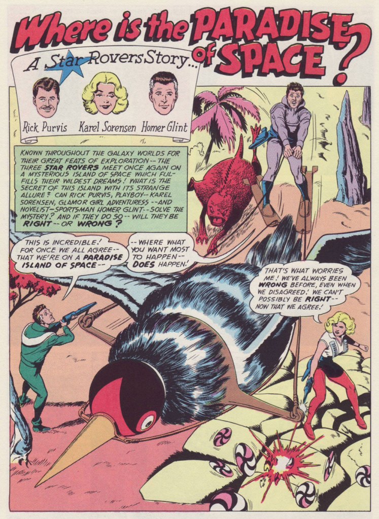
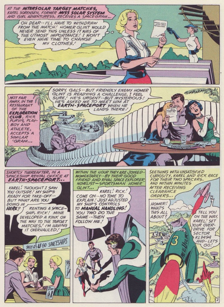
The other day, my partner was trying out a video game whose soundscape seemed exceptionally judicious and well-integrated to the action. At one point, she noticed that the optimal way to play was by matching one’s pace and movements to the musical rhythm. I said, “Oh, it’s just like that Star Rovers story!”
And now for a bit of context: The Star Rovers was a short-lived series that sporadically appeared in the back of DC’s Julius Schwartz-edited titles, mainly Mystery in Space, backing main feature Adam Strange.
As Michael Uslan beautifully puts it, in his introduction to Mysteries in Space: The Best of DC Science-fiction Comics (Fireside/Simon and Schuster, 1980):
« The Star Rovers were a whole other category of space heroes, typical of the kind of originality demanded by Julius Schwartz. A transgalactic trio of playboy, glamor-girl and novelist-thrill-seeker, they rarely agreed about anything and were rarely right about anything even when they did agree. »
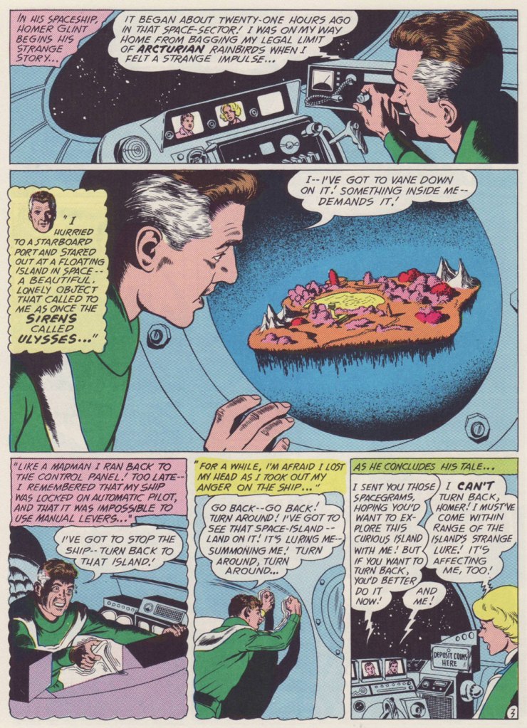
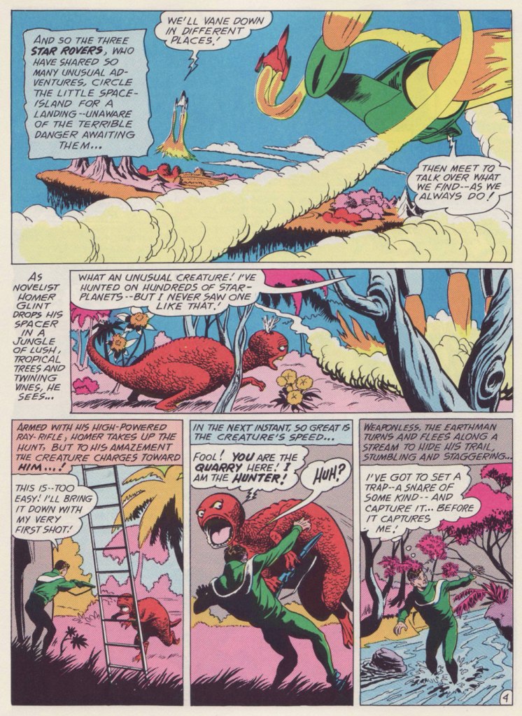
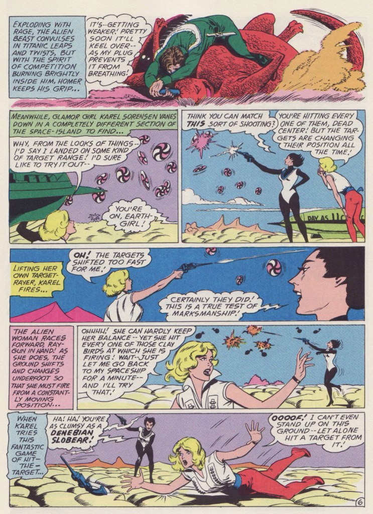
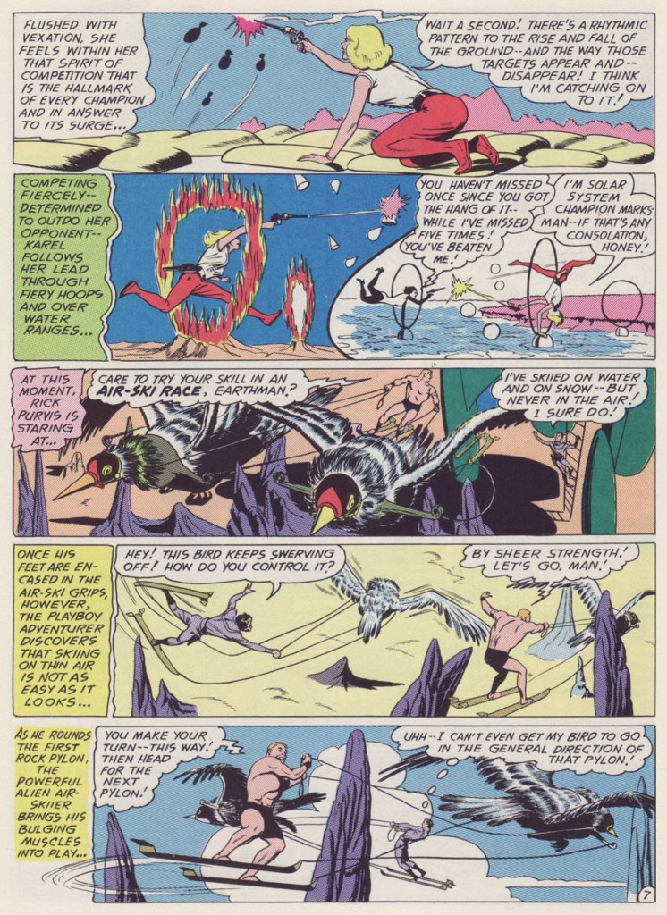
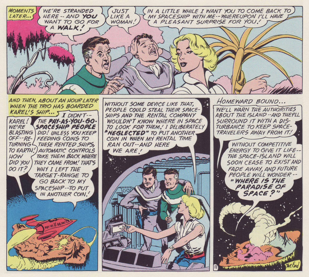
This is the third Star Rovers episode, Where Is the Paradise of Space?, from Mystery in Space no. 74,Mar. 1962, DC).
This is the sequence that brought this story to my mind.
One of the most charming aspects of the Star Rovers is the protagonists’ equal footing. In this case, Karel is a bit more than the fellows’ equal, but the series is mostly exempt of the sexism you’d expect from the period of its creation.
Much of the appeal of the Star Rovers is that they’re not a team: they’re friendly rivals, ‘frienemies’, as we’d call them these days. Aside from matching wits and theories, they never directly compete, as differences in their fields of endeavour would make the exercice pointless. There’s a light, jovial tone to these mysteries, yet they can still be taken seriously as intriguing puzzles.
All nine episodes were edited by Schwartz, scripted by Gardner Fox, and illustrated by Sid Greene (1906-72). The latter, a veteran of the comics industry with published work going back to 1940, arguably turned in the finest work of his busy career, and likely would have kept on doing so had it not been for… Batman’s troubles.
To make a long story short, as the Batman titles were shedding readers like there was no tomorrow (making it possible that there would, indeed, be no tomorrow), DC bigwigs opted to switch things around a bit, pulling editor (and Jack Kirby blackballer) Jack Schiff off Batman and Detective Comics and handing him the reins of Schwartz’s SF titles Strange Adventures and Mystery in Space. He ran those into the ground, but in goofily entertaining fashion, at least. Unlike the bat-books, there were expendable to DC.
As the ultimate Star Rovers tale appeared in the final issue of the Schwartz-edited Strange Adventures before the changeover, it seems likely that the series would have carried on under a Schwartz régime. But the Rovers weren’t at all in Schiff’s wheelhouse: the delicate premise called for deft, intricate plotting and wit, qualities not to be found within Schiff’s stable of writers. Gardner Fox and Greene were among Schwartz’s trusted confederates, and talent poaching was rarely allowed within DC’s editorial enclaves.
After this editorial switch, Greene was, with few exceptions, put to work inking the pencils of Schwartz’s big three: Carmine Infantino on Batman and The Elongated Man, Gil Kane on Green Lantern and The Atom, and Mike Sekowsky on Justice League of America. The problem, at least as I see it: Greene’s inks didn’t mesh well with any of these pencillers’ styles. Oh well — it’s a living. At least Greene was able to return to full pencil and ink duties on a handful of short stories for editor Murray Boltinoff, mostly in the pages of The Unexpected. Better late than never.
Finally, for your edification and amusement, here’s a Star Rovers checklist:
Who Caught the Loborilla? (Mystery in Space no. 66, Mar. 1961) What Happened on Sirius-4? (Mystery in Space no. 69, Aug. 1961) Where Is the Paradise of Space? (Mystery in Space no. 74, Mar. 1962) Where Was I Born– Venus? Mars? Jupiter? (Mystery in Space no. 77, Aug. 1962) Who Saved the Earth? (Mystery in Space no. 80, Dec. 1962) Who Went Where– and Why? (Mystery in Space no. 83, May 1963) When Did Earth Vanish? (Mystery in Space no. 86, Sept. 1963) Will the Star Rovers Abandon Earth? (Strange Adventures no. 159, Dec. 1963) How Can Time Be Stopped? (Strange Adventures no. 163, Apr. 1964).
« Jerry Grandenetti started out ghosting The Spirit, and nobody… NOBODY… captured the spirit of The Spirit better. Not content to stay in Will Eisner’s shadow forever, he forged his own unique style leading to a highly successful comics career lasting decades. » — Michael T. Gilbert
Since my very first encounter with his work, Jerry Grandenetti (1926-2010; born ninety-five years ago today, another Thursday April 15th) has endured as one of my true artistic heroes. But he’s not celebrated much at all.
Though he’s worked extensively on The Spirit, he’s treated as a bit of a footnote in the Eisner hagiography. His DC war work is well-regarded, but he’s inevitably overshadowed by the Joe Kubert – Russ Heath – John Severin trinity. Besides, by and large, the war comics audience doesn’t overlap much with the spandex long johns crowd. Grandenetti has only very occasionally and timidly dipped a toe into the super-heroics fray, and he was far too unusual for overwhelming mainstream acclaim.
In fact, aside from the couple of converts I’ve made over the years, I can only think of three fellow torch-bearing aficionados: Michael T. Gilbert (who digs best the early, Eisner-employed Jerry); Stephen R. Bissette (who favours the spooky 60s and 70s work); and Don Mangus, who’s most into the DC war stuff. I daresay I enjoy it all, but my taste is most closely aligned with Mr. Bissette’s on this particular point. Let’s sample a bit of everything, insofar as it’s feasible to sum up a career spread out over five decades… in a dozen-or-so images.
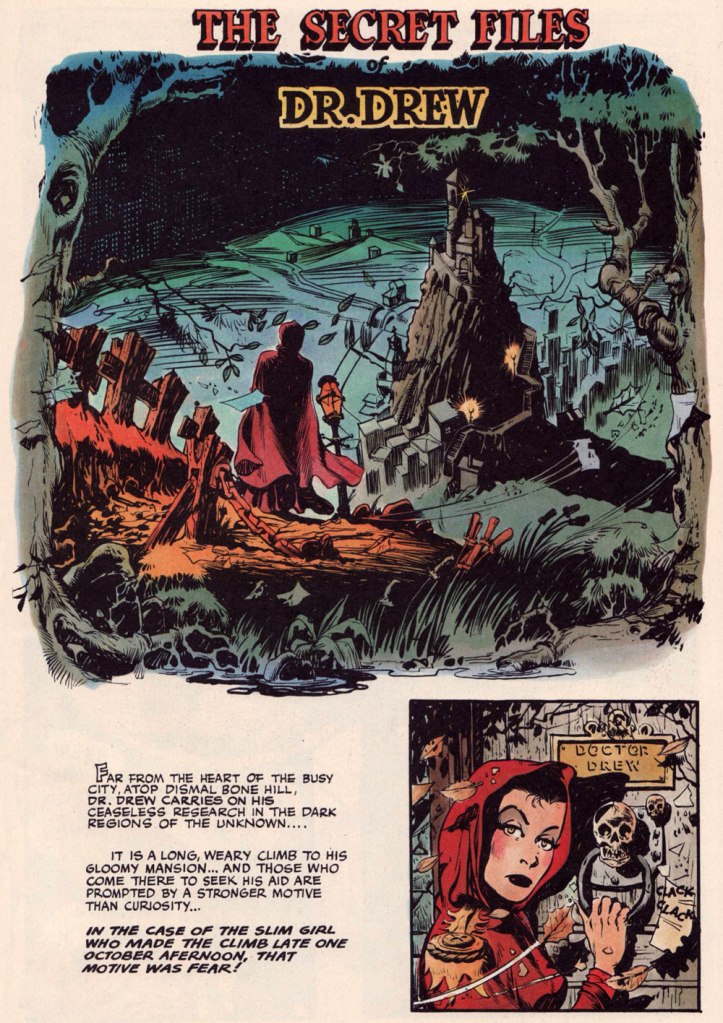
Opening splash from The Secret Files of Dr. Drew: Sabina the Sorceress, written by Marilyn Mercer and lettered by Abe Kanegson, from Rangers Comics no. 56 (Dec. 1950, Fiction House); this version hails from a reprint (Mr. Monster’s Super Duper Special no. 2, Aug. 1986, Eclipse) using the surviving original art; it was recoloured by Steve Oliff.
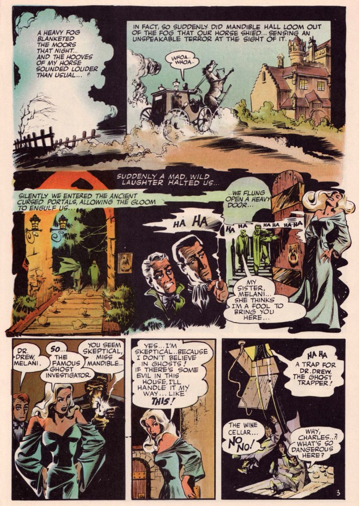
Page 3 from The Secret Files of Dr. Drew: Curse of the Mandibles!, written by Marilyn Mercer and lettered by Abe Kanegson, from Rangers Comics no. 55 (Oct. 1950, Fiction House); this version hails from a reprint (Doc Stearn… Mr. Monster no. 4, Dec. 1985, Eclipse) using the surviving original art; it was, again, most tastefully recoloured by Mr. Oliff.
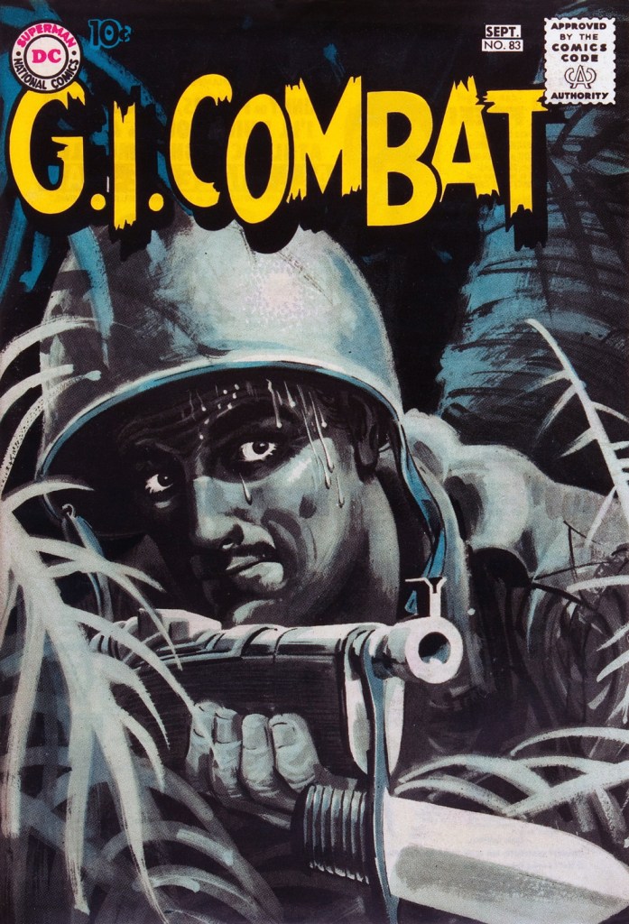
In 1954, the powers-that-be at National Periodical Publications (you know, DC) gave Grandenetti some latitude to experiment with their War covers. Grandenetti produced an arresting hybrid of painted and line art. The process involved a grey wash painting that was photostatted, with flat colour laid over the resulting image. The first few attempts yielded striking, but nearly monochromatic results. A bit farther down the pike, the production department got more assured in its technical exploration.
This is G.I. Combat no. 77 (Oct. 1959, DC); wash tones and colouring by Jack Adler, who recalled, in a 1970s interview: « It was suggested that we start doing washes for covers, and we were talking about doing it for so damned long, but nobody attempted it. I think Grandenetti did the first one, an army cover with someone floating in the water. I think that was the first wash cover that was done. That one ended up looking like a full color painting. »
This is G.I. Combat no. 83 (Aug.- Sept. 1960, DC); wash tones and colouring by Jack Adler. In 1995, Robert Kanigher, Grandenetti’s editor on the DC war books and a frequent collaborator, recalled: « Jerry liked to experiment and I had to sit on him to get him to stop it. Especially in his covers, which were outstanding, when I forced him to draw as realistically as possible. »
Original art from The Wrath of Warlord Krang!, smothered in dialogue and exposition by Stan Lee, from Tales to Astonish no. 86 (Dec. 1966, Marvel); inks by Bill Everett. Namor‘s constant random shouts of ‘Imperius Rex!‘ make him sound like a sitcom character with Tourette’s. As far as I’m concerned, it’s possibly been the most annoyingly asinine slogan in comics since Stan stole ‘Excelsior!‘ from Jean Shepherd.
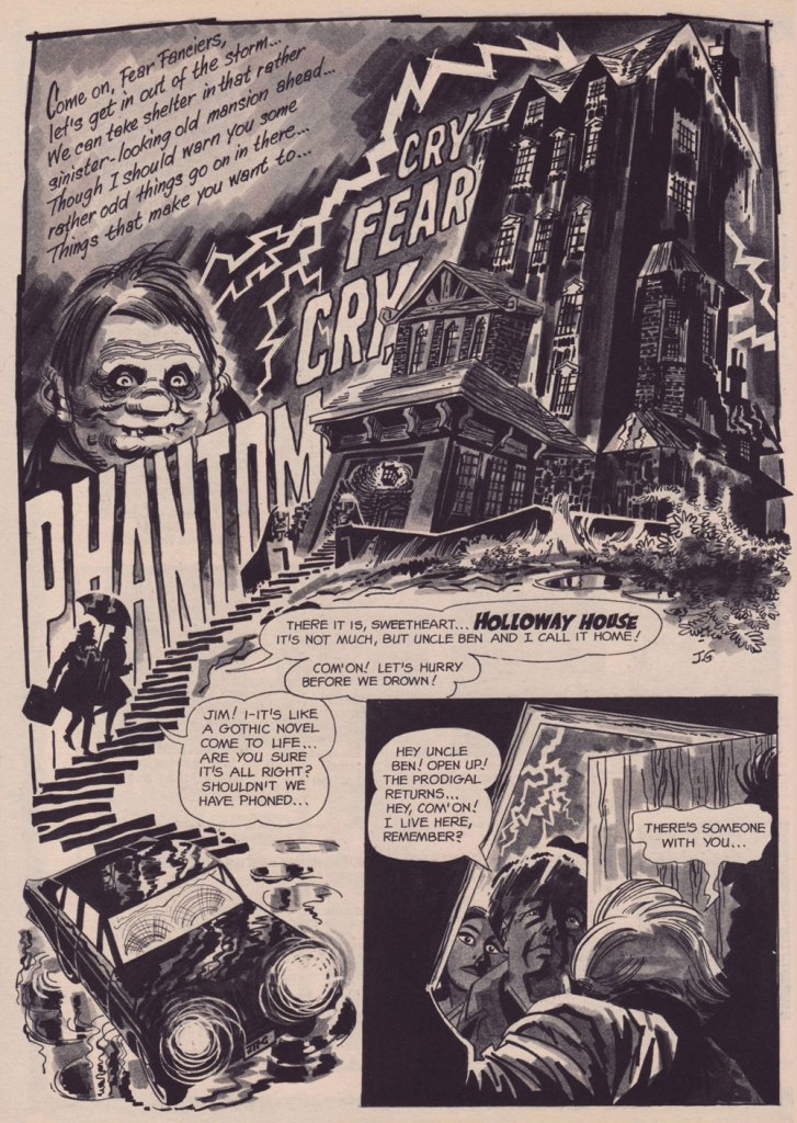
The opening splash from Cry Fear, Cry Phantom, written by Archie Goodwin, from Eerie no. 7 (Jan. 1967, Warren). In the mid-60s, presumably tiring of being pigeonholed as a war artist at DC, Grandenetti made the publishers’ rounds, doing a bit of work for Tower, Gold Key, Charlton, Marvel, Cracked (check it out here) and most memorably Warren where, after ghosting a few stories for Joe Orlando, he unleashed his innovative expressionistic style.
DC was generally hesitant to entrust its more established properties to the more “out there” artists. In the cases of Grandenetti and Carmine Infantino, the solution was to match them with the weirdness-dampening inks of straight-arrow artist Murphy Anderson. And you know what? It did wonders for both pencillers and inker.
This is The Spectre no. 6, October, 1968. A tale told by Gardner Fox (and likely heavily revised by hands-on editor Julius Schwartz, a man who loved alliterative titling) and superbly illustrated by the Grandenetti-Anderson team. Steve Ditko aside, Jerry Grandenetti had no peer in the obscure art of depicting eldritch dimensions (you’ll see!)
Page 13 from Pilgrims of Peril! written by Gardner Fox, from The Spectre no. 6 (Sept.- Oct. 1968, DC); inked by Murphy Anderson. Dig the salute to a trio of real-life spooky writers, all of whom editor Julius Schwartz knew well, having even served as Lovecraft’s literary agent late in the man’s life. By the tail end of the 1960s, Lovecraft’s work was finally making some commercial inroads, thanks largely to Arkham House co-publisher Derleth‘s unflagging diligence.
Page 22 from Pilgrims of Peril! written by Gardner Fox, from The Spectre no. 6 (Sept.- Oct. 1968, DC); inked by Murphy Anderson.
Page 2 from Men Call Me the Phantom Stranger, written by Mike Friedrich, from Showcase no. 80 (Feb. 1969, DC); inks by Bill Draut. This story reintroduced an obscure character from the early 50s, which Grandenetti had drawn a couple of times during his six-issue run. The Phantom Stranger has remained active ever since, but most writers (save Alan Moore, wouldn’t you know it?) don’t really know what to do with him. This, however, is my very favourite PS appearance. Draut, a slightly old-fashioned penciller by this time was, as a slick inker, a wonderful fit for Grandenetti’s confidently loopy layouts.
Page 3 from The Haunting!, written by Jack Oleck, from House of Mystery no. 183 ((Nov.-Dec. 1969, DC). Grandenetti pencils and inks: undiluted!
Page 2 from Eyes of the Cat, written by Robert Kanigher, from House of Mystery no. 189 (Nov.-Dec. 1970, DC); inks by Jerry’s fellow Will Eisner ghost Wallace Wood. The inspired combination of Grandenetti’s adventurous layouts and the velvety unctuousness of Wood’s finishes are a match made in heaven, but one Woody wasn’t fond of. Oh well.
So there you are. Just the tiniest tip of the iceberg. Happy birthday, Mr. Grandenetti!
« It was exactly an assembly line. You could look into infinity down these rows of drawing tables. » — Gil Kane
Some of our more sensitive readers may have noticed that we’ve been none too gentle with Gil Kane (1926-2000) in the past, dealing him some rather rough lumps at times. But that’s not the whole story: in taking stock of such a protracted and prolific (dare I say profligate?) career as his, much of it inevitably spent on autopilot, one must be discerning. In other words, I like some of Kane’s work, but there’s plenty of it I don’t care for. Still, WOT’s rule of thumb is that if we altogether loathe an artist and/or his work, we’ll just turn a blind eye.
And speaking of the sense of sight, what makes a great comic book cover? Must be my art school training and subsequent work in advertising tipping the scales, but to me, design and layout reign primordial as ingredients… as values. I’m often dismayed at many a would-be critic’s apparent method of assessing an image’s artistic worth, namely: how many popular characters does it feature? Is it action-packed? Is the issue sought-after and expensive? Does it feature a famous character’s début? Is it drawn by a fan-favourite artist who unquestionably can do no wrong… because he’s a fan-favourite artist who unquestionably can do no wrong? (and how dare you claim otherwise!)
Gil Kane reportedly generated around eight hundred covers for Marvel in the 1970s… of all levels of craft and quality. With that kind of frenzied output, it’s impressive that most were perfectly serviceable, given that there certainly was no time for meticulous, sober planning. They were generally over-captioned (not Kane’s fault!) and crassly sensationalistic, but that’s what Marvel sought and settled for.
It’s a shame that Kane and his former classmate at the School of Industrial Art (back in the early 40s!), DC lynchpin Carmine Infantino didn’t get on too well, because their Silver Age collaborations had a special spark… must have been the animosity. It had been noted by the DC brass, as early as the late 50s, that Carmine’s covers reliably caught prospective buyers’ attention and dimes. And so, by 1967, he was unofficially designing most of the publisher’s covers, and certainly the covers of all titles edited by Julius Schwartz. Green Lantern was among these.
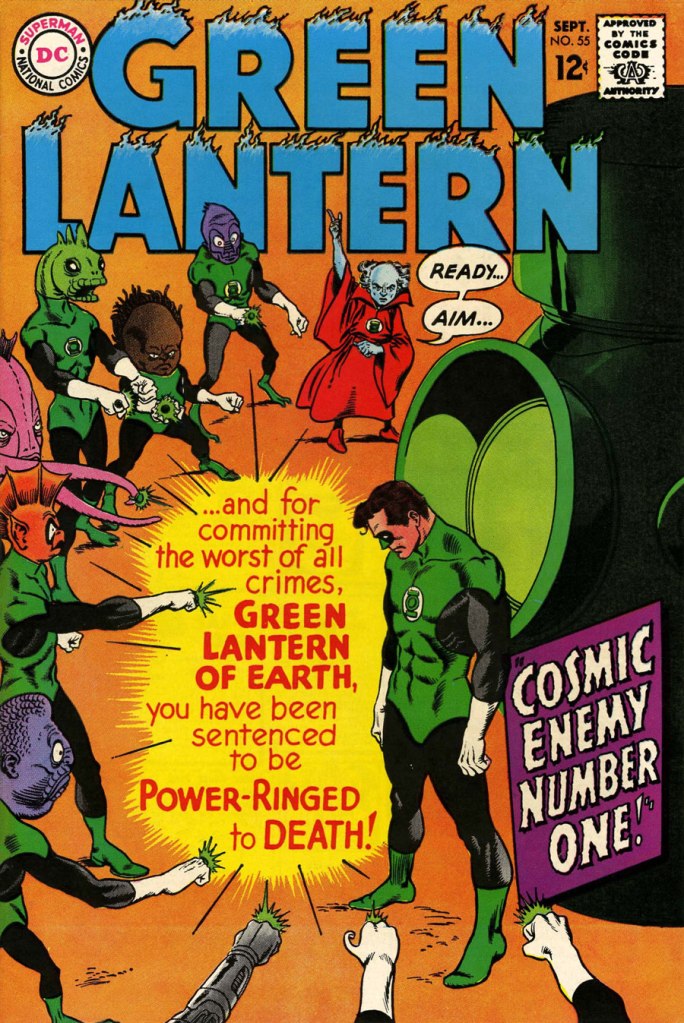
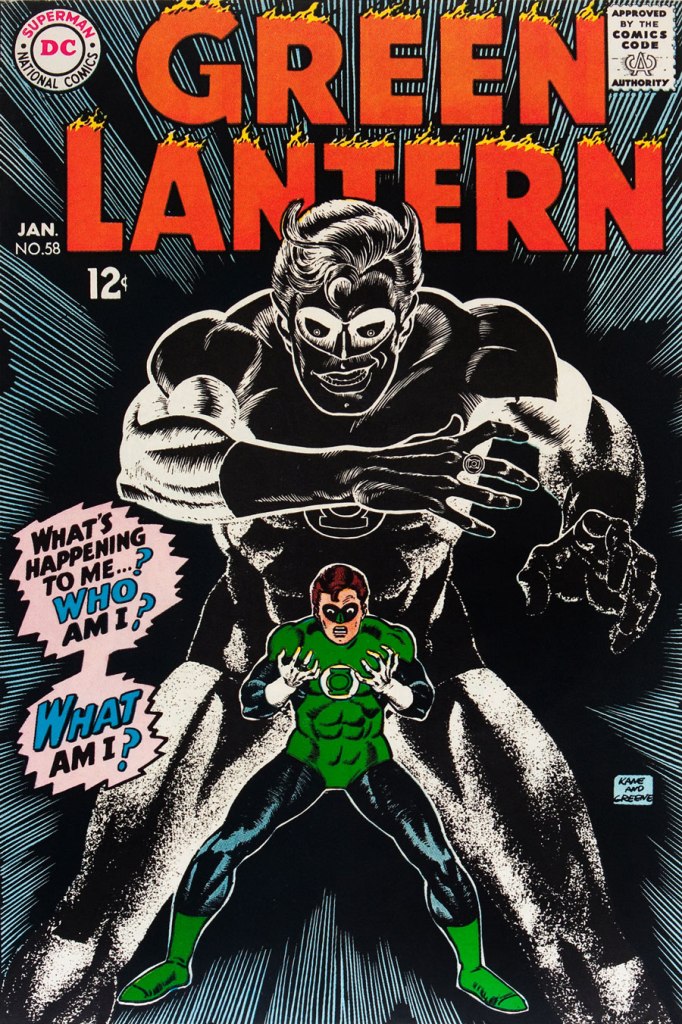
So we turn today’s spotlight on a hot streak of seven. Kane gets his name in the title, but it would be more accurate to say they were Infantino-designed, Gaspar Saladino-lettered, Jack Adler-coloured, Gil Kane-pencilled and Murphy Anderson and Sid Greene-inked covers. The streak begins after Green Lantern no. 54’s downright poor cover, and ends with the interruption of Kane’s impressively long run of consecutive issues.
We begin with Green Lantern no. 55 (Sept. 1967, DC). Harmonious, easy-to-parse arrangement of numerous elements and exemplary integration of text. Design by Infantino, pencils by Kane, inks by Murphy Anderson, lettering by Gaspar Saladino, colours by Jack Adler. Oh, and lest we forget: logo designed by Ira Shnapp (circa 1964), classic Green Lantern uniform designed by Kane (circa 1959).
This is Green Lantern no. 56 (Oct. 1967, DC). Kane was never much for varying his monsters (see below). Pencils by Kane, inks by Anderson.
For a bit of comparison on how things were done from company to company, this is Tales to Astonish no. 91 (May, 1967, Marvel). This is what happens when there’s no planning or attention to detail: in an already-crowded cover, did we really need that ugly box advising us of the presence of The Abomination? He’s right there! (maybe the abomination refers to the cover itself). And the foreshortening nightmare that is the baddie’s left arm was so dire that, when a fan commissioned Arthur Adams to produce a recreation of this cover (which, things being as they are, many surely consider ‘iconic’)… he wisely corrected the anatomy and tweaked the poor composition. Interesting how Marvel’s heavy-fingered yes-man, art director John Romita Sr., was always game to “fix” Ditko and Kirby art, but saw nothing wrong with this one.
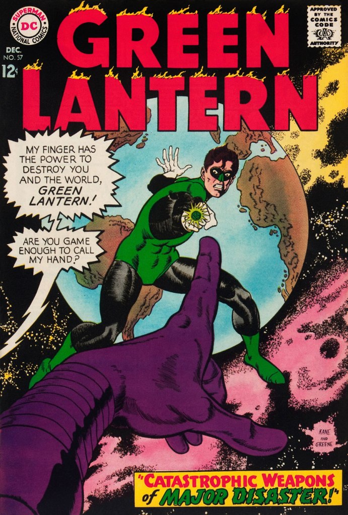
This is Green Lantern no. 57 (Dec. 1967, DC), featuring Catastrophic Weapons of Major Disaster!, written by Gardner Fox, pencilled and inked by Kane. Cover by Kane and Greene… love the placement of the signatures!
This is Green Lantern no. 58 (Jan. 1968, DC), featuring Peril of the Powerless Green Lantern! (a Julius Schwartz title if there ever was one), written by Gardner Fox, pencilled by Kane and inked by Greene. I’m not overly fond of the Kane-Greene mix, but Sid Greene, as a penciller-inker did some splendid work on the Star Rovers series (1961-64), co-created and scripted by Gardner Fox.
An issue whose price few can afford unless they bought it off the racks, this is Green Lantern no. 59 (March 1968, DC); pencils by Gil Kane, inks by Murphy Anderson. Featuring the introduction of GL alternate Guy Gardner, who was to be dubiously re(jack)-booted in the 1980s, by Steve Englehart and Joe Staton, as a jackass with an ugly uniform and a worse haircut. Never mind the fact that the Green Lantern Corps would never bestow power and stewardship on such an immature and pompous loose cannon.
This is Green Lantern no. 60 (April 1968, DC); an evident Infantino design, with pencils by Kane and inks by Anderson… which interestingly ends up producing a prototype of Brian Bolland‘s distinctive style… a decade early.
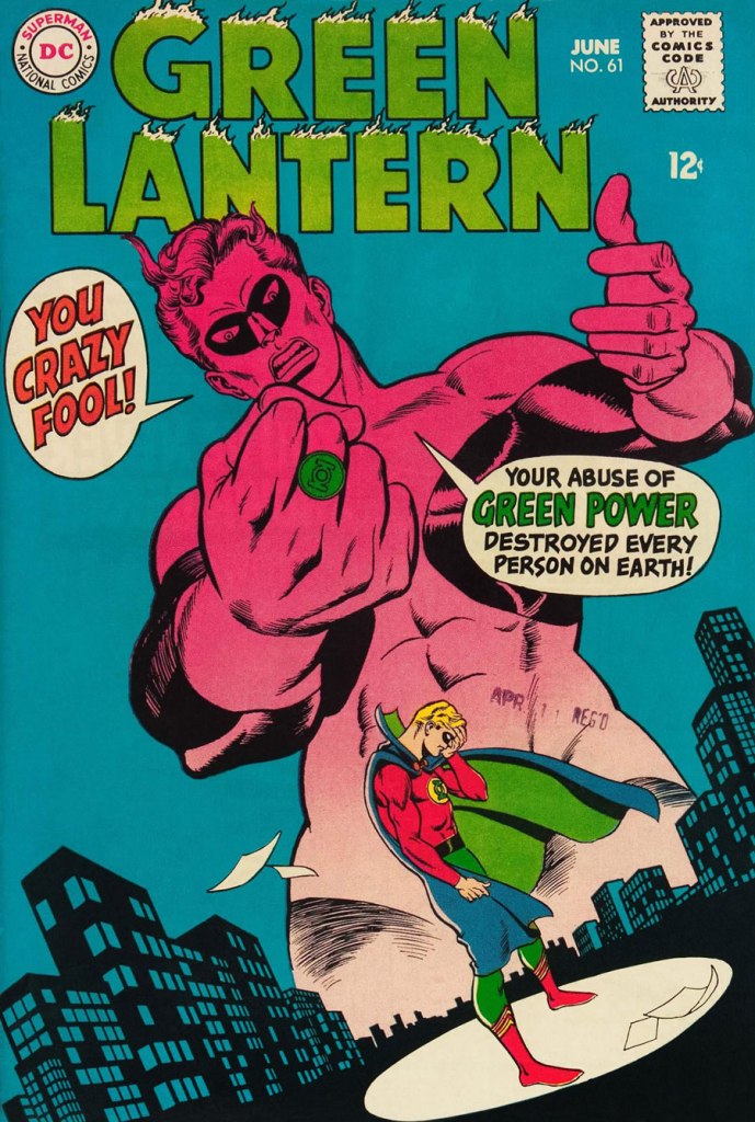
This is Green Lantern no. 61 (June 1968, DC); pencils by Kane, inks by Greene, and featuring (groan) Thoroughly Modern Mayhem!, scripted by Mike Friedrich, pencilled by Kane and inked by Greene. Co-starring Alan Scott, the Golden Age Green Lantern.


