« Down metal snake corridors Steely grey engines hum for nobody but me No sound comes from the sea above me No messages crackles through the radio leads They’ll never know, never no never How strange life in dark water can be… »*
Now that we’re finally enjoying proper autumnal weather – which is to say, grey, rainy and beautiful – my thoughts turn to the dark and the wet. Aquatic octopus scenes fit this mood beautifully: those mute scenes where characters are as if frozen in the clutches of a gargantuan octopus. In which overeager octopod grabbers get ferociously punished for their ill-advised enthusiasm, winding up, more often than not, on the wrong end of a sharp… implement.
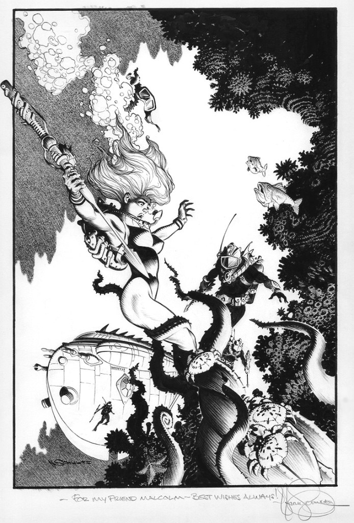
Original art by Mark Schultzintended for the Subhuman paperback collection (which, as far as I know, never saw print):
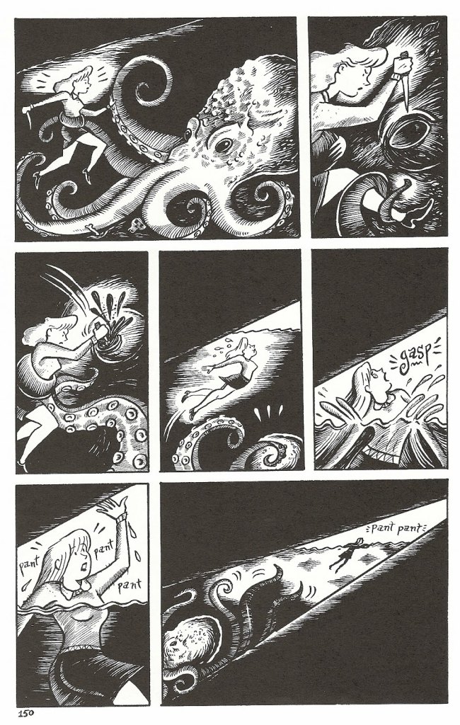
A few pages from Richard Sala‘s Mad Night (2005, Fantagraphics):
This book features not one, but two epic battle scenes with an octopus!
A painting by Vic Prezio, created for the front cover of a 1962 issue of Man’s Escape:
« Charlton was just a place where you felt you could let off a little steam, even if you were never going to get rich. » – Roy Thomas
For over a decade, Pat Masulli (1930-1998) was executive editor of Charlton Publications’ comics line… and of its more lucrative song lyrics (Hit Parader, Song Hits) and crossword puzzle magazine line. Though much has been made of artist Carmine Infantino rising through the editorial ranks at DC Comics (positions traditionally held by writers or just plain bossy types; Sheldon Mayer was a most notable exception at DC), Charlton always did employ artists to manage the comics wing: Al Fago (1951-55), Masulli (1955-66), Dick Giordano (1965-68), Sal Gentile (1968-71) and finally George Wildman (1971-85). There are overlaps in time as well as the porous distinctions betwixt the titles of Managing Editor and Executive Editor.
Now, all of the aforementioned are serviceable artists, but I’m most interested in Masulli. Over the years, it’s gradually dawned on me that, for a few months in 1965-66, Masulli, as if he weren’t busy enough already, decided to lay out and pencil most of the comics line’s covers. And, astoundingly, they represented some of the finest (though often obscure) comics artwork of the decade. Cover artist is a plum job in comics, but few are born that can smoothly fill these tight, squeaky shoes.
What was Masulli like? It depends on whom you ask. His one-time assistant, artist (and later DC inker) Frank McLaughlin, responded with a diplomatic, amused « You don’t want to know. » Charlton’s main writer, Joe Gill, queried about Masulli as editor, sums it up: « Terrible. Pat’s dead now, but he was a martinet, not a friendly guy that enjoyed amiable relations with the artists. He ruled it, and he and I co-existed. » On the other hand, writer-editor Roy Thomas (who was granted his entrée into the industry by Masulli), understandably speaks well of him although, to his regret, they never met. Before they could, Masulli was promoted at Charlton, leaving him to devote his time and effort to the music division, handing the reins of the comic book line to his now-and-again assistant, Mr. Giordano.
Masulli’s go-to guy within his stable of artists appears to have been the versatile, underrated Rocco ‘Rocke’ Mastroserio, who died far too young (at the age of 40!), still steadily improving and shortly after landing some promising jobs at Warren and DC. Mastroserio’s early work can be a tad gawky and lopsided, but shows much promise. By the mid-60s, his covers (his forte) could at times attain a level of craft and inspiration rivalling (and akin to) the work of John Severin and Joe Maneely, fine models to emulate.
This time, however, let’s focus on highlights from the Masulli-Mastroserio flash flood of ’65.
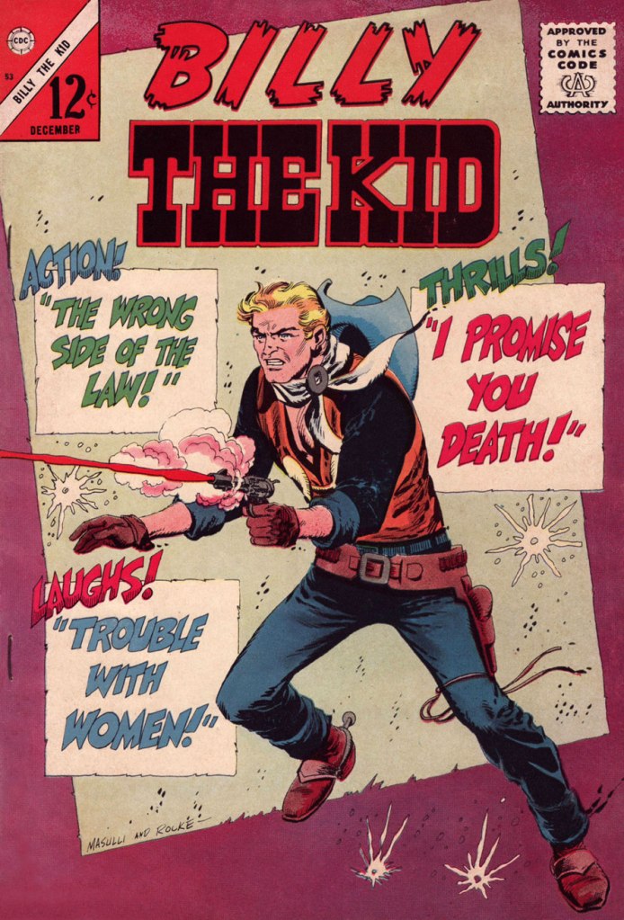
This is Billy the Kid no. 53 (Dec. 1965, Charlton).
This is Special War Series no. 1 (Aug. 1965, Charlton).
This is Fightin’ Navy no. 124 (Jan. 1966, Charlton).
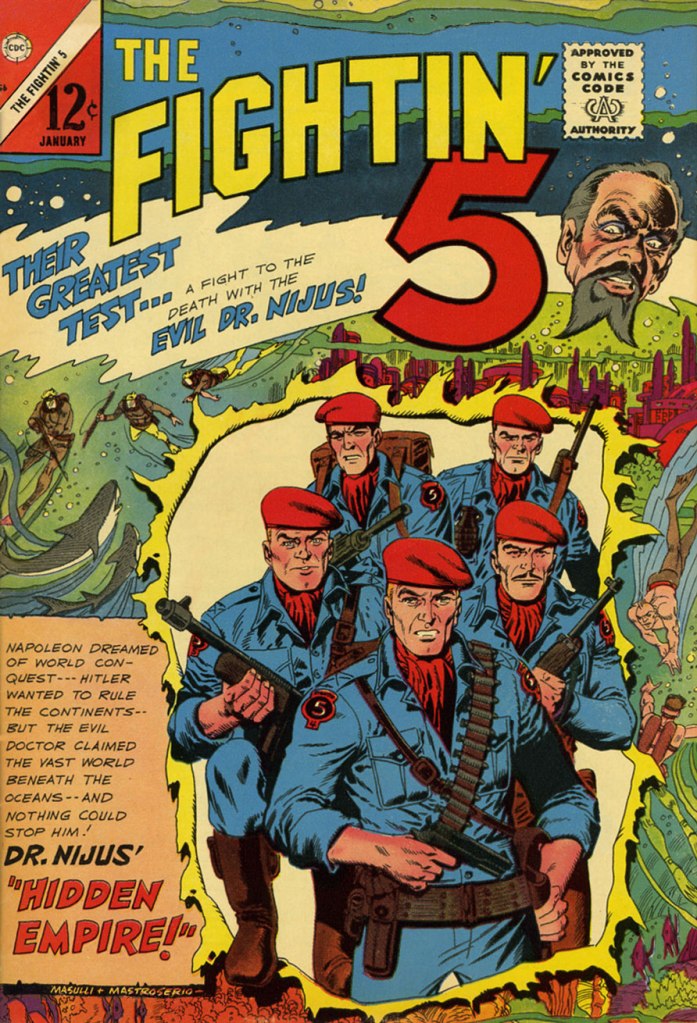
Intricate yet easy to parse, this is TheFightin’ 5 no. 36 (Jan. 1966, Charlton). Comic Book Artist editor Jon B. Cooke once or twice opined that The Fightin’ 5 were ‘a Sgt. Fury and His Howling Commandos swipe‘… but he was wrong: they were a Blackhawk swipe (if anything), and, let’s be honest, Sgt. Fury is, for his part, a Sgt. Rock and Easy Company swipe. All clear now?
This is Hot Rod Racers no. 9 (Jan. 1966, Charlton).
This is Hot Rod and Racing Cars no. 78 (Mar. 1966, Charlton). Masulli began his career as a colourist, and it certainly shows in his cover work.
This is Konga no. 23 (Nov. 1965, Charlton), the series’ final issue. The mighty Steve Ditko had begun the series, but later art chores were capably handled by the solid team of Bill Montes and Ernie Bache.
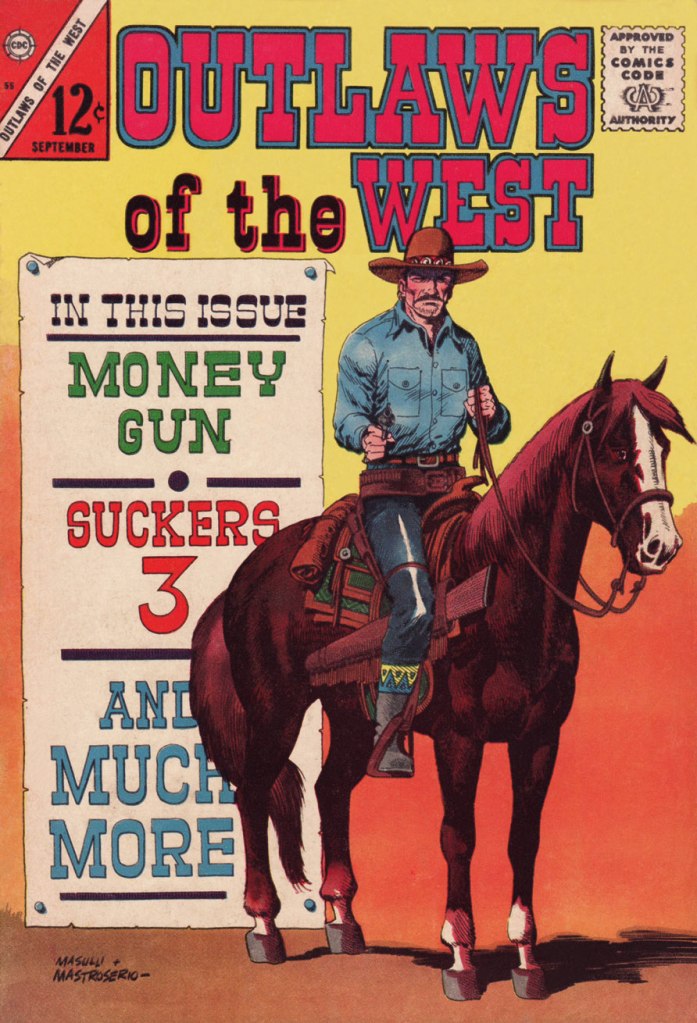
This is Outlaws of the West no. 55 (Sept. 1965, Charlton). Masulli could do busy and action-packed, and he could also do spare, clean and serene. Unlike many a cover artist, he didn’t seem to rely on one particular formula, or even two.
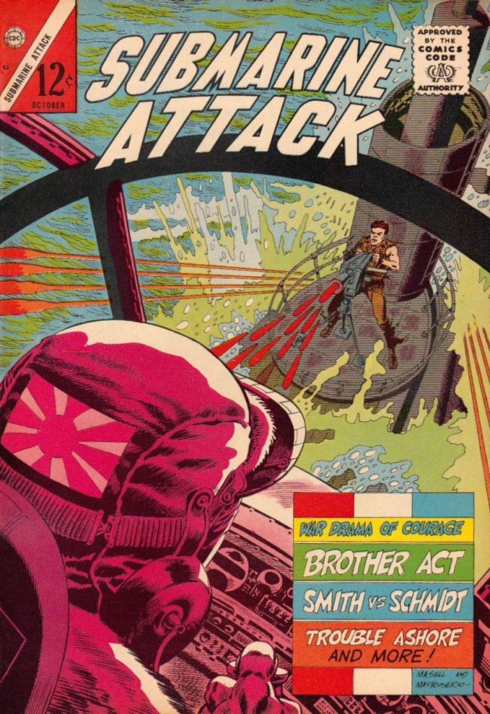
This is Submarine Attack no. 52 (Oct. 1965, Charlton). Both composition (that foregrounding!) and colouring are top-notch.
This is Texas Rangers in Action no. 53 (Dec. 1965, Charlton). Nearly all of Charlton’s covers of this period were distinctively lettered by Jon D’Agostino (1929-2010).
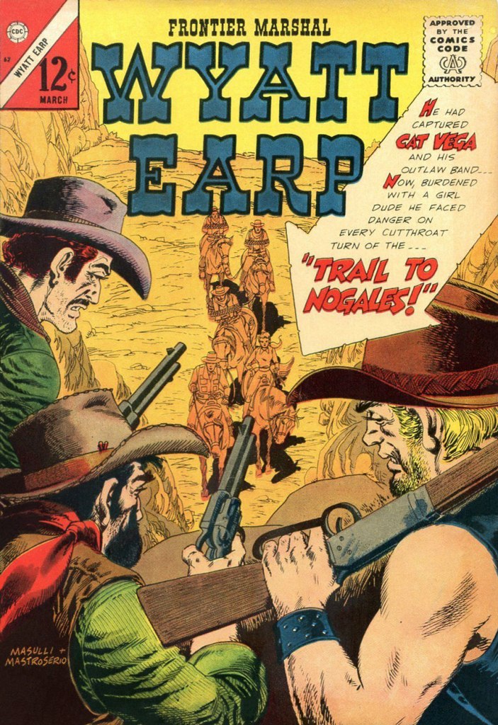
This is Frontier Marshal Wyatt Earp no. 62 (Mar. 1966, Charlton). Mastroserio’s savvy variation of line thickness to convey perspective and emphasize depth is what most reminds me of Joe Maneely‘s work for Atlas and DC (speaking of artists snatched away in their prime).
I’ll return at some point to spotlight solo Mastroserio. Next on the agenda for me, however, is this year’s Hallowe’en Countdown!
« Adults are just outdated children. » — Dr. Seuss
While some are of the opinion that children should be seen but not heard (and preferably not seen), others coo mindlessly over every mollycoddled tot. I think the truth lies somewhere in the middle, and today I’ll concentrate on courageous, plucky children who are not afraid of diving head first into adventure.
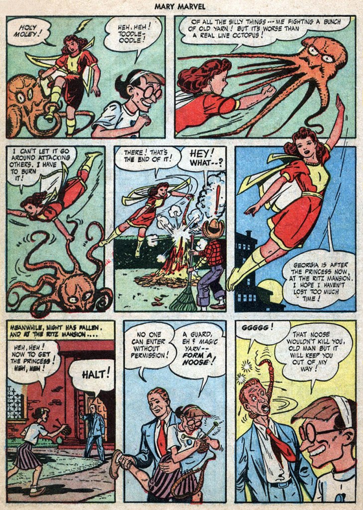
The Magic Yarn, published in Mary Marvel no. 2 (June 1946, Fawcett), was scripted by Otto Binder and drawn by Jack Binder. This immensely entertaining story about an old bat with dreams of world domination involves an octopus, some bondage (of course!), and lots of knitting. (Read it here)
Moving on to actual (rather than knitted) octopuses, here’s the original art from On the Bottom of the Sea, published in Little Max no. 16 (Harvey, April 1952). The story artist may be uncredited on GCD, but we know that it’s Al Avison 😉
The Little Wise Guys tangle with an ornery cephalopod. Giggles ensue! This is Daredevil Comics no. 111 (June 1954, Lev Gleason), with a cover is by Charles Biro. The cover story is Scarecrow’s Lucky Blunder, scripted by Charles Biro and illustrated by Ralph Mayo.
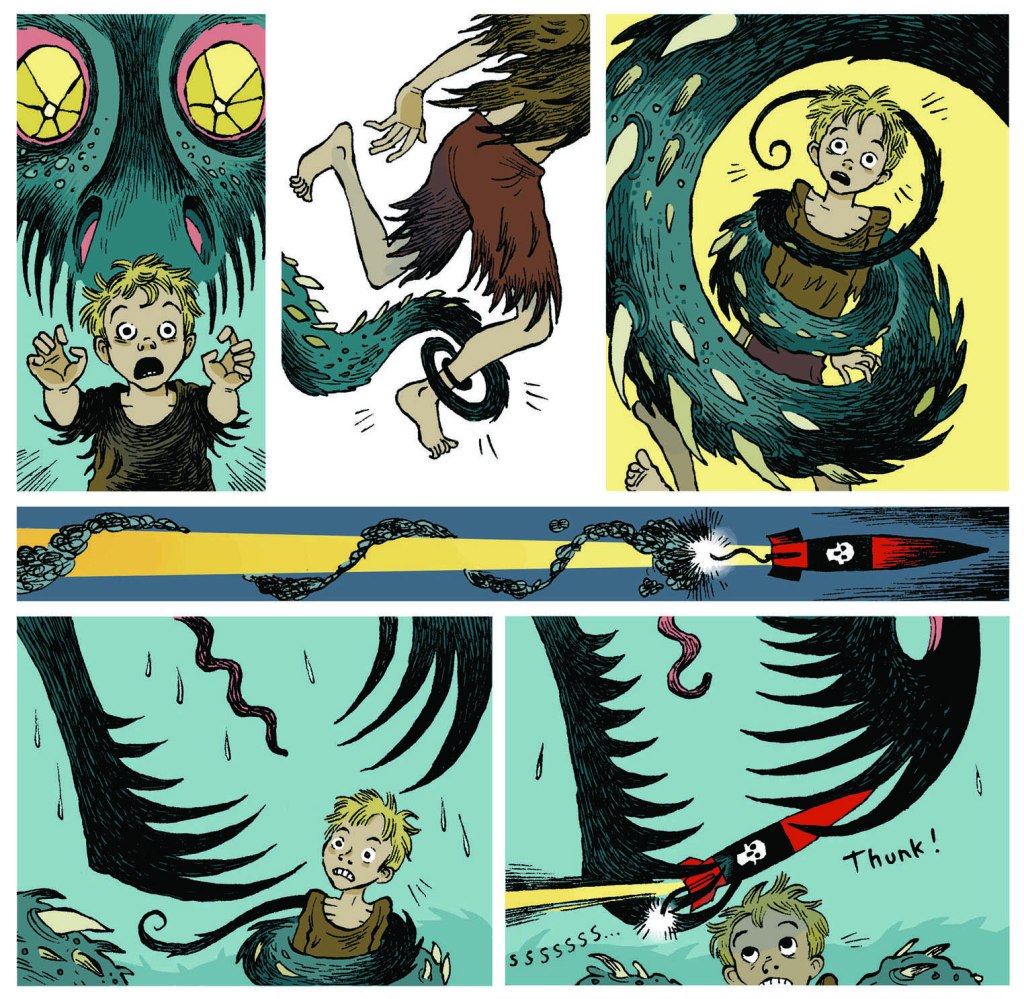
Finally, making an epic effort to wrench myself away from the tender embrace of the Golden Age, I’ll accelerate a little too much and end up in all the way in 2015. Here’s a page from Scarlett Hart: The Tentacles of Terror by Thomas Taylor and Marcus Sedgwick.
« It did not occur to me that I might be a writer until I flunked out of my first year as a chemistry major, and found work as an apprentice writer of Volkswagen ads. » — Peter Carey
Until the Beetle hit the market, automotive marketing copy was full of bluster, and the images (often illustrated) were flights of fancy, emphasizing low, long lines and a fantasy lifestyle.
The clean, simple photography on a white background that emphasized the Beetle’s compact, practical form may seem commonplace these days, but it was a revolution in a world where Americans grew up obsessed with muscle cars, horsepower, and tire smoke. Making the car small, when the convention was to make it fill the page, was also novel. The simplistic approach to design and layout was totally contrary to the advertising conventions of the time. [ source ]
While I object to the misuse of the rather pejorative “simplistic” to denote what is instead commendably strippeddown, uncluttered, or if one must, ‘simple‘… that’s the gist of it. After all, these folks are gearheads, not graphic designers.
One of the lesser-known components of the long-running campaign was a nifty 1967 promotional book that was graciously given away by one’s friendly Volkswagen dealer.
They gathered all the big guns and asked them to think small. Illustration by Charles Addams.
Let’s take a look inside.
One by perennial bon vivantEldon Dedini, working one of his pet motifs, but with his customary panache. Under Eldon’s pen, the car’s lines acquire a lusty fluidity.
A beauty by local favourite Virgil Partch (1916-1984). Such a graceful line the man had. Simple… not simplistic!
Don’t be confused: like the Porsche and the Corvair, the VW Beetle’s trunk is located in the front of the vehicle. Cute details: the booted husband’s still-smoking pipe and his glasses remain in the garage. VIP delivers, as usual. Read how he met his demise.
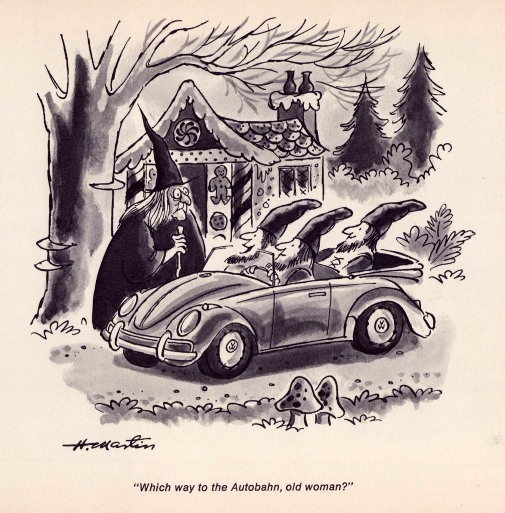
An adorable entry from long-time The New Yorker cartoonist Henry Martin, who passed away last June at the age of 94. I can just hear the German accent.
Another Playboy regular, Phil Interlandi (1924-2002) stretches out a bit, and very successfully at that.
One from the book’s royal guest, Charles Addams (1912-1988). It’s a fine joke, but I find that many people don’t get it; it would have benefitted from a more vertical composition. Still, trust Uncle Fester to know what’s going down.
A second dose of Mr. Addams. I wasn’t going to say no to a giant mutated toad and toadstool. Here’s our earlier sampler of his macabre wit, from (un)naturally, our first Hallowe’en Countdown.
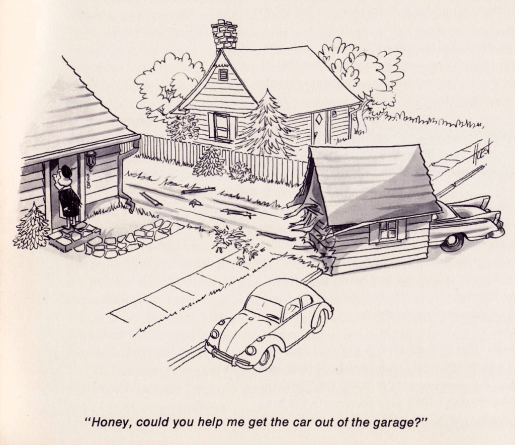
The couple of decades he spent drawing his successful syndicated strip about unceasing marital strife, The Lockhorns (whose début came the following year!) have perhaps dimmed the critical reputation of William ‘Bill’ Hoest (1926-1988). But he was quite good, when given a chance to stretch out a bit. It’s been since proven that women are the better drivers, incidentally.
And finally, a bat-entry from John Gallagher (1926-2005), a then-ubiquitous panel gag cartoonist in many of the biggest names in magazines: Collier’s, The Saturday Evening Post, Look, True… I love the absurd size ratio between the members of The Dynamic Duo. That’s one sidekick you could accidentally kick aside!
“Man is a rope stretched between the animal and the Superman–a rope over an abyss. A dangerous crossing, a dangerous wayfaring, a dangerous looking-back, a dangerous trembling and halting.”
– Friedrich Nietzsche
Superheroes come in all shapes and sizes, and for every successful superhero remembered throughout the ages, there’s probably about a hundred forgotten characters of varying degrees of goofiness. Periodically, some artist or writer digs up one of them from the deep recesses of time, dresses him in a new frock and plugs him into the modern era of Internet and cellphones, with almost universally lacklustre results.
I like to contemplate these bold strangers in their natural habitat — Golden Age comics! And for a 40s superhero, there is simply no better way to demonstrate super powers and a nimble brain than a friendly tussle with a cephalopod.
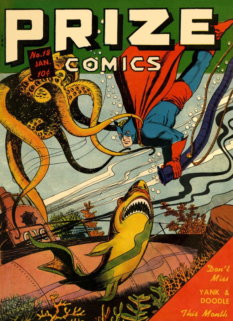
The Black Owl, clad in a red-and-blue costume with some odd leopard-print swimming cap… oh, sorry, that’s his blond hair:
Prize Comics no. 18 (January 1942). Cover by Jack Binder.
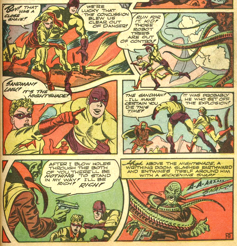
The Sandman… oh shoot, which one? Remember we have both feet firmly planted in the 40s in this post. This Sandman is Wesley Dodds, created by artist Bert Christman and writer Gardner Fox. Accompanied by his sidekick Sandy, this superhero-cum-detective wielded a special gun that could put criminals to sleep or act as a sort of truth serum.
The Adventure of the Magic Forest, published in World’s Finest Comics no. 6 (Summer 1942, DC), was scripted by Jack Kirby (Tentacle Tuesday Master!), pencilled by the King and inked by Joe Simon.
You’re not convinced that those are tentacles? Shame on you. Take a gander at this:
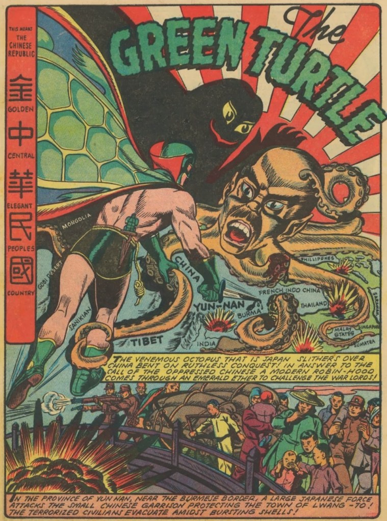
The next superhero (technically with no super powers, but managing beautifully all the same thanks to his lightning-fast reflexes and superior fighting skill) is my personal favourite Green Turtle, a Chinese superhero who fought against Japanese invaders in WWII. Unfortunately, the publisher wouldn’t let creator and artist Chu Fook Hing make his creation obviously Chinese, so the Green Turtle was never seen without a mask. It’s okay, we can read between the lines!
This Green Turtle adventure was scripted and illustrated byChu F. Hing and published in Blazing Comics no. 1 (June 1944, Rural Home). With apologies to our Japanese readers.
Magno the Magnetic Man has, believe it or not, magnetic powers (though I imagine it’s not helping him much in this particular skirmish). He’s irresistible to women (maybe they have metal parts?), impervious to harm, and is accompanied by his side-kick Davey, whom he periodically magnetizes to ensure that the little whippersnapper also has access to magnetic powers.
Super-Mystery Comics vol. 5 no. 4 (February 1946, Ace Magazines). Cover by the sudorific Rudy Palais.
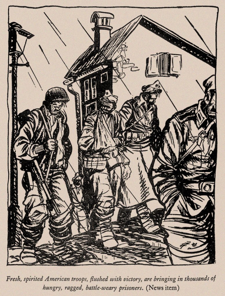
« Wherever despotism abounds, the sources of public information are the first to be brought under its control. Where ever the cause of liberty is making its way, one of its highest accomplishments is the guarantee of the freedom of the press. » — Calvin Coolidge
Ah, the pitfalls of anchoring yourself to the news cycle: given the shocking news, last week, of the impending, unjustified closure of one of the greatest American journalistic institutions, the independent military daily newspaper The Stars and Stripes (founded in 1861!). I was all set to cobble together a series of posts showcasing the work of S&S’s greatest cartoonists, but then the massively unpopular decision was just as abruptly reversed. For now.
So I’ll stick to one post for the nonce (Shel and Tom will have to wait) and feature one of history’s greatest soldier cartoonists, William Henry “Bill” Mauldin (1921-2003), twice recipient of the Pulitzer Prize (1945, 1958), the Legion of Merit… and a host of other distinctions, both military and civilian.
Our baby-faced artist photographed during WWII.
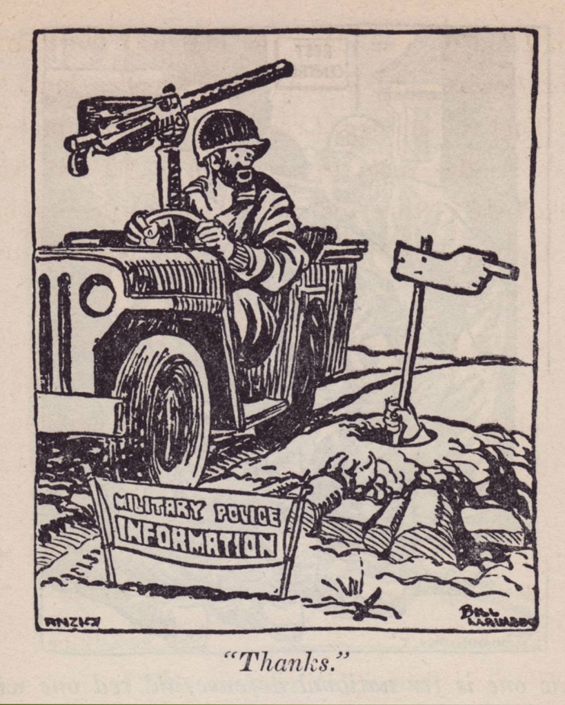
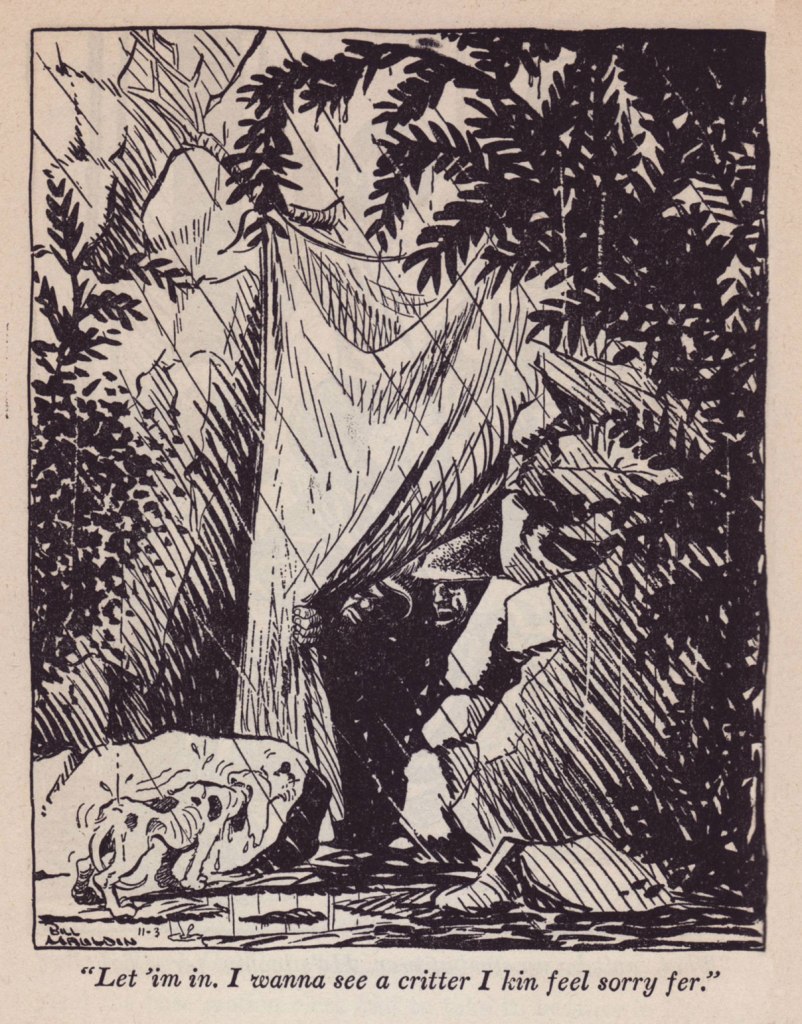
With but a single exception, the following are samples from his essential Up Front collection (1945), which Mauldin humbly opens with: « My business is drawing, not writing, an this text is pretty much background for the drawings. »
But such a background! Mauldin is, naturally, funny and insightful, but there’s much to learn therein, not merely about men in war, but just about everything under the sun. While so many nowadays mix up freedom and privilege, it’s good to be gently reminded of the high price of both.
« Until some intelligent brass hat repaired a big brewery in Naples and started to send beer to Anzio, the boys at the beach-head were fixing up their own distilleries with barrels of dug-up vino, gasoline cans, and copper tubing from wrecked airplanes. The result was a fiery stuff which the Italians called grappa. The doggies called it ‘Kickapoo Joy Juice’, and took the name from the popular ‘Li’l Abner’ comic strip which Stars and Stripes printed daily. It wasn’t bad stuff when you cut it with canned grapefruit juice. »
Mauldin’s biographer, Todd DePastino, wrote, in his Bill Mauldin: A Life Up Front: « First published on October 13, 1944, this cartoon made the 23-year-old Bill Mauldin the youngest Pulitzer Prize winner in history. Both he and his editors at Stars and Stripes were astonished by the selection, which did not seem to them particularly noteworthy. »
For a deeper dive into Mauldin’s war through the eyes of his ragged infantrymen, scrounge yourself a copy of Fantagraphics’ glorious Willie & Joe: The WWII Years (2008).
In closing, shall we hear from another president?
« I have great respect for the news and great respect for freedom of the press and all of that. » — Donald J. Trump
The thing kept coming. “Die, die!” Parke screamed, his nerves breaking. But the thing came on, grinning broadly. “I like quiet protoplasm,” the thing said as its gigantic mouth converged on Parke. “But I also like lively protoplasm.” It gulped once, then drifted out the other side of the field. — excerpt from The Last Weapon by Robert Sheckley
I Am the Living Ghost!, illustrated by Steve Ditko, was published in Tales of Suspense no. 15 (Mar. 1961, Marvel). I came across a reprint of this story while looking for Draculian tentacles (which you can see in Tentacle Tuesday: Dracula Drops In).
Call it goo, label it as a giant amoeba, christen it ectoplasm or protoplasm, but when it starts crawling your way, do remember to beat a hasty retreat.
Oh, yeah, and keep your fingers away from it, too.
Coo! this page has everything: a prehensile amoeba, tentacled plants, aliens with cephalopod appendages…
Spawn of Venus was scripted by Bill Gaines and Al Feldstein, and illustrated by the latter. It was published in Weird Science no. 6 (Mar.-Apr. 1951, EC).
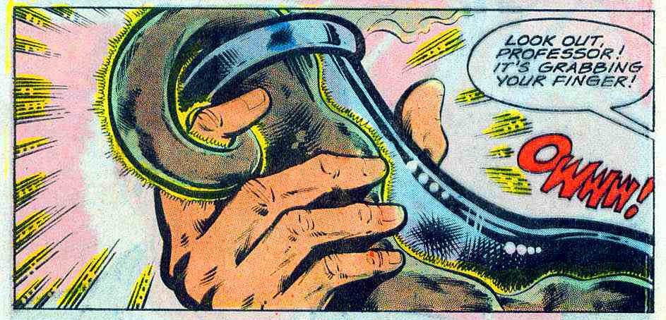
… but it’s the amoeba that’s of current interest to us (yes, the one devouring everything in its path, including dawdling professors).
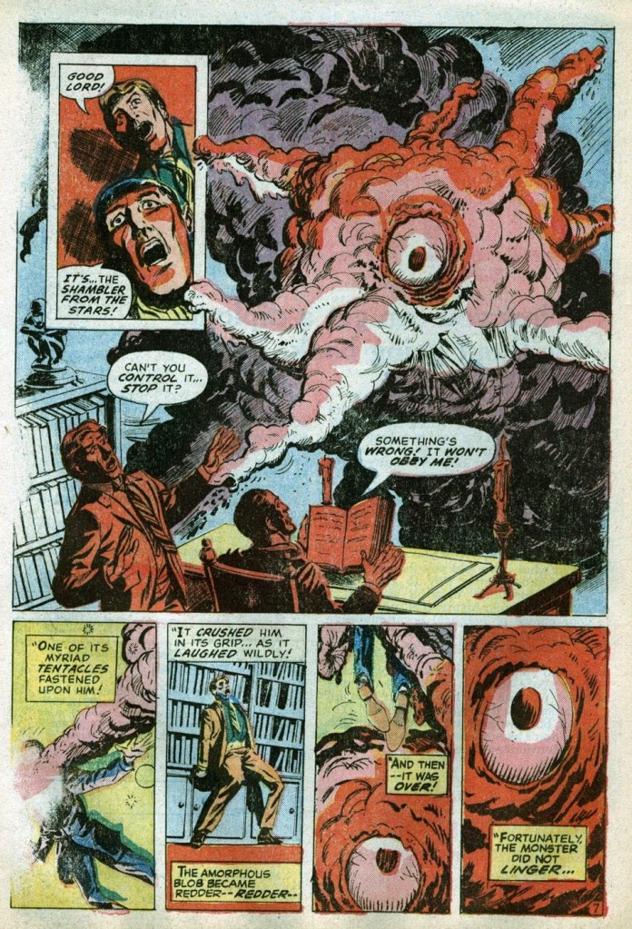
Continuing our literary delusions, a peek at the adventures of a ‘star vampire’, from a (somewhat lackluster) comic book adaptation of a Robert Bloch short story:
The Shambler from the Stars!, based on a story by Robert Bloch, was adapted by Ron Goulart, pencilled by Jim Starlin and inked by Tom Palmer. It was published in Journey into Mystery no. 2 (Feb. 1973, Marvel). An amorphous red blob is not a dog to be ordered around, which explains the poor results.
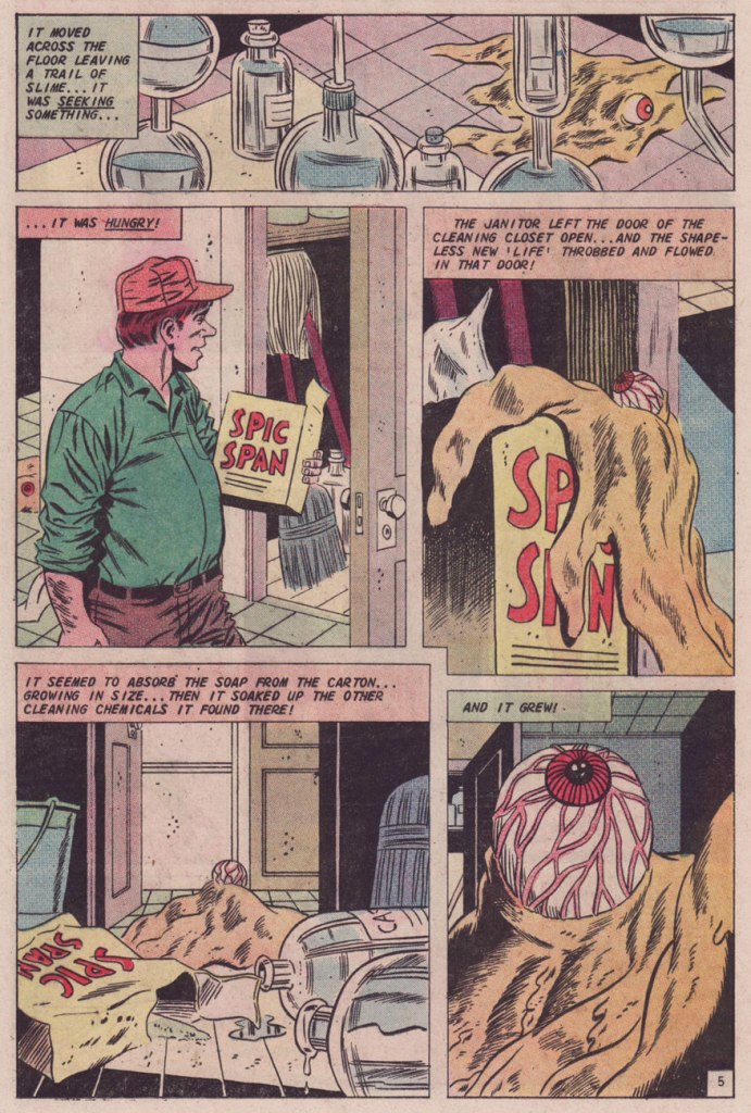
If a tentacled amoeba is scary, just think of how startling it is to run into an amoeba with a single bloodshot eyeball (that feeds on soap, among other things).
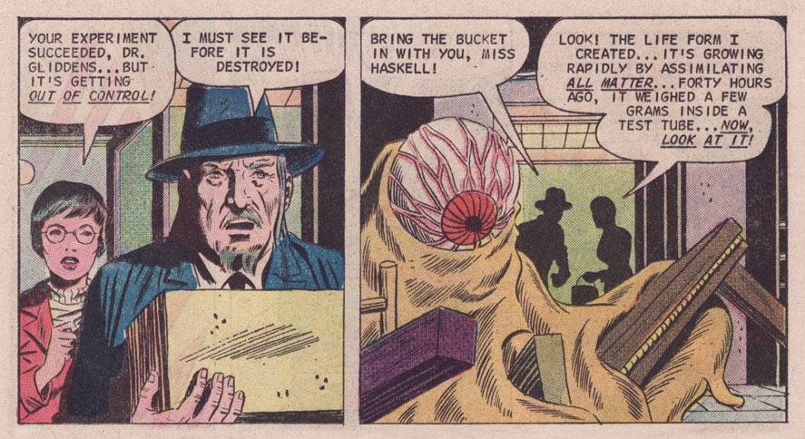
A page from Creator of Life, published in Ghost Manor no. 11 (Apr. 1973, Charlton). This story was written by Joe Gill and illustrated by Charles Nicholas and Wayne Howard.
An eyeball in a turtleneck! Scary stuff.
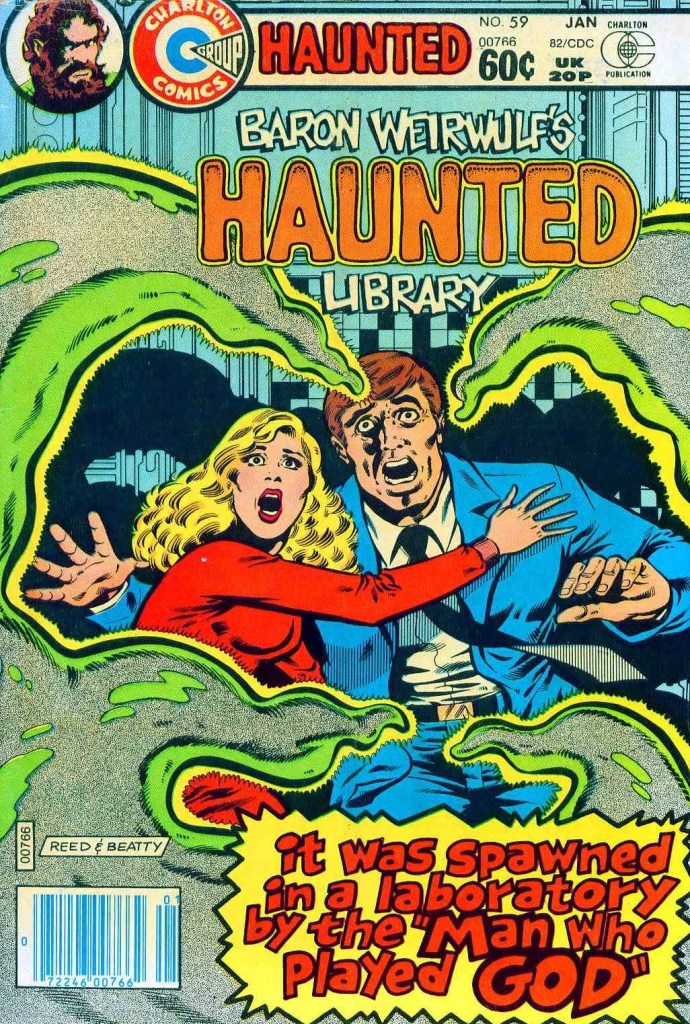
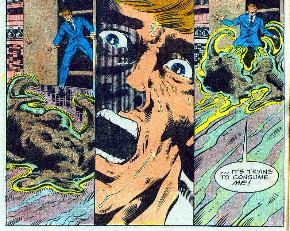
Haunted no. 59 (January 1982), pencilled by Dan Reed and inked by John Beatty.
Not only does this monstrosity go after the scientist, instead of pursuing his absurdly attractive assistant…
The Man Who Played God was scripted by Joe Gill (again), pencilled by Dan Reed and inked by John Beatty.
But she’s also the one who saves the situation. Joe Gill, ladies and gentlemen!
I love his tough-guy stance at the end. He surely would have punched the amoeba out, if only the meddling female hadn’t interfered!
« Flattery is like chewing gum. Enjoy it but don’t swallow it. » — Hank Ketcham
Going way back: When I was a wee lad (still in the single digits), my mother would accompany me to our area’s oldest and finest bookstore (Chicoutimi’s long-gone Librairie régionale). At the time, I had been purchasing bound collections of Belgian bédé publisher’s Spirou, the earlier the better. Even at that tender age, I held the conviction that things had already peaked.
A friendly employee ushered us into the restricted area of the bookstore’s top floor, a vast warehouse I never got a tour of… but it was immense! I was led to an aisle where, high above, dozens of older Spirou collections were kept, dating all the way back to 1962. I can afford to be specific, because I bought the oldest issue they had on hand (Album Spirou no. 84). At ten dollars a pop, they were reasonably-priced, but still costly for a child with a 1970s-scale allowance. For my parents, a reliable source of ideal birthday and Christmas gifts, however!
It was in their pages (no. 90, see below!) that, along with the established Spirou magazine series (Spirou et Fantasio, Boule et Bill, Buck Danny, Benoît Brisefer, Tif et Tondu, Gil Jourdan…), I encountered scads of unfamiliar entries. Of these, an early album caught mid-tale one that truly stuck with me through decades and therefore is the object of today’s post.
This is Album Spirou no. 90 (Sept. 1963, Dupuis), collecting the bédé weekly’s issues n° 1316 to 1328. Cover by André Franquin, depicting a scene from a Spirou adventure, the troubled production that was QRN sur Bretzelburg (under its original title, QRM sur Bretzelburg).
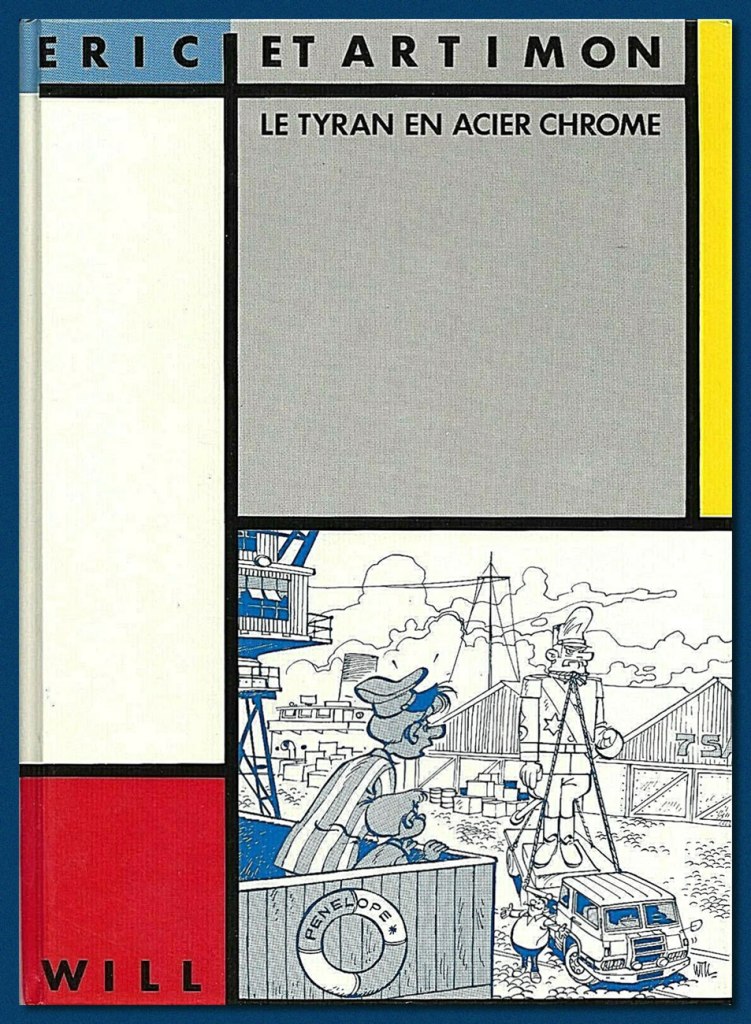
In short, though, here’s what’s relevant in this case: from 1949 to 1987 (with a pause between ’59 and ’63), Will illustrated the adventures of Tif et Tondu, characters owned by Éditions Dupuis, its publisher. Still, he longed to draw characters of his own, which wasn’t an idle whim, given that most of his colleagues and collaborators did just that, enjoying more latitude and far greater financial rewards. In 1962, he got the chance to try his hand at an original series, Éric et Artimon, conceived with versatile scripter-cartoonist Raymond Antoine, alias Vicq. And the result was outstandingly charming, light-hearted and hilarious.
The 1976 (and only, so far) edition of Toute la gomme. Still, I’m grateful for its existence: I was finally able to read the whole story, though without colour.
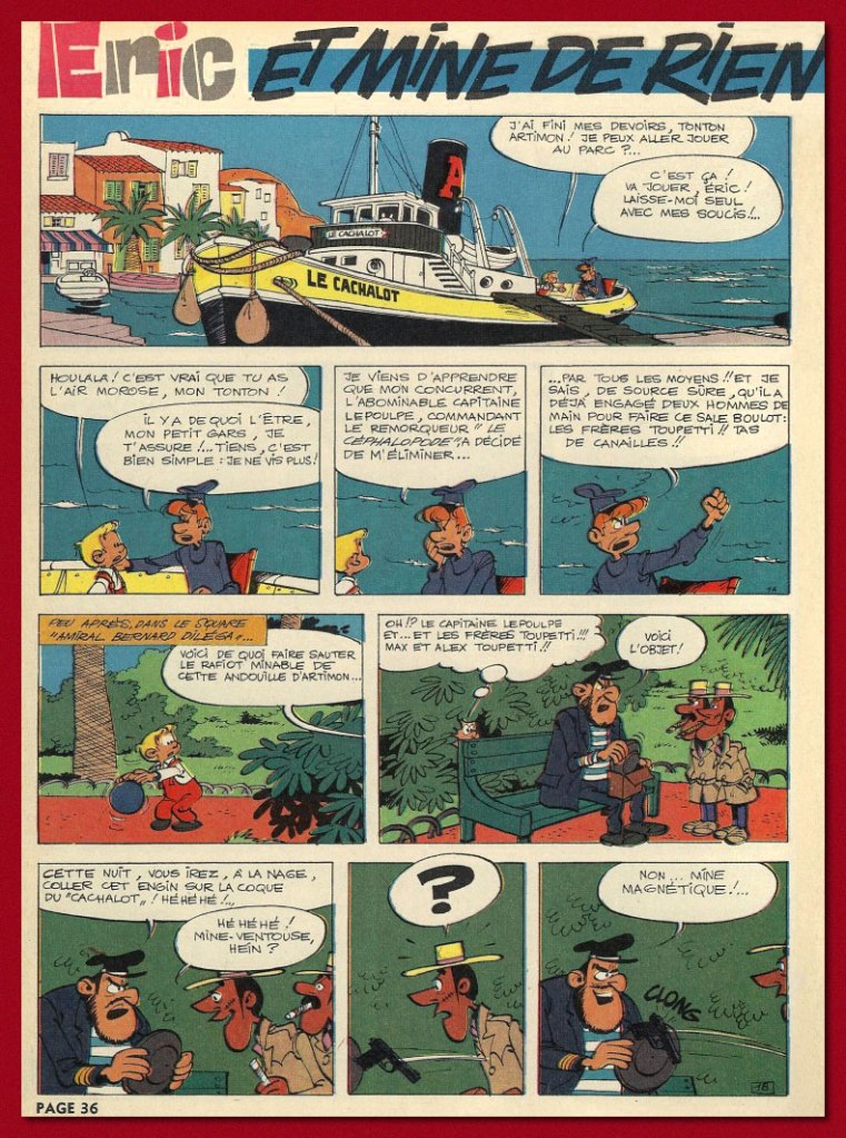
A mere two long adventures (44 pages each) were produced (Le tyran en acier chromé, 1962, and Toute la gomme, 1963, plus a six-pager, Et mine de rien, in 1967), and Dupuis never bothered to collect or reprint them. Instead, well down the pike, two separate, smaller publishers licensed the rights and issued small black and white runs of, respectively, Toute la gomme (Espace Édition, 1976) and Le tyran… (Magic Strip, 1983).
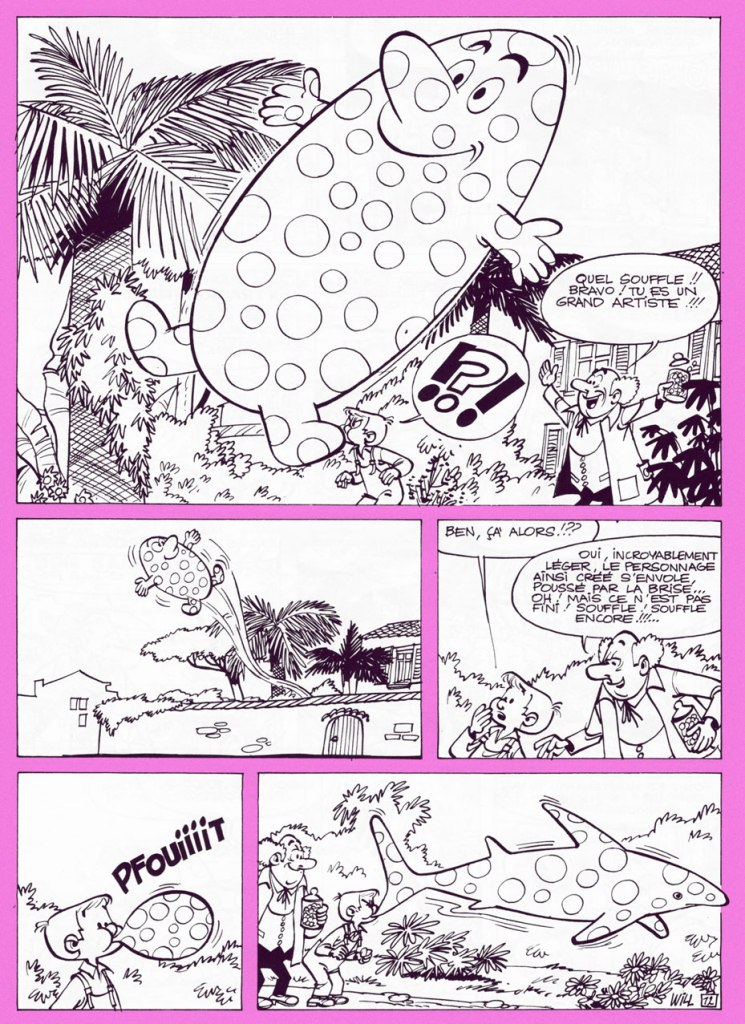
Candy aficionado Éric visits his main supplier, loveable eccentric Monsieur Grosoison, at his confiserie ‘Au bambin vorace’ (‘The Voracious Toddler’). The old man, also a brilliant inventor, shows off his new creation to his best and most loyal customer. The stuff’s not only downright magical, it’s also exquisitely delicious.
« Such lungs! Bravo! You are a great artist! »
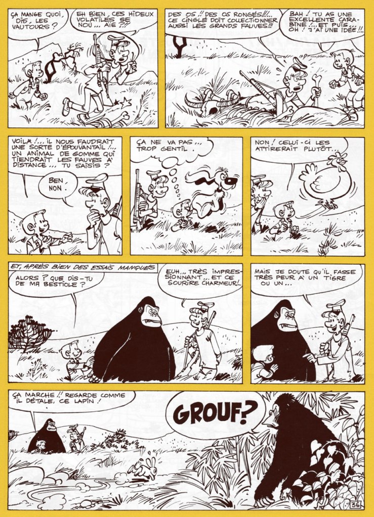
After an unscrupulous candy magnate has the inventor kidnapped by his henchmen (an uprarious pyromaniac and a pair of tiny twins afflicted with stiff necks from gaping at Éric’s balloon creations drifting overhead), and taken to his private island, he threatens to leave him in the hands of fearsome gorilla Tarquin the Superb. Meanwhile, Éric and Artimon encounter the ape, who turns out to be blessed with tremendous intelligence, a fine sense of humour, and a powerful set of lungs.
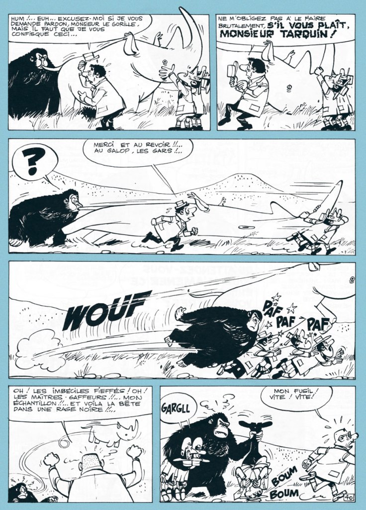
However, Tarquin doesn’t like his good-natured fun interrupted.The back cover of Espace’s Toute la gomme, wherein Éric employs ingenious means to escape a rooftop.
The opening page to the short concluding episode of the boy and the captain’s adventures, Et mine de rien (Spirou n° 1506, 1967).
And here’s the fancy 1983 edition of Le tyran en acier chromé, scarce and fairly pricey nowadays, unlike Toute la gomme.
Thankfully, Éric et Artimon haven’t been entirely forgotten, despite the shabby treatment they received at the hands of their original publisher. Here’s a signed lithograph produced in the early 1990s by Belgian bookstore Chic-Bull. Note the fancy silver ink on the statue. Mine’s number 48!
I’ll be spotlighting Will’s other creator-owned series, Isabelle, at some point during this year’s Hallowe’en Countdown!
« Well, she sneaks around the world from Kiev to Carolina She’s a sticky-fingered filcher from Berlin down to Belize She’ll take you for a ride on a slow boat to China Tell me, where in the world is Carmen Sandiego? »*
Today’s Tentacle Tuesday is for globe-trotters only – but don’t let this post give you an itch for actual travelling: that’s verboten right now.
This Teutonic tentacled cutie appeared on the cover of Moga Mobo no. 3 (1995). The wraparound cover is the work ofJonas Greulich, one of the co-founders of this German comics magazine that began publication in 1994 (the other two artists involved are Titus Ackermann and Thomas Gronle).
Speaking of German comics, does anybody know where this page and its German Captain Nemo come from?
20.000 Leguas de viaje submarino was adapted by Héctor Oesterheld and illustrated by Roberto Regalado. This 23-page story was published in Argentine Billiken Magazine (Editorial Atlantida) in 1974. For those who can read Spanish or would just like to see more images, head over to this article.
One would be remiss in not paying at least a brief visit to Asia:
The cover of a comics anthology from Hong Kong, probably from the 1960s.
And back to Germany at a staggering speed (watch out for whiplash)!
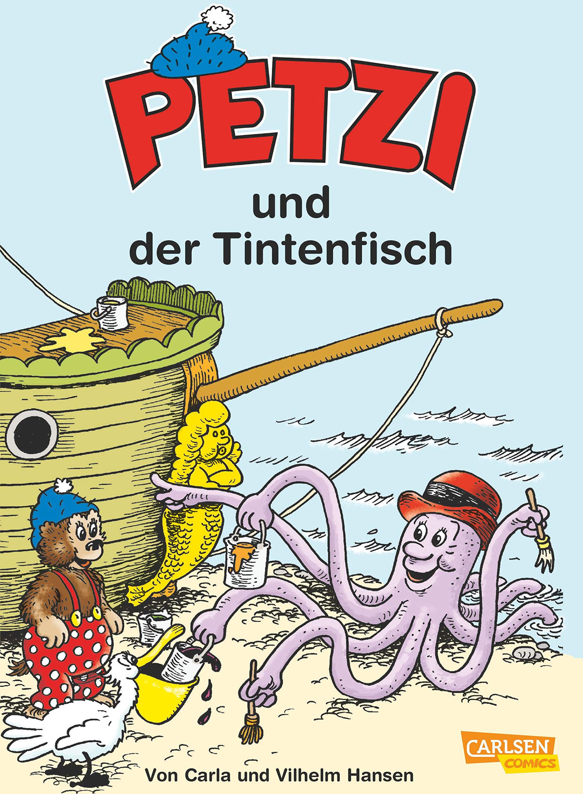
Petzi is actually a translated version of a Danish character named Rasmus Klump, created by a husband-and-wife team Carla and Vilhelm Hansen in 1951. The adventures of the lovable bear cub were popular enough to be translated into many languages, but a hefty price had to be paid – namely, a name change. Rasmus became Petzi in French, German, Italian, Portuguese and Vietnamese, and I’m slightly amazed that such different countries could agree on one name. In English, you will no doubt be familiar with Barnaby Bear. This is Petzi no. 40 (July 2008), a reprint of older material published by Carlsen Comics.
∼ ds
* She’ll go from Nashville to Norway, Bonaire to Zimbabwe
Chicago to Czechoslovakia.. and back!