« I know what romance is, I’ve written more romance probably than anyone alive. » — noted feminist Bob Kanigher*
Ready for another foray into that most neglected, dismissed and maligned of comics genres, the romance?
If I open with a quote from Mr. Kanigher, it’s because of the preposterous and ironic nature of his boast (here’s some useful — and entertaining — background from my partner ds, a post we simply had to call « Don’t Let a Mysogynist Plan Your Wedding: Robert Kanigher and Wonder Woman’s Utterly Unsuitable Suitors » ).
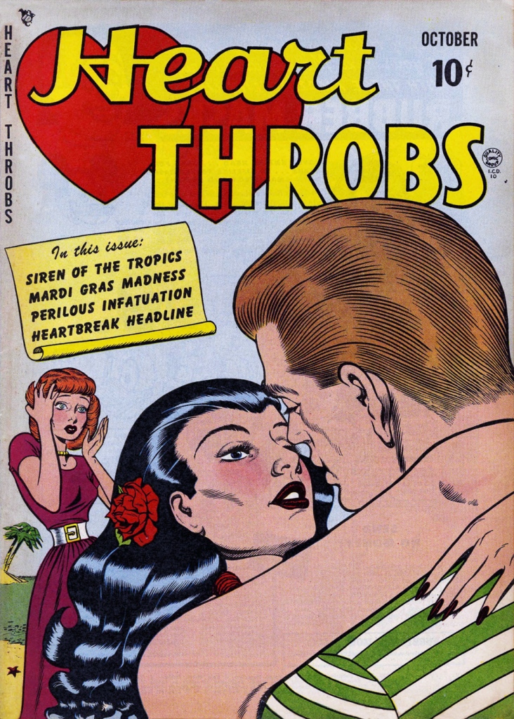
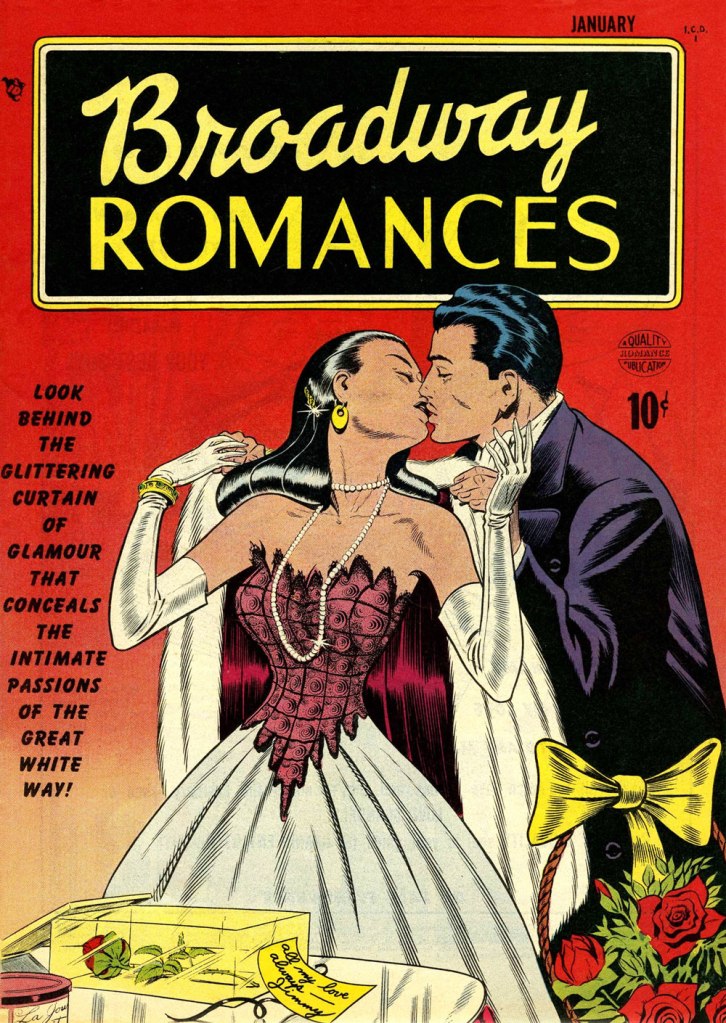
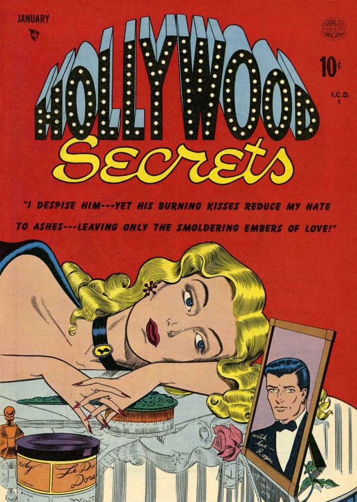
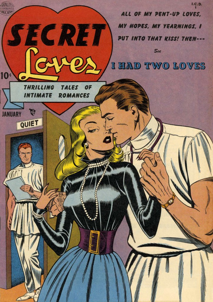
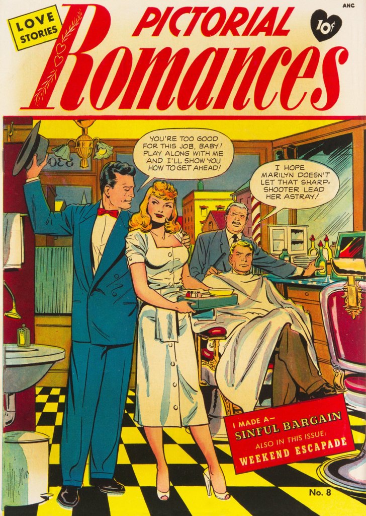
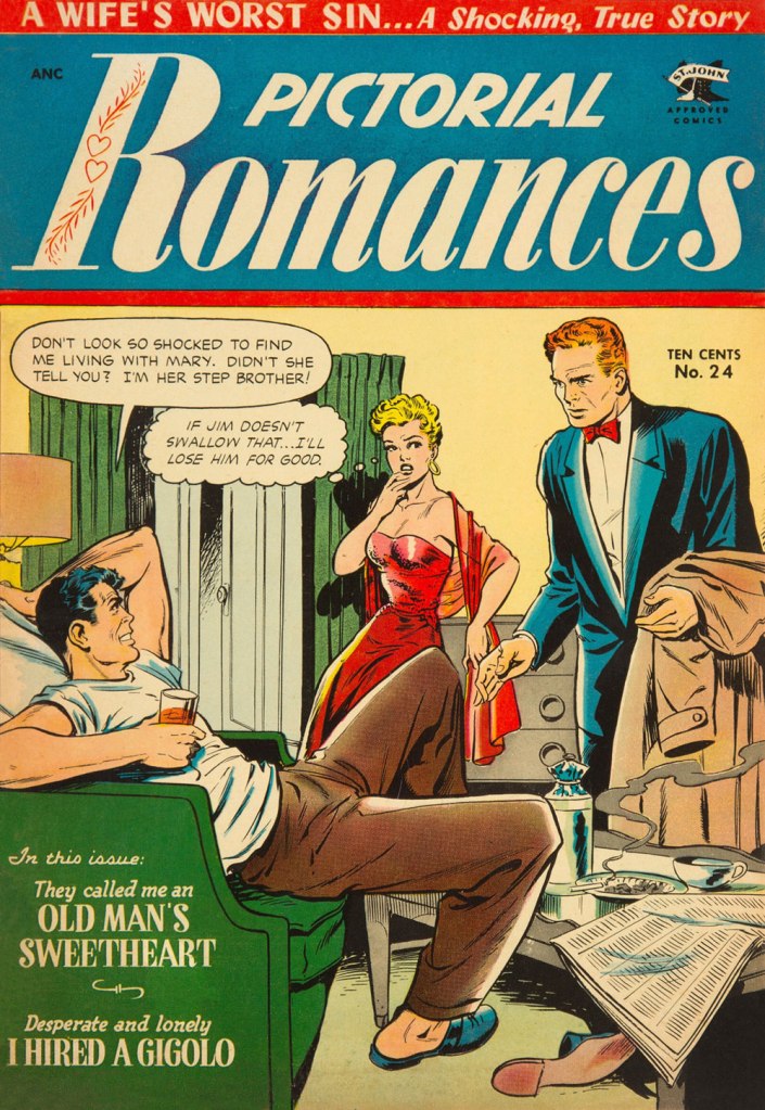
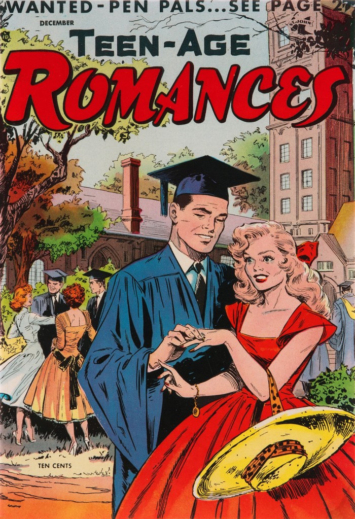
While I’m a late-blooming romance comics fan — the flamboyant Enrique Nieto drew me in, and I stuck around — I’m strictly a Charlton man: with precious few exceptions, DC’s take on the genre is histrionic and insincere. These were the books no-one at National wanted to be stuck editing. Also, and it’s always worth noting: wayyyy too much Vince Colletta. As for Marvel: Stanley Lieber was, not to put too fine a point on it, relentlessly sexist… ’nuff said?**
It’s not for nothing that Charlton was tops in romance, publishing a dozen or so titles at a time when the Big Two put forth a third of that number at most… with plenty of reprints tossed into the mix. Obviously, given Charlton’s tremendous romance output, it wasn’t all gold… but nuggets turned up with sufficient frequency to justify one’s continued interest.
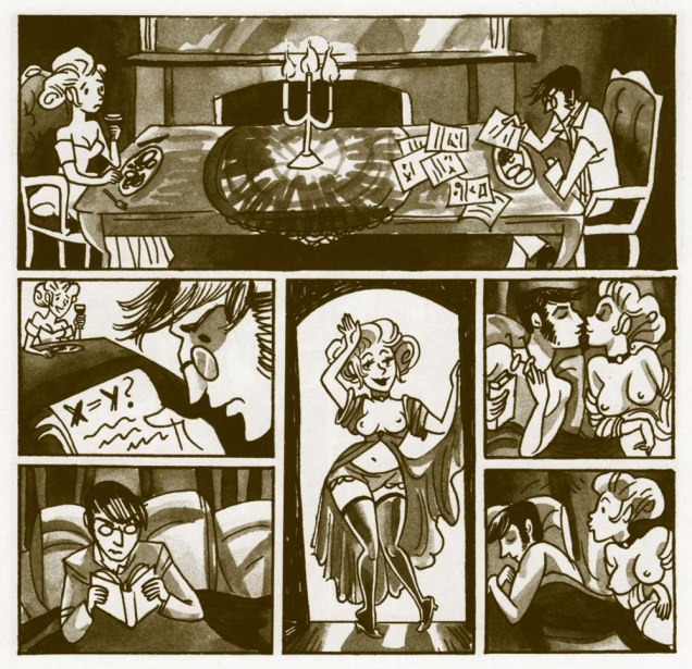
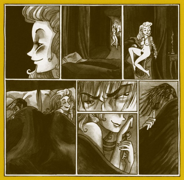
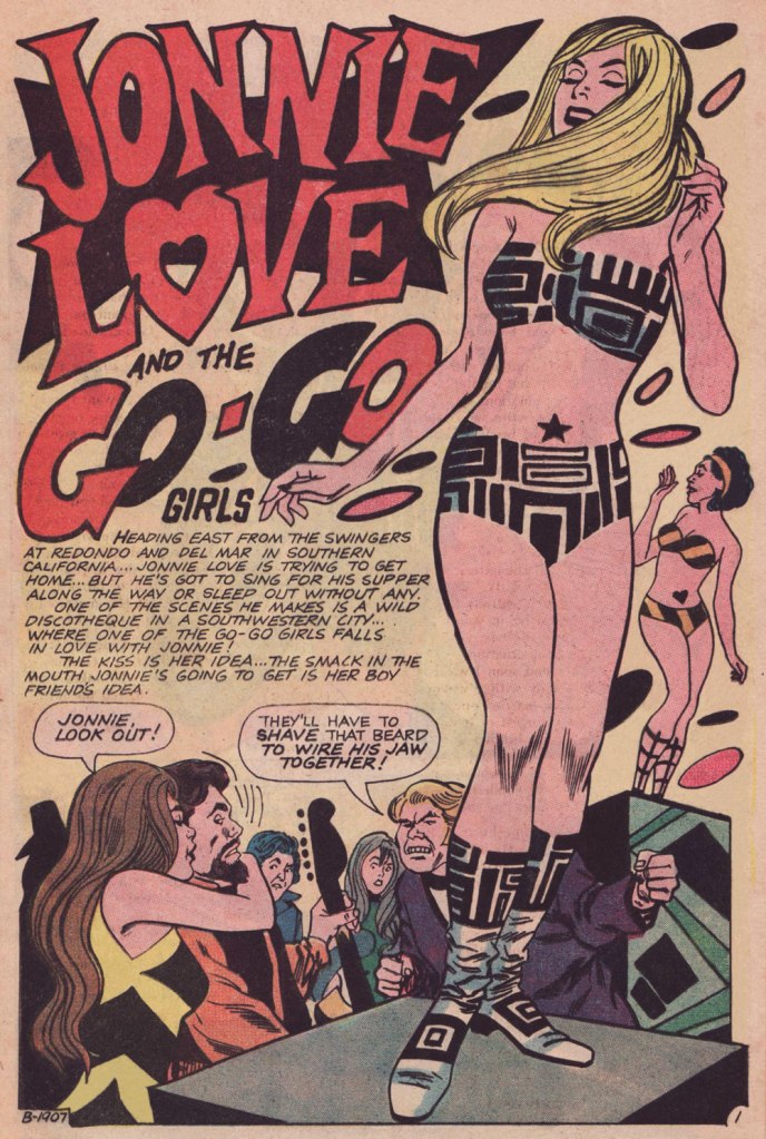
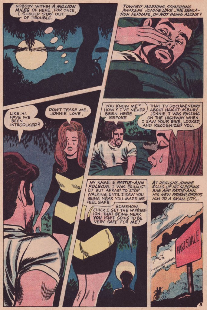
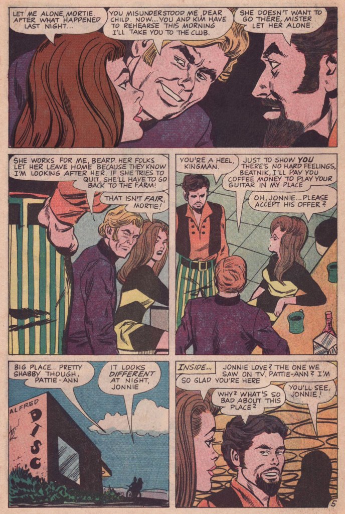
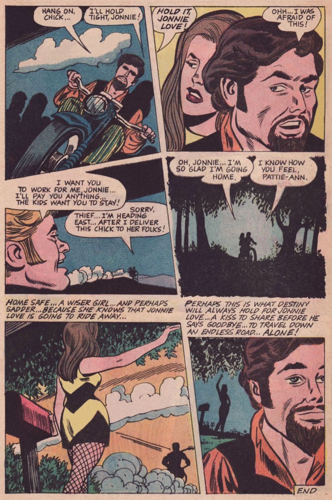
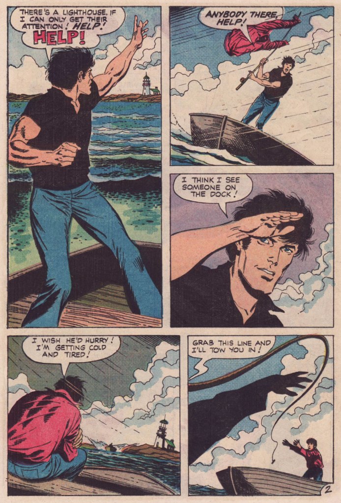
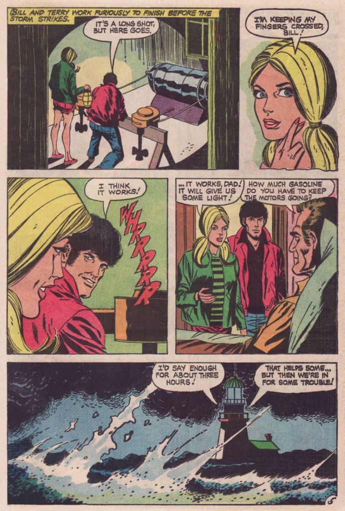
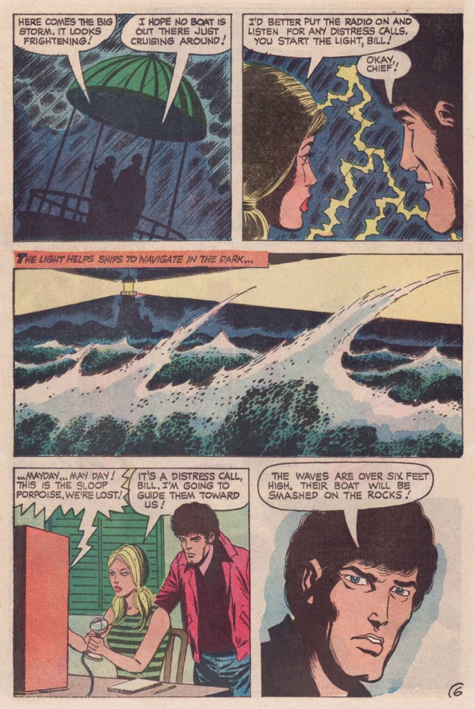
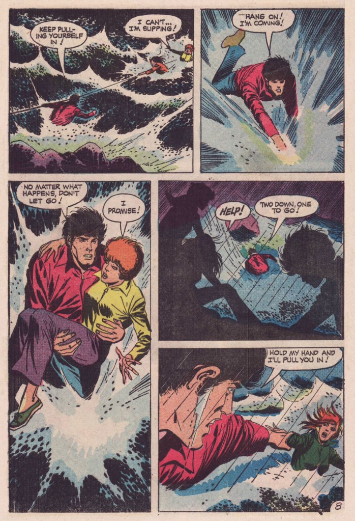
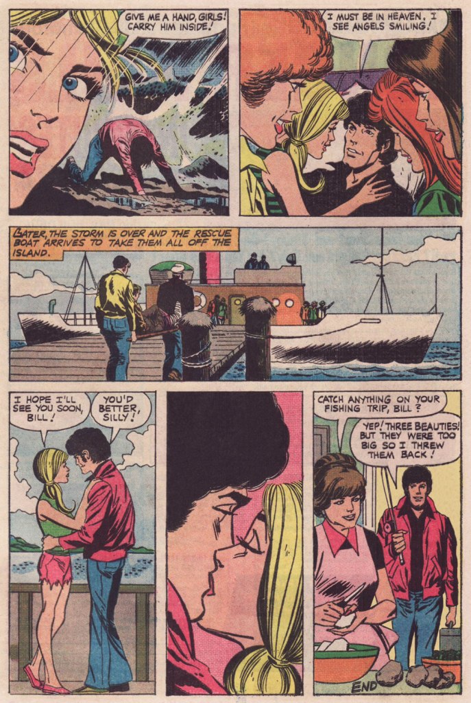
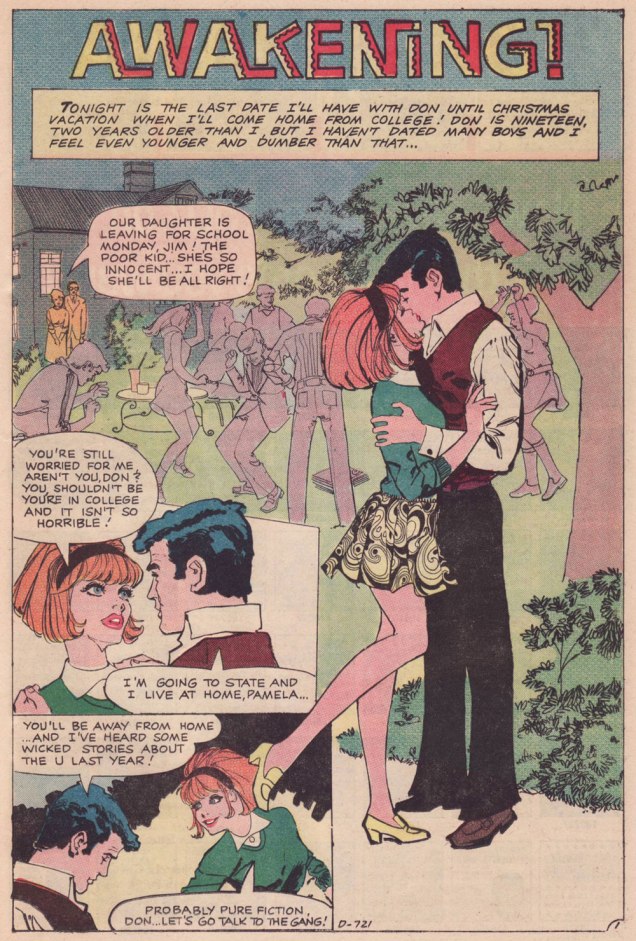
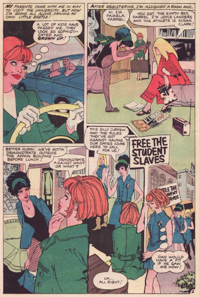
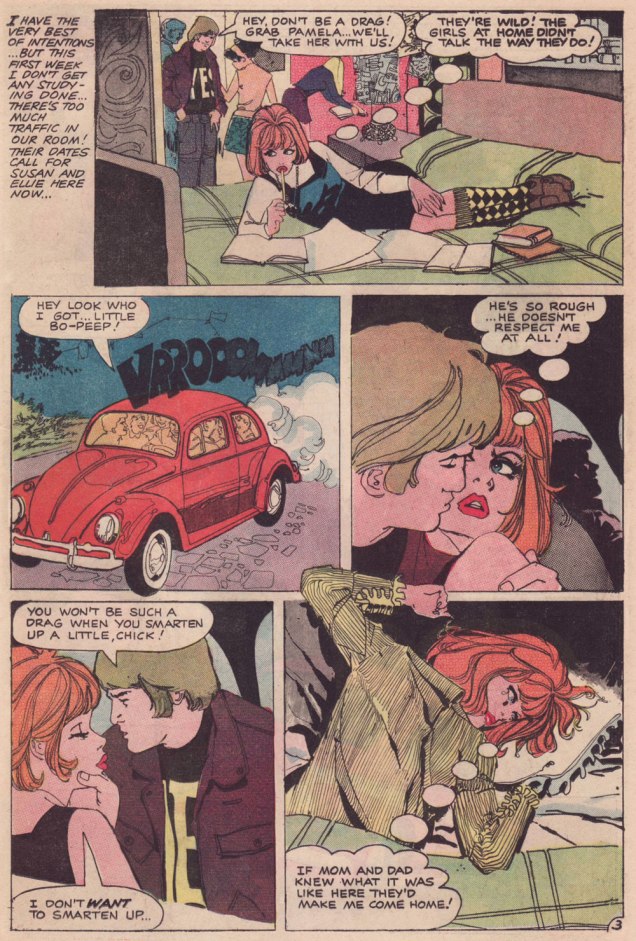
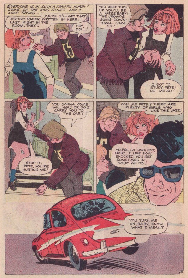
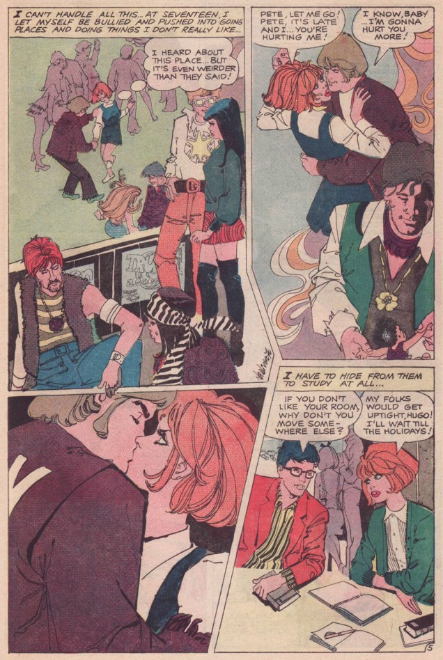
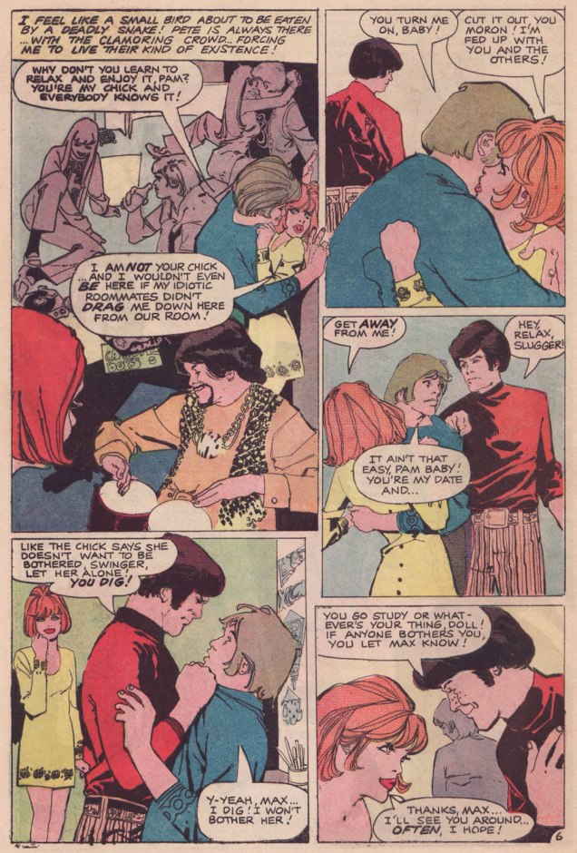
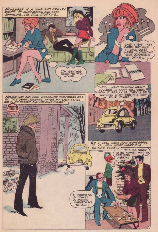
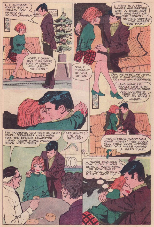
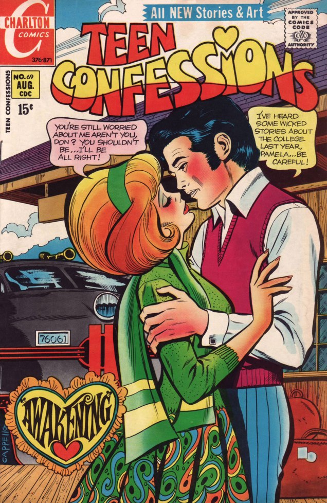
Let us then flash back to 1971, and a nugget from Teen Confessions no. 69 (Aug. 1971, Charlton). Almost certainly written by Joe Gill and definitely pencilled and inked by yet another talented Argentine, Nestor Olivera.***
.
.
.
.
-RG
*By all means read the full interview for some insight (beware!) into Kanigher’s thinking. He continually caroms from insight to delusion, from sagacity to madness… just like his work, one might say.
**Re: Marvel… I may someday devote a post to the question of why early 70s Marvel romance’s dream man was presented as a dead ringer to the, er… controversial Jim Shooter. Probably mere coincidence.
***By ‘talented Argentine’ (Spanish-Argentine, technically), I refer to none other than José Luis García-López. Also from ’71, and in a totally different style, check out his Emancipated Amanda.