« The sacred is found boring by many who find the uncanny fascinating. » — Mason Cooley
I’ve expressed many a time my ambivalent affection for Golden Age Atlas horror comics: in short, despite their slapdash, often incoherent writing, they had a solid stable of artists (which makes the thin writing all the more disappointing); but most of all, they generally had eye-catching covers, splendidly coloured (easy a task to underestimate!) and blessed with a light touch absent on the insides.
Today, I’ve picked out my favourite covers from Uncanny Tales (fifty-six issues, 1952-57). Enjoy!
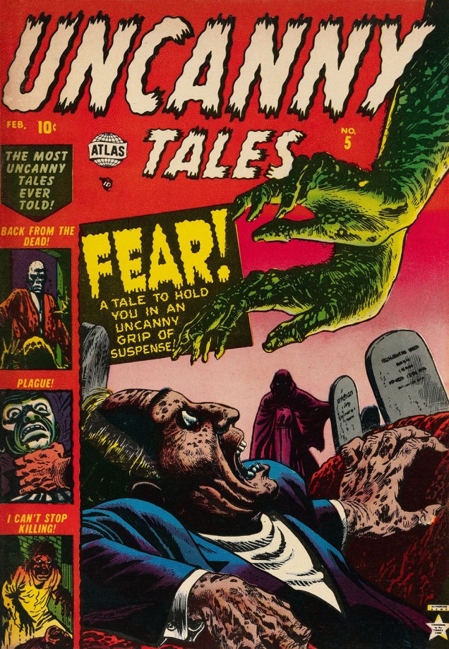
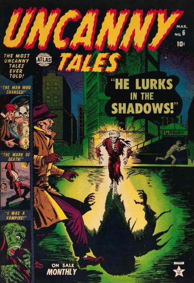
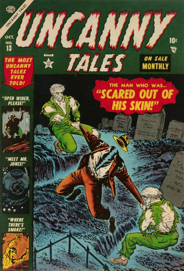
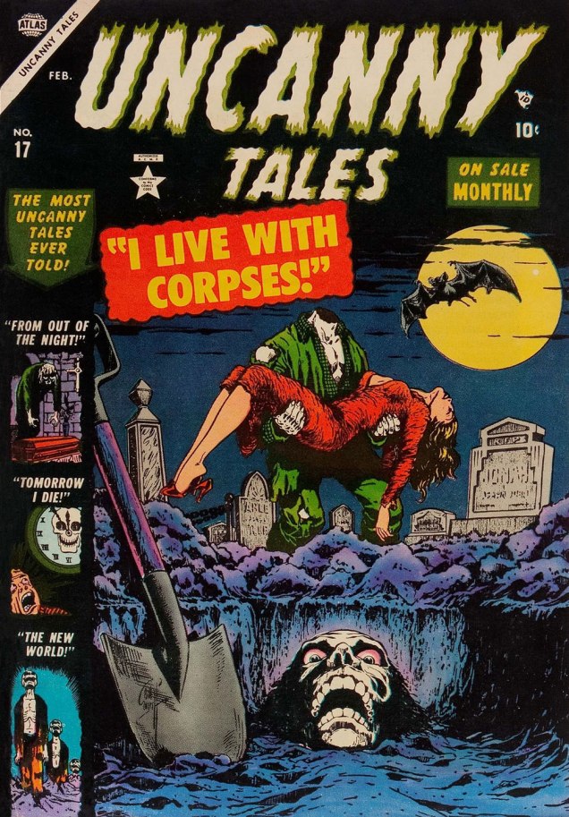
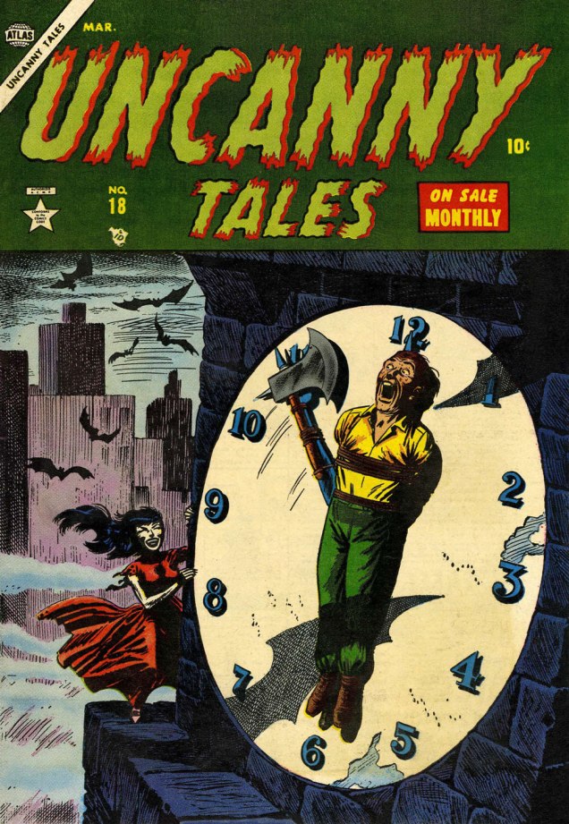
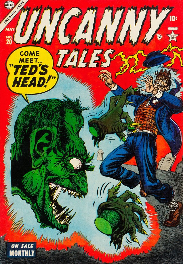
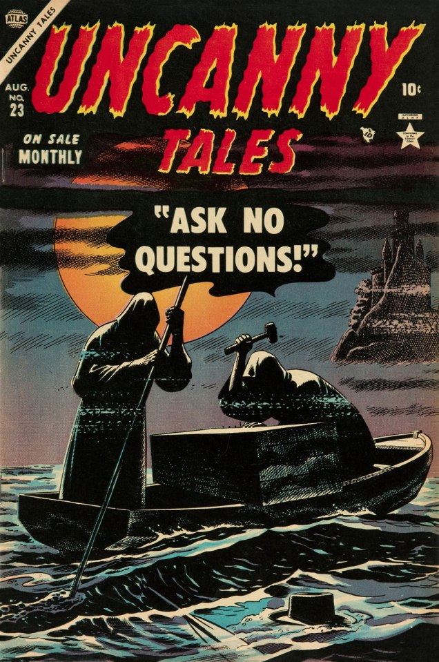
This is Uncanny Tales n. 5 (Feb. 1953, Atlas), cover art by Bill Everett, colours — consistently fine! — presumably by Stan Goldberg in all cases.This is Uncanny Tales n. 6 (Mar. 1953, Atlas), cover art by Bill Everett.This is Uncanny Tales n. 13 (Oct. 1953, Atlas), cover art likely a collaboration by Sol Brodsky and Carl Burgos.This is Uncanny Tales n. 17 (Feb. 1954, Atlas), cover art by Bill Everett.This is Uncanny Tales n. 18 (Mar. 1954, Atlas), cover art by Russ Heath. For a gallery of further Heath spookies, check out this entry from last year. This endearingly goofy one is Uncanny Tales n. 20 (May 1954, Atlas), with cover artist Robert Q. Sale giving it his best Joe Maneely imitation.Surely the leading candidate for “Most understated Marvel cover of the 1950s”… if not of all time. Stan must have been away from the office. This is Uncanny Tales no. 23 (Aug. 1953, Atlas); Art by Russ Heath. I’m understandably reminded of that old-timey jibe, « Walk East until your hat floats ».This is Uncanny Tales n. 27 (Dec. 1954, Atlas), cover art by Max ‘Carl Burgos‘ Finkelstein.And one post-Code entry, since it’s so outstanding. This is Uncanny Tales no. 48 (Oct. 1956, Atlas), Another subtle one by Russ Heath, but in a totally different register. Kudos!
« His deadline-flouting attention to detail was so ambitious that, whenever one of his jobs was delivered, editor Archie Goodwin reported, everyone gathered around to see what “that crazy bastard Heath” had done. » — Michael Dean
In my opinion, Atlas comics generally weren’t very good. But they remain fascinating because of one impressive asset: the line boasted no less than four absolutely top-notch cover artists, namely Joe Maneely, Bill Everett, John Severin… and Russ Heath. It may seem like nothing, but that was a truly phenomenal assemblage of talent in one place at one time. However, the writing was pedestrian and the second-stringers were, well… second-rate. But oh, some of those covers…
Today, we’ll coyly peek at some of Mr. Heath’s horror covers.
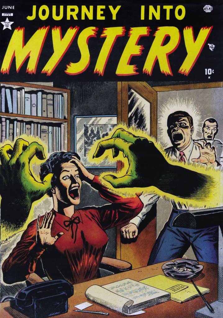
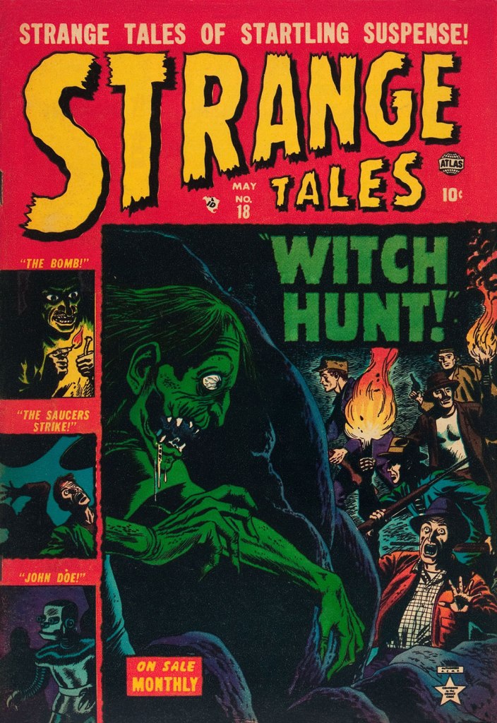
This is Marvel Tales no. 104 (Dec. 1951, Atlas); colours, in every case, by Stan Goldberg.This is Astonishing no. 9 (Feb. 1952, Atlas).This is Suspense no. 14 (Feb. 1952, Atlas). This one’s especially intriguing: there’s so much going on, yet it’s not overly busy… the mark of a first-rate cover designer.This is Journey into Mystery no. 1 (June 1952, Atlas). By now, I have a sneaking suspicion that Mr. Heath liked his ladies… on the buxom side.This is Adventures into Terror no. 11 (Aug. 1952, Atlas).This is Spellbound no. 3 (May 1953, Atlas). Yes, it’s the worm.This is Strange Tales no. 18 (May 1953, Atlas).
I’ve always had a soft spot for Tony DiPreta’s striking style. When it came to Atlas’ material, it was generally a case of lousy writing and interesting art. But DiPreta could somehow lend credence to the dodgiest semblance of a plot, because he could smartly provide it with just the right tone. I’ve featured this unfairly obscure illustrator a couple times in the past, so you may want to start there: first, the sublimely ridiculous The Hidden Vampires, then the Tinseltown satire Skull-Face.
I was pleased, in reading a rare interview with the artist, to hear him confide that « In the 1950s I did some comic book work for Stan Lee and others. That was pre-Code horror stuff and I loved it. Some of the illustration I did for crime and horror stories in that period is among the best work I’ve ever done. » Amen!
Aside from an expensive, low print run ‘Marvel Masterworks’ hardcover, this story has never been accessibly reprinted. And so enjoy this scarce gem!
The original appearance: this is Journey Into Mystery no. 12 (Sept. 1953, Atlas). Cover art by Max «Carl Burgos » Finkelstein.
« Master of puppets, I’m pulling your strings / Twisting your mind and smashing your dreams / Blinded by me, you can’t see a thing / Just call my name ’cause I’ll hear you scream / Master, master! » — Metallica
I’ve never been a Jim Mooney (1919-2008) fan, though he’s undeniably had a long and respectable career as a penciller (Tommy Tomorrow, Supergirl, Dial H for Hero, Omega the Unknown) and inker (Spiderman, Thor… and countless others). I’ve always found his work a bit stodgy and lightweight.
As these things usually go, however, if you keep an open mind, you’re bound to come up with exceptions, and here’s one.
While Atlas’ pre-Code horror comics were generally saddled with indifferent or nonsensical writing, the artwork on offer was often surprisingly wild. I mean… they even got straight-laced Joe Sinnott to go downright weird on a couple of occasions.
Here’s a short story that’s compellingly sombre, sinister and paranoid, and Mooney perfectly conveys its oppressive mood.
The ending is daft… and at the same time, inspired lunacy that takes it to another level. While I’m drawing from a 1974 reprint, here’s the cover from its original publication, Spellbound no. 13 (March 1953, Atlas); cover pencilled and inked by Carl Burgos, colours by Stan Goldberg. Working in the Goodman Family salt mines (in this case, the Humorama line of ‘girlie’ digests, at ten bucks a cartoon, writing included), Mooney was probably more in his element, nimbly bridging the cartoonish and more academic semi-realism, not a common skill!
« Skepticism is the highest duty and blind faith the one unpardonable sin. » — Thomas Henry Huxley
Plot-wise, this one’s a trifle, a frothy bit of nonsense, I’ll happily concede. But it’s ornately illustrated by Joe Maneely, in that busy-but-clear, rough-but-assured, scratchily cartoonish fashion of his.
I don’t know about you, but if I’d just had a bona fide supernatural encounter, it’s unlikely that my next move wouldbe to rush to the corner store to stock up on hokey monster comics. Unless I was thinking investment.
Hey, you know who our protagonist reminds me of? Marshall Teller’s sidekick, Simon Holmes, from outstanding early ’90s TV show Eerie, Indiana. See what I mean?
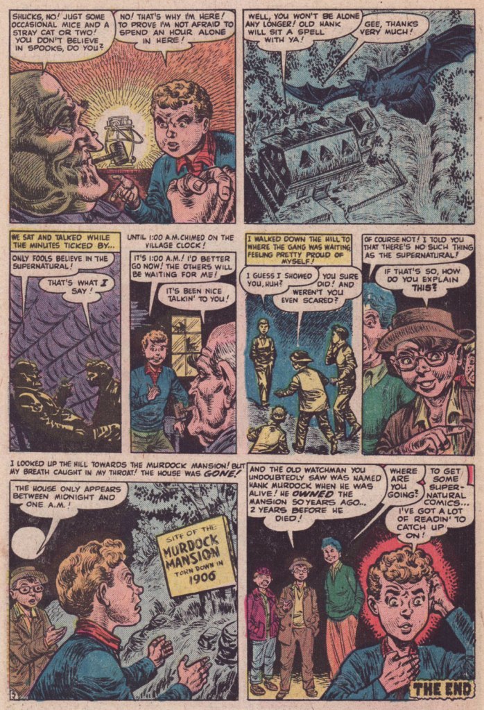
I Was Locked in a… Haunted House! originally materialised in Uncanny Tales no. 7 (Apr. 1953, Atlas), and was reprinted in the somewhat more affordable Chamber of Chills no. 15 (Mar. 1975, Marvel). Cover art by Bill Everett, colours by Stan Goldberg.
While our featured tale is saddled with the hoariest of plots, what lends it some flavour, in my book, is its rampant self-referential hucksterism (hello, Stan!), to the point that it’s practically a five-page commercial for Atlas’ supernatural titles. Still, I like it — it’s a bit of novelty.
« Fistfightin’ may not be your style, Marshall Earp! If you want to crawl, I’ll let ye off easy! » « Crawl, Irish John? I’m going to tie a knot in your cauliflower ears! » — ‘Hired to Die’ (1965)
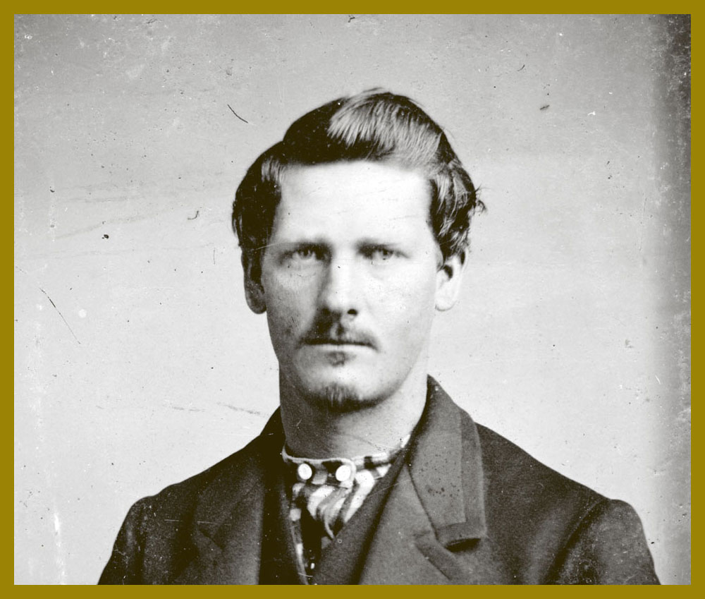
Happy one hundred and seventy-fourth birthday to Wyatt Berry Stapp Earp (March 19, 1848 – January 13, 1929), bison hunter, teamster, bouncer, saloon-keeper, gambler, brothel owner, pimp, miner, boxing referee, constable, city policeman, county sheriff, and, lest we forget, comic book hero… for several publishers at once!
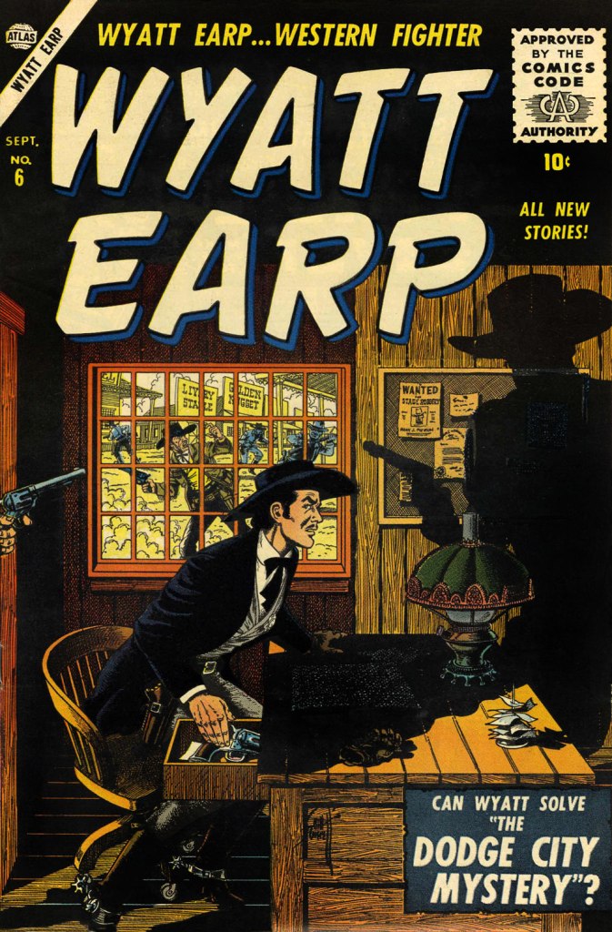
This is Wyatt Earp no. 6 (Sept. 1956, Atlas); ultra-detailed cover by Bill Everett, colours by Stan Goldberg.This is Wyatt Earp no. 9 (March 1957, Atlas); cover by John Severin, colours by Goldberg.This is Wyatt Earp no. 11 (May 1957, Atlas); cover by John Severin, colours by Goldberg.This is Wyatt Earp no. 15 (Feb. 1958, Atlas); cover by Joe Maneely, colours by Goldberg.To cash in on the success of The Life and Legend of Wyatt Earp (1955-61) tv series, Dell also threw their Stetson into the ring. This is Hugh O’Brian, Famous Marshal Wyatt Earp (sheesh!) no. 13 (Dec. 1960-Feb. 1961, Dell), the final issue.
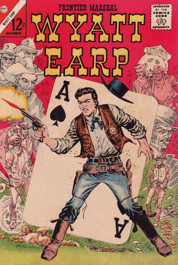
Mr. Earp had an especially notable run at Charlton (and by far the best title logo), with sixty-one issues of his very own title published between 1956 and 1967. And with Joe Gill scripts, so it’s solid stuff. This is Wyatt Earp, Frontier Marshal no. 61 (Dec. 1965, Charlton); cover by Pat Masulli and Rocco Mastroserio. I’d saved this one for this occasion, having withheld it from my M/M showcase The Masulli-Mastroserio Cover Deluge of ’65!
This is Wyatt Earp, Frontier Marshal no. 64 (July 1966, Charlton); cover by Mastroserio, lettering by Jon d’Agostino.This is Wyatt Earp, Frontier Marshal no. 69 (June 1967, Charlton); cover by Mastroserio.This is Wyatt Earp, Frontier Marshal no. 72 (Dec. 1967, Charlton), the fiery finale of *that* run. Another effective cover by Mr. Mastroserio, who passed away a few months later, aged a mere 40.And here’s a shot of the real-life Mr. Earp. Don’t look so glum, hombre — it’s your birthday!
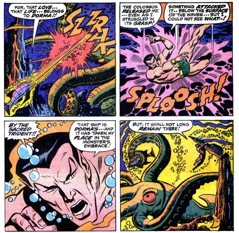
«Then suddenly, like some gigantic serpent out of the deep, a huge, quivering tentacle tose from out of the sea — a sight from any seaman’s maddest, most impossible nightmare –! »
Today we pay another visit to Subbie (or Subby), which every bit as horrible an abbreviation as ‘hubby’ for ‘husband’. We’ve gone over his history in a previous post (see Tentacle Tuesday: Prince Namor, the Sub-Mariner), so now we can concentrate on Action! Adventure!! Excitement!!! What’s on his charged schedule, you might ask? Why, a quick tussle with some Soviet submarines, a few pompous (I’m sorry, I meant ‘dramatic and exciting’) speeches, a plunge intro ‘wintry, unplumbed depths’, a lengthy trip to memory lane, and an epic fight with an unliving cyborg!
My favourite, naturally, are the Soviet submarines.
Sub-Mariner no. 35 (August 1954, Atlas), cover by Sol Brodsky. The insides of this issue actually don’t have tentacles, but do have pretty much everything else – it’s a fun, wacky read.
Moving forward by a little more than 15 years, we get embroiled in a slightly different kind of evil…
Sub-Mariner no. 27 (July 1970, Marvel), cover pencilled by Sal Buscema and inked by Mike Esposito.
When Wakes the Kraken! was scripted by Roy Thomas, pencilled by Sal Buscema and inked by Mike Esposito. Aside from a lot of dialogue (check out the ‘ay, woman… but the time has come for battle… not words!‘), this story also has a lot of plump, high-quality tentacles.
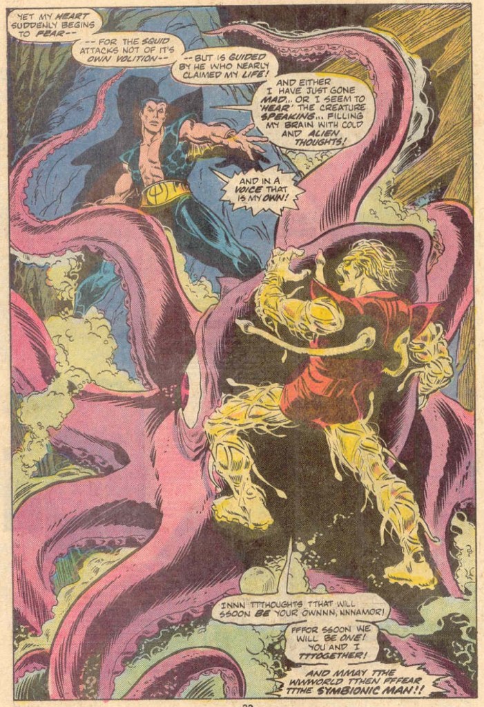
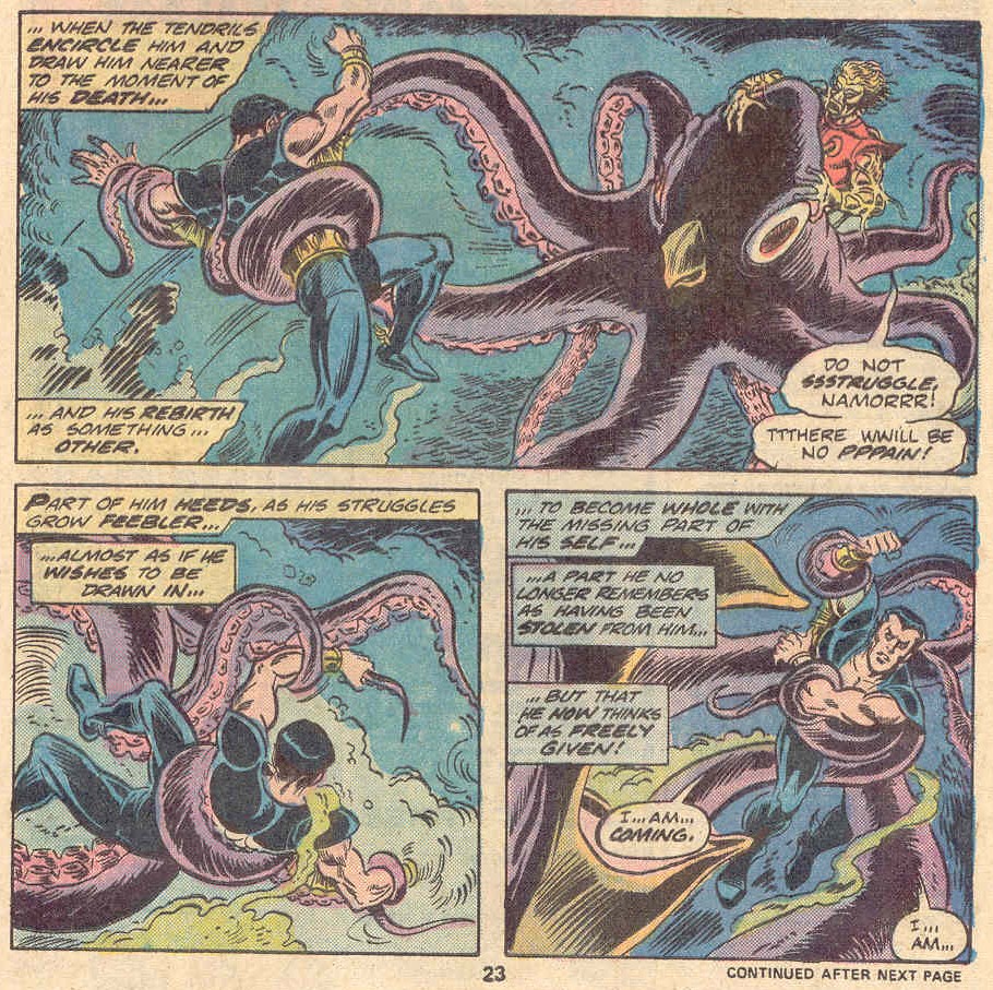
This cover is fun, given that the Symbiotic Man appears to have tentacles on the soles of his feet and the ends of his hair as well. Did somebody actually demand that Namor should fight alone? I was under the impression that Marvel readers were more into ‘the more the merrier’ type of fun.
Marvel Spotlight no. 27 (April 1976). Cover pencilled by Gil Kane (Tentacle Tuesday dabbler!) and inked by Frank Giacoia.
The cover story is titled Death Is the Symbionic Man!, scripted by Bill Mantlo and illustrated by Jim Mooney. Note the typo in ‘its’ in the second speech bubble.
The octopus appears to be having serious doubts about his presence in this fight. “Aw, do I hafta?”
What’s the point of having a super cool symbiotic-cyborg creature if it needs an octopus do its dirty work? This beaked octopus would do well in Tentacle Tuesday: Notes on Anatomy.
« Drinking your own blood is the paradigm of recycling. » — Gary Busey
Say, isn’t there something… sorta quaint about that cover?
In the 1970s, while DC and Charlton consistently provided all-new material*, Marvel quickly switched to an all-reprint formula (the better to save money whilst flooding the market, my dear!), sometimes even on the covers, with some amusingly inappropriate updates at times.
This is Dead of Night no. 2 (Feb. 1974). Alterations by unknown hands. Only one issue of this title would feature new material: its eleventh and final issue (introducing The Scarecrow); this number, however, reprints pre- and post-code Atlas stories from 54-56.
This is Marvel Tales no. 125 (July 1954, Atlas); cover art by Harry Anderson. The milky semi-transparency is a nice touch.
Okay, here are another pair of before and afters:
This is Tales to Astonish no. 34 (Aug. 1962, Marvel). Cover pencils by Jack Kirby, inks by Dick Ayers. Hardly a classic, not to mention that it lazily recycles the story’s opening splash. It’s also a textbook demonstration of what I dislike about Marvel colouring in the Silver Age: I’m guessing it was company policy to leave the backgrounds mostly in grey to make the characters ‘pop out’. A sound commercial policy, perhaps, but artistically, it seems pretty stale to me.
This is Monsters on the Prowl no. 29 (Aug. 1974, Marvel). A classic instance of John Romita‘s alteration-happy art direction. Making the protagonist a woman and adding a witness are both dishonest touches, for what it’s worth. On the plus side, I do like the lightning bolt (good use of existing space!), and the colouring is a marked improvement. Edited by Rascally Roy Thomas.
This is Mystic no. 30 (May, 1954, Atlas); colours by Stan Goldberg. A striking cover by Russ Heath…
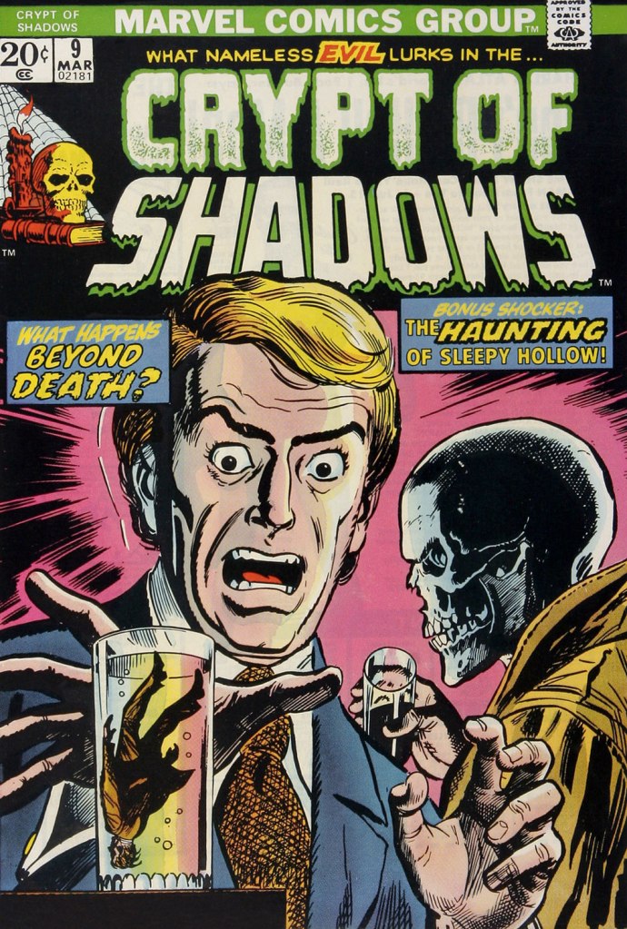
… is, if not ruined, then at the very least diminished by clumsy and pointless updates, including the removal of Heath’s signature (although upon seeing the ‘improvements’ perpetrated upon his work, he might have opted for the comics equivalent of an ‘Alan Smithee‘ or ‘Cordwainer Bird‘ credit). This is Crypt of Shadows no. 9 (Mar. 1974, Marvel). Alterations, once more, by unknown, guilty hands. Also edited by Roy Thomas (just so you know who’s responsible).
-RG
*and if and when they didn’t, they’d tell you! Not so with Marvel. As for Gold Key, they would just pretend the material was ‘reprinted by popular demand’.
« The whole planet reeks of mysticism without revelation. » — Dan Simmons
Last May, when I showcased Joe Maneely‘s Atlas cover art (see Joe Maneely, Atlas of Versatility), I intentionally left out his pieces for the horror titles, knowing them worthy of some attention of their own, an ideal topic for the Hallowe’en countdown. Besides, it took some pressure out of the selection process if I could save one whole genre for a rainy day — and today’s most certainly that day!
This is Mystic no. 7 (Mar. 1952, Atlas); colours by Stan Goldberg.
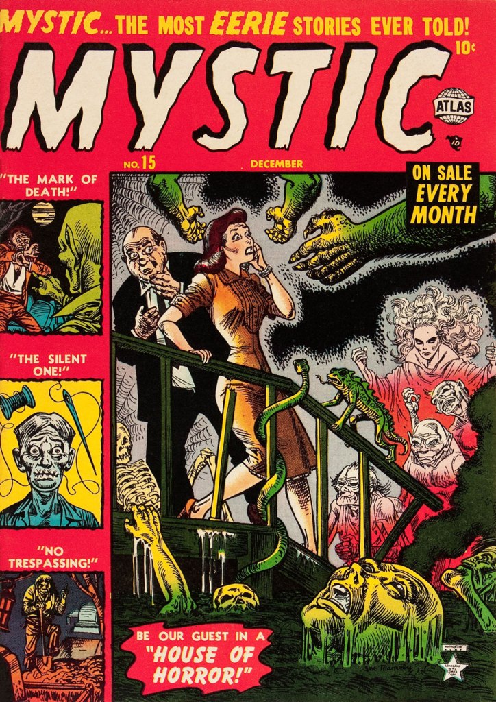
This is Mystic no. 15 (Dec. 1952, Atlas); colours by Stan Goldberg.
“Mystic” is evidently one of Marvel’s pet titles: the title was first used by Timely in 1940-42, then again in 1944-45; once more, most successfully in this Atlas horror series, for 61 issues from 1951-57. And lately in 2009 and 2011. I’ll bet that tradition’s not yet done with, but why on earth?
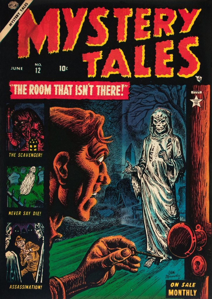
This is Mystery Tales no. 12 (June 1953, Atlas); colours by Stan Goldberg.
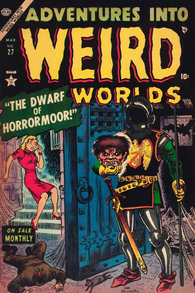
This one’s got it all! Here’s Adventures Into Weird Worlds no. 27 (Mar. 1954, Atlas); colours by Stan Goldberg.
This is Mystic no. 29 (Apr. 1954, Atlas); colours by Stan Goldberg. Maneely’s Atlas horror covers generally distinguished themselves by their goofiness.
Begging the question: What’s worse than having two left feet? Having three left hands, apparently. This is Riot no. 3 (Aug. 1954, Atlas); colours by Stan Goldberg.
This is Mystery Tales no. 24 (Dec. 1954, Atlas); colours by (need you ask?) Stan Goldberg. While I make no bones about my disdain for Goldberg’s work at Archie, he was a superb colourist in the 1950s. In terms of legibility, Atlas’ busy covers had to be quite a challenge to pull off, and he did it again and again.
« After that I never saw him again. He became the ‘phantom’ artist, whereabouts unknown! » — Bhob Stewart
Hello again. Last year, I touched upon the stint that Matt Fox (1905-1988) did as an occasional and unappreciated inker at Marvel in the Silver Age. While he’s assured a sort of immortality for the eleven winningly oddball covers he painted for Weird Tales, he also left his distinctive and lasting mark on horror comics of the 1950’s. Let’s give the old burying grounds the once-over, shall we?
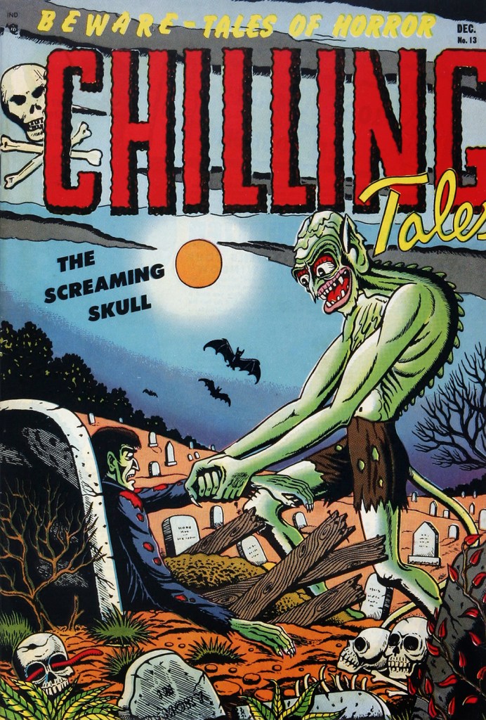
This is Chilling Tales no. 13 (Dec. 1952, Youthful), actually the title’s début, as it picks up its numbering from Beware. In addition to its cover, the issue features within a rare Fox story, The Hand of Glory. Read it here… at your own peril! (just kidding, it’s all perfectly safe).
This is Chilling Tales no. 15 (Apr. 1953, Youthful). What in tarnation is going on here?
This is Chilling Tales no. 17 (Oct. 1953, Youthful). Incidentally, this title was edited (anonymously) by Sally the Sleuth creator Adolphe Barreaux.
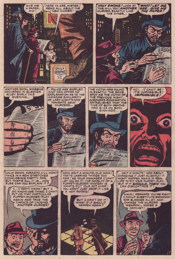
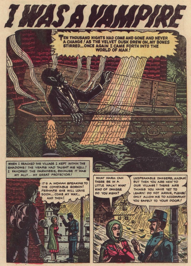
Here’s one of Fox’s all-too-infrequent forays between comic book covers. This one appeared in Uncanny Tales no.6 (March 1953, Atlas). Writer unknown… though that’s no great loss to history.
« There is an air of disquiet to his vision, yet it charms through a surreptitious blending of the primitive with the mockingly insane. His characters border on the lunatic, seemingly at home in his landscapes, concealing a darkness corruptive of the soul. »
And I leave the final word to my trusted accomplice ds, who observed that:
« I find that the art of Matt Fox reminds me of Terrance Lindall… Both can create disquieting monsters with eyes that speak of inner torment, reminiscent of Christian Art (mostly Spanish, I believe) from a few centuries ago. »