« You’re going out wearing THAT? »

« It’s wisest always to be so clad that our friends need not ask us for our names. » — James Fenimore Cooper

(Being a compendium of fashion faux-pas and various sartorial eccentricities.)

Now here’s a figure shrouded in mystery (and little else): Captain Wizard, whose sole appearance was on the cover (and not enough of it) of Atomic Bomb no. 1 (Gerona/Jay Curtis, 1946), a scarce one-shot. Artist unknown, regrettably.

AtomicBomb1A

What are this intriguing man of (relative) mystery’s abilities, aside from autonomous flight, quasi-nudity, bountiful love handles and a snazzy roué moustache? Did he “scare straight” hapless criminals with his sweaty, virile bear hugs? Sigh… I fear we shall never truly know. He’s in the public domain, the gent’s overdue for a revival!

Inside this issue: the exploits of Mandrake lookalike Beau Brummel, Special Agent No.1, Airmale and Stampy, Teeny McSweeny and Captain Milksop. Bracing stuff!

Read it here: http://comicbookplus.com/?dlid=25457

WhoThereLogotype

I suppose there are many ways to compete for the prized title of « Most outré criminal Batman and Robin have ever encountered » (awarded every other year in October at Gotham City Hall; call 608-555-1313 for reservations): powers, weapons, motivations, henchmen, moniker, targets, modus operandi

Batman63A
The Killer Moth made his play for the brass ring by donning the most garish and unsightly garb imaginable. Here he is making his début in Batman no. 63 (Feb. 1951), The Origin of Killer Moth! This sorry buffoon’s inception is credited to Bill Finger, Dick Sprang and Lew Schwartz, presumably to dilute the blame.

Of course, it’s unfair of me to pick on Killer Moth’s costume. I’m sure he took full opportunity to hone and refine his look over the next couple of decades. Plenty of down time to mull things over at his leisure in the clink, right?

Batman-Family10A

To precious little avail, apparently. Here he is a quarter century on, in Batman Family no. 10 (April, 1977); his wings have arguably been upgraded to a cape, but he’s still evidently daltonic. Cover by Bob Brown and John Calnan. Sadly, this was some of veteran Brown’s last published work; he passed away from leukaemia in January, 1977.

WhoThereLogotype

Another entry from the closet of shame. His Very Name Invokes Terror… among the dandies of the Serengeti, who blanch and quake at the notion of being seen in public with him. However, that headgear of his reportedly drove Sir Elton mad with envy.

Showcase66A
Showcase no. 66 (Jan.-Feb. 1967), The Birth of B’wana Beast, pencilled (and possibly scripted, but who’d admit it?) by Mike Sekowsky and inked by George Roussos. Edited by George Kashdan… who was unceremoniously relieved of his editorial duties after a mere two Showcase issues, both featuring B’wana Beast.

WhoThereLogotype

With Jack Kirby and Steve Ditko having decamped (not to mention Stan futilely slouching towards Hollywood), Marvel in the early 70s had not only lost its visionary plotters, but also its ace character designers.

Also, after 30 years or so of men in suits and hats, it was deigned that the younger and hipper generation should have characters whose wardrobe bore at least a tangential relationship to its own.

Created for the 100th issue of Daredevil by scripter Steve Gerber and penciller Gene Colan (who ended his initial long run on the title with that issue; was Angar the final straw, or was it the even more wince-inducing toadying to Jann Wenner?), Angar the Screamer was, to quote the amaranthine words of Wikipedia, « … born in San Francisco, California. He became a hippie and a radical social activist. He volunteered for an experiment that endowed him with sonic powers that caused people to hallucinate. » Groovy. Perfect for… 1973?

ColanDD100AngarA
If anything, we can be grateful that Angar’s colour scheme is relatively restrained. I suppose it makes sense for a flower child to opt for earth tones. This is the concluding, cliff-hanging panel from Mind Storm! (Daredevil no. 100, June, 1973). Pencils by Gene Colan, inks… nay, “embellishments” by John Tartaglione. Read that, er… masterwork right here.
Daredevil101A
Poor DD’s saddled with calves thicker than his thighs. Cover art by Rich Buckler and Frank Giacoia, with the usual fussing and turd polishing by John Romita Sr..

This is Angar’s first cover appearance, Daredevil no. 101 (July 1973), in a tale that could only be called… Vengeance in the Sky With Diamonds!

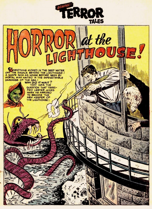
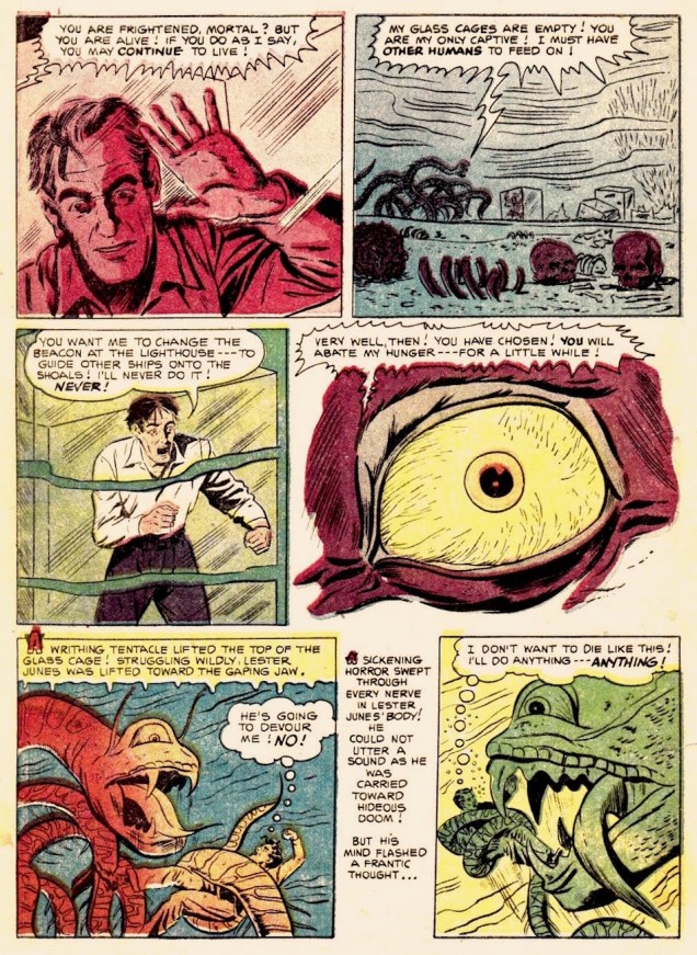
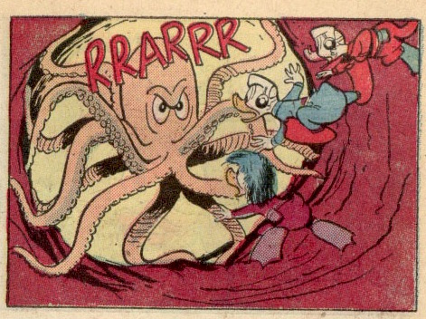
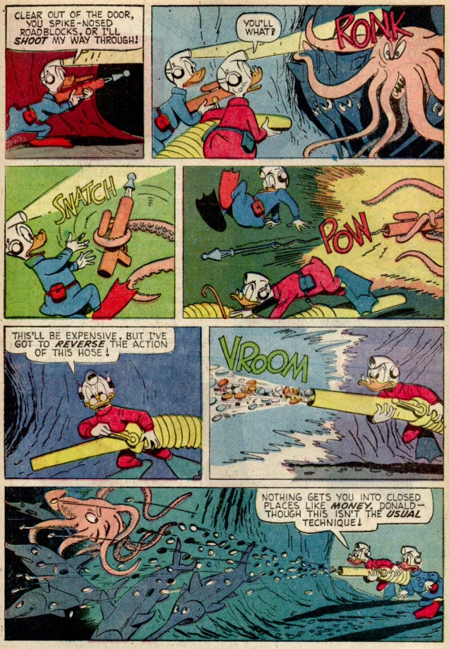
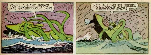
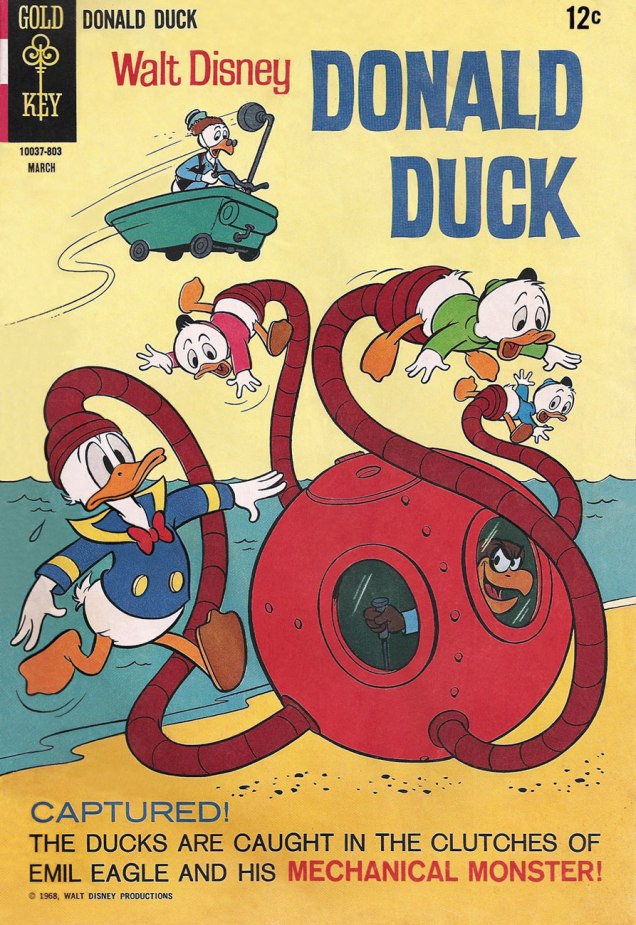
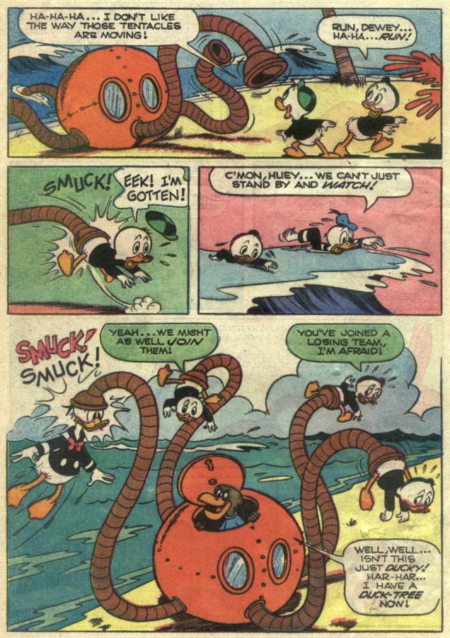
There *are* indeed tentacles within, so you’ll likely encounter these, some enchanted Tentacle Tuesday…

– RG

Tentacle Tuesday: Toothsome and Monstrous

« Teeth are always in style. »  — Dr. Seuss

By now, we have surely established that in the compendium of made-up monsters, tentacles are an artistic short-cut for evoking an especially terrifying creature. As it turns out, if there’s one way to make an already spine-chilling abomination even scarier, it’s to equip its gaping maw with teeth. Be it fangs borrowed from some unfortunate vampire, the implausibly symmetrical dentures of a TV show host, or clearly carnivorous, sharkish chompers, artists have been inserting teeth where no teeth should be long before you or I were born.

« But Grandmother! What big teeth you have! », once quipped Little Red Riding Hood in the 19th century, and this fear of teeth has clearly followed us into the Modern Age.Take a look —

Sheldon Moldoff was probably thinking of a snake’s fangs when he came up with this cutie:

TerroratheLighthouse-SheldonMoldoff-Beware! Terror Tales #6,
A page from Horror at the Lighthouse!, published in Beware! Terror Tales no. 6 (Fawcett Comics, March 1953). Scripted by Bill Woolfolk, drawn by Sheldon Moldoff. Read the full story at The Horrors of It All.

TerroratheLighthouse-2-SheldonMoldoff-Beware! Terror Tales #6,

This cross between a dinosaur and a mole (or is that more of an ant?) boasts an enviable set of sparklingly white dentition:

Challengers22A
Challengers of the Unknown no. 22 (Oct-Nov 1961), cover by Bob Brown.
Challenges of the Unknown22-1961-Bob Brown-TheThinginChallengerMountain2
Aw. You’d go “wacky”, too, if some jerk piled on grenades on you.

One thing you can say about tentacled monsters, it’s that they sure keep their denticulations (yes, it’s a word) impeccably clean. Maybe they choose their victims based on that, like cats gleefully enjoying the crunch of a good teeth-cleaning croquette?

WeirdMysteryTales#9DominguezA
Holy crap, look at those white chompers (that are about to get a little marred with blood, gristle and whatnot)! Weird Mystery Tales no. 9 (Dec 1973 – Jan 1974), cover by Luis Dominguez.

On the other hand, some monsters could have used a set of braces (this one is an orphan, which is why it had to make do with a British set of teeth).

Eerie131
Eerie no. 131 (June 1982), cover by Rudy Nebres. Can you imagine trying to chew anything with such a set?!

A somewhat similar (but a lot less overcrowded) set of ivories for gnawing and gnashing can be spotted in water:

Chet Phillips MartianKraken
A collectible card (from sometime in the 2000s) by illustrator Chet Phillips. Here you can admire his series about Japanese monsters, or visit his website, chetart.com.

This toothy post is now at its end – happy brushing (and flossing — it’s important!) to all, and ’til next Tentacle Tuesday!

~ ds

p.s. Not particularly related to comics, but I found this photograph distinctly on the side of scary:

expressteethwhitening
Captioned « Women in London sit down for express teeth whitening ». I think they’re about to be transformed into aliens, or contaminated with some deadly germ, or perhaps just burnt to a crisp by some mysterious rays. Have I been reading too many comics?

Tire la chevillette: Jean Ache’s Little Red Riding Hood Variations

« … Out behind a tree
there jumped a great big hungry wolf
‘Pardon me’, he said, real cool

‘Why make the scene alone?
A crazy chick like you should have
a handsome chaperone’ » — Ridin’ Hood (The Coasters, 1962)

It could be quite convincingly claimed that Jean Ache (1923-1985,  Jean-Baptiste Huet in Le Havre, France) was the most versatile, chameleonic artist of his generation. Not only was he able to accurately adopt any style he chose, “high” or “low”, but he also wielded a panoply of styles of his own devising. To support my claim, take a peek at noted historian Henri Filippini‘s comprehensive survey of Ache’s career (in French), which includes a generous gallery of his multifaceted art. [ Part One ] and [ Part Two ]

From 1971 to 1973, near the end of René Goscinny‘s enlightened regime (his Astérix compère Albert Uderzo ably serving as art director), French bédé periodical Pilote featured a high-calibre series of “high art” pastiches. It was entitled Le Musée Pilote.

The pages of 1973’s Pilote Annuel revealed an Ache tour de force, wherein he retold the classic tale of Little Red Riding Hood in comics format *and* in the style of a number (seven, to be exact… but not *the* Group of Seven) of famous painters. The set bore the following cheeky introduction: « Within the scope of the Musée Pilote, we came to realise that numerous artists had never tried their hand at comics. Thanks to our friend Jean Ache, it is now a done deal, and we are pleased to present the tryout pages crafted by these illustrious beginners. It is for you to decide whether these attempts are conclusive, and if these young people’s efforts should be encouraged. »

Here we go!

AcheRousseauA
After Henri Rousseau (French, 1944-1910). Incidentally, « Tire la chevillette, la bobinette cherra » means « Pull the bobbin, and the latch will go up. »
AcheLégerA
After Fernand Léger (French, 1881-1955).
AcheBuffetA
After Bernard Buffet (French, 1928-1999).
AchePicassoA
After Pablo Picasso (Spanish, 1881-1973).
AcheDeChiricoA
After Giorgio de Chirico (Italian, 1888-1978).
AcheMiróA
After Joan Miró (Spanish, 1893-1983). My first encounter with Miró came through this item; if I’d been hipper, it might have been this instead… but I was only six years old at the time.
AcheMondrianA
After Piet Mondrian (Dutch, 1872-1944).
PiloteAnnuelA
And here’s the cover. This is Pilote Annuel 74 (no. 731 bis, Nov. 1973). It comprised, in roughly equal measure, a selection of the past year’s best work and new material.

My initial brush with Ache came in the early 1970s and his short-lived Pastec (1968-70, 9 issues, plus one album). I only ever got my hands the album (« L’Agent secret chante à minuit », 1971), but I never forgot. Like many a childhood fascination, it came out of nowhere, then vanished.

AchePastecA
A sample from Pastec no. 4 (January 1969, Société française de presse illustrée). The birdie is Psitti, Pastec’s loyal Ara; the Llama is Camélo; and Pastec himself is the displeased fellow with the green hat in the middle tier.

I honestly hadn’t planned to write two consecutive posts about nearly-forgotten French artists named Jean, but something else fell through… and here we are. Sorry!

-RG

Tentacle Tuesday Dabblers: Gil Kane

When digging through comics in quest for tentacled material, one soon notices that Gil Kane‘s name tends to crop up again and again. Despite this seeming ubiquity, I’ve never specifically concentrated on his art, though he certainly has appeared in Tentacle Tuesdays before (quite a lot in Tentacle Tuesday: Conan-O-Rama, for instance).

I can’t quite put my finger on it, but one of the things that seems to bug me is that Kane, whose real name was Eli Katz and who was born in Latvia, threw himself with such vigour into American culture. It’s an unfair reproach, I realize – one can hardly expect a four-year old child to hang on to a quickly-receding memory of his parents’ motherland to the detriment of whatever culture he’s growing up in, not to mention that this would be unhealthy.

The crux of the matter is that I don’t grasp that je-ne-sais-quoi that people seem to find appealing about Kane’s art. Where others see “dynamic storytelling, emotionally charged characters, and innovative [sic] staged fight scenes“, I see overly busy, hard-to-parse scenes and stiff anatomy. It doesn’t help that the bulk of his oeuvre is concerned with a subgenre of comics I have strong misgivings about, namely superheroes.

To answer the question of what is it that makes Kane so special, I have naturally turned to Gary Groth:

GaryGroth-GilKane

That is certainly well argued, but I’ve read a few Kane interviews and his intellectualism is just clearly not on my wavelength at all. There’s no doubt that he was the analytical kind (this interview with him published in Alter Ego no. 10 (1969) calls him « the comics’ most articulate artist »), but what he says often strikes me as stilted (much like his art). Take this, for instance: « Craft is merely the springboard. It’s the ability to give wings to your expression; otherwise your expression bangs around in an inarticulate way and comes out thick and untutored; you’re just throwing away range and scope. » Let’s just say that Kane was a very opinionated man, which does him credit. Yet I get the impression that his inclination to pick at himself veered towards self-destructiveness, as if he were ever striving for some lofty heights he was aware he would never reach.

In that process of self-improvement (let’s call it that), he often slagged other artists who were operating on a different level from his. Even as he flattered them, his compliments felt incredibly back-handed, bringing to mind those people who never smile, trying to get their atrophied mouth muscles to do the job and achieving merely a sort of pained rictus. For instance, I’m a little sore about his description of Will Eisner, who « did little morality stories, which were very moving, but they had the quality of reading a children’s picture book; he could be quite dramatic, but always on a kind of innocent level. He never had complex, subtle characterizations…» or, again, « Eisner is a writer until you start talking about literature, and talking about the great writers of literature. Then Eisner is only a cartoonist. »

You can read the full interview over at Destination Nightmare.

All this being said, I do like *most* of today’s crop… save for the last two Kull the Destroyer covers, instances of the messy, rigid mises en scène I was carping about earlier. The best cover (imho) is inked by Tom Palmer, not so coincidentally. Co-admin RG has been heard to posit that Gil Kane should never have been allowed to ink himself.

And now I’d better stop displaying my ignorance and move on to the tentacles!

Warlock3-GilKane
Warlock no. 3 (December 1972). Cover by Gil Kane.
JourneyintoMystery3-GilKane
Journey into Mystery no. 3 (February 1973). Pencils by Gil Kane, inks by Tom Palmer.

GilKane-MarvelSpotlight27.

The original art for Marvel Spotlight no. 27 (April 1976). Pencils by Gil Kane, inks by Frank Giacoia.

KulltheDestroyer17-GilKane
Kull the Destroyer no. 17 (October 1976). Pencils by Gil Kane, inks by Klaus Janson.
Kull heDestroyer21-GilKane
Kull the Destroyer no. 21 (June 1977), cover by Gil Kane.

~ ds

Jean Mad’s Enigmas and Anomalies

« A good puzzle, it’s a fair thing. Nobody is lying. It’s very clear, and the problem depends just on you. » — Erno Rubik

Jean Mad… now who’s he? A once-popular and prolific French cartoonist and illustrator, largely forgotten today, in part because his body of work appeared, frequently unsigned, in ephemeral periodicals… and hardly any of it was ever collected or reprinted. So he isn’t a household name, if he ever was, but his distinctive style will ring a bell among francophone readers of a certain age.

Now for a little context: in 1959, Belgian publisher Marabout launched a wildly popular series (nearly 500 titles between 1959 and 1984!) of pocket books called Marabout Flash, and the little tomes’ handy format (11,5 x 11,5 cm) and low cost “inspired” French publisher Vaillant, in 1962, to borrow the idea (at a size of 11,5 x 12 cm… to sidestep legal repercussions) for cheap reprint collections of José Cabrero Arnal‘s Pif le chien strips, which had been running in communist newspaper L’humanité since 1948. The format decided upon was 100 gags – 100 jeux (« 100 gags – 100 games »). It was an instant hit (quickly reaching 150 000 copies sold per issue), and soon generated numerous spinoffs. But the games half of the equation was, for a long time, rather shoddily-illustrated. By the turn of the decade, though, thanks to several judicious additions (Jean-Claude Poirier, Jean Marcellin and Henri Crespi, to name but a few) to the production staff, the product looked pretty spiffy. Which brings us to Mr. Mad, who turned up in 1969… and had moved on by the spring of 1972.

JeanMadAnimauxVF_A
True or False? 1) The beaver only fells small trees 2) A newborn bear cup weighs a mere 200 g; its mother weighs 200 kg; An antelope can approach a lion without fear; A giraffe can reach foliage beyond the reach of an elephant. (1)-False: beavers have to known to drop trees up to 30 m high and 2 m in diameter; (2)-True; (3) True, when he’s full; (4) False: an elephant can just lean against a tree, bending it to reach the foliage it seeks.) From Pif Poche no. 71 (July, 1971, Vaillant).
JeanMadCostumeRobotA
Mad was a master of historical detail. A1-D2-R6 (Middle Ages); B1-I5-A3 (Louis XV); C1-J5-E3 (Prehistory); D1-H5-L6 (Ancient Egypt); E1-C2-F3 (Lady of the manor); F1-G5-J6 (1900); G4-E2-C3 (Musketeer); H4-R5-G6 (Cosmonaut); I4-B2-D3 (Roman); J4-L5-B3 (Knight); S4-A2-I6 (Renaissance); L4-F2-H6 (Gaul). From Pif Poche no. 71 (July, 1971, Vaillant).
JeanMadArbrePerchéA
Mad’s economical, chiaroscuro style came to mind when I later encountered Joseph Mugnaini‘s classic illustrations for Ray Bradbury’s The October Country. In this one, you have to find the hidden crow from Aesop’s timeless fable. From Pif Poche no. 70 (June, 1971, Vaillant).
JeanMadÀTableA
« While observing these odd guests, try to find the six idioms that each one evokes and that all have to do with the table. » (1) Manger son pain blanc le premier; (2) Mettre de l’eau dans son vin; (3) Mettre les pieds dans le plat; (4) Mettre les bouchées doubles; (5) Tourner la cuillère autour du pot (“beat around the bush”); (6) Couper la poire en deux; From Pif Poche no. 70 (June, 1971, Vaillant).
JeanMadDiableA
« These four drawings illustrate idioms featuring the word ‘devil’. Do you know them? » (1) Tirer le diable par la queue; (2) Loger le diable dans sa bourse; (3) Envoyer quelqu’un au diable; (4) Avoir le diable au corps. From Pif Poche no. 68 (April, 1971, Vaillant).
JeanMadBandesA
A cute demonstration of Mr. Mad’s versatility, from Ludo, le journal des amateurs d’énigmes no. 3 (Oct. 1973, Vaillant). « These four drawings are excerpted from different strips, but all have one detail in common. Which one? » The solution was to be provided in the following issue, which I only acquired decades later… but I’m sure you can suss out the answer to this one.
JeanMadMauvaiseChuteA
Prior to encountering this piece in Ludo, le journal des amateurs d’énigmes no. 1 (Feb. 1973, Vaillant), I had no clue as to the identity of the mystery artiste. I guess this piece was large and elaborate enough to warrant a signature.
JeanMadEnfinVoitureA
« A car at last! » « Where? » A bit of a cheat, that one. How was I to know, at age six, that a “DS” was a French car, even one as lovely and classic as the Citroën DS? We didn’t have those around where I grew up, and that’s a shame. From Pif Poche no. 70 (June, 1971, Vaillant).
JeanMadGaffeA
A surprisingly adult situation, given the audience. Catch the gaffe!: The man of the house, having queried his spouse: « At what time are those two drips due to drop in? », what should be her reply, to salvage the situation? « They had to cancel. But our friends, X… have just arrived. » From Pif Poche no. 71 (July, 1971, Vaillant).
JeanMadMonturesA
An artist who can not only draw steeds, but depict various equine types and personalities… now, that’s skill. From Totoche Poche no. 20 (March, 1971, Vaillant). Name Their Cavalier: (1) Don Quixote; « I am called Rossinante » (2) Alexander the Great; « Bucephalus is my name » (3) Attila the Hun; « The grass never grew back where I trod » (4) Henri IV (Henri de Navarre); « I am white, as is his panache ».
JeanMadProdigesA
Child Prodigies: (1) « My word, he’s rediscovered geometry! » (Little Blaise Pascal) (2) « Later on, with my machine, I’ll be making the pot boil. » (Little Denis Papin) (3) « The harpsichord? Child’s play! » (Little Wolfgang Amadeus Mozart). From Pif Poche no. 68 (April, 1971, Vaillant).

I suppose I didn’t think twice about it when I was a kid, but it seems to me, in hindsight, that kids in those days were expected to possess quite a baggage of eclectic knowledge pertaining to history, geography, language, architecture, logic, observation… As an omnivorous, voracious reader, that state of affairs suited me to a T, and so these dense little volumes nourished me considerably at a time when I was most receptive to such gleanings. Inevitably, both the comics and the puzzles were soon dumbed down, but I had moved on by then.

-RG

Tentacle Tuesday: Duck Feathers!

« I read some of my stories recently and thought, ‘How in the hell did I get away with that?’ I had some really raw cynicism in some of them… » – Carl Barks

Like so many kids, I owe a lot of my interest in comics to Carl Barks, even though at the time I had no idea who he was – embarrassingly, up until today I’m not great at spotting his art. So much depends on what is available when one is growing up – and I used to enthusiastically dig through discarded piles of books at garage sales and whatnot, in quest for (among other things) for issues of Super Picsou Géant. Picsou is Uncle Scrooge’s French name, meaning something like “penny pincher”. These (true to their name) giant anthologies, just like pocket-book sized Archie compendiums, offered their readers pêle-mêle reprints of comic book stories both relatively new and also quite old, mixing prime Barks material with shitty European knock-offs with offerings by decent Barks disciples (see co-admin RG’s take on the latter).

UncleScrooge68-CarlBarks-HalloftheMermaidQueen2

Just like a Picsou Géant, this post has a few Barks covers and stories, and a few submissions by other folk… all viewed through my usual tentacle-specific lens. Dive in!

DonaldDuck109
Donald Duck no. 109 (September 1966), cover by Larry Mayer. Minimal tentacles, but that clock was just too cute not to share.
UncleScrooge68
Uncle Scrooge no. 68 (March 1967), cover by Carl Barks.
UncleScrooge68-CarlBarks-HalloftheMermaidQueen
Hall of the Mermaid Queen is by Carl Barks.

Somewhat off topic, but I was quite amused by the ending of this story. Is this was Barks meant when he talked about raw cynicism? 😉

UncleScrooge68-CarlBarks-HalloftheMermaidQueen3

UncleScrooge70-Carl-Barks
Uncle Scrooge no. 70 (July 1967), cover by Carl Barks.
UncleScrooge70-Carl-Barks-TheDoomDiamond
The Doom Diamond, the cover story, is also by Carl Barks.

No Tentacle Tuesday post would be complete without mechanical tentacles:

DonaldDuck118A
Donald Duck no. 118 (March 1968), cover by Tony Strobl on pencils and Larry Mayer on inks.
DonaldDuck118-MechanicalMonster-VicLockman
The Mechanical Monster is scripted by Vic Lockman, which is almost an iron-clad guarantee of inventive goofiness. Penciled by Tony Strobl and inked by Steve Steere.

DonaldDuck118-MechanicalMonster-VicLockman-2

Donald-Duck141
Donald Duck no. 141 (January 1972), cover by Larry Mayer.
Donald Duck141-LarryMayer- The Tall-Tale Trail
The Tall-Tale Trail is penciled by Tony Strobl and inked by Larry Mayer.

Donald Duck141-LarryMayer- The Tall-Tale Trail-2

For this post, I wanted to concentrate on Gold Key publications, but at a later date there will be a follow-up post covering some other material.

~ ds

Lynch and Whitney’s Phoebe and the Pigeon People

« How do I despise thee? Let me count the ways. Society, you corpulent swine! » – Bix

Today, January 7, marks the seventy-fifth birthday of storied undergrounder Jay Lynch (1945-2017), creator of Nard n’ Pat, Wacky Packages, Garbage Pail Kids and MAD Magazine contributor… to name but a very few.

Today, we’ll shine a light upon his epochal comic strip Phoebe and the Pigeon People. Here’s how it was hatched:

« In April 1978, Lynch teamed up with cartoonist Gary Whitney to produce weekly Phoebe and the Pigeon People strips. Lynch wrote them and Whitney drew them. “It was very easy and it got us invited to cocktail parties”, said Lynch. “We wanted to do a strip that would appeal to secretaries, rather than a strip that would appeal to the comic fan type person.”

« Lynch and Whitney launched a stage show based on the characters, called When Cultures Collide, with an improvisational theater troupe, The Practical Theater. The performance included a battle of the bands between rock and new wave musicians. » (quoted from Ink & Anguish, a Jay Lynch Anthology, 2018, Fantagraphics)

P&TPP was another one of those captivatingly freewheeling features that popped up during the heady heyday of alternative weeklies. A while back, we devoted a post to Tom Hachtman‘s Gertrude’s Follies, which bloomed in a similarly unlikely fertile milieu. In Phoebe’s case, The Chicago Reader was the publication it called home during its impressive 1978-1996 run.

PhoebePosterA
A 1982 poster for the event in question. Art by Gary Whitney.

For a few years now, they’ve (in this case, a shadowy outfit vaguely named “Alternative Comics“) been promising us a Phoebe collected edition. We’re still waiting. Hey, if the publisher needs more time to do the job right, so be it… but expectations are accordingly high.

Amazon’s blurb is an ominous portent: « The under-achieving Phoebe and friends hang out with beatnik people-headed jazz-loving beat-philosophy cooing pigeons in a park in Chicago. »

Uh, not even close. Here are a few highlight from the strip’s first four years, pulled from the pages of Kitchen Sink’s valiant three-issue run (1979-81); read these selections and you’ll know more about the strip than whoever wrote that blurb. You’re welcome!

KSPhoebe02FrontA
Phoebe & The Pigeon People no. 2 (May 1980, Kitchen Sink).

PhoebeFrenchLessonsAPhoebeDebatingAPhoebeSignChangeA

PhoebeElderlyFeministA
Clearly, these strips are so rooted in their time period that they retain no relevance whatsoever to today’s world and its social and political mores.

PhoebeFlasherA

PhoebeGovernorA
Ah, politicians: Plus ça change, plus c’est la même chose. I’d love to see some of our finer young minds take a crack at such an opportunity. One can still dream, right?
PhoebeNancyDickA
In Phoebe’s world, there was always plenty of room for the meta-contextual.

PhoebeRoachMotelA

PhoebeGreetingCardsA
Bix gets to trot out his pet poetic phrase. Catchy!

PhoebeToupeeStatusA

KSPhoebe03FrontA
This is the magazine-size Phoebe & The Pigeon People no. 3 (July 1981, Kitchen Sink). Until the omnibus arrives, this is your best bet. Read the run right here, friends!
KSPhoebe03BackA
Our loveable auteurs and some of their cast, enjoying the Chicago winter. That’s Mr. Lynch on the left, Whitney on the right.

I particularly love the strip’s anything-for-a-joke ethos: as was Lynch’s wont, he ran the gamut from lowbrow to highbrow, from squeaky-clean to salacious, from sunny side up to scrambled. Let’s face it, that bizarre premise would have challenged and defeated most would-be humourists within a few weeks, let alone a decade-and-a-half.

JayLynch2014A
Jay Lynch, dapper elder, as he appears in the short film There’s Something Weird About Jay Lynch (2014, filmed and edited by John Kinhart). Watch it here!

-RG

Tentacle Tuesday: Ugly Stickers Uglify the World

I say, the year’s first Tentacle Tuesday is a big responsibility! That’s why I’d like to start with some slimy or furry,  squirming or pitter-pattering, whimsical or gnarled, skittish or spine-chilling, drooly woolly creepy crawlies with toupees and bloodshot eyes. After all, the 2020s decade is sadly guaranteed to be full of ’em… but  of a significantly less cute variety than the lot that I’m featuring today.

ToppsUgly Stickers have a lot going for them: excellently drawn, tongue-in-cheek monsters in various states of putrefaction. If there’s one commonality between them, it’s that most of them showcase teeth any dentist would be thrilled to drill through. Many of them have far more appendages that a regular creature needs… and a lot of these appendages are distinctly tentacular, which is of course where we come in! And they’re all cute as a button.

David Saunders, Norman Saunders’ son, explains in the latter’s biography (Illustrated, 2009):

«In 1965 Topps released Ugly Stickers. This set was initially based on the grotesque drawings of Basil Wolverton, but when he demanded copyright control, he was paid off for his first twelve images and then fired. The rest of the creatures in the set were designed by Norman Saunders and Wally Wood.

The creatures that appear on the display box, the wax wrapper, and the giant twelve-piece puzzle were all designed by Saunders. He also painted all 44 Ugly Stickers. These were so popular they were reissued in four later versions and even spawned a line of rubbery toys called Teacher’s Pets.»

So what’s the break-down? Out of the original 44 stickers, Wolverton designed 10. The rest were the handiwork of Wally Wood and Norman Saunders. The total set numbers 164. Not all cards were repeated in the re-runs, which is why the numbers don’t compute, for those of you who multiplied 44 cards by 4 versions and obtained 176, not 164; there were 4 groups of 40 cards + 4 non-repeated cards.

Monster Mash- The Creepy, Kooky Monster Craze In America
A page from Monster Mash: The Creepy, Kooky Monster Craze In America, 1957-1972 (Two Morrows Publishing, 2015), which you can read here.

In some print runs, the creatures did not have names, doubtlessly leaving that part to the reader’s imagination. Most cards, however, do have names, with genders shamelessly swapped, making guys into gals and back into guys again. Take a peek at the full list of name changes over at this very instructive website, Bubble Gum Cards.

ToppsUglyStickers3

Does s/he look like a Jacqueline to you? Or maybe an Edward? I vote for the former; such an elegant name for a bug-eyed, displeased brain-thing, Just look at the flair with which she wears that pink tuft of fur underneath.

Number3-UglyStickers-NamesA

SaundersWoodKennethA

ToppsUglyStickersIris

ToppsUglyStickersJames

ToppsUglyStickersMarvin

Joseph and Evelyn (or Stanley and Renée, or…) were previously used by my co-admin RG in his Hallowe’en Countdown III, Day 24 post, but they distinctly have tentacles, so I believe it’s worth running them again.

ToppsUglyStickersJoseph

SaundersWoodEvelynA

As a little bonus, here’s a lady from Topps’ 1966 Ugly Name Stickers series who asked to be included. Her name was… Donald, Sylvia, Angelo, Phyllis, Barney, or Rosemary. “Barney” is really pushing it!

Toppsno6uglystickers

Teacher'sPet-UglyStickers
A little friendly critter from the Teacher’s Pets series (probably…. these things are veiled in a shroud of mystery), which was a rubbery spin-off from Ugly Stickers.

~ ds

Hot Streak: Bill Everett’s Menace

« I have learned to live each day as it comes, and not to borrow trouble by dreading tomorrow. It is the dark menace of the future that makes cowards of us. » — Dorothy Dix

Menace was a short-lived (11 issues, 1953-54, Atlas) horror anthology title that’s mostly remembered*, if at all, for its one-shot introduction of a zombi by the name of Simon Garth. Because Atlas never really played the gore card, its successor Marvel was able to mine most of its Pre-code material as cheap filler in their 1970s bid to flood the market. Don’t get me wrong, though; these titles were still a lot of primitive fun, and in most cases, I’d pick an issue of Weird Wonder Tales, Where Monsters Dwell or Uncanny Tales From the Grave over the latest Fantastic Four or Spider-Man.

The writing was by no means daring or even coherent, but the artwork was frequently rather fine, with none quite finer than Bill Everett‘s, particularly his covers, which elegantly straddled the line between fearsome and goofy.

I’d be tempted to say that Everett (1917-1973) was at his peak when he created these, but the bittersweet fact of it is that Everett was still at the height of his artistic powers, even as he was slowly dying in the early 1970s.

This particular hot streak ends not because Everett turned in a lesser job, but because other hands provided covers for the rest of the run. Talented hands, at that (Carl Burgos, Gene Colan, Russ Heath, Harry Anderson), but none of the other Menace covers are a patch on Everett’s mighty half-dozen.

Menace01A
These monsters look kind of playful and kooky, don’t they? This is Menace no. 1 (March 1953, Atlas). Inside we find Everett, George Tuska, Russ Heath and Werner Roth art. Oh, and Stan Lee stories. Colours by Stan Goldberg.
Menace02A
This is Menace no. 2 (April 1953, Atlas). Colours by Stan Goldberg.
Menace03A
This is Menace no. 3 (May 1953, Atlas). Colours by Stan Goldberg. Was the title’s monthly schedule truly supposed to be a selling point?
Menace04A
This is Menace no. 4 (June 1953, Atlas). Colours by Stan Goldberg.
Menace05A
If you think that’s impressive, you should see what mushrooms can do to asphalt!** This is Menace no. 5 (July 1953, Atlas). Simon Garth was dug up (sorry) in 1973, likely at the behest of continuity addict Roy Thomas, to star (if you can call it that) in his own black & white magazine, Tales of the Zombie (10 issues, 1973-75). Like The Man-Thing, he was essentially mindless and shambling, and so mostly a pawn or an uncomprehending witness to others’ tragedies. The best of the mangy lot is, imho, The Blood-Testament of Brian Collier (TotZ no.7… read it here.) It’s not great, but it sure looks pretty, thanks to the sublime Alfredo Alcala, who’s quite in his element here.
BugEyedPair
Don and Warren also met Simon. Read Lee and Everett’s 1953 Zombie!
Menace06A
This is Menace no. 6 (August 1953, Atlas). Colours by Stan Goldberg.

That strange compulsion that’s creeping over you, that ungodly craving for more Bill Everett, cannot quite be slaked without incurring a terrible cost, be it in human lives, the forfeiting of your immortal soul, or both. But do check out my co-admin ds’ earlier tribute to Mr. Everett’s nightmares, Bill Everett’s Restless Nights of Dread, it might tide you over until dawn.

-RG

*these babies are rare, in any condition.

**Here’s an example:

« A bump in the garage floor turned into a half meter of mushrooms in little more than three days. It crushed its way through five centimetres of asphalt in Åge Reppes garage in Stord, western Norway. It is the water pressure in the cells of the fungus that makes it able to crack the asphalt, says a biologist at the local university. » [ source ]. These are inky caps. Edible, but some species are toxic when consumed with alcohol. These are commonly known as ‘tippler’s bane‘.